Release Notes for Alpha Anywhere
This document describes the updates and fixes made to Alpha Anywhere
in 2017 and earlier.
To see the 'What's New in V12' document (which describes all of the new
features in Alpha Anywhere's initial release) please click here.
Please note that Alpha Anywhere patches are only available to users with
a current subscription.
You can verify your subscription status from within Alpha Anywhere by
going to Help, About, or by clicking this link shown here (https://activation.alphasoftware.com/subscriptionStatus.aspx).
If you install an update for which your subscription is not entitled,
you will need to uninstall the update and rollback to an older version
that you are authorized to use in order to continue using Alpha
Anywhere.
To see release notes for other periods, click the appropriate link:
Release notes for 2025 to
present
Release notes for 2023 and
2024
Release notes for 2021 and
2022
Release notes for 2018 and
2019 and 2020
Alpha Anywhere V4.5.2 - Build 4770-5018 14-DEC-2017
NOTE: This build has introduced a bug in the Javascript Action to
refresh the data in a UX Component ViewBox control. After you install
this update you can install a hotfix for the bug by
downloading this file. Click
here for instructions on how to install a htofix.
Videos
|
UX Component - Tree Control |
Populating a Tree Control using a SQL Query and
Defining a Javascript Event for Each Tree Leaf
Node |
The Tree control can be automatically populated
with data derived from a SQL query. When doing
this it is common to want to execute some
Javascript code when the user selects a leaf
node in the tree.
In this video we show how this is done.
Watch Video
Download component
Date added: 2017-11-02 |
|
UX Component |
Selecting Multiple Values in an Auto-suggest or
Edit Combo Control |
The Auto-suggest and Edit Combo controls have
always allowed you to set a mode where multiple
selections can be made. However, each time you
make a selection the pick list is closed and you
must reopen the pick list before you can make
your next selection.
Now, a new property in these controls allows you
to specify that the pick list should stay open
after each selection, allowing you to make
multiple selections more easily.
Watch Video
Date added: 2017-11-15 |
|
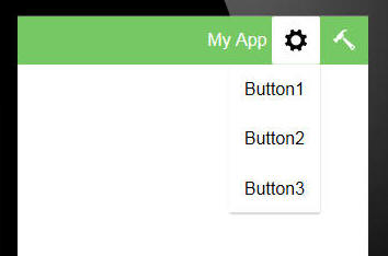
UX Component - ControlBars |
Using the Built-in ControlBar Templates |
The ControlBar is highly configurable. This
allows you to create solutions for many
different use cases. There are several common
patterns that developers use and for many of
these patterns you can get a quick start by
selecting one of the pre-defined ControlBar
templates. For example, common patterns
addressed by the pre-defined templates
are:ControlBar with a menu button that animates
in a menu from the left or right side of the
Panel, ControlBar with buttons that reveal
animated drop-down menus, ControlBar with
buttons that allow you to create a tabbed user
interface.
In this video we show how you can create a new
ControlBar from a template and then continue to
modify the resulting ControlBar.
Watch Video
Date added: 2017-11-28 |
|
UX Component |
Sample UX Component - Amazon Mobile Shopping
Look Alike Example |
The Amazon mobile shopping App is one of the
most recognizable mobile Apps. In this video we
show how the look and feel of this App can be
recreated using the UX component.
Open the App in a Browser
Watch Video - Overview
How the Products List is Populated
Watch Video
How the Back Button in the ControlBar is Implemented
Watch Video
How the Badge on the Shopping Cart Icon is Implemented
Watch Video
How the Search Box is Implemented
Watch Video
How the Product List Layout is Implemented
Watch
Video 1
Watch Video 2
How the Detail View is Implemented using a ViewBox Control
Watch
Video 1
Watch Video 2
Watch Video
3
Date added: 2017-12-13 |
|
|
|
|
Features
Application Server for IIS - Unlicensed Mode - The
Alpha Anywhere Application Server for IIS is will now run in
unlicensed mode. Five users can be active on an unlicensed
server allowing development and testing to be done without
needing a license. If more users are needed or the server is
running in production a license is required.
This change brings the Application Server for IIS in line with
the Standard Application Server for use in development and
testing.
You can download the installer for the Application Server for
IIS
here.
Application Server For IIS - Installer - Pending Reboots
- When you run the installer for the Application Server for
IIS the installer will now warn you if your machine has any
pending reboots mandated by previously installed Windows, or
other, updates.
UX Component - {dialog.object}.refreshExpandingMenuData()
Method - This method makes an Ajax callback to refresh the
data in an Expanding Menu. This method is useful if the
Expanding Menu control has assigned security or server-side
show/hide expressions to any of the branches or nodes in the
data for the expanding menu.
For example, after a user has logged into an application, you
might want to use this method to refresh the choices shown in
the expanding menu so that only choices for the user's role are
shown.
Syntax:
{dialog.object}.refreshExpandingMenuData(expandingMenuIds);
Where:
- expaningMenuIds - comma delimited list of
expanding menu controls to be refreshed.
UX Component - {dialog.object}.{dialog.object}.populateExpandingMenuControl()
Method - This method will repopulate the data shown in an
Expanding Menu control.
Syntax:
{dialog.object}.populateExpandingMenuControl(id,data)
Where:
- id - id of the Expanding Menu control
- data - JSON data with which to repopulate the
control.
Example:
var obj = {dialog.object}.getControl('EXPANDINGMENU1');
var data = {
	items:[
		{
			html: 'Category 1',
			value: 'category1',
			icon: 'svgIcon=#alpha-icon-addCircleBorder:icon,24',
			action: '',
			children: [
				{
					html: 'Action 1',
					value: 'action1',
					action: 'action:1',
					icon: 'svgIcon=#alpha-icon-bandAidCrossed:icon,24'
				},
				{
					html: 'Action 2',
					value: 'action2',
					action: 'action:2',
					icon: 'svgIcon=#alpha-icon-bellRing:icon,24'
				}
			]
		},
		{
			html: 'Category 2',
			value: 'category2',
			action: '',
			icon: 'svgIcon=#alpha-icon-heartSolid:icon,24',
			children: [
				{
					html: 'Action 4',
					value: 'action4',
					action: '',
					icon: 'svgIcon=#alpha-icon-map:icon,24',
					children: [
						{
							html: 'Action 4a',
							value: 'action4a',
							action: 'action:4a',
							icon: 'svgIcon=#alpha-icon-trendingDown:icon,24'
						},
						{
							html: 'Action 4b',
							value: 'action4b',
							action: 'action:4b',
							icon: 'svgIcon=#alpha-icon-trendingDown:icon,24'
						}
					]
				},
				{
					html: 'Action 5',
					value: 'action5',
					action: 'action:5',
					icon: 'svgIcon=#alpha-icon-trendingDown:icon,24'
				}
			]
		},
		{
			html: 'Category 3',
			value: 'category3',
			action: '',
			icon: 'svgIcon=#alpha-icon-shield:icon,24',
			children: [
				{
					html: 'Action 7',
					value: 'action7',
					action: 'action:7',
					icon: 'svgIcon=#alpha-icon-shuffle:icon,24'
				}
			]
		}	],
	actions: {
		action: function(arg){
			alert('Action' + arg);
		}
	}
}
{dialog.object}.populateExpandingMenuControl('EXPANDINGMENU1',data);
sql_upsert() Function - The
sql_upsert()
function is a high level Xbasic function that complements the
sql_update() and
sql_insert()
functions. The
sql_upsert() function will update a record if the record
exists in the database. Otherwise it will insert a new record
into the database.
Syntax
p result = sql_upsert(A connection,c tablename,c
fieldValuePairs [,c primaryKey [, a primaryKeyValue [, L execute
[, P e ]]]])
Where
-
result - an object with these property: error (true/false), errorText, sql (the
SQL that was generated), arguments (the
XML for the arguments that were generated, and
action
(indicating if an Update or Insert was executed)
-
connection - either an open SQL::connection object,
or the name of a connection string
-
tablename - name of table to update
-
fieldValuePairs - fields to update with corresponding
values. A cr-lf list of the form fieldname=value. Or a JSON
string (see example). Date values must be specified using yyyy-mm-dd format.
-
primaryKey - name of primary key field. If primaryKey is
multi column use ||| to delimit (e.g.OrderNumber|||PartNumber).
If primaryKey is blank or omitted, then the action is
automatically assumed to be an INSERT.
-
primaryKeyValue - value of primary key. If primaryKey is
multi-column, use ||| to delimit (e.g. 10245|||23).
If the primaryKeyValue is blank or omitted, then the
action is automatically assumed to be an INSERT.
-
execute - (true/false). If false, the SQL is not
executed. However, you can still examine the result.sql andresult.arguments properties
to see what SQL was generated.
-
rowsAffected - number of rows affected by the
operation if an UPDATE was executed. In some databases (e.g.
MySQL) if the record specified by the primary key is not
found an error is returned (result.error
= .t.), while in other databases (e.g. SQL Server)
the result.error flag
is .f., but rowsAffected will
be 0.
-
lastInsertedIdentity -
If an INSERT was executed, the value of the primary key
field (if its value was auto-generated)
-
e - a dot variable with with one or more
sub-properties. Used in the case where the fieldValuePairs contains
dot variables for the value. For example, assume that one
line in the cr-lf delimited list of fieldValuePairs containedname=e.whatname and
the e variable that was passed in contained e.whatname
= "John Smith", the e.whatname in
the fieldValuePairs would be resolved before the SQL was
executed.
Example:
dim cn as sql::Connection
cn.open("::Name::myconnstring")
tablename = "mytable"
fieldsValuePairs = <<%str%
name=fred smith
date of birth=1952/12/18
salary=78000
%str%
'You can also specify field values using JSON
fieldsValuePairs = <<%str%
{
"name" : "fred smith",
"date of birth" : "1954/11/25",
"salary" : "78000"
}
%str%
primaryKey = "id"
primarykeyValue = "1"
p =
sql_upsert(cn,tablename,fieldsValuePairs,primaryKey,primaryKeyvalue)
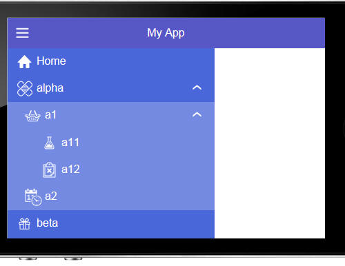
Amazon Look Alike Sample Mobile Application - A new
sample template is available. The Amazon look-alike sample mobile application is a sample
Alpha Anywhere application designed to show how a familiar
mobile app could be built using a UX component.
You can load the sample app in your web browser, or on your
mobile device from this url:
http://alphamediacapture.s3.amazonaws.com/sampleamazonlookalikeapp/index.html
You can watch a video showing a quick overview of the
application by clicking
here.
NOTE: When you create a new UX Component,
you can select this sample application from the list of template
applications.
The images below show screenshots from various parts of the
application:
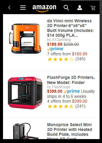
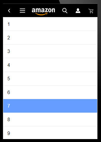
Main App screen. This screen shows a List control listing the
various products that can be purchased. Each row in the List is
rendered using a freeform layout template that uses Alpha
Anywhere's client-side templating feature to create a highly
customized layout.

Navigation menu. The navigation menu is shown when the user
taps on the menu icon in page header. The menu it rendered using
the Expanding Menu control.
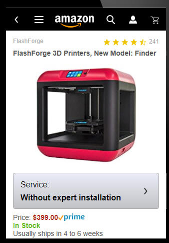
This is the Detail View for a particular product. This Panel
is shown when the user taps on a row in the List. The ViewBox
control is used to render the Detail View and the template that
is used in the ViewBox control to render the Detail View makes
extensive use of client-side templating features.
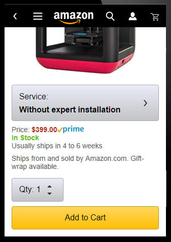
This is the scrolled view of the Detail View for a particular
product.
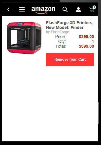
This is the shopping cart showing a list of products that
have been added to the cart. This Panel also uses a List control
with a freeform Layout to display each row in the shopping cart.
Notice that the shopping cart icon in the header has a badge
indicating how many products are in the cart.
This screen shows the page that is displayed when the user
taps on the Quantity button on the product detail page.
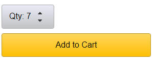
After the user selects a quantity, the Quantity button on the
product detail page is updated to show the selected quantity.
Understanding How the App Was Built
The entire App was built using a single UX component as shown
in the image below.
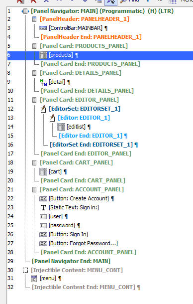
The key building blocks of the app are:
-
ControlBar control for the page header (control number 3)
-
Two List controls - one for the Products list and one for the
shopping cart list (controls 6 and 19)
-
ViewBox control - to show the product details for a selected
product (control 9)
-
Expanding menu control (control number 31) to display the
main navigation menu.
The app structure is shown below:
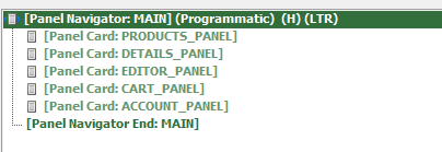
Each 'page' in the App is contained in a Panel Card and the
Panel Cards are contained in a Panel Navigator. The Panel
Navigator has been configured as "Programmatic" - meaning that
the user cannot swipe left-to-right, or right-to-left on a Panel
to navigate to the next Panel. Instead Javascript code is used
to control which Panel is shown in the Panel Navigator.
The Panels in the App are:
-
PRODUCTS_PANEL - This panel contains the main List control
that shows the available products
-
DETAILS_PANEL - This panel contains the ViewBox control that
shows the detail for the selected product. When the user
taps on a product in the products list, this panel is
animated into view.
-
EDITOR_PANEL - This panel contains the editors where the
quantity is selected and whether 'service' is required when
a user adds a product to the shopping cart
-
CART_PANEL - This panel contains the List control that shows
the shopping list
-
ACCOUNT_PANEL - This panel shows the screen where the user
can either log in or create a new account.
NOTE: This demo app is not a complete
application. It is only meant as a teaching tool to show how a
compelling mobile user interface can be created using the UX
components. For example, the navigation menu displays, but when
you make a selection from the menu, the product list is not
updated.
Videos Explaining How Various Features Are Implemented
How the Products List is Populated
Watch Video
How the Back Button in the ControlBar is Implemented
Watch Video
How the Badge on the Shopping Cart Icon is Implemented
Watch Video
How the Search Box is Implemented
Watch Video
How the Product List Layout is Implemented
Watch
Video 1
Watch Video 2
How the Detail View is Implemented using a ViewBox Control
Watch
Video 1
Watch Video 2
Watch Video
3
JSON_shred() Function - This function has been enhanced.
The input schema that describes how the JSON should be shredded is
now optional. Also, the function can automatically inject linking
values into the JSON if the JSON does not already have appropriate
linking values. If the input schema is not specified then linking
values are automatically injected.
The purpose of the JSON_shred()
function is to take a complex
JSON document (with one or more nested arrays) and decompose the
JSON into multiple flat arrays, none of which have nested arrays.
The new syntax for the function is:
C result = JSON_shred(C
json [,C schema [,C topArrayName [,L
flagAddSurrogatePrimaryKey [,C surrogateKeyName ]]]])
Where:
- json
- json document to shred
- schema
- optional schema that defines how the JSON document should be
shredded
- topArrayName
- optional. The name of the top level array - if not specified
'__top' is used
-
flagAddSurrogatePrimaryKey - if .t. then linking key
values are injected into the JSON data. The linking values are
GUIDS. If the schema is not specified, this parameter is
automatically set to .t.
- surrogateKeyName
- defaults to '__surrogatePrimaryKey'.
The name of the field that contains the linking value.
Example:
dim json as c
json  = <<%str%
[
    {"Firstname": "John", "Lastname" : "Smith", "City" : "Boston", "State" : "MA", "Children": [
        {"Name" : "Callie", "Age" : 5},
        {"Name" : "Griffin", "Age" :3},
        {"Name" : "Luke", "Age" : 1}
        ]
    },
    {"Firstname": "Henry", "Lastname" : "Rhodes", "City" : "New York", "State" : "NY", "Children": [
        {"Name" : "Howard", "Age" : 15},
        {"Name" : "Robert", "Age" : 11}
        ]
    }
]
?json_shred(json)

{
    "__top": [
        {
            "__surrogatePrimaryKey": "475750b196554658b2518fde4bfaec6e",
            "Firstname": "John",
            "Lastname": "Smith",
            "City": "Boston",
            "State": "MA"
        },
        {
            "__surrogatePrimaryKey": "c970381d48aa4abfa92d0f46d02ead27",
            "Firstname": "Henry",
            "Lastname": "Rhodes",
            "City": "New York",
            "State": "NY"
        }
    ],
    "Children": [
        {
            "ParentLinkingValue": "475750b196554658b2518fde4bfaec6e",
            "LinkFieldName": "__surrogatePrimaryKey",
            "__surrogatePrimaryKey": "16963be3261c4d82a50152dfb18f9ff0",
            "Name": "Callie",
            "Age": 5
        },
        {
            "ParentLinkingValue": "475750b196554658b2518fde4bfaec6e",
            "LinkFieldName": "__surrogatePrimaryKey",
            "__surrogatePrimaryKey": "556ed6b0264544bd93ebe1382578347a",
            "Name": "Griffin",
            "Age": 3
        },
        {
            "ParentLinkingValue": "475750b196554658b2518fde4bfaec6e",
            "LinkFieldName": "__surrogatePrimaryKey",
            "__surrogatePrimaryKey": "32558171e17c41f88dffc6594b4f73c3",
            "Name": "Luke",
            "Age": 1
        },
        {
            "ParentLinkingValue": "c970381d48aa4abfa92d0f46d02ead27",
            "LinkFieldName": "__surrogatePrimaryKey",
            "__surrogatePrimaryKey": "7ea305b5205844c5abde8728b68f08ae",
            "Name": "Howard",
            "Age": 15
        },
        {
            "ParentLinkingValue": "c970381d48aa4abfa92d0f46d02ead27",
            "LinkFieldName": "__surrogatePrimaryKey",
            "__surrogatePrimaryKey": "98ff8b3ccc1b4fa1a79bdee2620daee2",
            "Name": "Robert",
            "Age": 11
        }
    ]
}

%str%
Dynamic Storage Connection Strings - Storage - SQL Server
Reporting Services (SSRS) - Alpha Anywhere has had the concept
of dynamic connection strings for AlphaDAO connection strings for
some time now. But dynamic connection strings for storage and SSRS
did not exist. A dynamic connection string is particularly useful in
multi-tenant SaaS applications. Now, you can define dynamic storage
connection strings for both storage and SSRS.
A dynamic connection string will resolve differently based on a
the value of a session variable.
To define a dynamic storage connection string, your named
connection string must start with
DynamicConnection_.
For example:
DynamicConnection_myS3Storage.
You must also have a session variable named
__protected__<name>
where <name> is
the text to the right of
DynamicConnection_ in the named connection string.
So for example, if your named connection string is:
DynamicConnection_myS3Storage
You would need a session variable called:
__protected__myS3Storage
When the named connection string is resolved, it will resolve to
the value of the
__protected__myS3Storage session variable.
Xbasic csv_to_json() Function - Escaping Doublequotes -
This function now supports two different methods for escaping double
quotes.
The default is use use two double quote characters. .e.g
"fred","smith","the ""computer"" store","boston"
But you can also use Javascript style escapement. e.g.
"fred","smith","the \"computer\"
store","boston"
Syntax:
c json = csv_to_json(c csvtxt, c
escapeMethodForQuotes)
Where:
- escapemethodforquotes - either
doublequotes or
backslash -
manner in which the doublequote character in the data is escaped
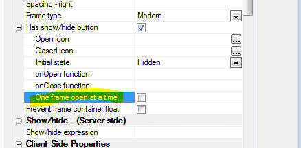
UX Component - Frame Container - Modern Frames - If a
modern frame container is configured to have a show/hide button, you
can specify that if the current frame is opened and another frame is
subsequently opened, the current frame will be closed.
UX Component - Mobile Applications - Panel Card - Drag
Scrolling - Previously if you dragged on an input control in a
Panel Card, the Panel did not scroll. Now, as long as you have not
actually given focus to the input control (i.e. the keyboard has not
come up) then the panel will still scroll.
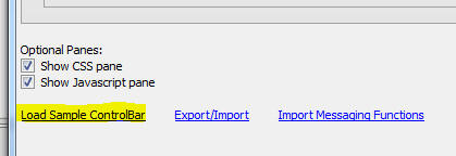
UX Component - ControlBar
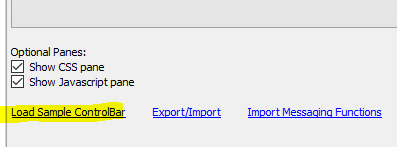
Builder - User-Defined Templates - You can now save a ControlBar
that you have designed as a template. Your user-defined templates
will be listed when you click the
Load Sample ControlBar
hyperlink on the Home pane of the ControlBar builder.
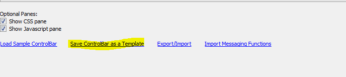
To save the toolbar that you are currently editing in the
ControlBar builder as a template, click the
Save ControlBar as a
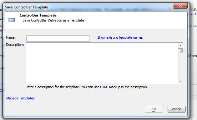
Template hyperlink on Home pane of the ControlBar builder.
The dialog shown below will be displayed where you can give the
template a name and a description. The description can use HTML
markup.
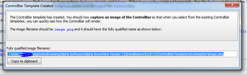
After you have saved the template, you can save an image of how
the ControlBar looks. The image filename that you must use is shown
in the next dialog.
When you use the Load
Sample ControlBar command the image you have saved will be
shown in the list of available templates, making it easier to choose
the template you wish to use.
Application Server - Publishing - The publish genie now
has an option on the 'Clear
Publishing History' button to clear the publish history for
just the currently selected publish profile. The ability to clear
all history is still available as an option.
UX Component - New Starter Template for Mobile App - A new
starter UX template is available. The template, called
MobileAppFramework_FlyInMenu_to_select_Active_Panel
) is a Panel Navigator, with multiple Panel Cards, and a Control Bar
with a menu button that displays an expanding menu that flies in
from the left.
Xbasic - Arrays - Change_type() Method - Changes the data
type of an Xbasic array.
When you create an Xbasic array by parsing some JSON text, the
array's type is set to 'A'. This is because a JSON array can contain
items that are of different type.
For example, consider the following code
dim json as c
json = <<%txt%
[
{name: "fred"},
3
]
%txt%
dim p as p
p = json_parse(json)
If you were to check the type of p[1], (using typeof(p[1]) ), it
would return 'P'.
However, if you were to check the type of p[2], it would return
'N'.
So the array elements in the array can be of any type. You can
also dim an array where the items can be of any type like as
follows:
dim array1[10] as A
Now consider a JSON string that defines an array in which all
items are of the same type:
dim json as c
json = <<%txt%
[
{name: "fred"},
{name: "john}
]
%txt%
dim p as p
p = json_parse(json)
In this case all of the elements in the array are of type 'P'.
However, if you insert or append elements to the array, the new
elements will be of type 'N' and not 'P' as you might have expected.
This is because the internal type of the array is 'A' (as is always
the case when an array is created by parsing a JSON string).
In some cases you will want to change the type of the array to a
specific type so that items inserted into the array, or appended to
the array are also of the same type as the other items in the array.
For example:
dim json as c
json = <<%txt%
[
{name: "fred"},
{name: "john}
]
%txt%
dim p as p
p = json_parse(json)
dim result as c
result = p.change_type("P")
if result <> "" then
ui_msg_box("Error","Could not
change array type: " + result)
end if
p.insert(1,1)
?typeof(p[1])
= "P" '<<----- would have been 'N' had
the .change_type() method not been called!
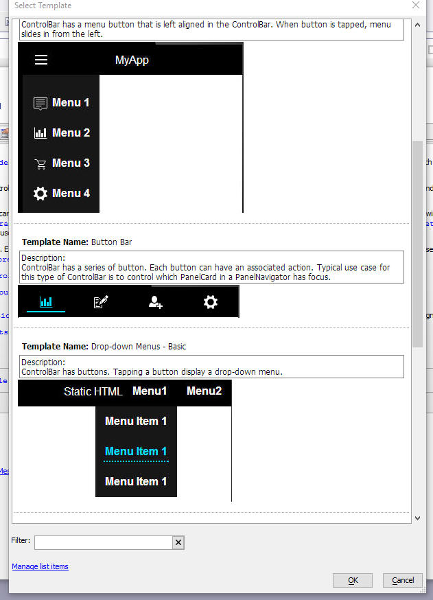
UX Component - ControlBar - ControlBar Builder - Pre-defined
Templates - New pre-defined templates are available when you
create a new ControlBar from a template and the template picker has
been enhanced to show a preview of each template.
Watch Video
When you create a new ControlBar, you can set all of the
properties in the ControlBar by selecting a template (i.e. sample
ControlBar). To select a template, click the
Load Sample ControlBar
hyperlink on the ControlBar builder Home pane.
When you click the hyperlink a window showing the templates is
shown:
UX Component - ControlBar - DisclosureButtons - Disclosure
Position - Three new disclosure positions are now available:
flyout,
flyout-element
and flyout-element-cover.
Using these positioning directives, it is possible to create
controlbars with dropdown menus. See example below.
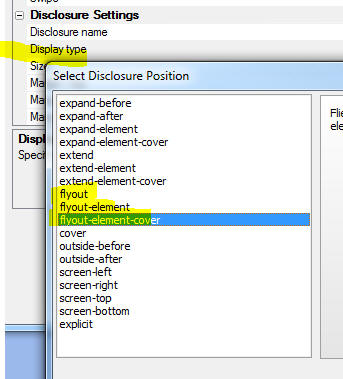
In the image below, the button on the toolbar opens another
disclosure positioned using the
flyout-element
position.
NOTE Sample ControlBars that use the new
flyout-element
position directive can be seen by selecting the Load Sample
ControlBar hyperlink on the ControlBar builder Home tab.
sql_import() function - Upsert - The
SQL_Import()
function is a helper function that imports new records into a SQL
table. It is called a 'helper' function because it is an alternative
to writing the low level Xbasic AlphaDAO commands to import data.
This function now supports both 'insert'
and 'upsert'. An 'upsert'
performs an update on existing records and an insert if there is no
existing record.
The syntax for the function is now:
p result = sql_import(connectionString as c,
tableName as c , tableOwner as c, csv_or_json_data as c ,
replicateIdentity = .f., inputfield_to_sql_table_column_map = "",
action="insert", primaryKey = "")
Where:
- connectionString - connection string to the database
- tableName - name of table you want to import or
upsert into
- tableOwner - table owner
- csv_or_json_data - name/value pairs of data to
import. data can either be in csv or json format. can also be
the name of an Excel file.
- replicateIdentity = .f. - if the primary key is an
auto-increment fields, indicates if primary key values in the
input data should preserved, or if new primary key values should
be assigned.
- inputfield_to_sql_table_column_map = if the field
names in the input data do not match the field names in the
able, a cr-lf delimited list of
fieldNameInData=fieldNameInTable
pairs
- action - either
insert (the
default) or upsert.
Upsert will update existing records in the target table.
- primaryKey - primary key for the table. If the field
name of the primaryKey in the input data does not match the
field name of the primaryKey in the table enter the primaryKey
as fieldNameInData=fieldNameInTable.
Example
p = sql_import("::name::myconnstring","table1","","c:\data\datatoimport.xlsx",.f.,"","upsert","id")
UX Component - List Control - Freeform Layout - List Item
Footer - Freeform layouts now support the List-item Footer
property. The state of the list item footer can be toggled on each
row from open to closed, or vice versa using the
<listObject>.toggleRowExpander()
method.
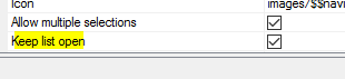
UX Component - Multi-select Token Control - Keep List Open
- A new option has been added to the Multi-select Token Control to
keep the pick list of choices open after the user makes a selection.
UX and Grid Components - Arguments - Upper Case Names -
When you add a new argument or rename an existing argument, the
argument name is now converted to uppercase. By using the convention
that argument names are always uppercase, a class of bugs that can
result when the same argument name is used in multiple linked
components is used and in each of these components, the argument
name is defined using a different case.
UX Component - List Control - Detail View - onStateChanged
Event - A new event has been added to the List control. The
onStateChanged event
fires when the Detail View goes from clean to dirty, or vice versa.
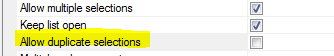
UX Component - Auto-Suggest and Edit-Combo Control - Multiple
Selections - Keep List Open - The Auto-suggest and Edit Combo
controls have always allowed you to set a mode where multiple
selections can be made. However, each time you make a selection the
pick list is closed and you must reopen the pick list before you can
make your next selection.
Now, a new property in these controls allows you to specify that
the pick list should stay open after each selection, allowing you to
make multiple selections more easily.
If you have turned on multiple selections, you can delete
previously made selections by either backspacing to delete one
character at a time, or use
Shift+Cntrl+Backspace to delete complete selections.
If you have turned on multiple selections, you can prevent the
user from selecting the same value more than once by setting the
Allow duplicate selections
property.
PhoneGap App Builder - Core Plugins And Some Key 3rd Party Plugins - Added a version specification to all core and some essential 3rd Party Plugins plugins to resolve
problems with updated plugins and Android on PhoneGap Build.
Many of the core plugins were updated recently and specified a requirement for a minimum PhoneGap version of Android 6.3.0. PhoneGap Build cli-7.0.1
(the latest release supported by PhoneGap Build) includes Android PhoneGap Version 6.2.3 so the changes to the plugins configuration files causes the build to
fail on the current release on PhoneGap Build. This change ensures that PhoneGap Build will work with the specified plugins.
PhoneGap App Builder - 3rd Party Plugins - Added support for the PDF417-Phonegap plugin. This plugin is a small but powerful scanner that handles bar code and PDF417 scanning.
Alpha Style Sheet - SVG Icons - Several new SVG icons have been
added to the Alpha stylesheet. These are:
- anchor
- docSpreadsheet
- docSpreadsheetSolid
- logoFacebook
- logoGooglePlus
- logoInstagram
- logoLinkedIn
- logoTwitter
- logoViddler
- logoVimeo
- logoYouTube
- reorder
- reorderDown
- reorderUp
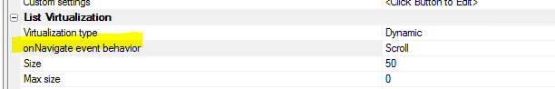
UX Component - List Control - List Virtualization - onNavigate
Event - The onNavigate
event's behavior is different depending on whether the list is
virtualized or not. If the List is not virtualized, the
onNavigate event
fires when the List is scrolled. If it is, then the
onNavigate event
fires when the user navigates to a new page of records.
In order to allow the behavior of this event to be consistent
regardless of the virtualization option, a new property has been
added to the list. The onNavigate event behavior property can be set
to Navigate,
Scroll or
Both. When set to
Scroll, the behavior
is the same as a non-virtualized list.
Application Server - OpenSSL - Updated to build 1.0.2m of
OpenSSL.
Web Security - Utility for SQL tables in Standard Server -
A revised utility has been added to the 'Utilities'
option in the Web Security menu when using SQL based tables on the
standard server. The new utility will still verify if the defined
security tables can be found, but has additional options.
If the security system connects to the SQL tables with Active Link
tables, the utility has an option to 'Validate
Field Maps'. The action will verify if the field map saved in
the Active Link tables map to the correct field names in the SQL
table.
The option will only check a single table if one is selected. If a
table is selected, the option 'Clear
Selected' will remove the selection and allow checking all
tables.
The option 'Show Connection
String' will show the actual connection string used by a
table if the table is selected. The normal configuration would have
the same connection for all tables.
Errors cannot be corrected if using Active Link tables, but the
utility will show a message on close if any errors were found
Changes can be made and saved if the security system is using a 'DataLink'
file in place of Active Link tables. The option to 'Show
Connection String' is still shown, but the option to 'Validate
Field Maps' will open a genie to remap the fields if any
errors were found in the existing map. The genie will only allow
selecting fields that are of the correct data type and length.
A new option is shown to 'Change
Connection String'. This shows a list of available
connections and can change the connection for all tables. The
utility will check if the current tables exist in the new connection
and will run the validation option is tables with the same names are
found.
Another new option is 'Select
New Table'. This will show a list of tabled found in the SQL
database that uses the connection. When a table is selected, the
field map validation will run to allow remapping the field as
needed. This option can also create a new table in the target
database, but will not populate the new table with any data.
Changes can be saved by the 'Save
Changes' button which is activated if any changes were made.
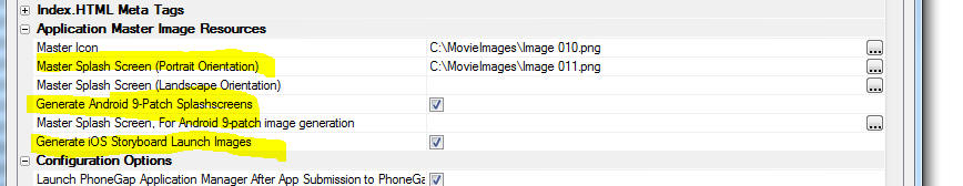
PhoneGap App Builder - iOS Launch Images - Added static (legacy) image generation support for iPhone X and the 10.5 inch iPad Pro launch images. If you are
planning to support the new iPhone X and/or the 10.5 inch iPad Pro, you previously had to use storyboard images for your app launch image. This is no
longer the case. If you choose to use static (legacy) launch images, then the appropriate size is automaticaly generated for the iPhone X and the 10.5 inch
iPad Pro. Remember to center weight your image (look at Twitter's launch image) and verify that each generated image looks correct. The iOS launch images can be found in the
PhoneGapProjects\ProjectName\www\res\screen\ios folder.
PhoneGap App Builder - PhoneGap Project Template The PhoneGap new project template was modified to support better code formatting for legacy (static),
iOS Storyboard and Android 9-Patch launch images. These sections are dynamically replaced within the PhoneGap config.xml file when the launch and storyboard images
are generated by the PhoneGap App Builder genie.
UX Component - List Control - No Records in List HTML -
Specify Message Using Javascript - The List Builder allows you
to specify a message to show in the List if there are no records in
the List.
Previously, you could only define some static HTML to display.
Now you can specify some Javascript code to return the message to be
shown. To specify that the message is returned by some Javascript
code, prefix the message with
javascript:
For example, assume that you had defined a local function called
norecordsmessage in
the List Builder (Turn on the optional Javascript tab in the
List Builder and define a function at the
This object level).
You would set the No Records HTML to:
javascript:this.norecordsmessage()
You can also include
a5-item attributes in the message text. For example, assume
you wanted to display a message if the user tapped on the no records
message. Assume also that the message was to be returned by a local
function called
norecordsmessage(). Here is how this could be done:
First, define an item
in the List Builder's Items
tab (by turning on the optional
Template Items tab -
check the box at the bottom of the List Builder window. For example,
you could define an item called 'norecords' that displayed a message
when clicked.
Then define the
norecordsmessage function as follows:
return '<span a5-item="norecords">List has no
records</span>'
Xbasic Functions - convert_ts_to_js() - Converts TypeScript files
(with .ts extension) to Javascript files (with same name, but .js
extension)
Syntax
result = convert_ts_to_js(files)
Where
- result is a JSON string containing an array of errors
for each input file.
- files is a cr-lf delimited list of TypeScript
filenames to transpile.
UX Component - Client-side Event - OnBeforeCreate - Fires
before any code to render the UX is executed. Allows you to change
settings in the Alpha Anywhere Javascript library that affect how
the UX is rendered. For example you could override the definition of
the A5.listBox.prototype.populate() method in this code.
NOTE: The
{dialog.object}
object cannot be referenced in the code for this event handler as it
has not yet been instantiated.
Xbasic - a5_XbasicTreeToJSONTree() Function - This function,
which takes a CRLF delimited string, and converts it into a complex
JSON structure that can be used to populate a Tree or Menu control,
has been enhanced and now allows you to define the Javascript code
to execute when the user clicks on a tree leaf.
Consider the following example, which produces a tree showing
Countries, Cities, then ContactName. ContactName is the tree leaf.
When the user clicks on a leaf, you want to call a Javascript
function. The data for the tree should come from a SQL query.
Here is how this is achieved:
dim cn as sql::Connection
cn.open("::Name::northwind")
cn.PortableSQLEnabled = .t.
dim sql as c
dim flag as l
'define the sql query that will return the
data in the correct format
sql = <<%str%
select country, city,
concatenate(contactname,'```onclick:findCustomer(','''',customerId,''')')
from customers where not (country = '') order by country, city,
contactname
%str%
flag = cn.Execute(sql)
dim txt as c
txt = cn.ResultSet.tostring(-1,-1,.t.,"|")
'this will generate a crlf delimited string like this
'France|Nantes|Carine Schmitt```onclick:findCustomer('FRANR')
'France|Nantes|Janine Labrune```onclick:findCustomer('DUMON')
'France|Paris|Dominique Perrier```onclick:findCustomer('SPECD')
'France|Paris|Marie Bertrand```onclick:findCustomer('PARIS')
'France|Reims|Paul Henriot```onclick:findCustomer('VINET')'
'notice that the tree branches are separated by a | character.
'the leaf nodes specify an onclick event.
'the syntax for the onclick event is ```onclick:javascript to
execute
'notice that we pass the primary key to the leaf as the argument to
the function
txt = a5_XbasicTreeToJSONTree(txt,"|","html")
The resulting JSON string is:
[
  {
    "html": "Argentina",
    "children": [
	          {
		    "html": "Buenos Aires",
		    "children": [
			          {
				    "html": "Patricio Simpson",
				    "onClick": function() { findCustomer('CACTU')}
				   },
				   {
				     "html": "Sergio Gutiérrez",
				     "onClick": function() { findCustomer('RANCH')}
				   },
				   {
				     "html": "Yvonne Moncada",
				     "onClick": function() { findCustomer('OCEAN')}
				   }
		]
           }
   }......
]
UX Component - Spreadsheet Input Control - Get and Set Column
State - Two new methods have been added to the control
- .getColumnState()
- returns a JSON object with the definition of all of the
columns in the controls. The definition includes the width of
each column. You can get the definition and store it in local
storage. Then, the next time the UX is run, you can use the
.setColumnState()
method to restore the Spreadsheet input control to its previous
state.
- .setColumnState(jsonDefinition)
- takes a JSON object (typically created using the
.getColumnState()
method) and sets the columns in the Spreadsheet input
control.
Example
var obj = {dialog.object}.getControl('myspreadsheetcontrol_1');
var json = obj.getColumnState()
//store the column state in local storage
localStorage.setItem('columnstate',json);
//restore the column state
var obj = {dialog.object}.getControl('myspreadsheetcontrol_1');
var json = localStorage.getItem('columnstate');
obj.setColumnState(json);
UX Component - List Control - Media Files - Events - In a
disconnected application you can configure the media files in the
List to download to the mobile device and be stored in the
filesystem on the device. The UX component will fire the
beforeMediaFiles
download and
afterMediaFilesDownload events. Previously, even if there
were no media files to download, these events would fire. Now, if
there are no media files to download a new event,
onNoMediaFilestoFetch
will be fired.
UX and Grid Components - Reports - Send via Email - A new
option in the Action Javascript command to display a report, now
allows you to email the report rather than displaying it.
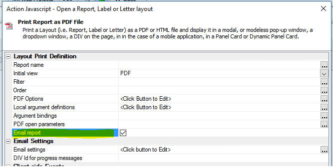
When you check the Email
report property the
Email settings property is shown when you can configure the
email that will be sent with the report as an attachment.
The Email Settings dialog is shown below.

UX Component - Frame Control - Modern Frame - Set Open/Close
State Programmatically - A new method allows you to set a modern
frame to be open. closed, or to toggle its state.
The method, {dialog.object}.frameOpenStateChange(frameId,
state) takes two arguments:
- frameId - the Id of the frame control
- state - can be open, closed or toggle
Bugs
Alpha Style - IE 11 - Browser Hang - Under some
circumstances it was possible to hang IE 11 when using a Grid or UX
component that used the Alpha style. The Alpha style uses SVG icons
for all icons shown in the components. If a button had an SVG icon
and you clicked directly on the icon, and as a result of the click,
the icon was replaced (perhaps with a disabled version of the icon),
IE11 would occasionally hang.
UX Component - SpreadsheetInput Control - Column Width -
The column width property was not being honored when the control was
rendered.
Alpha Anywhere Server for IIS - Install Error - An install
error introduced in approximately build 4710 has been corrected.
bus_days_between() Function - Fixed a bug in this function
when using a .dbf table for the list of holidays. The bug did not
exist when using a SQL table for the holiday list.
AlphaCloud - All Components - Local CSS - SASS - If any
local CSS defined in a component used SASS syntax, the definition
was not properly converted to CSS. This bug was a recent regression.
SASS Processing - This build now includes a new version of the
SASS processor that converts SASS to CSS. This new SASS processor
can report errors in the input SASS file.
UX and Grid Components - Client-side Watch Expressions - Stack
depth exceeded Error - Certain types of client-side watch
expression (for example
myFunction('{grid.componentName}'), would cause a 'stack
depth exceeded' error message when the component was saved.
Page Layout Component - Fixed an issue when a Page Layout
component contained a Grid component.
Tips
UX Component - Edit-Combo Control - Automatically Displaying
the List of Choices - In some situations you might want the pick
list for an edit-combo box to be displayed automatically as soon as
the user gives focus to the control.
This is easily done by getting a pointer to the button that opens
the pick list and then calling the object's
.click() method.
For example, assume that the variable name for your edit-combo
control was MYEDITCOMBO.
You could add this code to the control's
onFocus event:
ele = $('DLG1.V.R1.MYEDITCOMBO.BUTTON');
ele.click()
However, on a mobile device this will not work because the events
are all abstracted on a mobile device. To get the above code to work
on a both a standard desktop browser and a mobile device change the
code to use the $e.execute()
method, which allows you to execute abstract events.
ele = $('DLG1.V.R1.MYEDITCOMBO.BUTTON');
$e.execute(ele,A5.d.evnts.click);
Alpha Anywhere V4.5.1 - Build 4642_4981 12-Oct-2017
Videos
|
UX Component - List Control |
Reorder List Rows by Dragging Row to a new Group
when Client-side Grouping is Enabled |
When client-side grouping is enabled in a List,
the order of the rows in the List is determined
by the sort expression that is applied to the
data so that the List data can be grouped
correctly. That means that if you drag a row to
a new position, and then drop, the row will
immediately snap back to its original position
(because the client-side sort will be re-applied
to the List data).
However, you might want to use drag reorder to
move a row from one group to another. This is
done by changing data in the row that is moved
so that in the
onMoveEnd event, the data in the row is
updated and then, when the client-side sort is
applied to the List data, the row will continue
to appear in the target group.
In this video we show how a list of customers,
grouped by Country, can be re-arranged by
dragging a customer from one country to another.
Watch Video
Download component
Date added: 2017-09-14 |
|
UX Component - Spreadsheet Input Control |
Using the Spreadsheet Input Control |
In certain applications where a user needs to
input data quickly, a spreadsheet style data
entry control can be very efficient.
In this video we show how you can add a
Spreadsheet Input control to a UX component.
Watch Video - Part 1
Watch Video - Part 2
Watch Video - Part
3
Download component
Date added: 2017-10-02 |
|
|
|
|
Features
{dialog.Object}.frameOpenStateChange(frameId,state)"
a2[..].description = <<%html%
Sets the open/closed state of a Frame control. Frame control must be
configured as a 'Modern' frame and must have
the 'Has show/hide buttons' property checked. Where: <br>
PhoneGap App Builder - Added PhoneGap CLI Support for Cordova
Version 7.0.1 - Added support within the PhoneGap CLI
builder for Cordova Version 7.0.1, Android Studio 2.3.3 and XCode
Version 9.0.
Handling of Launch Images, Splashscreens and Icons was modified and
tested with the latest releases of PhoneGap, Android Studio and
Xcode.
Note: The script for Android Studio 2.3.3 was
modified to kill all aapt.exe (Android Asset Packaging Tool)
instances that remain open after a successful Android Cordova Build.
This appears to be a bug in the Windows Android SDK or Cordova
7.0.1.
Xbasic - JSON - extension::json::ForEachString() Method -
This method is similar to the Xbasic
*for_each()
function, except that it is designed to operate on property values
in a JSON string.
For example:
dim json as c = <<%str%
{
"name" : "name Smith " ,
"alias" : [ "jj " , "name " ] ,
"id" : {
"name" : "name_01 "
}
}
%str%
Notice that the string 'name' appears in the above JSON as both a
property name and also in a property value.
We want to change 'name' to 'John', without changing the names of
any of the property values. Also, note that each property value has
trailing spaces.
'change 'name' to 'John'
json =
extension::json::ForEachString(json,"strtran(value,'name','John')")
'trim trailing spaces from each property
value
json = extension::json::ForEachString(json,"trim(value)")
Result:
{
"name" : "John Smith" ,
"alias" : [ "jj" , "John" ] ,
"id" : {
"name" : "John_01"
}
}
Notice that none of the property names were changed.
UX Component - SpreadsheetInput Control - A new control
type is now available in the UX component. The SpreadsheetInput
Control allows you to display a spreadsheet style grid of cells in
which the user can enter/edit data. The spreadsheet columns can be
resized and also reordered.
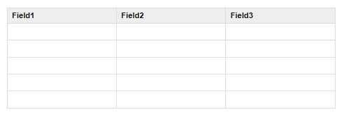
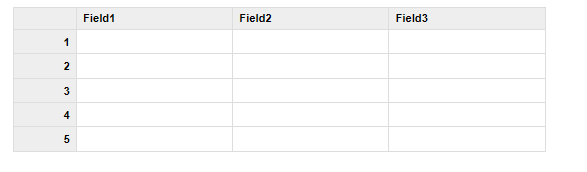
For example, in the image below, a SpreadsheetInput Control has
been defined with 3 columns and 5 rows. The user can use keyboard
navigation (tab, shift-tab, up and down ) to move between the cells
in the control.
Watch Video - Part 1
Watch Video - Part 2
Watch Video - Part
3
Download component
When the UX is submitted, the data in the control is submitted as
a JSON string.
For example, if the control had been filled in as shown below:
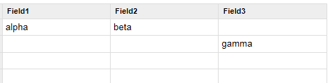
then, when the UX was submitted, the data submitted for the
SpreadsheetInput control would be as string with this value:
"[{"field1":"alpha","field2":"beta","field3":""},{"field1":"","field2":"","field3":"gamma"}]"
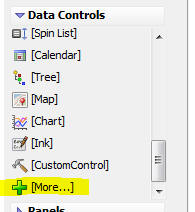
To, add a SpreadsheetInput control to a UX, select the [More..]
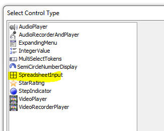
control from the Data Controls section of the UX toolbox.
Then select the SpreadsheetInput control from the list.
To configure the control, click the smart field for the
Control properties.
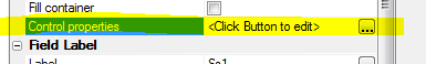
This will open the genie where you can configure the control.

The most important property to configure is the
Column definitions
property. This property allows you to define the columns shown in
the SpreadsheetInput control.
Click the smart field to open the editor, as shown in the image
below.
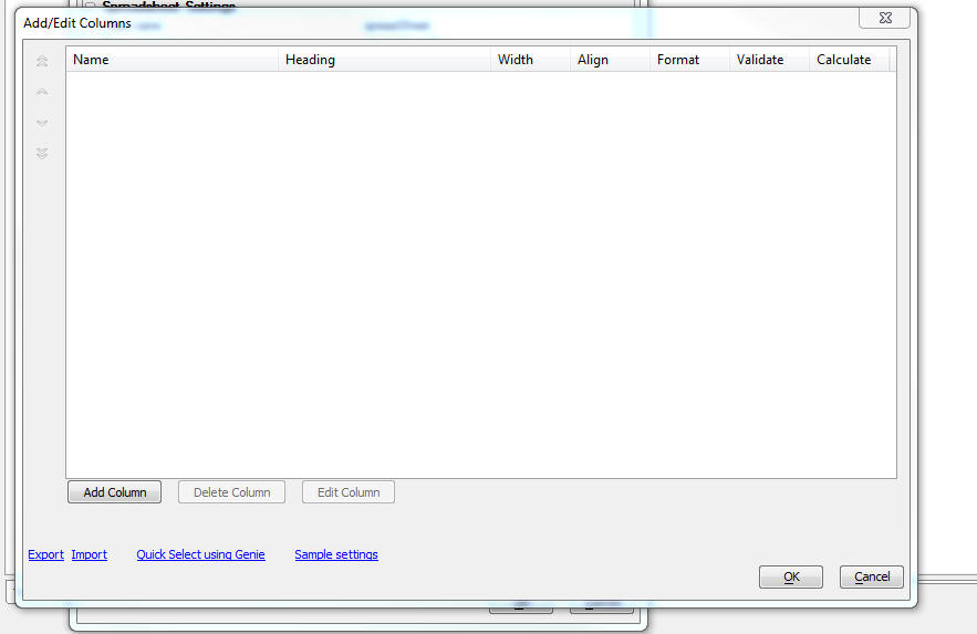
You can add columns one at a time by clicking the
Add Column button.
You can click the Quick
Select using Genie hyperlink to add columns to match the
fields in a SQL table.
The onNavigate
property allows you to specify Javascript code to execute when a
cell in the control gets focus.
Defining Row Prefixes and Suffixes
You can define row prefixes (i.e. row labels) and row suffixes so
that the control looks even more like a spreadsheet. The prefix
displays at the left side of each row and the suffix displays at the
right edge of each row. For example, in the image below a prefix has
been defined to show the row number.
Here is how the control is configured to show the prefix:
The Has row prefix
(label) property is checked.
The Row prefix HTML
is a defined using Javascript code that can reference row - the zero
based row number and data - the array of data with which the control
is populated. To show the row number as the row prefix, the
Javascript for the Row
prefix HTML is set to:
return (row + 1);
The Width
property is set to 50px to set the width of the prefix column.
The Style
property is set to font-size: 75%; text-align: right; to make the
font slightly smaller than the text in the input control and also to
right align the text in the row labels.

Methods
Since the SpreadsheetInput control is a standard UX Data Control,
you can use the {dialog.object}.setValue()
method to populate the cells in the control with data and the
{dialog.object}.getValue()
method to get the data in the control. When you use these
methods, the value is a JSON string.
For example, if the SpreadsheetInput control has 3 columns
(field1, field2 and field3), you could use the following Javascript
to populate the control:
var _data = [
{field1: 'alpha', field2:
'beta'},
{field2: 'gamma', field3:
'delta'},
{field3: 'epsilon'}
];
var _string = JSON.stringify(_data);
{dialog.object}.setValue('mySpreadsheetControl',_string);
.setColumnAndPopulate() Method
You can also dynamically change the columns shown in the control
to match the columns in some data with which you want to populate
the control. For example, say that the SpreadsheetInput control was
initially configured to show a single column (say 'Field1') and you
wanted to populate it with the the following data:
[
{firstname: 'John', lastname:
'Smith', city: 'London'},
{firstname: 'Harry', lastname:
'Jones', city: 'Boston'},
{firstname: 'Winston', lastname:
'Flowers', city: 'Harare'}
]
You can call the control's
.setColumnsAndPopulate() method.
For example:
var obj = {dialog.object}.getControl('mySpreadsheetControl');
var _data = [
{firstname: 'John', lastname:
'Smith', city: 'London'},
{firstname: 'Harry', lastname:
'Jones', city: 'Boston'},
{firstname: 'Winston', lastname:
'Flowers', city: 'Harare'}
]
obj.setColumnsAndPopulate(_data);
The columns shown in the control will now be 'firstname', 'lastname'
and 'city'.
.getColumnState() and .setColumnState() Methods
Since the columns in the Spreadsheet input control are resizeable
and reorderable, you might want to capture the state of the
Spreadsheet input control's column layout so that you can restore it
the next time the user runs the component.
For example
var obj = {dialog.object}.getControl('myspreadsheetcontrol_1');
'get the spreadhseet control state as a JSON
string
var json = obj.getColumnState();
'store in local storage
localStorage.setItem('spreasheet_01_State',json);
Then, to restore the state
var json = localStorage.getItem('spreasheet_01_State');
var obj = {dialog.object}.getControl('myspreadsheetcontrol_1');
obj.setColumnState(json)
UX Component - Client-side Events - onWatchEvent - A new
client-side event has been added. The
onWatchEvent fires
when any of the client-side watch events (show/hide, enable,
readOnly) fires. For example, when a client-side show/hide
expression on a control is executed the event is fired. The type of
event, the name of the control on which the expression is being
evaluated and the result of the expression are passed into the event
handler.
Possible values for the
type parameter passed to the event handler are
- show/hide
- show/hideTabPane
- enable
- enableTabPane
- readonly
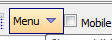
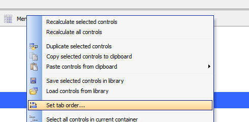
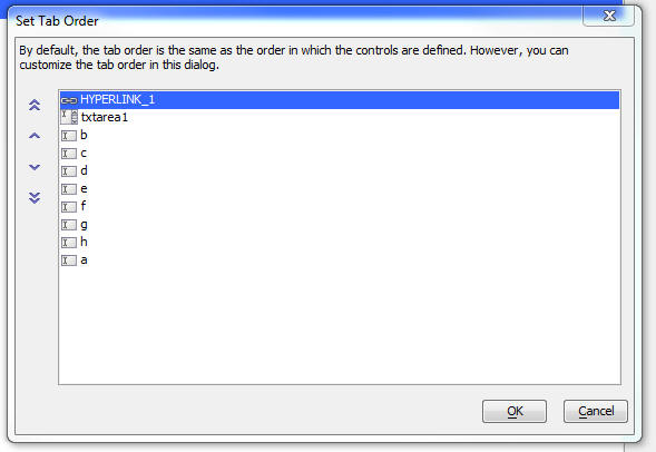
UX Component - Set Tab Order - By default, the tab order
in a UX component is the same as the order in which the controls
were defined. However, you can now define a custom tab order without
having to reorder the controls in the builder.
To open Tab Order dialog, select the Set tab order... menu item
in the dropdown Menu
In the dialog, select the tab order that you want.
UX Component - List Control - Event - onBeforeListClear -
Fires before the list data is cleared.
UX Component - Client-side Events - canAjaxCallback and
onAjaxCallbackComplete - callbackId Parameter - A new parameter
is available in the e
object passed to these events. The
e.callbackId
property is a GUID that identifies the callback and allows you to
match the
onAjaxCallbackComplete event with a particular AjaxCallback.
UX Component - List Control - .setDisplay() Method - This
method has been enhanced and can now be used to operate on List
columns.
For example, the following method will hide columns 0, 1 and 2 in
a columnar List layout:
var lObj = {dialog.object}.getControl('list1');
lObj.setDisplay('column',{column: [0,1,2],
display: [false,false,false]})
Documentation - List Control - The
documentation system now contains in-depth description of the
List object. Note that in the documentation the List is referenced
as ListBox, its
official internal name.
NOTE: The documentation referenced here does
not include the List control methods that are only available when
the List has a Detail View. These methods are currently documented
here.
PhoneGap Builder : Added support for PhoneGap Build Version cli-7.0.1
PhoneGap Build recently added support for PhoneGap 7.0.1 which aside from security and performance enhancements includes some important changes behind the scenes in the build infrastructure.
There are now two distinct builders that can be used by PhoneGap Build, the original and the new and this option is exposed in the Alpha PhoneGap App Builder as the PhoneGap Builder Version property, values 1 and 2.
By default this value is set to 1 which will use the original builder which will most likely be deprecated at some point in the future. If you set this option to 2, then the new builder will be
used by the PhoneGap Build Service.
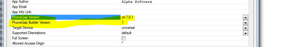
If you plan to support the new iPhone X, you will need to use storyboard launch images (now supported, see below) and you must use cli-7.0.1 and PhoneGap Builder Version 2.
Please see the PhoneGap Build Blog PhoneGap 7.0.1 Release Notes
for all of the details on the cli-7.0.1 release.
PhoneGap Builder: Added support for iOS Storyboards and Android 9 Patch images
With the release of PhoneGap Build cli-7.0.1, support for iOS Launch Storyboards is now inherently supported within the new builder. If you plan to support the new iPhone X or the iPad Pro 12.9�s
native resolution or split screen/slide-over multitasking, you�ll need to use iOS storyboard launch images.
Launch storyboard images are sized based on scale, idiom, and size classes. They supports all devices, and can be used with split-screen/slide-over multitasking.
Apple is moving away from legacy launch images. There is no official support for providing a native-resolution launch image for the iPad Pro 12.9 or for providing launch images that
work with split-screen multitasking or slide-over. If your app doesn't need to support these contexts, then you can continue to use legacy launch images for as long as you like.
The preferred method of providing launch images is to use a launch storyboard.
These are similar to the legacy launch images, but there are crucial differences:
- images are not specific to a given device.
- images are scaled to fill the available viewport (while maintaining the aspect ratio).
- the outer edges of the images will be cropped, and the amount will vary based on device an viewport.
- there is no need to provide an image for each possible device, viewport, and orientation; iOS will choose the best image for the situation automatically.
Designing launch storyboard images (Applies to Android 9-patch images as well)
The key to designing a launch storyboard image is understanding that the edges of the image will almost certainly be cropped. Therefore, one should not place any important information near
the edges of any images provided to the launch storyboard. Only the center is a safe area, and this all but guarantees that following Apple's advice of presenting an
unpopulated user interface will not work well.
Instead, the following tips should enable you to create a launch image that works across a multitude of form factors, viewports, and orientations:
-
Important graphics (logos, icons, titles) should be centered. The safe bounding region will vary, so you will need to test to ensure that the important graphics
are never cropped. Better yet, don't supply any important graphics in the first place.
- You�can�fine-tune the placement and size of these graphics, but you don't have the same fine-grained control as you did with legacy launch images.
-
Use a simple color wash. If you use two colors, you'll want one color to fill the top half of the image, and the second to fill the bottom half.
If you use a gradient, you'll probably want to ensure that the middle of the gradient lines up with the center of the image.
-
Don't worry about pixel perfection -- because the images are scaled, there's almost no chance the images will be perfectly fit to the pixel grid.
Since all supported iOS devices use retina screens, users will be hard pressed to notice it anyway.
Of the images supplied to the launch storyboard, iOS will choose the image that best matches the device and viewport and render that image.
The Alpha PhoneGap Builder will generate all of the rerquired storyboard images from a single user supplied square 2732px x 2732px (min) png file. The iOS storyboard file is generated from the image specified
for the Portrait splash screen.
Changes to the PhoneGap Build config.xml file
The Alpha Anywhere PhoneGap App Builder will automatically remove and replace certain sections of the config xml file that reference legacy splashscreens, storyboards or Android 9-patch images,
based on the properties set within the builder. All of the sections are marked with XML comments and those comments need to remain in place. If legacy splashscreens are specified then the sections
for the storyboard and Android 9-patch images are removed, but the comment tags are left intact. If storyboards and Android 9-patch images are specified, then the legacy sections are removed.
If you are modifying an older PhoneGap project with a legacy config.xml file (the comment tags we added around April of 2017), these sections will be added to the older config.xml file
and a message will be displayed, indicating that an older config.xml file was modified. In this case, you should edit the config.xml file to remove the older legacy splashscreen section, prior to
submission to PhoneGap Build.
Grid Component - Arguments - Session Variables - Arguments
that are bound to session variables are now updated on every Ajax
callback. Previously, the argument values were only set when the
Grid was initially run.
Xbasic - email_send_sparkpost() Function - SparkPost Options
- SparkPost allows you to specify options, such as
open_tracking and
click_tracking (see
SparkPost API documentation).
You can now pass in these options to the
email_send_sparkpost()
function as shown below:
dim ms as p
'xbasic commands to set required properties of mp
not shown
ms.options.open_tracking = .f.
ms.options.click_tracking = .f.
dim key as c = "your sparkpostkey"
dim pp as p
pp = email_send_sparkpost(key,ms)
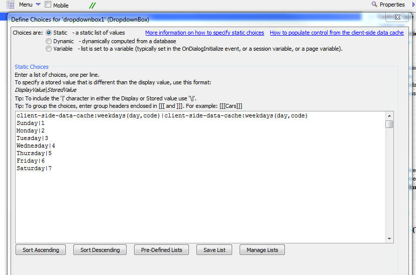
UX Component - DropdownBox Controls - Client-side Data Cache
- DropdownBox Box
controls can now be populated with data that is stored in the
Client-side Data Cache.
This is particularly useful in the case of mobile applications
that are deployed as PhoneGap applications, or in static HTML
applications that use the Application Cache, because in these
applications the DropdownBox controls are populated with data at the
time the application in built. When the applications are run, the
DropdownBox controls will still continue to show the data that they
were populated with at build-time.
In many cases it will be desirable to update the choices shown in
a DropdownBox with up-to-date data and to continue to use the most
up-to-date data available when the App is launched, even if there is
no connection available at that time.
To solve this problem, you can populate DropdownBox controls with
data from the Client-side Data Cache.
In order to indicate that data from the Client-side Data Cache
should be used, set the first line of the static choices to this:
client-side-data-cache:cacheItemName(displayDataColumn,storedValueColumn)
When the App is launched, if a connection is available, the
Client-side Data Cache will be refreshed and the DropdownBox will be
populated with fresh data. If no connection is available the first
time the App is launched the choices you specify in the second and
subsequent lines of the defined Static choices will be used.
For example, assume you had a Client-side Data Cache item called
Products and that
this item had two columns,
Description and Code.
In order to populate the DropdownBox to use the
Description field as
the display value and the
Code field as the stored value, you would use this directive
in the first line of the Static Choices:
client-side-data-cache:Products(Description,Code)
If you want the display value and stored value to be the same, then
just specify the name of the display value column for the stored
value.
client-side-data-cache:itemName(displayColumn,storedValueColumn)
The image below shows how the choices in a DropdownBox control
would be defined to read the data from a Client-side Data Cache item
called weekdays.
The choices shown starting on line two are the fallback choices
that will be used if there is no connection available the first time
the App is launched (which means that the Client-side Data cache
cannot be populated).
Xdialog - Dynamic Titles - It is now easier to dynamically
change the title on an Xdialog. The
{title} directive
can now display the value of a variable. When the value in the
variable changes, the Xdialog title is also changed.
To specify that the {title} directive should use a variable, use
this syntax:
{title=@variable_name}
Example:
dim dyn_title as c = "The Title"
ui_dlg_box("dynamicTitleExample",<<%dlg%
{title=@dyn_title};
Title [.80dyn_title!change];
{line=1};
{justify=right}<&Ok>
%dlg%,<<%code%
if a_dlg_button = "change" then
a_dlg_button = ""
end if
%code%)
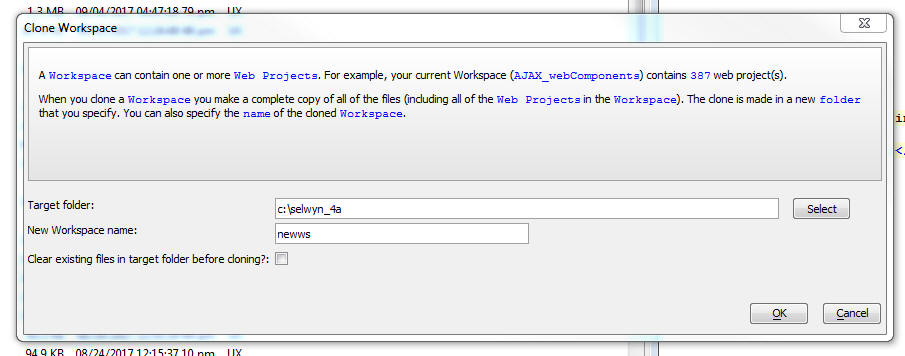
Clone Workspace - You can now clone a Workspace. The
Clone Workspace
command is on the File
menu when the Web Control Panel or the standard Control Panel have
focus.
UX Component - Slider Controls - Client-side Data Cache -
You can now set the data in a slider control based on data in a
Client-side Data Cache item.
UX Component - Client-side Events -
afterControlBasedOnClientSideDataCacheRefreshed Event - Several
control types (e.g. SpinList, ButtonList, Slider) can be populated
from data in a Client-side Data cache. This event fires after a
control that is populated from a client-side data cache item has
been populated.
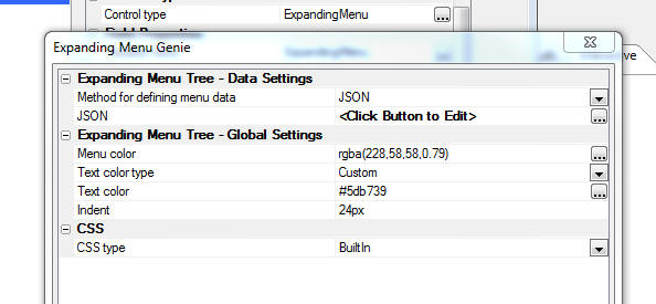
UX Component - Expanding Menu Control - Define Menu Choices
Using JSON - You can now define the menu choices in an expanding
menu control by defining a JSON object.
Xbasic - Handlebars.js Templating Library - You can now
use the popular Handlebars.JS templating library in Xbasic code.
NOTE: The Alpha Anywhere templating library
is also available to Xbasic code through the
a5_merge_JSON_into_template() Function.
Example:
dim hb as nodeservices::handlebars
dim source as c = <<%str%
<p>Hello, my name is {{name}}. I am from {{hometown}}. I have
{{kids.length}} kids:</p>
<ul>
{{#kids}}
<li>{{name}} is {{age}}</li>
{{/kids}}
</ul>
%str%
dim json as c = <<%str%
{
"name": "Alan",
"hometown": "Somewhere, TX",
"kids": [
{
"name": "Jimmy", "age": "12" },
{
"name": "Sally", "age": "4" }
]
}
%str%
html = hb.RunTemplate(source,json)
Resulting text:
<p>Hello, my name is Alan. I am from Somewhere,
TX. I have
2 kids:</p>
<ul>
<li>Jimmy is 12</li>
<li>Sally is 4</li>
</ul>
UX Component - SpinList and ButtonList Controls - Client-side
Data Cache - You can now specify that the data source for a
SpinList or
ButtonList control
is a Client-side Data Cache
item. This is particularly useful in PhoneGap applications
that are designed to work offline. Here is why:
Say you build a UX component that has a
SpinList control and
you specify that the control should be populated with data from a
Data Series. At the
time your PhoneGap application is built, the
SpinList with be
populated with the data in the Data
Series.
Once the PhoneGap app is installed on a device, the
SpinList will
continue to have the data that was in the
Data Series at the
time the PhoneGap app was built. If you refresh the
Data Series the
SpinList will now
have up to date data, but this data has not been persisted on the
device. So, this means that if you exit the App and re-launch it you
are back to having stale data in the
SpinList. If you do
not have a connection you would not be able to make a callback to
the server to refresh the data in the
SpinList.
However, if you specify that the
SpinList is
populated from data in a
Client-side Data Cache, the
Client-side Data cache
will be refreshed automatically when the App is launched and then
the SpinList will be
populated with the up-to-date data. The data that was retrieved from
the server will be persisted on the device (assuming the
Client-side Data Cache
item was configured to persist data on the device). This means that
if you exit the App and then re-launch it (while no connection is
available), the SpinList
will be populated with the data that was fetched from the server the
previous time the App was launched (presuming that at that time a
connection to the server was available).
UX Component - List Control - Search Part - Server-side After
Search Expression Computed Event - New server-side event when
performing a search on a List using the List's Search Part.
The Grid component exposes a server side event,
onSearchPartFilterCompute,
that allows developers to override the filter that was computed from
the submitted search data. This event fires before the actual search
query is executed.
Analogous behavior can now be added to searches performed from
the Search Part of a List control.
The Javascript method to invoke a search is as follows:
{dialog.object}.getControl('name_of_your_list').searchList(
searchOptions)
where searchOptions is a JSON object with these
properties:
- searchMode -
auto, clientSide,
serverSide
(auto will execute a
serverSide search if the List does not have any unsynced
edits)
- xbasicAfterFilterCompute - this is a new property. It
is optional. It defines the name of an Xbasic function that will
be called after the filter has been computed, but before the SQL
has been executed.
For example:
{dialog.object}.getControl('LIST1').searchList({searchMode
: 'auto', xbasicAfterFilterCompute : 'xbmodifysearch'});
The Xbasic function takes e as an input parameter.
The e object contains:
- e.tmpl - pointer to the UX component definition
- e.searchDefnition - an object with various properties
defining the filter expression computed by Alpha Anywhere from
the submitted data.
e.searchDefinition contains these properties
- parameters -- values for the arguments used in the filter
expression. Syntax is a CR-LF delimited string with syntax for each
line as:
searchValue|||field type|argument name
For example:
%UK%|||C|search_country_country1
- filter - the SQL Where clause to be added to the base SQL
query for the List.
For example:
(Country LIKE :SEARCH_Country_Country1)
- order - the SQL order clause
- having - the SQL having clause
- distanceFromLocation - used in geography searches
Your Xbasic function can modify any of the properties in the
e.searchDefinition
object.
Bugs
UX Components - Alignment Containers - Client-side Show/Hide
Expressions - Were not working on alignment containers.
UX Component - List Control - Star Rating and Switch Control -
Client-side Sorting - When you set the control type for a column in
a List to either a Star Rating or Switch control and the List had a
client-side sort applied to the data, the controls did not behave
correctly.
UX Component - Javascript Injection Attack - In some cases,
the UX was incorrectly reporting that a Javascript Injection Attack had
been detected.
Alpha Anywhere V4.5.0 - Build 4584_4961 13-Sep-2017
Bugs
UX Component - List Control - Deleting Records - Under some
circumstances a Javascript error was thrown when deleting a List row.
Application Server - IIS - Built-in icons were not displaying a
disabled when they should have been.
Alpha Anywhere V4.5.0 - Build 4582_4960 12-Sep-2017
Videos
|
UX Component |
Multi-Lingual PhoneGap Applications |
Normally, UX components can be localized by
wrapping the strings you want to translate in
either language tags (<a5:r>...</a5:r>) or text
dictionary tags (<a5:t>...</a5:t>). The string
translation takes place on the server when the
component is rendered. But in a PhoneGap
application, the component is loaded from the
file system on the device and so you can't use
language or text dictionary tags. Instead, you
must use a client-side approach (using
Javascript) to translate the strings into the
selected language.
In this video we show how you can implement
client-side language translation.
Watch Video - Part 1
Watch Video - Part 2
Download component
Date added: 2017-08-04 |
|
UX Component - FormView Control |
Client-side Show/Hide and Enable Expressions
that Reference External Data |
Typically, the client-side show/hide and enable
expressions in a FormView layout reference field
values that are in the data being displayed in
the Form. For example, the Form might have a
field called Country and you might want to show
a container only when the Country field has a
certain value.
However, there are also use cases where you want
to reference external data (i.e. the value in
some other control on the UX) in a client-side
expression. This video shows how this is done
using FormView state variables.
Watch Video - Part 1
Watch Video - Part 2
Download component
Date added: 2017-08-14 |
|
UX Component - ViewBox Control |
Client-side Show/Hide Expressions that Reference
External Data |
When you define the layout for a ViewBox
control, the template can use the
{*if}
directive to conditionally show/hide content in
the ViewBox. Typically the expression in the
{*if} directive will reference data in
the ViewBox data. But in some cases you might
want to reference data that is external to the
ViewBox (for example, your UX might have a
control whose value you want to reference in the
{*if}
directive's conditional expression). In order to
do this, you must create a ViewBox state
variable that is set to the value of the
external data.
In this video we show how external data is used
in a ViewBox conditional expression.
Watch Video
Download component
Date added: 2017-08-15 |
|
UX Component - List Control |
Displaying Data in a List using a StarRating
Control |
Many applications allow you to rate something by
tapping on a star in a StarRating control. The
UX component has a stand-alone StarRating
control (accessed by selecting
[More...] in the UX Builder Controls
toolbox), but in some cases you might want to
display data in a List control using a
StarRating control.
In this video we show how this is easily done.
Watch Video
Download component
Date added: 2017-08-18 |
|
UX Component - List Control |
Row Drag Actions |
A common user interface pattern seen in mobile
apps that use a List is to allow the user to
drag on a row in the List to invoke some type of
action. For example in the iOS Email app a user
can drag on a row to archive the row, mark is as
unread/read, or move the row to another folder.
In this video we show how you can implementing
row drag behavior an a List control.
Watch Video - Part 1
Watch Video - Part 2
Download component
Date added: 2017-08-25 |
|
UX Component - List Control |
Reorder List Rows by Dragging Row to New
Position |
In certain applications where a List control is
used, it is necessary to allow the user to
reorder the rows in the List. A common user
interface pattern used to reorder List rows is
to allow the user to drag a row to its new
position in the List.
In this video we show how you can add 'drag to
move row' behavior to a List control.
Watch Video - Part 1
Watch Video - Part 2
Download component
Date added: 2017-08-28 |
|
UX Component - List Control |
Displaying Summary Values in Column Footers |
In some applications you might want to compute
summary values (e.g. count, total, average,
etc.) for data in a List column and then display
that data below the last row of data in that
column.
In this video we show how this is done.
Watch Video
Download component
Date added: 2017-09-02 |
|
UX Component |
Adding Keyboard Shortcuts to a Component |
In this video we show how you can add support
for keyboard shortcuts to a UX component.
Keyboard shortcuts can speed up a user's
interaction with a component. For example, you
could configure the Ctrl-S key as a shortcut for
saving the data in the a UX.
Watch Video
Download component
Date added: 2017-09-02 |
|
UX Component |
Using the Enter key as a Keyboard Shortcut to
Navigate to Next Control |
For users filling in a UX with many controls,
pressing the Enter key to navigate from field to
field, can be a useful productivity boost.
In this video we show how the Keyboard Shortcuts
feature in the UX component can be used to map
the Enter key to navigate between input
controls.
Watch Video
Download component
Date added: 2017-09-02 |
|
UX Component - List Control |
Displaying Data in a List using Switch, Radio
Button, Checkbox, Integer Increment and Map
Controls |
The UX offers several different control types
that can be used to display data in the List.
In this video we demonstrate several of the
control types that can be used in a List.
Watch Video
Download component
Date added: 2017-09-02 |
|
|
|
|
Features
UX Component - Client-side Data Cache - A new option to
automatically refresh the Client-side Data Cache before reading it
has been added to the following actions in the Client-side Data
Cache action in Action Javascript:
-
Read Data
-
Read Multiple Data Items
When you read the value in a client-side data cache item that has
been persisted to storage on a device (either local storage or the
file system if in a PhoneGap application), the existing value in the
cache will be returned. If you wanted to ensure that you were
getting 'fresh' data you would need to first execute an action to
refresh the Data Cache. Now you can combine the refresh and read
actions into a single step. Both the 'Read Data' and 'Read Multiple
Data Items' actions now have a new property -
Refresh cache items (if
on-line) before read. When you read an item, the cache
will first be updated (if the device is on-line and the Alpha
Anywhere server is available) and then the refreshed cache will be
read. If the device is not on-line, or the Alpha Anywhere server is
not available), then the existing data in the cache is read and
returned.
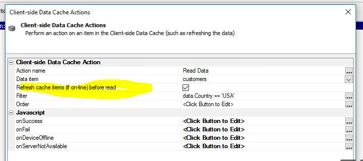
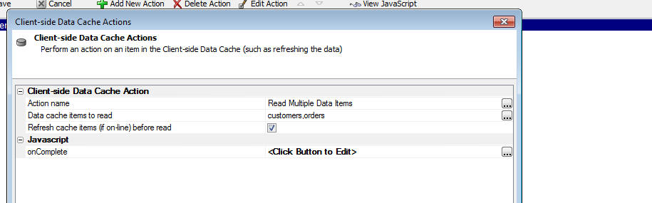
UX Component - Client-side Data Cache - Client-Side Data Cache
Action in Action Javascript - The
Refresh Data Item(s)
action now allows you to specify Javascript to handle these
situations:
-
onFail - The Ajax callback failed to return a response
-
onDeviceOffline - the device is off-line
-
onServerNotAvailable - the device is on-line, but the
Alpha Anywhere server is not on-line.
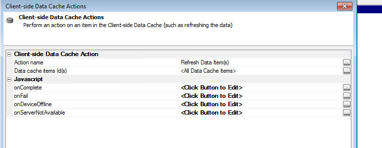
Web Control Panel - Bulk Operations UX Components - The
bulk operations 'Recalculate
UX components' and 'Turn
Pre-render option on for UX Components' have been replaced
with a new single genie for updating UX components. It is listed in
the Web Control Panel menu option
Edit ->
Bulk Operation as 'Update
UX components'
This new genie has options to filter the list of components by
filtering by the 'pre-render'
property, the file save
type (binary or JSON), and if the component was last saved in an
older build. This can make selecting the components to update
easier. The update options include the original recalculate option
and a new option to recalculate all controls as part of the update.
Selected components can be changed to
pre-render or have
the pre-render
option removed. The component save format (binary or JSON) can be
changed at the same time. The genie includes help to explain the
various options.
Some update options will automatically change the filters to show
appropriate components. For example, if you select to change
components to 'pre-render',
only components that are not already pre-rendered will be shown.
Web Security - Using SQL Data - Use DataLink File - A new
option has been added to the web security settings when using SQL
based tables. A special encrypted single
DataLink file is
used to store all of the connection data needed to connect to the
defined back-end SQL security tables. This file is named 'DataLink.SecuritySettings'
and will always be included in every publish with other security
settings files. Active Link tables for security are not used with
this option and will be removed from the web project when the 'Use
DataLink File' option is selected. If the
DataLink option is
not selected or removed, the original Active Link tables will be
recreated as required.
When a DataLink file
has been published, the original security Active Link files named 'websecurity_*.*'
will not be used and can can be deleted from the published web
project. A published application will always use the
DataLink.SecuritySettings
file if it exists.
UX Component - List Control - New Control Types - Several
new control types are now available for displaying data in a List.
These are:
- Switch - displays a value using a two state switch
control
- Integer - displays an integer value with buttons to
the left and right of the value to increment/decrement the
value. You can display buttons that change the value by 1, 10,
or 100.
- Radiobuttons - displays a value using a button list.
The control behaves like a radio button because only one value
in the button list can be selected.
- Checkbox - displays a value using a button list. The
control behaves like a checkbox control because multiple values
in the button list can be selected. The selected values are
stored as a comma delimited list. For example, if the user
selects the Red and Green buttons, the value stored in the List
is Red,Green
- Map - display a value using a Map. The value (which
must be a comma delimited string with a latitude and longitude
value) is shown as a marker on the map.
- Javascript - allows you to define a Javascript
function that returns HTML that is displayed in the List. The
Javascript must be defined as a List method (i.e. it must be
defined in the List builder on the Javascript pane). The method
must take these input parameters:
value - the
value of the field,
data - the array of data for all rows in the List,
rowNumber - row
number of the row being rendered (zero based),
fieldName - the
field name of the field being rendered.
The images below show the various control types.
Watch Video
Download component
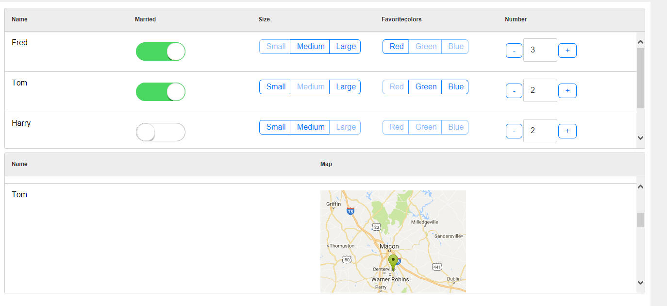
To select any of the above List Column control types, go to the
Fields tab in the
List builder and click the smart field for the Control type
property.
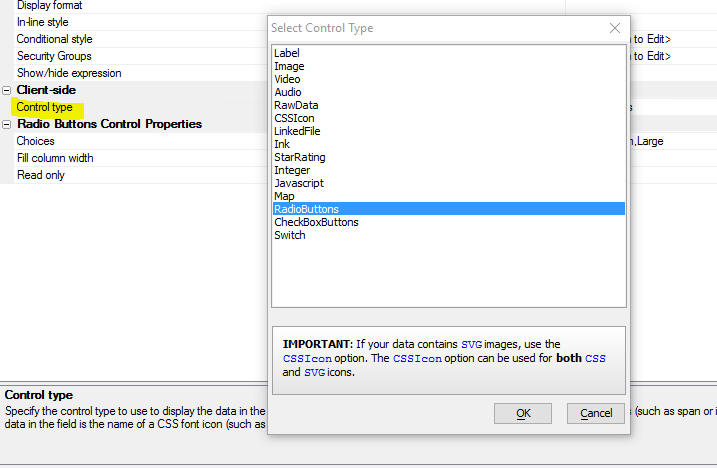
UX Component - Keyboard Shortcuts - You can now define
keyboard shortcuts for a UX component. The shortcuts can run
Javascript Actions, click a button, or execute arbitrary Javascript
code.
Watch Video
Download component
To define Keyboard shortcuts, click the smart field for the
Keyboard shortcuts property in the UX builder.
This will open up the genie where you can define key combinations
and the corresponding action for the key combination.
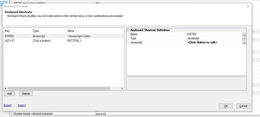
UX Component List Control - Columnar Layouts - Column Footer
- You can now define footers for columns in a List control.
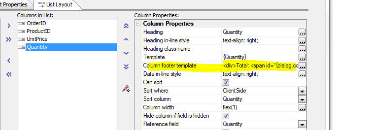
The ability to define column footers is particularly useful when
you want to display summary data (such as totals, averages, etc.) at
the bottom of a column of data.
For example, in the image below the total for the Quantity column
is shown in column footer for the Quantity column.
Watch Video
Download component
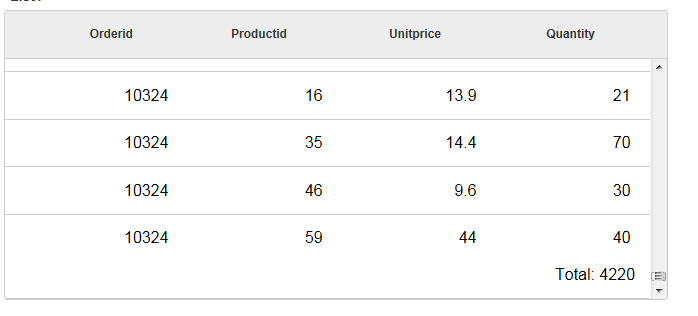
In the above example, the total was added to the column footer
for the Quantity column as follows:
1. On the Fields
tab of the List builder, the
Compute summary values
option for the Quantity field was checked. This option computes the
summary values on the client-side (after the List has been rendered)
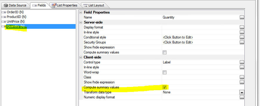
2. The following HTML markup was added to the
Column Footer Template
for the Quantity
column:
<div>
Total: <span id="{dialog.componentName}.{dialog.listid}.QTY.TOTAL"></span>
</div>
3. The following code was added to the
afterClientSideSummaryCompute event. The code writes the
value for the Quantity total to the element with the id of
{dialog.componentName}.{dialog.listid}.QTY.TOTAL.
This element was placed in the footer template for the Quantity
column. By using the placeholders,
{dialog.componentName}
and {dialog.listid}
in the id, we ensure that the Id is unique.
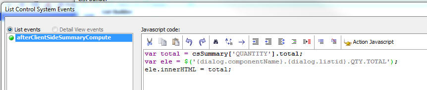
UX Component - List Control - Template Commands - New
directives are available for use in the List template. These are:
- {*if [temp].info.isFirst}
- true when rendering first row in List
- {*if [temp].info.isLast}
- true when rendering last row in List
- {[temp].index}
- row number in the List's
_data array
-
{[temp].renderIndex} - row number in the List's _rData
array. (This is the filtered/sorted array of data shown in the
List)
Request Enhancements - A new option on the Help menu
allows you send enhancement requests to the Alpha Anywhere
development team.
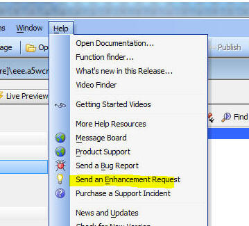
UX Component - List Control - Reorder Rows by Dragging on Row
- You can now easily implement a pattern where the user drags a row
in a List to a new position.
Watch Video - Part 1
Watch Video - Part 2
Download component
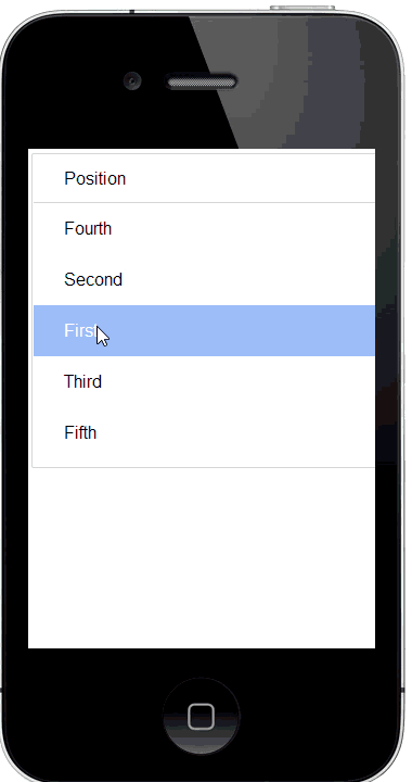
To turn on drag-reorder behavior, open the list builder and check
the Has row drag reorder
behavior property in the List builder on the
List Properties
pane.
Then open the settings builder.
The builder allows you to specify two different modes of
operation, DownHold
and Handle.
In the DownHold
mode, the user presses and holds on the row to be moved. The List
then switches to reorder mode and the user can drag the row to its
new location.
In Handle mode,
the user simply drags on a portion of the row that has been
designated as the drag handle to drag a row to its new location.
Dragging on any other portion of the row simply scrolls the List.
Typically a icon is used to designate the drag handle, and the icon
is hidden until the user puts the List in reorder mode (using some
Javascript).
When you click the smart field for the
Mode option, a
dialog is displayed explaining the modes.
Notice when you select the
Handle option, a hyperlink is
displayed that will show sample HTML, CSS and Javascript to hide the
drag handle until the user explicitly puts the List into reorder
mode.
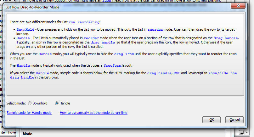
UX Component - List Template Items - You can now display a
tab in the List Builder for List template items. Previously you had
to open a modal dialog window when you wanted to define or edit List
template items.
NOTE: List template items are inserted into a
List template using the a5-item attribute in the HTML markup for the
List.
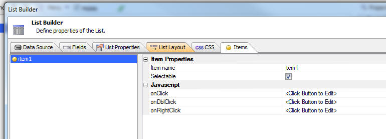
You can control the visibility of the Template Items, CSS and
Javascript tabs by
checking the appropriate checkboxes at the bottom of the List
builder screen. If your List definition contains control CSS ,
items, or user-defined List methods (Javascript), the appropriate tabs are automatically displayed when the
List builder is first opened.
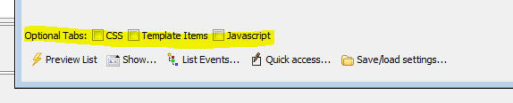
UX Component - List Control - CSS - Control Level CSS -
You can now define CSS for a List control. This CSS is scoped to the
List.
This means that if you have two List controls on a UX and in the
first List control you define a CSS selector called
.myclass1 as
color:red; and in
the second List control you define a CSS selector also called
.myclass1 as
color:blue; the CSS
selector defined in the second List will not override the selector
defined in the first List.
The List builder now has a new pane where you can define this
control level CSS.
NOTE: The advantage of CSS defined at
the Control level (besides the fact that it is in its own namespace)
is that the List is fully defined in the List definition. It does
not rely on any CSS classes that are in linked CSS stylesheets or in
local (to the UX component) CSS definitions. If you copy the List
from one component to another, it will still render correctly.
You can use SASS syntax when defining the control CSS.
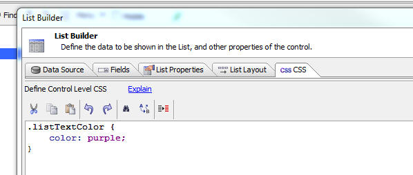
UX Component - List Control - Drag on Row - You can now
add support for drag actions on a row in a List. You can define
actions for both left-to-right and right-to-left drag actions. For
each drag action you can define one or more buttons that are
revealed as the user begins dragging on a row.
Watch Video - Part 1
Watch Video - Part 2
Download component
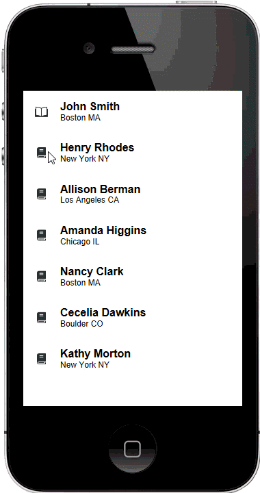
The sequence of images shown below shows a List with both
left-to-right and right-to-left drag actions defined in its
different states.
This image shows the list with the first row selected and
before user has dragged in either direction on the row.
This image shows the List after user begins dragging from
left-to-right. Notice that the action button is partially revealed
because the user has not dragged sufficiently far to the right.
The user has now dragged sufficiently far to the right and has
released her finger from the screen. The action button is now locked
in place. User can invoke the action by tapping on the button.
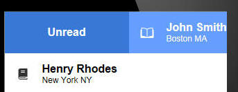
The user can continue dragging to the right past the specified
threshold distance. The action button keeps on expanding in size. If
the user removes her finger from the row the action will
automatically be selected. User does not have to tap on the button
to select the action.
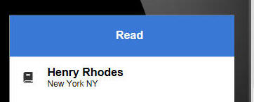
In this image the user has previously selected the Unread
action to mark the status on the row to read. Now the user has
dragged again all the way to the right and the label on the action
button has changed from Unread to Read. Releasing on the row will
invoke the action and mark the row as read. If, instead of
releasing, the user drags back in the opposite direction (toward the
left), the action button will gradually be hidden and the action
will not be invoked
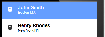
This List is shown in its normal state after the user has
selected the Unread action. Notice that the icon on the row has
changed to indicate that the row has been read.
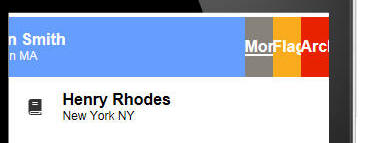
The user now starts dragging from right-to-left. Three action
buttons have been defined for this action. The action buttons are
only partially shown because the user has not dragged sufficiently
far. If the user were to release now, the action buttons would be
hidden and no action would be invoked.
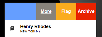
The user has now dragged sufficiently far to the right to
fully reveal the three action buttons. If the user releases now the
action buttons remain visible in the row. Tapping on one of the
buttons will invoke the action. Tapping in the area to the right of
the buttons will not invoke any action and the List row will be
returned to is normal state.
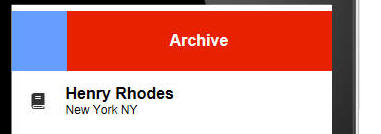
If the user continues dragging on the row (past the threshold
distance) after all of the action buttons are fully revealed, the
outermost action button (Archive) is auto selected and it begins to
fill the row. If the user releases now the Archive action will
automatically be invoked.
To define row drag settings open the List builder and check the
Has custom row drag behavior
property on the List
Properties pane.
Then open the genie by clicking on the smart field for the
Row drag settings
property.
TiP: You can get to the Row drag settings genie more quickly by
clicking the Quick
Access... button at the bottom of the List builder and then
selecting Row drag settings
from the menu.

The List Row Action Builder genie is shown below. The builder has
two panes. The Action Buttons pane is where you define the action
buttons for the drag actions. The Actions pane is where you define
the Javascript code to execute when each action button is selected.
NOTE: When you drag on a row and select an
action, the row you dragged on does not automatically become
the selected row in the List. If a previous row was selected, this
row remains selected. If you want the row you drag on to
automatically be selected, add this code to the Javascript for the
Action:
this.setValue(index);
UX Component - List Control - Lazy Image Loading - Virtualized
List - The code that the genie generates has been changed so
that if your list is virtualized and you scroll back to a page of
List records that have previously loaded images, the spinner will
not be shown for the previously fetched images.
UX Component - List Control - Star Rating - You can now
display data in a List column using a StarRating control. Tapping on
one of the stars in the control will update the value in the List.
Watch Video
Download component
For example, in the image below, the selected row in the List
(which has an associated Detail View) was edited by tapping on a
star and the List row is shown as dirty.
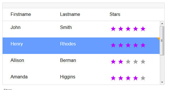
To display data in a List column using a Star control, set the
Control type for
that field to StarRating
in the List builder Fields
tab (as shown below).
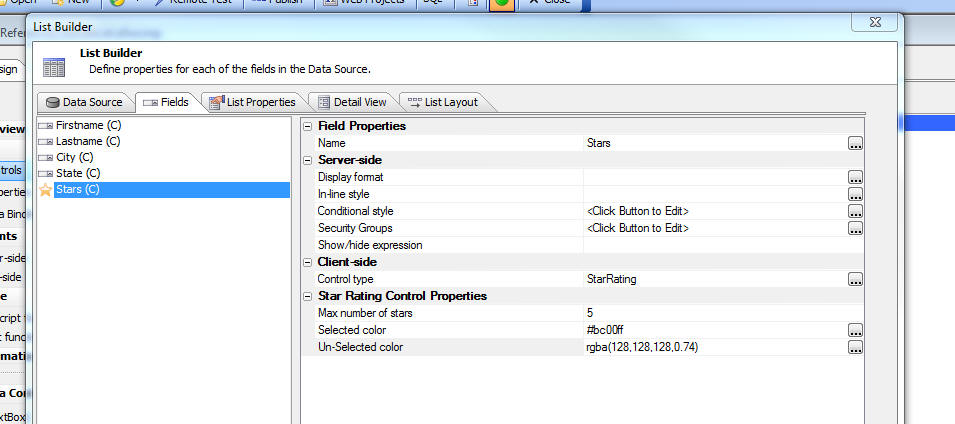
UX Component - Color Picker - A new color picker is now
being used in selected parts of the UX builder.
The color picker has several modes that make selecting colors
easier and faster.
The color picker also has support for semi transparent colors (when
set into either 'rgba', 'hsla' mode).
In the image below, the 'Fan Decks' (like paint swatch sheets
that you get from a paint store) allows you to select from a series
of predefined colors.
On the left you can select any color and transparency that you
want by dragging the sliders.
The selected color is shown in the rectangle at the top left.
In the top right corner of this rectangle a much smaller square
is shown. This is the color that was originally selected when the
color picker was first opened. It allows you to quickly switch back
to the initial color by clicking on the color square.
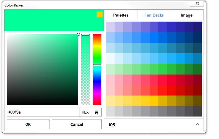
In the Palettes mode (shown below) you can select from a palette
of pre-defined colors that you define.
You can easily add a new color to the palette by selecting a
color in the left hand pane and then clicking the + icon in the
Palettes pane.
Another way to add a color to the palette (when the Palettes mode
is not selected) is by clicking on the
 button in the left
hand pane.
button in the left
hand pane.
You can manage your palettes by clicking the down arrow icon in
the Palettes mode
In the Image mode (shown below) you can load an image into the
image picker and then select colors by pointing to different parts
of the image.
You can set the mode in which the color picker works by clicking
on the button (shown as HEX in the above image)
This brings up a menu showing the mode.
UX Component - Star Rating Control - Color of Un-selected
Stars - You can now set the color of un-selected stars as show
in the images below. The top image shows the current default color
and in the second image both the selected and un-selected colors
have been changed.
TIP: The Star Rating Control is selected by
selecting the [More...] item in the UX toolbox (in the Data Controls
section).

Application Server for IIS - Publishing - IIS
publish now supports optimized publishing (like all other publishing
types when using the standard server). Previously, when you published to IIS all of the files in
your project were automatically published. It was not possible to
publish a single file, of a selected subset of files, as is possible
when publishing to the Alpha Anywhere server.
When you publish to IIS, a staging folder named
__staging.staging is
now located in the web project folder. This folder will contain the
published application in a form ready to be deployed to an IIS
server.
Application Server for IIS - Page Security - Deny by Default
- Authorization is now denied by default under IIS. The
authorization rules for accessing files under IIS were previously
set on files only known at publish time. This meant that files could
be added to the web root of a published application and access would
be allowed to any of these files. This changes means that a file
needs to have a rule set to expressly allow or allow by group name
in order for it to be accessible in an application.
Grid Component - Detailed Javascript Error Reporting - In
V4.5 detailed Javascript error reporting was added to the Grid. This
was done by defining a handler for the
window.onerror
event. This has caused error alerts to be displayed even when the
Javascript errors are benign and caused no problem with the Grids
that
were run in prior versions. Now, detailed Javascript error reporting
is off by default, but you can turn it on using this property:
UX Component - PhoneGap - Action Javascript - Open File with
Native Application -- SQL Server Reporting Services - This
action can now work with SSRS reports.
UX Component - Data Driven Forms Sample Template - The
sample template showing how to create a data-driven form (first
released in v4.5) has been updated to include a star-rating control.
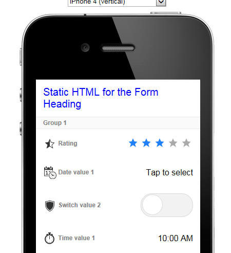
UX Copmponet - FormView Control - Action Javascript - The
Action Javascript action for FormView actions now has two additional
actions:
- Set state variables
- Get state variables
State variables can be referenced in the FormView layout
templates (and therefore in client-side show/hide and enable
expressions) using this syntax
[temp].state.your_variable_name
Say you had a container in a FormView layout that contained
several controls. You wanted to show this container if a session
variable (called say myVar1)
was equal to 'alpha'.
MOTE: You would, of course, need to publish
the value of this session variable to the client-side by setting the
Published session variables property.
Here is how you would do this:
Set the show/hide expression for the container to
[temp].state.myVar1 == 'alpha'
In the client-side
onRenderComplete event, execute this code to set the FormView
control's myVar1
state variable to the value of the session variable.
var myVar1 = {dialog.Object}.getSessionVariable('MYVAR1');
{dialog.object}.formViewSetStateVariables('FORMVIEW_1',{myVar1:
myVar1});
Watch Video - Part 1
Watch Video - Part 2
Download component
UX Component - Audio Player/Recorder Control - New Events
- Two new events have been added to the Audio Player/Recorder
- onBeforeOverwriteRecording - fires if the control
already has an existing recording and the user clicks the record
button to get in recording mode. If there is an existing
recording, the recording will get overwritten. This event will
allow you to prompt the user if they really want to overwrite
the existing recording. If the event returns false, the new
recording is aborted.
- onAbortOverwriteRecording - fires if the user aborts
a new recording.
UX Component - window.onerror Event Handler - In V4.5, the
UX component generates a
widow.onerror event handler to report Javascript errors. This
event handler displays an alert with a full stack. In some cases,
where you are loading 3rd party Javascript libraries, that might
throw benign errors on loading, you might want to suppress this
error reporting.
The Capture detailed
Javascript error information property allows you to turn off
detailed Javascript error reporting.
UX Component - Templates - Localize PhoneGap Application -
A new template is available showing how you can localize a PhoneGap
application at run-time, allowing the user to select the language
used for the app. The template is called
MobileAppFramework_Client-side-Language_Translation.
Watch Video - Part 1
Watch Video - Part 2
Download component
UX Component - Templates -
SecurityFramework-LoginComponentMobileApp-Persistent Login - The
template showing how to build a mobile app that has a persistent
login has been updated. The template now applies security settings
when the component is reloaded and a persistent login token is
found.
Alpha Anywhere Application Server for IIS - Publish - Delete
Files - Publish to IIS no longer deletes files and folders that
are not part of the web project. This applies to existing publish
profiles and new publish profiles. Previously, any files in the
target webroot folder that were not part of the web project were
deleted when a project was published.
In the event a you want the old delete behavior, the
Delete existing files
option can be checked in the publish profile:
or the Delete existing
files option can be checked in the Advanced Settings section
when creating a new publish profile:
UX Component - Pre-Defined Date Range Selector Control -
The Date Range selector control is useful if your UX component has
controls where the user must enter a start date and an end date.
In the image below, the Date Range Selector (a dropdown box)
shows the list of date ranges. The user has selected the 'This
Year-to-date' range and the two input controls (one for date start,
the other for date end) have been filled in.
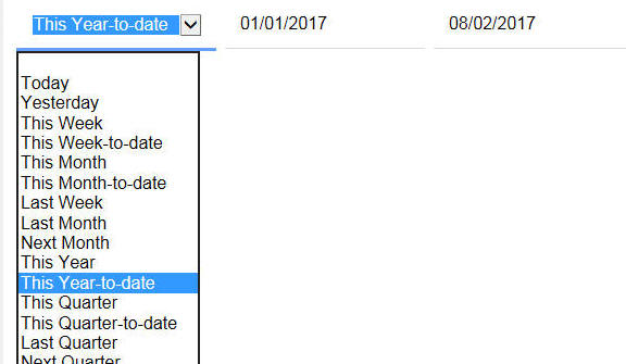
To add a Date Range Selector control to your UX, select the
control from the Defined Controls section of the UX toolbox.
Once you have added the control, you must edit the Javascript in
the control's onChange
event to define the Ids of the start and end date controls.
The Choices property for the Date Range Selector shows these
choices. These are the built in options. You can add text or
language tags to the display value if you want to show the choices
in a different language.
|
Today|today
Yesterday|yesterday
This Week|thisweek
This Week-to-date|thisweektodate
This Month|thismonth
This Month-to-date|thismonthtodate
Last Week|lastweek
Last Month|lastmonth
Next Month|nextmonth
This Year|thisyear
This Year-to-date|thisyeartodate
This Quarter|thisquarter
This Quarter-to-date|thisquartertodate
Last Quarter|lastquarter
Next Quarter|nextquarter
You can also add your own custom choices to this List. When you
define a custom choice you use this syntax
Display value|javascript:javascript code to
compute start and end date
The Javascript code that you write must follow these rules:
- the code must fit on a single line -- therefore be sure to
use semi-colons to terminate all statements
- the code must not contain any commas - as commas are
interpreted to have special meaning when the dropdown list is
computed.
- the code must return an object with two properties:
startDate
and endDate.
For example, here is how a customer item called 'Tomorrow'
could be added to the choices in the
Date Range Selector
Control:
(Code shown on multiple lines for clarity. Must all be on a
single line)
Tomorrow|javascript:/*custom date range. code must not contain any
commas*/var d1 = new Date(); var d2 = new Date();
d1.setDate(d1.getDate() + 1); d2.setDate(d2.getDate() + 1); var obj
= {}; obj.startDate = d1; obj.endDate = d2; return obj;
Xdialog - Overlays - You can now design Xdialogs with
floating 'overlay' windows. The overlays are similar to bubble-help
that you can define for toolbar buttons, Xdialog buttons, etc.
except that the overlay content can be any HTML text and the overlay
can be applied to any part of the Xdialog.
In the images below an overlay is shown when the mouse if over
the combo box and another overlay is shown when the mouse is over
the button.
The Xdialog {overlay=variableName}
directive is used to define an overlay.
Here is the code to produce the above Xdialog.
dim overlay1.html as c = <<%html%
<div style="margin: 0px; padding: 5px; border: 1px blue solid;
border-radius:10px;">
This <b>combo</b> lets you pick a number on entries<br>
Your choices are one, two, three or four.
</div>
%html%
dim overlay2.html as c = <<%html%
This is the button that performs the action
%html%
dim item as c = "one"
ui_dlg_box("with_help",<<%dlg%
A Combo;
List {overlay=overlay1}[.60item^={one,two,three,four}];
{line=1};
{overlay=overlay2}
<&Do It...>
%dlg%)
UX Control - Multi-select Tokens Control - Text Highlighting
- When you start typing into a multi-select tokens control, the list
of choices that is displayed, which is filtered, by the text you
have typed, now shows the matches in the choice list with the text
you have typed in bold.
For example, in the image below, the user has typed an 'a' and
the choice list shows all of the items that contain an 'a'. Notice
that in the choice list all of the 'a' characters are bolded.
If you have an existing multi-select token control you will need
to edit and resave to get this feature.
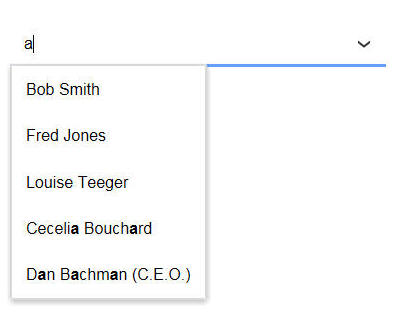
ViewBox and FormView Control - Post-process event - You
can now specify post process Javascript for each Layout. The post
process Javascript runs after the HTML for the layout has been
rendered. You can use the Post-process event to modify the HTML that
is shown in the layout. A common use of this event is using the
A5.u.html.highlight()
function to highlight some text in the Layout html.
Javascript Library - A5.u.html.highlight() Function - Can
be used to add markup to an HTML string to highlight portions of the
text in the HTML. Any text in HTML elements or attributes is
ignored.
Syntax:
A5.u.html.highlight(html, searchString [, prefix
[,suffix]])
Where
- html is the html text you want to search in
- searchString is the text you are searching for
- prefix - optional text to add before any matches - if
prefix and suffix are omitted then the matches are wrapped in
span tags that set the font-weight to bold. prefix can
also optionally be a function that takes these arguments:
search, match, offset, html
- suffix - optional text to add after any matches
Example
var html = '<div>this is some text</div>';
var html2 = A5.u.html.highlight(html,'ome')
The resulting html2 string will be:
<div>this is s<b>ome</b> text</div>
Example using a function for the prefix argument:
count = 0;
var html = '<span>this text is inside a span. But
only a single span</span>'
A5.u.html.highlight(html,'span',function(search,match,offset,html){
count++;
return '<i id="match.'+count+'">'+match+'</i>';
}
)
Result
<span>this text is inside a <i id="match.1">span</i>.
But only a single <i id="match.2">span</i></span>
Grid Component - Pre-defined Date Ranges - When you define
the Search Part for a Grid, you can specify that any of the search
fields are 'range' searches. If you turn on the range search
feature, the Search Part will display two search fields for the
start date and the end data.
You can now also display an optional pick list to select common
date ranges, as shown in the image below. If you select one of the
pre-defined date ranges, the dates in the From and To input controls
will be filled in.
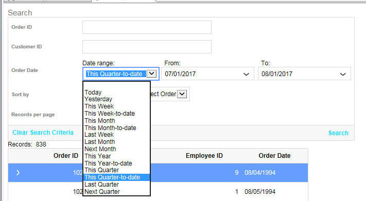
To turn on the pre-defined data range feature, check the
Pre-defined date range
selector property.
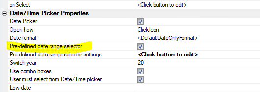
You can then click the smart field for the
Pre-defined date range
selector settings control to configure the selector.
The settings dialog allows you to set:
- width of the control
- label to show above the control
- in-line style for the control
- class name for the control
- list of pre-defined date ranges shown in the control.
By default a standard set of pre-defined date ranges are shown.
These are:
- Today
- Yesterday
- This Week
- This Week-to-date
- This Month
- This Month-to-date
- Last Week
- Last Month
- Next Month
- This Year
- This Year-to-date
- This Quarter
- This Quarter-to-date
- Last Quarter
- Next Quarter
If you want to translate these names into different languages you
can customize the list of choices and add language or text
dictionary tags to each label.
You can augment this list with your own data ranges, or you can
replace the built-in list with your own date ranges.
To define your own entry to appear in the list of choices, add a
choices to the choice list that is defined as follows:
display name in the selector|value|javascript
where value is a
unique name for the selection. The value must not contain any
special characters or spaces.
Javascript is some
code that returns an object with two properties:
startDate and
endDate.
For example:
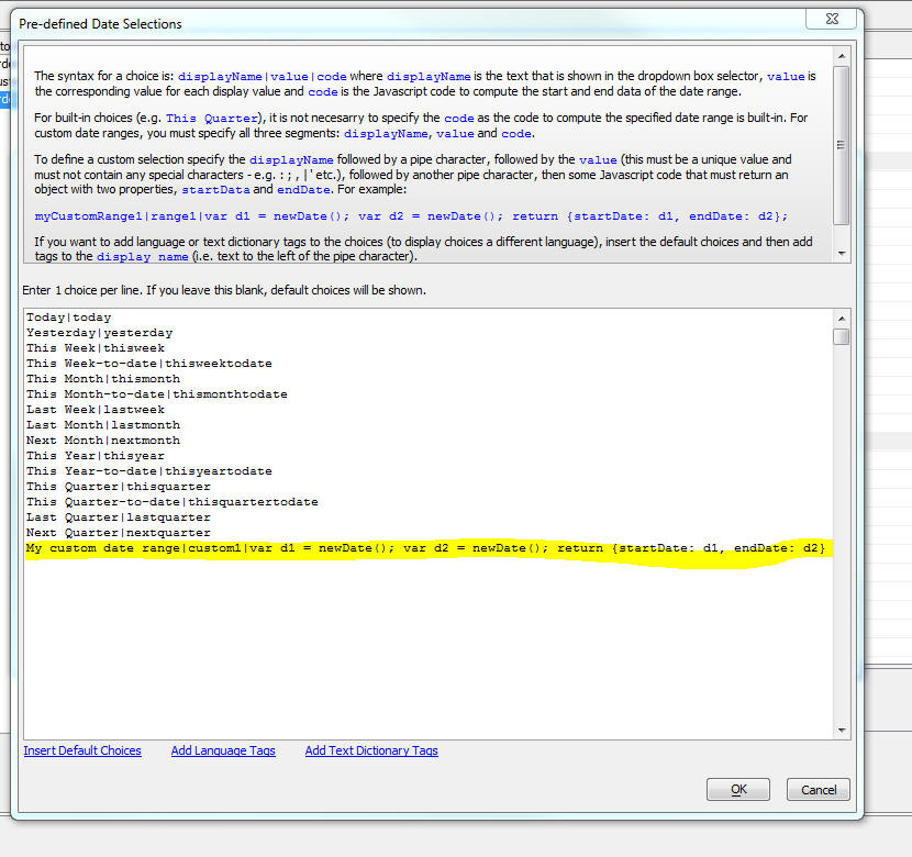
a5_ink_to_png() Function - This function now has a new
parameter that lets you control how the image is created from the
ink. Previously, the image was bound to the size of the ink with a
20px border. Now you can size the image to the entire ink page, not
just the bounds of the ink text.
The new optional parameter is
flagUseViewBox. This defaults to
.f. (size the image to the bound of the ink). Set to .t. to size the
image to the entire ink page.
Syntax:
a5_ink_to_png(c ink ,n heightInPoints,n
widthInPoints,c filename ,l flagUseViewBox)
Bugs
Code editor - Code Library - The code Library got broken in a
recent release. This is now fixed.
Javascript Errors - The previous build was too aggressive in
reporting Javascript errors. Benign Javascript errors are no longer
reported.
PhoneGap - SQLite - MySQL - Bit(1) Columns - A bug in creating
a SQLite database from a MySQL database when a table in the MySQL
database has bit(1) columns has been fixed. Alpha Anywhere treats bit(1)
columns as Logical columns. So a value of 3 or 4 (for example), are both
interpreted as True by Alpha Anywhere.
Tips
UX Component - HTML Editor - Display as Pop-up - Double-click
- If you configure an HTML editor to act as a pop-up and you specify
that the control has a 'click to edit' button, then you can open the
HTML editor by clicking the button. However, double clicking on the HTML
control will also open the editor. If you want to disable the double
click, so that the HTML editor can only be opened by clicking the
button, add this code to the UX
onRenderComplete client-side event:
var obj = {dialog.object}.getControl('name_of_html_control')
obj.dblClickEdit = false;
Alpha Anywhere V4.4.5 - Build 4491_4932 30-July-2017
Videos
|
UX Component - List Control |
Lazy Image Loading |
A common use case for Lazy Image Loading is when
you have a List that displays images that are
sourced from a server. If the List has a large
number of rows, fetching all of the images from
the server will slow down the initial render of
the List. However, by implementing Lazy Image
Loading, only the images for the rows that are
currently scrolled into view will be fetched.
You can set a wait time that the List will wait
after a row comes into view before the images
for the visible rows will be fetched. This
prevents fetching images for rows that you
scroll past without stopping on. When a row that
displays an image that has not yet been fetched
is displayed, a 'waiting' image will be
displayed. Once the image has been fetched, the
'waiting' image will be replaced with the real
image.
In this video we show how to configure a List
control to use Lazy Image Loading.
Watch Video
- Part 1
Watch Video
- Part 2
Watch Video
- Part 3
Download Component
Date added: 2017-05-25 |
|
UX Component - ControlBar Control |
Dynamically Styling Items on a ControlBar |
A common requirement when using ControlBars is
to dynamically style the items on a ControlBar.
For example, you might want some text to be red
under one condition and green under another
condition.
In this video we show how client side templating
directives (e.g. {*if} ...{*endif} can be used
to define dynamic styles and classes.
Watch Video
Download Component
Date added: 2017-06-09 |
|
UX Component - ControlBar Control |
Showing a List Control in a ControlBar
Disclosure |
A powerful feature of the ControlBar is its
ability to display 'disclosures' (i.e. windows).
These disclosures can be animated into view from
various positions on the screen. A common
requirement is to show a List control in a
disclosure.
This video shows how this can be done.
Watch Video
- Part 1
Watch Video
- Part 2
Download Component
Date added: 2017-06-18 |
|
UX Component - FormView Control |
Review of Different Field Editors |
Fields in the FormView control are edited using
Field Editors. You can build your own Field
Editors, or chose from the collection of
built-in Field Editors.
In this video we review the different built-in
Field Editors that are available as of Build
4192.
Watch Video
- Part 1
Watch Video
- Part 2
Watch Video
- Part 3
Download Component
Date added: 2017-06-25 |
|
UX Component - FormView Control |
Displaying Data from Hierarchical Lists in a
FormView Control |
(This video is aimed at advanced users of the
FormView control).
The FormView control can display data from
multiple Lists that are linked in an
hierarchical relationship. E.g. A Customer List
with a child Orders List. By default, when the
FormView displays data for a selected row in the
parent (i.e. Customer) List, it will display ALL
of the data from the children of the selected
row. In other words, the FormView control will
display data for the selected customer in the
Customer List and it will show ALL of the orders
for the selected Customer.
However, in some applications, you might want to
display only the data for the selected Order in
the Orders List. In other words, the FormView
control should use BOTH the parent (i.e.
Customer) List and the child (i.e. Orders) List
as selectors for the data that should be shown
in the FormView control.
In this video we show how the FormView control
is configured to show just the data from the
selected row in the child (i.e. Orders) List.
Note: Another way to achieve this result would
have been to use two separate FormView controls
- one for the Customer List and one for the
Orders List.
Watch Video
- Part 1
Watch Video
- Part 2
Download Component
Date added: 2017-06-26 |
|
UX Component |
Introduction to Style 'Tweaks' |
In order to change the appearance of a UX
component you can either edit the stylesheet or
you can 'tweak' the style.
In this video we show how you can tweak the
style to change the colors in the stylesheet and
also how you can add a new button sub-theme.
Watch Video
Date added: 2017-07-05 |
|
UX Component - FormView Control |
Displaying Editors in a Pop-up Window |
The typical pattern in a mobile UX component
that uses the FormView control is to place the
editors in their own PanelCard that is animated
into view when the user taps on a field in the
form to edit its value.
However if you are using a FormView control in a
web application, you might prefer the editors to
be shown in a pop-up window next to the field
you are editing.
In this video we show how the editors used in a
FormView control can be opened in a drop-down
window relative to the form field you are
editing.
Watch Video
Download Component
Date added: 2017-07-05 |
|
UX Component - List Control |
Injecting Arbitrary Headers and Footers into
List Data |
You can inject arbitrary HTML into the List.
This can be used to add headers and footers into
the List as shown in this video.
Watch Video
Download Component
Download Component
- collapsible headers
Date added: 2017-07-12 |
|
UX Component - Multi-select Tokens Control |
Adding a Multi-select Tokens Control to a UX
Component |
The Multi-select Tokens control operates much
like the Gmail app when you address an e-mail to
multiple recipients. You can type values into a
control, or make selections from a drop-down
choice list. Each selection is shown in the
control as a 'token'. Tokens can be removed from
the list of selections by either hitting the
backspace key while focus is in the control, or
by clicking on the 'delete' icon in the token.
A common use case for the Multi-select Tokens
control is to define selection criteria for a
List control. In this video we show how a
Multi-select Tokens control is used to select a
list of countries. The List control is then
filtered to show the countries that match the
selected tokens. For example, if tokens for
'USA' and 'UK' are selected, the List is
filtered to show customers in either 'USA' or
'UK'
Watch Video
- Part 1
Watch Video
- Part 2
Download Component
Date added: 2017-07-23 |
|
UX Component |
Data-driven Forms |
A data-driven form is a form whose fields are
determined at run-time (typically by querying a
database) to get a list of the fields to display
in the form.
In this video we show how a ViewBox control and
an Editor Set with multiple Editors can be used
to implement a data driven form.
Watch Video - Part 1
Watch Video - Part 2
Watch Video - Part 3
Watch Video - Part 4
Download component
Date added: 2017-07-26 |
|
|
|
|
Security
Alpha Anywhere Server for IIS - A potential security issue
under IIS has been fixed. A UX AJAX request could be crafted to
return the content of a file that should not be visible outside of
the server. This fix closes this vulnerability.
Features
email_send_sparkPost() Function - Reply To - Support has
been added for the 'Reply to' parameter.
Example:
dim ms as p
ms.send_to = "Fred@acme.com"
ms.reply_to = "Harry@acme.com"
ms.from_email = "admin@acme.com"
ms.from_alias = "admin@acme.com"
ms.from_name = "Admin"
ms.subject = "Reply To Now Supported"
ms.message_html = "Message goes here"
dim key as c = "Your api key"
pp = email_send_SparkPost(key,ms)
Grid Component - Column Sorting - Initial Sort Direction -
When the user first clicks on a column to sort the Grid on that
column an ascending sort is performed. Now you can specify that the
initial sort should be descending.
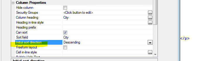
UX Component - Minimum Build Number - You can now specify
a minimum build number for a UX component. If a developer tries to
edit the component using a build that is older than the specified
minimum build, a warning will be displayed. The user will not,
however, be prevented from editing the component.
UX Component - Data Driven Forms Sample Template - A new
sample template has been adding showing a technique for implementing
data driven forms. A data driven form is a form where the fields in
the form are determined at run-time, rather than at design-time.
Watch Video - Part 1
Watch Video - Part 2
Watch Video - Part 3
Watch Video - Part 4
Download component
Typically, the form is generated by first querying a database to
determine what fields the form should display. Then, some Xbasic
code is executed to generate a dynamic form definition.
In the example template the form is implemented using a ViewBox
control, an Editor Set and numerous Editors for editing the field
values shown in the form.
The image below shows how the sample component renders a
particular data-driven form. The actual fields shown in the form are
easily controlled by editing a JSON object that defines the fields,
the field types and the editor to be used to edit the field value.
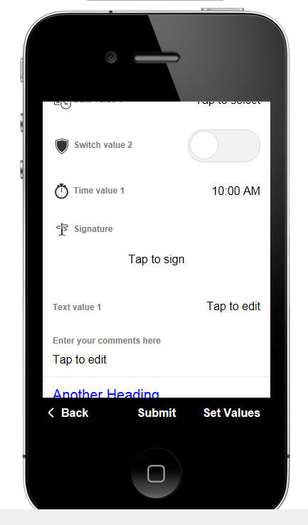
UX Component - Multi-select Token Control - A new control
type is available for the UX component. The Multi-select Token
control is similar to the Edit-combo control and the Auto-suggest
control. However, the selected values are displayed as 'tokens' (as
shown in the image below where 'Belgium', 'Brazil' and 'Canada' are
selected).
Watch Video
- Part 1
Watch Video
- Part 2
Download Component

The user can select values from a pick list as shown in the image
below. The pick-list can be automatically displayed when the user
starts typing in the input control, or can be displayed when the
user clicks on the down array (which is optionally displayed). The
user can also select tokens by typing the value into the control and
then pressing the Enter key.
To delete a previously selected token, click on the X icon in the
token, or click to the right of the last selected token and press
the Backspace key.
The choices for the pick-list can be statically defined, can be
derived from querying a SQL database, or can be computed by an
Xbasic function.
How to Add a Multi-select Token Control to a UX Component
To add a Multi-select Token control to your UX component, select
the [More...] item
in the Data Controls
section of the UX toolbox.
The Multi-select Token control is a
Data Control. This means it
has a .getValue()
and a .setValue()
method, just like other Data Controls. When the UX is submitted, the
data in the Multi-select Token control are submitted as a comma
delimited list of token values.
For example, if there are three tokens selected with values of
'USA', 'UK' and 'Canada', the value submitted is
'USA,UK,Canada'
To set the value in a Multi-select Token control you must specify
an array of values. For example
{dialog.object}.setValue('MY_MULTISELECT_TOKEN_CONTROL',['USA','UK','Canada']);
To set a default value for the control in the
Default value
property in the property sheet you can use this syntax
array(USA,UK,Canada)
Setting the Multi-Select Token Control Properties
To set the properties of a Multi-select Token control, click the
smart field for the Control
properties property in the Property sheet.
The configuration genie window is displayed, as shown below:
- Method for defining choices - Allows you to
specify how the data for the choices displayed by the control
are obtained. You can enter a static list of choices, you can
specify a SQL query, or you can specify an Xbasic function that
will compute the choices. If you specify a SQL query then you
must either specify the name of the table that will be queried,
or you can specify your own SQL statement (which could be a call
to a stored procedure).
In the case where you select the
FieldsFromTable
option, you must specify at least two columns from the table. The first
column (Value column) contains the value that the selected token
will have (i.e. just like a Dropdown box, each choices has both
a Display
property and a Value
property - The Display
property defines what is displayed in the choice list and the
Value property
is the actual value of the token). You can also specify an
optional 3rd column -
List Display column. This property defines the display
value shown in the choice list. If you do not specify this
property, the choice list shows the Display property of each
choice.
In the case where you specify an explicit SQL statement, your
query must return a result set with either 2 or 3 columns. The
first column must have a name of 'value',
the second column must have a name of 'display'
and the optional 3rd column must have a name of 'listDisplay'.
For example:
SELECT contactname as
value, customerId as display from Customers
- Display icon to open choice list - when the user
begins to type in the control, the choice list is opened and is
filtered on the text the user has typed. This is similar to how
an auto-suggest
control works. However, you can also specify that an icon should
be displayed (either to the right or left of the control) that
the user can click on to show the choice list.
- User must select from choices - If un-checked, the
user can type in any value into the control. When the user
presses Enter the text the user has typed is added to the
token list. If this property is checked, if the user types in a
value and then presses Enter and the text the user has typed is
not in the choice list (i.e. is not the
value property
for one of the choices in the list), a new token is not
added.
-
Icons - You can customize the icons used to display the
choice list and to delete a previously selected token, but you
must select SVG icons.
-
Token CSS type - can be either
Default or
Custom - allows
you to customize the appearance of the displayed tokens. If you
select Default, you can set the tokens to have square or rounded
borders by setting the
Token border style property. In the images above, the
border style has been set to rounded.
-
onChange - you can specify Javascript code to run when
the value in the control changes. This event will fire each time
the user makes a selection from the choice list to select a new
token, or when the user types in the value of a new token and
presses Enter, or when the user deletes a token. Your code can reference
this.value, an
array of the selected token values.
-
valueNotInList - you can specify Javascript code to run
when the user enters a value that is not in the list of choices.
This property is only shown if the
User must select from
choices property is false. If the user types in a value
and then presses Enter, if the value the user typed in is not in
the list of choices, the code defined for this event will
execute. You can use this event to add the value the user typed
into a database.
Dynamically Populating Choices at Runtime
You can dynamically populate the choices in the Multi-select
Token control at runtime by calling the control's
.populate() method.
For example, assume you have a Multi-select Token control called
'MST1'. You can use the following Javascript to populate the
control's choices:
var _d = {
"data":[
{"value" : "Argentina", "display" :
"Argentina"},
{"value" : "Austria", "display" :
"Austria"},
{"value" : "Belgium", "display" :
"Belgium"},
{"value" : "Brazil", "display" :
"Brazil"},
{"value" : "Canada", "display" :
"Canada"},
{"value" : "Denmark", "display" :
"Denmark"},
{"value" : "Finland", "display" :
"Finland"},
{"value" : "France", "display" :
"France"},
{"value" : "Germany", "display" :
"Germany"},
{"value" : "Ireland", "display" :
"Ireland"},
{"value" : "Italy", "display" :
"Italy"},
{"value" : "Mexico", "display" :
"Mexico"},
{"value" : "Norway", "display" :
"Norway"},
{"value" : "Poland", "display" :
"Poland"},
{"value" : "Portugal", "display" :
"Portugal"},
{"value" : "Spain", "display" :
"Spain"},
{"value" : "Sweden", "display" :
"Sweden"},
{"value" : "Switzerland", "display" :
"Switzerland"},
{"value" : "UK", "display" : "UK"},
{"value" : "USA", "display" : "USA"},
{"value" : "Venezuela", "display" :
"Venezuela"}
]
};
var obj = {dialog.object}.getControl('MST1');
obj.populate(_d);
Grid Component - Summary Fields - Headers - You can now
specify that column headers should be repeated before the summary
values are shown (as shown in the image below). This is useful when
you have a Grid with a lot of rows and the page must be scrolled to
get to see the summary values.
To turn on this feature, check the
Repeat column headings above summary values property.
Web Security - Get User Values When
Using Active Directory - a5ws_GetUserValuesActiveDirectory() -
A function named
a5ws_GetUserValuesActiveDirectory() has been added to Alpha
Anywhere. It can be used in code running on a web server to get
user values when using Active Directory for security
authentication. This function works in the Classic Alpha Anywhere
server and IIS and retrieves a number of default values from Active
Directory. Help about this function is found in the documentation
at
https://www.alphasoftware.com/documentation/index?search=api%20a5ws%20getuservaluesactivedirectory%20function
Xbasic - Arrays - .push() method - A new
.push() method
has been added for Xbasic arrays. To push onto a property array use
JSON syntax to define the object you want to push onto the array.
See examples.
Examples:
dim arr[0] as c
arr.push("hello")
arr.push("world")
? arr
= [1] = "hello"
[2] = "world"
'using a property array
dim arrp[0] as p
'push object defined using JSON syntax onto the
array
arrp.push({"text":"hello"})
arrp.push({"text":"world"})
? arrp.size()
= 2
? arrp[1].text
= "hello"
? arrp[2].text
= "world"
UX Component - List Control - Inject Arbitrary Headers and
Footers into List Data - You can now inject arbitrary headers
and footers into List data using the
onBeforeListDraw
event. For example, in the image below a header is inserted for each
group of 3 rows of data. A footer is also inserted. Both the header
and footer can contain arbitrary HTML. As shown in the image, the
footer text contains some bold text as well as a SVG icon.
Watch Video
Download Component
Using items (i.e. the
a5-item attribute), you can add event handlers to the header
and footer text (see video).
The onBeforeListDraw
event allows you to return a new array containing the data to be
rendered in the List.
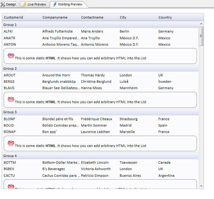
In the above example, the following Javascript is defined in the
onBeforeListDraw
event to add the headers and footers to the List.
var ta = [];
var group = 1;
for(var i = 0; i < data.length; i++) {
//add a user defined title into the data before every 3rd row
if( (i % 3 ) == 0) {
if(i != 0) {
//add the footer html
ta.push({'*static':
'<div a5-item="item1:'+(group-1)+'" style="padding: 10px; border:
solid 1px gray; border-radius: 10px;">
<img src="svgIcon=#alpha-icon-basketFull:26{ fill: #2730d1; stroke:
#f52d2d;}" />This is some static <b>HTML</b>.
It shows how you can add arbitrary HTML into the List</div>'});
}
//add the header html
ta.push({'*title': 'Group ' +
group});
group++
}
ta.push(data[i]);
}
//return a new array of data to be used to draw the list
return ta;
To inject a header into the List, add an object into the data
array that has a '*title'
property name. To add arbitrary HTML (e.g. a footer), add an object
into the data array that has a '*static'
property name.
Notice that in the above Javascript code, the data array is
passed in. But the contents of this array are not modified. Instead
a new array (called ta)
is created and the Javascript returns this array. The List is then
rendered using this new array of data.
Collapsible Headers
The image below shows a slightly more complex example. In this
example, each header is made collapsible. For example, Group1
through Group4 have been collapsed. Tapping anywhere on the header
will toggle the collapsed state of the group.
Download Component
- collapsible headers
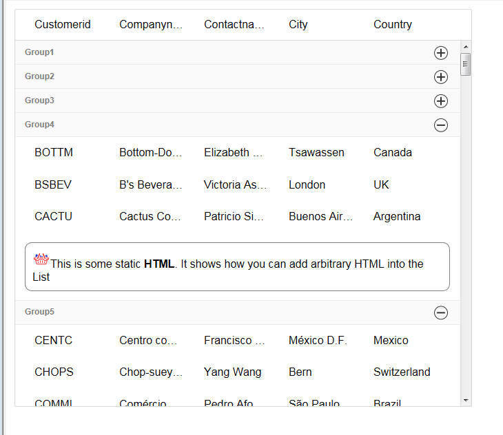
The Javascript in the
onBeforeListDraw
event to accomplish this is shown below:
var ta = [];
var group = 1;
var to = this._to;
if(typeof to == 'undefined') to = {};
var flag;
var iconOpen =
A5.u.icon.html('svgIcon=#alpha-icon-addCircleBorder:icon,24');
var iconClose =
A5.u.icon.html('svgIcon=#alpha-icon-removeCircleBorder:icon,24');;
var icon;
for(var i = 0; i < data.length; i++) {
//add a user defined title into the data before every 3rd row
if( (i % 3 ) == 0) {
if(i != 0) {
if(flag ==
'opened') {
ta.push({'*static': '<div a5-item="item1:'+(group-1)+'"
style="padding: 10px; border: solid 1px gray; border-radius:
10px;"><img src="svgIcon=#alpha-icon-basketFull:26{ fill: #2730d1;
stroke: #f52d2d;}" />This is some static <b>HTML</b>. It shows how
you can add arbitrary HTML into the List</div>'});
}
}
flag = to['Group:' + (group)];
if(typeof flag == 'undefined') flag =
'opened';
if(flag == 'opened') icon = iconClose;
else icon = iconOpen;
ta.push({'*title': '<div
a5-item="toggle:' + group + '" style="line-height: 26px;"><div
style="float:right;">'+icon+'</div>Group' +
group + '</div>' });
group++
}
if(flag == 'opened') {
ta.push(data[i]);
}
}
return ta;
Notice that the header is wrapped in a div that has an
a5-item attribute
called toggle.
Notice also that the list contains a variable called
_to that contains an
object with the open/closed state of each group. If a group is
closed then the code that pushed the list data onto the new array (ta.push(data[i])
is skipped over, thus omitting these rows from the rendered List.
When a user taps on a header, the onClick event in the toggle
item is fired. This event will then add the group's open/closed
state to the List object's
_to variable. The Javascript code in toggle item's onClick
event is shown below:
var to = lObj._to;
if(typeof to == 'undefined') to = {};
var flag = to['Group:' + ia];
if(typeof flag == 'undefined') {
to['Group:' + ia] = 'closed'
} else {
if(to['Group:' + ia] == 'closed') to['Group:' + ia] =
'opened';
else to['Group:' + ia] = 'closed';
}
lObj._to = to;
lObj.refresh();
UX and Grid Components - Amazon S3 - V4 Signing - Ohio Region
- Amazon has changed the way that URLs must be signed for their
newer regions. For example, support for the Ohio region was recently
added to the Storage Connection String builder. But in order to
upload or download files to/from the Ohio region, URLs must be
signed using Amazon's V4 signing scheme. Support has been added for
V4 signing, so now uploads and downloads to the Ohio region will
work correctly.
UX Component - ExpandingMenu Control - A new control type
is available in the UX Component. The Expanding Menu control
displays a list of menu choices, some of which may have sub-choices
(indicated by an icon at the right edge of the item). When a menu
item is clicked, it can invoke Javascript code. If the menu has a
sub-menu, the sub-menu is shown using animation.
In the image below the
ExpandingMenu is shown in its full collapsed state and it a
partially expanded state.
To add an ExpandingMenu
control to your UX component, select the
[More...] item in the
Data Controls
category.
NOTE The
ExpandingMenu is in
the Data Controls
section, because, like all
Data Controls, it has a
{dialog.object}.setValue()
and a {dialog.object}.getValue()
method. The 'value' of the current selection in the Expanding menu
is defined by the 'value' property for each node in the tree (see
below).
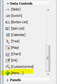
Then select the
ExpandingMenu option from the dialog.
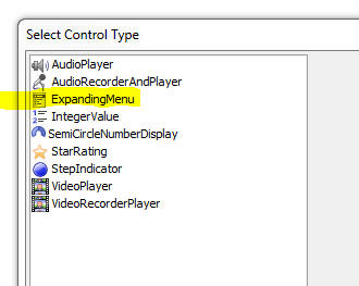
To configure the
ExpandingMenu control, click the smart field for the
Control properties
property.
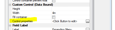
This will bring up a genie where you can define the choices shown
in the ExpandingMenu
and also set other properties.
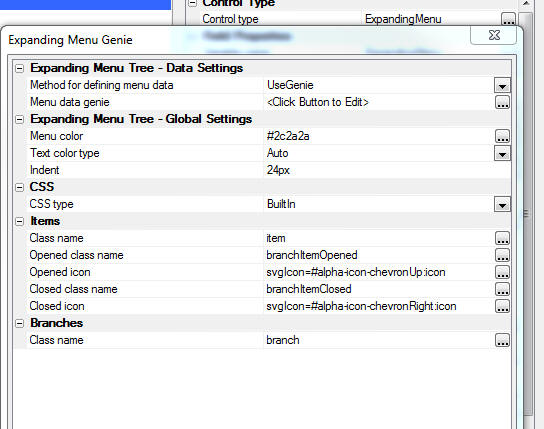
To define the choices and sub-choices shown in the menu click on
the smart field for the
Menu data genie property.
This will bring up a dialog where you can type in your menu
choices, using tab indents to indicate which menu choices are
sub-choices.
For example, in the image below, the top level menu choices are:
item1
item2
item3
item4
Item1 and
item2 hav3
sub-choices.
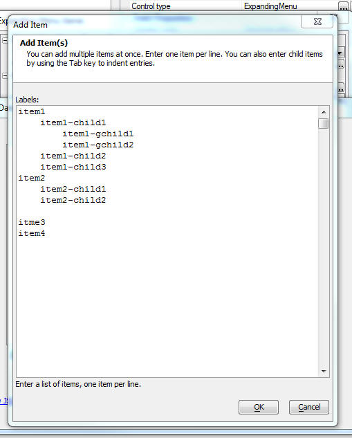
When you close the Add Item dialog, the Tree Data Genie is shown
(see image below). This dialog allows you to set properties for each
menu item in menu tree.
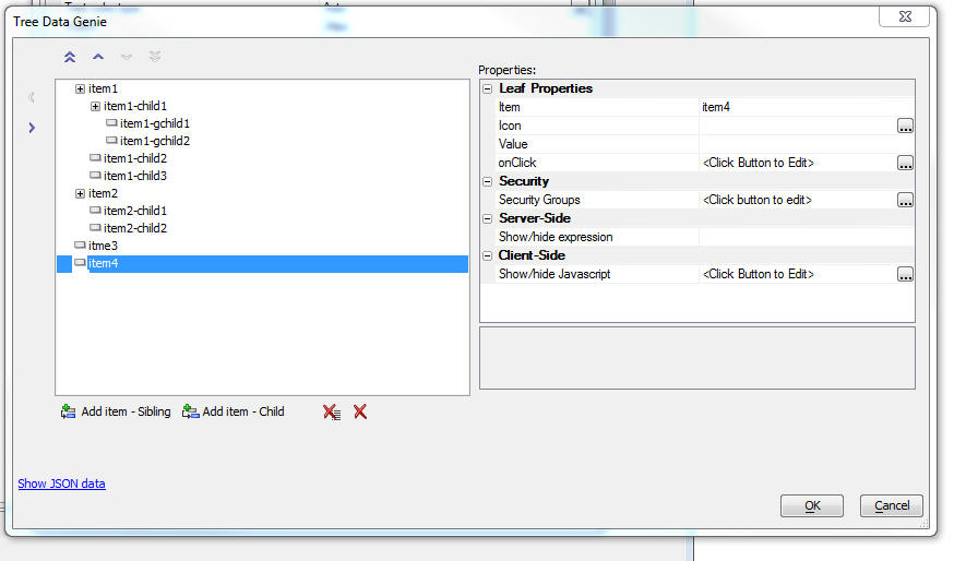
Properties that you can set include:
- Item - The HTML text show in the menu
- Icon - an optional icon shown to the left of the menu
text
- Value - an optional value that indicates what the
value of the ExpandingMenu control will be if this menu item is
selected. Also, if the .setValue() method is used to set the
value of the ExpandingMenu control, you will need to set the
control to a value defined in the
Value property.
- Security groups - if using the Security Framework-
the security groups that can see this menu item. If a menu item
is hidden because it is not in the specified security group, the
menu item and all of its children are hidden.
- Server-side show/hide expression - An
expression that is evaluated server-side to determine if the
menu item should be shown. Server-side show/hide expressions
typically involve session variables. Enter an expression that
evaluates to .t. or .f.
- Client-side show/hide Javascript - Javascript code
that returns a true or false value. If the code returns false,
the menu item (and all of its children) are now shown.
Grid Component - Delete Checkbox - Delete All - A new
option has been added to the Grid component to allow you to
check/uncheck the Delete checkbox in all rows on the current Grid
page at once.
To turn on this feature, check the
Allow 'delete-all' checkbox
property.
Update Settings
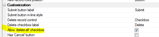
The Grid will be rendered as shown below. The Delete column title
will have a checkbox in it. Checking this box will check the delete
checkbox in all Grid rows on the current Grid page.
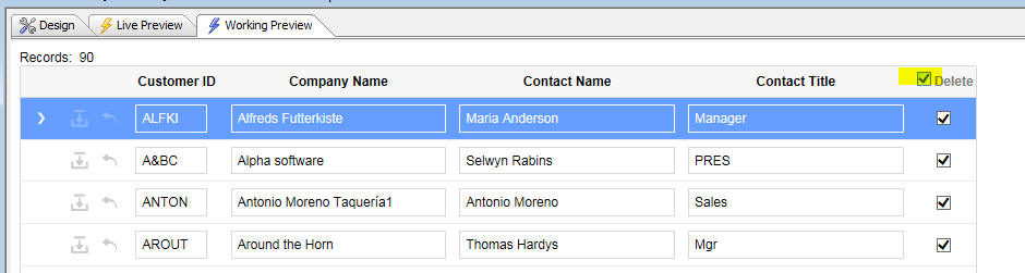
UX and Grid Components - Javascript Errors - Error Reporting
- Error reporting when a Javascript error occurs has been improved.
The error message will now include a stack dump.
UX Component - ViewBox Control - Sample ViewBox - When you
create a new ViewBox a new sample ViewBox is is now available when
you click on the Load
Sample ViewBox hyperlink.
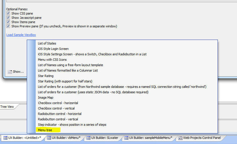
The Menu tree
option displays an hierarchical menu as sown in the image.
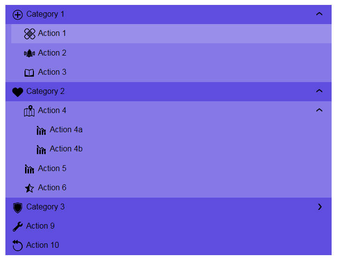
UX Component - Sample Templates -
MobileAppFramework_with_SplitView_ExpandingTreeMenu - A new
sample template for mobile apps is available. This template is
similar to the the MobileAppFremework_SplitView_Hierarchical_Menu
template, except that the menu is rendered using a ViewBox control,
not a List control.
The ViewBox menu can contain nested menus. When a menu item that
has children is expanded, the ViewBox is animated, creating a very
appealing visual effect.
To use the template, chose the template from the list of available
templates when you create a new UX component.
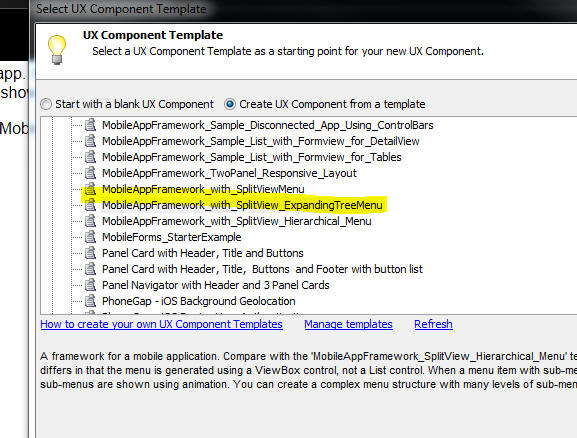
On a Phone, the UX will render as shown below.
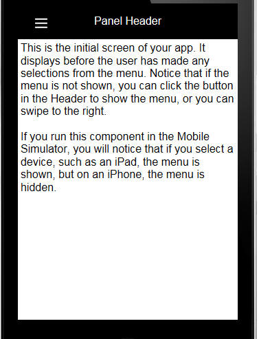
Tapping on the 'hamburger' menu icon will show the menu in its
collapsed state:
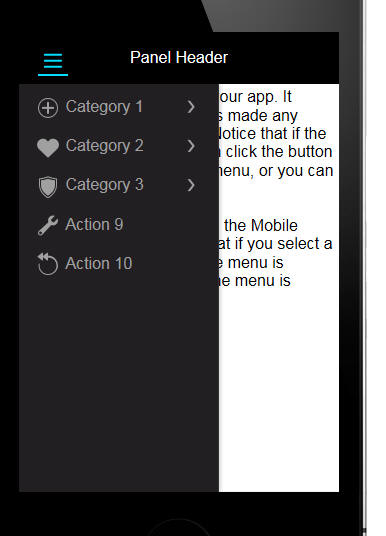
You can expand various branches of the menu. When you tap on a
menu item that is an endpoint, the associated action for that menu
item is executed.
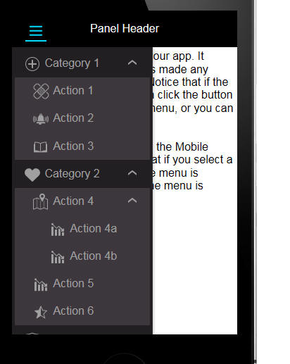
On a tablet, the menu is always shown on the left of the screen.
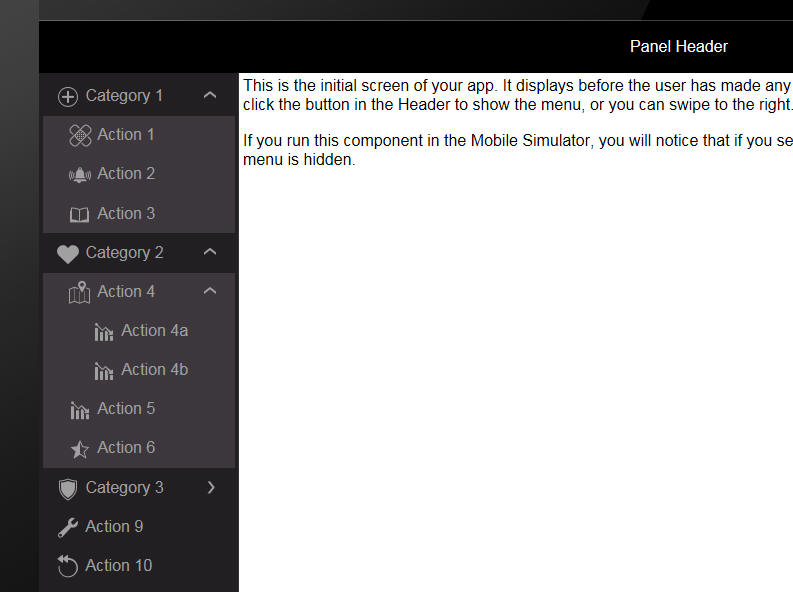
To edit the list of choices shown in the menu, edit the ViewBox
Control. In the ViewBox control, edit the Data Source. The menu
structure and the associated menu actions are defined in the
Javascript object for the ViewBox data source.
The background color of the menu is set in the CSS tab in the
ViewBox builder. To change the menu color, edit the ViewBox and in
the CSS tab, edit this value:
$color: #221f22; //this sets the color of
the menu tree.
Xdialog - Simple List View Control - The simple list view
control has been enhanced to allow sortable columns and different
views of the data.
In the image below, the List has been sorted on the Firstname
column and a small icon in the column title indicates the sort
direct.
This is the 'report' view of the data.
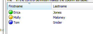
In the image below, the 'list' view of the data is shown.
In the image below, the 'SmallIcon' view of the data is shown.
To indicate that a column is sortable, add a caret to the column
definition. For example:
[%M;K;%.100,20id^"Firstname:30^|Lastname:50^"list!idchange];
In the above example, we have defined both the Firstname and
Lastname columns to be sortable.
You can specify if the sort should treat the data as numeric or
data/time values by adding a suffix of N or T after the ^. For
example
[%M;K;%.100,20id^"Lastname:30^|DateOfBirth:50^T"list!idchange];
To change the view of the List, send a command to the list using
the ui_dlg_ctl_command()
function, as shown in the example below. The second parameter in the
function is any string in the control definition that uniquely
identifies it. In the example below, the text string 'idchange' is
used to identify the control.
You can also sort the List on multiple columns using the ui_dlg_ctl_command()
function. For example to sort on Lastname (column 2) and then
Firstname (column 1), you this command:
ui_dlg_ctl_command(dlg_title,"idchange","sort:2,1")
Full example:
dim list as c
list = <<%txt%
{image=$$generic.orb.green}Erica|Jones
{image=$$generic.orb.blue}Tom|Snider
{image=$$generic.orb.yellow}Molly|Maloney
%txt%
list = replicate(list,30)
list = *for_each(x,"{data=" + *index() + "}" + x, list)
dim dlg_title as c = "Quick ListView - Sortable"
ui_dlg_box(dlg_title,<<%dlg%
{wrap=100}
This dialog shows a simple ListView using the new ^" Xdialog
syntax.;
Using this technique, it is possible to create a simple ListView
with substantialy less Xbasic than the {{Listview} Xdialog command.;
The ^ in the control definition makes the column sortable.;
[%M;K;%.100,20id^"Firstname:30^|Lastname:50^"list!idchange];
{lf};
Click button to change List layout;
<List><Report><SmallIcon>
%dlg%,<<%code%
if a_dlg_button = "List" then
a_dlg_button = ""
ui_dlg_ctl_command(dlg_title,"idchange","list")
else if a_dlg_button = "report" then
a_dlg_button = ""
ui_dlg_ctl_command(dlg_title,"idchange","report")
else if a_dlg_button = "smallicon" then
a_dlg_button = ""
ui_dlg_ctl_command(dlg_title,"idchange","SmallIcon")
else if a_dlg_button = "idchange" then
a_dlg_button = ""
ui_msg_box("Note","User clicked on : " + id )
end if
%code%)
UX Component - FormView Control - Pre-defined Editors -
AlphaNumeric KeyPad Editor - A new pre-defined editor for editing
character and numeric values
in a FormView control (without using the Native keyboard on a mobile
device) has been added.
The editor, as shown in the two images below, display the
AlphaNumeric KeyPad editor in its two possible configurations. In
the first image, the KeyPad is shown as it would be displayed on a
Phone.
In the second image, the KeyPad is shown as it would be displayed
on a Tablet.
To add the editor to a UX component, select the
[Editor-AlphaNumericKeyPad]
from the Defined
Controls section of the toolbox.
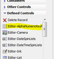
To configure the keypad settings, click the smart field for the
Editor configuration genie
property in the FormView builder.
The genie allows you to configure various aspects of the keypad.
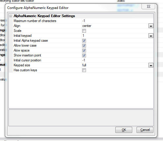
UX Component - FormView Control - Pre-defined Editors - Time
Value Editor - A new pre-defined editor for editing time values
in a FormView control has been added.
The editor, as shown below, displays SpinList controls for the
hour, minutes and AM/PM values.
The editor also displays a button to set the selection in the
SpinList controls to the current time.
You can configure the editor to hide the 'Now' button.
To add the TimeSpinLists editor to a UX component, select the
[Editor-TimeSpinLists]
item in the Defined
Controls section of the UX toolbox.
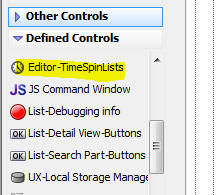
To configure the Time value editor, click the smart field for the
Editor configuration genie
property in the FormView builder on the Fields tab.
The configuration genie allows you to specify if the 'Now' button
should be shown.
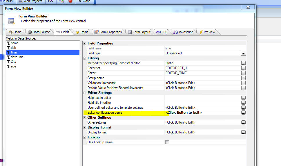
UX Component - FormView Control - Pre-defined Editors -
Date/Time Value Editor - A new pre-defined editor for editing
date/time values in a FormView control has been added.
The editor, as shown below, displays SpinList controls for the
month, day, year, hour, minutes and AM/PM values.
The editor also displays a button to set the selection in the
SpinList controls to the current date and time.
You can configure the editor to hide the 'Now' button and to show
a 'Clear' button which 'un-sets' the date/time value.
To add the DateTimeSpinLists editor to a UX component, select the
[Editor-DateTimeSpinLists]
item in the Defined
Controls section of the UX toolbox.
To configure the Time value editor, click the smart field for the
Editor configuration genie
property in the FormView builder on the Fields tab.
The configuration genie allows you to specify if the 'Now' button
should be shown.
UX Component - FormView Control - Pre-defined Editors -
Numeric Keypad Editor - A new pre-defined editor for editing
numeric values in a FormView control has been added.
The editor, as shown below, displays a keypad that allows the
user to enter numbers. When editing a value using the numeric
keypad, the native keyboard on a mobile device is not used.
A configuration genie allows you to specify various settings for
the keypad.
To add the Numeric KeyPad editor to a UX component, select the
[Editor-NumericKeypad]
item in the Defined
Controls section of the UX toolbox.
To configure the Numeric KeyPad editor, click the smart
field for the Editor
configuration genie property in the FormView builder on the
Fields tab.
The configuration genie (shown below) allows you to configure
various settings for the keypad.
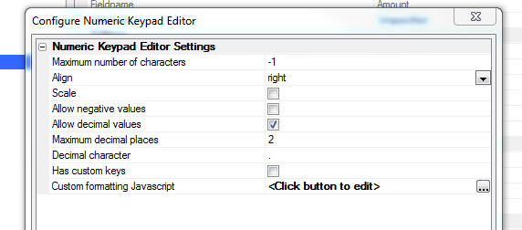
The Custom formatting
Javascript allows you to define code that formats the number
when it is displayed in the Keypad number display area.
For example, in the image below, the number is formatted to
display a $ sign and two decimal places.
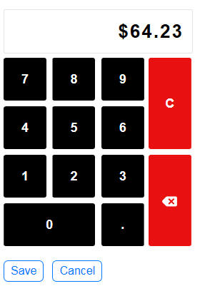
To achieve this, the
Custom formatting Javascript property was defined as:
return Number(val).toFormat('$#,##0.00;$
(#,##0.00);------');
UX Component - ControlBar Control - Disclosures - Injectible
Content - When you create a Disclosure in a ControlBar you can
now set the Disclosure type to
Injectible Container.
Previously, you could add a special
Injectible Content
placeholder in the HTML that you defined for the Disclosure. Setting
the Disclosure type to
Injectible Container is easier than using
Injectible Content
placeholders in the HTML and it has another advantage -- it makes it
very easy to display List controls in the disclosures displayed by
the Control Bar.
Watch Video
- Part 1
Watch Video
- Part 2
Download Component
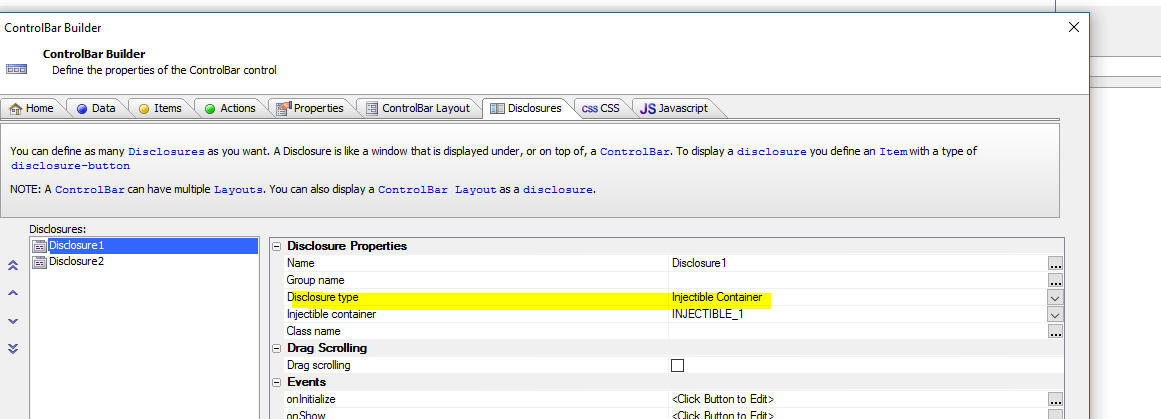
CSS - Shared Styles - You can now define CSS styles that
are shared across all stylesheets. Shared styles can be defined at
the system level or at the project level.
The shared styles are stored in the following locations:
- [Executable
Folder]\css\_sharedStyles - this is where system
level shared styles are defined. These styles are typically
defined by Alpha Software, not the developer.
- [Project Folder]\css\_sharedStyles
- this is where project level shared styles are defined.
The shared styles are defined in a file called
style.sass in the
_sharedStyles
folder. The shared styles can include SASS definitions.
For example, if you define a CSS selector called
.style1 in the [Project
Folder]\css\_sharedStyles\style.sass file, this selector will
be available in all components, regardless of what stylesheet the
component uses.
UX Components - ControlBar Control - Disclosure Buttons -
Margins - You can now specify margins for the content that
is displayed in a ControlBar disclosure.
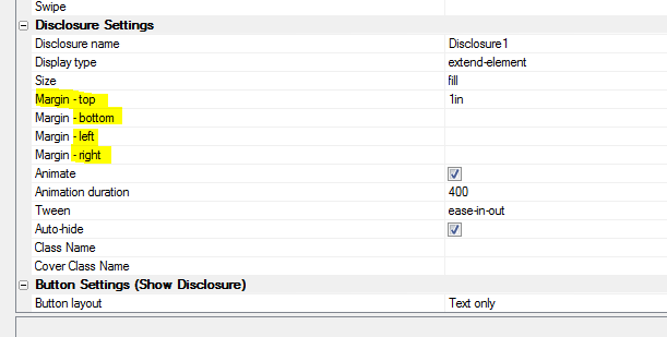
For example, in the image below, the List in Window disclosure
button in the ControlBar in the UX footer displays a disclosure and
sets the top, bottom, left and right margins to constrain the size
of the disclosure content, giving the impression that the List is
displayed in a window.
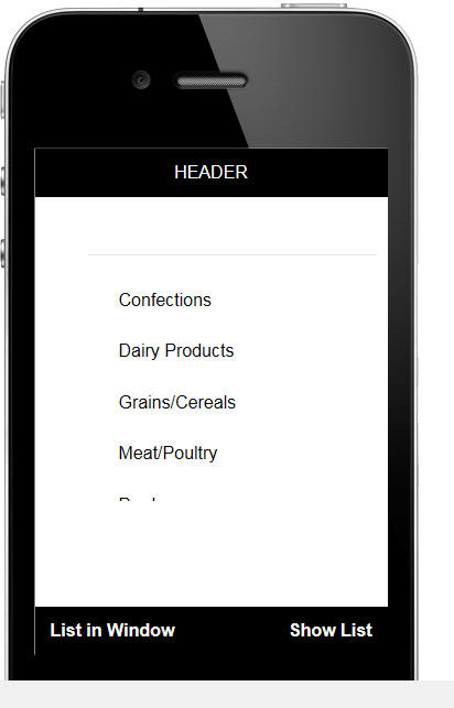
AlphaLaunch - AEX Files - When you register a UX
component as an AlphaLaunch App you can now specify that .aex files
for this App should be compiled and published.
Xdialog -WaitDialog - You can now set the width of the
Xdialog Waitdialog.
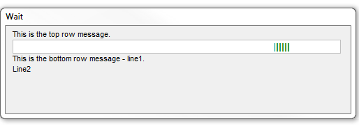
Example:
dim p3 as waitdialog
p3.create(3,"bounce",500) 'set with width to 500
p3.set_color("dark green")
p3.Set_Bottom_Message("This is the bottom row message - line1." +
crlf() + "Line2")
p3.Set_Message("This is the top row message.")
'to close the waitdialog
p3.close()
UX Component - List Control - Allow Any Value - The List
control now has a new property,
Allow any value,
that allows you to set the List value to a value not in the List
data. If this property is not checked (the default), you cannot set
the List value to a value that is not in the List data.
UX Component - Defined Control - Time Editor for FormView
Control - A new pre-defined editor for a time value in a
FormView control is available.
To select the time value editor, select
[Editor-TimeSpinLists]
from the list of controls in the Defined Controls section.
The image below shows a form control on the left with a time
value and a time value editor on the right. The time value editor is
implemented using three spin lists - one for hours, one for minutes
and one for AM/PM.
You can modify the values in the hours spin list if you want to
user to select minutes in multiples of 5, 10, 15 minutes, etc.
AlphaLaunch - Download Applications from S3 - By default,
when you publish an App to AlphaLaunch, the AlphaLaunch client (i.e.
the App running on the mobile device) will download the App from the
same folder to which the App was published. The App will be
published to a folder in the webroot of the standard Alpha Anywhere
server, the Alpha Anywhere IIS server, or AlphaCloud.
However, you can also publish the app to a S3 bucket and when the
AlphaLaunch user tries to install a new App, the App files will be
downloaded from S3, rather than from your Alpha Anywhere server. Of
course, once the user actually starts using the App on their device,
Ajax callbacks will be handled by your Alpha Anywhere server.
The benefit of downloading Apps from S3 is that you offload work
from your Alpha Anywhere server to S3. Also, in certain cases, when
using an Android device and downloading an App from an Alpha
Anywhere standard server, the install might fail because the App has
too many files. By using S3 as the download location, you can
circumvent this problem.
If you want to publish the App to S3, check the
Use Amazon S3 as download
site for AlphaLaunch Apps checkbox on the Publish to
AlphaLaunch dialog.
You will need to specify:
- S3 URL - this is the URL to your S3 bucket where your
AlphaLaunch files will be published. e.g.
http://alphalaunchservers.s3.amazonaws.com/. Do not
include the name of the S3 Folder in the URL
- S3 Folder - the folder within the S3 bucket where your App
files will be published
- S3 Connection String - the connection string to your S3
bucket. You can either use an explicit or named connection
string. If using a named connection string, you must use the
::storage::
prefix.
Xbasic - SQL Server Reporting Services - a5w_report_saveAs()
Function - You can now use the
a5w_report_saveAs()
function to print SSRS reports.
Syntax
c filenameOut =
a5w_report_saveAs(c reportname, c type, c filter,
c order, c filename,P globalVariables , P
printOptions, sql::arguments Args)
Where
- filenameOut - the filename where the report output is
stored. Generally will be the same as filename (the
passed in filename), unless the file extension had to be
changed.
- reportname - the name of the SSRS report (e.g.
customersbystate.ssrs.a5rpt)
- type - the output type. Supported types are PDF,
EXCEL, WORD, HTML, rtf
- filter - the client side filter - not supported for
SSRS reports - must be set to a blank value
- order - the client side order - not supported for
SSRS reports - must be set to a blank value
- filename - the filename for the output report (actual
filename used is returned in filenameOut)
- globalVariables - not supported for SSRS reports -
must be set to
null_value()
- printOptions - not supported for SSRS reports - must
be set to null_value()
- Args -
sql::arguments with argument values for the SSRS
parameters
Example:
dim reportName as c
reportName = "customersbystate.ssrs.a5rpt"
dim args as sql::Arguments
args.add("whatcountry","UK")
dim filename as c
filename = a5w_report_saveAs(reportname,"pdf","","","c:\pdf\report1.pdf",null_value(),null_value(),args)
sys_open( filename)
UX Component - List Control - Detail View - Incremental
Refresh After List Populate - A pattern that some mobile App
developers use when building offline applications is to
automatically do an incremental List refresh when the App is first
loaded. This ensures that the user has up to date data on their
device. An incremental List refresh (rather than a full refresh) is
done so that any unsynchronized edits are not lost. There was no
obvious event in which the incremental refresh could be triggered,
especially if the List had been configured to download media files
to the filesystem.
Therefore, to make this pattern easy to set up, a new property
has been added to the List. The
Do incremental refresh after List is
populated property will allow you to kick off an incremental refresh
of the List after the List has been populated.
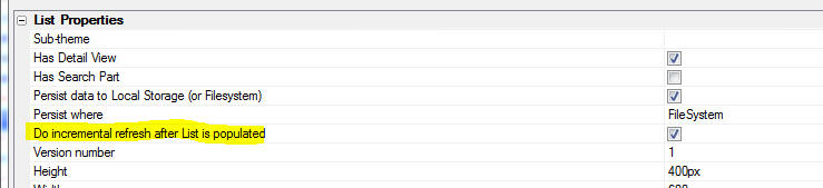
UX Component - Action Javascript - File Upload Action - S3
Timeout - When you upload to S3, you can now specify a timeout
setting. If you are uploading a large number of files, you might
need to increase this setting otherwise, you might get 'permission
expired' errors from S3 indicating that the time window in which
uploads are permitted has expired.
PhoneGap Applications - Usage Descriptions for Plugins - PhoneGap
Build now allows the addition of a
<config-file>
element into the config.xml
file.
http://docs.phonegap.com/phonegap-build/configuring/config-file-element/
This lets you add xml directly to the iOS
Info.plist file and
Android AndroidManifest.xml
file.
This solves an error that you might get when submitting an app to
the Apple App Store. The error complains about certain
UsageDescription
strings not being set in PhoneGap Build Plugins.
E.g.
Camera Plugin : NSCameraUsageDescription
Calendar Plugin : NSCalendarsUsageDescription
The entry into the
config.xml file to set the UsageDescription strings is:
<config-file platform="ios" parent="NSCalendarsUsageDescription"
mode="replace">
<string>This app will use the Calendar</string>
</config-file>
UX Component - Client-Side Events - onConnectionChange Event
- The onConnectionChange event when the device either gets a
connection, or looses its connections. The event has a parameter
that tells you whether the device has or does not have a connection.
Previously, this parameter was not always accurate. Now, it can be
relied on.
A common use case for this event is to only show a 'sync' button
on a mobile device when a connection is available. In addition,
before executing an Ajax callback you might want to first check that
the Alpha Anywhere server is responding (it is possible for the
Alpha server to be offline even though the device has a connection).
In summary, here are the events and methods that you can use in a
Mobile app.
- onConnectionChange
client-side event - tell when when the connection status changes
- {dialog.Object}._getOnlineStatus()
method - returns true/false depending on whether the device is
on/off line.
- {dialog.object}.serverIsAvailable()
method - calls a success callback function if the server is
available - calls an error callback function if the server is
not available.
Example use of .serverIsAvailable() method
var _ok = function() {
alert('server responded');
};
var _err = function() {
alert('server did not respond');
};
//wait up to 500 milliseconds before calling
either the _ok or _err callback function
{dialog.Object}.serverIsAvailable(500,_ok,_err);
UX Component - List Control - <listObject>.setValue() Method
- Several new options have been added to the .setValue() method.
NOTE: These new options only apply if the
List is set to allow multi-selection.
- add values to the current selection
- remove values from the current selection
- toggle selected state of items in an input array of values
- select rows in a list programmatically using a passed in
function that returns true/false for each row in the List
- add values that are selected programmatically to the current
selection
Examples:
//adds values to the current selection
listObj.setValue({select: 'add', value : ['Smith','Jones']});
//remove values from the currently selected value
listObj.setValue({select: 'remove', value: ['Smith','Jones']});
//toggles the selected state of the items in the value array
listObj.setValue({select: 'toggle', value: ['Smith','Jones']});
//select rows in a list programmatically. If function returns true,
row is selected.
listObj.setValue({select: 'match', match: function(value,data) {
//value and data for the current row
if(data.Country == 'USA') return
true;
else return false;
}
}
);
//select rows in a list programmatically. Optionally add to the
existing selection
listObj.setValue({select: 'match', additive: true, match:
function(value,data) {
//value and data for the current row
if(data.Country == 'UK') return true;
else return false
}
}
);
UX Component - Alignment Container - Centering Content -
The Alignment container allows you to easily center align content.
If you have multiple controls in an Alignment container, each
control is horizontally centered on its own line.
However, if you wanted (say) Control 1 and Control 2 to both be
on the same line, and center align the combined width of the two
controls, you can now wrap Control 1 and Control 2 in a container
within the Alignment container.
UX Component - List Control - Lazy Image Loading - A new
genie is available to set up a List to use Lazy Image Loading.
A common use case for Lazy Image Loading is when you have a List
that displays images that are sourced from a server. If the List has
a large number of rows, fetching all of the images from the server
will slow down the initial render of the List. However, by
implementing Lazy Image Loading, only the images for the rows that
are currently scrolled into view will be fetched.
Watch Video - Part 1
Watch Video - Part 2
Watch Video - Part 3
Download Component
You can set a wait time that the List will wait after a row comes
into view before the images for the visible rows will be fetched.
This prevents fetching images for rows that you scroll past without
stopping on. When a row that displays an image that has not yet been
fetched is displayed, a 'waiting' image will be displayed. Once the
image has been fetched, the 'waiting' image will be replaced with
the real image.
To access the Quick Setup Genie, open the List control builder.
Click on the Quick
access... button at the bottom of the window and then select
the List Quick Setup Genie
menu item.
Once the Quick Setup Genie opens, select the
Lazy Image Loading
option.
The genie allows you to configure a number of options, such as
the name of field in your List data that contains the image URL for
the image to display in each row. You can also set the URL of the
wait image (the image to display before the real image has been
fetched).
When you exit the genie, the genie will automatically set several
properties in the List, such as the
onListDraw and
onScroll event, the
List template, etc.
AlphaDAO - oData - Authentication Options - You can now
specify an Authentication option when building an oData connection
string.
The options are:
- None
- Basic (the default)
- Windows Integrated
UX Component - List Control - DetailView - addTableRow()
Method - The
addTableRow() method allows you to programmatically add new
rows to a List with a Detail View.
If you are using this method in a loop, then you can add many new
rows to a List quite quickly. Under certain circumstances, this
might cause a problem.
The circumstances under which this could cause a problem are:
- The List is set to persist to storage (so that the
application can function offline)
- The List storage is set to FileSystem
- The App is running in Phonegap.
The reason that there is a potential problem under the above
scenario is that writing to the FileSystem in PhoneGap is an
asynchronous operation. Each time the List is updated, the edits to
the List are saved in files written to the FileSystem. But since
these write operations are asynchronous, it is possible (actually
likely), that the write operation for the next record added to the
List will be initiated before the write operation for the current
record added to the List has completed, and so on. These overlapping
write operations to the FileSystem could corrupt the files used to
store the List edits.
The solution to this potential problem is to temporarily suspend
persisting the List while the
.addTableRow() method is being called
in a loop and then once the loop has completed, turn the suspension
off and persist the List to storage.
To suspend persisting to the List, you set the List's
.suspendPersist
property to true.
To turn persisting back on, you set the List's
.suspendPersist to
false
To manually persist the List after you have turned suspend
persist off use the List's
.persistToStorage() method. You must pass in an empty object
when calling this method.
For example:
//persist multiple rows in a loop
var listObj = {dialog.object}.getControl('list1');
//suspend list persisting
listObj.suspendPersist = true;
//execute the .addTableRow() method in a loop
//turn list persisting back on
listObj.suspendPersist = false;
//persist the list (passing in an empty object to the .persitToStorage()
method.
listObj.persistToStorage({});
UX Component - Panel Navigator - Carousel Mode - If you are
swiping to the left or the right to navigate from one Panel Card to
another, if the Panel Card you are navigating from allows for
vertical scrolling, you could easily start scrolling the Panel Card
vertically while you were also swiping left or right. This creates
an undesirable visual effect. Now, once you start moving the Panel
Card to the left or right (to transition from one Panel Card to
another), vertical scrolling the Panel Card is disabled.
AlphaDAO - SQLite - AlphaDAO now has built-in support for
SQLite. Previously, you could connect to a SQLite database by
installing an ODBC driver. However, since there was no syntax
handler for SQLite, there was no support for Portable SQL or the
Portable SQL functions that AlphaDAO exposes. As a result, certain
operations would fail.
Now, with built-in support for SQLite, there is no longer any
need to install an ODBC driver and all Portable SQL functions (with
the exception of Geography functions, which SQLite does not support)
are supported.
Full details on SQLite support are in the
documentation.
UX Components - Checkbox and Radiobutton Controls - Render as
ButtonList - Icon Alignment - A new property has been added to
the builder allowing you to better control the placement of the icon
relative to the text.
The Button style
property has these options:
- Image followed by text
- Text followed by Image
- Text left & image right (image will be right justified
and text will be left justified)
- Image left & text right (image will be left justified and
text will be right justified)
Bugs
Application Server - Stripe - The Stripe methods (built into
Alpha Anywhere using Action Javascript) did not work when using the
Application Server. This was because the Stripe methods use a Node.js
module and the Node modules were not getting installed when the
Application Server was installed.
UX Components - List Control - Detail View - Persist to FileSystem
- Various improvements have been made to the way the List control
persists offline data to the file system.
Application Server - Alternate Login - Facebook - As a result
of a change Facebook made to the data returned on a successful login,
the Facebook Alternate Login was throwing an error. This is now fixed.
UX Component - Apply Security Client-side - If you checked the
option to apply security client-side, but did not also check the option
to pre-render the component at design-time, the security settings were
not applied on the client-side.
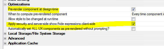
UX Component - Image Controls - Touch Events - Mobile Devices -
300ms Delay - If you defined a touch event for an image control, on
a mobile device, the browser would add a 300ms delay before firing the
event. This is now fixed.
UX Component - List Control With Detail View - CRUD Operations -
Regional Settings - If the regional settings on the server specified
a comma as the decimal characters, and the UX was configured to show
decimals with a period and to require decimal numbers to be entered with
a period, update and insert operations would fail.
SSRS Reports - Internal Parameters - When defining a SSRS
report you can specify that certain parameters are 'internal'
Previously, when printing a report that has internal parameters, the UI
would prompt for values for internal parameters. Internal
parameters should not have been exposed in the user interface.
AlphaLaunch - Embedded UX Components - The URL for Ajax
Callbacks was not getting set correctly for child UX components loaded
by the master UX component if the child UX components were set be 'precomputed'
(rather than loaded by making an Ajax Callback0.
UX Component - Absolute Container - Bulk Operations - Recalculate
UX Components - If you performed a bulk recalculate of UX
components, the settings in an Absolute Container were lost.
UX Component - List Control - Detail View - Persist List Data to
Storage - FileSystem - Incremental Refresh - In build 4.4.4, the
ability to persist the List data to the filesystem, rather than
localStorage, was introduced. This provided for a large increase in the
amount of data that could be used in offline mobile apps. A bug
was fixed when doing an incremental refresh on the List when the List
data was being persisted to the filesystem.
UX Component - List Control - Order - Multi-level sort
definitions did not work correctly.
UX Component - List Control - Detail View - Client-side Grouping -
New Records - If a List had client-side group breaks, then after a
new record was added and the List was synced, focus did not remain on
the new record.
Reports - Report Server - Storage Connection Strings - If a
report had a reference to an Amazon S3 image that used JSON syntax for
the image name, the storage connection string could not be resolved if
the report was printed using the Report Server.
Tips
Sample Mobile Application - Export to Excel - This sample
application shows how you can create a mobile application that has a
button that makes an Ajax callback to the server. The Xbasic function
that handles the callback creates an Excel file and then the mobile
device downloads the excel file and opens it using the native Excel
viewer on the device.
Download example
UX Component - PhoneGap - iOS Keyboard - Next / Previous Keyboard
Buttons - When you run a UX component on a native iOS device, the
native iOS keyboard has next/prev buttons to navigate to the next and
previous input control on the screen. If you have a UX component with
multiple panels and focus is on the last input control on the currently
visible Panel, if you tap the next button, focus will go to the next
input control, which may be a Panel Card that is not currently visible.
Clearly, this is undesirable.
The solution is to disable input controls that are not currently on a
visible PanelCard.
Assume you have a PanelNavigator (called 'PANELNAVIGATOR_1') with
child PanelCards.
You could add the following expression the the client-side enable
expression for each of the input controls.
enableControl('PANELCARD_1')
where 'PANELCARD_1' was the name of the Panel Card in which the input
control had been placed.
The enableControl()
function would be defined as follows:
function enableControl(txt) {
var p = {dialog.object}.panelGet('PANELNAVIGATOR_1');
var ps = p.state;
if( p.state.activePanel == txt) return true;
return false;
}
This function will return true if the active PanelCard name matches
the passed in PanelCard name.
So, only input controls on the currently active PanelCard will be
enabled and the iOS keyboard next/previous buttons will only cycle
through the controls on the current PanelCard.
Alpha Anywhere V4.4.4 - Build 4346-4889 18-May-2017
NOTICE: Alpha Anywhere is now being being built
with Visual Studio 2015. Previously Alpha Anywhere was built using
Visual Studio 2013.
IMPORTANT: If you have UX components with Lists that have
updateable Detail Views and these UX components were defined as
pre-rendered then you will need to edit these components and resave
them so that the pre-rendered code can be re-generated. You can use
the Edit,
Bulk Operations,
Recalculate UX Components
menu item to do a bulk update of your UX components.
Videos
|
AlphaLaunch |
Publishing Apps to a Device using AlphaLaunch |
Publishing Apps to an App store (especially the
Apple App store) can be a time consuming and
frustrating experience. Using AlphaLaunch you
can quickly and easily publish Apps to Apple and
Android devices, completely bypassing the App
stores.
In this video we show how you can publish an App
to a device using AlphaLaunch
Watch Video
- Part 1
Watch Video
- Part 2
Watch Video
- Part 3
Watch Video
- Part 4
Date added: 2017-03-26 |
|
UX Component |
Mobile Applications with Persistent Logins |
A common pattern in mobile applications is to
not require the user to login to the application
after they have successfully logged in for the
first time. The login should be persistent
until is is explicitly revoked by the action of
an Administrator, or until the end of the
persistent login period is reached.
Unlike a traditional Web application built using
the Alpha Security Framework, the user will not
have to log in again once their session expires,
or when they restart the application.
In this video we show how this pattern is
achieved.
(Requires build 4307 or above.)
Watch Video
- Part 1
Watch Video
- Part 2
Watch Video
- Part 3
Watch Video
- Part 4
Watch Video
- Part 5
Watch Video
- Part 6
Download Component
Date added: 2017-04-29 |
|
UX Component - ViewBox Control |
Get Data for Current Row in ViewBox |
A common use case for a ViewBox is a light
weight alternative to the List control. In a
List control it is easy to get the data for the
row that the user clicked on.
In this video we show how a ViewBox that is
configured to display a list of data can be
configured so that the data for the row that was
clicked on can be obtained.
Watch Video
Download Component
Date added: 2017-05-14 |
IMPORTANT: If you have UX components with Lists that have
updateable Detail Views and these UX components were defined as
pre-rendered then you will need to edit these components and resave
them so that the pre-rendered code can be re-generated. You can use
the Edit,
Bulk Operations,
Recalculate UX Components
menu item to do a bulk update of your UX components.
If you have PhoneGap applications that use Lists with updateable
Detail Views, and if you want to update the server that handles the
Ajax callbacks from your PhoneGap applications, you will need to
rebuild your PhoneGap applications.
Features
Xbasic - JSON - Reshape JSON - extension::JSON::FormatMapped()
Method - It is sometimes necessary to 'reshape' a JSON document,
changing property names, creating arrays and objects from
properties, etc.
The
extension::JSON::FormatMapped() method allows you to do this.
The method takes two arguments:
-
a map the describes how the JSON should be reshaped. The map is
itself a JSON document
-
a JSON file. The JSON data to be reshaped
For example, consider the following input JSON file:
dim jsonIn as c
jsonIn = <<%str%
{
"id" : "001",
"fname" : "John" ,
"lname" : "Doe",
"address1" : "12 Main Street",
"address2" : "Box 20"
}
%str%
Say you want to reshape this JSON document so that it looks like
this:
{
"person": {
"id": "001",
"firstname": "john",
"lastname": "public",
"address": [
"12 Main
Street",
"box 20"
]
}
}
Here is the Map that would define to achieve the above
transformation:
dim jsonMap as c = <<%str%
{
"person" : {
"id" : "id" ,
"firstname" : "fname" ,
"lastname" : "lname" ,
"address" : [ "address1" , "address2"
]
}
}
%str%
Notice that in the input JSON, there is a flat list of
properties. The firstname and lastname properties are called "fname"
and "lname"
In the output document, the firstname and lastname properties are
called "firstname" and "lastname", the two address fields are in an
array called "address" and all of the properties are now a child of
a new object called "person"
Here is how you would transform the input JSON (jsonIn) using the
map (jsonMap)
dim jsonOut as c
jsonOut =
extension::Json::FormatMapped(jsonmap,jsonin)
jsonOut2 = json_reformat(jsonOut) 'format the
JSON
Xbasic - JSON - Flatten JSON - extension::JSON::ExtractMapped()
Method - Creates a flattened JSON object from a complex JSON
object. The flattened JSON object has all properties at the top
level, with no nested objects are arrays.
The
extension::JSON::ExtractMapped() method allows you to do
this.
Assume you have a complex JSON document as shown below. Note that
the only top-level property is "person"
dim jsonIn as c
jsonIn = <<%json%
{
"person": {
"id": "001",
"firstname": "John",
"lastname": "Dublic",
"address": [
"12 Main
Street",
"Box 20"
],
"otherInfo" : {
"x": "value of x",
"y" : "value of y"
}
}
}
%json%
Say you want to flatten this JSON document so that all properties
are at the top level and also change some of the property names. The
resulting JSON document should look like this:
{
"id": "001",
"fname": "john",
"lname": "public",
"address1": "12 Main Street",
"address2": "box 20",
"x_value": "value of x",
"this is the y value": "value of y"
}
Here is the Map that would define to achieve the above
transformation:
dim jsonMap as c
jsonMap = <<%json%
{
"person" : {
"id" : "id" ,
"firstname" : "fname" ,
"lastname" : "lname" ,
"address" : [ "address1" , "address2"
],
"otherInfo" : {
"x" : "x_value",
"y" : "this is the y value"
}
}
}
%json%
Here is how you would transform the input JSON (jsonIn) using the
map (jsonMap)
dim jsonout as c
jsonOut = extension::Json::ExtractMapped(jsonMap,jsonIn)
dim jsonout2 as c
jsonout2 = json_reformat(jsonout) 'format the JSON
UX Component - Style 'Tweaks' - When working with version
3 and above styles (these include iOS7, AndroidLight, AndroidDark,
Alpha), you can now define style 'teaks'. Tweaks are adjustments to
the style definition that are stored in a separate file in the Web
Project folder. The adjustments include new sub-themes and CSS
classes, and changes to existing sub-themes and CSS classes.
Normally when you edit a system style (such as 'Alpha'), a local
copy of the style is saved in the Web Project folder and your edits
are applied to the local copy of the
style.js and
style.sass files.
The disadvantage of this approach is that if, in a future version of
Alpha Anywhere, the style is changed (to fix a bug or to add support
for a new control type), the changes made to the system version of
style.js and
style.sass will not
be reflected in the local copy of these files that you created when
you edited the style. You would need to manually edit the system
copy of these files and copy changes to the local copy of these
files. This would be complicated because it would not be easy to
find the parts of the file that had changed.
On the other hand, since style tweaks are stored in a separate
file, there are no local copies of the style files you are tweaking.
Therefore if a future version of Alpha Anywhere updates the style,
the tweaks are applied to this updated version of the style and your
tweaked style will automatically have all of the changes made to the
system style.
Style tweaks for a particular style are stored in this file:
<web project folder>\css\StyleTweaks\<style
name>\styleTweaks.json
To define style tweaks, click the smart button for the
Style sub-theme and CSS
'tweaks' property.
NOTE: If you customize the style colors and
fonts using the smart field for the
Customize style color and
fonts property, the changes to the SASS variables that define
the style's colors and fonts are also stored in the style's Tweaks
file.
NOTE: You can also adjust the CSS and
sub-themes in a style using these properties:

However, the adjustments made here apply ONLY to the component you
are editing, whereas style 'tweaks' apply to all components in the
Project that use the tweaked style.
UX Component - FormView Control - Pre-Defined Editors -
TextArea - A new pre-defined editor for a FormView control is
now available in the Defined Controls section of the UX toolbox. The
[Editor-TextArea] pre-defined control creates an editor for a
FormView value. The editor uses a TextArea control and it has a
vertical scroller so that long text can easily be scrolled on touch
devices.
Javascript Editor - Auto-complete for built-in Node modules
- When you are editing Node Javascript code in a Javascript editor
in Alpha Anywhere, you now get auto-complete for built-in Node
modules. For example, assume that you enter this code into your
Javascript code to get the Node filesystem module:
var fs = require('fs')
Now, when you type
fs.
you will get auto-complete, as shown in the image below:
Node API s - The Web Control Panel now has a new category -
Node APIs.
A Node API is similar to a Node
Service in that they both allow
you to call code written in Node from Xbasic. The difference is in
how you call the code.
A Node service exposes a single piece of functionality to Xbasic. You can invoke the Node service
using the node_request_result() function.
For example, assume you have a Node service called
mergeData. You would
call this service, passing in arguments to the service, as follows:
dim p as p
p.name = "Fred"
p.city = "Boston"
dim result as c
result = node_request_result("mergeData",p)
On the other hand, a Node
API allows you to define an Xbasic
class with multiple methods whose method are implemented using Node. Your Xbasic code invokes
the Node code by calling methods on an Xbasic class instance. Your
Xbasic code will create an instance of the class by declaring a
variable of type ::NodeServices::name_of_your_Node_API
and then calling methods of this class.
For example, assume you have created a Node
API called
myAPI and that this
API exposes two methods,
method1() and
method2() and that each method
takes a single character argument. Here is how you would invoke these methods
from your Xbasic code:
'Dim an instance of the API class
dim x as ::NodeServices::myAPI
'now call methods of the class
dim result1 as c = x.method1("alpha")
dim result2 as c = x.method2("beta")
In effect, the Node API allows you to extend Xbasic with methods that are implemented using Node.
NOTE: Future versions of Alpha Anywhere will
allow for another use of Node APIs. You will be able to expose REST
APIs whose endpoints are implemented using a defined Node API.
How to Create a Node API
To create a new Node API,
select the Node APIs
category in the Web Control Panel and then click the New button.
This will open a dialog where you can name the
Node API and define
the methods and implementation for the API
The API methods are defined in the Definition pane (shown in the
image below). The syntax used for defining the Node API methods is
the same syntax used for defining an Xbasic class. Note that the
Definition does not include any actual Xbasic code for implementing
each method. It simply define the functions that the API will
implement.
The actual implementation of the methods is coded in Node code on
the Implementation pane.
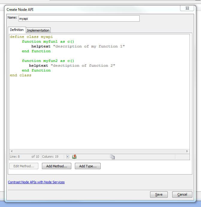
The Implementation pane fills in the stub Node code to implement
the API methods. You will fill in the actual code for each of the
functions in the API.
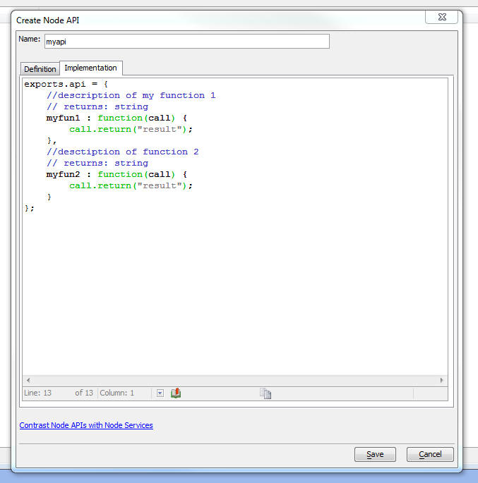
When you click the Save button two files are created in the
node_services
folder in your Web Project
- <node
API name>.a5api file -- this file contains the
definition of the Node
API (i.e. the code in the Definition pane shown in
the above images)
-
<node API name>.js
file - this file contains the Node Javascript code that
implements the methods in the
API.
When you edit a previously create Node
API, the .js
file is opened in the Alpha Anywhere Javascript editor, but the
editor toolbar shows a special button (API
Definition...) at the right edge of the toolbar:
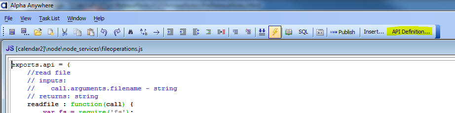
The API Definition...
button will bring up the Create Node API dialog (shown in the above
images) where you can edit the API definition. When you exit the
dialog, the the Implementation file (i.e. the .js file you are
editing) will be updated to reflect the edited API definition.
Example
In this example, we will show how to create a Node API with four
methods:
-
readfile - read a file using the Node 'fs' (fileSystem)
module
-
writefile - write a file using the Node 'fs' module
-
fileInfo - get information about a file using the Node 'fs'
module
-
specialN - perform some trivial arithmetic
Here is how this API
is defined in the Definition pane of the Create Node API dialog:
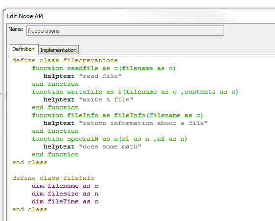
The code is reproduced below:
define class fileoperations
function readfile as c(filename as c)
helptext "read file"
end function
function writefile as l(filename as c ,contents as c)
helptext "write a file"
end function
function fileInfo as fileInfo(filename as c)
helptext "return information about a
file"
end function
function specialN as n(n1 as n ,n2 as n)
helptext "does some math"
end function
end class
define class fileInfo
dim filename as c
dim filesize as n
dim fileTime as c
end class
Notice that the
fileInfo method's return type is
fileInfo.
fileInfo is
defined as a class that has these properties:
filename,
filesize and
fileTime.
When you create Xbasic functions that return multiple values, it
is common to define the return type of the function as
P ( as pointer). In the case of a Node
API
definition, you cannot define a method whose return type is
P. If you
want to define a method that returns multiple values, you must
define a class, as shown above, and set the function return type to
the class.
The definition shown above simply defines what the methods of the
Node API are
and what input parameters each method takes. The Definition does
not contain any Xbasic code to implement the functionality of
each method.
The implementation for the above definition is shown below:
Note that the implementation is written using Node code.
exports.api = {
//read file
// inputs:
// call.arguments.filename - string
// returns: string
readfile : function(call) {
var fs = require('fs');
var _cb = function(err,data) {
if(err) {
call.error(err);
} else {
call.return(data)
}
}
fs.readFile(call.arguments.filename,'utf8',_cb);
},
//write a file
// inputs:
// call.arguments.filename - string
// call.arguments.contents - string
// returns: bool
writefile : function(call) {
var fs = require('fs');
var _cb = function(err) {
if(err) {
call.return(false)
} else {
call.return(true)
}
}
fs.writeFile(call.arguments.filename,
call.arguments.contents,_cb);
},
//return information about a file
// inputs:
// call.arguments.filename - string
// returns: fileInfo { filename : "" , filesize : 1 ,
fileTime : "" }
fileInfo : function(call) {
var fs =
require('fs');
var _cb =
function(err,stats) {
if(err) {
call.error('file not found');
} else {
var _d = {filesize: stats['size'], 'fileTime' : stats['mtime'],
filename: call.arguments.filename}
call.return( _d );
}
}
fs.stat(call.arguments.filename,_cb);
},
//does some math
// inputs:
// call.arguments.n1 - number
// call.arguments.n2 - number
// returns: number
specialN : function(call) {
var n =
call.arguments.n1 + call.arguments.n2
call.return(n);
}
};
The implementation is a Javascript file that exports an object
with the same name as the Node
API. This
object has function for each of the methods in the
API
definition.
The prototype for the object is automatically created from the
Node API definition.
Notice that the implementation of the
fileInfo
method returns an object with properties that match the definition
of the properties of the
fileInfo class in the Node
API
definition.
Each method defined in the Implementation takes as its input an
argument called call.
This argument is an object that has a property called
arguments
which contains the input parameters to the method and it also has
two methods, return()
and error(),
that allow you to return a result from the function, or report an
error.
To use this API from your Xbasic code:
'Dim an instance of the API class
dim fo as ::NodeServices::fileoperations
dim p as p
p = fo.fileInfo("c:\myfiles\file1.txt")
?p.filename
= "c:\myfiles\file1.txt"
?p.filesize
= 2942097
?p.fileTime
= "2017-05-10T14:26:04.193Z"
Xbasic - pdf_fillinFields_get() - Gets a list of the
fill-in fields in a PDF file. If a PDF file is created with
fill-infields, this function will extract the names of all of the
fill-in fields in the file. You can optionally extract additional
information about each field.
Syntax
c result = pdf_fillinFields_get(c pdfFilename [, L
flagExtendedInfo])
IMPORTANT: This function wraps a 3rd party
library which you must install yourself before you can use this
function. The download link for this library is:
https://www.pdflabs.com/tools/pdftk-the-pdf-toolkit/pdftk_server-2.02-win-setup.exe
Examples (from Interactive window):
dim fn as c
fn = "c:\mypdffiles\pdfform1.pdf
?pdf_fillinFields_get(fn)
= {
"first_name": "",
"last_name": "",
"date": "",
"football": "",
"baseball": "",
"basketball": ""
}
Get extended information (from Interactive window):
dim fn as c
fn = "c:\mypdffiles\pdfform1.pdf
?pdf_fillinFields_get(fn,.t.)
= [
{"title": "first_name","fieldType": "Text","fieldFlags":
"0","fieldValue": ""},
{"title": "last_name","fieldType": "Text","fieldFlags": "0","fieldValue":
""},
{"title": "date","fieldType": "Text","fieldFlags": "0","fieldValue":
""},
{"title": "football","fieldType": "Button","fieldFlags":
"0","fieldValue": ""},
{"title": "baseball","fieldType": "Button","fieldFlags":
"0","fieldValue": ""},
{"title": "basketball","fieldType": "Button","fieldFlags":
"0","fieldValue": ""}
]
Xbasic - pdf_fillinFields_merge() - Merges data into a PDF
file that has fill-in fields, creating a new PDF file with the
filled in data. You can use the pdf_fillinFields_get() function to
get the name of the fill-in fields in the PDF file.
Syntax
L result = pdf_fillinFields_merge(c pdfFileIn, c
pdfFileOut, c JSONData)
IMPORTANT: This function wraps a 3rd party
library which you must install yourself before you can use this
function. The download link for this library is:
https://www.pdflabs.com/tools/pdftk-the-pdf-toolkit/pdftk_server-2.02-win-setup.exe
The field values that you use in the JSON data must match the
defined 'Export value' in the PDF form. Win the PDF form designer,
you can specify an 'export value' for each field. In the Example
shown below, the 'Export value' for the 'football', 'baseball' and
'basketball' fields was defined as 'Yes'.
Example:
dim jsonData as c
jsonData = <<%str%
{
"first_name": "Fred",
"last_name": "Smith",
"date": "12/18/2003",
"football": "Yes",
"baseball": "Yes",
"basketball": "Off"
}
%str%
dim pdfIn as c
dim pdfOut as c
pdfIn = "c:\mypdffiles\pdfform1.pdf
pdfOut = "c:\mypdffiles\pdfform1_filled.pdf
pdf_fillinFields_merge(pdfIn,pdfOut,jsonData)
Xbasic - Functions - Arguments as Arrays - You can now
specify that an input argument is an array by adding a suffix of []
to the argument name. Previously you had to set the input type of
the argument to P if the argument was an array.
NOTE: The array is passed to the function by
reference.
Example:
function asText as c(arr as c[])
asText = crlf_to_comma( arr.dump() )
end function
Testing:
dim arr[2] as c
arr[1] = "alpha"
arr[2] = "beta"
?asText(arr)
= "alpha,beta"
Xbasic - Functions - Return Arrays - Previously, an Xbasic
function could return an array by setting the return type of the
function to a Pointer. Now you can explicitly set the return type to
an array by adding a suffix of [] to the return type.
function asAnArray as c[] (commaList as c)
commaList = comma_to_crlf(commaList)
asAnArray.resize(line_count(commaList))
asAnArray.initialize(commaList)
end function
Testing:
arr = asAnArray("one,two,three")
?arr.size()
= 3
?arr.dump()
= one
two
three
Xbasic - Functions - Return a typed Array - You can now
define Xbasic functions that return arrays of an explicit type by
adding a suffix of [] to the return type. Previously you could only
return a generic Pointer value.
For example, assume you had defined the following class:
define class mynamespace::point
dim x as n
dim y as n
end class
You can now define a function that returns an array of the
mynamespace::point type.
function ToPointArray as
mynamespace::point[](points as c)
points = strtran(points,";",crlf())
ToPointArray.initialize_properties("x,y",points)
end function
Testing:
pa = ToPointArray("1,1;2,2;1,2")
? pa[1]
= x = 1
y = 1
Web Control Panel - UX Components - Pre-rendered Components -
Warning Dialog - If you update to a newer version of Alpha
Anywhere and you open a web project that contains any UX components
that have been set to pre-render and any of these components were
last pre-rendered with an older version of Alpha Aynwhere, you will
now get a warning telling you that these UX components need to be
re-rendered. The warning dialog will allow you to click a 'Bulk
Update' button to automatically update all of the UX components that
need updating.
UX Component - List Controls - Offline
Applications - PhoneGap - Using the File System to Persist List data
- When you build a mobile app that is
intended to operate offline, the typical pattern is to use List
controls with Detail Views and to turn on the option to persist the
List data to storage.
The data in the List are persisted to the browser's
localStorage,
which is limited to about 5mb of data.
Now, if your mobile application is run as a PhoneGap application,
you can persist the List data to files in the device's file
system. This will allow you to work with much more data while you
are offline.
To turn on the feature to persist List data to the file system,
set the Persist where
property to FileSystem.
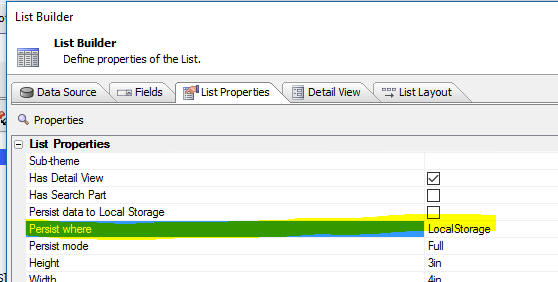
When you set the Persist
where option to
FileSystem, the
Persist mode option is automatically set to
Edits and the
property is hidden.
If you set Persist where
to LocalStorage, you
can set the Persist mode
to either 'Full', or
'Edits'.
In 'Full' mode,
each time the data in the List are edited, the entire List is
persisted to localStorage
(this is the mode that is implicitly used in all versions of Alpha
Anywhere prior to this version).
In 'Edits' mode,
each time the data in the List are edited, only the edited rows are
persisted to storage.
NOTE: f you select the
FileSystem option
and your component is not running in PhoneGap, Alpha Anywhere will
automatically set the option back to
LocalStorage.
How Persisting Data to the FileSystem Works
When you persist List data to
localStorage, when
the List is initially populated the List data is persisted to
localStorage. Each
time the List data are edited, the entire List is persisted
again to localStorage
(unless you change the
Persist mode option to
Edits).
Because writing to
localStorage is so fast, and because there is a built-in
limit (of approximately 5mb) to the amount of data that must be
written to localStorage
on each edit, there is no perceptible delay when you are editing the
data in the List.
However, writing to the
FileSystem is much slower than writing to
localStorage and
because there is no longer a built-in limit as to the amount of data
in the List, a different approach is taken when the
FileSystem option is
used. When the List is initially populated, all of the data in the
List are written to a file in the
FileSystem. Each
time the List is edited, the only the rows in the List that have
been edited are written to a second file in the
FileSystem. This
will file will typically be substantially smaller than the first
file (that contains all of the List data), and since the file is
likely very small, writing this file to the
FileSystem will be
very fast, and again, there will be no perceptible delay when you
are editing data in the List.
When the List is synchronized data in the synced rows are written
to a third file in the
FileSystem and the primary keys of any deleted rows are
written to a fourth file in the
FileSystem.
The filenames of these four files in the
FileSystem are:
- <namespace>.LIST.<listName> - the file that
contains all of the List data. This file is only written to when
the List is initially populated or refreshed. This file can be
quite large (several megabytes) - much larger than would be
allowed in localStorage.
- <namespace>.LISTEDITS.<listName> - the file
that contains the rows in the List that have been edited, but
not yet synced. This file is updated each time the user makes an
edit to the List data. This file is typically quite small.
-
<namespace>.LISTSYNCEDEDITS.<listName> - the file
that contains the rows in the List that have been edited and
synced. This file is updated after the user had synced the List
data. This file is typically quite small.
-
<namespace>.LISTSYNCEDDELETES.<listName> - the
file that contains the primary keys of the rows in the List that
have been deleted. This file is updated after the user had
synced the List data. This file is typically quite small.
Where:
<listName> - is the Id of the List.
<namespace> is the value of the
Namespace property
(see image below).
NOTE: If the List data are being persisted to
localStorage, the
Namespace property
is used in constructing the
localStorage key name. If the List data are being persisted
to the FileSystem ,
the Namespace
property is used in constructing the filenames for the four files
used to persist the List data and edits.
Location of the List Data Files in the FileSystem
The files for the List data are stored in the device's 'saved'
filesystem. The location of the device's 'saved' filesystem is
returned by the
{dialog.object}.phoneGapGetLocalDirURL('saved') method. The
files are stored in a directory (called
_offline by default)
in this location.
The following methods can be use to get the file system URL and
folder for the List data files:
{dialog.object}._persistFS()
- the file system URL of the directory in which the List data
sub-directory is located
{dialog.object}._persistFolder()
- the sub-folder in which the files are actually stored - name has a
trailing /
character.
The actual folder name of the files is therefore:
{dialog.object}._persistFS()
+ {dialog.object}._persistFolder()
For example, the fully qualified name of the file that contains
all of the data in the List when the list is initially populated is
therefore (assuming the List id is
LIST1 and the UX
Local Storage Namespace property was set to
NS1):
{dialog.object}._persistFS() + {dialog.object}._persistFolder() +
'NS1.LIST.LIST1'
NOTE: In the case where the component is
running in AlphaLaunch, the base folder for the files is in a
special folder returned by the
A5.shell.getAppFileStorageDir() method. The
{dialog.object}._persistFS()
will return the appropriate base folder name when the component is
running in AlphaLaunch.
List Virtualization
If you are populating a List with a large amount of data, it is
strongly recommended that you turn on the List's
virtualization feature. With virtualization turned on, populating a
List with a large amount of data is substantially faster than
populating the List with virtualization turned off.
To turn on List virtualization, set the
Virtualization type
property to Dynamic
as shown in the image below.
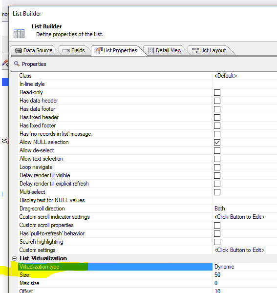
DetailView Button Genie
The DetailView Button Genie now has two new options as shown in
the image below:
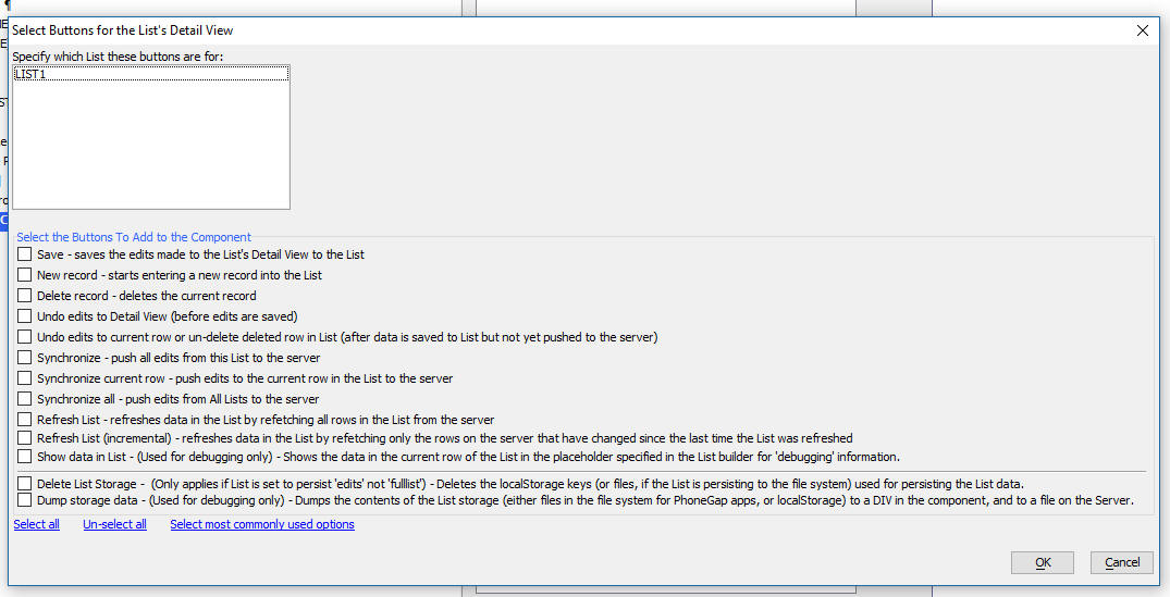
Delete List Storage - This deletes the files used to store
the List data. (If the List is set to persist to Local Storage
and the Persist mode is set to Edits, this option will delete
the List data from localStorage)
Dump storage data - Dumps out the contents of the files
that contain the List data (If the List is set to persist to Local
Storage and the Persist mode is set to Edits, this option
will dump the List data stored in localStorage). The data can be
dumped to a file on the server, a bucket on Amazon S3, and can also
be written to a DIV or placeholder on the screen.
NOTE The DetailView Button Genie is accessed
by clicking the [List-Detail View-Buttons]
item in the UX toolbox Defined Controls section
.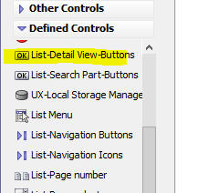
Deleting Storage
You can delete the files that contain the List data using this
Javascript:
var ls = {dialog.object}._localStorageSettings;
{dialog.object}._persistToLocalStorageInitializeKeys(ls,'listId',true);
Deleting the files that contain the List data can be useful when
debugging an application.
Grid Components - Publish Meta Data Files - Published grid
components do not include meta data that is needed to open the
component in the Grid Builder. Therefore the published grid files
found in the server webroot can not be edited in the Grid component
Builder. A new option has been added to the publish profiles to
'Publish Grid Meta Data Files'. This option is selected by default
and a special data file with the component name and a
'_a5wcmp_metadata' file extension will be published when the grid is
published.
NOTE: The motivation behind publishing meta
data files is so that if a developer no longer has access to the
original grid component files (.a5wcmp files) from the Web Project
Folder, but does have access to the published .a5wcmp files, they
will still be able to edit the Grid component files in the Grid
builder (as long as they also have access to the published meta data
files - _a5wcmp_metadata). The published files for all other component types (i.e. other
than Grids) can be edited in
the development program component builders (and therefore it is not
necessary to publish meta data files for these component types).
The special _a5wcmp_metadata file is not used by the web server, but can be converted
into the original editable grid using an option 'Create Grid
Component From Meta Data File' found in the Web Control Panel 'More...'
drop down.
This option should only be turned off if there are backup copies of
the original grids available outside of the development system.
UX Component - Mobile Applications - Persistent Logins -
A common pattern in mobile applications is to
not require the user to login to the application
after they have successfully logged in for the
first time. The login should be persistent
until is is explicitly revoked by the action of
an Administrator, or until the end of the
persistent login period is reached.
NOTE:
The canAjaxCallback
server-side event previously would only emit user-defined Javascript
if the event denied permission for the callback. Now, user defined
Javascript can be emitted even if the Ajax callback is allowed.
This change was made to support the Mobile Application with
Persistent Login pattern.
For more information on the approach used to implement this pattern,
please
view this document.
Watch Video
- Part 1
Watch Video
- Part 2
Watch Video
- Part 3
Watch Video
- Part 4
Watch Video
- Part 5
Watch Video
- Part 6
Download Component
When you create a new UX component a new template is available
for the persistent login pattern.
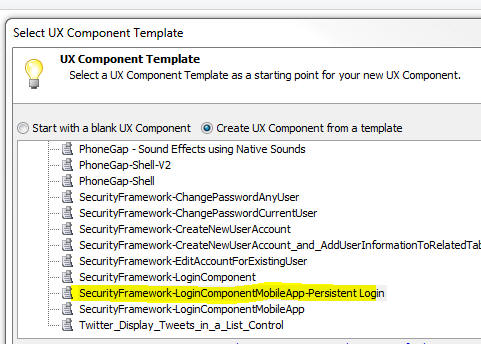
Alpha Anywhere Application Server - Self-signed Certificates -
A change has been made in the way self-signed certificates are
generated.
Alpha Anywhere Application Server - Request Object - As
part of an ongoing initiative to standardize functionality between
the Alpha Anywhere Application Server (AA Server) and the
Application Server for IIS (AA Server for IIS), the
Request object in
the AA Server server will be undergoing a number of changes.
While no immediate action is required from developers, there are
a number of planned changes that will potentially introduce
incompatibilities for existing Xbasic code. Alpha Software is
committed to minimizing the impact of these changes, and this
release of Alpha Anywhere includes several new properties and
methods on the Request
object to allow developers to begin transitioning their code at
their convenience. Future releases will continue to add
functionality to ease this transition. All new functionality will
work identically when running under either the AA Server or the AA
Server for IIS.
The goal of these changes is to ensure that your applications
will work identically on both the AA Server and the AA Server for
IIS, thus allowing for a seamless transition between servers should
you decide to deploy your app using the AA Server for IIS
New Functionality
-
Request.A5WIncludePath - a read-only character
property indicating the path that will be used as the default
location for a5w_inlude()
- Request.HttpMethod - a read-only character property indicating the
HTTP method used when the request was made. This is a
replacement for
Request.Request_Method, which is now deprecated.
- Request.GetCookie(CookieName
as c) as System::Web::HttpCookie
- Request.HasCookie(CookieName
as c) as l
Request.Cookies
will be changing to be a
System::Web::HttpCookieCollection in the future. Currently it
is an Xbasic property class ("dot variable"). Once changed, any
Xbasic code expecting a property class will fail. To prepare for the
upcoming change, the new
HasCookie() and
GetCookie() methods can be used to replace code that directly
operates on Request.Cookies.
These methods will continue to work even after the underlying type
of Request.Cookies
is changed. These methods also work consistently in both the AA
Server and the AA Server for IIS.
Request.GetCookie()
returns null if the specified cookie does not exist, or returns a
System::Web::HttpCookie
instance if the cookie exists. Existence of the cookie can be
checked in advance with
Request.HasCookie().
Sample to see if a cookie exists:
if Request.HasCookie("MyCookie") then
'cookie exists in the request
else
'cookie is NOT included in the request
end if
Sample to read a cookie's value:
dim GreetingName as c = ""
if Request.HasCookie("Greeting") then
dim GreetingCookie as System::Web::HttpCookie =
Request.GetCookie("Greeting")
GreetingName = GreetingCookie.Value
else
GreetingName = "new user"
end if
Response.Write("Welcome " + GreetingName)
Sample of updating legacy code:
Sample old syntax:
dim MyCookieValue as c = ""
if eval_valid("Request.Cookies.MyCookie")
MyCookieValue = Request.Cookies.MyCookie
end if
Sample new syntax:
dim MyCookieValue as c = ""
if Request.HasCookie("MyCookie")
MyCookieValue = Request.GetCookie("MyCookie").Value
end if
- Request.GetHeader(HeaderName
as c) - returns a header value as a string
Headers will be changing to a
System::Collections::Specialized::NameValueCollection.
Currently it is a character string containing the raw header text of
the HTTP request. To prepare for the upcoming change, the new
GetHeader() method
can be used to replace code that directly operates on
Request.Headers.
These method will continue to work even after the underlying type of
Request.Headers is
changed. This method also works consistently in both the AA Server
and the AA Server for IIS.
The Request.GetHeader()
method always returns a string value. If the specified header
name does not exist in the request, the returned value will be an
empty string. There is no distinction between a header that does not
exist, and a header that exists with an empty value.
Sample old syntax to get the value of a specific header:
dim HeaderValue as c = ""
HeaderValue = alltrim(extract_string(wr.Headers,"MyHeader:
",chr(10)))
Sample new syntax to get the value of a specific header:
dim HeaderValue as c =
Request.GetHeader("MyHeader")
Deprecated Properties
- Accept -
replace with
GetHeader("Accept")
- AcceptCharset
- replace with
GetHeader("Accept-Charset")
- AcceptEncoding
- replace with
GetHeader("Accept-Encoding")
- AcceptLanguage
- replace with
GetHeader("Accept-Language")
- Cookie -
replace with
GetHeader("Cookie")
- HTTP_Request -
no replacement
- IfModifiedSince
- replace with
GetHeader("If-Modified-Since")
- IfUnmodifiedSince
- replace with
GetHeader("If-Unmodified-Since")
- REQUEST_METHOD -
replace with
HttpMethod
Additional Documentation
Full documentation for the .Net class
System::Web::HttpCookie
can be found at
https://msdn.microsoft.com/en-us/library/system.web.httpcookie.aspx
Full documentation for the .Net class
System::Web::HttpCookieCollection can be found at
https://msdn.microsoft.com/en-us/library/system.web.httpcookiecollection.aspx
Full documentation for the .Net class
System::Collections::Specialized::NameValueCollection can be
found at
https://msdn.microsoft.com/en-us/library/system.collections.specialized.namevaluecollection.aspx
AlphaLaunch - Install Mobile Apps to Apple and Android Devices
- AlphaLaunch is a free AppStore app that you can install on an
Android or Apple device. Once AlphaLaunch has been installed on a
device you can install as many Apps as you want to that device
without having to go through the Apple or Android App stores, or
without having to go through a PhoneGap build process (either Adobe
PhoneGap Build or the Command Line Interface). The Apps are
installed into AlphaLaunch, not directly to the device. This makes
it extremely easy and quick to install new Apps on a device.
Watch Video
- Part 1
Watch Video
- Part 2
Watch Video
- Part 3
Watch Video
- Part 4
NOTE: AlphaLaunch is not licensed for use in a production
environment if you do not have a subscription to the Enterprise
Edition of Alpha Anywhere.
The use cases for AlphaLaunch include:
- You are developing a mobile App for a client and you want
the client to be able to install and test the App on their own
device
- Organizations that need to create many 'employee-facing'
applications and need a quick way to deploy these applications
to their user community
- You want a quick and easy way to update previously installed
Apps on a device without having to wait for App store approval.
Once an App has been installed into AlphaLaunch it operates
largely identically to the way in which it would operate had it been
installed directly on the device. For example, even when there is no
internet connection, you will be able to start any App that is
installed in AlphaLaunch.
AlphaLaunch is not suitable as a means of deploying a public
facing App that will be installed by many users who will go to the
App Store to find and install your App. When an App is installed
directly onto a device the App icon will appear on the device's home
screen. However, when you publish to AlphaLaunch, the App will not
have an icon on the home screen. To launch the App you will first
have to launch AlphaLaunch and then you will be able to select the
App from the list of Apps installed in AlphaLaunch.
NOTE: Apps installed in AlphaLaunch are
PhoneGap applications (even though you did not have to go
through the PhoneGap build process) and they can use any of the
PhoneGap plugins that AlphaLaunch exposes. For more information see
the section Understanding AlphaLaunch Limitations below.
NOTE: On Apple devices, there are other ways
that you can allow a user to test an App that you are developing
using the Apple Test Flight system. However, setting up Test Flight
is complex. Alternatively, you could get the UDID of a user's device
and use a special Apple publishing profile with PhoneGap build that
allows Apps that you build to be installed on that user's device
(without having to submit the App to the App store). However, this
too, is complex and you are limited to only 100 devices.
Understanding AlphaLaunch Limitations
- AlphaLaunch is branded as an Alpha Software App. If you want
a version of the AlphaLaunch App that is branded with your
company's logo and colors, please contact your Alpha Software
sales person.
- The Apps that run in AlphaLaunch are PhoneGap Apps, but they
can only use the plugins that AlphaLaunch was configured to use.
If you want a version of AlphaLaunch that uses a different set
of PhoneGap plugins, please contact your Alpha Software sales
person.
To see the list of plugins that AlphaLaunch enables, tap the
Settings button in the footer of the AlphaLaunch home screen.
Then make sure that the Show Support Settings switch is on.
Then scroll the screen till you see this menu item:
How to Install AlphaLaunch on a Device
To install AlphaLaunch on a device, simply go to the App Store
and search for 'Alpha Launch'.
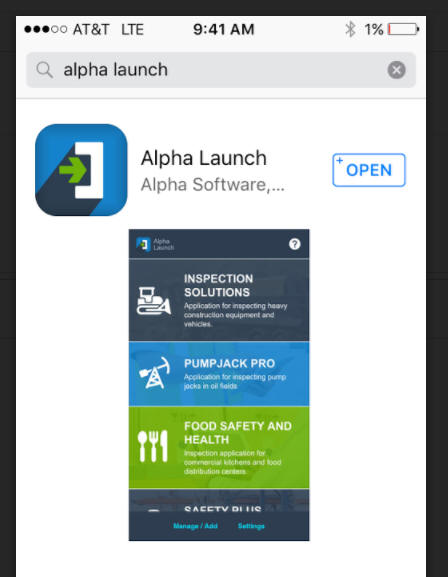
How to Run an App That Has Been Installed in AlphaLaunch
To run an App that was previously installed in AlphaLaunch,
simply launch the AlphaLaunch App on your device by clicking the
Launch icon.

Then scroll the list of installed Apps until you find the App
that you want and tap on the App name.
How to Install An App Into AlphaLaunch
To install a new App into AlphaLaunch, tap the Manage/Add button
in the footer of the AlphaLaunch App.

If there are any existing installed Apps a screen showing these
apps will be shown.
Note that for each installed App, the name of the server from
which the App was installed is shown. When an App is run, all Ajax
callbacks are made to the same server from which it was
originally installed.
 '
'
You can use this screen to reorder the installed Apps. You can
also use a 'press-hold' gesture on any of the Apps in the List to
bring up a screen that will allow you to uninstall an App or to
update the App.
Tap the Add button to bring up a list of the available Apps
on the server that AlphaLaunch is currently configured to use.
For each App that is listed, there is either an Install or
Reinstall button. The Install button will appear if the App is not
currently installed and the Reinstall button will appear if the App
has previously been installed. Reinstalling a previously installed
App is effectively updating the App to a newer version of the App.
How to Select the Active AlphaLaunch Server
When you click the Add button on the Manage App List screen, the
Apps that are available on the active AlphaLaunch server are shown.
You can change the active AlphaLaunch server by tapping the Settings
button at the AlphaLaunch home screen.
Then, tap on 'Server Web Address for Downloading Apps....
This will bring up the list of registered servers.
Tap on the server you want to select, then tap the Select button.
NOTE: The Active AlphaLaunch server only
controls the list of available Apps that you can install when you
press the Add button to install a new App. If an App (called 'App1'
for example) was installed from 'Server1' and then the active server
is changed to 'Server2', when App1 is running, it will make Ajax
callbacks to 'Server1', regardless of what server is currently
designated as the 'active' server.
How to Register a New AlphaLaunch Server
To register a new AlphaLaunch server, follow the instructions
(above) for selecting the Active AlphaLaunch server. On the Server
List screen (shown above), tap the Add button.
This will bring up the Edit Server Info screen where you can
either type in the server address or scan a special QR code that
encodes all of the necessary information.
How To Publish an App to AlphaLaunch
To publish Apps to AlphaLaunch open the Web Control Panel and
select the project that contains the Apps that you want to publish.
NOTE: An 'App' is a UX component. The UX
component can call child UX components, but these child UX
components should typically be configured as
Precomputed so that
they can load directly from the device (so as not to be dependent on
an Internet connection).
Before you publish Apps to AlphaLaunch you must first 'register'
the Apps you want to publish. Registering an App involves defining
how the App will appear when it is shown in the AlphaLaunch home
screen and how it will be described when a user displays the list of
available Apps that can be installed into Alpha Launch
Registering Apps To Be Published to AlphaLaunch
To register the Apps from a particular Web Project for
publication to AlphaLaunch, tap the More... button on the extreme
right of the Web Control Panel.
Then select the
AlphaLaunch, Publish Apps to AlphaLaunch... menu item.
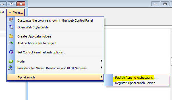
This will bring up the AlphaLaunch dialog where you can register
the Apps from the Web Project that you want to publish to
AlphaLaunch.
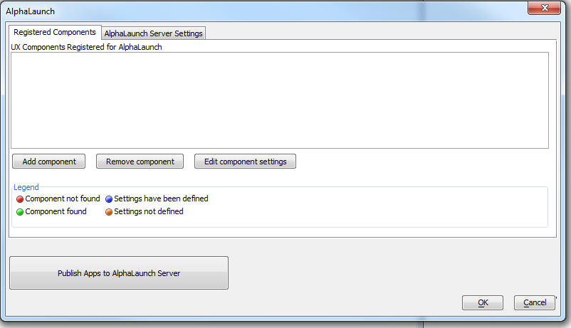
To register a new UX component, click the Add component button
and then select the UX component you want to publish.
The AlphaLaunch dialog will then show the component that you
selected and the orange icon will indicate that the settings for
this component have not yet been defined.
Either double click on the component name, or click the Edit
component settings button to open the AlphaLaunch Settings dialog
box.
The important properties on this dialog include:
- ID - the ID must be unique across all App that are
installed in AlphaLaunch. It is common to use a reverse URL
format for the ID (e.g. com.mydomain.myappname), but this is not
required. The ID will be used in future versions of AlphaLaunch
to allow one AlphaLaunch App to communicate with another
AlphaLaunch App.
- Name - the name of the App. This is the name that is
shown on the AlphaLaunch home screen and in the list of
available Apps that can be installed into AlphaLaunch when a
user adds a new App to AlphaLaunch.
- Description - the App description. This is the
description that is shown on the AlphaLaunch home screen and in
the list of available Apps that can be installed into
AlphaLaunch when a user adds a new App to AlphaLaunch.
- Version - this is the App version.
- Minimum size - this defines the minimum screen
resolution of the device that the App can be installed on. You
can leave this blank if you do not wish to set a minimum size.
- Maximum size - this defines the maximum screen
resolution of the device that the App can be installed on. You
can leave this blank if you do not wish to set a maximum size.
- Template - The template defines how an installed App
will appear on the AlphaLaunch home screen. By checking the
Advanced mode property, you have complete control over the
template. The template can include special placeholders (e.g.
{name} and {desc} ) to show the App name and description. If you
want to use a default template style, do not check the Advanced
mode property. You will then be able to select the App icon and
background color of the row for this App in the list of
installed Apps.
- Icon type - You can either use an SVG or bitmap as
the icon for the App. The icon is shown in the list of installed
Apps at the AlphaLaunch home screen.
-
Download location - If you leave this property blank, the
App files are download from a folder in the webroot of your
Alpha Anywhere server. However, you can download the App files
from another server if you wish. For example, you might want to
have AlphaLaunch download the App files from Amazon S3. In this
case you would enter the URL of the bucket on S3 where you have
placed the App files. For example:
http://mys3account.s3.amazonaws.com/app1. For more information
on why you might want to specify another server (such as S3) as
the download location see App Install Errors below.
You can preview how the App will appear in the AlphaLaunch home
screen by clicking on the Preview app template hyperlink at the
bottom of the screen. For example, here is a preview of a
template that is using a purple background color and an SVG icon.
Once you have registered all of the Apps in a Web Project that
you want to publish to AlphaLaunch you are now almost ready to
publish to AlphaLaunch.
But before you can publish you must first define a Publishing
Profile that indicates where the Apps will be published (i.e. the
Alpha Anywhere server and folder on that server where the Apps will
be published). To define a publishing profile, click the Profiles
button on the toolbar when the Web Project Control Panel has focus.
NOTE Each Web Project will typically be
published to its own AlphaLaunch server address. For example, you
may have 3 UX components in 'Web Project1' that you want to publish
to AlphaLaunch and (say) 2 UX components in 'Web Project2' that you
want to publish to AlphaLaunch. In both cases you may want to use
the same physical Alpha Anywhere server. The Publishing Profile that
you define for 'Web Project1' might specify that you want to publish
to a folder called 'webProject1', in which case the server address
for the 3 Apps in this group of Apps might be something like
'http://www.myAAserver/webProject1'. On the other hand, the
Publishing Profile you define for 'Web Project2' might specify that
you want to publish to a folder called 'webProject2', in which case
the server address for the 2 Apps in this group of Apps might be
something like 'http://www.myAAserver/webProject2'.
Once you have defined the publishing profile, click the Publish
Apps to AlphaLaunch Server button on the AlphaLaunch dialog.
This will bring up the Publish to AlphaLaunch dialog. You will
need to select the Publishing Profile to use and you will also need
to specify the Sever URL (i.e. the url of the location where the
Apps are being published).
Once you have published your Apps you will need to register the
server in AlphaLaunch. AlphaLaunch will contact the server to get a
list of the available Apps.
For instructions on how to register a server with AlphaLaunch,
see the section above titled How to Register a New AlphaLaunch
Server . To make it easy to register a new AlphaLaunch server
(i.e. to avoid having to type in a long server URL on a mobile
device keyboard), you will probably want to generate a QR code with
with server address. Check the 'Show a QR code...' property before
you click the OK button.
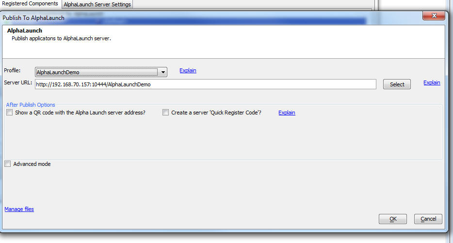
You can use Advanced mode when you want to republish to
AlphaLaunch after having made a change to the App settings (e.g. the
App template, description, version number, etc.), but not the App
itself. This will speed up the process of publishing the Apps
because it will avoid having to recreate the static fileset for each
App.
Adding an Exit Button to your App
When an App is run in AlphaLaunch you will typically want to add
an 'Exit' button to your App to go back to the AlphaLaunch home
screen. If you do not add an Exit button, then after the user
launches the App they will not be able to get back to the
AlphaLaunch home screen to launch a different App.
You can use Action Javascript to add an Exit button, or you can
code the Javascript for the button yourself.
To use Action Javascript, select the 'AlphaLaunch Actions' action
for the list of available Action Javascript actions.
To code the Javascript directly, use this code:
if(A5.shell) {A5.shell.exitComponent();};
The code tests if you are running in AlphaLaunch, then if you are
then it calls the
A5.shell.exitComponent() method.
Troubleshooting
The most common problem with AlphaLaunch is that after you have
published Apps to your AlphaLaunch server and you then go to
AlphaLaunch to install the Apps you just published, the Apps are not
listed on the Apps to Install screen. This cause of this problem is
either the Application Server has not been started, or the Server
Addrtess (i.e. URL) that was entered in the Publish to AlphaLaunch
dialog was incorrect.
You can test if you entered a valid server address by going to a
browser and entering the following URL into the browser
<server URL>/availableAppInfo.txt
For example, if your server URL was entered as:
http://192.168.70.157/AlphaLaunchDemo
You would enter this address into the browser address bar:
http://192.168.70.157/AlphaLaunchDemo/availableAppInfo.txt
If you do not receive a response, then it is likely that the
server URL that you specified is incorrect.
App Install Errors
If you are installing an App from a folder on an Alpha Anywhere
standard server (as opposed to the Alpha Anywhere Server for IIS),
you might get an install error if the App has a large number of
files. This is because the Alpha Anywhere server limits the number
of files that can be simultaneously served. The error will not occur
if you are using the Alpha Anywhere server for IIS. You can work
around this problem by copying the folder that contains your App
files to a bucket on Amazon S3 and then setting the
Download location
for the App to the URL of this S3 bucket.
AlphaLaunch Methods
A5.shell.exitComponent()
-- Exit the App that is running an return to the AlphaLaunch home
screen
A5.shell.getAppDir()
- Returns the file URL of the local directory with the App's
files
A5.shell.getAppFileStorageDir() - Returns the file URL of the
local directory where the Apps data files are stored (this is
separate from other Apps).
UX and Grid Component - Language Definitions - High Order
Characters - When you tag strings in a Grid or a UX with
language tags (<a5:r> ...</a5:r> you must then define how the tags
are resolved in each of the different supported languages.
Previously when entering high order characters, it was necessary to
HTML encode the character. Now you can just type in the characters
directly into the Language Definition dialog box.
UX Components - Pre-render - Working Preview - Internet
Explorer - jQuery - When you do a Working Preview of a UX
component and all of the following conditions are met:
- The UX is set to pre-render
- Working Preview is set to use Internet Explorer, not Chrome
- jQuery is set to load using the Internal version (set in the
Project Properties dialog)
then jQuery will not be loaded.
If you need to have jQuery loaded while you are in Working
Preview then you can either switch to Chrome for Working Preview, or
change where jQuery is loaded from.
If you cannot switch to Chrome for Working Preview, and you
cannot change the location from which jQuery is loaded, then you
will have to make an Ajax callback to load jQuery. For example, you
could use the following Xbasic function to handle the Ajax callback
that loads the internal version of jQuery.
function loadJQuery as c (e as p)
loadJQuery = __hidden__javascript__a5_jquery_core() +
crlf() + __hidden__javascript__a5_jquery_ui()
end function
Xbasic Function Libraries, Modules and Classes - Encrypt -
Password Protect - When you create Xbasic Function Libraries,
Modules or Classes in your Web Project you can now specify that the
files should be encrypted, or both encrypted and password protected.
In order to encrypt a file the first line of the file must be an
Xbasic comment (with no leading spaces):
'ENCRYPT
In order to both encrypt and password protect a file the first
line of the file must be an Xbasic comment (with no leading spaces)
of this form:
'PASSWORD:your_password
For example:
'PASSWORD:mysecretpassword
At run-time encrypted files are automatically decrypted.
If a file is password protected, then when you try to edit the
file from the Web Control Panel, you will be prompted to enter the
password. Once you have successfully supplied the file password you
will no longer be challenged for the password when you next edit the
file (until you exit from the Alpha Anywhere IDE).
.Net v4.6.2 - The Alpha Anywhere Installers now install
.Net V4.6.2 if it has not previously been installed. Previously, the
installers were installing v4.6.1
Bugs
UX Component - List Control - onSelect Event - Detail View -
If a List had a Detail View and the List was configured to Allow Null
Selection, when the List was rendered, the onSelect event would fire,
even though no row in the List was selected.
UX and Grid Component - Action Javascript - File Download -
International Characters - If the filename of the file to download
contained international characters, the download would fail.
UX Component - Action Javascript - SQLite Actions - Create Table
From Data Action - If the Create Table From Table action was
configured to get the data by making an Ajax callback, if the data
returned by the callback contained null values or values with double
quotes, the action would fail.
UX Component - Google Maps - The API for scaling bitmaps uses
as markers on a map was changed by Google. Support for the new API has
been added.
UX Component - List with Detail View - Sync Log - The sync log
feature was not working.
UX Component - List Controls - .dbf Tables - Mapped Table - If
a List control was based on .dbf tables and if any of the .dbf tables in
the databasource definition was a mapped table that included date
fields, an error was generated.
UX Components - jQuery - Pre-rendered - If a UX component was
set to pre-render and jQuery was specified to be loaded then in Live
mode, jQuery was not being loaded. In Working Preview, jQuery was loaded
(as long as you were using Chrome for Working Preview).
NOTE: For pre-rendered UX components that are set
to load the internal version of jQuery that are rendered in Working
Preview using Internet Explorer, jQuery is not loaded.
UX Component - PhoneGap - Action Javascript - Image Capture for
List Detail View Action - onImageCapture Event - The
onImageCapture event was not firing if the image was captured using
using PhoneGap
UX Component - PhoneGap - App Icons - The utility to create
app icons in the PhoneGap builder was failing. if you have not installed
your own copy of ImageMagick. This is now fixed.
Desktop Applications - Forms - MS Word Mailmerge - Was failing
if the merge data contained a double quote.
SQL Server Reporting Services - Fixed an issue with
multi-value input parameters.
UX Builder Crash - If all of the following conditions
were met, then when doing a Working Preview of a component, Alpha
Anywhere would crash
- the UX component was pre-rendered
- using Internet Explorer (not Chrome) for Working Preview
- in Web Project Properties, one or more linked Javascript files
were being loaded
Web Applications - Multi-file Upload - If you created your own
.a5w page to do file uploads, the
multiple attribute in
the <input> element was
not handled properly.
Consider the following .a5w page. Notice that the
<input> element uses the
multiple attribute.
Therefore, the control name must end in
[] to indicate that multiple instances of this variable must be
created (i.e. the variable must become an Xbasic array when the form is
processed).
<form action="fileupload.a5w" method="post"
enctype="multipart/form-data">
Select images:
<input type="file" id="files"
name="selectedfile[]" multiple>
<input type="submit">
</form>
When the files are uploaded, the above example specifies that an .a5w
page called fileupload.a5w
page will be called. Here is an example of how the
fileupload.a5w page might be defined:
<%a5
dim files as p
files = request.variables.selectedFile
'files will be an array. the number of items
in the array will match the number of files that were selected
'save each uploaded file to a folder
'ensure that the folder exists
dim folder as c
folder = "c:\uploads"
dir_create_recurse(folder)
dim count as n
'get a count of the number of files that were
uploaded
count = files.size()
dim i as n
'loop over each item in the files[] array
dim fn_i
for i = 1 to count
'construct the local
filename
fn_i = folder + chr(92) +
files[i].filename
'each file in the array
has a SaveToFile() method
'call this method to
persist the uploaded file to a local file
files[i].saveToFile(fn_i)
next i
'Note: Each item in the files[] array will
have these properties and methods:
'Properties:
'Name
'FileName
'ContentType
'CharacterSet
'Encoding
'Data - the data that was uploaded.
'NOTE: It is recommended that you do NOT reference the 'data' property
(especially for large files)
'as it causes the data to be read into memory.
'Size
'Methods
'SaveToFile - save the
uploaded data to a local file
'SaveToStorage - save the uploaded data to storage (e.g. S3,
Azure, Disk, etc.)
%>
Tips
Grid Component - Detail View - Disable Input Controls when Update
Not Allowed - In a Grid component if you have the Security Framework
enabled and the user does not have permission to update data, the input
controls are still enabled even though the user will not be able to save
any edits.
It might be desirable to disable input controls when the user does
not have update permission.
Here is how this can be done:
First, define the following Javascript function in the component's
Javascript Functions property:
function enableControl(alias) {
var obj = window[alias + '_GridObj'];
var val = obj._editPermissions.allowUpdate;
return val;
}
Next, add the following expression for the client-side Enable
expression for each of the Detail View input controls:
enableControl('{grid.componentName}')
NOTE The enableControl()
function takes the Grid alias as an input parameter. This
allows the Grid object to be dynamically computed. If the
enableControl() function had used:
{grid.object}._editPermissions
Then you would run into trouble if you had multiple Grids that
defined the function because the last Grid that was displayed would
overwrite the previously defined global function and the {grid.object}
placeholder would resolve to the last Grid displayed.
Web2Cal Calendar Control - Adding Server Side Event Handlers To
Respond to Event Changes -
When using the Web2Cal calendar control you
might want to execute server-side code for the following events:
- an event is added
- an event is edited
- an event is moved
- an event is deleted
There are no built-in hooks for these events, but you can easily define you
own.
For the event added, edited,
or deleted cases, you can add event handlers as follows:
- Edit the UX component used to edit events and add the functions shown
below to the Xbasic function declarations
function onEventDelete as v (e as p)
end function
function onEventUpdate as v (e as p)
end function
function onEventAdd as v (e as p)
end function
- Edit the UX component used to edit events and modify the server-side
afterDialogValidate event to add calls to the
onEventUpdate and onEventAdd functions. See
below.
- Edit the UX component used to edit events and modify the
deleteEventXbasic Xbasic function by adding the following at the end
of the function: onEventDelete(e)
How to Update the afterDialogValidate Event Handler Function
Make the changes shown in red to the
afterDialogValidate event.
'update the event on the calendar
dim javascriptUpdateCalendar as c
dim po as p
if pv.eventsMode = "EditEvent" then
po.eventId = convert_type(e.dataSubmitted.eventId,"N")
onEventUpdate(e)
else
po.eventId = eventId
e.eventId = po.eventId
onEventAdd(e)
end if
To handle the event is moved case, edit the
Web2Cal component and add this code to the
onComponentExecute server-side event:
if eval_valid("request.variables._XbasicFunction") then
	if request.variables._XbasicFunction = "updateEvents" then
		'event was moved -- event data is in request.variables._calEvent_eventId, etc.
	end if
end if
Alpha Anywhere V4.4.3 - Build 4254-4863 04-Apr-2017
Features
Xbasic - a5_json_to_excel() Function - Export JSON Data to
Excel - Exports data in a JSON document to an Excel file. If the
JSON document is an object with multiple arrays, each array is
exported as a separate sheet in the Excel file.
If the JSON document is an array, the Excel file will have a
single sheet called 'Table1'
Syntax:
L flag = a5_json_to_excel(c Json, c filename)
Where
- flag = .t. or .f. - indicates if the Excel file was
created
- json - the JSON data to export to Excel
- filename - the filename of the Excel file (must have
a .xlsx extension)
For example, if the JSON document shown below was exported to
Excel, the Excel file would have two sheets ('customers' and 'phoneNumbers').
Each sheet would have the data in the corresponding array in the
JSON data.
			{
	"customers" : [
		{"id": "1", "firstname" : "Fred", "lastname": "Jones"},
		{"id": "2", "firstname" : "Mary", "lastname": "Nickerson"}
	],

	"phoneNumbers" : [
		{"id": "1", "type" : "Home", "number" : "555-555-1234"},
		{"id": "1", "type" : "Office", "number" : "555-555-1235"},
		{"id": "2", "type" : "Home", "number" : "555-555-1236"},
		{"id": "2", "type" : "Office", "number" : "555-555-1237"},
		{"id": "2", "type" : "Vacation", "number" : "555-555-1238"}
	]
}
TabbedUI - onLogin Server-side Event - This event can now
set data values that will be available when the client-side
afterLogin event
fires.
For example, you could add this code in the server-side
onLogin event:
e.eventDataObject = "{userName: '"+e.userName+"',
var2: 'some other value', timeOfLogin: '"+js_escape("" + now())+"'}"
In the client-side
afterLogin event you can refer to any value in the
eventDataObject.
For example:
alert('Welcome: ' +
e.eventDataObject.userName );
Reports - Free-form Reports - Vertical Lines - Growable -
You can now set the Growable property on vertical lines in a report.
When this property is set, the vertical line will grow to the full
height of the report section it is in.
For example, in the report shown below, the vertical line extends
the full height of each record in the Detail Section without any
gaps between the lines.
Bugs
Application Server for IIS - Password Expiration - When
publishing an application to IIS, if the application has a password
expiration set, the expiration time will not be set correctly and can
lead to users getting password has expired messages.
UX Component - List Control - Detail View - Parent-Child Lists -
New Records - If you entered a new record in a child List and then
synchronized the data, if focus was on the new child record at the time
the sync command was executed, focus did not remain on this record when
the sync completed.
Reports - SQL Data Sources - Null Values - Fixed an issue with
character
fields that had null values.
Reports - SQL Data Sources - Long Text - Fixed an issue with
long text fields not printing all of the data in the field under some
circumstances.
Alpha Anywhere V4.4.1 - Build 4246-4859 31-Mar-2017
Videos
|
UX Component - List Control |
Showing Content in Row When Row Is Selected |
A common use case with the List is to only show
certain content in each List row when the row is
selected. This is easily done using CSS.
In this video we show how this is achieved.
Watch Video
Download Component
Date added: 2017-03-26 |
|
|
|
|
Features
Alpha Anywhere Application Server - TLS Protocol - The
Alpha Anywhere Application Server now allows the server
administrator to specify the minimum TLS protocol version supported.
While SSL v2 and SSL v3 had been fully removed from the Alpha
Anywhere Application Server some time ago, it has not been possible
to fully disable older TLS versions until now. This setting allows
TLS 1.0 and TLS 1.1 to easily be completely turned off, if desired.
TLS 1.2 is the most recent protocol and generally considered to be
the most secure. Setting the minimum TLS version to 1.2 will disable
TLS 1.0 and TLS 1.1 and provide what is currently considered the
highest level of security. Note however that not all older web
browsers or operating systems support TLS 1.2. Site administrators
should evaluate the needs of their users before modifying this
setting.
This setting defaults to TLS 1.0, in order to prevent unexpected
client connectivity issues.
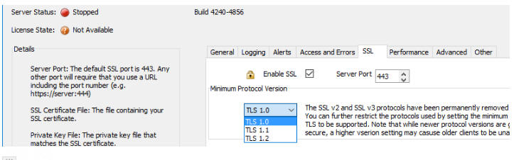
Bugs
Reports - SQL Reports - Null Numeric Values - Null numeric
values were being displayed as 0 and not blanks in reports. This bug was
introduced in v4.4.0.
Xbasic - AlphaDAO - SQL Server - In certain cases, when
listing tables in a SQL Server database, the 'dbo' schema prefix was
added to all of the tables that were listed. This was not necessary and
now when tables are listed, the 'dbo' schema prefix is not shown in the
list of tables.
UX Builder - Duplicate Control - A bug was introduced in the
Duplicate Control command in V4.4.0.
Application Server - Server Settings Dialog - Dialog Height -
The OK and Cancel buttons were not visible on machines with less than
800 pixels vertical resolution. This issue was caused because the new
Administrative Alerts feature (introduced in V4.4.0) caused the dialog
height to increase in size. The Alerts properties have now been moved to
their own tab in the dialog.
Alpha Anywhere V4.4.0 - Build 4238-4856 28-Mar-2017
Videos
|
UX Component |
Alignment Container |
The Alignment Container makes it easy to Left,
Center or Right align a series of control on a
UX.
Watch Video
Date added: 2017-02-02 |
|
Xbasic |
Using Xbasic Classes in Server-side code |
You can define Xbasic classes in your project
and then use those classes in any server-side
Xbasic code.
In this video we show how an Xbasic class
definition can be added to a web project and
then used in the server-side code that executes
when an Ajax callback is made.
Watch Video
Download Components
Date added: 2017-02-11 |
|
UX Component - Map Control |
Adding Multiple Markers to a Map Control using
Client-side Data |
Action Javascript has an action to add multiple
markers to a map. The data that defines the
latitude/longitude for each marker on the map
(and also for the marker titles, details etc).
can either come from server-side data, or from
client-side data.
In the case of server-side data you specify the
name of a Data Series that specifies the
properties for each marker.
In this video we show how to configure the
Action Javascript 'Add multiple markers to a
map' action to use client-side data. This
client-side data can come from a Javascript
function, a List control, the client-side Data
Cache, or, in the case of a PhoneGap
application, by querying a SQLite database on a
device.
Watch Video - Part 1
Watch Video - Part
2
Watch Video - Part
3
Watch Video - Part
4
Watch Video - Part
5
Download Component
Date added: 2017-02-12 |
|
UX Component - FormView Control |
Lookup Fields |
When you create a FormView control, you might
want to display 'friendly' values for some of
the fields in the form. For example, you might
want to display the Product Name, rather than
the Product Id.
In this video we show how you specify a lookup
for any field in the Form View control.
Watch Video
Download Components
Date added: 2017-02-14 |
|
UX Component - PhoneGap |
Using the CLI (Command Line Interface) to Build
PhoneGap Applications instead of PhoneGap Build |
When you build a PhoneGap application from a UX
component that you have built, the easiest
approach is to use the Adobe PhoneGap Build
service. Direct integration with PhoneGap Build
is built into the Alpha Anywhere IDE. While the
advantages of using PhoneGap Build are clear -
no software to install on your PC, and ability
to build apps for iOS on your Windows machine -
there are also disadvantages. These include
having to wait an uncertain amount of time
before PhoneGap Build finishes the build (wait
time depends on how busy the service is) and
inability to use certain plugins not supported
by PhoneGap Build.
Another way in which PhoneGap applications can
be built is by using the PhoneGap CLI (Command
Line Interface). When you use the CLI, you are
not restricted to only the plugins supported by
PhoneGap build. The disadvantage of the CLI
approach is that you will first have to install
the CLI tools and platform SDKs on your machine.
You will also need a Mac to build for iOS.
In this video we give an overview of using the
CLI.
Watch Video
See documentation
Date added: 2017-02-18 |
|
UX Component |
Using 3rd Party jQuery Libraries in Control
Javascript |
The UX Builder allows you to define 'Control
Javascript' which allows you to easily configure
a UX control to use a jQuery controls (such as a
date or time picker). However, in the case where
the jQuery control is defined in a linked file,
you can run into timing issues that result
because the control javascript is executed
before the linked jQuery file has loaded.
This video describes how you can resolve these
timing issues.
Addendum: In the video we show that the control
javascript function is created using the syntax:
var
clockpicker = function()
This should be changed to
window.clockpicker = function()
Watch Video
Date added: 2017-02-19 |
|
TabbedUI |
Adding a Search Feature to the TabbedUI |
It is not uncommon for developers to create
TabbedUI components with a very large number of
items. Users may then struggle to find a
particular item in the list of available menu
items. Adding a search feature to the TabbedUI
component makes it very easy for users to find
the menu item they want.
In this video we show how the search feature is
added to the TabbedUI component.
Watch Video
Date added: 2017-02-24 |
|
Reports |
Using SQL Server Reporting Services Reports in
an Alpha Anywhere Project |
Many organizations who use SQL Server also use
SQL Server Reporting Services (SSRS). Using
reports created in SSRS in an Alpha Anywhere
project is possible.
In this video we show how reports defined in
SSRS can be used in Alpha Anywhere applications.
Watch Video - Part 1
Watch Video - Part
2
Watch Video - Part
3
Date added: 2017-02-25 |
|
Node |
Calling a Node Service that Returns Binary Data |
When you call a Node service from Xbasic, the
service can return both text and binary data.
In this video we show how a Node Service can
return binary data.
Watch Video
Date added: 2017-02-28 |
|
UX Component |
Running Asynchronous Functions Synchronously |
Many Javascript functions in an application are
asynchronous. For example, functions that make
Ajax callbacks are asynchronous and many
PhoneGap functions are also asynchronous. Often
you will want to call several asynchronous
functions, but you want to execute the functions
synchronously. For example, you do not want to
call the second function until the first
function has completed.
Javascript Promises are typically used to run
asynchronous code synchronously. But Promises
can be hard to understand and it can be tricky
to restructure your code to use Promises. The
Alpha Anywhere Javascript library has a function
called A5.runChain() that provide an easy way to
run asynchronous functions synchronously. Also,
minimal changes need be made to your function
definitions to make them suitable for use with
the A5.runChain() function.
In this video we show how the A5.runChain()
function is used.
Watch Video - Part 1
Watch Video - Part
2
Date added: 2017-03-04 |
|
UX Component |
Semi-circular Number Display Control |
The semi-circular number display control
displays the value of a number on a
semi-circular chart. It is ideal for dashboard
type applications.
This video shows how you can add a semi-circular
number display control to a UX component and how
you can configure the component.
Watch Video - Part 1
Watch Video - Part
2
Download Component
Date added: 2017-03-04 |
|
UX and Grid Component |
Code Glossary |
The code glossary is a great timesaver when
editing Xbasic and Javascript code.
In this video we show how to use the code
glossary in the editors.
Watch Video
Date added: 2017-03-17 |
|
UX Component - Javascript Charts |
Introduction |
Javascript Charts allow you to create a variety
of different chart types using Javascript.
Because the charts are created client-side,
using Javascript, these types of charts are
ideal for disconnected applications where the
Chart control cannot be used (as this control
type produces charts server-side).
In this video we show how to set up a basic
Javascript Charts.
Watch Video
Date added: 2017-03-26 |
|
UX Component - Javascript Charts |
Binding Chart Data to a Javascript Function |
The data shown in a Javascript Chart can be
obtained by calling a Javascript function.
in this video show show how to bind the Chart
data to a Javascript function.
Watch Video
Download Component
Date added: 2017-03-26 |
|
UX Component - Javascript Charts |
Binding Chart Data to Data From a SQL Database -
Using a Data Series for Chart Data |
The data shown in a Javascript Chart can be
obtained by querying a SQL database.
In this video show show how to bind the Chart
data to data from a SQL database table by
binding the Chart data to the data in a Data
Series. The Data Series is populated with data
from a SQL database table.
Watch Video
Date added: 2017-03-26 |
|
UX Component - Javascript Charts |
Binding Chart Properties to a Javascript
Function |
Any property of a chart can be made dynamic by
binding the property to the result of a
Javascript function.
In this video we show how properties of the
Chart (in addition to the Chart data) can
be made dynamic.
Watch Video
Download Component
Date added: 2017-03-26 |
|
UX Component - Javascript Charts |
Action Scripting Methods for Working With
Javascript Charts |
Action Scripting exposes several methods for
working with Javascript Charts.
In this video we show how you can use Action
Scripting to resize a Javascript Chart.
Watch Video
Download Component
Date added: 2017-03-26 |
|
UX Component - Javascript Charts |
Action Scripting - Setting a Chart Property
Using Action Scripting vs. Binding a Chart
Property to a Javascript Function |
Action Scripting allows you to dynamically
change properties (such as the Chart colors, or
title) after the Chart has been rendered.
However, you can also achieve the same result by
binding the Chart properties to Javascript
functions.
In this video we contrast the two methods for
setting Chart properties.
Watch Video
- Part 1
Watch Video
- Part 2
Download Component
Date added: 2017-03-26 |
|
UX Component - Javascript Charts |
Using Action Scripting to Refresh Chart Data |
Action Scripting allows you to refresh the data
shown in a Chart. If the Chart data is based on
a Data Series, an Ajax callback to the server
will be made to refresh the data in the Data
Series on which the Chart depends and then the
Chart will be redrawn, showing the new data.
In this video we show how Action Scripting is
used to refresh the Chart data.
Watch Video
Date added: 2017-03-26 |
|
UX Component - Javascript Charts |
In Depth Example - Chart Based on SQL Data |
This example shows a pie chart whose data is
obtained from a multi-table SQL query against
the sample Northwind database. The Chart is
based on a custom Data Series to generate the
Chart data. The user can select the country for
which the Chart should be shown from a
dropdownbox control.
In this video we show how this Chart is set up.
Watch Video
- Part 1
Watch Video
- Part 2
Watch Video
- Part 3
Download Component
Date added: 2017-03-26 |
|
UX Component - Javascript Charts |
Understanding the Structure of the Javascript
that Defines a Javascript Chart |
The Javascript used to define a Javascript Chart
has a well defined structure, described in this
video.
Watch Video
Date added: 2017-03-26 |
|
UX Component - Javascript Charts |
Javascript Chart Events |
In this example we show a Chart with a Tooltip
event. After the Chart is resized, the Tooltip
events must be re-registered.
Watch Video
Download Component
Date added: 2017-03-26 |
|
|
|
|
Features
UX Component - Copy/Paste Controls - The UI for copying
and pasting controls has been simplified.
Grid, UX and TabbedUI Builder - Collapse/Expand Property Grid
Categories - You can now quickly collapse or expand all
categories in the Property Sheets. This can make it easier to find a
property without having to open the Properties search dialog.
PhoneGap App Builder - Icons and Splash Screens - The way in which icons and splash screens (iOS calls them launch images) has been completely rebuilt and a new option
has been added to the Application Master Image Resources category that allows
you to generate a series of 9-patch splash screen images
for Android devices (iOS does not support 9-patch images without additional libraries).
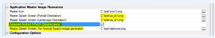
VERY IMPORTANT: It is very important that you create a new PhoneGap Project when generating custom icons and splash screens for your app because the PhoneGap app
config.xml file has been changed to support new functionality.
When you supply a single image that needs to be resized for the numerous aspect ratios required by all of the
different types of mobile devices, the aspect ratio will typically change and the resulting image will be out of proportion. The new resizing code uses a center weighting technique to clip the image
without any change to the image aspect ratio. This technique is used for the generation of all of the splash screens and you need to be aware of that when you supply the images for the portrait or landscape
orientations.
Recommended Image Sizes
For portrait splash screens, the recommended size is 1536px x 2048px.
For landscape splash screens, tre recommended size is 2048px x 1536px.
You can also specify a square image (suggested size is 2732px x 2732px) for both orientations and the resulting images will not be
distorted.
Android 9-patch images
A 9-patch image is a standard png file that has been divided into a
matrix of 3 x 3 rectangles (like a tic-tac-toe board). Each region in the matrix has specific stretch properties that allow the image to
be resized without altering the aspect ratio of the center weighted rectangles. As such, 9-patch images can be stretched to fit the different screen sizes without clipping or distortion.
You need to supply a square image that will be used for both portrait and landscape modes and the graphics need to be center weighted. The recommended size is 2732px x 2732px.
For more info on 9-patch splash screen images see:
Cordova Splashscreen Plugin Documentation
NOTE: iOS Storyboard Launch Images - If you open and inspect the new
config.xml file you will see support for iOS storyboard launch images (which act much like Android's 9-patch images). While the
support is included in the image builder module, it hasn't been exposed because the current version of PhoneGap Build does not support it. As soon as PhoneGap Build supports the inclusion of iOS
storyboard images, we will expose iOS storyboard support within the PhoneGap App Builder.
PhoneGap App Builder - Use ImageMagick Option - This option has been removed
as all icons and splash screens are now generated using ImageMagick.
UX Component - List Control - deselectAll() Method - A new
method has been added to the List control to un-select all selected
rows in a List.
Contrast this method with the low level
._deselectAll()
method which also un-selects any selected rows in a List, but does
not perform any action on child Lists or the associated Detail View
that the List may have..
The .deselectAll()
method wraps the ._deselectAll()
method, but in addition to un-selecting rows in the List, if the
List has child Lists with pre-fetched data, the selected rows in all
child Lists are also un-selected, and the Detail View for the List
(and the Detail View for any child Lists with pre-fetched data) is
disabled (if the 'No record
in List selected' property for the top-most parent List is
set to 'Disable Detail View').
For example:
var lObj = {dialog.object}.getControl('CUSTOMERLIST');
lObj.deselectAll();
UX Component - Data Series - Publish to Client-side - You
can now specify that the data in Data Series should be published to
the client-side so that it can be used in your Javascript code.
You define Date Series either by clicking on the smart
field for the Data Series property (on the UX Builder Properties
pane) , or by click on the Menu button.
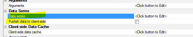
Your Javascript code can reference the data in a Data Series
using the following syntax:
{dialog.object}._dataSeriesData.SeriesName.SubSeriesName
If the Data Series has no sub-series, then syntax for referencing
the Data Series is:
{dialog.object}._dataSeriesData.SeriesName
Understanding Data Series
A Data Series is a series of values. Say you have a SQL query
that returns the data shown in the table below.
Each column in the table is a series of data. For example, the
data series in the pink
Firstname column is
Fred, John and Sally.
|
Firstname |
Lastname |
Age |
|
Fred |
Smith |
23 |
|
John |
Jones |
35 |
|
Sally |
Harrison |
29 |
The name of the Data Series represented by the pink column in the
above table is:
Names.Firstname
(where 'Names' is
the arbitrary name given to the data table)
A common use case for Data Series is in charting applications.
Both the Chart and Javascript Chart control in the UX component
consume data series for the data shown in the charts.
Action Javascript
There is a new action in Action Javascript to perform actions on
Data Series. The Data
Series Actions action allows you to:
- Refresh DataSeries - refresh the data in one or more
Data Series. The action is only meaningful if you specified that
your Data Series data should be published to the client-side. An
Ajax callback is made and the SQL query or custom Xbasic code
that gets the data for the Data Series is executed. The new
data is then published to the client-side
- Read DataSeries - gets the data in a Data Series and
assigns it to a Javascript variable.
UX Component - Javascript Charts - A new option for
generating charts in the UX component is now available. Javascript
Charts generate charts using client-side data. Because Javascript
Charts are generated using Javascript with client-side data, they
are ideal for disconnected mobile applications.
NOTE: Javascript charts are based on the open
source RGraph charting library. Only the SVG charts in this library
are built into Alpha Anywhere. If you want to use any of the Canvas
charts in this library, you can, but you will need to write the
Javascript yourself. For more information go to
http://www.rgraph.net.
Contrasting Javascript Charts with the Chart Control
The Chart controls is a server-side
control. The chart is rendered as a bitmap on the server and then
the client-displays the bitmap image. Because the
Chart control is a
server-side control, it is not suited for disconnected
applications. Also, since the
Chart control is a server-side
control, it will be slower than
Javascript Charts.
To add a Javascript Chart to a UX component, select the
[Javascript Chart] control in the
Other controls
section of the UX toolbox.
NOTE: Tthe
Chart control (i.e. the
server-side charting control) is available in the
Data Controls
section of the UX toolbox.
After you add a Javascript Chart to your UX, you can then edit the
Javascript Chart properties by clicking the smart field for the
Chart properties
property.
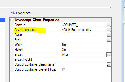
This will open the Javascript Chart builder, as shown
below.
The top half of the screen is where you enter the Javascript code
that generates the chart and the bottom half of the screen allows you
to get a quick preview of the Chart.
In most cases you will get a quick start by selecting one of the
Sample Charts. This will enter the Javascript for the selected chart
and you can then tweak the Javascript to get the chart appearance
that you want. You will likely also want to base the chart on real data, not the
sample data shown in the sample chart.
To select a sample chart, click the
Select Sample Chart
button. This will open up a dialog showing the available sample
charts:
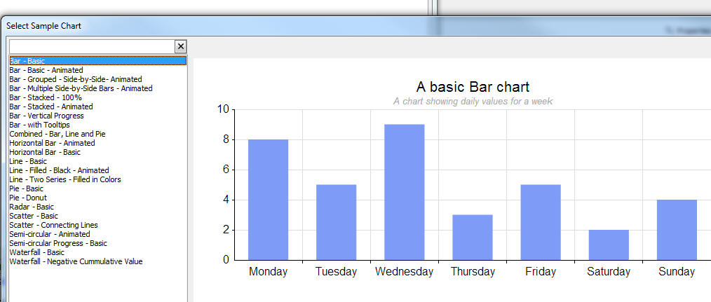
Select the sample chart that you want. It will then fill in the
Javascript for that chart into the builder. For example:
The Javascript shown in the window is the Javascript used by the
RGraph charting library to render the Javascript chart.
Understanding the Pattern Used for the Chart Javascript
All of the sample charts insert Javascript that follows the same
pattern.
var _settings = function() {
//function that returns an RGraph settings object
}
var _chart = new RGraph.SVG.Bar(_settings()).draw()
{dialog.object}._jsCharts['{chartName}'] = {};
{dialog.object}._jsCharts['{chartName}'].settings = [_settings];
{dialog.object}._jsCharts['{chartName}'].object = [_chart];
Depending the RGraph chart type (e.g. Pie, Line, Bar, etc.), the
appropriate RGraph function is called to render the chart.
A settings object is passed to the RGraph function. This settings
object is created by calling the
_settings()
function.
NOTE: You do not need to include the RGraph
charting Javascript libraries yourself in your UX component. The
libraries are automatically loaded by Alpha Anywhere.
The Chart settings are stored in the
_jsCharts object in
the UX component object. These settings are stored to enable the
chart to be refreshed with new data, to be changed on the fly by
changing any of the chart properties, or to be dynamically resized.
Notice that the settings
object and the object
object are arrays. This is because a chart can actually be composed
of multiple charts each drawn on the same DIV.
The Javascript for the chart uses two special placeholders:
- {chartDiv} - The id of the div where the chart will
be rendered.
- {chartName} - The name of the chart. This resolves to
the Chart Id shown in the Javascript Chart property sheet.
Using Real Data in a Chart
When you select a Sample Chart, the Javascript that is inserted
into the Javascript window in the Javascript Chart builder uses
static data. This is fine initially when you are designing a chart,
but at some point you will want to replace the static sample data
with 'real' data.
The source of this 'real' data must be client-side data. For
example, it might be data from a column in a List control. You will
need to create a Javascript function that gets the data from the
List and then set the data
property in the Chart settings to the this function.
In many cases the 'real' data will be data that you want to get
by querying a database, calling a service (REST, SOAP, etc.), or
running some custom server-side code. In the case where the data you
want to use in your chart originates on the server, you will need to
define a Data Series that retrieves the necessary data.
(When you define the Data
Series you will need to specify that the
Data Series data should be 'published' to the
client-side.)
For example, here are the settings for a simple bar chart that
uses static sample data:
var _settings = function() {
   var settings = {
      id: '{chartDiv}',
      data: [8,5,9,3,5,2,4],
      options: {
          gutterTop: 50,
          hmargin: 20,
          xaxisLabels: ['Monday','Tuesday','Wednesday','Thursday','Friday','Saturday','Sunday'],
          tooltips: ['Monday','Tuesday','Wednesday','Thursday','Friday','Saturday','Sunday'],
          title: 'A basic Bar chart',
          titleSubtitle: 'A chart showing daily values for a week',
          titleSubtitleItalic: true,
          colors: ['#7e9cf6'],
          shadow: true,
          shadowOpacity: 0.2,
          attribution: false
       }
   };
   return settings;
}
var _chart = new RGraph.SVG.Bar(_settings()).draw();
Notice that the chart data is defined by the
data property in the
settings object.
Say we have a Javascript function that returns an array of values
and we want to use the data returned by this function in the Chart.
For example, the function that return an array of values could be
defined as follows:
function getData() {
return [1,2,3,4,5,6,7];
}
To base the Javascript Chart on the data returned by this
function, we simply change the data property in the Chart settings to:
....
id: '{chartDiv}',
data: getData(),
options: {....
In the case where the data comes from a column in a List control,
the Javascript function that gets the data would be something like
this (assuming that the column in the List that contains the data is
called 'Sales'):
function getData() {
var lObj = {dialog.object}.getControl('myList');
var _d = lObj._data //get list
data
var _a = []; //make empty array
for(var i = 0; i < _d.length; i++)
{
_a.push(_d[i].Sales); //push data from the 'Sales' column onto the
array
};
return _a;
}
If the data you want to use in your chart originates server-side,
then you will need to create a
Data Series. Assume
you have created a Data Series called
Sales, with two
sub-series, Amount
and Month.
The data in the Sales
Data Series might look something like this:
|
Month |
Amount |
|
Jan |
200 |
|
Feb |
220 |
|
Mar |
190 |
|
Apr |
250 |
|
May |
270 |
|
Jun |
210 |
|
Jul |
300 |
|
Aug |
320 |
|
Sep |
290 |
|
Oct |
330 |
|
Nov |
300 |
|
Dec |
350 |
You can reference data from
Amount column in the
above Data Series using this syntax:
{dialog.object}._dataSeriesData.Sales.Amount
Using this syntax, you could change the
settings object for
the example bar chart to:
var _settings = function() {
   var settings = {
      id: '{chartDiv}',
      data: {dialog.object}._dataSeriesData.Sales.Amount,
      options: {
          gutterTop: 50,
          hmargin: 20,
          xaxisLabels: {dialog.object}._dataSeriesData.Sales.Month,
          tooltips: {dialog.object}._dataSeriesData.Sales.Month,
          title: 'A basic Bar chart',
          titleSubtitle: 'A chart showing sales by month',
          titleSubtitleItalic: true,
          colors: ['#7e9cf6'],
          shadow: true,
          shadowOpacity: 0.2,
          attribution: false
       }
   };
   return settings;
}
var _chart = new RGraph.SVG.Bar(_settings()).draw();
Notice that the chart data, X axis labels and tooltips are all
based on Data Series data.
Any Property in the Chart Can Be Dynamic
In the above examples we have set the Chart's
data property to the
result of a Javascript function call (first example), or to the
value in a Data Series (second example). However, it is not just the
Chart's data
property that can be dynamic. Any property in the Chart settings can
be set to a Javascript function, or Data Series value.
For example, in the above example, the Chart Title is defined
using this settings:
titleSubtitle: 'A chart showing sales by month'
This could be changed to:
titleSubtitle: getChartTitle()
Working in the Javascript Chart Builder
When you are working in the Javascript Chart builder, the dialog
has these buttons and hyperlinks.
The purpose of each of these buttons or hyperlinks is:
- Select Sample Chart - opens a window showing sample
charts. You can select a chart and the Javascript for the
selected chart will be entered into the builder
- Preview Chart - Previews the chart in the bottom half
of the window.
- Define Chart CSS - In some cases your Chart settings
will use CSS classes for some aspect of the Chart (for example,
formatting tooltips). You can define the CSS classes here.
- Color - Allows you to insert the value of a color
into the Javascript code. If you highlight an existing color in
the Javascript code before you click on the Color hyperlink, the
highlighted color will be shown in the color picker. The color
you select will be inserted into the Chart Javascript.
- Property name - The Javascript shown in the code
window after you select a Sample Chart typically only sets a
small number of the available properties for the Chart. If you
click the hyperlink you get a list of some of the other
available properties. Note: This list may include properties
that are not appropriate for the type of chart you are
designing. To read documentation about the available properties,
please refer to the RGraph web site. (http://RGraph.net)
- Validate Javascript - the code you enter into the
Code window in the Javascript Chart builder is Javascript. It
must, of course, be valid Javascript. This hyperlink lets you
validate the Javascript so you can check that you have not made
any syntax errors when editing the sample code.
- Select Data Series - If you want to set the value of
any property in the Chart Settings to data in a
Data Series you
can click this hyperlink to insert the Javascript to reference a
Data Series.
When you click the hyperlink, a window showing all of the
available Data Series
will be shown. You can define new
Data Series in
this window. When you select a
Data Series (and
sub-series if the selected
Data Series has
sub-series) the appropriate Javascript is entered into the code.
Setting a Chart's Background Color or Border
In some cases, you will want to set the background color or
border of a chart. For example, the Chart shown below has a black
background.
You can set the Chart background color and border using the
Javascript Chart's Style
property.
Setting Javascript Chart Size to 100%
You can set the Javascript Chart width to 100% (useful when the
Chart is shown in a Panel Card). However, setting the Chart's height
to 100% is not supported. You must specify an explicit height for
the Chart. Also, unlike many other UX controls, Javascript Charts do
not have a Fill Container
property.
NOTE: If you set the Javascript Chart width
to 100% and the Javascript Chart is contained inside a Panel Card,
the Javascript Chart will automatically be resized when the device
orientation is changed.
Action Javascript Javascript Chart Actions
The Javascript Chart
Action in Action Javascript allows you to:
- Refresh Data in Chart(s) - Allows you to refresh the
data in one or more Charts. If any of the selected Charts have
any properties that are set to a Data Series, this action makes
an Ajax callback to the server and refreshes the data in all of
the referenced Data Series.
- Resize a Chart - Resizes a chart. You can specify a
new height and width for the Chart using CSS syntax. e.g.
'500px'. You can use percentages for the width property, but not
the height property. When the Chart is redrawn at its new size,
by default, it will use the same draw method that was defined in
the Chart settings. For example if the Chart is set to use
animation when it is rendered, the Chart's 'draw method' will be
'grow' (or one of the other animation methods supported by
RGraph). You might want the Chart to render at its new size
without using animation. You can override the default draw
method and specify an explicit draw method. For example, if the
Chart was defined to use the 'grow' method, you can specify
'draw' to redraw the Chart without using animation.
- Redraw a chart - Redraws a Chart. Like the Resize
a Chart action, you can override the default 'draw method'
when the Chart is redrawn. Typically used when one or more
properties in the Chart settings are based on Javascript
functions to re-render the Chart with new settings values
returned by the Javascript functions.
- Set Chart Properties - Allows you to explicitly set
any of the Chart's properties and then redraw the Chart. Like
the Resize a Chart action, you can override the default
'draw method' when the Chart is redrawn after its properties
have been set.
Methods
The following methods are available for working with Javascript
charts:
{dialog.Object}.jsChartResize(UXJavascriptChart,width,height[,redrawMethod[,methodParameter]])
Resizes a Javascript chart. You can optionally pass in a draw
method to redraw the chart without animation, or with a specified
animation option.
Where:
- UXJavascriptChart - name (i.e. Chart id) of the
Javascript chart you want to resize.
- width - new width of the chart. Use CSS syntax. e.g.
'500px'
- height - new height of the chart. Use CSS syntax.
e.g. '500px'
- redrawMethod - you can override the default 'draw'
method specified when the chart was defined. For example, if the
chart was originally defined to use the 'grow' method (so that
the chart is animated when it is drawn), you can override this
and specify the 'draw' method (so that the chart is redrawn at
its new size without animation.
- methodParameter - if you specify an explicit redrawMethod,
if the method that is specified takes a parameter, you can use
this argument to supply the parameter. For example, the 'grow'
method can take this parameter:
{frames: 100}
{dialog.Object}.jsChartSetProperties(UXJavascriptChart,
properties [,drawMethod [,methodParameters]])
Resizes a Javascript chart. You can optionally pass in a draw
method to redraw the chart without animation, or with a specified
animation option.
Where:
-
UXJavascriptChart - name of the Javascript Chart (i.e.
Chart id)
-
properties - an object with values for the properties you
want to set. If the Chart is made up of multiple sub-charts,
then you must pass in an array of property objects. For example,
say that a Chart is comprised of a Bar Chart and a Pie Chart
superimposed on the Bar Chart in the top left hand corner and
you want to set the colors of the bars in the Bar Chart and the
pie slices in the Pie Chart. Since the Chart is comprised of two
sub-charts, you must pass in an array of properties. For
example: [ {colors:
['blue']}, {colors: ['blue','red','green'}] .
-
drawMethod - you can override the default 'draw' method
specified when the chart was defined. For example, if the chart
was originally defined to use the 'grow' method (so that the
chart is animated when it is drawn), you can override this and
specify the 'draw' method (so that the chart is redrawn at its
new size without animation.
-
methodParameter - if you specify an explicit
redrawMethod, if the method that is specified takes a
parameter, you can use this argument to supply the parameter.
For example, the 'grow' method can take this parameter:
{frames: 100}
{dialog.Object}.jsChartRefreshData(UXJavascriptChart)
Refreshes the data in Data Series that the Chart uses and then
redraws the Chart. An Ajax callback is made to the server to
refresh the Data Series and then the Chart is redrawn using the new
data. If the Chart is not based on any Data Series, then no Ajax
callback is necessary and the Chart is redrawn.
Where:
-
UXJavascriptChart - name of the Javascript Chart (i.e.
Chart id). You can enter a comma delimited list of Chart names.
If you specify multiple Charts, each of which is based on one or
more Data Series, a single Ajax callback is made to refresh all
of the Charts.
{dialog.Object}.jsChartRedraw(UXJavascriptChart [,drawMethod
[,drawMethodParameters [,properties]]])
Redraws a Javascript chart. You can optionally pass in a draw
method to redraw the chart without animation, or with a specified
animation option. You can also
optionally change chart property values when it is redrawn.
Where:
-
UXJavascriptChart - name of the Javascript Chart (i.e.
Chart id)
-
drawMethod - you can override the default 'draw' method
specified when the chart was defined. For example, if the chart
was originally defined to use the 'grow' method (so that the
chart is animated when it is drawn), you can override this and
specify the 'draw' method (so that the chart is redrawn at its
new size without animation.
-
drawMethodParameter - if you specify an explicit
redrawMethod, if the method that is specified takes a
parameter, you can use this argument to supply the parameter.
For example, the 'grow' method can take this parameter:
{frames: 100}
-
properties - an object with values for the properties you
want to set. If the Chart is made up of multiple sub-charts,
then you must pass in an array of property objects. For example,
say that a Chart is comprised of a Bar Chart and a Pie Chart
superimposed on the Bar Chart in the top left hand corner and
you want to set the colors of the bars in the Bar Chart and the
pie slices in the Pie Chart. Since the Chart is comprised of two
sub-charts, you must pass in an array of properties. For
example: [ {colors:
['blue']}, {colors: ['blue','red','green'}] .
Building Dashboard Applications
Javascript Charts are ideal for 'dashboard' applications. You can
design a UX component with multiple Javascript Charts each of which
displays data on one of the metrics your dashboard is designed to
monitor.
In situations where a large number of users are connected to the
dashboard, and where you want to update the dashboards frequently,
you can use Alpha Anywhere's Web-sockets feature to create an
efficient application. Instead of having the UX component make
periodic callbacks to the server to refresh the data shown in the
dashboard charts, a scheduled CRON job on the server can update data
for the dashboard, then when broadcast the data to all of the
connected UX components.
Speed Typing Glossary - Javascript and Xbasic Editors -
You can now define abbreviations that get automatically expanded in
the Javascript and Xbasic editors. This can significantly improve
your productivity when you are writing Xbasic and Javascript code.
For example, say that in the Javascript editor you frequently
type the following code:
var lObj = {dialog.object}.getControl(
You can now define an abbreviation for this code snippet. Every
time you type the abbreviation, it is automatically expanded. For
example, you might specify that the abbreviation for the above code
snippet is .gc.
Every time you type .gc
in the code editor, .gc
will be replaced with var
lObj = {dialog.object}.getControl(.
Watch Video
The replacement text for the abbreviation can be arbitrarily
long. It does not have to be a single line of text as in the above
example. You can also specify where the insertion point should be
placed after the abbreviation has been expanded.
You can also set rules that control when an abbreviation is
expanded. For example, you can specify:
- Only expand abbreviations that appear at the start of the
line
- Only expand abbreviations that are preceded by a word
boundary. For example, if you have defined an abbreviation
do (that expands
to {dialog.object})
if would be expanded if you typed
do after a space
character. But would not be expanded if you typed
abcdo because
the do abbreviation is not preceded by a word boundary.
You can also specify if the abbreviations should be shown in
auto-complete (just like auto-complete for functions and variables),
as shown in the image below. If you specify that an abbreviation
should be shown in auto-complete, you can define an optional
description that will also be shown in auto-complete.
To define a glossary while editing either Xbasic or Javascript,
right click, and select the
Edit glossary command from the menu. The glossary editor is
shown below:
Each line shows the abbreviation, expansion for the abbreviation,
and expansion options ( S - show in auto-complete, F - expand if
first word on a line, W - expand if preceded by a word boundary)
To edit an individual glossary entry, double click on the item,
or click the Edit button. The editor is displayed where you can
define both the abbreviation and the replacement text. You can also
set the options for the glossary item.
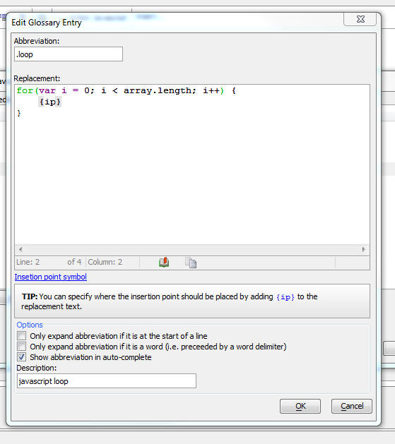
email_send_noprofile() Function - Now allows for a blank
username or password. The third parameter for
email_send_noprofile()
is the security mode. The valid options are blank (""), SSL, and
TLS. This parameter is now optional.
Flying Start Genie - Row Expanders - The Flying Start
Genie allows you to quickly build Grid components for all (or
selected) tables in a database. Now, the Genie will automatically
detect if there is a relationship between the Grids that are created
and it will add a Row Expander to each Grid if that Grid has related
Grids.
For example, in the image below which shows the Grid that was
created for the Customers table in the sample Northwind database you
can see that each row in the Grid has a row expander that shows the
Orders for the selected customer. Similarly, the Orders grid has a
row expander to show the Order Details for the selected Order.
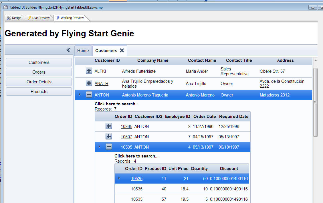
UX Component - SemiCircularNumberDisplay Control - A new
control type is available in the UX component. This control allows
you to display a numeric value on a semi-circular chart. It is ideal
for using in 'dashboard' type applications. You can configure the
color of the control so that it changes depending on the value. For
example if a numeric value is in the 'safe' zone, you might set the
color to green, and if the value was in the 'danger' zone, you might
set the control color to red.
Watch Video - Part 1
Watch Video - Part
2
To add a
SemiCircularNumberDisplay control to your UX component,
select the [More...]
control in the Data
Controls section of the UX Toolbox. Like other controls in
the Data Controls
section of the UX toolbox, the
SemiCircularNumberDisplay
control has both a .SetValue()
and .GetValue()
method that allows you to set its value and read its values.
This will display the list of additional control types:
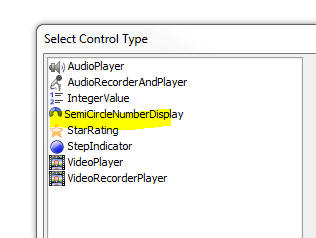
After you add the control to the UX you can configure the
properties of the control by clicking on the smart field for
Control Properties.
This will open a dialog where you can set the properties of the
controls.
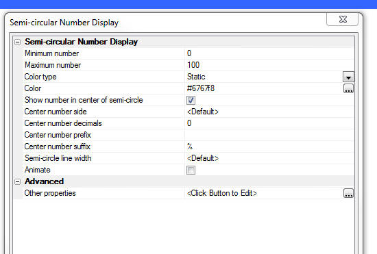
Properties of note in the builder include:
- Color type - Choices are 'Static', 'Dynamic' and
'Javascript'. 'Static' - a single color is used to display all
values. 'Dynamic' - different colors are used for different
ranges of numbers (see below for more information), 'Javascript'
- you can specify Javascript code to dynamically compute the
color.
- Animate - This option is only available if the
Color type is set to Static. Specify if the chart is
animated when it's value is set.
- Other properties - Allows you to set other properties
of the chart not exposed in the builder. The control is based on
the RGraph library (see
http://RGraph.net for more information) and there are many
more properties to control the appearance of the chart than are
exposed in this dialog.
Defining Dynamic Colors
When you set the Color type to Dynamic you can define a series of
ranges and the corresponding color for each range. Click the smart
field for the Values ranges
property (shown when the
Color type is
Dynamic) to open the builder (as shown in the image below).
The builder allows you to define multiple ranges and for each
range, you can specify a color.
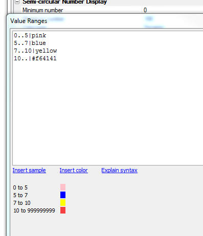
UX Component - RadioButton - CheckBox Controls - Render as
ButtonList - Align - When you set either a Radio Button, or
CheckBox control to render as a ButtonList, you can not control the
alignment (left or right) of the button labels.
Components - Styles - Customize Colors - Pre-defined Palettes
- When you select the 'Alpha' style for a component, you can
customize the colors used in the style by simply setting the values
of SASS variables.
When you click the smart field for the Customize style colors and
fonts property, a dialog is opened, as shown in the image below,
where you can set values for each of the SASS variables used in the
style.
Now, when you open the Edit Style SASS Variables dialog, a new
button appears at the bottom of the dialog that allows you to select
a pre-defined palette.
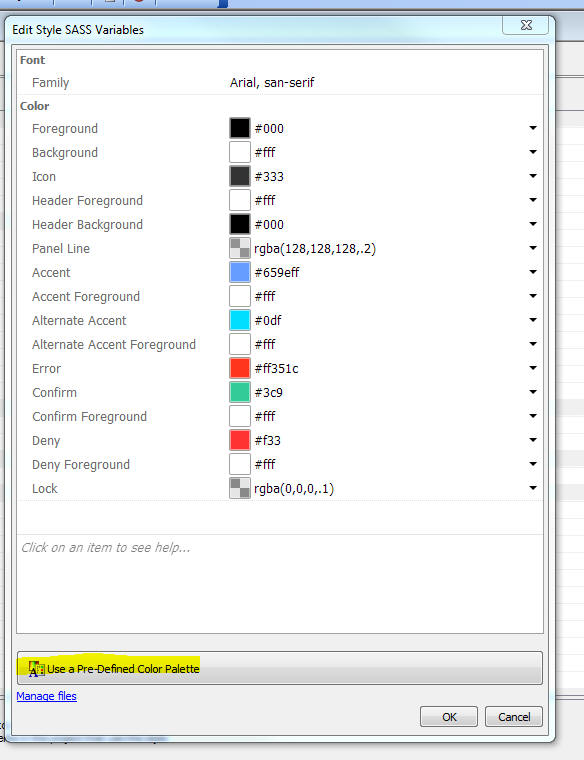
When you click the Use a Pre-Defined Color Palette button, the
Palette Selector window is opened, as shown below.
When you select a palette from the list, the colors are applied
to the items in the Edit Style SASS Variables dialog. If you want to
use the colors, click OK. If you click Cancel, the colors are not
applied.
If you have selected a palette, and you want to go back to the
base theme with no palette, select <none> from the list.
Setting Min and Max Values at Run-time
The following Javascript snippet shows how you can dynamically
set the control's min and max value at run-time.
var max = {dialog.object}.getValue('max');
max = Number(max)
//get a pointer to the control
var obj = {dialog.object}.getControl('semicircularNumber_1');
//set the min and max
obj.rgraphSettings.max = 200;
obj.rgraphSettings.min = 40;
//redraw the control
obj.redraw();
Application Server - Alerts - The Alpha Anywhere
Application Server Classic server now has the ability to send
administrative alerts by email and SMS. This can be configured on
the Logging tab of the settings UI. There is also a Test Alerts
button. This will send both a test email and a test SMS, if each are
enabled, in order to confirm that the settings entered are working
as expected.
NOTE: These comments do not apply to the
Alpha Anywhere Application Server for IIS.
For email notifications, all that is required is a recipient
email address. There is no email server configuration necessary, as
emails will be sent using a special account, AppServerAlerts@alphasoftware.com.
Multiple recipients may be specified by separating them with a
comma.
For SMS notifications, the customer must have their own Twilio
account and provide the appropriate account information in the
server's settings, along with the recipient SMS number. This
functionality will work with a free Twilio account, but Twilio may
impose limits on free accounts. Multiple recipients may be specified
by separating them with a comma.
Currently there are 4 different notification levels, detailed below.
Each level includes all alerts from levels under it (higher number).
Level 1 - Emergency
(Indicates something that requires immediate attention, as the
server is no longer operating normally)
- Server failed to start
- Server terminating abnormally (crashing)
Level 2 - Alert
(Indicates something that needs attention very soon, as server
functionality will be impacted)
- Server has started in an unlicensed mode
Level 3 - Warning
(Indicates a potential problem)
- Maximum threads are running (server is at full capacity)
- Failed to create new threads
Level 4 - Notice
(Indicates an informational notice)
- Normal server start
- Normal server stop
- Logs automatically rotated
Xbasic - a5_ink_to_png() Function - Convert Ink to a PNG Image
- The Ink control (in the UX component) uses a special syntax for
the Ink data. The
a5_ink_to_png() function converts the ink data to a PNG
image.
Syntax
a5_ink_to_png(C ink,N heightInPoints,N
widthInPoints,C filename)
Where:
- ink - the Ink data to be converted
- heightInPoints - the height of the PNG image in
points (72 points = 1 inch)
- widthInPoints - the width of the PNG image in points
- filename - the filename of the PNG image
Javascript Library - A5.runChain() Function - Run Asynchronous
Functions Synchronously - A new function has been added to the
Alpha Anywhere Javascript library to run asynchronous functions
synchronously.
Many Javascript functions run asynchronously. For example,
functions that make Ajax callbacks are asynchronous. In PhoneGap
applications, most of the functions are asynchronous.
This helper function allows you to run a series of functions
(some of which may be asynchronous) synchronously (i.e. the second
function does not start executing until the first function has
completed, and so on).
Watch Video - Part 1
Watch Video - Part
2
Syntax:
A5.runChain(actions,onAllDone,onStop [, context]);
Where:
- actions - an array containing the functions to be
executed. Some or all of the functions in the array may be
asynchronous.
- onAllDone - function to call when all of the
functions in the actions array have completed.
- onStop - function to all if any of the function in
the actions array stopped the execution chain.
- context - an optional object to define the scope of
the actions. Inside each function that is executed, the
this object will
be the same as the
context. This allows you to pass initial information into
the first function and allows each function to set variables on
the this object
that will be seen by subsequent functions.
Each function in the actions array must take a single
object as its input parameter. Each function must call the
.next() method of
the input object to begin execution of the next function in the
actions array. If the function is an asynchronous function, the
call to the .next()
method would be in the onSuccess callback of the asynchronous
function.
The execution chain can be stopped if any function calls the
input object's .stop()
method.
Example
//define 3 functions you want to run
asynchronously
//this is an asynchronous function
function action1(obj) {
setTimeout(function() {
console.log('wait 1 second');
obj.next() // call the next function to be executed
},1000 );
}
function action2(obj) {
console.log('this is a
synchronous function');
obj.next()
}
function action3(obj) {
setTimeout(function() {
console.log('wait .5 seconds');
obj.next()
},500 );
}
//create an array with the functions to executed
var actions = [action1,action2,action3];
//run the actions synchronously
A5.runChain(actions,
function() { alert('alldone');
},
function(err) { alert('error: '
+ err); }
);
//if we want to pass in values to the chain we can
do as follows
var context = {var1: 'value of var1'};
A5.runChain(actions,
function() { alert('alldone');
},
function(err) { alert('error: '
+ err); },
context
);
//inside any of the functions we can reference
'this.var1'
//we can also set properties on the 'this' object.
When you run this code, the messages in the console will appear
in the following order:
wait 1 second
this is a synchronous function
wait .5 seconds
If you had simply called the functions one after the other, then
the messages would have appeared in the following order:
this is a synchronous function
wait .5 seconds
wait 1 second
Installing the Alpha Anywhere IDE on Multiple Machines -
Deactivating a License - The Alpha Anywhere IDE license allows
you to install the Alpha Anywhere IDE on as many machines as
you want, but you can only use it on one machine at a time.
If you have installed the AA IDE on two machines, for example,
and you started the AA IDE on one machine and then exited the AA IDE
on that machine and tried to start it on the second machine
immediately after exiting the AA IDE on the first machine, this
would not be possible because the activation 'lease' would not yet
have expired. By default, the activation 'lease' for the AA IDE is
24 hours. (This can be changed in the View, Settings, Preferences
menu command)
However, if you select the
File, Deactivate License
and Exit menu
command, on the first machine, you would be able to go to the second
machine and start the AA IDE immediately. You would not have to wait
until the lease on that machine expired.
UX Component - List Control - Import Data - If a List
control in a UX component is based on data from a SQL database you
can now upload an Excel or Ascii file (containing CSV data - comma
separated values) and then import the data in that file into the
table in the SQL database that the List is based on. After the data
are imported, the List is automatically refreshed.
NOTE: If a List is based on a stored
procedure, you cannot import data.
The data in the uploaded file must use field names that match the
column names in the target SQL table.
In the case of a CSV file, the field names are in the first row
of data in the file. In the case of an Excel file, the field names
are the column heading in the first row of data.
NOTE: In the case of an Excel file, if the
file has multiple tabs, the data on the first tab is imported.
Field names in uploaded file cannot contain spaces, or special
characters.
To create an Import Action, use Action Javascript and select the
Import Data into a List
Control from Excel or Ascii file action.
This will open the builder where you can define the define the
target List control into which you want to import data.
The properties of note in the builder include:
Target List control name - The name of the List control
into which you want to import data. The data are actually imported
into the table in the SQL database that the List is based on. Only
Lists that are based on SQL databases (and do not use stored
procedures for the List query) are eligible targets.
Pre-process uploaded file Xbasic function - After the file
has been uploaded you can call an Xbasic function to validate the
data before it is imported into the target table. Your Xbasic
function gets passed an array with all of the data to be imported.
Your code can modify the data in the array or delete array entries
that do not meet validation criteria
Maximum records to process - If the uploaded file contains
more records that the specified maximum, no data are imported.
Xbasic - Context.Security.AdministrativeCreateUser() Method
- Adds a new user with a password.
Normally
Context.Security.CreateUser() is used to create users. When
the security setting for
Reset Password is set require a question and answer, a
security question and answer are required to create a user.
This requirement is not practical when an administrative task
creates a user.
The
AdministrativeCreateUser() method can be used in this case.
It does not require a security question and answer even if the
security settings require one. Because of this, its use should be
limited to pages/code that require administrative access and the
application should require the user to set a security question and
answer on first login.
Web Control Panel - Node Services Category - The Web
Control Panel now has a new category - Node Services. This makes it
easier to create Node services that can be called from your Xbasic
code.
When the Node Services item has focus, the New button will create
a new stub Node service that serves as a helpful starting point for
defining a new service.
Once you have defined your Node service, you can call it from
your Xbasic code using the
node_request_result() function.
For example, say you have define a service called
multiply and that
this service takes as input
x and y. Here
is how you could call the service from Xbasic:
dim pIn as p
pIn.x = 4
pIn.y = 3
dim pOut as p
pOut = node_request_result("multiply",pIn)
?pOut.error
= "" 'empty string indicates no errors.
?pOut.result
= 12
Web Control Panel - Node Services Category - The Web
Control Panel now has a new category - Node Services - that shows
all of the Node services defined in the project.
Node_request() Function - Automatic Node Restart - If
you are in WorkingPreview or LivePreview and you have edited the
code in a Node Services definition, when you call
node_request() to
run the service, the optional
flagRestartNode
parameter will automatically be set to
.T.. This makes
iteratively testing edits to a Node service easier to test. Without
a Node restart, edits to the Node service definition would not be
picked up by Node.
Node_request_result() Function - A wrapper around the
node_request()
function, except that instead of returning a JSON string, the JSON
is already parsed and the function returns a
.result and
.error property. If
there was no error, the
.error property is blank.
Session Folders - The Alpha Anywhere Application Server
now uses A5Storage for session files. A5Storage allows for much
greater flexibility in storing session data on local disk, network
attached storage, Amazon S3, and Azure. This means that the physical
folders previously located in a directory named
session_folders
within the webroot are no longer used in any way and will not be
created by the server.
Direct access to these folders has never been supported by Alpha
Software, and the
Session.Session_Folder and
Session.Session_URL
properties were deprecated in version 11 and removed in version 12
(Alpha Anywhere). With this update,
ServerSetting.SessionFolders has also been removed.
However, some developers may have written custom code to directly
access these folders. Any existing code of this type will no longer
function as expected and will need to be updated or replaced
accordingly.
See
https://www.alphasoftware.com/documentation/pages/Server/Guide/Design/Sessions/Storing%20Files%20in%20Sessions.xml
for more information on working with files in Sessions.
Xbasic - create_table_sql() Function - Excel - You can now
pass the name of an Excel file to the create_table_sql() function.
This will create a SQL table based on the list of columns in the
Excel data and also import the data into the SQL table.
The name of the Excel file is passed in as the fieldList
parameter.
Xbasic - sql_import() Function - Excel - You can now pass
the name of an Excel file to the sql_import() function. This will
import the data in the Excel file into the SQL table.
The name of the Excel file is passed in as the data
parameter.
SQL Server Reporting Services - Using Reports Created in SQL
Server Reporting Services in an Alpha Anywhere Project - Many
organizations use SQL Server Reporting Services (SSRS) and have a
number of reports that were developed in SSRS. Using these reports
in an Alpha Anywhere application is now possible using the SSRS
integration features in Alpha Anywhere.
Watch Video - Part 1
Watch Video - Part
2
Watch Video - Part
3
In order to use SSRS reports in an Alpha Anywhere project you
must:
- Create a SSRS connection string that points to a SSRS server
- Link the SSRS reports that you want to use in the Web
Project Control Panel
These steps are discussed in more detail below.
Once you have created a link to a SSRS report, the report link
can be used just like any other Alpha Anywhere report. You can add
the report to the TabbedUI, or you can create actions using Action
Javascript to display the report.
Creating a SSRS Connection String
To create SSRS connection string, select the Tools menu when the
Web Control Panel has focus and then select the
SQL Server Reporting
Services Connection strings menu item.
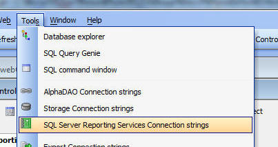
You can then define a new connection string, or edit an existing
connection string:
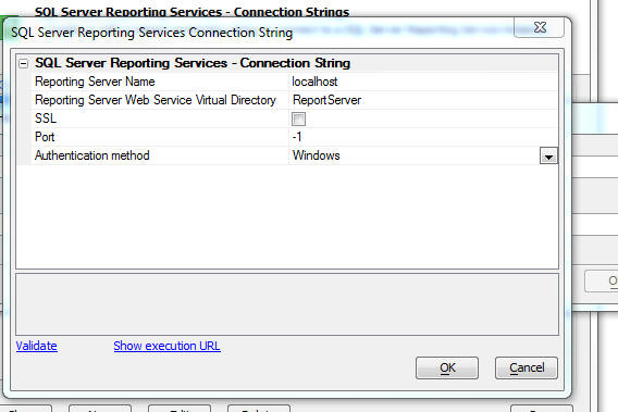
Linking SSRS Reports
To link SSRS reports in your Web Project, go to the Web Projects
Control Panel and select the Reports category.
Then click the New
button. The dropdown menu shows these choices:
This will bring up a dialog where you can select the SSRS reports
you want to link in your Alpha Anywhere project.
Select your SSRS connection string in the Connection String
dropdown box. A list of reports defined in the selected SSRS server
will be displayed.
NOTE: The first time you connect to a SSRS
server, it can take quite a long time before SSRS responds with the
list of reports.
Select as many of the listed reports as you want.
Notice that at the bottom of the dialog there is a
Preview Reports
hyperlink that will allow you to preview any report before you
select it. If the selected report uses parameters, you will be
prompted for the parameter values.
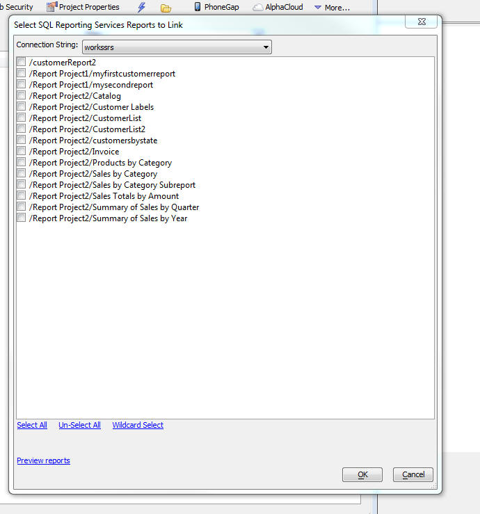
Links will be created for each of the selected reports. A link is
a file in the Web Projects control panel with information about the
SSRS report. The filename includes the
.ssrs. string in the
name just before the .a5rpt
extension.
For example:
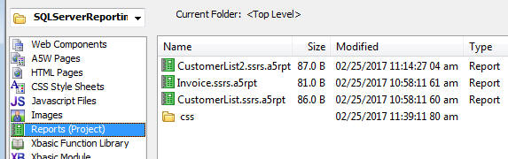
Once a report has been linked, you can set security on the report
as if it were a native Alpha Anywhere report. You can add the report
to a TabbedUI, or show the report when a button is clicked by using
Open a Report action
in Action Javascript.
Publishing Profiles
When you define a publishing profile to publish your application
you can specify values for your SSRS connection strings, just as you
can for all other types of connection strings (e.g. AlphaDAO,
storage, etc.). This means that you can connect to a different SSRS
server when you publish your application than you do when you are
developing your application.
TabbedUI Component - Search - If a TabbedUI component has
a large number of items, it can be difficult for a user to find the
item that they want. You can now add a search feature to the
TabbedUI to allow users to quickly find the items they are looking
form. As the user types into the search box a filtered list of the
matching items is displayed (see second image).
Watch Video
In the image below the search feature has been turned on, but the
user has not yet typed into the search box.
In this image the user has typed a string into the search box and
all of the matching items are displayed.
To turn the search feature on, go to the TabbedUI Properties pane
in the TabbedUI builder and check the
Enable search
property.
Once you have turned on the search feature, there are a number of
other properties you can set.
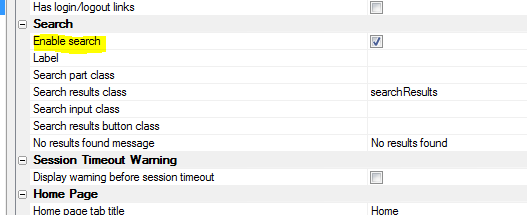
UX Component - Action Javascript - Get Server-side Data -
A new action has been added to Action Javascript. The purpose of the
action is to get server-side data and return the data to the client
where you can then further process the data with Javascript code.
For example, you might use the data returned to populate a List
control, a dropdown box, a SpinList etc.
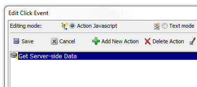
The builder for the action is shown below:
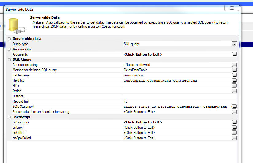
The server-side data can be obtained by performing a query
against a SQL database, or by executing a Xbasic function (which
can, in turn, call web services - REST or SOAP) to get the data that
should be returned to the client.
The options for the
Query type parameter are:
- SQL query - A query any SQL database that Alpha
Anywhere can connect to.
- Nested SQL query - A query against a SQL database
that will return a complex JSON document with nested arrays. For
example an array of customers, for each customer, a nested array
of orders, for each order, a nested array of order details.
- Xbasic - An Xbasic function that will execute when
the action is run. The Xbasic function will return an array of
data (in JSON format). The JSON might come from a REST or SOAP
API called by the Xbasic function.
The onSuccess
property allows you to define Javascript to execute once the data is
received by the client. The data that is received by the client will
be stored in a variable called:
{dialog.object}._serverSideData
UX Component - List Control - Dynamic Images - Image Sequences
- Client-side - You can now specify dynamic images when you
define a dynamic image field to a List and specify that the dynamic
image computation is server side.
Xbasic - SQL_Import() Function - Import data into a SQL Table
- The sql_import()
function is a helper function that imports CSV or JSON data into a
SQL table.
NOTE: The function is called a 'helper'
function because it simply wraps the low level AlphaDAO methods for
doing a bulk insert into a SQL table.
Syntax
p result = sql_import(c connectionString,
c tableName, c tableOwner, c data [, L
replicateIdentity [, c fieldMap]])
Where
- result - an object with these properties:
error - either
.t. or .f., depending on whether the operation succeeded and
errorText -
description of the error
- connectionString - the connection string
(either a named or explicit connection string. if named, the
::name:: prefix
is optional)
- tableName - the name of the table into which you want
to import data
- tableOwner - the owner of the table into which you
want to import data.
- data - the data to be imported. Can either be in CSV
(comma separated value) or JSON format. See examples
- replicateIdentity - .t. or .f. - defaults to .f..
Should only be set to .t. if you are importing into an empty
table. If .t. then values for the auto-increment primary key (if
any) that are supplied in the input data are explicitly set in
the target table.
- fieldMap - If the columns in the input data do not
match the field names in the target SQL table you can specify a
map. The map is a crlf delimited string of field pairs. See
example below.
Example fieldMap
Assume that the input data is as follows
fname,lname
fred,smith
john,jones
Assume that the target table has column names of
firstName and
lastName.
You would need to specify the following fieldMap:
fname=firstName
lname=lastName
Example:
dim cs as c
cs = "mydata"
tablename = "table1"
data = <<%str%
id,name,notes,dob,number
1,"Jones, Amy","Here are some notes",1992-12-18,34.56
%str%
'replicateIdentity = .f.
map = "name=fullname"
dim p as p
p = sql_import(cs,tablename,"", data,replicateIdentity,map)
?p.error
= .f.
UX Component - Map Control - Action Javascript - Google Map
Methods - Two new actions have been added to the Google Map
Methods action
- Get a pointer to the Google Map object - allows you
to get a pointer to the underlying Google Maps object. Useful if
you are trying to implement some code you found while reading
the Google Maps API documentation.
- Add KML Layers to map - Allows you to add a KML layer
to your map.
Xbasic - what3words() Function - Add support for the
what3words service. Allows you to translate an address or location
to a what3words address, or a what3words address to a location. For
more information on what3words go to
www.what3words.com.
Syntax
p result = what3words(c key, c
mode, c input)
Where
- result - object with result from the call.
- key - your what3words API key
- mode - can be
wordstolocation
- converts a what3words address to a location (lat, lng),
locationtowords
- converts a location (lat,lng) to a what3words address, or
addresstowords -
converts a standard address to a what3words address.
Examples
key = "Your api key"
mode = "wordstolocation"
input = "traps.plan.code"
dim p as p
p = what3words(key,mode,input)
?p.lat
= 42.423661
?p.lng
= -71.213213
mode = "addresstowords"
input = "70 blanchard road, burlington ma usa"
dim p as p
p = what3words(key,mode,input)
?p.words
= "newly.slams.roses"
Xbasic - create_table_sql() Function - Create a table in a
SQL database.
Syntax
P result = create_table_sql(c fieldList,c
connectionString,c tableName [, c mode])
Where
- result - an Object with these properties: "hasError"
- (true or false), "errorText" - description of the error, "sqlStatement"
- the SQL statement that was generated to create the table
- fieldList - a crlf string or a JSON string defining
the fields in the table to be created. See below for more
information.
- connectionString - The connection string to the
database where you want to create the SQL table. Can be either a
named connection string, or an explicit connection string.
- tableName - Name of the table to create
- mode - Can be "skip" - does not create table if there
is an existing table, or "overwrite" - overwrite any existing
table
The fieldList parameter can be either a JSON array of objects
defining each field, or a crlf delimited list of pipe delimited
properties.
Example of a CRLF delimited fieldList:
id|N|6|0|AutoIncrement
name|c|20
dob|d
notes|m
In this example a primary key (that is not an AutoIncrement
fields) is defined
id|c|6||PrimaryKey
name|c|20
dob|d
notes|m
When defining a primary key you can designate multiple columns:
firstname|c|20||PrimaryKey
lastname|c|20||PrimaryKey
dob|d
notes|m
Example of a JSON fieldList:
[
{"name": "id", "type":
"numeric", "size": 6, "decimals" : 0, "autoIncrement": true},
{"name": "name",
"type": "character", "size": 20},
{"name": "dob",
"type": "date"},
{"name": "notes",
"type": "memo"}
]
In this next example a primary key (that is not an Auto Increment
field) is defined:
NOTE: Multiple fields can have the 'primaryKey' attribute set to
true.
[
{"name": "id", "type":
"character", "size": 6, "primaryKey": true},
{"name": "name",
"type": "character", "size": 20},
{"name": "dob",
"type": "date"},
{"name": "notes",
"type": "memo"}
]
Xbasic - JSON_shred() Function - Converts a complex JSON
string representing an array of objects with nested arrays) into
individual arrays that do not have any nested arrays.
Syntax:
c result = JSON_shred( c JSON, c
schema [, c ParentArrayName])
where
- result - the output from the
JSON_shred()
function
- JSON - the JSON to be shredded
- schema - the description of the 'shape' of the input
JSON and the definition of any 'key' fields that should be added
to the result.
- ParentName - the name of the top level array in the
result.
Consider the following JSON string:
[
	{"Firstname": "John", "Lastname" : "Smith", "City" : "Boston", "State" : "MA", "Children": [
		{"Name" : "Callie", "Age" : 5},
		{"Name" : "Griffin", "Age" :3},
		{"Name" : "Luke", "Age" : 1}
		]
	},
	{"Firstname": "Henry", "Lastname" : "Rhodes", "City" : "New York", "State" : "NY", "Children": [
		{"Name" : "Howard", "Age" : 15},
		{"Name" : "Robert", "Age" : 11}
		]
	}
]
The JSON is an array in which each object in the array has a
nested array of 'children'.
This JSON can be 'shredded' to produce this result:
{
    "__top": [
        {
            "Firstname": "John",
            "Lastname": "Smith",
            "City": "Boston",
            "State": "MA"
        },
        {
            "Firstname": "Henry",
            "Lastname": "Rhodes",
            "City": "New York",
            "State": "NY"
        }
    ],
    "Children": [
        {
            "Name": "Callie",
            "Age": 5
        },
        {
            "Name": "Griffin",
            "Age": 3
        },
        {
            "Name": "Luke",
            "Age": 1
        },
        {
            "Name": "Howard",
            "Age": 15
        },
        {
            "Name": "Robert",
            "Age": 11
        }
    ]
}
The result is an object with two arrays:
__top and
Children. Notice
however, that since the 'Children' array is no longer nested inside
each object in the top level array, the linkage between the entries
in the 'Children' array and their parent has been lost.
In the above example, the
JSON_shred()
function was called using a schema that did not specify that any key
fields should be added to the
Children array.
The schema used to produce the above result was:
[
    {
        "Children" : [
            {
            }
        ]
    }
]
Notice how the
schema defines the 'shape' of the input JSON but does not specify that
any additional 'key' fields should be added to the Children array.
In order not to loose the relationship between each object in the
Children array to its parent, a key field must be added to each
object in the Children array that points to its parent record. The
desired output from the shredding operation is shown below:
{
    "__top": [
        {
            "Firstname": "John",
            "Lastname": "Smith",
            "City": "Boston",
            "State": "MA"
        },
        {
            "Firstname": "Henry",
            "Lastname": "Rhodes",
            "City": "New York",
            "State": "NY"
        }
    ],
    "Children": [
        {
            "key": "John Smith",
            "Name": "Callie",
            "Age": 5
        },
        {
            "key": "John Smith",
            "Name": "Griffin",
            "Age": 3
        },
        {
            "key": "John Smith",
            "Name": "Luke",
            "Age": 1
        },
        {
            "key": "Henry Rhodes",
            "Name": "Howard",
            "Age": 15
        },
        {
            "key": "Henry Rhodes",
            "Name": "Robert",
            "Age": 11
        }
    ]
}
Notice that each record in the 'Children' array now has a property
called 'key' that points to its parent record. To obtain the above
result, the following schema is used:
[
    {
        "Children" : [
            {
            	"key": "{../Firstname} {../LastName}"
            }
        ]
    }
]
The schema specifies that each object in the 'Children' array should
have a property called 'key' whose value is the "Firstname' and "Lastname"
property in the immediate parent object. The syntax used to specify
a value from a parent object is
../. You can
reference properties at the grand parent level using
../../, and so on.
Here is a more complex example that shows multiple levels of nested
arrays in the input JSON. Notice that the "Hobbies" array is an
array of strings, not an array of objects. This array is converted
into an array of objects in the result.
[
	{"Firstname": "John", "Lastname" : "Smith", "City" : "Boston", "State" : "MA", "Children": [
		{"Name" : "Callie", "Age" : 5},
		{"Name" : "Griffin", "Age" :3, "Hobbies" : ["Leggo","Star Wars"]},
		{"Name" : "Luke", "Age" : 1}
		]
	},
	{"Firstname": "Henry", "Lastname" : "Rhodes", "City" : "New York", "State" : "NY", "Children": [
		{"Name" : "Howard", "Age" : 15},
		{"Name" : "Robert", "Age" : 11, "Hobbies" : ["Soccer"]}
		]
	}
]
Here is the schema that could be used to shred the above JSON:
[
    {
        "Children" : [
            {
            	"Hobbies" : [
            		{
            			"hobbyKey" : "{../../Firstname} {../../Lastname}|{../Name}"
            		}
            	],
            	"key": "{../Firstname} {../LastName}"
            }
        ]
    }
]
And here is the resulting output from the shredding operation:
{
    "__top": [
        {
            "Firstname": "John",
            "Lastname": "Smith",
            "City": "Boston",
            "State": "MA"
        },
        {
            "Firstname": "Henry",
            "Lastname": "Rhodes",
            "City": "New York",
            "State": "NY"
        }
    ],
    "Children": [
        {
            "key": "John Smith",
            "Name": "Callie",
            "Age": 5
        },
        {
            "key": "John Smith",
            "Name": "Griffin",
            "Age": 3
        },
        {
            "key": "John Smith",
            "Name": "Luke",
            "Age": 1
        },
        {
            "key": "Henry Rhodes",
            "Name": "Howard",
            "Age": 15
        },
        {
            "key": "Henry Rhodes",
            "Name": "Robert",
            "Age": 11
        }
    ],
    "Hobbies": [
        {
            "hobbyKey": "John Smith|Griffin",
            "__value": "Leggo"
        },
        {
            "hobbyKey": "John Smith|Griffin",
            "__value": "Star Wars"
        },
        {
            "hobbyKey": "Henry Rhodes|Robert",
            "__value": "Soccer"
        }
    ]
}
PhoneGap App Builder - PhoneGap CLI Build Option - A new option has been added to the PhoneGap App Builder that allows the developer to select and use either PhoneGap Build or a local install of the Cordova CLI
(Command Line Interface) to build a PhoneGap App.
Android builds are supported on PC's running Windows and iOS builds are supported on a Mac with Xcode. Using the CLI allows the developer to use the platform's native development tools to build and debug Cordova apps. This also allows the use of plugins that PhoneGap Build does not support because PhoneGap Build does not support the use of plugin hooks.
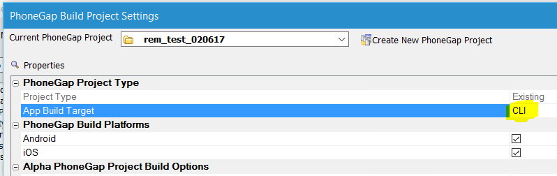
For the full documentation on the PhoneGap/Cordova CLI Builder,
see PhoneGap/Cordova CLI Builder
For a video overview on using the PhoneGap/Cordova CLI Builder,
see PhoneGap/Cordova CLI Builder Video Overview
Xbasic - CURL Object - Auto-complete - When you define a
CURL object in Xbasic, you now have auto-complete for all of the
options available to the .SetOpt() method.
For example:
dim c as extension::curl
c.setOpt(
As soon as you type the opening (, the bubble help instructs you
to right click on the argument value (as shown in the image below)
to get a list of the options for the .setOpt() method.
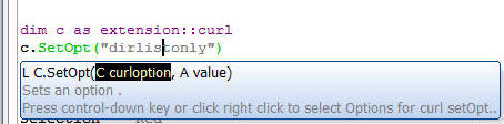
UX Component - FormView Control - Lookup Fields - You can
now define lookup fields in the FormView. This allows you to display
'friendly' values in the Form (e.g. product name, rather than
product id).
To define a Lookup field, go to the Fields tab in the FormView
builder and check the Has
Lookup value property.
You can then define the Lookup. The lookup data source can be a
List control or a Javascript function.
TIP: You may want to use the client-side data
cache or a query against a SQLite database (in a PhoneGap
application) as the data source for your Lookup. This requires a
two-step process because reading data from the client-side data
cache, or from a SQLite database can only be done asynchronously.
Therefore you must first execute some code that reads the
client-side data cache or executes a SQLite query and puts the data
in a variable in memory. You can then define the Lookup in the
FormView builder to use the Javascript Function option, performing
the lookup against the data you have loaded into memory.
Web Project Control Panel - Automatic Refresh - By default
every time the list of files in your Web Project changes, or a file
is edited, the Web Project Control Panel will refresh. However, if
your project contains a very large number of files (several
thousand), then refreshing the Control Panel can be slow and you
might want to turn off the automatic refresh of the Control Panel
and only refresh it when needed.
You can turn off automatic refresh by clicking on the More...
button in the Web Control Panel and selecting the
Set Control Panel refresh
options... menu entry.
If you turn off automatic refresh, a Refresh button will be shown
in the Web Control Panel. Click this button to refresh the Control
Panel.
UX Component - List Controls - Dynamic Images - Image Sequence
- When you add a server-side dynamic image to a List control,
you can now specify that you want to use an image sequence for the
image.
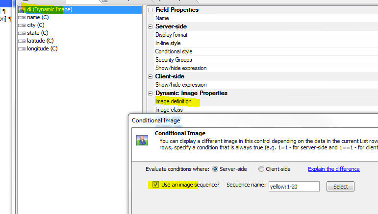
UX Component - Map Control - Adding Multiple Markers to a Map
Control Using Client-side Data -
Action Javascript has an action to add multiple
markers to a map. The data that defines the
latitude/longitude for each marker on the map
(and also for the marker titles, details etc).
has previously been server-side data. Now, you can
specify that the data should be
client-side data.
In the case of server-side data you specify the
name of a Data Series that specifies the
properties for each marker. In the case of
client-side data, the data can come from a Javascript
function, a List control, the client-side Data
Cache, or, in the case of a PhoneGap
application, by querying a SQLite database on a
device.
Watch Video - Part 1
Watch Video - Part
2
Watch Video - Part
3
Watch Video - Part
4
Watch Video - Part
5
Download Component
To specify that the
Google Map Method (UX Component) /
Add multiple markers to the
map action should use client-side data, set the
Data type property
to ClientSideData.
You can then specify whether the client-side data comes from a
Javascript function, or from data in a List control.
In the case where you specify the name of a Javascript function,
you specify the name of a Javascript function (which must return an
array of objects - each object has properties that must include the
marker latitude and longitude values). You must also specify the
names of the properties in the data returned by the Javascript
function.
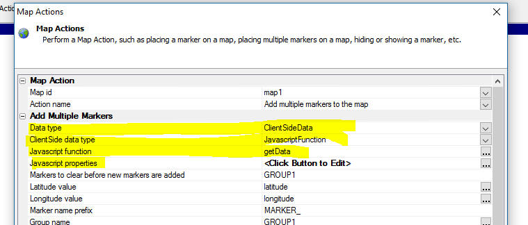
For example, assume that you specify the name of a Javascript
function that returns data like this:
[
		{
			"name": "COYOTE FLATS",
			"city": "BISHOP",
			"state": "CA",
			"latitude": "37.20203",
			"longitude": "-118.47629"
		},
		{
			"name": "LOST HILLS SHERIFF\\'S STATION",
			"city": "CALABASAS",
			"state": "CA",
			"latitude": "34.14167",
			"longitude": "-118.5262"
		},
		{
			"name": "GOLDSTONE /GTS/",
			"city": "BARSTOW",
			"state": "CA",
			"latitude": "35.35053",
			"longitude": "-116.88837"
		}
]
In this case the property names that you specify in the
Javascript properties
property would be:
name,city,state,latitude,longitude
NOTE: If you want to use data from the
client-side Data Cache, or (in the case of a PhoneGap application)
data from a query against a SQLite database, you need to use a
two-step process because reading data from a Data Cache (or a SQLite
database) is an asynchronous action. Therefore your Javascript must
read the Data Cache, or execute the SQLite query (you can use Action
Javascript for this) and in the on success function for the action,
you must put the data you have just read into a variable in the UX
object (for example {dialog.object}._mapData)
and then call the Action Javascript action to add the markers to a
map using the Javascript function option. The Javascript function
will read the data from the variable that contains the data.
Xbasic - Classes - The Web Control Panel now exposes a new
category - Xbasic Class - that allows you to defined Xbasic classes
that can then be used in any server-side Xbasic code.
To use an Xbasic class in your Xbasic code you use the
loadClass() function to load the definition and then you can
DIM and instance of the class.
For example:
dim flag as l
flag = loadClass("helloclass")
dim h as helloclass
NOTE: It is not strictly necessary to use the
loadClass() function to load the class before
DIMming and instance
of the class. If the DIM
statement fails, Xbasic will then try to load the class itself by
searching for the class definition. But this will add a short delay
to your code while Xbasic tries to resolve the class. Therefore it
is recommended that you explicitly load the class before using it.
Also, if you make an edit to the class definition, the edit will be
seen immediately if you explicitly load the class.
Xbasic - loadClass() Function - Loads a class definition.
Syntax
L flag = loadClass(c className)
Where
- flag = .t. or .f. depending on whether the class was
successfully loaded or not
- className = name of the Xbasic class filename (with
or without the .a5xbclass extension).
UX Component - Integrated Login - Server-side onLogin Event
- Enhancements have been made to the server-side onLogin event so
the following actions in the onLogin event handler are now supported
- setting argument values
- setting control values using the e.control.controlname
syntax
- setting property values using the e._set syntax.
For example:
e.arguments[e.arguments.ArgumentNumber("Arg1")].data
= "Portugal"
e._set.field1.value = "foo"
e.control.field2 = "bar"
Web Components - Manifest Files - Using Source Control -
Most web components use a special support file with a
_a5wcmp_manifest
file extension. When a component is published, the process checks
for a manifest file built at the same time as the requested
component. The publish process uses this manifest file to determine
what other files need to be published to run the component.
Previously, the file name for each 'manifest' file contained a
timestamp string to synchronize the file with its parent component.
This caused a problem if the component files were stored in a source
control system. (See release notes for 'Grid Component - Compiled
Files - Using Source Control' for a complete explanation).
The new process stores the linking timestamp internally in the two
files, and the manifest filename never changes. It can now be stored
in a source control system with its parent component.
This new naming convention is only applied when a component is
edited and resaved, or when the manifest files are updated by a bulk
process. Existing components with the legacy file naming will still
function normally. Some components such as login and navigation
components do not use the new process as they do not build a
manifest when saved.
UX Component - Alignment Container - The Alignment
container makes it easy to left, center, or right align a series of
controls.
When you select an Alignment container you can set standard set
of properties for container. If you set the alignment to left
or right, then you can also set an offset property to control
distance of the controls from the left or right edge.
All of the controls in an Alignment Container render on their own
line, regardless of whether or not a break follows the control.
If you want multiple controls to be on the same line, you must
wrap the controls in a container and then the Alignment container
will align the enclosing container.
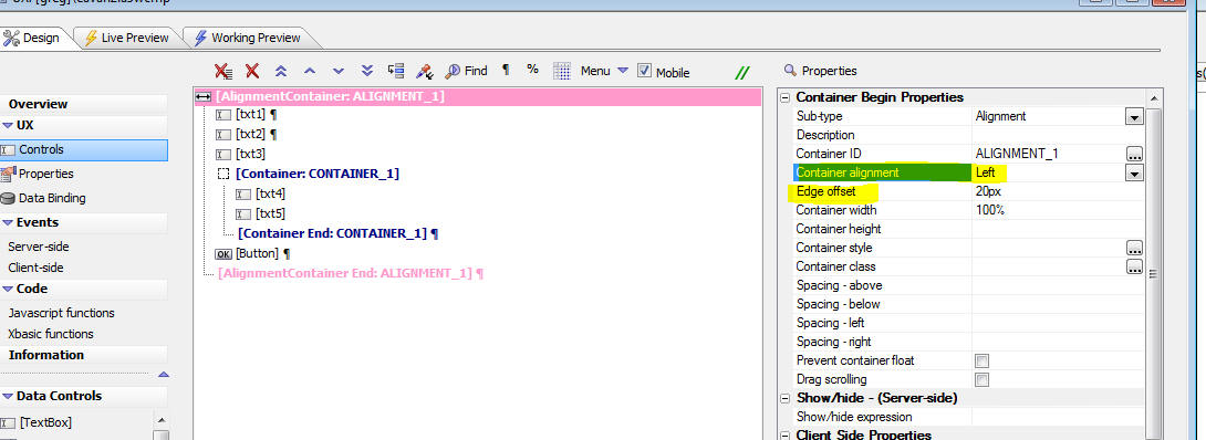
The image below shows how the above definition renders (but with
the alignment set to Center, not Left as shown in the image).
The width of the Alignment container has been set to 100% and the
width of the first three textbox controls have been set to 50%, 75%
and 33% respectively. As you can see the controls are all
horizontally centered within the container.
The txt4 and txt5 controls both appear on the same line because
they are wrapped in standard container whose width has been
set to 2.5inches. The container itself, which has a red border, is
horizontally centered.
UX Component - PhoneGap - New Sample Template - PhoneGap -
Sound Effects using Native Sounds - A new sample template
component has been added that shows how you can add sound effects to
your application using the PhoneGap Low Latency Audio plugin. When
you create a new UX component you will see the template listed in
the list of available samples.
UX Component - FormView Control - List DataSource - {dialog.object}.formViewCommit()
Method - Commit Dirty Fields Only - You can now specify
that only fields that were edited should be committed to Form's data
source. Only applies if the Form's data source is a List control.
Syntax
var flagOnlyCommitDirtyFields = true;
{dialog.object}.formViewCommit('{form.id}',flagOnlyCommitDirtyFields);
Xbasic - csv_to_json() - Convert a CSV string to JSON.
Fields must be comma delimited. First row must be fields names. If a
field contains a comma, enclose field in quotes. If a field contains
quotes, escape quotes using two consecutive quotes
Example
dim txt as c
txt = <<%txt%
ticker,name,price:N,change:N,mktcap,chgPct
"AAPL","Apple Inc.",402.215,"-24.025",377.7B,"-24.025 - -5.64%"
"GOOG","Google Inc.",780.37,"-13.00",257.3B,"-13.00 - -1.64%"
%txt%
? csv_to_json(txt)
= [
{ "ticker" : "AAPL" , "name" : "Apple Inc." , "price:N" : "402.215"
, "change:N" : "-24.025" , "mktcap" : "377.7B" , "chgPct" : "-24.025
- -5.64%"} ,
{ "ticker" : "GOOG" , "name" : "Google Inc." , "price:N" : "780.37"
, "change:N" : "-13.00" , "mktcap" : "257.3B" , "chgPct"
: "-13.00 - -1.64%"}
]
UX Component - onLogin and onLogout Server-side Event -
Setting state variables. You can now use the
e._state.varname = varvalue
syntax to set the value of state variables in the server-side
onLogin and
onLogout event. Keep
in mind that if the UX is set to do a full refresh on logout,
setting state variables in the
onLogut event is
meaningless.
Action JavaScript - Stripe Checkout -
A5.stripe.getEmbeddedStripeResults Function A new function has
been added to Stripe Checkout to handle a unique situation that
occurs when the Stripe Checkout control is used within an embedded
UX component that is reloaded after its was initially loaded The new
function may be called in the
onStripeCheckoutComplete
event.
Example: onStripeCheckoutComplete event handler
var e = {};
if ({dialog.object}.getStripeResults) {
e = {dialog.object}.getStripeResults();
} else {
e = A5.stripe.getEmbeddedStripeResults();
}
Bugs
UX and Grid Component - onChange Event - Fixed a bug
introduced in V4.3.2.
PhoneGap App Builder - ImageMagick - UNC Paths - A problem with UNC
paths when using ImageMagick to generate icons has been resolved.
UX Component - Stripe - Fixed an issue when setting the
currency type to a non US dollar value.
UX Component - Dynamic Images - Fixed a bug introduced in
build 4152 when support for image sequences was introduced.
Xbasic - .Net Integration - Fixed an issue when using Xbasic
to work with a .Net assembly
Tips
SQL Server Performance Optimization - Indexes - Performance of
queries against SQL Server can be affected by string arguments due to an
issue with the SQL Server optimizer.
It appears that when a query has a string value argument, the SQL Server
optimizer does not always see the type as matching some types of columns
(for example CHAR columns with a fixed size). As a result, the optimizer
will ignore indexes and hints to use them and resort to a table scan.
For example:
SELECT AmountDue, AmountPaid, AccountNumber FROM Invoices WHERE
AmountDue > 0 and CustomerId = :CustomerId
If CustomerId is defined
in the database as Char(5),
the optimizer may not recognize the :CustomerId argument
contains a matching value because the type of the argument is VARCHAR.
In such cases, adding a CAST
to the argument value causes the optimizer to choose the appropriate
index because the types match:
SELECT AmountDue, AmountPaid, AccountNumber FROM Invoices WHERE
AmountDue > 0 and CustomerId = CAST(:CustomerId AS CHAR(5))
Alpha Anywhere V4.3.2 - Build 4119-4825 30-Jan-2017
Features
Xbasic - SQL_Update() Function - Updates a record in a SQL
table. This function is just a wrapper around the Xbasic AlphaDAO
commands to execute a SQL update statement, but it convenient to use for
simple cases.
NOTE: The record to update is specified by
primary key, not by a generalized WHERE clause. This limitation is
intentional so a to eliminate the possibility of unintentionally
updating multiple records in the database. If you need to update
multiple records you will need to write your own Xbasic code.
Syntax
p result = sql_update(A
connection,c tablename,c fieldValuePairs,c primaryKey, a primaryKeyValue
[, L execute [, P e ]])
Where
-
result - an object with these property:
error (true/false),
errorText,
sql (the SQL that
was generated), arguments
(the XML for the arguments that were generated.
-
connection - either an open SQL::connection object, or the
name of a connection string
-
tablename - name of table to update
-
fieldValuePairs - fields to update with corresponding values.
A cr-lf list of the form fieldname=value. Or a JSON string (see
example). Date values must be specified using
yyyy-mm-dd format.
-
primaryKey - name of primary key field. If primaryKey
is multi column use ||| to delimit (e.g.
OrderNumber|||PartNumber).
If you set primaryKey to an empty string, Alpha Anywhere will
automatically determine the primary key fields.
-
primaryKeyValue - value of primary key. If primaryKey
is multi-column, use ||| to delimit (e.g.
10245|||23)
-
execute - (true/false). If false, the SQL is not executed.
However, you can still examine the
result.sql and
result.arguments
properties to see what SQL was generated.
-
rowsAffected - number of rows affected by the update
operation. In some databases (e.g. MySQL) if the record specified by
the primary key is not found and error is returned (result.error
= .t.), while in other databases (e.g. SQL Server) the
result.error flag is
.f., but rowsAffected
will be 0.
-
e - a dot variable with with one or more sub-properties. Used
in the case where the fieldValuePairs contains dot variables
for the value. For example, assume that one line in the cr-lf
delimited list of fieldValuePairs contained
name=e.whatname and
the e variable that was passed in contained
e.whatname = "John Smith",
the e.whatname in
the fieldValuePairs would be resolved before the SQL was executed.
Example:
dim cn as sql::Connection
cn.open("::Name::myconnstring")
tablename = "mytable"
fieldsValuePairs = <<%str%
name=fred smith
date of birth=1952/12/18
salary=78000
%str%
'You can also specify field values using JSON
fieldsValuePairs = <<%str%
{
"name" : "fred smith",
"date of birth" : "1954/11/25",
"salary" : "78000"
}
%str%
primaryKey = "id"
primarykeyValue = "1"
p = sql_update(cn,tablename,fieldsValuePairs,primaryKey,primaryKeyvalue)
Xbasic - SQL_Insert() Function - Inserts a record in a SQL
table. This function is just a wrapper around the Xbasic AlphaDAO
commands to execute a SQL insert statement, but it convenient to use for
simple cases.
Syntax
p result = sql_insert(A
connection,c tablename,c fieldValuePairs [, L execute[, P e ]]])
Where
-
result - an object with these property:
error (true/false),
errorText,
sql (the SQL that
was generated), arguments
(the XML for the arguments that were generated,
lastInsertedIdentity
- the value of the primary key field (if its value was
auto-generated)
-
connection - either an open SQL::connection object, or the
name of a connection string
-
tablename - name of table to update
-
fieldValuePairs - fields to update with corresponding values.
A cr-lf list of the form fieldname=value. Or a JSON string (see
example). Date values must be specified using
yyyy-mm-dd format.
-
execute - (true/false). If false, the SQL is not executed.
However, you can still examine the
result.sql and
result.arguments
properties to see what SQL was generated.
-
e - a dot variable with with one or more sub-properties. Used
in the case where the fieldValuePairs contains dot variables
for the value. For example, assume that one line in the cr-lf
delimited list of fieldValuePairs contained
name=e.whatname and
the e variable that was passed in contained
e.whatname = "John Smith",
the e.whatname in
the fieldValuePairs would be resolved before the SQL was executed.
Example:
dim cn as sql::Connection
cn.open("::Name::myconnstring")
tablename = "mytable"
fieldsValuePairs = <<%str%
name=fred smith
date of birth=1952/12/18
salary=78000
%str%
'You can also specify field values using JSON
fieldsValuePairs = <<%str%
{
"name" : "fred smith",
"date of birth" : "1954/11/25",
"salary" : "78000"
}
%str%
p = sql_insert(cn,tablename,fieldsValuePairs)
?p.lastInsertedIdentity
= 5
Application Server - OpenSSL - A new version of OpenSSL is
now used. The build is OpenSSL 1.0.2k. For details of the fixes in
OpenSSL, see:
UX Component - {dialog.object}.debugInfoToFile() Method -
This method is useful when debugging an application and you want to
examine some client-side data. While you can typically use Alerts in
client side code to examine data, or in some case use
console.log()
commands (not always possible when the app is running on a mobile
device), this method allows you to write client side data to a file
on the server.
In cases where you do not have permission to write to server
files (e.g. when running under IIS or on the Alpha Cloud), the
companion {dialog.object}.debugInfoToS3()
method can be used to write to a file on an S3 bucket.
Syntax
{dialog.object}.debugInfoToFile(data,filename[,
append [,silent]])
Where
- data - the data you want to write to the file. If the
data is an Object, you must serialize it using
JSON.stringify()
- filename - the fully qualified filename on the server
where the data should be written
- append - defaults to false. If true, the data are
appended to the end of an existing file
- silent - defaults to false. If true, the confirmation
message is suppressed.
UX Component - {dialog.object}.debugInfoToS3() Method -
This method is useful when debugging an application. It allows you
to write data to a S3 bucket. See
{dialog.object}.debugInfoToFile()
Method for more information.
Syntax:
{dialog.object}.debugInfoToS3(data,connectionString,objectName
[,append [,silent]])
Where
-
data - the data you want to write to the file. If the
data is an Object, you must serialize it using
JSON.stringify()
-
connectionstring - the connection string to the S3
bucket. (Use the Tools,
Storage connection strings menu item to define storage
connection strings.)
-
objectName - Name of the S3 object (i.e. filename)
-
append - defaults to false. If true, the data are
appended to the end of an existing file
-
silent - defaults to false. If true, the confirmation
message is suppressed.
UX and Grid Component - DevArts Zoho CRM ODBC Driver - The
DevArts ODBC driver for Zoho CRM is now supported.
Xbasic - json_from_xml() Function - Ignore Attributes - In
some cases, when you convert XML to JSON, the XML either does not
contain attribute tags, or you want to ignore attribute tags when
converting the XML to JSON. This will result in cleaner looking
JSON. The json_from_xml() function now takes an optional '-A'
attribute to ignore attributes.
For example, consider the following input XML:
dim xml as c = <<%str%
<qdbapi>
   <ticket>auth_ticket</ticket>
   <apptoken>app_token</apptoken>
   <query>{'11'.CT.'Bob'}AND{'19'.GTE.'5'}</query>
   <clist>6.7.9.11.16</clist>
   <slist>11.6</slist>
   <fmt>structured</fmt>
   <options>num-4.sortorder-D</options>
</qdbapi>
%str%


showvar(json_reformat(json_from_xml(xml,"qdbapi","-A")))
The following JSON in produced:
{
     "qdbapi": {
        "ticket": "auth_ticket",
        "apptoken": "app_token",
        "query": "{'11'.CT.'Bob'}AND{'19'.GTE.'5'}",
        "clist": "6.7.9.11.16",
        "slist": "11.6",
        "fmt": "structured",
        "options": "num-4.sortorder-D"
    }
}
Grid Component - Compiled Files - Using Source Control - Grid
components use a special support file with a
_a5wcmp_compiled
file extension.
When a Grid component is published, the process checks for a compiled
file built at the same time as the requested Grid.
The publish process uses this compiled file to construct the published
version of the Grid Component used at run time. If the compiled file is
missing or out of date, it is reconstructed, which slows the publish
process. In a large project this could add a significant amount of time
to the publish operation.
Previously, the file name for each 'compiled' file contained a timestamp
string to synchronize the file with its parent Grid. This filename
changed every time the Grid was resaved. This caused a problem if the
Grid component files were stored in a source control system, as
explained below.
At publish time, the timestamp in the filename of the
_a5wcmp_compiled file
was compared with the last edited time of the Grid component file to
determine if the
_a5wcmp_compiled was up to date. However, if the Grid files in
the project had been restored from a source control system, the last
edited time on the Grid component filename would be different from their
original value and would no longer match the timestamp stored in the
local project _a5wcmp_compiled
filename. Because the file name for each 'compiled' file changed at
every save, it could not be stored in a source control system. As a
result, when publishing the application, it would appear that the
_a5wcmp_compiled files
were out of date and the
_a5wcmp_compiled would have to be re-created, thus slowing down
the publishing operation.
Now, the _a5wcmp_compiled
filename no longer contains a timestamp. Instead, the timestamp is
stored as a property in the Grid and it's
_a5wcmp_compiled file.
The _a5wcmp_compiled
filename never changes when the Grid component is edited and the Grid
and its linked compiled file can both be stored in a source control
system. If both are updated at the same time, they will still match when
retrieved from the source control. You do not need to store the
_a5wcmp_compiled files
in source control if the Grid will not be edited in source control.
This new naming convention is only applied when a grid is edited and
resaved, or when the compiled files are updated by a bulk process.
Existing grids with the legacy file naming will still function normally.
UX Component - Static HTML Page Head Section - When you turn on
the Application Cache for a UX component you can now inject custom
markup into the head section of the static HTML page using the new
Page head section
property.
The common use case for customizing the head section is to
include markup that specifies the icons to use should the user
choose to make a home screen shortcut for the page.
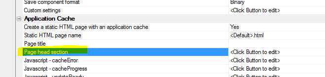
When you click the smart field to edit the HEAD section, the
editor has a hyperlink that will insert sample markup showing how
the home screen icons are defined.
In the example below it is assumed that your project has icons
called 'apple-icon-57x57.png', etc.
UX Component - List Control - Detail View - afterSynchronize
and afterSynchronizeRecord Server-Side Events - Two new
server-side events have been added to the List control.
- afterSynchronize - fires after all the data in
a List control with a Detail View are synchronized. If the List
data are being synchronized in batches, fires after each batch
is synchronized.
- afterSynchronizeRecord - fires after each composite
record is synchronized. Only fires if there were no
synchronization errors (i.e. server-side validation, write
conflict, or database errors). Note: A 'composite' record is a
parent List record with all of its child records (e.g. a
customer record, all of the orders for that customer, and all of
the order items for each of the customer's orders).
NOTE: Both of these events must be defined
for the top-most parent List in the List hierarchy. For example if
your UX has a List showing Customers and a child List showing Orders
(and if the child List is set to pre-fetch data), then these events
must be defined for the Customer List. Defining these events for the
Orders List is meaningless.
Xbasic - CURL to Xbasic Genie - The CURL to Xbasic genie
has been substantially enhanced. You can now automatically generate
sample CURL commands by clicking the Example commands... hyperlink
in the genie.
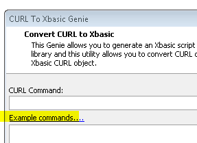
When you click on the hyperlink a menu of available example
commands is shown. You can use this genie to get a template for how
the CURL command should be constructed. Then when you convert the
generated CURL command to Xbasic, you will have an excellent
starting point for fashioning your Xbasic CURL code to perform the
task you want.
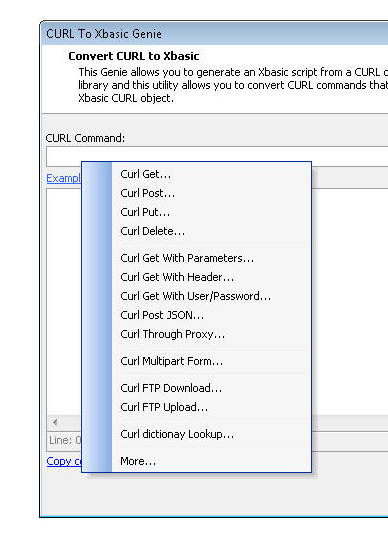
The list of examples in the menu is extensive, but if you need a
specialized CURL command (for example, you need custom headers),
select the More... option.
This will open up a generic CURL command builder, as shown in the
image below.
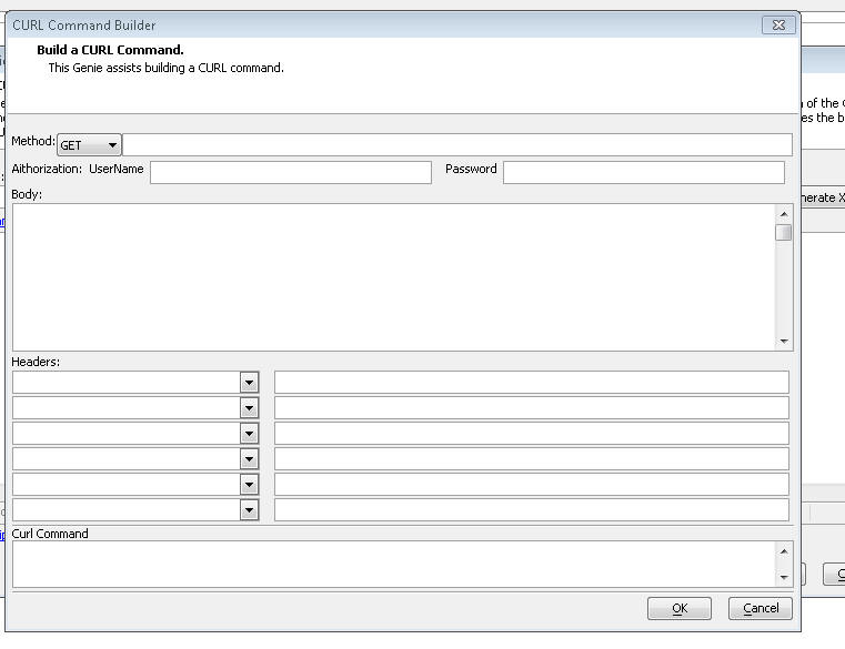
Bugs
UX Component - Google Address Suggest - If you had a Google
Address Suggest control on a UX and that control was opened in a TabUI,
if the tab containing the UX was closed and then the tab was opened a
second time, the Address Suggest control did not work.
REGEX Validation - A recent change in the Regex validator
in Grid and UX control validation rules (to support international
characters in Regex expressions) broke some regex
validations that were previously working
UX Component - PhoneGap - Fixed an issue introduced in
build 4015 when creating a PhoneGap appllcation.
SQL Trace - Working Preview - If you checked the SQL Trace
checkbox in the AlphaDAO Connection String Builder dialog and then
executed SQL in Working Preview, the SQL was not shown in the Trace
Window.
Video Library - Refresh - The Refresh command on the Video
Library did not always update the list of videos shown in the Video
Library.
UX and Grid Component Components - onChange Events - Fixed
a bug introduced in build 4095 for Grid and UX controls with
onChange event handlers, if the Javascript code had any single quote
characters.
Report Preview - E-mail Report - PDF - If you clicked the
'Email Report' button on the Report Preview window to send a report
as a PDF, an error was generated.
Alpha Anywhere V4.3.2 -
Build 4107-4820 24-Jan-2017
Bugs
UX Component - PhoneGap - Fixed an issue introduced in build
4015 when creating a PhoneGap appllcation.
Alpha Anywhere V4.3.2 -
Build 4105-4819 23-Jan-2017
UX Component - Static HTML Page Head Section - When you turn
on the Application Cache for a UX component you can now inject custom
markup into the head section of the static HTML page using the new
Page head section
property.
The common use case for customizing the head section is to include
markup that specifies the icons to use should the user choose to make a
home screen shortcut for the page.
When you click the smart field to edit the HEAD section, the editor
has a hyperlink that will insert sample markup showing how the home
screen icons are defined.
In the example below it is assumed that your project has icons called
'apple-icon-57x57.png', etc.
UX Component - List Control - Detail View - afterSynchronize and
afterSynchronizeRecord Server-Side Events - Two new server-side
events have been added to the List control.
-
afterSynchronize - fires after all the data in a List
control with a Detail View are synchronized. If the List data are
being synchronized in batches, fires after each batch is
synchronized.
-
afterSynchronizeRecord - fires after each composite record is
synchronized. Only fires if there were no synchronization errors
(i.e. server-side validation, write conflict, or database errors).
Note: A 'composite' record is a parent List record with all of its
child records (e.g. a customer record, all of the orders for that
customer, and all of the order items for each of the customer's
orders).
NOTE: Both of these events must be defined for
the top-most parent List in the List hierarchy. For example if your UX
has a List showing Customers and a child List showing Orders (and if the
child List is set to pre-fetch data), then these events must be defined
for the Customer List. Defining these events for the Orders List is
meaningless.
Xbasic - CURL to Xbasic Genie - The CURL to Xbasic genie has
been substantially enhanced. You can now automatically generate sample
CURL commands by clicking the Example commands... hyperlink in the
genie.
When you click on the hyperlink a menu of available example commands
is shown. You can use this genie to get a template for how the CURL
command should be constructed. Then when you convert the generated CURL
command to Xbasic, you will have an excellent starting point for
fashioning your Xbasic CURL code to perform the task you want.
The list of examples in the menu is extensive, but if you need a
specialized CURL command (for example, you need custom headers), select
the More... option.
This will open up a generic CURL command builder, as shown in the
image below.
Bugs
SQL Trace - Working Preview - If you checked the SQL Trace
checkbox in the AlphaDAO Connection String Builder dialog and then
executed SQL in Working Preview, the SQL was not shown in the Trace
Window.
Video Library - Refresh - The Refresh command on the Video
Library did not always update the list of videos shown in the Video
Library.
UX and Grid Component Components - onChange Events - Fixed a
bug introduced in build 4095 for Grid and UX controls with onChange
event handlers, if the Javascript code had any single quote characters.
Report Preview - E-mail Report - PDF - If you clicked the
'Email Report' button on the Report Preview window to send a report as a
PDF, an error was generated.
Alpha Anywhere V4.3.2 -
Build 4099-4819 20-Jan-2017
Bugs
UX and Grid Component Components - onChange Events - Fixed a
bug introduced in build 4095 for Grid and UX controls with onChange
event handlers, if the Javascript code had any single quote characters.
Report Preview - E-mail Report - PDF - If you clicked the
'Email Report' button on the Report Preview window to send a report as a
PDF, an error was generated.
Alpha Anywhere V4.3.2 -
Build 4095-4816 18-Jan-2017
Bugs
Grid Component - Query By Example - If you added two or
more filter conditions, ran the query, then removed one of the two
filter conditions and then added a third condition, you would get an
error.
UX Component - onChange Event - Pre-render - If a UX
component had an event handler for the onChange event for a control
then if the component was set to pre-render and if the component was
shown though an Ajax callback and if the event handler used single
quotes in the Javascript, you would get an error.
Alpha Anywhere V4.3.2 -
Build 4089-4815 15-Jan-2017
Bugs
UX Component - List Control - Detail View - Multi-Column Primary
Key - Fixed an issue when adding a new record to a List that was
based on a SQL table with a multi-column primary key. This issue was
introduced in Version 4.3.2
UX Component - DropDownBox, RadioButton and CheckBox Controls -
Choices - Connection String - The connection string builder did not
open because of a recent bug that had been introduced.
Reports - Conditional Objects - Fixes to the Conditional Object
in reports that resulted from a recent change to this control.
Alpha Anywhere V4.3.2 -
Build 4081-4811 11-Jan-2017
Features
Xbasic - AlphaDAO - Date and Number Formats - The
SQL::Connection object now supports three new properties that allow
you to control the format for date and number fields when the .toJSON()
or .toJSONObjectSyntax() methods are called.
- JSONDateFormat - Specify the date format to use
for date fields
- JSONDateTimeFormat - Specify the date/time format to
uses for time fields
- JSONDecimalSeparator - specify the decimal separator.
By default, if these properties are not set, the the date format
and the decimal separator are inherited from the machine's regional
settings
Note: The properties must be set on
the connection BEFORE the result set is created.
Example Usage
dim cn as sql::connection
?cn.open("::Name::Access_Northwind")
= .T.
cn.PortableSQLEnabled = .t.
cn.JSONDateFormat = "yyyy-MM-dd"
cn.JSONDateTimeFormat
= "yyyy-MM-dd hh:mm::ss 3"
cn.JSONDecimalSeparator
= ","
?cn.tojson("select first 5 orderdate, freight from
orders")
= [
{"orderdate" : "1996-07-04 00:00::00 000", "freight" : "32,38"},
{"orderdate" : "1996-07-05 00:00::00 000",
"freight" : "11,61"},
{"orderdate" : "1996-07-08 00:00::00 000",
"freight" : "65,83"},
{"orderdate" : "1996-07-08 00:00::00 000",
"freight" : "41,34"},
{"orderdate" : "1996-07-10 00:00::00 000",
"freight" : "58,17"}
]
Bugs
Reports - Conditional Objects - A bug was introduced
recently that broke reports with conditional objects.
UX Component - List Control - Dates - A bug was introduced in the
last update where, if the client-side data format did not match the
server-side data format, dates with days less than 13 (e.g. 13 Oct 2017)
were not being persisted to the database correctly
Alpha Anywhere V4.3.2 - Build 4077-4809 09-Jan-2017
Videos
|
UX Component - Ink Control |
Image Annotation using the Ink Control in a Data
Bound UX Component |
The ink control allows you to create sketches by
'drawing' with your mouse, any type of pointing
device, or with your finger (on a device that
supports touch). A common use of the ink control
is to annotate images. The image you want to
annotate is shown as the background to the ink
control and then you can draw 'on top of' the
image. When the data are saved the ink is stored
separately from the image in a long text field.
In this video we show how a data bound UX
component that allows a user to upload images
can be configured to allow the user to annotate
the images that are uploaded.
Watch Video
- Part 1
Watch Video
- Part 2
Watch Video
- Part 3
Watch Video
- Part 4
Download Component
Download
SQL Table Definition
Date added: 2016-10-30 |
|
UX Component - ControlBar Control |
Defining Disclosure Forms using the Disclosure
Form Builder |
In the video 'Displaying a Modal Pop-up Form
using a Disclosure' we show how a modal pop-up
form can be displayed using a Disclosure. The
definition of the HTML for the form is fairly
tedious because it is completely hand coded.
In this video we show how the Disclosure Form
Builder can be used to make it easier to define
the form HTML.
Watch Video - Part 1
Watch Video - Part 2
Download Component
Date added: 2016-10-30 |
|
UX Component ControlBar Control |
Display Modal Message Dialogs using Disclosures |
Modal messages (such as confirmations, progress,
feedback) as commonly used when designing the
user interface for an application. ControlBar
disclosures make displaying these messages
particularly easy.
In this video we show how the ControlBar can be
configured to display three different types of
message dialogs: basic information dialogs (one
button), confirmation dialogs (two buttons) and
wait dialogs (no buttons).
Watch Video - Part 1
Watch Video - Part 2
Watch Video - Part 3
Download Component
Date added: 2016-10-30 |
|
UX Component - List Control |
Specifying Sort Criteria when Filtering a List |
Action Javascript allows you to easily define
fields on a UX where the user can specify search
criteria for a List control on the UX ( much
like the Search Part in a Grid). Now you can
also define sort criteria.
In this video we show how the Filter Records in
a List action in Action Javascript can be
configured to allow sort criteria to be
specified.
Watch Video
Download Component
Date added: 2016-1-03 |
|
UX Component - ControlBar Control |
Adding List Navigation Buttons to a ControlBar |
When you define a List control, you can specify
that the List should be paginated. If you set
the pagination method to 'Navigation Buttons'
then you must define buttons to move to the next
and previous page of records. In a mobile
application that uses a ControlBar in a Panel
header or footer, it is desirable to place these
navigation buttons in the ControlBar.
In this video we show how you can quickly add
List navigation buttons to a ControlBar by
selecting the 'Pre-defined buttons' option when
adding ControlBar items to your ControlBar
definition.
Watch Video
Date added: 2016-11-05 |
|
UX Component - FormView Control |
Using a FormView Control to Edit Data in a List
Control - Master-Detail Forms - Very Large Forms |
By default, when you configure a List with a
Detail View (so that edits can be made to the
List data), the Detail View is composed using
individual controls (e.g. Textbox, Textarea,
Dropdown, etc). If the Detail View has a large
number of fields, then composing the Detail View
using individual controls will be inefficient
and will result is a very large UX component
that may not perform well.
An alternative approach is to use the FormView
control to implement the List's Detail View.
This is extremely efficient and will allow you to
build UX components that edit very large forms
but still perform very well.
In this video we show how a master-detail Form
is built using a FormView control to edit the
fields in the Master table and a second FormView
control to edit the fields in the Detail Table.
The master table has 100 fields and the detail
table has 100 fields, so in total, the UX
component is editing 200 fields.
Watch Video - Part 1
Watch Video - Part 2
Watch Video - Part 3
Watch Video - Part
4
Download Component
Download
Script to Create SQL Tables
Date added: 2016-11-08 |
|
UX Component - FormView Control |
Tutorial - Building a Mobile Master-Detail Form
using The List, FormView and ControlBar Controls
- |
In this video tutorial we show how a mobile app
can be built to implement a master-detail form
using the FormView control. The app will allow
users to edit data from the Customers and Orders
table in the sample Northwind database. This is
a classic master-detail form: Each customer has
multiple orders. The UX component uses two Lists
joined in a parent-child relationship. The
parent List displays data from the Customer
table and the child List display the related
orders from the Orders table.
Each List has a Detail View, but in both cases,
the Detail View is implemented using the
FormView control.
Once the basic functionality of the app has been
built, the app is 'mobilized' by wrapping the
various sections of the component in PanelCards
and a ControlBar is added to implement
navigation between the various parts of the
application.
Watch Video - Part 1
Watch Video - Part 2
Watch Video - Part 3
Watch Video - Part 4
Watch Video - Part 5
Watch Video - Part 6
Watch Video - Part 7
Watch Video - Part 8
Watch Video - Part 9
Watch Video - Part 10
Download Components
Date added: 2016-11-10 |
|
UX Component |
Displaying a Custom Wait Message while a Large
Mobile App is Loading in the Background |
If you have built a very large mobile App which
takes some time to load, you might want to
display a custom wait message to the user while
the main UX component of your App is loaded in
the background.
In this video we show how this can be done using
a simple 'startup' UX component.
Watch Video
Download Components
Date added: 2016-12-11 |
|
UX Component - PhoneGap |
PhoneGap - Using the PhoneGap - Open File with
Native Application Action to View PDF Files in a
Mobile Application |
The PhoneGap cordova-open plugin allows you to
open various file types using the associated
native app on a mobile device. For example, if
you open a .pdf file, the PDF file is displayed
using the native PDF viewer app on the mobile
device. If you open a .mp4 file, the video is
displayed using the native video viewer on the
device. A common use case for this plugin is to
download several files when a connection is
available so that the files can then be viewer
later on when no connection is available.
In this video we show how an application is
built that shows a list of PDF files. These
files are downloaded from the server and stored
in the filesystem on a mobile device. Then we
show how each of the downloaded files can be
viewed using the PDF viewer on the mobile
device. Because the PDF files are stored in the
filesystem on the device, they can be viewed
even if the device no longer has a connection.
The application uses the 'PhoneGap - Open File
with Native Application' action to display the .pdf
file.
Watch Video - Part 1
Watch Video - Part
2
Watch Video - Part
3
Date added: 2016-12-27 |
|
UX Component - PhoneGap |
PhoneGap- Viewing Reports in PDF Format on a
Mobile Device |
The PhoneGap cordova-open plugin allows you to
open files (such as .pdf files) using the natvie
application associated with that file type on a
mobile device. This plugin is particularly
useful for viewing PDF files. The Alpha Anywhere
report writer can save reports as PDF files. The
cordova-open plugin therefore fits really well
with the Alpha Anywhere report writer because
you can build applications that generate reports
as PDF files and then display the reports on a
mobile device using the cordova-open plugin.
In this video we show how you can use Action
Javascript (the 'PhoneGap - Open File with
Native Application' action) to generate a PDF
file from an Alpha Anywhere report, then
download the resulting PDF file to a mobile
device and display it using the native PDF
viewer.
Watch Video
- Part 1
Watch Video
- Part 2
Date added: 2016-12-27 |
Features
Xbasic - Javascript Web Tokens (JWT) - Additional Options
- Additional options have been added to the Xbasic classes for
generating Javascript Web Tokens. For more details refer to the
documentation.
IIS Application Server - PKI Authentication - Support has
been added for PKI authentication. For more details refer to the
documentation.
Watch Video - Part 1
Watch Video - Part 2
Xbasic - Extension::JSON Class - New methods - New methods
have been added to the
extension::JSON class to make it easier to extract data from a
JSON object.
NOTE: You can generally easily extract data from
a JSON string by parsing the JSON to an Xbasic dot variable, using the
json_parse() method. But if the JSON has property names that are
not valid Xbasic variable names, then you cannot parse the JSON. Also,
parsing an extremely large JSON string could be slow. The methods
described here do not require the JSON to be parsed into an
Xbasic dot variable, and work for all types of JSON property names.
Methods 1
extension::JSON::OffsetToPath(json,offset[,base])
where:
- json - string of JSON data
- offset - number - position in the JSON string - e.g. 1345
(character 1345 in the JSON string)
- base - 0 for Javascript and 1 for Xbasic (since Xbasic
arrays are 1 based)
Returns a 'path' to the JSON element that contains the text at
the specified offset.
Example:
Assume that json is a variable that contains the sample JSON shown
below
?extension::JSON::OffsetToPath(json,540,1)
= "[1].orders[1].orderItems[1]"
This means that the path in the JSON to the element that contains the
text at position 540 is:
[1].orders[1].orderItems[1]
Method 2
extension::JSON::PathToOffset(json,path[,base])
where:
-
json - string of JSON data
-
path - path to an element in the JSON string
-
base - 0 for Javascript and 1 for Xbasic (since Xbasic arrays
are 1 based)
Returns the offset in the JSON string for the element specified by
the path.
Example:
Assume that json is a variable that contains the sample JSON shown
below
?extension::JSON::PathToOffset(json,"[1].orders[1].orderItems[1]",1)
= 355
Method 3
extension::JSON::PathExtract(json,path[,base])
where:
-
json - string of JSON data
-
path - path to an element in the JSON string
-
base - 0 for Javascript and 1 for Xbasic (since Xbasic arrays
are 1 based)
Extracts a JSON element for a specified path
Example:
?extension::JSON::PathExtract(json,"[1].orders[1].orderItems[1]",1)
= {
	"OrderID": "10643",
	"ProductID": "28",
	"Quantity": "15",
	"UnitPrice": "45.6"
}
Sample JSON string for above examples:
		[
        {
            "CustomerID": "ALFKI",
            "CompanyName": "Alfreds Futterkiste",
            "orders": [
                {
                    "OrderID": "10643",
                    "CustomerID": "ALFKI",
                    "OrderDate": "09/25/1995 12:00:00 00 am",
                    "orderItems": [
                        {
                            "OrderID": "10643",
                            "ProductID": "28",
                            "Quantity": "15",
                            "UnitPrice": "45.6"
                        },
                        {
                            "OrderID": "10643",
                            "ProductID": "39",
                            "Quantity": "21",
                            "UnitPrice": "18"
                        },
                        {
                            "OrderID": "10643",
                            "ProductID": "46",
                            "Quantity": "2",
                            "UnitPrice": "12"
                        }
                    ]
                },
                {
                    "OrderID": "10692",
                    "CustomerID": "ALFKI",
                    "OrderDate": "11/03/1995 12:00:00 00 am",
                    "orderItems": [
                        {
                            "OrderID": "10692",
                            "ProductID": "63",
                            "Quantity": "20",
                            "UnitPrice": "43.9"
                        }
                    ]
                },
                {
                    "OrderID": "10702",
                    "CustomerID": "ALFKI",
                    "OrderDate": "11/13/1995 12:00:00 00 am",
                    "orderItems": [
                        {
                            "OrderID": "10702",
                            "ProductID": "3",
                            "Quantity": "6",
                            "UnitPrice": "10"
                        },
                        {
                            "OrderID": "10702",
                            "ProductID": "76",
                            "Quantity": "15",
                            "UnitPrice": "18"
                        }
                    ]
                },
                {
                    "OrderID": "10835",
                    "CustomerID": "ALFKI",
                    "OrderDate": "02/15/1996 12:00:00 00 am",
                    "orderItems": [
                        {
                            "OrderID": "10835",
                            "ProductID": "59",
                            "Quantity": "15",
                            "UnitPrice": "55"
                        },
                        {
                            "OrderID": "10835",
                            "ProductID": "77",
                            "Quantity": "2",
                            "UnitPrice": "13"
                        }
                    ]
                },
                {
                    "OrderID": "10952",
                    "CustomerID": "ALFKI",
                    "OrderDate": "04/15/1996 12:00:00 00 am",
                    "orderItems": [
                        {
                            "OrderID": "10952",
                            "ProductID": "6",
                            "Quantity": "16",
                            "UnitPrice": "25"
                        },
                        {
                            "OrderID": "10952",
                            "ProductID": "28",
                            "Quantity": "2",
                            "UnitPrice": "45.6"
                        }
                    ]
                },
                {
                    "OrderID": "11011",
                    "CustomerID": "ALFKI",
                    "OrderDate": "05/09/1996 12:00:00 00 am",
                    "orderItems": [
                        {
                            "OrderID": "11011",
                            "ProductID": "58",
                            "Quantity": "40",
                            "UnitPrice": "13.25"
                        },
                        {
                            "OrderID": "11011",
                            "ProductID": "71",
                            "Quantity": "20",
                            "UnitPrice": "21.5"
                        }
                    ]
                }
            ]
        }
    ]
Sample Xbasic script that shows an Xdialog to show how
these methods can be used:
'sample.json contains some sample json data
dim json as c = file.to_string("C:\data\sample.json")

dim def.text as c = json
dim def.object as p
dim selection as c
dim subselect as c
ui_dlg_box("JSON",<<%dlg%
{watch=def.object.get_selection_start(.t.)!cursor}
[%M;K%.100,20def];
Path;
[.100path] <copy<;
[.100selection] <select>;
[%M;K%.100,5subselect];
%dlg%,<<%code%
if a_dlg_button = "cursor" then
	a_dlg_button = ""
	dim pos as n = def.object.get_selection_start(.t.)
	path = extension::JSON::OffsetToPath(strtran(def.text,crlf()," "),pos)
else if a_dlg_button = "copy" then
	a_dlg_button = ""
	selection = path
else if a_dlg_button = "select" then
	a_dlg_button = ""
	dim pos as n = extension::JSON::PathToOffset(strtran(def.text,crlf()," "),selection)
	if pos < 1 then
		dim subselect as c = extension::JSON::PathExtract( strtran(def.text,crlf()," "),selection)
		def.object.select(pos,len(subselect) )
		def.object.show_caret()
	else
	   ui_msg_box("","Not found")
	end if
end if
%code%)
UX Component - Client-Side Properties - On Get Value and On
Set Value - Two new client-side properties have been added for
Data Controls in a UX component.
- On Get Value Javascript - fires when the
{dialog.object}.getValue()
method is called. Allows you to transform the value
returned by the method.
- On Set Value Javascript - fires when the
{dialog.object}.setValue() method is called. Allows you
to transform the value used to set the control's value.
In both cases, your Javascript can reference a variable called
value and must
return a value. For example, in the following example, the
.getValue() method will return the upper case version of the
control's value
return value.toUpperCase()
These methods can be used to translate a stored value into a
display value and vice versa. For example, you might want to display
a part description, but store the part number. The data used to to
the translation might be stored in a client-side data cache.
UX Component - PhoneGap - Cordova-Open Plugin - The
PhoneGap genie now exposes the Cordova-Open plugin. This plugin
allows you to open files using their associated native application.
For example, if you open a file with a .pdf extension the plugin
will open the file using the native PDF application on the device.
If you open a file with a .mov extension, the plugin will open the
file using the native video player on the device.
The Cordova Open plugin is selected in the PhoneGap genie as
shown in the image below.
There are many use cases for the Cordova-Open plugin, but PDF
files is perhaps the most compelling use case. Displaying PDF files
in a mobile application can be tricky because the browsers on mobile
devices do not have built-in PDF viewers as is typical with desktop
browsers.
Another great use case for this plugin is a mobile app that
downloads multiple files (pdf, video, audio, excel, word, etc.) and
then stores these files in the filesystem on the device so that they
can be viewer later when the device is no longer connected to the
internet. For more information on techniques for downloading files
to a mobile device, see this topic in the Tips section: Downloading Files to a Mobile Device.
A new action in Action Javascript (PhoneGap
- Open File with Native Application) makes it easy to use the
Cordova-Open plugin in mobile applications.
The image below shows how a PDF file appears in the Native PDF
viewer on an iPhone (in this case the PDF file was created by
generating a report and saving the report output to a PDF file).
Notice the Done button that will return you to the app when you
close the Native Viewer.
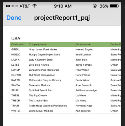
UX Component - Action Javascript - PhoneGap - Open File with
Native Application Action - This action allows you to open a
file on a mobile device using the associated native application.
Watch Video - Part 1
Watch Video - Part
2
Watch Video - Part
3
NOTE: You can only use this action in a PhoneGap
application. The PhoneGap application must load the
Cordova Open plugin.
The action allows you to:
- Open a file that is already present in the file system of
the mobile device
- Open a file that is remote.
- Open a file that is dynamically created by making an Ajax
callback to the server
- Open a PDF report that is created by making an Ajax callback
to the server to run a report and save the report output as a
PDF file.
When you select the
PhoneGap - Open File with Native Application action in Action
Javascript, the following dialog is shown:
- File is remote - specify if you want to open a local
file, or a remote file (i.e. a file that is on a remote server)
- Filesystem part - the part of the device filesystem
where the file is stored. You can specify a Javascript function
to return the filesystem part by prefixing the name of the
Javascript function with
javascript:, For
example
javascript:getFileSystemPart.
- Filename - the name of the file you want to open.
This can include a relative path if the file is stored in a
sub-directory. E.g. PDF/mypdffile.pdf. You can also specify a
Javascript function to return the filename by prefixing the name
of the Javascript function with
javascript:, For
example
javascript:getFileName.
If you specify that the file is remote, you must specify the File
URL.
- File URL - the URL of the file you want to open. For
example: http://alphafiles.s3.amazonaws.com/pdffile1.pdf. If the
file is stored in the webroot of the Application Server, you can
specify a relative filename. For example: pdffile1.pdf. You can
specify a Javascript function to return the URL by prefixing the
name of the Javascript function with
javascript:, For
example
javascript:getFileURL.
- Make Ajax callback to get the file to view - Specify
if an Ajax callback should be made to dynamically create the
file that you want to view on the mobile device.
If you specify that you want to make an Ajax callback to get the
file to open, you must specify the Ajax callback type
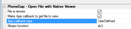
- Ajax callback type - can either be
UserDefined or
Report. Choose
UserDefined if
you want to create your own Xbasic function to handle the
callback. Choose Report
if you want to run a Report that you have defined in your web
project and save the report as a PDF file.
- Xbasic function - the name of the Xbasic function
that will handle the Ajax callback. In addition to generating
the file you want to view on the mobile device, your Xbasic
function must return Javascript to set these variables:
{dialog.object}.__filenameNativeViewer
- the URL of the file you want to view.
{dialog.object}.__filenameFriendlyNativeViewer
- the friendly name for the file that will be displayed in the
title bar of the Viewer app.
TIP: To see an example of how these variables should be
set by your Xbasic function, click the smart field for the
Xbasic function property. Then click the
Show function prototype
button.
If you set the Ajax callback type to Report, you must specify
which report you want to run.
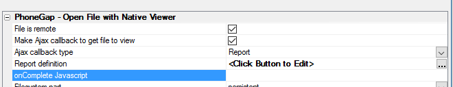
- Report definition - When you click the smart field
for this property a genie opens up (see below) where you can
define which report to run.
- onComplete Javascript - the name of a Javascript
function to run after the report has been generated. See below
for an example of how this property can be used.
NOTE: Alpha Anywhere will automatically send
the following Javascript to the client once the report has been
created:
{dialog.object}.hideWaitMessage();
This is useful because if you displayed a wait message when invoking
the action to save a report as a PDF file, the wait message will
automatically be closed once the report has been generated. You do
not have to specify an
onComplete Javascript property solely for the purpose of
hiding a wait message.
Report Definition Genie
When you click the smart field for the Report definition
property, the following dialog is shown where you can specify the
name of the report to run and other properties of the report, such
as the filter, and order, PDF options (such as whether the PDF file
should have a watermark, etc.) and argument bindings.
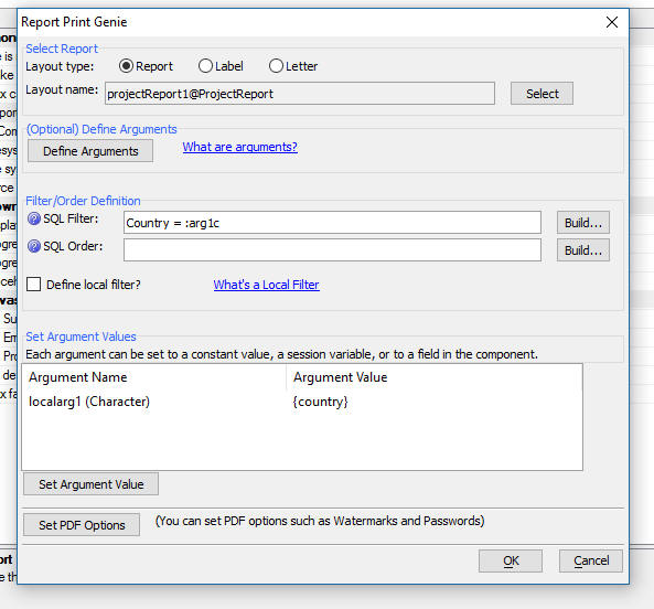
The filter you define for the report in this dialog is in
addition to any filter defined in the report definition itself.
When defining a filter, it is common to use arguments in the
filter rather than literal values. For example:
Country = :whatcoutry
rather than
Country = '{country}'
where {country} is the value in a control called Country on the
UX component.
To create an argument to use in a report filter click on the
Define Arguments
button shown in the above image and then bind the argument to a
value (either a static value, or a value in a UX control) in the
Set Argument Values
section of the dialog.
Understanding the onComplete Javascript Property
When you set the Ajax Callback type to Report, the
onComplete Javascript
property allows you to define the name of a Javascript function that
will be called after the report has been generated on the server.
Your function will take a single parameter as its input. This
parameter is an object with these properties:
- localFilename - the file name in the filesystem on
the device where the report will be saved after it is downloaded
to the mobile device.
- reportName - the name of the report that was printed
- fileSystem - the filesystem part where the report PDF
file will be stored. e.g.
saved,
private,
public,
persistent,
temp.
- folder - the name of the folder in which the report
PDF file will be stored.
A common use case for this function is to store the name of the
report and its associated properties (such as filesystem part,
filename, etc), in a List control so that the user can quickly view
a previously viewed report by simply viewing the file for that
report (which is stored on the device after it is viewed for the
first time). This allows the user to view reports even when there is
no connection.
For example, the following function would store the report
information in a List control called
previouslyViewedReports:
(Assume that the List control has columns named
filename,
reportname,
fspart and
folder).
function afterReportGenerated(obj) {
var l = {dialog.object}.getControl('previouslyViewedReports');
var _d = [
{
filename: obj.localFilename,
reportname: obj.reportName,
fspart: obj.fileSystem,
folder: obj.folder
}
];
l.appendRows(_d);
}
Alpha Anywhere Application Server - Building Connection
Strings - If you have a remote server that does not have the
Alpha Anywhere development version installed, building an ad-hoc
connection string that you can paste into the a5_appllication.a5i
file can be difficult.
There is now a hyperlink on the
Web Server Settings
dialog on the Other
tab to Open the Connection
String Builder Genie. This opens the regular connection
string builder where a new connection can be built and tested. It
will also verify if the correct client driver is installed, as the
test connection option will fail if the driver is not correct. The
generated string is shown in a simple dialog with an option to
Copy to clipboard
when the genie is closed. This allows creating and testing a
connection in the same environment where it will be used.
Xdialog - {Condition_else} Directive - The
{condition_else}
directive makes it much easier to display Xdialogs that have
conditional sections that render in the same place. Previously it
was necessary to use the {start_pos}
directive to get the second and subsequent condition to render in
the same space as the first condition.
For example:
ui_dlg_box("Conditional Sections",<<%dlg%
{removeleadingspaces}
{removecomments}
{region}
Condition: [condition^=conditions];
{condition_begin=condition="condition1"}
{region}
This is
condition 1;
{endregion}
{condition_else=condition="condition2"}
{region}
This is
condition 2;
{endregion}
{condition_else=condition="condition3"}
{region}
This is
condition 3;
{endregion}
{condition_else}
{region}
This is any
other condition;
{endregion};
{condition_end};
{endregion};
{line=1,0};
{justify=right}<Close>
%dlg%)
The images below show how the Xidialog renders for various
conditions. Note that when 'condition4' is selected, the
{condition_else}
text is show because there is no handler for this condition.
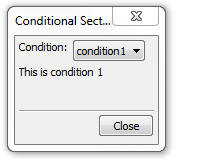
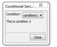
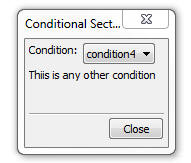
Xbasic - Sys_shell_wait() Function - SYS_SHELL_WAIT()
now has two additional parameters (in addition to the command
and the ShowWindow flag):
- Timeout 0 (millliseconds - defaults to -1 =
INFINITE)
- TerminateOnTimeOut - (defaults to FALSE) - If a
timeout occurs and this parameter is set to true, the created
process will be terminated using a pattern that injects a thread
into the new process and calls Exit Process. This is to prevent
handles from remaining locked. Kill process (TerminateProcess())
does not release handles gracefully.
Note:
SYS_SHELL_WAIT() does not throw any errors if something
fails.
There is a new function called
Run() that accepts
all of the same parameters (in fact is now called by
sys_shell_wait() )
but will return an error if something doesn't work.
Example Interactive Window Session
Run("CMD.EXE /C \"DIR C:\*.* /s\"", .t.,1000,.t.)
ERROR: Application timed out.
SYS_SHELL_WAIT("CMD.EXE /C \"DIR C:\*.* /s\"", .t.,1000,.t.)
UX Components - List and ViewBox Controls - SQL Data Sources -
Security and Server-side Show Hide Expressions - You can now
apply security settings and server-side show/hide expressions to
individual columns in the SQL queries that are used to populate List
and ViewBox controls.
To define security and/or server-side show/hide expressions for
individual columns in a SQL query, click on the smart field for the
Security and Show/hide
Expressions property (as shown in the image below)
This will open a builder where you can define settings for each
column in the SQL query.
At run-time, before the SQL is executed, if any of the columns in
the SQL SELECT statement have security or show/hide expressions, the
columns that should not be shown are removed from the SQL SELECT
statement. This means that if a user is not authorized to see a
particular column in a SQL query, the data that are sent to the
client does not include the excluded columns.
Contrast this with applying security or show/hide expressions to
individual fields in the List (in the 'Fields' pane of the List
builder). When you apply security to List fields that merely removes
a hidden column from the List display. But the data for the hidden
column is still set to the client and would be visible if the user
viewed the source of the page.
NOTE: You can only apply security and
show/hide settings to the SQL if Alpha Anywhere can parse the SQL
statement. For example, if the data source for a List is a stored
procedure, then, since this is not a parse-able statement, you
cannot apply security and show/hide settings.
UX Component - Step Indicator Control - The Step Indicator
control is used to show what step a user is on in a multi-step
action.
The image below shows a Step Indicator control configured to show
four steps, labeled One, Two, Three and Four
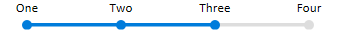
When you add a Step Indicator control you can specify as many
steps as you want and you can define the labels for each step. You
can also control the color of the completed steps (blue in the above
example) and the un-completed steps (gray in the above example).
The Step Indicator control is a Data Control. This means that you
can set its value using the
{dialog.object}.setValue() method and you can read its value
using the {dialog.object}.getValue()
method.
For example, to set the above control so that it shows you are at
the beginning of the sequence (on the first step) you would use:
{dialog.object}.setValue('name of control',0)
To set the control's value so that it shows you are on step Three
(i.e. as shown in the above image) you would use:
{dialog.object}.setValue('name of control',2)
To add a new Step Indicator control to a UX, select the [More...]
entry in the UX toolbox in the Data Controls section.
This display a list of additional control types.
To configure a Step Indicator control, click the smart field for
the control's Control Properties property.
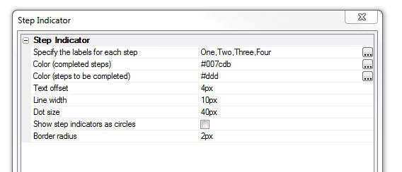
In the image below, the 'Dot' size has been increased, the 'Show
step indicators as circles' property has been turned off and the
'Dot size' has been set to '40px'. A small border radius of 2px has
been set so that the 'dot' (squares in this case) have slightly
rounded edges.
Xbasic - a5Helper_SQL_ApplySecurity() Function - The
a5Helper_SQL_ApplySecurity() function applies security and
server-side show/hide expressions to a SQL SELECT Statement. Any
column that is not authorized by the security group or server-side
show/hide expression is removed from the SQL Select statement.
The SQL statement you pass to this function must be parseable. If
Alpha Anywhere cannot parse the statement (e.g. the SQL is a call to
a stored procedure), the function returns the original SQL
statement.
If a column does not have a security setting or server-side
show/hide expression is will be included in the SQL statement.
If a column has a defined security setting that the column will
only be included in the SQL statement if the logged in user is a
member of one of the security groups specified by the column's
security setting.
If a column as a show/hide expression the column will only be
included in the SQL statement if the expression evaluates to a true
result.
Syntax
c SQLStatement =
a5Helper_SQL_ApplySecurity(sql as c , securityDef as c
, loggedInGroups as c)
Where:
- sql - the SQL statement you want to apply security to
- securityDef - a JSON object that defines the security
settings and show/hide expression for selected columns in the
SQL statement
- loggedInGroups - the security groups that the current
user is a member of
securityDef is a
JSON array of objects. Each object in the array has these properties
- column - the column in the SQL statement (must match
exactly the way the parsed SQL represents the column. see below)
- security - A comma delimited list of the security
groups authorized to see this column
- showHide - A logical expression that evaluates to
true or false. Typically the expression will reference session
variables.
The column specify in the
securityDef must
match exactly how the SQL parser represents the column. For example,
consider the following column expression
concatenate(customers.name , ', ',
customers.contacttitle)
The meaning of this expression is unchanged if the expression is
written as:
concatenate(
customers.name , ', ',
customers.contacttitle )
However, this is not how the expression is represented in the SQL
parser. To get the correct representation of the expression, you can
use the code below:
dim si as sql::Query::SelectItem
sql2 = "concatenate( customers.name , ', ',
customers.contacttitle)"
?si.Parse(sql2)
= .T.
?si.SQLStatement
= "concatenate(customers.name, ', ', customers.contacttitle)"
Example
sql = <<%str%
SELECT customers.CustomerID as cid, customers.CompanyName as
compName, customers.ContactName, customers.ContactTitle,
concatenate(customers.name,', ',customers.contacttitle) as exp1,
orders.OrderID, orders.CustomerID AS CustomerID1, orders.EmployeeID,
orders.OrderDate, orders.RequiredDate
FROM customers customers
INNER JOIN orders orders
ON customers.CustomerID = orders.CustomerID
%str%
'define the security settings
dim ss[0] as p
ss[].column = "customers.ContactTitle"
ss[..].security = ""
ss[..].showHide = "session.var1 = \"alpha\""
ss[].column = "concatenate(customers.name, ',
', customers.contacttitle)"
ss[..].security = "Sales,Marketing"
ss[..].showhide = ""
ss[].column = "customers.CompanyName"
ss[..].security = "Administrator"
ss[..].showhide = ""
dim security as c
'Generate a JSON string
security = json_generate(ss)
dim loggedInGroups as c
loggedInGroups =
Context.Security.GetUserRoles()
sql2 = a5Helper_SQL_ApplySecurity(sql,security,loggedInGroups)
UX Component - PhoneGap Applications - Delay Function Calls
Until PhoneGap is Ready - Typically, when a need to execute a
method that can only be run after PhoneGap has loaded, you add code
to the onPhoneGap
ready client-side event. But in some cases this is not practical and
you might already have some code that runs in the
onRenderComplete, or
onPrepareComplete
event and some of the methods in these events need to wait till
PhoneGap is ready.
The new {dialog.object}._delayTillPhoneGapReady()
method allows you to register function calls that will only
be made once PhoneGap is ready.
The syntax is:
{dialog.object}._delayTillPhoneGapReady(functionToExecute,
scope, arguments)
For example, say you wanted to call the List Object's
._fetchMediaFiles()
method.
Normally your code would be
var lObj = {dialog.object}.getControl('LISTNAME');
lObj._fetchMediaFiles()
This could be rewritten as
var lObj = {dialog.object}.getControl('LISTNAME');
{dialog.object}._delayTillPhoneGapReady(_fetchMediaFiles,lObj)
UX Component - Building Component Programmatically Using
Xbasic - Absolute Layout Containers - You can now use the
a5wcb_createDialogUsingXbasic() Xbasic function to create a
UX component that define a component that contains an Absolute
Layout container. This is made possible because the Absolute
Layout's absolutePositions
property now allows you to specify the
variablename of the
control in the absolute layout, rather than its
idInternal property,
which cannot be used because it is dynamically assigned when
a5wcb_createDialogUsingXbasic() executes.
dim wp as p
DIM wp.page_fields[0] as P
with wp.page_fields[]
.controltype = "layout_directive_ContainerBegin"
.v.container.subType = "AbsoluteLayout"
.v.container.id = "ABS1"
.v.container.absolutePositions = <<%str%
[
{
variablename:
'c',
top: '7px',
left: '16px',
height: '28px',
width: '139px',
style: 'position: absolute; top: 7px;
left: 16px; width: 139px; height: 28px; '
},
{
variablename:
'd',
top: '156px',
left: '141px',
height: '27px',
width: '132px',
style: 'position: absolute; top:
156px; left: 141px; width: 132px; height: 27px; '
}
]
%str%
end with
with wp.page_fields[]
.v.variableName = "c"
.v.breakType = "None"
end with
with wp.page_fields[]
.v.variableName = "d"
.v.label = "Field D"
.v.hasWaterMark = .t.
.v.waterMark.text = "Enter name"
end with
with wp.page_fields[]
.controltype = "layout_directive_Containerend"
end with
a5wcb_createDialogUsingXbasic(wp,"genByXbasic",.t.)
PDF Reports - Embed Fonts - In certain cases, PDF reports
generated will not render correctly on iOS devices. This is because,
by default, the PDFs are generated with the 'Embed fonts' option set
to false. The PDFs do not render on the iOS devices because they use
fonts they are not native to the iOS device. The solution is to turn
the 'Embed fonts' option on (this is done by opening the Project
Properties dialog and going to the PDF Options section).
Now, the Embed fonts option is turned on by default. Since this
will result in slightly larger PDF files, some developers might want
to not embed fonts in generated PDF files. This can be done by
setting the property in the Project Properties.
UX Component - Pre-render Option - Bulk Update - If you
have a large number of UX components and you want to turn on the
'Pre-render at design-time' option for each UX component, opening
each component, setting the property and then saving the component
would be tedious. A new bulk operation allows you to automatically
set this property in multiple UX components at once.
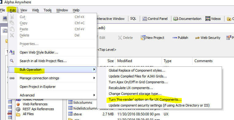
Xbasic - Regular Expressions - regex_valid() Function -
The regex_valid() function can be used to test if a regular
expression is valid.
Examples:
? regex_valid("[.+")
= .F.
The issue with the above failing regular
expression is lack of a closing ']'.
? regex_valid("[.+]")
= .T.
? regex_match(".","[.+")
ERROR: Unmatched [ or [^ in character class declaration. The error
occurred while parsing the regular expression: '[.+>>>HERE>>>'.
UX and Grid Components - <ProjectStyle> - Compact Styles
- Certain of the built-in styles (e.g. 'Alpha') have a 'compact'
option. If you set <ProjectStyle>
to 'Alpha' you can
now specify that you want to use the 'compact' option by setting the
<ProjectStyle> to
Alpha:compact . In
an individual component that is set to use
<ProjectStyle> as
its style, you can override the global settings of 'compact' or
'non-compact' by specifying:
<ProjectStyle>:compact
or
<ProjectStyle>:notcompact
UX Component - List Control - Show/Hide List Column - A
new method has been added to the List control that allows you to
show or hide a List column.
Syntax:
<listObject>.showHideColumn(columnNumber,flagShow)
- columnNumber - zero based column number to show or
hide
- flagShow - if true, the column is shown. If false,
the column is hidden
UX Component - Pre-render at Design-time Option - Warning
Message - When you save a UX component that does not have the
Pre-render Component at Design-time option turned on, a warning
message now comes up telling you that it is recommended to turn this
option on because of the significant speed improvement this options
will give at run-time.
If you choose not to turn the Pre-render option on, you can
specify that the message should not be shown again for this
component, or for all components
If you choose to turn the option on you can specify that the
option should automatically be set to 'on' for all future UX
components that you create.
TIP: If you choose the option to turn on
pre-render for all UX components, you can un-set the option by going
to View, Settings, Preferences, UX Component.
Xbasic Functions - JSON_to_YAML() - YAML is a markup
language that is sometimes used in place of JSON. This function
converts JSON to YAML. YAML (yet another markup language) uses
nesting to represent hierarchy.
Example
json = <<%str%
{
"fname": "john",
"lname": "public",
"children" : [
{"name": "callie","hobbies": ["minecraft","leggo"]},
{"name": "griffin","hobbies":
["ballet"]}
],
"address": {
"street": "12 and main",
"city": "Squares Ville",
"State": "KY"
}
}
%str%
?json_to_yaml(json)
fname: john
lname: public
children:
- name: callie
hobbies:
- minecraft
- leggo
- name: griffin
hobbies:
- ballet
address:
street: 12 and main
city: Squares Ville
State: KY
Note: This function is just a wrapper around
the extension::JSON class.
Xbasic Functions - JSON_from_YAML() - YAML is a markup
language that is sometimes used in place of JSON. This function
converts YAML to JSON.
yaml = <<%str%
fname: john
lname: public
children:
- name: callie
hobbies:
- minecraft
- leggo
- name: griffin
hobbies:
- ballet
address:
street: 12 and main
city: Squares Ville
State: KY
%str%
json_from_yaml(yaml)
= {
"fname": "john",
"lname": "public",
"children" : [
{"name": "callie","hobbies": ["minecraft","leggo"]},
{"name": "griffin","hobbies":
["ballet"]}
],
"address": {
"street": "12 and main",
"city": "Squares Ville",
"State": "KY"
}
}
Note: This function is just a wrapper around
the extension::JSON class.
UX and Grid Component - Live Preview - Edge - When you do
a Live preview from the UX or Grid, you can now select Microsoft
Edge as the target. (For Windows 10 and above)
UX Component - Google Visualization Libraries- Gantt -
Because of a recent change Google made to how their visualization
libraries are loaded, if you select the 'gantt' library, you would
get a Javascript error. This is now fixed.
Alsp, the sample templates that are available when you create a
new UX includes an update example for Google charts. This new
component includes as Gantt chart, as shown in the second image.
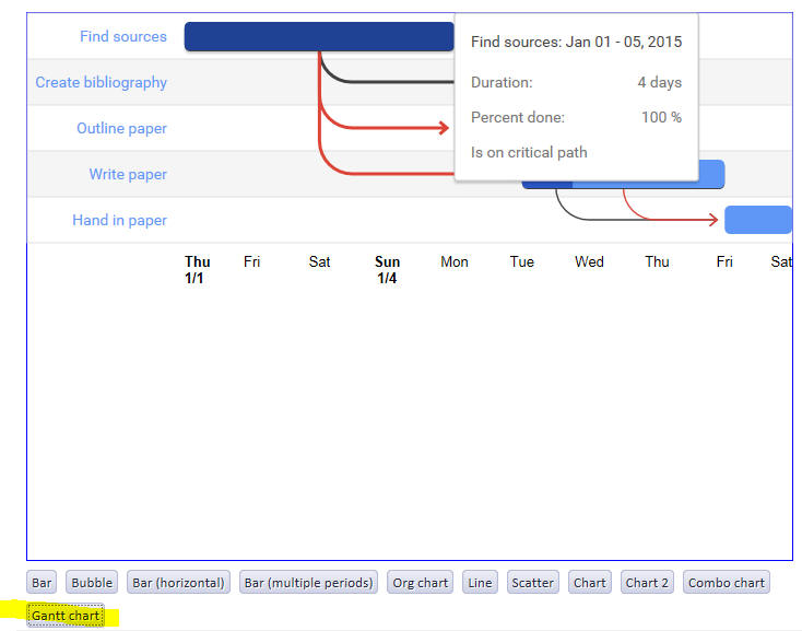
Xbasic Arrays - DIMMing Arrays with Default Values - When
you DIM a new array, you can now specify a default value for each
array item. This is especially useful when DIMming arrays for use
with .Net code.
Examples:
dim sb[6] as system::Text::StringBuilder = new
system::Text::StringBuilder(1024)
? sb[1].capacity
= 1024
? sb[2].capacity
= 1024
...
dim nums[6] as n = rand()
? nums
= [1] = 0.680694580078125
[2] = 0.709716796875
[3] = 0.17425537109375
[4] = 0.60302734375
[5] = 0.752105712890625
[6] = 0.02587890625
dim strs[6] as c = Rand_String(6+int(rand()*10))
? strs
= [1] = "eimpzcugesd"
[2] = "chjhlwuzu"
[3] = "nioseq"
[4] = "gsrslnflqravo"
[5] = "rvaqfaqqu"
[6] = "joexbk"
Xbasic - AlphaDAO SQL::Resultset.toJSON() - The
.toJSON() method has
been changed so now it create a parseable JSON array of objects.
Previously the .toJSON()
method was used for an internal function and it generated a special
format that was of no general use.
Contrast the AlphaDAO
SQL::Resultset.toJSON() with the AlphaDAO
SQL::Resultset.toJSONObjectSyntax()
method. The later generates a CR-LF delimited string of JSON
objects. To turn the output from this method into a parseable
string, it is necessary to add the opening and closing square
brackets and to terminate each line, except the last, with a comma.
Examples:
dim cn as sql::Connection
cn.Open("::Name::northwind")
cn.PortableSQLEnabled = .t.
cn.Execute("select customerid, contactname, city, country from
customers where country = 'canada'")
rs = cn.ResultSet
? rs.tojson()
= [
{"customerid" : "BOTTM", "contactname" : "Elizabeth Lincoln", "city"
: "Tsawassenn", "country" : "Canada"},
{"customerid" : "LAUGB", "contactname" : "Yoshi Tannamuri", "city" :
"Vancouverr", "country" : "Canada"},
{"customerid" : "MEREP", "contactname" : "Jean Fresnière", "city" :
"Montréal", "country" : "Canada"}
]
cn.Execute("select customerid, contactname, city, country from
customers where country = 'canada'")
rs = cn.ResultSet
? rs.ToJSONObjectSyntax()
= {"customerid" : "BOTTM", "contactname" : "Elizabeth Lincoln",
"city" : "Tsawassenn", "country" : "Canada"}
{"customerid" : "LAUGB", "contactname" : "Yoshi Tannamuri", "city" :
"Vancouverr", "country" : "Canada"}
{"customerid" : "MEREP", "contactname" : "Jean Fresnière", "city" :
"Montréal", "country" : "Canada"}
UX Component - Pre-render - Security and Server-side Show/Hide
Expressions - The pre-render option for UX component can make a
dramatic difference in the speed with which UX components are
rendered. This is especially true of large UX components.
Pre-rendering can result in 5 to 10x performance improvements in
certain cases. However, if your UX component used security or
server-side show/hide expressions to control the visibility of
certain controls on the UX you were not able to turn the pre-render
feature on.
Now, even if your UX uses security or server-side show/hide
expressions, you can still use the pre-render option as long as you
also turn on the Apply
security and server-side show/hide expressions property.
When this property is turned on, the UX is not recomputed at
run-time (as is normally the case when a UX which uses security
and/or server-side show/hide expressions). Instead, at run-time,
data are sent to the UX with information about what security groups
the user is in, and which controls need to be hidden or shown as a
result of evaluating server-side show/hide expressions. A
client-side function will then hide the controls that should not be
visible.
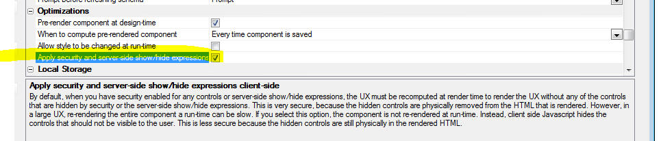
It is important to understand that when you turn on the option to
apply security and server-side show/hide expressions client-side,
the result is not as secure as applying security and server-side
show/hide expressions on the server. That's because when security
and server-side show/hide expressions are applied server-side, the
HTML and data that are sent to the client does not physically
include anything that should not be visible to the user.
But when apply these settings client-side, the HTML may contain
sensitive information that the user could see by viewing the page
source (even though this information is hidden on the page itself).
A side benefit of turning this option on is that any controls
whose visibility is controlled by a server-side show/hide expression
will be shown or hidden if any ajax callback sets the value of a
session variable that is used in a server/side show expression.
UX Component - Action Javascript - SQLite Actions -
Several new actions have been added to the SQLite Actions actions in
Action Javascript.
The new actions are:
- Get Fields in a Table
- Delete a Database
- Create a Table
- Create a Table from Data
- Import Data into a Table
- Delete All Records from a Table
Get Fields in a Table - This action will get the fields in
a table as well as some additional information. The onSuccess event
handler gets an array of objects. The array has an entry for each
field in the table. Each object in the array has these properties:
- cid - column id (e.g. 0, 1, 2, 3, etc.)
- name - field name
- type - data type (e.g. TEXT, INTEGER, NUMBER, etc.)
- nonnull - 0 or 1 - indicates if the column is
nullable
- dflt_value - default value
- pk - 0 or 1 - indicates if the column is a primary
key column
Delete a Database - Deletes the physical file for the
SQlite database from the device.
Create a Table - Allows you to create a new table in a
SQLite database. You can define the table structure and also the
indices for the table. The image below shows the builder where you
specify the table structure. The action will automatically drop any
existing table with the same name.
Create a Table from Data - This action will create a new
table from data (i.e. it will import data into a new table). The
data from which the table is created is a JSON array of objects
where each object represents a record. For example, if you specify
the following data:
[
{"id" : 1, "FirstName":
"Bob", "LastName": "Smith", "Department" : "Sales"},
{"id" : 2, "FirstName":
"Terry", "LastName": "Jones", "Department" : "R&D"},
]
A new table with 2 records would be created. The fields in the
table would be id, FirstName, LastName and Department and the type
of each field (except the id field) would be TEXT. The type of the
id field would be INTEGER.
NOTE: SQLite does not have Date or DateTime
fields. Date and time values should be stored in TEXT fields and
should appear in the data to be imported as string values.
When you specify the data from which the new table is to be
created you have the following options:
- specify the data directly
- specify the name of a Javascript function that will return
the data. e.g set the data to
Javascript:myfunctionname where
myfunctionname
is the name of a Javascript function that will return the data
array.
- make an Ajax callback to the server and compute the data on
server.
When you specify that the data are to be computed by an Ajax
callback you have two options
- SQL Query - specify a SQL query that will return the data
- Custom - specify the name of an Xbasic function. This
function will return the data as a JSON string.
You can specify if a table already exists with the table name you
specify that the existing table should be dropped. If you do not
drop the existing table, the operation will fail.
You can also specify a
batch size property. After the new table has been created
(with no records in it initially), INSERT statements are executed to
insert the data into the table. You can specify how many records
should be inserted with each INSERT statement. The default
batch size is 100,
which means that each INSERT statement will insert up to 100 records
into the table. If you set the
batch size to -1,
Alpha Anywhere will try to add the data to the table with a single
INSERT statement. However, this may result in an INSERT statement
that exceeds the maximum statement length supported by SQLite and
the action will fail. If you set the
batch size to
1, Alpha Anywhere will perform one INSERT statement for each row of
data to be added to the table. If you have a large amount of data,
this could be slow. Therefore, if you want to optimize performance
of this action, you will want to choose the largest batch size
possible before the action fails.
If the action fails at any point while adding the records to the
newly created table, the table is not created.
Import Data into a Table - This action is very similar to
the Create a Table from Data action except that a new table
is not created from the data. Instead, the data are imported into an
existing table. All of the options for specifying the data that the
Create a Table from Data action supports are supported by
this action.
Delete All Records from a Table - This action deletes all
of the records in a table.
UX Component - List Control and ViewBox Control - Text Select
- A new property 'Allow text select' allows you to
enable/disable the ability to select text in a List or ViewBox
control. Previously this always defaulted to true. Now, this
property defaults to false.
UX Component - List Control and ViewBox Control - Multi-select
- Shift+Click - When doing a multi-select in a List or ViewBox
that is configured to allow multiple selections, shift+click will
now select multiple values, following the standard Windows
conventions.
UX Component - FormView Control - Default Template and Named
Templates - Formatting Directives - You can now use formatting
directives in templates. For example:
Web Publishing - HTTP publish and Optimized Publish -
These publish methods will now force a reload of the security data
and will clear the UX component cache, so any changes should be
reflected in the first request after publish.
UX Component - Action Javascript - PhoneGap File Download
Action - This action has been enhanced. You can now specify that
the list of files to be downloaded should be generated by making an
Ajax callback. Of course, this same Ajax callback can also create
the files to download (which is the most likely reason for choosing
this option).
You can also specify where the file(s) that are downloaded should
be stored in the device's filesystem.
You can set the
Filesystem property to one of the defined locations. You can
also set this property to the name of a Javascript function that
will return the name of the Filesystem part, using this syntax:
javascript:myfunctionname
Your function must return the filesystem part (e.g. saved,
private, public, persistent). Alternatively, you can return an
explicit folder where you want to store files by prefixing the
return value with 'explicit:'
. For example:
function myfunctionname() {
//return full path to folder
with trailing /
return 'explicit:file:///dir1/dir2/dir3/';
}
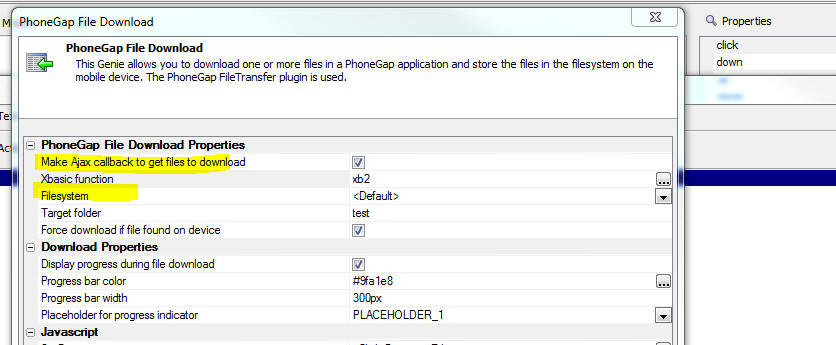
UX Component - Action Javascript - SQLite - Delete a Database
- A new SQLite action has been added. The 'Delete a Database'
action will delete a SQLite database file that had previously been
downloaded to the device.
UX Component - List Control - Refresh List Data Action - Keep
Focus - Child Records - If you refresh List data and you
select the option to keep focus on the current selection, child
records (if any) will also keep their focus. Previously only the
record in the parent List kept its focus.
UX Component - Captcha Controls - You can now define the
style for the captcha control error message and you can control
where the message is displayed.
UX Component - Application Cache - Spaces in Filenames - If
a file in the manifest had spaces in the name, the application cache
was not created. This is now fixed as all filenames in the manifest
are now URL encoded.
Bugs
UX Component - List Control - iOS Devices - List Freeze -
Fixed an issue where the List control could freeze if it was being
scrolled at the same time that the List was being repopulated. This
issue could also have affected scrolling on PanelCards.
UX Component - Video Player Control - Action Javascript - SSL
- YouTube - The action to set the YouTube video id was not
honoring the SSL flag set in in the VideoPlayer properties.
UX Component - DetailView - Media Files - Incremental Refresh
- After performing an incremental refresh on a List control, remote
media files referenced in new data displayed in the List were not
being fetched.
Xbasic - a5storage_listitems() Function - The
a5storage_listitems()
was limited to 1,000 items. Now, all of the items in the bucket are
listed
UX Component - ControlBar Control - Disclosure Button -
Placeholders in Button Text - If a disclosure button had a
placeholder in the button text, the placeholder was not resolved
when the Disclosure was in its open state.
UX Component - List with Detail View - PhoneGap - Fetch Media
Files - If a List with a Detail View was configured to fetch the
media files referenced in the List from a remote server and store
them in the file system on the device, when the PhoneGap app was
loaded you would occasionally get a 'PhoneGap not ready' error
message. This is now fixed. The reason for the error was that the
method that downloads media files was firing before the PhoneGap
ready event.
UX Components - Repeating Sections - Date Fields - If the
client side date format for date fields in a Repeating Section did
not match the server-side date format, when submitting data to the
server, the client-side date fields in the Repeating Section were
not being translated to the server-side date format.
UX Component - Client-side Calculated Fields - International
Formats - If the client side decimal separator was set to a
comma, then client-side calculated fields that involved decimal
numeric fields were not being computed correctly. This bug was
introduced in version 4.3.
UX Component - Ink Control - If a UX component was a child
of a parent UX component, and the child UX component contained an
Ink control, the Ink control would, in certain cases, not operate
the second or subsequent time the child UX was opened.
Tips
Downloading Files to a Mobile Device - This topic
discusses two different techniques for downloading files (such as
PDF, Video, Audio, Excel, Image files) to a mobile device so that
the files are stored in the filesytem on the device and can be
viewer later on (presumably when the device no longer has an
internet connection) using the Native app associated with the
particular file type.
NOTE: The comments in this topic apply only to PhoneGap
applications. Your PhoneGap application will need to load the
following plugins: Cordova
Open, Device,
File,
File Transfer.
The first technique uses the
PhoneGap - File download action in
Action Javascript. Using this action you can define an action that
will download a list of files and store them in the filesystem on a
mobile device. The action downloads a list of files returned by a
Javascript function.
The second technique uses features of the List control to
automatically download files when the List is populated. The data
with which the List is populated should contain a field that has the
URL for file you want to download. For example:
|
Filename |
URL |
|
pdffile1 |
http://alphafiles.s3.amazonaws.com/pdffile1.pdf |
|
pdffile2 |
http://alphafiles.s3.amazonaws.com/pdffile2.pdf |
|
pdffile3 |
http://alphafiles.s3.amazonaws.com/pdffile3.pdf |
|
pdffile4 |
http://alphafiles.s3.amazonaws.com/pdffile4.pdf |
|
etc.... |
|
To use this technique:
- Define a List control with a Detail View
- In the List builder, on the Fields tab, set the control type
of the URL to LinkedFile
- In the List Builder, on the DetailView tab click on the
smart field for the
Media files (photos, videos, audio recordings, other) settings
property.
- In the dialog that is displayed, check the Automatically
download media a other linked files when populating this List
property. This will cause all remote files (referenced by their
URL, and identified by List columns that have a column type of
Image, Video, Audio or LinkedFile) to be downloaded and saved in
the filesystem on the mobile device when the List is populated.
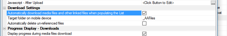
- You may also want to check the
Automatically delete
un-referenced files property. This will delete any
previously downloaded files when the List is re-populated with
new data and records in the List data no longer reference any
previously downloaded files.
The advantage of this second technique over using the
PhoneGap - File download
action in Action Javascript is that the downloading of files is
automatically handled for you.
Alpha Anywhere V4.3.1 -Build 3962-4772 14-Nov-2016
Videos
|
UX Component - Ink Control |
Image Annotation using the Ink Control in a Data
Bound UX Component |
The ink control allows you to create sketches by
'drawing' with your mouse, any type of pointing
device, or with your finger (on a device that
supports touch). A common use of the ink control
is to annotate images. The image you want to
annotate is shown as the background to the ink
control and then you can draw 'on top of' the
image. When the data are saved the ink is stored
separately from the image in a long text field.
In this video we show how a data bound UX
component that allows a user to upload images
can be configured to allow the user to annotate
the images that are uploaded.
Watch Video
- Part 1
Watch Video
- Part 2
Watch Video
- Part 3
Watch Video
- Part 4
Download Component
Download
SQL Table Definition
Date added: 2016-10-30 |
|
UX Component - ControlBar Control |
Defining Disclosure Forms using the Disclosure
Form Builder |
In the video 'Displaying a Modal Pop-up Form
using a Disclosure' we show how a modal pop-up
form can be displayed using a Disclosure. The
definition of the HTML for the form is fairly
tedious because it is completely hand coded.
In this video we show how the Disclosure Form
Builder can be used to make it easier to define
the form HTML.
Watch Video - Part 1
Watch Video - Part 2
Download Component
Date added: 2016-10-30 |
|
UX Component ControlBar Control |
Display Modal Message Dialogs using Disclosures |
Modal messages (such as confirmations, progress,
feedback) as commonly used when designing the
user interface for an application. ControlBar
disclosures make displaying these messages
particularly easy.
In this video we show how the ControlBar can be
configured to display three different types of
message dialogs: basic information dialogs (one
button), confirmation dialogs (two buttons) and
wait dialogs (no buttons).
Watch Video - Part 1
Watch Video - Part 2
Watch Video - Part 3
Download Component
Date added: 2016-10-30 |
|
UX Component - List Control |
Specifying Sort Criteria when Filtering a List |
Action Javascript allows you to easily define
fields on a UX where the user can specify search
criteria for a List control on the UX ( much
like the Search Part in a Grid). Now you can
also define sort criteria.
In this video we show how the Filter Records in
a List action in Action Javascript can be
configured to allow sort criteria to be
specified.
Watch Video
Download Component
Date added: 2016-1-03 |
|
UX Component - ControlBar Control |
Adding List Navigation Buttons to a ControlBar |
When you define a List control, you can specify
that the List should be paginated. If you set
the pagination method to 'Navigation Buttons'
then you must define buttons to move to the next
and previous page of records. In a mobile
application that uses a ControlBar in a Panel
header or footer, it is desirable to place these
navigation buttons in the ControlBar.
In this video we show how you can quickly add
List navigation buttons to a ControlBar by
selecting the 'Pre-defined buttons' option when
adding ControlBar items to your ControlBar
definition.
Watch Video
Date added: 2016-11-05 |
|
UX Component - FormView Control |
Using a FormView Control to Edit Data in a List
Control - Master-Detail Forms - Very Large Forms |
By default, when you configure a List with a
Detail View (so that edits can be made to the
List data), the Detail View is composed using
individual controls (e.g. Textbox, Textarea,
Dropdown, etc). If the Detail View has a large
number of fields, then composing the Detail View
using individual controls will be inefficient
and will result is a very large UX component
that may not perform well.
An alternative approach is to use the FormView
control to implement the List's Detail View.
This is extremely efficient and will allow you to
build UX components that edit very large forms
but still perform very well.
In this video we show how a master-detail Form
is built using a FormView control to edit the
fields in the Master table and a second FormView
control to edit the fields in the Detail Table.
The master table has 100 fields and the detail
table has 100 fields, so in total, the UX
component is editing 200 fields.
Watch Video - Part 1
Watch Video - Part 2
Watch Video - Part 3
Watch Video - Part
4
Download Component
Download
Script to Create SQL Tables
Date added: 2016-11-08 |
|
UX Component - FormView Control |
Tutorial - Building a Mobile Master-Detail Form
using The List, FormView and ControlBar Controls
- |
In this video tutorial we show how a mobile app
can be built to implement a master-detail form
using the FormView control. The app will allow
users to edit data from the Customers and Orders
table in the sample Northwind database. This is
a classic master-detail form: Each customer has
multiple orders. The UX component uses two Lists
joined in a parent-child relationship. The
parent List displays data from the Customer
table and the child List display the related
orders from the Orders table.
Each List has a Detail View, but in both cases,
the Detail View is implemented using the
FormView control.
Once the basic functionality of the app has been
built, the app is 'mobilized' by wrapping the
various sections of the component in PanelCards
and a ControlBar is added to implement
navigation between the various parts of the
application.
Watch Video - Part 1
Watch Video - Part 2
Watch Video - Part 3
Watch Video - Part 4
Watch Video - Part 5
Watch Video - Part 6
Watch Video - Part 7
Watch Video - Part 8
Watch Video - Part 9
Watch Video - Part 10
Download Components
Date added: 2016-11-10 |
UX Component - ControlBar Control - Buttons - Bubble Help
- You can now define bubble help for all button types (button,
button-list, button-toggle, disclosure-button) in the ControlBar
control.
PhoneGap App Builder - Passcode Check Plugin - A new
plugin for iOS has been added that allows the developer to verify
that a passcode has been set on an iOS device. This an important
security consideration if you are planning to store data on the
device. If a passcode has been set on an iOS device, then the
contents of the device are encrypted when the device is locked.
When the plugin is installed, a JavaScript
PasscodeCheck object
is automatically created after the PhoneGap ready event fires. You
do not need to create this object. To use the plugin, call the
isDevicePasscodeSet
function.
PasscodeCheck.isDevicePasscodeSet(successCallback, failureCallback);
The successCallback
and the failureCallback
functions are required.
Success callback (called if device passcode is set with value of
true)
Failure callback (called if the passcode is not set, with a value of
false or on error or if the device does not support the
LocalAuthentication
framework)
Example:
PasscodeCheck.isDevicePasscodeSet(function() {
alert('Passcode is set);
},
function() {
alert('Passcode not set);
}
);
PhoneGap App Builder - File Transfer Plugin - In early
September, we detected a problem on Android devices with the latest
version (as of 11/7/2016 : v1.6.0) of the File Transfer Plugin. A
change was made to the PhoneGap Builder to load version 1.5.1 of the
File Transfer Plugin, which is working reliably. If you have any
Android apps that fail to upload media files, make sure version =
"1.5.1" has been included in the project's config.xml file. If you
do not feel comfortable editing the project's config.xml file, you
can remove the file-transfer plugin, save the changes and then add
the file transfer plugin once again and save. This will load the new
plugin definition string that includes the version 1.5.1
specification.
Action JavaScript - Stripe Checkout - Locale Property -
Stripe has added support for a new locale property. The locale
property is used to display the Stripe Checkout dialog in the native
language of the user. The default value is auto and that will
display Checkout in the users preferred language, if available.
English is used by default. Supported languages include Simplified
Chinese (zh), Danish (da), Dutch (nl), English (en), Finnish (fi),
French (fr), German (de), Italian (it), Japanese (ja), Norwegian
(no), Spanish (es) and Swedish (sv). Checkout also uses the locale
to format numbers and currencies.
PhoneGap Shell V2 - Overlay Button Position - You can now
adjust the position of the overlay icon that shown when you are
running a UX component in the PhoneGap shell. By default, the
overlay button is shown bottom right. However, in some cases the
overlay button will obscure an important part of the component you
are testing and you will want to move it. To do so, click on the
overlay button to show the bottom toolbar and then click the menu
icon (left hand button).
This will show a dialog where you can adjust the overlay
position.
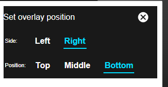
UX Component - ControlBar - Pre-Defined Buttons - List Control
Pagination Buttons - When you define a List control, you can
specify that the List should be paginated. If you set the pagination
method to 'Navigation Buttons' then you must define buttons to move
to the next and previous page of records. In a mobile application
that uses a ControlBar in a Panel header or footer, it is desirable
to place these navigation buttons in the ControlBar.
When you add 'button' Items to a ControlBar, the
Pre-Defined Buttons
hyperlink opens a genie that makes it easy to add List control
navigation buttons to the ControlBar.
Watch Video
UX Component - List Control - Action Javascript - Filter
Records in a List Action - You can now specify sort criteria
when using the Filter Records in a List action in Action Javascript.
Watch Video
UX Component - List Control - afterSelect Client-side Event
- A new event has been added to the List control. The
afterSelect event
fires after a row in the List has been selected.
The afterSelect
event is essentially the same as the
onSelect event
except in the case where the List has a Detail View and is the
parent of a child List and the child List has been set to pre-fetch
data. In this case the
onSelect in the parent List will fire after the row in the
parent List has been selected and the List's detail View has been
populated, but before the child Lists have been populated. The
afterSelect will
fire after the child Lists have been populated.
UX Component - Client-side Events - onAjaxCallbackNotAllowed
- The
onAjaxCallbackNotAllowed client-side event fires if the
server-side canAjaxCallback
event does not allow the Ajax callback. I.e. the
canAjaxCallback
event sets:
e.authorized = .f.
UX Component - Client-side Data Cache - Deleting Items From
Cache - You can now delete items from client-side data cache
using the {dialog.object}.deleteFromDataCache()
method.
Syntax:
{dialog.object}.deleteFromDataCache(itemName,
onSuccessIn,onError)
Where
- itemName - name of item to delete, or '<all>'
to delete all items
- onSuccess - function to call when action is completed
- onError - function to call if there was an error.
UX Component - Client-side Data Cache - Listing Files from the
Cache that have been saved to disk - A new method allows you to
list the files in the client-side data cache. These are the
cache-items that are defined to persist to the filesystem and that
have been retrieved. The syntax is:
{dialog.object}.listFileInDataCache([onSuccess [,
onError]);
Where
- onSuccess - function to call with result. Function
takes a single parameter - filelist - an array of filenames.
- onError - function to call if there is an error.
UX Component - Client-side Data Cache - File Location -
You can now specify where the client-side data cache files should be
persisted in the file system (when running in PhoneGap).
To specify the location open the Client-side Data Cache editor
and set properties on the Other Settings tab.
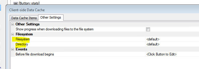
For backward compatibility select
<default> for both
the Filesystem and
the Directory. This
will store the files in the persistent filesystem (as specified by
the PhoneGap constant
LocalFileSystem.PERSISTENT). The files will be stored in a
folder called __AADataCache/A5SessionFile.
If you specify an explicit
Directory name or a
Filesystem other
than <default>, the
A5SessionFile
sub-folder in the target folder is not used.
The Filesystem
and Directory can be
dynamically set at run-time by calling a Javascript function.
For example, you could set the
Directory to:
javascript:getDirectory
This would call a Javascript function called
getDirectory. This
function must return the name of the directory (with a trailing
slash).
To specify an explicit location for storing the files in the
client-side data cache, set the
Filesystem property
to the name of a Javascript function (for example
javascript:getFilesystem).
Your Javascript function should return the fully qualified URI of
the folder where the cache files should be stored, prefixed with the
string explicit: .
For example:
function getFilesystem() {
//return full path to folder
with trailing /
return 'explicit:file:///dir1/dir2/dir3/';
}
UX Component - ControlBar Control - Disclosure Form Builder
- A new genie has been added to make building the HTML for simple
Disclosure forms easier.
Watch Video - Part 1
Watch Video - Part 2
Xbasic - JWT - JSON Web Tokens - New methods have been
added to create and decode JSON Web Tokens (JWT)
Example:
dim secret as c = "thisismykey"
dim token as c =
extension::JSON::JWTSign(json_sanitize("{ fname : 'john' , lname :
'smith'}"),secret)
?token
=
"eyJhbGciOiJIUzI1NiIsInR5cCI6IkpXVCJ9.eyJmbmFtZSI6ImpvaG4iLCJsbmFtZSI6InNtaXRoIiwiaWF0IjoxNDc3ODMzMDgwfQ.RJ7vNIYtUaC5DNXiJtiQpxKYUO2TRW2U9bpFZMPypw4"
? extension::JSON::JWTVerify(token,secret)
= {"fname":"john","lname":"smith","iat":1477833068}
UX Component - List Controls - Events - The way in which
events are handled for buttons, hyperlinks and dynamic images in a
List control has been changed to use 'items' (i.e. the 'a5-item'
attribute), rather than binding events to the buttons, hyperlinks
and dynamic images in each row. This new method is substantially
more efficient than the previous method and will result in less
memory utilization and better performance. The performance
differences in large lists with several buttons, hyperlinks etc. in
each List row should be especially noticeable.
UX Component - Image Annotation using Ink Control in a Data
Bound UX Component - A great use case for the Ink control is to
annotate images. This is done by displaying the image you want to
annotate as the background to the Ink control and then the user can
'draw' on top of the image.
New properties have been added to the UX to allow you to easily
configure the Ink control to use an image as its background. The
image is and the ink annotation are stored in separate fields in a
database.
The image below shows an Ink control with an image as its
background.
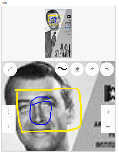
When you configure the UX you specify that it is data bound to
the table that contains the images and the ink annotation. You bind
the image field in the table to an image control on the UX and you
bind the annotation field in the database to the Ink control on the
UX. The in the Ink control's Data Binding section you specify the
name of the image control to use as the ink background.
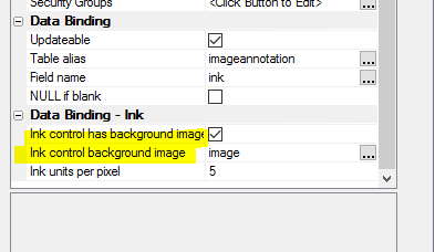
Application Server - a5w_info() Function - Changes have
been made to the a5w_info() function to give additional information
under IIS and the AlphaCloud. The changes are summarized below:
1. The System section at the bottom now includes values that tell
you the operating system and version of the server.
For example:
Server Product
ApplicationServerIIS
Platform
Windows
Operating System Name
Microsoft Windows Server 2008 R2
Operating System Version
6.1
Operating System Is Server Edition True
The XBasic required to generate those values is below.
? Context.ApplicationConfiguration.ServerProduct
= �ApplicationServerClassic�
?OSPlatform()
= "Windows"
?OSName()
= "Microsoft Windows Server 2008 R2"
?OSVersion()
= "6.1"
?OSIsServerEdition()
.t.
2. The ServerSetting section is specific to the Classic edition of
Alpha Anywhere Application Server. This section is no longer
generated unless the value of
Context.ApplicationConfiguration.ServerProduct is
ApplicationServerClassic;
which apples to Live Preview as well.
The full set of values available is currently:
- ApplicationServerClassic
- ApplicationServerIIS
- AlphaCloud
3. There is an Alpha Cloud section that is displayed only when the
server product is
AlphaCloud.
This section shows the application constants generated by Alpha
Cloud on deployment, including the subscription, account,
application, deployment, published version and publication creation
date/time and the deployment date/time..
4. On the Request section, many of the values on a5w_info() showed
the names of object properties and functions rather than the values
of interest.
For all servers
Session.Keys was not working. It now displays the keys for
session values.
For IIS (and Alpha Cloud), the following were not showing values,
but object function and property names instead. These now display
the keys and values in nested tables:
-
Request.Params
-
Request.ServerVariables
-
Request.QueryString
-
Request.Form
-
Request.Headers
-
Request.Cookies
Bugs
UX Component - Javascript Error in _numberStringSanitize
Function - In certain cases a UX would give Javascript error
when loading. The reported error was in the _numberStringSanitize
method of the UX component.
UX Component - Caching - A bug in the way the UX component
was being cached was fixed. This bug could, in certain cases, lead
to a server crash.
Desktop Forms - Supercontrols - Google Maps - Because of a
change Google made to their Maps API, the Google Maps supercontrol
will no longer work. However, the Bing or Mapquest supercontrols can
be used as alternatives.
Reports - Layout Table Reports - Fixed an issue with high
order characters.
Web Applications - Web References - Fixed an issue with
the proxy generator.
Tips
Grid Component - Alpha Theme - Icons - When you use the new 'Alpha'
theme in a Grid, the toolbar icons for the Detail View can be a little hard to
see in their default state (see first image).
However, you can make the icons much clearer by applying some CSS to the SVG
icons used in the toolbar (see second image)
To define the necessary CSS select the
Local CSS definitions property.
Specify the following CSS:
.grid .link .icon {
fill: #333;
stroke: #333;
}
Alpha Anywhere V4.3 -Build 3922-4757 26-Oct-2016
VERY IMPORTANT: As of build 3898 if the
regional settings on your server do not use a period as the decimal
character and if the client-side number format that users will use
when entering numbers does not use default settings (period for
decimals and comma for thousands separator) then you must
set the new Number
format - decimal character and
Number format -
thousands separator
properties in each UX component. See the
UX Component - Number Formats topic
below for more information.
Summary: V4.3 is packed with new features. Perhaps the single most
important new feature is the ControlBar control in the UX component. If
you are building Mobile apps, the ControlBar will give you a huge
productivity boost and allow for much more professional looking
applications. It is an essential tool for Mobile app developers!
Other new features of note include the new 'Alpha' stylesheet, new
PhoneGap shell for quickly testing PhoneGap applications, Built-in SVG
icons for all themes, Google address auto-complete
Videos
|
UX Component - FormView Control |
Capturing Signatures using the SignatureInk
Editor |
A common requirement when using the FormView
control is capturing a signature. Alpha Anywhere
has a Signature control, but this control
captures signatures as bitmaps and is not ideal
for use in a FormView control. The Ink control
is better suited for this use case.
In this video we show how a FormView control is
configured to use the built-in SignatureInk
editor.
Watch Video
Download Component
Date added: 2016-06-30
|
|
Node |
Installing a Node Module from NPM and then
Creating a Node Service to Call Methods in the
Node Module |
The Xbasic code you write in your Web
applications can call methods in Node.js modules
that are installed from NPM (the Node Package
Manager).
In this video we show how a Node module is
installed into the Web Project folder and then
how a Node Service is created so that methods in
the Node module can be called.
The particular Node module that we install in
this video is called Tinify and we show how a
Node Service is defined so that we can call into
this module from Xbasic using the Node_request()
function.
Watch Video
- Part 1
Watch Video
- Part 2
Watch Video
- Part 3
Date added: 2016-07-06
|
|
UX Component - Ink Control |
Customizing the Ink Control Overlay |
The Ink control 'overlay' displays a number of
tools that are used by the Ink editor (such as
the Pen selector, Eraser, etc.). You can
customize the appearance of the 'overlay' and
add your own tools (i.e buttons).
In this video we show how you can add a new
button to the Ink editor overlay.
Watch Video
Date added: 2016-07-08 |
|
UX Component - Ink Control |
Setting the Ink Control Background Image |
Setting the background image in the Ink Control
is a common practice. In this video we discuss
various aspects of how you can set the Ink
control image background and control whether the
UX goes dirty when the Ink background is set.
Watch Video
- Part 1
Watch Video
- Part 2
Date added: 2016-07-06 |
|
UX Component - Ink Control |
Using the Ink Control to Capture Signatures |
The UX Component has always had a built in
Signature Capture control. However, it is also
possible to use the Ink control to capture
signatures. The primary benefit of using the Ink
control to capture signatures is that the
signature is captured using the Ink format,
which is an ascii format, rather than as a PNG
image, which the Signature Capture control uses.
In this video we show how to configure the Ink
control to capture signatures.
Watch Video
Date added: 2016-07-08 |
|
UX Component - ViewBox |
Using a ViewBox as the List's Detail View |
A common pattern when building mobile
applications is to use a List control with a
Detail View. When the user taps on a row in the
List, the Detail View shows the details for the
selected row. This pattern is used extensively,
especially for offline applications where the
data in the List is intended to be updateable.
However, there are many cases where the List is
not intended to be updateable and a much
'lighter weight' solution can be achieved but
not turning on the List's 'Has Detail View
property' and instead, using a ViewBox to
display details for the selected row in the
List.
An even lighter weight solution can be achieved
by using a ViewBox to replace the List. So you
end up with a ViewBox to display a list of
records and another ViewBox to display details
for the selected record.
Watch Video
- Part 1
Watch Video
- Part 2
Download Component
Date added: 2016-07-09 |
|
UX Control |
Building a Custom Image Gallery using the List
and Ink Control |
The List and Ink Control can be used to build a
custom Image Gallery in which the List is used
to display thumbnails of the available images
and when the user taps on a particular image,
the full size image is shown in the Ink control.
The advantage of using the Ink control to
display the image is so that you can take
advantage of the Ink controls pinch-zoom
features and pan features to scale the image and
to pan around to see details of different parts
of the image. The ability to actually draw ink
(which of course is the primary purpose of the
Ink control) is not used in this case.
Watch Video
- Part 1
Watch Video
- Part 2
Watch Video
- Part 3
Download Component
Date added: 2016-07-16 |
|
UX Component - List Control |
Options for Handling Write Conflicts when
Syncing Data |
When you build a disconnected mobile
application, there is always a chance that the
user will get a write conflict when they sync
data that was edited while they were offline.
This could happen because some other user
has committed a change to a record before
another user could commit their change.
By default, when a write conflict occurs, the
information about the conflict is sent to the
user and the user can resolve the conflict by
selecting 'Their value' or 'My value'. However,
there are other powerful programmatic options
for handling write conflicts. In this video we
discuss the various techniques for handling
write conflicts.
Watch Video
- Part 1
Watch Video
- Part 2
Date added: 2016-07-21 |
|
Grid Component |
Preventing User from Closing Pop-up Window if
Grid or a Linked Child Grid is Dirty |
It is common in web applications to have buttons
that open a Grid component in a pop-up window.
The Action Javascript builder when you build
this action has a built-in property that allows
you to prevent the user from closing the window
if the Grid shown in the window is dirty. But
what if the Grid shown in the window has Linked
child Grid components? You might want to also
check that the child Grids are not dirty before
the window can be closed.
In this video we show how this can be done.
Watch Video
Date added: 2016-08-04 |
|
UX Component - FormView Control |
Creating Complex Form Layouts using the Flow and
Column Layout Containers |
When you lay out a Form using the FormView
control, by default, the controls on the form
are rendered with one control per line and each
control taking up the full width of the FormView
control. If you want to create a more complex
Layout you can either switch from Genie mode to
the Freeform mode, or you can use Flow and
Column Layout Containers to control the layout
of your Form.
In this video we show how a complex Form layout
is achieved using Column and Flow layout
containers.
Watch Video
- Part 1
Watch Video
- Part 2
Download Component
Date added: 2016-08-27 |
|
UX Component |
Adjusting Colors and Fonts in a Stylesheet |
Alpha Anywhere has always allowed you to edit a
stylesheet used by a component to change any of
the CSS defined in the stylesheet. But when you
simply want to change some colors in a
stylesheet, using the style editor may be more
than you need.
In this video we show how you can easily adjust
colors and fonts in a style.
NOTE: This option is only available for 'new'
styles (AndroidLight, AndroidDark, iOS7, Alpha)
as these styles are based on SASS.
Watch Video
Date added: 2016-09-14 |
|
UX Component - ControlBar Control |
Introduction to Basic Concepts |
This video demonstrates basic concepts of the
ControlBar control.
Watch Video
- Part 1
Watch Video
- Part 2
Date added: 2016-09-14 |
|
UX Component - ControlBar Control |
Updating ControlBar Data - Dynamic Text |
This video demonstrates how you can update the
data in the ControlBar's data. This allows you
to put dynamic text in the Controlbar. We also
show how the ControlBar can be animated when it
is refreshed.
Watch Video
- Part 1
Watch Video
- Part 2
Date added: 2016-09-14 |
|
UX Component - ControlBar Control |
Using Watch Events to Update ControlBar Data |
The ControlBar data can be updated automatically
in response to certain events in the UX (such as
the UX going dirty, a List going dirty, etc.) or
by a change in the value of one or more
controls.
In this video we show how you can configure
watch events to automatically update ControlBar
data.
Watch Video
Date added: 2016-09-14 |
|
UX Component - ControlBarControl |
Adding a Button to a ControlBar |
In this video we show how you can add a button
to a ControlBar and then associate an action
(i.e. some Javascript code) to run when the
button is tapped.
Watch Video
Download Component
Date added: 2016-09-14 |
|
UX Component - ControlBarControl |
Adding a Button-Toggle to a ControlBar |
In this video we show how you can add a
Button-Toggle to a ControlBar. Toggle buttons
can either be two-state (switching between a
true and a false state), or multi-state (each
click advances to the next button state).
The video shows how the state of a Button-Toggle
is used to control what action a button performs
when clicked.
Watch Video
Download Component
Date added: 2016-09-14 |
|
UX Component - ControlBarControl |
Adding a Button-List to a ControlBar |
A common pattern in mobile apps is to have a
button bar at the bottom of the screen with a
series of buttons that allow you to select the
active Panel that is shown on the device.
Typically, these buttons are spread out so that
they fill the width of the screen.
The button-list control is ideal for
implementing this pattern.
In this video we show how a Button-List can be
configured to fill the width of the screen and
to select a Panel Card in a Panel Layout when
one of the buttons in the Button-List is tapped.
Watch Video
- Part 1
Watch Video
- Part 2
Watch Video
- Part 3
Download Component
Date added: 2016-09-14 |
|
UX Component - ControlBar Control |
Selecting the Active ControlBar Layout |
A ControlBar can have multiple Layouts. In this
video we show how you can dynamically select the
Layout to show.
Watch Video
- Part 1
Watch Video
- Part 2
Download Component
Date added: 2016-09-14 |
|
UX Component - ControlBar Control |
Showing a Disclosure |
A disclosure can be some explicitly defined
HTML, or it can be another Layout. In this video
we show how a disclosure, defined as a
ControlBar layout, is shown.
Watch Video
Download Component
Addendum: One of the more unusual disclosure
types is Outside-After (and Outside-Before)
which display the disclosure perpendicular to
the parent Layout. In this video we show how the
disclosure is rendered when the Outside-After
type is selected.
Watch Video
- Part 2
Date added: 2016-09-14 |
|
UX Component - ControlBar Control |
Showing a List in a Disclosure |
You can display standard UX controls (such as
Lists, Buttons, Input controls, etc.) in a
disclosure. In this video we show how a list is
displayed in a disclosure.
Watch Video
- Part 1
Watch Video
- Part 2
Download Component
Date added: 2016-09-16 |
|
UX Component - ControlBar Control |
Setting the Selected Button in a Button List
using Javascript |
The selected button(s) in a ControlBar Button
List can be set programmatically using
Javascript. It is also possible to completely
change the buttons shown in a Button List
programmatically.
In this video we show how this is done.
Watch Video
Download Component
Date added: 2016-09-21 |
|
UX Component |
Google Address Auto-complete |
A commonly seen feature in many web and mobile
applications is address auto-complete. As the
user starts typing an address into a textbox, a
list of suggested address is shown and the user
can select from the list. This feature is
powered by Google Maps.
In this video we show how you can turn on the
Address Suggest feature for any textbox control
on a UX.
NOTE: Textbox controls in Repeating
Sections are not supported.
Watch Video
- Part 1
Watch Video
- Part 2
Date added: 2016-09-16 |
|
UX Component - ControlBar Control |
Defining Javascript in a ControlBar -
Understanding the 'This Object' Option. Using
Javascript function in a template. |
When you define Javascript functions in a
ControlBar (and also a ViewBox and FormView
control), you can specify where the Javascript
should be stored. The options are: At the
control level, at the UX level and 'This
object'.
This video explains the options and discusses
why the 'This object' option is best. It also
describes how functions defined at the 'This
object' level can be referenced in templates.
Watch Video
Download Component
Date added: 2016-09-28 |
|
UX Component - ControlBar Control |
Dynamically Showing and Hiding Lines in a
ControlBar Layout |
A ControlBar layout can have multiple Lines.
Each Line in a Layout can be dynamically shown
or hidden.
This video shows how a show expression can be
defined for a Line in a ControlBar Layout
Watch Video
Download Component
Date added: 2016-09-28 |
|
UX and Grid Component |
Sending SMS Messages using the Twilio Service |
You can send SMS messages from the Grid and the
UX. The messages are sent using the Twilio
service, so you will need a Twilio account. You
can use Action Javascript to define the action
which sends the message.
There are a large number of options for
customizing the message, such as sending
messages in different languages, depending on
the user preference.
In this video we show how a button was defined
in the UX to send a message. The phone number
and message body are read from controls on the
UX.
Watch Video
Date added: 2016-09-29 |
|
UX Component |
Creating Offline HTML5 Applications using the
Application Cache |
The Application Cache (an HTML5 feature widely
supported by various browsers) allows you to
build 'offline' applications - i.e. applications
that can be loaded into the browser even if
there is no internet connection.
In order to load
the application initially an internet connection
is obviously needed. But once the application
has been loaded initially, all of the files
(e.g. CSS.Javascript, images, etc.) referenced
by the application are cached in the browser and
an internet connection is not needed to load the
application subsequently.
If the application is updated, then if an
internet connection is available when the app is
loaded, the new version of the app is downloaded
and cached in the browser.
In this video we show how offline HTML5
applications can be created using the
Application Cache feature.
NOTE: These 'offline' HTML5 applications do not
require PhoneGap!
Watch Video
- Part 1
Watch Video
- Part 2
Date added: 2016-09-29 |
|
UX Component - List Control |
Saving and Restoring List Settings to Quickly
Define New Lists |
The List control is one of the most commonly
used controls in a UX component. But because of
the richness of the List, there can be many
properties that need to be set to configure a
List. After you have configured a List, you can
save all of the settings for the List in a named
file. Then when you define your next List, you
can restore the settings from the named file -
saving a lot of time.
This video demonstrates how List settings can be
saved and restored.
Watch Video
Date added: 2016-109-02 |
|
UX and Grid Component |
Using the Javascript Code Library |
The Javascript Code Library is available in all
contexts where Javascript can be edited. The
Code Library is ideal for storing snippets of
code that can then be pasted into the Javascript
you are editing.
In this video we walk through the various
features of the Javascript Code Library.
Watch Video
Date added: 2016-109-05 |
|
UX Component - ControlBar Control |
Adding an Edit ControlBar Item to a ControlBar |
A ControlBar typically contains text and
buttons, but a common use case is to build a
Search ControlBar that uses an edit control in
the ControlBar.
In this video we show how the edit ControlBar
item type can be used to build a Search feature.
Watch Video
Download Component
Date added: 2016-10-08 |
|
UX Component - ControlBar Control |
Displaying a Modal Pop-up Form using a
Disclosure |
A common pattern in many applications (both
Mobile and Desktop web) is to display pop-up
modal forms to collect some information from the
user. Displaying pop-up modal forms using the
ControlBar is very easy and extremely powerful.
This video shows how a ControlBar 'disclosure'
is used to display a pop-up modal form. The
'a5-action' attribute in the Disclosure HTML is
used to invoke actions defined in the
ControlBar's Action pane.
Watch Video
- Part 1
Watch Video
- Part 2
Download Component
Date added: 2016-10-08 |
|
UX Component - FormView Control |
Displaying Calculated Values on a FormView
Control |
When you design a FormView control you may want
the form to display calculated values (typically
computed from other fields in the form). Since
the Form is really just an HTML template that is
rendered using Alpha Anywhere's client-side
templating features, this is easily done.
In this video we show how a calculated field is
added to the FormView control.
Watch Video
Download Component
Date added: 2016-10-10 |
|
|
|
|
Features
UX Component - ControlBar Control - A new control type is
available in the UX component. The ControlBar is primarily intended
for creating the content that appears in Panel headers and footers
and it is a much easier and vastly more flexible way for populating
a Panel header or footer compared with the previous technique of
adding standard UX controls (such as buttons and static text
controls) to the header or footer.
For more information on ControlBars, please see the User Guide
documentation
here.
You can also refer to the API documentation
here.
To see videos on the ControlBar refer to the Videos section of
this document.
UX Component - ControlBar Control - Modal Dialogs - A new
property (Auto-hide
disclosure) for disclosure-buttons allows the disclosure opened by the disclosure-button
to be modal. This
means that the user will not be able to tap anywhere off the disclosure
to close the disclosure, but must tap a button on the disclosure itself
in order to close the disclosure. To make a modal disclosure:
-
Set the Auto-hide
property to false.
-
Set the Auto-hide
disclosure property in the
Common Settings
section to auto
-
Put a button on the disclosure to close the disclosure. The
button's action should execute this Javascirpt:
this.hideDisclosure()
For example, in the image shown below when the user taps the
Settings button, the disclosure (a modal dialog) prompting for two
input fields is shown. The user cannot close the disclosure by
clicking off the disclosure. The only way to close the disclosure is
by tapping the OK or Close buttons.
UX Component - ControlBar Control - Miscellaneous Improvements
When you define HTML for a Disclosure you can now use the
a5-actions attribute in your HTML to bind to ControlBar Actions. For
example:
<div a5-action="action1">
Tap here to do some task
</div>
A new type of ControlBar Item is available. The Edit item allows
you to display an input control in the ControlBar.
The button-disclosure ControlBar item now supports user defined
events such as click, downhold, etc.
UX Component - ControlBar Control - Samples - When you
open the ControlBar builder you can now get a quick start by loading
a sample ControlBar. On the 'Home' tab in the ControlBar builder,
click the Load Sample
ControlBar hyperlink.
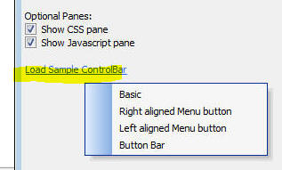
UX Component - ControlBar, ViewBox and FormView Controls -
Defining Javascript - In the builder for the ControlBar, ViewBox
and FormView, you can define Javascript functions.
When you define you Javascript functions, you can specify where
the Javascript should be stored. The options are:
- With the control
- With the UX
Now, a new option is available:
When you select the 'With the control' option, the Javascript is
stored in the control definition, (which means that if you copy the
control to another UX component, the Javascript you define comes
along - this would not be the case if you use the 'With the UX'
option). However, at render-time for both the 'With the control' and
'With the UX' options, the Javascript functions you define are
global functions. That means that if you have a UX with multiple
ControlBar, ViewBox or FormView controls, and they each define a
different function called (say) 'func1' at the 'With the
control' option, the definition of the global func1 function will be
whatever definition exists in the last control that was rendered.
However, if you define the Javascript at the 'This object' level,
then your Javascript functions become method of the ControlBar,
FormView or ViewBox object and a definition in one control cannot
overwrite a definition in another control.
To invoke a function defined at the 'This object' level, you must
use a pointer to the object as a prefix.
For example
this.func1()
(assuming that the this object is a reference to the ControlBar,
FormView or ViewBox object).
In cases where the this object does not reference the ControlBar,
FormView or ViewBox object, you can still call the function by first
getting a pointer to the ControlBar, FormView or ViewBox object. For
example
var obj = {dialog.object}.getControl('myViewBox1');
obj.func1()
The ControlBar, FormView and ViewBox controls allow you to use
client side templates. If you templates you can reference a
Javascript function defined at the 'This object' level as follows:
{@[scope].func1}
The [scope] keyword is a reference to the object.
UX Component - ControlBar Control - Show/Hide Lines in a
ControlBar Layout - You can now dynamically show or hide lines
in a ControlBar layout.
Watch Video
To define a Show expression for a Line, click the Line Properties
button on the ControlBar layout editor.
UX Component - PhoneGap Shell V2 - A new PhoneGap shell
template is now available. When developing a PhoneGap application,
a shell is a huge productivity boost because you can test new
versions of the app you are developing by quickly loading the app
into the shell that is running on your device. You do not have to
submit your app to PhoneGap build every time you want to test a new
version of your app.
The V2 shell improves on the previous PhoneGap shell that shipped
with Alpha Anywhere in several key areas.
To create a new PhoneGap shell, open the UX builder and create a
new UX component. Select PhoneGap-Shell-V2 from the list of
templates.
Once you have created the UX component using the template, save
it and submit it to PhoneGap build using the PhonGap build genie
(accessed from the PhoneGap button on the Web Control Panel). Then
load the shell onto your device.
Key benefits of the V2 shell include
-
Cleaner look - achieved by using ControlBars to implement
the shell component
-
Full screen when running app - The Back and Previous
buttons are hidden by default and are shown on demand by tapping
on a small icon in the lower right corner of the screen.
-
Multiple server address - You can now use the same shell
with multiple servers. Previously you have to build a shell for
each server as the server address was hard coded into the shell.
Now you can specify as many server addresses as you want and
then select which address should be active.
-
Test server address - You can now test if the server
address you selected is valid. It is important to know if you
have specified a valid server address or else the shell will not
be able to load components.
-
Edit component names - After you enter a component name,
you can edit the value. In the old shell you could not edit
values.
-
Scan values when filling in forms - The shell has two
forms that need to be filled in - when adding a new component,
and when defining a new server address. In both of these forms
you can press a Scan button to scan a QR code that encodes the
value to be entered into the form. To create the QR codes, go to
the UX component, Click the Menu button and select the
PhoneGap shell QR
codes... menu item.
-
See list of PhoneGap plugins - The Settings screen menu
allows you to select a command that shows the list of plugins
that the shell has loaded.
-
Android back button - full support for the Android Back
button. For example, if you press the back button while on the
screen that shows your running component, you will return the
shelll home page.
The various screen shots shown below illustrate various of the
new V2 features of the PhoneGap shell.
1. PhoneGap Shell V2 - Main Screen
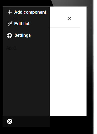
2. PhoneGap Shell V2 - Main Screen Menu
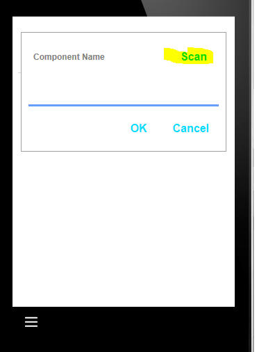
3. PhoneGap Shell V2 - Adding a new component to the list
4. PhoneGap Shell V2 - Generating a QR code for the component
name from the dropdown menu in the UX builder
5. PhoneGap Shell V2 - QR code type
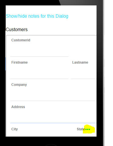
6. PhoneGap Shell V2 - Showing a running component -
Back and Refresh buttons are hidden
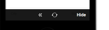
7. PhoneGap Shell V2 - Showing a running component -
Back and Refresh as hidden shown after tapping on the menu icon
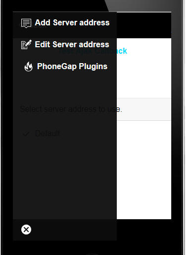
8. PhoneGap Shell V2 - Settings screen menu
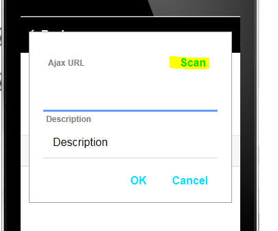
9. PhoneGap Shell V2 - Adding a new server address
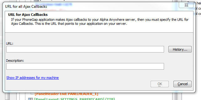
10. PhoneGap Shell V2 - Generating a QR code for the
server address and description to avoid having to type into the
dialog prompting for server address
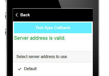
11. PhoneGap Shell V2 - Testing a server address
UX and Grid Component - Javascript Library - Date Arithmetic
- A new method has been added to the date object prototype. The .addTime()
method is now a built-in method of the date object. This method
takes two arguments:
The possible values for
interval are:
- year
- quarter
- month
- week
- day
- hour
- minute
- second
Units is a
number.
Examples:
//add 1 year to a date object
var d1 = new Date();
d2 = d1.addTime('year',1);
//add 1 year, 3 months, 10 days to a date value
var d1 = new Date();
d2 = d1.addTime('year',1).addTime('month',3).addTime('day',10);
UX Component - .getDateValue() Method - When you use the .getValue()
method to retrieve the value of any control, a string is returned,
regardless of the control's defined data type. In the case of
numeric and logical types, casting the value to the required
Javascript type is easy (using the
$u.s.toNum() or
$u.s.toBool() )
functions, but casting to a date value is harder because the data
value has to be parsed. Therefore a new method has been added to get
the value in a control as a date object.
For example:
var d = {dialog.Object}.getDateValue('dateofbirth')
The date string in the control is parsed into a date object using
the client-side date and time format defined in the UX component.
UX Component - List Control - Server-side beforeQuery Event
- This event fires before the query to retrieve the List data is
executed.
The Xbasic function that handles this event gets passed the SQL
statement that will be executed and the SQL arguments that will be
used in he query.
Now, your Xbasic code can modify the SQL statement that the query
will execute.
Previously your Xbasic could only change argument values.
UX Component - Action Javascript - PhoneGap - Scan Barcode
- A new action in Action Javascript allows you to scan barcodes in a
PhoneGap application.
The action is called
PhoneGap - Scan Barcode. The builder for the action is shown
in the image below.
You can define an onSuccess Javascript event handler that gets
called if the scan was successful. You Javascript code can
reference:
- result.text
-- the scanned text
- result.format
-- the format of the barcode
- result.cancelled
- 0 if the scan was successful, 1 if the user cancelled the scan
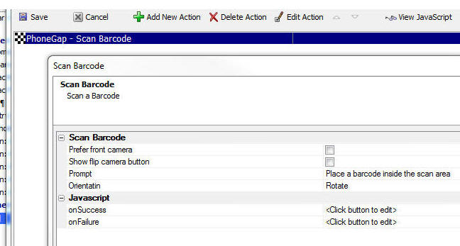
IMPORTANT: When you build the PhoneGap application be sure to
select the Bar Code Scanner plugin in the Third Party PhoneGap
Plugins section.
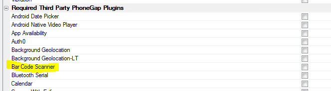
UX Component - PhoneGap - Android - onAndroidBackButton -
When running in a PhoneGap shell the client-side
onAndroidBackButton
event will fire when the user taps on the system back button. If you
do not define an event handler for this event, then when your app is
running and user taps on the Android Back button, your app will
exit.
If you define a handler for this event, then when the user taps
on the Android Back button, the app will not exit and the code in
your event handler will execute. You can typically use this event to
move to the previous 'state' of your app. For example, if the user
had just opened a window, you would close the window.
An approach that you might take is to add a new item to a 'stack'
every time the user executes an action in your app that should be
undone by pressing the back button.
Then when the user presses the Back button you can execute the
top action on the stack and then pop that action off the stack. When
there is nothing left on the stack and the user presses the Back
button you can exit the app. To do this your event handler would
execute this code.
e.event.preventDefault();
navigator.app.exitApp();
UX Component - List Control - AfterRefreshData Event - A
new event has been added to the List control After the List
control's data has been refreshed (using the
{dialog.object}.refreshListData()
method) the AfterRefreshListData event will fire. This event is
defined in the Events section in the List Builder.
UX Component - Action Javascript - Image Capture -
Camera/Photo Library Action - Videos - This Action Javascript
action can now let the user select a Video from the Photo Library.
This only works in a PhoneGap application.
The Type property
in the image shown below is visible if the
Image capture method
is set to PhoneGap
and the Picture source
property is set to Photo
Library.
Once the user has selected a video from the Photo Library, the
Javascript defined in the
Javascript to execute when image has been captured property
is executed.
Your code can reference
e.fileSystemURL, the filename of the video file. You could
use this value to set the value of the VideoPlayer control so that
the video can be played back, or you might want to upload the video
to your server, or to Amazon S3.
For example
{dialog.object}.setValue('myvideoplayer',e.fileSystemURL)
UX Component - Google Address Suggest - Address Filtering
- You can now specify a filter to filter the addresses shown. For
example, you might want to restrict address to a certain country.
For example, in the image below, addresses in New Zealand are
shown.
You can also use a Javascript function to specify the filter. For
example:
javascript:myfunction
In the above example, the Javascript function
myfunction should
return the Filter as an object. For example:
function myfunction() {
return {country: 'NZ'};
}
Note: The Javascript function is called when
the auto-complete field is initialized. It is not called
every time the user types an address into the field.
UX Component - Number Formats - Two new properties in the
UX allow you to specify the format that users will use when entering
numbers.
The Number format -
decimal character allow you to specify what character the
user will use when entering decimal places.
The Number format -
thousands separator allow you to specify what character the
user will use when entering formatted numbers above 999.
You can enter the explicit character to use or 'period' (which is
simply a symbol for a period) or 'comma' (which is simply a symbol
for a comma).
These properties can also be set automatically, and dynamically,
using session variables. The values in these session variables could
be set when a user logs in by referring to some user preference
setting stored in a table on the server.
The session variables are:
-
session.__protected__clientSideDecimalCharacter
-
session.__protected__clientSideThousandsSeparatorCharacter
IMPORTANT: If the regional settings on your
server do not use a period as the decimal character then it will be
important to update existing UX components and set the value in
these two properties if the defaults (period for decimals and comma
for thousands separator) are not correct.
 Build 3892
Technical Note
This change is made necessary by an internal change to the
{dialog.object}.getValue() method. Previously, if a user in (say)
Spain (where the decimal character is a comma) entered a value (say
234,34) into a
numeric textbox, and then used the .getValue() method to read the
value in the control, the .getValue() method returned:
234,34
Now, if the user has specified that the
Number format - decimal
character property is a comma, .getValue() will now return
this (a string value)
234.34
This is an important change because if you wanted to perform a
numeric calculation using this number you can simply use the
Javascript Number()
function to convert the string to a number and then do the
calculation. For example
var newVal = Number({dialog.object}.getValue('NUMBER1'))
* 12
UX Component - Internationalization Helper - The
Internalization Helper (accessed from the
 button in the UX
builder), now has a new option to perform all actions at once,
rather than requiring actions to be executed individually.
button in the UX
builder), now has a new option to perform all actions at once,
rather than requiring actions to be executed individually.
UX and Grid Component - Javascript Editors - Code Library
- A code library is available in all contexts where Javascript can
be edited.
Watch Video
To open the Code Library, click the Code Library icon (shown
highlighted in yellow below) on the toolbar.
To add a code snippet to the library, highlight the code in the
editor and then click the 'Add' button (left most button on the
button bar at bottom of the Code Library window)
To insert a code snippet into the code you are editing either
double click on the item or click the 'Insert' button (3rd from left
on button bar).
Features of the Code Library include:
- Mark an entry as a favorite by tapping the 'Favorite' button
in the button bar. To un-mark a favorite, click the 'Favorite'
button
- Change the order of items in the list by clicking on the Up
and Down buttons in the button bar
- Define multiple Code Libraries. To add a new Code Library,
click on the Menu button in the button bar.
- Filter entries in the list by typing a filter string into
the Filter textbox.
- Filter favorites by clicking on the Favorite icon to the
right of the Filter textbox
- Preview the contents of each item in the List by clicking on
the 'View' button (5th button from the left on the button
bar). This will open a modeless window showing the contents of
the item with focus. As you select different items in the list,
the View window is automatically updated.
- While the View window is shown you can edit entries in the
Code Library
- When editing entries, you can insert
\ip to control
where the insertion point should be shown after a Code Library
item is inserted into the code you are editing.
- The Code Libraries are stored in files. To open the folder
where the Code Libraries are stored click the Menu button and
select the Manage Code
Libraries menu item.
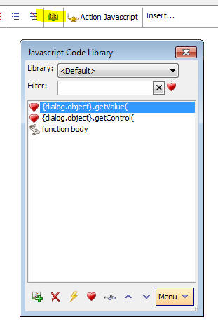
UX Component - System SVG Icons - Alpha Anywhere now comes
with a set of pre-defined SVG icons that can be used with any style.
These SVG icons are the same icons that the new Alpha stylesheet
uses.
When you are using a stylesheet other than the the Alpha
stylesheet, when you open the SVG Icon picker you will see that the
system SVG icons are shown in a category called
System SVG Icons.
In addition, the Class dropdown will have three special
auto-generated classes that can be applied to the SVG icons. These
are
- icon
- iconSizeable
- iconDisabled
The definition of these classes are shown below.
If you do not select any class, some of the images will not
render properly because the stroke color of the SVG icon is not
defined.
You must select either
icon or iconSizeable
for the icons to render correctly.
You will notice that the
icon class defines a explicit size for the icon (26 x 26 px).
Therefore changing the size using the slider on the dialog will have
no effect.
If you would like to be able to size the icon, you should select
the iconSizeable
class.
You can also define your own classes in the component's Local CSS,
or Linked CSS to apply to the SVG icon.
.icon {
vertical-align: middle;
width: 26px;
height: 26px;
fill: #333;
stroke: #333;
}
.iconSizeable {
vertical-align: middle;
width: auto;
height: auto;
fill: #333;
stroke: #333;
}
.iconDisabled {
opacity: .25;
}
UX Component - Text Area - Mobile Devices - If you have a
Text Area control on a mobile device, it can be difficult to scroll
the text in the text area without scrolling the Panel that the Text
Area is in,
On iOS devices you can scroll the text in the Text Area using a
two finger drag. However, this is a cumbersome and not obvious
gesture.
A new pre-defined control is available to create a Text Area that
is optimized for mobile devices.
The image below shows the Text control with a special slider on
the right hand side that will allow you to easily scroll the text in
the Text Area control.
SQL Server LocalDB - Alpha Anywhere now automatically
installs SQL Server LocalDB when you install Alpha Anyhwere. SQL
Server Local DB is installed. This means that as soon as Alpha
Anywhere has been installed, developers will be able to start
building applications that use a SQL database, even if they don't
access to a SQL database of their own.
According to the Microsoft documentation:
LocalDB installation copies a minimal set of files
necessary to start the SQL Server Database Engine. Once LocalDB is
installed, you can initiate a connection using a special connection
string. When connecting, the necessary SQL Server infrastructure is
automatically created and started, enabling the application to use
the database without complex configuration tasks. Developer Tools
can provide developers with a SQL Server Database Engine that lets
them write and test Transact-SQL code without having to manage a
full server instance of SQL Server.
When AlphaAnwhere is started it automatically creates a named
instance of LocalDB called
AlphaAnywhere
To build a connection string to the LocalDB databse, use the SQL
Server driver and specify the Version as
2016 and the Server
Name as (localDB)\AlphaAnywhere.
When you select a connection string in the various genies and
builders, a hyperlink appears at the bottom of the dialog that
allows you to automatically create a LocalDB version of the sample
Northwind database
that is uses in many of the Alpha Anywhere tutorials and videos.
When you click the hyperlink a named connection string called
AADemo-Northwind is
created.
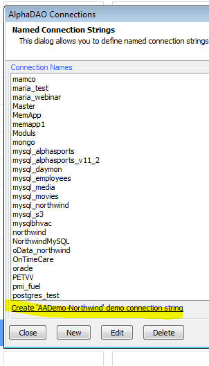
UX Component - Starter Templates - Two of the starter
templates listed when you create a new UX component have been
recreated using ControlBars in the Panel headers and footers rather
than individual UX controls. The versions created using ControlBars
are smaller than the corresponding versions that do not use
ControlBars.
Grid Component - HTML Editor - Customize Toolbar Icons and
Layout - You can not choose your own icons for the HTML toolbar
editor and you can customize the layout of the editor, rearranging
the buttons, and leaving off buttons for features you don't want to
expose.
UX Component - List Control - Save/load Settings - After
you have defined the settings for a List control, you can now save
the settings to a file on disk. Then when you begin defining a new
List, you can restore previously saved settings. This can save a lot
of time when setting up a List that is similar to a previous List
you have created.
Watch Video
To save, load or manage your settings file, click on the
Save/load Settings... button at the bottom of the List builder.
Select an option from the sub-menu that appears.
If you select the Manage
saved settings option, Windows Explorer will show the folder
where the settings files are stored and you can delete, or rename
any of the files.
NOTE Saved settings are common to all web
projects and all Workspaces. That means that it is possible to load
a saved setting that will not work in your current context. For
example, if you restore a saved setting for a SQL list that
specifies a particular connection string, and that connection string
is not present in the current Workspace, your List will not work
until you fix the problems.
UX Component - Application Cache - Building Offline HTML5
Applications - You can now create a static HTML page for a UX
component. This static HTML file can include a cache manifest. This
will enable the static HTML page to work 'offline'.
Watch Video
- Part 1
Watch Video
- Part 2
Offline enabled HTML pages can be loaded into a browser even if
no internet connection is available.
To turn on this feature, click the smart field for the
Create a static HTML page
with an application cache property, as shown in the image
below.
When this property is checked, when you save the UX component, a
special sub-directory in the Web Project folder is created. This
directory is called
StaticHTMLFileset and it contains the static HTML page with
the rendered UX component and all of the files referenced by this
page (e.g. Javascript, CSS and image files). The directly also
contains an application manifest file which lists all of the files
reference by the static HTML page. The application manifest file is
linked in the head of the static HTML page by specifying a
value for the manifest
attribute in the <html>
tag. For example:
<html manifest="cache_myuxcomponent.appmanifest">
When a static HTML page that includes a manifest is loaded, all
of the files listed in the manifest are stored in the browser's
ApplicationData storage area.
When a static HTML page is loaded, the browser checks to see if a
cached version of the page and all of the files it references exists
in the browser's ApplicationData storage area. If so, the page is
loaded from the ApplicationData storage area. To determine if the
cached version is stale or not, but browser will attempt to contact
the server (if an internet connection is available) to check if a
newer version of the manifest is available.
If a newer manifest is available, the browser will download and
cache the new version of the static HTML page and its referenced
files.
While the browser is downloading files listed in the manifest, a
series of events will fire. You can specify event handlers for these
events in your UX component.
When you click the smart field for the
Create a static HTML page
with an application cache property, you can automatically
generate default code for the
error,
updateready and
progress Application
Cache events:
UX and Grid Component - Action Javascript - Send SMS Message
using Twilio - A new action has been added to Action Javascript
to allow you to send an SMS message. You will need an account with
Twilio to use this feature.
Watch Video
The action allows you to:
- Specify an explicit 'to' number - the number to which you
want to send the SMS message
- Call a Javascript function to return the 'to' number
- When specify the 'to' number using the 'explicit' option you
can use a field value placeholder to specify the 'to' number -
e.g. {phoneNumber}
To specify the message text you can:
- Specify an explicit message. The message can use
placeholders for field values. You can also use special
directives in the message body to send messages in different
languages, depending on the user preference. See help text in
the genie when you click the smart field to edit the message
text.
- Specify a Javascript function to return the message text
- Specify an Xbasic function to return the message text.
You can also specify Javascript code to execute after the message
has been sent.
You can either explicitly specify your Twilio credential, or you
can reference a NamedResource which contains your credentials. You
will need your Twilio SID, Token, and Phone Number (the phone number
from which the SMS message is sent).
If you use the NamedResouce option, you can change specify
different values for the SID, Token and Phone Number in your
publishing profile.
To create a NamedResource, open the Web Project Properties
dialog.
The screen below show the Action Javascript builder for the
action.
reversearray() Function - You can reverse the order of
items in an array with the reversearray() function.
Examples:
dim p[3] as n
p[1] = 1
p[2] = 2
p[3] = 3
reversearray(p)
?p.dump()
= 3
2
1
dim p[2] as p
p[1].name = "alpha"
p[2].name = "beta"
reversearray(p)
?p.dump_properties("name")
= "beta"
"alpha"
UX Component - List Control - Layout - Copy Property Value
- In the Layout tab of the List Builder, when you are editing a
column layout, you can now copy a property value from one column and
paste it to multiple columns.
UX Component - List Control - Render Columns in Reverse Order
- If you are using a right-to-left language (such as Hebrew), then
you might want the columns in a Column layout to be rendered in
reverse order. A new property in the List Properties allows you to
reverse the column order.
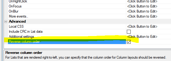
Xdialog - Caption Fields - You can now define a caption
(i.e. a watermark) for an input control on an Xdialog. When there is
no text in the input control the caption shows. As soon as the user
begins to type in the field, the caption is replaced by the user
entered text.
To define a caption for an input control, use the
caption directive
within the %...%
delimiters.
For example:
ui_dlg_box("Captions",<<%dlg%
[%caption=Enter Name%.60name];
[%caption=Enter City%.60city];
%dlg%)
UX Component - Google Address auto-complete -
afterGoogleAddressSelect Client-side Event - A new client-side
event is defined. This event is called after the user makes a
selection from the Google address auto-complete list. The event gets
the Google 'place' object with a wealth of information about the
address the user selected. You can use this event to define a custom
mapping of data from the 'place' object to controls on your
component.
UX Ccomponent - ViewBox Control - Sample iOS Settings Screen
- A new sample ViewBox can be loaded into the ViewBox builder.
The iOS Settings screen example is loaded by clicking the Load
Sample ViewBox link on the Home tab of the ViewBox Builder.
The entire contents of the settings screen (i.e. each of the
properties prompted for and the type of editor used for the
property) is driven by the ViewBox data. For example, the settings
screen in the above image is created using this data:
[
{text: 'Name', type: 'edit', editor: ['EDITORSET_1','EDITOR_1'],
name: 'name', value: 'John Smith'},
{group: 'Group 1', icon: 'svgIcon=#alpha-icon-home:icon', text:
'Item 1', type: 'switch', name: 'item1', value: true},
{group: 'Group 1', icon: 'svgIcon=#alpha-icon-shield:icon', text:
'Item 2', type: 'switch', name: 'item2', value: false},
{group: 'Group 1', icon: 'svgIcon=#alpha-icon-envelopeSolid:icon',
text: 'Item 3', type: 'switch', name: 'item3', value: true},
{group: 'Group 2', text: 'Notifications', type: 'disclosure', name:
'disclosure1'},
{group: 'Group 2', name: 'passFail', value: 'Pass', values: ['Pass','Retry','Fail'],
type: 'radio'},
{group: 'Group 2', name: 'colors', value: ['Red','Green'], values:
['Red','Blue','Green'], type: 'checkbox'},
{text: 'Phone', type: 'edit', editor: ['EDITORSET_1','EDITOR_1'],
name: 'phone',value: '123 456-7890'}
]
The ViewBox 'value' is a JSON string of the setting values. The
settings can be initialized by using the .setValue() method and
setting the ViewBox value to a JSON string of setting values.
NOTE: This control is must be used with the
Alpha style as the icons in the data are SVG icons, used in the
Alpha style.
NOTE2: The edit the text properties in the
dialog you will need to add an editor set called EDITORSET_1 with a
text box editor called EDITOR_1.
This sample ViewVox is a good example of how very rich user
interfaces can be built very easily and efficiently using a ViewBox.
For example to add a new setting to the ViewBox, simply add the
definition to the ViewBox data.
UX Component - Google Visualization Libraries - When using
the Google Visualization library in a UX component, it is no longer
necessary to go to the Web Project Properties dialog to specify that
the Google JSAPI library should be loaded. The Visualization
libraries are now loaded automatically by the UX as needed.
UX Component - Goggle Address Auto-complete - In many
applications (both web and mobile) it is common when typing in an
address to get auto-complete suggestions, as shown in the image
below. In the image shown, the user has begun typing an address into
the Address control ('70 blanc') and a drop-down list of possible addresses is
shown.
This is achieved using a feature of the Google Maps API.
You can now add this functionality to your any textbox in a UX
component.
Watch Video
- Part 1
Watch Video
- Part 2
NOTE: In order to use this feature you will
need an API key from Google. You can get an API key for Google Maps
Javascript from the Google site. This API key is the same key needed
for Google Maps.
When the user makes a selection from the drop-down list, you can
also specify that the individual parts of the address should
populate other controls on the UX. For example, if the user were to
select the first entry in the drop-down list shown above, you might
want to insert '70' into a 'StreetNumber' control on your UX,
'Blanchard Road' into a 'Street' control, 'Burlington' into a 'City'
control, and so on.
The genie that allows you to configure this feature makes it easy
to set up these mappings.
To turn on
GoogleAddressSuggest for any textbox control, set the Special
type property to
GoogleAddressSuggest.
Next click the smart field for the
Special type settings
property. This will open a builder appropriate for the special type
you selected.
The builder allows you to specify how the address parts from the
selected address should be mapped to individual controls on the UX
component. You do not have to define any mapping if you don't want
to map address parts to individual controls.
For each address part that you choose to map, you can specify if you
want the 'long' or 'short' form of the string. For example, the long
form of a state field might be 'Massachusetts', while the short form
might be 'MA'.
You can also specify your API key.
NOTE: If you leave the API key blank then Alpha Anywhere will
read it from the setting in Web Project Properties. If there is no
setting in Web Project Properties then it will look for a file
called GoogleMapsAPIKey.txt.
This file should have the API key in it.
The Bias address suggestions to the user's current location
prompt allows you to bias the address suggestions to the user's
current location. So, for example, if the user is in Paris, the
suggestions displayed by Google will show Paris addresses at the top
of the list.
NOTE: Address auto-complete for textbox controls in Repeating Sections
are not supported.
UX and Grid Component - Customize Style Colors and Fonts -
Editing the colors and fonts used in a style has always been
possible by editing the style sheet. For example, if you are using
the iOS7 style, you could edit this style and customize all colors
and fonts.
However, if you edit the style, you create your own copy of the
style. That means that if Alpha subsequently modifies this style
(for example, by adding new CSS classes for some new control type
that is added to the UX), your style will not see these new classes
unless you manually add them to your copy of the style.
Also, bringing up the style builder just to change one of the
colors in the style seems like overkill.
A new option is now available for 'version 3' (e.g. iOS7,
AndroidDark, AndroidLight) and 'version 4' (e.g. Alpha) styles.
These styles use SASS variables to define the colors and fonts used
in the stylesheet.
Watch Video
To edit colors and fonts, click the smart field for the
Customize style colors and
fonts property.
The dialog in the image shown below will be displayed.
When you edit the colors and fonts using this builder, you are
not editing the base style sheet. Instead you are storing your
adjustments to the style in a separate file. This means that if the
style sheet is changed by Alpha, you will get all of the edits
applied to the style by Alpha, and you will still get your color and
font changes.
To see the file in which your edits are stored click the
Manage files
hyperlink at the bottom of the dialog.
NOTE: When you customize the colors and fonts
for a style, the edits apply to all components in your project that
use the style. So, even though you might be in UXComponent1 when you
edit the colors, UXComponent2 (for example), if it uses the same
style as UXComponent1, will get the same edits to the colors and
fonts.
If you want to delete the custom colors you have defined, open
the editor, and click the
Manage files hyperlink and then delete the
styleTweaks.json
file that contains the settings.
Xbasic Functions - sha512() function - Creates a hash using
the SHA512 algorithm.
Syntax
result = sha512(c text [, L flagBinary])
If flagBinary is .t. the result is a blob.
Web Applications - Style Sheets - Alpha style - A new
style sheet called Alpha has been released.
The Alpha style (which is a 'version 4' style) uses SVG icons (as
opposed to CSS Icons which 'version 3' styles - such as iOS7,
AndroidLight and AndroidDark used).
The Alpha style is primarily intended for use with UX components.
When you select the Alpha style (or any 'version 4' style), the
builder displays a prompt allows you to select the 'compact' version
of the style. For mobile applications the standard version of the
style is appropriate. For desktop web applications, you might find
the standard version of the style to be too large. Selecting the
compact version of the style will render the component using smaller
text, buttons, icons, etc.
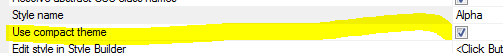
The images below show a grid using the Alpha style. The first
image is using the compact version of the style.
A notable feature of the new 'version 4' styles is the change in
the naming convention for the CSS selectors. In 'version 3' and
older style sheets, the CSS selectors include the style name in the
selector. For example, in the iOS7 style sheet there is a selector
called:
iOS7Button
In 'version 4' style sheets, the CSS selectors do not include the
style name. So, the CSS selector for a button is now simply
button
As a result of this change, when using a 'version 4' style, it
will not be possible to have a page with two different components,
each of which uses a different 'version 4' style. On the other hand
it will now be possible to dynamically change the style of a
component from one 'version 4' style to another 'version 4' style
without having to re-render the component.
UX Component - ViewBox Control - Capture Focus property -
The ViewBox has a new property that allows you to specify if the
ViewBox can capture focus. Be default, this property is set to true.
However, in cases where you ViewBox contains standard HTML controls
(such as INPUT or TEXTAREA controls) and you want the user to be
able to type into these controls you should set the Capture Focus
property to false.
PhoneGap App Builder - User Defined PhoneGap Plugin Library
Manager - When you use the PhoneGap Builder to build a PhoneGap
project, the Builder gives you a list of PhoneGap plugins to choose
from. However, there are many more PhoneGap plugins than those that
are listed in the Builder. The plugins that are listed in the
Builder are those specially chosen by Alpha Software and they are a
small subset of the available plugins.
You may have a need for a plugin that is not listed in the Builder.
The User Defined PhoneGap
3rd Party Plugins Library Manager has been added to the
PhoneGap App Builder. This allows users to easily include any
publicly available PhoneGap plugin within a PhoneGap Project. The
Plugin Manager allows you to easily add, edit and delete the
PhoneGap plugin resource definitions.
To open the User Defined
PhoneGap 3rd Party Plugins Library Manager click the
Manage My PhoneGap Plugins
button at the bottom left of the Builder screen.
This will open the Library manager where you can add the plugins
that you want.

For more information on this feature, please refer to the
documentation. See
User Defined PhoneGap Plugin Library Manager
UX Component - Client-side Templating - New Directives -
Several new directives have been added to the client-side templating
syntax.
The new directives are listed below:
Comments - You can now add comment to your templates.
Syntax:
{/* comment */}
Note: Comments must have white space after the first "*" and
before the last "*".
When the template is expanded, any space taken by comments is
ignored. Comments are useful for the obvious use case of adding
explanations to your templates.
But another less obvious use case for comments is to make templates
more readable. For example, in certain cases your templates should
not include any line breaks because the space taken by the line
break will affect how the expanded template appears. However, this
makes the template difficult to read. In the example below, an empty
comment that spans two lines is used to insert a line break into the
template for readability. This line break is ignored, however, when
the template is expanded.
Example
{/* this is the firstname field */}
<div class="item">{/*
*/}<div class="label">Firstname</div>{/*
*/}<div class="field">{firstname}</div>{/*
*/}</div>
Arbitrary iterator - Allows you to iterate over
dynamically created data.
Syntax:
{*@functionName}
...
{/*}
The iterator is useful for inserting external data into the template
when it is expanded.
Example:
{orders}
{id} {total} {date}<br />
{*if !delivered}
{*@tracking}
{location} at {date}
{/*}
{*endif}
{/orders}
Where tracking is a Javascript function that might be defined as
follows:
function tracking(data,temp,root,parent,path){
/*
data is the current parent data context - in this case the
current order
assume code here that goes to a separately stored tracking array
and
returns an array of locations and dates
return [
{location: 'Boston MA', date: '9/4/2016'},
{location: 'Albany NY', date: '9/5/2016'}
];
}
Escape - Allows you to escape a long string of template
characters.
Syntax:
<escape<{some template code'}>>
In some cases you need to include special functions in a template
(such as A5.map.staticMap() - a function that generates a static
HTML map). The function call may include characters such as a colon
and curly braces,
which must be escaped because they have special meaning in a
template.
Example:
{A5.map.staticMap(<escape<{
width: 400,
height: 300,
center: 'Boston MA'
}>>)}
Before the escape directive was available, this above template would
have had to be written as (escaping the
: { and
} characters in the
function arguments):
{A5.map.staticMap(\{width\: 400,height\: 300,center\: 'Boston
MA'\})}
Ensure - Allows you to ensure that certain properties exist
in the Data.
Syntax:
{*ensure a,b,c}
Where a,
b and
c are data variables
that you want to define so that if they are referenced in an
{*if} block, the
{*if} block will
evaluate correctly.
Example:
Assume the data passed to the template is:
{bar: 'world'}
Template
{*if foo == 'hello'}
...
{*elseif bar == 'world'}
...
{*else}
...
{*endif}
Without {*ensure foo},
the {*if} block will
not execute correctly, as
foo doesn't exist.
Here is how the template could be rewritten to ensure that it works
as expected:
(*ensure foo}
{*if foo == 'hello'}
...
{*elseif bar == 'world'}
...
{*else}
...
{*endif}
Defined / Undefined - Provides a shorthand syntax for
checking if a list of variables are either defined, or undefined.
It is common in the logical expressions in a
{*if} block to check
that certain variables are defined or undefined. The code to do this
can be cumbersome and the
<defined<variableList>> and
<undefined<variableList>>
directives make your template more readable.
For example, imagine you had the following template:
{*if typeof variableName1 == 'undefined' || typeof variableName2 ==
'undefined'}
...
{*endif}
The syntax in the template is cumbersome and can be simplified as:
{*if <undefined<variableName1,variableName1>>}
...
{*endif}
Similarly, an expression that tests if variables are all defined
might previously have been written as:
{*if typeof variableName1 != 'undefined' && typeof variableName2 !=
'undefined'}
...
{*endif}
can now be written as
{*if <defined<variableName1,variableName2>>}
...
{*endif}
Expression escapement - The ":" and "|" characters have
special meaning in a template and therefore, if they are used in an
expression, they must be escaped.
If a logical expression in an immediate if expression is enclosed in
( ... ), the special
: and
| characters do not
need to be escaped.
NOTE: The :
character in a template is how a formatter is defined and the
|| character
sequence is now text for null values are defined.
For example consider the following template code:
{a ? b \: c:uppercase}
If a is true, then
the expression will return
b. However, if a
is false, the expression will return
c. The returned
value (either b or
c) will then be
uppercased because the formatting directive (:uppercase)
is applied to the result of the expression.
The above template can now be rewritten as:
{(a ? b : c):uppercase}
Expression escapement is not limited to logical expressions. For
example, the following template expression concatenate strings, one
of which is a string containing a
: character.
{(a + ':' + b):uppercase}
UX Component - AudioPlayer and AudioRecorderPlayer Control -
onError event - The onError event fires when an audio file does
not load.
UX Component - AudioPlayer and AudioRecorderPlayer Control -
onChange event - These controls now support an onChange event.
This event can be used to create a custom progress display while an
audio is playing back.
UX Component - FormView Control - Form Layout - Flow and
Column Containers - When you are laying out a Form in a FormView
control using the Genie mode, there are two new Layout Container
types that allow you to create complex form layouts without forcing
you to switch from Genie mode to Freeform mode.
The two new Layout Containers are
Watch Video
- Part 1
Watch Video
- Part 2
The flow container allows you to lay out controls that flow from
left to right and then start a new line when an explicit break is
inserted, or the sum of the widths of the control on a line equals
100%.
The column container allows you to lay out the controls in
multiple columns in which the controls flow from top to bottom and
then start a new column.
Flow and Column containers can be nested, allowing you to create
extremely complex layouts, all from within the Genie.
In the image below, the form has been laid out using a column
container. The container has been divided into two equal width
columns and a vertical line spacer has been inserted between the
columns.
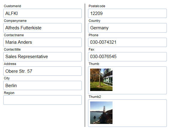
In the next image, the controls have been laid out using a flow
container. Notice that explicit breaks to start a new line have been
inserted after some of the controls and the width of each control
has been explicitly set (using a percentage, although explicit
widths are also supported).
For example, the Customerid control width was set to 25% and a
break was inserted after the field to start a new row.
The City Region and Postalcode fields all have a width of 33.33%.
The Phone and Fax field are each 50% and the Thumb and Thumb2 fields
are also 50% each.
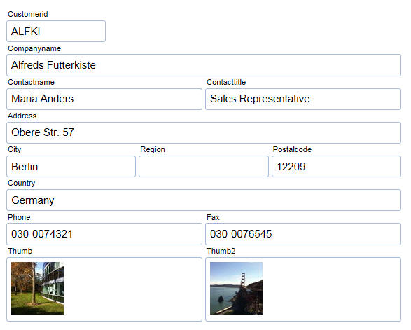
In the next image a more complex layout is created by nesting
Flow and Column layout containers.
At the top level a Column container is defined with column widths
of 50%, 25% and 25%.
Within the first column a nested Column container is defined.
This container has two columns showing Companyname and Contactname
in the first column and Contacttitle in the second column.
Also within the first column a nested Flow container is defined.
This flow container has Address (with a width of 100%) and City,
Region ad Postalcode, each with a width of 33.33%.
In the third column a nested Flow container is used to put Thumb
and Thumb2 on the same line (each with a width of 50%).
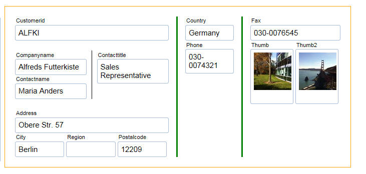
Here is how this layout is defined in the FormView Builder:
Using the Column Container
To insert a Column Container into the Form Layout click the Add
Item button and select a Layout Container and set the Layout type to
'Column'. All of the controls that should be laid out in columns
should be placed inside this container.
You can start a new column at any time by inserting a break after
a control. In the above example, the nested Column layout container
has two columns because only one control in the container
(LAYOUTCONTAINER_5) has a break (i.e. ContactName).
The outer Column container has three columns because there is a
break on [LayoutContainer End: LAYOUTCONTAINER_3], and Phone.
You can control whether there is a line between columns, how much
space to leave to the left of the first column and the right of the
last column and how much space to insert above the the columns and
below the columns.
You can also control the spacing between columns.
The columns can either be equal sizes. or you can specify
explicit widths for each column (using either percentages or
absolute sizes). To specify explicit sizes for each column, enter a
comma delimited list of sizes. The first size in the list applies to
column 1, the second size in the list applies to column 2 and so on.
Using the Flow Column Container
To insert a Flow container into the Form Layout click the Add
Item button and select a Layout Container and set the Layout type to
'Flow'. All of the controls that should be flowed should be placed
inside this container.
You can assign an explicit width to each control and you can add
breaks after certain controls to force a new line.
NOTE: If you are using percentage widths and
the sum of the widths of the controls on a line equals 100% a new
line is implicitly started for the next control. It is not necessary
to put a break after the last control on the line. However, if you
do not put an explicit break on the last control in the line, the
control spacing setting (defaults to 4px) will still get added to
the end of the line even if you have unchecked the 'Add spacing
after last control on each line' property.
You can control the horizontal spacing between each control on a
line. You can also specify if the spacing should be added before the
first control on a line or after the last control on a line.
Grid and UX Component - Google Maps - Icon Sequences -
Icon sequences previously used URLs that pointed to remote images
for each image in the sequence. Some of these remote URLs are now
broken and as a result certain icon sequences were no longer
working. All icon sequences have now been converted to use internal
images and therefore all icon sequences will now render correctly.
Development Server - Default Port - The default TCP port
for HTTP communications is 80. As such, the Alpha Anywhere
Application Server and Development Server have both used port 80 as
their default server setting. However, this port is not always
available on non-server systems because of other software using it
(e.g. Skype) and conflicts sometimes arise. To address this, the
Development Server no longer defaults to port 80. The Application
Server is unchanged and still defaults to port 80/
When the Development Server does not already have a server
configuration file available (e.g. a new install), Alpha Anywhere
will find an available TCP port for the server to run on instead of
simply defaulting to port 80. The search for an available port
begins at 1580. If no available port is found (ports go up to 65535
so this is extremely unlikely), the configuration will fall back to
80.
Because this port search is only done when there is no existing
configuration file, a developer may specify a port at any time and
that setting will be maintained. Similarly, this change does not
impact existing installations of Alpha Anywhere where the
Development Server has been configured or run at least once.
Application Server - HTTP Strict Transport Security - The
Alpha Anywhere Application Server now supports HTTP Strict Transport
Security (HSTS). HSTS is a security mechanism that allows a server
to indicate that clients should only communicate with it using using
HTTPS connections. For more information on HSTS, see
https://wikipedia.org/wiki/HTTP_Strict_Transport_Security
HSTS can be enabled on your server by simply checking the box on the
SSL tab of the Application Server Settings. The HSTS maximum age may
also be specified here.
With the default SSL Cipher List, HTTP Strict Transport Security
enabled, and a valid SSL certificate, the Alpha Anywhere Application
Server can achieve an A+ rating on the Qualys SSL Labs SSL Server
Test at
https://www.ssllabs.com/ssltest/index.html (as of August 3,
2016).
UX Component - List Control - Detail View - onSQLExecute Error
Event - A new server side event has been added to the List to
allow you to translate database error messages into friendlier error
messages.
To define the Xbasic function to process database error messages,
go the Detail View tab in the List builder, and edit the Table
Properties.
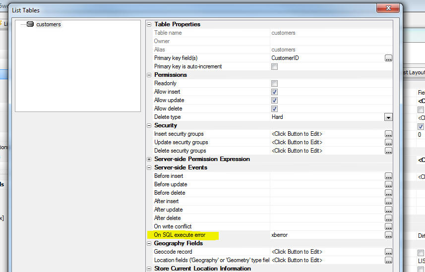
XBasic - Twilio - Sending SMS Messages - twilio_send_sms()
Function - You can now send SMS messages from XBasic to a mobile
phone.
NOTE: In order to use this function you must
first set up an account with Twilio an purchase a phone number that
is authorized to send SMS messages. Go to
www.twilio.com for more
information.
When you create your twilio account you will get the following
items, which you will need in order to use the twilio_send_sms()
function:
- AccountSID
- Authorization Token
When you use the
twilio_send_sms() function you can either pass in the values
for the AccountSID, the AuthorizationToken and the 'From' phone
number directly, or you can create an entry in the
Named Providers
property in Project Properties to store these values and then just
pass in the name of the stored settings to the function.
NOTE: Using Named Resources is the preferred
method because you can redefine any of the parameter values in the
stored setting when you define a publishing profile.
Syntax:
L result = twilio_send_sms(pResult as
p, to as c, message as c, namedResource as c , from = "", accountSID
= "", authCode = "" )
If you want to explicitly set the
accoundSID,
authCode and
from arguments, set
the namedResource
argument to an empty string.
pResult is an
object that contains return information provided by Twilio. For
example, if the SMS fails (
result = .f.) the
pResult object will
have a property explaining why the SMS failed.
To define a Named Resource, click the Project Properties button
on the Web Control Panel. The click the smart field for Named
Providers.
Example:
dim to as c
to = "+15551111"
dim message as c = "Sent from Xbasic at: " + now()
dim namedResource as c = "MyTwilioSettings"
dim pResult as p
dim flag as l
flag = twilio_send_sms(pResult,to,message,namedResource)
'to see what's in the pResult object
showvarscript(pResult, "" + flag)
UX Component - ButtonList Control - Fill Width - If a
ButtonList control is set to render horizontally, a new property
allows you to force the ButtonList control to fill with width of the
ButtonList's defined width. So, if the ButtonList's defined width is
set to 100% and the Fill
width property is checked, the ButtonList will fill the width
of the screen.
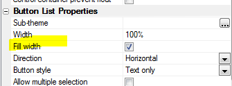
The Fill width
property is also available for RadioButton and CheckBox controls
that are set to render as ButtonLists.
ButtonList, RadioButton and CheckBox controls set to fill the
width of the screen.
IIS Application Server - Application Pre-load - The first
time a page in an IIS application is loaded, it can be slow because
the application needs to be initialized. A new option allows you to
pre-initialize the application. This options is accessed in the IIS
Publish Profile. The option is called
Enable application preload
and is checked by default. This setting uses the IIS "Application
Initialization" feature to automatically load and initialize an
application so that it is more likely that the first request to an
application is serviced much quicker.
Note that this option will default to enabled for existing publish
profiles and that the "Application Initialization" feature must be
installed on IIS. The installation guide recommends that application
initialization is installed, but stops short of requiring it.
Because of this, publish will check if application initialization is
installed or not and will prompt the user if it is not installed and
preload is enabled.
UX Component - List Control - Detail View - Write Conflicts
- When you sync data that was edited in a List with a Detail View,
there is always a chance that an update will fail because of a write
conflict. When a write conflict does occur, the error is bubbled
back to the user to allow the user to resolve the conflict. However,
the developer can also define a server-side onWriteConflict event
that fires when a write conflict occurs. The code in the event can
programmatically resolve the conflict and no write conflict error
will be bubbled back to the user.
If your event handler programmatically resolves a write conflict
you can now specify Javascript code that will execute on the client
after the sync is complete. The typical use case for this new
property would be to inform the user that there was a write
conflict, but that the write conflict was resolved programmatically
on the server.
For example, your Xbasic code in the onWriteConflict event might
set e.javascript as follows:
e.javascript = "alert('Write conflict in row [rowNumber]
was automatically handled on the server.')"
The [rowNumber] placeholder in the message will be replaced with the
zero based row number in which the conflict occurred. If you are
working with hierarchical data (i.e. there is a parent-child
relationship between Lists), then [rowNumber] will be replaced with
the full path to the List where the conflict occurred. For example,
0,'__LIST__ORDERS',3
This would indicate that the row in which the conflict was
handled programmatically is the first row in the parent List, then
the 4th row in the 'Orders' list.
PhoneGap App Builder - Icon and Splash Screens (Android) - Added support for Android xxxhdpi icons and splash screens. When building an Android app, the PhoneGap App Builder now includes default
images for a xxxhdpi icon and xxxhdpi splash screens in portrait and landscape mode. When generating the icon or splash screens for an Android app, the xxxhdpi icon and splash screens will be generated.
PhoneGap App Builder - Configuration Options - Launch PhoneGap App Manager After App Submission to PhoneGap Build
- By default, the PhoneGap App Manager is launched after
an app is submitted to PhoneGap Build. Uncheck this option to disable this
behavior.
PhoneGap App Builder - Third Party Plugins (Android, iOS) -
Media Capture With MP4 Video - Added support for the Alpha Media
Capture With MP4 Video plugin. This plugin requests a MPEG/MP4 video
file when run on an Android device (not all Android versions/devices
support MP4 video) and converts the recorded mov file to an MPEG/MP4
file on an iOS device. This provides file uniformity across all
devices. The videos that are recorded with this plugin can be played
back on iOS, Android, Windows and OSX devices.
For the full Media Capture With Mp4 Video plugin documentation, see
cordova-plugin-media-capture-mp4video.
UX Component - Form View Builder - Enhancements to the
FormView builder now allow for a new container type - HTML Element.
This allows you to use the Layout genie to construct HTML tables.
Connecting to MySQL using AlphaDAO - A new MySQL driver is used in
build 3732 and above. There are some things to be aware of when using
build 3732 or above.
-
If you have any problem connecting to MySQL with the new driver,
you can roll back to the old driver by selecting the MySQLV4 API
when you build your connection string.
- The connection string builder for MySQL now has a new property that
allows you to specify the version of MySQL that you are using.
-
The connection string builder for MySQL and Maria DB now has a
new property to specify if you want to use ipv4 or ipv6. The
property is only enabled if the database version is specified
and is 5.6 or above.
Google Maps - Map overview and Pan control properties removed from the builder as
Google has deprecated these features. For more information, click
here.
Image Gallery Component - Google MAPS APIKey - Now allows
you to specify your Google Maps API key.
Grid Component - JSON Format - The Grid component file
(i.e. the .a5wcmp file) can now be saved in a JSON format.
Previously the Grid was always saved as a binary file. The ability
to save the UX in JSON format was introduced some time ago.
Web Components - Default File Save Format - The default
component save format for all new components that support multiple
file formats can now be set in the Web Project Properties. This is
set in the Design-time Properties under 'Component File Save
Format'. Most components can be saved in 'Binary' or 'Formatted JSON'
formats. Formatted JSON saves the properties in clear text. This is
useful if you are using some type of source or version control
system and the system has a method to show differences between
versions. The 'Binary' format creates smaller files and can be used
if source control is not used. The option can be left blank to use
the default file format set for each component type in the component
builder.
AlphaDAO - Oracle - Oracle TLS/SSL Support - Alpha Anywhere now supports Oracle TLS/SSL connection definitions without the requirement of a tnsnames.ora file (containing a TNS name definition).
This can make deploying to an application server easier in cases where a secure connection is required and you do not want to maintain individual TNS names.
Oracle Connection String Changes
In the Oracle connection string dialog, there is now an additional tab labeled TLS/SSL that includes a checkbox for enabling SSL.
There is also a text box for optionally entering the distinguished name of the server certificate.
Providing this entry results in the clause (SECURITY=SSL_SERVER_CERT_DN=...) being added to the connection description.
The distinguished name you provide is used to verify the server certificate.
The connection string dialog sets the following connection string attributes:
- A5SSL=Y
- A5TLSServerCertificateDistinguishedName='<the value you provide>'
Note: If you are connecting to an Amazon RDS server, leave the Distinguished Name entry blank.
Alpha Anywhere will provide it automatically.
Be sure to import the Amazon RDS certificate on your application server (the client for Amazon RDS).
You can download the certificate bundle from Amazon at rds-ca-2015-root.pem
For more information on Amazon RDS SSL support for Oracle see Options for Oracle DB Instances
For help on importing a certificate on Microsoft Windows Servers see Import a Certificate
sqlnet.ora
Important: Oracle requires the configuration file sqlnet.ora for the most common SSL settings.
The example entries below show the most common values.
Consult Oracle documentation for details.
- WALLET_LOCATION = (SOURCE = (METHOD = MCS))
Note: The MCS (Microsoft Certificate Service) option causes Oracle to read certificates from the Windows certificate store
Consult Oracle documentation for other options, including using Oracle wallet files.
- SSL_VERSION = 1.0
The version numbers here begin with 3.0 for SSL version 3.0, but move to 1.0 and 1.1 for TLS 1.0 and TLS 1.1 respectively.
- SSL_CLIENT_AUTHENTICATION = FALSE
Setting client authentication to false (a required entry) means that client's will not need to authenticate with a client side certificate.
- SSL_SERVER_DN_MATCH = Yes
You can disable distinguished name matching, but this is discouraged, as it leaves room for spoofing attacks.
- SSL_CIPHER_SUITES= (SSL_RSA_WITH_AES_256_CBC_SHA)
This entry sets the allowable ciphers to be negotiated by the TLS/SSL layer.
Notes:
- The TLS/SSL port will NOT be 1521 as Oracle requires multiple ports. The TLS/SSL port is typically 2484, but this is configurable.
- If you select TLS/SSL (A5SSL=Y) and a connection cannot be established securely, SQL::Connection::Open will fail.
- If you do not select SSL or do not provide a distinguished name, no value will be added to the connection string.
- A new property of SQL::Connection objects called IsSecurelyConnected will return true (.t.) if an SSL connection has been established.
Alpha Anywhere connection strings may support only encryption, or
both client and server certificates. Connection string properties for TLS/SSL support
include:
a) SSL
- If A5SSL is set to 'Y', and
the connection cannot be established securely, an error is returned.
b)
A5TLSCertificateAuthorityFile - Contains name of a file that
contains one or more certificates PEM format with which to verify
the server certificate.
c)
A5TLSTrustedCertificatePath - Contains a path name to be used
for walking the certificate chain. If this property is used,
Individual certificates are stored in individual PEM files.
d)
A5TLSClientKeyFile,
A5TLSClientCertificateFile - These properties are used to
identify the file containing the Client private key and the client
certificate for verification of the client. They are used together.
As explained above, they are less commonly used.
e) A5TLSCipherList
- An optional list of ciphers to be passed to the server. This list
establishes a limit on the ciphers that can be negotiated.
3. A new property
IsSecurelyConnected will return true (.t.) if a connection
for one of the drivers below confirms a secure connection. Note that
ODBC drivers or Oracle TNS connections may in fact connect securely,
but if Alpha Anywhere does not know this has happened, the value of
IsSecurelyConnected
may still return false (.f.).
UX Component - Ink Control - Capturing Signatures - The
Ink control can now be easily configured to capture signatures. When
you open the Ink Control builder to edit the settings for the Ink
Control, the genie now has a new option for Signature Capture.
Watch Video
Json_sanitize() Function - Converts a JSON string to 'strict'
JSON syntax - Javascript objects can be created from literal
definitions that do not follow the strict JSON syntax.
For example:
var obj = {name: 'Fred'}
However the JSON.parse() function can only parse strict JSON
strings.
Similarly, on the server-side, the Xbasic json_parse() function
can parse JSON strings that do not follow the strict syntax.
However, many of the other Xbasic JSON functions (e.g. Json_extract()
) require strict syntax.
The Json_sanitize() function will convert a JSON string to strict
syntax. For example:
dim json as c = "{name: 'Fred'}"
?json_sanitize(json)
= {"name": "Fred"}
json_delete() Function - Deletes attributes from a JSON string
that match a certain pattern -
For example, consider the following JSON string:
dim json as c = <<%json%
{
one : 1 ,
two : 2 ,
arr : [
{ __deleted : true , fname : "joe" },
{ __deleted : false , fname : "jim" }
],
arr2 : [
{ __deleted : false , fname : "joe"
},
{ __deleted : true , fname : "jim" }
],
}
%json%
Assume that you want to remove all 'rows' in the JSON that
contain the attribute:
__deleted: true
Using json_delete() we can do this:
json = json_sanitize(json) 'convert to
strict syntax
dim json2 as c
json2 = json_delete(txt , "{ \"__deleted\" : true
}")
json2 = json_reformat(json2)
?json2
{
"one": 1,
"two": 2,
"arr": [
{ "__deleted": false, "fname": "jim"}
],
"arr2": [
{"__deleted": false,"fname": "joe"}
]
}
AlphaDAO - Database Drivers - New and Updated Alpha Anywhere
Database Drivers - Alpha Anywhere now include two new SQL
database drivers.
- MariaDB - This is a new driver built on MariaDB
Connector/C version 2.2.3. The connection string builder dialog
includes an additional tab for SSL settings.
Note: Alpha Anywhere now ships with
libmariadb.dll
version 2.2.3, with some minor fixes for SSL support.
- MySQL - This is an updated driver built on MySQL
Connector/C version 6.1.6. The connection string builder dialog
includes an additional tab for SSL settings.
The existing MySQL driver has been renamed
MySQLV4 and will be
available as a fallback for those running older databases. The MySQL
library was last updated around 2005 and still uses version 5.0.18
of MySQL Connector/C, so it has no support for SSL, prepared
statements and other mainstream features. MySQL version 5.0 was in
beta at that time. The current release of MySQL is 5.7 and was
released in October of 2015.
- MySQLV4 - This is the old MySQL driver built with
MySQL statically linked in and is compatible with MySQL versions
3.0 and 4.0.
Note: Alpha Anywhere now ships with
libmysql.dll version
6.1.6.
There are a couple of potential configuration issues on some
instances of MySQL that may require attention:
Because MySQL Connector 6.1.6 supports IPV6 as well as IPV4, you may
experience slow connect times if one of the following is not set in
your MySQL configuration file:
- Bind-address =* - Add this keyword on its own line
under the section [mysqld] and restart the server. For versions
before 5.6.6 use :: rather than *. This enables servers to
accept IPV6 connections.
- skip-name-resolve - Add this keyword on its own line
under the section [mysqld] and restart the server. This entry
will stop the lookup of hosts by name. Note that you may be
required to secure clients by IP address rather than host name.
This is recommended. If you have already enabled clients to
access your server by host name, your clients may no longer be
able to connect.
Instead of
CREATE USER 'root'@'localhost' IDENTIFIED BY 'root-password';
use
CREATE USER 'root'@'127.0.0.1' IDENTIFIED BY 'root-password';
CREATE USER 'root'@'::1' IDENTIFIED BY 'root-password';
Note: For Windows servers the configuration file is currently
found in the folder "C:\ProgramData\MySQL\MySQL Server 5.7", but
your other versions may store it in a different location.
For more information, see the MySQL documentation:
Alpha Anywhere support for SSL:
1) Each database client has a different implementation of TLS/SSL.
The most common features are:
a) Secure/encrypted communication. Here TLS/SSL is used as a
vehicle to guarantee a secure communication link with the server.
Data is considered to be 'encrypted in transit'.
b) Verification of the server.
i) X509 certificates are issued by a
certificate authority who vouches for a certificate by signing it
with their private key. Using the public key of the certificate
authority, a client can verify that they have 'signed' the server
certificate.
ii) A certificate authority can
delegate to another authority. As a result, a certificate from a
server may actually have a 'chain' of authorizations that go back to
a well-known certificate authority. One that our system trusts. When
a server returns a certificate to the client, it will generally
include the chain of authorities - one of which should match a
certificate you trust.
iii) You can, and in some cases need
to, install any certificate as a trusted certificate to verify that
a server certificate matches the host name you requested.
c) Verification of the client.
i) The same process of verification
can also be used to authenticate an SSL client. A certificate is
installed on the client (along with a private key) that is then sent
to the server to verify that the client is who they say they are.
This is less common, but is used in some applications - especially
those with a greater need for security and for which there is a
manageable number of clients..
2) Alpha Anywhere connection strings may support only encryption, or
both client and server certificates (see the driver by driver
explanation below). Connection string properties for TLS/SSL support
include:
a) A5SSL -
can be Y or N. If A5SSL is set to 'Y', and
the connection cannot be established securely, an error is returned.
b)
A5TLSCertificateAuthorityFile - Contains name of a file that
contains one or more certificates PEM format with which to verify
the server certificate.
c)
A5TLSTrustedCertificatePath - Contains a path name to be used
for walking the certificate chain. If this property is used,
Individual certificates are stored in individual PEM files.
d)
A5TLSClientKeyFile,
A5TLSClientCertificateFile - These properties are used to
identify the file containing the Client private key and the client
certificate for verification of the client. They are used together.
As explained above, they are less commonly used.
e) A5TLSCipherList
- An optional list of ciphers to be passed to the server. This list
establishes a limit on the ciphers that can be negotiated.
3. A new property
IsSecurelyConnected will return true (.t.) if a connection
for one of the drivers below confirms a secure connection. Note that
ODBC drivers or Oracle TNS connections may in fact connect securely,
but if Alpha Anywhere does not know this has happened, the value of
IsSecurelyConnected
may still return false (.f.).
TLS/SSL Support by Database Driver
MySQL
- The Alpha Anywhere MySQL driver currently uses
libmysql.dll version 6.1.6 (shipped with Alpha Anywhere) to connect to MySQL
databases.
- The library libmysql.dll
provides secure communication and will
verify a server, but limits the length of the certificate chain, so
some environments (such as Amazon RDS) are not suitable for using
it.
- All of the options for connection strings discussed above are
available for MySQL on the SSL/TLS tab of the connection string
dialog.
MariaDB
- The Alpha Anywhere MariaDB driver currently uses libmariadb.dll
version 2.2.3 to connection to MySQL , MariaDB or Aurora (from
Amazon) databases.
- The library libmariadb.dll, shipping with Alpha Anywhere, has been
modified slightly to support SNI (Server Name Indication) and to
allow for longer certificate chains when verifying a server
certificate. The Amazon certificates have a slightly longer chain
that is typical.
- All of the options for connection strings discussed above are
available for MySQL on the SSL/TLS tab of the connection string
dialog.
Oracle
- The Alpha Anywhere Oracle driver currently does not abstract
secure connections for Oracle. You can, however set up a TNS
connection definition that does include secure connections and
reference that from the connection string dialog.
Note: See Oracle documentation for the process of creating a
"wallet" for certificates and defining a TCPS connection with a
matching certificate information.
PostgreSQL
- The PostgreSQL driver for Alpha Anywhere currently uses the 32-bit
ODBC driver for PostgreSQL.
- The installer for this driver is included in the installation
files in the path <install directory> SQLDatabases\ClientInstallers\PostgreSQL
and is called Npgsql-3.0.5.msi
- The Alpha Anywhere PostgreSQL driver currently has a single
checkbox for TLS/SSL support. This sets the A5SSL connection string
parameter to 'Y', enabling TLS/SSL.
- The ODBC driver interface extends the interface by giving you
options like allow, prefer, require, verify-ca, verify-full, so you
can configure using that option if you wish.
Note: There are other keywords (such as sslcert, sslkey, and
sslrootcert), but they are not fully supported on Windows. According
to the PostgreSQL documentation (https://www.postgresql.org/docs/9.5/static/libpq-ssl.html)
- The server certificate authority file must be stored in %APPDATA%\postgresql\root.crt
- The certificate and key files must be in stored in %APPDATA%\postgresql\postgresql.crt
and %APPDATA%\postgresql\postgresql.key respectively.
SQL Server
- The Alpha Anywhere SQL Server driver supports TLS/SSL connections.
- There is a checkbox on the SQL Server connection string dialog
entitled "Encrypt". This flag will result in setting the
"encrypt=true" flag on the connection string.
Note: Install any certificate authority files as trusted
certificates in the Windows store. The Microsoft SQL Server native
client will find them there.
Connecting Securely to Amazon RDS Database Instances from Alpha
Anywhere
Amazon RDS (Relational Database Service) currently includes the
following databases: Aurora, MariaDB, MySQL, Oracle, PostgreSQL and
SQL Server. In order to secure communication to these databases,
Amazon generates a certificate for the database and instance that is
presented by the server when a secure link is requested.
Alpha Anywhere ships a copy of the certificate authority files for
Amazon and it is installed under the installation directory for
Alpha Anywhere (and application servers) in a folder with the path
<installation directory>\SQLDatabases\Certificates\Amazon RDS.
We recommend the following when attempting to communicate securely
with an Amazon RDS instance:
- Aurora - Use the new MariaDB client driver in Alpha Anywhere. Add
the PEM file included in the installation directory entitled "rds-combined-ca-bundle.pem"
as the certificate authority file.
- MariaDB - Use the new MariaDB client driver in Alpha Anywhere. Add
the PEM file included in the installation directory entitled "rds-combined-ca-bundle.pem"
as the certificate authority file.
- MySQL - Use the new MariaDB client driver in Alpha Anywhere. Add
the PEM file included in the installation directory entitled "rds-combined-ca-bundle.pem"
as the certificate authority file.
Note: There is an issue with Connector/C 6.1.6 that causes server
verification to fail on Amazon RDS MySQL instances.
- Oracle - Create a TNS connection definition following the Oracle
instructions in the Oracle and Amazon documentation. We are looking
at incorporating this into Alpha Anywhere to simplify the process.
- PostgreSQL - Add the contents of the PEM file included in the
installation directory entitled "rds-combined-ca-bundle.pem" to %APPDATA%\postgresql\root.crt
and check the checkbox on the connection string dialog entitled "UseS
SL".
- SQL Server - Install the file entitled
"rds-combined-ca-bundle.p7b" in the Windows certificate store as a
trusted certificate. SQL Server will find the certificate chain
there.
UX Component - Caching - When a UX component makes an Ajax
callback, the UX Component file (the .a5wcmp file) must first be
de-serialized before the callback is handled. If the UX component is
very large, de-serializing the file can be relatively slow and it
imposes a significant 'tax' on every callback. Now, the first time
the UX component file is de-serialized, it is cached. As a result,
Ajax callbacks (in the case of large components) can be
significantly faster.
This caching technique was first introduced in version 4.0, but
was subsequently pulled in version 4.2 when it was found that under
some circumstances, the caching logic was introducing errors.
Now, a much more robust caching technique has been developed and
UX caching is again turned on by default.
If you notice any odd behavior in a UX that was previously
working, you can turn caching off by creating this file (does not
matter what's in the file):
c:\debug\nocaching2.txt
REDIS - Alpha Anywhere now has built-in support for REDIS.
Redis is a very popular database for storing name/value pairs,
working with queues and many other use cases. Alpha Anywhere ships
with a local Redis database. Xbasic now has a Redis client object
that allows you to interact with Redis databases. For more
information on this feature, see the documentation.
http://www.alphasoftware.com/documentation/pages/Guides/Services/Redis/index.xml
PDF Printing - Amyuni Printer Driver - Multilingual Support
- The default setting for the
MultilingualSupport
flag in the PDF Options dialog has been changed to true (checked).
This was done because many users were reporting 'bugs' when then
high order characters in their reports were not rendering correctly.
The issue was they did not have the
MultilingualSupport
flag turned on.
If you are certain that your reports do no contain any high order
characters and you are concerned about the size of the PDF files
generated by the Amyuni printer driver, you can turn this flag off.
Xbasic Arrays - .Net data types - You can now dim Xbasic
arrays using .Net types. This makes working with .Net assemblies
from Xbasic easier to do.
For example:
dim myarr[10] as system::int32
For more information, see:
http://www.alphasoftware.com/documentation/pages/Guides/Dotnet
Integration/Arrays/index.xml
Application Server - Performance - AEX Files - An option has
been added to preload AEX files into memory on the first request for
any code in the AEX file. The maximum size of the AEX file to load
into memory can be set. The default behavior is to create a copy of
the AEX in the user's temporary folder and load code from the
temporary file. However, if any utility is run to clean up temporary
files, it is possible this copy could be deleted causing a problem.
This option does not impact performance and is only needed when
cleanup programs are removing the temporary AEX file after the
application server has started.
Grid Component - File Save Format - JSON - Grid Components
can now be saved as formatted JSON instead of binary (the default).
This option was added to UX components some time ago. Formatted JSON
saves the properties in clear text. This is useful if you are using
some type of source or version control system and the system has a
method to show differences between versions. The save format can be
selected in the Grid Properties under 'Advanced-> Save component
format'.
The compiled file used to publish the Grid is still saved as binary
as a binary file size is smaller.
You can do a bulk conversion of the storage format by selecting the
'Edit, Bulk Operation, Change Component storage type' menu option
when the Web Control Panel has focus.
UX Component - FormView Control - Signature Editor - A new
predefined Editor for use in an Editor Set has been added for
capturing signatures.
Watch Video
Download Component
UX and Grid Components - Google Maps - API Key - Google
has made a change to Google Maps and they now require you to specify
an API key when using the Google Maps Javascript API. This release
allows you to specify your API key. There are three different ways
in which you can specify the API key - described below.
NOTE: To obtain your Google Maps you will
need to visit the Google site. Do a Google search for 'Google Maps
API key'. You will need an API key for Google Maps Javascript API.
You can specify the Google Maps API key as follows:
- When you add a Map control to a UX or Grid there is a new
property called Google
Maps API key where you can set the key for just the
selected Map control
- You can open the Project Properties dialog when the Web
Control Panel has focus and specify the API key in the Project
Properties dialog. If you specify the API key here, it will
apply to all Map controls (in both the UX and Grid) defined in
the current project. It will not be necessary to specify the API
key in the properties each Map control. However, if you do
specify an API key at the individual Map control level, that key
will be used in preference to the key specified in Project
Properties.
- You can create a file called
GoogleMapsAPIkey.txt
in the executable folder of the Alpha Anywhere Development
version that contains the API key. This key will be used for all
Map controls in both UX and Grid components if you don't specify
the key at the individual Map control level, or in the Project
Properties.
NOTE: If your Developer version of Alpha
Anywhere is installed in the "Program Files (x86)" folder you will
need Administrator privileges in order to create the
GoogleMapsAPIkey.txt
file.
UX Component - Client-side Events -
onServerSideEventHandlerError - This event is fired when there
is an error in some user defined Xbasic function that handles an
AJAX callback.
UX Component - AudioPlayer, AudioRecorderPlayer, VideoPlayer,
and VideoPlayerRecorder Controls - New methods - These controls
all have these new methods:
In addition, the Audio controls also have .stop() method.
Example
var Obj = {dialog.object}.getControl('MYVIDEOPLAYER');
Obj.pause();
Bugs
AlphaDAO - MariaDB - Timestamp Fields - When retrieving
timestamps with microseconds from MariaDB, the milliseconds part was
not retrieved.
Notes:
- XBasic Time values (type 'T') do not store the full
precision in microseconds, so only the most significant digits
are retained.
- To retrieve a raw value including the microseconds use this
SQL expression:
cast(<column> as char(50))
UX Component - Local Storage - Version Number - In the Local Storage
section of the UX builder you can specify the version number of the Local
Storage settings. If the version number is increased and the application is
republished, then any existing data in Local Storage should not have been
restored (because it was stored with a version number less than the current
version number). The version number was not being honored and the data in
Local Storage was being restored. Now, if the version number is increased,
the existing data in Local Storage will NOT be restored.
UX Component - Numeric Fields - Client-side Formatting -
Submitting Data - If you have a numeric control that is
formatted using client-side formatting rules (for example 123456.78
gets formatted as $123,456.78 ) when the data in this control was
submitted, it was previously submitted in its formatted form. Now,
the data are converted to an unformatted number. So in the case of
this example, the data submitted to the sever would be 123456.78 and
NOT $123,456.78.
The same comments here also apply to the {dialog.object}.getValue()
method.
UX Component - List Control - Export to Excel - Fixed an
issue where data was not exported correctly if the list had group
breaks.
UX Component - Video Recorder Player Control - A bug was
fixed. If you have an existing UX with this control you must edit
the control properties and resave to regenerate the control with the
fixed code.
Reporting - SQL Reports against tables with fieldnames
longer than 32 characters caused a problem.
Temporary Folder
- The system stores temporary files in special folders under the
users folder such as in "C:\Users\<userName>\AppData\Local\Temp\AlphaAnywhere\p_1234".
Under certain conditions, a cleanup utility could remove these
folders and saving a temporary file would fail. Now saving any file
to the temporary folder using an xbasic method will recreate the
folder if it has been deleted.
UX Component - List Control - Auto-fetch more Mode - When
pagination was turned on for a List, and the pagination method was set
to 'AutoFetchMore' - the Ajax callbacks that were firing to fetch
additional records were firing too early.
Tips
UX Component - List Control - Right to Left - When creating a
List control for a right-to-left language (e.g. Hebrew, Arabic), you
typically want:
- the List control to be right justified on the page
- the List column order to be reversed (e.g. the first column in
the List definition should be the right most column in the rendered
List)
- the List data and column headings to be right aligned
- the sort icon that appears next to the column heading should be
displayed to the left of the heading text, not the right as is
standard
- change the language for the List column headers
- if your List uses client-side grouping, you will probably want
the group heading text to be right aligned.
To achieve this:
- Set the Control flow
direction property on the UX properties page to
rtl.
- Edit the List and check the
Reverse
column order
property on the List Properties pane.
- If the List uses a column layout, go to the Layout tab and add
this to the in-line style for the header and the data:
text-align: right;
direction:rtl;
- To change the position of the sort icons, edit the
Local sub-themes
definitions - Javascript property and paste in this code:
{
"listbox": {
"base": {
"columnLayout": {
"header": {
"item": {
"order": {
"style": "position: absolute; left: 25px; top: 50%; margin- top: -5px;
display: none;"
}
}
}
}
}
}
}
- To change the language for the List column headers, wrap the
heading text in either language or text dictionary tags. E.g.
<a5:r>..</a5:r> or
<a5:t>..</a5:t>. Use
the Internationalization
Helper Utilities... on the
More dropdown menu
when you are editing the UX layout.
- To right align the text in group headers (or footers), open the
Group breaks definition
dialog and add an additional class (say 'rtl')
to the class name for the header or footer. For example:
{dialog.style}ListTitle rtl
- Define the rtl class
in the UX Local CSS definitions property as:
.rtl {direction: rtl;}
UX Component - Text Area - Scrolling - iOS - If you have a
text area control in a Panel Card and you have more text in the control
than can be seen, drag scrolling on the text in the text area control
will not allow you to scroll the text.
You can however enable two-finger drag scrolling on the text by
defining a local CSS class as shown below and then setting the text area
class to this class.
.scrollTextBox {
overflow-y: scroll;
-webkit-overflow-scrolling: touch;
}
UX Component - Changing the Background Image of a Panel at Run-time
- When you add a Panel Card to a UX component, you can specify a
background image for the Panel Card. In some situations you might want
to dynamically change the background image for the Panel Card. For
example, you might want to use one image when the device is in portrait
mode and another when in landscape mode. The following Javascript code
shows how you can do this
//get the id of the 'body' part of the Panel Card
var id = {dialog.ob ject}.panelGetId('PANELCARD_1','body');
//set the background image to 'image2'
$(id).style.backgroundImage = 'url("image2.png")'
Alpha Anywhere V4.2 -Build 3670-4684 13-Jun-2016
Videos
|
UX Component - List Control |
Tutorial - Building a PhoneGap Application to
Capture Images and Audios while Disconnected
from the Network |
A common requirement when building mobile
applications is to capture data that includes
photos and audio recordings. The application
must work while offline and then be able to
synchronize the data and the media files
(photos, audios, videos) when a connection is
available. In order to implement this
application it is necessary to use PhoneGap.
Note: Because PhoneGap is used the, data that
are captured includes the filenames of pictures,
rather than the base64 data for each picture. As
a result many more images can be captured while
the device is offline than would be possible if
images were captured as base64 encoded data.
In this video we show how a UX component with a
List/Detail View is configured to capture data
and media files and then sync with a server.
Watch Video - Part 1 - Configuring the Data
Source
Watch Video - Part 2 - Configuring the List
control and its associated Detail View
Watch Video - Part 3 - Configuring the List
control and its associated Detail View
Watch Video - Part 4 - Configuring the List
control and its associated Detail View
Watch Video - Part 5 - Configuring the List
control and its associated Detail View
Watch Video - Part 6 - Running the app on a
Device (Note: This is a large video file. It
will take some time to download)
Download Component
(Note: See the component's 'PhoneGapDefaultSettings'
property for a list of plugins that the PhoneGap
app should use)
Date added: 2016-06-05 |
|
Reports |
HTML-Paged Output Option |
When you render reports in a Web application you
can choose whether the report should be rendered
as PDF or HTML. The HTML option is only
available for Layout Table reports - not
Freeform reports.
The HTML-Paged option will work with all report
types -- Freeform and Layout Table and can be
rendered in any browser (including mobile device
browsers that do not have the ability to render
PDF files.
This video contrasts the different report output
options.
Watch Video
Date added: 2016-06-10 |
|
UX Component - ViewBox Control |
Dynamically Setting Data Displayed in the
ViewBox |
The ViewBox control is often used as a very
light weight alternative to the List control
when all you need is a scrollable list of data
and not the full functionality of a List.
When used as an alternative to the List, a
common pattern is to populate the data shown in
the ViewBox dynamically, based on some search
criteria entered by the user.
In this video we show two different techniques
for doing this.
Watch Video
- Part 1
Watch Video
- Part 2
Download Component
Date added: 2016-06-10 |
Features
UX Component - Video Recording - PhoneGap Applications - It is
now possible to add video recording to your PhoneGap applications. Video
recording will work in disconnected application. You can record as many
videos as you want, and then when you sync you data with the server, the
video files can be uploaded to the server. In this respect, syncing
video files is identical to the way pictures and audio recordings are
synced when the user has an internet connection.
When you sync data on your mobile device you can specify that media
files (pictures, audio recordings and videos) should be uploaded to
Amazon S3, rather than the Alpha server. Since media files can be quite
large, uploading media files to S3 is often preferable to uploading
these files to an Alpha server.
To support video recording a playback, two new UX controls are
available:
-
Video Player
-
Video Recorder/Player
The Video Player control is used when you only want to allow users to
play back previously created video files. The Video Recorder/Player
control will allow playback of previously created videos and recording
of new videos.
To add a Video Player or Video Recorder/Player control to your UX
component select the [More...] option in the list of Data Controls.
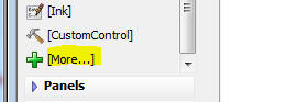
Both the Video Player and Video Recorder/Player controls are standard
'data controls'. This means that they have
.setValue() and
.getValue() methods,
like all other data controls.
The .setValue()
method is used to set the control to the URL of a video file.
The .getValue()
method is used to read the current value of the control.
For example, in a PhoneGap application, after you end a video
recording, if you called the .getValue()
method for the control, the filename of the video that had just
been recorded would be returned.
You can also convert the type of an existing control to a Video
Player or Video Recorder/Player control by clicking on the smart field
in the Control type prompt.
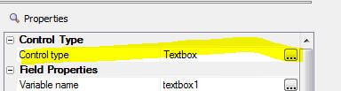
In the image below, the Video Player control is shown. Since the
Player does not support recording, the control is not limited to
applications that are running under PhoneGap.
The VCR buttons allow you to start, pause and resume playback. The
fast forward and back buttons behave as follows:
-
Single tap - skip forward/back by 2 seconds
-
Tap and hold - step forward or backwards through the video
The double sided arrow icon at the right edge will allow you to
switch into full screen mode.

The control also shows a progress indicator and how long the video
has been playing
The appearance and behavior of the Video Recorder/Player control is
essentially the same as the Video Player control, except that the
Recorder/Player control include a button to switch from Playback mode to
record mode:
Configuring the Video Recorder/Player and Video Player Controls
To configure the Video controls, click the smart field for the
Control Properties
property.
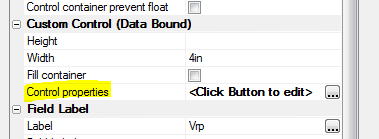
The Properties dialog for the Video Recorder/Player controls is shown
below.
You can set the maximum allowed length (in seconds) of the video and
you can specify code for the various events that the control fires.
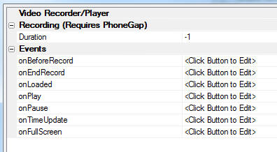
How to Configure a PhoneGap Application To Support Video
Recording/Playback
Let's assume you want to build a PhoneGap application that will allow
users to enter/edit data and record videos. The application must work
offline and when a connection is available the data must be synced to a
SQL database on the server and the videos must be uploaded to S3.
This tutorial will highlight the key configuration settings you will
need to make as you build the UX component.
Let's assume that the underlying schema of the table in which data
must be stored is as follows
-
id - int
(auto-increment) - primary key
-
field1 - a
character field to contain textual information
-
videofilename - a
character field that contains the URL of the video.
If the videos are being uploaded to Amazon S3 when data are synced,
the videofilename field
will contain values like:
http://alphamediacapture.s3.amazonaws.com/video1.MOV
On the other hand, if the video are being uploaded to the Alpha
server, the videofilename
field will contain values like:
videofiles/video1.MOV
(assuming that the video files are uploaded to a folder called 'videofiles'
in the Webroot).
Step1 - Create a UX control with a List/Detail view showing data from
the SQL table. You can use the List Control Quick Setup genie to quickly
create the List/Detail view.
Step 2 - Configure the fields in the List. After you have created the
List you must edit the List and on the Fields tab, set the control type
of the videoFilename
field to Video.
In addition, if the video files are going to be uploaded to the Alpha
server (as opposed to Amazon S3) you will also need to specify the
folder on the Alpha server where the video files should be stored. To do
this, click the smart field for the
Video capture and storage
properties.
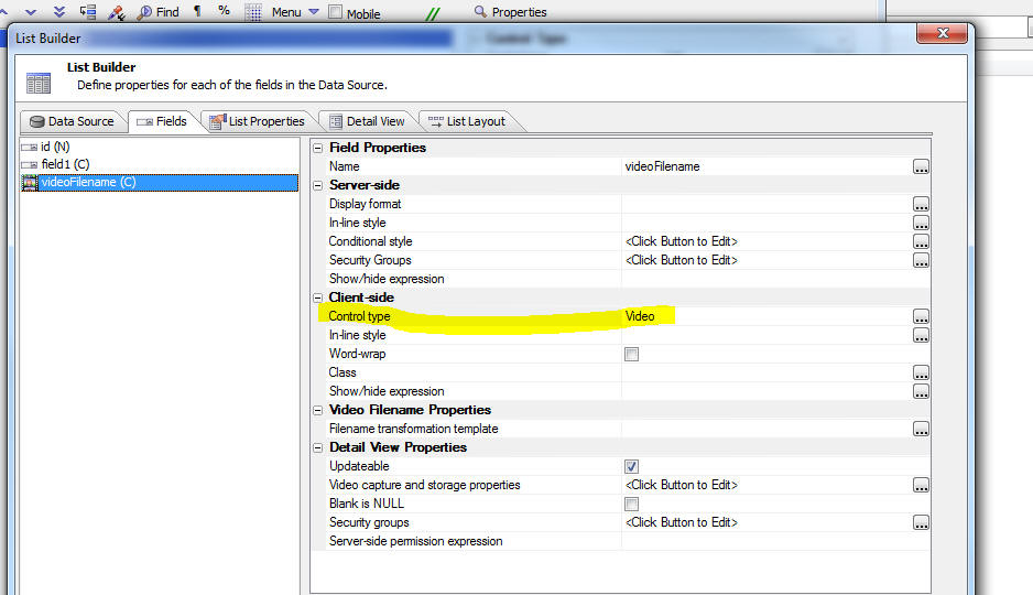
The Video Capture Properties dialog is shown below. The
Upload folder is where
you specify the folder name.
For example, if you specify:
myVideos
The videos will be stored in a folder called
myVideos that is
relative to the Webroot. It is recommended that you specify a folder
that is relative to the webroot. This will allow you to upload videos
from the server to the device for storage in the device's file system so
that videos are available for playback on your device even when you have
no internet connection.
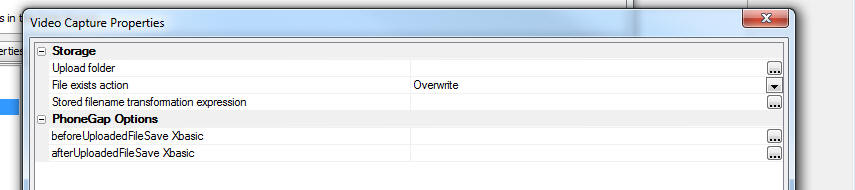
In addition to specifying the
Upload folder you should
also specify the Stored
filename transformation expression. This property defines what
gets stored in the
videofilename field in the database. The builder for this
property allows you to use 2 special placeholders:
<Filename> - the fully
qualified video filename, and <ShortFileName>
- the name of the video file with no drive and path information.
You will typically want to store a filename that is relative to the
Webroot. For example, if the
Upload folder was set to
myVideos then you should set this property to:
"myVideos/<shortFileName>"
With this setting, the actual data stored in the
vidoefilename field in
the database will look something like this
myVideos/video1.MOV
NOTE: If your videos are being uploaded to Amazon
S3, it is not necessary to specify Video Capture Properties.
Step 3 - Specify if media files (pictures, audios and videos) should
be uploaded to the Alpha server or Amazon S3 when data are synced.
To do this, edit the List properties and go to the Detail View tab.
Then click the smart field for the
Media files (photos, videos,
audio recordings, other) settings property.
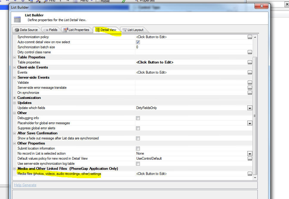
This dialog will allow you to specify if media files are uploaded to
the Alpha server or to Amazon S3.
The dialog will also allow you to specify if media files should be
downloaded to the device when data are loaded into the List control.
If you download media files to the device the media files are stored in
the file system on the device and will be available even when there is
no connection.
Step 4 - Set the control type for the
videoFilename control in
the List's Detail View to a Video Recorder/Player control. When the List
Quick Setup Genie created the List's Detail View, it set the control
type of the videoFilename
field to a textbox. To change the control type to a Video
Recorder/Player, click the Control type smart field and select the Video
Recorder/Player control.
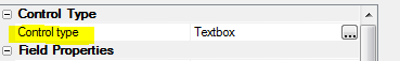
Having configured the List control and its Detail View, you are now
ready to build your PhoneGap application.
TIP: To see a list of PhoneGap plugins that you
should enable when you build your PhoneGap application, download the
sample component using the link shown below and then examine the setting
in the component's PhoneGap
default settings property.
Download Component
Grid, UX and Tabbed UI Component - Reports - HTML-Paged Output
Option - A new option (HTML-Paged) is available for how reports
should be rendered in web applications.
When you use Action Javascript to display a report, or you add a
Report to a Tabbed UI, or you embed a report into a UX component, the
output options are now:
Watch Video
The PDF Option
The PDF option will render the report as a PDF file using the bundled
Amyuni PDF printer driver. The PDF file will then be displayed in your
browser (in a window in the component, a tab pane in the Tabbed UI or in
a div on the current page). The manner in which the PDF will be
displayed depends on the browser you are using. For example, if you are
using IE, the Adobe Acrobat PDF viewer is used as IE does not have a
built-in ability to render PDF files. Chrome and Firefox, on the other
hand, have a built in ability to render PDF files, so the Acrobat reader
is not used.
Unfortunately, the situation on mobile devices is more complicated
because on many mobile devices there is no option to render PDF files in
a browser.
When you choose the PDF option, the resulting report is properly
paginated and is ready for printing, should the user want to print the
displayed report.
The PDF option works with both type of Alpha Anywhere reports:
Freeform and Layout Table.
The HTML Option
The HTML option will render the report as HTML. This option does
not use the Amyuni PDF printer driver. However, this option is only
available for Layout Table reports. The advantage of Layout Table
reports over Freeform reports is that they render much more quickly than
Freeform reports, and they can be exported to Excel with very high
fidelity (because the cells in the Layout Table report can be directly
mapped to cells in the Excel spreadsheet). The HTML produced by this
option is not paginated. The report does not render any Page
Headers, Page Footers, or page breaks defined in the report. When the
HTML is printed, the page breaks are controlled by the printer -- i.e. a
new page is started when the current page is full.
The HTML-Paged Option
The new HTML-Paged output option can be used for both Freeform and
Layout Table reports. This output option does not use the Amyuni
printer driver, but unlike the HTML option, the report is properly
paginated and all Page Header, Footers and breaks defined in the report
are honored. When the output from the HTML-Paged report is printed, the
printout is properly paginated -- just like the output from the PDF
option.
Since the output from HTML-Paged option is pure HTML (technically it
is HTML with embedded SVG), no special plugins or viewers are needed by
the browser. This means that the reports will render in all mobile
browsers (unlike the PDF output option).
When you display a report in your web application the uses the
HTML-Paged output option, the display window has buttons that allow you
to create a PDF version of the report, to print the HTML, to export to
Word, or to export to text.
Another benefit of the HTML-Paged output option is the way image with
an Alpha channel (images with transparent backgrounds) are rendered. The
HTML-Paged option will render these images correctly, while the PDF
option (which uses the Amyuni printer driver) will not render these
images correctly.
Bugs
A5ws_SaveValidateUser() Function -
A bug was introduced in build 3633 that broke the
A5ws_SaveValidateUser() function.
Grid Component - Export to Excel - Computed Fields - If a
computed field in the SQL SELECT statement for the grid contained a
colon in the field expression, the field was not exported to Excel.
Alpha Anywhere V4.12 -Build 3633-4676 26-May-2016
Bugs
UX Component - Panel Navigator - A bug was introduced in build
3629 that resulted in a child Panel not displaying correctly after a
command that set focus to the child Panel without animation.
UX Component - Slider Control - Show/Hide - If a slider
control had the message area turned on, when the control was hidden
using a client-side show/hide expression, the message area was not
hidden.
UX Component - Slider Control - Set Value - If a slider
control had the message area turned on, when the value in the control
was set using the .setValue() method, the slider message was not
updated. The message was only updated when you dragged on the slider.
Application Server - Performance - Made a
change to the algorithm used to reduce priority on busy threads.
Alpha Anywhere V4.12 -Build 3629-4676 25-May-2016
Videos
|
UX Component - PhoneGap |
Sending Push Notifications using the Pushwoosh
Service |
A common feature in mobile applications is push
notifications. In a PhoneGap application, this
can be be done, utilizing the Pushwoosh plugin,
which integrates the Pushwoosh service.
This video shows an example application that
uses push notifications.
Watch Video - Part 1
Watch Video
- Part 2
Watch Video
- Part 3
Documentation - PhoneGap Push Notifications
Date added: 2016-04-28 |
|
UX Component - FormView Control |
Specifying Display Formats for Numbers and Dates |
You can specify display formats for numbers and
date values that are displayed in the FormView
control.
Watch Video
Date added: 2016-05-22 |
Features
Font-Awesome - Version 4.6.3 - Updated to a new version of
Font-Awesome. In order to see new icons in Working Preview when using
Internet Explorer you will need to install the new font. To do this,
open Windows Explorer and navigate to the cssIcons\font-awesome\fonts
folder and double click on the the .ttf file.
PhoneGap App Builder - PhoneGap Version - Added support for PhoneGap 6.1.0 which is now supported by PhoneGap Build.
PhoneGap App Builder - Third Party Plugins (Android, iOS) - Secure Local Storage For Cordova. Added support for the nl-afas-cordova-plugin-securelocalstorage plugin.
This plugin stores local data encypted using the iOS Keychain or the Android keystore. The data is NOT stored to the webview localstorage resource. It is stored
in the keychain of the keystore.
For the full nl-afas-cordova-plugin-securelocalstorage plugin documentation,
see nl-afas-cordova-plugin-securelocalstorage
UX Component - FormView Control - Display Format
for Numeric and Date Values - You can now specify a display
format property for fields displayed in the FormView. This allows
you to apply formatting directives to number and date values.
Watch Video
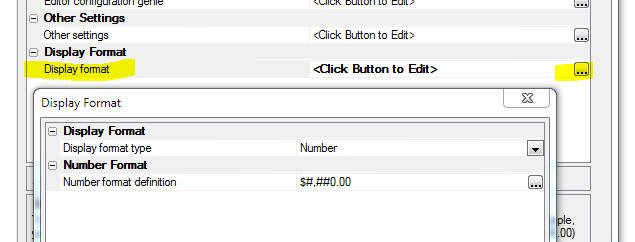
PhoneGap - Android - Build Tool - A new option
has been added to the PhoneGap Builder that allows you to specify
the Android build tool to be used by PhoneGap Build when creating
Android apps. The default setting is gradle, which is required by
many of the newer plugins. If you run into any issues when building
Android apps using older plugins, you can set the Android build tool
to ant, which was used in older versions of PhoneGap.
Web Security - Action Scripting -
You can now completely customize the messages used by security
action scripting in a UX component. The Action scripting genie
shows a list of messages used by the action and information about
the conditions that will show the message. You can also use
language tags (<a5:r>..</a5:r> ) to translate the messages into
different languages.
UX Component - List Control - Export - Select
Columns to Export - A new option has been added to the 'Export
List data to Excel/Ascii' action to allow selection of the List
columns to export.
To export only selected List columns you must first specify
settings for the 'Customize field sizes and column headings in
export file' property and then ton the 'Only export columns for
which customize options are defined' property.
PhoneGap App Builder - Generate App Zip File - A new
option has been added to the PhoneGap Builder to create a zip file
that contains all of the files and assets required to build an iOS,
Android or Windows Phone app on PhoneGap Build.
The use case for this option is that in some organizations,
access to the API that Alpha Anywhere uses to communicate with the
PhoneGap build service is blocked and therefore, in order to build a
PhoneGap project it is necessary to visit the PhoneGap site in a
browser and then upload a .zip file from the user interface
presented by the browser.
When you select this option, you can specify the folder location
to allow easy access to the file. The zip file is named with the app
name specified in the PhoneGap Builder.
The zip file can be uploaded directly to https://build.phonegap.com
to update an existing project or to create a new project on PhoneGap
Build. The ability to easily upload the app zip file is helpful when
the development machine is located behind a secure firewall that
does not allow access through to PhoneGap Build through the PhoneGap
Build API which is used by the Alpha Anywhere PhoneGap App Builder.
Bugs
UX and Grid Component - Javascript Functions - Hang when Saving
Component - if you had done a fresh install of Build 3603 (rather
than install the Build 3603 update over an existing build), the node.exe
program file was not installed in the executable folder as it should
have been. (If you ran the update, to update an existing build, node.exe
was already installed in the executable folder and so you would not have
been affected by this issue).
When a component that contains Javascript is saved, Alpha Anywhere
automatically validates the Javascript syntax. To do this is uses a
node.js module. However, if node.exe was not present in the executable
folder, Alpha Anywhere would hang. This is now fixed and the installers
(both full and update) will install the required 32 bit version of
node.exe in the executable folder.
Printing - Windows 10 - Under some
circumstances, only on Windows 10, requesting 2 copies of a report
would print 4 copies.
UX/List Control - Grid Component - Dynamic Images
- SVG Icons - Fixed several issues when the Dynamic Image
control referenced SVG Icons.
UX Component Crash - An error was introduced
in the previous build that, under certain circumstances, would cause
a UX to crash. The pattern for the error message shown when the
crash occurs was:
wfNew.<some variable name> = wfOrig.<some variable
name>
Alpha Anywhere V4.12 -Build 3603-4668 13-May-2016
Features
UX Component - List Control - Export - Select Columns to
Export - A new option has been added to the 'Export List data to
Excel/Ascii' action to allow selection of the List columns to
export.
To export only selected List columns you must first specify settings
for the 'Customize field sizes and column headings in export file'
property and then ton the 'Only export columns for which customize
options are defined' property.
PhoneGap App Builder - Generate App Zip File - A new
option has been added to the PhoneGap Builder to create a zip file
that contains all of the files and assets required to build an iOS,
Android or Windows Phone app on PhoneGap Build.
The use case for this option is that in some organizations,
access to the API that Alpha Anywhere uses to communicate with the
PhoneGap build service is blocked and therefore, in order to build a
PhoneGap project it is necessary to visit the PhoneGap site in a
browser and then upload a .zip file from the user interface
presented by the browser.
When you select this option, you can specify the folder location
to allow easy access to the file. The zip file is named with the app
name specified in the PhoneGap Builder.
The zip file can be uploaded directly to https://build.phonegap.com
to update an existing project or to create a new project on PhoneGap
Build. The ability to easily upload the app zip file is helpful when
the development machine is located behind a secure firewall that
does not allow access through to PhoneGap Build through the PhoneGap
Build API which is used by the Alpha Anywhere PhoneGap App Builder.
Bugs
UX Component Crash - An error was introduced in the
previous build that, under certain circumstances, would cause a UX
to crash. The pattern for the error message shown when the crash
occurs was:
wfNew.<some variable name> = wfOrig.<some variable
name>
Alpha Anywhere V4.11 -
Build 3596-4665 10-May-2016
Features
SVG Icons - Slow Loading - If you defined a large
number of SVG icons in a component, the component was slow to load.
Bugs
Security Framework -
A recent change in a security function broke the security show /hide on
legacy components built in early versions of Alpha Anywhere and previous
Alpha versions. A workaround was to use the bulk update process to
Update component security settings and republishing. It is now not
necessary to use the workaround.
Alpha Anywhere V4.1 -
Build 3583-4662 03-May-2016
|
UX Component - List Control |
Search Highlighting |
When you perform a server-side search to filter
records in a List you can highlight the matching
characters in each record. This makes it easy to
see why the record was included in the search
result.
Watch Video
Date added: 2016-04-24 |
|
SVG Icons |
Introduction to SVG Icons |
SVG Icons have many benefits over bitmap images
and font icons. In this video we introduce you
to SVG icons and show how they can be used in
your components.
Watch Video
Date added: 2016-05-01 |
|
SVG Icons |
Search the Web for SVG Icons and Importing into
Components |
There are a large number of free SVG icons
available for download on the web. In this video
we show how you can download SVG files from a
site that specializes in SVG images and then
import the SVG files for use in your components.
Watch Video
Date added: 2016-05-01 |
|
SVG Icons |
Converting Locally Defined SVG Icons to Linked
SVG Files |
SVG icons can either be defined within a
component, or they can be stored in physical
files that are linked by your components. The
advantage of using linked files is that
many components can share the same SVG icon
definitions. In this video we show how you can
easily convert locally defined SVG into a file
of SVG icons that can then by linked by many
components.
Watch Video
Date added: 2016-05-01 |
|
SVG Icons |
Using SVG Icons in a List Control on a UX
Component |
A common pattern in mobile applications is to
use a List control as the menu for the
application. It is common to use icons in the
menu List. In this video we show how SVG icons
can be used in these menu Lists.
Watch Video
Date added: 2016-05-01 |
|
UX Component - PhoneGap |
Sending Push Notifications using the Pushwoosh
Service |
A common feature in mobile applications is push
notifications. In a PhoneGap application, this
can be be done, utilizing the Pushwoosh plugin,
which integrates the Pushwoosh service.
This video shows an example application that
uses push notifications.
Watch Video - Part 1
Watch Video
- Part 2
Documentation - PhoneGap Push Notifications
Date added: 2016-04-28 |
|
|
|
|
Features
SVG Icons - The Grid, UX and TabbedUI components
now support SVG icons.
Introduction to SVG Icons - Video
SVG icons have several very important advantages over
traditional bitmap icons. Namely:
-
much lighter weight than bitmaps
-
scale to any size and look crisp at any resolution
While the same advantages are also true of font icons,
which Alpha Anywhere has supported for some time now,
SVG icons are easier to work with than font icons.
An additional benefit of SVG icons over font icons is
the ability to support colored icons. With a font icon
you can specify a color for the entire icon - but not
for different aspects of the icon. In other words, a
font icon is always green, red, yellow, or whatever
color you specify. Whereas an SVG icon can be mostly
green, red, yellow, or whatever color you specify for
the 'fill' and 'stroke' color, but certain parts of the
icon can be hard-coded as a particular color.
There are a large number of freely available SVG icons
on the web. A particularly good source of free SVG icons
is
http://www.flaticon.com/
In the screen shot below, two different icon sets are
shown in the SVG Image picker. These icons were imported
from icon sets on
www.flaticon.com. As the image shows, the second
icon set is richly colored.
In this next screenshot the icons are shown at a much
larger size. As you can see, the icons scale smoothly.
There are two ways to use SVG icons in a component:
-
Locally defined
-
Linked SVG files
To use locally defined SVG, you set the
Local SVG
definitions property in the CSS/SVG section in
the component builder. To use linked SVG files you set
the SVG Linked
files property in the CSS/SVG section in the
component builder.
Locally Defined SVG
When you open the builder for
Local SCG
definitions you get a screen where you can enter
the SVG definitions. For example:
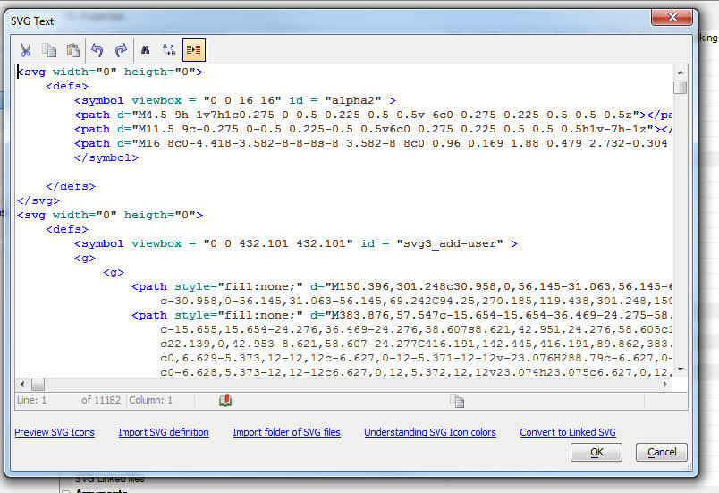
As you can see, the SVG definition looks quite
formidable, but this is largely irrelevant because the
SVG will, in almost all cases, be generated by importing
SVG files that you have downloaded, or will have been
created by an SVG authoring tool that you use.
How to Import SVG Files
Watch
Video
Once you have found a source of SVG icons on the web
that you want to use in your components, you will need
to import the SVG. To import SVG files:
-
Open the builder for
Local SVG definitions
-
Click the Import folder of
SVG files hyperlink
-
Specify the name of folder where the SVG files that you downloaded
are stored
-
Specify an icon prefix name. This name will be used as the prefix
for each SVG icon in the SVG Icon Selector.
After you import the SVG into the builder, you might
want to manually edit the SVG. The most common type of
edit you might want to perform on the imported SVG is to
change the fill and stroke color on the SVG icons. Click
the
Understanding SVG Icon colors hyperlink for more
information on this subject.
Converting Locally Defined SVG to Linked SVG
Watch Video
After you have imported SVG files into
Local SVG definitions,
you might want to convert the SVG that is locally defined, into a SVG
file that is linked. The main reason for doing this is so that other
components can use the same SVG icon definitions.
To do this, click the
Convert to Linked SVG hyperlink on the dialog while you are
editing the local SVG definitions..
Syntax for Specifying an SVG Icon
When you use a SVG icon in a component (for example as
the image on a button, or in a List control, or as the
image to display in a Dynamic Image control), you use a
special syntax (generated automatically by the image
picker). For example:
svgIcon=#svg3_safebox:52 {fill: red}
This syntax is very similar to the syntax used for CSS
font icons. For example:
cssIcon=fa fa-heart fa-2x
In the case of the SVG icon, the prefix is 'svgIcon' and
in the case of the CSS font icon, the prefix is 'cssIcon'
In the above example, the SVG icon is being displayed
with a size of 52px and a fill color of red. The icon
name being displayed is 'svg3_safebox'. Notice that the
icon name is prefixed with a hash character.
Printing Ink Annotation over a Picture in a Report -
a5_composite_picture_and_ink() Function -
If your database has picture fields and ink fields that were used to annotate pictures you might want to print a picture field with the ink annotation shown directly over the picture.
This is done by creating a calculated field that uses the special a5_composite_picture_and_ink() function.
This function takes the name of the field that contains the picture, the name of the field that contains the ink and (optionally) a base path.
The base path is only needed if the picture field contains relative a relative filename. The base path is used to convert the relative image filename into an absolute filename.
a5_composite_picture_and_ink(c pictureFieldName, c inkFieldName [, c basePath])
For example, assume that your database has fields called picture1 and
annotation1 and you want to print the ink in annotation1 over the picture
in picture1. You could create a calculated field called
compositeImage, defined as shown below, and then add this calculated field to your report.
compositeImage = a5_composite_picture_and_ink("picture1","annotation1")
PhoneGap - UX Component Template - Secure Login With Location Tracking And Pushwoosh Notifications
- This new UX component template is a mini-app that
is designed to introduce developers to the power of using native push notifications with Alpha Anywhere and
the Pushwoosh service.
The app offers user login and location check in and check out
for a mobile worker. When the user logs in or out, an admin user is sent a push notification that includes the user name and the date and time the user logged in or
out of the app. When the user checks in or out of a location, a marker is placed on a map, the lat/lon is reverse geocoded with the Google Geo-location API to determine
the exact address and a push notification is sent to the admin user. The admin user is identified in a Pushwoosh filter called Admin. This allows the admin user to
receive push notifications to track all activity within the app.
For a video overview of this component template, click the link below.
Video overview of the Secure Login With Location Tracking And Pushwoosh Notifications
To view the help documentation click the link below.
PhoneGap Push Notifications
UX Component - List Control - Search Highlighting
- When you perform a server-side search on the records in a List
control (using the 'Filter records in a List' action in Action
Javascript), or you apply a filter from a List's Search Part (either
server-side or client-side) you can now highlight the characters in each record that
were matched by the search. This makes it easy to see why a
particular record was included in the search result.
Watch Video
For example, in the image shown below, the table were searched
for all records that contain the string 'manager' in the 'Contacttitle'
field.
To turn on search highlighting, edit the List and check the
Search highlight
property, as shown in the image below. You will then be able to set
the class name and in-line style to apply to the highlight
characters.
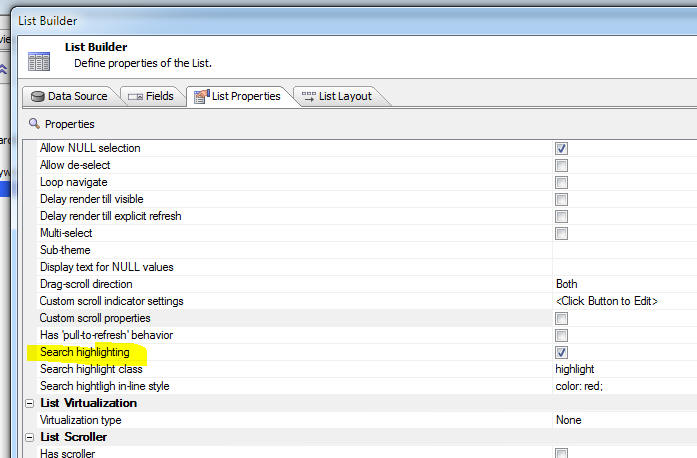
UX Component - AudioPlayer and
AudioRecordAndPlayer Controls - Events - Added event hooks to
these controls.
Action Javascript - PhoneGap - File System Actions
- A new action is now available in Action Javascript. The
PhoneGap - File System Actions (Fire URI Based) is similar to
the PhoneGap - File
System Actions action in that they both allow actions such as
read file, write file, create directory, delete directory, read
directory, etc.. The key difference is the the File URI Based
actions give you explicit control over which part of the device's
file system the operations are performed in.
The PhoneGap - File
System Actions actions operate on files in a default
location, whereas the
PhoneGap - File System
Actions (Fire URI Based) actions allow to specify an
explicit file location.
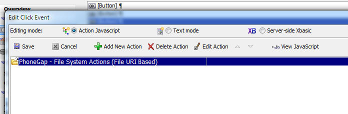
SQLite Database - Indexes - PhoneGap -
When you use Action Javascript to construct a SQLite database you
can now specify that indexes should be build for each table in your
SQLite database. You can add as many indexes as you want. For each
index you can define the columns used in the index.
Sending E-mail Using the SparkPost Service -
email_send_SparkPost() Function - You can now use an Xbasic
helper function to send e-mail using the SparkPost service. This
service is similar to the Mandrill service. You must first go to sparkpost.com to get an API key. You will also be required to verify
your ownership of you sending domain.
Once you have your API key and you have verified your domain
ownership you can send e-mail in much the same way that you may have
used the email_send_mandrill() function.
NOTE: Currently the
email_send_sparkPost() function does
not expose the ability to use merge variables in the HTML message.
If you need this functionality, you must compose the message JSON
manually. Refer to the SparkPost documentation.
Syntax
p Result = email_send_sparkpost( c key,
A message)
Where
- key - your SparkPost API key
- message - either a JSON string that defines the
message, or a dot variable with message properties (see example
below)
- result - a dot variable with properties that
lets you know if the message was delivered to the SparkPost
server (does not tell you if the message was delivered to each
recipient). Also shows the JSON message definition that was
constructed from the message object.
Example:
dim ms as p
ms.send_to = "john@acme.com:Optional friendly name for John
Smith,sally@acme.com"
ms.from_email = "sendername@acme.com"
ms.from_name = "Sales at Acme" 'friendly name - optional
ms.subject = "Information You Requested"
ms.message_html = "Here is the <b>information</b> you requested."
ms.message_text = "Plain text version of the message"
ms.attachments = "c:\alphasports\invoice.pdf,c:\alphasports\vendorlist.pdf"
dim key as c = "your sparkpostkey"
pp = email_send_SparkPost(key,ms)
You can optionally define attachments using an array syntax.
Instead of defining a property called
ms.attachments which has a comma delimited list of files to
attach, you can define an array as shown in the example below::
dim ms.attachmentsArray[1] as p
ms.attachmentsArray[1].name="report.pdf"
ms.attachmentsArray[1].type=resolve_mime_type("pdf")
ms.attachmentsArray[1].content=base64encode(file.to_blob("c:\myfiles\invoice.pdf"))
In the body of your HTML message you can optionally include
in-line images. To define in-line images you can either use a
property that specifies a comma-delimited list of image filenames,
or you can use an array syntax:
Array syntax:
dim ms.inlineImagesArray[1] as p
ms.inlineImagesArray[1].name = "myimage1.jpeg"
ms.inlineImagesArray[1].type = resolve_mime_type("jpg")
ms.inlineImagesArray[1].content = base64encode(file.to_blob("C:\Images\4296.JPG"))
Comma delimited filenames syntax:
ms.inlineImages =
"c:\movieImages\4296.jpg|myimage1.jpeg"
Notice that the comma delimited names syntax specifies the image
name (the name by which you will refer to the image in the HTML
body) with a | delimiter. In the above example, the image name is
'myimage1.jpeg'
To use the in-line images in the HTML message body, you use this
syntax:
Here is your inline image!<br><img src="cid:myimage1.jpeg">
Signature Control - Reports - PDF - If you print a report that
contains a signature control bitmap image using the Amyuni PDF
printer driver, the bitmap previously showed up with a black
background. This is due to a bug in the Amyuni Printer Driver which
does not properly render transparent image backgrounds.
Now, Alpha Anywhere will automatically convert the transparent
background on the image to white. If you want an explicit background
color, then set the image fill style to 'solid' and pick the
background color you want to use. The transparent background on the
image will be converted to the specified color.
PhoneGap - Custom Window onerror Event Handlers - By
default, the Alpha Anywhere Javascript libraries add
window.onerror
handlers to certain functions in the Alpha Anywhere libraries. This
can interfere with any
window.onerror event handlers that you might want to add to
your code.
You can now prevent Alpha Anywhere from adding system
window.onerror event
handlers by adding the following code to the client-side
onRenderComplete event.
{dialog.object}.customWindowErrorEvents = true;
Bugs
Grid Component - Search - 'Is blank' and 'Is not blank' -
Were generating SQL statements that used the Length() function
rather than the StringLength() function (which is the portable SQL
function for string length).
Application Server - Xbasic Error Log - A change was made
in how thread usage is calculated in the Application Server to
reduce false thread error messages which could occur under rare
conditions.
Alpha Anywhere V4.01 -
Build 3550-4650 18-Apr-2016
Videos
|
UX Component - Map Control |
Adding Multiple Markers to a Map - Customizing
the Marker Icon for Each Marker |
Using Action Javascript, it is easy to add
multiple marker to a map control on the UX.
However, in some cases you might want to use a
different icon for each marker. In many cases
the decision as to what icon to use for a
particular marker should be based on some data
about the marker.
In this video we show how the marker icons used
for markers on a map can be dynamically
specified.
Watch Video
- Part 1
Watch Video
- Part 2
Watch Video
- Part 3
Date added: 2016-04-15 |
Features
UX Component - Map Control - Action Javascript - Adding
multiple markers to a map - Customizing the marker icons
- When you add multiple markers to a map you can now dynamically set
the icon used for each marker based on data in the Data Series for
each marker. You can also use image sequences.
Watch Video - Part 1
Watch Video - Part 2
Watch Video - Part 3
To customize the marker icons, click the smart field for the
Marker icon property, shown below.
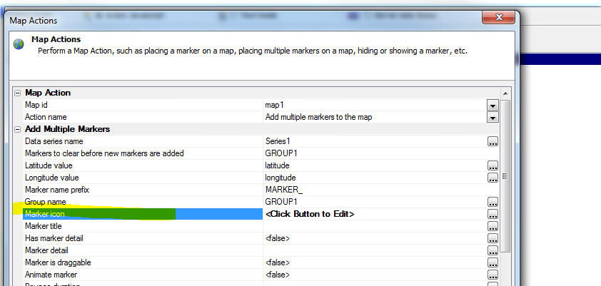
This will bring up a dialog that offers three different methods
for specifying the marker icons:
- List of expressions - this method allows you to
define expressions that refer to data in the Data Series. If the
expression is true, then the corresponding marker icon is used.
- Xbasic function - this method allows you to define an
Xbasic function that is called for each row in the Data Series.
Your Xbasic function will return the name of the marker icon to
use.
- Image Sequence - a sequence of images that are
numbers sequentially so that each marker is unique.
UX Component - Calendar Control and Date Picker - Disabled
Days - When configuring the Calendar control or the Date Picker
you can now explicitly disable certain dates.
You can either explicitly specify certain dates to disable (or
call a Javascript function that returns an array of explicit date
values), or you can specify more general Javascript code that gets
called before each date value is drawn to determine if the date is
disabled or not. For example to disable every December 25th date
(regardless of year), you could specify the following Javascript:
Note: The Javascript is referencing a variable called 'd' -- the
date value of the entry being rendered.
if(d.getMonth() == 11 && d.getDate() == 25) return
true; //month is 0 based
return false;
You can also set the disabled dates programmatically (using
Javascript) after the calendar has been rendered. For example:
//create an array of disabled dates
var disabledDates = [];
disabledDates.push('12/25/2016');
disabledDates.push('12/26/2016');
//get a pointer to the calendar control
var obj = {dialog.object}.getControl('MYCALENDAR1');
//set the calendar's disabledDates.dates property
obj.datePicker.disabledDates.dates = disabledDates;
//refresh the control
obj.refresh();
Bugs
AlphaDAO - MySQL - Commands out of sync Error
- If you executed code that returned a resultset from MySQL, but did
not read all of the rows in the resultset before executing a new SQL
command you would get a 'Commands out of sync' error from MySQL.
This is now fixed.
AlphaDAO - SQL::Resultset - .NextResult() Method
-- Under some circumstances, when there was no next result set,
would return an Xbasic error, rather than .f..
AlphaDAO - Oracle - CLOB Fields - Fixed an
issue with Oracle CLOB fields if the data in the field contained
high order characters.
UX Component - List Control - Search Part -
Keyword Searches - Keyword searches now honor the search type
setting for individual character fields. This means that if you had
set the search type for a field to (say) '12' -- a case in-sensitive
'contains' search -- and you preformed a keyword search that
included this field, the field search would be performed using
search type of '12'.
Grid Component - Row Expander and Linked Content
Section - Fixed an issue if the child component was a UX or
Custom Component.
Grid Component - Excel Import - Under some
circumstances empty data in the Excel file did not import correctly.
Forms - Desktop Applications - Button Labels - A bug was
introduced in the previous build the caused button labels on forms
to not display correctly if the button text included the &
character.
Application Server - Session Variables - Null Values -- A
bug was introduced in the previous build that prevented a session
variable from being set to a null value if it had previously been
set to a non-null value.
UX Component - Default Value - Page Variables - If you set
the default value of a variable to an expression that used the
PageVariable prefix, the expression did not evaluate. For example:
=PageVariable.var1
This bug was introduced in build 3522-4647. However, an easy work
around is to change the default value expression to:
=request.variables.var1
Alpha Anywhere V4.0 -
Build 3522-4647 05-Apr-2016
Videos
|
UX Component |
PhoneGap - Storing Large Amounts of Data for
Off-line Use in Files on a Device |
When you build an application for disconnected
usage, the data you want to have available while
you are disconnected is stored in List controls
in the UX which are persisted to Local Storage
on the device. Local Storage is, however,
limited in size. In some cases your application
will need to have a large amount of read-only
data available (such as price lists, etc.) and
instead of storing this information in Local
Storage you would like to store the data in
files in the file system of the device.
If your application is a PhoneGap application,
then you can store large amounts of data in
files on the device as shown in this video
tutorial.
Watch Video - Part 1
Watch Video - Part 2
Watch Video - Part 3
Watch Video - Part 4
Watch Video - Part 5
Watch Video - Part 6
Watch Video - Part 7
Watch Video - Part 8
Watch Video - Part 9
Download Component
Date added: 2015-08-01 |
|
UX Component |
PhoneGap Shell |
Building and testing PhoneGap applications can
be tedious because every time you want to test a
change to your application you have to submit
the application to the PhoneGap build service
and then load the app onto your device for
testing.
This process can be dramatically shortened by
building a PhoneGap shell application and then
testing your application inside the shell. Every
time you make a change to the component you are
working on, you no longer have to submit it to
PhoneGap build - you simply click the refresh
button inside the shell, where the component is
running.
In this video we show how you can easily build a
PhoneGap shell component.
Watch Video - Part 1
Watch Video - Part
2
Date added: 2015-08-01 |
|
UX Component |
PhoneGap - Using the Image Picker Plugin To
Select Multiple Images from the Photo Library |
The List control allows you to use the camera on
a mobile device to take a picture and then when
the List data are synchronized, upload the
picture to a server (such as Amazon S3 or the
AlphaAnywhere server) and store the picture
filename in the database. However, there are
situations where you want to capture multiple
pictures and adding one record at a time to a
List and then using the camera to get the image
for each record would be tedious. It would be
preferable to be able to open the Image Library
(i.e. the Photo Roll) on the device and select
as many images as you want. Each selected image
would add a new row to a List control.
This video shows how the PhoneGap Image Picker
plugin can be used to do this.
Watch Video - Part 1
Watch Video - Part
2
Watch Video - Part
3
Date added: 2015-08-09 |
|
UX Component |
Setting the Height of an Object to 100% |
Setting the height of to 100% might seem like a
natural thing to want to do, but in reality it
is complicated because while it is clear what
you MEAN by this, the HTML layout engine may not
know what the height of the containing element
is. or put more accurately, when the the element
you want to size at 100% height is initially
rendered, its container may not have been
properly sized yet.
This is
especially true with Panels which need to be
resized after initial render so that they fit
the device.
Fortunately, Panels have an onSize event that
exposes a height property, which you can use to
set the absolute height of an element so that it
fills a Panel, as shown in this video.
Watch Video
Download Component
Date added: 2015-08-25 |
|
UX Component |
Building 'Real-time' Applications Using
Web-Sockets |
In a typical web-application the client makes a
request to the server and the server responds.
The server cannot send information to any client
unless the client first requests it. However, in
'real-time' applications the server maintains a
connection to the client and there is a two way
channel for sending and receiving messages. When
the server, or any of the connected clients,
sends a message, the message is broadcast to all
of the connected clients and an event will be
triggered on each client when a message is
received. The event handler can choose to handle
the message, or to ignore it.
A common pattern (which is discouraged because
it does not scale) is to user timer events on a
Grid or UX to make periodic callbacks to the
server to see if there is any 'new information'
that is of interest to the client. Real-time
applications built on web-sockets are much more
efficient than the pattern of executing Ajax
callbacks on a timer.
This video demonstrates how a real-time
application can be built. The video demonstrates
a chat application where any client can post a
message that is instantly seen by all of the
other clients.
Watch Video - Part 1
Watch Video - Part
2
Watch Video - Part
3
Download Component
Date added: 2015-09-03
(Requires build 4540 or above) |
|
UX Component |
Client-side Data Cache |
The client-side data cache allows you to
retrieve data from the server. Once the data has
been loaded into the data cache, you can use the
data in your UX component. The data in the
client-side data cache can be persisted (either
to Local Storage or to the file system in a
PhoneGap application) so that the data is
available even when you no longer have a
connection.
The client-side data cache is particularly
useful in PhoneGap applications that are
designed for disconnected usage because you can
store a large amount of data on the device and
have this data available to your application.
In this video we show how the client-side data
cache is set up and we demonstrate how it
persists data to Local Storage and to the file
system in a PhoneGap application.
Watch Video - Part 1
Watch Video - Part
2
Watch Video - Part
3
Watch Video - Part
4
Watch Video - Part
5
Watch Video - Part
6
Download Component
Date added: 2015-09-05
(Requires build 4541 or above) |
|
UX Component |
Map Control - Adding Multiple Markers to a Map
using Client-side Data |
Action Javascript has a method (in Map Control
Actions) to add multiple markers to a map.
However, this action assumes that you will be
making an Ajax callback to the server to do a
query to get the list of latitude/longitude
values for each marker you want to add to the
map. But what if you already have a list of data
on the client-side with latitude/longitude
values? Making an Ajax callback to the server
under these circumstances is unnecessary.
In this video we show how a List control, which
has latitude/longitude values for each row, can
be used as the data source for the markers and
how a marker for each row in the List can be
added to the map without having to make an Ajax
callback.
Watch Video
Download Component
Date added: 2015-09-10 |
|
Xbasic |
Calling into Node.JS from Xbasic - Node Services
Defined at the Project Level |
You can define global Node services (i.e.
services that can be called from any application
on your server), or you can define Node services
at the individual project level. Node services
defined at the project level get 'published'
like any other components, or pages in your
application when you publish your applications.
In this video we show how you can define and
consume Node services in a web project.
Watch Video - Part 1
Watch Video - Part
2
Download Component
Date added: 2015-09-12 |
|
UX and Grid Component |
Using OData Data Sources |
OData is a standard method of access data using
a REST api. Alpha Anyhwere allows you to easily
consume data from OData services.
In this video we show how a connection string is
defined to connect to an OData service and then
how a Grid component is built to go against the
OData service.
Watch Video - Part 1
Watch Video - Part
2
In the next video we show how a UX component
with a List can be built using the OData data
source:
Watch Video - Part
3
Date added: 2015-09-12 |
|
UX Component |
Finding Controls in a Large UX Component |
When editing a UX component with a large number
of controls, finding the control that you want
to edit can be difficult. The Quick Find genie
makes it very easy to locate the control that
you want to edit.
Watch Video
Date added: 2015-10-07 |
|
Xbasic |
Validating and Reformatting JSON Data |
Xbasic has many functions that make working with
JSON data easy. Two particularly useful
functions are json_validate() and json_reformat().
These functions are described in this video.
Watch Video
Date added: 2015-10-22 |
|
UX Component - List Control |
Converting a List that uses a Static Data Source
to a SQL Data Source and Vice-Versa |
It is common when building a UX component that
uses List controls to start off with Lists that
are based on static data (because setting up a
List to use static data is so easy). Once you
have your UX working, you might then want to
convert the List to be based on a SQL database.
A genie allows you to easily export the data
from your static data source to a new table in a
SQL database, or to link your List to an
existing table in a SQL database.
You can also easily convert a List that uses a
SQL data source to a static data source by
importing the data from the SQL table.
Watch Video
Date added: 2015-11-04 |
|
UX Component - List Control |
Opening a Pop-up Window with a Button in a List
Row - Positioning the Window Relative to the
Button |
When you create pop-up windows in a UX control,
a common pattern is to open the window
positioned relatively to the button that
displays the window. If the button is in a row
of a List control, then it is a little trickier
to position the window relative to the the
button that was clicked.
This video shows how you can position a dropdown
window relative to a button in a List row.
Watch Video
- Part 1
Watch Video
- Part 2
Date added: 2015-11-09 |
|
UX Component - List Control |
Dynamically Changing Page Size of a Paginated
List at Run-time |
In this video we show how you can dynamically
change the page size of a paginated List that is
based on SQL data.
Watch Video
Download Component
Date added: 2015-12-29 |
|
UX Component |
Executing Client-side Validation Rules
Programmatically |
When you define validation rules for controls on
a UX, the rules are evaluated when the UX is
submitted. However, there may be cases where you
want to explicitly (programmatically) evaluate
the validation rules for a set of controls.
For example, you might not want to allow the
user to go to a different Panel Card if there
are validation errors on the current Panel Card.
In this video we show how you can
programmatically execute the client-side
validation rules for a series of controls.
Watch Video
Download Component
Date added: 2015-12-30 |
|
UX Component - List Control |
Displaying Hierarchical Data in a List |
A common requirement in many mobile applications
is to display cascading data in a List control
(such as a list of menu choices). Some of the
items in the List will have sub-choices. When an
item in the List that has sub-choices is
selected, the List is repopulated with the
sub-choices and a 'back' button is enabled to go
back to the previous level.
There is no limit as to how deep this hierarchy
of nested Lists can be. Typically, when an item
in the List that has no sub-choices is selected,
an action associated with that List item is
executed.
In this video we show how you can build a UX
component that uses a List to display an
hierarchical menu system. We show how a genie
can help you generate the JSON data for the
hierarchical menu system and how the List's
'Quick Setup Genie' can be used to configure the
List to display the nested Lists defined by the
List's JSON data.
TIP: In some cases, instead of populating the
List with static data, you might want to
generate the List data by querying a SQL
database. See the video 'Displaying Hierarchical Data From a SQL Table in
a List' for a demonstration of how this can be
done.
Watch Video
- Introduction
Watch Video
- Part 1
Watch Video
- Part 2
Watch Video
- Part 3
Watch Video
- Showing Animation for List Transitions
Date added: 2016-01-04 |
|
UX Component - List Control |
Displaying Hierarchical Data From a SQL Table in
a List |
In the 'Displaying Hierarchical Data in a List'
video we show how hierarchical data can be
displayed in a List. In that example the data
shown in the List is defined statically. In this
video we show how the data hierarchical data for
the List can be retrieved from a SQL table.
The video shows a List with Country names. When
the user selects a Country, the List is
repopulated showing the Cities in the selected
Country and a 'back' button is enabled. When the
user selects a City, the Contacts in that City
are shown.
Watch Video
Download Component
Addendum:
In this next sample component the Xbasic
commands that are executed to get the JSON data
are replaced with a built-in helper function
(a5_sqlToJSONTree() ).
When the user clicks on a List 'endpoint', the
selected record is shown and can be edited.
Download Component
Date added: 2016-01-05 |
|
UX Component |
Structure Explorer |
When you are working with a complex UX component
that has many different Panel Layouts,
Navigators and Cards as well as many Window
containers and Panel Overlays, it can be
difficult to get a sense of the component's
underlying 'structure'.
In this video we show how the Structure Explorer
can help in getting an overview of how a UX
component is structured.
Watch Video
Date added: 2016-01-05 |
|
UX Component |
Client-side Data Cache - Populating Dropdown
Boxes From the Client-side Data Cache - PhoneGap |
In a PhoneGap application, if your UX contains
Dropdownbox controls, the choices shown in the
Dropdownbox controls will be defined at
design time (when the PhoneGap application
is built).
However, in your application you might want the
choices in the Dropdownbox controls to be
defined at run-time. Your app should make a
callback to the server to get current data for
the Dropdownbox controls and then persist that
data locally so that the next time the app is
loaded it already has the data for the
Dropdownbox controls. The client-side data cache
is ideal for this scenario.
In this video we show how you can define
client-side data cache items for the data to
populate Dropdownbox controls.
Watch Video
- Part 1
Watch Video
- Part 2
Watch Video
- Part 3
Download Component
Date added: 2016-01-12 |
|
UX Component - PanelOverlay |
PanelOverlay Windows |
The UX component allows you to display
PanelOverlays that 'float' on top of a Panel. By
showing and hiding the PanelOverlay you can make
the PanelOverlay behave much like a 'window'.
In this video we show how the 'PanelOverlay is
window' property is used to turn a PanelOverlay
into a window that is initially hidden and shown
on demand by executing the 'PanelOverlay window
show' action in Action Javascript.
Watch Video
Download Component
Date added: 2016-01-13 |
|
UX Component - Custom Controls |
Understanding CustomControls |
The UX Component allows you to define two types
of CustomControls - data bound and non-data
bound. In both cases the HTML and Javascript for
the custom control can either be specified at
design-time, or (much more powerfully) generated
by Xbasic at run-time.
In this video we introduce the CustomControl
found in the 'Other Controls' category of the UX
Builder (as opposed to the 'CustomControl' found
in the 'Data Controls' category).
After introducing the basic concepts of the
CustomControl, the video shows how a UX form can
be dynamically generated at runtime from a
definition that could be read from a database.
Watch Video
- Part 1
Watch Video
- Part 2
Watch Video
- Part 3
Watch Video
- Part 4
Watch Video
- Part 5
Watch Video
- Part 6
Watch Video
- Part 7
Download Component
Date added: 2016-01-19 |
|
TabbedUI Component |
Keyboard Shortcuts |
The TabbedUI component is a great way for
navigating to the different components that make
up an application. You can assign keyboard
shortcuts to the different buttons in the
TabbedUI that launch components.
Launching a component using a keyboard shortcut
can be more efficient than having to visually
locate the button in the TabbedUI and then click
on it.
In this video we show how to assign a keyboard
shortcut to a button in the TabbedUI.
Watch Video
Date added: 2016-01-21 |
|
Xbasic |
Calling SOAP Web Services from Xbasic |
You can register SOAP web services at the Web
Projects Control Panel and then call methods of
these services from your Xbasic code.
In this video we show how to register a SOAP
service and then call methods of the service.
Watch Video
Date added: 2016-01-21 |
|
Grid Component |
Using IN clause in SQL Statement and Argument
Arrays |
Argument arrays, in combination with the SQL IN
clause are a powerful way to define what records
the Grid should show.
In this video we show how you can use argument
arrays to define a button on a UX that opens a
Grid showing a selected list of records.
Watch Video
Download Component
Date added: 2016-02-10 |
|
Xbasic |
Working with MongoDB using AlphaDAO |
Alpha Anywhere allows you to connect to a vast
array of SQL databases and then build Grid and
UX components against the SQL data. You can also
use Xbasic (specifically the AlphaDAO object) to
write code that executes SQL commands.
You can work with a Mongo database in the same
way.
In this video we show how you can create an
AlphaDAO connection string that points to a
Mongo instance - how you can export data from a
SQL database to a Mongo database - and how you
can build a Grid component against a Mongo
database.
NOTE: These videos show how the Mongo database
is accesses using standard AlphaDAO objects.
Alpha Anywhere also provides an
API to access
Mongo directly.
Watch Video
- Part 1
Watch Video
- Part 2
Watch Video
- Part 3
Required build: 4612
Date added: 2016-02-10 |
|
UX Component |
Understanding Custom Settings |
The UX allows you to define Custom Settings - a
list of named setting values. These custom
settings can be referenced in Javascript code
and also when the component is initially
rendered.
Custom Settings are a powerful tool for
dynamically configuring certain aspects of a UX
component.
In this video we introduce the concept of Custom
Settings and show some of they ways they can be
used.
Watch Video
- Part 1
Watch Video
- Part 2
Download Component
Required build: 4614
Date added: 2016-02-14 |
|
UX Component - List Control |
Pull-past-end to Refresh List Data |
A common pattern in mobile applications is to
allow a user to refresh the data in a List by
pulling down on the List past the top of the
List and if the user pulls down past some
threshold value, to trigger a List refresh once
the user releases the List, and it bounces back
to its initial position.
In this video we show how you can implement the
'pull-past-end-to-refresh' pattern in a List
control.
Watch Video
Required build: 4620
Date added: 2016-02-20 |
|
PhoneGap |
Including Pre-populated SQLite Database Files in
a PhoneGap Project |
The UX component has extensive support for
working with SQLite databases in PhoneGap
applications. A common requirement when building
PhoneGap applications is to include
pre-populated SQLite database files as part of
your PhoneGap project. These pre-populated
database files can contain large amounts of
data. Since they are part of the PhoneGap
project, the data in these database files will
be immediately available to your application
when it is loaded, even if there is no
connection.
In this video we show how the PhoneGap Builder
allows you to define the pre-populated SQLite
database files to include in your PhoneGap
project.
Watch Video 1
Watch Video 2
Required build: 4625
Date added: 2016-02-27 |
|
UX Component |
Using SQLite in a UX Component in a PhoneGap
Project |
Action Javascript has actions that make it easy
to work with a SQLite database on a mobile
device.
In this video we demonstrate various actions
that can be performed with the Action Javascript
SQLite action.
Watch Video 1
Watch Video 2
Watch Video 3
Watch Video 4
Required build: 4626
Date added: 2016-02-28 |
|
Publishing Web Applications |
Using the HTTP Method for Publishing Web
Applications |
When you publish a web application to a remote
server, you can choose whether to use FTP or
HTTP to do the actually work of transferring the
files. The HTTP option has more options than the
FTP option, but has some additional setup that
is required.
In this video we show how to configure a server
to allow HTTP publishing and how to create a
Publishing Profile in the Alpha Anywhere IDE
that uses HTTP Publishing.
Watch Video - Configuring the Server
Watch Video - Defining a Publishing Profile
Date added: 2016-03-02 |
|
UX Component |
Vertically Centering Content in a Panel Card |
A common pattern in mobile applications built
using Panels it to vertically center some
content in a Panel Card. The content should be
vertically centered regardless of the device
orientation or size.
In this video we show how this is easily done
with some Javascript in the Panel Card's onSize
event.
Watch Video
Download Component
Date added: 2016-03-04 |
|
UX Component |
Using SQLite to Store a Large Database of
Records with Images for Use in an Off-line
Application |
In a PhoneGap application, being able to use
SQLite on the device allows you to store a large
amount of information on the device that will be
available when the device is offline. A common
requirement is for the data that is stored in
the SQLite database to contain images.
In this video we should how you can build a UX
component that makes a callback to the Alpha
Anywhere server to create a SQLite database of
500 records, with each record having an
associated image. The SQLite database is then
download to the device and stored on the device.
The a SQL query is executed against the
on-device SQLite database and a List control is
populated showing all of the records and their
associated image.
Watch Video - Part 1
Watch Video - Part 2
Download Component
Date added: 2016-03-08 |
|
UX Component |
PhoneGap - iOS Background Geolocation |
This video shows how to use the 3rd party iOS
Background Geolocation PhoneGap plugin.
Watch
Video
Date added: 2016-03-11 |
|
UX Component |
PhoneGap -
Local Authentication for iOS with the Fingerprint Scanner |
This video shows how to use the 3rd party
Local Authentication for iOS with the Fingerprint Scanner PhoneGap plugin.
Watch
Video
Date added: 2016-03-11 |
|
UX Component - ViewBox Control |
Introduction to Basic Concepts |
This video demonstrates basic concepts of the
ViewBox control such as the a5-item attribute
and the a5-value attribute and shows how events
are attached to the ViewBox and how parts of the
ViewBox can be made 'selectable'.
Watch Video
Download Component
Date added: 2016-03-13 |
|
UX Component - ViewBox Control |
ViewBox HTML Rendered by Merging Data into a
Template |
The HTML that the ViewBox displays can be
generated dynamically by merging data into an
HTML template.
Watch Video
Download Component
Date added: 2016-03-13 |
|
UX Component - ViewBox Control |
ViewBox HTML Rendered by Merging Data Array into
a Template |
The data that is merged into the ViewBox
Template can be an array of objects. In this
video we show how the template is expanded by
iterating over all of the objects in the data
array and how the resulting HTML can be
formatted to look and behave like a simple List
control.
Watch Video
Download Component
Date added: 2016-03-15 |
|
UX Component - ViewBox Control |
Making a ViewBox Behave Like a Simple List
Control |
A common use case for a ViewBox control is to
implement a simple List control. In cases where
you don't need the full richness of a List
control, but you only want to create a
scrollable list of items, the ViewBox represents
a simpler option.
In this video we show how the special
ListRowContainer control can be used to make a
simple List using the ViewBox.
Watch Video
Download Component
Date added: 2016-03-15 |
|
UX Component - ViewBox Control |
Sample ViewBox Walkthrough - Star Rating Example |
In this video we do a behind-the-scenes
walkthrough on the sample 'star rating' ViewBox
Control.
Watch Video
- Part 1
Watch Video
- Part 2
Date added: 2016-03-15 |
|
UX Component - ViewBox Control |
Sample ViewBox Walkthrough - iOS Login Example |
In this video we do a behind-the-scenes
walkthrough on the sample 'iOS Login' ViewBox
Control.
Watch Video
- Part 1
Watch Video
- Part 2
Date added: 2016-03-15 |
|
UX Component - ViewBox Control |
Understanding the Concept of 'Selectable'
Elements in a ViewBox |
One of the key concepts of the ViewBox control
is that elements in the HTML rendered by the
ViewBox control can be 'selectable'.
In this video we explain this concept by taking
a complex ViewBox layout that does not have any
selectable elements and making portions of the
ViewBox HTML selectable.
Watch Video
Download Component
Date added: 2016-03-15 |
|
UX Component - ViewBox Control |
Understanding the ViewBox State Object |
The ViewBox has a 'state' object and the values
in the state object can be used in the ViewBox
template.
In this video we show how the template can
reference values in the ViewBox state and how
the ViewBox's .setState() method allows you to
set properties in the ViewBox state object.
Watch Video
Download Component
Date added: 2016-03-16 |
|
UX Component |
Add-in Controls |
The UX Builder allows you to define add-in data
bound controls. These are control that are
defined externally and are available in the uX
Builder just like any of the built-in controls.
Watch Video
- Part 1
Watch Video
- Part 2
Date added: 2016-03-15 |
|
UX Component - List Control |
Dynamically Populating a List Columns and Data -
Generic SQL Table Viewer |
The List control on a UX is one of the most
versatile controls in Alpha Anywhere. To
demonstrate its versatility this video shows a
sample UX component that can be used to view the
data in any table in a SQL database. The UX has
a dropdownbox where the user can select the
table in a SQL database and then a callback is
made to the server to dynamically populate the
List with the data from the table.
In addition the UX contains a search part where
the user can specify filter criteria to filter
the data in the table.
Watch Video
- Part 1
Watch Video
- Part 2
Watch Video
- Part 3
Download Component
Date added: 2016-03-18 |
|
Xbasic |
Using Output Arguments when Calling a Stored
Procedure |
When you call a stored procedure from Xbasic,
the stored procedure might return values (in
addition to resultsets). The calling Xbasic code
can read these return values by using 'output'
arguments.
In this video we show how input/output and
output arguments are defined and used when
calling a stored procedure.
Watch Video
- Part 1
Watch Video
- Part 2
Date added: 2016-03-18 |
|
UX Component - List Control |
Audio Recording/Playback in a UX Component |
It is quite common to build mobile applications
that work in disconnected mode and allow the
user to capture images using the phone's camera.
You can also build mobile applications that
allow users to record and playback audio files.
NOTE: To record audio, you must be using
PhoneGap.
In this video we show how a List with a Detail
View can be used in a UX component that is
running as a PhoneGap application to capture
audio files for each new record that is added to
the List. The application that we show can work
in disconnected mode and allows the user to
record many audio files while disconnected. When
a connection is obtained and the data that was
captured while disconnected is synchronized, the
audio files can first be uploaded to a server
(such as Amazon S3).
The component relies on the
AudioRecorderAndPlayer control in the UX
component.
Watch Video
- Part 1
Watch Video
- Part 2
Date added: 2016-03-26 |
|
Style Builder |
Style Builder |
In Alpha Anywhere V4 the Style Builder has been
rewritten. You can now easily adjust the entire
appearance of a style by simply adjusting the
SASS variables that control the style colors and
you can also easily add new sub-themes for
different control types.
In this video we show how you create a new style
for buttons and we also show how the entire
style can be c hanged from a 'blue' color to a
'green' color.
Watch Video
- Part 1
Watch Video
- Part 2
Watch Video
- Part 3
Date added: 2016-03-26 |
|
UX Component - Ink Control |
Introduction to the Ink Control |
The Ink control allows you to create and edit
'ink' data.
In this video we give a very brief introduction
to the Ink control.
Watch Video
- Part 1
Watch Video
- Part 2
Date added: 2015-08-13 |
|
UX Component - Ink Control |
Setting the Background Image for the Ink Control |
You can set the background image shown in the
ink control to anything you want - either by
specifying the URL of an image, or the base 64
encoded data for an image.
In this video we show how you can set the
background to an image and also to a map this is
generated by Google Maps.
Watch Video
Date added: 2016-01-21 |
|
UX Component -
ViewBox Control |
ViewBox Control - In Depth Tutorial |
This video is an in-depth tutorial on how the
ViewBox control can be used to build a 'star
rating' control.
A common pattern in many applications is to
allow a user to rate something by clicking on
the number of stars. For example, the control
might display 5 stars, all of which are grey.
The user will then click on the 4th star to rate
something as '4 stars'. The first four stars
will then change color and the 5th star will
remain greyed out.
This type of control can easily be built using
the ViewBox control, as shown in this video.
NOTE: A 'star rating' control is actually a
built-in control type (select the [More...] tool
in the UX toolbox) so it is not necessary to go
through the steps shown in this tutorial every
time you want to add a star rating control to a
component. The video is mean simply as in
introduction to key concepts of the ViewBox
control.
Watch Video
- Part 1
Watch Video
- Part 2
In depth discussion of how the control is built.
Watch Video
- Part 3
Watch Video
- Part 4
Watch Video
- Part 5
Watch Video
- Part 6
Watch Video
- Part 7
Watch Video
- Part 8
Download Component
Date added: 2015-09-04 |
|
UX Component - FormView Control |
Using the MobileForms_StarterExample Quick Start
Template |
When you create a new UX component that will use
the FormView control to create a mobile
optimized form, the sample 'MobileForms_StarterExample'
template is a convenient starting point.
In this video we give a quick overview of the
features of this sample template.
Watch Video
- Part 1
Watch Video
- Part 2
Watch Video
- Part 3
Date added: 2016-04-02 |
Features
FormView Control - Starter Example - When you
create a new UX component you can use the
MobileForms_StarterExample as a quick start to create a basic UX
component with a List control (the form's data source), a FormView
control and a set of Editors (for editing values in the form).
Watch Video
- Part 1
Watch Video
- Part 2
Watch Video
- Part 3
To use the template select 'MobileForms_StarterExample' from the
dialog shown below.
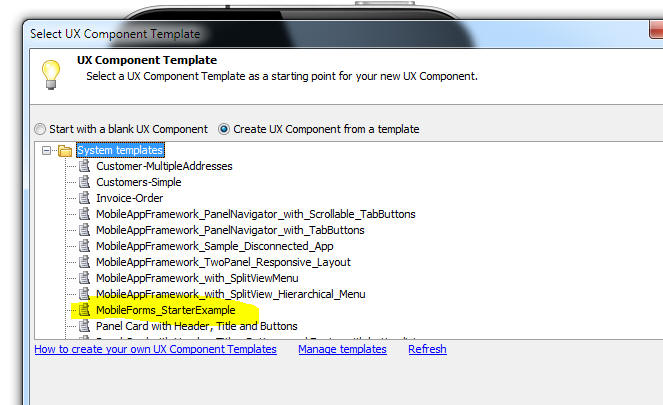
FormView Control - The FormView control
(together with Editor Sets and Editors and the List View control)
are the fundamental building blocks for building touch optimized
mobile forms.
For more information on the FornView control
click here.
Ink Control - A new type of data bound control
can be added to a UX Component. The ink control allows users to
'draw' (using a finger or stylus on a device that supports touch
events) or with a mouse (on a desktop browser). The ink is captures
using a special text format.
Watch Video
- Part 1
Watch Video
- Part 2
Overview
The ink control, shown in the image below, is made up of two main parts, the editor and the
view.
The editor (bottom part -- this is where the user draws) allows the user to edit the ink while the view
(top part) provides the ability to navigate to the part of the page
where the ink is being drawn. For example, the 'page' that contains
the ink might be a standard 8.5 x 11 inch page. In ink editor
(bottom part) only shows a small part of the page. The view (top
part) contains a
dragable zoom-box (see the dotted red rectangle) showing the portion of the ink visible in the
editor. The editor and view can be laid out in three ways.
The first is a split layout. In this layout the editor and the view
share the ink controls layout area in either a horizontal or
vertical layout. It should be noted that a split layout can still
optionally show only the view or editor. This is useful if you are
targeting multiple screen sizes, as you can use responsive layout
Javascript to change the split layout on smaller screens to toggle
between the editor and view if there isn't space for both. You can
also use this to allow the user to toggle the editor to take up the
entire ink control on larger screens as well.
The second layout is a detached view layout. In this layout the
editor takes up the entire ink control area, while the view part is
injected into an element specified by an ID. This allows
for extremely customized layouts.
The last layout is an editor layout. This will display only the
editor. This is useful for ink editing that doesn't need navigation,
such as signature capture.
Ink data is stored in a string format, with the strokes stored as
vectors. Below is an example of some ink data.
#A5Ink
version 1.0
settings %json%
{"page":{"width":5,"height":3,"unit":"in","dpu":300,"lines":false,"background":{"image":false,"color":""}},"meta":{"bounds":{"l":57,"t":35,"r":1393,"b":571},"created":"2015-09-12
05:12:15 pm","modified":"2015-09-12 05:29:42 pm"}}
%json%
A pen 3 #000
S
120,228,CAC+D+E+F+G+I+J+M+M+TaTaR+UaQcRdQcTeOePcMfJcGcFcEdDcEdAdBcAcAdBd+e+c+e+caebcbebedddekhfcfbgbgbfahahajal+m+-29+p+lBiBkAhBfAfBdAdCcAcC+CCAFCHCKCMBUDQBOBPBN+NAJ+MAI+J+H+H+IaIcHbIbGbEcDbCbCc+d+cAc+cAdDdCdCcBcBcBcBcE+D+D+DADCEAEBDBCBBCCEACDEAECFAF+FAFAG+E+F+EbHbDaDbEaC.........
This keeps the file size down and allows for the ink to
be rendered at any resolution. The boundaries of the ink page are defined
by the ink page settings. The page settings include width and height
in a specified unit (in, px, etc.). This data is combined with the
dots-per-unit (dpu) to create the ink page. The width and height are
multiplied by the dpu to get the base page size in "ink units". The
dpu can be thought of like "dpi" in printing. The higher the dpu,
the higher the ink resolution.
The goal is to get the dpu relative
to the units so that when the editor is at a scale of '1 ink unit
equals 1px', the user is encouraged to enter ink at a larger scale
than if they where writing on a sheet of paper. This works around
the inherent lack of accuracy in capacitive touch screens (ink can
only be captured at screen pixel accuracy), and allows for readable
written input.
If the ink page unit is 'inches' then the dpu should be at least be 300. All measurements inside of the ink (pen
width, margins, etc.) are in 'ink units' derived from the dpu.
The
page can also store background (color and image) settings, and have
automatically generated lines to create graph and ruled paper look.
The editor and view parts of the ink control can each have an
overlay. The overlay is arbitrary HTML that will be laid out over
each part. Elements in the HTML can make use of the "a5-item"
attribute in order to easily add buttons to the ink control. There
are a number of predefined "items" that allow the user to access the
eraser tool, pan tool, undo and redo actions, and navigate the ink.
Custom "items" allow you to add unique behaviors to elements in the
overlay. The events on the "items" have direct access to the ink
control.
The ink editor uses tools to edit the ink. The default tool in the
pen tool. Other tools can be selected using the ink control's .setTool()
method. This method can specify whether the tool is "sticky" or not.
If a tool is not "sticky" then after a single user interaction with
the tool, the tool will be deselected, and the ink editor will go
back to the pen tool. Each tool has an optional "active class name"
that will be applied to the ink control when that tool is active.
This allows you, though CSS, to automatically highlight the elements
in the overlay, and possibly change visibility of elements as well.
AudioPlayer Control - The AudioPlayer control
allows you to add a control to the UX to play audio files.
To add a new AudioPlayer control to the UX component, select the
[More...] entry in the controls toolbox (in the 'Data Controls'
section) and then select the 'AudioPlayer' control.
NOTE: A separate Audio Recorder/Player
control is also available. This control can only record in a
PhoneGap application.
This will insert a control into the UX that looks like this:
To customize the AudioPlayer control, click the smart field for
the Control properties.
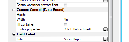
Since the AudioPlayer is a data bound control, it has a
{dialog.object}.setValue()
and a {dialog.object}.getValue()
method.
To set the audio file that you want to play back you use the
{dialog.object}.setValue()
method
For example:
{dialog.object}.setValue('MYAUDIOCONTROL','stream:http://audio.wgbh.org:8004');
In this case the AudioPlayer value is being set to a 'stream' -
(a continuous audio stream) rather than a file.
After the stream is ready to play, the AudioPlayer appearance
will change to this;
While the stream is loading (i.e. before it is ready to play),
the text 'Stream', shown in the above image, will say 'Loading...'.
All of the text messages shown in the control are customizable in
the AudioPlayer Control
properties.
In this next example, the AudioPlayer value is set to a file URL:
{dialog.object}.setValue('MYAUDIOCONTROL','http://s3.amazonaws.com/alphaVideos/theway.mp3');
In the case where the AudioPlayer value is set to an audio file
(not a stream), its appearance will change as follows once the audio
file is ready to play:
When the user taps the Play button, the audio starts to play
back. The number on the right side indicates the duration of the
audio file. Before playback starts, or when playback is paused, the
fast forward and fast reverse buttons (on either side of the Play
button) will skip to the beginning or end of the audio clip (if you
tap on them). However, if you press and hold, they will rewind or
fast forward in 2 second steps.
The top bar shows the progress as the audio file is being played.
The number on the right hand side shows the duration of the audio
file. The number on the left hand side shows how much of the audio
file has been played. The buttons on each side of the Play button
allows you to skip forward and back in the file.
NOTE: The AudioPlayer control cannot play
audio files that are hosted on the Alpha Anywhere server. It can
play files that are hosted on Amazon S3, or, in the case of a
PhoneGap application, files that are stored in the file system on
the device.
AudioRecorderAndPlayer Control - The
AudioRecorderAndPlayer control allows you to add a control to the UX
component to play audio files and to record audio files.
NOTE: A separate AudioPlayer control is also
available. This control is for playback only and is not limited to
PhoneGap applications.
To add a new AudioRecorderAndPlayer control to the UX, select the
[More...] entry in the controls toolbox (in the 'Data Controls'
section) and then select the 'AudioRecorderAndPlayer' control.
The AudioRecorderAndPlayer controls is a dual purpose control. It
can be used to play audio files (or streams) and it can also be used
to record audio files.
You can only record audio files if you are using PhoneGap.
When you build your PhoneGap application you must must ensure
that the Media plugin has not been selected:
and that the Media With Compression plugin has been
selected.
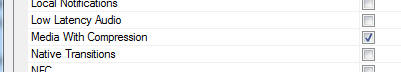
In addition, you are likely to need to upload the captured audio
files to a server so the following PhoneGap plugins should also be
loaded: Device,
File,
File transfer.
When you add an AudioRecorderAndPlayer control to your UX you
customize the control properties by clickin the smart field for the
Control properties.
The customization genie allows you to set customize text and also
set the maximum recording duration (in seconds).
When the component is run, the AudioRecorderAndPlayer control
will look like this (if not audio file has been loaded for
playback):
The red circle button will put the control into record mode. When
the control is in record mode, it will appear as follows:
The Done button (text on this button is customizable -- you can
use language, or text dictionary tags for International
applications- <a5:r> or <a5:t>) becomes enabled. This button
indicates that you want to end the recording. The record button
changes to a Pause button. You can use this button to pause the
recording.
The horizontal line at the top of the control indicates the
recording level. The color of the line will be orange, green or red
to indicate if the recording level is too low, ok or too high.
The number on the right indicates the duration of the recording.
If you set the value of the control to an audio stream or an
audio file ( using the {dialog.object}.setValue()
method ), the control's appearance will change as shown
below.
The control is now in 'Player' mode. The play button in the
center of the control will start playback. The small record button
at the left of the control will allow you to switch the control from
'Player' mode to 'Record' mode.
Audio Files - List Control - Detail View - The
List control now supports the 'Audio'
control type in the 'Fields' pane of the List Builder, as shown in
the image below. The purpose of setting a field type to 'Audio' is
to designate the field as a 'media' field for synchronization
purposes (as explained below).
Watch Video
- Part 1
Watch Video
- Part 2
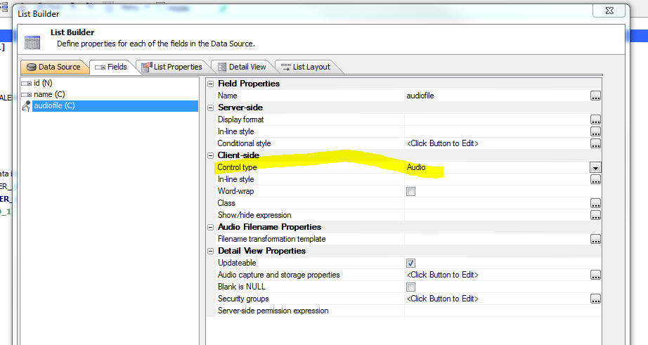
The 'Audio' control type is intended to address a very specific
use case. Consider the following scenario:
- You have built a mobile application that runs in PhoneGap
- You have used the AudioRecorderAndPlayer control to record
audio files in your application. When an audio file is recorded,
the audio file is stored in the file system on the mobile device
and the filename of the audio file is stored in the List control
- When you sync the List control to save any edits that were
made, you want to upload the audio files from the device to a
server (either Amazon S3, or the Alpha Anywhere server) and then
store the edits that made in the List data to the SQL database
that backs the List.
When you sync the List, Alpha Anywhere looks in all of the
'media' fields in the List looking for local filenames. These files
are then uploaded to the target server and the data in the List are
then changed to reflect the filename of the file on the remote
server before the data are submitted to the server to update
the SQL database. The following example will help make this point
clearer.
Assume that you have a List with these fields:
name, audioFile
The user adds a new row to the List and records an audio. The
data in the List will look something like this:
name: John Smith
audioFile: file://folderNameOnTheMobileDevice/filenameOfAudiofile.m4a
When the user hits the sync button to push the edits made to the
List back to server so that the data can be added to the SQL
database that backs the List, Alpha Anywhere first scans the data in
all 'media' files to find any references to local file system
filenames.
If the control type of the
audioFile fieldname
was set to Audio in
the List builder, the
audioFile field is considered a 'media' field. Alpha Anywhere
will detect that the data in the
audioFile field is a
local file and it will first upload this file to the target server.
Assuming that the target server is Amazon S3, the URL of the file
once it has been uploaded to S3 might be something like:
https://your_bucket_name.s3.amazonaws.com/audiofile1.m4a
Next, before sending the data in the List back to the Alpha
Anywhere server (where the data will be written to the SQL
database), the data in the List is changed so that the media fields
are set to the URL of the files on the remote server. So, in our
example, the data in the List is changed to this:
name: John Smith
audioFile:
https://your_bucket_name.s3.amazonaws.com/audiofile1.m4a
The data are then sent to the Alpha Anywhere server and the value
that is stored in the SQL database for the
audioFile field is
https://your_bucket_name.s3.amazonaws.com/audiofile1.m4a and
not file://folderNameOnTheMobileDevice/filenameOfAudiofile.m4a
(which of course would be a meaningless value to store in the
database!)
NOTE: It is recommended that you set Amazon
S3 as the target for media file uploads as the AudioPlayer cannot
play audio files that are hosted on an Alpha Anywhere server. To set
the upload target go to the 'Media and Other Linked Files (PhoneGap
Applications Only) property on the 'Detail View' tab in the List
Builder.
PhoneGap - FileTransfer - Upload and Download -
SSL Server - If you are testing a PhoneGap application with a
server that is using SSL with a self-signed certificate, all
PhoneGap file transfer functions will fail.
You can set a global flag to tell the PhoneGap file transfer
function to trust all host. When you set this flag to true, you will
be able to test PhoneGap file transfer functions even though your
server might be using a self-signed certificate.
To set the flag, you could add this code to the client-side
onRenderComplete event:
{dialog.Object}._phoneGapTrustAllHosts = true;
PhoneGap App Builder - Config.xml File Format - Updated - PhoneGap Build has deprecated the 'gap:' prefix previously used within the project's
config.xml file. While the 'gap:" prefix is still officially supported, the recent PhoneGap Build documentation suggests that the prefix should be dropped.
This change affects the splash, icon, platform and qualifier tags. All new PhoneGap project config.xml files will no longer include the 'gap:' tag.
All previously defined config.xml files will be automatically updated and the 'gap:' prefix will be removed once the PhoneGap project is saved.
PhoneGap App Builder - Launch Images / Splash Screens - Android Only
-
PhoneGap Build now requires a default launch image /splash screen called 'splash.png' for Android apps. You must include the core SplashScreen plugin as well.
The SplashScreen plugin is now automatically enabled if you choose to build an Android app. The config.xml file now includes the required splash
tag as well.
PhoneGap App Builder - App Icons / Splash Screens - Windows 8.1
- PhoneGap Build now supports Windows 8.1. The appropriately sized icons and launch images / splash screens have been added to the config.xml file
and will be automatically generated, should you choose to generate the images files for icons and splash screens when building a Windows 8 mobile app.
Please keep in mind that you should always check the sizing on each launch image / splash screen prior to publishing your app to any of the app stores. While
the PhoneGap Builder does its best to size the images in the X axis, the Y axis may be larger than the expected size because of the
numerous varying aspect ratios that the properly sized images require.
UX Component - Control Flow Direction -
Right-to-Left Languages - A new property in the UX builder
allows you to set the control flow direction.
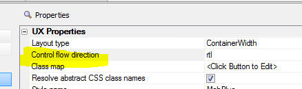
The default is left-to-right (ltr). You can also select
right-to-left, as shown in the image below.
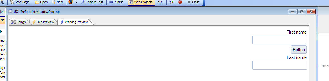
Web-sockets Server - Redis - A new option has
been added to the Web-sockets server to use Redis to store the
messages that are sent and to handle the distribution of messages to
the connected Node.js server(s)
To turn on this option, go to the Web Project Properties dialog
(accessible from the Web Control Panel) and select the option as
shown in the image below.
A copy of Redis is automatically installed with Alpha Anywhere.
You need to ensure that the Redis server has been started before you
run a component that uses the web-sockets server.
You can start a local copy of the Redis server, or you can point
to a remote copy by specifying the Redis host property in the
dialog.
To start a local copy of Redis you can either start Redis
manually, or install Redis as a service.
To start Redis manually, navigate to the Alpha Anywhere
executable folder from the command window and then type:
Redis-server
For information on how to install Redis as a service, see:
http://stackoverflow.com/questions/26213403/install-redis-as-windows-service
If you are using a load balancer to distribute load to multiple
Alpha Anywhere servers, then you should turn on the Redis option.
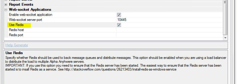
The benefit of using Reds in your web-sockets configuration is
that the solution is more robust. If the Node.js server is restarted
for any reason, the message queue is not lost. In addition, Redis
enables web-sockets applications if you are running multiple
instances of the Alpha Anywhere server that are managed by a load
balancer.
registry.sys_get() Method - 64 Bit Registry
Entries - A new option has been added to the registry.sys_get()
method to specify where you search for a registry value.
The second parameter passed to the method can be '32', '64' or
'Any'. 'Any' is the default option. With the 'Any' option, the
method will first search the 32 bit registry and then if no match
was found, it will search the 64 bit registry.
Examples:
? registry.sys_get("HKEY_LOCAL_MACHINE\SOFTWARE\MongoDB\Server\3.0\Edition")
= "MongoDB 3.0 2008R2Plus SSL (64 bit)"
? registry.sys_get("HKEY_LOCAL_MACHINE\SOFTWARE\MongoDB\Server\3.0\Edition","32")
= ""
? registry.sys_get("HKEY_LOCAL_MACHINE\SOFTWARE\MongoDB\Server\3.0\Edition","64")
= "MongoDB 3.0 2008R2Plus SSL (64 bit)"
? registry.sys_get("HKEY_LOCAL_MACHINE\SOFTWARE\MongoDB\Server\3.0\Edition","Any")
= "MongoDB 3.0 2008R2Plus SSL (64 bit)"
UX Component - Add-in Controls -- The UX
Component now supports 'add-in' controls. Addin controls are
defined by entries in the 'uxCustomControls'
folder in the executable folder.
Watch Video
To add an add-in control to your UX component, click the
[More...] item in
the UX toolbox.

This will bring up a dialog showing the existing Add-in controls:
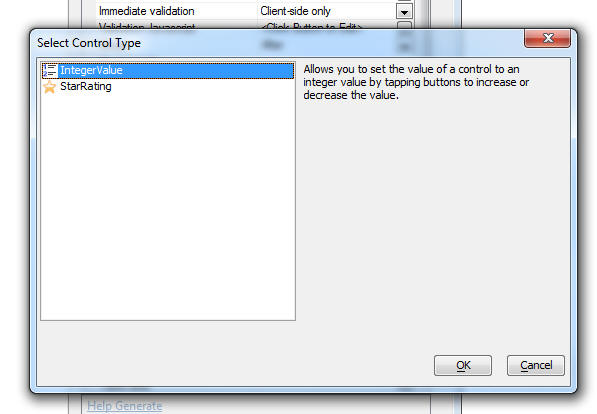
To define a new Add-in control add a new folder to the
uxCustomControls folder in the executable folder.
The name of the folder defines the name of the add-in control.
Inside the sub-folder there should be three files
- define.xbasic -- Xbasic script the defines the
'builder' for the custom control
- generate.xbasic - Xbasic script that generates the
settings for the custom control based on properties defined in
the builder
- info.json - a settings object that defines the icon
and help text for the control that are shown in the dialog where
the user selects the control.
For examples of how to define the contents of these three files,
please refer to any of the sample controls that are shipped with
Alpha Anywhere.
Here is an example of how the IntegerValue control looks:
This control is used for a field that only allow integer values
and the value can be set by clicking buttons to increment/decrement
the integer value.
UX Component - Data Controls - Custom Control
- Data Bound Custom Controls are a powerful new technique for
creating custom controls on a UX component.
NOTE: Contrast 'Custom Controls' in the
'Data Controls' section of the UX toolbox (discussed here) with
'Custom Controls' defined in the 'Other Controls' section of the the
UX toolbar - search for 'UX Component - CustomControl - 'Other
Controls' for more information.
NOTE: 'Data controls' are controls that have
the concept of a control 'value'. These controls have a
{dialog.object}.setValue()
and {dialog.object}.getValue()
method and when the UX is 'submitted' the value in these controls
are submitted and are available in the
e.datasubmitted
object in your Xbasic event handlers.
Custom data controls are built using the ViewBox control. An
understanding of how the ViewBox control works is essential before
you can create a custom data bound control. For more information on
the ViewBox control, click
here.
To add a data bound Custom Control to a UX cpmponent, select the
[CustomControl] item in the UX toolbox.
To define the properties of the Custom Control click the smart
field for the control properties. This will bring up the builder as
shown below:
When you define a custom control you can specify the properties
for the control 'now' (i.e. at design time), or you can generate the
property settings at run-time using Xbasic.
The 'Specify Now' option is rarely used because a Custom Control
that uses the 'Specify Now' option is really no different than a
ViewBox control and so there is little reason to use the Custom
Control rather than the ViewBox.
However, the option to generate the custom control definition at
run-time using an Xbasic function is extremely powerful. and allows
you to generate highly customized controls on your UX component.
Creating a Custom Control - Starting with a ViewBox Control
The easiest way to create a new Custom Control is to start by
creating a ViewBox control and then once you are satisfied with the
ViewBox control copy the generated Javascript from the ViewBox
builder to the Custom control.
From the ViewBox builder, click the Show button at the bottom
left corner of the dialog. Then select the 'Javascript code to
render ViewBox' menu command.
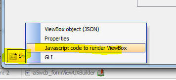
Copy the code for the 'Settings' object. This is the code you
will paste into the Settings JSON property in the Custom Control
builder.
UX Component - ViewBox Control - A powerful
new control type is now available in the UX Builder.
See this link for details
about the ViewBox control.
UX Component - List Control - International
Numbers - If the system regional settings on your server are set
to a country that uses a comma as the decimal point, when you create
a List control numbers are now shown with the comma as the decimal
character. Previously, numbers were displayed using a period as the
decimal character.
As a result of this change client side calculations (e.g.
client-side calculated fields), might no longer work correctly. To
fix the problem add this code to the client-side
onRenderComplete
event:
$u.decimal = ',';
This code informs the Javascript functions that convert a string
into a number what the decimal character is.
UX Component - File Save Format - JSON - In a
previous pre-release build (4582) an option was introduced to
allow the UX component to be saved as a text file (using a JSON
format) rather than the default binary file format. However, the
default format was left unchanged as binary. Now, the default format
has been changed to JSON. The reason for this change is to make
using source controls systems easier to work with.
UX Component - PhoneGap - Image Capture - File
name Option - When you use the PhoneGap camera option to take a
picture, the picture filename is stored in the file system in a
temporary location. This means that if the application is terminated
the file may be removed by the operating system. You now have the
option of moving the file to a different part of the file system so
that it is not in a temporary location.
This new option is exposed in the Action JavaScript builder as
shown below.
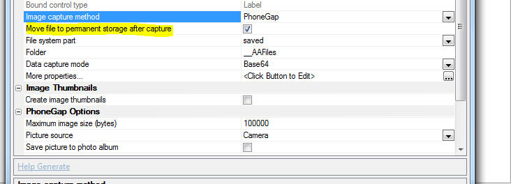
UX Component - PhoneGap - File System Methods
- Several new methods for working with the file system in a PhoneGap
application have been added.
NOTE: The existing PhoneGap file system
methods (accessed using the PhoneGap - File System Actions action in
Action Javascript) are limited in that they do not allow you
explicitly specify what file system you (i.e. 'temp', 'private',
'saved', 'public') you want to use and they assume that all actions
are in the 'saved' file system.
These new methods are more generalized as they can work with
fully qualified file and directory URLs.
|
{dialog.object}.phoneGapFilesAvailable() |
Returns true if there is a local file system and
PhoneGap is running. |
|
{dialog.object}.phoneGapGetLocalDirURL(type) |
Returns URL of base for the requested part of
the file system. 'type' can be: "temp",
"private", "saved", "public"
Note: On iOS, "saved" and "public" may be backed
up to iCloud |
|
{dialog.object}.phoneGapReadFileURL(filepath,
onReadSuccess, onError, startAt, endAt) |
Read a file. Optionally specify a starting and
ending position in the file. |
|
{dialog.object}.phoneGapWriteFileURL(filepath,
text, onWriteSuccess, onError, append) |
Write a file |
|
{dialog.object}.phoneGapFileExistsURL(filepath,
onResult, onError) |
Check if a file exists. onResult(properties)
will be called with false if the file does not
exist. |
|
{dialog.object}.phoneGapDeleteFileURL(filepath,
onDeleteSuccess, onError) |
Delete a file |
|
{dialog.object}.phoneGapCopyFileURL(srcpath,
destdirpath, destname, onCopySuccess, onError) |
Copy a file. |
|
{dialog.object}.phoneGapMoveFileURL(srcpath,
destdirpath, destname, onMoveSuccess, onError) |
Move a file. |
|
{dialog.object}.phoneGapRemoveDirectoryRecurseURL(dirpath,
onRemoveSuccess, onError) |
Deletes the specified directory and all of its
contents, including other directories and their
contents. |
|
{dialog.object}.phoneGapEnsureDirPathURL(rootpath,
subdirpath, onCompletion, onError) |
Ensures that a directory structure (specified by
subdirpath) exists within the specified rootpath.
If the directories do not exist, they are
created. |
|
{dialog.object}.phoneGapListFilesRecurseURL(rootpath,
onCompletion, onError) |
List files in a directory (recursively) |
|
{dialog.object}.phoneGapListFilesURL(dirpath,
matchRegex, onCompletion, onError) |
List files in a directory. If matchRegex is
specified only matching files are listed. |
|
{dialog.object}.phoneGapDeleteFilesNotInListURL(dirpath,
matchRegex, keepList, onCompletion, onError) |
Delete files. If matchRegex is specified, only
matching files are listed. If keepList is
specified files in the list are not deleted,
even if they matched. |
UX Component - HTML Editor - Toolbar - You can
now customize which buttons are shown on the HTML editor toolbar.
To customize the toolbar, click the smart field for the
HTML editor toolbar
customization property.
This will open the Genie where you can select the buttons that
you want and the order in which you want them to appear. Use *break
to start a new row of icons and *space to insert a spacer between
the icons.
UX Component - Sample Templates - PhoneGap -
When you create a new UX component, the available sample templates
now include 'PhoneGap - iOS Background Geolocation' and 'PhoneGap -
iOS Device User Authentication'.
PhoneGap App Builder - Third Party Plugins (iOS) - Touch ID. Added support for the TouchID plugin.
This plugin, allows a PhoneGap app to locally authenticate the user with the TouchID sensor (fingerprint scanner) on iPhone 5S and greater devices.
For a video overview of using this plugin with the new UX PhoneGap - iOS Device User Authentication template,
see Local Authentication for iOS with the Fingerprint Scanner Plugin
For the full cordova-plugin-touch-id plugin documentation,
see cordova-plugin-touch-id
PhoneGap App Builder - Third Party Plugins (iOS) - Background Geolocation. Added support for the Transistorsoft/cordova-background-geolocation-lt plugin.
This sophisticated plugin, allows a PhoneGap app to continue acquiring device geolocation data when the app is in the background or the device is locked.
For a video overview of using this plugin with the new UX PhoneGap - iOS Background Geolocation template,
see iOS Background Geolocation with PhoneGap
For the full transistorsoft/cordova-background-geolocation-lt plugin documentation,
see cordova-background-geolocation-lt
Style Builder - A new Style Builder is
available for Alpha Anywhere V3 Styles - Alpha Anywhere styles that
were released in older versions of Alpha Five (e.g. MobBlue,
MobGreen, GrBlue, etc) are tagged internally as 'version 2' styles.
Newer styles (e.g. iOS, iOS7, AndroidLight, AndroidDark) are tagged
internally as 'version 3' styles.
Watch Video
- Part 1
Watch Video
- Part 2
Watch Video
- Part 3
A new Style Builder is available for 'version 3' styles.
Previously it was not possible to edit a 'version 3' style in the
'version 2' style builder.
Now, when you try to edit a style, Alpha Anywhere automatically
selects the appropriate style builder.
There are several ways to get to the style builder. The easiest
is to open the UX or Grid component and click the smart field button
for 'Edit style in Style Builder' property (which is just
below the Style Name property).
You can also select the Edit, Open Web Style Builder command from
the menu when the Web Control Panel has focus.
Alpha Anywhere web styles can be stored in one of three places:
- system - styles are stored in the CSS folder in the
executable folder -- these styles cannot be directly edited. If
you want to edit a 'system' style, you must first make a 'local'
or 'global' copy of the style. You will edit the copy of the
style.
- local - styles are stored in the CSS folder in the
Web Project folder
- global - styles are stored in a special folder that
is visible to all web projects in your Workspace.
When you select a style to edit, if you selected a 'system'
style, you will get a dialog asking you to make a 'local' or
'global' copy of the style.
When you make a copy of the style you can keep the same name as
the source ('system') style, or you can give the style a new name.
Since the local or global style is stored in a different folder than
the system style, it is perfectly OK to use the same name as the
source ('system') style.
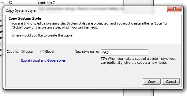
If you selected a version 3 style the new style builder will be
displayed:
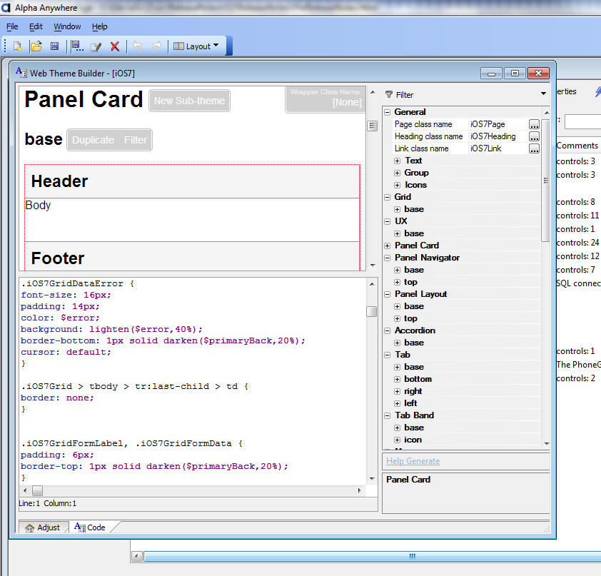
The Style Builder has two distinct modes.
- Code - where you can directly adjust the CSS for the
style and create new 'sub-themes' for different control types.
- Adjust - where you can adjust the SASS variables used
in the style.
Alpha Anywhere styles sheets are defined using SASS syntax. To
learn more about SASS visit
http://sass-lang.com/
One huge advantage of SASS syntax is the ability to define
variables for many of the setting in the stylesheet, especially
colors.
The Adjust mode allows you to easily adjust the SASS variables in
your stylesheet. For example if you use the built-in iOS7 stylesheet
you will see that the predominant color in the style is blue. By
changing a single SASS variable in Adjust mode you can change the
entire
The tabs at the bottom on the screen allow you to switch between
Adjust mode and Code mode.
Code Mode
In Code mode the left side of the screen has a preview of the
style in the top and the actually CSS in the bottom.
The property grid on the right shows all of the "object" types
defined in the stylesheet. Examples of "objects" include Textbox,
Button, Accordion.
For each object type one or more named sub-types can be defined.
The sub-types are called 'sub-themes'. Generally every "object" has
at least one 'sub-theme' called 'base'. For some object types only
'base' sub-theme is defined. You can add an arbitrary number of
sub-themes for any object type.
A sub-theme defined all of the CSS classnames used to style the
object.
At the top of the code window when you are in Code mode you will
all of the SASS variables defined in the stylesheet.
You can adjust the variable values directly in the Code window or
you can switch to Adjust mode to change the SASS variables.
UX and Grid Component - Open Style Builder -
You can now open the Style Builder directly from the UX and Grid
component. A new property 'Edit style in Style Builder' appears
directly below the 'Style name' property.
Application Server - Open SSL - A new version
of OpenSSL is now included with Alpha Anywhere.
OpenSSL 1.0.2g addresses the 'Drown attacks' vulnerability.
UX Component - Sub-theme Picker - Preview -
When you pick the sub-theme for any control that supports
sub-themes, the picker now shows a preview of all of the available
sub-themes.
PhoneGap Builder - SQLite Databases - When you
create a PhoneGap project, you can now include pre-populated SQLite
database files as part of the PhoneGap project. A new genie allows
you to create the SQLite databases that you include with your
PhoneGap project.
Watch Video 1
Watch Video 2
If your PhoneGap project includes pre-populated SQLite databases,
your UX component can work with the data in these SQLite databases
using Action Javascript. See 'UX Component - PhoneGap - Using
SQLite - Action Javascript' below for more information.
If you are including pre-populated SQLite databases in your
project, be sure to specify the following PhoneGap plugins: Device,
File,
File Transfer,
SQLitePluginExt.
To define the SQLite databases that should be part of your
PhoneGap project, click the smart field for the
SQLite Databases
property in the PhoneGap Genie.
This will open a dialog where you can define your SQLite
databases.
Your project can include multiple SQLite databases and each
database can include multiple tables. Each SQLite database is
contained in a single file and this file is automatically added to
the Additional Files
Required setting in the builder.
You can choose to put all of the tables you want in your SQLite
databases in a single SQLite database, or you can use multiple
SQLiite databases - the choice is yours.
Once you add a new SQLite database to the above dialog, you can
click the Define SQLite
Database Contents button to specify the tables that should be
in the SQLite database. For each table that you specify you can
define how the table should be populated. The options are to perform
a SQL query to extract data from any SQL database supported by
AlphaDAO, static data, or Xbasic. If you choose the Xbasic option,
you can specify Xbasic code that will return data that are used to
populate a table.
Once you have defined the SQLite databases, click the
Create SQLite Database
Files button to actually create the SQLite database files.
These files will be created in the
www folder in your
PhoneGap project.
NOTE: Contrast creating pre-populated SQLite
databases with making an Ajax callback to the server and dynamically
creating the SQLite database. Dynamically creating SQLite databases
is a built-in action in Action Javasascript and it is discussed
below. See UX Component - PhoneGap - Using SQLite - Action
Javascript.
UX Component - PhoneGap - Using SQLite - Action
Javascript - The UX component now has extensive support for
working with SQLite databases in a PhoneGap application.
SQLite is a SQL database that is available on your mobile device
and is accessible through a PhoneGap plugin. When building
disconnected applications, having an on-device SQL database can be
extremely useful. It allows you to get rapid access to large amounts
of data that are stored on the device (and is therefore available
even when there is no connection). You can store significantly more
data for offline access than would be possible using Local Storage.
The primary use case for an on-device SQLite database is to make
large amounts of 'lookup' information available in a disconnected,
mobile application.
Watch Video 1
Watch Video 2
Watch Video 3
Watch Video 4
NOTE: The UX
Component Client-side Data
Cache is also useful, in PhoneGap applications, for storing
large amounts of data on the mobile device for use in offline
applications. Your particular application requirements will dictate
if the Client-side data
cache, or SQLite,
is the better solution.
IMPORTANT: To use the SQLite features in a
PhoneGap application, your PhoneGap project must load the
following plugins: Device,
File,
File Transfer,
SQLitePluginExt.
These plugins are all listed in the PhoneGap builder.
NOTE: While it is certainly possible to
perform Insert, Update, and Delete actions on the SQLite database
that is on a device, there is no built-in mechanism for persisting
these changes to the source database on your server. You would be
responsible for writing your own code to persist changes to the on-decice
SQLite database to your server databases.
A SQLite database is a single file. The SQLite database file can
be part of your PhoneGap project, or it can be downloaded to the
device by making a callback to a server.
If the SQLite database is part of your PhoneGap project, you will
need to list the name of the SQLite database file in the
Additional Files Required
property in the PhoneGap Builder.

NOTE: For more information on adding SQLite
database to a PhoneGap project, see this section : PhoneGap
Builder - SQLite Databases.
You can use Action Javascript to download a SQLite database to
the mobile device at run-time (see below for more information). When
you download the SQLite database to the device at run-time, you can
either download an existing SQLite database, or your callback
function can dynamically create the SQLite database file.
Action Javascript now has a new action called 'PhoneGap
- SQLite Actions' that will allow you to select and configure
the type of action you want to perform.
When you select this action, the builder shows the available
SQLite actions:
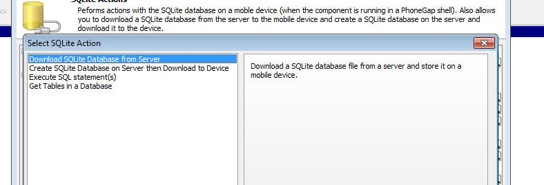
The available action are:
|
Command |
Description |
|
Download SQLite Database from the Server |
Downloads a SQLite database file from a server
and stores the database file on the mobile
device |
|
Create SQLite Database on Server then Download
to Device |
Similar to the 'Download SQLite Database from
the Server' action excepting that the SQLite
database file is dynamically created on the
server before it is downloaded to the device |
|
Execute SQL statement(s) |
Executes one or more SQL statements. If you
execute multiple SQL statements, the statements
are automatically wrapped in a transaction so
that no changes are made to the database if any
of the statements fail. |
|
Get Tables in a Database |
Lists the tables in a SQLite database. |
Each of these commands in discussed in more detail below.
Download SQLite Database from Server
Use this action to fetch a remote SQLite database file from a
server (does not have to be the Alpha Anywhere server) and store the
database on the mobile device. Once the database has been
downloaded, you can then start executing SQL commands against the
tables in the database.
There are two ways in which this action can be used:
- Specify the URL of the remote SQLite database file (using
Javascript).
- Make an Ajax callback to the Alpha Anywhere server. The
function that handles the callback will be responsible for
returning the URL of the SQLite database file.
If you are using option 1, then you will need to specify
Javascript code that returns the URL of the SQLite database file.
Examples:
Assume that the SQLite database files is in a folder in the
webroot. The relative filename of the SQLite database file is (for
example) sqlite/db1.db.
Your Javascript code that returns the URL will therefore be:
return 'sqlite/db1.db';
There is no need to specify a protocol for the URL since the
resource is relative to the webroot.
If, on the other hand, the SQLite database file was (for example)
in an Amazon S3 bucket, your Javascript code might be:
return
'http://name_of_your_s3_bucket.s3.amazonaws.com/sqlitedbfilename.db';
Id you are using option 2, you must specify an Xbasic function
that will handle the Ajax callback. The Xbasic function will return
the URL of the SQLite database file (by setting the
e.URL property in
the Xbasic code).
Create SQLite Database on Server then Download to Device
This action is really just a variant of the Download SQLite
Database from Server action. The main difference is that the
SQLite database to download to the device is created on the fly by
Alpha Anywhere and once the database file has been created, a
message is sent to the client (i.e. the mobile device) telling it
that the SQLite database file has been created and can now be
downloaded to the server.
The SQLite database file is created by populating a SQLite
database with data obtained from SQL queries (against your SQL
Server, Oracle, MySQL etc. data sources), static data, or from
Xbasic code (that returns data to be used to populate the SQLite
database).
For example, you might define a SQLite database that contains
several tables (called say 'table1', 'table2', 'table3', etc.)
where:
- table1 - a query on a SQL server database that
joins server tables
- table2 - a query on an Oracle table
- table3 - a query on a MySQL table
- table4 - an Xbasic function that calls a REST
endpoint to retrieve data
- table5 - an Xbasic function that calls a SOAP service
to retrieve data
- table6 - some static data
When you select this action, the builder shows this screen:
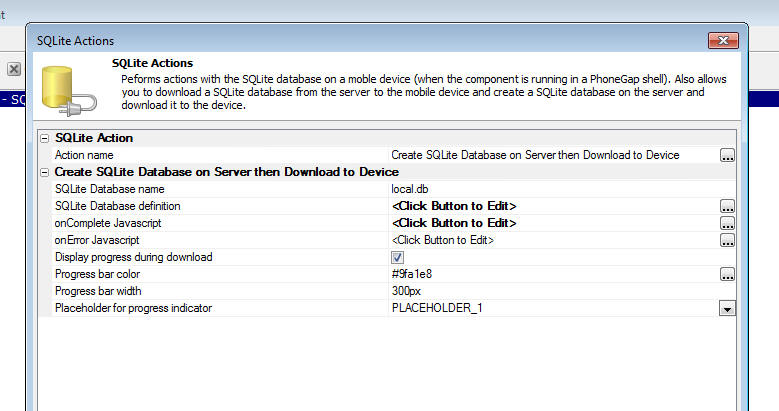
The SQLite Database
definition property is where you define how the SQLite
database will be created. When you click the smart field for this
property you get this dialog.
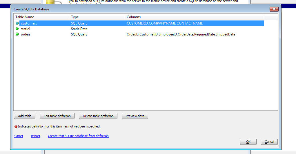
This dialog allows you to define the tables that will added to
the SQLite database.
You can add as many tables as you want. Once you have have added
a table (by clicking on the Add table) button, you can then define
the data source for that table (by clicking on the Edit table
definition) button.
When you click the Edit table definition button you get a dialog
as shown below where you can define how the SQLite table will be
populated.
The choices are:
- SQL Query - any SQL query that returns data
- Static Data - static data - see below for description
of the format of the static data
- Xbasic - an Xbasic function that returns data - see
before for information on the format of the data that the Xbasic
function must return. The Xbasic function can, for example, make
calls to REST endpoints, or SOAP services to retrieve the data.
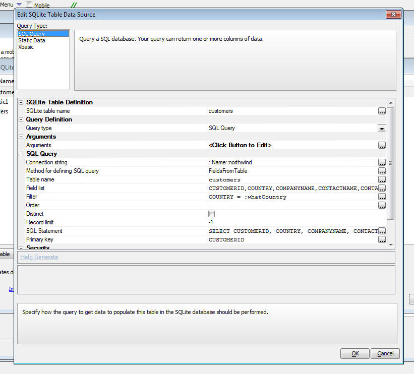
Format for Static Data and Data Returned by Xbasic Functions
If your Query Type is set to either Static or Xbasic, the
required format for the data is as shown in the following example:
ID=INTEGER (Primary Key),FirstName=TEXT,LastName=TEXT,Salary=NUMERIC
1,Fred,"Smith",87234
2,Tom,Jones,45234
Note that the data is in CSV (comma separated value) value
format. Values can be quoted if they contain commas.
The first row in the data is the field names. The format for the
fieldnames is:
fieldname=fieldtype
There is no need to specify a field size for a SQLite table. The
SQLite field types are TEXT, NUMERIC, INTEGER, REAL and BLOB. You
can optionally indicate which column in the primary key by including
the (Primary Key)
keyword after the field type.
Execute SQL statement(s)
This action allows you to execute SQL statements against any
SQLite database on the device. You can either execute a single SQL
statement, or you can execute multiple statements.
If you execute multiple statements, the statements are wrapped in
a transaction, which means that the state of the database is not
changed if any of the SQL statements fails.
When you select this action you get the following dialog (shown
twice - once for the 'Single' statement case and once for the
'Multiple' statement case).
Executing a Single SQL Statement
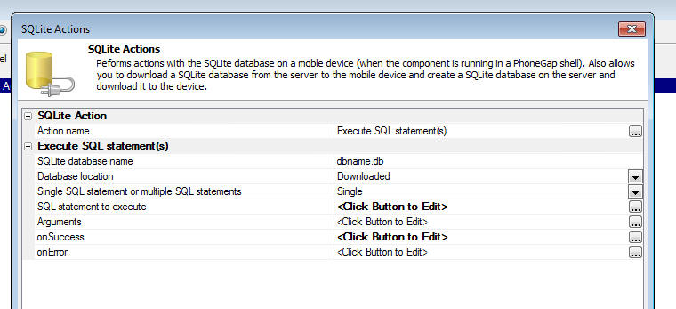
The properties in the Dialog are defined below:
- SQLite database name - the name of the SQLite
database you want to query.
- Database location - this can either be 'Downloaded'
- if the SQLite database was downloaded to the mobile device, or
'Root' - if the
SQLite database was part of the PhoneGap package (the SQLite
database filename will need to be specified in the
Additional Files
Required property in the PhoneGap Builder).
- Single SQL statement or multiple SQL statements - set
to either Single
or Multiple.
- SQL statement to execute - Javascript to return the
SQL that you want to execute.
Your SQL statement can optionally reference arguments (similar to
SQL::arguments when using AlphaDAO in Xbasic).
For example, this statement does not use arguments:
select * from customers where id = 'ALFKI'
This statement does use arguments:
select * from customers where id = ?
The ? indicates
an argument value.
If your SQL statement uses arguments you must defined the
argument values in the
Arguments property.
- Arguments - Javascript to return an array with values
for each of the arguments in your SQL statement. It is important
that the length of the arguments array that your Javascript
returns exactly matches the number of arguments references in
your SQL statement.
For example, if your SQL statement was
select * from customers
where id = ?
the Javascript that you define for the
Arguments property
might be:
return ['Alfki'];
- onSuccess - The Javascript to execute if the SQL
statement succeeds. In the case where the SQL statement returns
data, the data will be in an array called
resultArray. If
the SQL performed an update, insert or delete, your Javascript
can reference these variables:
result.rowsAffected - the number of rows affected by the
statement,
result.insertId - the id of the auto-increment primary
key value (for an INSERT command).
Example:
Assume that your SQLite database has a table called customers and
you want to populate a List control with the results of this query:
select * from customers where city = 'Boston'
You might set the
onSuccess Javascript to:
if(resultArray.length > 0) {
//populate list 'list1' with
data
{dialog.object}.setListColumnsAndPopulate('list1',resultArray);
} else {
alert('No records in query.');
}
- onError - The Javascript to execute if the SQL
statement failed.
Executing Multiple SQL Statements
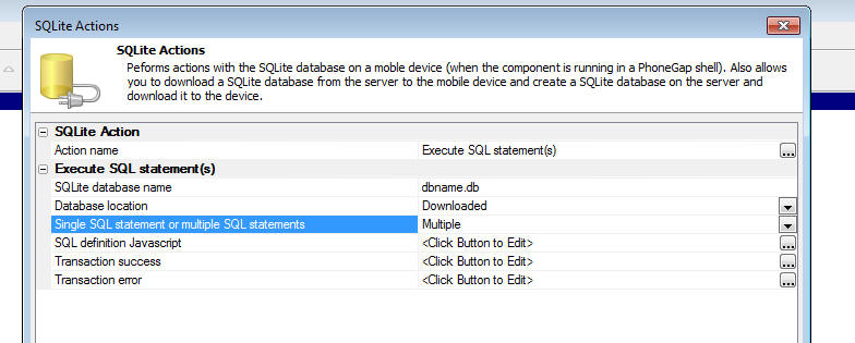
In the case where you are executing multiple SQL statements you
must set the SQL definition
Javascript property.
Your Javascript must return an object with these properties:
-
sql - an array of SQL statements to execute
-
arguments - an array of arrays - each array in the array
has the arguments for the corresponding SQL statement. For
example if the first SQL statement (in the
sql array)
has a single argument, and the second SQL statement has two
arguments, then the array in the
arguments object
might look like this: [
['alpha'], ['beta','gamma'] ]
-
onSuccess - an array of function definitions. The first
function in the array is called if the first SQL statement in
the sql array
succeeds, etc.
-
onError - an array of function definitions. The first
function in the array is called if the first SQL statement in
the sql array
fails, etc.
Alternatively, your Javascript can return an array of objects.
Each object in the array should have these properties:
- sql - the SQL statement to execute
- arguments - optional - an array of arguments for the
SQL statement
- onSuccess - optional - the onSuccess function for the
SQL statement
- onError - optional - the onError function for the SQL
statement
Example:
(This example uses the array of objects method. Notice that the
parameters passed into the onSuccess functions are:
tx,
result,
array and
transObj.
where:
- tx - the SQLite transaction object
- result - object returned by SQLite
- array - if the SQL was as select statement, the data
returned by the query in a Javascript array
- transObj - an object that can be used to pass
information from one SQL statement to another.
Notice how the arguments property for the last object in the
array calls a function to set one of the argument values. This
function can see the transObj variable.
)
var obj = [];
obj.push( { sql: 'drop table if exists cars', onSuccess:
function(tx,result,array,transObj) { alert('table was dropped'); }}
);
obj.push( { sql: 'CREATE TABLE Cars (Id INTEGER PRIMARY KEY, Name
TEXT, Price INTEGER)'} );
obj.push( { sql: 'insert into cars (name,price) values (?,?)',
arguments: ['Ford',1], onSuccess: function(tx,result,array,transObj)
{ transObj.foobar = 123;} });
obj.push( { sql: 'insert into cars (name,price) values (?,?)',
arguments: ['GM',2] } );
obj.push( { sql: 'insert into cars (name,price) values (?,?)',
arguments: ['Honda',3] } );
obj.push( { sql: 'insert into cars (name,price) values (?,?)',
arguments: ['Toyota',function(transObj) { return transObj.foobar; }
] } )
return obj;
NOTE: When you edit the Javascript for the
SQL definition Javascript
property, the Javascript editor shows extensive help for how to
construct the object for the SQL definition object. For
example, the help shows how you can do the following task:
-
add a new record to the invoiceHeader table
-
capture the id of the invoice number in the newly added record
(assume that id is an auto-increment field)
-
add multiple records to the invoiceItems table using the id that
was captured when the invoiceHeader record was added
-
rollback the entire transaction if any errors occur.
You can also define these properties:
-
Transaction success - the Javascript to execute if ALL of
the SQL statements succeeded
-
Transaction error - the Javascript to execute if the
transaction gets rolled back (because one of the SQL statements
failed).
How to Create a New SQLite Database on a Device
When you want to start working with a SQLite database on a mobile
device there is no requirement that you either download an exiting
SQLite database from the server or include a pre-populated SQLite
database in your PhoneGap application. You can simply create a new
SQLite database on the fly in your Javascript code.
When you use the 'Execute
SQL statement(s)' action in the 'PhoneGap
- SQLite Actions' action, you specify the name of the SQLite
database name against which the SQL commands should be executed.
If you specify the name of SQLite database that does not
exist, then a new SQLite database will automatically be created.
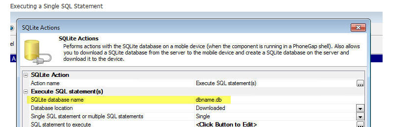
Xdialog - {treatasform} Directive - If a
modeless Xdialog is displayed and then all Alpha Anywhere windows
(besides the modeless Xdialog) are closed or hidden, then once the
last window is hidden, the Workspace itself will be closed.
For example, consider the following sample Xdialog code.
dim dlg_title as c
dlg_title = "test"
dim dlg_body as c
dlg_body = <<%dlg%
<close><hide><show>
%dlg%
dim dlg_event as c
dlg_event = <<%code%
if a_dlg_button = "close" then
ui_modeless_dlg_close(dlg_title)
else if a_dlg_button = "hide" then
controlpanel.hide()
else if a_dlg_button = "show" then
controlpanel.show()
end if
%code%
ui_modeless_dlg_box(dlg_title,dlg_body,dlg_event)
Once you press the 'Hide' button to hide the Control Panel
(assuming that there are no other Alpha windows open at the time),
the Workspace will closed, and therefore the "Show" button, which is
intended to show the Control Panel, will not work.
You can instruct Alpha Anywhere not to enforce this rule by
adding the {treatasform}
directive to the Xdialog. This will cause Alpha Anywhere to not
close the workspace when the last window (not counting the Xdialog)
is closed.
dim dlg_title as c
dlg_title = "test"
dim dlg_body as c
dlg_body = <<%dlg%
{treatasform}
<close><hide><show>
%dlg%
dim dlg_event as c
dlg_event = <<%code%
if a_dlg_button = "close" then
ui_modeless_dlg_close(dlg_title)
else if a_dlg_button = "hide" then
controlpanel.hide()
else if a_dlg_button = "show" then
controlpanel.show()
end if
%code%
ui_modeless_dlg_box(dlg_title,dlg_body,dlg_event)
UX Component Builder - Display Line Numbers in the
Controls List - You can now turn on the display of line numbers
in the control list in the UX builder. In large components, this
will make it easier to find a control quickly.
Watch Video
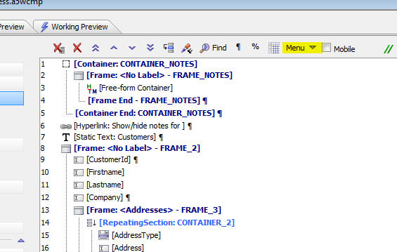
To toggle the display of line numbers, click on the Menu button
and select the Toggle line
numbers in Controls display menu item.
You can also go to the Properties pane and check the
Show line number in
Controls list property.
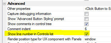
TIP: You can easily navigate to a control by
number by pressing the Ctrl-G shortcut key.
UX Component - List Control - Pull-past-End to
Refresh List Data - You can now easily implement the common
'pull-past-end-to-refresh' List data pattern.
Watch Video
To turn on this behavior, open the List builder and check the
Has 'pull-to-refresh' behavior property.
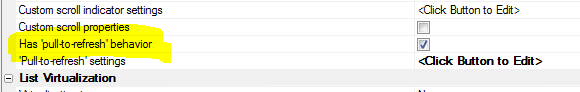
You can then configure the settings for the behavior.
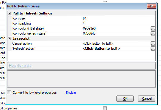
The Convert to low level
properties checkbox on the builder allows you to see all of
the individual properties that get set to implement this behavior.
If you want to customize the behavior beyond what this genie allows,
check this box.
AlphaDAO - SQL - DateTime Fields -
SQL::Resultset.toJSONObjectSyntax() - Datetime fields are now
exported using an increased precision. Previously, the default
format for date time fields was:
MM/dd/yyyy 0h:0m:0s
(or dd/MM/yyyy
0h:0m:0s if set by
Windows regional settings).
Now, the default format is:
MM/dd/yyyy
0h:0m:0s 3
Technical Note: This change will solve the
following problem: Assume that you had a SQL table with a field
called (for example) 'ExaminationDate'
and that the value in the field was
2/18/2016 3:24:10 123.
Assume that you then built a UX component with a List control with a
Detail View to allow users to edit this value and that you had write
conflicting checking turned on for the
ExaminationDate
field.
When the user tried to synchronize the data after making a change to
the ExaminationDate
field they would get a write conflict error because the 'old' value
for the ExaminationDate
field was stored as
2/18/2016 3:24:10 and not
2/18/2016 3:24:10 123.
With the above change, the 'old' value for the field stored in the
List will be stored at the field's full precision, and the update
will succeeed.
UX Component - Custom Settings - Custom
settings are named setting values that you can reference in
JavaScript code and in your component definition.
Watch Video
- Part 1
Watch Video
- Part 2
Download Component
To define Custom Settings go to the Properties Pane in the UX
builder. The Custom
settings property appears in the Advanced section.
Click the smart field and the Custom Settings dialog is shown.
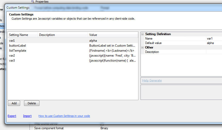
The dialog allows you to create an unlimited number of custom
settings. Each custom setting has a name and a value.
If the value is a string, just enter the string value. If the
value is a JavaScript object, you must prefix the definition with '{javascript}'.
If the value is a function definition, you must also prefix the
value with '{javascript}. In the example below, three custom
settings are defined showing how the value of the custom setting is
set to a string, object and function:
|
Custom Setting Name |
Value |
|
setting1 |
Some string value |
|
setting2 |
{javascript}{name: 'Fred', city: 'Boston'} |
|
setting3 |
{javascript}function(name) { alert('Hello
name.toUpperCase());} |
You can export Custom Setting definitions and import them using
the Export and Import hyperlinks at the bottom of the screen.
Using Custom Settings
Custom settings can be used in your Javascript code and also at
the time the UX component is rendered.
Using Custom Settings when a Component is Rendered
When you define the properties of a UX component, any place that
you define some text you can use a Custom Setting value using this
syntax:
[CustomSetting:settingName]
For example, assume you have a Button control in your UX. You
could set the Button text to:
[CustomSetting:button1]
If you had defined a Custom Setting called 'button1' with a value
of 'Save new record' then when the UX component was rendered, the
label on the button would be 'Save new record'.
Using Custom Settings in JavaScript Code
The UX object has a method that allows you to read and set Custom
Setting values:
{dialog.object}.customSetting(settingName [,
newSettingValue])
If you do not provide the optional second parameter the method is
used to read the value of a Custom Setting. If you provide the
second parameter, the method is used to update a Custom Setting
value.
For example, assume you had defined a Custom Setting called
'string1', with a value of 'this is the value of string1'. You could
use this in your JavaScript code:
var txt = {dialog.object}.customSetting('string1');
alert(txt);
If the value of 'string1' had been set to an object (using this
for the value: {javascript}{name:
'Fred', city: 'Boston'} ), then your JavaScript might look
like this:
var obj = {dialog.object}.customSetting('string1');
alert(obj.name + ' -- ' + obj.city);
If the value of 'string1' had been set to a function (using this
for the value: {javascript}function(name)
{alert('Hello ' + name);} ), then your JavaScript might look
look like this:
var fn = {dialog.object}.customSetting('string1');
//now call the function
fn('Fred');
To set a new value for the 'string1' Custom Setting:
{dialog.object}.customSetting('string1','this is a
new value for string1');
Overriding Custom Settings when Opening a UX Component
When you use Action Javascript to define an action that opens a
UX component, if the target UX component has defined any Custom
Settings, you can override the value of the Custom Settings.
In the image shown below, the Action Javascript action opens a UX
called 'uxWithCustomSettings'. Since this UX has defined some Custom
Settings, the dialog shows an option to override any of the Custom
Setting values.
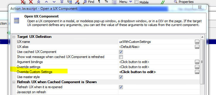
Note The overrides defined here are applied
when the UX is initially rendered. If this action is called from a
button and the target UX is opened in a Window and the 'Use cached
UX Component' property is checked, the second and subsequent times
the button is clicked to open the target UX, the Custom Settings remain at the values they were set to when the target UX was
initially opened.
Using Language and Text Dictionary Tags in Custom Settings
You can use language tags (<a5:r>...</a5:r>)
and text dictionary tags (<a5:t>...</a5:t>)
in the Custom Setting values.
UX Component Builder - Buttons and StaticText
Objects - Double-clicking on a Button in the UX Builder
will now open the editor to edit the click or onClick event for the
button. Similarly, double clicking on a static text control will
bring up the text editor.
MongoDB - Using MongoDB in Grid and UX Components and
with Xbasic AlphaDAO - Alpha Anwhere has an
API
for working directly with a Mongo database. This
API
is useful if you want to write your own server side code to query
and update a Mongo database. However, if you want to use a Mongo
database as the data source for a Grid, or UX component, you cannot
use the
API.
In order to use Mongo as the data source for a Grid or UX, it is
necessary to impose a schema on the Mongo database, much like any
SQL table has a schema.
Alpha Anywhere now allows you to define a connection string to a
Mongo database (much like you would define a connection string to
any SQL database). Once you have define a connection string, you can
build Grid and UX components against the Mongo database in exactly
the same way that you would build a Grid or UX against any SQL
database. You can also use AlphaDAO in Xbasic to perform CRUD
operations against the Mongo database
When you define a connection string to a Mongo database you
define a schema for each table (i.e. collection) in the
database. This schema defines the fields and data type of each field
in each table.
When you define a connection string to a Mongo database you
define:
- URL of the Mongo service
- Username and password (if required - the Mongo service might
have been launched with the -noauth parameter, in which case
username and password are not required)
- Name of the Mongo database. This can either be an existing
database, are the name of a new Mongo database that you want to
create.
- Manifest filename (this the the file where the database
schema is defined - it is a JSON file)
The image below shows the connection string builder for a Mongo
database.
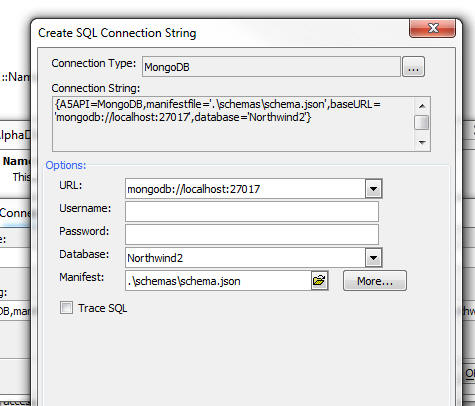
NOTE: In the above screenshot the manifest
filename stats with '.\'.
This syntax is used to indicate the the manifest is stored relative
to the Web Project folder. In the above example, the manifest will
be stored in a folder called 'schemas'
in the Web Project folder, and when the project is published, the
schema.json file
will be published to a folder called 'schemas' in the web root.
Alpha Anywhere has a number of helper function that help you
define the schema for the Mongo database.
- If you have an existing Mongo database, Alpha can infer a
schema by examining existing data in the Mongo database. You can
then tweak the schema that Alpha Anywhere suggests
- You can start with a sample schema that shows the format
required for the schema
- You can build a schema from the schema of a SQL database.
You give Alpha Anywhere a connection string to a SQL database
and then select the list of tables you want in your Mongo schema
and Alpha Anywhere will automatically create the schema for you.
When you use this option you also have the option of exporting
data from the SQL database to your Mongo database.
Structure of the Schema JSON File
A sample schema JSON file is shown below. The JSON file defines
two objects, 'schema' and 'collection' and an optional property, 'sourceconnection'.
The 'collection' object contains a property for each collection
in the Mongo database and the name of the corresponding schema in
the 'schema' object.
For example, the entry in the 'schema' object shown below
specifies two schemas, one called 'Categories' and another called
'Employees'. For each schema, the primary key column is specified
and the list of columns and their corresponding data type are
identified.
The optional 'sourceconnection' identifies if the schema was
obtained from a looking at the schema in some other SQL database.
If so, the 'sourceconnection' property is the connection string to
that database.
{
    "schema": {
        "Categories": {
            "primary": [
                "_id"
            ],
            "columns": {
                "_id": "String",
                "CategoryID": "Number",
                "CategoryName": "String",
                "Description": "String",
                "Picture": "String"
            }
        }
        "Employees": {
            "primary": [
                "_id"
            ],
            "columns": {
                "_id": "String",
                "EmployeeID": "Number",
                "LastName": "String",
                "FirstName": "String",
            }
        }
    },
    "collection": {
        "Categories": {
            "schema": "Categories"
        },
        "Employees": {
            "schema": "Employees"
        }
    },
    "sourceconnection": "::Name::northwind"
}
Creating the Schema
To define the Mongo database schema, click the More... button on
the connection string build.
This will open an intermediate dialog:
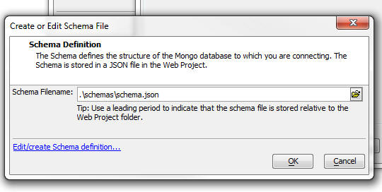
Then click the 'Edit/create Schema definition...' hyperlink.
This will open a dialog when you can edit the schema definition.
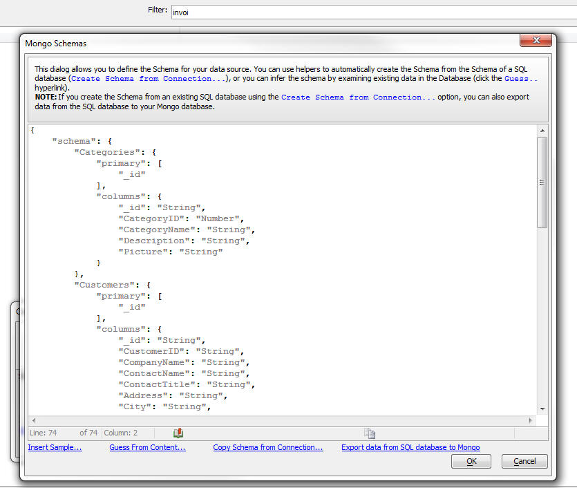
At the bottom of the dialog you will see several hyperlinks:
-
Insert sample...
-- this will insert a sample schema definition. You can then
edit this definition. You would typically use this option if you
are creating a new schema for a Mongo database that does not yet
have any data in it.
-
Guess From Content...
- this will examine the data in an existing Mongo database and
try to infer the schema by examining the data in the database.
See below for more information.
-
Copy Schema from
Connection.. - this will allow you to create a schema
based on the schema of a SQL database. When you click this
hyperlink you will be prompted for the connection string that
points to the SQL database whose schema you want to copy. You
will then be able to select which tables in the SQL database you
want to copy. NOTE: If you choose this option, the schema
that is created will contain the optional 'sourceconnection'
property (discussed above).
-
Export data from SQL
database to Mongo - this hyperlink will only be present
if the schema was created using the
Copy Schema from
Connection.. button and the schema has a 'sourceconnection'
property. You can use this button to populate a Mongo database
with data from a SQL database.
More on the 'Guess From Content...' Option
When you click the Guess
From Content... button, Alpha Anywhere will examine the data
in the Mongo database specified at the 'Database' prompt on the
connection string builder. This is the dialog that was displayed
before you clicked the 'More...' button to get to the dialogs when
you define the schema.
Using a MogoDB Connection String
Once you have built the connection string to the MongoDB database
you use it in the same way that you use any other connection string
(that connects to SQL databases). You can build Grid and UX
components against the Mongo database. You can also use Xbasic and
AlphaDAO objects to work with the data in the Mongo database.
When you use a connection string that points to a Mongo database
you are essentially using SQL syntax to interact with the Mongo
database. Behind the scenes Alpha Anywhere is automatically
converting the SQL commands to the appropriate commands that then
Mongo API understands.
You can see how Alpha Anywhere makes this translation but turning
on the 'Trace SQL' option in the connection string build (shown
below). Once you do this, the trace information will be shown in the
Trace window (View, Trace window) if you are working in the Alpha
Developer Version - i.e. the IDE) or in a folder where your logs are
created if you are in the Server.
Here is some sample output from the Trace window showing the SQL
statement and how that statement was translated to Mongo commands.
SQL Statement: SELECT FIRST 11 [_id], CustomerID,
CompanyName, ContactName, ContactTitle, City, Country FROM Customers
ORDER BY ContactTitle, [_id]
Time to prepare URL: 0.001
Time to execute REST call: 0.041
Mongo Commands:
{
"verb": "GET",
"collection": "Customers",
"select": "_id , CustomerID , CompanyName , ContactName ,
ContactTitle , City , Country",
"groupby": "",
"where": {},
"orderby": "ContactTitle, _id",
"limit": "TOP 11 "
}
Because Mongo is not a SQL database, there are obviously
limitations as to what SQL commands you can send to Mongo. For
example, you cannot execute a SQL statement that performs a JOIN
since the concept is meaningless to Mongo. You also cannot perform
CRUD operations that affect more than a single record. For example,
the following SQL statement will update multiple records
UPDATE customers set Status = 'B' where Balance >
100
This will not work if you are connected to a Mongo database if
there is more than one record with a Balance that is > 100.
Grid Component - Arguments - Array Arguments - IN
Clause in SQL Statements - You can now use the IN clause in a
SQL statement in a Grid, where the IN clause is tested against an
argument.
For example, you might set the SQL query for a Grid to
Select * from customers where customerId IN (:array_customerIds)
IMPORTANT: The parentheses around the
argument in the above SQL statement are required when using
an IN clause.
The argument in the above SQL is 'array_customerIds'. The
'array_' prefix in the array name is significant. It informs Alpha
Anyhwere that the argument is an 'array argument'
When you define the 'array_customerIds' argument in the Grid you
might (for example), bind the array to a session variable. For
example, you might bind the argument to session.whatCustomerIds.
The session variable would be set to a comma delimited list of
values.
Report Events - BeforePrint and AfterPrint
- You can now define two new events for Reports. The beforePrint
event fires before any report is printed and the afterPrint event
fires after any report is printed.
These events must be defined in an Xbasic Function Library. The
name of the functions to call to handle these events are defined in
the Web Project Properties dialog, as shown below.
Xbasic - AlphaDAO - SQL::Resulset.ToCSVFile() and
.ToStringFile() - Two new methods on the SQL::Resultset object
allow you to create a file directly without first having to call .toCSV()
or .toString() to create an intermediate variable.
List with Detail View - Synchronizing Data -
Synchronization Log Table - The synchronization log table helps
prevents a sync command being processed more than once.
If you do offline-data entry in a List, there is a small chance
that the SQL updates to the underlying table will be executed more
than once. This can happen if the mobile device loses connectivity
to the server AFTER the synchronize command has been received by the
server, but BEFORE the mobile device has received the response from
the server. Under this condition, the next time the List is
synchronized, the previously submitted edits will be submitted a
second time. By checking the 'Use server-side synchronization log
table' property, a special server-side log can be used to prevent
the possibility of duplicate SQL updates. When you check this
property an extra Ajax callback fires after the client-receives
acknowledgement from the server that the synchronization was
performed.
By default, after a successful sync, the sync log table is
cleared out.
Now, a new property has been added to not clear the sync log
table automatically. This provides an extra level of protection
against duplicate sync commands being executed by the server.

NOTE: If you turn the 'Clear sync log table
after successful sync' off, then may need to periodically clear our
the sync log table manually as it will continue to grow as users
sync their data.
Application Server - SSL - Alpha Anywhere now
includes the latest stable release of OpenSSL, version 1.0.2f.
Why make the change?
- OpenSSL 1.0.2 includes a number of performance improvements
over version 1.0.1 in addition to maximum negotiated TLS
versions and cipher suites..
- OpenSSL 1.0.1 will no longer be supported after December
31st 2015 and is only receiving bug fixes until then.
- OpenSSL 1.0.2 is considered the Long Term Support version of
OpenSSL and will be supported through December 31st 2019.
- OpenSSL 1.0.2 is binary compatible with version 1.0.1; which
has been shipped with Alpha Anywhere for some time.
No coding changes were required in Alpha Anywhere to move to
OpenSSL 1.0.2.
For more information on OpenSSL releases please go to:
http://www.openssl.org
a5_sqlToJSONTree() Function - Generates a JSON tree
structure from a SQL database table - To display
cascading data in a List control (i.e. user selects an
item in the List and a sub-list is displayed and a back
button is enabled to allow user to navigate to the
previous list) a new helper function has been added to
Xbasic.
Watch Video
The function will generate the JSON for the hierarchical
List.
The function takes the name of a table and a list of
fields. For example, if the field list is Country, City,
ContactName, the generated JSON data will have a list of
Countries. In each Country record there will be a nested
array of Cities and in each City record there will be a
nested array of ContactNames.
The syntax for the function is:
c JSON = a5_sqlToJSONTree as c (c connectionString,
c table,c fieldList [, c
endPointFfieldName [ ,c filter [,c order
[p arguments]]]])
Where
- connectionString - connection string to SQL database
- table - name of SQL table to query
- fieldList - List of fields from the SQL table in the order you
want the List hierarchy to be constructed (e.g. Country, City, ContactName).
- endPointFieldName - optional - name of field to define the value
of the 'action' property when user selects a List endpoiont. If no value is
specified, the last field in the fieldList is used.
- filter - optional - a WHERE clause to apply to the generated SQL
statement
- order - optional - an ORDER clause to apply to the generated SQL
statement
- arguments - optional - an SQL::arguments parameter to supply
argument values for any arguments defined in the filter.
Example
dim args as sql::Arguments
args.add("c1","USA")
args.add("c2","UK")
json = a5_sqlToJSONTree("::name::northwind","Customers","Country,City,ContactName","CustomerID","Country
= :c1 or Country = :c2","",args)
A partial listing of the JSON returned by the above
function call is shown below:
Notice that for each 'endpoint' the display value is the
ContactName, but the 'action' property is set to the
CustomerID.
[
{
"display": "UK",
"children": [
{
"display": "Cowes",
"children": [
{
"display":"Helen Bennett","action":"ISLAT"
}
]
},
{
"display": "London",
"children": [
{
"display":"Ann Devon","action":"EASTC"
},
{
"display":"Elizabeth Brown","action":"CONSH"
},
........
FormView Control - API Changes - The FormView
Control API has been changed to simplify the passing of data to the
Editors that are associated with fields in the FormView control. As
a result of this change, existing UX components that use the
FormView control will not be affected. But you should use new syntax
when building new Editors.
For example, this syntax
settings['*a5column']
is replaced with
settings.formView.active.path
settings.data is
replaced with
settings.formView.data
All information dynamically generated by the FormView when an
Editor is invoked is now encapsulated in the settings.formView
namespace. This reduces the chances of a user's settings conflicting
with system settings.
Calling SOAP Services - A new set of genies
makes it easy to register and call SOAP services from Xbasic code.
Watch Video
The Web Projects Control Panel has a new category called 'Web
References' where your registered SOAP services are displayed.
To register a new SOAP web service, select the Web References
category in the Web Projects Control Panel and then click the New
button.
This will open the New Web Reference dialog where you can
register your SOAP web service.
At the 'Service address' prompt, enter the URL of the service
WSDL. For example:
http://bernera.zapto.org/astronomy/astronomy.asmx?WSDL
Also specify the local name of the service. This can be any name
you want.
Once you click the OK button, Alpha Anywhere will create a proxy
file in the bin\webreference folder in the web projects folder. The
proxy file has the same name as the the Name you entered into the
New Web Reference dialog and it has a .dll.
NOTE: When you publish your Web Project the
'bin' folder will automatically be published. Your Xbasic code that
calls the SOAP service will need to be able to reference the proxy .dll
file at run-time.
Once you have create the Web Reference you can explore it method
by double clicking on the entry in the Web Control Panel:
This will open the Explorer. The explorer shows the methods
exposed by the service and the arguments for each method and the
return values for each method.
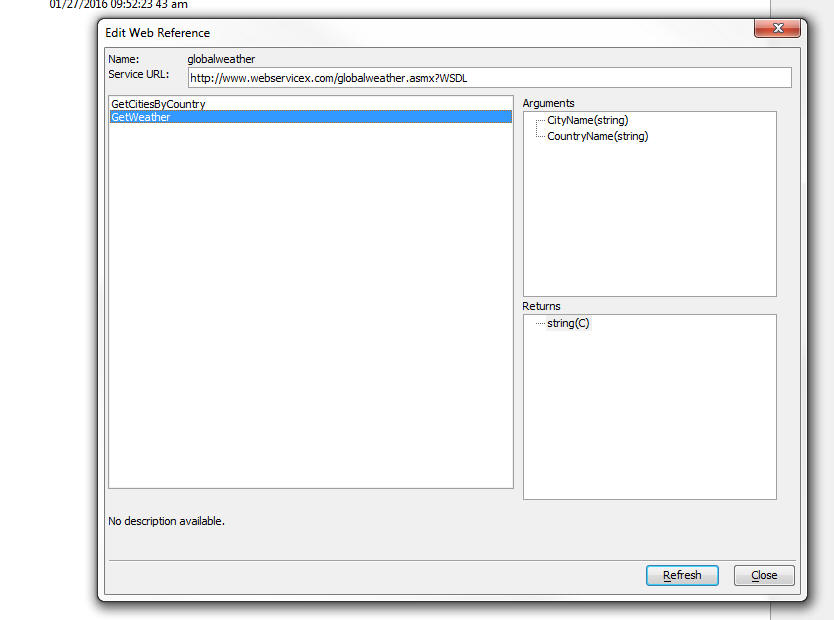
Calling a Registered SOAP Service from Xbasic
Once you have registered your SOAP service as described above,
you can call it from your Xbasic code. A genie will help you write
the Xbasic code.
To get to the genie open the Xbasic editor where you will be
writing your Xbasic function to make the SOAP call (this might in
the Xbasic Function Declarations section in a component, or while
exiting an Xbasic Module file), and right click on white space.
Then select the Genies...., Web Reference Call... menu item.
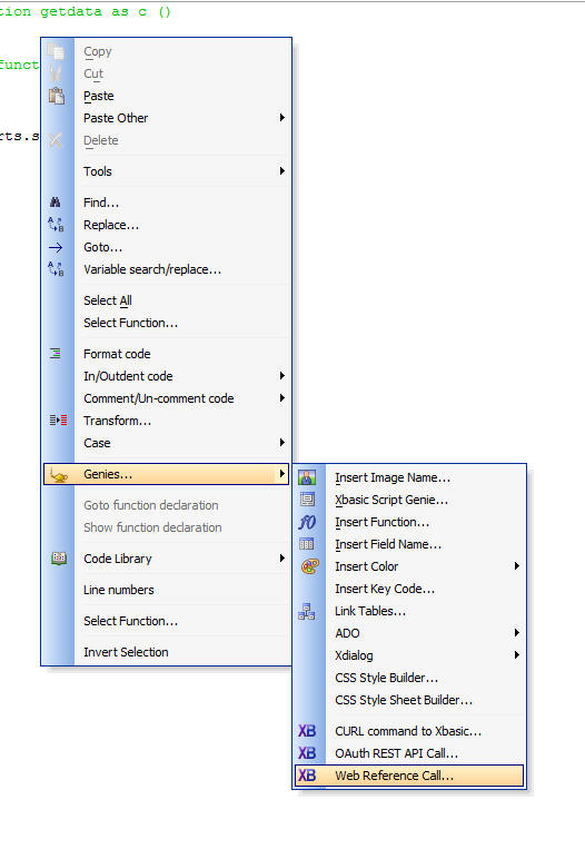
This will then bring up a dialog where you can select the Web
Service you want to call. The list of services that you previously
registered are shown here.
Once you select the service, the Explorer is shown where you can
choose the method that you want to call.
Finally, when you press the OK button, Alpha Anywhere generates
the sample Xbasic code needed to call the service. You can paste
this code in the Xbasic function you are writing.
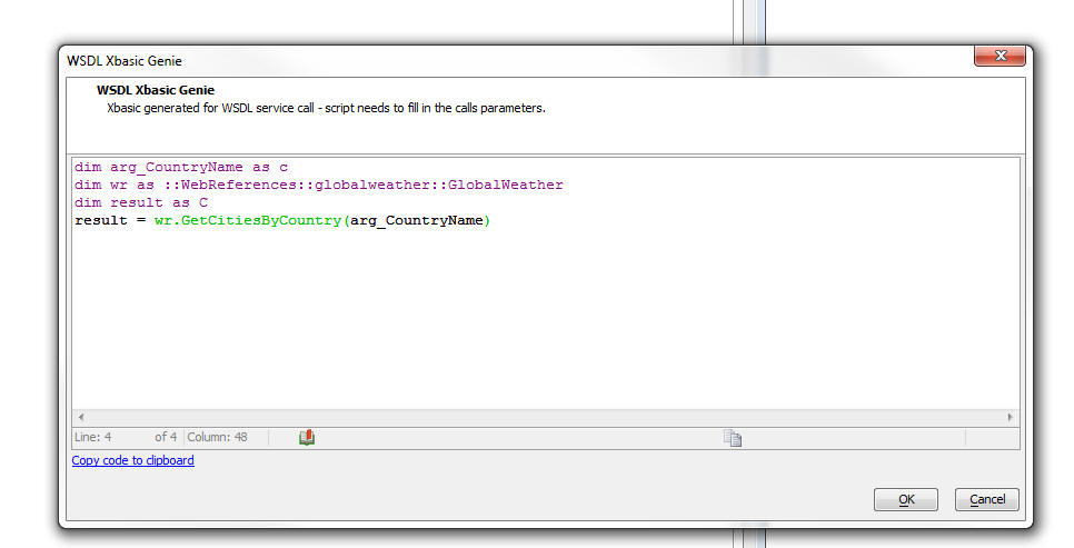
Web Applications - Publishing - HTTP Publishing
- When you publish a web application to a remote server you first
define the Publishing Profile to use. The publishing is currently
accomplished by using FTP to upload the files to the remote server.
Now, a new way of publishing files to a remove server is available
using the HTTP protocol.
Watch Video - Configuring the Server
Watch Video - Defining a Publishing Profile
The HTTP Publishing method requires that the Alpha Anywhere
server on the remote site be running because the Alpha Anywhere
server is actually handling the uploading of the data.
The HTTP Publishing method is more reliable and faster than the
FTP method.
For more details on HTTP Publish, click this link:
http://downloads.alphasoftware.com/a5v12Download/ReleaseNotes/HTTPPublish/httpPublish.html
PhoneGap App Builder - Third Party Plugins (iOS) -
Keyboard Plugins - Added support for the cordova-keyboard
and the ionic-keyboard plugins. These plugins provide functions to
make interacting with the iOS keyboard a bit easier and include
events to indicate the keyboard will show/hide.
For the full plugin documentation, see the links below.
cordova-plugin-keyboard
cordova-plugin-ionic-keyboard
PhoneGap App Builder - Third Party Plugins (Android,
iOS) - Media With Compression Plugin - The Alpha cordova-media-with-compression
plugin has been updated to include three (3) new methods.
- pauseRecord()
: pause the current audio recording session in progress
- resumeRecord()
: resume audio recording with the existing session
- getRecordLevels()
: returns the averagePower and peakPower in dB (iOS) or an
approximation of dB SPL (Android).
For the full plugin documentation, see the link below.
cordova-plugin-media-wth-compression
UX Component - Data Binding - Server-side Save
Submitted Data to Table(s) Action - onSQLError Event - A new
event has been added to the action to allow you change the error
message shown to the user when a SQL database error occurs.
For example say that the user tries to enter a new record. When
the INSERT SQL statement is executed, the database returns some
error (perhaps a foreign key violation). The error message returned
by the database is displayed to the user. However, this error
message is often quite cryptic and is certainly not 'friendly'. The
onSQLError event handler allows you to intercept the error before it
is displayed to the user and replace it with a friendlier message.
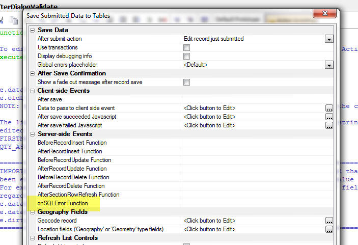
TabbedUI Component - Keyboard Shortcuts - You
can now define keyboard shortcuts for the action buttons in a
TabbedUI component.
Watch Video
To define a keyboard shortcut for a TabbedUI button, click the
smart field and select the key combination. The user will be able to
open the component by using the keyboard shortcut in addition to
clicking on the button.
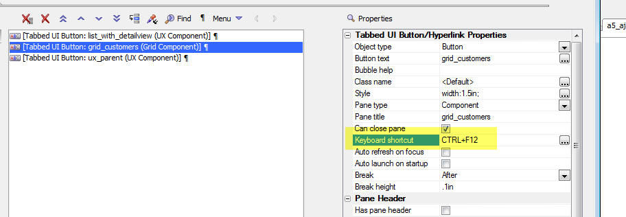
UX Component - Server-side Events -
canAjaxCallback - afterAjaxCallback - Two new server side events
have been added:
- canAjaxCallback - fires when any Ajax callback is
made
- afterAjaxCallback - fires after the Ajax response has
been computed, but before it is set to the client.
In the canAjaxCallback
event handler, if your code sets:
e.authorized = .f.
then the Ajax callback action will not be performed. Your code
can examine data in
request.variables to see what type of callback was being
attempted.
In the afterAjaxCallback
event, the 'e' object that is passed into the event handler
contains:
e.ajaxResponse
Your code can modify this response.
UX Component - List Control - SQL Datasource -
beforeQuery - The
beforeQuery server side event fires before a query is
performed to get data for the List.
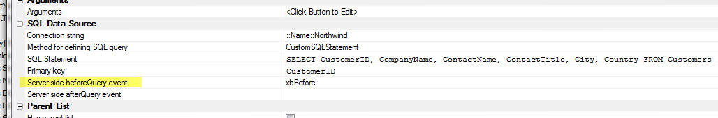
The event allows you 'authorize' the query.
In your Xbasic code in the function, you can set:
e.authorized = .f.
This will cause the query for the List data to return no data.
UX Component - CustomControl - 'Other Controls'
- A new control type has been added to the 'Other Controls' section
in the UX builder:
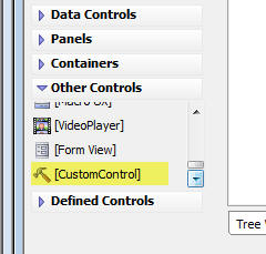
The CustomControl allows you to specify arbitrary HTML and
Javascript for the control. You can specify the HTML and Javascript
at design-time, or you can specify an Xbasic function that will
generate the HTML and Javascript for the control at run-time.
A very powerful use case for the CustomControl is to dynamically
generate a form based on a definition stored in a database.
Watch Video
- Part 1
Watch Video
- Part 2
Watch Video
- Part 3
Watch Video
- Part 4
Watch Video
- Part 5
Watch Video
- Part 6
Watch Video
- Part 7
When you add a CustomControl to a UX component, the PropertySheet
for the control is displayed as follows
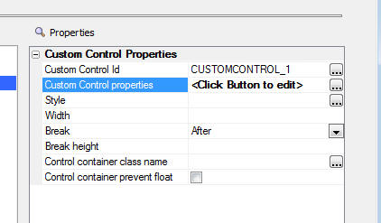
Clicking on the smart field for the Custom Control Properties
brings up the builder.
If you select the 'Specify Now' option in the Custom Control
builder you can specify the HTML for the control and (optionally)
any Javascript you want to execute before the UX is 'prepared' and
after the UX has been rendered.
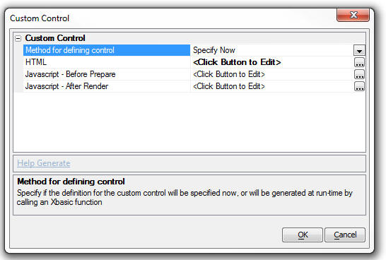
For example, if you wanted your CustomControl to render a
standard UX component input control (called, say, 'CUSTOM1')
you would add this code to the HTML:
<input id="{dialog.componentname}.V.R1.CUSTOM1"
name="V.R1.CUSTOM1" class="{dialog.style}Edit" ></input>
And you would add this Javascript to the 'Javascript - Before
Prepare' property:
{dialog.object}.columnInfo['CUSTOM1'] = { info: {controlType:
'Textbox'}, hiddenVal: false, type: 'input,label', isCalc: false,
hlp: '', isArray: false, dataType: 'C' };
On the other hand, if you wanted your CustomControl to render a
standard UX component button control (with an ID of, say, 'B1') you
would add this code to the HTML:
<div id="B1" style="width: .5in;">MyButtonGoesHere</div>
And you would add this Javascript to the 'Javascript - After
Render' property:
//add an event handler for the button
$e.add('B1',A5.d.evnts.click,function(e) {
alert('this is button b1');
},this,false,'B1');
//define a new button object
{dialog.object}._buttons['B1'] = new A5.Button({
layout: 'text',
style: 'box-sizing: border-box; -moz-box-sizing: border-box;
-ms-box-sizing: border-box; -webkit-box-sizing: border-box; width:
1.5in;',
html: 'Button',
onClick: function() {
},
theme: '{grid.style}'
})
//bind the button object to the html element
{dialog.object}._buttons['B1'].bind('B1');
If you wanted to generate the HTML and Javascript at run-time you
can set the Method to 'Xbasic' and then define an Xbasic function
that generates the HTML and Javascript.
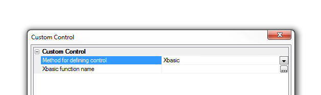
PhoneGap Shell Template UX Component - Statusbar
Plugin - iOS - The template UX component that implements a
PhoneGap shell has been modified so that it now uses the PhoneGap
Statusbar plugin. When running the Shell UX on an iOS device the
status bar will now display above the UX component. Previously, the
status bar was overwritten by the UX component. The code that
implements this is in the UX components onPhoneGapReady client-side
event.
NOTE: Search for PhoneGap - PhoneGap Shell
- for more information on the PhoneGap Shell.
UX Component - List Control - Lists with Detail
View - Synchronization - onSynchronize Server-side event -
The onSynchronize event fires when the user clicks the synchronize
button on the UX to submit edited List rows to the server. The
primary purpose for this event is to allow the developer to take
complete control of the synchronization process and implement a
custom handler to synchronize the edited List data.
When the user synchronizes a List with a Detail View, the dirty
List records are submitted to the server. If the List is based on
SQL queries, the CRUD operations to update the database are
automatically computed by Alpha Anywhere. However, you may want to
process the dirty List data yourself.
In the case where the List is not based on SQL queries, you
have no choices - you have to handle the List synchronization
yourself.
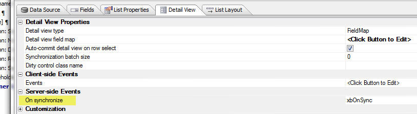
NOTE: If the List is not based on SQL queries, the List
Builder also has these events:
The onSynchronize server-side event is a higher level event that
fires before any of the 'Synchronization Handler' events are fired.
For example, the 'Commit data handler function' is called after the
server has processed validation rules. The event is called once for
each dirty composite record submitted to the server.
Application Server - Self-Signed Certificates
- Self-signed SSL certificates are now signed using the SHA-256
algorithm. Previously they were signed using the md5 algorithm,
which is no longer considered secure for these purposes. It is still
recommended that a public-facing server use a certificate from a
commercially supported Certificate Authority (e.g. Verisign, Comodo,
GoDaddy, etc.) for browser compatibility, but this change increases
security in situations where self-signed certificates are desired.
UX Component - PanelOverlay - Windows - A new
property has been added to PanelOverlays to make the PanelOverlay
behave like a window. When the 'PanelOverlay
is window?' property is checked, the PanelOverlay is
initially hidden (when the Panel that contains the PanelOverlay is
shown).
Watch Video
Download Component
To show the PanelOverlay you can use Action Javascript. There are
two new actions in Action Javascript:
- Show PanelOverlay window
- Hide PanelOverlay window
These actions allow you to animate the PanelOverlay as it is
shown or hidden.
NOTE: The animation option uses jQuery. Your
application must load jQuery. See the Project Properties dialog
(accessed from the Web Applications Control Panel).
.Net Framework v4.6 - Alpha Anywhere now uses
.Net Framework v4.61. If the machine you are installing to does not
include the .Net Framework v4.61, Alpha Anywhere will install it. It
can take quite a bit of time to install the .Net Framework. However,
this is a one-time event.
Web Applications - Xbasic Error Log - A new
warning message is now written to the Xbasic error log if you run a
component that was last edited with a build that is greater than the
version of the server.
For example, say your server is running using build 4600 and you
run a component that was built with build 4610. This is a version
mismatch that might cause an error.
For example if the component built using build 4610 calls some
function that was added after build 4600, it will definitely lead to
a run-time error. On the other hand if the the component does not
use any new functionality, then it is unlikely that there will be an
error.
Because it cannot be know with certainty if this version mismatch
will lead to errors, the message written to the Xbasic error log is
termed a 'warning' and not an 'error'.
Xbasic - Web Applications - How to Write to the
Xbasic Error Log - Xbasic_Write_to_Error_log() - A new Xbasic
function allows you to write messages to the Xbasic error log.
The text is written to the error log exactly as specified in the
function. Therefore it is recommended that you format the message so
that it appears in the log in a useful manner.
For example
dim message as c
message = "Warning: " + crlf() + chr(9) + "This is
a warning message" + crlf()
Xbasic_write_to_error_log(message)
The message will appear in the log as:
Warning:
This is a warning message
UX Component - ButtonList Control - Allow Null
Property - The ButtonList now has a new property - 'Allow NULL
selection'. The options for this property are:
- auto - This is the default property. If the
ButtonList is configured to only allow a single selection then
once the user has made a selection in the ButtonList, tapping
the selected control will not un-select it. However, if the
ButtonList is configured to allow multiple selections, clicking
on a previously selected item will unselect it and all items can
be un-selected.
- true - user can un-select all items regardless of the
setting for Allow multiple selections.
- false - user can never un-select all items once a selection
has been made.
UX Component - ButtonList - Class name - You
can now specify a class name for the items in a ButtonList.
In the above example the class name is set to 'foobar'
Here is how you might want to define this class:
.foobar {color: red;}
.{dialog.style}ButtonPressed.foobar {color:
orange;}
Notice that two CSS selectors are defined.
.foobar - defines the appearance when the Button is not
selected
.{dialog.style}ButtonPressed.foobar - defined the
appearance when the Button is selected.
UX Component - Checkbox and RadioButton Controls -
Vertical Alignment - Vertical Spacing - A new property has been
added for Radio Button and Checkbox controls that allows you to
control the vertical spacing between each item. The 'Vertical
spacing' property is shown when the Orientation is set to
'Vertical'.
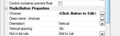
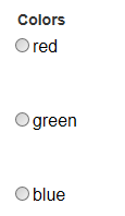
UX Component - Data Bound Image Control -
imageIsEmpty() Method - A new method on the Dialog object allows
you to test if an image control is empty.
Example:
var flag = {dialog.object}.imageIsEmpty('PICTURE1');
UX Component - Explore Structure - A new
dialog is available to help you understand the structure of complex
UX component layouts.
Watch Video
When you build large UX components with many Panels, Windows,
PanelOverlays, etc. it can be difficult to get an 'overview' of the
underlying structure of the component. The new 'Structure View' can
help you quickly explore the structure of a UX.
The 'Structure Explorer' is implemented as another view in the
Quick Find dialog.
To open the 'Structure Explorer' click the 'Find' button on the
toolbar and then select the 'Explore Structure' radio button.
UX Component - List Control - Configuring a List
Control to Display Nested Lists - A new genie is available to
configure a List to display a series of cascading Lists.
Watch Video
- Introduction
Watch Video
- Part 1
Watch Video
- Part 2
Watch Video
- Part 3
To select the Genie, create a new List, then select the 'Quick
Access...' button at the bottom of the List Builder. Then select the
'List Quick Setup Genie'. This genie can be used to quickly
configure a List that has a data source that defines hierarchical
data to display a series of nested Lists.
UX Component - List Control - Static Data Genie -
Nested List Data - A new genie is available to help you defined
the static JSON data for a List that is intended to display a series
of cascading Lists.
For example in the images shown below the List initially displays
the data shown in the image on the left. When the user selects an
item in the List that has a sub-list (indicated by the icon at the
right edge of the List item), the List is repopulated with the
sub-choices defined by the item that was selected and a 'back'
button is shown. In order to implement a List that behaves in this
manner, the List is populated with JSON data that defines the
choices for each item in the List.
For example, for the List shown in the above two images, the
following JSON data is used to populate the List.
[
{
display: 'Menu1',
children: [
{
display: 'Menu1_A',
action: 'Action_1'
},
{
display: 'Menu1_B',
action: 'Action_2'
},
{
display: 'Menu1_C',
action: 'Action_3'
}
]
},
{
display: 'Menu2',
action: 'Action_4'
},
{
display: 'Menu3',
action: 'Action_5'
}
]
Notice that the 'Menu1' item has a property called 'children'
that defined the sub-choices for that item. The actual text
displayed in the List is defined by the 'display' property in the
JSON. Any item in the List can have a 'children' property.
It can be tedious to define this JSON data manually. The 'Nested
List Genie' can help you define the JSON. Once you have the basic
structure of the JSON defined, you can then make making further
edits to the JSON manually. To get to the 'Nested Lists Genie', open
the List builder, set the List Data Source to 'Static', click the
smart field to open the Static Data dialog. Then click the 'Sample
data' hyperlink at the bottom of the dialog (as shown in the image
below).
UX Component - Sample Template -
MobileAppFramework_with_SplitView_Hierarchical_Menu - When you
create a new UX component, a new sample template is available. This
template is similar to the MobileAppFramework_with_SplitViewMenu
template. The only difference is that, unlike the
MobileAppFramework_with_SplitViewMenu, which implements a 'flat'
list of choices for the menu, the
MobileAppFramework_with_SplitView_Hierarchical_Menu template
implements a hierarchical list of menu choices.
UX Component - List Control - Paginated List - SQL
Data - Change Page Size - You can now dynamically change the
page size of a paginated List that is based on SQL data.
For example, say you want to change the page size of a paginated
List (called, say, 'LIST1') to 20 records per page.
//get pointer to List object
var lObj = {dialog.object}.getControl('list1');
//set the new page size
lObj._state.pageSize = 20;'
//refresh the List
dialog.object}.refreshListData('LIST1');
UX Component - Embedded Report - HTML - Option
Buttons - When a report is embedded into a UX component and is
rendered as HTML, the report is displayed with a series of buttons
that allow the user to print the report as PDF, export the report to
Word or Excel, etc. There was no ability to control which of these
buttons were shown. Now, when a report is embedded into a UX, the
'HTML report options' property allows you to control which button
are shown.
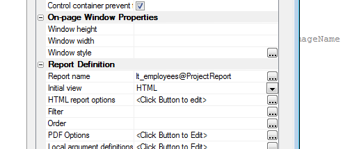
UX Component - Persisting Variables to Local
Storage - Variables to Omit - When you build a disconnected
application using a UX component, it is typical to persist the
variables (i.e. the Data Bound controls in the UX) in your component
to Local Storage so that when the application is restarted, the
variables (i.e. Data Bound controls) in the UX will have their
values restored automatically from Local Storage. However, there may
be certain variables that you do not want to persist to Local
Storage. For example, your UX may contain a login section that
contains a UserId and Password field. You might not want to persist
the Password field to Local Storage.
The UX now has a new property that allows you to define an
exclusion list. The
Variables to NOT persist property in the
Local Storage
section (on the Properties pane) allows you to select a list of
variables.
UX Component - Panels - .resize() Method - A
new method has been added to allow you to force Panels (Cards,
Layouts and Navigators) to resize themselves. Typically this is not
necessary, but if the Panels were initially sized and then the
window was resized (and a resize event was not triggered -- for
example, the PhoneGap Statusbar plugin), then Panels will have been
laid out based on incorrect size information and the .resize()
method can be useful.
For example:
var obj = {dialog.object}.getPanelObject()
obj.resize();
UX and Grid Component - Date Picker - 'Today'
Button - A new property in the Date Picker and the Calendar
control (UX component) allows you to turn off the 'Today' button.
Web Security - Alpha Anywhere Server - Publishing
Data - Publishing Roles - Publishing web security to an Alpha
Anywhere server from the Publish genie or the Web Security menu
"Publish Security Files" has new options. These are available only
if using Optimized FTP publishing. You can now publish security
roles without publishing the security tables. The options are:
- 'Merge Roles' - will add any new security roles defined the
local project that do not exist in the published application.
This will also update any existing roles to show edited role
names.
- 'Replace Roles' - will also remove any roles defined in the
published application that no longer exist in the local
security.
The option to publish security tables is available in all publish
profiles that publish to an Alpha Anywhere server.
UX Components - File Save Format - UX Components
can now be saved as formatted JSON instead of binary (the default).
Formatted JSON saves the properties in clear text. This is useful if
you are using some type of source or version control system and the
system has a method to show differences between versions. The save
format can be selected in the UX Properties under 'Advanced-> Save
component format'.
You can do a bulk conversion of the storage format by selecting
the 'Edit, Bulk Operation, Change UX Component storage type' menu
option when the Web Control Panel has focus.
Xbasic - Dot Variables - .set() Method - A new
method has been added to dot variables to allow you to set
properties on the variable. The .set() method complements the
.data() method which is used for reading a property value.
Example
dim p as p
p.name = "Fred"
?p.data("name")
= "Fred"
p.set("name","John")
?p.data("name")
= "John"
p.set("city","Boston")
?p.city
= "Boston"
Reports - Free-Form Reports - UTF8 - SQL Data
- Free-form reports that are based on SQL data can now use the full
UTF8 character set. This means that reports can now, for example,
easily include Chinese, Hebrew, Arabic and other characters on the
same report. Previously this was only possible by setting the
localization settings on the machine where the Application Server
was running. Since you had to pick a particular locale that meant
that you could not combine characters from different code pages
(e.g. you could not have Chinese and Hebrew on the same report).
This feature can be turned off in web applications in the Project
Properties dialog by un-checking the PDF Printing option to "Allow
all international character in free-form reports".
For desktop applications, the option can be turned off in "View->
Settings-> Preferences-> Reports-> SQL Support All International
Characters". When the feature is off, the reports will use temporary
dbf tables for report data.
UX Component - Publishing Session Variable Values
to Client Side - Ajax Callback - If an Ajax callback made a
change to a session variable that had been published to the
client-side the value of the session variable on the client-side is
now automatically updated.
Application Server - Session Variables -
Session.Sequence - A change was made to the way session
variables are stored internally by the Alpha Anywhere server. This
change should not affect any application.
This change makes the method used by the Alpha Anywhere server
and the Alpha Anywhere Server for IIS the same and it opens the
possibility for a future enhancement to the Alpha Anywhere server to
use the IIS session state provider. This will allow for improved
scalability and fail over (sessions shared across instances).
As a result of this change a new property is now available on the
session object.
Session.Sequence is a character value and is an unformatted
string representation of a GUID. It will automatically be updated
when a session variable is created, modified, or deleted.
UX Component - List Control - Detail View -
Synchronizing in Batches - Client-side Events - The
client-side events for batch synchronization -
afterSynchronizeListBatch
and
afterSynchronizeListBatch now both allow your Javascript to
reference the e.countInfo
object which has information in it about the number of records in
each batch, the number of successful updates and the number of
errors in the batch.
UX Component - Signature Control - .signatureIsEmpty()
method - This method has been improved and it now gives accurate
answers regardless of the browser that is being used. Previously,
the method would be inaccurate for Chrome.
In addition, this method can now be used when the signature
control is in 'signing' mode. Previously it could only be used after
the user had clicked the 'accept' button to accept the signature.
You can also now pass in an optional second parameter to
specify a length parameter The control is considered to be 'empty'
if the base64 encoded value of the signature is less than the
specified length. Note that even an 'empty' signature will have a
non-null value for its base64 encoded value.
Reports - Calculated Fields - User Defined
Functions - When you create reports you can define calculated
fields that use user-defined functions in the calculate field
expression.
Now, the user-defined functions that the report references can be
defined in an Xbasic Function Library. Previously these functions
had to be in an .aex file that was published along with the other
files in the project.
Placing the Xbasic functions in a Function Library is more
convenient than having to create an .aex file.
NOTE: This feature only applies to Project
Reports (i.e. reports defined in the Web Projects Control Panel).
To attach an Xbasic Function Library to a report, right click on
the report and select the Xbasic Function Library References..
command.
UX Component - Ajax Callbacks - Caching
- When an Ajax callback is made to a component, the first thing that
the Alpha Anywhere server does when handling the callback is
de-serialize the component ( the .a5wcmp file). For very large
components, the time taken to de-serialize the .a5wcmp file can be
significant (perhaps as much as 200ms). Now, the de-serialized
components are cached. As a result, the performance of Ajax
callbacks will be improved.
NOTE: Caching is only used on UX component
that do not user security or server-side show/hide
expressions. For example, if you have a button that is only show to
members of the 'Sales' group, caching is not used.
UX Component - List Control - Convert Data Source
from Static to SQL or SQL to Static - A new genie in the List
Builder allows you to convert the Data Source for a List from Static
data to SQL or vice-versa. When you convert the data source from
static to SQL, the following options are available:
- You can connect your List to an existing table in the SQL
database or you can create a new table in the SQL database
- If connecting to an existing table you specify a map showing
how the fields in the List are mapped to fields in the existing
SQL table. The genie will automatically generate the SQL select
statement for the SQL data source.
- If creating a new table in the SQL database you specify if
the existing data in the static data source should be exported
to the new SQL table. You also specify the structure of the new
table that the Genie will create and you can specify if the
genie should overwrite an existing table when creating the new
table.
When you convert the data source from SQL to Static, the
following options are available:
- You can specify if the data in the SQL table should be
imported into the Static data for the List data source
- If you specify that data should be imported, you can specify
the maximum number of rows to import and you can specify if the
data should be imported as a CR-LF delimited string, or as a
JSON string.
PhoneGap Applications - _phoneGapSettings()
Function - In PhoneGap applications you can now call a special
system function to return information about your PhoneGap
application. For example, you might want to know if a particular
option was selected, if a particular plugin was loaded or what the
application id is.
For example:
To get the application id:
alert( 'app id: ' + _phoneGapSettings().appId );
To find out if the sqlite plugin was loaded:
var flagSQL = _phoneGapSettings().plugins['com.brodysoft.sqliteplugin'];
if(typeof flagSQL == 'undefined') flagSQL = false;
NOTE: When a PhoneGap application is built, a
special .js file called _phoneGapSettings.js is created in the 'www'
folder.
Below is a sample of the _phoneGapSettings.js file:
function _phoneGapSettings() {
return {
"appId": "com.yourCompany.yourApp",
"preferences": {
"permissions": "none",
"orientation": "default",
"target-device": "universal",
"fullscreen": "true",
"webviewbounce": "true",
"prerendered-icon": "true",
"stay-in-webview": "false",
"ios-statusbarstyle": "black-opaque",
"detect-data-types": "true",
"exit-on-suspend": "false",
"show-splash-screen-spinner": "true",
"auto-hide-splash-screen": "true",
"disable-cursor": "false",
"android-minSdkVersion": "7",
"android-installLocation": "auto",
"phonegap-version": "3.7.0",
"FadeSplashScreen": "true",
"FadeSplashScreenDuration": "2",
"EnableViewportScale": "false",
"MediaPlaybackRequiresUserAction":
"true",
"AllowInlineMediaPlayback": "false",
"TopActivityIndicator": "gray",
"BackupWebStorage": "cloud",
"iosPersistentFileLocation":
"Library",
"KeyboardDisplayRequiresUserAction":
"true",
"SurpressesIncrementalRendering":
"true",
"android-maxSdkVersion": "",
"android-targetSdkVersion": "",
"KeepRunning": "true",
"splash-screen-duration": "5000",
"ErrorUrl": "error.html",
"LoadingDialog": "Please wait, the
app is loading.",
"LoadingPageDialog": "Please wait,
the data is loading.",
"LoadUrlTimeoutValue": "20000",
"AndroidPersistentFileLocation":
"Internal"
},
"plugins": {
"battery-status": "npm",
"console": "npm",
"device": "npm",
"file": "npm",
"file-transfer": "npm",
"geolocation": "npm",
"inappbrowser": "npm",
"media": "npm",
"network-information": "npm",
"com.phonegap.plugins.pushplugin": "pgb",
"com.brodysoft.sqliteplugin": "pgb",
"com.alphasoftware.plugins.camera.withexif":
"pgb",
"statusbar": "npm"
}
};
}
Xbasic - YELP API - You can make requests against
the YELP API using Xbasic - The following example shows how to
make a request against the YELP API:
Example:
The query syntax for the YELP API is described on the YELP
website (see the YELP API dashboard).
Say that the syntax for the query you want to make is as follows:
https://api.yelp.com/v2/search/?location=lexinton
ma&radius_filter=10000
This query will show businesses within 10,000 meters of
Lexington, MA.
To perform this API query using Xbasic
1. Extract the URL from the query (everything up to the ?) and
set the URL variable (in the code shown below) to this value.
2. DIM an Xbasic dot variable (DIM
P as p in the code shown below) and set properties in
this dot variable for each parameter in the query string. Note that
when setting parameter values, spaces in the parameter values must
be converted to + signs.
dim p as p
p.location=stritran("lexington ma"," ","+")
p.radius_filter = "10000"
Here is the complete example:
dim ao as extension::OAuthClient
ao.consumer_key = "consumer key value - get from
the YELP website"
ao.consumer_secret = "consumer secret value - get
from the YELP website"
ao.oauth_token = "oauth token - get from the YELP
website"
ao.user_secret = "user secret - get from the YELP
website"
ao.oauth_signature_method = "HMAC-SHA1"
ao.url_encode_flags = "+plusspace"
url = "https://api.yelp.com/v2/search/"
dim p as p
p.location=stritran("lexington ma"," ","+")
p.radius_filter = "10000"
dim result as n
result = ao.Exec("GET",url,p4)
if result = 200 then
dim jsonResponse as c
'reformat the json response to
make it readable
jsonResponse = json_reformat(ao.response_content)
showvar(jsonResponse)
else
showvar("Error")
end if
Once you get the response from YELP you can use the json_parse()
function to get an Xbasic variable and then generate code to (for
example) populate a List control on a UX component showing the
results.
UX Component - {dialog.object}.refreshDropdownBoxChoices()
Method - Refreshing Multiple Controls in a Single Ajax Callback
- You can now refresh multiple Dropdown controls in a single Ajax
callback. Previously, if you wanted to refresh the choices in
multiple controls you had to make multiple Ajax callbacks.
There are two syntax options.
You can specify a comma delimited list of controls to refresh.
For example:
{dialog.object}.refreshDropdownBoxChoices('COUNTRY,CITY')
Or, you can specify a JSON string. Using the JSON string method you
can specify optional parameters for each Dropdown control.
For example:
var arr = [];
arr.push({ controlName: 'country');
arr.push({ controlName: 'city', dynamicFilter: 'country = \'usa\' or
country = \'uk\''});
var json = JSON.stringify(arr);
{dialog.Object}.refreshDropdownBoxChoices(json)
Application Server - Configuration Changes -
Many Application Server configuration changes are now effective
immediately (without requiring a server restart)
Changes made to the Application Server's configuration are now
effective as soon as those changes are saved, including when the
server is currently running. This allows the server configuration to
be modified without having to restart the server and interrupt user
activity.
For example, many server administrators do not enable server logging
in order to conserve disk space and other server resources. However,
since logs are very helpful when an unexpected problem occurs, it is
often times desirable to turn them on temporarily. Previously, this
would require a server restart which meant either interrupting users
of your applications or going without logging until some later time
when the server became idle. Now changes such as this can be made
with no impact on application users.
Some changes cannot be made effective without a server restart
however. These are changes to the listening IP address or port, the
server's license, and the SSL configuration.
IMPORTANT: Changes must be made through the
Alpha Anywhere or Alpha Anywhere Application Server user interfaces.
If the server's configuration file is directly edited then the
changes will not be effective until either the server is restarted
or changes are saved through the user interface.
UX and Grid Component - Auto-Suggest Control -
Return Value - By default, the return value for an auto-suggest
control is the same as the search field. Now you can specify a
different return value than the search field.
PhoneGap App Builder - Status Bar Plugin (iOS)
- The Status Bar Plugin default behavior has changed to reflect the
styling recommended by Apple for iOS 7 and greater apps. By default,
the iOS status bar is now overlaid on top of the PhoneGap WebView.
This will require the addition of a 20px spacer to a Panel header to
accommodate the status bar. If you would like to set the behavior to
the previous iOS 6 style, which does not overlay the WebView, you
must set the properties for the status bar from within the
onPhoneGapReady
event in the Client-side events.
Example:
Add this code to the
onPhoneGapReady event:
StatusBar.overlaysWebView(false);
StatusBar.styleDefault();
NOTE: While the PhoneGap documentation for
the Status Bar plugin indicates that a preference setting within the
config.xml file can be used to set the default behavior as required,
this is not currently supported by PhoneGap Build.
IMPORTANT: The PhoneGap StatusBar plugin resizes the size
of the WebView control asynchronously. That means that if your UX
component uses Panels (which is very likely) the Panels will have
been laid out using the original size of the WebView control. This
will cause layout errors - most likely manifested as Panel Footers
being incorrectly sized. Therefore, it is very important that you
add this code to the
onPhoneGapReady event to resize the Panels in your component.
This code must be wrapped in a
setTimeout() so that
it runs after the Statusbar plugin has completed.
For example:
StatusBar.overlaysWebView(false);
StatusBar.styleDefault();
setTimeout(function() {
var obj = {dialog.object}.getPanelObject()
obj.resize();
},100);
UX Component - Action Javascript - File Upload -
Amazon S3 Action - Alpha Anywhere Server - This action
previously only allowed upload to S3. Now you can use the same
action to upload files to the Alpha Anywhere server. In the case of
the Alpha Anywhere server, you specify the name of an Xbasic
function to call after each file us uploaded. This action allows you
to select multiple files for upload. The files are all uploaded at
once and separate progress bars are shown for each file. The Xbasic
function will be called once for each file selected.
UX Component - PanelOverlay - zIndex Property -
You can now specify an explicit z-index for a PanelOverlay.
Previously the zIndex for a PanelOverlay was hard-coded to '4'. The
default value has been changed from '4' to '6'. This means that it
is possible that you might see a change in behavior when running a
UX in that a PanelOverlay that was previously shown when another
Panel was brought into view would now be hidden. To restore the
prior behavior simply set an explicit value of '4' for the
PanelOverlay's zIndex property.
Xbasic - a5_word_merge_dotNet() Function
- Merge Data into Word Template - Merges data that results from
executing a SQL query into a Microsoft Word template document.
IMPORTANT: You must install the Microsoft
Office 2010: Primary Interop Assemblies Redistributable in order to
use this function.
http://www.microsoft.com/en-us/download/details.aspx?id=3508
Syntax:
p pResult = a5_word_merge_dotNet(c
folder,c templateFile, c connectionstring,c sql,sql::arguments
args [,l flagPortableSQL [c outputFilename]])
Where:
- result - an object with a 'error' property. The error
property is set to .t. if an error occurred. If an error did
occur. then result.errorText contains the error message.
- folder - folder where the Word template file is
located and where the merged documents will be created
- templateFile - name of the Word template file - file
is assumed to be in the specified folder.
- connectionString - connection string to the SQL
database
- sql - SQL SELECT statement to select the records to
merge into the template
- args - SQL::Arguments object that contains argument
values.
- flagPortableSQL - defaults to .t. - indicates if the
sql statement uses portable or native SQL
- outputFilename - template for the output filename. If
you don't specify an outputFilename, the files generated
by the merge will be called 'MergeResult_1.docx',
'MergeResult_2.docx', etc. The outputFilename can include
field placeholders that reference data in the SQL query. For
example "Invoice for {customerID}.docx"
Example:
dim folder as c = "c:\data\wordMerge"
dim template as c = "Template.docx"
dim ConnectionString as C = "::Name::Northwind"
dim sql as c = "select customerid, contactname, address, city,
region, country, postalcode, contactname as [salutation] from
customers where country = :whatcountry"
dim args as sql::arguments
args.add("whatcountry","uk")
dim outputfilename as c = "Invoice for {customerid}"
dim pr as p
pr =
a5_word_merge_dotNet(folder,template,connectionstring,sql,args,.t.,outputFilename)
The Xbasic source code for this function can be download
here. The reason for including the source code is that it serves
as a useful guide to calling .Net code from Xbasic and it allows
developers to tweak the function to expose other Word features.
: UX and Grid Component - Building Real-time
Applications - Web-sockets Server - Publish/Subscribe - The
web-socket server functionality has been enhanced to support a
publish/subscribe model. When a client-connects to the web-socket
server they can specify the 'message types' that they are interested
in receiving.
If the client is not subscribed to a particular 'message type'
then when the web-socket server will not send any messages of that
type to the client.
In the component properties, you can specify what message types
the component should listen for.
You can use the Web-socket server actions in Action Javascript to
dynamically change the types of messages that the component has
subscribed to.
For example, in the image shown below, the component will be
subscribing to messages of type 'messageboard' and 'alpha'
The 'message types' are completely arbitrary. When a message is
sent, it is given a specific (arbitrary) message type.
For example, the code below sends a message of type 'myspecialtype':
var obj = {type: 'myspecialtype', messageText:
'this is the message};
{dialog.object}.wsclient.socket.send(JSON.stringify(obj));
Alpha Anywhere comes with certain 'built-in' message types. You
can add you own built-in message types by writing a node.js handler
for your user-defined message type.
The built-in 'messageboard' message type (for example) is written
so that when the user connects to the web-socket server (or
re-connects after having lost the connection) any messages of type 'messageboard'
that were sent prior to their connecting are automatically sent to
the client (assuming, of course, that the user has subscribed to
messages of type 'messageboard'). The 'messageboard' special type is
written to keep a certain maximum number of messages in is 'history'
stack, but you can edit this value.
The custom message types are stored in the
<Alpha Anywhere executable
folder>\node_services\ws_queue folder. For example, the
'messageboard' special type is in a file callled
messageboard.js.
To add your own message type (called say 'type1') create file
called type1.js in the ws_queue folder. Use the messageboard.js code
as
The web-socket server actions in Action Javascript allow you to
specify what message types to subscribe to when you select the
following actions:
- Connect to Web-socket Server
- Re-Connect to Web-socket Server
Using the Web-Sockets Server when Alpha Anywhere is Using a
Load Balancer
A load balancer is commonly used to distribute incoming requests
to one of several Alpha Anywhere Application Server instances
running on a single Windows computer. Alpha Anywhere uses a Node.js
server running on a different port in order to provide WebSockets
functionality, so the load balancer will need additional
configuration if you will be using WebSockets with your application.
The URL used for your application points to the load balancer so it
must know about all incoming traffic that is to be expected and
passed along.
Configuring the load balancer to work with the WebSockets server is
simpler than configuring it to work with the Alpha Anywhere
Application Server instances because only one Node.js server is
used. There is no balancing to be done, just allow the incoming
traffic to pass through to the Node.js server. The load balancer
should be configured to accept traffic on the port that has been
specified in the web project properties and send that traffic to the
same machine as the Alpha Anywhere Application Servers, but on the
port specified. The exact configuration steps vary from load
balancer to load balancer, but it is essentially the same as
creating the alpha Anywhere Application Server load balancing that
was already done but with just a single target.
Action Javascript - File Upload - Amazon S3
Storage Action - Base64 Encoded Data - Previously this action
assumed that the user would select the files to be uploaded. The
action has been enhanced so that you can now specify the file to
upload by supplying base64 encoded data (which must be in the form
of a data URI).
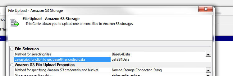
Tabbed UI - Initial State of Buttons Pane - If
you specify that the Buttons Pane on the Tabbed UI can be collapsed,
you can now specify its initial state.
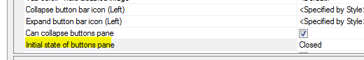
The use case for this is typically when you have a Tabbed UI with
integrated login. Before the user logs in you do not want the
Buttons pane to display, but after login, in the afterLogin
client-side event you want to display the Buttons pane. This is done
by adding code to the client-side afterLogin event:
tbiObj.showTabbedUIMenuPanel(false);
Note that the .showTabbedUIMenuPanel()
event is called with a
false parameter to
indicate that animation should not be used.
UX Component - Data Bound UX Component Quick Start
Genie - You can now create a data bound (SQL Database) UX with
full CRUD support using a quick start genie.
To get started, create a new UX component, go to the Controls
pane and then click on the [Textbox] item in the toolbox on the
left. The following dialog is shown:
Select the 'Create multiple new controls at once' option and then
click the 'Populate list from a table' option.
The following dialog will be shown:
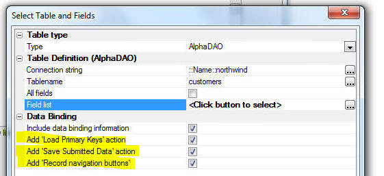
The highlighted properties are new. When the controls are added
to the UX you can specify that a server-side action to load primary
keys should be added to the onDialogIntialize event, that a
server-side action to save submitted data to the database to which
the UX is bound should be added to the afterDialogValidate event,
that buttons to submit/cancel the UX should be added and that
buttons to navigate from record to record in the bound table should
be added.
This genie makes it much quicker to get started building a data
bound UX component.
NOTE: You can also build UX components that
perform CRUD operations by creating a List with a Detail View.
UX Component - Quick Find - When a UX
component has a large number of controls, finding the control that
you want to edit in the Tree View can be difficult. The existing
Find feature (accessed by clicking the Find button on the toolbar)
was not very helpful. The Find command has been re-implemented as
shown in the image below.
To open the Quick Find dialog, click on the highlighted icon in
the image below.
The tree view of your UX controls is shown below. You can filter
this list by typing into the Filter box, or by clicking on one of
the categories in the lists on the left.
You can then double click on an item in the tree view or click
the Goto Control button.
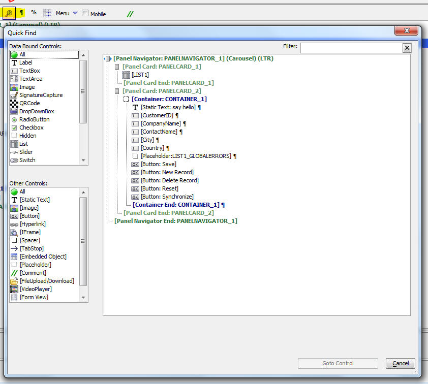
PhoneGap App Builder - Added support for the latest CLI versions of PhoneGap - The PhoneGap App Builder has been updated to support the latest CLI versions
of PhoneGap. As of early October, 2015 the latest CLI vesrion supported by PhoneGap Build is 5.2.0.
PhoneGap App Builder - Configuration options - Backup config.xml file - A new option has been added to the PhoneGap App Builder that controls the generation of a backup of the
config.xml file when any changes are saved. The backup config.xml option is enabled by default. You may disable or enable this
option as required. The backup config.xml files are stored in the projects resources folder and the files are date and time stamped. A .bak extension is included.
PhoneGap App Builder - Added support for the new NPM Plugin Registry - The PhoneGap App Builder has been updated to load all of the core PhoneGap plugins from
the NPM registry. All prior versions of the PhoneGap App Builder loaded the core and 3rd party plugins from the PhoneGap Build Registry, which is being deprecated by PhoneGap in favor of NPM.
If you are using any of the CLI versions of PhoneGap, the NPM core plugins are required. PhoneGap Build will no longer accept any updates to the plugins listed within the
PhoneGap Build Registry.
Approximately 30% of the 3rd party plugins listed within the PhoneGap App Builder have been listed within the NPM registry by their respective authors and the PhoneGap
App Builder will load those plugins from NPM when appropriate. Some of the plugins must still be loaded from the PhoneGap Build registry in order to work properly within PhoneGap Build.
A new property has been added to all 3rd party plugins that identifies the registry that is being used.
This information is available within the help of each plugin from within the builder.
All previous PhoneGap Build project config.xml files will be automatically updated to use the NPM listed plugins if they are used within a project. This includes the
3rd party plugins that have been updated to the NPM registry.
PhoneGap App Builder - Added support for the Android Crosswalk plugin - The Crosswalk plugin for Android is now supported. You must use one of the CLI versions
of PhoneGap in order for this plugin to be enabled.
Crosswalk replaces the Android WebView with the most recent revision of Chrome. This generally provides enhanced app performance and consistency among different Android devices.
Crosswalk Benefits
- Performance improvements
- Consistent WebView that doesn't change based on device/Android version
- Enhanced capabilities: Adds WebRTC, WebAudio and Web Components
Crosswalk Drawbacks
- Increased memory footprint
- Increased APK size (about 17MB)
- Increased size on disk when installed (about 50MB)
- Crosswalk WebView stores data (IndexedDB, LocalStorage, etc) separately from System WebView
json_filter() Function - Extracts or omits
certain properties from a JSON string.
NOTE: Conceptually, this function is similar
to the filter_string()
function, except that it operates on JSON strings.
Syntax:
c result = json_filter(c json [, c
properyNames [, L exclude]] )
Where:
- json - input string of JSON data
- propertyNames - comma delimited list of the property
names in the JSON string that you want to filter
- exclude = .t. or .f. - default .f. - if exclue = .t.
the specified propertyNames are excluded from the JSON
string
Examples:
'extract object with a single field
dim json as c
json = <<%txt%
{
one" : 1 ,
two" : "TWO" ,
three : [ 1 ,2 ,3 ]
}
%txt%
? json_filter(json,"one")
= { "one" : 1}
? json_filter(json,"two")
= { "two" : "TWO"}
? json_filter(json,"three")
= { "three" : [ 1 ,2 ,3 ]}
'exclude a single field
? json_filter(json,"one",.t.)
= { "two" : "TWO" , "three" : [ 1 ,2 ,3 ]}
? json_filter(json,"two",.t.)
= { "one" : 1 , "three" : [ 1 ,2 ,3 ]}
? json_filter(json,"three",.t.)
= { "one" : 1 , "two" : "TWO"}
'include multiple (comma separated) fields
? json_filter(json,"one,two")
= { "one" : 1 , "two" : "TWO"}
? json_filter(json,"one,three")
= { "one" : 1 , "three" : [ 1 ,2 ,3 ]}
compile_xbasic_function_library() Function -
Allows you to use Xbasic Function Libraries in an .a5w page.
Syntax
p nameSpace =
compile_xbasic_function_library(c functionLibraryName)
Where:
- nameSpace = the nameSpace where the Xbasic functions
are compiled to
- functionLibraryName - the name of the Xbasic Function
Library file.
To call a function you must prefix the function name with the
nameSpace. See example below.
Example:
<%a5
dim p as p
p =
compile_xbasic_function_library('myFunctionLibrary');
?p.functionInMyLibrary()
%>
Amyuni PDF Printer Driver - Amyuni V5.0 -
Windows 10 - Alpha Anywhere uses the Amyuni PDF Printer driver
to produce PDF output from reports. Previously Alpha Anyhwere included V4.5
of the Amyuni Printer Driver. Alpha Anywhere now bundles V5.0 of the
Amyuni Printer Driver. The V5.0 driver is compatible with Windows
10 whereas the V4.5 driver is not.
Grid Component - Sorting - Add Primary Key to
ORDER BY Clause - By default, when you sort a Grid component,
the Primary Key of the primary table for the SQL statement that the
Grid is based on is now automatically added to the ORDER BY clause.
This is done to ensure that even when the user sorts on a field that
would not normally generate unique sort keys (e.g. user sorts on the
'City' column), that the sort keys are unique.
If you do not add the primary key to the ORDER BY clause and if
the user sorts on a non-unique field, then when the user navigates
from page to page in the Grid, it is possible for records that have
appeared on a prior page to re-appear on a subsequent page.
You can control whether this feature is enabled or not by setting
the 'Add primary key to all ORDER BY clauses' property on the
Properties pane of the Grid Builder.
a5_copyLayout_to() Function - Can now be used
without bringing up any UI.
The a5_copy_layout_to() function is used to copy a Report, Label,
or Letter from one data dictionary to another (does not apply to
'Project' reports). This function brings up a user interface for the
user to enter the target dictionary. Now, you can use this function
programmatically, without bringing up a user interface.
Example:
a5_copy_Layout_to("Report","report1@c:\alphasports\customer.ddd","report2","c:\a5v12\packages\alphasports.ddd")
Where the arguments are:
- objectType - Report, Label or Letter
- sourceName - fully qualified name of the object
(including its dictionary)
- newName - short name of the new object (does not
include the dictionary)
- targetDictionary - fully qualified target dictionary
name.
OData Support - Consume Data from OData Sources
- You can now use standard AlphaDAO methods to access data exposed
by OData data sources.
Watch Video - Part 1
Watch Video - Part
2
Watch Video - Part
3
OData is a very popular standard for accessing data using REST
calls. Alpha Anywhere now allows you to connect to OData services
and then execute standard portable SQL code against the connection.
Obviously, the SQL that you execute is limited to functionality
supported by the OData service. That means, for example, that while
you cannot execute JOIN commands.
To use OData data, you define a named AlphaDAO connection string,
and then select OData as the connection type.
The dialog will prompt for the Base URL of the OData service.
Once you have the named connection string, you can then continue to
build Grid and UX components in the same manner that you would for
any SQL database.
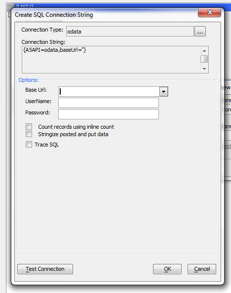
node_request() Function - Calling Node.JS Code
From Xbasic - Node Code Defined at Project Level - The
node_request() function allows you to execute some Node.js code.
The syntax is:
c Result = node_request(c
NodeServiceName, p data [L flagRestartNode [, L
flagShowNodeConsoleWindow]]);
Where:
- result - result of the Node code. Will be in the form
of a JSON string that contains the result and any error messages
- NodeServiceName - the name of the Node.js service -
this is a .js file in the 'node\node_services' folder in the Web
Project Folder.
- data - an object with values for all of the input
parameters required by the Node service. For example,
data.firstname = "Fred",
data.lastname =
"Jones".
- flagRestartNode - .t./.f. - specify if the Node
service should be restarted before executing the code. If you
make an edit to the Node.js files, you will need to restart the
Node service. In a production application you should not set
this to .t. as it takes time to restart the Node service.
- flagShowNodeConsoleWindow - .t./.f. - specify if the
Node console window should be shown. If you Node code contains
console.log() statements then you will see the output from these
statements in the Node Console Window.
Watch Video - Part 1
Watch Video - Part
2
Download Component
NOTE: Contrast this with the technique for
running Node code shown in video XB_V12-3 "Calling into Node.JS from
Xbasic". The technique shown in this video are for Node services
defined at the Alpha Server level (the Node services can be
called from any project), whereas the
node_request()
function discussed here is for Node services defined at the Web
Project level.
IMPORTANT: The Node services must be defined in a special
location in your Web Project. You must define the Node .js file in
the Node\Node_Services folder in the Web Project.
Example:
Assume you have defined a Node service called 'hello' (name is
case-sensitive). This service will be defined in a file called
hello.js in the 'node\node_services' folder in the Web Project
folder.
The contents of the hello.js file is:
exports.handler =
function(packet,response,sendResponse) {
var e;
var attachments = null;
var msg = 'Hello there <b> ' + packet.firstname + ' ' +
packet.lastname + '</b>';
response.result = msg;
console.log(msg);
sendResponse(response,attachments);
};
This is the standard format for a Node module.
Notice the following about the hello.js file:
- The code references packet.firstname and packet.lastname -
The input parameters to the Node code are properties of the
packet object. The input parameters are passed into the
node_request()
function in the data
object.
- The code executes a
console.log() command. The output written to the console
window will only be seen if
node_request() is
called with the flagShowNodeConsoleWindow
parameter set to .t.
To run this Node service from the Interactive window:
'define an object (i.e. an Xbasic dot
variable) to contain the input parameters
dim p as p
p.firstname = "Fred"
p.lastname = "Smith"
'restart the Node service so that any edits
to the hello.js file are picked up and show the console window
?node_request("hello",p,.t.,.t.)
The result, shown in the Interactive window will be:
{"_id":"e38bcc7c-581f-4b6b-9d13-d4da6eb0aa8a","error":"","result":"Hello
there <b> Fred Smith</b>"}
This string is a JSON object that can be parsed:
For example:
dim json as c
json = node_request("hello",p)
dim pOut as p
pOut = json_parse(json)
showvar(pOut.result)
TECHNICAL NOTE: The
node_request()
function is actually a simple wrapper around these low level Xbasic
commands:
dim n as helper::node
dim p as p
p._id = "some_unique_id"
p._command = "name of the Node service"
p.param1 = "value of parameter 1"
p.param2 = "value of parameter 2"
dim jsonCmd as c
jsonCmd = json_generate(p)
dim folder as c
folder = "fully qualified path to the
'node\node_services' folder"
n.request(folder,jsonCmd)
NOTE: The files in the 'node\node_services'
folder in your Web Project are automatically published when you
publish your application. When you do a Live Preview of a component
you are working on and you choose the 'Full
Preview' option from the menu, the files in the 'node\node_services'
will also be published to the
LivePreview folder
in the server webroot.
Client-side Data Cache - The client-side data cache allows you
to define one or more 'data items' that are cached on the client-side so that
you can reference this data in a UX component. The data in the data cache is in
the form of Javascript arrays.
Watch Video - Part 1
Watch Video - Part
2
Watch Video - Part
3
Watch Video - Part
4
Watch Video - Part
5
Watch Video - Part
6
For example, you might define a client-side data cache with these items:
- customers
- orders
- products
For each item in the data cache you specify the server side query that
generates the JSON data for the data item. For example, you might specify that
the data for the 'customer' data item is obtained by executing a SQL SELECT
command against a SQL Server database.
The data for the 'orders' data item might be obtained by executing some
custom Xbasic code that returns a string of JSON data.
The data source for a data item can be:
- a SQL query
- nested SQL queries - multiple nested SQL queries that return
complex JSON data (with nested arrays of data). For example you might have a
query for all customers in Boston, with all orders and payments for each
customer as a nested array and then all order details for each order as a
nested array
- Xbasic - any Xbasic code that returns data in JSON format
- static - a static string of data in JSON format
The data in a data-item can, optionally, be saved on the client-side so that
it is available when you are running the application in disconnected mode. When
you choose to save the data on the client, you have the option of storing the
data in:
- local storage
- a file on the device (option only applies when you are running in a
PhoneGap shell)
The amount of data that can be stored in local storage is limited. If you
store data in a file on the device you will be able to store significantly more
data than would be possible in local storage.
The UX has methods that allow you to refresh the data in a data item and to
read the data from a data item into a Javascript array. When you read data from
a data item into an array you can, optionally, specify filter and order
conditions so that only 'records' that meet your filter criteria are in the
array returned by the read method.
You can specify that the data in a data-item should be 'delayed'. This means
that when the UX is initially rendered, the query for the data item is not
performed and no data is initially sent to the client. Only when the user
executes an explicit command to 'refresh' the data item will an Ajax callback to
the server be made and then the data item query is performed and the data are
sent to the client.
If you have specified that the data in a data item should be persisted to
Local Storage, there is no way of knowing, at the time the query to get the data
for the data item is performed, if the data that is returned to the client will
actually be able to be stored in Local Storage - because there is not enough
available space in Local Storage. Therefore, when you specify that a data item
should be stored on the client side you can also specify an event handler that
will get fired if the data could not be successfully persisted to Local Storage.
This will allow you to display some UI to inform the user to enter more
selective search criteria for the query that returns the data for the data item.
IMPORTANT: If you want to use the FileSystem
option in a PhoneGap application you must include the Device,
File and File Transfer plugins when you build your PhoneGap
application.
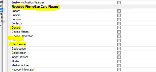
Defining a Client-side Data Cache
To define a client-side data cache, you open the Client-side Data Cache
Editor. There are two ways to open the editor. You can use the dropdown menu by
clicking the Menu button, as shown below:
Or, you can click the smart-field for the 'Client-side data cache' property
on the Properties pane in the UX builder
Client-side Data Cache Editor
The Client-side Data Cache editor, shown in the image below, shows the names
of data items in the Data Cache. The dialog show summary information about each
data item.
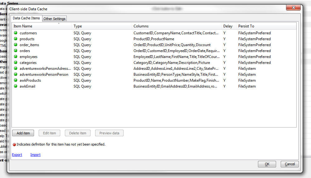
To edit an item in the Data Cache, click the 'Edit item' button, or double
click on the item in the list. This will open the Data Item editor.
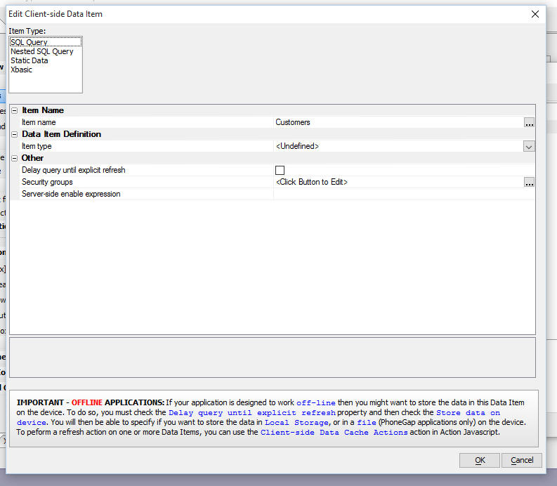
For each item you can specify:
- Item type - specify how the data for the data item are obtained.
The choices are SQL Query, Nested SQL Query, Static Data and Xbasic
- Delay query until explicit refresh - specify if the data in the
data item should only be computed after the user has issued an explicit
'refresh' command. IMPORTANT: If you want to persist the data in a
data item to a file or to Local Storage, then this option must be
checked.
- Security groups - specify the security groups for this data item.
If the user is not logged in an a member of one of the specified security
groups, the data in the data item will be empty.
- Server-side enable expression - specify a server-side expression
(typically involving session variables). If this expression evaluates to
false, the data in the data item will be empty.
Persisting Data
If the Delay query until explicit
refresh property has been
checked, the dialog shows additional properties that allow you to specify that
the data item should be stored on the device.
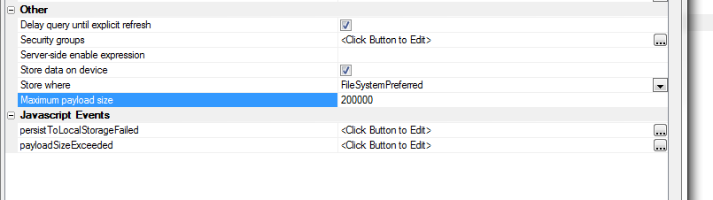
The options for Store where are:
- Local Storage - stored in Local Storage on the device. If there
is not sufficient space in Local Storage the Javascript defined in the
persistToLocalStorageFailed
property will execute.
- FileSystem - stored in a file on the device. This will only work
if the UX is running in a PhoneGap shell. (Files are downloaded to a folder
called '__AADataCache' on
the device)
- FileSystemPreferred - If the UX is running in a PhoneGap shell,
the data are stored in a file on the device, otherwise, data are stored in
Local Storage.
IMPORTANT: If you are persisting to the file system and
you are using Xbasic to generate the data for the data items, be sure to
generate properly formed JSON. For example:
[ {"name" : "fred"} ] and not
[ {name: 'fred'} ]
When Store data on
device option is checked you can specify a
Maximum payload size
property. This is the maximum size (in bytes) that a query is
allowed to return. If you specify the default value of -1 there is
no maximum. This property is designed to allow you to protect
against the user trying to download too much data to the device.
When the
Maximum payload size
property is set to some value greater than -1, the
payloadSizeExceeded
Javascript Event property is shown. You can put code in this
property to alert the user that their query for the data item
returned too much data and they they must enter a more restrictive
query.
Other Settings
If any of the data items in your Client-side Data Cache are configured to
store data in the file system on the device then you can set additional settings
in the Other Settings tab of the Client-side Data Cache editor.
These settings control whether a progress bar is shown while the device is
downloading the data from the server to be stored in files on the device.
If you are storing large amounts of data on the device you will generally
want to show the user a progress bar so that they know that something is
happening.
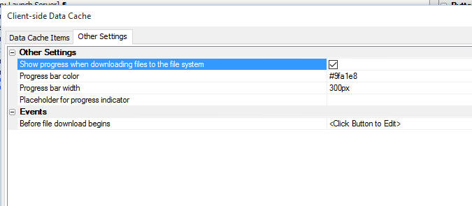
You can specify the color and width of the progress bar and you can also
specify a placeholder or an explicit element id for the position of the progress
indicator. Say for example, and element with an ID of 'progress1' and you want
to display the progress indicator in this element, you specify the
Placheholder for progress indicator
as element:progress1
Before file download begins - This event fires after the Ajax callback
to get the data for the data items that are being refreshed has completed, but
before the device actually starts downloading data.
The use case for this event is as follows:
Say you have defined a Client-side data cache with a large number of data
items, (or a few data items, some of which return a large amount of data.) The
Ajax callback to refresh all data items will take some time on the server to
complete. While the server is busy performing the queries to get the data in the
data items, the user has no indication that anything is happening. So, it is
likely that you will want to display a wait.. dialog when the user clicks a
button to refresh the data in the data items (which triggers the Ajax callback
to the server). Once the server has obtained all of the data it sends a response
back to the client telling the client to start downloading the data. At this
point the progress indicator will start moving, giving feedback to the user. The
Before file download begins
event will allow you to dismiss the wait... dialog (since it is no longer needed
-- the user can now watch the progress indicator).
Action Javascript
Action Javascript allows you to perform several actions on data items in the
Data Cache. Select the 'Client-side Data Cache Actions' action from the list of
available actions.
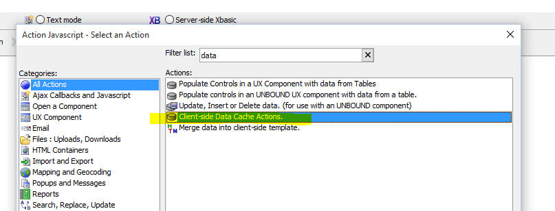
Then in the editor, select the action type:
The actions currently currently supported are:
- Refresh Data Items(s) - allows you to refresh one or more data
item. You can also select <All Data
Cache items> to refresh all items. Refreshing data cache items is an
asynchronous action. The action allows you to specify an
onComplete action that will
be called after all items have been refreshed.
- Read Data - allows you to read the data in a data item. Reading a data
item is an asynchronous action. You can specify the Javascript to run once
the item has been read. If you read an item that has been set to
Delay query until explicit
refresh and the item has not
yet been refreshed, the item will be automatically refreshed first, and then
it will be read. Once it has been read the onSuccess Javascript event is
fired and the data in the data item is available to your Javascript code in
the data variable. You can
specify an optional Filter
and Order property to
filter/sort the data in the data array before the
onSuccess event handler is
called.
Read Data Action
The builder for the Read Data action is shown below. You specify the name of
the data item you want to read and then you define the Javascript code you want
to execute once the item has been read. You code can reference
data - a Javascript array that
contains the data in the data item.
The filter allows you to define an arbitrary filter to filter the data. The
filter builder dialog is shown below. The filter is in the form of a Javascript
expression that evaluates to true or false. Fields in the data item are
referenced with the data.
prefix. In the screenshot shown below only records in London or Berlin are
included in the data array passed to the
onSuccess event handler.
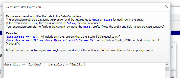
The order allows you to define an arbitrary sort order for the data in the
data array. The order builder is shown below:
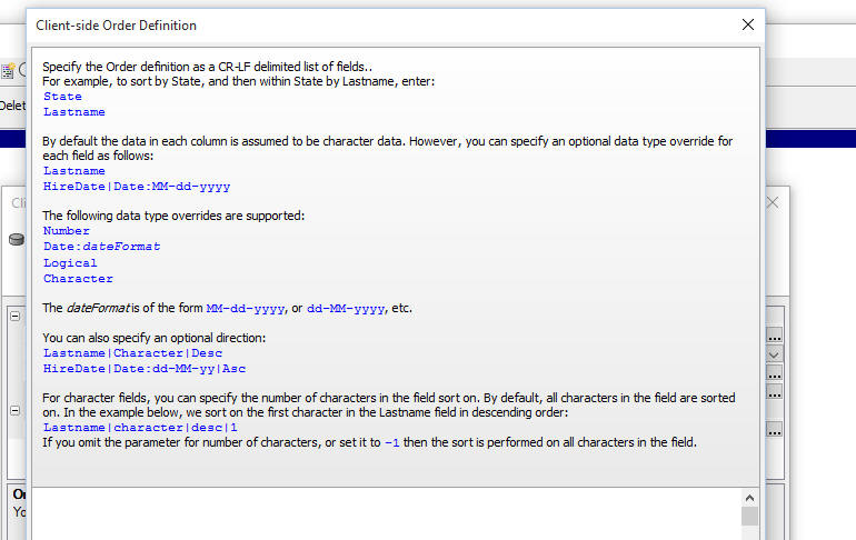
The order builder allows you to define a multi-level sort. It also allows you
to parse numeric, logical and data strings into data of the correct type so that
the data are ordered correctly. For example data values in your data cache might
be in form of date strings (e.g. 12-31-2015). In order to sort these values
correctly, they have to first be parsed into real date objects.
Data Cache Methods
The UX object has several methods for working with data items.
Refreshing Data-cache items:
{dialog.object}.refreshDataCacheItem(listOfItemsToRefresh,
onCompleteFunction)
Where:
- listOfItemsToRefresh - a comma delimited list of data items to
refresh or '*all' to refresh
all items.
- onCompleteFunction - a function to call when all of the data
items have been refreshed. Data items are refreshed asynchronously.
Reading a data-cache item:
{dialog.object}.getFromDataCache(itemName,onSuccessFunction,
onFailFunction, filter, order)
Where:
- itemName - the name of the data item to read
- onSuccessFunction - the Javascript code to execute once the data
item has been read. Reading data items is asynchronous. Your Javascript can
reference data, and array
with the data for the specified data item.
- onFailFunction - the Javascript code to execute if there was an
error reading the data item.
- filter - either a string (with a filter expression) or a function
that defines how the data should be filtered.
- order - either an object that defines how sorting should be
performed, or a function that defines a custom order definition.
Here is an example of the filter
parameter specified as a string:
var _filter = 'data.Country == "USA" || data.Country =
"France"';
Here is an example of the filter
parameter specified as a function:
var _filter = function(data) {
if(data.City == 'Boston') return true;
else return false;
}
Here are examples of the order
parameter specified as an object:
//sort by City, then by Lastname (descending)
var _order = {'City' : 1, 'Lastname': -1};
//sort a date string that is in the format MM-dd-yyyy
var _order = {'DateOfBirty:date:MM-dd-yyyy' : 1);
Here is an example of the order
parameter specified as a function:
//sorts by Lastname, then by DOB ( a date field with a
format of MM-dd-yyyy) in descending order
var _order = function(a,b) {
if(a.Lastname > b.Lastname) return 1;
else if(a.Lastname < b.Lastname) return -1;
else {
if(new
Date().fromFormat(a.DOB:date:MM-dd-yyyy,'') > new
Date().fromFormat(b.DOB:date:MM-dd-yyyy,'')) return 1;
else return -1;
}
}
UX and Grid Component - Building Real-time
Applications - Web-sockets Server - You can now build
'real-time' applications by enabling a 'web-sockets' server to
broadcast messages to all 'connected clients'.
Use cases for 'read-time' applications include:
-
Broadcasting a message to all connected clients telling them
that the server will be shutting down for maintenance
-
Real-time chat applications
-
Dashboard application where data are automatically sent to
client machines to refresh the dashboard display
-
Showing users the names of all other users who are logged into
an application.
Watch Video - Part 1
Watch Video - Part
2
Watch Video - Part
3
In a typical web-application, the server can only respond to a
request from a client. The server cannot push information to
clients. But in web-socket applications, the server and the client
can establish a permanent 'channel' that allows the server to send
messages to all of the connected clients.
In addition to the server, all of the other connected clients can
send messages and all of the connected clients will receive the
messages.
To turn on web-socket server support in your application you must
first go to the Project Properties dialog:
Then navigate to the 'Web-socket Applications' section and turn
on web-socket applications and specify the port that the web-socket
server should run on. This needs to be a different port than your
Application Server. Be sure to specify a port that is not in use.
Web-socket support must then be turned on at the individual UX or
Grid component level. For a UX component, go to the Properties Pane,
Advanced section and check the 'Web-socket
server' property.
For a Grid component, go to the Grid, Properties pane and check
the 'Web-socket server'
property.
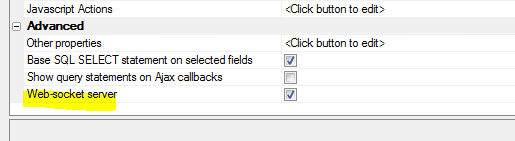
Once the 'Web-socket
server' property has been checked, when the UX or Grid
component is run, it will automatically launch the web-socket server
(if it is not already running) and it will start listening for
messages. When a message is received, the client-side
webSocketOnMessage
event will fire and your Javascript code can decide what (if
anything) to do with the message.
Web-socket Client-side Events
The UX and Grid components have method for web-socket server
applications. These methods are:
-
webSocketOnMessage - Fires when a message is received.
-
webSocketServerClose - Fires when the web-socket server
is closed
Web-socket Server - Action Javascript
Action Javascript has actions for the web-socket server. The
Web-sockets Server Actions
option allows you to perform the following actions:
-
Send a message - broadcast a message to all of the
connected clients
-
Stop listening - stop listening to broadcast messages.
Once this action is taken, if some other user, or the Alpha
server, broadcasts a message, the message will not be seen by
this component, and the
webSocketOnMessage event will not fire.
-
Start listening - start listening to broadcast messages.
Note that if the
Web-socket server property for the component is
checked, when the component is loaded, it immediately starts
listening for messages. There is no need to execute an explicit
'Start listening' command. This command would typically only be
needed to resume listening after performing an explicit 'Stop
listening' command.
-
Start web-socket server - starts the web-socket server.
Typically, if the
Web-socket server property for the component is
checked, when the component is loaded, the web-socket server is
automatically started (if it is not already running). The
exception is in a PhoneGap application where you would have to
use the action to make an explicit callback to the Alpha server
to start the web-socket server.
-
Server-side - Send a message - The client can sent a
message to all connected-clients without having to make an Ajax
callback to the Alpha server by using the Send a message
action. However, if you want to compute the message text by
calling a server-side Xbasic function, you can use this action.
An Ajax callback is made, the Xbasic function to compute the
message is called and then the server broadcasts the message to
all of the connected clients.
web_socket_server_sendMessage() Function
The
web_socket_server_sendMessage() Xbasic function can be used
to broadcast messages to all connected-clients.
The syntax is
P pResult = web_socket_server_sendMessage(C
message)
Where
pResult - object with two properties - error (.t. or .f.)
and errorText.
message - message text to send
UX Component - List Control - De-select a Row
- If a row in a List has been selected, and the List allows NULL
selection, you can now set a property to de-select the row (so that
no row is shown as selected) by clicking on the selected row a
second time.
UX Component - List Control - Loop Navigation
- You can now set a property in a List to turn on 'loop navigation'.
With loop navigation, if the last row in the List is selected and
the user presses the 'down' key, focus will go to the first row in
the list (if Loop navigate
null selection is unchecked) or will be set to NULL (if
Loop navigate null
selection is checked)
UX Component - List Control - Dynamically Set
Columns Shown in List - A new helper method has been added that
allows you to dynamically set the columns shown in a List and
populate the List with some data. The columns are based on the data
with which you are populating the List.
For example, assume you have a List and you have a Javascript
variable with this data:
[
{
"Firstname": "John",
"Lastname": "Smith",
"City": "Boston",
"State": "MA"
},
{
"Firstname": "Henry",
"Lastname": "Rhodes",
"City": "New York",
"State": "NY"
},
{
"Firstname": "Allison",
"Lastname": "Berman",
"City": "Los Angeles",
"State": "CA"
}
]
The 'columns' in the above data are Firstname, Lastname, City and
State.
You might want to populate the List with this data and
simultaneously set the display columns in the List to Firstname,
Lastname, City and State.
At some later point you might have another Javascript variable
with this data:
[
{"Name" : "Fred Smith", "Age" :
30},
{"Name" : "Tim King", "Age" : 23}
]
The 'columns' in the above data are Name and Age. You might want
to populate the same List with this data and simultaneously
set the display columns in the List to Name and Age.
The {dialog.Object}.setListColumnsAndPopulate(listName,data,options)
method can be used to populate the List and set the List
columns (based on the columns in the first row of data).
Examples:
var data = [
{
"Firstname": "Kathy",
"Lastname": "Morton",
"City": "New York",
"State": "NY"
}
];
//populate List 'mylist' with the first 3 columns in data
var ops = {columnCount: 3};
{dialog.object}.setListColumnsAndPopulate('mylist',data,ops);
//specify columns
var ops = {columns: ['Firstname','State']};
{dialog.object}.setListColumnsAndPopulate('mylist',data,ops);
AlphaDAO - ToJSONFile() Method - A new method
has been added to both the
SQL::Connection and
SQL::ResultSet object to create a file in JSON format with
the data in a query.
- Both methods are similar to their
ToJSONObjectSyntax()
counterparts in signature, but have a first argument that
is the target file path, and return a logical value (use the
CallResult
property to get error specifics).
- Both functions terminate intermediate lines with a comma and
wrap the entire file in a pair of square brackets
[] (so that the
result is a properly formed JSON array).
Example:
dim cn as sql::Connection
?cn.open("::Name::Access_Northwind")
= .T.
?cn.tojsonfile("c:\temp\cncustomer.json", "select * from customers")
= .T.
PhoneGap Shell - Memory Management - The
sample PhoneGap shell component, used for testing UX components that
use PhoneGap features, has been improved. Now, when you go back to
the menu screen to load a different UX for testing, the UX that you
were using is completely removed from memory. This will prevent the
PhoneGap shell from becoming sluggish after you have cycled back and
forth from the main menu to a test component several times.
PhoneGap Builder - Android APK Version Code
Property - A new property has been added to the PhoneGap Builder
that allows you to define the APK Version Code.
This code is required for Android apps published to the Google Play
store and it must be unique for each version/update that your submit
to Google Play. If you fail to change the APK version code, your app
submission to Google Play will be rejected.
PhoneGap Builder - 3rd Party Plugins - Camera With Exif Plugin - The Camera with Exif plugin has been added to the
PhoneGap 3rd party plugins.
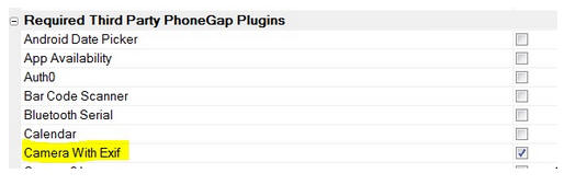
The Camera With Exif PhoneGap plugin, developed by Alpha Software,
is a modified version of the cordova-plugin-camera that provides the
addition of the EXIF and geolocation metadata to all camera and
gallery images and returns this metadata along with the image file
URI to the success callback. This allows the image metadata to be
stored to a database along with the image or the image file
reference. The metadata does not need to be parsed from the image
itself because it is included in the success callback.
See
GitHub: cordova-plugin-camera-with-exif for the full
documentation.
TIP: If you use the
Image Capture -
Camera/Photo Library action in Action Javascript and you use
the Camera with Exit plugin, then when you write the
Javascript code for the
Javascript to execute when image has been captured property,
you will be able to reference this variables in your code:
- options.EXIF.lattitude
- options.EXIF.longitude
- options.EXIF.altitude
- options.EXIF.dateTime
- options.EXIF.ExifJSON - a JSON string with all of the EXIF
data returned by the camera
PhoneGap Builder - 3rd Party Plug- ins - Media With
Compression plugin - The Media With Compression plugin has been
added to the PhoneGap 3rd party plugins.
The Media With Compression plugin, developed by Alpha Software, is a
modified version of cordova-plugin-media that provides the ability
to record and play back audio files on a mobile device. This plugin
adds MPEG4 compression to both iOS and Android audio recording,
making the recordings compatible for playback on either an iOS or
Android device and within most modern browsers. MPEG4 compression
typically results in a significant reduction in the recorded audio
file size when compared to the stock Media plugin. The reduction in
file size is required for efficient online/offline storage and
retrieval of the audio files.
See
GitHub: cordova-plugin-media-with-compression for the full
documentation.
Web security - E-mail - The data recovery options in
web security can be configured to send an email to the user with the
requested data. Previously, this process could only use an email
profile configured on the Application server. Email can now be sent
using email settings defined in the Web Security Settings, email
settings defined in the Web Project Properties, or using Mandrill in
addition to a defined profile.
UX Component - PhoneGap - Image Picker Plugin - A new
plugin is now available in the PhoneGap Builder. The Image Picker
plugin can be used to select multiple images from the Photo
Library. The typical use case for this plugin is in a disconnected
application where you want to add an image to a record, but instead
of adding one record with an associated image at a time (to a List
control with an associated Detail View), you want to select multiple
images at once and then automatically add a new record to a List for
each selected image and associate each new record with one of the
selected images.
You can watch videos demonstrating this use case here:
Watch Video - Part 1
Watch Video - Part
2
Watch Video - Part
3
The Image Picker plugin is invoked with this Javascript
function:
window.imagePicker.getPictures(successFunction,
failureFunction, options);
To see the options supported by the plugin do a Google Search on
the PhoneGap Image Picker.
Here is how the image picker is used to add a new row to a List
control for each selected image. In the code example below, the
field in the List that contains the image filename is
imageChar.
function getImages() {
var success = function(results) {
//add the selected image names to the child List.
for(var i = 0; i < results.length; i++) {
var _d = {};
_d.imageChar = results[i];
var lObj = {dialog.object}.getControl('LIST1');
lObj.addTableRow(_d);
}
}
var fail = function(error) {
}
var settings = {width: 800};
window.imagePicker.getPictures(success,fail,settings);
}
In the above example, the
imageChar field in
LIST1 should be set
to an Image control
type (on the Fields
tab in the List builder). Also, when is
LIST1 synchronized,
you can upload the selected images to either Amazon S3, or to the
Alpha Anywhere server. See the medial files property on the
Detail View tab in
the List builder for LIST1.
PDF Printing - Windows 10 - Microsoft PDF Printer -
Windows 10 includes a PDF printer driver. This printer driver can be
used instead of the Amyuni PDF printer driver that is bundled with
Alpha.
You can set Alpha Anywhere to use the Microsoft PDF printer by
going to the View/Settings menu in the Development version and then
selecting Preferences/Reports/PDF Driver.
For the Application Server there is no UI currently to set the
preferred PDF printer. Instead you can open the Interactive Window
by right clicking on the Alpha Anywhere Server icon in the system
tray and then entering these commands:
dim p as p
registry.load_settings("preferences",p)
p.reports.pdf_driver = "Name of the driver
you want to use"
registry.save_settings("preferences",p)
where 'name of the driver you want to use' one of:
AMYUNI printer driver
Microsoft Print to PDF
Microsoft XPS Document Writer
UX Component - Watermark -
Dynamically Setting the Watermark - .setWatermark() Method - A
new method has been added to controls that have a watermark property
that allows you do dynamically change the watermark text.
For example, say you have a control
called 'LASTNAME' and you want to set its watermark property.
var obj = {dialog.object}.getControl('LASTNAME');
obj.setWatermark('Enter your last
name');
In the case where the watermark text
contains international characters, you must use a unicode encoded
value. For example, to set the watermark text to 'Pr�nom',
you would use:
var obj = {dialog.object}.getControl('LASTNAME');
obj.setWatermark('Pr\u00E9nom');
TIP: To get the unicode
encoded value of a string you can go to the Tools menu when the Web
Control panel has focus and select the
Open text encoder window
menu command. The encoded string will be of this form:
Pr{unicode}00E9nom.
Replace {unicode}
with \u.
PhoneGap - PhoneGap Shell - Alpha Anywhere Developers
enjoy a very rapid design-test cycle. You can test a component you
are working on by simply going to the Working Preview or Live
Preview tab in the builder. However, when you are working on a
PhoneGap application and you want to test any PhoneGap specific
functionality in your component (such as accessing the native file
system on a device), you cannot test your application in the Working
Preview or Live Preview tab. You have to create a PhoneGap
application and then install the PhoneGap application on your mobile
device. This is a time consuming process.
Using a PhoneGap shell you can dramatically shorten this cycle.
The basic idea behind the shell is that you build the PhoneGap shell
once and install it on your device. You then dynamically load the UX
that you are developing into a Panel in the PhoneGap shell. If you
make a change to your component, you can simply click the Refresh
button on the PhoneGap shell and the new version of your component
is loaded. You don't need to submit the component to PhoneGap build.
Alpha Anywhere now ships with a sample PhoneGap shell that you
can use for testing your UX components on a device.
Watch Video - Part 1
Watch Video - Part
2
When you create a new UX component, you can select the
PhoneGap-Shell.
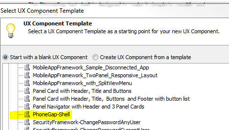
Once you have created a new UX using the PhoneGap shell template,
save the component using any name that you want. The next step
is to build a PhoneGap project from your shell UX component.
When you build your PhoneGap project it is extremely important
that you set the URL For
All Ajax Callbacks correctly. If you do not set this property
correctly, your shell will not work - it will not be able to
dynamically load the UX component that you want to test.
It is also important that you specify the plugins that your
components will need when you build the PhoneGap shell. That's
because the dynamically loaded components cannot load PhoneGap
plugins.
For example, assume that you are building a UX component that
uses the SQLite PhoneGap plugin. You will need to ensure that this
plugin is selected when you build the PhoneGap shell.
Obviously, you can't know ahead of time what plugins the
components you are going to build in the future will need. So, from
time to time you will need to rebuild your shell component to
specify a different set of plugins to load.
When you open the PhoneGap shell on your device, it will look
something like this.
Since you have not previously loaded any UX components, the list
is empty.
Click the Add button and enter the name of the UX component you
want to test.
Here is what the List will look like after entering the name of a
UX component called 'ux1'.
 '
'
Now, to run this component in the shell, simply tap on the row in
the List.
The shell will transition to a new Panel and load the component
into the Panel as shown below.
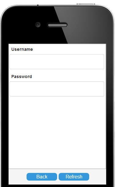
If you make any changes to the 'UX1' component that you are
testing, simply republish the component then hit the 'Refresh'
button. If you want to load a different component into the shell,
tap the 'Back' button, and add the component name to the List.
UX Component - PhoneGap File Download Action - Force Download
Property - The 'Force
download if file found on device' property allows you to
force the file(s) to be downloaded even if a file with the specified
name is already on the device. If you force download, the existing
file(s) on the device will be overwritten. Previously, if a file
with the specified name was found on the device, the source file was
not downloaded.
Bugs
AlphaDAO - MySQL - Stored Procedures - Multiple
Resutsets - If you create a MySQL stored procedure that returned
multiple resultsets, the
SQL::Resultset.nextResult() object failed. As a result you
could only read the first resultset returned by the stored
procedure.
Web Applications - Repository Database - Case
Sensitive Databases - If you configured your Web application to
use a Repository database (for example, to save searches in a Grid
component) and your defined the repository tables in a SQL database
that case case-sensitive for table and column names, saving data to
the repository did not work.
Script Editors - Windows Server 2008 - The
status bar in the Xbasic and Javascript Script editors contain
several 'hot' areas that you can click on to navigate to a line in
the script or navigate to a particular function in the script. These
'hot' areas did now work on Windows Server 2008.
UX and Grid Component - Live Preview - In some
cases if the browser you selected for Live Preview was installed as
a 64 bit program, the selected browser was not found. This is now
fixed.
UX Component - List with Detail View - Local
Storage - Minify - If the minify option was turned on to
compress the data stored in Local Storage when a List's data was
updated, under some circumstances you could be sync errors when
syncing a List's data after restoring the List data from Local
Storage.
Xbasic - Stringdictionary Object - Clearing
Existing Entries when Initializing - When the
stringdictionary
object was initialized (using its
.initialize()
method) , existing entries in the
stringdictionary
were not being cleared out. Now, they are. An optional flag has been
added to the initialize()
method to allow you to specify that existing entries should not be
cleared out.
Example:
dim map1 as c = "alpha=this is alpha"
dim map2 as c = "beta=this is beta"
dim sd as stringdictionary
sd.Initialize(map1)
?sd.get("alpha")
= "this is alpha"
?sd.get("beta")
= ""
sd.Initialize(map2) 'clear out existing entries
?sd.get("alpha")
= "" 'because existing entries were cleared
?sd.get("beta")
= "this is beta"
sd.Initialize(map1,.f.) 'do not clear out existing entries
?sd.get("alpha")
= "this is alpha"
?sd.get("beta")
= "this is beta" 'because existing entries were NOT
cleared
UX Component - Action Javascript - File Upload
Action - Repeating Section - Fixed a problem when using the File
Upload action in a Repeating Section.
UX and Grid Component - Action Javascript - Send
E-mail Action - If you used the Send-mail action multiple
times on a component, the settings for the last instance were used
for all instances.
UX Component - Image Capture - Character Fields -
PhoneGap - In a PhoneGap application if captured images were
uploaded to the Alpha Anywhere server (as opposed to Amazon S3), the
images would not render correctly after the component was refreshed.
UX Component - Image Capture - Character Fields -
Thumbnails - If you were capturing images in a character field
and you had specified that you wanted to create thumbnails for the
image and the stored filename expression for the field was <Shortname>
(as opposed to <Fieldname>), the thumbnail was not created
correctly.
UX Component - Panels - Google Map - Touch Events
- When a Google Map is displayed in a PanelCard, certain touch
events on the Map that the Google Map should have responded to were
not being seen by the Map control.
Report Preview - Two Page Preview - When you
switched to Two Page preview mode, a 'Print Progress' dialog was
displayed. This dialog could not be dismissed and should not have
been displayed.
Runtime - Debug(1) - In a Runtime application,
if a debug(1) statement was inadvertently left in some user-defined
code, Alpha would hang.
Grid Component - QBE - Hidden Columns - Fixed
a problem in the generated HTML for the QBE feature if a Grid
contained hidden columns.
Web Applications - Publishing - FTP Publishing -
History - In certain cases the History list was not being
maintained correctly when using FTP publishing. As a result of the
bug, files were published in some cases when they did not have to be
published.
UXComponent - Hierarchical Lists with Detail View
- Data Synchronization - Fixed errors that occur under certain
circumstances if the initial sync returns sever-side validation
errors and then a subsequent sync is performed after the validation
errors are corrected.
Oracle CLOB Fields - Limit of 4000 Characters -
When reading data from an Oracle CLOB field, only the first 4,000
characters were read. This is now fixed.
Xbasic CURL Genie - Fixed an issue in
converting certain CURL statements to Xbasic.
international_days_of_week() Function - This
function was returning the days in the incorrect order when with a
specific start of week day. For example:
?international_days_of_week("start-monday,short")
= Mon
Tue
Wed
Thu
Fri
Sun
Sat
UX Component - List Control - Detail View -
Synchronizing in Batches - If a UX contains List controls that
are in a parent-child hierarchy, and the parent List is configured
to synchronize data in batches, then there were errors when the data
was submitted that prevented all dirty rows from being synchronized.
This error was only if the List was set to synchronize in batches.
Grid - Export Data - Security - The export
function was not honoring security settings for columns in a Grid.
Web-Sockets Server - Fixed a bug where the
web-sockets server was not starting correctly if the user was
running the application on the default port (i.e. the URL for the
application did not specify an explicit port).
UX Component - Repeating Sections - Xbasic
Validation - Immediate Validation - Improvements were made in
how immediate Xbasic validations are performed on fields in
Repeating Sections.
Grid and UX Component - Searching SQL Databases -
'Is blank' and 'Is not blank' Search Options - The generated SQL
for the 'Is blank' and 'Is not blank' search options has been
changed to:
- <fieldname>
is NULL or stringLength(<fieldname>) = 0
- <fieldname> is NOT NULL AND
stringLength(<fieldname>) > 0
Previously, the generated SQL was:
-
<fieldname> is
NULL or <fieldname> = ''
-
<fieldname> is NOT NULL AND <fieldname>
<> ''
The change was made because in some Oracle databases the previous
generated SQL did not return the expected results. The stringLength()
function is a portable SQL function.
Alpha Anywhere Server - 500 Error - Fixed an
error that would, under some circumstances, cause the server to
crash with a 500 Error. Also improved server memory utilization.
UX Component - Data Bound - Repeating Sections - Unbound
Controls - Default Values - If you had unbound controls in a
Data Bound UX component and you had set default values for the
unbound controls, then when UX was initially rendered and the data
bound controls were set to their bound values, the unbound controls
did not show their default values. If the component did not use
Repeating Sections, this bug did not occur.
UX and Grid Component - jQuery - Internal Version - The
version of jQuery and jQuery UI that Alpha Anywhere includes when
you choose the 'built in' version have been updated to jQuery 1.11.3
and jQuery UI v 1.11.4.
UX and Grid Component - Oracle - Search for Records
that End with '_ some character' -
A user was trying to search for records in an Oracle table
that ended with '_1'.
This was failing because SQL treats the _
as a wildcard character. To perform the search the search has to be
entered as '\_'. Alpha Anywhere will
now automatically add the ESCAPE '\'
clause to the generated SQL statement for Oracle.
UX Component - Signature Capture Control - Initially Hidden
- If the Signature Capture control was initially hidden when the UX
component was rendered, but was then made visible by some
Javascript, in some cases, it did not work correctly.
UX Component - List Control - .addTableRow() Method -
Fixed issues with the .addTableRow() method when the rows were being
added to a child List control.
UX and Grid Components - Google Maps - Google made some
changes to the Google maps API fairly recently, and now recommends a
different URL to access the API. They also changed Google Premier
and now use a "key" value in the URL instead of "clientId". The
existing code added the ClientId property which has been deprecated.
The URLs generated by the UX and Grid to access the Google Maps API
have been updated to reflect the changes Google made.
Another issue occurred if the map was run on a server using SSL, but
was not set to use SSL. Most browsers blocked the request for the
API JavaScript. A change has been added to force the Google URL to
SSL if the server is using SSL in places where the link is built at
run time.
The standard public Google map access will throttle map requests,
and currently that public access limit is listed at 2,500 requests
per day.
The latest Google method to get a higher limit is to sign up for a
Google developer account (previously called Google Premier), create
a project (free), and then activate the Google Maps JavaScript API.
This will create a special API key that can be added to any Alpha
Anywhere Map configuration in the builders as the "Google Premier
ID". If you use an API key, Google tracks the number of requests,
but allows a much higher free limit, currently listed as 25,000 per
day. For large companies, they do start charging if the requests
exceed that limit. If a key is not provided, the standard public map
access will be used.
UX Component - Auto-suggest Control - Fill in Fields - The
fill in fields were only filled in if you selected from the
auto-suggest list by clicking on a row in the suggestion list. If
you typed in a matching value (and did not select by clicking on the
suggestion list), the fill-in values did not fill in.
UX Component - List Controls - List with Parent List -
Pre-fetched Data - Arguments in Child List WHERE Clause - Fixed
a bug where you would get an error after synchronizing data in a
List with a Detail View if the SQL for the List used arguments in
the WHERE clause.
Tips
AlphaDAO - Stored Procedures - Output Arguments - When you
use execute SQL statements from Xbasic using AlphaDAO it is very
common to use the SQL::Arguments object to pass parameter values to
the SQL statement that you execute. For example
dim args as sql::arguments
args.add("customerId","alfki")
dim cn as sql::connection
dim flag as l
flag = cn.open("::Name::Northwind")
dim sql as c
sql = "Select * from customers where
customerId = :customerId"
flag = cn.execute(sql,args)
In the above example, the argument (customerId) is termed an
'input' argument - it is passing a value to the database engine.
However, Alpha Anywhere also allows you to create 'output'
arguments and 'inputOutput' arguments. These argument types are used
when you want the database engine to return a value to Xbasic.
Watch Video
- Part 1
Watch Video
- Part 2
For example, consider the following (very simplistic) stored
Procedure defined in a SQL server database:
CREATE
PROCEDURE
[dbo].[output]
-- Add the
parameters for the stored procedure here
@Param1
integer
output,
@Param2
varchar(30)
output
AS
BEGIN
-- SET
NOCOUNT ON added to prevent extra result sets from
--
interfering with SELECT statements.
SET
NOCOUNT
ON;
-- Insert
statements for procedure here
set
@Param1 =
100
set
@Param2 =
'Hello world'
return
END
In this stored procedure, the parameters (Param1 and Param2) are
being set.
Here is how an Xbasic script could call the stored procedure and
get the value of the parameters set in the stored procedure:
dim args as sql::arguments
'define to arguments, 'inout' and 'inout2' as
inputOutput arguments
args.add("inout",0,sql::ArgumentUsage::inputoutputargument)
'notice that a dummy value of the correct size
needs to be defined for the argument
args.add("inout2",replicate(" ",40),sql::ArgumentUsage::inputoutputargument)
dim cn as sql::Connection
cn.open("::Name::sqlserver_northwind")
'call the stored procedure and pass in the two
argument values
?cn.Execute("exec output :inout, :inout2",args)
= .T.
?args[1].data
= 100
?args[2].data
= "Hello world"
If the size of the argument is not big enough then when you
execute the stored procedure you might get an error like this:
?cn.CallResult.text
= "Internal Error - Data Truncated - The buffer for receiving data
is too short"
In some cases your stored procedure will also return one or more
resultsets in addition to setting the value of output arguments.
Depending on the database you are using you might have to read
each of the returned resultsets before you can read the values in
the output arguments.
For example, consider the following modification to the above
stored procedure:
CREATE
PROCEDURE
[dbo].[output]
-- Add the
parameters for the stored procedure here
@Param1
integer
output,
@Param2
varchar(30)
output
AS
BEGIN
-- SET
NOCOUNT ON added to prevent extra result sets from
--
interfering with SELECT statements.
SET
NOCOUNT
ON;
-- Insert
statements for procedure here
set
@Param1 =
100
set
@Param2 =
'Hello world'
select
*
from
customers
select
*
from
orders
return
END
This stored procedure now returns two result sets.
Below is the Xbasic to execute the stored procedure and get the
values from the output arguments:
dim args as sql::arguments
args.add("inout",0,sql::ArgumentUsage::inputoutputargument)
args.add("inout2",replicate(" ",50),sql::ArgumentUsage::inputoutputargument)
dim cn as sql::Connection
cn.open("::Name::sqlserver_northwind")
?cn.Execute("exec output :inout, :inout2",args)
= .T.
'value of the output arguments not yet available
because we have
'not read the resultsets
?args[1].data
= 0
?args[2].data
= ""
dim rs as sql::ResultSet
rs = cn.ResultSet
'still not available
?args[1].data
= 0
?args[2].data
= ""
'get the next resultset
?rs.NextResult()
= .T.
'still not available
?args[1].data
= 0
?args[2].data
= ""
'no more resultsets to read
?rs.NextResult()
= .F.
'argument value are now available!!
?args[1].data
= 100
?args[2].data
= "Hello world"
Web Applications - Windows 10 - Acrobat PDF Viewer - Internet
Explorer 11 - Unlike Chrome and Firefox, Internet Explorer 11
does not have a built-in PDF viewer and therefore it relies on Adobe
Acrobat Reader to display PDF files. On some machines, when you try
to view a PDF report in IE, Acrobat will not open. You will need to
turn off 'Enhanced Protected Mode' in IE11 to solve this problem.
For more information, see this
post.
UX Component - Panel Cards - Vertically Centering a Container
- A common requirement when building mobile applications is to
vertically (and horizontally) center content in a Panel Card.
Watch Video
Download Component
For example, in the image below, the content in the blue frame is
always vertically and horizontally centered, regardless of the
device orientation.
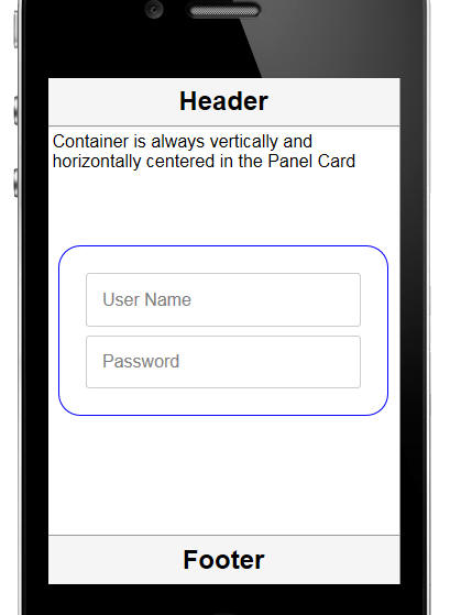
This is achieved by putting the following code in the onSize
event of the Panel Card that contains the container.
Assume that the content to be centered is in a container called
CONTAINER_1 and that the in-line style on this container has been
set to 'visibility: hidden'. Setting the visibility to hidden will
prevent the container from being seen until it is correctly
positioned.
if({dialog.object}) {
var p = $(this.contId + '.BODY');
var v = {dialog.object}.getPointer('CONTAINER_1');
var ph = p.offsetHeight;
var vh = v.offsetHeight;
var pw = p.offsetWidth;
var vw = v.offsetWidth;
var offsetH = (ph-vh)/2;
var offsetW = (pw - vw)/2;
v.style.left = offsetW + 'px';
v.style.top = offsetH + 'px';
v.style.visibility = '';
v.style.position = 'absolute';
}
Windows 10 - Default Printer - PDF Printing - When you
save a report as a PDF, Alpha Anywhere uses the special 'AlphaFive'
printer driver that is automatically installed with Alpha Anywhere.
After the report has been saved to PDF the default printer (that was
defined before the report was saved) is restored. On Windows 10 this
does not work because of a change Microsoft made. After the report
has been saved to PDF, the default printer is now set to the
AlphaFive printer. To disable this new Microsoft feature,
see this document.
AlphaDAO - Microsoft Access - Can't Load ODBCJI32.dll Error
- If you have installed Office 365 on your computer you might find
that you can no longer connect to a Microsoft Access database.
To fix the error you will have to install the Microsoft Access
Database Engine.
Here is a
link to the installer on the Microsoft site.
If you already have the Microsoft Access Database Engine
installed, then running a 'Repair' on the engine should fix the
problem.
Working with XML Data in Xbasic - JSON_from_XML() Function
- Xbasic has extensive support for parsing XML data. However in some
cases, the Xbasic XML parsing features are too granular and you
might want a quick and simple way to convert an XML document into an
Xbasic object (i.e. dot variable). The
xml_from_json()
function provides such a mechanism.
Here is an example of some simple XML that is first parse into a
JSON string which is then parsed into an Xbasic object using the
json_parse()
function.
dim xml as c
xml = <<%html%
<customers>
<customer>
<name>Dion Jones</name>
<city>Boston</name>
<more attribute1="val attr1"
attribute2="val attr 2">More for Dion Jones</more>
</customer>
<customer>
<name>Donald Trumpet</name>
<city>Washington</name>
<more attribute1="val attr1"
attribute2="val attr 2">More for Donald Trumpet</more>
</customer>
</customers>
%html%
dim json as c
json = json_from_xml(xml)
json = json_reformat(json)
showvar(json)
dim p as p
p = json_parse(json)
UX Component - Radio Button and Checkbox Controls - Render as
Button List - Right to Left - For languages that use
right-to-left text, when you render a radio button or checkbox
control as a Button List, you might want the Button List to render
as shown below (text right aligned and icon to the right of the
text).
In the property sheet for the Radio Button or Checkbox, set a
custom class name for the 'Class name - choices' property.
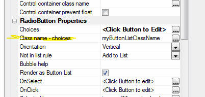
Then, in the CSS for the component, define this custom class as
follows:
.myButtonListClassName {
direction:rtl;
text-align:right !important;
}
UX Components - List Control - Nested Lists - Hierarchical
JSON Data from SQL Tables - If you want to display a List
control with nested Lists (ile. when the user selects an item in the
List, the List is repopulated with that item's child data), you
typically define JSON data for the List using this format:
Watch Video
Download Component
[
{
display: 'Menu1',
children: [
{
display: 'Menu1_A',
action: 'Action_1'
},
{
display: 'Menu1_B',
action: 'Action_2'
},
{
display: 'Menu1_C',
action: 'Action_3'
}
]
},
{
display: 'Menu2',
action: 'Action_4'
},
{
display: 'Menu3',
action: 'Action_5'
}
]
In some cases you might want to generate this JSON data by
querying a SQL database. This is easily done by using the
a5_xbasicTreeToJSONTree()
function.
For example, consider the following Xbasic string which defines a
tree structure in Xbasic syntax:
dim txt as c
txt = <<%str%
MA.Boston.Smith
MA.Boston.Jones
MA.Cambridge.King
CA.Los Angeles
%str%
json = a5_XbasicTreeToJSONTree(txt,".","display")
The syntax for the
a5_XbasicTreeToJSONTree() function is:
a5_XbasicTreeToJSONTree(c XbasicTreeDefinition,
c delimiter [, c propertyName])
This will generate a JSON string in this format:
[
{
"display": "MA",
"children": [
{
"display": "Boston",
"children": [
{
"display": "Smith"
},
{
"display": "Jones"
}
]
},
{
"display": "Cambridge",
"children": [
{
"display": "King"
}
]
}
]
},
{
"display":
"CA",
"children": [
{
"display": "Los Angeles"
}
]
}
]
With this understanding of how the
a5_XbasicTreeToJSONTree()
function works, it is easy to see how to generate the JSON from a
SQL database. The key is to simply define a query that returns data
in the Xbasic tree format and then call the
a5_XbasicTreeToJSONTree()
function.
For example, to generate data that displays a list of Countries,
Cities and Contact Names, you can use this Xbasic:
dim cn as sql::Connection
cn.open("::Name::northwind")
dim sql as c
sql = "SELECT Country, City, ContactName FROM Customers ORDER BY
Country"
dim flag as l
cn.PortableSQLEnabled = .t.
flag = cn.Execute(sql)
dim rs as sql::ResultSet
rs = cn.ResultSet
dim txt as c
'generate the Xbasic tree format data using a
| as the delimiter
txt = rs.ToString(-1,-1,.t.,"|")
dim json as c
'generate the JSON tree specifying the | as
the delimiter and 'display' as the property name
json = a5_XbasicTreeToJSONTree(txt,"|","display")
Reports - Calculated Fields - User Defined Expressions - Slow
Performance in Report Design Mode - A common pattern in reports
is to define calculated fields that use user defined functions.
Sometimes these functions are quite complex and because the
functions get evaluated repeatedly when you are design mode, the
performance of the report designer is degraded.
You can easily solve this problem by adding code to your user
defined functions that cause the functions to exit when you are in
report design mode.
For example, say you have a calculated field that references a
function defined as follows:
function my_report_calc_field as ()
'some code here that does a
database query
my_report_calc_field =
"function return value"
end function
You can rewrite this function as follows:
function my_report_calc_field as ()
if
eval_valid("topparent.window_title") then
'in report design mode, so bail out
my_report_calc_field = "some dummy return value"
exit function
end if
'some code here that does a
database query
my_report_calc_field =
"function return value"
end function
Reports - Calculated Fields - User Defined Expressions - 1024
Character Limit - A common patter in reports is to define
calculated fields that use user defined functions. In some cases the
function might return a long value. However, calculated fields have
a limit of 1024 characters.
You can easily work around this limit by converting the
calculated field to an HTML type. For example, suppose you have a
function that returns a long string of text. You could define your
calculated field in the report as follows:
myCalcField = *mime_object("html",myFunction())
UX Component - Columnar Lists Not Displaying Correctly -
If a List control is initially hidden when the UX is rendered, and
then it is later shown (for example, using some Javascript that
shows the container in which the List is contained), the List will
not display correctly (if the List is defined as a columnar List as
opposed to a free-form layout List). In order to get the List to
display correctly you must refresh it. For example:
var lObj = {dialog.object}.getControl('name of
your list');
lObj.refresh();
In many cases when you build your UX, Alpha Anywhere will be able
to detect automatically that a List is not displayed when the UX is
initially rendered and it will automatically generate the code to
refresh the List when it is shown (for example, if you put a List on
Pane number 2 of a Tab control, the List is not initially shown, bug
when Pane 2 is given focus, the List is automatically refreshed).
However, there are cases where it is not possible for Alpha Anywhere
to detect this and you will need to add the refresh code yourself.
NOTE: Lists that use a free-form layout do
not need to be refreshed when they are shown.
UX Component - PhoneGap - Disconnected Applications - Storing
Read-only Data in the Device File System - When you build
applications that are designed to be used while you are
disconnected, you typically load the data that you want to have
while you are disconnected into List controls and then you set these
List control to persist the data to Local Storage.
TIP: You can download a working example of
the component described in this topic
here. You can also watch a video tutorial on the steps.
Watch Video - Part 1
Watch Video - Part 2
Watch Video - Part 3
Watch Video - Part 4
Watch Video - Part 5
Watch Video - Part 6
Watch Video - Part 7
Watch Video - Part 8
Watch Video - Part 9
However, if your application is designed to be run in a PhoneGap
shell, then you can store the 'read-only' data in your application
in the file system on a mobile device. Only the editable data needs
to be stored in List controls. By storing the 'read-only' data in
the file system, you leave more of the available space in Local
Storage for your editable data.
NOTE: The technique described here is
different from linking in a static Javascript file in the
Javascript linked files
property in the UX component. You certainly can include read
only data in linked Javascript files, but after the PhoneGap
application has been built, you will not be able to refresh the data
in the Linked files. The technique described here allows the user to
click a button at any time to make a callback to the server to
refresh the data that is stored in the mobile device's file system.
When the user wants to update the 'read-only' data stored on
their device, you might perform the following steps:
- Make an Ajax callback to the server. Include data in the
callback describing what data you want to load onto the device.
Include with the callback data the name of the file in the file
system on the mobile device where the data should be saved.
NOTE: When you define an Ajax callback you can specify
'additional data' to be sent to the server when the callback is
made. Assume that you want to store the data in a file called 'data1.json'
on the device. If you are using Action Javascript to define this
Ajax callback, you would set the 'Additional
data to submit' property to '_filename=data1.json'.
- The Xbasic function that handles this callback will perform
the necessary database queries to get the data. The function
will create a file that contains this data (in JSON format) and
will store the file as a temporary session file. (See 'The
Xbasic Function to Handle the Ajax Callback' below for
details)
- The Xbasic function will send a response back to the client
with the URL of the temporary session file and call a Javascript
function that uses the PhoneGap File Transfer plugin to
download the temporary file from the server (using the URL that
the Ajax callback returned). Once the file has been retrieved,
it will be stored in a file in the file system on the mobile
device. (NOTE: You don't have to write the code to use
the PhoneGap File Transfer plugin yourself - there is an Action
in Action Javascript that will write the code for you. See below
for more details).
Now that the data is in a file, you can use PhoneGap to read the
file into memory. Once the file has been read into memory, you can
call the JSON.parse()
Javascript function to crate a Javascript object with the
data and your UX component can then use this data as needed.
The Xbasic Function to Handle the Ajax Callback
The Xbasic function that handles the callback to fetch data from
the server will have to create a file with data in JSON format. Here
is an example of what the file might look like:
{
"table1" : [
{
"field1" : "alpha", "field2" : "beta"},
{
"field1" : "alpha", "field2" : "beta"},
{
"field1" : "alpha", "field2" : "beta"}
],
"table2" : [
{
"field1" : "a", "field2" : "b", "field3": "c"},
{
"field1" : "d", "field2" : "e", "field3": "f"}
]
}
Notice that the file is in JSON format. In this case, the file
defines two objects (you can think of these as 'tables') called
'table1' and 'table2'. 'table1' has 3 records and each record has
these fields: field1 and field2. 'table2' has 2 records and these
fields: field1, field2, field3
This file must then be stored as a session file so that the
client (i.e. the mobile device) can download it from the server.
Assume that you used Action Javascript to define the the Ajax callback
and that in the action definition you specified that the
name of the Xbasic function to handle the callback was
xb_getData. Assume
also that you specified
Additional data to submit
as '_filename=data1.json'.
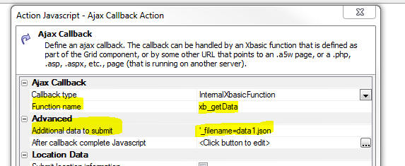
Here is
how xb_getData()
might be defined.
Function xb_getData as c (e as p)
'in this example the json data is statically
defined.
'in a real-world case you would likely execute
database queries here to generate the json
dim json as c
json = <<%txt%
{
"table1" : [
{
"field1" : "alpha", "field2" : "beta"},
{
"field1" : "alpha", "field2" : "beta"},
{
"field1" : "alpha", "field2" : "beta"}
],
"table2" : [
{
"field1" : "a", "field2" : "b", "field3": "c"},
{
"field1" : "d", "field2" : "e", "field3": "f"}
]
}
%txt%
'get a temporary filename
dim tempFn as c
tempFN =
request.GetRequestTempFileName(".json")
'save the json data to the temporary file
file.from_string(tempFn,json)
'get the filename to use from the 'additional
data' submitted by the ajax callback
dim clientSideFileName as c
if eval_valid("e._filename") then
clientSideFileName =
e._filename
else
'user did not specify the
client-side filename in the Ajax callback
'so generate a random
filename
clientSideFileName = remspecial(api_uuidcreate()) + ".json"
end if
'now put the temporary file into session
storage
session.SaveFileToSessionFile(tempFN,clientSideFileName)
'get the URL for this session file
dim url as c
url = Session.FormatFileDataURL(clientSideFileName)
'construct the Javascript response that will
be sent to the client
'note that we specify that a function called
'fetchFile()' should be called
'on the client-side with the name of the URL
that points to the temporary
'file in session storage. This 'fetchFile()'
function is a user-defined
'Javascript function that you will need to
add to your UX component
dim js as c
js = js + "fetchFile('" + js_escape(url) + "');"
'return the javascript code
xb_getData = js
End function
At run-time, the user might click a button to trigger the Ajax
callback. The Xbasic function will prepare the file and then send a
response back to the client (i.e. the browser) and call a function
(called 'fetchFile' in this example).
Here is how the fetchFile function could be initially defined (in
the Javascript functions section of the UX) to test that the Ajax
callback is working:
function fetchFile(url) {
alert('Server has prepared this
file: ' + url);
/*
eventually, we will put the Javascript here to make a
callback to the server to fetch the file
however, in the mean time, we are just going to store the URL
in a
variable so we can reference it from another function
*/
{dialog.object}._urlToDownload
= url;
}
Flushing out the 'FetchFile' Action
In order to fetch the file from the server and store it in the
file system on the device we can use Action Javascript to get
started.
Add a temporary button to your UX (label it 'Fetch File') and
then use Action Javascript to define the button's
onClick action.
Select the PhoneGap - File
Download action.
NOTE: The reason for putting the temporary
button on the UX is so that we can use Action Javascript to assign
an action to this button and then copy the generated Javascript.
This is easier than writing the Javascript by hand.
The genie for this action will open:
The builder allows you to specify the names of the files on a
remote server (in this case the Alpha Anywhere server) that you want
to download. You do this by specifying the name of a Javascript
function that will return an array of filenames.
You can specify the name of the folder on the device where the
downloaded file(s) should be stored.
The 'Force download if
file found on device' property allows you to force the file(s)
to be downloaded even if a file with the specified name is already
on the device. If you force download, the existing file(s) on the
device will be overwritten.
You can also specify if you want to display a progress bar while
the files are being downloaded. Since you might be downloading large
files or many files, displaying progress to the user is always a
good idea.
Finally, you can specify some Javascript to execute once the
file(s) have been downloaded and stored in files on the device.
Set the 'Files to
download Javascript Function' property to 'getFiles'
and add this function to the Javascript functions in the UX
component.
function getFiles() {
/*
recall
that in the fetchFile() function we put
the url
in a temporary variable (called _urlToDownload)
in the
UX object
*/
var url = {dialog.object}._urlToDownload
/*
this
function must return an array of filenames, so
put the
url into an array
*/
return [url];
}
We can add a
[Placeholder] control to the UX and set the 'Placeholder
for progress indicator' to the name of our placeholder.
Finally, we can set the 'On
Download Complete (all files)' property to some Javascript
code. Let's set it temporarily to this:
alert('File was downloaded');
After you have filled in all of the properties that you need to
fill in in the PhoneGap File Download genie, click the OK button.
Here is the Javascript code that was generated to download a file on
the server (specified by a URL) and store that file in local file on
the mobile device.
Note: To see this code, click the View
Javascript button in Action Javascript editor.
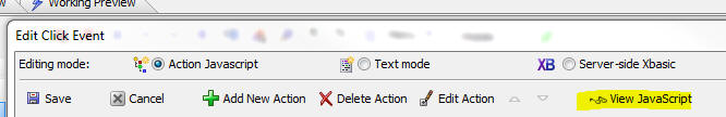
var _list = window['getFiles']();
var arr = [];
for(var i = 0; i < _list.length; i++) {
arr.push( {filename: _list[i]} );
}
var options = {
targetFolder: '__myAlphaFiles',
showProgress: true,
forceDownloadIfFileExists:
false,
onComplete: function(array) {
alert('file was downloaded');
},
onError: function(array,arrayIndex) {
alert('error');
},
progress: {
color: '#9fa1e8',
width: '300px',
allowCancel: false,
progressElement: '{dialog.componentname}.V.R1.PLACEHOLDER_1'
}
}
{dialog.object}.phoneGapFileDownload(arr,options);
Next, we need to write some Javascript that will read the
contents of the file that has been stored on the mobile device.
Again, rather than write this Javascript by hand, we will use the
same technique we just used - add a temporary button to the UX and
then use Action Javascript to set the button's action. We will be
using the PhoneGap - File System Actions action to define this
action.
Add a temporary button to the UX (label it 'Read file') and
select the PhoneGap - File System Actions action. The builder for
this action will then open.
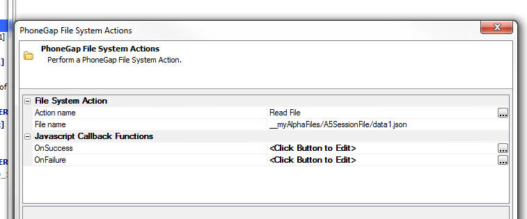
The PhoneGap File System Actions genie allows you to select from
many different types of actions (such as read file, delete file,
read directory, delete directory, etc.). Set the
Action name to
Read File.
Next, set the Filename
to __myAlphaFiles/A5SessionFile/data1.json.
Recall that when you defined the File Download action you
specified __myAlphaFiles
as the folder where the downloaded file(s) were to be stored. Recall
also, that when we made the Ajax callback to create the file of JSON
data we specified that the file should be called
data1.json. Our
Xbasic function that handled the callback created the JSON file and
then added it to temporary session storage using the name
data1.json as the
key. Our Xbasic function then called the
Session.FormatFileDataURL()
method to get a URL for this session file. The format of the
URL that this function returns has
A5SessionFile/ as a
prefix. So, the actual name of the file that is stored in the file
system on the device is not
__myAlphaFiles/data1.json as you might have expected, but is
instead __myAlphaFiles/A5SessionFile/data1.json.
The OnSuccess
property allows you to specify the Javascript to run once the file
has been read and the
OnFailure property allows you to specify the Javascript to
run if the file cannot be read.
The onSuccess
function can refer to a variable called data, which contains the
contents of the file that was read. The data that was read will be a
string in JSON format, so we will need to use the Javascript
JSON.parse() function to turn it into a Javascript object.
Edit the onSuccess
property and enter this Javascirpt:
var _d = JSON.parse(data);
var _dt = '';
for (var tableName in _d) {
_dt = _d[tableName];
var msg =
'Rows in table \'' + tableName + '\': ' + _dt.length;
alert(msg);
}
Here is what this code does.
- Parse the string of data in
data into a
Javascript object called
_d .
- Loop over all of the properties in the
_d object. The
properties in this object should be 'table1'
and 'table2'.
- Get an object for the table
_dt = _d[tableName].
This object will be an array containing the rows of data in the
table. Get the number of rows in the table and alert it in a
message that says (for example)
Rows in table 'table1'
: 3.
You can set the
onFailure code to
alert('could not read file');
After you have completed filling in the genie, click ok and then
view the generated Javascript. The generated code will look like
this:
{dialog.object}.phoneGapReadFile('__myAlphaFiles/A5SessionFile/data1.json',function(data)
{
var _d = JSON.parse(data);
var _dt = '';
for (var tableName in _d) {
_dt = _d[tableName];
var msg = 'Rows in table \'' + tableName + '\': ' + _dt.length;
alert(msg);
}
},function() {
alert'Could not read file');
}
)
Putting it All Together
At this point we have separate buttons for:
- Making the ajax callback to prepare the file of JSON data
- Downloading the file of JSON data and store it in a file on
the device.
- Reading the file and process the data.
Ideally, we would like to combine all of this into a single
action so that the user can click a button, which makes a callback
to the server and then the file is automatically downloaded to the
device, read and processed.
As you will recall, the whole client-side process starts when the
Ajax callback completes and it calls the 'fetchFile'
function which is current defined as follows:
function fetchFile(url) {
alert('Server has prepared this
file: ' + url);
/*
eventually, we will put the Javascript here to make a
callback to the server to fetch the file
however, in the mean time, we are just going to store the URL
in a
variable so we can reference it from another function
*/
{dialog.object}._urlToDownload
= url;
}
Also recall that when we created a button to download the file
from the server and we then examined the code to download the file,
the generated code looked like this:
var _list = window['getFiles']();
var arr = [];
for(var i = 0; i < _list.length; i++) {
arr.push( {filename: _list[i]} );
}
var options = {
targetFolder: '__myAlphaFiles',
showProgress: true,
forceDownloadIfFileExists:
false,
onComplete: function(array) {
alert('file was downloaded');
},
onError: function(array,arrayIndex) {
alert('error');
},
progress: {
color: '#9fa1e8',
width: '300px',
allowCancel: false,
progressElement: '{dialog.componentname}.V.R1.PLACEHOLDER_1'
}
}
{dialog.object}.phoneGapFileDownload(arr,options);
So let's take this code and inject it directly into the
fetchFile()
function. We know the url of the file that needs to be downloaded
(it is passed into the
fetchFile() function), so we don't need to call the
getFile() function
as we did previously. The
fetchFile() function will become:
Let's change this function to:
function fetchFile(url) {
/*
we need to put the url into an
array of objects where the filename is
specified by the 'filename'
property.
*/
var arr = [];
arr.push({filename: url})
var options = {
targetFolder: '__myAlphaFiles',
showProgress: true,
forceDownloadIfFileExists: false,
onComplete: function(array) {
alert('file
was downloaded');
},
onError: function(array,arrayIndex) {
alert('error');
},
progress: {
color:
'#9fa1e8',
width:
'300px',
allowCancel:
false,
progressElement: '{dialog.componentname}.V.R1.PLACEHOLDER_1'
}
}
{dialog.object}.phoneGapFileDownload(arr,options);
}
The next step is to replace the
onComplete code
above, which current simply does:
alert('file was downloaded');
with the code that reads and processes the JSON file.
As you will recall when we defined the action to read the file
and then examined the generated Javascript, the code to read the
file was:
{dialog.object}.phoneGapReadFile('__myAlphaFiles/A5SessionFile/data1.json',function(data)
{
var _d = JSON.parse(data);
var _dt = '';
for (var tableName in _d) {
_dt = _d[tableName];
var msg = 'Rows in table \'' + tableName + '\': ' + _dt.length;
alert(msg);
}
},function() {
alert'Could not read file');
}
)
We need to simply replace the codeblock that says
alert('file was
downloaded'); with the above code block. However, rather than
simply injecting the read file code into the
onComplete event
let's wrap the code that read the file in a function and then call
this function in the
onComplete event.
So we have:
function readFileAfterDownload() {
{dialog.object}.phoneGapReadFile('__myAlphaFiles/A5SessionFile/data1.json',function(data)
{
var _d = JSON.parse(data);
var _dt = '';
for (var tableName in _d) {
_dt = _d[tableName];
var msg = 'Rows in table \'' + tableName + '\': ' + _dt.length;
alert(msg);
}
},function() {
alert'Could
not read file');
}
)
}
And the fetchFile()
function becomes:
function fetchFile(url) {
/*
we need to put the url
into an array of objects where the filename is
specified by the
'filename' property.
*/
var arr = [];
arr.push({filename: url})
var options = {
targetFolder: '__myAlphaFiles',
showProgress: true,
forceDownloadIfFileExists: false,
onComplete: function(array) {
readFileAfterDownload();
},
onError: function(array,arrayIndex) {
alert('error');
},
progress: {
color:
'#9fa1e8',
width:
'300px',
allowCancel:
false,
progressElement: '{dialog.componentname}.V.R1.PLACEHOLDER_1'
}
}
{dialog.object}.phoneGapFileDownload(arr,options);
}
UX Component - Abstract Events - Tweaking Settings - For
mobile applications built with the UX component, several abstract
events, such as tap, double tap, swipe, etc. are implemented. In
certain cases you might want to customize aspects of the way these
abstract events are implemented. For example, you might want to:
- change how 'fast' a user must 'swipe' on the screen before a
'swipe' event is fired
- change how long a user must hold down on the screen before a
'downHold' event is fired
- change how far a user must drag in order to prevent a 'tap'
event from firing
This can be done by setting properties on the
$e.abstractEvents
object. You could, for example, set these properties in the
onRenderComplete
client-side event.
Examples:
//if the user's finger moves by more than
20px after touching the screen, the 'tap' event will not fire.
$e.abstractEvents.tap.wiggle = 20
//if the user puts a finger on an element
that has a 'click' event handler and then scrolls the screen by
//more than 20px, the 'click' event will
not fire.
$e.abstractEvents.click.scrollMax = 20
//if the time between the first tap and
the second tap is less than 600ms, a 'dblTap' event will fire.
$e.abstractEvents.dblTap.duration = 600
$e.abstractEvents.dblClick.duration = 600
//see dblTap example
//if you hold down on an element for less
than 600ms the 'downHold' event will not fire
$e.abstractEvents.downHold.duration = 600
//if you hold down on an element for more
than the 'downHold' duration, but move your finger
//by more than 10px after you touch the
screen, the 'downHold' event will not fire
$e.abstractEvents.downHold.wiggle = 10
//specify the 'swipe' velocity - a
smaller value will mean that a less 'dramatic' gesture is needed
//to register a 'swipe' event on an
element
$e.abstractEvents.swipe.velocity = .75
Alpha Anywhere V3.5 -
Build 2999-4519 28-Jul-2015
Bugs
UX Component - Captcha Controls - Captcha control got
broken in build 2970. This is now fixed.
Editors - Horizontal Scroll Bar - Various editors in the
Development version (e.g. code editor, CSS editor, etc.) did not
automatically display a horizontal scroll bar if the current line in the
editor too long to display in the window.
Alpha Anywhere V3.5 -
Build 2991-4518 24-Jul-2015
Features
CSS Icons - Google Material Design Icons - The open source
Google Material Design icon set is now included with Alpha Anywhere.
When you select an image, and you select the 'Css Icon' category, in
addition to the built-in 'FontAwesome' category, there is now a new
category called 'MaterialIcons'. There are over 700 icons in the
Material Design icon set.
Bugs
UX Component - List Control - Custom Data Source - Pagination -
Fetch More - If the Xbasic function for the custom data source set
the e.fatalError flag to .t. the 'Fetch More' button in the List was not
turned off.
Trial Version of Alpha Anywhere - If a user was using Alpha
Anywhere in trial mode (i.e. they did not have a license key), certain
features of the product that should have been enabled were incorrectly
disabled.
Alpha Anywhere V3.5 -
Build 2988-4516 22-Jul-2015
Features
UX Component - PhoneGap Applications - Setting Default
Properties for the PhoneGap Genie - When you build a PhoneGap
application it is critical that you turn on all of the required
plug-ins for your application in the PhoneGap Build Project Settings
genie.
Now, a new property in the UX Builder allows you to specify that
certain PhoneGap settings should be automatically set when a
PhoneGap application is built using a particular component.
When you click the smart field for the
PhoneGap default settings
property, a dialog is shown where you can set certain PhoneGap
Builder properties. When you open the PhoneGap genie, the
corresponding properties in the builder will automatically be set.
UX Component - List Builder - Refresh Database Schema - By
default when you edit a List that is based on one or more SQL
tables, the database schema information is refreshed every time you
click OK to exit the List builder. In most cases, if your database
is local, the time taken to refresh the database schema is
negligible. However, if your List is based on one or more tables in
a remote SQL database, the time taken to refresh the schema can be
significant.
A new property
Automatically refresh database schema on edit allows you to
turn off the automatic refresh of schema information when the List
builder is opened. If you subsequently change the structure of any
of the tables that the List is based on you should click the 'Refresh
Database Schema' link shown below.
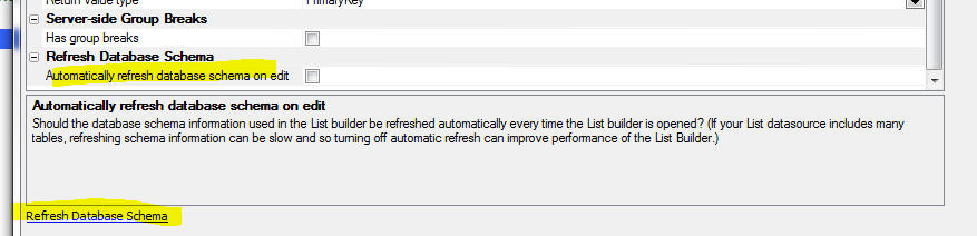
type::Definition::Exists()
- Check if a namespace exists
- Check if a type in a specified namespace exists.
Syntax
L flag = type::Definition::Exists("mynamespace::mytype")
This method is particularly useful for checking if a .NET dll has been
successfully registered.
UX Component - List Control -
SQL Data Source - Group By in SQL - Filter List - If a List
control is based on a SQL statement that uses the GROUP BY clause
and the UX contains a button to filter the list, if a filter is
defined on any of the summary fields in the SQL statement, an
appropriate HAVING clause will now be generated.
UX
and Grid Component - Class Name Selector - Filter - When you
bring up the Class Name selector dialog you can now filter the list
of CSS class names to make finding the class name you want easier.
Bugs
UX and Grid Component - Javascript Actions - Filter
List Of Actions - If you opened the Javascript Actions dialog
and you applied a filter to filter the list of actions shown in the
window, then clicked the OK button without first clearing the
filter, the actions that were excluded by the filter were
permanently deleted.
UX Component - Pre-render at Design-Time - {dialog.object}.getParentObject()
- If a child UX (that is pre-rendered at design-time) was opened
by a parent Grid or UX component, the
{dialog.object}.getParentObject()
method did not return the correct value.
UX Component -
Pre-render at Design-Time - Session Timeout Warning - Was not
working if the UX was pre-rendered at design-time.
UX Component
- Pre-render at Design Time - 3rd Party CSS Icons - Working Preview
- If your UX included any 3rd party CSS icons (e.g. FontAwesome,
Fontello, etc.) these icons did not display in working preview if
the UX was pre-rendered at design-time.
UX Component
- Spin Lists - Percentage Width - If the width of a Spin List
control was set to a percentage value (e.g. 50%), the width setting
was not correctly applied. NOTE: To see the fix you will need to
edit any property on the Spin List control to cause the generated
code to be recalculated.
Tips
UX Component - Google Map - Getting a Pointer to the Low Level
Map Object - The UX component allows you to place a Map control
on the UX. Alpha Anywhere creates a map object that has many methods
(such as placing markers on the map). Behind the scenes, the Alpha
Anywhere map object just calls methods of the underlying Google Map
object.
In some cases you might want to get a pointer to the underlying
Google map object so that you can invoke methods on it directly. For
example, you might have read about some feature in the Google
Map API documentation that is not implemented in the Alpha
Anywhere map object. Getting a pointer to the underlying Google Map
object will allow you to implement any feature you might read about
in the Google Map API documentation.
Here is how you can
get a pointer to the Google Map object:
//
get a pointer to the Alpha Anywhere map object
//assume your map control is called 'MYMAP1'
var
mObj = {dialog.object}.getControl('MYMAP1');
//now
get a pointer to the underlying Google Map object
var gMap = mObj.map;
Alpha Anywhere V3.5 -
Build 2970-4510 14-Jul-2015
Videos
|
UX Component |
File Upload to Amazon S3 Storage |
Amazon S3 is a popular service for storing
files. In this video we show how you can build a
UX component that allows a user to upload files
from their machine directly to S3 storage.
Watch Video
- Part 1
Watch Video
- Part 2
Download Component
Date added: 2014-12-31
In this next vide we show how you can make an
Ajax callback after all of the files have been
uploaded. By making an Ajax Callback this action
can be used as a replacement for the 'File
Upload - User Defined' action in Action
Javascript:
Watch Video
- Part 1 |
|
UX and Grid Component |
Image Upload |
When you use the Image Upload action in Action
Javascript to upload an image to an image field
in a database you now have the option of
uploading the image to Amazon S3 storage, rather
than to a folder on the Alpha Server.
This video shows how to set up image upload to
Amazon S3 and discusses some of the benefits of
upload to images to Amazon S3, rather than to
the Alpha Anywhere server that is hosting your
application.
Watch Video
- Part 1
Watch Video
- Part 2
Watch Video
- Part 3
Date added: 2015-01-28 |
|
UX Component |
Applying Security Client-Side |
A common pattern in applications is to control
the visibility (or enabled state) of certain
controls on a page based on the 'role' that the
user has in the application security framework.
For example, a button might only be visible to
users in the 'Administration' role.
Typically, the security settings are enforced
server-side. But in some situations you might
want to enforce the security rules on the
client-side.
In this video we show how controls in a UX can
be shown/hidden client-side based on the user's
role.
Watch Video - Part 1
Watch Video - Part 2
Download Component
Date added: 2015-02-06 |
|
UX Component - List Control |
Exporting Data in List to Excel or Ascii Files |
A popular feature in the Grid component is the
ability to export the data in the Grid query to
an Excel or Ascii file. The UX component List
control also allows the data in the List to be
exported to Excel or Ascii. When you export data
from a List you can either export the data
currently shown in the List, or the data in the
query that the List is based on. Setting up the
code to export the List data is easily done
using Action Javascript.
In this video we show how the data in a List and
in a List query can be exported to Excel.
Watch Video
Download Component
Date added: 2015-02-09 |
|
UX Component |
'File Upload' Action in Action Javascript |
This video shows how you can configure the UX
component to upload a file to the Alpha Anywhere
server and then store the filename of the
uploaded file in a character field in the table
to which the UX component is data bound.
Watch Video - Part 1
Watch Video - Part
2
Date added: 2015-02-15 |
|
UX Component |
'File Upload' Action in Action Javascript -
Uploading to Amazon S3 |
This video shows how you can configure the UX
component to upload a file to Amazon S3 storage
and then store the object name of the S3 object
in a character field in the table to which the
UX component is data bound.
TIP: It is recommended that you watch these
videos (Watch Video - Part 1
Watch Video - Part
2 ) which discuss uploading files to the
Alpha Anywhere server (as opposed to Amazon S3)
before watching this video.
Watch Video - Part 1
Watch Video - Part
2
Date added: 2015-02-15 |
|
UX Component |
File Download from Amazon S3 |
This video shows how you can use the File
Download action in Action Javascript to download
files that were previously uploaded to Amazon S3
storage.
The video discusses the two different download
modes - 'Indirect' (in which the Alpha Anywhere
server retrieves the file from S3 and then sends
it to the client) and the much more efficient
'Direct' mode (in which the file is downloaded
to the client directly from Amazon S3 storage,
thus placing minimal load on the Alpha Anywhere
server).
Watch Video - Part 1
Watch Video - Part
2
Date added: 2015-02-15 |
|
UX Component |
File Upload to Amazon S3 Storage - Ajax Callback
On Complete |
When all files have been uploaded to S3 a
Javascript event is fired, but there is no
property in the builder that allows you to
specify the name of an Xbasic function to
execute.
In this video we show how an Ajax callback can
be made after all of the files have been
uploaded to S3. The Xbasic function that handles
the callback gets passed an array with the names
of all of the files that were uploaded.
A typical use case for this technique would be
to store the name of the files that were
uploaded in some database on the server.
Watch Video
- Part 1
Date added: 2015-02-18 |
|
UX Component |
Stripe Checkout |
The Stripe API allows you to use the popular
Stripe service to process credit card
transactions.
Watch Video
Download Component
Date added: 2015-04-01 |
|
UX Component - List Control |
Client-side Summary Values - Aligning Summaries
with List Columns |
The List control allows you to insert
client-side group breaks in a List and to
display summary values in the group headers and
footers. In a columnar List layout you typically
want to align these summary values with the
appropriate List columns.
In this video we show how a genie can generate
the necessary Javascript to make it easy to
align the summary data with the corresponding
List column.
Watch Video
Download Component
Requires build 4465 or above
Date added: 2015-04-07 |
|
Reports |
Linked Reports |
The Alpha Anywhere report writer lets you create
'Linked reports'. A linked report is a report
that is embedded inside a parent report and
linked on some common fields. Linked reports can
themselves also contain other linked reports.
In this video we take a simple database that has
a 'customer', 'orders' and 'payments' table and
create reports on each of these tables. We then
link the 'orders' and 'payments' reports into
the parent 'customer' report.
When you use linked reports you will often want
to reference fields values in the linked reports
from the parent report. The video shows how this
is done by computing the net amount due for each
customer, which is the total for their orders
minus the total for their payments.
Watch Video - Part 1
Watch Video - Part 2
Watch Video - Part 3
Watch Video - Part 4
Download Files
Requires build 4469 or above
Date added: 2015-04-17 |
|
UX Component - List Control |
Using the a5-item Template Item Attribute to Add
Custom Event Handler to the List Row Template |
Each row in a List control is rendered by
merging data into a row template. The row
template is standard HTML which you are free to
edit. You can include events in the HTML, but
adding onClick and other events directly into
the HTML template is not efficient and does not
work well on touch enabled devices. A much
better solution is to use 'template items' to
add custom events to the HTML template.
In this video we show how the a5-item attribute
can be added to the HTML template and how you
can define event handlers for these 'template
items'.
Watch Video
Requires build 4473 or above
Date added: 2015-04-17 |
|
UX Component - List Control |
Field Level Events - Adding Events for Click,
Double Click and Right Click on a Field in a
List |
The List control has several events that fire
when the user clicks, double clicks, taps, etc.
on a List row. Now there are additional events
that fire when the user clicks, double clicks or
right clicks on individual fields in a List. The
onFieldClick event fires when the user click on
a column in a particular row of the List. The
event handler that get called is passed an
object with the row number of the row, the name
of the field and the value of the field that was
clicked.
Watch Video
Requires build 4473 or above
Date added: 2015-04-17 |
|
Grid Component |
Master Template - Tabs - Controlling Active Tab
with Javascript |
When you build a Grid component you can specify
that the Grid parts (Search, Grid and Detail
View) should be shown in a Master Template.
There are several pre-defined Master Templates
that you can choose from. For example, you can
choose a template that puts each Grid part in
its own tab.
In this video we show how you can use Javascript
to automatically control which tab has focus.
For example, after the user does a search you
would want the Grid tab to have focus. After the
user clicks on a row in the Grid to show the
Detail View for that row, you would want the
Detail View tab to have focus.
Watch Video
Download Component (requires a connection
string called Northwind that connects to the
sample Northwind database).
Date added: 2015-04-28 |
|
Grid Component |
Adding 'Genie-Style' Tabs to the Detail View |
When you build a Grid component you can specify
that the Detail View fields should be shown in a
Tab Control. A common design pattern with tabs
is to hide the tab buttons and instead display
Next and Previous buttons that allow the user to
step through the tabs one at a time.
This style of moving from tab pane to pane by
clicking Next and Previous buttons is called
'Genie-style' tabs.
The Grid does not have a built-in option for
creating 'Genie-style' tabs (unlike the UX,
which does), but with a small amount of
Javascript you can add this feature to the Grid,
as shown in the video.
Watch Video
Download Component (requires a connection
string called Northwind that connects to the
sample Northwind database).
Date added: 2015-04-28 |
|
UX Component - List Control |
Disconnected Applications - Compressing Data
Before Storing it in Local Storage |
When you build applications that are designed to
work while disconnected, the data in the List
controls in your UX component are persisted to
Local Storage. There is a limit to the amount of
data that can be put into Local Storage. The
limit varies by browser, but it typically in the
5MB range.
By compressing the data before it is put into
Local Storage you can store more data. In this
video we show how to turn the compression
feature on and how to measure the impact of data
compression.
Watch Video |
|
UX Component |
Using Date Variables in Client-side Calculated
Fields |
When you define a client-side calculated field
expression in a UX and a fields in the
expression is a 'Date' type field, it is
important to understand what goes on behind the
scenes. Alpha Anywhere converts the date string
into a Javascript date object, which enables
date calculations in your client-side calculated
expression.
This video explains some of the subtleties when
working with 'Date' type fields in client-side
calculated fields.
Watch Video - Part 1
Watch Video - Part 2
Addendum. In the video we describe how
the formatDate() function should be defined.
Under some circumstances the formatDate()
function, as defined in the video, will give an
error because the code that adds the .toFormat()
method to the date object has not yet executed.
The modified version of the formatDate()
function, shown below, can be used instead:
function formatDate(dt) {
var fmt = A5.__dtfmt + ' ' + A5.__tfmt;
try{
return dt.toFormat(fmt);
} catch(err) { }
}
Date added: 2015-06-26 |
|
UX Component - List Control |
Capturing Photos in a Disconnected Application
when using PhoneGap |
If your disconnected application runs in a
PhoneGap shell then you can capture a large
number of photos while you are disconnected
without being constrained by the amount of Local
Storage available on a device. You can also load
photos onto your device so that they are
available while you are disconnected.
In this video we show how photo capture works in
a PhoneGap application when the option to use
the file system on the device is enabled.
Watch Video - Part 1
Watch Video - Part 2
Watch Video - Part 3
We also show how the List control is configured
to use PhoneGap and the file system on the
device:
Watch Video - Part 1
Watch Video - Part 2
Watch Video - Part 3
Date added: 2015-07-07 |
|
|
|
|
Features
UX Component - Methods - {dialog.Object}.refreshClientSideComputations([flagSynchronous])
Method - Now takes an optional flag to indicate
whether the refresh should be synchronous or
asynchronous. By default, this method now executes
asynchronously and the refresh is delayed for 300ms. The
reason for changing the behavior of this method to be
asynchronous is to prevent multiple calls to this method
within a very short time from degrading performance of a
UX component (especially in the case where the UX has a
lot of watch expressions or the UX is running on a
mobile device - which will have a relatively slow
processor compared with a desktop machine). If multiple
calls to the method are made within a 300ms window, only
the last call is now executed - unless the calls are
made with the
flagSynchronous flag set to true.
Application Server - Open SSL - Updates to
OPenSSL 1.0.1p
PhoneGap
- UX Component with Child UX Components - Pre-render at
Design-time - When you build a PhoneGap application
you specify the name of the UX component that is the
'start-up' component. This is the UX that is loaded when
the user taps on the application icon on the device home
screen. Since the start-up component is physically part
of the PhoneGap app, the application can be launched
regardless of whether the mobile device has a connection
or not.
A common design pattern is for this start up component
to call child UX components. These child UX components
can either be embedded into the start-up component (for
example on a Panel Card that is not initially visible)
or might be displayed in pop-up windows. These child
components are loaded by making an Ajax callback to the
server.
However, if you do not have a connection, you will not
be able to make the callback to load the child
component.
Now, when you add an embedded object to a UX, or when
you use Action Javascript to define an event to open a
child UX, you can specify that the child-UX should be
pre-computed.
In the image below, the new property (Method
for opening UX in a PhoneGap or Static HTML application)
for an embedded object is shown in the
Optimizations
(PhoneGap/Static HTML) section.
A similar property is also available in the Action
Javascript builder for opening a child UX.

The options for this property are:
- Ajax callback - This is the default. An Ajax callback is
made to the server and the component is rendered on the server and
Javascript is returned to the client to show the child component.
- Precomputed - The component is pre-computed at the time
the PhoneGap (or Static HTML) application is built. When the child
component is loaded by the start-up component at run-time, there is
no Ajax callback. The child component is loaded from a Javascript
file that is part of the PhoneGap application. With this option, it
does not matter if the device does not have a connection.
- AjaxIfOnLine_PrecomputedIfOffLine - If the mobile device
has a connection, an Ajax callback is made, but if there is no
connection, the pre-computed child component is loaded.
- Dynamic - Allows you to call a Javascript function to
make the decision about whether to load the child UX component by
making an Ajax callback, or by loading the pre-computed version.
Your function should return either 'ajax' or 'precomputed'.
Benefits of the Pre-computed Method
The primary benefit of the precomputed method is speed. No callback
is necessary, so the child UX will load very quickly.
Limitations of the Pre-computed Method
Since the child UX component is pre-computed at the time the PhoneGap
application (or Static HTML) application is build, there is no concept
of what the user's security groups are and what the value of any session
variables are. Therefore this option is not appropriate if you have any
server-side show/hide expressions, or if certain controls have
associated security settings. Also, any data in the component will have
been rendered at design-time so you may need to write Javascript code to
set certain control values in the child UX after it has been rendered.
PhoneGap - Action Javascript - Working with Files
- New actions have been added to Action Javascript that
make it easy to work files files in the file system of a
mobile device. The new actions are:
- PhoneGap - File Upload - Allows you to upload one or more
files from the file system on the mobile device to either the Alpha
Anywhere server, or to Amazon S3
- PhoneGap - File Download - Allows you to download one or
more files from a remote server (e.g. Amazon S3, the Alpha Anywhere
server, or some other server) and store those files in a folder on
your mobile device
- PhoneGap - File System Actions - A collection of actions
that perform various actions on files.
PhoneGap - File Upload Action - Action Javascript -
Uploads files from the file system on a mobile
device to a server.
When you select this action, the following dialog
appears:
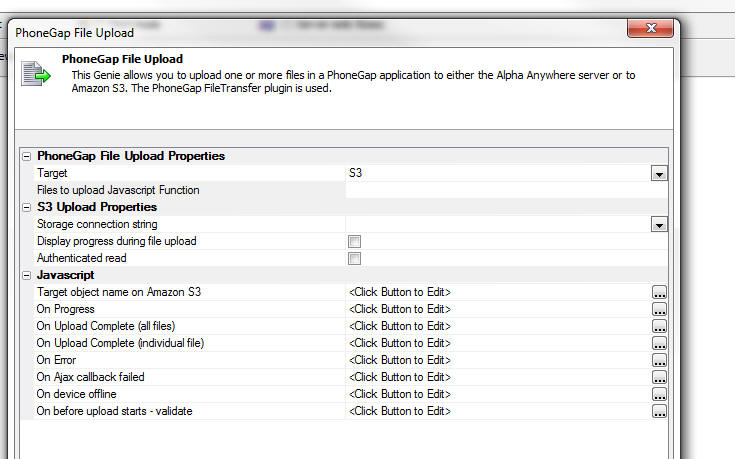
IMPORTANT: Your PhoneGap application must include
the
Device,
File,
File Transfer plug
ins.
Properties of note in this builder include:
- Files to upload Javascript Function - The name of a
Javascript function to call. This function must return an array of
fully qualified filenames. For example:
return
['file:///storage/emulated/1234567.JPG']
- Target - Amazon S3 or the Alpha Anywhere server.
If you select multiple files to upload, the files are uploaded
asynchronously. Each selected file has its on 'On Upload Complete'
event. There is also an 'On Upload Complete' event that is fired once
all selected files have been uploaded.
If you upload files to the Alpha Anywhere server, you can specify an
Xbasic function to call after each file has been uploaded.
PhoneGap - File Download Action - Action Javascript
- Downloads files from a remote server and stores
the files in the file system a mobile device.
When you select this action, the following dialog
appears:
IMPORTANT: Your PhoneGap application must include
the
Device,
File,
File Transfer plug
ins.
Properties of note in this builder include:
- Files to download Javascript Function - A Javascript
function that returns an array of files that should be downloaded to
the mobile device. You can specify fully qualified files (e.g.
http://www.imageserver.com/images/image1.jpg) or relative filenames
(e.g. images/image1.jpg). Relative filenames are fetched from the
Alpha Anywhere server.
- Target folder - The name of the folder on the mobile
device where the files should be stored.
- On Download Complete - fires when all of the files have
been downloaded. NOTE: Not every file that was specified in the
input array was necessarily successfully downloaded. Files are that
are already in the target folder on the device will not be
downloaded again. Your Javascript can reference an array with
information about each file. See the help text for this property in
the builder for more information.
PhoneGap - File System Action - Action Javascript - A
collection of actions that make working with files in the mobile device
file system easier.
When you choose this action, you can select from the following list
of file system actions:
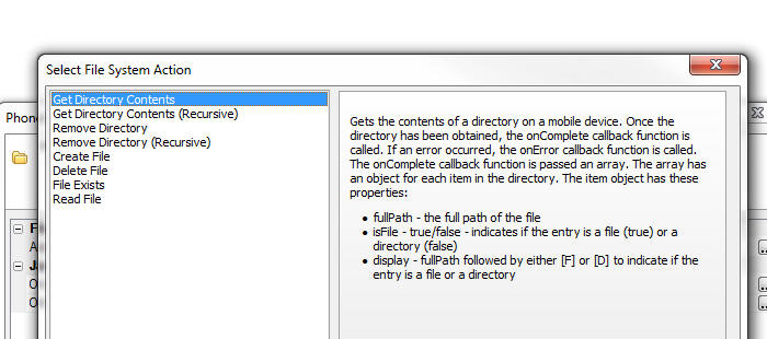
Note: All PhoneGap file system actions are
asynchronous. When you define any of these actions you specify a success
function that gets called once the PhoneGap action has successfully
completed.
List Control - Detail View - Photos in PhoneGap Applications - Previously, when you built a disconnected application (using List
controls with associated Detail Views) you were limited as to how
many photos you could capture while you were disconnected because
the photos had to be stored (as base64 encoded data) in the browser's Local Storage cache
until a connection was available and you could synchronize the data.
On most mobile devices, Local Storage is limited to about 5MB.
Also, if the data you were loading from your server onto a mobile
device contained photos, the number of records you could retrieve
from the server and keep on the mobile device was limited because
the photos had to be stored along with your data in Local Storage on
your device.
Now, if your application uses PhoneGap, you can use the file
system on the device to store your photos and you can capture a
large number of photos while you are disconnected, without having to
worry about the limits of Local Storage. Future versions of Alpha
Anywhere will also allow you to capture video and audio while you
are disconnected.
NOTE: Photos, videos and audios are collectively
labeled as 'media' files in this topic.
Quick Summary of Steps to Use PhoneGap File System
for Photos:
- Photo fields in your SQL database must be character fields.
- Create a List control with a Detail View on your UX component.
- In the Detail View, set the control type for the Photo fields to
Image.
- In the List builder go to the
Detail View pane and set the
Media and other Linked Files
properties. Most importantly, specify if the media files should
be uploaded to Amazon S3 or the Alpha Anywhere server. It is also
recommended that you check the
Automatically download media files... property so that your
photos in your existing data are available when you go offline.
- In the List builder, go to the
Fields pane and set the
control type for the Photo fields to
Image. Also, if you have
specified that the media files should be uploaded to the Alpha Anywhere
server, edit the Image Capture
and Storage properties to specify the folder where the uploaded
photos should be stored.
- Add a button to the Detail View to capture an image using the camera.
Define the click event for this button using the
Image Capture for List-Detail
View action in Action Javascript. In the builder for this action
set the Image Capture Method
to Phonegap and set the
Data capture mode to
Filename.
Watch Video - Part 1
Watch Video - Part 2
Watch Video - Part 3
NOTE: In order to use this feature, your
PhoneGap application must include these PhoneGap plug-ins:
Camera,
Console,
Device,
File,
File Transfer,
Media,
Media Capture.
Similarly, when you retrieve data from the server to store on
your device, there is no need to store the photos in Local Storage.
The photos can be downloaded and stored in files on the device. This
will substantially increase the amount of data you can load onto
your device.
In order to use the file system for your images (rather than
Local Storage), you configure the
Image Capture for
List-Detail View - Camera/Photo Library action in action
Javascript to use the 'Filename' option (rather than the 'Base64'
option). See below for more detail.
When you sync the List with the server database, the photos (and
other media files, once support for videos and audios is made
available) are first uploaded (to
the Alpha server or to Amazon S3) and then once the media files are
all uploaded, the data in the Lists are synchronized.
Before examining how to configure the
Image Capture for
List-Detail View - Camera/Photo Library action in action
Javascript and the List Detail View to use this option, it is
helpful to understand more about what happens behind the scenes when
you capture photos, and then sync the data in your List controls.
Behind the Scenes
When you take a picture, the List data for a row in the List
might look like this (where the file in the picture field is a local
file on the mobile device):
{Name: 'Fred Smith', picture: 'file://folder_in_the_file_system/image1.jpg'}
Note: If you had not set the action
that captured the picture to use the 'filename' option, the data in
the List might have looked like this (note that the picture field
contains a long string of base64 encoded image data):
{Name: 'Fred Smith',
picture: 'xysshdh24g22334hack46h2dk43hahdh...........'}
When you sync the List data, the media files (the photo in this
case) are first uploaded to the server. Let's assume you are
uploading media files to S3. The URI of the image on S3 might be something
like:
https://yourS3bucketName.s3.amazonaws.com/image1.jpg
After the media files have been successfully uploaded to the
server, the data in the List are changed as follows:
{Name: 'Fred Smith', picture:
'https://yourS3bucketName.s3.amazonaws.com/image1.jpg'}
The data in the List can then be synchronized with the server
database. The following record would be written to the database:
Name
Picture
Fred Smith
https://yourS3bucketName.s3.amazonaws.com/image1.jpg
Once the data synch operation has completed, the data in the List
is again changed back to:
{Name: 'Fred Smith', picture: 'file://folder_in_the_file_system/image1.jpg'}
The reason to change the data in the List back to its original
state is that there is no need to reference a remote image (on say
S3) when the local copy of the image is already available in the
device file system.
Taking Your Media Files With You When You Go Off-line
If the data in your List has references to remote files (e.g.
photos, videos, audio files, etc.) that are located on remote
servers (such as the Alpha server, or Amazon S3), you can retrieve
those files and store them in the file system on the mobile device.
By doing this, you ensure that even when you are disconnected, your
application can still reference these files.
Assume that a typical row in the SQL table that you are querying
to populate the List contains data like this:
Name
Picture
Fred Smith
https://yourS3bucketName.s3.amazonaws.com/image1.jpg
When you retrieve data from the server, the JSON representation
of the data in a typical row
in the List might look like this:
{Name: 'Fred Smith', picture:
'https://yourS3bucketName.s3.amazonaws.com/image1.jpg'}
The picture field is pointing to an image on Amazon S3 and this
image will not be available if you are not connected. However you
can fetch the image while you do have a connection, store the image
in the file system, and update the data in the List to something
like this:
{Name: 'Fred Smith', picture: 'file://folder_in_the_file_system/image1.jpg'}
Notice that the picture field in the List no longer points to the
remote server, but instead is pointing to a file on the mobile
device.
Orphaned Files
Assume that when the List is initially populated, the data in the
List are:
[
{Name: 'Tom Smith', picture:
'https://yourS3bucketName.s3.amazonaws.com/image1.jpg'},
{Name: 'Jan Toms', picture:
'https://yourS3bucketName.s3.amazonaws.com/image2.jpg'}
]
When you fetch the media files, the following files will be
stored in the file system on the mobile device:
Assume that the user then does another query and retrieves this
data with which to populate the List:
[
{Name: 'Tom Smith', picture:
'https://yourS3bucketName.s3.amazonaws.com/image1.jpg'},
{Name: 'Ian King', picture: 'https://yourS3bucketName.s3.amazonaws.com/image3.jpg'},
{Name: 'Jack Jon', picture: 'https://yourS3bucketName.s3.amazonaws.com/image4.jpg'}
]
At this point, the file system on the device will contain these
files: 'image1.jpg', 'image2.jpg', 'image3.jpg' and 'image4.jpg',
Notice that it still contains a file
called 'image2.jpg', but there is no data in the List that
references this file. 'image2.jpg' is an 'orphan' file and it can be
deleted. The List Detail View has settings that allow you to
automatically delete orphan files (see below). There are also events that are
fired before and after orphan files are deleted.
Configuring Photo Capture to Use the File System
In order to capture photos in disconnected application you will
need a List control with an associated Detail View. Let's assume
that the List control is bound to a SQL table that has these fields
- id - primary key
- description - a character field - contain a
description of the photo you have captured
- imageChar - a character field that will contain the
photo (actually, it will contain the URL that points to the
photo - which might be on S3 or on your Alpha Anywhere server).
NOTE: When you are capturing base64 data, the
photo field could be a character field, or a binary field. But if
you want to use the file system on the mobile device for your
photos, your photo field must be a character field.
Assume that you have have added a List control that is bound to
this table to your UX. The control type for the photo field (imageChar)
in the Detail View should be set to
Image.
First you will need to edit the List control and go to the Fields
pane and ensure that the control type for the imageChar field is set
to Image. Since imageChar is a character field the List does
not set its default type to
Image.
You should then add a button next to this Image control and set
the action on this button to
Image Capture for
List-Detail View - Camera/Photo Library.
When you click the smart field to configure this action, the
builder will open as shown below:
- Image capture method - Specify if you want to use
HTML5, PhoneGap or PhoneGapPreferred to capture the image. If
you select PhoneGapPreferred, the PhoneGap method will be used
if the application is running in a PhoneGap shell, but the HTML5
method will be used if you are running in a browser.
- Data capture mode - Filename or Base64 - This prompt
only appears if the Image capture method is PhoneGap or
PhoneGapPreferred. If you want to store photos in the file
system on the device you must use the Filename option.
Note that the builder has several properties shown as read-only
properties.
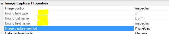
- Bound field type - the Image control in the List's
Detail View is bound to a corresponding field in the List
control and this field in the List control is in turn bound to a
field in the source SQL database. The data type of this field in
the SQL database is a character field. As mentioned previously,
you can only use the Filename option for the Data capture mode
if the photo is bound to a character field in the SQL database
(as it is in this example).
- Bound List name - the name of the List control that
this image control (imagechar) is associated with.
- Bound field name - the name of the field in the SQL
table where the image name will be stored when data from the
List are synchronized.
In this example, the target field (i.e. the Bound field type)
is a character field. Therefore we have the option of uploading the
image to either Amazon S3, or the Alpha Anywhere server when the
data in the List are synchronized.
NOTE: If the Bound field type is a
binary field then uploading the image to Amazon S3 is not an
option. The image can only be uploaded to the Alpha Anywhere server.
- More properties ... - (Not necessary if the Upload
Target is set to Amazon S3) Allows you to specify the folder on
the Alpha Anywhere server where the uploaded images will be
stored. Also allows you to specify the name Xbasic functions
that will called before and after the file has been uploaded
from the device to the Alpha Anywhere server is saved. A typical
use case for the beforeUploadedFileSave function is to
override the default settings and specify the filename and
folder where the file should be stored.
NOTE: More properties... are
actually stored in the List control settings. It is merely a
convenience that you can edit these setting in this builder. Open
the List builder and go to the Field pane to see the settings for
each image field.
- Upload target settings -- Allows you to specify the
upload target (Amazon S3, or the Alpha Anywhere server). See
below for more information.
NOTE: Upload target settings are
actually stored in the List control settings. They are not
stored as part of your Action Javascript definition. It is merely a
convenience that you can edit the Upload target settings from
within this builder. If you open the List builder and go to
the Detail View pane,
Media and Other
Linked Files (PhoneGap Application Only) section, you will
the upload settings.
NOTE: Upload target settings apply to all
image fields in the List (and any child Lists with pre-fetched data
that are linked to this List). For example, assume that you have two
image fields in your List. You might have one button to capture a
photo for the first image and another button to capture a photo for
the second image. If both of these buttons are configured to use the
Filename option for
the Data capture mode,
then both of these images will be uploaded to the same target
(either the Alpha Anywhere server, or Amazon S3). It is not possible
to upload the first image field to S3 and the second image field to
the Alpha Anywhere server.
- Capture image thumbnails - Allows you to specify if
you want to create thumbnails from the uploaded images. You can
only create thumbnails if you are uploading to the Alpha
Anywhere server. If you are uploading to Amazon S3, then you
cannot create thumbnails.
- Store EXIF info - Allows you to specify if you want
to extract EXIF information from the uploaded photo and store
that information in fields in the table to which the List
control is bound (the 'target' table). This option is only
available if you are uploading the photos to the Alpha Anywhere
server. It is not available if you are uploading to Amazon S3.
When you turn this option on, the genie allows you to map
various pieces of EXIF information to fields in the 'target'
table. For example, the target table might have a fields called
'lattitude' and 'longitude' and you could map the EXIF latitude
and longitude values to the corresponding fields in the target
table. There may be quite a bit of data in the EXIF object that
is extracted from the uploaded image and you can store the raw
JSON string (with all of the EXIF information) in a long
character field in the target table.
NOTE: Depending on the mobile device that was used to
capture the photo, and depending on the settings on that mobile
device, EXIF information may not be available in the uploaded
photo.
Upload Target Settings Dialog
The Upload Target Settings Dialog allows you to define if the
media files should be uploaded to the Alpha Anywhere server or to
Amazon S3. There are two ways to get to this dialog:
- While you are editing an Action Javascript button to capture
a photo, you can click the smart field for
Upload target settings
(as explained above)
- While editing a List control settings. Go to the Detail View
pane and then click the
Media files smart field (as shown in the image below).
NOTE: You must define the Upload Settings in the top-most parent
List if you have a List hierarchy (i.e. a parent-child
relationship between Lists with the child Lists configured to
pre-fetch their data).
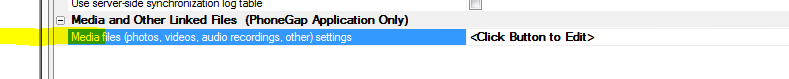
The Upload Target Settings dialog is shown below.
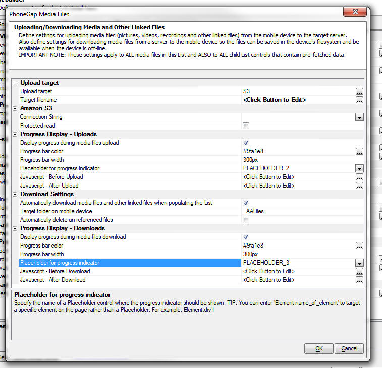
- Upload target - Alpha Anywhere Server or S3 - Specify
where the media files (i.e. photos) should be uploaded when data
from the List are synchronized. Uploading to S3 is very
efficient because the upload takes place directly from the
mobile device to S3, without involving the Alpha Anywhere
server. (NOTE: When you upload to S3, the Alpha Anywhere
server actually does play a very small role - before the upload
to S3 starts, an Ajax callback is made to the Alpha Anywhere
server to 'sign' the URL for the S3 upload using your S3 account
credentials. By signing the URL on the Alpha Anywhere server,
there is no need to expose your S3 credentials on the client
side).
- Target filename -- Allows you to specify Javascript
code that returns the filename of the uploaded media file when
it is stored on S3 or the Alpha Anywhere server. It is very
important that the target filename be unique for each uploaded
media file or an upload from a user on one device could
overwrite an upload from another user on a different device. The
default code for this property is:
return '<DeviceId>_' +e.object.listFieldName
+ '_' + A5.ts() + '_' +e.name
This indicates that the name of the uploaded file on S3 or the
Alpha Anywhere server will be composed of the following
elements:
- <DeviceId> - a unique id generated by the mobile
device. Unfortunately, is is possible that two or more mobile
devices might generate same device id.
- e.object.listFieldName - name of the field in the List
where the uploaded filename will be stored
- e.object.listName - name of the List that contains the
target field
- A5.ts() - a time stamp string.
You can specify that the uploaded files are stored in a folder
on the target by including a forward slash in the name. For
example, the following Javascript stores the uploaded files from
each user in separate folders:
return '<DeviceId> +
'_' + e.object.ListFieldName + '/' + e.name;
In the case where you are uploading to the Alpha Anywhere
server, this target filename returned by this Javascript code
can be overwritten by an Xbasic function that is called before
the uploaded file is saved to disk. See information on the
beforeUploadedFileSave above.
- Amazon S3
- Connection string - If you upload to S3, the name of
your S3 storage connection string. Storage connection strings
are defined by selecting the Tools menu when the Web Projects
Control Panel has focus.
- Protected read - Specify if the files that are
uploaded to S3 are protected. Unprotected files can be accessed
by anyone who knows the URI of the file. Protected files can
only be accessed using a signed URL.
- Progress Display = Uploads
- Display progress during media files upload - Allows
you to specify if you want to display progress while media files
are uploaded when data in the List are synchronized. Since you
can capture a large number of photos while you are disconnected,
it can be very helpful to the user to display progress while the
media files are uploaded. If you check this property then
additional properties are shown that allow you to indicate
properties of the progress indicator.
- Progress bar color - Specify the color of the
progress bar that is shown while the media files are being
uploaded.
- Progress bar width - Specify the width of the
progress bar. Use CSS units.
- Placeholder for progress indicator - Specify the name
of the [Placeholder] control (see Other Controls section in the
UX toolbox) where the progress indicator will be shown.
- Javascript - Before Upload - Javascript to execute
before files are uploaded to the target server. Since uploading
the media files might take some time, this event is useful
because it allows you to lock the screen and put up your own
wait dialog. Your code can reference
e.array - an
array with information about the media files that will be
uploaded.
- Javascript - After Upload - Javascript to execute
after media files have all be uploaded to the target server.
- Download Settings
- Automatically download media files and other linked files
when populate the List - When data to populate the List is
fetched from the server, if any fields in the data that are
fetched reference linked photos (or other media files), specify
if those files should be downloaded to the device. For more
information on this see the section above Taking Your Media
Files With You When You Go Off-line. If this property
is checked, then when you populate the List with data from the
server, all of the media files referenced in the List are
downloaded to the device and stored in files on the device so
that your photos will be available even once you no longer have
a connection. (It is recommended that you set this property on).
-
Target folder on mobile device - Specify the name of the
folder on the mobile device where the media files that are
downloaded from the server should be stored.
-
Automatically delete un-referenced files - See section
above Orphaned Files for more information on what an
un-referenced (e.g. 'orphan' file is). If you do not check this
property you can manage the orphan files yourself using the <listObj>._deleteOrphanMediaFiles() method.
NOTE: In the case where you are not using
PhoneGap, you can still access photos in your data when you are
offline. However, the amount of data you can load into the List will
be limited because the photos are stored in Local Storage along with
the List data. In order to store images in the List data so that
they are available when you are offline, the photo field in your
database must be a binary field (as opposed to a character field -
which is required if you are using the PhoneGap option) and you must
configure the List to embed the image data (as base64 encoded data)
into the List (by checking the
Embed images into HTML
property for the image field in the List settings, Fields pane).
Methods
The following methods are available
- <listObj>._fetchMediaFiles() - Scans the List for the
names of any files on remote servers, and then fetches the
files, stores them in the mobile device file system and then
replaces the data in the List to change references to remote
files to local files.
- <listObj>._deleteOrphanMediaFiles() - Deletes any
orphan files that have been saved to the file system.
Events
The following client-side events have been added:
- beforeMediaFilesUploaded - fires before any media
files are uploaded to the server (or S3) when data in the List
are synchronized. The method can reference e.array - an array
containing information about each files that will be uploaded.
If the method returns false, the sync operation is aborted.
- afterMediaFilesUploaded - fires after media files
have been uploaded
- beforeMediaFilesDownloaded - fires after the List has
been populated and before any media files referenced in the List
data are downloaded to be stored in the file system of the
mobile device. The method can reference e.array - an array
containing information about each file to be downloaded.
- afterMediaFilesDownloaded - fires after media files
have been downloaded from the remote server and have been stored
in the file system on the mobile device.
- beforeDeleteOrphanMediaFiles - Fires before orphan
media files are deleted from the file system. The method can
reference e.array
-- an array containing the filenames of the
files that are orphaned and will be deleted. See definition of
'Orphan Files' above. If your code returns false, the orphaned
files are not deleted.
- afterDeleteOrphanMediaFiles - Fires after orphaned
files have been deleted. Your code can reference
e.array - an
array with the names of the orphaned files.
UX Component - Optimizing Initial Load Time -
When a UX component is opened, the layout of the
component is computed from the UX component definition.
In a large component that can take some time and the
component will appear to be slow to open.
NOTE: If the component is opened from a button on
a parent component, and the action that defines how the
component is opened uses the 'Use cached UX Component'
option, the second and subsequent times the button on
the parent component is clicked, the UX will open
quickly.
A new option in the UX allows you to pre-render the
component layout at design-time, thus speeding up the
load time for the component at run-time.
NOTE: Not all use cases are appropriate
candidates for this option. In particular, if you have
controls on your UX that are shown/hidden based on a
user's security group, or based on session variables,
then you should not use this option. The reason is that
at design-time when the component is rendered, it is not
know what the value of the session variables or group
assignments are.
TIP: You can easily check if a component uses
security and/or server-side show hide expressions by
click the Menu button and then selecting the 'Security
and server-side show/hide settings in component...' menu
choice.

To turn on this optimization feature go to the
Properties pane in the UX builder and check the
'Pre-render component at design-time' property.
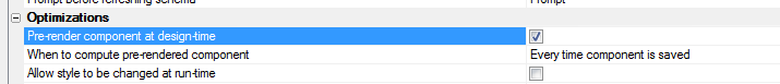
When you check this property you will see two additional
properties:
- When to compute pre-rendered component - Options are
'Every time component is saved' and 'Prompt when component is
saved'. In a large component, computing the pre-rendered component
will take a noticeable amount of time and you might not want to
compute the pre-rendered component every time the component is
saved. If you select the 'Prompt at run-time' option, be sure to
re-compute the layout the last time you save the component before
exiting the UX builder.
- Allow style to be changed at run-time - You will get the
most optimization if you do not allow the component style to
be changed at run-time. For example consider a situation where you
have a parent UX or Grid that opens a child UX. Assume that the
parent component uses a style of MobBlue. If the child UX (the
component that you are setting to pre-render at design-time) also
uses MobBlue, then you can leave this property unchecked. However,
if the child UX uses (say) MobRed, then you will need to check this
option (and you will not get the maximum amount of optimization).
TIP: When you save a pre-rendered component at
design-time, you might have Xbasic code in functions you
have defined that is meaningless at design-time, but is
nevertheless being called when the component is being
pre-rendered. You can test if you are in pre-render mode
by checking the
flagPreRender property of the
rtc
object that is passed to all server-side code in the
e
object. For example:
function someXbasicFunction as c (e as p)
if eval_valid("e.rtc.flagPreRender") then
if e.rtc.flagPreRender then
exit function
end if
end if
.... your code
end function
json_sqlQuery() Function - Allows you to filter a
JSON array using a simple SQL query syntax. For example
assume you have a JSON string as shown below. The JSON
is an array of objects. You can think of this as a table
with the following fields: firstname, lastname, city and
state.
dim json as c
json = <<%str%
[
{firstname: 'John', lastname: 'Smith', city: 'Boston', state:
'MA'},
{firstname: 'Fred', lastname: 'Jones', city: 'Cambridge',
state: 'MA'},
{firstname: 'Tom', lastname: 'King', city: 'New York', state:
'NY'}
]
%str%
Assume that you want to apply a filter to this string to
retrieve certain records and also to sort the result.
The SQL that you would need to express your query might
be:
select * from JSONTABLE WHERE state = 'MA' ORDER BY
lastname
Or if you would like to use arguments in your SQL, you
might express your query as:
select * from JSONTABLE WHERE state = :whatstate ORDER
BY lastname
Here is how you can use the json_sqlQuery() function:
dim args as sql::arguments
args.add("whatstate","MA")
dim jsonResult as c
json2 = json_sqlQuery(json,"select * from jsontable
where state = :whatstate ORDER BY lastname",args)
The resulting string will be:
[
{firstname: 'Fred', lastname:
'Jones', city: 'Cambridge', state: 'MA'},
{firstname: 'John', lastname: 'Smith', city: 'Boston', state:
'MA'}
]
UX Component - List Control - Persisting List to
Local Storage - The UX component has a property that
allows you to minify the data before it is put into
Local Storage, thereby reducing the amount of space
needed to stored the List data.
When you check the Minify data option now, any blank
fields in the JSON data are automatically removed and
system fields that are used internally in the List
(these are field that have a leading '*' in their name)
are also removed. This can result in a significant
reduction in the amount of space needed to save a List
in Local Storage.
UX Component - SQL - Native SQL and Stored Procedures
- You can now enter native SQL statements (including SQL
to execute Stored Procedures) in the SQL Statement for a
List that is based on a SQL data source.
Previously if you wanted to base a List on native SQL,
or on a Stored Procedure you had to use a Custom data
source. However, when you used a custom data source you
then had to write your own code to handle pagination and
server-side filtering.
Now, pagination and server-side filter all work
regardless of whether the SQL for the List is portable,
native or a Stored Procedure.
If you apply a server side filter to a List that is
based on a Stored Procedure, or a native SQL statement
that cannot be parsed, Alpha Anywhere will execute the
SQL (without the filter/order clause) and then apply the
filter/order to the data that is retrieved from the
database server.
For example, suppose you based on List on this SQL
statement:
exec getAllCustomers
The you apply a server-side filter to the List:
Country = 'USA'
Since the Stored Procedure can only return all customers
and since it (presumably) was not designed to take an
arbitrary 'where' clause, Alpha Anywhere will execute
the Stored Procedure and then apply where filter to the
data after it has been returned by the database server,
but before it is sent to the List control.
Storage Connection Strings - Amazon S3 - Connection
String Builder - Region Name - The dialog now uses
'friendly' region names that match the region names used
in the AWS Management Console.
Web Applications = Development Server - The Alpha
Anywhere Development Server now allows an unlimited
number of sessions from localhost clients (i.e. browsers
running on the same system) without requiring an
Application Server license. This extends the existing
Development Server functionality that has always allowed
5 sessions from any client. Localhost clients are no
longer counted towards the 5 session limit, so a
developer may do unlimited testing using local browsers
and device emulators, and still test from 5 non-local
clients such as an actual mobile device, a coworker's or
client's computer, etc.
Previous versions of Alpha allowed an unlimited number
of localhost sessions and no non-local sessions when
running the server without a license.
Web Security - Password Validation - The password
validation in the web security now supports regular
expressions in the Text Format. Previously, if a regular
expression was used for validation, it had to be added
as a custom expression. Publishing to IIS does not
support custom expressions, so a custom expression
should be converted to a regular expression if possible.
PhoneGap Builder - File Opener Plugin - The File
Opener plugin has been added to the options screen in
the PhoneGap Builder.
More info on the plugin is available
here.
http_fetch() Function - Validation has been added
to the host specified for the HTTP request. Users have
occasionally specified a full URL as the host name,
which has caused a failure. The new validation logic
will extract the host name from the URL if one is
mistakenly provided and allow the HTTP request to be
completed
UX Component - List Control - Scroller - You can
now dynamically show/hide the scroller for a List
control. This is useful if you are dynamically
populating the List and under some circumstances that
are so few rows in a List that the scroller is not
wanted, but in other cases there will be many rows in
the List and the scroller would be wanted.
The List's .setDisplay() method is used for this as
follows:
var lObj = {dialog.object}.getControl('myList');
lObj.setDisplay('scroller',false); //hide
lObj.setDisplay('scroller',true); //show
Other parts of the list that can be controlled with the
.setDsiplayMethod() are:
-
column-header
-
content-header
-
content-footer
-
header
-
footer
-
scroller
Grid Component - .filterCheckedRows() Method -
Now takes an optional argument to filter the unchecked
rows as opposed to the checked rows.
Syntax:
{grid.Object}.filterCheckedRows([flagUncheckedRows])
UX Component - DataBound UX Components - Refreshing
Schema Information - The UX builder has an option to
automatically refresh the stored schema information
every time the UX is opened for editing. For complex
data bindings, this can slow down the time taken to open
the UX for editing. If you know that the table schema
has not changed, there is no need to refresh the stored
schema in the UX and you can therefore speed up opening
the UX for editing by skipping this step. When you
specify that the schema should be refreshed when the UX
is edited, there is now a new option to prompt for
confirmation each time the UX is opened.
a5_getExifInfo() Function - Extract EXIF
information from an image.
Syntax
P result = a5_getExifInfo(c imageFilename)
The result object that is returned has these properties
- .error - .t. or .f. depending on if there was some error
when trying to extract the EXIF information
- .errorText - error description
- .hasExifInfo - .t. or .f. depending on whether the image
has EXIF information
- .latitude - a character string with the latitude
- .longitude - a character string with the longitude
- .altitude - a character string with the altitude
- .date_time - a character string with the date/time
- .json - a character string with the all of the raw EXIF
information in JSON format.
UX Component - Action Javascript - Populate Controls
in an Unbound UX - New options if no matching record
found - If the specified primary key is not found in
the table you can now specify that the values in the
databound controls should be cleared, you can also
suppress the error message, and you can call a
Javascript function.
See 'Errors and No Match Found' section in the genie.
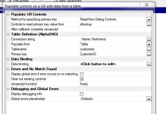
Faster Startup - Alpha Anywhere now starts up
faster because the licensing check is now done in a
background thread.
PhoneGap - Index.HTML Meta Tags - When you build
a PhoneGap app, a new option in the PhoneGap builder now
allows you to insert custom META tags in the index.html
file that is generated for your PhoneGap app.
A common use case for this feature is to turn off iOS
auto-detection of phone numbers and email addresses.
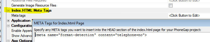
Web Applications - Context Object Documentation -
The Context object is available to all server side code
that executes in the context of a Web application (for
applications that use the Alpha Anywhere server and for
those that use the Alpha Anywhere plug-in for IIS).
This object has an extensive set of methods and
properties that allow you to get information about the
request and the response to interact with the security
framework.
Click here to see Context object documentation.
json_parse() Function - Parsing Javascript Object Literals -
The JSON parse function now takes an optional second argument to
indicate if the JSON being parsed is a Javascript object literal rather
than a JSON string. For example, consider the following Xbasic code
which defined an Xbasic object (i.e. dot variable):
dim p as p
p.name = "Fred"
p.sayHello = "{javascript}function() { alert('hello');}"
Now, generate a Javascript object literal. Pass in .t. as the second
argument to vartojson()
to indicate that we want an Javascript object literal and not a JSON
string.
dim jsObject as c
jsObject = vartojson(p,.t.)
Here is what the resulting string looks like:
{
name: 'Fred',
sayHello: function() { alert('hello');}
}
Now, in order to be able to parse this object literal back to Xbasic,
we use the json_parse() function but we set the optional second argument
to .t.
dim pj as p
pj = json_parse(jsObject ,.t.)
?pj.name
= "Fred"
?pj.sayHello
= "{javascript}function() { alert('hello');}"
UX Component - List Control - Template Items - a5-item
Attribute - Template Items are a powerful new way to efficiently
add event handlers to the HTML markup used in the List template.
Template items are added to the HTML markup by adding an
a5-item attribute to
the markup, as explained below.
Watch Video
Regardless of whether the List is defined as a free-form or
columnar layout, every row displayed in the List is created by
merging data into the row template. For a free-form List, there is a
single template for the entire row and for a columnar List, there is
a template for each column in the List. The template is HTML with
placeholders for the List data.
For example, the template for the Firstname field in a columnar
List might be:
{Firstname}
The template for a free-form List might be:
<b>{Firstname} {Lastname}</b> <br>
{City} {State} {Zip}
You might want to add an event handler so that when the user
clicks on the Firstname field, an event fires. You might change the
template for the Firstname field to:
<span onClick="event1()" >{Firstname}</span>
When the user clicks on the Firstname field in any row of the
List, the event1()
Javascript function should be called.
While inserting the
onClick attribute into the
<span> that wraps
the {Firstname}
placeholder seems easy enough there are two problems with it:
- The event will not be fired on a touch device
- The event will be added to the DOM for every row in the
List, which is very inefficient as there could be a large number
of rows.
Both problems can be solved by using template items. The template
could be defined as:
<span a5-item="item1" >{Firstname}</span>
In the above example, 'item1'
is the name of a template item. The event handlers for the 'item1'
template item are defined in the Template Item editor.
To define template items, you can either click the Quick
Access... button at the bottom of the List Builder window and then
select 'Template Items' from the menu.
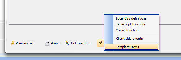
Or, you can click the Template 'items' hyperlink in the Column
Template of Layout Template editor.
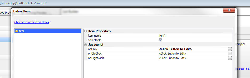
When you open the Template Items editor you get a screen that
looks like this:
You can define as many template items as you want. For each item
you define event handlers for the Click, Double Click and Right
Click events.
You can also set the 'Selectable' property. If this property is
set, then when the user clicks on the item, the row in which the
user clicks is selected. Otherwise, the row is not selected.
When you insert a template item into the HTML markup you can
insert an optional 'item argument'. The item argument follows the
item name, delimited by a colon. In the example below, 'item1' is
the item name and 'argumentValue' is the item argument. The purpose
of the item arguments is to pass additional information to the
Javascript event handler.
<span a5-item="item1:argumentValue" >{Firstname}</span>
The Javascript event handlers for the item can reference:
- rowNumber - the row that was clicked (zero based)
- ia - the item arguments (if any)
- value - the value of the List
When you are editing the List template the Template 'items'
hyperlink also gives you access to a special genie that makes it
easy to insert items into the template:
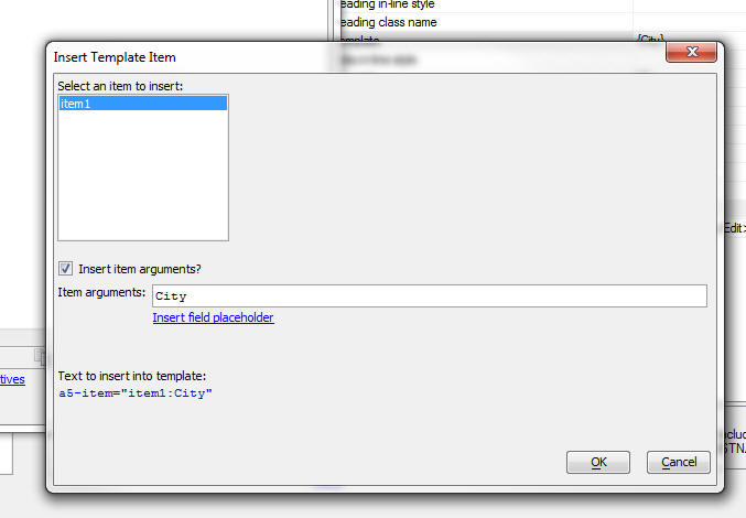
UX Component - List Control - onFieldClick, onFieldDblClick,
onFieldRightClick Events - New events have been added to the
List that fire when you click, double click or right click on fields
in the List.
Watch Video
Contrast these events with the onClick, onDblClick, etc. event
which fire when you click on a row (as opposed to a field) in the
List.
When the onFieldClick, onFieldDblClick or onFieldRightClick
events are fired, the e object that is passed into the event handler
has these properies:
- rowNumber - the row number of the row that was
clicked (zero based)
- fieldName - the name of the field that the user
clicked on
- fieldValue - the value of the field that was clicked
- data - a Javascript object with data for the row in the List
that was clicked.
NOTE: The above events are only implemented
for Label and RawData control types.
varToJsonHash() Function - Converts an Xbasic
property array to a JSON hash
Syntax:
C jsonHash = varToJSonHash(p propertyArray, c
hashProperty [, L flagSpecialTags [, L
flagCondense [, flagUseDoubleQuotes ]]])
Where:
- propertyArray - Xbasic property array
- hashProperty - name of the property in the Xbasic array
to be used as the hash key
- flagSpecialTags - specifies if the property array uses
the special {javascript} directive to indicate that the JSON
property should be generated as Javascript and not as a string.
Default if false.
- flagCondense - indicates if the generated JSON should be
condensed to eliminate line breaks.
- flagUseDoubleQuotes - indicates if strings and property
names should be double quoted. By default property names are not
quoted and strings are single quoted.
Example:
Consider the following Xbasic property array:
DIM P[0] as p
p[].name = "John Smith"
p[..].address = "123 Main Street"
p[..].age = 23
p[].name = "Fredia Malt"
p[..].address = "456 Center Lane"
p[..].age = 33
We can convert this to a JSON hash, using the 'name'
property as the hash index as follows:
dim jsonHash as c
jsonHash = vartojsonHash(p,"name")
The resulting JSON string looks like this:
{
'John Smith' : {address: '123 Main Street',age: 23},
'Fredia Malt' : {address: '456 Center Lane',age: 33}
}
In this next example we use the flagSpecialTags
property
DIM P[0] as p
p[].name = "John Smith"
p[..].address = "123 Main Street"
p[..].age = 23
p[..].sayHello = "{javascript}function() { alert('hello
John') }"
p[].name = "Fredia Malt"
p[..].address = "456 Center Lane"
p[..].age = 33
jsonHash = vartojsonHash(p,"name", .t.)
The resulting JSON string is:
{
'John Smith' : {address: '123 Main Street',age: 23,sayHello:
function() { alert('hello John') }},
'Fredia Malt' : {address: '456 Center Lane',age: 33}
}
AlphaDAO - SQLServer Driver - Faster Connections -
There are two changes in the SQL Server Extension
driver:
- The actual ODBC driver is selected based on the installed
drivers and the selected SQL Server database version. The logic is
not complicated but can be expensive; taking a few milliseconds to
find the best matching driver. The driver has been optimized so that
for a specific SQL Server version, the result is cached and only
needs to be evaluated once per process.
- The code that should be enabling connection pooling was not
working properly. The SQL Server Extension driver now pools
connections in a driver specific environment. This behavior should
not have any effect on other drivers and is not implemented for the
generic ODBC driver because some ODBC drivers are not thread-safe.
As a result of both changes, the connection times are
now in the microsecond range when connecting to a local
machine.
UX Component - Edit Combo - Stored Value is Different
than Display Value - Resolving Value Message - When
you define an Edit-Combo that sets the stored value to
be different than the display value, and the Edit-Combo
is populated using an Ajax callback, you can now control
the message that is shown when the stored value is
resolved into a display value. By default the message:
Resolving: <stored value being resolved>
is shown while the Ajax callback that resolves the
stored value is running. But you can customize this
message or even eliminate it by setting the message text
to <None>.
UX Component - List Controls - Detail View -
Parent/Child Data - In disconnected applications,
when you define parent-child relationships between List
controls you must set the child List's 'Pre-load data'
property to true.
However, when you are building a connected application
you might still want to define a parent-child
relationship between Lists and you might want to define
a Detail View for each List to allow editing of the List
data, but you might not want to pre-load the child
data (since Alpha Anywhere can easily fetch the
child data as needed as you have a connection).
Previously, if you did not have the pre-load option
checked, you were not allowed to edit data in the child
Lists (using the child List's Detail View).
Now, you can edit data in the child Lists, but you must
specify linking values in the optional Linking fields
section. The data you fill into these properties is used
to ensure that the values in the linking fields are
automatically set to the corresponding values in the
parent List record when insert or updates are performed.
a5_sql_schema_to_json() Function - Takes a schema
of a SQL database and generates a JSON representation of
the schema showing all tables in the database, and their
relationships.
Example:
Type the following commands in the Interactive window:
dim cn as sql::Connection
?cn.Open("::Name::northwind")
= .T.
dim sn as sql::Schema
?cn.GetSchema(sn)
= .T.
dim jsonSchema as c
jsonSchema = a5_sql_schema_to_json(sn,{
show_field_type_info : true })
showvar( jsonSchema)
UX Component - Action JavaScript - Geolocation Functions- A new option,
Get accurate position within a designated radius has been added to the Action JavaScript Geolocation functions.
When enabled, you may specify a desired accuracy radius. The returned lat/lon will fall within the desired accuracy radius if at all possible. This option calls a new custom method that has been added to
the navigator.geolocation object called
getAccuratePosition(). This method uses the
geolocation watchPosition()
method to attempt to get position data within a specified accuracy radius. The method will time-out at the maximum wait time
and will return the last known location, even if the accuracy does not
meet the desired accuracy target.
The maximum wait time defines the maximum amount of time in ms to wait for a geolocation change event.
If Ignore first result is checked, the first geolocation point returned will not be used. Some devices return cached location data for the first result, which is, in most cases, inaccurate.
The returned geolocation data can be accessed through the
{dialog.object}.getGeolocation() method.
Example code for the 'Callback function' in the above image:
   function gotResults() {
       var e = {dialog.object}.getGeolocation();
       alert('Lat = '+e.latitude+' Lon = '+e.longitude);
     }
UX Component - Client-side Group Breaks - Aligning
Summary Values with List Columns - The List control
allows you to insert client-side group breaks in a List
and to display summary values in the group headers and
footers. In a columnar List layout you typically want to
align these summary values with the appropriate List
columns.
A new genie in the Header/Footer builder make this easy
to do. The genie generates a sample Javascript function
that you can easily modify.
Watch Video
Download Component
UX, Grid, TabbedUI and Custom Components - Local CSS
and Linked CSS Files - SASS - When you define local
CSS (at the
Local CSS definitions property), or when you link
in CSS files you can now use SASS syntax in your CSS
definition.
NOTE: For more information on SASS syntax see
http://sass-lang.com/
In the case of linked CSS files your CSS file should have a .scss extension
and when you specify the name of the linked CSS files you should include the .scss
extension.
TIP: You can turn off automatic SASS
processing of your local CSS definitions by adding this property to the
Advanced, Other Properties section in the builder:
tmpl.sassProcessor =
.f.
UX and Grid Builder - Editing HTML Content - Script
Tags - When you add a <script> tag to HTML content that you are editing, by
default Alpha Anywhere assumes that the type is 'text/javascript' and does not
auto-complete or syntax highlight the text between the opening an closing
<script> tags.
However, if you set the type to 'text/html', then Alpha
Anywhere will treat the text in the <script> tags as HTML and will do syntax
highlighting and html code completion.
This feature is very useful when you
want to create strings of HTML for use in Javascript code.
UX and Grid Component - HTML Snippets - When writing Javascript
functions, a common requirement in the Javascirpt code is to define a long
string of HTML markup. A good example of where this requirement is common is
when using the A5.u.template.expand() function in client-side templates.
For
example, you might write Javascript like this:
var _d = {
firstname: 'Fred',
lastname: 'Smith',
Address: {
Street: '123 Main St',
City: 'Boston',
State: 'Ma'
}
};
var _t = [
'Hello {firstname} {lastname}<br>',
'Address: {Address.Street}<br>',
'{Address.City} {Address.State}'
].join('');
var settings = {
template: _t,
partials: ''
}
var html = A5.u.template.expand(_d,settings);
The HTML template in the above code was written as an array of single-line
strings that were then joined to create a long string.
While the
above pattern for creating long strings is perfectly reasonable, it is difficult
to write because the single-line strings all need to be Javascript escaped and
you do not get any HTML auto-complete help while you compose the script.
A better technique is to add a static-text control to the UX and then to add the
HTML template to the static-text control using a
<script> tag with a type of
"text/html".
Because the HTML markup is in a
<script> tag, it will not be rendered when the UX is run. And because the
type is 'text/html' the markup will not be executed as Javascript code.
Any
text inside a <script> tag
with a type of "text/html"
will be highlighted as HTML text and the standard HTML auto-complete help will
apply.
By giving a unique Id to the
<script> tag, your Javascript can easily reference the contents of the
<script> tag.
In the above example
Javascript, the code can be changed as follows:
var _d = {
firstname: 'Fred',
lastname: 'Smith',
Address: {
Street: '123 Main St',
City: 'Boston',
State: 'Ma'
}
};
var _t = $('template1').innerHTML
var settings = {
template: _t,
partials: ''
}
var html = A5.u.template.expand(_d,settings);
And the template can be
defined in a static-text control as follows
<script id="template1">
Hello {firstname}
{lastname}<br>
Address: {Address.Street}<br>
{Address.City} {Address.State}
</script>
json_flatten() Function - Takes a JSON string
that defines an array of hierarchical objects and
'flattens' the array.
This function is useful for Reporting where the report
data source is set to a Custom data source that returns
JSON data. If the JSON data that is returned is
hierarchical, then you will need to 'flatten' it in
order to get it into an appropriate format for the
report writer.
The syntax for json_flatten() is
c output = json_flatten(C jsonIn, c
template)
The format of the template is shown in the following
example.
Consider the following JSON String:
[
        {
            "id": "alfki",
            "name": "customer 1",
            "__a5crc": -253329,
            "orders": [
                {
                    "orderId": 1,
                    "orderData": "12/1/2013",
                    "ordcust": "1|||alfki",
                    "orderDetails": [
                        {
                            "lineitemId": 1,
                            "prodId": 1,
                            "qty": 3,
                            "ordprod": "1|||1"
                        },
                        {
                            "lineitemId": 4,
                            "prodId": 3,
                            "qty": 2,
                            "ordprod": "1|||3"
                        }
                    ]
                },
                {
                    "orderId": 3,
                    "orderData": "12/3/2013",
                    "ordcust": "3|||alfki",
                    "orderDetails": [
                        {
                            "lineitemId": 6,
                            "prodId": 4,
                            "qty": 9,
                            "ordprod": "3|||4"
                        },
                        {
                            "lineitemId": 7,
                            "prodId": 3,
                            "qty": 1,
                            "ordprod": "3|||3"
                        }
                    ]
                }
            ]
        },
        {
            "id": "bolid",
            "name": "customer 2",
            "__a5crc": -194126,
            "orders": [
                {
                    "orderId": 2,
                    "orderData": "12/2/2013",
                    "ordcust": "2|||bolid",
                    "orderDetails": [
                        {
                            "lineitemId": 2,
                            "prodId": 6,
                            "qty": 6,
                            "ordprod": "2|||6"
                        },
                        {
                            "lineitemId": 3,
                            "prodId": 9,
                            "qty": 7,
                            "ordprod": "2|||9"
                        }
                    ]
                }
            ]
        }
]
The JSON object defined by the above string shows an
array of customers with embedded orders. For each order,
there are embedded line-items.
The structure of the JSON object is
Customers
Orders
Order Details
The json_flatten() function takes two arguments - the
JSON string you want to flatten, and a template that
defines which properties in the input JSON you want to
map to the output JSON.
Assume that the following template is specified:
{
   "id" : "id" ,
   "name" : "name" ,
   "orders" : [
                 {
                    "orderId" : "orderId" ,
                    "orderData" : "orderData" ,
                    "orderDetails" : [
                                         {
                                            "lineitemId" : "lineitemId" ,
                                            "prodId" : "prodId" ,
                                            "qty" : "qty"
                                         }
                                    ]
                }
              ]
}
If you 'flatten' this JSON using the above template, you will get the following
output:
[
    {
        "id": "alfki",
        "name": "customer 1",
        "orderId": 1,
        "orderData": "12/1/2013",
        "lineitemId": 1,
        "prodId": 1,
        "qty": 3
    },
    {
        "id": "alfki",
        "name": "customer 1",
        "orderId": 1,
        "orderData": "12/1/2013",
        "lineitemId": 4,
        "prodId": 3,
        "qty": 2
    },
    {
        "id": "alfki",
        "name": "customer 1",
        "orderId": 3,
        "orderData": "12/3/2013",
        "lineitemId": 6,
        "prodId": 4,
        "qty": 9
    },
    {
        "id": "alfki",
        "name": "customer 1",
        "orderId": 3,
        "orderData": "12/3/2013",
        "lineitemId": 7,
        "prodId": 3,
        "qty": 1
    },
    {
        "id": "bolid",
        "name": "customer 2",
        "orderId": 2,
        "orderData": "12/2/2013",
        "lineitemId": 2,
        "prodId": 6,
        "qty": 6
    },
    {
        "id": "bolid",
        "name": "customer 2",
        "orderId": 2,
        "orderData": "12/2/2013",
        "lineitemId": 3,
        "prodId": 9,
        "qty": 7
    }
]
Notice that the template has omitted the '__a5crc' in
the input property. The template indicated which
properties were to be extracted from the input JSON. It
also indicates that the property name should be called
in the output JSON.
For example, the template indicates:
"id" : "id"
Had that been:
"id" : "CustomerId"
The output JSON would have named the 'id' property 'CustomerId'.
Here is a simpler example:
dim json as c
json = <<%str%
[
{"id" : 1, "name": "John", "kids" : [ {"name": "callie"},{"name"
: "griffin"} ]},
{"id" : 2, "name": "Tom", "kids" : [ { "name" : "betty" } ]}
]
%str%
dim template as c
template = <<%str%
{"id" : "id", "name" : "firstname", "kids" : [ {"name":
"name"} ] }
%str%
dim json2 as c
json2 = json_flatten(json,template)
json2 = json_reformat(json2)
Here is what json2 looks like:
[
{
"id": 1,
"firstname": "John",
"name": "callie"
},
{
"id": 1,
"firstname": "John",
"name": "griffin"
},
{
"id": 2,
"firstname": "Tom",
"name": "betty"
}
]
The json_flatten() function can also be used to simply
map property names in the input JSON to new property
names in the output JSON. For example, consider the
following script:
dim json as c
json = <<%str%
[
{"id" : 1, "name": "John"},
{"id" : 2, "name": "Tom"}
]
%str%
dim template as c
template = <<%str%
{"id" : "id", "name" : "firstname"}
%str%
dim json2 as c
json2 = json_flatten(json,template)
json2 = json_reformat(json2)
showvar(json2)
The resulting JSON will look like this:
[
{"id" : 1, "firstname": "John"},
{"id" : 2, "firstname": "Tom"}
]
PhoneGap- Modified The Default Location For Persistent Files - Previous versions set the Persistent File Location property to "Compatibility" mode on both Android
and iOS devices. It has now been changed to "Internal" for Android and "Library" for iOS. This is the recommended setting on Android to ensure the files are
contained within the app folder and that the files are deleted when the app is deleted. Under iOS, the files are always in the app folder, however, files in the
Library folder are not available to iTunes nor are they synchronized to iCloud.
When "Compatibility" mode is set as the persistent file location for an Android PhoneGap app:
- The files are written to the devices root directory
- The app has full access to the devices files
- The media files are indexed by the Gallery app
- The files are NOT deleted when the app is un-installed from the device.
When "Compatibility" mode is set as the persistent file location for an iOS PhoneGap app:
- The files are written to the apps sand-boxed Documents directory
- The files may be accessed via iTunes
- The files may be synchronized to iCloud
In general "Compatibility" mode is NOT the recommended setting.
If you have used the PhoneGap file plug-in in previous versions, the default setting will make your app files inaccessible.
The setting will not change for existing PhoneGap apps because the previous "Compatibility" setting will remain within the configuration file.
Your app will only be affected if you delete the previous PhoneGap project and create a new one.
You can change this setting by enabling Show Advanced Options in the Configuration Options settings of the PhoneGap App Builder Genie.
Once the Show Advanced Options is enabled, you can change the persistent file location as required
Web Applications - Web Projects Control Panel -
'Search all files in this Project' Command - This
command will now search in report, label and letter file
(.i.e. .a5rtp, .a5lab and .a5ltr). The data source
definition of the report layout (not the report body
itself) will be searched.
UX Component - Action Javascript - PhoneGap - File System Actions
- A new action in Action Javascript allows you to perform actions on the
file system of the mobile device on which your UX is running.
NOTE: File system actions are only supported for
PhoneGap applications.
The actions currently supported are:
-
Get Directory Contents
-
Get Directory Contents (Recursive)
-
Remove Directory
-
Remove Directory (Recursive)
-
Create File
-
Delete File
-
File Exists
-
Read File
All of these actions are performed asynchronously. For each action
you specify the Javascript to execute once the action has successfully
completed. If the action fails, the Javascript you specify for the on
failure action is executed.
Because the actions are asynchronous, you cannot simply define an
Action Javascript that calls two file system actions sequentially. For
example, assume that you defined an Action Javascript that did this
-
Create a new directory
-
Write a file to the new directory
This would likely fail because the second action (write a file to the
new directory) would be executed immediately after the first action
(before the new directory had actually been created).
In order to make the above work, the second action (write a file)
needs to be called in the first action's onSuccess function.
The asynchronous nature of file system actions makes it tricky to
write complex scripts that perform many file system actions
In the above example, you would need to convert your Action
Javascript to text mode and then rearrange the code.
For example, assume you defined the above two actions using Action
Javascript. Once you converted to text mode your code would look like
this:
{dialog.object}.phoneGapCreateDirectory('dir1',
function() { //ok}, function() { //fail } );
{dialog.object}.phoneGapCreateFile('dir1/file1.txt','some data',function() { //ok }, function() {//fail },false);
To re-organize the code so that the write file action happens after
the new directory has been created, we simply paste the action into the
create directory's onSuccess function:
{dialog.object}.phoneGapCreateDirectory('dir1',
function() {
//ok
{dialog.object}.phoneGapCreateFile('dir1/file1.txt','some
data',
function() { //ok },
function() {//fail },false);
}, function() { //fail } );
UX Component - PhoneGap File System Methods - The following
methods have been added to the UX for working with files on the mobile
device.
NOTE: File system actions are only supported for
PhoneGap applications.
|
Create a directory |
{dialog.object}.phoneGapCreateDirectory(dirName,
onComplete, onError) |
|
Create a directory (recursively) |
{dialog.object}.phoneGapCreateDirectoryRecurse(dirName,
onComplete, onError) |
|
Read a directory |
{dialog.object}.phoneGapGetDirectory(dirName,
onComplete, onError) |
|
Read a directory (recursively) |
{dialog.object}.phoneGapGetDirectoryRecurse(folder,
onDirComplete, onDirError) |
|
Remove a directory |
{dialog.object}.phoneGapRemoveDirectory(dirName,onSuccess,onError)
|
|
Remove a directory (recursively) |
{dialog.object}.phoneGapRemoveDirectoryRecurse(dirName,onSuccess,onError)
|
|
Delete a file |
{dialog.object}.phoneGapDeleteFile(fileName,onSuccess,onError) |
|
Check if a file exists |
{dialog.object}.phoneGapFileExists(fileName,onResult,onFailed) |
|
Read a file |
{dialog.object}.phoneGapReadFile(fileName,onReadFile,onReadFileERROR) |
|
Create a file |
{dialog.object}.phoneGapCreateFile(fileName,text,onCreatedFile,onCreateFileERROR,flagAppend) |
UX Component - Action JavaScript - Stripe Checkout- A new Action JavaScript has been added to the UX component that allows you to easily use Stripe Checkout.
Stripe Checkout, and the Stripe API, allow you to process credit card payments from within your desktop web or mobile app.
You will need to obtain your unique test and live authentication/api keys from Stripe prior to working with Stripe Checkout within your app.
See the Stripe Website to setup your account.
A typical use case is to assign the action to a button click event, once the total of all items to be purchased has been computed.
Watch Video
Download Component
Specifying your Stripe API Keys: Stripe will issue you a total of four authentication/api keys. One set is for testing and one set is for a live app.
The keys can be entered in explicitly within the Action Javascript builder or you may specify the keys within your project properties
(click the Project Properties button when the Web Control Panel has
focus).
Entering the Stripe Checkout keys in the Project Properties
Entering the Stripe Checkout Keys in the Project Properties allows you to easily use Stripe Checkout within multiple components. Be careful to
enter the test keys (typically prefixed with sk_test and pk_test) and the live keys (typically prefixed with sk_live and pk_live) in the appropriate fields.
The secret key is used server side when the server is communicating to the Stripe API with the token supplied by Stripe Checkout. The secret key is never revealed client side.
Stripe App Type: The app type can be Test or Live. Use Test for all of your testing and when you are ready to go live you must switch this property to Live and republish the app. If you are building a PhoneGap app, make sure to rebuild the PhoneGap app and upload to PhoneGap Build.
Icon Image: The icon image is displayed at the top of the Stripe Checkout component. The recommended minimum size is 128 x 128 px. Supported image types include .gif, .jpeg and .png.
Currency type: This specifies the currency of the amount being charged. The code entered here is the 3 letter ISO country code.
Stripe offers support for a worldwide range of currencies. You can accept payments in your supported currencies from almost any credit card and debit card no matter where the customer lives.
Customers in other countries may be charged additional fees by their bank.
Charge description: A general description of the product or service being purchased. The JavaScript you enter here can simply return a string (like the example below), return the value contained
within a control or return the result of a JavaScript function, defined within the UX component's JavaScript Functions property.
Charge amount: The amount (in cents) that is being charged. The JavaScript you enter here may simply return a number (example: return 1235; for a $12.35 charge),
may read the value of a control (make sure you convert to cents!) or may return the result of a JavaScript function, defined within the UX component's JavaScript Functions property.
OnStripeCheckoutComplete: This event fires after Stripe has attempted to process the payment with the token supplied by Stripe Checkout. The JavaScript you enter here
can examine the results returned from Stripe by calling the {dialog.object}.getStripeResults() method (see the sample code below). The {dialog.object}.getStripeResults method
returns either a Stripe charge object with a wide range of properties or an error.
See Stripe Charges Doc for more information.
HTTPS For Your Site All submissions of payment info using Stripe Checkout are made via a secure HTTPS connection. However, in order to protect yourself from certain forms of
man-in-the-middle attacks, it is suggested that you serve the page containing the payment form with HTTPS as well.
UX Component - Image Upload Action Javascript -
Mobile - Amazon S3 - When defining an Image Upload
action for a UX component that is run on a mobile device
you can specify in the image should be uploaded directly
to Amazon S3 rather than to the Alpha Anywhere server.
This option is only available if the image is bound to a
character field in the Table to which the UX component
is bound.
Image upload in a mobile application uses the camera, or
the photo library to select the image.
The option to upload to S3 is available for both HTML5
camera access and PhoneGap camera access.
NOTE: In the case where you are building a
PhoneGap application, it is very important that when you
build your PhoneGap project you include all of the
necessary plugins when you define your PhoneGap project.
You must include the File, FileTransfer and Camera
plugins.
The ability to upload file images to Amazon S3 when
using the Image Upload action in Action Javascript for
the 'Desktop' mode was released previously. More
information about this feature can be found in this
topic:
Action Javascript - Image Upload Action - UX and Grid Component - Amazon S3
UX Component - Android - Client-side Events -
onKeyboard Event - A new event has been added that
fires when the keyboard comes up, or is dismissed. This
event is only supported on Android devices.
NOTE: The reason that the event is not supported
on iOS is that under iOS the reported screen size of the
device does not change when the keyboard is up.
NOTE: If you have set the UX quirks mode
keyboardAffectsScreenSizeCalc property to true
for backward compatibility then the
onKeyboard
event will not fire. For example:
{dialog.object}._quirks = {
keyboardAffectsScreenSizeCalc: true};
UX Component - List Control - .setValue() Method -
New Options - Several new options have been
added to the List control's .setValue() method. The
options allow
-
select all records in a List that has been configured to allow
multiple selections
-
select all records in one or more Groups in a List that has been
configured to show client-side group breaks and to allow multiple
selections.
-
select all of the currently rendered records in a List that that has
its 'Virtualization type' property set to 'Dynamic' and has been
configured to allow multiple selections.
Examples:
Select all records in a List:
var lObj = {dialog.object}.getControl('MYLISTNAME');
lObj.setValue({select: 'all'});
Select records by Group name (deselecting any existing
selections):
var lObj = {dialog.object}.getControl('MYLISTNAME');
lObj.setValue({
select: 'group',
groups: ['CA','MA'],
additive: false
})
Select records by Group name (preserving any existing
selections):
var lObj = {dialog.object}.getControl('MYLISTNAME');
lObj.setValue({
select: 'group',
groups: ['NY'],
additive: true
})
Select all rendered records in a 'Virtualized' list (if
there are 100 records per 'page' and the List has (say)
2,000 records then there are 100 rendered records that
will be selected):
var lObj = {dialog.object}.getControl('MYLISTNAME');
lObj.setValue({
select: 'view',
additive: false
})
UX and Grid Component - Javascript Actions - Filter
List - The Define Javascript Action dialog now has a
filter control to allow you to easily filter the list of
actions. This is useful because some developers now have
a large number of Javascript Actions defined in their
components.
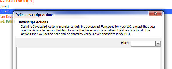
a5_json_viewer() Function
- The A5_json_viewer() function can be used to open a
viewer for JSON data.
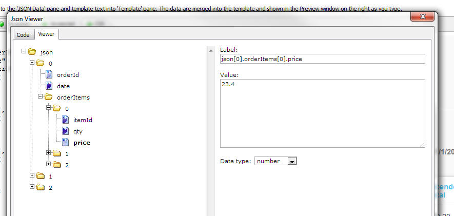
Xbasic - CURL Genie - The code generated by the
Xbasic CURL Genie is now more flexible. Instead of
generating a constant for the post body length, it now
generates a variable. For example, assume that you paste
this CURL command into the genie.
curl --data "param1=value1¶m2=value2" https://example.com/resource.cgi
The generated output from the genie will now be:
dim cf_1 as extension::CurlFile
dim flag_1 as l
dim ce as extension::Curl
ce = extension::Curl.Init()
ce.setOpt("URL","https://example.com/resource.cgi")
ce.setOpt("NOPROGRESS",1)
dim posted_fields as c = ("param1=value1¶m2=value2")
ce.setOpt("POSTFIELDS",posted_fields)
ce.setOpt("POSTFIELDSIZE_LARGE",
len(posted_fields) )
ce.setOpt("USERAGENT","curl/7.40.0")
ce.setOpt("MAXREDIRS",50)
ce.setOpt("CAINFO",a5.Get_Exe_Path()+"\caroot\ca-cert.pem")
ce.setOpt("CAPATH",a5.Get_Exe_Path()+"\caroot")
ce.setOpt("SSH_KNOWNHOSTS","C:\Users\Cian\AppData\Roaming/_ssh/known_hosts")
ce.setOpt("TCP_KEEPALIVE",1)
ce.SetOpt("FILE",cf_1)
flag_1 = ce.Exec()
if flag_1 then
showvar( "Headers: "+crlf()+cf_1.GetHeaders()+crlf()+"Content:"+crlf()+cf_1.GetContent())
else
showvar("error: " + ce.Error() )
end if
ce.close()
File.to_property() Function - Can now
automatically de-serialize a file that was serialized
using property_to_string(), property_to_blob() or
json_generate().
Example:
dim src.fname as c = "john"
dim src.lname as c = "public"
file.From_string("c:\data\sample.txt",property_to_string(src))
file.From_string("c:\data\sample.json",json_generate(src))
file.From_blob("c:\data\sample.dat",property_to_blob(src))
dim p1 as p
file.to_property("c:\data\sample.txt",p1)
? p1
= fname = "john"
lname = "public"
dim p2 as p
file.to_property("c:\data\sample.json",p2)
? p2
= fname = "john"
lname = "public"
dim p3 as p
file.to_property("c:\data\sample.dat",p3)
? p3
= fname = "john"
lname = "public"
UX Component - Static HTML Web Sites - Publishing to
Amazon S3 - If you have a static UX component (i.e.
the component does not make any callbacks to an Alpha
Anywhere server), you can publish the static HTML site
to Amazon S3. The advantage of this is that you don't
need to publish your site to an Alpha Anywhere server
and the site will be accessible from any browser that
has an internet connection.
VERY IMPORTANT - The Amazon S3 bucket that you publish
to must be configured to allow 'Public Read' otherwise
when you try to access the application Amazon will
return a 'Permission Denied' error. To set the correct
policy on your Amazon bucket, you can use this JSON
setting string in the Amazon Web Services console.
{
"Version": "2008-10-17",
"Statement": [
{
"Sid": "AllowPublicRead",
"Effect":
"Allow",
"Principal":
{
"AWS": "*"
},
"Action": [
"s3:GetObject"
],
"Resource": [
"arn:aws:s3:::specify_the_name_of_your_bucket_here/*"
]
}
]
}
Web Applications - Publishing - Check Security Before
Publish - You can now check if any pages,
components, or reports in the list of files to be
published are set as 'Always Denied' in the web
security. This is useful if publishing new pages or
components to verify the security is set before the new
elements are published. The check is only performed if
security is active, and will check all pages, and
components and reports if component security is
activated. Most other files have security set by file
extension.
If the option is selected and the file list to publish
includes pages, components, or reports that are set as
'Always Denied', a list of these files will be shown
before publish. You can continue with the publish or
cancel and correct any errors.
This option can be selected at publish, and a default
value for the option can be set in the publish profile.
The option can also be set separately for right click
publish.
Web Applications - Publishing - Publish Page Security
as Binary - Some projects may have very large number
of entries in the 'Pages.SecuritySettings' security
file. The file is normally stored as a text file, but if
it is very large (over 1 MB for example), it may load
slowly on the application server when the security is
loaded. This security file can be converted to a binary
file when published which will load much faster. If the
security cache timeout is set to 0 to never check for
updates, a slow load time will only impact the first
request for a project.
a5_url_fromStorageJSONformat() Function - Generates a signed
URL to download a file from Amazon S3 storage.
The a5_url_from_storageJSONformat() function can be used to display/download
a file from storage (e.g. Amazon S3) directly, with very little load on the
Alpha server. The purpose of the function is to take a JSON string that defines
the address of an object in storage (e.g. Amazon S3) and to generate a signed URL that
can be used to download the object directly to the client from storage without
having to first download the object to the Alpha server and then have the Alpha
server send the file to the client.
The JSON string format that defines the address of an object in storage is:
{cs: 'storage connection string', object: 'name of
object', source: 'vendor'}
NOTE: Currently the only vendor supported is Amazon S3 so
vendor must be set to 'S3'
NOTE: The storage connection string is defined by
selecting the Tools, Storage Connection Strings menu when the Web Projects
Control Panel has focus. When you define storage connection strings you have the
option of encrypting the storage connection string. You must NOT encrypt the
storage connection string or else Alpha Anywhere will not be able to parse the
storage connection string to determine your storage credentials.
For example, assume you have a named storage connection string called
'myS3bucket'. A JSON string that defines the address of an object called 'ProductPrices.pdf'
would be:
{cs: 'myS3bucket', object: 'ProductPrices.pdf', source: 'S3'}
To generate a URL to display or download this object you would do the
following:
dim address as c
address = <<%txt%
{
cs: 'myS3bucket',
object: 'ProductPrices.pdf',
source: 'S3'
}
%txt%
dim url as c
url = a5_url_from_storageJSONformat(address)
The resulting URL would look something like this (assuming that the bucket
name specified in the connection string was 'myBucket'):
https://s3.amazonaws.com/myBucket/ProductPrices.pdf?AWSAccessKeyId=key&Expires=expiration&Signature=signature
Where:
key - your access key - as defined in the storage connection
string
expires - indicates how long the URL can be used for (only
applies if the object was uploaded to storage as 'Protected Read')
signature - a special signature based on the credentials
specified in the storage connection string.
By default, the expires property is 240 seconds. That means
that if the URL is used more than 240 seconds after it was generated,
Amazon S3 will return a 'permission denied' error. The
a5_url_from_storageJSONformat()
function takes an optional second argument where you can specify how
long the URL is good for in seconds. The default value for this
parameter is 240.
File Upload - Amazon S3 - A new action has been added to Action
Javascript for the UX component to upload files to a bucket in Amazon S3
storage.
NOTE: This action is not available for the Grid
Component. However, the standard 'File Upload' and 'Image Upload' actions in
Action Javascript, which are supported in the Grid now supports an option
to target the upload to Amazon S3.
Watch Video
- Part 1
Watch Video
- Part 2
The benefit of this method is that the upload occurs directly to the
Amazon servers without putting any load on the the Alpha Application Server.
NOTE: There is a small load on the Alpha Server for
each file that is uploaded because a callback has to be made to the Alpha
server to sign the URL used for the upload. This is necessary because the
secret key for your Amazon account is stored on the Alpha server.
Features of the Amazon S3 File Upload include:
- ability to upload a single file or multiple files
- ability to define rules for maximum size of an individual file, or
all files (if multiple file upload is supported)
- ability to show progress during while file(s) are being uploaded
- ability to cancel an file upload
- full event model that allows you to completely customize the action.
- ability to specify the name (including sub-folder name) for each
object that is stored on S3. A Javascript function can be called to
dynamically compute the fully qualified name of the object on S3.
- ability to set read permission on the uploaded files (public read or
authenticated read)
IMPORTANT: Before you can upload files to Amazon S3,
you must configure your Amazon bucket to allow CORS support. CORS
(Cross-Origin Resource Sharing allows you to make callbacks to a different
server than the server (the Amazon server in this case) from which the page
was originally loaded (your Alpha server). To configure your bucket you will
need to open the AWS console. You can click the 'Setting CORS Support
on your Amazon Bucket' in the Action Javascript builder for more
information.
In order to create an action to upload files to Amazon S3, use Action
Javascript. Select the 'File Upload = Amazon S3 Storage' action.
The genie for this action is shown below:
Method for specifying Amazon S3 credentials and bucket - There are
two ways in which you can specify the credentials for your Amazon S3 bucket.
You can specify a named storage connection string, or you can use the
'Explicit' option, in which case you will need to specify your Amazon access
key, secret and bucket name.
NOTE: To create a named storage connection string, go
to the Tools menu when the Web Projects Control Panel has focus and select
the Storage Connection Strings menu item.
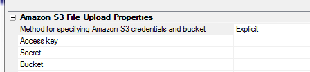
Allow multiple files - If you check this box, the user will be
able to select multiple files. The files will be uploaded in parallel.
If you check this box then you can specify value for the Max total
file size property, which is the maximum combined size of all selected
files. By default, this property is set to -1, which means no maximum.
Display progress during upload - If you check this property, then
progress will be displayed during the file upload.
NOTE: If you do not check this property, you can still create your
own progress display by adding custom code to the Javascript On Progress
event.
Allow cancel - Specify if the user can cancel the upload after it
has been started, but before it completes.
Progress indicator type - The progress can be displayed either as
a text that shows the percentage complete, or as a bar.
In the image below, progress is shown for a multiple file upload using
the 'bar' option. Note that the Allow cancel property was also
checked, and so a small button to the right of the bar is shown where the
user can click to cancel the upload.
This next image shows progress using the 'text' option.
Placeholder for progress indicator - You must specify the name of
a Placeholder control where the progress will be shown.
Authenticated read - Allows you to specify whether the file that
is uploaded to S3 is 'public read' or 'authenticated read'. A 'public read'
file can be read by specifying the URL of the object on Amazon S3. For
example, assume you upload a file called 'Image1.jpg'
and you use the same object name on S3 (i.e. you don't specify any code in
the Target object name on Amazon S3 event so that the name of the
object on Amazon is the same as the filename of the file on the
client-machine), you will be able to read the file using this URL:
http://<nameOfYourAmazonS3Bucket>.s3.amazonaws.com/Image1.jpg
If the Authenticated read property is checked then you can retrieve an
object from S3 using Xbasic functions in server-side code.
For example, assume you wanted to retried 'Image1.jpg' which had been
uploaded to S3 with the Authenticated read property turned on, you could
perform an Ajax callback that executed this code to retrieve the file and
save it to a local file called c:\myfiles\Image1.jpg.
dim cs as c
cs = "::storage::YourStorageConnectionStringName"
a5storage_getitem_as_file(cs,"Image1.jpg","c:\myfiles\Image1.jpg")
The full list of a5storage helper functions is shown below:
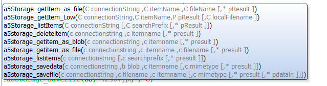
Validating File Selection
You can specify a maximum file size for any file that the user can
select. By default this is set to -1, which means no maximum.
If the Allow multiple files property is checked you can also specify a
maximum total file size for all files combined.
You can specify list of file types that the user can select in the
Allowed file types property. You can enter a comma delimited list of file
extensions. For example
.png,.jpg,.jpeg
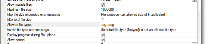
You can also customize the error messages that are shown if a rule is
violated. For example, in the image below, the message that will be shown if
the user selects a file that is larger than 1,000,000 bytes is
File exceeds max allowed size of [maxfilesize]
[maxfilesize] is a placeholder that will be replaced at run-time.
You can also completely customize the display of validation error
messages by defining your own on Validate Error event handler in the
Javascript Events section. You can also use language and text dictionary
tags (<a5:r>..</a5:r> and <a5:t>..</a5:t>) to translate the messages into
different languages.
If you define a custom on Validate Error handler then you should
blank out the default messages so that the system messages do not display.
Javascript Events
The genie exposes the following Javascript events:
Target object name on Amazon S3 - If this event is not defined,
the name of the object in the S3 bucket will be the same as the name of the
object on the client machine. For example, if the user uploads a file called
'sales_analysis_march_2015.xlsx', the name of the file in the Amazon bucket
will be 'sales_analysis_march_2015.xlsx'.
Your code in this event can reference these variables:
- e.name - name of the file on the client machine
- e.type - size of the file
- e.size - mime type of the file
However, you can add code to this event to compute a different name on
S3. Your Javascript code must return the name you want to use. For example,
assume you want to store the uploaded file in a folder called 'sales
analysis' then your Javascript code in this event will be
return 'sales_analysis/' + e.name
Before file select - fires after the user clicks the button to
initiate the action, but before any files are selected. If your code
executes return false, the
action is aborted.
After file select - fires after the user has selected the file(s)
to upload, but before any uploads have actually started. Your code can
reference a Javascript variable called
e, which is an array of
objects containing information about each file that was selected. If
your code executes return false,
the action is aborted. You can use this event to perform custom validation
on the selected files before initiating the upload. If you are writing a
custom onProgress event handler you can use this event to set up the HTML
for your custom progress indicator.
On progress - Fires each time progress information is returned by
Amazon. You can use this event to create a custom progress handler. You code
can reference these variables:
- e.percent - percentage complete
- e.message - message describing the current state of the
upload
- e.name - name of the file
- e.targetName - name on Amazon S3 - same as e.name if you have
not defined any code for the 'Target object name on Amazon S3' event
- e.size - file size
- e.type - mime-type
On Upload Complete - Individual File - (If multiple files are
allowed) - fires after each individual file has been uploaded.
On Upload Complete - All Files - (If multiple files are allowed) -
fires after all files have been uploaded.
On Upload Complete - (If only a single file is allowed) - fires
after the file has been uploaded.
On validate error - Fires if any file violates the file rules
(maximum size or allowed type).
File Download - Amazon S3 - A new option has been added to the
File Download action in Action Javascript to allow you to download files
that are stored in Amazon S3 storage.
The File Download dialog allows you to specify the File Download 'Type'
as 'Amazon S3 Storage'.
Watch Video - Part 1
Watch Video - Part
2
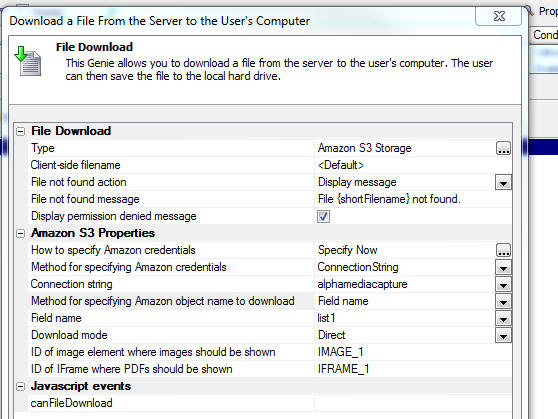
Once you set the type as Amazon S3 Storage you can specify additional
properties. These include:
- How to specify Amazon credential - The options are
Specify now or
Credentials are specified with the object name.The smart field
for the property opens a dialog (shown below) that explains the option.
-
Download mode - The options are
Direct and
Indirect. See below for
explanation.
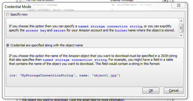
- Method for specifying Amazon credential - Can be set to
ConnectionString or
Explicit. If you choose
the ConnectionString
option then you can specify the name of a storage connection string.
Otherwise you must specify your Amazon access key, secret and bucket
name.
- Method for specifying Amazon object name to download - This
is how you specify the name of the object on Amazon that you want to
download. Options are FieldName
- the name of a field in the component that contains the name of the
object you want to download,
Explicit - the explicit name of the object (e.g. image1.jpg), or
Javascript - the
name of a Javascript function that will return the object name.
In all cases, if you have specified
Credentials are specified with
the object name for the How to specify Amazon credentials
prompt you must specify the object name using the special JSON
syntax that includes the connection string property.
Download Mode - Direct and Indirect Mode
When you download a file from Amazon S3 you have the option of
using Direct or
Indirect mode.
Indirect mode is most
like a regular file download, excepting that the file must first be
retrieved from Amazon S3 before it can be sent to the user. The user
will be prompted to save the file on his computer. This mode is
inefficient because the file has to first be retrieved from Amazon S3
before it can be sent to the user. Depending on the size of the file
being retrieved, this can place a heavy load on the Alpha Anywhere
server.
The Direct method on
the other hand is much more efficient because the file is downloaded
directly to the client from Amazon S3 storage. A lightweight callback is
still made to the Alpha Anywhere server to 'sign' the URL used to
retrieve the file from S3, but this callback places very little load on
the server.
When you download using the
Direct method there are some additional considerations that you
have to be aware of. The typical way in which the download is
accomplished is by setting the URL of a hidden IFrame element on the
page (which Alpha Anywhere automatically includes on the page) to the URL of the
object on S3. So, for example, consider the case
where the user wants to download a .xlsx file from Amazon S3. The URL to
this object might be something like:
https://s3.amazonaws.com/bucketnameOnS3/myspreadsheet.xlsx
Setting the src property of the hidden IFrame to this URL will cause
the browser to display a prompt asking the user if they want to save the
file. The browser does this because it does not have a built-in handler
for .xlsx files.
Now consider the case there the user wants to download a .pdf file
from storage. In this case the URL to this object might be something
like:
https://s3.amazonaws.com/bucketnameOnS3/mypdf.pdf
However, browsers typically do have built-in handlers for .pdf files
and so setting the src property of the hidden IFrame to this URL will
not result in the user being prompted to save the file. Instead, the
browser will actually render the PDF, but the user will not see it
because the IFrame is hidden.
Therefore, the Download Action builder prompts for the ID of the
IFrame where PDFs will be rendered (TIP: Set the initial address
of this IFrame to about:blank) . The
user will still not receive a prompt to save the file, but they will see
the PDF document rendered in the IFrame that they specified. Once the
PDF has been rendered, they will be able to right click on it and then
save it to their machine (since the PDF render feature of the browser
exposes this option).
A similar situation exists for image files and therefore the ID of an
Image element must be supplied to render the images that are downloaded
from S3.
The ID of the elements for PDF and Image files are specified at these
prompts in the builder:
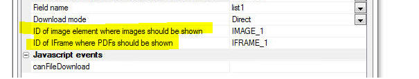
Action Javascript - Image Upload Action - UX and Grid Component - Amazon S3
- The Image Upload action allows you to upload an image and store the
image in a field in the table to which the UX or Grid component is bound.
-
If the image is bound to a binary field in the target table, the binary
data for the uploaded image is stored in the binary field in the target
table.
-
If the image is bound to a character field in the target table, the
image is uploaded to the server and then saved in a file in a specified
folder on the server. The filename of the image on the server is saved
in the character field in the target table.
In the case where the image is bound to a character field in the target
table you now have the new option of uploading the image to Amazon S3
storage rather than to the Alpha Anywhere server.
Watch Video
- Part 1
Watch Video
- Part 2
Watch Video
- Part 3
Uploading the image to Amazon S3 storage is an extremely efficient solution
because it places minimal load on the Alpha server (both for uploading the
image and then subsequently displaying the image when the component is run).
When you choose the option to upload to Amazon S3 storage you can either
upload the image as:
-
public read
-
protected read
NOTE: The Image Upload builder has a property called
Authenticated read. To use
the 'public read' option, the
Authenticated read property should not be checked. To
use the 'protected read' option, the
Authenticated read property
should be checked.
When you upload using the 'public read' option, the image is uploaded to
Amazon S3 and then the URL to the image is stored in the character field in
the database. For example, this URL might look like:
https://s3.amazonaws.com/yourBucketNamehere/imageFileName
This URL can be pasted into a browser address bar and the image from Amazon
S3 storage will be shown. In other words, it is not necessary to supply any
credentials in order to see the image.
When you upload using the 'protected read' option, the image is uploaded to
Amazon S3 as a protected file and the value that is stored in the character
field in the database is a special JSON string that contains information
about the storage connection string and the object name on Amazon S3. For
example:
{cs: 'name of your storage connection
string', object: 'name of object on S3', source: 'S3'}
NOTE: When you check the
Authenticated read
property you must use the
Named Storage Connection String
option as the
Method for specifying Amazon S3
credentials.
When the component is rendered, the Alpha server automatically takes this
JSON encoded string and computes a special signed URL that can be used to
retrieve the image from S3. This special signed URL expires after a certain
amount of time (current set to 240 seconds).
When an image is upload to S3 the work flow is as follows:
-
an initial Ajax callback is made to the
Alpha server to 'sign' the URL that will be used to upload the image to
Amazon S3 (this is a very 'lightweight' action which places very little
load on the Alpha server).
-
the signed URL is retuned to the browser
and the browser then initiates the file upload to the Amazon S3 server
(all communication is between the browser and Amazon S3 - there is no
load on the Alpha server).
-
once the upload completes, an event fires
in the browser to set the component dirty (in the case of a Grid
component, the current row in the Grid is set dirty)
When the component is run, if the image field in the current row that is
being displayed, contains the special JSON encoded string which is used for
protected reads, the Alpha Anywhere server converts this JSON string into a
signed Amazon S3 URL that can be used to retrieve the image.
To
use the Amazon S3 image upload option in the Image Upload genie, select the
Upload target
property and set it to
AmazonS3 as shown in the image below.
The options for the
Upload target property are:
-
Server -- upload the image to the
Alpha Anywhere server and store the image in a file on the server
-
AmazonS3 -- upload the image to
Amazon S3
Once you select AmazonS3
as the upload target the Amazon S3 Storage Properties section is displayed,
allowing you to set your Amazon S3 properties. For a complete discussion on
these properties see the topic that documents the 'File Upload - Amazon
S3' action in Action Javascript.
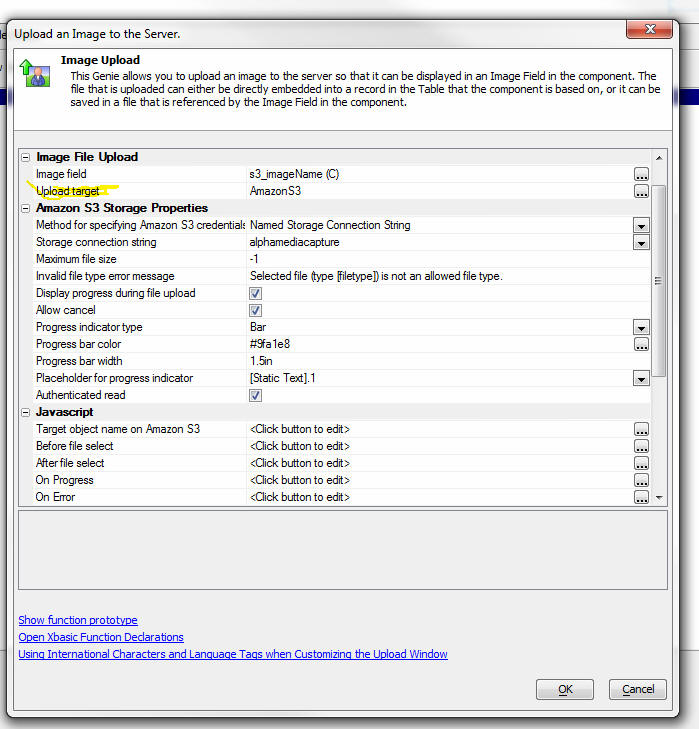
Action Javascript - File Upload Action - UX and Grid Component - Amazon S3 -
The File Upload action allows you to upload a file and store the file in a field
in the table to which the UX or Grid component is bound.
-
If
the file is bound to a binary field in the target table, the binary data for
the uploaded file is stored in the binary field in the target table.
-
If
the file is bound to a character field in the target table, the file is
uploaded to the server and then saved in a file in a specified folder on the
server. The filename of the uploaded file on the server is saved in the
character field in the target table.
In
the case where the file is bound to a character field in the target table you
now have the new option of uploading the file to Amazon S3 storage rather
than to the Alpha Anywhere server.
Watch Video - Part 1
Watch Video - Part
2
Uploading the file to Amazon S3 storage is an extremely efficient solution
because it places minimal load on the Alpha server when the file is uploaded. In
addition, once the file has been uploaded to Amazon S3, when the file needs to
be downloaded, there are options to configure the download so that the download
takes place directly from Amazon S3 to the client, placing no load on the Alpha
server, or in the case of a protected read (see below), placing minimal load on
the Alpha server.
When
you choose the option to upload to Amazon S3 storage you can either upload the
file as:
-
public read
-
protected read
NOTE: The File Upload builder has a property called
Authenticated read. To use the
'public read' option, the Authenticated
read property should not be checked. To use the 'protected
read' option, the Authenticated read
property should be checked.
When
you upload using the 'public read' option, the file is uploaded to Amazon S3 and
the File Upload action builder gives you an option of storing the URL to the
file in the character field, or a special JSON string that contains information
about the file's location on S3.
If
you choose the URL option, the format of the data stored in the field is:
https://s3.amazonaws.com/yourBucketNamehere/fileName
This
URL can be pasted into a browser address bar and the file from Amazon S3 storage
will be downloaded, (or shown -- if the browser has a built-in handler for the
file MIME type). It is not necessary to supply any credentials in order to
retrieve image.
If you
choose the JSON option, the format of the data stored in the field is:
{cs: 'name of your storage connection string',
object: 'name of object on S3', source: 'S3'}
When
you upload using the 'protected read' option, the JSON option is the only
option.
NOTE: When you check the
Authenticated read
property you must use the
Named Storage Connection String
option as
the Method for specifying
Amazon S3 credentials.
When a
file is upload to S3 the work flow is as follows:
-
an
initial Ajax callback is made to the Alpha server to 'sign' the URL that
will be used to upload the file to Amazon S3 (this is a very 'lightweight'
action which places very little load on the Alpha server).
-
the
signed URL is retuned to the browser and the browser then initiates the file
upload to the Amazon S3 server (all communication is between the browser and
Amazon S3 - there is no load on the Alpha server).
-
once
the upload completes, an event fires in the browser to set the component
dirty (in the case of a Grid component, the current row in the Grid is set
dirty)
To use
the Amazon S3 file upload option in the File Upload genie, select the
Upload target
property and set it to AmazonS3
as shown in the image below.
The
options for the Upload
target property are:
-
Server -- upload the image to the Alpha Anywhere server and store the
image in a file on the server
-
AmazonS3 -- upload the image to Amazon S3
Once
you select AmazonS3
as the upload target the Amazon S3 Storage Properties section is displayed,
allowing you to set your Amazon S3 properties. For a complete discussion on
these properties see the topic that documents the 'File Upload - Amazon S3'
action in Action Javascript.
Xbasic Modules - Live Preview - If you do a 'Full
Preview' when doing Live Preview, Xbasic Modules that
are used in your Xbasic code are now automatically
published to the Live Preview folder.
Reports - Layout Table Reports - 'Keep Row Together'
Property - A new property is available for Layout
Table reports. This property will prevent a page break
in the middle of the row. This property is useful for 'growable'
row content, such as HTML and Linked Reports.
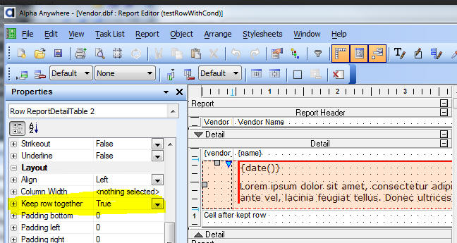
Alpha DAO - ODBC - New SQL Connection Property =
A5ODBCTableList - There is a new property available
on the ODBC connection string dialog labeled 'ODBC Table
List' and identified in the connection string as
A5ODBCTableList.
The default value for A5ODBCTableList is false; meaning
no change in behavior. When set to true, the selected
vendor behavior will continue for most functionality.
The one exception will be listing tables. This will
defer to the ODBC driver as you would see if you used
'ODBC' as your vendor.
This new option provides a fallback for ODBC drivers
giving better control over the list of tables than the
native syntax implementation.
One use case for this option is to limit the number of
tables displayed in AS/400 (DB2 iSeries); which tend to
include an entire library list (like a path in Windows)
and can be quite large. The DB2 iSeries driver has
optional parameters for the library list that can be set
when creating a DSN; and which our connection string is
unaware of. Checking 'ODBC Table List' when connecting
to the AS/400 DB2 iSeries driver through an ODBC DSN
defers to the driver itself to create the table list.
UX Component - List Control - Export Data to Excel
or Ascii - You can now export data in a List control
to either Excel or to Ascii files.
Watch Video
After the export file has been created you can either download the file
to the client, or call an Xbasic function to further process the exported
file. A typical use case where you might want to call an Xbasic function to
process the exported file would be if you wanted to email the file to a list
of recipients, or upload the file to cloud storage, such as Amazon S3
storage.
In the case where the List is based on a SQL query you have the option
of:
- exporting the data in the List
- exporting the data in the List query
Consider the case where you have defined a List and have turned on the
pagination feature. You might have set the page size to 100 rows. The query
that the List is based on might have 1,000 records, but the List will only
show 100 rows of data at a time. If the export is based on the 'Data in the
List' the export file will have 100 rows in it (because the List only has
one page of data - 100 rows - in memory at any time). However, if the export
is based on 'Data in the List Query' the export file will have 1,000 rows in
it (subject to the Max Records setting which might limit the number of rows
in the export file).
To export data in a List you can use Action Javascript to define the
code.
- Select the 'List Control Actions' in Action Javascript
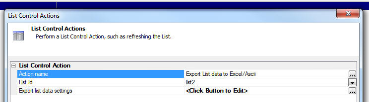
- Select the 'Export List data to Excel/Ascii' action from the list of
available actions.
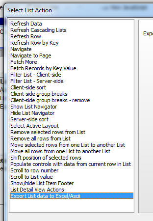
- Click the smart field to define the 'Export list data settings'.
In the case where the List is based on a SQL query, the builder shows the
'Export what' property which can be set to 'Data in List query' or 'Data
shown in List'.
If the 'Export what' property is set to 'Data in List query' the 'Maximum
number of records to export' property is shown.
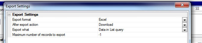
In the case where the 'Export what' property is set to 'Data shown in
List' or if the List is not based on a SQL query (in which case the data
that is exported is always the 'Data shown in List'), the 'Customize field
sizes and column heading in export file' property is shown.
NOTE: The 'Customize field sizes and column heading
in export file' property is only shown if the 'Export format' is Excel.
This property allows you to customize the column headings in the Excel
file and control the data types of the data in the excel file.
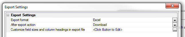
To customize fields, click the smart field for the 'Customize field
sizes and column heading in export file' property.
A build opens up where you can enter a CR-LF delimited list of definition
- one for each field you want to customize.
The syntax for the definition can be shown by clicking the 'Show syntax
help' hyperlink.
The syntax allows you to specify the data type, size and column heading
of each column in the Excel file.
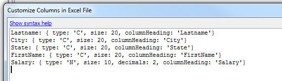
UX Conponent - List Control - List with Detail View - .addTableRows()
Method - Insert Rows - The .addTableRows() method now has new
options to allow you to add the new row at a specified position in the
List (i.e. insert rows), rather than at the end of the List (append
rows). For information on the .addTableRows() method, click
here.
Bugs
UX Component - Tab Controls - Method For Selecting
Active Pane - Automatic - Nested Tabs - If you had
nested tab controls and the outer tab was set to use the
'Automatic' method for selecting the active pane, the
watch expression that selected the active pane was not
being generated correctly.
UX Component - Android - Scrolling - Fixed an
issue where (in certain cases), after editing in a text
control in a component, you could no longer scroll a
Panel Card to the top or bottom of the Panel Card.
UX Component - onSynchronize Server-side Event - Open
UX in Window - Cached Option - If a data-bound UX
component was opened in a pop-up window and the allow
caching of the child UX feature was turned on, and if
the child UX had a long-running onSynchronize event, it
was possible for the primary keys in the child UX to get
overwritten with the wrong values the second and
subsequent times the child UX was opened. If this
occurred, any edits to data made in the child UX would
have been applied to the wrong record.
UX and Grid Component - Amazon S3 - File and Image
Upload - Uploading files to S3 buckets that were not
in the default US East region was not working correctly.
UX Component - Container Width 100% - Break - On
some browsers, if you have a two consecutive containers,
each with a width of 100% and you do not have the break
between the containers turned on, you might get strange
behavior when you scroll the Panel Card that contains
that containers. Turning on the break between the
containers resolves the issue. Now, if you set a
container's width to 100%, the break in the Container
End is automatically turned on.
TabbedUI Component - onLogout Event - Fixed
various issues with the onLogout event.
Grid Component - AlphaDAO - Compound Primary Key
- If you specified that a Grid had a compound primary
key and you selected the columns in the Primary Key in
the order in which they should appear in the Primary
Key, Alpha Anywhere would define the Primary Key in the
order in which the columns existed in the schema. For
example, if you specified that the primary key was
Lastname, Firstname, but the schema order was Firstname,
Lastname, the primary key was defined as Firstname,
Lastname. To fix the problem you must edit the existing
grid and reselect the primary key columns.
UX Component - {dialog.object}.panelGet() Method
- Previously, if you called this method with an invalid
Panel name, the method returned the top-most Panel (root
Panel). Now, false is returned.
UX Component - List Control - Multiple Layouts -
onOrientationChange - If a List has a separate
layout for Landscape and Portrait mode, now, when
changing orientation, the selected row is remembered
when the List layout is changed.
UX Component - Edit Combo - Different Stored and
Display Values - Data Source Type Xbasic Function -
Previously different display and stored values were only
supported if the data source was AlphaDAO. Now, it is
supported for Xbasic Functions.
Grid and UX Component - Export to Excel - Text
Dictionary Tags - Text dictionary tags in column
headings were not honored when exporting to Excel or
Ascii files
Grid and UX Component - Export to Excel - SQL
Databases - Dates - Dates are now exported using a
date format that such that when the Excel file is opened
the dates are shown using the regional settings of the
machine. Previously the dates used a format that matched
the regional settings of the server.
AlphaDAO - Postgres - Geography Searches - Fixed
bugs in geography searches. Radius search was failing
and case of search field was not properly preserved when
the SQL WHERE clause was composed.
copy_folder() Function - Under some
circumstances, the copy_folder() function did not copy
files.
UX - List Control - Server-side Summary Fields -
Under some circumstances the server-side summary fields
values were not available in the 'summary' object when
the afterServerSideSummaryFieldsComputed event was
fired.
Grid Component - Read Only Grid - .getValue() Method
- Empty Values - If the .getValue() method was
used to read the value in a control that was empty, the
method would return ' ' for the value rather than a
blank string.
Javascript Library - Date Object - .fromFormat()
Method - The Alpha Anywhere Javascript library add a
.fromFormat() method to the Javascript date object
prototype. Under some circumstances (when using 'yyyy-MM-dd'
as the date format string) strings representing date
values were not correctly parsed into date objects.
UX Component Builder - Moving Controls Up/Down -
Fixed an occasional error that was reported when moving
controls up/down in the UX Component builder.
UX Component - onOrientationChange Event - Android
- Fixed an issue where the
onOrientationChange event did not fire on Android
devices after the first orientation change, and then
after that, it fired, but reported the wrong
orientation. This bug resulted from know bugs with the
Android orientation event that cause the screen size to
be reported incorrectly when the orientation event is
fired. We have worked around this issue by introducing a
300 ms delay after the system reports an orientation
change before we read the screen size.
When computing the orientation on Android, the keyboard
position is now ignored. Previously on Android if the
screen was in (say) portrait mode and the keyboard came
up, the
onOrientationChange event would fire and report
that the screen was in landscape mode. The
onOrientationChange would also fire when the
keyboard was dismissed. This is because when the
keyboard is visible, the screen size that Android
reports is affected by the size of the screen. On iOS,
the keyboard does not affect the reported screen size.
If, for backward compatibility reasons, you want to use
the old method on Android where the keyboard does affect
the reported screen size, add this code to the
onRenderComplete client-side event:
{dialog.object}._quirks = {
keyboardAffectsScreenSizeCalc: true};
Navigation Component - iOS - Navigation component
menus did not operate well on iOS devices.
Report
Server - Temp File Cleanup - Under certain
conditions temporary files created for SQL based reports
were not being deleted when the report was completed.
These files are now immediately deleted when the report
is finished. The report server now uses the temporary
file cleanup setting from the parent Application server
to remove other old temporary files created by the
report server.
UX Component - List with Detail View - Image Capture
- Fixed an issue when a UX component had more than one
Detail View image capture field on it.
UX Component - Panel Card - Text Area Control -
Scrolling - Fixed an issue with scrolling text in a
text area control when the control was in a Panel Card.
Excel Import - Determining Field Type of Imported
Data - Made a change to Excel import so that more
rows of the sheet are examined in order to determined
the field type of each column in the Excel sheet.
UX Component - Arguments - Bound to Session Variables
- If an argument value was bound to a session variable,
the argument value was not getting updated on Ajax
callbacks if the value of the session variable was
changed after the component was initially rendered.
Also, if the session variable was set in the
onDialogInitialize or onDialogExecute server-side event,
the argument values were not getting reset to the new
value of the session variables.
Video Component - Opening from Button on uX Component
- Under some circumstances, if you had a button to open
a Video component on a UX component, it would fail.
UX Component - PhoneGap - Linked Javascript Files - {HeadSection}
Directive - If a UX component linked a Javascript
file and specified the special {HeadSection} directive,
the linked file was not copied into the PhoneGap project
folder.
Web Applications - Web Security - New Password
Encryption - A new password encryption process has
been added that generates a much longer encrypted value
for a password. This is considerably more secure than
previous encryption methods as a password cannot be
decrypted even if a person has the project's password
encryption key.
The security settings genie now has a new property on
the 'User Id
and Password Options' tab under 'Password
Options'. If password encryption is selected, a 'Password
use legacy encryption' option is shown. When
checked, the system will use the legacy encryption
method used in earlier Alpha Anywhere builds for any new
passwords entered. If the option is not checked, any
new passwords entered will use the new password
encryption process.
New security systems will use have the 'Password
use legacy encryption' property un-checked by
default and will use the new encryption process.
Existing security systems will initially have the 'Password
use legacy encryption' property checked and will
continue to use the older encryption methods. The
property can be changed at any time and will only impact
new passwords being
entered. Existing passwords are not converted when the
property is changed. The new process will still use any
existing encryption key that has been defined for the
web security.
This system is compatible with previous Alpha Anywhere
builds as passwords encrypted in previous versions will
still work. It is not necessary to convert any existing
passwords.
However, all existing passwords in a project or
published application can be converted to the new scheme
if desired with a new utility function.
The function 'a5ws_RefreshPasswordEncryptionUtility()'
can be run from the development program interactive
window or the application server interactive window.
When run from the development program, a list of all
projects in the workspace that have security will be
shown (unless there is only one project). When run on
the application server, a list of all applications in
the webroot that have security will be shown (unless
there is only one application).
The function will convert all previously encrypted
passwords in the selected application or project to the
new password encryption. If the optional parameter 'UseLegacy'
is set to True, all passwords will be converted back to
the legacy encryption scheme.
NOTE: Only Alpha Anywhere builds after release
build 2614-4409 can recognize passwords that are
encrypted with the new method. If you want to roll back
to build prior to 2614, you must first run the utility
to convert all passwords back to the legacy encryption
used in the earlier builds.
If you change the encryption key or add a new key, all
existing passwords will be lost, and will need to be
re-entered.
Recommended Action
-
If the current encryption method is acceptable for your needs, no
action is needed.
-
If you want to take advantage of the new encryption method and have
a system that requires users to periodically change passwords, you
can just uncheck the 'Password use legacy encryption' option. As
users change or add passwords, the new passwords will use the new
method. An existing password encrypted with any encryption method
will still be recognized.
-
If you want to take advantage of the new methods and the
configuration doesn't require regular password changes, or you want
to immediately convert all passwords to the new method, you can run
the conversion utility function in the interactive window of the
development program and the application server to update all
passwords in the security for the application.
UX Component - Tab Controls - Fixed a bug where
the UX would fail if the last control in a Tab Pane was
hidden and the previous control was any type of
container end control.
a5_merge_JSON_into_template() Function - Application
Server - The a5_merge_JSON_into_template() function
did not work when called from Xbasic code running in the
Application Server. It only worked in the Development
Server.
Xbasic Code - File System Dictionaries - Fixed a
bug when exporting code to a File System Dictionary that
was not relative to the Workspace.
UX Component - Arguments - OnSynchronize and
OnDialogExecute Events - Under some circumstances
argument values shown in the server-side onSynchronize
and onDialogExecute events did not reflect the argument
bindings that had been defined.
Javascript Code Editor - Code Colorization of
Commented Out Code - Code in commented out sections
was not always colorized correctly. This was a cosmetic
bug - it had no effect on application.
Reports - SQL Data Source - Image File Reference
Fields - Fixed a bug where Image File Reference
fields were not working correctly.
Grid Component - Row Expander - Scroll Position on
Page - If a Grid had been scrolled on the page and
then a Row Expander for a row near the bottom of the
page was opened and the user clicked on one of the rows
in the Grid shown in the Row Expander, the parent Grid
would scroll back to the top of the page. This is fixed
now, but you can also work around the issue by using a
master template in the child Grid and wrapping the
master template in a div with a
position:relative; style attribute. For example
<div style="position:relative;">
</div>
UX Component - Panel Cards - Tab Control - Hidden
Controls - If a UX component used Panel Cards and
you had a Tab Control in one of the Panels, if the last
control in a given Tab Pane was hidden, the UX would
fail. This is now fixed but you can also work around the
bug by simply moving the hidden control up so that is is
no longer the last entry for the Tab Pane.
UX Component - Pop-up Window - Google Map - As a
result of a recent change Google made to Google Maps,
the following pattern had stopped working:
-
create a UX with a map control in a container window
-
create a button to show the window
When the UX was run the map, which should have been
hidden because the window had not yet been shown, should
have been hidden, but was not. This is now fixed.
List Control - Image Fields - Missing Images - In
some situations, the 'missing image' for a field that
did not have an image, was not being displayed.
Grid Component - Geography Search - Radius Search
- If you performed a search for all records within a
specified radius of a point and you specified that the
search result should be sorted by distance from the
center point, then if you tried to navigate to the next
page of records in the search result you would get an
error.
Tips
UX Component - List Control - Using a Slider Control to Scroll a
List - Say you have a List control and you want to put a Slider
control under the List to scroll the List. Assume that the name of the
Slider control is 'Slider1'
Step 1 - Put this code in the List's AfterRenderComplete event
var s = {dialog.object}.getControl('Slider1');
var l = {dialog.object}.getControl('{dialog.listId}');
s.min = 0;
s.max = (l._data.length -1);
s.refresh();
This code sets the min/max values on the slider to match the row
count of the List.
Step 2 - Put this code in the Slider control's onSlide event:
var l = {dialog.object}.getControl('LIST1');
//the value of the slider while it is being
dragged is in arguments[0].value
var val = arguments[0].value
l.scrollToItem(val);
UX Applications - PhoneGap - iOS Native Date Picker - If your
UX component allows editing for date field fields you might want to use
the native iOS Date Picker in your app. This is easily done by:
1. Setting the HTML5 type for the textbox where you edit the value to
'date'
2. Setting the display format for the textbox to yyyy-MM-dd
3. If the UX uses a List control with a Detail View the client-side
display format for the date field can be set in the List Control, Fields
tab.
UX Component - List with Detail View - Searching while Offline
- When you use the List Detail View genie to create a List control with
an associated Detail View and Search part, the genie inserts code like
this in the Search button's click event:
{dialog.object}.getControl('name_of_the_list').searchList({searchMode :
'auto'});
The 'auto' in the .searchList() method means:
1. if the List is not dirty then do a server-side search
2. if the List is dirty do a client-side search (because doing a
server-side search would repopulate the List and blow away your unsynchronized
edits)
If your List is not dirty and you do not have a connection, the
command will do a server-side search (because the List is not dirty),
but because there is no connection, the search will obviouslyfail.
Once approach is to test for connectivity before doing the search,
and if there is no connection, then automatically switch to a
client-side search. For example, you can change the code in the button's
click event to:
var flag = {dialog.Object}._getOnlineStatus();
if(flag) {
// device is connected - ok to so a server-side search
{dialog.object}.getControl('name_of_the_list').searchList({searchMode :
'auto'});
} else {
// device is not connected - must do a client-side search
{dialog.object}.getControl('name_of_the_list').searchList({searchMode : 'clientSide'});
}
UX and Grid Component - Tab Controls - Right to Left - For
Hebrew and Arabic applications you might want the Tab buttons on a tab
control to be displayed right to left, rather than the standard left to
right format.
To do this, you can add the following CSS markup to the Local CSS
property in the component.
.{dialog.style}TabTButton, .{dialog.style}TabTButtonSelected,
.{dialog.style}TabBButton, .{dialog.style}TabBButtonSelected {
float: right;
}
Application Server - Silent Install - The Alpha Anywhere
server installation program can be run in 'silent mode' by using the /S
command line switch.
For example:
a5v12_AppServer.exe /s
However, the first time you install the Alpha Anywhere server on a
machine you will need to specify your license key. Since you are doing a
silent install, you cannot enter the license key in the Application
Server UI as you normally would do.
You can add the license key to a special registry key and Alpha
Anywhere will automatically install the license if it is found in this
registry location.
The registry key in which you must install your license number varies
depending on whether you are running on a 32 bit or 64 bit operating
system.
The following command line shows how you can add your license number
to the appropriate registry key
For 64 bit operating systems
reg add "HKLM\SOFTWARE\Alpha Software\Alpha Anywhere Application Server
12.0\httpd" /v ActivateLicense /t REG_SZ /d "yourlicensenumber"
For 32 bit operationg systems
reg add "HKLM\SOFTWARE\Wow6432Node\Alpha Software\Alpha Anywhere
Application Server 12.0\httpd" /v ActivateLicense /t REG_SZ /d "yourlicensenumber"
The commands to add the registry key should be executed before you
run the Alpha Anywhere install.
You can also specify the install path and the install group when you
run the installer by setting Environment variables before you run the
installer.
The installer reads the following environment variables
- A5_MAINDIR --
the folder where the install will be done
- A5_GROUP - the
group where the install will be done.
For example, from the Windows command prompt:
SET A5_MAINDIR=c:\AlphaAnywhere\Server
PDF Report Print on Development Server But Not Production Server
- Occasionally we here from developers who report that their PDF reports
are working fine on their Development server but when they deploy their
application to their production server, the PDF reports do not print.
The error that is report is:
Report
did not print. Error reported was:
Report Server: 'Alpha Five Printer' (for creating PDF, RTF and HTML
output) is not installed. Re-install Alpha Anywhere Application Server
at line: 27
The error indicates that the Amyuni Printer Driver (also called the
'Alpha Five Printer') did not install properly on your server machine
when the Alpha Anywhere Application Server was installed.
Here are some things you can check to resolve the problem:
That indicates the print driver did not install. This can happen for
a couple reasons.
- If you were not logged in as an administrator when the
Application Server was installed the driver may not have installed.
- The driver may have installed, but isn't assigned to a port.
- The Application server is running under a system account
- The server is running under Server 2012 or Win 8 and the Windows
Print Spooler is not running
The first issue can be checked and corrected fairly easily. Log onto
the server machine with administrator rights. Open the "Devices and
Printers" from the Windows control panel and see if the driver for
"AlphaFivePrinterV4p5" is installed. If it is, then open the "Printer
Properties" and verify the printer is assigned to a port. Normally, it
is assigned to a NUL port.
If the printer isn't listed, open Windows Explorer or My Computer, and
look for the folder that contains the Alpha Anywhere Application Server
program. It would normally be at:
C:\Program Files (x86)\a5V12 ApplicationServer
Find the subfolder named "AmyuniV4" and find the file "InstallAmyuniPrinters.exe". Right
click on the file and select to "Run as Administrator". A window should
open showing the progress. If it fails to install, check any error
message. If it fails, the last issue may be the problem as Windows may
not install any print driver if the spooler is not running.
If the driver is installed, or installs correctly, then the problem may
be is the user rights. If running the Application Server as a service
with srvany, or under AlwaysUp, make sure the user login is not the
"Local System Account". That account does not normally have printing
privileges. Is is best to run the program under a user with full
administrator rights
UX Components - Panel Cards - Child Components that Open in a
Parent Component Panel -- A common pattern when building mobile
applications using the UX component is to have a master component with
one or more Panel Cards and then have buttons that open child
components in a Panel Card in the master component.
When utilizing this pattern be sure to turn off the 'Body can scroll'
property for the target Panel (i.e. the Panel in which the child UX will
be rendered).
Alpha Anywhere V3.11 -
Build 2689-4440 4-Feb-2015
Videos
|
UX Component |
Hiding/Showing/Enabling/Disabling Buttons in a
Button List Control |
You can use Javascript to dynamically hide,
show, enable and disable buttons in a Button
List control on a UX component. You can also
dynamically add and remove buttons from the
Button List.
In this video we show the Javascript to
dynamically alter the Button List.
Watch Video
Download Component
Date added: 2015-01-30 |
Features
Web Applications - Publishing Using FTP - CURL -
When you publish your web application to an ISP, your
publishing profile will typically specify that the
method for publishing the files is FTP.
You then have the option of using either the built-in
FTP features in Alpha Anywhere, or using an external FTP
client.
If you choose to use the built-in FTP features in Alpha
Anywhere, you now have a new option of using CURL FTP.
Unlike the standard FTP feature in Alpha Anywhere (which
uses Active mode), the CURL FTP option supports passive
mode. Passive move is more reliable as is has enhanced
error checking and error messages.
NOTE: Some FTP servers require passive mode and
will not support the standard built-in Alpha Anywhere
FTP features, which use active mode. In this case you
must use the CURL FTP option.
To select the CURL option, check the 'FTP Publish with CURL' property
in the Profile Editor dialog.
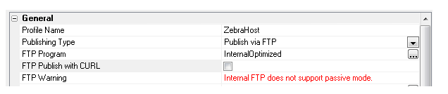
Passive mode FTP is slower than active mode FTP, especially when
uploading a lot of files, rather than one large zipped file. Therefore
it is recommended that you only use the CURL FTP option when using the 'InternalOptimized'
option (which zips all of the files to be published into a single zip
file).
UX Component - List Control - Disconnected Data Entry - Preventing
Duplicate Records when Connectivity is Lost - When you are working
with disconnected data in a List control there is a small possibility of
a synchronization request being submitted to the server more than once -
resulting in the possibility of duplicate records in the database.
To understand how this might happen, consider what happens when the
user clicks the 'Synchronize' button on a device to synchronize edits
that were made while offline.
-
A JSON packet containing all of the edits that were made to the List
(including any child Lists) is sent to the server.
-
The server processes the updates.
-
After the server has completed processing the updates, the server
sends a response back to the client indicating which rows were
successfully synchronized and which rows have errors. This response
will set the 'dirty' state of each row in the List that had been
edited back to 'clean'.
Obviously, in order for the server to receive the synchronization
request, the user must have a connection. But suppose that AFTER
the user sends a synchronization request to the server, but BEFORE
the server completes the work and can send a response back to the
client, the client looses connectivity.
The server will continue processing the updates to the server and
will do all of the synchronization requests contained in the package
sent from the client. The server does not know that the client is now
offline and so, after it completes all of the work, it will send a
response to client indicating which rows were successfully synchronized.
However, since the client is now offline, the client will not receive
this message from the server. This means that all of the rows on the
client that were edited are still marked as 'dirty' (even though the
server has successfully applied all of the edits).
Now assume that the client gets its connection back and the user
clicks the 'Synchronize' button again. The client will send a JSON
package to the server and this package will include all of the updates
that were previously sent to the server.
In order to protect against this possibility, a special server-side
log can be used to prevent synchronization commands from being executed
more than once.
In order to turn on the server-side synchronization log, edit the
List control and on the Detail View pane, check the
Use server-side synchronization
log table property.
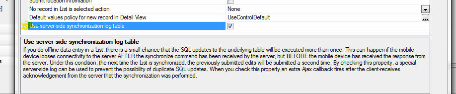
Before you can check this property however, you must first define the
setting for the Synchronization Log Table. To define these settings,
click the Project Properties button when the Web Projects Control Panel
has focus.
Scroll to the Offline Data Synchronization Log Table Settings section
and set the properties for the table. You can map this table to an
existing table in your SQL database or Alpha Anywhere can create a new
table for you with the correct table structure.
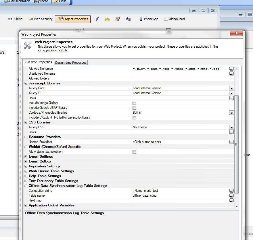
Bugs
UX Component - List Control - Dynamic Images -
Client-Side - Fixed an issue with dynamic,
client-side images in a List control. Image did not
display correctly after data in the List had been
edited.
Grid Component - Linked Grids - Detail View - New
Record - If a child Grid was linked to a parent
Grid, when going to the new record in the child Grid's
Detail View, the linking fields in the Detail View were
not filled in with the linking values as they should
have been.
Reports - Native SQL - Dynamic Filter at Runtime
- If a report was based on native SQL, rather than
portable SQL, then if you tried to apply a dynamic
run-time SQL filter to the report, the dynamic filter
was ignored. Now, the dynamic filter will be added to
the native SQL query for the report. However, because
this may be combining a native SQL query with a portable
dynamic filter, there is no guarantee that the resulting
SQL statement will execute correctly.
Video Finder - A bug was introduced in the
previous update that prevented the Video Finder from
opening.
Alpha Anywhere V3.11 -
Build 2684-4438 30-Jan-2015
Bugs
UX Component - Signature Capture - Build 2682
introduced a bug when saving data from a signature
capture control.
Grid Component - Linked Grids - Up/Down Keys - In
some cases when using the up/down keyboard navigation
keys to navigate in the child grid, the keystrokes were
being handled by the parent Grid.
Alpha Anywhere V3.11 -
Build 2682-4435 28-Jan-2015
Videos
|
UX Component |
Dynamically Re-populate the Choices in an
Edit-Combo using Javascript |
The choices shown in an edit-combo can be
dynamically repopulated at run-time using
Javascript.
Watch Video
Date added: 2014-12-21 |
|
UX Component |
Constraining an UX that has Panels to an Element
Rather Than Entire Window |
When a UX component that uses Panels is
rendered, by default it consumes the entire
window (only true if UX uses Panels). That means
that if you have created an .a5w page to render
the component and placed HTML markup on the page
that you would like to be rendered in addition
to the UX component, that markup will be
overwritten by the UX. An advanced property of
the UX now allows you to specify that the UX
should be constrained to an element, rather than
the entire window.
In this video we show how an .a5w page can be
defined with a DIV to contain the UX and how the
UX can be configured so that it is constrained
to this DIV element.
(Requires build 4411 or above).
Watch Video
Download Component
Date added: 2014-12-22 |
|
|
|
|
Features
Publishing Web Applications - Publishing Profiles -
Lock Profile - A new property has been added to each
publishing profile. The 'Lock' property allows you to
lock a profile to prevent accidental publishing to a
deployed application.
The 'Lock' property can be set to blank (not locked),
'Locked' or 'Locked with password'.
At publish time, if you select a profile that has been
locked, the publish will be aborted. If you select a
profile that is 'locked with password', you will be
prompted for a password before publish continues.
UX Component - List Control - List Builder -
Resizeable - The List builder dialog window is now
resizeable.
ui_bitmap_info_get() Function - Image Type - Now
can return the image type of image binary data.
Syntax:
c type = ui_bitmap_info_get(b blobImageData,"T")
Example
dim b as b
b = file.to_blob("c:\images\image1.jpg")
? ui_bitmap_info_get(b,"T")
= "JPG"
UX Component - List Control - Numeric Fields -
Client-side Display Format - The List Builder now
allows you to specify a client-side display format for
numeric fields. Previously you had to define a client
side display format by directly editing the template for
the field. This method is easier than editing the
template.
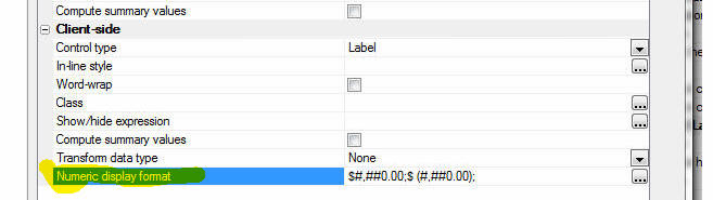
AlphaDAO - MS SQL Server - DateTimeOffset Field Type
- Support has been added for the SQL Server
DateTimeOffset field type.
The Alpha Anywhere support for the SQL Server
DateTimeOffset type works as follows:
- When a value is retrieved that is of type DateTimeOffset, it is
bound as a TIMESTAMP. SQL Server also converts the value to the
local time zone.
- When a value is passed in as a DateTime and the prepared target
column is reported as DateTimeOffset, the value is assumed to have
been provided as local time and is automatically adjusted to UTC
(based on the Windows time zone information).
UX Component - Web Security Server-Side Action
Scripts - The web security action scripts in a UX
component now allow the password to be optional in the
variable mapping even if the security setting require a
password. The password is optional if the component can
only edit an existing security record. The password
mapping is required if the component can add a new user
security record. A warning message will appear when the
action script is saved if a password variable is not
specified.
Xbasic Code Editors - JSON Strings - Real-time
Validation - If you use the specify
<<%json%...
%json%
delimiters to enter a long string of JSON data, the
Xbasic editor will perform real-time validation on the
JSON data.
For example, in the image below, the JSON has an error
because of the trailing comma after the last property
(age: 23). Notice the squiggly red line indicating the
error. If you click on the error indicator you will see
the error message.
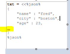
Reports - Free-form Reports - Text Dictionary Tags
- You can now use text dictionary tags
(<a5:t>...</a5:t>) to internationalize the labels in a
report.
For example, you can set the label of a column to
<a5:t>Last Name</a5:t>
Next, turn on the text dictionary feature in your web
application by going to the Web Projects Properties
dialog when the Web Projects Control Panel has focus and
specify the connection string and table name for your
text dictionary.
To define entries in the Text Dictionary select the
'Text dictionary...' menu item from the 'Reports',
'Label' or 'Letter' menu while you are editing the
report, label or letter.
json_to_xml() Function - ATOM Format - The
json_to_xml() function can now generate XML using the
"atom" format:
For example:
js = <<%str%
{
"OrderId":10248,
"ProductID":11,
"UnitPrice":14,
"Quantity":12,
"Discount":0
}
%str%
dim xml as c
xml = json_to_xml(js)
<?xml version="1.0" encoding="UTF-8"?>
<data>
<OrderId>O10248</OrderId>
<ProductID>11</ProductID>
<UnitPrice>14</UnitPrice>
<Quantity>12</Quantity>
<Discount>0</Discount>
</data>
dim format as c
format = <<%str%
{ "format" : "atom"}
%str%
dim xml as c = json_to_xml(js,"",format)
<?xml version="1.0" encoding="UTF-8"?>
<atom:entry xmlns:atom="http://www.w3.org/2005/Atom"
xmlns:m="http://schemas.microsoft.com/ado/2007/08/dataservices/metadata"
xmlns:d="http://schemas.microsoft.com/ado/2007/08/dataservices">
<atom:content type="application/xml">
<m:properties>
<d:OrderId>O10248</d:OrderId>
<d:ProductID>11</d:ProductID>
<d:UnitPrice>14</d:UnitPrice>
<d:Quantity>12</d:Quantity>
<d:Discount>0</d:Discount>
</m:properties>
</atom:content>
</atom:entry>
UX Component - Panels - Render Position - By
default, when a UX component that has Panels is
rendered, it consumes the entire window. In certain
cases you might want to constrain the UX to a particular
element.
The 'Render position type for UX component with Panels' property
allows you to constrain a UX with Panels to a specified element. The
default for this property is 'window'
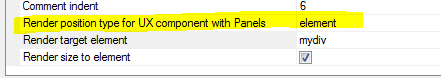
Watch Video
Bugs
Dynamic Connection Strings - Field Validation -
Cross-file Validation Rule - Was not honoring
dynamic connection strings.
UX Component - PhoneGap - Windows Phone 8.1 -
Ajax callbacks in PhoneGap applications on Windows Phone
8.1 were not working.
AlphaDAO - SQL Server - Varchar fields - Memory Leak
- Fixed a memory leak when executing update statements
that used arguments.
UX Component - List Control - Detail View - Image
Capture using Camera - PhoneGap - Fixed an issue
where the image was lost when the data was synchronized.
This issue only occurred in PhoneGap applications.
UX Component - List Control - No Records in List
Message - List Virtualization - The 'no records in
list' message did not display if List Virtualization was
turned on.
Security Framework - Editing an Existing User -
Under some circumstances you would get an error when
trying to edit the properties of an existing user
account.
UX Component - Client-side onSynchronize Event -
Changed the order in which this event is fired. It is
now fired after the code that sets argument values in
the stateInfo object has executed.
UX Component - Chart Control - Javascript Events
- If you executed an event (say a click on a pie chart
slice) and the data that was passed to the event handler
had single quotes in it, you would get a Javascript
error.
UX Component - Tab Controls - Panels - Fixed a
bug rendering nested Tab controls when the UX used
Panels.
Web Applications - Security Framework - Alternate
Login - Under certain conditions, when a new user
was added a duplicate record in the security tables was
being created.
UX Component - Buttons - Label Position - If a
button (or other non-data control) had its label
position set to some value other than 'None' the control
did not render correctly. This bug was introduced in the
previous update.
Grid Component - Edit-combo - v.hasStoredValue Error
Message - If a Grid that contained an
edit-combo was built using an older version of Alpha
Anywhere and then run using Version 3.1 you would get an
error stating that the v.hasStoredValue property was not
found. The solution was to edit the edit-combo and then
re-save it. Now, it is no longer necessary to edit
edit-comb control and re-save it.
PhoneGap Build - Unable to Log-in to PhoneGap Build
from the PhoneGap Genie - As a result of a change in
the ca-cert.pem certificate file (in the CARoot folder
in the Alpha Anywhere executable) that was made in build
4410, you were not able to log into PhoneGap. This
update installs a new ca-cert.pem file which fixes the
problem.
Tips
Chrome Browsers - Making Text Selectable - By default when
running a component (Grid or UX) in Chrome, the static text (not the
text in textarea or textbox) is not selectable. Alpha Anywhere does this
automatically so that when a component is run on a mobile device, you do
not unintentionally select text when dragging on different parts of the
screen.
However, in a desktop application you might want the static text to
be selectable. Here is how you can do this for a Grid:
Specify that the Grid has a master template. Then define a custom
template using this HTML markup:
<div style="-webkit-user-select: text; ">
{grid.Search_Part}
{grid.Grid_Part}
{grid.DetailView_Part}
</div>
In the case of a UX component, add a Container control around any
controls that you want to be selectable and then set the in-line style
of the container to:
-webkit-user-select: text;
Xbasic - OLE Automation - Implementing Callback Event Handlers in
Xbasic - This topic discusses how you can write Xbasic code to
handle callback events when running OLE automation code.
For example, consider the following Xbasic code that uses the
ADODB.CONNECTION object to connect to SQL server and then execute a SQL
command.
dim adow as ADODBOleWrapper
dim conn as p = ole.create("adodb.connection" )
conn.Open("driver={SQL Server};server=LOCALHOST;database=Northwind")
conn.Execute("select * from customers")
conn.Close()
When this code executes, it will raise these events:
- willconnect
- connectcomplete
- infomessage
- willexecute
- executecomplete
- disconnect
In order to handle these events with Xbasic code you need to pass in
an optional second argument to the ole.create() method.
First, to get the function prototype for the event handlers you can
use this method:
dim events as c
events = ole.Class_Event_Prototypes("adodb.connection")
showvar(events)
Once you have the function prototypes, you can create an Xbasic class
using this pattern:
define class ADODBOleWrapper
'Your class code goes here
implementation EventHandler as OLE::A5Events
'your Xbasic code to handle the
callback functions goes here
end implementation
end class
Note that the class has a special 'implementation' section where the
OLE callback handlers are defined.
For example, let's create a real class that writes the name of the
event that was raised to a property of the class (called 'traceEvents').
define class ADODBOleWrapper
dim traceEvents as c
function TraceEvent as v(event as c)
self.traceEvents = self.traceEvents + event
end function
implementation EventHandler as OLE::A5Events
function begintranscomplete as v(TransactionLevel as N,pError as
a,adStatus as a,pConnection as p)
self.TraceEvent("begintranscomplete "+TransactionLevel+crlf())
end function
function committranscomplete as v(pError as a,adStatus as a,pConnection
as p)
self.TraceEvent("committranscomplete "+crlf())
end function
function connectcomplete as v(pError as a,adStatus as a,pConnection as
p)
self.TraceEvent("connectcomplete "+crlf())
end function
function disconnect as v(adStatus as a,pConnection as p)
self.TraceEvent("disconnect "+crlf())
end function
function executecomplete as v(RecordsAffected as N,pError as a,adStatus
as a,pCommand as a,pRecordset as p,pConnection as p)
self.TraceEvent("executecomplete "+crlf())
end function
function infomessage as v(pError as a,adStatus as a,pConnection as p)
self.TraceEvent("infomessage "+crlf())
end function
function rollbacktranscomplete as v(pError as a,adStatus as
a,pConnection as p)
self.TraceEvent("rollbacktranscomplete "+crlf())
end function
function willconnect as v(ConnectionString as C,UserID as C,Password as
C,Options as a,adStatus as a,pConnection as p)
self.TraceEvent("willconnect "+crlf())
end function
function willexecute as v(Source as C,CursorType as a,LockType as
a,Options as a,adStatus as a,pCommand as p,pRecordset as p,pConnection
as p)
self.TraceEvent("willexecute "+crlf())
end function
end implementation
end class
As you can see, this class defined a method called TraceEvent() which
writes to the 'traceEvents' property of the class instance.
In the Implementation section, the event handlers are all defined and
they call the TraceEvent() method (using self.TraceEvent() ) to write
the name of the event that was just fired to 'traceEvents' property of
the class instance.
Now, putting this all together, we can rewrite the OLE automation
code as follows:
'DIM an instance of the class
dim adow as ADODBOleWrapper
'pass the class into the ole.create() call
dim conn as p = ole.create("adodb.connection" , adow )
conn.Open("driver={SQL Server};server=LOCALHOST;database=Northwind")
conn.Execute("select * from customers")
conn.Close()
'show the value of the class instance 'traceEvents'
property
showvar( "Events " + crlf() +adow.traceEvents )
This next example is a different take on the previous example in
which .open(), .execute() and .close() are implemented as methods of the
class instance.
define class ADODBOleWrapper2
dim conn as p
dim traceEvents as c
function TraceEvent as v(event as c)
self.traceEvents = self.traceEvents + event
end function
implementation EventHandler as OLE::A5Events
function begintranscomplete as v(TransactionLevel as N,pError as
a,adStatus as a,pConnection as p)
self.TraceEvent("begintranscomplete "+TransactionLevel+crlf())
end function
function committranscomplete as v(pError as a,adStatus as a,pConnection
as p)
self.TraceEvent("committranscomplete "+crlf())
end function
function connectcomplete as v(pError as a,adStatus as a,pConnection as
p)
self.TraceEvent("connectcomplete "+crlf())
end function
function disconnect as v(adStatus as a,pConnection as p)
self.TraceEvent("disconnect "+crlf())
end function
function executecomplete as v(RecordsAffected as N,pError as a,adStatus
as a,pCommand as a,pRecordset as p,pConnection as p)
self.TraceEvent("executecomplete "+crlf())
end function
function infomessage as v(pError as a,adStatus as a,pConnection as p)
self.TraceEvent("infomessage "+crlf())
end function
function rollbacktranscomplete as v(pError as a,adStatus as
a,pConnection as p)
self.TraceEvent("rollbacktranscomplete "+crlf())
end function
function willconnect as v(ConnectionString as C,UserID as C,Password as
C,Options as a,adStatus as a,pConnection as p)
self.TraceEvent("willconnect "+crlf())
end function
function willexecute as v(Source as C,CursorType as a,LockType as
a,Options as a,adStatus as a,pCommand as p,pRecordset as p,pConnection
as p)
self.TraceEvent("willexecute "+crlf())
end function
function ping as v()
self.TraceEvent("PING "+crlf())
end function
end implementation
function adodbolewrapper2 as v ()
self.conn = ole.create("adodb.connection",self)
end function
function Open as v( connectionString as c )
self.conn.Open(connectionString)
end function
function Execute as v( sqlStatement as c )
self.conn.Execute(sqlStatement)
end function
function Close as v( )
self.conn.Close()
end function
end class
To test this example:
'dim an instance of the class. this class has a
constructor function
'which will execute when the class is dimmed
dim adow as ADODBOleWrapper2
'now call the methods of the class instance
adow.open("driver={SQL Server};server=localhost;database=Northwind")
adow.execute("select * from customers")
adow.close()
showvar( "Events "+crlf() + adow.traceEvents )
Alpha Anywhere V3.1 -
Build 2614-4409 18-Dec-2014
Videos
|
UX Component |
Tutorial - Uploading Files using the File Upload
- User Defined Action |
There are two different actions in Action
Javascript for uploading files from a UX
component. If the UX component has been 'data
bound' then the 'File Upload' action is
appropriate. But if the UX component is not data
bound, or if you want to write your own handler
for the binary data that was uploaded to the
server, the 'File Upload - User Defined' action
should be used.
When you use the File Upload - User Defined
action, an Xbasic function that you define is
called after the file (or multiple files if you
choose to allow multiple files to be uploaded)
has been uploaded. Your Xbasic function is free
to process the uploaded data in any way.
In this video we show how the File Upload - User
Defined action can be used to save the uploaded
data to a file on the server.
Watch Video - Part 1
Watch Video - Part 2
Download Component
Date Added: 2014-10-02 |
|
UX Component |
Tutorial - Uploading Files and Images to a Data
Bound UX Component |
When you upload a file or an image to a data
bound UX component, the assumption is that you
want to store the uploaded image or file in the
record to which the UX component is bound. You
can either store the binary data that was
uploaded in a field in the record, or you can
save the binary data that was uploaded into a
file on the server and then store the filename
of the file in a character field in the record.
In this video we show how image upload and file
upload to a data bound UX component can be done.
Images and files are uploaded to both binary and
character fields in the record.
Introduction
Watch Video - Part 1
File Upload to a Character Field
Watch Video - Part 2
Watch Video - Part 3
Watch Video - Part 4
File Upload to a Binary Field
Watch Video - Part 5
Watch Video - Part 6
Image Upload to a Character Field
Watch Video - Part 7
Watch Video - Part 8
Image Upload to a Binary Field
Watch Video - Part 9
Download Component
(Note: The zip file also contains the MySQL SQL
script to create the table that the UX component
is based on.)
Date Added: 2014-10-02 |
|
UX Component |
Using the CSS Calc() Function Instead of Flex
Layout Containers to Create Dynamically Sized
Controls |
A common requirement when building UX components
is to create a row of controls where some of the
controls are fixed size and the other controls
dynamically contract or expand to consume the
remaining space on the row.
Typically, the Flex Layout container is used to
achieve this design goal, but the built-in CSS
calc() function is an alternative (and simpler)
way for achieving the same result. The drawback
of the calc() function is that not all versions
of the Chrome browser on older Android devices
support the CSS calc() function.
In this video we contrast the use of Flex Layout
containers and the CSS calc() function.
Watch Video
Download Components
Date Added: 2014-10-12 |
|
UX Component |
Getting the Display Value in a DropdownBox
Control |
When you define the choices in a Dropdownbox
Control you can specify both the display value
and the stored value for each choice in the
control. When you read the value from the
control (using the .getValue() method), the
stored value is returned. In some cases you
might want to read the 'display' value.
In this video we show how you can write a small
amount of Javascript to read the dropdownbox
control's display value.
Watch Video
Download Component
Date Added: 2014-10-13 |
|
UX Component |
Intro to JSON |
JSON is ubiquitous in Web application
development. Having a good understanding of JSON
is very helpful in building web applications. In
this series of videos we introduce you to
various ways in which you can work with JSON on
the server side (using Xbasic) and on the
client-side (using Javascript).
We show how JSON is the ideal way for sending
complex data from the client to the server, or
from the server to the client (in an AJAX
callback).
Using Xbasic on the server-side to work with
JSON
Watch Video - Part 1
Watch Video - Part 2
Watch Video - Part 3
Using Javascript on the client-side to work with
JSON
Watch Video - Part 1
Watch Video - Part 2
Using JSON to send complex data to the server
from the client
Watch Video - Part 1
Watch Video - Part 2
Using JSON to send complex data from the server
to the client
Watch Video - Part 1
Watch Video - Part 2
Watch Video - Part 3
Advanced example - sending complex data from the
server and formatting the data for presentation
on the client side using a template
Watch Video - Part 1
Watch Video - Part 2
Watch Video - Part 3
Watch Video - Part 4
Download component
Date Added: 2014-10-15 |
|
UX Component - Disconnected Applications |
Showing Which Fields Have Been Edited |
When you have a List with an associated Detail
View and you edit the data in one of the rows of
the List, an icon (whose appearance you can
customize) is shown in the List row to indicate
that the List row has data that has been edited,
but not yet synchronized.
In this video we show how you can indicate the
dirty fields in a List row that has been edited.
You can specify a custom CSS class to apply to
the Detail View control if the field value has
been edited.
Watch Video
Download Component
Date Added: 2014-10-18 |
|
UX Component - Mobile Applications |
Panel Navigator with a Button Bar To Select
Active Panel - Quick Start Templates |
A common design pattern when building mobile
applications is to use a button bar in the
footer of the screen to select the active 'page'
in the application. The selected button should
be highlighted so the user knows which button
corresponds with the current page.
In this video we show how you can use a built-in
template to get a quick start on your
application if you want to use this pattern. We
explain what's going on behind the scenes so
that you understand how the component works.
Watch Video - Part 1
Watch Video - Part 2
In the next video we show how the component can
be extended to allow for more navigation buttons
that can been seen at once on a phone. The user
can drag scroll horizontally on the button bar
to see the other buttons.
Watch Video
Date Added: 2014-10-28 |
|
UX Component |
Video Player Control |
The UX Component now includes a Video Player
control. Previously, to include videos in the UX
component, you created a Video Player component
and embedded the Video Player component in
a UX control. Using the new Video Player control
is much easier.
In addition, there are new actions in Action
Javascript that allow you to perform actions on
the Video Player control.
Watch
Video
Download Component
Date Added: 2014-11-15 |
|
UX Component |
Embedded Components - Delay Render - Techniques |
(This video is aimed at advanced developers.) A
common pattern in large applications is to
design a UX component that has several embedded
components. The embedded components are
typically on different Panel Cards that are all
wrapped in a Panel Navigator. The embedded
components all have their 'Delay render till
visible' property set to true so that the
initial load of the parent UX is not slowed
down.
However, while the user is working on PanelCard
1 (for example), you might want to fire off a
Ajax callback to load PanelCard2's embedded
components in the background so that when the
user does eventually navigate to PanelCard 2,
the embedded component has already been loaded
and the user does not perceive any delay.
This video shows how this can be done.
Watch Video
Download Components
Date Added: 2014-11-19 |
|
UX Component |
Using a 'Slider' to Display the Value in a
Numeric Field |
In a List control that display numeric values,
instead of displaying the number, you might
instead want to use a 'slider' to represent the
numeric values.
This video shows how the template for the
numeric field can be easily modified to display
the number using a 'slider'.
Watch Video
Download Component
Date Added: 2014-11-19 |
|
UX Component - List Control |
Displaying a Google Map in Each Row of a List |
In this video we show how you can add a Google
Map to each row in a List to display the
position of a point in the current row on a map.
Watch Video
Download Component
Date Added: 2014-11-19 |
|
UX Component |
Printing a Report Using Same Filter/Order as a
List Control |
A common pattern in Grids is to have a button on
a Grid that prints a report showing the same
records that are in the current Grid query. Now
you can use a similar pattern for List controls
on a UX component.
In this video we show a UX with a List control.
The List control is based on a SQL query and the
UX has a button that allows you to perform a
server-side filter on the List (for example,
search for all records in France or Denmark).
The UX has a button that prints a report that is
based on the same SQL tables as the List and
automatically uses the same filter for the
report as the List.
Watch Video
Date added: 2014-11-27 |
|
Miscellaneous |
Javascript File Editor |
When you edit a Javascript File from the Web
Projects Control Panel, the editor used to edit
the file was previously a modal editor. It has
now been rewritten to use a MDI window, which
means you can leave the editor open while you
work on other files. Also, the editor has an
integrated Interactive Window that allows you to
test Javascript code.
Watch Video
Date added: 2014-11-30 |
|
UX and Grid Component |
Xbasic Function Library |
When a component makes an Ajax callback, an
Xbasic function that you define handles the
callback. This function is typically defined
within the component (in the Xbasic Function
Declarations section). This means that the
function definition cannot be used in some other
component.
By defining the function in an Xbasic Function
Library that is linked into the component, you
can now easily define Xbasic functions that can
be shared among multiple components.
NOTE: Xbasic Function Libraries are an
alternative to compiling your functions into an
.aex file.
Watch Video
Date added: 2014-11-30 |
|
Miscellaneous |
Xbasic Modules |
An Xbasic Module is a file that contains Xbasic
function and class definitions. The code defined
in a module can be made available to other
Xbasic code by using the require() function.
This video demonstrates how Xbasic Modules can
be used.
Watch Video
Date added: 2014-11-30 |
|
UX Component - List Control |
Image Capture Using the Camera in the List
Detail View - Disconnected Applications |
A common requirement in a mobile application is
to be able to capture images using the camera on
the device. It is also a common requirement that
the application work when it is disconnected
(i.e. there is no internet connection
available).
In this video we show how to build a
disconnected mobile application that supports
image capture.
Watch Video - Part 1
Watch Video - Part 2
Watch Video - Part 3
Watch Video - Part 4
Watch Video - Converting the app to a mobile
layout - Part 1
Watch Video - Converting the app to a mobile
layout - Part 2
Download Component
Date added: 2014-12-18 |
|
|
|
|
Features
WorldPay API - A new XBasic class called
WorldPayAPI::SoapActions has been added to support the WorldPay Online Commerce Suite. All of the documented
methods of the WorldPay SOAP API are included in this class.
For more information on the WorldPayAPI Xbasic class,
click
here.
json_to_xml() Function - Convert JSON to XML -
Takes a string of JSON data and converts it to XML.
Syntax
c xml = json_to_xml(c json, c attribute)
Example
dim json as c
json = <<%txt%
{
"firstname" : "john" ,
"lastname" : "public" ,
"num" : [1,2,3] ,
"flag" : true ,
"place" : { "state" : "Texas"}
}
%txt%
dim xml as c
xml = json_to_xml(json,"person")
The resulting XML string looks like this:
<?xml version="1.0" encoding="UTF-8"?>
<person>
<firstname>john</firstname>
<lastname>public</lastname>
<num>1</num>
<num>2</num>
<num>3</num>
<flag>true</flag>
<place>
<state>Texas</state>
</place>
</person>
UX Component - List - Detail View - Client-side
Events - 'hasClientSideValidationErrors' - A new
client-side event has been added. the 'hasClientSideValidationErrors'
event fires when the user tries to save Detail View
edits back to the List and one or more controls in the
Detail View has a client-side validation error.
UX Component - Action Javascript - Camera - A new
action has been added to Action Javascript to allow you
to capture an image using the camera on a mobile device.
The 'Image Capture - Camera/Photo Library' action allows
you to specify some Javascript code to execute once the
image has been acquired. Your Javascript code can
reference:
- e.data - the base64 encoded image data
- e.fileSystemURL - (PhoneGap only) the native file system
URL for the image.
NOTE Contrast this action with the 'Image Capture
for List-Detail View - Camera/Photo Library' which also
allows you to capture an image using the camera. This
action however, is specifically for an Image control in
a List View with a Detail View. The 'Image Capture
- Camera/Photo Library' action simply returns the image
data (base 64 encoded) and the native file URL (in the
case where PhoneGap is being used). It is up to the
developer to decide what to do with the base64 encoded
data or file URL.
UX Component - Detail View - New Records - Default
Values - When you define a List control with a
Detail View you can specify Javascript code to return
the default value for a field when a new record is
created in the Detail View. A new option has been added
to the List builder to allow you to automatically use
the default value that was defined for the control to
which the List field is bound for new record default
values.
For example, assume:
- You have a list with a field called FNAME
- You have a control in the List's Detail View called FIRSTNAME
and the FNAME List field is mapped to this control
- In the List builder, you defined the following Javascript code
for the FNAME field's default value:
return 'Sam';
- The FIRSTNAME control has its
Default value
property set to 'Fred'.
When you click the New Record button in the List Detail View, the
default value for the FIRSTNAME control (i.e. the control to which the
FNAME List field is bound) will be set to 'Sam' because there was an
explicit Default value rule set in the List builder. The default value
of 'Sam' will be used even though the FIRSTNAME control defined a
default value of 'Fred'.
However, assume that you now edit the List and delete the Default
value Javascript code for the FNAME field. Now, when you create a new
Detail View record, the default value shown in the FIRSTNAME control is
governed by the setting of the 'Default
values policy for new record in Detail View' property in the List
builder.
This property can either be set to:
- UseControlValue - (default choice)The default value will
be 'Fred'
- None - The control will not have a default value (even
though the control specified 'Fred' as its default value)
UX Component - List Control - Detail View - Image
Capture using Camera/HTML5 - Disconnected Applications
- You can now build mobile, disconnected applications,
that include the ability to capture images using the
camera on the device. When running on a device
that does not have a camera, the image to use can be
selected from the file system.
To create a button to capture a new image for an Image
control in a List Detail View use the 'Image Capture for
List-Detail View - Camera/Photo Library' action.
For more information on capturing images in the List
Detail View, click
here and search for 'camera'.
Application Server - Report Server - HTML Reports
- By default, the Report Server is only used for PDF
reports. Now, you have the option of offloading your
HTML reports to the report server.
To turn this feature on, go to the Project Properties
dialog and check the 'Use for HTML Reports' property.
urlencode() Function - New Parameters to Make Signing
Requests when Using oAuth Easier - The urlencode()
function now takes optional arguments that are useful
when working with APIs that require oAuth
authentication. In many of these APIs, the request body
must be specially encoded.
The flags that you can use are:
- u - uppercase
the hex codes
- s - don't
convert spaces
- r - don't
convert legal characters, '-', '_' '.' and '~'
- o - 'oAuth'
encoding - a special flag that is a shorthand for the combined
'sru' flags
Examples:
? urlencode("text-value=foo bar;")
= "text%2dvalue%3dfoo%20bar%3b"
? urlencode("text-value=foo bar;","u")
= "text%2Dvalue%3Dfoo%20bar%3B"
? urlencode("text-value=foo bar;","s")
= "text%2dvalue%3dfoo bar%3b"
? urlencode("text-value=foo bar;","r")
= "text-value%3dfoo%20bar%3b"
? urlencode("text-value=foo bar;","o")
= "text-value%3Dfoo bar%3B"
rsa_hash() function - Generates a RSA digital
signature of the data using the key and SHA1, or any
other signing method supported by the .NET framework.
Syntax
c result = rsa_hash(c data, C key
[, c algorithm])
Example
dim parameters as b = "name=some url parameters"
' Pull the RSA private key out of the file
dim pemFile as c = file.to_string("c:\<somefolder>\<privatekeyfilename>.pem")
pemFile = word(pemFile,2,"-----BEGIN RSA PRIVATE
KEY-----")
pemFile = word(pemFile,1,"-----END RSA PRIVATE
KEY-----")
pemFile = alltrim(pemFile)
? rsa_hash(parameters,pemFile)
=
"EA1c/M2q9QhxTE/EgV5gljzAzeg8Xhj+0DY/7qzF4RXskp5g6ZDimRGJu1f........."
UX Component - {dialog.object}.activateControlContainer(UXControl)
Method - Previously this method would activate the
Tab or Accordion pane in which the specified UX Control
had been placed. Now, the method will also activate the
PanelCard in which the control has been placed.
UX Component - List Control - Detail View - No Record
in List is Selected Action - A new property has been
added to the List control to allows you to specify the
action if no record is currently selected (which can
happen if the List's 'Allow null selection' property is
not checked).
The options are:
- None - do nothing. (Default action) When the UX is
rendered no record in the List will be selected. The Detail View
will be enabled and the user will be able to enter data into the
Detail View. When the user clicks the 'Save' button, a new record
will be added to the List. However, since the List's .NewDetailViewMethod()
was not called, any default values for fields in new records will
not be displayed in the Detail View.
- NewRecord - The List's .NewDetailViewMethod() method will
be called. If this method does not prevent the new record being
shown, the Detail View will be enabled and the user can enter a new
record. The default values for any fields in the Detail View will be
shown. (Detail Values for fields in the Detail View are defined in
the Fields pane of the List builder.)
- DisableDetailView - The DetailView will be disabled. The
user will have to either click on an existing row (in which case the
Detail View will then be enabled, showing data from the selected
row). or click the New Record button (in which case the Detail View
will then be enabled, showing default values for fields).
Note: If you have not defined any default values
for fields then there is little difference between the 'None' option and
the 'NewRecord' option because in both cases the Detail View will be
enabled and will not have any default values filled in. If the user
edits data in the Detail View and then clicks the Save button, a new row
will be added to the List.
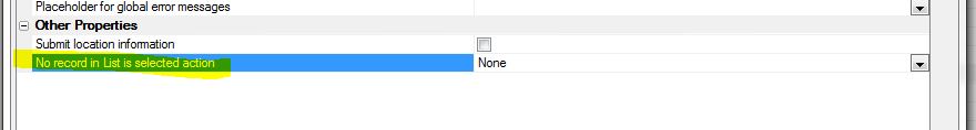
Grid Component - Query By Example Menus -
Internationalization - The menus that are shown in
Query by Example can now be internationalized.
A new property in the Query-by-Example Row section
allows you to specify if the entries in the menu should
be wrapped in Language Tags (<a5:r>..</a5:r>) or Text
Dictionary tags (<a5:t>..</a5:t>).
Once you have wrapped the menu strings in tags, you can
go to the Language definitions or Text dictionary
properties section in the Grid builder to define the
replacement strings for each language you want to
support.
Web Applications - Xbasic Function Libraries -
When you build a web component that does Ajax callbacks,
you typically define the Xbasic function that handles
the Ajax callback in the component itself (in the Xbasic
Function Declarations section of the component).
Alternatively you can create a .AEX file that creates a
library of global Xbasic functions that your component
can call.
Now a new method is now available. The Web Projects
Control Panel now has a new category called Xbasic
Function Library.
An Xbasic Function Library is a text file with a
.a5xbfl
extension that is stored in your Web Project. This file
contains definitions for one or more Xbasic functions.
Watch Video
To use an Xbasic Function Library in a component you
must link the file by specify the Xbasic Linked files
property in the component. You can link as many Xbasic
Function Library files as you want.
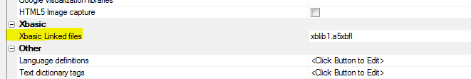
The benefit of using Xbasic Function Library files over
defining the Xbasic function directly in the component
is that you can share function definitions across
multiple components. Xbasic Function Library files are
text files, which makes them easy to manage in a source
control system (such as Git), and they are easier to
work with than .aex files (which provide an alternative
method for sharing Xbasic function definitions across
multiple components).
NOTE: If an Xbasic function is defined in both
the Xbasic Function Declarations section within a
component and also in a linked Xbasic Function Library
file, the locally defined function is used.
Web Applications - Xbasic Modules - The Web
Projects Control Panel now has a new category called
Xbasic Module.
An Xbasic Module is a text file with a
.a5xbm
extension. It is stored in the web project folder. The
purpose of an Xbasic Module is to allow you to package
Xbasic functions and class definitions so that they can
easily be used in other Xbasic code you write.
Watch Video
NOTE: Xbasic Modules are very similar to the
concept of Node modules.
An Xbasic Module must end with an exports command that
defines which functions and classes the Module 'exports'
(makes available to the calling code).
To use an Xbasic Module in your Xbasic code you use the
require()
function to 'register' the Module.
The require()
function can take an optional CRLF delimited string of
search paths. By default the
require()
function will look in the Web Root (if you are running
live) and in the Web Project Folder (if you are in
Working Preview). If the file is not found there, it
will search for the module in the
<ExeFolder>\xbasic_modules
folder. If you pass in a CRLF delimited string of folder
names as the second parameter to the
require()
function, these folders will also be searched for the
module.
For example, assume you had defined the following Xbasic
Module called
MyXBModule.a5xbm.
The module file was defined as follows:
function greeting as c (name as c )
greeting = "Hello " + ut(name) + "
the time is now: " + currentDate()
end function
function currentDate as c ()
currentDate = date()
end function
exports.sayHello = greeting
Notice that the module defines two functions, but only
the greeting()
function is 'exported' (i.e. made public). Also notice
that the
greetings() function was exported as
sayHello.
This means that to the calling code the function
sayHello()
can be called (but not the internal
greetings()
function).
Now assume you had define an .a5w page with this code:
<%a5
dim pxb as p
pxb = require("myxbmodule")
?pxb.sayHello("jim")
%>
The Xbasic code in the .A5w page uses the
require()
function to register the 'myxbmodule'
Xbasic Module and assigns the function to a namespace
called pxb.
Then, to call any of the exported functions, you must
use the pxb
prefix.
Modules can be loaded recursively. For example, in the
definition of a module can reference another module.
What is the Difference between an Xbasic Function
Library and an Xbasic Module?
On the surface an Xbasic Function Library and an Xbasic
Module seem similar in that they are both files in which
you can define multiple Xbasic functions.
However an Xbasic Module only makes 'public' certain of
the functions and classes it defines (through use of the
'exports' keyword) and the exported functions are all in
their own namespace and must be called using the
namespace prefix.
On the other hand an Xbasic Function Library must be
linked into a component before any of the functions
defined in the library can be called. The functions
defined in the Xbasic Function Library are in the same
namespace as any locally defined functions in the
component itself.
CSS Files - MDI Editor - When you edit a CSS file
in the Web Projects Control Panel, the editor is now an
MDI window. Previously, a modal window was used. Because
the window is a MDI window, you can edit multiple CSS
files at once and you can keep the CSS editor open while
you edit other files.
Javascript Files - MDI Editor - When you edit a
Javascript file in the Web Projects Control Panel, the
editor is now an MDI window. Previously, a modal window
was used. Because the window is a MDI window, you can
edit multiple Javascript files at once and you can keep
the Javascript editor open while you edit other files.
Also, while you are editing Javascript files you can
test your code by executing it directly in the code
editor. You can also switch to the Interactive Windows
to test different Javascript code snippets.
NOTE: When you test code in the Javascript editor
you are not testing it in the context of the browser.
That means you can't test code that assumes that the DOM
is present. Also certain Javascript global objects such
as window and document are not defined. The alert(),
function is also not defined.
The Interactive Window pane in the Javascript editor is
shown below. The window is divided into two sections.
The top section is the Javascript code that you want to
test and the bottom window shows results.
You can print text to the results window by using any of
the following functions in your Javascript code:
- console.log('text to
log') - prints text and follows text with a line break
- print('text to print')
- prints text but does not follow text with a line break
- printJSON(objectToPrint)
- emits nicely formatted JSON
-
printJSONCompact(objectToPrint) - emits the JSON in a single
line
NOTE: When you are done testing your Javascript,
be sure to remove or comment out any print(), printJSON()
or printJSONCompact() functions in your code as these
functions only are defined in the context of the
Javascript editor.
Watch Video
UX Component - Lists - Printing Reports Using Same
Filter as List - A common pattern in Grids is to
have a button on a Grid that prints a report showing the
same records that are in the current Grid query. Now you
can use a similar pattern for List controls on a UX
component.
NOTE: This feature is only for Lists and Reports
based on SQL tables.
When you define the filter and order for the report in
the Action Javascript genie you can use these special
functions
currentListFilter("NameofList")
currentListOrder("NameOfList")
For example, if your UX component has a List called
CUSTOMERS, you might specify the report filter and order
as :
currentListFilter("CUSTOMERS")
currentListOrder("CUSTOMERS")
Watch Video
Reports - Custom Data Sources - Previously, when you created a Report
in Alpha Anywhere you could choose to base the report on a SQL data source, or a
native .dbf table.
Now you can specify that the report is based on a Custom data source.
NOTE: When creating 'Project reports' (Reports defined in
the Web Projects Control Panel), the option to base the report on a .dbf table
is not available.
When you specify a custom data source the following dialog appears:
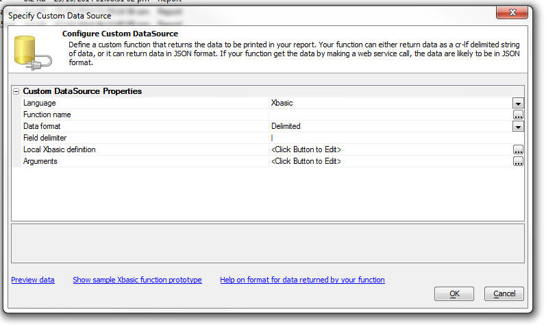
You specify the name of an Xbasic function that will return the data to be
printed by the report.
The Xbasic function can return data in one of two formats:
In both cases, the Xbasic function returns a string of data (that is either
in delimited or JSON format - explained below).
The function prototype for the Xbasic function is (assuming you specified
that the Function name was
myDataFunction in the Function
name property in image shown above):
function myDataFunction as c (e as p)
myDataFunction = <<%txt%
......the delimited, or JSON format data goes here
%txt%
end function
Notice that the function takes a single input parameter,
e.
The e object that is passed
into the function includes the value of any arguments that were passed into the
report.
For example, assume that you specified that the Custom Data Source uses an
argument called whatCountry.
Your Xbasic function can reference the value in this argument as follows:
dim country as c
country = argVal(e.arguments,"whatCountry")
Understanding the Format of the Delimited Data Your Custom Function Must
Return
The delimited option allows you to return a CR-LF delimited list of data.
Each row in the data that are returned represents a row of data in your report.
The 'fields' in the data are typically delimited with a pipe character (e.g. |),
but you are free to specify any delimiter. For example, here is how a simple
Xbasic function could be defined to return some data for a report.
function myXBfunction as c (e as p)
dim txt as c
txt = <<%txt%
Firstname|Lastname|City
Fred|Smith|Boston
John|Jones|London
%txt%
myXBfunction = txt
end function
Notice that the first row of data in the string that is returned by the
function are the field names. In this example, the field names are Firstname,
LastName and City.
The first row of data can optionally include additional information that
defines the data type and size of each field.
For example:
function myXBfunction as c (e as p)
dim txt as c
txt = <<%txt%
Firstname=C20|Lastname=C30|City=C20|DOB=D|Salary=10.2
Fred|Smith|Boston|12/6/1972|86500.00
John|Jones|London|11/5/1982|76000.00
%txt%
myXBfunction = txt
end function
For Character fields, the format is defined as
Cw where 'w'
is the size of the field. For Numeric fields, the format is defined as
Nw.d where 'w'
is the size of the field and 'd'
is the number of decimal places.
The following field type codes can be used:
- C - character
- N - numeric
- L - logical
- M - memo
- D - date
- T - date/time
- S - short time (time portion of a data/time field only)
- E - exponent numeric
- K - guid
Understanding the Format of the JSON Data Your Custom Function Must Return
The JSON data that your function returns can be Simple or Complex.
Simple JSON
For Simple JSON, the string that you return is just an array of JSON objects, For example:
function myjson as c(e as p)
myjson = <<%json%
[
	{"Firstname" : "Fred", "Lastname" : "Smith"},
	{"Firstname" : "Harry", "Lastname" : "Jones"}
]
%json%
end function
In this case since no schema is supplied the data are all considered to be character type of length 1024 characters. While the advantage of this format is
that is extremely simple, it does mean that you will need to adjust the size of each field you place on your report because its default size will likely be too large.
Complex JSON
For Complex JSON, the string that you return is an object with two properties, schema
and data. The schema object defines the schema of the data (for example, field type, size, etc.)
and the data property is an array of JSON objects that define the data for the report. For example:
function myjson as c(e as p)
myjson = <<%json%
{
	"schema" : { "firstname" : { "type" : "C" , "width": 30 }
	           , "lastname" : { "type" : "C"  , "width": 30}
	           , "company" : { "type" : "C"  , "width": 30}
	           , "age" : { "type" : "N" , "width" : 3, "decimal" : 0 }
	},
	"data":
		[
			{"firstname":"Fred", "lastname":"Smith", "company" : "Alpha Software", "age" : 30},
			{"firstname":"John", "lastname":"Jones", "company" : "Beta Software", "age" : 23}
		]
}
%json%
end function
In the above example, we have specified the size and type of each field in the data array. Notice that we have also specified the number of decimal places
for the numeric field.
The data types supported in the schema are:
- C - Character (you must also specify a "width" property for this type)
- N - Numeric (you must also specify a "width" and "decimal" property for this type)
- L - logical
- M - memo
- D - date
- T - date/time
- Y - short time
- E - exponent numeric
- K - guid
- JPEG - Jpeg field (data in the JSON data property is expected to be base64 encoded)
- PNG - PNG (data in the JSON data property is expected to be base64 encoded)
- BMP - BMP (data in the JSON data property is expected to be base64 encoded)
- I - Image Reference Field (data in the data property is a image file name but the report will treat the data as an image).
Note: If you specify that a field uses the Date (D),
Date/Time (T) or Short time (Y) format in the schema, the data in the data array
must be a string in UTC date format. For example: 2014-10-27T23:06:50.361Z. The
date part format is yyyy-mm-dd and the time part uses GMT. In the case of a
Short time field, the date portion of the UTC date string is ignored.
The schema also allows you to extract data from objects within each row and to map property names in the data array to different names.
For example in the data shown below, the address property is an object with two sub-properties.
{
   "name": "Fred Smith",
   "company" : "XYZ Corp",
   "address": {
       "street": "Main Street",
       "number": 23
    }
}
Shown below is how the function would be defined to return the JSON data. Notice that the JSON object has both a schema
and a data property. The schema indicates what fields will be available to the report.
The list of fields specified by the schema are:
name, companyName, street and number.
Notice that the data
array does not have a property called companyName. It has a property called company. So the schema
property for the companyName field indicates that the source of this field is the company
property in the data array. Similarly, the street field in the schema is mapped to the
address.street property in the data array.
If the definition for a field in the schema omits the source property, then the source
is the same as the item name. For example the definition for the name field in the schema shown below does not have a source
property, therefore this field is mapped to the name property in the data array.
function myjson as c(e as p)
myjson = <<%json%
{
    "schema": {
        "name": {
            "type": "c",
            "width": 30
        },
        "companyName: {
        	"source": "company",
        	"type" : "c",
        	"width" : 30
        },

        "street": {
            "source": "address.street",
            "type": "c",
            "width": 40
        },
        "number": {
            "source": "address.number",
            "type": "n",
            "width": 5,
            "decimal": 0
        }
    },
    "data": [
        {
            "name": "Fred Smith",
            "company" : "XYZ Corp",
            "address": {
                "street": "Main Street",
                "number": 23
            }
        },
        {
            "name": "John Jones",
            "company" : "ABC Corp",
            "address": {
                "street": "Corner Road",
                "number": 3
            }
        }
    ]
}
%json%
end function
In the next example, we show how the JSON object that you specify can include image data. The binary data for the image are encoded as base64 strings.
The example shows the complete function definition. Notice that the schema indicates that the image field will be stored as a
PNG. Notice also that in the first record, the base64 encoded data in the image property does not include the
MIME type at the start of the base64 encoded data. This data is therefore presumed to be a
PNG image since the schema indicates that the image is
a PNG type. Notice however, that the second row of data in the data array has a MIME type prefix on the base64 encoded image data. The data
for the image is for a BMP image. The image will therefore be converted from
BMP to PNG automatically.
function myjson as c(e as p)
myjson = <<%json%
{
   "schema" : {
      "name" : { "type" : "C" , "width": 30 },
      "image" : { "type" : "Png" }
	},
	"data":
       [
          {"name":"John Smith", "image" : "iVBORw...(data truncated for readability)....AAAElFTkSuQmCC" },
          {"name":"Jane Smith", "image" : "data:image/bmp;base64,Qk02AwAAA...(data truncated for readability)....AAAADYAAAAAA=="}
       ]
}
%json%
end function
UX Component - Action Javascript - Dial Telephone
Action - A new action has been added to Action
Javascript to allow you to dial a telephone number.
The number to dial can either be static (i.e. specified
at design time), or it can be read from controls on the
UX, columns in a List, or returned by a Javascript
function.
Apperian EASE Integration, Mobile Application Management -Added support for Apperian which allows you to publish your PhoneGap apps directly to the Apperian EASE platform.
The Apperian EASE platform can secure, manage and deploy enterprise mobile apps for all platforms.
Apperian�s mobile application management platform provides:
- An enterprise app store for distributing public, custom and web apps as well as configuration profiles
- Rock-solid mobile app security using enterprise credentials
- Diverse app wrapping policies without requiring code modifications or SDKs
- One-time app distribution option for getting a single app deployed quickly
- Seamless mobile enterprise integration with development platforms and identity providers
- Flexible content management solution for distributing virtually any type of file content for mobile users
To publish apps to the Apperian Ease platform, you will need to setup an Apperian account.
See the Apperian Web Site for more information.
To enable the Apperian features, from within the PhoneGap App Builder, check the Enable Apperian EASE Integration Options.
Next, enter your Apperian account credentials and make sure to specify the correct Apperian server. Different servers are used for US and non US accounts.
Once the Apperian features have been enabled, a number of optional items are enabled within the PhoneGap App Builder.
- You will be able to save the App bundle for uploading to Apperian when you bring up the QRCode within the
PhoneGap App Builder.
- A button will be displayed at the base of the PhoneGap Build App Manager table to launch the
Apperian Admin Console.
The Apperian Admin Console will display all of the apps you may have previously published to the Apperian EASE platform.
To Add A New App To Apperian
Make sure to download and save the app bundle for the target platform. The app bundle files will be automatically
saved to the appDownloads folder of the PhoneGapProjects target project directory.
Next click the Add App button and fill out all of the required information for submission to Apperian.
All of the fields must has valid data and the version number should include a decimal, ie: 1.20, 0.20, 2.52, etc.
The app.bundle.id will be automatically retrieved from the app bundle.
To Update An Existing App
Click the update button. You do not need to upload a new app bundle unless the files have changed.
You can simply edit the information and save.
To Access the Apperian EASE Platform
Log in to your Apperian EASE account at Apperian.
Once you've logged in, you will see the files and data that have been uploaded from Alpha Anywhere.
Further deployment options will be set within the Apperian EASE Management Console.
Keep in mind that you can update the app within Alpha Anywhere and update the app bundle and app meta data
anytime.
AlphaDAO Connection Strings - Mask Passwords -
Previously, the connection string builder masked (i.e.
obfuscated) the password by using high order characters.
For example, a password of 'alpha' would be masked as '�����'.
Now, the connection string builder uses a different
technique to mask password that does not use high order
characters. The reason for this change is so Alpha
Anywhere IIS server can correctly interpret the
connection strings.
Passwords masked using the new scheme will now have the
'A5:B64' prefix.
If you edit an existing connection string, the existing
masked password will be masked using the new scheme.
NOTE: The reason that the connection string
builder masks passwords is so that someone looking over
your shoulder as you define a new connection string will
not see the real password. This is much like the way a
login dialog will mask your password as you enter it.
You do not have make any changes to your existing
applications because of this change.
However, if you edit an existing connection string, or
you add a new connection string and then publish your
application, you will need to ensure that the server is
also running this build or a higher build.
There are two methods on the SQL::Connection object that
allow you to mask and unmask as string
For example:
dim cn as sql::connection
?cn.MaskPassword("alpha")
= ":A5:B64:YWxwaGE="
?cn.UnMaskPassword(":A5:B64:YWxwaGE=")
= "alpha"
PDF Reports - Set Maximum Allowed Time - You can
now set a timeout for PDF reports. This is useful to
prevent tying up the Application Server (or Report
Server if the Report Server is enabled) for a long time
in the event the user requests a report that might take
too long to process.
To set the maximum allowed time for a PDF report, open
the Project Properties dialog from the Web Control
Panel. By default, the timeout is set to 0 seconds
(which means that reports will run to completion,
regardless of how long they might take).
It is recommended that you set this property to a
non-zero value.
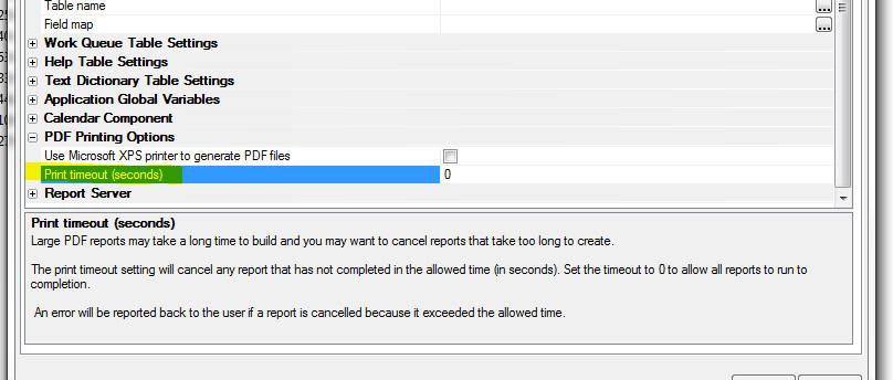
UX Component - Video Player Control - The UX
component now includes a built-in video player control.
Previously, to add video playing functionality to a UX
component, you had to first create a stand-alone Video
Player component and then embed the Video Player
component into your UX component.
The Video Player Control supports YouTube, Vimeo,
Viddler and HTML5 video players.
The player supports many options specific to the type of
player used.
NOTE The 'auto play' option does not work on
mobile devices as it is disabled in an effort to
conserve bandwidth.
An 'automatic sizing' option is included to adjust the
video player size on device orientation change. This
feature is important on Android devices.
A typical use case is to include a panel navigator with
two panel cards. The first panel card contains a list
control that may display the video title, the second
panel card includes the video player control. When the
user taps on a row in the list, the second panel card is
transitioned into view and the video may be played.
Download a sample component that demonstrates this
use case.
Watch Video
HTML Reports in Components - Display limit -
Large reports (more than 1,000 records) may be slow to
open when created as HTML reports. This will add load to
the application server and slow the server response. You
can now set a limit on the number of records to display
in a report opened as HTML. This will allow a large
report to open faster as a preview of data in the
report. If the report is then printed as PDF or
exported, the full number of records will be in the
final report.
The HTML Report Viewer Options will show an option for
'Maximum records to display' if the initial view is
HTML. An embedded report in a UX will show the property
in the Report definition. Set the value to 0 to show all
records, or set a value to limit the maximum records to
display. The limit only applies to HTML reports. A
reasonable upper limit is 1,000 records as larger
reports may be slow to generate.
You can set a 'More records' message with placeholders
and a style for the message container. This message will
be added to the bottom of the report if the number of
actual records in the report is greater than the display
limit. The message will not be shown if the number of
records in the report is less that then display limit.
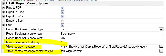
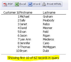
UX Component - Data-Bound Image Field - Image File
Transformation Template - If you have image
fields that are bound to a character field (that
contains the image filename), you need to define the
'Image File Transformation Template' to resolve the
image name stored in the table. The Image File
Transformation Template can now include field
placeholders. For example
{folder}\<value>
If the current record you were viewing had a value of
c:\project1 for the 'folder' field, the images for this
record would be found in the c:\project1 folder.
UX Component - Hide Container Window - New
methods and actions in Action Javascript have been added
to hide (i.e. close) a 'container' window.
A 'container' window is a pop-up window that is defined
in the UX by wrapping controls in a 'Container' and
setting the sub-type to 'Window'.
Opening a container window has always been easy as there
is an explicit method in Action Javascript to open a
container window and there is a corresponding method (
{dialog.object}.showContainerWindow() ) in the UX
object.
However, closing the window programmatically involved
first getting a pointer to the actual window object that
was created and then calling that object's .hide()
method.
Now, the UX object has a new method:
{dialog.object}.hideContainerWindow(containerName);
UX Component - List Control - Client-side Display
Format for Date, DateTime and Short-time Fields - A
new property has been added to the 'Fields' pane in the
List Builder to allows you to set the client-side
display format for date, date/time and short-time
fields.
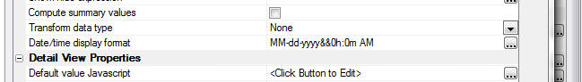
The builder for the 'Date/time display format' field
allows you to set the format to:
- <None>
- <Default> or <Default - date part only> (applies only to
date/time fields)
- a custom format
If you choose <None> then no client-side formatting rule is applied.
This means that the date/time values will be displayed using the
regional settings on the server from where the UX is loaded. So for
example, if the server is located in Switzerland where the date format
is dd.MM.yyyy, then dates in the List will be displayed like this:
12.31.2014.
If you choose <Default> (or <Default - date part only> for a
date/time field), the client side display format will match the setting
for the 'Date format property' (shown below). This property is set on
the Properties pane in the UX builder. This property can be overwritten
at run-time by setting a session variable (__protected__clientSideDateFormat)
at the time a user logs into your application.
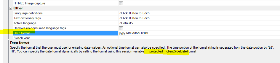
Grid and UX Component - Action Javascript - File
Upload - User Defined Action - A new property has
been added to the builder for the 'File Upload - User
Defined Action'.
The 'Xbasic function arguments array mode' property can
be set to either 'Filename' or 'Data'.
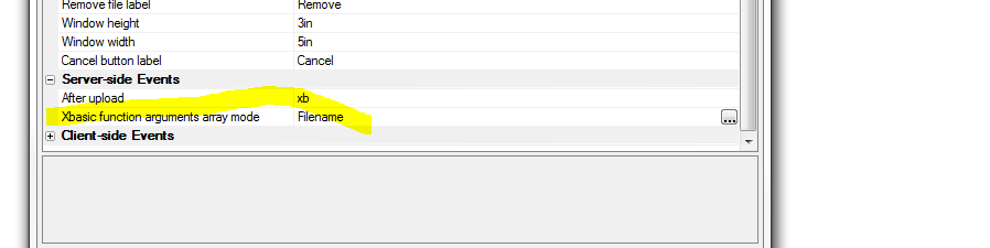
For all existing actions this property is set to 'Data'.
For all newly defined actions, this property will
default to 'Filename'.
When the upload is complete, the 'After upload' Xbasic
function is called. This function gets passed an array
(in the 'e' object that is passed into the function)
that contains information about each of the files that
was uploaded.
For example, if the 'Data' option is selected, and (say)
the user uploaded two files. the e object passed to the
'After upload' function will contain these properties:
e.fileArray[1].file.characterSet - character set of the
uploaded file
e.fileArray[1].file.contentType - MIME type (e.g.
'application/octet-stream')
e.fileArray[1].fileName - filename of the file on the
client machine
e.fileArray[1].encoding - For text files, specifies the
encoding type
e.fileArray[1].data - data that was uploaded.
e.fileArray[1].file.dataType = Either 'text' or 'binary'
e.fileArray[2].file.characterSet - character set of the
uploaded file
e.fileArray[2].file.contentType - MIME type (e.g.
'application/octet-stream')
e.fileArray[2].fileName - filename of the file on the
client machine
e.fileArray[2].encoding - For text files, specifies the
encoding type
e.fileArray[2].data - data that was uploaded.
e.fileArray[2].file.dataType = Either 'text' or 'binary'
Note that the array has a .data property that contains
the data that was uploaded.
On the other hand, if the 'Filename' option is selected
the array will not have the .data and file.dataType
properties. Instead it will have a property called 'tempFileUploadedData'
that contains the filename of the temporary file on the
server where the uploaded data was saved. So, in the case
where the user uploaded two file, the e object will
contain:
e.fileArray[1].tempFileUploadedData
e.fileArray[2].tempFileUploadedData
It is recommended that for your existing actions you
edit the action and change the mode to 'Filename'. This
will require that you also change your Xbasic function
that processes the uploaded data because the array
passed to your function will no longer has a .data
property.
The benefit of the 'Filename' option over the 'Data'
option is that the uploaded data is never loaded into
memory. If you use the 'Data' option, the uploaded data
is read into memory. This consumes virtual memory on
your server and may result in server errors if you have
a large number of users uploading files (or just one
user uploading a huge file).
With the 'Filename' option, your application will be
able to handle larger file uploads, or more users
concurrently uploading files.
Security Framework - Alternative Login - Microsoft
Live Connect -
The Alpha Anywhere alternative login feature now
supports user authentication using Microsoft Live
Connect.
The developer site for configuring a new Live Connect
application can currently be found at:
https://account.live.com/developers/applications
UX Component - New Quick Start Templates - When
you create a new UX component, two new quick-start
templates are available:
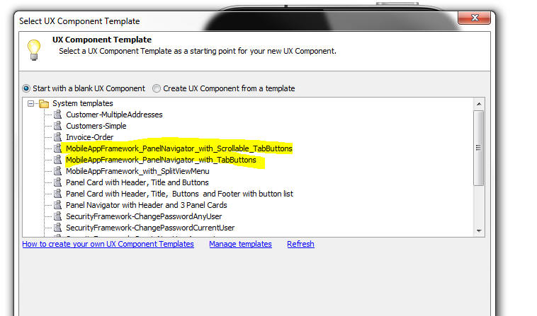
Watch Video - Part 1
Watch Video - Part 2
Watch Video- Part 3
Xbasic - UTC Date - Convert To and From - Xbasic
functions have been added to convert UTC date strings to
Xbasic date or time objects.
Examples:
? date_to_utc_date(now())
= "2014-10-28T17:23:27.681Z"
? date_to_utc_date(date())
= "2014-10-28"
? date_from_utc_date( "2014-10-28T17:23:27.681Z")
= 10/28/2014 01:23:27 68 pm
? now()
= 10/28/2014 01:23:36 06 pm
? date_from_utc_date("2014-10-28")
= {10/28/2014}
? date_from_utc_date( "2014-10-28T17:23:27.681Z" , "D")
= {10/28/2014}
? date_from_utc_date("2014-10-28","T")
= 10/27/2014 08:00:00 00 pm
Web Applications - Publishing Application - Command
Line Options - Typically when you publish your web
application you do it using the user interface in Alpha
Anywhere. You start the process starts by clicking the Publish
button on the Web Control Panel.
However, there may be cases where you would like to
automate the process by creating a batch file that
automatically invokes the publishing operation.
A new function,
a5w_publish2() has been added to make it easier
to do command line publishing.
This function takes either a dot variable or a JSON
object that defines the publishing options. The function
can be called from a batch file, as described below.
The
a5w_publish2() function allows you to set values
for the following publish options:
- projName - the name of the Web Project you want to publish. If
you leave this blank the last selected project is used.
- profile - name of the publishing profile to use. If you leave
this blank "Local Webroot" is used.
- publish_type - 1 = all files in project, 2 = selected files
(specified by the 'files' property). Note: if you set to 1, the 'flagPublishSupportFiles'
property is set to .t.
- files - CR-LF delimited list of files to publish. Must set
publish_type to 2. File names are relative. e.g. 'MyUXComponent.a5wcmp'.
- flagOptimizePublishing - default to .t. - specifies if the
publishing history should be checked to see if the file has been previously
published. If .t., then only files that have not been published since they
were last changed are published.
- flagPublishDatabaseALB - default to .f. 'Workspace' SQL reports
are stored in the Workspace files (.alb, .alm, .alx). If you are using
Workspace SQL reports (as opposed to Project reports), you can specify if
the Workspace SQL reports should be published.
- flagPublishSecurityTables - default to .f. - Specify if security
tables (containing user and group settings) should be published.
- flagPublishSupportFiles - default .t. - only applies if
publish_type is 2. Support files include CSS and Javascript files.
flagCreateAex - default .f. - if you have global functions and classes you
can compile these into an .aex file and publish the .aex file
- flagSuppressFilesToBePublishedDialog - default .t. - suppress the
dialog that show the list of files that will be published.
- exitAfterPublish - default .f. - if .t. then after the function
is called Alpha Anywhere is closed. If you have a batch file to publish from
the command line, you would set this flag to .t.
TIP: To view help for this function, enter the following
command in the Interactive Window:
a5w_publish2("help")
The dot variable or JSON object that you pass into the
a5w_publish2() function can set a sub-set of these
properties.
To use the .dot variable syntax:
dim ops as p
ops.profile = "Profile1"
ops.publish_type = 1
dim flag as l
flag = a5w_publish2(ops)
To use the JSON syntax:
dim flag as l
flag = a5w_publish2("{profile: \"Profile1\",
publish_type: 1}")
Assume that you have a Workspace called 'c:\MyWorkspaceFolder\MyWorkspace.adb'
and you want to publish all files in the 'project1' folder using the 'profile1'
web publishing profile.
You could create the following batch file to do the publish.
Note: The batch file would be all on one line. The line
breaks shown below are not part of the code.
C:\Program Files (x86)\alpha5.exe "C:\MyWorkspaceFolder\MyWorkspace.adb"
-COMMAND="a5w_publish2(\"{profile: 'profile1', projName:
'project1', publish_type: 1, exitAfterPublish: true}\")"
UX Component - Client-Side Events -
securityNotAuthenticated and securityPermissionDenied
Events - Two new client-side events have been added
to the UX component.
- securityNotAuthenticated
- securityPermissionDenied
When an Ajax callback is made and the server sends back
a '401' status code in the response, the
securityNotAuthendicated event will fire.
If the server sends back a '403' status code in the
response, the
securityPermissionDenied event will fire.
You can manually set the status code in an Ajax response
(for example, if you want to test the events) by setting
the
Response.StatusCode
property in the Xbasic function that handles the Ajax
callback.
NOTE: Typically, when defining these events, you
will also set the
Security
permission denied action property in the
Other
section of the UX properties to
Fire
client-side security events.
For example, assume you have a button on UX component
that does an Ajax callback. The function that handles
the callback is
myXBFunction. Your could define the function as
follows:
function myXBFunction as c (e as p)
Response.StatusCode = 401
end function
These events are primarily intended for use in a UX
component that contains an integrated login section (for
example in a mobile application where the UX has Panel
Navigator with at least two Panel Cards and the Login
controls are on Panel Card 1 and the afterLogin event
sets focus to Panel Card 2).
In the case where the UX contains an integrated login
section, these events can be used to direct a user back
to a panel or section used for login on a UX component.
For example, the UX may have login controls on a panel,
PANELCARD_1. The
securityNotAuthendicated event could set focus
back to that panel.
{dialog.object}.panelSetActive('PANELCARD_1',true);
If the event was fired from a child component, the event
in the child component could redirect the user back to
the login panel.
var po = {dialog.object}.getParentObject();
if(po) {
po.panelSetActive('PANELCARD_1',true);
}
If the child was opened in a window, the child event
could also close the window. If the child UX had a
control named 'list1', the event would be:
var po = {dialog.object}.getParentObject();
if(po) {
var ele = {dialog.Object}.getPointer('list1');
{dialog.Object}.closeContainerWindow(ele);
po.panelSetActive('PANELCARD_1',true);
}
UX Component � Security Permission Denied Action
Property - The UX component has a new property to
set the server permission denied action.
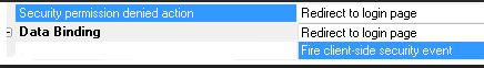
This is the action the security system will take when a
request is made from this component and the request is
denied because of security restrictions.
This can occur if a UX attempts to open another
component that has login restrictions and no one is
logged in, or the user has insufficient permission to
see the component being requested. The security action
will also be taken if the current component has login
restrictions, the login has expired, and some request is
made to the server, such as a request to refresh a
control or do a server-side sort on a column in a list
control.
The new property UX property is
Security
permission denied action in the
Other
section of the UX properties.
The default action is
Redirect to
login page. This action will allow the security
to redirect to the login or insufficient permission page
as set in the security settings.
The action Fire
client-side security event will cause the server
to return either a 401 status code if the login has
expired, or a 403 status code if a user is logged in,
but not allowed to access the requested component. This
will fire either the
securityNotAuthenticated or
securityPermissionDenied client-side events.
This action is currently only available in UX
components. The action applies to only Ajax requests
made from the component. A UX component ('parent'
component) can open other UX components ('child
components'). If any of the child components have a
login restriction, and this action is set to fire the
client side events on any of the components, the
recommended 'best practice' is to set the property to
fire the client side event on all of the child
components and the parent component. This should be set
even if the parent component is always allowed.
UX Component - List Control - Templates - Date
Formatting - Typically the data in a List control is
all text data. So even though a column in the List might
be displaying a date value, the actual data in the List
data array for that column is still a string.
The only exception to this is if the List is populated
using Javascript and in the Javascript array that was
used to populate the List, the column was explicitly set
to a Javascript data object. Or, the data in the column
was explicitly cast to a date object by setting the
Transform data
type property on the Fields pane in the List
builder.
The template used to display data in the list allows you
to specify an optional format.
For example, say you have a column in the List called 'OrderDate',
the template for that column in the List will be:
{OrderDate}
However, say you wanted the display format for the
OrderDate to be yyyy-MM-dd (e.g. 2014-12-25), then you
can add a format directive to the template. For example:
{OrderDate:date('yyyy-MM-dd')}
However, the above format directive only works if the
data in the 'OrderDate' column in the List are a date
object.
But, as previously discussed, in many cases, the data in
the List are all strings of text, so you cannot use the
above format directive unless you first cast the data to
a date object. When working with Lists that have
updateable Detail Views, casing date strings to date
objects introduces other complexities and it would be
desirable to not have to cast the date string to a date
object, but rather to be able to simply format the date
string.
To do this, a new format directive has been added. For
example:
{OrderDate:dateString('MM-dd-yyyy','yyyy-MM-dd')}
This directive takes two date formats. The first date
format is used to parse the date string into a date
object and the second date format is the output format.
UX Component - List Control - Detail View - Showing
Edited Fields - When you have a List with an
associated Detail View and you edit the data in one of
the rows of the List, an icon (whose appearance you can
customize) is shown in the List row to indicate that the
List row has data that has been edited, but not yet
synchronized.
You can now indicate the dirty fields in a List row that
has been edited by specify a custom CSS class to apply
to the Detail View control if the field value has been
edited.
For example in the image shown below, you can see that
the first row in the List has been edited, and you can
now also see that the field in that row that was edited
was the city field that was changed to 'Frankfurt'.
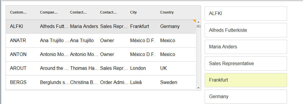
To indicate the CSS class that you want to apply to
dirty fields, open the List builder and set the 'Dirty
control class name' property.
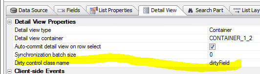
In the above example, the dirtyField CSS class was
defined as follows:
.dirtyField {
background: #f6f9c2;
}
Watch Video
Download Component
Export Data - .dbf Tables - Delimited Data - A
new option has been added to the export operation so
that you can optionally suppress escaping characters.
The 'Disable Character Escapement' property has been
added to the export options.
Consider a table that has this data:
|
Name |
Comment |
|
Fred "J" Smith |
This is a comment with
a trailing \ |
|
Hank Kaplan |
No comment |
If you export the data and specify that the fields
should be quoted, the exported data looks like this:
"NAME","COMMENT"
"Fred \"J\" Smith","This is a comment with a trailing
\\"
"Hank Kaplan","No comment"
Note that quotes in the data itself are escaped and that
the trailing backslash in the data is also escaped.
This data could be successfully re-imported in Alpha
Anywhere.
However, if you check the new 'Disable Character
Escapement' property, the data will be exported as
follows.
Note that the quotes in the data are converted to single
quotes and the trailing backslash in the data is not
escaped.
This data could NOT be successfully re-imported
into Alpha Anywhere.
"NAME","COMMENT"
"Fred 'J' Smith","This is a comment with a trailing \"
"Hank Kaplan","No comment"
UX and Grid Component - File Download Action
Javascript - You can now specify a dynamic
'client-side filename' by specifying the name of a
Javascript function to call. For example, you can
specify the following for the 'client-side filename':
function:myfunc
Where 'myfunc' is the name of the Javascript function
you want to call to generate the client-side filename.
You function must return a url encoded value.
AlphaDAO - Connection Strings - Dynamic - A
dynamic connection string is a connection string that is
resolved at the time the database connection is opened,
rather than at the time the connection string is
defined.
Alpha Anywhere has allowed for dynamic connection
strings for some time now by allowing you to create a
named connection that starts with
DynamicConnection_. For example
DynamicConnection_MyCustomApplication
The actual value of the dynamic connection string is
resolved by referring to a session variable called:
session.__protected__MyCustomApplication
which defines the actual connection string to be used.
The value of this session variable is typically set when
the user logs into the application. For example, it
might be set to:
::Name::User1Connection
Now, a new way of creating dynamic connection strings is
available using the
::EVAL::
prefix in the named connection string, rather than the
::Name::
prefix.
Prefixing a connection string with
::EVAL::
causes the connection string to be evaluated as an
Xbasic expression.
For example, consider the following connection string:
::EVAL::MyFunctionThatReturnsAConnString()
When an AlphaDAO connection is opened using the above
string, the
MyFunctionThatReturnsAConnString() is evaluated
and the return value (which would typically be a named
connection string with the ::Name:: prefix) is used as
the connection string.
In this next example, the dynamic connection string uses
an in-line Xbasic expression:
::EVAL::if(User = "Fred","::name::Fred","::name::EverybodyElse")
UX and Grid Components - Javascript Actions -
Copy/Paste - You can now copy and paste Javascript
Actions from one component to another component (of the
same type). For example, you might have defined several
Javascript Actions in component called 'UX1' and now you
are building a new UX component and you would like to
copy some of the Javascript Actions from 'UX1' to your
new UX component.
Create PDF File from HTML - helper::HtmlToPdf Class
- Xbasic now has a new class that allows you to convert
HTML to PDF.
The helper::HtmlToPdf class has methods that allow you
to convert HTML to PDF or a URL to PDF.
The following example code can be pasted into a new
script in the Code editor and executed.
dim hp as helper::HtmlToPdf
dim html as c
html = <<%html%
<style>
.mystyle {color: red;}
</style>
<h1>This is So Cool</h1>
<h2>Generate PDF from HTML!</h2>
<p>This shows how you can turn <span class="mystyle">any</span>
html into a pdf</p>
%html%
dir_create_recurse("c:\mypdffiles")
hp.SaveHTMLToPdf(html,"c:\mypdffiles\mypdf.pdf")
'now open the file
sys_open("c:\mypdffiles\mypdf.pdf")
The helper::HtmlToPdf class exposes these methods:
- SaveHTMLToPdf(c HTML, c output_filename) - saves
html to a pdf file
- SaveUrlToPdf( c URL, c output_filename) -
retrieves html from a url and converts the html to a PDF file.
The helper::HtmlToPdf class exposes these properties:
- enable_forms - .t. or .f. - default .f. - if .t. then
input controls in the HTML become input controls in the PDF file.
- grayscale - .t. or .f. - default .f. - if .t. then pdf
does not use colors.
- image_quality - numeric value that controls the amount of
compression of embedded jpeg images. default is 94 - 100 is no
compression.
- javascript_delay - if the html page contains javascript
code that runs when the page renders, the amount of time in
milliseconds to wait before generating the PDF. Allows long running
Javascript to complete before conversion starts.
- landscape - .t. or .f. - If .t. then use landscape mode.
- margin_bottom - margin expression in setting for units
- margin_left - margin expression in setting for units
- margin_top - margin expression in setting for units
- page_height - page height expression in setting for units
- page_width - page width expression in setting for units
-
page_size -- the size of the page. Options include "A4",
"Letter", etc. Default is "A4"
- smart_shrinking - enable WebKit's 'intelligent shrinking'
strategy. Makes the pixel/dpi ratio variable.
- units - the units that all measurements are in
(e.g. margin_left, page_height, etc.). default is "in" (inches).
options are: "cm", "mm", "pt" (points), "tw" (twips - 20th of a
point), "px" (pixels)
Bugs
UX Component - List - Detail View - Client-side
Validation - Client side validation was not being
performed on all of the controls in the Detail View when
the user tried to save Detail View edits back to the
List. As a result, it was possible to save edits to the
List when client-side validation errors should have
prevented this. (The validation errors would still have
been caught server-side when a sync operation was
performed, and bad data could not have been entered into
the database.)
UX Component - Android Mobile Devices - Keyboard -
Responsive Events - Under some circumstances on
Android mobile devices, if the device was in portrait
mode and the keyboard came up, the UX would indicate
that it was now in landscape mode even though the device
orientation was still portrait.
Application Server - HTML Reports - Memory Leak -
Fixed a memory leak in the Application Server when doing
large HTML reports.
Application Server - Security Framework - SQL Tables
for Security Tables - Postgres - Converting the
security tables to use a Postgres database was failing.
This is now fixed.
Label Reports = Setting an Image as the
Background - In some case, setting an image as the
background for a label was failing.
UX Component - List Control - Detail View -
Incremental Refresh - Fixed an issue with
incremental refresh in the case where the UX had
multiple Lists in a parent-child relationship and the
top-level parent List was based on a SQL statement that
joined multiple tables and the top-level List
pre-fetched the data for the child Lists.
UX Component - List Controls - Data Type Casting
- The List Control allows you to cast the data type in
any List column to a date object, number or logical
value (by setting the
Transform data
type property on the Fields pane in the List
builder). However, after data in the list was updated,
or new rows were added to the List, the data casting
rules were not being applied to the new data.
UX Component - List Control - Detail View - Editing a
Value that Was Previously NULL - A change has been
made in the SQL that gets generated when you edit the
value in a field that was previously NULL.
UX Component - List Control - .getValue() method -
Reading Value in List Column - The .getValue()
method can get the value in a control, or in an
individual column in a List control.
When reading the value in a control, there is no concept
of a null value (since the UX does not have the concept
of setting a control value to null).
However, List columns can contain
null values and previously, when you read the
value of a List column that contained a null value, .getValue()
returned a null value, which was inconsistent with how .getValue()
works when reading a control's value. Now, .getValue()
returns a blank string when reading the value in a List
column that is null.
For example
var = value = {dialog.object}.getValue('list::LIST1::CustNum');
now returns a blank string if the 'CustNum' column in
LIST1 in the selected List row is
null. Previously it returned
null.
Note that you can still determine if a List column
really does contain a null
value as follows:
//get a pointer to 'LIST1'
var lObj = {dialog.object}.getControl('LIST1');
//get data in first selected row of the List
var _d = lObj.getData(lObj.selection[0]);
//read the value of the 'CustNum' property in the data
object
var _v = _d['CustNum']; //_v will be null if the
data in the column is null
PhoneGap - Web Security Framework - Fixed an
issue with the Web Security Framework when running in a
PhoneGap shell. Redirecting to the login page after a
session timeout, or after an attempt to load a resource
for which you did no have permission was not working
correctly.
UX and Grid Component - Wait Message - Fixed a
case where the wait message was not getting cleared
after an Ajax callback had completed.
UX Component - File and Image Upload - Internet
Explorer - Fixed a case where a Javascript error was
generated when the file or image upload window was
opened. Only happened in IE when in the UX component.
UX Component - Panel Navigator - Opening a Child
Component in a Panel Card inside a Navigator - Fixed
an issue where a child component was being opened in a
Panel Card inside the Panel Navigator. After the child
component was opened, the swipe gesture to move to a
different Panel in the Navigator was causing a
Javascirpt error.
Grid Component - Grid Based on Stored Procedure -
If a Grid was based on a Stored Procedure and a
surrogate Primary Key for query was defined, the _keys
array in the Grid Object was not getting defined.
Tips
UX and Grid Component - Edit-Combo Control - Dynamically
Populating Choices Using Javascript - The choices in an edit-combo
control can be dynamically set using Javascript. For example, say you
have an control on a UX called 'TEXTBOX1' and you want to dynamically
set the choices in the edit-combo. The following code can be used:
var obj = {Dialog.object}.getControl('TEXTBOX1');
var newData = [
{COMPANYNAME:
'Alpha Corp'},
{COMPANYNAME:
'Beta Corp'},
{COMPANYNAME:
'Gamma Corp'}
]
obj.setData(newData);
UX Component - List Control - Freeform Layout - Hyperlinks -
When you create a free-form List layout you can use any HTML that you
want to lay out each row in the List. Your HTML template will include
placeholders for the various fields in the List.
For example:
<div>
Name: {name}<br>
Address: {address}
</div>
Because the template is HTML, you might expect to be able to add
hyperlinks. For example:
<div>
Name: {name}<br>
Address: {address}<br>
<a href="page2.a5w?{address}"
target="_blank">Open Page</a>
</div>
This will not work because the List is configured to handle all
events. However, you can make this pattern work by adding markup to your
html to stop event propagation. For example:
<a href="page2.a5w?{address}" target="_blank"
onclick="$e.stopPropagation(event);" ontouchstart="$e.stopPropagation(event);">Open
Page</a>
With the addition of event handlers for the onclick and ontouchstart
events which stop event propagation, the hyperlink will work as
expected.
UX Component - PhoneGap Applications - Ajax Callback URL - Setting
Dynamically at Runtime - When you build a PhoneGap application you have to
specify the URL for Ajax callbacks in the PhoneGap genie.
When you perform any action in your PhoneGap application, the callback is
made to the server address specified in the
URL for Ajax callbacks property in the
PhoneGap genie.
However, you might be building an app where you don't know what server the
app will be running on (i.e. you don't know what server the app will be making
its Ajax callbacks to) and so you would like to be able to set the URL for Ajax
callbacks after the app has loaded.
Here is how this can be done.
First, when you specify the URL for Ajax callbacks, set the URL to some
placeholder value. For example:
replaceMe
Next, put a textbox on your UX component where the user can enter the address
of the server to which they will be making callbacks. For example, assume that
this text box is called: ServerAddress.
Then put a button on the UX to set the callback URL. The callback URL is a
property of the UX object (i.e. {dialog.object}. It is called
ajaxURL.
Define the following Javascript for this button:
//read the server address from the serverAddress textbox
var prefix = {dialog.object}.getValue('SERVERADDRESS');
//the address should look something like this:
//'http://www.myserver.com/folderWhereAppWasPublished/';
//notice that the server address has a trailing forward slash
//read the existing callback URL
//it will start with 'replaceMe' since that is what you
specified
//in the PhoneGap genie
var url = {dialog.object}.ajaxURL
//replace the placeholder with the server address
url = url.replace('replaceMe/',prefix);
//set the URL
{dialog.object}.ajaxURL = url;
Having done this, Ajax callbacks made to the server will now work. But what
happens the next time the user loads the application? The Ajax URL will be
wrong. You would want the Ajax URL to be automatically set correctly without
requiring the user to go through the steps of having to enter the server address
again.
The solution to this problem is to store the callback URL in local storage
and then to restore from local storage whenever the application is started.
To do this, you would add code like this to the end of the above Javascript:
localStorage.setItem('AJAXCALLBACKURL',url)
In the onRenderComplete
client-side event, you would add this code to restore:
//read url from local storage.
var url = localStorage.getItem('AJAXCALLBACKURL');
//if value exist, set the UX's ajaxURL property
if(url != null) {
{dialog.object}.ajaxURL = url;
}
UX Component - List Control - UX Component 'Dirty State' -
Just like standard UX Components controls (such as Textbox, Textarea,
RadioButton, etc), the List control is bound to a UX component variable.
When the value in any control changes the UX component is considered to
be 'dirty'. So for example, if you open a UX and then select a row in a
List, ghe UX will go from 'clean' to 'dirty'.
In some use cases you might not want the UX go to 'dirty' when the
user is making selections in a List. You can easily do this by adding
some code to the onBeforeSelect and onSelect event in the List.
Here is the code to add to the List's
onBeforeSelect event:
var flagUXIsDirty = false;
//see if the UX is already dirty
flagUXIsDirty = {dialog.object}._dirtyRows[0];
//store the dirty state of the UX in a variable in the
List object
this._flagUXIsDirty = flagUXIsDirty;
Here is the code to add to the List's onSelect
event:
//if the UX was not dirty when you selected the row
//set the UX state back to clean after the row is
selected.
//you need to use a timeout with a small delay.
if(this._flagUXIsDirty == false) {
setTimeout(function() {
{dialog.object}._setRowState(1,false);
},10);
}
Reporting - Group Breaks - mrec_eof() Function - The mrec_eof()
function is useful if you want to put some conditional text in the
header, detail or footer of the last group in a parent group.
The mrec_eof() function takes a group name as an argument and returns
.t. or .f. depending on whether the you are in the last group within a
series of groups.
Consider a report that has two levels of grouping. The top-most group
is State and the inner group is City.
For a given state, there will be multiple city groups. For example,
NY might have groups for Albany, Buffalo and New York City. E.g.
New York
Albany
Buffalo
New York City
When the 'Albany' group is printing, the following function will
return .f.
mrec_eof(grp->city)
When the 'Buffalo' group is printing, the function will also return
.f..
But, when the 'New York City' group is printing, the function will
return .t. because 'New York City' is the last group within the parent
group ('State').
Assume further that the states in the report are:
New York
Oregon
Washington
When the New York and Oregon groups are printing, the following
expression will return .f. because both New York and Oregon are not the
last groups in the list of states.
mrec_eof(grp->state)
However, when the Washington group is printing, the function will
return .t. because Washington is the last group in the list of states.
Say you wanted to put some text in the group footer for the City
group, but only if you were printing the group footer for the last group
in a given state. To do this you would define a calculated field that
referenced mrec_eof(grp->state). For example:
calc1 = if(mrec_eof(grp->city), "Last city in
state","More cities...")
Similarly, you might define another calc field:
calc2 = if(mrec_eof(grp->state), "Last
state","More states...")
For example
NY
Albany
Group footer for Albany -
calc1 = "More cities..."
Buffalo
Group footer for Buffalo -
calc1 = "More cities..."
New York City
Group footer for New York City
- calc1 = "Last city in state"
Group footer for NY - calc2 = "More states..."
....
Washington
Olympia
Group footer for Olympia -
calc1 = "More cities..."
Seattle
Group footer for Seattle -
calc1 = "Last city in state"
Group footer for Washington - calc2 = "Last
state"
Disabling a Hyperlink - A Behind the Scenes Look At How The UX Binds
Events
A user wrote about a case where he had a hyperlink control on a UX
component. The hyperlink had an click event which displayed an alert and
then 'disabled' the hyperlink by calling the
.setDiabled() method of
the UX component.
The actual code in the hyperlinks' click event was:
alert('I was clicked');
{dialog.object}.setDisabled('HYPERLINK_1');
When running the component in the UX builder with the Mobile
Simulator turned on, or on a mobile device the behavior of the component
was as expected. The first time the user clicked or tapped the hyperlink
the alert would display and then the next time he clicked or tapped on
the hyperlink nothing would display.
However, when running in a browser (or in the UX builder) with the
Mobile Simulator turned off, the behavior was not as expected. Every
time the user clicked the hyperlink the message displayed - the
{dialog.object}.setDisabled('HYPERLINK_1')
had no apparent effect.
Why?
Actually, there is a lot going on here behind the scenes.
First, if you run the component and then look at the source to see how
the click event was bound to the hyperlink, you will see code like this:
$e.add('DLG1.V.R1.HYPERLINK_1',A5.d.evnts.click,function(e)
{
alert('click event');
DLG1_DlgObj.setDisabled('HYPERLINK_1');
},
this,false,'DLG1.V.R1.HYPERLINK_1');
The $e.add() function
is a function in the Alpha Anywhere Javascript library that allows you
to bind events to DOM elements. It is really just a wrapper around the
built in Javascript .addEventListener()
function, but it works with older browsers that don't support the
.addEventListener()
function.
We only need to focus on the first three arguments passed to
$e.add()
- The first argument is the id of the element we want to add the
event to. In this case, it is the id of the hyperlink control -
HYPERLINK_1.
- The second argument is the type of event, such as the 'click'
event. But in this case, it does not specify the 'click'
as the event. Instead it specifies
A5.d.events.click.
We will get back to this later.
- The third argument is the code that we want to execute when the
hyperlink is clicked.
First some background on events. The click event is fired when you
click or tap on an HTML element. On a desktop browser, the event fires
as soon as you click on the element. But on a mobile device there is a
300ms delay before the event fires. The reason for the delay is that the
browser on the mobile device is a 'touch enabled' device and when you
tap on the hyperlink it is not sure if the tap is really a tap, or just
the start of some type of dragging gesture. So it waits for 300ms and
then if it determines that you did not start some type of drag gesture,
it decides that you really meant to fire the click event.
This 300ms delay makes your apps feel unresponsive. So Alpha Anywhere
implements a special 'abstractclick'
event on touch enabled devices that fires immediately when the element
is tapped.
The A5.d.events.click
variable is how we allow the user to define a generic click handler, but
at runtime we either bind the code to the built-in 'click'
event or to the 'abstractclick'
event that Alpha Anywhere implements.
So, when running in a browser that is not touch enabled,
A5.d.evnts.click
resolves to 'click' and when running on a browser that is touch enabled,
A5.d.events.click will
resolve to 'abstractclick'.
However, when running on a browser that is not touch enabled, if you
have the Mobile Simulator turned on,
A5.d.events.click will
resolve to 'abstractclick'.
So getting back to the $e.add()
method that the UX uses to bind the event handler to the hyperlink. If
you are on a non-touch enabled device, the code that is being executed
is:
$e.add('DLG1.V.R1.HYPERLINK_1','click',function(e) { code to run when
hyperlink is clicked });
And when on a touch enabled device (or when running in the Mobile
Simulator):
$e.add('DLG1.V.R1.HYPERLINK_1','abstractclick',function(e)
{ code to run when hyperlink is clicked });
So now that we know which event is really firing when the user
clicks/taps the hyperlink, lets try to understand why disabling the
hyperlink only seemed to work on a touch enabled browser (or when
running in a Mobile Simulator).
The way in which the code is 'disabling' the hyperlink control is by
calling the UX component's .setDisabled()
method. Here is how the
.setDisabled() method is implemented internally in the Alpha
Anywhere Javascript library:
- If the element you want to disable is an Alpha Anywhere
Javascript control (such as a List, SpinList, Slider, Switch,
Button, etc.) the method calls the
.setDisabled()
method of the control. (Controls such as Lists, SpinLists, etc. all
implement a .setDisabled()
method).
- If the element you want to disable is not an Alpha Anywhere
Javascript control, but is just an HTML element (such as a
hyperlink), the method simply sets a property (called 'disabled')
on the element to true.
HTML only allows you to disable form element. Form elements are input
controls and buttons. A hyperlink is not an input control. There is no
concept in HTML of a 'disabled' hyperlink.
So to be clear, the command:
{dialog.object}.setDisabled('HYPERLINK_1')
did nothing more than this:
var ele = {dialog.object}.getPointer('HYPERLINK_1');
//set the value of a 'disabled' property to true
ele.disabled = true;
We could just as easily have set the value of any other 'made up'
property name. For example:
ele.myFicticiousProperty = 'some value';
In the case of the hyperlink element, the 'disabled' property is, in
effect, a 'made up' property. As explained, there is no concept in HTML
of a 'disabled' hyperlink.
So, why does it appear that disabling the hyperlink works on a touch
enabled browser or in the Mobile Simulator, when, as we have discussed,
hyperlinks cannot be disabled?
The reason, as it turns out, is that when Alpha Anywhere fires an
abstract event on an element it checks first to see what the value of
the element's 'disabled'
property is. If the 'disabled'
property ti set to true, it does not fire the event.
In other words, when an 'abstractclick'
event is fired, the event will no do anything if the element's
disabled property is
true.
So now we understand what's going on here. When the component is run on
a non-touch enabled device, the built-in HTML click event is bound and
since hyperlinks cannot be disabled, the event fired every time the
hyperlink is clicked.
But when the component is run in a touch enabled browser (on in the
Mobile Simulator), the abstract 'abstractclick'
event is fired and this event does honor the value of the 'disabled'
property on the element.
So, how could the user have gotten this to work on both touch-enabled
and non-touch browsers? Simple. Just add a line of code to the event
handler:
if(this.disabled) return false;
alert('click event');
{dialog.object}.setDisabled('HYPERLINK_1');
After the .setDisabled()
method has been called on the hyperlink, reading the element's 'disabled'
property will return true. So
this.disabled will be true after the
.setDisabled() method
has been called.
Build 2446-4365 1-Oct-2014
Bugs
UX Component - List Control - Detail View - A bug
was introduced in build 2442 that caused the Detail View
to not populate correctly in certain rare situations
when a row in the List was selected.
Application Server - Reports - Under certain
circumstances, a report would print correctly the first
couple of times it was printed, and then start to fail.
UX and Grid Component - Grid Linked Content Section -
.getParentObject() Method - If a UX or Grid was
opened in a parent Grid's Linked Content Section, the
child component could not use the .getParentObject()
method to get a pointer to the parent Grid.
Build 2442-4362 29-Sept-2014
Videos
|
Tabbed UI Component |
Using Alternative Login |
The 'Alternative Login' feature allows a user to
log in to an application using their credentials
from a social network, such as Google, Twitter,
LinkedIn, etc.
The UX component allows you to build Login
dialogs that allow users to log into an
application using an Alternative Login. The
integrated login feature in the Tabbed UI,
however, does not allow you to expose
Alternative Logins. Therefore, if you want to
allow a user to login into an application that
uses the Tabbed UI, you must use a UX component
in the Tabbed UI to do the log in.
In this video we show how this can be done.
Watch Video
Date Added: 2014-09-11 |
|
UX Component |
Downloading a Google Chart as a Bitmap |
In the video 'Using Google Charts as an Alternative to the
Built-in Chart Controls' we showed how you can
use Google Charts in a UX component. In this
video we show how you can add a button to the UX
to download a Google chart as a bitmap image.
The user can then save the image to disk, or
print the image.
Note: Not all Google chart types support this
feature.
Watch Video - Part 1
Watch Video - Part 2
Download Component
Date Added: 2014-09-13 |
|
Xbasic |
Working with SQL Databases |
A common requirement in server-side events
handlers (including custom Ajax callbacks) is to
write some Xbasic code that manipulates data in
a SQL database.
Xbasic has a very powerful set of objects
(called AlphaDAO) for interacting with SQL
databases.
In this video we give a quick overview to using
Xbasic to work with SQL databases.
(For a full introduction and tutorial on using
Xbasic to work with data in SQL databases, go to
the Help, Open Documentation menu command and
type 'Using Xbasic with SQL Tables' in the
filter box.)
Watch Video - Part 1
Watch Video - Part 2
Watch Video - Part 3
Watch Video - Part 4 |
|
Xbasic |
Calling Into Node.JS from Xbasic |
Node.js is a popular technology for implementing
server-side utilities. Xbasic has very tight
integration with Node and it is possible to
create Node services that can be called from
Xbasic.
In this video we show how a Node service can be
defined and then called from Xbasic.
Watch Video - Part 1
Watch Video - Part 2
Watch Video - Part 3 |
|
|
|
|
Features
UX and Grid Component - Ajax Callbacks - OnComplete
Javascript - A new option has been added to the
method that makes an Ajax callback from the Grid and UX
component. You can now specify Javascript to run when
the callback is complete.
This option has been exposed in the Action Javascript
Ajax Callback action as shown in the image below:
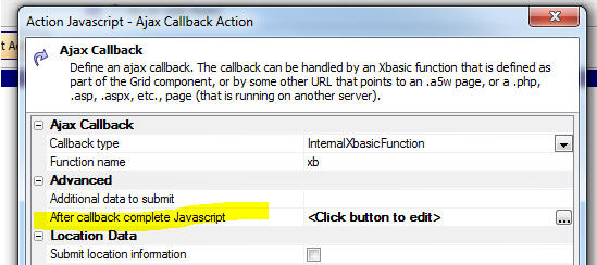
The Javascript that you specify is run after the
callback is complete and after any Javascript returned
by the callback function has executed.
To specify the after callback complete Javascript in the UX or Grid's
.ajaxCallback() method, you set the onComplete property in the optional
optionsObject passed in.
For example:
{dialog.object}.ajaxCallback('','','myXbasicFunction','','',{onComplete:
function() {
alert('callback is complete')
}
})
Tabbed UI - Integrated Login Feature - When the
Login window is opened, the User name field is now
automatically given focus. Previously the user needed to
explicitly click on the user name control. In addition,
when the password field has focus, pressing the Enter
key will now execute the Login button.
Security Framework - Importing Data into the User
Table - The previous import method,
a5ws_ImportUsersDBF(), did not support import
into SQL based security tables. The import feature has
been rewritten and a new method,
a5ws_ImportUsers(), is available. The import will
now properly add records into SQL security tables.
The
a5ws_ImportUsers() method can be used to import
data into either .dbf security tables or SQL security
tables. When importing into .DBF tables security tables,
this new method is up to twice as fast.
TIP: You can also now use the
a5ws_ImportUsers() function from the Interactive
Window of the Application Server control panel to import
users into your security tables on your server. When you
use this function from the Interactive Window it will
display a list of all web projects that have security
and you can select the project into which you wish to
import data.
Xbasic - Node.JS - Extending Server-side
Functionality using Node.js - Node.js is a popular
program for writing server side utilities in Javascript.
Alpha Anywhere now has tight integration with Node and
you can now define your own Node modules that can be
called from Xbasic.
Watch Video - Part 1
Watch Video - Part 2
Watch Video - Part 3
To create a new 'Node Service' that can be called from
Xbaisc, you create a new .js file in the Node_Services
folder in the Alpha Anywhere executable folder. The
syntax for this .js file is the syntax you would use for
any Node module.
To call a Node service from Xbasic, you:
-
dim an instances of the helper::V8 object
-
construct a JSON string that defines the Node service you want to
call and the parameters you wan to pass to the Node service
-
call the .NodeRequest() method of the helper::V8 object instance
In the following example, we have defined a trivial Node service that
takes as its input two variables, 'firstname' and 'lastname' and sends
back a string showing: Hello
firstname lastname.
The Node service in this example is called 'hello'. Therefore the
'_command' property of the JSON command object is set to 'hello'
You must also set an '_id' property in the JSON command object. This
can be any value. Using a UUID for this value is convenient.
The Node service is called using the .NodeRequest() method and the
result is returned as a JSON string with properties for the error text
(if there was an error) and 'result' - the result of the request. The
JSON response can be parsed to get Xbasic varibles, or the json_extract()
function can be used to extract the 'result' property.
dim n as helper::V8
dim p as p
'generate an id for the request we are about to send to
Node.
'we just use a GUID for convenience
p._id = api_uuidcreate()
'set the _command property. This is the name of the Node
service we want to call
p._command = "hello"
'specify any variables you want to pass to the Node
service
p.firstname = "Nellie"
p.lastname = "Jones"
'convert the Xbasic .dot variable to a JSON string.
dim jsonCommand as c
jsonCommand = json_generate(p)
?n.NodeRequest(jsonCommand)
= {"_id":"id1","error":"","result":"Hello Nellie Joness"}
Here is how the corresponding Hello.js file is defined.
This file must be in the Node_Services folder in the
Alpha Anywhere executable folder. This is a standard
Node module. It can 'require' any other Node modules
that you have written, or that have been installed using
NPM (the Node Package Manager).
exports.handler = function(packet,response,sendResponse)
{
var e;
var attachments = null;
var msg = 'Hello ' + packet.firstname
+ ' ' + packet.lastname;
response.result = msg;
sendResponse(response,attachments);
};
If you edit the .js file in the Node_Services folder
after having called it, your edits will not be seen
until you shutdown the Node service. The next time you
call the Node service you will see a short delay as Node
starts up.
To shut down the Node service you can all the .NodeShutDown()
method on the helper::V8 object instance. For example,
in the above example the helper::V8 object instance was
called 'n', so the following command will shut Node
down.
n.NodeShutdown()
NOTE: Node.exe is automatically installed in the
Alpha Anywhere executable folder when you install Node.
You do not need to install Node yourself.
UX Component - Client-side Events - onPhoneGapReady
- This event fires when the UX component is running in a
PhoneGap shell and the PhoneGap library has been loaded.
NOTE: The existing onCordovaReady event has been
deprecated and will be removed at some point. Move any
code defined for the onCordovaReady event to the
onPhoneGapReady event.
UX Component - {dialog.object}.phoneGapLoaded()
Method - Returns true if the UX component is running
in a PhoneGap shell.
List Control - Detail View - Disconnected Application
- Count Records to Be Synchronized - A new method
gives a count of the number of unsynchronized records.
Syntax:
object = {dialog.object}.countRecordsToSynch(listId)
Returns an object with properties showing the number of
records that have not yet been synchronized with the
server. The object has these properties: count,
updatedRecords, newRecords, deletedRecords. 'count' is
all dirty records (edits, inserts and deletes), 'updatedRecords'
is all records that were edited, 'newRecords' is records
that were added and 'deletedRecords' is records that
were deleted.
Example:
var o = {dialog.object}.countRecordsToSynch(listOrders)
alert('You have ' + o.count + ' records to synchronize')
List Control - Detail View - New Events to Transform
Data Before Display and Save - When you define a
List control with a Detail View, two new properties are
exposed for each List field.
- onDetailView Populate Javascript
- onListUpdate Javascript
These properties allow you to transform the data before
it is displayed in the Detail View and before the Detail
View is saved back to the List. The code you you specify
in these two properties must 'return' the transformed
value.
The Javascript for both of these properties can refer to
this._value
to get the default value that the Detail View control
should be populated with when the user clicks on a
Detail View row and to get the default value that the
List should be updated with when the user clicks the
Save button to save the Detail View back to the List.
For example, say that in the List data for row 2, the
value for the Lastname field was 'Smith'.
In the onDetailViewPopulate event, you might specify
this Javscript
return this._value.toUpperCase()
When the user clicked on row 2, the value shown for the
Lastname field in the corresponding Detail View control
would be:
SMITH
even though the actual data in the List for that field
was 'Smith'.
Similarly, in the onListUpdate event, you might specify
this Javascript:
return this._value.toLowerCase()
When Detail View edits were saved back to the List, the
List would be updated with the the lowercase version of
the data in the Lastname field
UX and Grid - Edit-Combo - Filter choices by
searching anywhere in field - Previously, in
an edit-combo, as you typed into the textbox, the
choices were filtered, starting the search with the
first letter in the entry. Now, you can set the 'Search
style' property to search anywhere in each entry.
For example, if the choices in the edit-combo were
Austria
France
USA
UK
and you typed 'U' in the textbox, the choices would be
filtered to
USA
UK
Now, if you set the 'search style' to 'Anywhere in
field', the choices will be filtered to
Austria
USA
UK
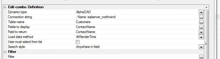
UX Component - HTML Editor - Toolbar Icons - You
can now customize all of the icons used in the HTML
editor toolbar.
Reports - SQL - Native SQL - Previously, if a
report was based on a custom SQL statement and the SQL
type was set to 'Native', during execution of the report
the SQL statement was parsed (sometimes more than once).
Parsing the SQL was necessary in order to determine if
the report used arguments that were not defined (and
therefore if a prompt should be shown for missing
arguments) and in order to add in dynamic filters and
order definitions.
In certain cases, the native SQL being passed to the
report engine was so complex that parsing the SQL added
a substantial delay to rendering the report.
Now, if you specify that the report data source uses
native SQL the SQL query for the report will never be
parsed. It will simply be passed to the database engine
to execute.
As a result of this change if your native SQL statement
uses arguments and you do not pass in values for all of
the arguments used in the SQL, the report will no longer
be able to dynamically prompt for missing argument
values. Also if you are attempting to dynamically add a
filter or order to the report at runtime, this will no
longer work in the case were the report is based on
native SQL.
UX Component - List Control - Scroller -
Previously, the 'scroller' feature was only supported
for Lists if the UX style was set to iOS7, AndroidDark
or AndroidLight. Now, the scroller is supported for all
styles.
Bugs
UX Component - Security Framework - Error Messages -
Errors returned from the server-side Action Scripts
to validate web security values, save web security
values, and change web security passwords may not
display property if the UX uses Panels, a placeholder is
specified for the UX component validation errors, or the
option to show errors in a popup window is selected.
This is now fixed. The Action Scripting actions in the
server-side events must be edited to apply the change.
Select any of the web security actions in a server-side
event and select "Edit action". Click OK to save and the
code will be updated.
Grid Component - Oracle 9i - Fixed an issue using
a Grid with Oracle9i.
UX Component - Textbox and Textarea Controls - Help
Icon - Container With Layout Mode - If a textbox or
textarea control had its help icon turned on, and if the
icon was displayed left or right of the control and if
the UX layoiut mode was set to 'Container width' (the
default mode), the icon would show above or below the
control. This is now fixed.
UX Component - Data Binding - Views - Auto-increment
- Entering new records into a UX component that was
bound to a View (rather than a Table) which had an
auto-increment primary key would fail. The record was
inserted, but not refreshed after insert.
UX Component - Display Wait Message on Ajax Callback
- In some cases the wait message was not being cleared
after the callback completed and the screen remained in
a locked state.
UX and Grid Components - Lookup Grids - SQL -
Filter - If you defined a Lookup Field that used a
Grid based on a SQL database and you specified that the
Lookup Grid had both a static filter and a dynamic
filter, you would get an error when opening the lookup
Grid. The error only happened if the static filter was
defined as a 'base' filter.
Grid Component - Image Download - Detail View -
Image download of an image field in the Detail View part
was not working correctly.
Grid Component - File Upload Action - New Record Rows
- Uploading a file on a new record row caused an error.
UX Component - HTML Editor - Container Window -
If you added a textarea control (configured as an HTML
editor) into a Window Container, then when the window
was displayed, the HTML editor was displayed, but you
could not type into the editor.
Grid and UX Builder - Working Preview - Internet
Explorer V10 and Earlier - If you had IE10 or
earlier installed on your computer, in some cases you
would get a Javascript error when testing a component in
Working Preview.
Tips
AlphaDAO - Oracle - Returning a Resultset from a Stored Procedure
- Returning a SQL::Resultset object from an Oracle stored procedure can
be tricky depending on which version of Oracle you are using.
As an alternative to returning a resultset from a stored procedure,
you can use an Oracle function.
In this example we show how a resultset is returned using an Oracle
function.
NOTE: The Oracle database used in this example
was created by using the Workspace Upsize Genie (see the 'Tool' menu
when the Control Panel has focus) to upsize the sample Alphasports
Workspace that ships with Alpha Anywhere.
dim cn as sql::Connection
dim flag as l
flag = cn.open("::Name::oracle_alphasportsUpsize")
dim sql as c
sql = <<%str%
create or replace FUNCTION REFCURSOR_CUST(p_city IN VARCHAR2) RETURN
SYS_REFCURSOR AS p_recordset SYS_REFCURSOR;
BEGIN
OPEN p_recordset FOR select FIRSTNAME, LASTNAME, BILL_CITY from CUSTOMER
where bill_city LIKE p_city;
return p_recordset;
END REFCURSOR_CUST;
%str%
'Oracle does not like CRLF in statements, so
convert CRLF to spaces
dim sql2 as c
sql2 = stritran(sql,crlf()," ")
'Execute the SQL statement to define the function
flag = cn.Execute(sql2)
dim sql::arguments
args.add("Whatcity","Boston")
'Execute the function. Notice the 'from dual'
syntax that Oracle requires
flag = cn.Execute("select REFCURSOR_CUST(:whatcity) from dual",args)
dim rs as sql::resultset
rs = cn.ResultSet
dim txt as c
txt = rs.ToString()
showvar(txt)
Here is what we see:
Mary McDonald Boston
Richard Queen Boston
If you are using Oracle 12, you have the option of using implicit
cursors in a stored procedure.
The above function definition could be written as the following
stored procedure:
CREATE OR REPLACE PROCESURE SP_GETCUSTOMERS (p_city
IN VARCHAR2)
AS
p_recordset SYS_REFCURSOR;
BEGIN
OPEN p_recordset FOR SELCT FIRSTNAME, LASTNAME,
BILL_CITY FROM CUSTOMER WHERE BILL_CITY LIKE P_city;
DBMS_SQL_RETURN_RESULT(p_recordset);
END;
UX Component - In-Control Buttons - Delete Text - Only Show Icon
if Existing Text - The In-Control Button feature of a textbox
allows you to embed icon inside a textbox. A typical use for for this
feature is to allow the user to easily clear out existing text in the
control.
You might want the icon to only show if there is existing text in the
textbox, as shown in the the screenshots below.
In order to do this you will need to add code to t he Click action
for the in-control button and to the onKeyUp event for the textbox
control.
You will also need to add code to the onRenderComplete client-side
event of the UX to set the initial state of the icon.
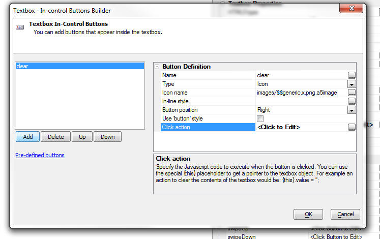
Here is the code you need to add to the Click action:
//clear the value in the control
{this}.value = '';
//get a pointer to the element that contains the
icon and hide it
var ele = $('{dialog.ComponentName}.V.R1.TXT1.CUSTOMBUTTONSTATIC.0')
ele.style.display = 'none';
Here is the code to add to the onKeyUp event for the textbox.
//get a pointer to the element that contains the
icon
var ele = $('{dialog.ComponentName}.V.R1.TXT1.CUSTOMBUTTONSTATIC.0');
//if there is text in the control, show the icon,
else hide the icon
if(this.value == '') {
ele.style.display = 'none';
} else {
ele.style.display = '';
}
Here is the code for the onRenderComplete client-side event to set
the initial state of the icon:
var ele = $('DLG1.V.R1.TXT1.CUSTOMBUTTONSTATIC.0')
ele.style.display = 'none';
Build 2399-4351 8-Sept-2014 - Alpha Anywhere
Version 3
We are pleased to announce Alpha Anywhere Version 3.
This release contains a huge number of new features,
enhancements, performance improvements and bug fixes.
The standout feature in the release are the enhancements
made to the List control to support building
disconnected mobile applications. See the 'Features'
section for details.
Videos
|
UX Component |
Tree Control - Populating Data using Javascript |
The data in a tree control on a UX component can
easily be set using Javascript. In this video we
show how to repopulate the entire tree, or
dynamically add a node to an existing tree.
Watch Video
Download Component |
|
UX Component |
Submitting all of the Data in a List Control on
an Ajax Callback |
When an Ajax callback is made, the data in the
variables on the UX are submitted, but the data
in List controls are not submitted. There may be
situations where you want to submit all of the
data that are currently in a List control to the
server.
In this video we show how you can 'harvest' the
data that is in a List control and then submit
that data to the server when you make an Ajax
callback.
Watch Video - Part 1
Watch Video - Part 2
Download Component |
|
UX and Grid Component |
Using Chrome for Working Preview - Debugging
Javascript using the Chrome Debugger; |
When you are in the Component builders, the
Working Preview window now allows you to choose
whether you want to use Internet Explorer or
Chrome.
Using Chrome has several benefits, including the
ability to 'detach' the Working Preview window
so that it can be moved to a second monitor and
be kept open while you continue to design your
component. You can also use the Chrome Debugger
to debug your Javascript or inspect elements on
the page.
Watch Video - Part 1
Watch Video - Part 2 |
|
UX Component |
List Control - Custom Control - Client-side |
When you define a List control in a UX
component, one of the 'control types' that you
can insert into the List is a 'Custom Control'.
A 'custom control' is computed with an Xbasic
function. Because Xbasic is used to render the
custom control, it means that the custom control
is rendered server-side when the List is
initially rendered. If your UX component has
code that modifies data in the List, the
server-side custom control is obviously not
re-rendered.
Therefore, you might want to define your custom
control using client-side Javascript.
This video shows an approach to creating
client-side custom controls in a List component.
Watch Video
Download Component |
|
UX Component - List Control |
Vertically Justifying Data in a Row |
By default, data in a columnar List control is
vertically top justified. In a Grid, on the
other hand, data in a Grid row is vertically
middle justified. In a Grid this is easily done
because the generated HTML for a Grid uses an
HTML table. The generated HTML for a List is not
based on an HTML table, and so middle justifying
the data is a little trickier.
In this video we show how you can vertically
middle justify data in a List row.
Watch Video
Download Component |
|
UX Component - List Control |
Displaying Data From Twitter |
The Twitter API returns data in JSON format. The
List control on a UX component is easily
populated with JSON data. The Twitter API,
however, is a little tricky to work with because
it requires an OAuth authorization before you
can call the API functions. Xbasic contains two
built-in functions that simplify this.
In this example we show how you can easily build
a List control that displays Tweets that are
retrieved by making a REST API call to Twitter.
In the example we use built-in Xbasic functions
to get a 'bearer token' from Twitter. Once we
have this token, we can make calls to the
Twitter API to get data in a JSON format that is
used to populate the List control.
IMPORTANT: The video shows selecting the
Twitter List from the 'Defined Controls' section
of the UX builder toolbox. This has been
changed. You should now select the 'Twitter_Display_Tweets_in_a_List_Control'
sample UX Component template in the dialog that
appears when you create a new UX component.
Watch Video - Part 1
Watch Video - Part 2
Watch Video - Part 3
Watch Video - Part 4 |
|
Reports |
Suppressing Blank Rows in a Layout Table Report |
The Layout Table report editor exposes a
property that you can set for each row in the
Layout Table to suppress the row if it is blank.
In this video we show how blank lines in a
Layout Table Report are suppressed. We also
discuss how the report writer determines that a
row is 'blank'.
Watch Video |
|
UX Component |
Setting Content of Scrollable Containers/Windows |
Normally, you can set the content of an element
in a component by simply getting a pointer to
the element and then setting the element's .innerHTML
property. However, if the element whose content
you are setting has been configured to allow
drag scrolling, setting the .innerHTML directly
will destroy the drag scroll settings and the
new content will no longer be scrollable.
The solution to this problem is to use the
A5.u.element.setContent() function to set the
element's content.
Watch Video - Part 1
Watch Video - Part 2
Download Component |
|
UX Component |
Edit-Combo Control - Specifying a Different
Stored Value from the Display Value |
Dropdownbox controls allow you to specify that
the stored value is different from the display
value. For example, the control might display a
'ProductName' but the stored value in the
control might be the 'ProductId'.
Edit-combo box controls can now also be
configured to store a different value than their
display value, just like a Dropdownbox control.
The benefit of using an Edit-combo control over
a Dropdownbox control is that you can display
multiple columns of data in the choice list and
you can dynamically populate and filter the
choices in the list with an Ajax callback every
time the control is opened.
In this video we show how to configure an
Edit-combo control to store a different value
from its display value.
Watch Video |
|
Interactive Window |
Executing Shell Commands Directly from the
Interactive Window |
You can now execute shell commands directly from
the Interactive Window. You no longer have
to open a separate CMD window to execute shell
commands. This can be a very useful time saver
for developers.
For example, when building an application that
uses REST APIs, it is common for the API
documentation to show how you can use CURL to
execute the REST command. Using the Interactive
Shell, CURL commands can be executed directly
from the Interactive Window.
Watch Video - Part 1
Watch Video - Part 2 |
|
|
|
|
|
UX Component |
Dynamic Images - Client-Side |
When you add a 'Dynamic Image' column to a List
control to display an image in the List that is
based on other data in each List row you can
specify if the computation of what image to show
should be server-side, or client-side. If
server-side, your expressions that define the
conditional tests are specified in Xbasic. If
client-side, your conditional expressions are
expressed in Javascript.
The benefit of client-side dynamic images is
that the image will be automatically recomputed
when the data in a List row is updated.
In this video we show how client-side Dynamic
Images can be defined and then we show another
technique for creating client-side Dynamic
Images using the List's Computed Columns
feature. This second technique has the advantage
of offering more flexibility.
Watch Video - Part 1
Watch Video - Part 2
Download Components |
|
UX Component |
Client-side Template Tutorial |
Client-side templating allows you to generate
HTML for display by merging a data object into a
template. The client-side template library in
Alpha Anywhere is extremely powerful and can be
compared with similar functionality in 3rd party
templating libraries, such as Mustache.js and
Handlebars.js.
In this video we show how a complex template can
be designed to display data (a list of Orders
with OrderItems for each order) in a richly
formatted display. The video shows how the
templating system can compute values, including
summary values.
Watch Video - Part 1
Watch Video - Part 2
Watch Video - Part 3
Watch Video - Part 4
Watch Video - Part 5
Watch Video - Part 6
Watch Video - Part 7
Watch Video - Part 8
Watch Video - Part 9 |
|
UX Component - PhoneGap |
Displaying .PDF, .XLSX, .DOCX Files |
Unlike desktop browsers, the browsers on mobile
devices typically do not have built-in handlers
for displaying .pdf, .xlsx, .docx and certain
other types of files.
If your mobile application is wrapped using
PhoneGap you can easily use the built-in native
document viewer on both Android and iOS devices.
In this video we show how to build a PhoneGap
app that can display .pdf and Microsoft Office
files.
Watch Video |
|
UX Component - PhoneGap |
Using Native Transitions |
If you wrap a UX component in a PhoneGap shell
you can now use native transitions to animate
certain Panel Cards in your app into view. This
feature relies on the Native Transitions
PhoneGap plugin (iOS only).
In this video we show how the Native Transitions
plugin can be called.
Watch Video |
|
Web Security Framework |
Alternative Logins - Logging into an Application
using Google, Facebook, LinkedIn or Twitter |
When the Application Server Security Framework
is turned on you can require that a user must
log into an application before they can use it.
A user will enter the userid and password
associated with their account in the Security
Framework in order to log into the application.
You can provide an option for a user to login to
their account using the credentials from a
social network as an alternative to their
account userid/password.
You can also allow someone to log into an
application using social network credentials and
then automatically create a new account in the
Application Server Security Framework for that
user.
These videos demonstrate this functionality. If
you have not yet read the documentation on
Alternative Login, it is recommended that you
read the documentation before watching the
videos. Click
here to read the documentation.
Video 1 - Setting up the Providers
Video 2 - Creating Named Providers
Video 3 - Configuring Web Security
Video 4 - Adding Alternative Login to a UX
Component
Video 4 - Testing Alternative Login |
|
UX Component - List Control |
Dialing a Phone Number Shown in the List |
When running on a phone, it is a common
requirement to be able to dial a phone number
that is displayed on screen. For example, you
might have a List control showing contact names
and for each name you have an associated phone
number.
In this video we show how you can configure a
hyperlink control in the List to dial a phone
number.
Watch Video |
|
UX Component - List Control |
Displaying a Custom Message in the List if the
List has No Records |
A common requirement in a List is to show a
custom message if the List has no records.
The List control has built-in properties to make
this easy. You can also automatically center the
message horizontally and vertically in the List.
Watch Video |
|
Video Finder |
Finding Videos in the Video Library |
There are a large number of videos that have
been recorded to demonstrate and explain various
features in Alpha Anywhere. The Video Finder
application (accessed from the Help menu) allows
you to search for videos. In Alpha Anywhere V3,
the Video Finder application has been completely
rewritten to make finding videos even easier and
faster.
The new Video Finder application has been
implemented as a UX component with two List
controls - one for the list of categories, and
one to list the videos in each category.
This video discusses the new Video Finder
application.
Watch Video |
|
|
|
|
|
UX Component - List Control |
Introduction to the List Control Detail View |
The List control can have an associated Detail
View. The Detail View allows you to see details
for the currently selected row in the List. The
Detail View can be updateable, allowing you to
update data that is in the List.
In this video we show how you can add a Detail
View to a List. We show two different genies
that you can use - one for setting up a List
with a Detail View, and another for adding a
Detail View to an existing List.
IMPORTANT: Lists with Detail Views are
the essential building block for applications
that can work while you are disconnected. For
more information about the features of Lists
with Detail Views, see the videos in the 'UX
Component - Disconnected Applications' category.
Even if you do not need to build mobile
applications that work while disconnected, the
information regarding Lists and Detail Views in
these videos will be relevant.
Watch Video - Part
1
Watch Video - Part 2
Date Added: 2014-09-07 |
|
UX Component - List Control |
Contrasting Data Binding at the UX Level with
Data Binding at the List Level to Update a SQL
Database |
When you want to update data in a SQL database
using a UX component you previously could define
Data Binding properties for the UX component,
then define a server-side action that loaded the
primary keys of the records you wanted to edit
and another server-side action to save the edits
back to the SQL database.
Now, using a List control with an updateable
Detail View, you can perform edits on a SQL
database using the List and its associated
Detail View.
In this video we contrast the two methods of
performing CRUD (create, read, update, delete)
operations on a SQL database using Data Binding
and List controls.
Watch Video - Part
1
Watch Video - Part 2
Download Components
Date Added: 2014-09-07 |
|
UX Component - List Control |
List Control Search Part |
The List control has a built-in Search Part that
allows you to perform searches on the database
that is used to populate the List. (This is very
much like the Search Part in a Grid component).
The Search Part in the List can be configured in
three different ways:
- individual fields for the Search Part
(allowing the user for example to enter criteria
in a Name, City or Country field)
- a single keyword field (allowing the user to
enter criteria in a single field then then
searching for matches in multiple fields)
- query by form (allowing the List's Detail View
to be used to enter the search criteria)
In this video we show how the various options
can be used to search a List.
Watch Video - Part 1
Watch Video - Part 2
Watch Video - Part 3
Watch Video - Part 4
Download Components
Date Added: 2014-09-07 |
|
|
|
|
|
UX Component - Disconnected Applications |
Introduction |
You can build applications that are designed to
work when you are disconnected. The UX component
and the List control are the fundamental
building blocks of these types of applications.
In this video overview we show how a UX
component is built using a List control with an
associated Detail View to display and edit data,
how the data in the List is persisted to Local
Storage and then how the edits made to the List
data are synchronized with the server. We also
show how your disconnected data can be
'hierarchical' - i.e. a list of customers, with
orders for each customer and order details for
each order.
Watch Video 1 - Setting up a List with a Detail
View using the Quick Setup Genie
Watch Video 2 -
Editing Data and Persisting Data to Local Storage
Watch Video 3 - Introduction to Hierarchical
Data Structures
For more information on building disconnected
applications, click
here.
Date Added: 2014-09-07 |
|
UX Component - Disconnected Applications |
Editing Data While Offline and then
Synchronizing the Data |
When you build an application for disconnected
operation, the List control is the basic
building block for the application. The List
control is used as the 'offline' data storage.
The data in the List control can be thought of
as an in-memory table. Edits to this data are
persisted to Local Storage and then are pushed
to the server to synchronize with the server
database when a connection is available.
In this video we look at how data in the List
are edited and then synchronized with the server
database.
Watch Video
Date Added: 2014-09-07 |
|
UX Component - Disconnected Applications |
Editing Data While Offline - Behind the Scenes -
What Data are Stored in the List |
In order to get a better understanding of how
the data in a List control are stored to support
disconnected operation, this video shows how you
can debug into the internal data that is stored
in the List when the user edits, enters and
deletes records.
Watch Video
Date Added: 2014-09-07 |
|
UX Component - Disconnected Applications |
Synchronization Errors - Validation Errors |
When a user synchronizes edits to data that were
made while they were offline, there is the
possibility of synchronization errors.
These errors can typically result because the
user entered a value in a field that was
rejected by some server-side validation logic, because of a write conflict,
or because the database rejected the edit.
In this video we show how synchronization errors
that result from server-side validation errors
and database errors
are handled.
Watch Video - Part 1
Watch Video - Part 2
Date Added: 2014-09-07 |
|
UX Component - Disconnected Applications |
Synchronization Errors - Write Conflicts |
When a user synchronizes edits that were made
while they were offline, there is the
possibility that some other user edited and then
synchronized the same data before the user had a
chance to synchronize his/her edits.
If this happens a write conflict will occur and
the user will be notified that the synchronize
operation could not be completed. The user will
have to choose how to resolve the conflict. The
developer also has the option of handling write
conflict errors programmatically.
In this video we show how write-conflict errors
are handled.
Watch Video - Part 1
Watch Video - Part 2
Watch Video - Part 3
Date Added: 2014-09-07 |
|
UX Component - Disconnected Applications |
Synchronization Events |
When data in a List control is synchronized with
the server database there are a number of events
that fire (on both the client-side and the
server-side) that give you a lot of control over
the process and allow you to inject custom code
to be executed.
In this video we discuss some of the events that
fire when data are synchronized.
Watch Video
Date Added: 2014-09-07 |
|
UX Component - Disconnected Applications |
Custom Synchronization Handlers |
When the user synchronizes a List that is based
on a SQL database, Alpha Anywhere automatically
generates the SQL statements to perform the
various CRUD (create, read, update, delete)
operations.
However, if your List is based on a custom
datasource (for example, a web service), then
you must write your own functions to handle
synchronization of the data.
In this video we show an example of how custom
handlers can be written to synchronize data.
Watch Video - Part 1
Watch Video - Part
2
Download Component
Date Added: 2014-09-07 |
|
UX Component - Disconnected Applications |
Incremental Refresh |
After a List has been populated with data from
the server you can perform incremental refreshes
on the List data to retrieve any edits that have
been made to server data. Unlike a full refresh,
only rows that have been edited are sent to the
client, resulting in a much smaller payload
being sent to the client compared to a full
refresh of the List data.
You can also set a 'synchronization policy' in
the List definition to specify that every time
edits to the List data are synchronized with a
server an incremental refresh of the List should
also be performed.
Watch Video
Date Added: 2014-09-07 |
|
UX Component - Disconnected Applications |
Geographic Data - Capturing Location Information
when the User Edits Data |
You can configure a List so that every time the
user enters a new record, or edits a record, the
user's location will be stored. This allows you
to create applications where you capture the
location of the device at the time a record was
edited or entered.
In this video we show how this is done.
Watch Video - Part 1
Watch Video - Part 2
Download Component
Schema for MySQL Table Used in Component
Date Added: 2014-09-07 |
|
UX Component - Disconnected Applications |
Geographic Data - Capturing Location Information
when the User Synchronizes Data |
In a previous video we show how location
information can be captured at the time the user
edits a record in the List. But you can also
capture location information at the time the
user synchronizes the data.
In this video who show how to configure the List
to submit location information at the time the
user synchronizes the List.
Watch Video
Download Component
Schema for MySQL Table Used in Component
Date Added: 2014-09-07 |
|
|
|
|
|
UX Component - Disconnected Applications |
Geographic Data - Geocoding Data |
In order to perform geography searches on your
data (for example, find all records that are
within 5 miles of my current location), you need
to geocode the data in your table. For example,
if you have captured the address for the record,
when the record is synchronized, you can make a
call to a geocoding service to get the
latitude/longitude for the record. Then when the
record is written to the database you can also
compute the location field value so that
geography searches are possible.
In this video we discuss the features that the
List control exposes to support working with
geographic data.
Watch Video
Download Component
Schema for MySQL Table Used in Component
Date Added: 2014-09-07 |
|
UX Component - Disconnected Applications |
Setting Default Values for Fields in New Records |
When you enter a new record in a List with a
Detail View you might want to set default values
for certain of the fields in the Detail View.
The List builder allows you to execute
Javascript code to compute the default value for
each field in the List. This allows for
sophisticated computations for the default
value, including setting the default value for a
field to the value that was just entered into
the previously entered record.
Watch Video
Date Added: 2014-09-07 |
|
UX Component - Disconnected Applications |
Synchronizing Data in Batches |
If the user has made a large number of edits
while they were offline you might want to
synchronize the data in batches, rather than
sending all of the edits to the server at once.
In this video we show how you can configure the
synchronization process so that data are sent to
the server in batches.
Watch Video
Download Component
Date Added: 2014-09-07 |
|
UX Component - Disconnected Applications |
Delaying Populate List Till Active Search |
In an application designed for disconnected
usage, the user will typically load a subset of
the database onto their mobile device while they
have connection.
This is usually done by adding a Search Part to
the primary List control in the component and
specifying the the List should not be populated
until the user has performed a search to
retrieve the 'records of interest'.
TIP: For more information on how to set up the
Search Part for a List control see the video
titled 'List Control Search Part'.
Watch Video
Date Added: 2014-09-07 |
|
UX Component - Disconnected Applications |
Settings Maximum Number of Records that a Search
Can Return |
In an application designed for disconnected
usage, the List controls in the UX component
hold the data that will be available while the
user is offline. These Lists are populated when
the user does a search to retrieve the 'records
of interest' that they want to have available to
them while they are on-line.
Since the amount of data that can be held on a
mobile device is limited, you will typically
want to ensure that the user does not enter
search criteria that retrieve too many records.
In this video we show how you can set limits on
how large a result a user search is permitted to
return.
Watch Video
Date Added: 2014-09-07 |
|
UX Component - Disconnected Applications |
Persisting Data to Local Storage |
When you build an application for disconnected
operation you need to be sure that the data in
the application is persisted to Local Storage so
that edits that are made to any data are not
lost if the application is restarted before the
user has had a chance to synchronize the data
with the server.
Watch Video - Part 1
Watch Video - Part 2
Watch Video - Part
3
Date Added: 2014-09-07 |
|
UX Component - Disconnected Applications |
Working with Hierarchical Data |
The data for disconnected applications are
stored in List controls. In many types of
applications the data you need to work with is
hierarchical. For example, you might have a list
of customers. Each customer has orders and each
order has order details.
In a connected application, you can make an Ajax
callback to the server when a user selects a
different customer to fetch to orders for that
customer. However, in a disconnected application
you cannot make callbacks to the server, so when
the user selects a customer, the orders for that
customer must already have been retrieved from
the server so that the data can be shown without
making an Ajax callback.
The List control can easily be populated with
hierarchical data. In this video we explain how
a List control is populated with a customers,
each customers' orders, and each order's
details.
Watch Video - Part 1
Watch Video - Part 2
In this follow on video we show how new records
can be added to child tables and how the new
records are automatically linked to their
parent. In the video we show how a new order is
added for the selected Customer record and then
how new order detail records are added for the
new order. When the data are synchronized, the
linking fields are automatically filled in - the
customer Id is filled into the new order record
and the order id is filled into the new order
detail records.
Watch Video - Part 3
Download Component
Date Added: 2014-09-07 |
|
UX Component - Disconnected Applications |
Managing Local Storage |
When you build an application that is designed
for offline use (i.e. a disconnected application), the data in
the List controls, and the variables in the UX
component are persisted to Local Storage.
In this video we show how you can manage the
data in Local Storage using the built-in Local
Storage manager and using methods of the UX
component.
Watch Video - Part 1
Watch Video - Part 2
Date Added: 2014-09-07 |
Features
Building Disconnected Mobile Applications - The
UX component now allows you to build mobile applications
that work while you are disconnected.
The following videos will give you a quick overview of building
disconnected applications in the UX component:
Watch Video 1 - Setting up a List with a Detail
View using the Quick Setup Genie
Watch Video 2 -
Editing Data and Persisting Data to Local Storage
Watch Video 3 - Introduction to Hierarchical
Data Structures
For detailed information about this feature, click
here.
UX Component - List Control - Detail View and Search
Part- List controls can now have an updateable
Detail View and an integrated Search Part.
This feature is central to building disconnected applications, but
should also be of great interest to developers of traditional desktop
web application. (See the section in the detailed information - see link
below - that contrasts Data Binding with updateable Lists).
For detailed information about this feature, click
here.
Application Server - 64 bit Machines - Alpha
Anywhere is now compiled using a special compiler switch
that allows access to more system RAM when running on a
64 bit machine. As a 32bit application, the amount of
system RAM that Alpha Anywhere can access is limited to
approximately 2GB. Now, up to 4GB of system RAM can be
accessed. As a result of this change larger files can be
uploaded, more simultaneous uploads can be performed,
more sessions can be handled, and server restarts
because of memory fragmentation should be needed less
frequently.
Video Finder - The Video Finder (accessible from
the Help/Video Finder menu) has been completely
rewritten. The Video Finder now loads much more quickly
and searches are much faster. Also, you can now click
the 'Preferences' button on the toolbar to specify if
the Video Finder should be opened in a MDI window or a
modeless window. The modeless window option is useful if
your computer has two monitors because it allows you to
drag the Video Finder window to the second monitor and
keep it open while you are working.
Watch Video
UX Component - List Control - Custom 'No Records in
List' Message - A common requirement in a List is to
show a custom message if the List has no records.
The List control has built-in properties to make this
easy. You can also automatically center the message
horizontally and vertically in the List. See image
below.
Watch Video
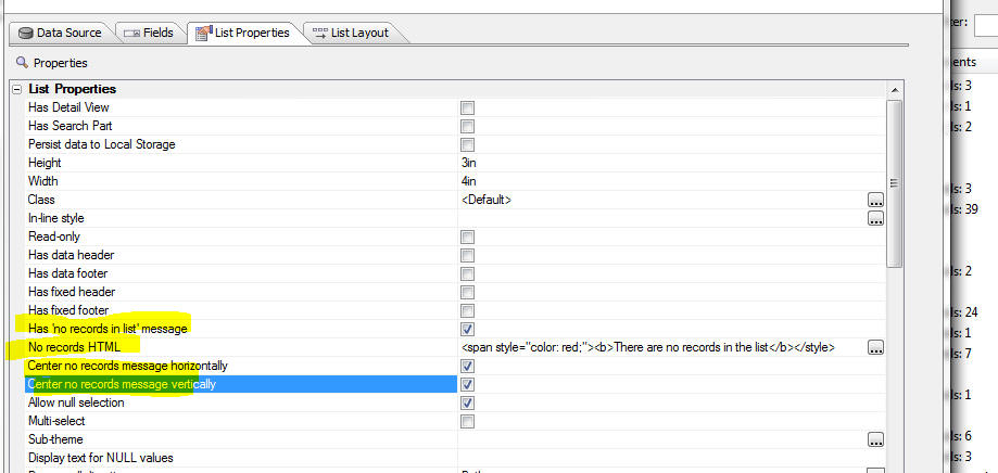
UX Component - List Control - Hyperlink - Telephone
- You can now configure a hyperlink control in a List to
dial a telephone number. This is particularly useful in
mobile applications that are run on a phone.
Watch Video
Assume you have a List control with this data:
name|phoneDisplay|phoneDial
John Smith (home)|(555) 555-5555|+15555555555
John Smith (mobile)|(555) 555-5556|+15555555556
The List data contains both the phone number to display
in the List and the phone number to actually dial.
Notice that the phone number that should be dialed
includes the +1
prefix to indicate that this is a U.S. phone
number. The phone number to be dialed must start with
+ and
then the country code (1 in the case of the U.S.).
The phone number to be dialed can also include special
directives. For example you can insert 'p' in the number
to indicate a one-second pause and 'w' to indicate 'wait
for dial tone'.
Using the sample data shown above, to configure the
hyperlink to dial the telephone number in the 'phoneDial'
field, but display the number shown in the 'phoneDisplay'
field, you would set the 'Action type' property to
'Telephone', the 'Phone number' field to '{phoneDial}'
(note that the placeholder is case-sensitive) and the
'Hyperlink text' property to '{phoneDisplay}', as shown
in the image below.
It is permissible for the value passed in as the phone
number to dial to include spaces and parentheses. For
example, +1(555) 555-5555 is a valid number to dial.
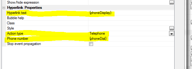
If, for example, your List data had separate fields for
the phone number (called 'phone' for example) and
country code (called 'code' - without the leading + in
the data), you could set the 'Phone number' field to:
+{code} {phone}
UX Component - List Control - Hyperlink - E-mail
- You can now configure a hyperlink control in a List to
open the associated e-mail client and fill in the 'to'
address with a field.
To configure a hyperlink to open an e-mail client, set
the 'Action type' to 'Email' and the 'Email address' to
the value you want to put into the email client's 'to'
address field. You can use placeholders in the 'Email
address' property to refer to data in a field in the
current row of the List.
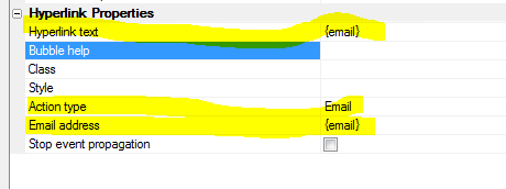
UX Component - List Control - Hyperlink - Specifying
a Target HRef - Previously, when you added a
hyperlink control to a List, the action associated with
the hyperlink was always some Javascript code. Now you
can define standard HTML hyperlinks with an 'href'
attribute that specifies the hyperlink target.
To specify a hyperlink target, set the 'Action type' to
'Href' and then specify the 'Hyperlink address'. You can
use a placeholder for the address. For example if your
List has a field called 'address', you can specify the
'Hyperlink address' as {address}.
The hyperlink address must include the protocol if the
target is not a page in the application webroot. For
example, to display bing.com, you would need to set the
target to 'http://www.bing.com', but to display a page
called 'page1.a5w' in the current webroot, you would
just need to set the target to 'page1.a5w'.
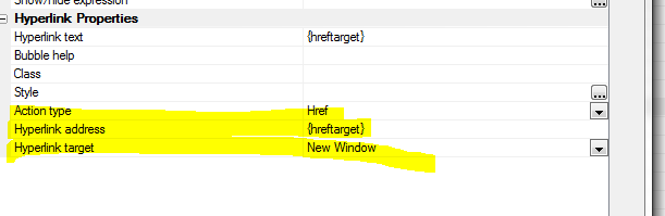
Client-Side Template Tester - User Interface
Improvements - The user interface in the client-side
template tester window has been enhanced. The window is
now resizable and has separate tabs for JSON Data,
Template, Javascript and CSS.
As you edit in any of these windows the template preview
is automatically updated in the right part of the
window.
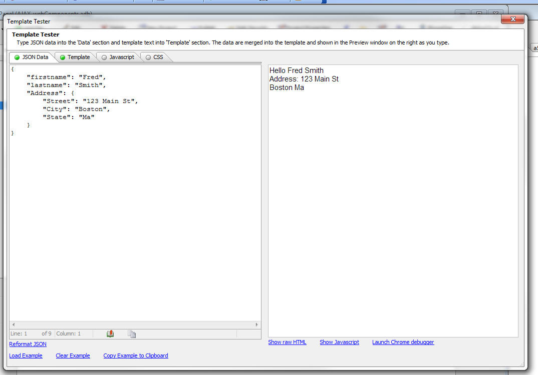
json_reformat_safe() Function - Reformats as
string of JSON data with line-breaks and optional
indentation.
Syntax:
c json_text = json_reformat_safe(json_text
[, flagIndent = .t.])
For example:
dim json as c
json = <<%txt%
{firstname: 'Fred', lastname: 'Smith', Address: {
Street: '123 Main St',
City: 'Boston',
State: 'Ma'
}
}
%txt%
?json_reformat_safe(json)
= {
"firstname": "Fred",
"lastname": "Smith",
"Address": {
"Street": "123 Main St",
"City": "Boston",
"State": "Ma"
}
}
NOTE: json_reformat_safe() wraps the lower
level json_reformat() function. The json_reformat()
function only accepts 'properly formed' JSON strings
(property names must be double quoted and string values
must be double quoted). json_reformat_safe() will
automatically convert JSON strings where property names
are not quoted and strings are single quoted.
json_extract() Function - Extracts a property
from a JSON object .
Syntax
c text = json_extract( C json_text, c
property_name)
NOTE The JSON text passed to the function must be
properly formed (i.e. use double quotes on property and
string names). You can use json_reformat_safe() to
'clean' up the JSON string before calling json_extract.
For example:
dim json as c
json = <<%txt%
{
name: 'Fred',
address: {
street: '123
Main St',
city:
'Boston',
state: 'MA'
}
}
'json_extract() requires properly formed JSON, so
'we first call json_reformat_safe()
dim json2 as c
json2 = json_reformat_safe(json)
?json_extract(json2,"name")
= "Fred"
?json_extract(json2,"address")
= "
{
street: '123
Main St',
city:
'Boston',
state: 'MA'
}
"
%txt%
Grid Component - Export - Comma Delimited ASCII -
Quoting Fields with Commas - If the data you are
exporting has commas in the data, the fields with commas
are now quoted. If there are quotes inside a field, the
quotes are escaped as double quote (e.g. "").
UX Component - Image Upload - Clear Image -
Action Javascript has a method to upload an image and
save the uploaded image in a field in the table that the
UX is bound to. However there was no easy way to clear
out a previously uploaded image - and set the field back
to a null value. A new action in Action Javascript now
support the 'Delete Image' action.
UX Component - Security Framework - Alternative Login
- Login with Google, Facebook, Twitter and LinkedIn -
You can now allow users to log into an Alpha Anywhere
application using a 'social network' login.
The social network logins are referred to as
'alternative logins' because they provide an alternative
way for a user to log into their account in the Alpha
Anywhere security system using their social network
credentials, rather than the userid/password associated
with their account in the Alpha Anywhere security
system.
The Alternative Login features are exposed as new
actions in Action Javascript for use in a UX component.
For complete details on the Alternative Login feature
click
here.
Video 1 - Setting up the Providers
Video 2 - Creating Named Providers
Video 3 - Configuring Web Security
Video 4 - Adding Alternative Login to a UX Component
Video 4 - Testing Alternative Login
NOTE: In a previous pre-release build we added
support for Google's OpenID protocol.Google has
deprecated this protocol, and therefore we will not be
supporting it in Alpha Anywhere. If you attempted to
test the OpenID protocol in a pre-release build, please
send a bug report and we can provide instructions on
removing the OpenID elements as they are not compatible
with the current system, which is based on oAuth.
Xbasic - CURL - CURL is a popular utility that
can be used for many tasks, such as making REST API
calls. CRUL is now exposed as a top level Xbasic object,
allowing you to execute CRUL commands from your Xbasic
code.
Many APIs are documented using CURL examples.
You can use a built-in genie to convert a CURL command
into an Xbasic script.
To get to the CURL genie, right click on white space in
the Xbasic code editor and select the 'Genies...'
command. The select the 'CURL command to Xbasic....'
command.
This opens the CURL to Xbasic Genie where you can type
in a CURL command then then click the 'Generate Xbasic'
button to generate the Xbasic code to execute the
specified CURL command.
For more information on the Xbasic CURL object, click
here.
Xbasic - Parsing a Name/Value String -
extension::URIQuery Class - Xbasic now has a new
utility class that makes it very easy to parse
name/value pairs in a 'query string'.
The following Interactive Window session demonstrates
use of this class:
dim qs as c = "name=fred&city=boston&country=&age=25"
dim postQ as extension::URIQuery
postQ.ParseURIQuery(qs)
?qs
= "name=fred&city=boston&country=&age=25"
?postq.age
= "25"
?postq.country
= ""
?postq.ToJson()
= {"name":"fred","city":"boston","country":"","age":"25"}
Template Tester - Tools Menu - The Template
Tester can now be opened directly from the Tools menu
when the Web Control Panel has focus.
The Template Tester is useful when you are constructing
templates that generate HTML by expanding data in an
object. See 'Client-side Templates' in the Release Notes
for information on templates.
NOTE: While templates are documented in a section
called 'Client-side Templates' this is somewhat
misleading because you can also use templates in
server-side code using the a5_merge_JSON_into_template()
Xbasic function.
Client-side Template Enhancements - Client-side
Templates (first introduced in build 2091 - 4284 - see
Release Notes for more information) have been enhanced.
The {*root} Tag
Previously if the data you passed into the
A5.u.template.expand()
function was an array (as opposed to an object with an
array as property of the object), you could not use the
{*header}
and
{*footer}
directives in your template to generate a header or
footer for the array data.
Now, you don't have to artificially structure
your data as a top level object with an array as a
property of the object. The {*root} tag is now supported
when the data passed in is an array.
Consider the following sample data:
var data = [
{firstname: 'Fred', lastname: 'Smith'},
{firstname: 'John', lastname: 'Jones'}
]
and the following template:
var template = [
'{*root}',
'{*header}There are {root.length} people<br
/>{/*header}',
'{firstname} {lastname}<br />',
'{*footer}Count: {root.length} {/*footer}',
'{/*root}'
].join('');
This data and template will product this output:
There are 2 people
Fred Smith
John Jones
Count: 2
Because the template uses the
{*root}
tag, the data that is passed in is implicitly
restructured as:
var data = {
root: [
{firstname:
'Fred', lastname: 'Smith'},
{firstname:
'John', lastname: 'Jones'}
]
}
Escaping the { and } Characters in a Template
The { and } characters in a template indicate
placeholders for merged data. If you want to explicitly
output either of these characters you can escape them
using a leading backslash.
Assume that the data you pass to the template expander
is:
{firstname: 'Fred'}
Assume that you want the output from the template to be
{Fred}
You would define your template as:
\{{firstname}\}
Pre-processing Arrays Before They are Expanded
You can now pre-process arrays before they are expanded.
For example, assume you have the following data:
var data = {
company: [
{firstname: 'Fred', lastname:
'Smith'},
{firstname: 'John', lastname:
'Jones'},
{firstname: 'Andrea', lastname:
'Jones'},
{firstname: 'Margo', lastname:
'Jones'}
]
}
And the following template:
var template = [
'{company}',
'{firstname} {lastname}<br>',
'{/company}'
].join('');
This template and data combination will result in this
output:
Fred Smith
John Jones
Andrea Jones
Margo Jones
But, say you only wanted to output the top two
customers. To do this you would need to pre-process the
company array before it was expanded. You can specify
the name of a function (which can be a global function,
or a function in a namespace) to call before an array is
expanded using the
@functionName
directive in the placeholder for the array.
For example, notice in the template below, the
placeholder for the company array specifies that the
processCompany function should be called before the data
are expanded:
var template = [
'{company@processCompany}',
'{firstname} {lastname}<br>',
'{/company}'
].join('');
The array pre-processor function gets called with three
arguments
- data - the array that is being expanded
- temp - a global storage object that will exist for the
entire length of time that the template is being expanded. You can
use this object to capture information to be output later in the
template.
- root - the root data object (i.e. all of the data)
Your array pre-processor function must return the array
that you want to render.
Here is how the processCompany array pre-processor
function could be defined:
function processCompany(data,temp,root) {
//limit to first two items in the
array
data = data.slice(0,2);
return data;
}
The resulting output is now:
Fred Smith
John Jones
Now assume you want to first sort the data by the 'firstname'
property, then return the top two entries. In this case,
the array pre-processor function would be defined as:
function processCompany(data,temp,root) {
//sort on the 'firstname' property
data.sort( function(a,b) {
if (a.firstname < b.firstname) return
-1;
if (a.firstname > b.firstname) return
1;
return 0;
}
)
//limit to first two items in the
array
data = data.slice(0,2);
return data;
}
The resulting output is now:
Andrea Jones
Fred Smith
An important use for the array pre-processor function is
to compute summary data for the array. See Using the
Special "root" and "temp" Variables in Templates
below. You can compute all of the summary values your
template needs in a single function, rather than
defining separate functions for each summary value your
template outputs.
Using the Special "root" and "temp" Variables in
Templates
You can use the special "root" and "temp" variables in a
template by enclosing them in [ and ].
The example below demonstrates the use of both
[root] and
[temp] in the template.
Download component that demonstrates this example.
TIP: To watch a video of how the template used in this
example was developed, watch these videos:
Watch Video - Part 1
Watch Video - Part 2
Watch Video - Part 3
Watch Video - Part 4
Watch Video - Part 5
Watch Video - Part 6
Watch Video - Part 7
Watch Video - Part 8
Watch Video - Part 9
For example, consider the following data set:
var data = [
{
orderId: 1,
date:
'1/1/2014',
orderItems: [
{itemId: 1, qty: 3, price: 23.4},
{itemId: 23, qty: 2, price: 3.3},
{itemId: 7, qty: 5, price: 5.3}
]
},
{
orderId: 2,
date:
'1/2/2014',
orderItems: [
{itemId: 31, qty: 7, price: 3.8},
{itemId: 17, qty: 4, price: 9.2}
]
},
{
orderId: 3,
date: '1/5/2014',
orderItems: [
{itemId: 11,
qty: 9, price: 13.3},
{itemId: 27,
qty: 2, price: 19.2},
{itemId: 6,
qty: 19, price: 3.6},
{itemId: 7,
qty: 22, price: 9.1}
]
}
]
The data are an array of order objects. Each order has a
nested array called 'orderItems' that have the order
items for that order.
Assume that you would like the template to render as
shown below:
Order Id: 1 (Order number 1 of 3 orders - for orders placed between
1/1/2014 and
1/5/2014)
Order Date: 1/1/2014
|
# | Item Id | Quantity |
Price | Extended Total |
| 1 | 1 | 3 | $23.40 | $70.20 |
| 2 | 23 | 2 | $3.30 | $6.60 |
| 3 | 7 | 5 | $5.30 | $26.50 |
| Count: 3 | | Avg Quantity: 3.33 | Avg Price $10.67 | Total: $103.30 |
Order Id: 2 (Order number 2 of 3 orders - for orders placed between
1/1/2014 and
1/5/2014)
Order Date: 1/2/2014
|
# | Item Id | Quantity |
Price | Extended Total |
| 1 | 31 | 7 | $3.80 | $26.60 |
| 2 | 17 | 4 | $9.20 | $36.80 |
| Count: 2 | | Avg Quantity: 5.50 | Avg Price $6.50 | Total: $63.40 |
Order Id: 3 (Order number 3 of 3 orders - for orders placed between
1/1/2014 and
1/5/2014)
Order Date: 1/5/2014
|
# | Item Id | Quantity |
Price | Extended Total |
| 1 | 11 | 9 | $13.30 | $119.70 |
| 2 | 27 | 2 | $19.20 | $38.40 |
| 3 | 6 | 19 | $3.60 | $68.40 |
| 4 | 7 | 22 | $9.10 | $200.20 |
| Count: 4 | | Avg Quantity: 13.00 | Avg Price $11.30 | Total: $426.70 |
Grand total for all 3 orders is: $593.40
There is a lot going on in this example. The template
for this example is shown below.
Items of note in this example include:
- While the data for each orderItem does not contain an
extendedPriice property, the extended price is shown for each item
and it is formatted with a $ and two decimal places.
If you look at the template below you will notice that the template
for the 'Extended Total' column is defined as:
{qty*price:number(\'$#,###.00\')}. The template
defines the expression
qty * price and then uses the
:number() directive to format is with a $ and two
decimal places (and a comma for the thousands separator - not shown
in the output because none of the extended totals are above
$999.99).
- The Order Items are displayed in a table. The
<table> HTML tag is output in the
{*header} section for the OrderItems array and the
</table> HTML tag is output in the
{*footer} section for the OrderItems array.
- The footer row for the Order Items table displays the count of
the number of items, the average quantity, the average price and the
total for the order. All of these summary values are computed in the
array pre-processor function (orderItemsPreprocessor). Notice that
the tag for the orderItems array
{orderItems@orderItemsPreProcessor} specifies the name
of the pre-processor function.
The array pre-processor function puts these summary values in the
special 'temp' variable. The function adds the following properties
to the 'temp' variable:
temp.grandTotal - the grand total for
all of the orders
temp.averagePrice - the average price
for each order
temp.averageQuantity - the average
quantity for each order
temp.totalExtendedPrice - the order
total for each order
temp.itemCount - the number of items
in each order
In order to output these computed values in the template, the
special [temp] variable is used. For example, to show the average
price (formatted with $ and two decimal places), the template has:
{[temp].avaragePrice:number(\'$#,###.00\')}.
- The rows in the Order Items table are numbered. The special
{[countOneBased]} tag is used to number the rows.
- Each order specifies the order number and the number of orders
(e.g. Order number 2 of 3 orders). The template looks like this:
(Order number {[countOneBased]} of {[root].length}
orders .....
In order to output the order number (i.e. 1 for the first
order, 2 for the 2nd order, etc.), the special
{[countOneBased]} tag is used.
In order to output the total number of orders, the length property
of the special
[root] variable is used. Because the data passed into
the template expand function is an array, the 'root' object is
implicitly created (see section above 'The {*root} Tag ')
- Each order also indicates the date for the first order and last
order displayed. For example:
(Order number 2 of 3 orders - for orders placed between 1/1/2014 and 1/5/2014)
The template the date range is:
- for orders placed between <b>{[root][0].date}</b> and
<b>{[root][-1].date}
To get the date of the first order the special [root] variable is
used with an index of 0. So [root][0] has the data for the first
order and [root][0].date is the date for the first order.
To get the date for the last order, we again use the special [root]
variable, but this time with an index of -1. So [root][-1].date is
the date for the last order.
- To print the grand total of all of the orders, the template is:
Grand total for all {[root].length} orders is: {[temp].grandTotal:number(\'$#,###.00\')}
The count of the number of orders can be obtained using the length
property of the special [root] variable. The grand total of all
orders is output using the grandTotal property that was added to the
'temp' variable by the 'orderItems' array pre-processor function. To
output a value in the special 'temp' variable, we use [temp].
The 'temp' variable is not scoped to each invocation of the array
pre-processor function. It it therefore ideal for accumulating
aggregate values for all of the data. You will notice that in the
pre-processor function, when the first order is processed, the
temp.grandTotal variable does not yet exist. It is therefore
initialized to 0. Then, the order total for the current order being
processed is added into the temp.grandTotal variable.
Here is the template for this example:
var template = [
'{*root}',
'Order Id: {orderId} (Order number {[countOneBased]} of {[root].length}
orders - for orders placed between <b>{[root][0].date}</b> and
<b>{[root][-1].date}</b>) <br>',
'Order Date: {date}<br>',
'{orderItems@orderItemsPreProcessor}',
'{*header}',
'<table border="1" cellspacing="1" cellpadding="3"
style="border-collapse: collapse;" >',
'<tr>',
'<th>#</th>',
'<th>Item Id</th>',
'<th>Quantity</th>',
'<th>Price</th>',
'<th>Extended Total</th>',
'</tr>',
'{/*header}',
'<tr>',
'<td>{[countOneBased]}</td>',
'<td>{itemId}</td>',
'<td style="text-align:right;">{qty}</td>',
'<td style="text-align:right;">{price:number(\'$#,###.00\')}</td>',
'<td style="text-align:right;">{qty*price:number(\'$#,###.00\')}</td>',
'</tr>',
'{*footer}',
'<tr>',
'<td>Count: {[temp].itemCount}</td>',
'<td></td>',
'<td>Avg Quantity: {[temp].averageQuantity:number(\'#.00\')}</td>',
'<td>Avg Price {[temp].averagePrice:number(\'$#,###.00\')}</td>',
'<td style="text-align:right;">Total: {[temp].totalExtendedPrice:number(\'$#,###.00\')}
</td>',
'</tr>',
'</table><br>',
'{/*footer}',
'{/orderItems}',
'{*footer}',
'Grand total for all {[root].length} orders is: {[temp].grandTotal:number(\'$#,###.00\')}<br>',
'{/*footer}',
'{/*root}'
].join('');
The array pre-processor function for the 'orderItems'
array is defined as follows:
function orderItemsPreProcessor(data,temp,root) {
var totalQuantity = 0;
var totalPrice = 0;
var totalExtendedPrice = 0;
var extendedPrice = 0;
var _d = '';
for(var i = 0; i < data.length; i++) {
_d = data[i];
extendedPrice = _d.qty * _d.price;
totalExtendedPrice =
totalExtendedPrice + extendedPrice;
totalPrice = totalPrice + _d.price;
totalQuantity = totalQuantity + _d.qty;
}
//the first time this function is
called temp.grandTotal will be undefined
//so we initialize it to 0
if(typeof temp.grandTotal == 'undefined') temp.grandTotal =
0;
//we can then accumulate the grand
total for all orders
temp.grandTotal = temp.grandTotal + totalExtendedPrice;
temp.averagePrice = (totalPrice /
data.length);
temp.averageQuantity = (totalQuantity / data.length);
temp.totalExtendedPrice = totalExtendedPrice;
temp.itemCount = data.length;
//it is CRITICAL that the pre-processor function return an
array to be expanded
//even though this function has not modified the data in the
'data' array,
//it must still return the 'data'
array
return data;
}
Templates Can Reference Functions in Any Namespace
and Can Take Arguments
Previously, when a template referenced a function, the
function needed to be defined as a global function. Now,
templates can reference functions an arbitrary
namespaces.
Consider the following simple example:
Data:
var data = [
{firstname: 'Fred', lastname: 'Smith'},
{firstname: 'John', lastname: 'Jones'}
]
Javascript function definition:
(Notice that the function takes two arguments and is in
the 'obj' namespace.)
var obj = {
fullname: function(fn,ln) { return 'Hello <b>' + fn + ' ' +
ln + '</b>'}
}
Template:
(Notice that the template calls the function in the 'obj'
namespace and passes in argument values from the current
row.)
var template = '{firstname} {lastname} Function call is
output here: {@obj.fullname(firstname,lastname)}<br>'
The output HTML produced is:
Fred Smith Function call is output here: Hello Fred
Smith
John Jones Function call is output here: Hello John
Jones
Defining Custom Formatters
Templates can format data before it is output using the
built-in format directives. For example, you can format
a number so that it has $ and two decimal places by
using the :number() format directive.
For example:
{price:number(\'$#,###.00\')}
However, you can also define your own custom format
directives. This is done by adding functions to the
A5.u.template.formats object.
Consider the following example:
Data:
var data = {
company: [
{firstname: 'Fred', lastname:
'Smith', phone: 7815551234},
{firstname: 'John', lastname:
'Jones', phone: 2125551234},
{firstname: 'Jane', lastname:
'Jones', phone: 4155551234},
{firstname: 'Margo', lastname:
'Jones', phone: 4325551234}
]
}
Template:
var template = [
'{company}',
'{firstname:formatName(\'l\')} {lastname:formatName(\'u\')} {phone:phoneNumber}<br>',
'{/company}'
].join('');
Notice the template uses custom formatters for the each
of the fields. Both 'firstname' and 'lastname' use a
custom formatter called 'formatName' and in one case an
argument value of 'l' is passed in (to format the data
as lower case) and in the second case, an argument value
of 'u' is passed in (to format the data as upper case).
The 'phone' field uses a custom formatter called 'phoneNumber'.
This formatter does not take any arguments.
To define these two custom formatters, the following
Javascript is used to add the format functions to the
A5.u.template.formats object:
A5.u.template.formats.formatName = function(value,flag)
{
if(flag == 'u') return value.toUpperCase();
else if(flag == 'l') return value.toLowerCase();
else return value;
}
A5.u.template.formats.phoneNumber = function(value) {
return value.toFormat('=(###)-###-#####');
}
Notice that the custom format functions all get passed
'value' - the value to be formatted.
Arguments Passed to Template Functions
If a template function does not explicitly specify
arguments, the implicit arguments passed to the function
now include the special 'temp' and 'root' variables.
For example, consider the following template snippet:
{@myCustomFunction}
This template function does not specify any arguments.
Therefore the 'implicit' arguments for the function
called are:
Previously, only 'data' and 'context' were passed to the
function.
Where context is a string with the name of the
variable that the function was being called in the
context of. For example, in a {*header} or {*footer}
directive for an array called 'company' the 'context'
would be 'company'. Hhowever in an individual item in
the company array, the context would be blank (as the
context is implicit).
UX Component - List Control - Dynamic Images -
Client-Side - The List control now allows you to
define client-side Dynamic Image fields.
Previously, Dynamic Images were computed on the server.
This meant that if the List was populated dynamically
using Javascript code, the Dynamic Images would not be
computed.
The Dynamic Image builder now allows you to specify the
type of Dynamic Image.
If you choose the 'Client-side' option, then you must
enter the condition expressions using Javascript. Keep
in mind that Javascript is case-sensitive, you must use
double equals (i.e. ==) and not a single equals for
equality tests, and that strings must be single quoted.
Also, when referring to a field in the current row, the
field name is prefixed with
data. .
The major benefit of client-side dynamic images is that
if the data in a List row is edited, the Dynamic Image
is immediately recomputed.
Watch Video - Part 1
Watch Video - Part 2
Download Components
UX and Grid Components - Javascript - Trapping Syntax
Errors - When you save a component, Javascript
function declarations are checked for syntax errors.
Also when you edit the Javascript for an event handler,
the syntax is checked for syntax errors. Previously this
functionality was available, but was turned off by
default. Now, it is turned on by default because a more
robust method for checking Javascript syntax is used.
(Based on the Node.JS 'Grasp' module).
If you want to disable Javascript syntax checking, go to
View, Settings, Preferences, Javascript.
OLE Automation - Named Parameters - You can now
use named parameters in an OLE automation call. The
technique for doing this involves defining a dot
variable with the parameters, then passing in the dot
variable to the OLE method.
Previously, if you want to specify a value for an
optional parameter you had to supply values for all of
the optional parameters preceding the one you wanted to
define. This could be very tedious.
For example, consider the function prototype for the
Microsoft Word .open() method.
.Open(FileName, [ConfirmConversions], [ReadOnly], [AddToRecentFiles],
[PasswordDocument],
[PasswordTemplate], [Revert], [WritePasswordDocument], [WritePasswordTemplate],
[Format],
[Encoding], [Visible], [OpenAndRepair], [DocumentDirection], [NoEncodingDialog],
[XMLTransform])
As this prototype shows, only the first argument (FileName)
is required. All other arguments are optional. If you
wanted to supply a value for (say) the 'ReadOnly'
argument, you would need to specify a value for the 'ConfirmConversions'
property as well.
Now, you can define a dot variable and define property
values for just the arguments you want to set.
For example:
Dim wrdApp As P 'Word.Application
Dim wrdDoc As P 'Word.Document
wrdapp = ole.create("word.application")
'define a .dot variable and define the arguments you
care about
dim args as p
dim args.FileName as c = "e:\files\hello.docx"
dim args.ReadOnly as l = .t.
'pass in the .dot variable to the OLE .open() metehod
wrdDoc = wrdapp.Documents.Open(args)
OLE Automation - Bubble-help for OLE Methods -
The Xbasic editor and Interactive window now show the
argument list for OLE methods. This is especially useful
when you want to use named parameters and pass in a dot
variable to the method because it lets you see the
argument names, which you will use in the dot variable.
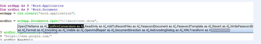
Interactive Window - Shell Commands - You can now
execute shell commands directly from the Interactive
window. Examples of the different use cases for this
feature include:
- Displaying a directory of a folder
- Running a batch file
- Executing a CURL command
- Executing a Node.js script
- Running a Node.js REPL loop
Watch Video - Part 1
Watch Video - Part 2
Any command with a $ prefix that you enter in the Interactive window
is considered to be a shell command. For example, type the following in
the Interactive window:
$dir c:\windows
For detailed information on the Interactive window shell commands
click
here.
Action Javascript - Open .a5w Page Action - Page URL
- If the page URL is specified by a placeholder that
references fields in the current component, or uses
placeholders in the URL, you can now specify that the
value in individual placeholders should not be
URL encoded by entering the placeholder name as:
{nourlencode:placeholderName}
For example:
{nourlencode:field1}
By default all placeholder values are URL encoded when
they are replaced in the URL.
UX Component - Edit-Combo Control - Specifying
Different 'Stored' and 'Display' Values -
Dropdownbox controls allow you to specify that the
stored value is different from the display value. For
example, the control might display a 'ProductName' but
the stored value in the control might be the 'ProductId'.
Edit-combo box controls can now also be configured to
store a different value than their display value, just
like a Dropdownbox control.
NOTE: If you configure an Edit-combo to have a
different stored value from its display value, then you
must check the option to only allow the user to
select values in the choice list. The user cannot type
arbitrary values into the control.
The benefit of using an Edit-combo control over a
Dropdownbox control is that you can display multiple
columns of data in the choice list and you can
dynamically populate and filter the choices in the list
with an Ajax callback every time the control is opened.
Watch Video
jQuery - Make Safe for Alpha Anywhere -
a5_make_jQuery_safe() Function - Many jQuery
Javascript files are written using the $ object as a
proxy for the jQuery object. This makes it impossible to
use these files in AlphaAnywhere without first editing
the files and changing the $ object to the jQuery
object. This can be a tedious process because a simple
search and replace will not work as that would replace
the $ string literal.
The a5_make_jQuery_safe() function converts all
references to the $ object to 'jQuery' while leaving $
in variables names and strings unchanged.
NOTE: This function is built on top of the
Node.JS GRASP module.
Syntax:
L flag =a5_make_jquery_safe(c filename [,
flagCreateBackup = .t. ])
If fileCreateBackup is .t. a file with the
extension of .old is created with the original text in
the file.
HTML Reports - No Records in Report - If an HTML
report has no records in it, it previously displayed a
blank page. Now a 'No records in report' message is
shown.
UX Component - A5.u.element.setContent() Function -
Normally, you can set the content of an element in a
component by simply getting a pointer to the element and
then setting the element's .innerHTML property. However,
if the element whose content you are setting has been
configured to allow drag scrolling, setting the .innerHTML
directly will destroy the drag scroll settings and the
new content will no longer be scrollable.
The solution to this problem is to use the
A5.u.element.setContent() function to set the element's
content.
Watch Video - Part 1
Watch Video - Part 2
Download Component
Syntax
A5.u.element.setContent(element,html [, options])
Where:
-
element - pointer to the element whose content you want to
set. (i.e. a container, window, etc.)
-
html - the html that you want to inject
-
options - an optional object containing settings.
Example:
//get a pointer to the 'CONTAINER_1' container
var ele = {dialog.object}.getPointer('CONTAINER_1');
var string = 'define some long string of html here';
string = string + '<span id="span1">end of string</span>';
var settings = {animation: {allow: true}};
var settings: {
fireEvent: false, //fire the scroll event
mode: 'into-view', //mode can be 'into-view', 'top', 'bottom'
axis: 'both', //which axes do you want to scroll on
offset: {x: 0, y: 0}, //offset from the element that you are
scrolling to
animation: {allow: true, duration: 300} //animation
}
//scroll the element 'span1' into view
var obj = {element: 'span1', settings: settings};
A5.u.element.setContent(ele,string,obj);
//in this next example, instead of scrolling an
element into view,
//we scroll to position 0,0 in the new content
//get a pointer to the 'CONTAINER_1' container
var ele = {dialog.object}.getPointer('CONTAINER_1');
var string = 'define some long string of html here';
string = string + '<span id="span1">end of string</span>';
var settings = {}
var obj = {x: 0, y:0, settings: settings};
A5.u.element.setContent(ele,string,obj);
Temp File Folder - Temporary Files - Code has
been added to more aggressively clean up any temporary
files that Alpha Anywhere created in the temp file
folder. To turn on this feature for the development
version go to the View/Settings/Preferences menu and set
the value for the 'TEMP files' property.
To specify the setting in the Application Server (or the
Development Server), go to the 'Advanced' tab in the
server control panel.
Reports - Layout Table Reports - Suppress Blank Rows
- A new property has been added for each row in a Layout
Table report that makes it easy to suppress the entire
row in the report if all of the columns in that row are
blank.
Watch Video
To set the property, click in the vertical ruler to the
left of the row whose property you want to set.
Then, in the property sheet, set the 'Suppress Blank'
property.
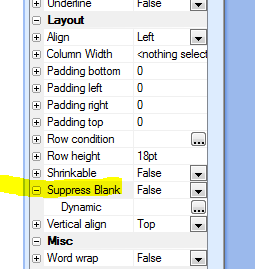
A row is considered to be blank if the expression that
defines the contents for each column in the row is a
NULL value (i.e. equals the value returned by the
null_value() function).
Note that:
- blank strings are considered NULL
- 0 numbers are considered NULL
- false logical values are considered NULL
- blank dates/times are considered NULL
UX Component - List Control - Show/Hide List Footer -
.rowExpander() Method - Each row in a tabular
List layout can have an optional 'List Item Footer'.
(Similar to a row expander in a Grid component). The
initial state of the List Item Footer can be opened, or
closed. The <listObject>.rowExpander() method can be
used to show, hide, or toggle the show/hide state of the
List Item Footer. The show/hide can optionally be done
using animation.
Syntax:
<listObject>.rowExpander([rowNumber, [animationObject
[,mode]]]);
Where:
- rowNumber - zero based row number of item footer to show.
If omitted, current row is used
- animationObject - a JSON object that defines the
animation settings
- mode - defaults to 'toggle'. Can also be set to 'show',
or 'hide'
Twitter - New functions have been added to make
working with the Twitter API easier. Working with the
Twitter API now requires that you use OAuth. The
following two functions have been added:
- twitter_getBearerToken() - Using your client_id and
client_secret, returns a bearer token which you can then use to make
API calls.
- twitter_clientApiCall() - Allows you to call a Twitter
API function.
Watch Video - Part 1
Watch Video - Part 2
Watch Video - Part 3
Watch Video - Part 4
twitter_getBearerToken() Function - Gets a 'bearer token' from
Twitter.
Syntax:
c bearerToken = twitter_getBearerToken(C
client_id, C client_secret)
The client_id and client_secret must be
obtained from Twitter. Go to dev.twitter.com and create
an application. Once you have created an application,
you can get the keys.
The bearerToken that is returned will allow you
to make Twitter API calls.
Typically you will only need to get the bearerToken
once in your application. You can then save it in a
session variable for use throughout your application.
The source code for the twitter_getBearerToken()
function might be of interest to some developers, and is
shown below:
function twitter_getBearerToken as c ( client_id as c ,
client_secret as c )
'DESCRIPTION:Uses OAuth 2.0 to get a bearer token from
Twitter.
'LIMITATIONS:X
dim bl as b = client_id+":"+client_secret
dim cf_1 as extension::CurlFile
dim flag_1 as l
dim slist1[2] as c
slist1[1] = "Authorization: Basic "+base64encode(bl)
slist1[2] = "Content-Type: application/x-www-form-urlencoded;charset=UTF-8"
dim ce as extension::Curl
ce = extension::Curl.Init()
ce.setOpt("URL","https://api.twitter.com/oauth2/token?grant_type=client_credentials")
ce.setOpt("NOPROGRESS",1)
ce.setOpt("USERAGENT","curl/7.34.0")
ce.setOpt("HTTPHEADER",slist1)
ce.setOpt("MAXREDIRS",50)
ce.setOpt("CAINFO",a5.Get_Exe_Path()+"\caroot\ca-cert.pem")
ce.setOpt("CAPATH",a5.Get_Exe_Path()+"\caroot")
ce.setOpt("CUSTOMREQUEST","POST")
ce.setOpt("TCP_KEEPALIVE",1)
ce.SetOpt("FILE",cf_1)
flag_1 = ce.Exec()
if flag_1 then
dim result as p = json_parse(cf_1.GetContent())
twitter_getBearerToken = result.access_token
end if
ce.close()
end function
twitter_clientApiCall() Function - Allows you to
call a REST API function in Twitter.
Syntax
C result = twitter_clientApiCall( c
bearerToken, c request)
The bearerToken must have previously been
obtained using the twitter_getBearerToken() function.
Example:
The following Interactive window session shows how you
can get 10 tweets for 'London'
dim bt as c = getBearerToken("YourUserKeyHere","YourUserSecretHere")
dim url as c
url = "/search/tweets.json?q=london&count=10&lang=en&type=recent"
json = twitterClientApiCall(bt,url)
'make the JSON 'pretty'
json = json_reformat(json,.t.)
json = convert_utf8_to_acp(json)
showvar(json)
This example gets a user time line
dim bt as c =
getBearerToken("YourUserKeyHere","YourUserSecretHere")
dim url as c
url = "/statuses/user_timeline.json?count=100&screen_name=twitterapi"
json = twitterClientApiCall(bt,url)
'make the JSON 'pretty'
json = json_reformat(json,.t.)
json = convert_utf8_to_acp(json)
showvar(json)
The source code for the twitter_clientApiCall() function
might be of interest to some developers, and is shown
below:
function twitter_clientApiCall as c ( bearerToken as c ,
request as c )
'DESCRIPTION:Make a REST call to the Twitter API using a
bearerToken that was obtained using the
twitter_getBearerToken() function
'LIMITATIONS:X
dim slist1[1] as c
slist1[1] = "Authorization: Bearer "+bearerToken
dim cf_1 as extension::CurlFile
ce = extension::Curl.Init()
ce.setOpt("URL","https://api.twitter.com/1.1"+request)
ce.setOpt("NOPROGRESS",1)
ce.setOpt("USERAGENT","curl/7.34.0")
ce.setOpt("HTTPHEADER",slist1)
ce.setOpt("MAXREDIRS",50)
ce.setOpt("CAINFO",a5.Get_Exe_Path()+"\caroot\ca-cert.pem")
ce.setOpt("CAPATH",a5.Get_Exe_Path()+"\caroot")
ce.setOpt("TCP_KEEPALIVE",1)
ce.SetOpt("FILE",cf_1)
flag_1 = ce.Exec()
if flag_1 then
twitter_clientApiCall = cf_1.GetContent()
end if
ce.close()
end function
UX and Grid Component - Tab/Accordion Control -
onLeave and onBeforeLeave Events - Two new events
have been added to the Tab and Accordion Control. The
events can be defined at the control level or at the
individual pane level.
- onLeave - fires after a tab pane has lost focus.
- onBeforeLeave - first when the user attempts to leave a
pane.
Report Server - Logging - A new logging feature
has been added for the Report Server. The report server
log is turned on automatically when the logging is
active on the server, which turns on the access and
error logs. With these logs on, be sure to set the
logging to rotate on size and daily to keep the files
sizes under control and easier to manage.
The report Server log data will look like this
[Fri Jul 11 06:58:34 2014] StartRpt
bb8f711ef8a8487f87a528b315827120
C:\A5Webroot\AppServerDemoV12\NWEmployees.a5rpt
C:\Users\Jerry\AppData\Local\Temp\tmp983.pdf
[Fri Jul 11 06:58:35 2014] Finished
bb8f711ef8a8487f87a528b315827120
C:\A5Webroot\AppServerDemoV12\NWEmployees.a5rpt
C:\Users\Jerry\AppData\Local\Temp\tmp983.pdf
|
Value |
Description |
|
[Fri Jul 11 06:58:34 2014] |
Date and time of the action |
|
StartRpt |
The action, which will be "StartRpt", "Finished
", or "RptError" if no error was reported, but
the report was not created. |
|
bb8f711ef8a8487f87a528b315827120 |
A unique identifier that is assigned to each
report at build time |
|
C:\A5Webroot\AppServerDemoV12\NWEmployees.a5rpt |
The report definition requested |
C:\Users\Jerry\AppData\Local\Temp\tmp983.pdf
|
The physical file created - often a temp file as
shown here
|
By matching the identifier, the time to build a report
can be calculated from the timestamp. This can help
identify reports that are slow to build.
If a report has a start action, but no finished or error
action, that would indicate the report server has not
finished the report.
If the action is "RptError", this error may be noted in
the Xbasic error log and a special mini-dump file
created in the Xbasic log folder. This mini-dump file
will have a name syntax similar to
"A5ReportServer_20140710115412520.a5dmp" This file can
be used by Alpha Software to evaluate the report
properties of a failed report.
UX Component - List - Client-side Events - New
events have been added.
- beforeClientSideSort - fires before a client-side sort is
performed (by clicking on a List column heading). Return false to
cancel sort.
- afterClientSideSort - fires after a client-side sort is
performed.
Xbasic - MongoDB - NoSQL document databases are
becoming popular for certain types of applications. A
new MongoDB class has been added to Xbasic to make it
easy to query, update and manage a MongoDB database from
Xbasic.
Click here for information.
Technical Note: The Xbasic mongo class it built
on top of the MongoDB node.js driver.
Xbasic - CouchDB - You can now query,
update and manage a CouchDB NoSQL database from Xbasic.
Click here for information.
Performance Improvements in Following Functions
and Methods - Major performance improvements in
- property_from_string()
- SQL::Resultset.toPropertyArray()
- rsToJSON()
Web Applications - Security Framework - Active
Directory - The Security Framework for Web
Applications now supports Active Directory. That means
you can authenticate a user using an Active Directory
server.
Click here for information.
UX, Grid, TabbedUI and PageLayout Components -
Working Preview - Chrome - When you use Working
Preview you now have the option of using either Internet
Explorer, or Chrome. Previously, Working Preview
automatically used Internet Explorer.
The benefits of using Chrome for Working Preview
include:
- Faster performance when switching between Design and Working
Preview mode
- Ability to use the Chrome Javascript debugger to debug
Javascript code.
- Ability to use the Chrome debugger to inspect elements in the
Working Preview HTML
- Ability to detach the Working Preview window so that it can
remain open while you work in Design mode. This is especially useful
if your computer has two monitors because you can drag the Working
Preview window onto your second monitor. Alpha Anywhere will
remember the position and size of the detached Working Preview
window so that the next time you detach a Working Preview, the
window is automatically sized and positioned at its last location.
- Ability to set the detached Working Preview window to do 'live
updates' so that every time you change a property in Design mode,
the Working Preview is automatically refreshed.
Watch Video - Part 1
Watch Video - Part 2
The Working Preview window now has new hyperlinks at the bottom of
the screen.
When Internet Explorer is being used, the menu looks like this:

Clicking on the Internet Explorer hyperlink will bring
up a dialog that will allow you to change to Chrome.
Your choice is stored as part of the component
definition. You can choose to use Internet Explorer for
some components and Chrome for others.
When Chrome is used for Working Preview, the menu has
more options.
The 'Detach Working Preview Window' is particularly
useful because it creates a separate, detached window
for Working Preview. This window can be moved to a
second monitor and be left open while you return to the
Design pane to continue editing your component.
You can set the Detached Working Preview window to
update immediately every time a property is changed.
NOTE: For very large components, setting the
Detached Working Preview to automatically update is not
recommended as the delay in updating the Working Preview
window will make setting properties seem sluggish.

Debugging Javascript Using the Chrome Debugger
To use the Chrome Javascript debugger, you must insert
the
debugger;
command into the Javascript that you want to debug.
You must also, click the 'Open Chrome Debugger'
hyperlink before you execute the code you want to
debug. This will open the Chrome Debugger in a
background window.
You can then invoke the code that you want to debug.
When the
debugger; command is hit, the Javascript will
pause and the Working Preview screen will show:
You can then click the 'Open Chrome Debugger' hyperlink
again, and it will bring the Chrome Debugger window to
the forefront:
UX Component - List Control - New Methods - New
method have been added to the List control that fire
when the data in the list are changed. The methods are:
- onBeforeUpdateRow
- onUpdateRow
- onBeforeAddRow
- onAddRow
- onBeforeRemoveRows
- onRemoveRows
- onBeforePopulate
- onPopulate
The events fire when the .populate(), updateRow(), appendRows() and
removeRows() methods are called.
If the 'before' events return false, the corresponding action does
not occur.
UX Component - Mobile Simulator - Now includes
iPhone5 option in dropdownbox to select simulator size.
UX Component - Action Javascript - Wait Message -
Auto Close After Setting - You now have control over
how long to wait before the wait message is closed. By
default, the setting is 5000 milliseconds.
email_send_mandrill() function - Sender Name Alias -
Support for specifying an alias for the sender name
has been added. The dot variable that is passed into the
email_send_mandrill() function can now have a .from_name
property.
For example:
ms.from_name = "Sales at Alpha" 'friendly name -
optional
Here is a complete example
'create a .dot variable to define the message
dim ms as p
ms.send_to = "john@acme.com:John Smith,sally@acme.com:Sally Jones"
ms.from_email = "sales@alpha.com"
ms.from_name = "Sales at Alpha" 'friendly name -
optional
ms.subject = "Information You Requested"
ms.message_html = "Here is the <b>information</b> you requested."
dim pResult as p
pResult = email_send_mandrill("mysecretkey",ms)
UX Component - List Control - .scrollToClosestValue()
Method - Scrolls to the closest record in the List.
Syntax:
<listObject}.scrollToClosestValue(value [,
flagCaseInsensitive [, position [,
animationObject]]])
Where
- value - the List value you want to scroll into view. This
is based on the the value that the List is set to return. For
example, if the List is set to return the value from the Lastname
field, and a value of 'M' is specified, the List will be scrolled so
that the first record that has a Lastname field that starts with 'M'
will become visible.
- flagCaseInsensitive - default true (i.e. a
case-insensitive search is performed).
- position - 'top', 'bottom', or 'in-view' - position of
the target row
- animationObject - When the List is scrolled, it can be animated.
This object has two properties: 'allow' - true/false, and 'duration'
- animation duration in milliseconds.
Example:
Scroll the List so that the first Customer with a Lastname starting
with 'M' is shown at the top of the List
var lObj = {dialog.object}.getControl('list1');
lObj.scrollToClosestValue('m',true,top,{allow: true,
duration: 200})
UX Component - List Control - Tabular Layout -
Sorting Columns - Custom Javascript - When a user
clicks on a column heading in a List to sort the data on
that column, you can specify if the sort should take
place client-side or server-side (only appropriate if
the List is based on a SQL or DBF data source). Now, a
new option has been added to the list of choices. The
'Javascript' option allow you to specify your own
Javascript code to execute.
UX Component - Repeating Sections - Set Active Row -
setRepeatingSectionActiveLogicalRow() Method - A new
method is now available for setting the active row in a
Repeating Section.
{dialog.object}.setRepeatingSectionActiveLogicalRow(sectionName,logicalRowNumber)
The logical row number of a row in a Repeating Section
and its physical row number are the same, unless rows
have been deleted from the Repeating Section. When a row
is deleted from a Repeating Section it is not really
deleted, it is only hidden.
So, for example, assume that a Repeating Section had 5
rows to start with and then the first three rows were
deleted. There would now be two visible rows, (logical
row number 1 and 2), but the physical row numbers for
these two rows would be 4 and 5. In order to set focus
to the last visible row in the Repeating Section
(logical row 2, but physical row 5) you can now use the
new .setRepeatingSectionActiveLogicalRow()
method.
This is more convenient than having to first call the ._repeatingSectionLogicalToPhysicalRow()
to convert the logical row number to a physical
row number, and then calling the
.setRepeatingSectionActiveRow()
method.
UX Component - List Control - .getVisible() Method
- Returns an object with two properties 'start' and
'end' which contain the zero based row numbers of the
rows in the List that are currently visible.
var lObj = {dialog.object}.getControl('list1');
var obj = lObj.getVisible();
alert(obj.start + ' to ' + obj.end);
UX Component - List Control - onNavigate Event -
The onNavigate event fires when the List has been
scrolled. The e object passed into the event handler has
two properties:
- startIndex - zero based row number of first row in the
viewport
- endIndex - zero based row number of the last row in
the viewport
UX Component - Hide/Show Controls - .setControlDisplay()
Method - A new method is exposed that can be
used to show/hide controls. The method will hide/show
the control and also its label (if the control has a
label).
{dialog.object}.setControlDisplay(name, flag
[, mode [, animatationJSON]])
- name - control variable name
- flag - true/false - true displays control, false hides
control.
- mode - 'display', 'visibility' - if mode is set to
'visibility', the control is hidden, but the space taken by the
control in the layout is preserved.
- animJSON - JSON object defining animation. (Only applies
if mode is set to 'display')
The animJSON object has two properties:
- type - the animation effect. Options are: fade, slide,
blind, clip, drop, explode, fold, puff, scale, pulsate and none
- duration - animation duration in milliseconds. You can
also use 'fast' and 'slow'.
NOTE: If you specify animation, you must load
jQuery. To load jQuery, go to the Web Project Properties dialog and turn
jQuery on.
Example:
{dialog.object}j.setControlDisplay('FRAME_1',false,'d',{type:
'fade',duration: 3000});
UX Component - Validation - Show/Hide Expressions
- If a control has been hidden by a client-side show
hide expression, the control is no longer validated.
AppLauncher Component - Browser Flags - A new
option allows the query string that loads the target
component to suppress the browser flags from showing in
the query string. Instead, the browser flags are stored
in a session variable called session.__browserFlags.
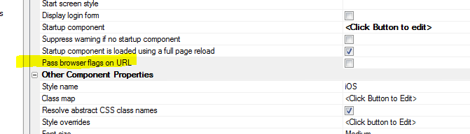
UX Component - List Control - .scrollToItem() method
- This method now has new options that allow you to
control where the target row will be in the List.
Previously, the List was scrolled so that the target row
became visible. But you could not control whether the
target row was positioned at the top, or bottom of the
List.
Now, you can pass in an optional object to the method
with settings. For example:
var listObj = {dialog.object}.getControl('list1');
listObj.scrollToItem(50,{mode: 'top' ,animation: {allow:
true, duration: 200},offset: {x: 0,y: 0}});
Options for 'mode' are: top, bottom, in-view
The offset settings control the number of pixels at the
top or bottom of the list between the List edge and the
scrolled to row.
UX Component - ButtonList Control - Static JSON -
A new option has been added to populate a ButtonList
control. The Static JSON option allows you to enter some
static data in JSON format as the data source for the
ButtonList.
UX Component - List Control - Get List Row Number
from Element Method - A new method of the List
control allows you to get the List row number (zero
based) from an element in the row.
For example, assume that you have a List with a freeform
layout and a button in the freeform Layout with this
code:
<button onclick="getRow(this);">What Row Am I
On</button>
The getRow() function would be defined as:
function getRow(ele) {
//get a pointer to the list - assume
list is called 'LIST1'
var lObj = {dialog.object}.getControl('LIST1');
//get the row index by calling the .indexFromElement()
method.
//'ele' is a pointer to the button in
the List row.
var index = lObj.indexFromElement(ele);
}
PhoneGap Builder - Now uses a token based
authentication feature so that once you have
successfully logged into the PhoneGap build service, all
further interaction with the PhoneGap build service is
done using the token (until the token expires -
currently set for 24 hours after login). The benefit of
this approach is that interacting with the PhoneGap
build service is faster as we no longer need to
authenticate each time.
UX Component - List Control - Javascript Function
Datasource - If a List control specifies a
Javascript function as its data source, when the .refreshListMethod()
is called an Ajax callback is no longer fired (as it was
meaningless). Instead, the function that populates the
list is called and the List is repopulated with the
function results.
UX and Grid Component - Edit-combo and Auto-suggest
Control - The height property was not being honored
if it was set to a value that included the 'max'
keyword.
UX Component - Testing if the Alpha Anywhere Server
is Available - The UX component now supports a new
method, .serverIsAvailable() that tests if the Alpha
Anywhere server is available. This is a more
comprehensive test than simply testing if an Internet
connection is available.
NOTE: Contrast this method with the UX
component's ._getOnlineStatus() method. This method
merely tests if there is an internet connection. It does
not make an ajax callback to the Alpha Anywhere server.
Is merely uses the HTML5
navigator.online property. The .serverIsAvailable()
method, on the other hand, does a lightweight callback
to the Alpha Anywhere server to test if the server is
available.
The syntax for the .serverIsAvailable() method is:
{dialog.object}.serverIsAvailable( [timeOut [,
successFunction [, errorFunction]]);
If you don't specify a timeOut, the default value is 300
milliseconds.
The 'successFunction' parameter allows you to pass in an
Javascript function to be called once it is determined
that the Alpha Anywhere server is available.
The 'errorFunction' parameter is called if the server is
not available.
The function will set these variables in the global A5
Javascript object:
_serverAvailable - true/false
_serverCheckTime - the time the server availability was
last checked.
Example:
Execute the 'refreshList' action is the server is
available.
function success() {
{dialog.object}.playAction('refreshList');
}
{dialog.object}.serverIsAvailable(300,success);
Grid and UX Component - Search - QBE Syntax -
Combining Multiple Wildcard Searches with AND -
If your search style is set to 'Exact match' and you
enter search criteria that use wildcards, and you have
QBE syntax turned on, then you can enter search criteria
in the following form:
%string1%,%string2%
This will be interpreted as a search for any record that
contains either
string1 or
string2
in the field.
However, you may want to find records that contain
string1
AND string2.
You can now do this using the
&&
operator in your search definition, rather than the
comma.
Application Server - The Application Server now
uses an updated default SSL cipher list to enhance the
security of SSL-enabled servers. The new cipher list is
based on https://wiki.mozilla.org/Security/Server_Side_TLS
Bugs
UX Component - List Control - Frame - Modern -
Show/Hide - If a List control was in a Frame
container and the frame was defined as a modern frame
that could be shown/hidden and if the initial state of
the frame was hidden, the List controls in the Frame did
not render properly when the frame was shown.
UX and Grid Components - Pop-up Modal Windows -
Resizing - In some cases, when resizing a modal
pop-up window, the window content would not redisplay
properly after you stopped resizing the window.
Application Server - SSL - Test Certificates -
Firefox - Certificate extensions are no longer
generated into self-signed certificates when using the
Application or Development Server Settings dialog to
generate a self-signed certificate or calling directly
from INET::SSLContext::CreateTestCertificate(). Version
31 of Firefox no longer accepts deprecated certificate
extensions and this change corrects that problem.
IMPORTANT: You will have to regenerate your
self-signed certificate.
UX Component - Map Control - onZoom Event - This
event was not firing.
UX and Grid Component - Working Preview - Chrome -
Memory Leaks - When using Chrome for Working Preview
while building UX and Grids components there is a small
memory leak that forces you to have to restart Alpha
Anywhere occasionally. A number of these memory leaks
have been fixed.
NOTE: This comment does NOT apply to the Application
Server - it is only for the Development version.
UX Component - Logical Checkbox - Client-side
Show/Hide - If you have defined a text label for the
control, the text label was not being hidden when the
control itself was hidden.
HTML Layout Reports - A number of minor bugs have
been fixed. For example, scrolling HTML Layout reports
in a mobile application when the report was shown in a
pop-up window did not work the second time the report
was opened.
Grid Component - File Upload - User Defined Action -
Working Preview - Using this action in Working
Preview had previously been supported, but got broken in
a recent update. This is now working again.
UX Component - Tab Controls - Embedded Components -
Server-side Show/Hide or Security - If a server-side
show/hide expression or security group setting removed
an embedded component from a tab pane at run-time, a
Javascript error would occur.
UX Component - Panel Header/Footer - Container Height
- The container height property was honored for a Panel
Header or Footer.
Grid Component - Edit Row on Demand -
afterRowSwitchFromEditable Client-side event - This
event was not firing if the row you were editing was
implicitly set to not-editable mode because the user
clicked to edit another row and the Grid was set to edit
one row at a time.
UX and Grid Component - Javascript Actions -
Fixes a recently introduced bug where a Javascript
Action that used Action Javascript to open a child
component in a div on the parent component failed.
Report Editor - Layout Table Reports - Static HTML
Cells - Now honor the font and alignment properties
applied at the cell level.
Report Editor - Layout Table Reports - Row size to
fit - Now works when row contains static HTML
content.
UX Component - List Control - Client Side Summary -
Client Side Filtering - Fixed an issue where the
client-side summary values were not recalculated if a
client-side filter was applied to the List.
UX Component - List Control - Client Side Summary
- Fixed an issue where the items in the csSummary object
were not upper case, as documented. Also, the count
summary value was only being computed if the data in the
field was numeric.
UX Component - Lookup Columns - Columnar Layout -
If there was no matching row in the lookup List, the
data in the List would be misaligned in the List
columns.
Grid and UX Component - Lookup Grids - Dynamic Filter
- If a Lookup Grid had a dynamic filter, the filter was
being applied as a 'user filter' rather than as a 'base
filter'. This meant that if the user clicked the 'Clear
Search' button on the Lookup Grid, the dynamic filter
was removed.
Grid and UX Component - Javascript Actions -
Fixed an issue that could have resulted in the .playAction()
method invoking the wrong action.
UX Component - Slider - Date Values - Two Value Mode
- When a two value slider was configured to show date
values, the dates were off by when when you set the
value on the date start/end.
Reports - Named Datasources - Fixed a recently
introduced issue with reports that use named data
sources (not to be confused with named connection
strings which do not have any issues).
UX and Grid Components - Client-side Expressions -
Date Fields - Client side expressions (for example,
show/hide, enable and calculated fields) that are based
on controls whose data type is set to 'Date' or 'Time'
now treat the controls as true Javascript date objected.
For example, say you had a UX with two input controls
(called say 'DATE1' and 'DATE2') and a button. Say you
defined as show/hide expression for the button as
follows:
DATE1 > DATE2
Assume that the client side date format was set to MM/dd/yyyy
and that the values in the two controls were
'04/20/2000' and '02/01/2000'.
Previously, this expression was evaluated as as string
expression. So the string '04/20/2000' was compared to
the string '02/01/2000'.
This might have led to the correct result in some
circumstances, but would not have been correct in other
circumstances. For example, say that the client side
date format was set to dd/MM/yyyy. Now the two values
for the date controls would be '20/04/2000' and
'01/02/2000' and comparing these two values as strings
would lead to a different result.
Now, the input controls are converted to real Javascript
data objects (in other words, the date string values are
automatically parsed using the setting for the client
side date format) and the client-side expression is
evaluated using true date values.
Previously, some uses might have implemented their own
solution to this problem by defining a custom Javascript
function to use in the show/hide expression. For
example, the show/hide expression might have been
specified as:
compareDates(DATE1,DATE2)
And the compareDates function would have been defined
as:
function compareDates(d1,d2) {
var _d1 = new Date();
var _d2 = new Date();
_d1.fromFormat(d1,'MM/dd/yyyy');
_d2.fromFormat(d2,'MM/dd/yyyy');
if(_d1 > _d2) return true;
else return false;
}
If you had previously implemented this pattern, you will
now get an error because the inputs to the compareDates()
function (d1 and d2) are now date objects and not
strings.
UX Component - List Control - Cascading Lists - DBF
Tables - Allow Null Selection - If you had defined
cascading List controls (i.e. a child List whose data
depends on the selection in its parent List) and the
List data source was .dbf tables, and the parent List
was set to not allow a null selection, then when the UX
initially rendered, the child List was not populated, as
it should have been. The child List was only populated
after the user clicked on a row in the parent List.
Tips
Edit-Combo, Auto-Suggest and List Controls - Web Applications -
Touch Enabled Computers - Windows 8.* - If you are running a web
application on a touch enabled computer under Windows 8.*, Edit-combo,
Auto-suggest and List controls will not display a vertical scroll bar
because the assumption is that the user will use touch gestures on the
list to scroll the data.
This assumption is valid for a mobile application that does not
support mouse interaction, but in a web application on a machine that
does support mouse interaction, you would want to see a vertical scroll
bar.
You can turn off drag scrolling (and thus cause the vertical scroll
bar to appear), by executing the following Javascript code:
A5.u.drag.useDragScrolling = 'never';
If your application is running in a Tabbed UI, a good place to inject
this code is in the Tabbed UI's 'Javascript to run on startup' property.
In the case of a Grid, you can use the onGridRenderComplete
client-side event.
UX Component - Define Custom Watch Events - The client-side
'calculated fields', 'enable expression' and 'show/hide' expressions all
generate watch expressions that automatically fire when the 'watched'
variables change.
You can completely bypass these properties and instead define your
own watch expressions.
For example, the following code can be placed on the client-side
beforePrepare event to
define a custom watch event that updates the value in 'TEXTBOX1'
whenever the value in 'TEXTBOX2' changes.
{Dialog.Object}.dialogWatches['MY_WATCH_EVENT'] = {
watch: ['TEXTBOX2'],
variables: [],
updateColumn: 'TEXTBOX1',
onChange: function(data) {
var dialog = {};
var summary = {};
{Dialog.Object}._getDialogVariables(dialog,summary,data);
var txt2 = {dialog.object}.getValue('textbox2');
{Dialog.Object}.setValue('TEXTBOX1',
{dialog.object}._functions.myFunc2(txt2) );
}
}
Using CSS Icon Images and Bitmap Images - A5.u.icon.html()
Function - The Alpha Anywhere Javascript library contains a useful
utility function that makes working with CSS Icon images and regular
bitmap images easier.
The issue is somewhat complicated because the HTML markup to display
a bitmap image uses the <img>
tag, whereas the HTML markup for a CSS Icon image uses a
<i> tag with special
class names.
The A5.u.icon.html()
function takes the name of the image you want to display and generates
the appropriate HTML markup. It is also able to interpret the special
syntax Alpha Anywhere uses to assign an in-line style to CSS Icons.
For example:
var icon1 = A5.u.icon.html('cssIcon=fa fa-align-center
fa-2x {color: blue;}');
will return the following HTML markup:
<i class="fa fa-align-center fa-2x " style=";color:
blue;"></i>
and:
var icon2 =
A5.u.icon.html('images/$$application.chrome.png.a5image');
will return this HTML markup:
<img src="images/$$application.chrome.png.a5image" />
UX Component - List Control - Using the Client-side Computed
Columns Feature to Display Dynamic Images in a List - The Computed
Columns property allows you to define computed (virtual) columns to
display in a List. The computed columns can display dynamic images (i.e.
images that are based on data in the current row). For example, you
could define the following Computed Column:
data.DYNAMICIMAGE = function(data,index) {
if(data.State == 'MA') {
return A5.u.icon.html('cssIcon=fa fa-align-center
fa-2x {color: #f6b5b5;}');
}
else if(data.State == 'CA') {
return A5.u.icon.html('cssIcon=fa fa-align-center
fa-2x {color: blue;}');
}
else if(data.State == 'NY') {
return
A5.u.icon.html('images/$$application.chrome.png.a5image');
}
else return 'Not Defined';
}(data,index);
UX and Grid Component - Sending E-mail From the Client Using
Mandrill - Alpha Anywhere has well documented methods for sending
email from a web component. These method are all server-side method. An
Ajax callback is made to the server and the e-mail is sent from the
server. However, it is possible to send an e-mail directly from the
client without involving the Alpha Anywhere server at all using the
Mandrill Mail service.
The technique discussed here uses the XMLHttpRequest object to make a
REST call to Mandrill.
function sendMailData() {
//data for the message
var url = "https://mandrillapp.com/api/1.0/messages/send.json"
var json = {
"key": "Your Mandrill key here",
"message": {
"to": [
{
"email": "test@gmail.com"
}
],
"from_email": "customerservice@gmail.com.com",
"subject": "Message Subject",
"html": "Message text here",
"text": "Text form of message",
"preserve_recipients": false
},
"asynch": false,
"ip_pool": null,
"send_at": null
}
var obj = {};
obj.url = url;
obj.json = json;
return obj;
}
function sendMail() {
var obj = sendMailData();
var _url = obj.url
var params = JSON.stringify(obj.json);
var _xhr = new XMLHttpRequest();
_xhr.open('POST',_url,true);
_xhr.timeout = 5000;
_xhr.setRequestHeader("Content-type",
"application/x-www-form-urlencoded");
_xhr.setRequestHeader("Connection", "close");
_xhr.ontimeout = function(e) {
alert('error - timeout');
}
_xhr.onload = function(e) {
if(this.status == 200) {
alert('sent');
} else {
alert('failed')
}
}
_xhr.send(params);
}
UX Component - Drag Scrollable Elements (including Lists) -
Dynamically Turning Scrolling On/Off - You can dynamically turn
scrolling on/off on certain elements, including List controls.
The basic steps are:
1. Get a pointer to the element
2. Call this code:
A5.u.drag.setDisabled(element,dragType,value)
For example:
//get a pointer to the List obj
var lObj = {dialog.object}.getControl('mylist');
//get a pointer to the scrollable part of the List
var ele = $(lObj.contId+ '.CONTENTWRAPPER');
//disable scrolling
A5.u.drag.setDisabled(ele,'scroll',true);
//now enable scrolling
A5.u.drag.setDisabled(ele,'scroll',false);
The dragType parameter can be 'scroll' or 'custom'. 'Custom'
is used for 'drag' actions that are not 'scroll' actions. For example, a
Carousel uses a custom drag, not a 'scrolling' drag.
Basic Authentication - How to Create an .A5W Page that Requires
Basic Authentication - Basic Authentication is a simple HTTP form of
authentication.
As defined in Wikipedia:
HTTP Basic authentication (BA) implementation is the
simplest technique for enforcing
access controls to web resources because it doesn't require
cookies,
session identifier and login pages. Rather, HTTP Basic
authentication uses static, standard
HTTP headers which means that no
handshakes have to be done in anticipation.
If you create simple web services in Alpha Anywhere, you might want
to use basic authentication on the .a5w page that implements your web
service.
In the example page below, basic authentication is used. In this
trivial example, the only user Id/password combination that is valid is
Alpha/Anywhere. However, the example could easily be extended to do a
database lookup to authenticate the user.
When this page is called (by some other program that is trying to
consume the web service implemented by this page), it is assumed that
the headers will have been set to supply the user id and password.
If you try to call this page from a browser, the browser will prompt
for a user id and password
<%a5
if ("Authorization: Basic " $ Request.Headers)
'extract the 'Authorization'
from the request header
dim EncodedUserAndPass as c =
filter_string(Request.Headers,"Authorization: Basic ", crlf())
EncodedUserAndPass = word(EncodedUserAndPass,2,": Basic")
EncodedUserAndPass = alltrim(EncodedUserAndPass)
'the authorization is base64
encoded. decode it.
dim DecodedUserAndPass as b =
base64decode(EncodedUserAndPass)
'extract the username and
password
dim Username as c =
word(DecodedUserAndPass, 1,":")
dim Password as c = word(DecodedUserAndPass, 2, ":")
'here is where you could do a
database lookup to authorize the user
if (Username = "Alpha" .and.
Password = "Anywhere")
? "Authorized as " + Username
'this
is where you would implement the web service.
'at
this point, the user has been authorized.
'for
example, you might respond with some JSON data
'e.g.
data = "{name: 'alpha', city: 'Boston'}"
'?data
else
?"Bad username or password"
'if
you want to present the user with another change to log in, uncomment
this
'Response.StatusCode = "401"
'Response.StatusDescription = "Not
Authorized"
'Response.Headers.Add("WWW-Authenticate",
"Basic")
end if
else
Response.StatusCode = "401"
Response.StatusDescription = "Not Authorized"
Response.Headers.Add("WWW-Authenticate", "Basic")
end if
%>
UX and Grid Component - Edit-Combo - Dynamically Repopulate
Choices - When you define an Edit-Combo control, the builder allows
you to specify that the choices shown in the edit-combo should be
computed at render time, or dynamically, by making an Ajax callback
every time you open the edit-combo.
If you choose the option to populate the edit combo at render time,
you might still want to programmatically change the choices in the edit
combo.
Here is the Javascript showing how it can be done:
//get a pointer to the edit-combo for 'TEXTBOX1'
obj = DLG1_DlgObj.fieldHelpers['TEXTBOX1'];
//define the new date for the edit-combo
var _d = ['Red','Green','Blue','Orange'];
//call the .setData() method to repopulate the
edit-combo
obj.setData(_d);
If you want to generate the new choices for the edit-combo by making
an Ajax callback to the server, here is how the Xbasic function that
handles the callback might be written:
This example is where the edit-combo shows a single column of data.
function xb_refreshData as c (e as p)
dim cn as sql::Connection
cn.open("::Name::northwind")
sql = "select customerid from
customers where country = 'uk'"
rs = cn.ResultSet
dim txt as c
txt = rs.ToString()
dim data as c
data = js_list_to_array(txt)
dim js as c
js = "var obj = {dialog.object}.fieldHelpers['TEXTBOX1'];
"
js = js + "var _d = " + data +
";"
js = js + "obj.setData(_d);"
xb_refreshData = js
end function
This example is where the edit-combo shows a multiple columns of
data.
function xb_refreshData as c (e as p)
dim cn as sql::Connection
cn.open("::Name::northwind")
'note that we alias the
columns in the SQL statement with field names
'that are capitalized. this
is because Javascript is case-sensitive and the
'property names in the JSON
data that is used to populate the edit-combo
'are all capitalized. the
column aliases will be uses for the property names
'when the .ToJSONObjectSyntax()
method is called.
sql = "select customerid as
[CUSTOMERID], contactname as [CONTACTNAME] from customers where
country = 'uk'"
rs = cn.ResultSet
dim txt as c
txt = rs.ToJSONObjectSyntax()
dim data as c
data = "[" +
stritran(alltrim(txt),crlf(),"," + crlf()) + "]"
dim js as c
js = "var obj = {dialog.object}.fieldHelpers['TEXTBOX1'];
"
js = js + "var _d = " +
data + ";"
js = js + "obj.setData(_d);"
xb_refreshData = js
end function
UX and Grid Controls - Button Icons and Text - Setting Dynamically
- In the case of 'advanced' buttons (all buttons in a UX are, by default
'advanced' buttons and 'Action Buttons' in a Grid are 'advanced'
buttons), you can dynamically set the button icon, or button text by
setting properties in the underlying button object, then refreshing the
button object.
For example:
var bc = {dialog.object}.getControl('MYBUTTON1');
bc.icon = 'cssIcon=FontAwsomeIconHere';
// optionally you can also set 'hoverIcon', 'pressedIcon',
and 'disabledIcon'
bc.refresh();
UX Component - List Control - Cascading Lists - Delay Render -
The UX component makes it very easy to create cascading Lists. For
example, say you have 3 Lists:
- customer
- orders
- orderDetails
You can easily configure the orders List to specify that the customer
List is its parent List and the orderDetails List to specify that the
orders List is its parent.
If you specify that a List has a parent, then when you click on a row
in the parent List, ajax callbacks are automatically made to refresh the
child Lists.
Now, assume that each List is placed in its own PanelCard and the
PanelCards are wrapped in a PanelNavigtor. Further assume that for each
List you have checked the 'Delay render till visible' property.
The desired behavior is that when the UX is initially rendered, ONLY
the customer List is rendered. Then when the user clicks on a row in the
customer List, a single ajax callback is made to populate the
order List and the PanelCard that contains the orders List gets focus.
Next, when the user clicks on a row in the orders list, again a
single ajax callback is made to populate the orderDetails list and
the PanelCard containing OrderDetails gets focus.
However, if you set up your UX as described above, when you click on
a row in the customer List, you will notice that there are two ajax
callbacks and that the orders List is refreshed twice - not once as
desired. The first ajax callback occurs because the customer List
automatically refreshes all of its child Lists when the user selects a
row in the List. The second callback occurs because the PanelCard that
contains the orders List gets focus and the orders List was configured
to render when it becomes visible.
To solve this problem here is how the setup of the UX component must
be changed.
- Even though the orders and orderDetail lists have parent Lists,
the 'Has Parent List' property for these two Lists is turned off.
Each of the child Lists still have a WHERE clause in their SQL
select statements that reference argument values set to the value of
the parent Lists.
- In the onSelect event in each parent List, code is added to set
the _hasBeenRendered property of each child List to false.
So, for example, in the onSelect event for List1 (the customer List),
the following code is executed:
var l = {dialog.object}.getControl('list2');
l._hasBeenRendered = false;
var l = {dialog.object}.getControl('list3');
l._hasBeenRendered = false;
{dialog.object}.panelSetActive('PANELCARD_2');
This event sets the ._hasBeenRendered property for list2 and list3 to
false, and then gives focus to PANELCARD_2. When PANELCARD_2 gets focus,
list2 is rendered (an ajax callback is made). This is the only callback
that is made. Because the orders List (list2) no longer has its 'Has
Parent List' property set, no callback triggered by simply clicking on a
row in the customer list.
Similarly, the onSelect event for List2 (the orders List), the
following code is executed:
var l = {dialog.object}.getControl('list3');
l._hasBeenRendered = false;
{dialog.object}.panelSetActive('PANELCARD_3');
The
sample component which uses Northwind demonstrates the concepts
discussed in this topic.
UX Component - List Control - Sort Icon Position - By default,
when you sort the data in a List column, the sort icon shows to the
right of the Column heading. If you are working with a RTL language,
such as Arabic or Hebrew, you might want the sort icon on the left of
the column heading (as shown below):
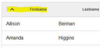
Download Component
This is easily done by customizing the component style. You can
either make a change to the style sheet (which will affect all of your
components). Or you can make a local change to affect just the UX that
you are designing.
To define the changes so that they are local to the current
component, edit the 'Local sub-theme definition' as shown below:
Edit the Javascript as shown below.
You can start by clicking the 'Show style.js file for current style'
hyperlink. The search for 'listbox'. Copy the JSON to the clipboard and
paste into the editor. You will need to wrap the pasted text in opening
and closing curly brackets as shown in the image. The make the edit
shown in yellow highlight below.
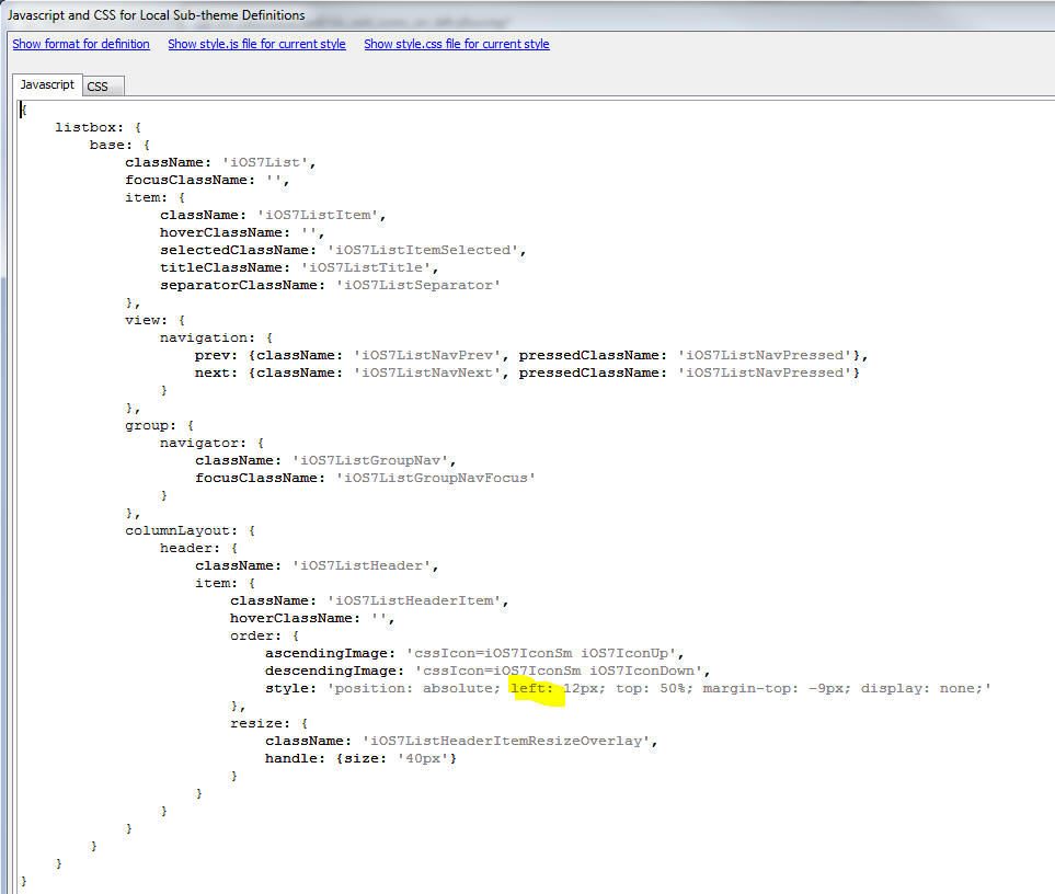
You will also need to make this change to the CSS:
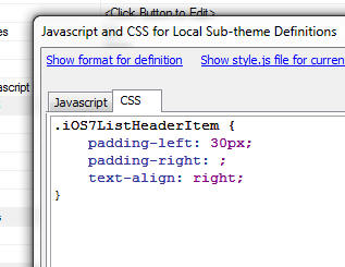
Of course, if you are not using iOS7, but some other style, you will
need to use the appropriate style names.
UX Component - Tree Control - How to Save and Restore the
Open/Close State of Tree Nodes - Consider a UX that has a tree
control with multiple levels of nested branches. Assume that the user
has carefully navigated in the tree, opening some branches, while
leaving others closed. The user would then like to save the 'state' of
the tree so that at a future time, they can easily restore the state of
the tree to its current state.
This is easily done with some simple Javascript that captures and
restores the state. Below are two function. The first captures the tree
state and stores it in a variable in the Dialog object. The second
restores the tree state.
function getstate() {
//get a pointer to the tree control
var t = {dialog.object}.getControl('tree1');
//get the tree data and stringify
it.
var js = JSON.stringify(t.data);
//store in a variable in a dialog
object
{dialog.object}.treeData = js;
}
function setstate() {
//get a pointer to the tree
var t = {dialog.object}.getControl('tree1');
//get the stored data. parse it
into an object
var d =
JSON.parse({dialog.object}.treeData);
//reopulate the tree
t.populate(d);
}
UX Component - Map Control - List Control - Add Markers to Map
Using Data From List - Assume you have a List control with multiple
records. Each record has a lat/lng value. You would like to add a marker
to the map for each row in the List. You can certainly do this by using
a built-in action in Action Javascript to 'Add multiple markers to a
map'. However, the Action Javascript action involves making an Ajax
callback.
Since the List already has lat/lng data for all of the markers you
want to add to the map, it would be nice to be able to add the markers
to the map without having to do an Ajax callback.
Here is a working
example.
To do this, add a button to the List that calls the addMarkers()
function.
Here is the definition of the addMarkers() function
function addMarkers() {
//get a pointer to the list
var lObj = {dialog.object}.getControl('list');
//get the list data
var _d = lObj._data;
//get a pointer to the map control
var m1Obj = {dialog.object}.getControl('map1');
m1Obj.removeMarkerGroup('GROUP1');
var _dr = '';
//loop through all of the rows in
the list
//reading the 'name', 'city',
'state', 'latitude' and 'longitude'
//columns in the list.
for (var i = 0; i < _d.length; i++) {
_dr = _d[i];
delete _s;
_s = {};
_s.group = 'GROUP1'
_s.title = _dr.name ;
_s.detail = {};
_s.detail.has = true;
_s.detail.data = _dr.city + ' - ' + _dr.state;
m1Obj.addMarker('MARKER_' +
i,[Number(_dr.latitude),Number(_dr.longitude)],_s);
}
m1Obj.viewMarkerGroups('GROUP1');;
}
UX Component - Tabular Lists - Showing and Hiding Lists - When a
columnar List is shown after initially having been hidden, the List will
not render correctly until is has been explicitly refreshed. Here is how
you can refresh a columnar List so that it displays correctly after
having been shown:
var lObj = {dialog.object}.getControl('mylist');
lObj.refresh();
NOTE: This comment does not apply to
free-form Lists. Free-form Lists do not need to be explicitly refreshed.
PhoneGap Application - iOS StatusBar - In iOS, it is common to
have the status bar at the top of the screen (with time, Wifi, and
battery information) display as an overlay of the app. For many designs
this can be a problem. You might rather have the "old" style of having a
separate status bar above the active area of the screen. You might also
want to specify the color of the background of that bar (for example, to
match or complement the top of your app) and text. PhoneGap gives you an
optional "Status Bar" 3rd Party plug-in to customize the status bar on iOS.
See example code in next topic.
Android Back Button - In Android, users often expect the
device's "Back" button to control the app. By default, in PhoneGap, this
will just exit the app and go back to the previous app. If you have
popup windows, or detail views, the users will expect (and their fingers
will be trained) to dismiss pop-ups or go back up the view list. See
"Navigation with Back and Up" on the Android Developers web site:
http://developer.android.com/design/patterns/navigation.html
Here is some code that can be placed in your app (such as in the
Javascript functions or the onRenderComplete Client-Side Event:
// PhoneGap start up and initialization
document.addEventListener('deviceready', function() { // PhoneGap
started
var platform = device.platform;
switch (platform) {
case "Android":
// back button support
document.addEventListener('backbutton', handleBackButton, false);
break;
case "iOS":
if (typeof
StatusBar === 'undefined') break;
// configure statusbar in iOS 7+
StatusBar.overlaysWebView(false);
// Light statusbar text color. Use StatusBar.styleDefault() for dark
text.
StatusBar.styleLightContent();
StatusBar.backgroundColorByHexString("#3355AA"); // Hex RGB value,
similar to CSS
break;
}
}
);
function handleBackButton(e) { // Android back button event handler
// Go through UI items in priority order to do "back"
operation
var winobj = {dialog.Object}.getWindow('INTROWINDOW'); // Is
this window popped up?
if (!winobj.hidden) {
winobj.hide(); // no - hide and
finish
return;
}
winobj = {dialog.Object}.getWindow('SETTINGSPOPUP'); //
another potential window
if (!winobj.hidden) {
winobj.hide();
return;
}
. . .
var panel = {dialog.object}.panelGet('OVERALLLAYOUT'); // is
a docked panel being shown?
if (panel.state.dockPanelShown) {
panel.hideDock(); // yes - hide it
and finish
return;
}
if (canGoBack()) { // do normal user-initiated "back"
operation in app (like a browser)
doBackForward(+1);
return;
}
// nothing left - exit app
e.preventDefault();
navigator.app.exitApp();
}
Note that the "back" handling seems to work in Android 4.3, but may not
work in earlier versions.
Xbasic Classes - Property Getter and Setter Functions - You
can create special .get() and .set() functions to read and write
property values in a class. For example, in the class below the 'foo'
property of the class has a .get() and .set() function. These functions
are automatically invoked when you try to set or get the value of the
classes' .foo property.
define class mynamespace::mySampleClass
dim _foo as c = "hello"
function sampleMethod1 as v()
ui_msg_box("sampleVar1",sampleVar1)
end function
function foo.get as c ()
foo.get = _foo
end function
function foo.set as v (value as c )
_foo = upper(value)
end function
end class
Using this class:
dim x as mynamespace::mySampleClass
?x.foo
= "hello"
x.foo = "Goodbye"
?x.foo
= "GOODBYE"
Calling SOAP Web Services From Xbasic - This topic shows 'real world'
examples of Xbasic code that call SOAP web services.
Examples are provided here for WorldPay (a credit card processing company),
Kareo (a medical billing software company) and Norman G Jensen, Inc (a provider
of freight brokerage services).
The source code is extensively commented and is intended as a learning vehicle to help you write code to call these and other similar SOAP web services.
WorldPay
WorldPay provides credit card processing as a web service. For more
information go to
http://www.worldpay.com/us.
The function below encapsulates the process of charging a credit card using the
world pay service.
This example was provided by Max Hammond, who has extensive experience using
Alpha Anywhere with SOAP web services.
FUNCTION WorldPay_ProcessCC AS CallResult (acctid AS C, ccname
AS C, ccnum AS N, amount AS N, expmon AS N, expyear AS N )
dim Result as CallResult
on error goto errorWp_ProcessCC
dim webLink as c = "https://trans.worldpay.us/Web/services/TransactionService?wsdl"
dim assemblyFile as C = "C:\Program Files (x86)\a5V12\WorldPayService.DLL"
dim webEndpoint as c = "https://trans.worldpay.us/Web/services/TransactionService"
dim sv as DOTNET::Services
dim ay as DOTNET::AssemblyReference
ay.FileName = assemblyFile
' This extra call does the heavy lifting and registers the assembly DLL.
' If the assembly does not exist, create one.
if .not. File.Exists(ay.FileName)
if .not. sv.GenerateWCFWebServiceClientFromURL(webLink,
ay.FileName)
Result = sv.CallResult
end if
end if
' Load the assembly into the Alpha Anywhere type system.
if Result.Success
if .not. sv.RegisterAssembly("WorldPay", ay)
Result = sv.CallResult
end if
end if
if Result.Error
goto doneWp_ProcessCC
end if
' Set up HTTP Binding
' The binding object determines how we will communicate with the web service.
' This includes the underlying network transport, credentials
dim b as System::ServiceModel::BasicHttpBinding
b.MessageEncoding = System::ServiceModel::WSMessageEncoding::Text
' The settings below will depend on the service.
' We want sufficient capacity to retrieve very large nested structures.
' If you get an error that you have exceeded a size, make the adjustment here.
b.MaxReceivedMessageSize = 10485760
b.maxBufferSize = 10485760
b.MaxBufferPoolSize = 10485760
b.ReaderQuotas.maxDepth = 32
b.ReaderQuotas.MaxStringContentLength = 10485760
b.ReaderQuotas.MaxArrayLength = 16384
b.ReaderQuotas.MaxBytesPerRead = 4096
b.ReaderQuotas.maxNameTableCharCount = 16384
' Set up the security.
' In this case, we are using transport level security a UserName credential over
SSL and will provide a user name credential.
b.Security.Mode = System::ServiceModel::SecurityMode::Transport
b.Security.transport.ClientCredentialType =
System::ServiceModel::HttpClientCredentialType::None
b.Security.Transport.ProxyCredentialType =
System::ServiceModel::HttpProxyCredentialType::None
b.Security.Transport.Realm = ""
b.Security.Message.ClientCredentialType =
System::ServiceModel::BasicHttpMessageCredentialType::UserName
b.Security.Message.AlgorithmSuite =
System::ServiceModel::Security::SecurityAlgorithmSuite::Default
' Create an endpoint. This is the address information needed to find the service on the web.
dim endpoint as system::ServiceModel::EndPointAddress = new System::ServiceModel::EndPointAddress(webEndpoint)
' Create Client for WorldPay Service using endpoint and bindings
dim Client as WorldPay::TransactionSOAPBindingImplClient = new
WorldPay::TransactionSoapBindingImplClient(b, endpoint)
' Create Web Request using WorldPay Client
dim WebRequest as WorldPay::processCCSaleRequest
WebRequest.ccinfo = new WorldPay::CreditCardInfo()
WebRequest.ccinfo.acctid = acctid
WebRequest.ccinfo.ccname = ccname
WebRequest.ccinfo.ccnum = ccnum
WebRequest.ccinfo.amount = amount
WebRequest.ccinfo.expmon = expmon
WebRequest.ccinfo.expyear = expyear
' Make Web Service Call to WorldPay
dim WPResponse as p
WPResponse = Client.ProcessCCSale(WebRequest)
' End process in error or success
goto doneWp_ProcessCC
errorWp_ProcessCC:
on error goto 0
Result.Code = error_code_get()
doneWp_ProcessCC:
WorldPay_ProcessCC = Result
END FUNCTION
Kareo
Kareo Medical Billing Software provides a comprehensive web service to manage practices. For more information go to
http://www.kareo.com.
The sample code below was provided by Max Hammond, who has implemented a product using Alpha Anywhere and Kareo.
The following functions are included:
-
GetAppointments - Can be called directly to get a list of appointments. It also manages creating and loading the client proxy.
-
CreateService - Creates the service object.
-
RegisterServiceDLL - Checks to see if the local proxy assembly exists. If not, it downloads the definition.
-
SetSvcGraphObjectQuota - Sets additional quotas to allow for large updates
or retrievals.
FUNCTION GetAppointments as CallResult (WSDLWebLink as C, ServiceWebLink as C,
AssemblyFile as C, CustomerKey as C, User as C, Password as C, ConnectionString
as C, PracticeName as C)
on error goto errorGetAppointments ' To catch the dim of service objects
dim Result as CallResult
' This extra call does the heavy lifting and registers the assembly DLL
CreateService(WSDLWebLink, ServicePointWebLink, AssemblyFile)
dim RequestHeader as Kareo::www::Kareo::com::api::Schemas::RequestHeader
RequestHeader.CustomerKey = CustomerKey
RequestHeader.User = User
RequestHeader.Password = Password
dim AppointmentsRequest as
kareo::www::kareo::com::api::schemas::GetAppointmentsReq
dim GetAppointmentsRequest as Kareo::GetAppointmentsRequest
AppointmentsRequest.RequestHeader = RequestHeader
GetAppointmentsRequest.request = AppointmentsRequest
dim Service as Kareo::KareoServicesClient = CreateService(WebLink,
EndPointWebLink, AssemblyFile)
' Create the filter for the GetAppointments call
dim filter as Kareo::www::kareo::com::api::schemas::AppointmentFilter
filter.FromLastModifiedDate = date()-30
filter.ToLastModifiedDate = date() + 10
filter.PracticeName = PracticeName
AppointmentsRequest.Filter = filter
' Set the fields you want populated in the return by marking them as true
dim fields as Kareo::www::kareo::com::api::schemas::AppointmentFieldsToReturn
fields.AllDay = .t.
fields.AppointmentReason1 = .t.
fields.AppointmentReason10 = .t.
fields.AppointmentReason2 = .t.
fields.AppointmentReason3 = .t.
fields.AppointmentReason4 = .t.
fields.AppointmentReason5 = .t.
fields.AppointmentReason6 = .t.
fields.AppointmentReason7 = .t.
fields.AppointmentReason8 = .t.
fields.AppointmentReason9 = .t.
fields.AuthorizationEndDate = .t.
fields.AuthorizationID = .t.
fields.AuthorizationInsurancePlan = .t.
fields.AuthorizationNumber = .t.
fields.AuthorizationStartDate = .t.
fields.ConfirmationStatus = .t.
fields.CreatedDate = .t.
fields.EndDate = .t.
fields.ID = .t.
fields.LastModifiedDate = .t.
fields.Notes = .t.
fields.PatientCaseID = .t.
fields.PatientCaseName = .t.
fields.PatientCasePayerScenario = .t.
fields.PatientFullName = .t.
fields.PatientID = .t.
fields.PracticeID = .t.
fields.PracticeName = .t.
fields.Recurring = .t.
fields.ResourceName1 = .t.
fields.ResourceName10 = .t.
fields.ResourceName2 = .t.
fields.ResourceName3 = .t.
fields.ResourceName4 = .t.
fields.ResourceName5 = .t.
fields.ResourceName6 = .t.
fields.ResourceName7 = .t.
fields.ResourceName8 = .t.
fields.ResourceName9 = .t.
fields.ServiceLocationName = .t.
fields.StartDate = .t.
fields.Type = .t.
' Create the GetAppointmentsRequest object with the request information
dim Response as p
' Make the service call
Response = Service.GetAppointments(GetAppointmentsRequest)
' Get the appointment information out of the response.
AppointmentsResponse = Response.GetAppointmentsResult
if AppointmentsResponse.ErrorResponse.IsError
Result.Code = -1
Result.Text = AppointmentsResponse.ErrorResponse.ErrorMessage
elseif .not. AppointmentsResponse.SecurityResponse.SecurityResultSuccess
Result.Code = -2
Result.Text = AppointmentsResponse.SecurityResponse.SecurityResult.ToString()
else
Result = LoadAppointments(AppointmentsResponse.Appointments, ConnectionString)
end if
Result.Code = error_code_get()
goto doneGetAppointments
errorGetAppointments:
on error goto 0
doneGetAppointments:
on error goto 0
GetAppointments = Result
END FUNCTION
The functions below make it easier to populate service requests.
FUNCTION CreateService as Kareo::KareoServicesClient(DefinitionWebLink as C,
EndPointWebLink as C, AssemblyFile as C)
' Make sure the client proxy DLL is created and loaded and create a client proxy
(an object we can make service calls on).
dim Result as CallResult = RegisterServiceDLL(DefinitionWebLink, AssemblyFile)
if .not. Result.Success
error_generate(Result.Code)
end if
' Set up HTTP Binding
' The binding object determines how we will communicate with the web service.
' This includes the underlying network transport, credentials
dim b as system::ServiceModel::BasicHttpBinding
b.MessageEncoding = System::ServiceModel::WSMessageEncoding::Text
' The settings below will depend on the service.
' We want sufficient capacity to retrieve very large nested structures.
' If you get an error that you have exceeded a size, make the adjustment here.
b.MaxReceivedMessageSize = 20485760
b.maxBufferSize = 20485760
b.MaxBufferPoolSize = 10485760
b.ReaderQuotas.maxDepth = 32
b.ReaderQuotas.MaxStringContentLength = 10485760
b.ReaderQuotas.MaxArrayLength = 16384
b.ReaderQuotas.MaxBytesPerRead = 4096
b.ReaderQuotas.maxNameTableCharCount = 16384
' Set up the security.
' In this case, we are using transport level security a UserName credential over
SSL and will provide a user name credential.
b.Security.Mode = System::ServiceModel::SecurityMode::Transport
b.Security.transport.ClientCredentialType =
System::ServiceModel::HttpClientCredentialType::None
b.Security.Transport.proxyCredentialType =
System::ServiceModel::HttpProxyCredentialType::None
b.Security.Transport.Realm = ""
b.Security.Message.ClientCredentialType =
System::ServiceModel::BasicHttpMessageCredentialType::UserName
b.Security.Message.AlgorithmSuite =
System::ServiceModel::Security::SecurityAlgorithmSuite::Default
' Create an end point object to represent the address of the server.
dim e as system::ServiceModel::EndPointAddress = new
System::ServiceModel::EndPointAddress(EndPointWebLink)
' Create the service object using the binding and the endpoint
dim MyService as Kareo::KareoServicesClient = new Kareo::KareoServicesClient(b,
e)
' There are some quotas that are harder to set.
' This utility function will take care of this in one place.
SetSvcGraphObjectQuota(MyService)
CreateService = MyService
END FUNCTION
FUNCTION RegisterServiceDLL as CallResult (WebLink as C, AssemblyFile as C)
' This function retrieves the Web Service Definition Language (WSDL) XML file
and generates a local .NET proxy.
' The proxy assembly is registered in Alpha Anywhere as a namespace (set of
types) and can be used
' as any other .NET type to make web service calls.
on error goto errorRegisterServiceDLL
dim Result as CallResult
dim sv as dotnet::Services
dim Assembly as dotnet::AssemblyReference
'Create Web Service Client and Register
Assembly.FileName = AssemblyFile
if .not. File.Exists(AssemblyFile)
if .not. sv.GenerateWCFWebServiceClientFromURL(WebLink, AssemblyFile)
Result = sv.CallResult
end if
end if
if Result.Success
if .not. sv.RegisterAssembly("Kareo", Assembly)
Result = sv.CallResult
end if
end if
goto doneRegisterServiceDLL
errorRegisterServiceDLL:
on error goto 0
Result.Code = error_code_get()
doneRegisterServiceDLL:
on error goto 0
RegisterServiceDLL = Result
END FUNCTION
FUNCTION SetSvcGraphObjectQuota as CallResult (Service as P)
' This utility function sets the maximum number of objects in the serializer.
' The serializer packages and unpackages the request as it is send over the Web.
' You should only need to do this for services that return large amounts of
data.
dim Result as CallResult
on error goto errorQuota
Operations = Service.Endpoint.Contract.Operations
for i = 1 to Operations.Count
Operation = Operations[i]
Behaviors = Operation.Behaviors
Enumerator = Behaviors.GetEnumerator()
while Enumerator.MoveNext()
Current = Enumerator.Current
if Current.gettype().FullName = "System.ServiceModel.Description.DataContractSerializerOperationBehavior"
Current.MaxItemsInObjectGraph = 2147483647
end if
end while
next
goto doneQuota
errorQuota:
Result.Code = error_code_get()
doneQuota:
SetSvcGraphObjectQuota = Result
END FUNCTION
Norman G. Jensen
Norman G. Jensen, Inc (JGJ) provides US and Canadian customers brokerage, freight forwarding, warehousing,
distribution and consulting services to North American importers and exporters.
For more information about the
company see http://www.ngjensen.com.
This script example downloads the service definition, generates and loads a
client proxy assembly and then calls a service
function that accepts raw XML requests.
dim WebLink as C = "https://forms.ngjensen.com/library/aes_jt_service.php?wsdl"
dim DLLName as C = "c:\temp\aesV12.dll"
dim EndPointWebLink as C = "https://forms.ngjensen.com/library/aes_jt_service.php"
dim Result as CallResult
' Test Values - See Jensen documentation for actual values.
Authorization = 12345
IPAddress = "127.0.0.1"
XML = "<?xml version='1.0'?><NGJDocument><DocInfo ... >"
Result = CreateDLL(WebLink, DLLName)
if Result.Sucess
Result = RegisterNamespace(DLLName, "submit_xml")
end if
if Result.Success
Result = SubmitXML(EndPointWebLink, Authorization, IPAddress, XML)
end if
FUNCTION CreateDLL as P (WebLink as C, AssyFile as C)
CreateDLL = new CallResult()
if File.Exists(AssyFile)
end function
end if
dim Service as DotNet::Services
if .not. Service.GenerateWebServiceClientFromURL(WebLink, AssyFile)
CreateDLL = Service.CallResult
end if
end function
FUNCTION RegisterNameSpace as P (AssyFile as C, NameSpace as C)
' Load the assembly and register the types in Alpha Anywhere
RegisterNameSpace = new CallResult()
dim Service as DotNet::Services
dim AssyRef as DotNet::AssemblyReference
AssyRef.FileName = AssyFile
Dim Result as CallResult
if .not. Service.RegisterAssembly(NameSpace, AssyRef)
RegisterNameSpace = Service.CallResult
end if
end function
function SubmitXML as C (EndPointWebLink as C, Authorization as C, IPAddress as
C, XML as C)
dim AES as submit_xml::AES_Methods
dim cc as c
cc = AES.js_submit_xml(Authorization, IPAddress, XML)
SubmitXML = cc
end function
UX Component - List of Switches - A common design pattern in
mobile applications is to have a series of switch controls to set
logical values. The screenshot below shows how this might look.
Download component
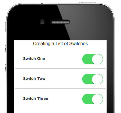
Here are some of the important settings for each switch control:
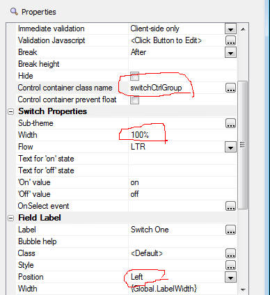
Notice that the 'Control Container Classname' property property has
been set to a custom class name. The definition is shown below.
In the CSS, we first set the control container to have a relative
position - which means all absolutely positioned child elements will be
positioned relative to the parent - allowing parent width and position
to be honored be the child.
We then set the first level of child DIVs (of which there is only one -
the switch itself - the label is a LABEL element) to have an absolute
position, a specific width, and a right location of 0px - which means it
will stick to the right of the parent.
.switchCtrlGroup {
position: relative;
}
.switchCtrlGroup > div {
position: absolute;
right: 0px;
width: .75in;
}
Build 2128-4292 29-Apr-2014 - Alpha Anywhere Version 2
Features
Web Application - PhoneGap - If you have a lot of
applications in PhoneGap build, retrieving the app icon
for each app can be slow because the PhoneGap build API
does not have a call to retrieve all icons at once. You
have to call the API once for each app. Therefore, a new
property has been added to the Get Icon Timeout
Threshold property. If you set this property to
<disable>, a default icon will be used.
Features
Grid Component - <RowNumber> and <LogicalRecNo> Columns - Using
these virtual columns in a tabular Grid caused an error.
AlphaDAO - MySQL - Numeric Fields with 7 or More Decimals - Fixed
an issue with MySQL where you could not enter numbers with more than 6
decimal places.
Grid Component - Setting State Variables - Fixed an issue where
setting state variables using the e._state pattern was not working in
the AfterInsert, AfterUpdate and AfterDelete server-side events.
Build 2118-4290 24-Apr-2014 - Alpha Anywhere Version 2
Videos
|
UX Component |
Multi-select List Control - Icon to Indicate
Selected Rows |
The Button List control (and the Checkbox
control - configured to render as a Button List)
can show an icon on selected items. The List
control can also be configured to allow multiple
selections (like a Button List or Checkbox), but
it does not show an icon on the selected rows to
indicate the row has been selected (it shows
selected rows using a different row color).
In this video we show how you can easily display
an icon on the selected rows. The technique uses
a custom CSS class.
Watch Video - Part 1
Watch Video - Part 2
Download Component |
|
UX Component |
Making a TextArea Fill a PanelCard |
Controls such as Lists and Maps have a 'Fill
container' property that allow you to
automatically cause the List or Map to fill the
Panel Card in which the control is contained.
Other controls, such as Text Areas, do not have
this property.
In this video we show how you can configure the
UX so that the Text Area control automatically
fills the Panel Card in which it is contained.
Watch Video
Download Component |
Bugs
UX and Grid Component - Image Upload Action -
Image Scaling - Fixed issue with scaling image after it
was uploaded.
Calendar Component - Editing Events - Fixed
an issue editing an event the second and subsequent
time. This issue was introduced in build 2089.
UX Component - Phone Gap - Fixed an issue with
PhoneGap where Ajax callbacks were failing and images
that were loaded from the server were failing.
Features
AlphaDAO - SQL::TableInfo - ParseTableName() Method
- A new static method has been added to the
SQL::TableInfo object. The .ParseTableName() method
takes a fully qualified tablename and returns the base
table name, owner, schema and catalog for the table.
For example
dim CatalogName as C
dim SchemaName as C
dim OwnerName as C
dim BaseTableName as C
dim FullName as C = "dbo.[hello.world]"
dim ti as sql::tableinfo
?ti.ParseTableName(CatalogName, SchemaName, OwnerName,
BaseTableName, FullName)
= .T.
?CatalogName
= ""
?SchemaName
= ""
?OwnerName
= "dbo"
?BaseTableName
= "dAgency.06"
?fullname
= "[dAgency.06]"
UX Component - Action Javascript - Panel Actions -
Navigate Action - History - The 'Navigate' action
now has new options. The options with the 'History'
prefix allow you to navigate through the Panel
Navigator's history (much list the way a browser's
history button works).
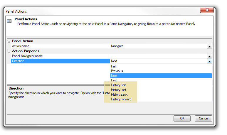
Code Editors - Xbasic and Javascript - Bookmarks - You can now
get quick access to any bookmarks you insert into the
script or function you are editing by clicking the
'Bookmark' icon on the status bar.
A bookmark is any comment that starts with //.
For example:
'//bookmark1 (Xbasic)
//''Bookmark1 (Javascript)
AlphaDAO - Listing Tables in a Database - When
you use the <connection>.listTables() or <connection>.listTablesWithTypes()
methods to list the tables in a database, by default,
only the first 1,000 objects are listed.
As a result of this, many of the builders you use in
AlphaAnywhere that require you to select a table only
present a list showing the first 1000 tables in the
database. Now, a new setting in the Settings dialog box
allows you to set the maximum number of tables returned
in a table listing.
To open the Settings dialog box, select the top-level
View menu, then select Settings.
If you are using AlphaDAO to get your own listing of
tables in an object, the SQL::TableFilter object which
is passed into the .listTables() and .listTablesWithTypes()
method now allows you to set the .MaximumTablesInList
property on the SQL::TableFilter object. Set this
property to -1 for no limit.
For example:
dim sqlFilter as sql::TableFilter
sqlFilter.IncludeAliases= .t.
sqlFilter.IncludeAllCatalogs= .F.
sqlFilter.IncludeAllOwners= .F.
sqlFilter.IncludeAllSchemas= .T.
sqlFilter.IncludeLinkedTables= .f.
sqlFilter.IncludeSynonyms= .t.
sqlFilter.IncludeSystemTables= .f.
sqlFilter.IncludeTables= .t.
sqlFilter.IncludeViews= .t.
sqlfilter.MaximumTablesInList = 2000
dim cn as sql::connection
cn.open("::name::myconnection")
dim list as c
list = cn.listTables(sqlFilter)
Tip: You can use the Xbasic helper function to
list tables and automatically honor the setting you have
defined in the Settings dialog. The helper functions are
a5_list_tables() and a5_list_tables_with_types(). The
functions take the connection object as the first
parameter and the sql::tableFilter object as the second
parameter.
Tips
AlphaDAO - Connection Strings - Postgres - Specifying the Default
Schema - When working with a Postgres database that contains
multiple schemas, you can specify the default schema in the connection
string. Unfortunately, at this point, the connection string dialog does
not let you specify the default schema, but you can easily edit the
generated schema to add the necessary directive to set the schema.
For example:
{A5API='PostgreSQL',A5Syntax='PostgreSQL',A5UseServerSidePrepare=Y,A5InitialCommand='SET
SCHEMA ''TestSchema''', Database='Alphasports', Password='alpha',Port='5432',Server='localhost',UserName='postgres'}
In this example, the following directive has been added to the
connection string:
A5InitialCommand='SET SCHEMA ''TestSchema'''
Notice that the entire argument to the A5SetInitialCommand is
enclosed in single quotes. Therefore the schema name, which must also be
enclosed in single quotes uses escaped single quotes (a double single
quote).
Build 2091-4284 11-Apr-2014 - Alpha Anywhere Version 2
Bugs
UX Component - List Control - Multi-Select - If
the List control was configured to allow multiple rows
to be selected, when the UX was submitted, the
selections in the List were not being returned as an
array, as they should have been. Instead, they were
being returned as a '\n' delimited string. This bug was
introduced in the last update.
Videos
|
Grid Component |
Opening a UX from a Button on a Grid and Passing
Information Into the UX |
You can open a UX component from a button on a
Grid using several different actions in Action
Javascript. For example, there are built-in
actions to edit the data in the current row of a
Grid using a UX.
But sometimes you want to simply open a UX and
pass information from the current row in the
Grid to the UX.
In this video we show how this is easily done by
defining arguments in the UX component and then
automatically setting the value of these
arguments when the UX is opened.
Watch Video - Part 1
Watch Video - Part 2
Download Component |
Build 2089-4283 10-Apr-2014 - Alpha Anywhere Version 2
Security
Application Server - OpenSSL - 'HeartBeat' Bug - The
Application server now uses Version 1.0.1g of the 3rd party OpenSSL
library which Alpha Anywhere uses. This updated library patches the so
called 'HeartBeat' vulnerability in the OpenSSL library.
Breaking Changes
UX Component - List Control - Group Summaries - If you are
using the {dialog.object}.groupSummary()
method in a Group header or footer, you will need to edit the component
and change the method to
this.groupSmmary()
The .groupSummary() function is now a method of the List object.
Previously is was a method of the UX object.
Application Server - Warning. A
change has been made to the web security system to load the security
much faster. This change alters one of the published security files. If
a project is published from the latest pre-release to an older
application server, the older application server will report a 500
internal server error as it won't be able to read the new file.
The application server should be the same build
as the development program.
Videos
|
UX and Grid Component |
E-mailing a Report |
A common pattern in both the UX and Grid
component is to place a button on the component
to print a Report and display the Report in a
window, div or TabbedUI pane. However, instead
of displaying the Report, you might want to send
it as an email.
The Action Javascript action to Print a Report
has an option to call an Xbasic function when
the Report has printed.
In this video we show how you can use this
option to e-mail the report using the Mandrill
e-mail service.
(Note: The sample function prototype shown in
the video is only available in build 4241 or
above.)
Watch Video - Part 1
Watch Video - Part 2 |
|
UX Component |
Cross-domain Ajax Callback |
A cross-domain Ajax callback is a callback that
takes places to a server that is in a different
domain than the domain from which the component
was loaded.
In this video we show how a callback is made to
the Apple iTunes store and we contrast the
difference between making the callback directly
to the Apple site versus making a callback to
the Alpha server first and then having the Alpha
server make the call to the Apple site.
Watch Video - Part 1
Watch Video - Part 2
Watch Video - Part 3
Download component
|
|
UX and Grid Component |
Using CSS Icons from the Font-Awesome Icon Font
Library |
The Font-Awesome CSS Icon library (http://fontawesome.io) is bundled with Alpha
Anywhere and can be used in the UX, Grid and TabbedUI
components.
In this video we show how to use the Font-Awesome font
library and CSS icons in general.
Watch Videos - Part 1
Watch Videos - Part 2
Watch Videos - Part 3
|
|
UX and Grid Component |
Using 3rd Party Icon Font Libraries (CSS Icons) |
There are many 3rd party Icon Font (CSS Icons)
libraries that can be used with Alpha Anywhere.
In this video we show how you can go to a source
of icon fonts (http://www.fontello.com/)and
download a font library that can then be
installed into Alpha Anywhere.
Watch Video |
|
UX Component |
Using CSS Icons in a List - List Menus |
A common pattern in mobile applications is to
use a List control as the menu. This list
control is then displayed in a Panel Window that
animates in from the left side of the screen.
Icons are typically displayed for each menu
choice. CSS Icons are ideal for these types of
icons. In this video we show how a List can be
easily configured to display a menu. Each item
in the List has a CSS Icon in it.
Watch Video |
|
UX Component - Mobile Applications |
Creating a 'Split-View' using the Pre-Defined
'Split-View' Template |
A common pattern in mobile application is the
'split-view' which shows a menu on the left and
a work area on the right. On a phone, were space
is limited, the menu is hidden and only shown on
demand, but on a tablet, the menu is always
shown. In this video we show how you can quickly
create a UX component that implements a
split-view by selecting one of the pre-defined
'split-view' templates. We then explain some of
the concepts behind the component.
Watch Video - Part 1
Watch Video - Part 2
Watch Video - Part 3
|
|
UX Component |
Split Buttons |
A split button is displayed as a regular button
and a smaller button with a dropdown icon. You
can have different event handlers for the
dropdown button portion of the button and the
regular portion of the button. When space is
constrained, you can use a single split button
to perform many tasks, while still giving the
user single click access to the last selected
task.
In this video we show how you can use split
buttons in your applications.
Watch Video - Part 1
Watch Video - Part 2
Watch Video - Part 3
Download components |
|
UX Component |
List Control - Lookup Columns |
The List control allows you to define 'lookup
columns' where the data in the column is 'looked
up' either by calling a Javascript function
(that you define), or by looking up the value in
some other List.
A typical use case for this is a List that shows
Order Details. Each row in the list has a 'productId'
field. You would like to display the product
name for each product id.
In this video we show how to define Lookup
Columns in a List.
Watch Video
Download Component (You will need to change
the connection string for both lists to point to
the sample Northwind database). |
|
UX Component |
List Control - Client-side Grouping and List
Navigator |
Group breaks can be inserted into the List
control. The group breaks can be 'server-side'
group breaks, or 'client-side' group breaks. The
advantage of 'client-side' group breaks is that
they can be dynamically applied to the data in
the List. That means you can easily switch from
grouping the data by 'Lastname' to grouping by
'City', etc. You can also display summary values
in the group headers and footer.
For lists that have group breaks (regardless of
whether the group breaks were computed
server-side or client-side), you can also
display a List Navigator, which allows the user
to easily scroll a long List.
In this video we give an overview of client-side
group breaks and the List Navigator. Then, we go
into depth on setting up client-side grouping
using Action Javascript (to apply the group
breaks after the List is initially rendered) and
in the List definition itself (so that when the
List is initially rendered, the group breaks are
shown).
We also show how summary data can be inserted
into a List header or footer.
Watch Video - Overview
Watch Video - Part 1
Watch Video - Part 2
Watch Video - Part 3
Watch Video - Part 4
Download components |
|
UX Component |
List Control - Using Native SQL For List Data |
When you create a List control that is based on
SQL data, you must use Alpha Anywhere 'portable'
SQL. If you want to base you List on 'native'
SQL (which includes stored procedures), you must
define a 'custom' data source for the List and
then in the Xbasic function that returns the
data, you can use your native SQL.
In this video we show how this can be done.
Watch Video - Part 1
Watch Video - Part 2
Download Component |
|
UX Component |
Drag and Drop - Dragging Rows from a Source List
to a Target List |
A common design pattern in applications is to
allows users to drag items from one List to
another.
The Alpha Anywhere Javascript library contains
powerful drag and drop functions that allow you
to easily enable this type of functionality. In
this video we show how you can create a UX with
two List controls and drag rows from one List to
the other.
Watch Video
In this video we explain the Javascript code
that enables this functionality:
Watch Video - Part 1
Watch Video - Part 2
Watch Video - Part 3
Watch Video - Part 4
Download component
Addendum. The previous videos show drag/drop on
a List using a mouse. However, the previous
examples do not work on some mobile devices
because on iOS (for example), the 'up' event
fires on the element that initiated the 'down'
event (and not on the element on which the up
event took place, as you might have expected).
The next video explains how the component shown
in the previous videos can be slightly rewritten
so that it works on a mobile device (and as a
bonus, also allows re-ordering of the rows
within a List).
Watch Video
Download component
|
|
UX Component |
List Control - Range Searches |
The List control has a built-in action in Action
Javascript to filter the List. An Ajax callback
to the server is made and the query that
populates the List is executed with a filter
that is computed based on values in the search
control on the UX. Now, you can easily perform
'range' searches, as shown in this video.
NOTE: Another way to perform a 'range' search is
to use a single search control, turn on the
'Allow QBF' option and then enter the search
value as a range using the .. (two dots) synax.
For example, to search for quantity between 10
and 20, you would enter 10..20 in the search
control.
Watch Video |
|
UX Component |
Absolute Layout Container - Save as PDF |
The Absolute Layout container in a UX allows you
to place controls at absolute locations,
typically using a bitmap image of a form as a
background. You can use an action in Action
Javascript to save the contents of the Absolute
Layout container as PDF file and then download
the PDF to the client, or call some Xbasic
function to process the PDF file.
This video shows how this is done using Action
Javascript.
Watch Video |
|
UX Component |
Internationalization - Language and Text
Dictionary Tags |
Language or Text Dictionary tags are typically
used to internationalize the strings in a UX
component. However, adding the tags to a large
component can be tedious. This video shows how
the Internationalization Helper can be used to
automate this task.
Watch Video |
|
UX Component |
Client-side Formatting for Numeric Data and
Templates |
You can use format directives in the Templates
that the UX component List control uses to
display data. This allows you to easily format
numbers (for example show thousands separated by
commas with 2 decimal places) and apply
templates to strings (for example, show
'5551234567' as (555) 123-4567)
The video shows how you can insert a format
directive into a List template using the Number
Format Genie.
Watch Video |
|
UX Component |
Using a List Control to Display Detail
Information (in Field/Value Pairs) for a Record |
A common pattern in mobile applications is to
display a List of records and then when the user
clicks on a row in the List to display a list of
fields and corresponding values for the row the
user clicked on, with one field/value pair per
line.
In this video we show how a second List can be
used to display the field/value pairs and how
this List can be dynamically populated when the
user clicks on a row in the main List of records
Watch Video - Part 1
Watch Video - Part 2
Download component
Addendum: In this video we show how you can
enhance the UX by showing a message in the
Detail List when no record is active in the
primary List.
Watch Video
|
|
UX Component |
Dynamically Populating a List with Data from a
SQL Database |
Populating a List dynamically with data from a
SQL database is a very common pattern in
application development. In this video we show
how this is easily done.
In the video we show how a List control on a UX
can be populated with customers in a country.
The country is selected from a dropdown control.
Watch Video - Part 1
Watch Video - Part 2
Download component |
|
UX Component |
Transform Data Type of List Data |
By default, the data type for each field in a
List is a Javascript string. In some cases you
might want the data type for a column to be a
Javascript date or number object.
A benefit of transforming dates into true
Javascript date objects is that you can then use
date formatting in the template for the List.
For example, when displaying a field called
OrderDate in the the List, instead of specifying
{OrderDate} in the template, you might specify {OrderDate:date('yyyy-MM-dd')}
Watch Video
Download component
|
|
UX Component |
List Virtualization - Optimizing the List for
Large Number of Rows |
When you are working with List controls that
contain a large number of rows (say several
thousand rows), it is advisable to turn on the
List's 'virtualization' feature. With
virtualization turned on, the List will only
render a small number of rows at a time (the
visible rows and some additional rows above and
below the visible rows).
Turning on List Virtualization will dramatically
reduce both the time taken to load the List and
the amount of memory consumed by the List.
Watch Video
Download component |
|
UX Component |
List Control - Modeless Preview Window in List
Builder |
When you are designing a List control in a UX
component, the List Builder is a modal dialog.
This means that you need to first close the List
Builder before you can preview the UX component
to see how your List control looks.
However, while you have the List Builder open,
you can click the Preview button to open a
modeless preview window which you can keep open
whiel you are working in the List Builder.
Simply clicking on the Preview button will
quickly refresh the preview shown in the window.
Watch Video |
|
UX Component |
Action Javascript - Merge Data into Template |
Alpha Anywhere has a very powerful client-side
template engine that allows you to merge
Javascript data into templates to produce HTML
output that can then be displayed on your
component.
This functionality is exposed in the 'Merge data
into client-side template' action in Action
Javascript.
NOTE: Other videos explain the template syntax
in more detail.
Watch Video
Download Component |
|
UX Component |
Using the Template Tester to Help Design
Templates - Tutorial on Template Syntax |
The client-side template engine in the UX
component is very powerful, but to be able to
take full advantage of its power it is necessary
to understand the syntax used in the templates.
In this video we demonstrate how to use the
Template Tester and we walk through the various
examples that are built into the Template
Tester.
The video gives an extensive overview of the
template syntax.
Watch Video - Part 1
Watch Video - Part 2
Watch Video - Part 3
Watch Video - Part 4
Watch Video - Part 5
Watch Video - Part 6
Watch Video - Part 7
Watch Video - Part 8 |
|
UX Component |
List Control - Column Resizing |
The List control allows you to specify that
columns in the list are resizable.
This video shows how you can set the resizable
property at the individual column level.
Watch Video
Download Component |
|
UX Component |
Destroy Child UX Component |
A common pattern when building large mobile
applications is to break the app into multiple
sub-component which are called from a master
component.
Once the child component is no longer needed, it
is useful to be able to delete the component
from memory in order to conserve the limited
memory available in the browser.
The {dialog.object}.destroyChildComponent()
method can be used to delete child UX components
from memory, as shown in this video.
Watch Video
Download Components |
|
UX Component |
Generate a component at run-time using Xbasic |
In most cases, the UX components that your
application uses will be built at design-time.
However, there may be use cases for UX
components that are generated dynamically at
run-time using Xbasic.
The a5wcb_createDialogUsingXbasic() allows you
to generate a UX component using Xbasic.
In this video we show how a button on a UX makes
an Ajax callback to generate a UX on the fly.
Another button then opens this dynamically
generated UX component.
Watch Video
Download Component |
|
Code Editor |
Highlighting Opening and Closing 'Pair'
Delimiters |
When editing Xbasic or Javascript code, html,
JSON etc. it is often helpful to be able to see
the start and end of different 'pairs'. For
example in an Xbasic function call, highlighting
the opening an closing parentheses. Or in a
Javascript function, highlighting the opening
and closing curly braces. In some HTML text, the
opening and closing tags (e.g. <div>, <body>,
<p> , etc.)
In addition, once a 'pair' has been identified,
keyboard shortcuts (Control ] and
Control-Shift ] ) allow you to quickly
move focus from the start of the 'pair' to the
end of the 'pair' or to select all of the text
inside the 'pair'.
Watch Video |
|
UX Component |
Using the List Scroller to Move Through the Rows
in a List |
When working with virtualized Lists, it is
possible to have Lists that have a very large
number of rows. Navigating a very large List by
drag scrolling on the List body could be
cumbersome. To facilitate navigating large
Lists, a 'List scroller' can be added to the
List. The scroller shows a message while you are
dragging on it showing which row in the List
will be shown if you were to stop dragging on
the scroller.
Using the scroller, you can very quickly
navigate to any row in the List.
The List Scroller is not limited to virtualized
Lists. It can also be used with non-virtualized
Lists.
In this video we show how to add a List Scroller
to a List and we show how you can quickly
navigate to the last row in a virtualized List
that contains 100,000 row of data.
Watch Video
Download component |
Notice
Application Server - OpenSSL - 'HeartBeat' Bug - The
Application server now uses Version 1.0.1g of the 3rd party OpenSSL
library which Alpha Anywhere uses. This updated library patches the so
called 'HeartBeat' vulnerability in the OpenSSL library.
Postgres ODBC Driver - Version 9.03.01.00 - Bugs -
Postgres has introduced a bug in the latest version
of their ODBC driver that affects the Grid component.
The only solution is to roll back to a previous version
of the ODBC driver, or turn off write conflict checking
for all updateable fields in the Grid.
Specifically, the driver fails when an expression is
included in the WHERE clause that tests a bound variable
for NULL-ness.
Here is a summary of the bug:
Consider the following sample Interactive window
session:
dim args as sql::arguments
args.add("tags", "rain, snow")
?cn.execute("select * from test_table where :tags is
null", args)
This will fail and the error reported is:
The PostgreSQL ANSI ODBC driver reports 42P18 - ERROR:
could not determine data type of parameter $<n>; when
preparing SQL with an expression of the form:
<bound parameter> IS NULL.
Update: A work around has been added in the SQL
generated by the Grid Component so that Grids will work
with the 9.03.01.00 ODBC driver.
AlphaDAO - Postgres - Connection String - Changes
In Default Values Set By the Alpha Anywhere PostgreSQL
Extension Driver
The Alpha Anywhere PostgreSQL extension driver now
defaults the following connection string attributes:
Protocol=7.4-1
UseServerSidePrepare=1
Previously only the following were set:
B8=1 // B8 = UnknownsAsLongVarchar (rather than varchar)
B9=0 // B9 = Bools as Char
ByteaAsLongVarBinary=1
If these defaults do not work for your installation for
some reason, you will need to create and ODBC DSN and
use the Alpha Anywhere ODBC driver.
Setting Protocol=7.4-1 has been demonstrated by one
customer to dramatically improve performance with
PostgreSQL 9.3 on large batches of inserts (about 25%).
Change in Behavior
Bugs
Reports - HTML Reports - Export to PDF, Excel, Word -
International Dates - If your date format was set to
dd/mm/yyyy then if you printed an HTML report that used
dates in its filter expression and then you clicked a
toolbar icon to export the report to PDF, Excel, or
Word, the date filter was not applied correctly.
Reports - Quick Report Genie - Summary Fields -
Fixed a bug where the Genie would crash if you edited a
field that had summary values.
UX Component - Responsive Design Genie - Absolute
Layout Containers - Textbox Controls with In-Place
Buttons - Fixed an issue that caused the textboxes
to not display.
TabbedUI Component - HTML Reports - Reports with
Parameters that are Set to Prompt at Runtime - If
you had an HTML report that was set to prompt for
parameters at runtime, the first time you ran the
report, the report would render correctly. But if you
tried to run the report a second time (by entering new
parameter values, but NOT first closing the Tab Pane),
the report did not render.
UX Component - AbsoluteLayout Container - Text
Control - Fixed a bug with text controls in an
AbsoluteLayout container which caused controls that
followed the text control to render in the wrong
position.
Reports - Export to Word - In some cases, numeric
fields in a report would not export correctly to Word.
UX Component - Absolute Layout Container -
PanelOverlay Container - Content in an
AbsoluteLayout container that was inside a PanelOverlay
container did not render correctly.
Web Applications - Security Framework - MySQL -
Under certain circumstances using MySQL tables for web
security, deleting a user could fail. This has now been
fixed.
Web Security Framework - CSS Icon Fonts - The new
iOS7 and Android style sheets use icon fonts. The images
were not displaying if the security framework was
enabled because the font files did not have the
appropriate security settings.
The web security framework will now recognize the the
new font files for CSS icon fonts. The page security
must be opened from the web security menu to add the new
types to the page security. Then publish any page to
add the new settings to security. If the Security cache
lifetime is set to 0, the application server must be
stopped and restarted to apply the changes.
UX and Grid Component - Edit-Compo - Populate using
Ajax Callback - If an edit-combo is dynamically
populated using an Ajax callback, previously, the Order
By property was ignored and the list was automatically
ordered by the columns in the display list. Now, the
order by clause is honored. Many SQL databases do not
allow an order by clause on columns that are not in the
select list. Therefore, you may need to ensure that the
columns in your order by clause are also in the list of
fields to display.
Grid Component - Font-Awesome - Live Preview -
When you did a Live Preview from a Grid component that
used Font-Awesome CSS Icons, the Font-Awesome files were
not getting published to the Live Preview folder.
Layout Table Reports - Absolute Position Cell -
Calculated Fields - If you created a cell in a
Layout Table report that used Absolute Positioning and
placed calculated fields in the absolute layout, the
calculated fields were not shown in the Absolute Layout
editor when you opened the editor a second time to make
edits to the cell.
Web Applications - Report Server - SQL Reports -
Under some circumstances, a report based on a SQL
database would fail to print when using the Report
Server. The error message was reporting that the
connection string could not be resolved.
UX Component - Signature Capture Control - Tab
Control - If a signature capture control was placed
in a tab pane that was not initially visible, when the
tab pane was made visible the control did not work.
Desktop Applications - Security - If you set
permission on a .dbf table to disallow edits, changes or
deletes, the permissions were not being honored.
UX Component - Server-side Save Records to Table(s)
Action - User Defined Events - Aborting the Action -
The help in the function prototype for the various
events (such as beforeRecordInsert, beforeRecordUpdate,
etc.) describe that you can abort the action by setting
rtc.abort = .t.
The help is wrong. It should have read:
e.rtc.abort = .t.
e.rtc.abortReason = "Reason"
Desktop Applications - Forms - Embedded Browses -
Entering New Records - There was a cosmetic issue
during data entry into a one-to-one child table in an
embedded browser. Consider the following set:
TableMaster===>TableChild1---->TableChild2
If you were entering a new record into the embedded
browse and you entered a value in the field in
TableChild1 that links TableChild1 to TableChild2 and
there was no matching record in TableChild2 (in other
words, you were creating a new record in both
TableChild1 and TableChild2, rather than the more common
case of a new record in TableChild1 that links to an
existing record in TableChild2), then as soon as you
tabbed out of a field in TableChild2, the data you
entered would disappear. When you saved the record, the
data you entered would then show up. This is fixed.
UX and Grid Component - Edit-Combo - Static Choices
- The 'Filter method for required selection'
property was not shown if the choices were set to
'Static'. (This property was shown for 'Dynamic'
choices).
On Firefox, if you do not set this property to
'Progressive' and you have set the 'User must select
from list' property to true, then you will not be able
to hit the tab key to tab out of the control to the next
control in the form.
Xbasic - Passing Function Arguments By Referencing -
Array Indexers - If a numeric value was passed into
a function and then that value was as an array indexer,
it failed. For example:
function myFunc as c (arr as p, byRef myIndex as n)
dim result as c
result = arr[myIndex].name
myFunc = result
end function
However, if you did this, it would have worked:
function myFunc as c (arr as p, byRef myIndex as n)
dim result as c
result = arr[myIndex.value].name
myFunc = result
end function
Desktop Applications - Forms and Browse - Lookup
Field Rules - Display a Dropdown - Fixed an issue
when you could not edit entries in a control that was
defined as a lookup.
Calendar Component - TabbedUI - If you had a
TabbedUI component that opened multiple calendar
components, then buttons in the popup UX component would
only render in the last calendar component that was
opened.
UX Component - Signature Capture Control - Data
Binding to .DBF Tables - Fixed an issue in the
signature control if the UX was bound to .dbf tables.
Grid Component - Tree Control Navigator - Session
Variables in Custom SQL Statement - If you specified
a custom SQL statement for any level of the tree and
used session variables in the WHERE clause, the query
would fail.
Grid Component - Search Part - Cascading Dropdown
Boxes - 'Explicit' Option - If the 'Explicit' option
was used for defining the filter for the child Dropdown
box, the child Dropdown was not populated correctly when
its parent's value was changed. This bug only happened
for controls in the Search part.
Grid Component - Radiobutton and Checkbox Controls -
'Not in List' Rule - Numeric Fields - The 'Not in
List' property was not exposed for Numeric fields.
UX Component - Map Control - Bulk Add Marker - If
the latitude sub-series name in the Data Series was not
called 'latitude' and the longitude sub-series name was
not called 'longitude' the action would throw an error.
UX Component - RadioButton and CheckBox Controls -
Render as ButtonList Option - Events - When you
check the property to render a RadioButton or CheckBox
control as a ButtonList, the standard Javascript events
that can be defined for a RadioButton or CheckBox are
meaningless. ButtonsLists expose two Javascript
properties:
Therefore, when you check the 'Render as ButtonList'
property all of the standard Javascript properties in
the Property Sheet are hidden and the onClick and
onSelect events, which are standard for ButtonLists are
now exposed.
UX Component - Panels - Internet Explorer V11 -
Fixed some issues with Panels not working correctly
under IE11.
Security Framework - Security Log in - The
security log in process no longer checks user id and
password values to see if they meet validation rules.
The process will now attempt to log in with any
non-blank value. This check is now only performed when
user credentials are created or edited.
Features
Xdialog - UpperCase Only Input Control - A new
directive, ^, allows you to specify that an input
control will only accept uppercase characters. If the
user types in a lowercase character, it will convert to
uppercase. Previously you could have created a template
to only accept uppercase, but that would have prevented
the user from entering non-alphabetic characters.
For example:
ui_dlg_box("Convert to Upper","[%^%.10name]")
Using a template:
ui_dlg_box("Convert to Upper","[%X=LLLLLLLLLL%.10name]")
UX Component - Additional Resource Files Property -
A new property has been added to the UX builder that
allows you to specify the names of any additional
resource files. These are files in the Web Project
folder that you want to ensure get published every time
you publish the UX component.
This property is in the 'Other' section of the UX
Properties pane in the UX builder.
Additionally, if this component has been specified as
the 'initial' component in a PhoneGap project then these
files are automatically copied into the PhoneGap project
that is submitted to PhoneGap build.
The files entered into this list must be in the form of
a cr-lf list of relative filenames (relative to the Web
Project folder).
UX Component - List Control - Scrollers - List
scrollers allow you to quickly navigate to a particular
record in a List. You can drag on the scroller in much
the same way that you drag on the 'thumb' portion of a
scrollbar in a desktop application. When you stop
dragging on the scroller, the corresponding row in the
List is brought into view.
Watch Video
Download component
While you are dragging on the scroller, a message is
displayed showing what record would be shown if you were
to stop dragging. The contents of the message is
completely customizable. It is actually a standard HTML
List template and it supports all of the template
features for List controls. The message can display
fields from the data in the List.
The List scroller is particularly useful for virtualized
Lists because a virtualized List can contain a very
large number of rows. Using the scroller you can quickly
navigate to any row in the List without having to drag
scroll one screen at a time.
However, List scrollers are not limited to virtualized
Lists. They can also be used with non-virtualized Lists.
(See below for information on Virtualized Lists).
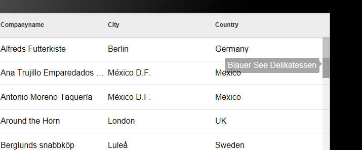
To turn on the List scroller, check the 'Has scroller'
property on the List Properties pane in the List
builder.
You can use placeholders for any field in the List in
the template.
UX Component - Customizing the Scroll Indicator
- When you are drag scrolling on a List (or any
container that supports drag scrolling), scroll
indicators are displayed. You can now customize the
appearance of these scroll indicators (or even turn them
off).
To customize the scroll indicator settings, click the
smart field for the 'Custom scroll indicator settings'
property.
UX Component - List Control - Fixed Headers and
Footers - List controls have always supported 'data'
headers and footers. Data headers appear before the
first row of data (below the List titles) and after the
last row of data. When the List is scrolled, the data
header and footer can scroll out of view.
Fixed headers and footers, on the other hand, appear
above and below the List and are always visible
regardless of how the List has been scrolled.
To turn on fixed headers and footers, check the
appropriate property in the List Properties pane in the
List builder.
TIP: To insert controls in the header or footer
(e.g. input controls, buttons, etc), add the control to
the UX and wrap then in an 'Injectible' container. The
inject the contents into the header or footer as shown
in the image below. When you open the header or footer
editor you will see a hyperlink that generates the
required code.
Code Editor - Highlighting - The code editor now
highlights opening and closing parentheses, curly
braces html tags (when editing HTML text) and long
string delimiter (e.g. <<%txt% .... %txt%).
Watch Video
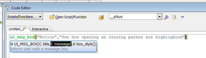
In the image below, the long string has curly braces (it
is a JSON object). Because the long string uses the
special
%html% delimiter, the curly braces are highlighted.
When the braces are highlighted, the right click menu
has a new option - Select Pair... - which selects all of
the text between the opening and closing brace.
The following keyboard shortcuts can be use when a
'pair' has been identified (i.e. the editor is
highlighting the start and end of a pair.
- Control ] - acts a a toggle, moving to the end of the 'pair',
then back to the start of the pair.
- Control-Shift ] - Selects all of the text in the 'pair'.
Grid Component - Action Scripting - Send e-mail
Action - Mandrill - Now supports the Mandrill
service as a method for sending the e-mail.
Grid Component - Action Scripting - Send e-mail
Action - Dynamically Computing Message Body -
The message body can now be dynamically generated using
an Xbasic function.
UX Component - Action Scripting - Send e-mail Action
- A new action is now available in Action Scripting to
send an e-mail. This is the same action that is exposed
in server-side Action Scripting in the After Dialog
Validate server-side event handler.
CSS Editor - Source View - Quick Navigator - When
you are editing CSS in the Source tab of the CSS editor,
the toolbar now has a quick selector that allows you to
quickly jump to any rule. For example in the screenshot
below, clicking on the down arrow icon in the status bar
has opened a menu showing all of the selectors in the
code being edited.
JSON_standardize() function - Takes non-standard
JSON and standardizes it. Also corrects for trailing
commas in the JSON (which are illegal)
For example:
?json_standardize("{name: 'Fred', age: 21}")
{
"name": "Fred",
"age": 21
}
?json_standardize("{name: 'Fred', age: 21,}")
{
"name": "Fred",
"age": 21
}
UX Component - {dialog.object}.destroyChildComponent()
Method - A common pattern when building large mobile
applications is to break the app into multiple
sub-component which are called from a master component.
Once the child component is no longer needed, it is
useful to be able to delete the component from memory in
order to conserve the limited memory available in the
browser.
The {dialog.object}.destroyChildComponent() method can
be used to delete child UX components from memory.
Watch Video
UX Component - List Control - Column Resizing -
You can now specify that individual columns in the List
can be resized by the user at run-time. To specify that
a column can be resized, check the 'Resizable column'
property.
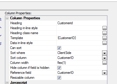
Watch Video
UX Component - Customize Scroll Indicator - List,
Panel and Containers - You can now customer the
scroll indicator for List controls, Panels and
Containers. By default the scroll indicator for vertical
scrolled content is on the right edge and the for
horizontally scrolled content, it is on the top.
However, you can set the position to left or bottom, and
you can control the class and various offsets.
In the image below, the scroll indicator is shown on the
left edge with a 20px offset.
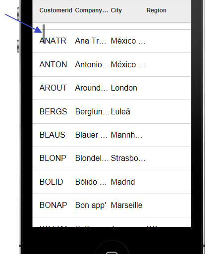
To open the scroll indicator customization dialog, click the smart
field button:
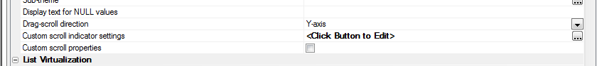
Client-side Templates - Allows you to merge complex Javascript data in
richly formatted templates to produce HTML that can be displayed in a UX or Grid
component.
NOTE: A powerful tool is available when you working with
templates. See section below: 'Using the Template Tester'
NOTE: Templates use the A5.u.template.expand() Javascript
function in the Alpha Anywhere Javascript library. See section below 'The
A5.u.template.expand() Function'
The basic idea of client-side templates is that you have some Javascript data -
typically a Javascript object, or an array of Javascript objects, and a template
(with placeholders for data) and you merge the data into the template.
For example, take the following trivial example. Say you have a Javascript
object defined as follows:
var data = {Firstname: 'Fred', Lastname: 'Jones'};
And a template defined as follows:
var template = 'Hello {Firstname} {Lastname}';
When you merge the data into the template, you will get a string that looks
like this:
Hello Fred Jones
Technical Note: The syntax for the template is identical
to the syntax for free-form templates in the List control and for individual
columns in a columnar List control.
Of course, in a real application the template will likely also include HTML
markup. For example:
var template = 'Hello {Firstname} <span class="class1">{Lastname}</span>';
Array Data
The data for the template can be an array of objects, in which case the
template will be expanded for each object in the array.
For example:
var data = [
{Firstname: 'Fred', Lastname: 'Jones'},
{Firstname: 'John', Lastname: 'Smith'},
{Firstname: 'Sally', Lastname: 'Rome'}
];
Using the same template as above, this will produce this output:
Hello Fred Jones
Hello John Smith
Hello Sally Rome
Object Data
The data object can include sub-objects. For example
var data = {Firstname: 'Fred', Lastname: 'Jones', Address: {
Street: '123 Main St', City: 'Boston', State: 'Ma' }};
The template to consume this data could then be defined as follows:
var template = 'Hello {Firstname} from {Address.Street} in {Address.City}';
Alternatively, the template could be defined as follows:
var template = 'Hello {Firstname} from {Address} {Street} in
{City} {/Address}';
Notice that the template includes {Address} and {/Address}. Inside the
{Address} block, the placeholders do not need to be fully qualified. You can use
{Street}, rather than {Address.Street}
The {Address} placeholder is referred to as a 'scope' placeholder.
Both of these templates will produce the same output:
Hello Fred from 123 Main St in Boston
Array Data and Object Data Combined
In the Array Data example above, the data was in the form of a Javascript
array. In many cases it will be preferable have the data as an object. So,
instead of specifying the data for the template as:
var data = [
{Firstname: 'Fred', Lastname: 'Jones'},
{Firstname: 'John', Lastname: 'Smith'},
{Firstname: 'Sally', Lastname: 'Rome'}
]
You could specify it as:
var data = {
Customers: [
{Firstname: 'Fred', Lastname: 'Jones'},
{Firstname: 'John', Lastname: 'Smith'},
{Firstname:
'Sally', Lastname: 'Rome'}
]
}
The template to consume this data could then be defined as:
var arr = [];
arr.push('{Customers}');
arr.push('Hello {Firstname} {Lastname}');
arr.push('{/Customers}');
var template = arr.join('\n');
NOTE: The template is created by pushing individual lines into a
Javascript array and then joining the array. This is simply a convenient
technique for creating long strings in Javascript.
This template will produce this output:
Hello Fred Jones
Hello John Smith
Hello Sally Rome
Notice that since the {Firstname} and {Lastname} placeholders are nested
inside the {Customer}...{/Customer} scope placeholders, it is not necessary to
use fully qualified placecholders (e.g. {Customer.Firstname}).
The benefit of placing your array as a property of an object, rather than at
the top level, is that you can then use the {*header} and {*footer} constructs,
and you can compute summary information (such as the number of items in the
array, an average value of a field in the array, etc).
Client-side Template Syntax
There are a rich set of template directives that make templates both
extremely powerful and also easy to use.
-
{scope} Placeholders
-
{[value]} Placeholder
-
Missing data
- Headers and Footers
- Empty Arrays
- Conditional Sections
- Formatting Directives
-
Expression
- Functions
- Using the [] directive to emit array instance data
- Partial templates
{scope} Placeholders
If the data passed to the template expand function contains nested objects,
or arrays, you can use special {scope} placeholders, where scope is the name of
nested object or array.
For example, consider the following simple data object:
{name: 'John Smith', address: {street: '1 Main', city:
'Boston'}}
The template to print this could be:
{name}
{address.street}
{address.city}
or more conveniently, a {scope} variable could be used:
{name}
{address}
{street}
{city}
{/address}
The {scope} variable acts like an 'with' statement in Xbasic.
Within the {scope}, it is not necessary to fully qualify the placeholder
names.
In the case where the data contains a nested array, the {scope} variable
indicates that the template should loop over the rows in the array.
For example, consider this data object:
[
{name: 'John Smith', children: [{name:
'Griffin'}, {name: 'Callie'}]},
{name: 'Toby Mohan, children: [{name:
'Kyle'}, {name: 'Katy', name: 'Luke'}]}
]
And the following template:
{name}<br>
<ul>
{children}
<li>{name}</li>
{/children}<br>
</ul>
Which will produce this output:
{[value]} Placeholder
The {[value]} Placeholder is a special placeholder to use when
looping over arrays of values, rather than arrays of objects.
In the previous example, the data was specified as:
[
{name: 'John Smith', children: [{name:
'Griffin'}, {name: 'Callie'}]},
{name: 'Toby Mohan, children: [{name:
'Kyle'}, {name: 'Katy', name: 'Luke'}]}
]
The nested array is an array of objects.
However, the data could have been specified as:
[
{name: 'John Smith', children: 'Griffin','Callie'] },
{name: 'Toby Mohan, children: ['Kyle', 'Katy','Luke']}
]
In this case, the nested array is an array of values, not of objects.
To emit the data in the array, the template must use the special
{[value]} placeholder. For example:
{name}<br>
<ul>
{children}
<li>{[value]}</li>
{/children}<br>
</ul>
NOTE: The [value] field can be followed by
formatting directives, just like any other field. For example:
{[value]:number('$#,###.00')}
Missing Data - Alternative Text - The || Directive
In some cases the data you pass in to the template expander will have missing
data. For example, consider the following data object:
{
employees: [
{firstname: 'Fred', lastname:
'Smith', city: 'Boston'},
{firstname: 'Laura', lastname: 'Linneker'}
]
}
The 'city' property has been specified for the first object in the
'employees' array, but not the second.
{employees}
Employee name: <b>{firstname} {lastname}</b>
City: {city||Not available}<br>
{/employees}
The text to display for a missing value is specified in the placeholder after
a || delimiter. In the template shown above, the missing text for the {City}
property has been specified as 'Not available'.
The above template will render as follows
Employee name: Fred Smith City: Boston
Employee name: Laura Linneker City: Not available
NOTE: The missing data directive can be combined with
formatting directives. For example:
{price:number('#.00')||N/A}
Headers and Footer - {*header} / {*footer}
Headers and Footer can be used if the data object you pass into to the
template expander contains array data.
For example, assume the data object looks like this:
{
employees: [
{firstname: 'Fred', lastname:
'Smith'},
{firstname: 'Laura', lastname: 'Linneker'}
]
}
And the template looks like this:
{employees}
{*header}
This is the header - it prints before
the first item in the array.<br>
{/*header}
Employee name: <b>{firstname} {lastname}</b><br>
{*footer}
This is the footer - it prints after
the last item in the array
{/*footer}
{/employees}
The merged data will look like this:
This is the header - it prints before the first item in the array.
Employee name: Fred Smith
Employee name: Laura Linneker
This is the footer - it prints after the last item in the array
Empty Arrays - Alternative Text - {*empty}
If an array does not contain any entries you can specify alternative text to
display.
For example, consider the following sample data:
{
employees: [
{firstname: 'Fred', lastname:
'Smith', skills: [ {name: 'Javascript'},{name: 'CSS'}]},
{firstname: 'Laura', lastname: 'Linneker',
skills: [{name: 'Xbasic'}]},
{firstname: 'Junior', lastname:
'Programmer', skills: [] }
]
}
Notice that only the last array instances does not have any rows in the
skills array.
The template might be defined as follows:
{employees}
Employee name: <b>{firstname} {lastname}</b><br>
<div style="border:solid 1px green; margin-left:50px;">
{skills}
{*empty}
No skills yet
{/*empty}
Skill Name:
{name}<br>
{*footer}
<i>Count of skills: {@countSkills}</i>
{/*footer}
{/skills}
</div>
{/employees}
The Javascript function for the countSkills function (called by the {@countSkills}
directive) is:
function countSkills(data,context) {
return data[context].length;
}
The merged data looks like this:
Employee name:
Fred Smith
Skill Name: Javascript
Skill Name: CSS
Count of skills: 2
Employee name:
Laura Linneker
Skill Name: Xbasic
Count of skills: 1
Employee name:
Junior Programmer
No skills yet
Conditional Sections - {*if logicalExpression}, (*endif}
Templates can include conditional sections. Conditional sections are defined
using the following template commands:
- {*if logicalExpression}
- {*elseif logicalExpression}
- {*else}
- {*endif}
where logicalExpression is any Javascript expression that evaluates to
a true/false value.
The logicalExpression can refer to data in the current 'row' of data.
For example, consider the following data:
{
employees: [
{firstname: 'Fred', lastname:
'Smith', state: 'MA'},
{firstname: 'Laura', lastname: 'Linneker',
state: 'CA'},
{firstname: 'Junior', lastname:
'Programmer', state: 'MA'},
{firstname: 'Bill', lastname:
'Lindsey', state: 'NY'}
]
}
And the following template:
{employees}
Employee name: {[countOneBased]} <b>{firstname} {lastname}</b><br>
<div style="border: solid 1px blue; margin-left:20px;
margin-bottom: 10px;">
{*if state=='MA'}
Employee is
based in MA
{*elseif state=='CA'}
Employee is
based in CA
{*else}
Employee is
not based in MA or CA
{*endif}<br>
</div>
{/employees}
The merged data looks like this:
Employee name: 1
Fred Smith
Employee is based in MA
Employee name: 2
Laura Linneker
Employee is based in CA
Employee name: 3
Junior Programmer
Employee is based in MA
Employee name: 4
Bill Lindsey
Employee is not based in MA or CA
Formatting Directives
You can include formatting directives in the template placeholder to format
numeric values and strings, and to format date values.
To format a numeric value, use the :number(formattingDefinition)
directive in your placeholder.
For example, assume you have a field called Price, which contains this value:
123456.345.
You might define the template to emit this field as follows:
{Price:number('$#,###.00')}
This will result in the following output:
$123,456.35
You can also use the :number()
directive to merge strings into templates. For example,, assume that you
have a field called Phone, which contains 6715551234.
The placeholder for this field in your template could be defined as:
{Phone:number('=(###) ###-####')}
This will result in the following output:
(617) 555-1234
To format a date value, use the :date(formattingDefinition)
directive in your placeholder.
You can use the following symbols in the formattingDirective.
- yy - 2 digit year (e.g. 72)
- yyyy - 4 digit year (e.g. 1972)
- dd - day with leading 0 (e.g. 04)
- d - day (e.g. 4)
- MM - month with leading 0 (e.g. 03)
- M - month (e.g. 3)
- Mon - 3 character month abbreviation with capital first letter (e.g.
Dec)
- mon - 3 character month abbreviation (e.g. dec)
- Month - month name in full, with capital first letter (e.g. December)
- month - month name in full (e.g. december)
You can also use the :uppercase
and :lowercase directives to
force string values to upper or lower case.
For example:
{name:uppercase}
{name:lowercase}
NOTE: The missing data directive can be combined with
formatting directives. For example:
{price:number('#.00')||N/A}
Expressions - {expression}
The placeholders in a template can be arbitrary Javascript expressions.
For example, assume that you have the following data and template:
{product: 'Book', qty: 4, price: 23}
Template:
Product: {product.toUpperCase()} - Price: {price}, Quantity:
{qty} - Total: {price * total:number('$#,###.00')}
Result:
BOOK - Price 23, Quantity: 4 - Total $92.00
Functions - {@JavascriptFunctionName}
Your template can include calls to Javascript functions that compute values
based on data in the current 'row'. To call a function you use the {@JavascriptFunctionName}
placeholder in your template, where JavascriptFunctionName is the name of
the Javascript function that you want to call.
The value returned by the function is emitted for the placeholder.
The Javascript function takes a single parameter, data, which allows
you to reference data from the current row.
Consider the following simple data object:
{firstname: 'John', lastname: 'Smith'}
And the following template:
Hello {@fullname}
The fullname Javascript function might be defined as:
function fullname(data) {
return data.firstname + ' ' +
data.lastname.toUpperCase();
}
The template result for the above data, template and Javascript function will
be:
Hello John SMITH
Functions can also be used to compute summary data. For example, assume that
the data object you define includes an array of data. You might want to output
summary data that includes (say) the count of the number of rows in the array
and the total of one of the fields in the array.
Consider the following sample data object:
{
customer: [
{name: 'Smith',
amountDue: 345.34},
{name: 'Jones',
amountDue: 35.43},
{name: 'King',
amountDue: 45.14}
]
}
And the following template:
{customer}
{name} - {amountDue}<br>
{*footer}
Total amount due:
{@amountDue} from {@count} customers.
{/*footer}
{/customer}
And the following definition for the 'amountDue' and 'count' javascript
function:
function amountDue(data,scope) {
var arr = data[scope]
var tot = 0;
for(var i = 0; i < arr.length; i++) {
tot = tot + arr[i].amountDue;
}
return $u.n.round(tot,2);
}
function count(data,scope) {
return data[scope].length;
}
The above will produce this output:
Smith - 345.34
Jones - 35.43
King - 45.14
Total amount due: 425.91 from 3 customers.
In the above example, notice that the 'amountDue' and 'count' functions are
in the {*footer}..{/*footer} block inside the {customer}..{/customer} scope.
When the Javascript functions are called from inside a {*header} or {*footer}
block the scope ('customer') is passed into the function along with the data.
('data' is the first argument, and 'scope' is the second argument).
What's in the 'data' object passed into a Javascript function depends on
where the Javascript function is called from.
If a Javascript function is called from within a {*header} or {*footer}
placeholder the data in the data object will be the same as if the function had
been called from outside the scope. In other words, if the template has {@myfunction}
after the closing {/customer} placeholder, the data passed to the 'myfunction'
Javascript function will be the same as the data that would be passed to the
function had it been called from inside a {*header} or {*footer} block inside
the scope (e.g. {customer}...{/customer}.
On the other had, if the {@myfunction} placeholder is used anywhere within
the scope (e.g. inside the {customer} ..{/customer} block), but not inside a
{*header} or {*footer} block, the data object only contains data for the current
array instance and the 'scope' value is blank.
The following example will help make this clear:
Data:
{
customer: [
{name: 'Smith', amountDue: 345.34},
{name: 'Jones', amountDue: 35.43},
{name: 'King', amountDue: 45.14}
]
}
Template:
{customer}
{name} - {amountDue} - {@data}<br>
{*footer}
In footer:<br>{@data}
{/*footer}
{/customer}
<br>
Outside the 'Customer' scope: {@data}
Javascript function:
function data(data,scope) {
if(scope == '') scope = 'BLANK';
var json = JSON.stringify(data,'\t');
var msg = '<div style="border: solid 1px red;"><b>scope</b>:
' + scope +
'<br><b>data</b>: ' + json + '</div>';
return msg;
}
The above produces this output:
Smith - 345.34 -
scope: BLANK
data: {"name":"Smith","amountDue":345.34}
Jones - 35.43 -
scope: BLANK
data: {"name":"Jones","amountDue":35.43}
King - 45.14 -
scope: BLANK
data: {"name":"King","amountDue":45.14}
In footer:
scope: customer
data: {"customer":[{"name":"Smith","amountDue":345.34},{"name":"Jones","amountDue":35.43},{"name":"King","amountDue":45.14}]}
Outside the 'Customer' scope:
scope: BLANK
data: {"customer":[{"name":"Smith","amountDue":345.34},{"name":"Jones","amountDue":35.43},{"name":"King","amountDue":45.14}]}
Note that the 'data' Javascript function simply shows the data that is passed
into the function (as a JSON string) and also shows the value of the 'scope'
argument
The 'data' function is called in 3 different places:
- Inside the {customer} scope - (i.e. once for each customer in the array)
- Inside the {*footer} block (inside the {customer} scope
- Outside the {customer} scope
As show, inside the {customer} scope, the data passed into the function is
just the data for the current array instance and the 'scope' passed into the
function is blank.
However, when the Javascript function is called from inside the {*footer}
block, the data and scope passed into the function are the same as if the
function had been called from outside the {customer} scope. In this case the
data passed into the function includes all of the data in the scope.
With the above understanding of the what's passed into the Javascript
function, let's re-examine the 'amountDue' and 'count' functions from the
previous example. Here is the function definition again:
function amountDue(data,scope) {
var arr = data[scope]
var tot = 0;
for(var i = 0; i < arr.length; i++) {
tot = tot + arr[i].amountDue;
}
return $u.n.round(tot,2);
}
The amountDue function has been called from inside a {*footer} construct.
Therefore the data passed into the function looks like this (in JSON format)
{"customer":[{"name":"Smith","amountDue":345.34},{"name":"Jones","amountDue":35.43},{"name":"King","amountDue":45.14}]}
Therefore we can get the array of data shown in the {customer} scope by using
this Javascript statement:
data['customer']
However, the 'scope' variable that was also passed into the function contains
'customer', so we can get the array of data as follows:
data[scope]
Once we have the array of data, it is a simple matter of writing a Javascript
loop to sum up the value in the 'amountDue' property for each row in the array.
Note that before we return the number we use the $u.n.round() function from
the Alpha Anywhere Javascript library to round the result to 2 decimal places.
The 'count' function is even simpler. We simply return the length of the
array.
function count(data,scope) {
return data[scope].length;
}
Here is a more complex example that shows an object with two arrays of data -
'charges' and 'payments'. Our template shows the total charges, total payments,
and the net amount due (total charges - total payments)
Here is the data:
{
charges: [
{name: 'Smith', amount: 345.34},
{name: 'Jones', amount: 35.43},
{name: 'King', amount: 45.14}
],
payments: [
{name: 'Smith', amount: 123.34},
{name: 'Jones', amount: 45.45}
]
}
Here is the template:
<b>Charges</b><br>
{charges}
{name}<br>
{*footer}
Total charges: {@totaldue}
{/*footer}
{/charges}<br>
<br>
<b>Payments</b><br>
{payments}
{name}<br>
{*footer}
Total payments: {@totaldue}
{/*footer}
{/payments}<br>
<br>
Net amount due: {@netdue}
Here is the Javascript:
function totaldue(data,context) {
var tot = 0;
var arr = data[context];
for(var i = 0; i < arr.length; i++) {
tot = tot + arr[i].amount;
}
return tot.toFormat('$#,###.00');
}
function netdue(data,context) {
var arr = data['charges'];
var totDue = 0;
for(var i = 0; i < arr.length; i++) {
totDue = totDue + arr[i].amount;
}
arr = data['payments'];
var totPay = 0;
for(var i = 0; i < arr.length; i++) {
totPay = totPay + arr[i].amount;
}
var netDue = totDue - totPay;
return netDue.toFormat('$#,###.00');
}
And here is output produced by this template:
Charges
Smith
Jones
King
Total charges: $425.91
Payments
Smith
Jones
Total charges: $168.79
Net amount due: $257.12
Notice in the above example that the same 'totalDue' function can be used to
return both the total charges and the total payments (because in the first case
the 'scope' passed into the function will be 'charges' and in the second case,
the 'scope' passed into the function will be 'payments'.
The 'netDue' function that called from outside both the 'charges' and
'payments' scope gets called with the data for both arrays. This function gets
the charges array using this syntax:
data['charges']
and then computes the total charges.
Then it gets the payments array, using this syntax:
data['payments']
and then computes the total payments.
Once the total charges and total payments are computed, the net amount due
can be computed.
Using the [] directive to emit array instance data
When you are outside a scope that references array data, you can use a
special syntax in the scope placeholder to display values from the scoped array.
For example, consider the following output from a template:
Showing employees from: 'Smith' to 'Programmer'
Employees
Employee name: 1
Fred Smith
skillName: 1 Javascript
skillName: 2 CSS
Count of skills: 2
Employee name: 2
Laura Linneker
skillName: 1 Xbasic
Count of skills: 1
Employee name: 3
Junior Programmer
No skills yet
Notice that before the Employees are shown, the template shows:
Showing employees from: 'Smith' to 'Programmer'
Where 'Smith' is a value from the first row in the array, and 'Programmer' is
a value from the last row in the array.
In the above example, the following template was defined:
Showing employees from: '{employees[0].lastname}' to
'{employees[-1].lastname}' <br>
{employees}
{*header}
<b>Employees</b><br>
{/*header}
Employee name: {[countOneBased]} <b>{firstname} {lastname}</b><br>
<div style="border:solid 1px green; margin-left:50px;">
{skills}
{*empty}
No skills yet
{/*empty}
skillName: {[countOneBased]}
{name}<br>
{*footer}
<i>Count of skills: {@countSkills}</i>
{/*footer}
{/skills}
</div>
{/employees}
Notice that outside the {employees} scope, the following template directives
can be used to emit data from the employees array:
{employees[0].lastname} - 'lastname'
property from the 1st array instance.
{employees[-1].lastname} - 'lastname'
property from the last array instance.
Partial Templates - {*partial partialName}
Partial templates are named sub-templates. A template can reference these
partial templates using the {*partial partialName} command. This is
useful if a template has text that is repeated. For example, consider the
following Javascript code:
//define the data
var _d = {firstname: 'Fred', lastname: 'Smith'}
//define the template
var arr = [];
arr.push('Welcome<br>');
arr.push('Hello {firstname} {lastname}<br>');
arr.push('{*partial partial1}');
var _t = arr.join('\n');
//define the settings object (template and partials)
var settings = {
template: _t,
partials: {
partial1: 'from partial1: {firstname}
{lastname}<br>'
}
}
//merge the data into the template
var html = A5.u.template.expand(_d,settings);
This will produce the following output:
Welcome
Hello Fred Smith
from partial1: Fred Smith
NOTE: Several powerful new features for templates have been
added in Alpha Anywhere V3. Please consult the Release Notes for
additional information.
Using the Template Tester - The Template Tester is a powerful tool to
help you design and test templates.
To open the Template Tester select the Tools menu when the Web Control Panel
has focus and then select the 'JSON Data Template tester' command.
This will open a modeless window where you can enter test JSON data, template
definitions and Javascript functions and then see the results in real-time.
NOTE: The Template Tester can also be opened from within
the List control builder when you are defining a template for a column in a
columnar list or you are defining a free-form template.
Watch Video - Part 1
Watch Video - Part 2
Watch Video - Part 3
Watch Video - Part 4
Watch Video - Part 5
Watch Video - Part 6
Watch Video - Part 7
Watch Video - Part 8
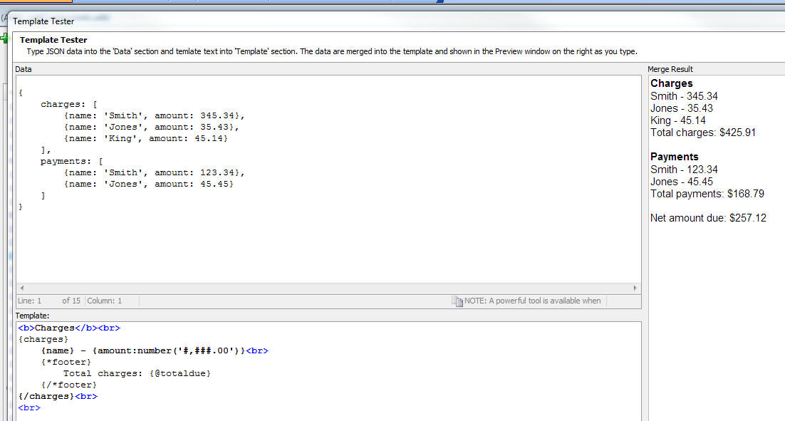
You can also click the 'Load Example' button to open a menu showing several
different examples that illustrate different concepts.
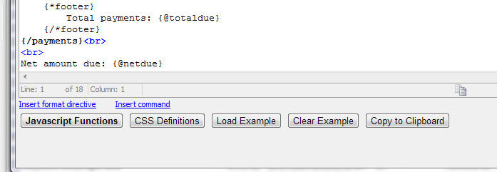
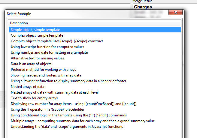
Whenever you open the Template Tester, the text that you had last entered is
automatically restored.
The A5.u.template.expand() Javascript Function - Templates are
expanded using the A5.u.template.expand() Javascript function, which is part of
the Alpha Anywhere Javascript library.
The syntax is
var html = A5.u.template.expand(data,settings);
Where data is a the data array or object to be merged into the
template and settings defines the template (and any partial templates).
For example:
var data = {firstname: 'Fred', lastname: 'Smith'};
var template = 'Hello {firstname} {lastname}';
var settings = {
template: template,
partials: ''
}
var html = A5.u.template.expand(data,settings)
NOTE: For an example that uses partials, see 'Partial Templates
- {*partial partialName}' above.
A5.u.template.parse() Function - If a template is used multiple times
in a component, you can pre-parse the template so that when the template needs
to be expanded you can use the pre-parsed template for improved performance.
For example, take the following Javascript:
var data = {firstname: 'Fred', lastname: 'Smith'};
var template = 'Hello {firstname} {lastname}';
var settings = {
template: template,
partials: ''
}
var html = A5.u.template.expand(data,settings)
The could be re-factored as follows:
var data = {firstname: 'Fred', lastname: 'Smith'};
var template = 'Hello {firstname} {lastname}';
var parsedTemplate = A5.u.template.parse(template);
var settings = {
template: parsedTemplate,
partials: ''
}
var html = A5.u.template.expand(data,settings)
Action Javascript - Templates - Merge data into client-side template'
Action - This action allows you to define a data and a template, merge the
data into the template and then set the innerHTML of a div, placeholder control,
or Panel with the resulting HTML.
Watch Video
Download Component
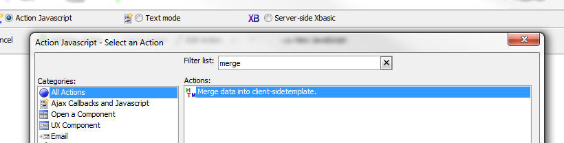
When you open the builder, the genie shows this screen:
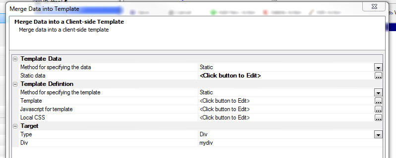
You can either specify static data to merge into the template, or you can
specify the name of a Javascript function that will return the data to merge
into the template.
Similarly, you can specify a static template, or the name of a Javascript
function that will dynamically create the template.
Using Client-side Templates on the Server-side -
a5_merge_JSON_into_template() Function - Because Alpha Anywhere has
the ability to execute Javascript from an Xbasic script, you can actually use
client-side templates in Xbasic using the a5_merge_JSON_into_template()
function.
The syntax for the function is:
c Result = a5_merge_JSON_into_template(C jsonData
,C template [,C javascriptFunctions [,C partialTemplatesJSON
[,C localCSS ]]])
For example:
dim data as c
data = <<%txt%
{firstname: 'Fred', lastname: 'Jones'}
%txt%
template = <<%html%
Name: {firstname} {lastname}
%html%
htmlOut = a5_merge_JSON_into_template(data,template)
showvar(htmlOut)
{grid.object}.getRowsInGrid() Method - Returns
the number of rows in the current page of the grid. This
is not the same as the number of rows in the Grid query.
Previously, users were using the internal
._rowsInGrid
property to get the number of rows in the current
page, but this value includes rows that have been
deleted.
For example, say that the Grid is set to show 10 rows
per page and that the refresh method is set to 'Auto'
and that a minimal refresh is done after update, insert
and delete operations.
If the user deletes a row from the Grid, the
._rowsInGrid
property will still be 10, because the deleted
row is not really deleted from the current page - it is
just hidden and marked as deleted.
On the other hand, the
{grid.object}.getRowsInGrid()
method will return 9.
{grid.object}.getSelectedRow() Method - Returns
the selected row number, or null if no row is selected.
Previously, users were using the internal
._selectedRow
property to get the row number of the currently selected
row. However, under some circumstances this property can
return a confusing (but technically correct) value.
For example, if the refresh method on the Grid is set to
'Auto' and a minimal refresh is done after an update,
insert or delete operation and the user deletes a row,
the ._selectedRow
property will return the row number of the row that was
just deleted (which is actually correct internally,
because the row that was deleted has simply been hidden
in the page and it is still marked as selected).
On the other hand. the
{grid.object}.getSelectedRow()
method will return
null,
indicating that no row is currently selected.
UX Component - List Control - List Preview - Modeless
- The List Builder has a 'Preview' button to do a quick
preview of the List control while you are in the List
builder. The Preview window is now modeless - which
means you can keep it open while you are working in the
List builder (and perhaps move it to a second screen if
your computer has two monitors). This makes it very
convenient to preview the List after every change you
make.
Watch Video
UX Component - List Virtualization - Normally,
when a List control is populated, the HTML for all of
the rows in the List is rendered. If the list only has a
few rows (say 200 rows), then there is no noticeable
delay while the List is populated.
However, if the List has a lot of rows (say several
thousand rows), then there will be a noticeable delay
while the List is populated and also, a large amount of
memory will be consumed by the List. On a mobile device
where memory is more limited, the amount of memory
consumed by the List could be a problem.
List virtualization allows you to only create HTML
elements for a portion of the List - the portion that is
currently visible and some additional rows above and
below the currently visible portion. The number of rows
that are rendered in the List is called the 'page' size.
When the user is scrolling the List and they hit a page
boundary, the user can tap on a Next or Previous button
(or optionally use a pull/release gesture) to populate
the List with the next or previous page of data. It is
important to recognize that tapping the Next or Previous
button does not trigger an Ajax callback. It is
simply rendering the next or previous page of data using
the data that has already been loaded into the List and
is in memory. Therefore, the time take to populate the
next or previous page is practically instantaneous.
The advantage of virtualizing the List is that you can
dramatically reduce the time taken to load large Lists
and you can reduce the memory footprint of the List.
To turn on List Virtualization, set the Virtualization
type property shown below to 'Dynamic'.
Watch Video
Download component
Once you do this, several additional properties will be
shown
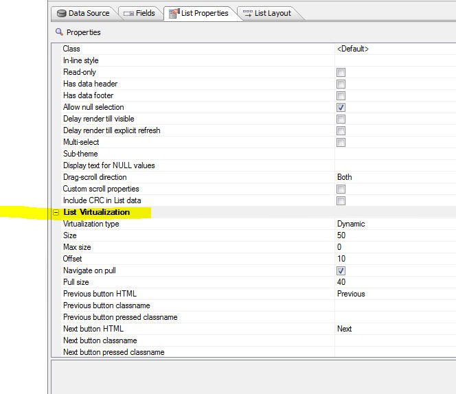
Virtualization type - Set to 'None' to turn
virtualization off. Set to 'Dynamic' to turn
virtualization on.
Size - The size property defines the 'page' size
- the number of rows of data that should be rendered.
This should typically be a multiple of the number of
rows in the viewport. For example, say that your List
can display 20 rows of data at a time, you might set the
size to (say) 100 so that the user can scroll a fair
amount before hitting the page boundary.
When you reach a page boundary (either on top or bottom
of the page), there are 'Next' and 'Previous' buttons to
get the next logical 'page' of data. The user can either
tap on the Next/Previous button, or use a pull/release
action to fetch the next page of data.
Max size - This is an advanced optional setting
that can be used to specify a type of 'hybrid'
virtualization. By default, this property is set to 0,
which means that the number of rows that the List
renders is always equal to the 'page' size. When you hit
a page boundary, the current page is memory is replaced
by the next page that is loaded.
However, if you set the Max size to -1 (which indicates
that the max size is equal to the number of rows in the
List), or some positive number that is greater than the
size property, then when you are navigating
forward and you hit a page boundary, the next page of
data is automatically rendered (without requiring the
user to tap the Next button). The number of rows in
memory continues to grow as the user scrolls down in the
List. In other words, the memory consumed by the List is
initially very small (as only a single page of data are
rendered) and the time taken to render the List is
optimized (again, because only a single page of data are
rendered), but as the user scrolls, the number of
rendered rows in the List continue to grow and more
memory is consumed. When the 'max size' is reached, then
the user will then have to use the 'Next' button to
continue to viewing additional records.
Offset - When you hit a page boundary, and click
the Next/Previous button, the 'offset' indicates the
number of rows from the page that is being discarded
that should be included in the new view. If this number
is less than the number of rows in the viewport, the
List will appear to 'jump' when you navigate to a new
page. It is recommended that this value be set to a
minimum of the number or records that can be seen in the
viewport at one time so that when the user taps the
Next/Previous button, the scroll position of the List
does not change. It is recommended that this number be
no more than half of the 'page size'. The larger the
number, the more rows the user can scroll backwards
before hitting the Next/Previous buttons.
Navigate on pull - Allows the user to
pull/release to navigate (in addition to tapping on the
Next/Previous buttons).
Pull size - Number of pixels before the
'pull/release' gesture is recognized as a 'navigate'
action.
UX Component - List Control - onBeforePopulate and
onPopulate Client-side events - Two new client-side
events have been added to the List control.
onBeforePopulate - fires before the List is
populated. Allows you to transform the data that will be
used to populate the List. The event handler gets passed
in 'data' - an array with all of the data for the List.
onPopulate - fires after the List has been
populated.
UX Component - List Control - Transform Data Type
- Unless the List data source is a Javascript function
(in which case you have complete control over the data
types for each field in the List), all data in the List
are string values.
Watch Video
Download component
The 'Transform data type' property allows you to
transform the data type of the data in a List column to
a Date, Numeric, or Logical data type.
To transform the data type, set the option in the
'Transform data type' property on the Fields pane in the
List builder (as shown below).
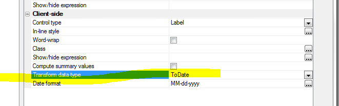
The benefit of transforming dates into true date objects
and numbers into true number objects is that you can
then use the template formatting options to format date
or numeric values.
For example, the template for a date field might be
specfied as:
{DateOfBirth:date('MM-dd-yyyy')}
or a numeric field, the template might be specified as:
{Price:number('$# ###.00')}
NOTE: It is not strictly necessary to transform a
string to a number in order to use the number format
directive in the template. The sample template shown
above ( {Price:number('$# ###.00')} would actually also
work on a string value that contained a valid number.
Property Grids - Font Size - Property Grids are
ubiquitous in the Alpha Anywhere builders. You can now
change the default font size by selecting the View,
Settings... menu item. Select the 'System Font's pane
and then the 'Property Grid' category.
The image below shows a Property Grid with a 12 point
font size:
word_i() function - A case-insensitive version of
the word() function
Example
?word_i("alpha software corp",2,"SOFTWARE")
= "corp"
Web Applications - Session Object - .SaveSessionFileToFile() - A new
method on the session object allows you to save a file that as previously stored
as a session file to a permanent location.
The syntax is
session.saveSessionFileToFile(c Key, C
DestinationFile)
Note: The session file might have been created in the first place using
either of these methods:
session.saveFileToSessionFile( c fileName, c key)
session.saveDataAsFile( b data, c key)
Storage - Storage is an Alpha Anywhere abstraction for dealing with
different types of storage using a standard interface. Currently, 3 type of
storage are supported - Amazon S3, Azure and Disk storage.
Storage is used for storing files.
To work with Storage you will need a storage connection string to 'connect'
to the storage object.
Named connection strings are typically used (in much the same way that named
AlphaDAO connection strings are used when you connect to a SQL database).
To create a named storage connection string, select the Tools, Storage
Connection strings menu item from the Tools menu when the Web Control Panel has
focus.
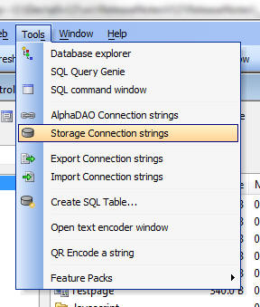
This will open a dialog where you can create as many named storage connection
strings as you want.
When you create or edit a named storage connection string, the Connection
String dialog is shown:
Named storage connection strings are published in the a5_application.a5i file
when you publish your application.
Summary of Helper Functions for Working with Storage - Several Xbasic
helper functions make it easy to work with the storage. These helper functions
are written on top of the low level storage objects that are documented
here.
The helper functions are:
-
a5Storage_saveFile() - saves a file in storage
-
a5Storage_saveData() - saves binary data in storage
-
a5Storage_getItemProperties() - gets information about a file in storage
-
a5Storage_getItem_as_blob() - retrieves an item from storage to a variable
-
a5Storage_getItem_as_file() - retrieves an item from storage and stores it
as a local file
-
a5Storage_listItems() - create a CRLF delimited list of items in storage
-
a5Storage_deleteItem() - deletes an item from storage.
Examples for each of these functions is shown below.
a5Storage_saveFile() - Saves a file to storage
Syntax:
L a5Storage_saveFile(C connectionString ,C filename ,C
itemName [,C mimeType [,* pResult ]] )
Where:
connectionString - Storage connection string with
::storage:: as a prefix.
filename - name of the local file to save in storage.
itemName - name of the object in storage. You can can specify a
logical folder by using forward slashes in the name. For example:
image/image1.jpg
mimeType - the mime type of the object. If you don't specify this
property, the value can be inferred from the extension you assign to the
itemName property.
pResult - an optional dot variable that you can pass in that will be
populated with information about the object.
Example:
dim pr as p
flag = a5Storage_saveFile("::storage::Amazon_East","c:\images\4290.jpg","movies/4290.jpg","",pr)
?flag
= .T.
If you examine the pr dot variable that was passed into the function you will
see the following properties:
hasError = .f.
timeTakenMilliseconds = 239
AbsolutePath = "https://<bucketName>.s3.amazonaws.com/movies/4290.jpg"
ContentType = "image/jpeg"
ModifiedTime = CTODT('03/15/2014 01:53:13 00 pm')
Name = "movies/4290.jpg"
size = 5880
The AbsolutePath property gives you a URL to the object. Note that in
order for this URL to work you need to make sure that you have set the
appropriate permissions on the storage container ('bucket' in S3 terminology).
a5Storage_saveData() - Saves data to storage
Syntax:
L a5Storage_saveData(C connectionString ,b blob ,C itemName
[,C mimeType [,* pResult ]])
Same as a5Storage_saveFile(), except takes a blob as input rather than a
filename.
A5Storage_getItemProperties() - Gets properties of an item in storage
Syntax:
P itemProperties = a5Storage_getItemProperties(C connectionString
, C itemName)
Where:
connectionString - Storage connection string with
::storage:: as a prefix.
pResult - an optional dot variable that you can pass in that will be
populated with information about the object.
Returns a dot variable with these properties
-
itemFound - .t. or .f.
-
hasError - .t. or .f.
-
AbsolutePath - the URL to the item
-
ContentType - the content type of the item
-
ModifiedTime - time item was last modified
-
Name - name of the item
-
size - item size
-
item = a dot variable with a pointer to the item object. This object exposes
various methods and properties of the item.
a5Storage_getItem_as_blob() - Retries data from an item in storage and put
the data in a blob variable
Syntax:
b blob = a5Storage_getItem_as_blob(C connectionString ,C
itemName [,* pResult ])
Where:
connectionString - Storage connection string with
::storage:: as a prefix.
pResult - an optional dot variable that you can pass in that will be
populated with information about the object.
Example:
dim p3 as p
b3 = a5Storage_getItem_as_blob("::storage::Amazon_East","movies/4290.jpg",p3)
?b3.size()
?p3
'= contentType = "image/jpeg"
timeTakenMilliseconds = 297
a5Storage_getItem_as_file() - Retries data from an item in storage and
create a local file
Syntax
L flag = a5Storage_getItem_as_file(C connectionString ,C
itemName, C filename [,* pResult ])
Where:
connectionString - Storage connection string with
::storage:: as a prefix.
pResult - an optional dot variable that you can pass in that will be
populated with information about the object.
a5Storage_listItems() - Lists items in storage
Syntax:
c List = a5Storage_listItems(C connectionString [, C
searchPrefix [,* pResult ]])
Where:
connectionString - Storage connection string with
::storage:: as a prefix.
pResult - an optional dot variable that you can pass in that will be
populated with information about the object.
a5Storage_deleteItem() - Delete an item from storage
Syntax:
L flag = a5Storage_deleteItem(C connectionString, C itemName
[,* pResult ])
Where:
connectionString - Storage connection string with
::storage:: as a prefix.
itemName - name of item to delete
pResult - an optional dot variable that you can pass in that will be
populated with information about the object.
Note: The flag value returned by this function is .f. if
the connection failed, but is .t. if the item was not found in storage.
Web Applications - .A5W Pages - Debugging - You
can now debug live running .A5w pages from within the
HTML editor. The editor now has a new 'Live Preview'
tab.
Simply insert a debug(1) statement in your Xbasic code
and then switch to the 'Live Preview' tab pane.
UX Component - Pop-up Javascript Windows - Customize
Title Direction - A new property has been added to
set the default title direction for pop-up Javascript
windows. By default, the direction is 'ltr' (left to
right), but the direction can now also be set to 'rtl'
(right to left - title on right and close button on
left).
Grid Component and UX Component - Image and File Upload - Show Progress
and Allow Cancel - The image and file upload features in the UX and Grid
components have been enhanced.
The image below shows the File Upload window showing progress as a large file
is uploaded.
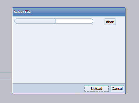
You can now:
-
Display progress while a file is uploading
-
Allow a user to abort the upload after the upload has started
-
Check the maximum allowed upload size before the upload is started.
(Previously the file was uploaded and then if the uploaded file exceeded the
maximum allowed size an error was returned to the user).
-
Check the allowed file types before the upload is started. (Previously the
file was uploaded and then if the uploaded file was not of the correct type,
an error was returned to the user).
In order to enable this new functionality, edit your Image Upload, File Upload
or File Upload - User Defined actions (defined using Action Javascript) and set
the properties shown below.
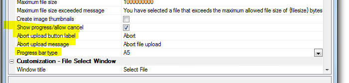
In the case of the 'File Upload - User Defined' when the 'Allow multiple
files' option is selected, the size check that takes place before the upload
begins is the combined size of all selected files. You can set the maximum
combined size property in the builder. The 'Maximum file size' property which
applies to individual files will also be enforced after all of the files have
been uploaded.
The Action Javascript builders allows you to specify the style for the
progress bar. The 'A5' style blends in nicely with the component style, but for
older styles, such as GrBlue, GrOlive, etc. the 'A5' style might be too subtle
for your taste and you might prefer to use the 'Basic' style, wich uses a
standard HTML progress element.
The image below shows how the slider is rendered using the 'A5' option (first
slider - using the iOS style) and the 'Basic' option (second slider).
Grid and UX Component - HTML Editor - File and Image Upload - The File
and Image upload features in the HTML editor have been enhanced.
You can now:
-
Display progress while a file is uploading
-
Allow a user to abort the upload after the upload has started
-
Check the maximum allowed upload size before the upload is started.
(Previously there was no way to specify a maximum file size).
-
Check the allowed file types before the upload is started. (Previously there
was no way to specify allowed file types).
UX Componet - Slider Control - Displaying Progress
- A new property on the slider control has been exposed
that allows you to turn off the slider handle. This is
useful for displaying 'progress'. In the image below the
first Slider has its handle turned off.
When you want to use the slider to show progress, you
should also disable it so that the user cannot change
the value by clicking on the slider. For example, enter
'1=2' as the client-side Enable expression for the
slider.
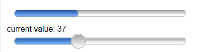
UX Component - Tab Control - Genie Style - Genie
Button Position - When defining 'Genie Style' tab
controls (shows buttons to advance through the tabs),
you can now specify the button position (Above or Below
the Tab Panes). Previously, the buttons were always
shown below the Tab Panes.
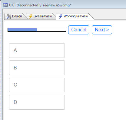
Xdialog - Edit Combo - Case-Insensitive - The
edit combo in Xdialog is case-insensitive by default.
You can now force it to be case sensitive using the new
%CS% flag.
For example
dim selected as c = ""
dim colors as c
colors = a5.color_enum()
ui_dlg_box("Select Color",<<%dlg%
Color combo: [%CS%.50selected^+colors];
Color edit-combo: [%CS%.50selected^=colors];
%dlg%)
UX Component - Abstract Events - downHold Information
- Click, Tab, Swipe, Etc. events now have additional
information in the event's 'abstractData' object that
tells you if a 'downHold' event occurred. The motivation
for this additional information is to allow you to add
code to Click, Tap and other abstract events to prevent
them from executing their standard code when a downHold
abstract event fires.
For example, if you examine the 'e' object that is
available inside the event handler for a click abstract
event, you will see the following information (screen
shot taken from Visual Studio Javascript debugger). As
the screen shows, the e.abstractData object has a
property called 'downHold'. In this case the property is
true, indicating that the click event has fired as a
consequence of the downHold event firing.
You might then write your click event handler as follows
var flagRunCode = true;
if(typeof e.abstractData != 'undefined') {
if(e.abstractData.downHold)
flagRunCode = false;
}
if(flagRunCode) {
//code you want to run in a pure
click event
}
Code Editors - Search and Search and Replace - Regular
Expressions - The Search and Search and Replace dialogs
now support the ability to use regular expression. In
addition, the history feature that shows previous search
and replace values is now case-sensitive.
UX Component - Internationalization - List Controls -
The UX component Internationalization genie (described
later in this document), now allows you to add language
and text dictionary tags to column headings for List
controls.
Xbasic - Dot Variables - .data() Method - The
.data() method can be used to read the value of a
property in a dot variable. However, the .data() method
trims trailing spaces. Now you can use an option to
preserve trailing spaces by adding the '.raw' suffix to
the property name.
delete p
dim p as p
p.name = " "
?"a" + p.name + "b"
= "a b"
?"a" + p.data("name") + "b"
= "ab"
?"a" + p.data("name.raw") + "b"
= "a b"
UX Component - List Control - Client-side Numeric
Formats - You can now specify format directives in
the template for the List control. For example, the
image below the template for the 'longitude' column in
the List.
Watch Video
Notice that the placeholder in the template shows:
{longitude:number('#.0'}
The numeric format is specified in the placeholder,
separated from the field name by a colon.
The builder has a link labeled 'Insert format directive'
that will open a genie to help you define formatting
directives.
NOTE: In the screenshot shown below the List is a
columnar List. Client-side format directives can also be
inserted into the template for Freeform Layout Lists.
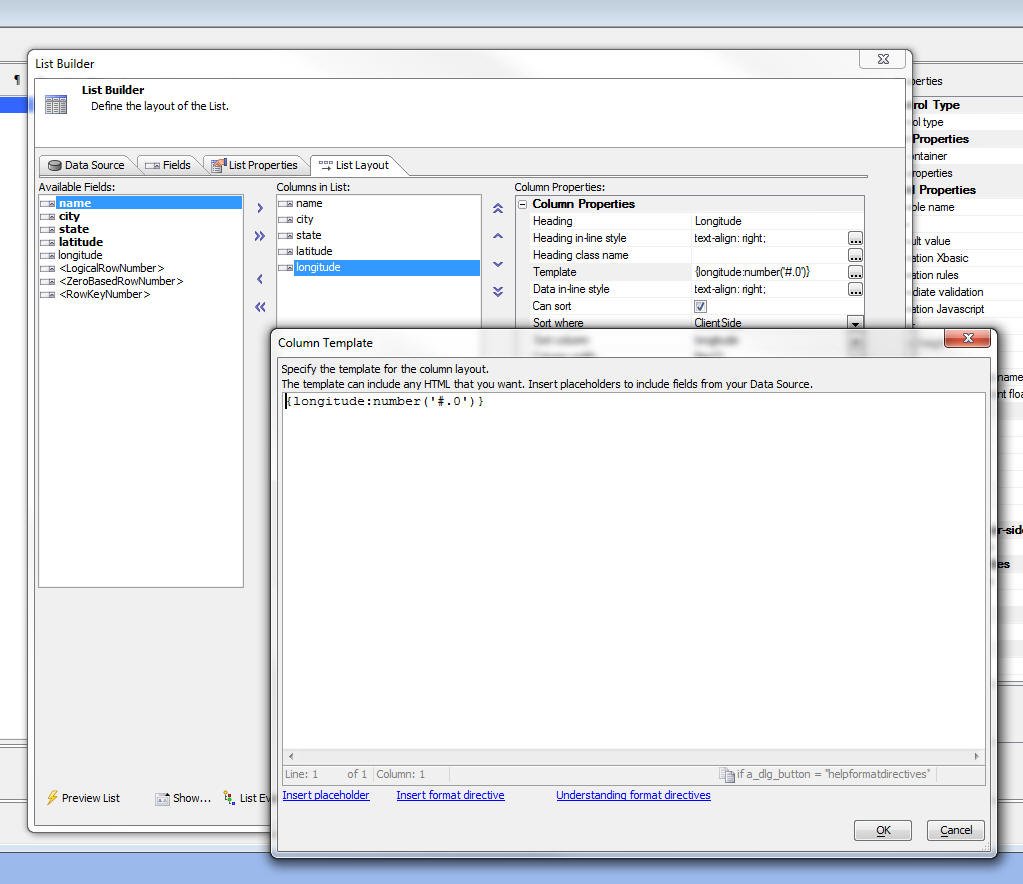
See 'UX and Grid Component - Client-side Calculated Fields
- Builder' below for more information.
Xbasic - Image Metrics Class - The new Image
Metrics class gets both the pixel size and the logical
size of an image.
The logical size is expressed in twips, and reflects the
DPI stored with the image.
Example usage:
dim isize as Helper::ImageMetrics
isize.LoadImage("jpg",file.to_blob("C:\imgage.jpg"))
? isize
..
pixel_height = 1200
pixel_width = 1920
twip_height = 18000
twip_width = 28800
? *unit_convert(isize.twip_width,"tw","in")
= 20
? *unit_convert(isize.twip_height,"tw","in")
= 12.5
UX and Grid Component - Action Javascript - Open Grid
- The Action Javascript to "Open a grid component"
now has an option to set Autorefresh on focus if the
target is a TabbedUI Pane. When checked, the content in
the tab pane will be refreshed automatically every time
the pane gets focus.
UX and Grid Component - Masks - User Defined Formats
- When you define a mask for an input control in either
the UX or Grid you can select from a list of built-in
masks, or you can define your own mask. Now, you can add
your own entries to the list of built-in masks by
creating a special text file in the executable folder.
The text file must be called:
UserDefinedMasks.txt
The text in the file must be of this form:
{data=(000) 000-0000}US Phone number
{data=000-00-0000}Social Security Number
{data=00000}Zip code - 5 digit
{data=00000-0000}Zip code - 9 digit
{data=L0L 0L0}Postal Code - Canada
UX and Grid Builder - Live Preview - Caching -
Previously if you made a change to CSS or linked
Javascript files after previously having done a Live
Preview in the builder, the changes were not always
reflected because Internet Explorer was loading assets
from its cache. Now, the builder is more aggressive
about not caching assets during Live Preview.
UX Component - Internationalization - In order to
design a UX component that adapts automatically to
different languages, you typically wrap all labels in
either language tags (e.g. <a5:r> ... </a5:r>) or Text
Dictionary tags (<a5:t>..</a5:t>). Adding these tags to
all of the text elements (such as labels, bubble help,
frame labels, etc) in a large component can be quite
tedious.
A new Internationalization Utility makes it easy to
retrofit an existing UX component with language or text
dictionary tags.
Watch Video
To access the utility, click the Menu button, shown
below.
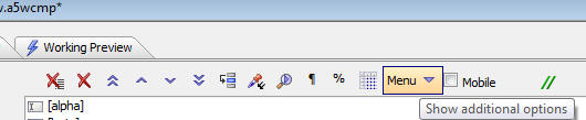
Then, select the Internationalization Helper
Utilities... menu option.
This will open a dialog that allows you to select
different options. Each option generates some Xbasic
code that will set properties on your UX component.
TabbedUI - onTabbedUIInitialize Server-side Event
- The TabbedUI Component now has a new server-side event
that fires when the TabbedUI component is initialized.
TIP: You can use this event to simulate session
variables when you are in Working Preview. For example:
if eval_valid("request.SERVER_PROTOCOL") then
if request.SERVER_PROTOCOL = "A5RES" then
session.var1 = "simulated value for var1"
end if
end if
UX Component - Get Online Status -
{dialog.object}._getOnlineStatus() Method -
The
{dialog.object}._getOnlineStatus() method returns
true if the device has an internet connection and false
if there is no connection.
NOTE: The onConnectionChange
client-side event fires when the connection state
changes.
NOTE: For testing how your application will
behave when there is no connection, you can set your
component to simulate a disconnected state by calling
the {dialog.object}._setSimulatedOnlineStatus() method.
UX Component - Set {dialog.object}SimulatedOnlineStatus()
Method - Allows you to force the return value from
the {dialog.object}._getOnlineStatus() method to be true
or false, regardless of the true state of the
connection. This is useful for testing purposes when you
want to test how your component behaves when it is
disconnected, even though you currently have a
connection.
The syntax is
{dialog.Object}._setSimulatedOnlineStatus(mode);
Where the mode flag is
-
on - force the _getOnlineStatus() method to return true
-
off - force the _getOnlineStatus() method to return true
-
(blank value) -
allow the _getOnlineStatus() method to return the true online
status of the device.
UX Component - Client-side Events -
onAjaxCallbackNotAvailable Event - A new client-side
event has been defined. The onAjaxCallbackNotAvailable
event fires if the user tries to execute some Javascript
that does an Ajax callback and the device is not
currently connected to the internet.
UX Component - Client-side Events -
onConnectionChange
Event - The onConnectionChange event fires
whenever the device's connection status changes. For
example if the device was online and the connection was
lost, the event will fire, and vice versa.
NOTE: If you set the simulated connection status
using the {dialog.object}._setSimulatedOnlineStatus()
method, the event will also fire (assuming that the _setSimulatedOnlineStatus()
method changed the simulated online status.
UX Component - Ajax Callback Action - Offline
Javascript - A new property can be set when defining
an Ajax Callback. The 'Offline Javascript' property
allows you to define Javascript to be called when the
device is not connected. This differs from the 'Ajax
failed Javascript' property in that if the device is not
connected, the Ajax callback is not even attempted, and
the Javascript specified in the 'Offline Javascript'
property is executed immediately.
On the other hand, the 'Ajax failed Javascript' is only
fired after the timeout period if a response is not
obtained from an Ajax callback.
NOTE: You can also use the new client-side
onAjaxCallbackNotAvailable event to specify Javascript
to execute when a user tries to make an Ajax callback
and there is no connection.
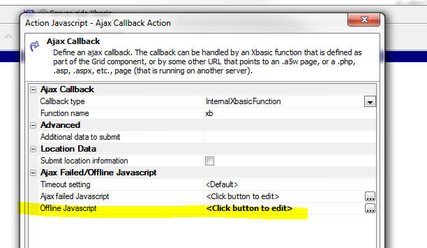
UX Component - List Control - Filter Records - Range
Searches - Using Action Javascript, you can
create actions that filter the records shown in a List
control. Now, you can easily make 'range' searches
(similar to the Search Part in a Grid).
Watch Video
To define a 'range' search, select the control that has
the 'range start' value first. Then, check the 'Range
search' checkbox. A new prompt will be shown where you
can specify the name of the control that has the 'range
end' value.
Range searches can also be defined for actions that
search embedded grids on a UX, retrieve primary keys for
a data bound UK and print embedded reports.
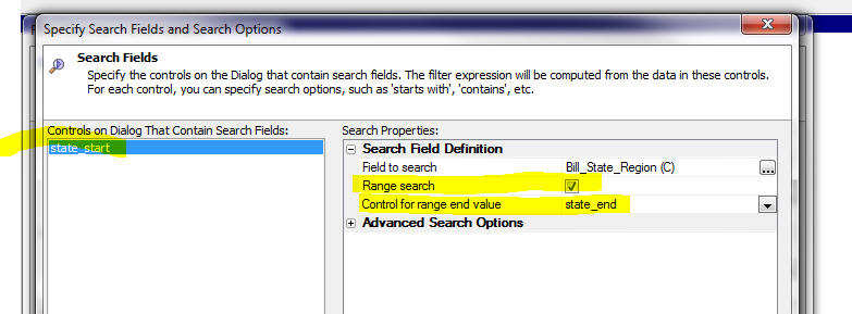
UX Component - Absolute Layout Containers - Save as
PDF - You can now create a button using Action
Javascript to save the contents of the container to a
PDF file.
Watch Video
To create a button to save an Absolute Layout container
as a PDF, use the 'Absolute Layout Container - Create
PDF' action in Action Javascript.
After the PDF is created you have the option of either:
- downloading the PDF to the client
- calling an Xbasic function to process the PDF file in any way
that you want (for example, sending the file via e-mail)
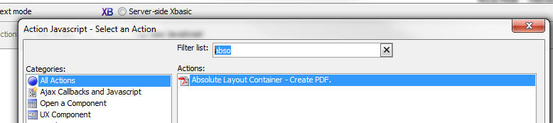
UX Component - Control Containers - Class Name and
Prevent Float - When a UX component is rendered,
every control in the component is wrapped in a DIV
control that has a class of 'A5CWLayout'.
NOTE: If you have set the UX 'Layout type'
property to be 'ControlWidth', then the class is
A5container.
The A5CWLayout (or A5container) class has two important
functions:
- It adds a 'float' to the element which causes the controls on
the UX to automatically lay themselves out from left to right across
the page until either their is no more room on the current 'line' or
until a control with a 'break' property is encountered.
- It adds padding around each control so that when they are laid
on the page automatically, there is a gap between each control. The
UX builder exposes a property that allows you to define the amount
of padding. By default, 4px on all sides of the control is used.
Under some circumstances a developer might want more
control over the styling of the container (a DIV) that
is used to enclose each control. Two new properties have
been added for most of the controls in a UX:
The 'Control container class name' property allows you
to specify the CSS class name that will be used in the
container DIV in addition to the standard 'A5CWLayout'
(or 'A5container') class.
The 'Control container prevent float' property allows
you to specify if the container DIV will use the
'A5CWLayout' (or 'A5Container') class at all.
With these two new properties you have complete control
over the styling of all controls on the UX.
NOTE: For controls that are in a 'NoFloat'
container, the 'Control container prevent float'
property is implicitly true.
UX Component - Panels - .Refresh() Method - Panel
Cards and Panel Navigators now have a .refresh() method.
This means that if you change the contents in the header
or footer of the Panel (which might change the height of
a header or footer, for example), you can now call the
.refresh() method to layout out the Panel again, showing
the new footer or height.
For example:
var pObj = {dialog.object}.panelGet('PANELCARD_1');
//some code to change the HTML shown in the Panel header
or footer
pObj.refresh();
Xbasic - CURL - Built-in Support For CURL - CURL
is a popular library for calling URLs. A genie is
available to convert a CURL command that you might read
in some API documentation into Xbasic. To open the CURL
command to Xbasic genie, right click on whitespace in
the Xbasic code editor or Interactive window. The select
the CURL command to Xbasic command.
The genie open up and you can paste in a CURL command,
then click the Generate Xbasic button.
The generated Xbasic instantiates the Curl object in the
extension namespace.
NOTE: When using the HTTPS protocol, you must
have a certificate. In the sample shown below the
certificate in the CARoot folder in the Alpha Anywhere
executable folder is used.
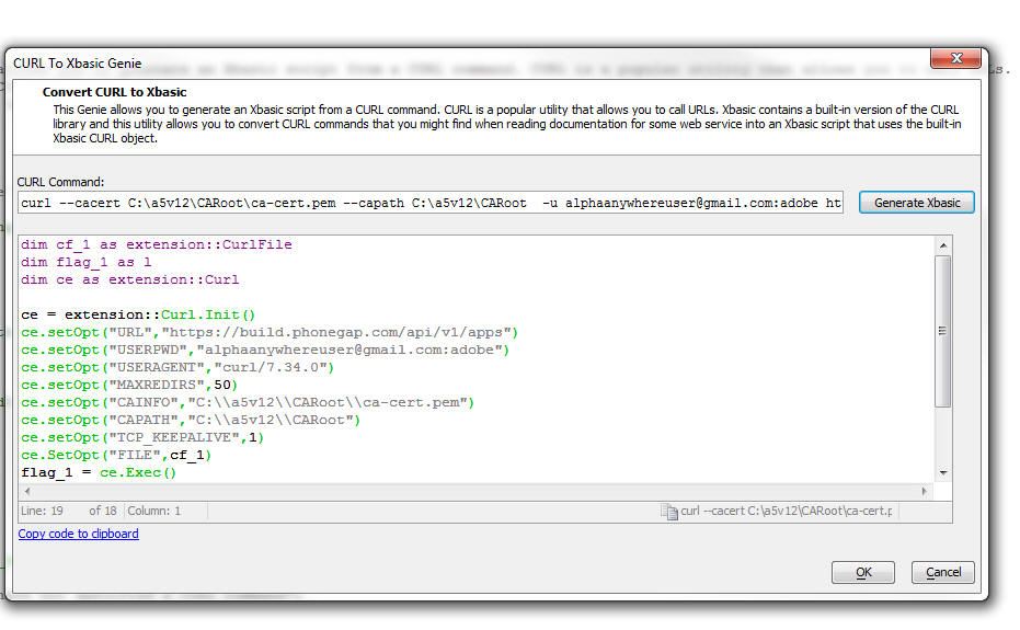
Grid Component - SQL - Search Part - Grids Based on
GROUP BY Statements - If you have defined a Grid
that is based on a SQL statement that has a GROUP BY
clause, interpreting what the user intends when they do
a search using the the Grid's Search Part can be tricky.
For example, does the user intend the submitted search
criteria to be used in a WHERE clause, or a HAVING
clause?
Previously, if the Grid based based on a GROUP BY
statement, the SQL generated by the Search Part was
added to the HAVING clause.
Now, a more flexible approach is implemented.
When you define the Search Part in a Grid, for each
field you add to the Search Part, you can define the
Search Expression. The Search Expression is used in the
generated SQL when the user searches on this field. If
the search expression uses a summary operator (for
example Sum(AmountDue) ), then a search on this field
will go into the HAVING clause. On the other hand, if
the Search Expression does not use a summary operator
(for example, AmountDue), then a search on this field
will go into the WHERE clause.
As a result of this change, you can define a Search Part
in the Grid that will generate SQL statements that have
both WHERE and HAVING clauses.
Grid and UX Component - Image and File Upload -
Window Position - You can now set an explicit
position for the file select window in these actions:
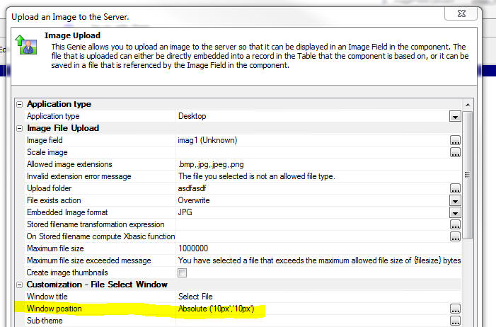
Reports - HTML Content - Base64 Encoded Embedded
Images - If you have HTML content in a report and
the HTML content has base64 encoded embedded images, the
images will now render correctly in the printed report.
UX Component - List Control - Action Javascript -
List Control Actions - Client-Side Order Expression
- The genie now allows you to perform multi column
sorts.
Set the 'Client-side sort mode' to Advanced and then use
the smart field to define the sort definition.
You can define ascending or descending sorts and you can
specify whether you want to sort on the whole field, or
a subset (for example, just the first character of the
field).
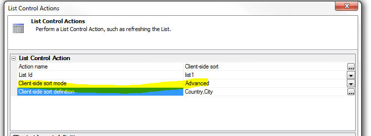
This gene generates Javascript that uses the .setOrder()
method of the List. For example, here is how a mult-level
(Customer, Country) sort would be defined:
var listObj = {dialog.object}.getControl('LIST1');
var sortObj = {'Country' : 1 , 'City' : 1};
listObj.setOrder(sortObj);
UX Component - List Control - Group Breaks -
Client-Side - The List control has always had a
Group Break option, but this option is a server-side
group break. This means that the data that is sent from
the server to the browser has the group breaks
physically embedded into the List data.
Now, you can define client-side group breaks. These
group breaks are inserted into the List on the
client-side (after the List has been populated).
Client-side group breaks offer several advantages over
server-side group breaks. Namely:
- You can define multiple levels of group breaks. Server-side
group breaks only allow for one level of grouping.
- You can dynamically change the grouping on the List at any time
using Javascript. (There is an action in Action Javascript to help
you do this).
- You can apply group breaks regardless of the data source for the
List.
- You can display Group Headers and Group Footers (server-side
grouping only shows a header).
- You have complete control over the HTML that is displayed in the
header and footer.
- You can include any summary data that you want in the header and
footer (for example, average value of some column in the group).
NOTE: One advantage of server-side group breaks over
client-side group breaks is when the List data source is based on a SQL
query and you have turned on the List pagination option. In this case,
summary data shown in a List header will be for all of the data in that
group, not just the records that are currently visible in the List.
In the image below, the List has two levels of grouping: Country and
City. Notice that a custom style has been defined for the second level
group headers (showing the city name in blue, with a left padding of
50px).
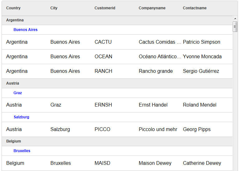
Here is the same List, but this time showing some
summary data in the top level group header:
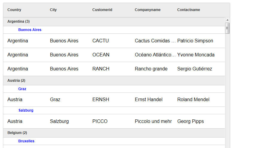
To turn on client-side grouping for a List, check the
'Has client-side group breaks' property for the List as
shown in the image below:
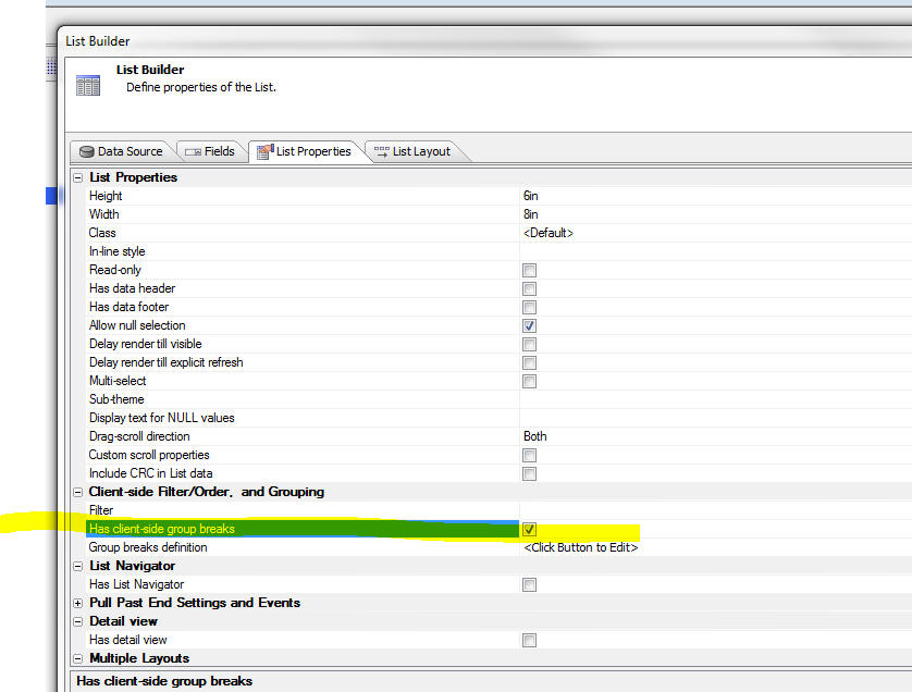
You can then click the smart field to open the
'Client-side Grouping' genie.
The genie allows you to define multiple levels of
grouping.
For each group you define:
- Sort expression - the columns in the List on which the data is
to be sorted. You can specify multi-level sorts, ascending or
descending, and the number of characters in the field on which you
want to sort.
- Group break expression - a Javascript expression that can
reference fields from the current row in the List. If the value in
this expression changes, a new group is started.
- Header - a Javascript expression that returns the HTML to
display in the group header. This expression has reference to these
fields: group and
data.
group is the value
of the group break expression, and
data is an array
containing the rows that are shown in this group. Having access to
the array of data in the group means you can compute any type of
summary value to show in the header or footer.
- Footer - a Javascript expression that returns the HTML to
display in the group footer.
- Include group in navigator - Specified if data from this group
are included in the Navigator (see below). For the top level group,
this option must always be checked.
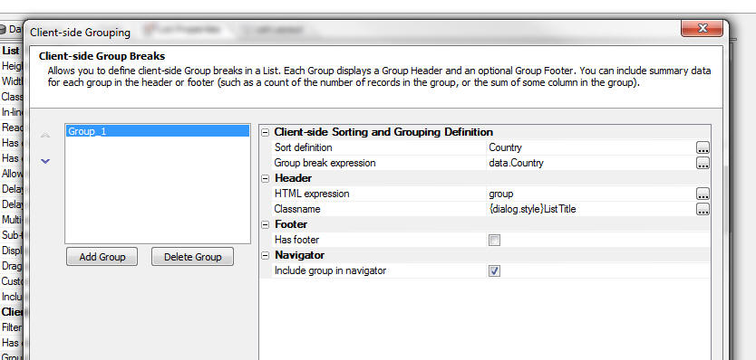
When you define the HTML for the header or footer, you
can click the smart field button to open a genie. This
genie has an option that makes it easy to include
summary data in the header or footer. For example, in
the image below, which shows the editor for the header
HTML expression, the user has clicked on the 'Insert
summary field' hyperlink, and the Summary Field Genie is
displayed.
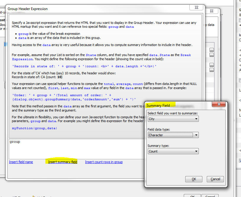
When you use the Summary Field genie, the generated
Javascript that is inserted into the expression calls a
special helper method of the List object. For example,
here is the code to compute the average of the Price
column:
this.groupSummary(data,'Price:N','avg')
Note: The .groupSummary() method ignores NULL
values in the data.
In the example below, the average is computed and then
formatted using a format string
Number(this.groupSummary(data,'Price:N','avg')).toFormat('#
##0,00')
UX Component - List Navigator - When you have a
lot of records in a List, scrolling the List to the
bring a section of the List into view can be tedious -
especially on mobile devices where there is no vertical
scroll bar. The List Navigator makes it easy to scroll a
List that has group breaks. In the image below a List is
shown with group breaks on the first character of the
Contactname field. A List Navigator is shown on the
right side of the List.
NOTE: You can only display a Navigator if the
List has group breaks. It does not matter,
however, if the group breaks are computed server-side or
client-side.
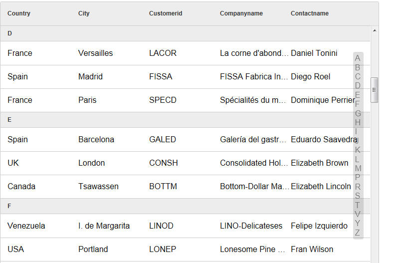
The user can drag on the Navigator to quickly scroll the
List.
The Navigator has an entry for each Group Heading.
The Navigator can be positioned on the left, right, top
or bottom of the List. Positioning the Navigator on the
top or bottom is generally done when the List is set to
scroll horizontally.
You have complete control over the size of the Navigator
(when it is not in use) and its position (relative to to
the edge of the List). The size of the Navigator when it
is in use (i.e. when the user is dragging on it), is
automatically determined by its contents. If the size of
the Navigator (when it is not in use) is not wide enough
(for left/right position), or high enough (for
top/bottom position) to show its full contents when the
user starts to drag on it, it will dynamically resize
while it is in use and then go back to the smaller size
when the user stops dragging on it.
To define a Navigator for a List, check the 'Has List
Navigator' property on the List Properties pane of the
List Builder. Then click the smart field to open the
genie.
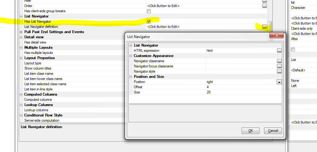
The List Navigator builder (shown above) allows you to
define a Javascript expression that determines what data
are put into the Navigator. You expression can reference
the special
html field. The
html
field contains the HTML that is shown in the Group
Header.
In the above screen show, the HTML expression is:
html
This means that if the Group Headers in the List
contain:
A
B
C
D.....
The Navigator will also contain the exact same values.
But, if the HTML expression was:
html.toLowerCase()
The Navigator would contain:
a
b
c
d...
UX Component - List Control - Action Javascript -
List Control Actions - Client-side Group Breaks - A
new action has been added to the List Control Actions
genie that allows you to apply client-side Group Breaks
to a List. The user interface for the Genie is identical
to the user interface for client-side group breaks in
the List Builder. See the section 'UX Component -
List Control - Group Breaks - Client-Side' for
more details.
UX Component - List Control - Action Javascript -
List Control Actions - Show Navigator/Hide Navigator
- New actions have been added to the List Control
Actions genie that allow you to show a List Navigator
for any list that has group breaks and to hide a
previously shown List Navigator.
UX Component - List Control - Client Side Filter and
Order Expressions - You can now define a client-side
filter and order for any List. The client-side filter is
applied to the data when it is loaded into the List. If
you have defined a server-side filter/order, the
client-side filter will be applied in addition to the
server side filter/order.
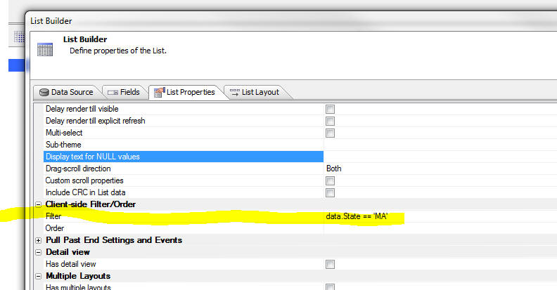
UX Component - Lookup Columns - You can display
columns in a List where the data in the column is
'looked' up in another List, or by calling a Javascript
function.
Watch Video
Download Component (You will need to change the connection string
for both lists to point to the sample Northwind database).
Consider the following example. The image shows a List
based on the Order Details table in the sample Northwind
database. Notice that the List shows the ProductId, but
not the ProductName.
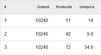
It would be nice to show the Product Description in the
List, as shown in the image below:
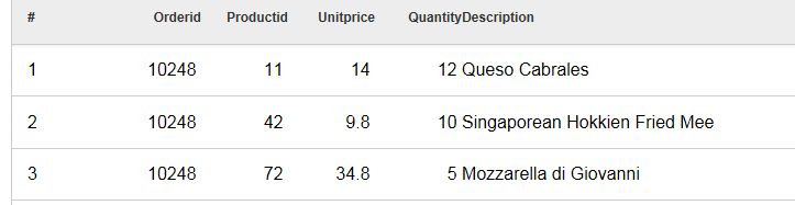
Obviously this could be done by specifying a SQL join
for the List data source where the Order Detail table
was joined with the Products table. However, this would
mean that much more data would have to be sent over the
network as every row of data in the List would include
the Product Description field.
A much better approach would be to 'look up' the data on
the client-side as the List was being rendered. You
might create a second List based on the Products table
that has the ProductId and ProductDescription fields in
it.
To define a Lookup, click the smart field for the
'Lookup columns' property on the 'List Properties' pane
in the List Builder.
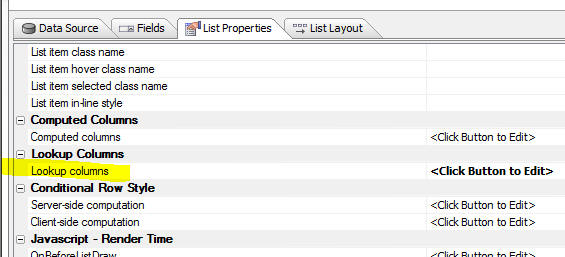
This will open the Lookup Columns genie. You can define
as many lookups as you want.
Each lookup must have a unique name. The lookup type is
either 'List' or 'Function'.
A 'List' lookup will lookup the value in another List.
You can Link the list to the Lookup List on one or more
fields.
IMPORTANT: The List that is used as the data
source must appear in the UX builder before the List
that references it. For example, if the OrderDetails
List lookups up values in the Products List, the
Products List must appear before the OrderDetails List
in the UX builder.
A 'Function' lookup will call a Javascript function that
you define and return either a single value, or an
object (with multiple values). Data from the current row
in the List is passed into the Javascript function. You
specify what data from the current row is passed into
the Javascript function by setting the 'Lookup field(s)'
property in the Lookup Columns builder.
If you specify more than one lookup field (for example,
'Firstname' and 'Lastname'), the lookup fields are
passed into the Javascript function in an array. If
there is only one lookup field, the value is passed into
the Javascript function as a string. Here is an example
of a very simple Javascript function that takes an array
of input values:
function myLookupFunction(idValues) {
if(idValues[0] == 'John' &&
idValues[1] == 'Smith') return 'value1';
if(idValues[0] == 'John' &&
idValues[1] == 'Jones') return 'value12;
return 'Value not found'
}
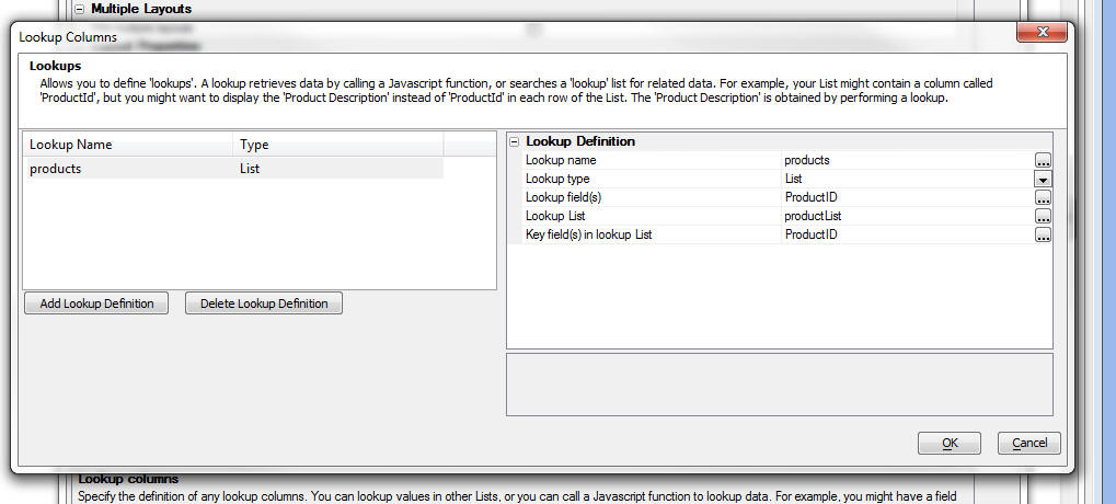
Once you have defined the Lookup, the fields from the
Lookup are available in the 'Available Fields' list in
the List Builder.
Notice in the image above, the 'Lookup Name' was set to
'products'.
Notice in the image below the available fields include:
- products.ProductId
- products.ProductName
The 'products' prefix is derived from the 'Lookup Name'.
The list of available fields includes all of the fields
in the Lookup List.
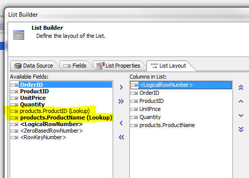
UX Component - Buttons - Split Buttons - A new
option on the Button control allows you to easily create
'split' buttons. A 'split' button has a 'button' part
and a 'down' part. You can define different event
handlers depending on which part of the button the user
clicked on.
Watch Video - Part 1
Watch Video - Part 2
Watch Video - Part 3
Download components
To define a split button, set the 'Display as split
button' property
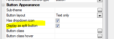
In your Javascript event handler you can reference
arguments[1]
If the user clicked on the button, arguments[1] is set
to 'normal'
If the user clicked on the dropdown arrow, arguments[1]
is set to 'split'.
IMPORTANT: You can only reference the
arguments[1] parameter if your code is in the button's 'onClick'
event. If you use the abstract 'click' event, then
arguments[1] is not set to 'normal' or 'split'.
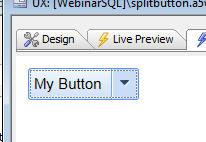
A typical use case for a split button is to display a
menu when the user clicks on the down arrow. The user
makes a selection from the menu, the action is performed
AND the button is updated to show the action the user
selected. The next time the user wants to perform the
same action, a single click on the button will perform
the action (rather than clicking on the down arrow and
having to select from the menu).
The relevant methods that the menu can use to update the
text in the button are:
- <buttonObject>.setContent(
JSONSettings) - set the contents of the button
- <buttonObject>.clearContent()
- resets the button to its original state.
For example:
var btn = {dialog.object}.getControl('button1');
btn.setContent( { html : 'New Button Text', tip: 'Help
for button', icon: 'mynewicon.jpg'});
In some case, when the down arrow has been pressed, you might want to
open a modal window and while the window is open you might want to show
the button in a 'depressed' state, For example, notice the difference in
the image below compared with the image above:
To set the state of a button to depressed or normal, you can use the
<buttonObject>.setState() method.
The syntax is:
<buttonObj>.setState( pointerToButtonElement,
true/false);
where true indicates the button is depressed and false returns the
button to its normal state.
For example, assume the button Id is 'BUTTON_1';
var bEle = {dialog.object}.getPointer('BUTTON_1');
var bObj = {dialog.object}.getControl('BUTTON_1');
bObj.setState(bEle,true);
Application Server - Security Framework - Large
Applications - The time to load security framework
information for large applications has been
significantly improved. In a test of a large application
with 5,000 pages, each of which had security settings,
the the time improvement is 2 orders of magnitude. To
take advantage of this change, you must republish
something in your application.
If a project is published from the latest
pre-release to an older application server, the
older application server will report a 500 internal
server error as it won't be able to read the new file.
The application server should
be the same build as the development program.
SQL Query Builder - Column Alias Naming - When
you build a SQL query that involves multiple tables and
you select a column with the same name from multiple
tables, Alpha Anywhere automatically assigns an alias to
the column so that it has a unique name. The alias is a
numeric suffix (e.g. CustomerID1). Now, you can specify
if you prefer to use a table alias in the generated
column alias. To set you preference, click the
Preferences hyperlink in the image shown below.
PhoneGap - Support for the PhoneGap Build service
is now tightly integrated into Alpha Anywhere.
PhoneGap is an open source product that allows you to
build native applications for mobile devices. PhoneGap
Build is a web service offered by Adobe that allows you
to create native applications that use PhoneGap without
having to install the device SDK on your machine, or in
the case of iPhone/iPad apps, without even having to use
a Mac.
PhoneGap creates a native application with an embedded
browser control. Your Alpha Anywhere mobile app runs in
the embedded browser, but has access to all of the
native features of the phone that are exposed by
PhoneGap.
To bring up the PhoneGap genie, click the PhoneGap
button on the Web Control Panel toolbar.
You can download the documentation for the PhoneGap
Build genie
here.
For more information on PhoneGap, go to
http://phonegap.com/
Web Applications - Security Framework - SQL Databases
- The Web Application Security framework allows you to
store the account information for the users and groups
in your security framework in either .dbf tables or a
SQL database. Previously, configuring the Web Security
Framework to use SQL tables was a manual process,
described in the following document:
http://wiki.alphasoftware.com/Using+SQL+tables+in+Web+Security
Now, a new genie makes it easy to configure the Security
Framework to use SQL tables for your user and groups
list. The genie also make it easy for you switch a
previously configured Security Framework from .dbf
tables to SQL tables without loosing any data.
When you edit your Security Properties (by clicking the
Web Security button when the Web Control Panel has
focus), the dialog now has a new property called
'Security Table Type', as shown in the image below.
If you select the 'SQL' option, then when you close the
Security Settings dialog, a genie is launched (see
screens below) to walk you through the process. The
genie will prompt for a connection string and then will
create the necessary security tables in your target SQL
database.
If you are switching from .dbf security tables to SQL
security tables, the genie will transfer your existing
data to the SQL database.
NOTE: Remember, the genie will only be started
once you close the Security Settings dialog and only if
you have not previously configured security settings, or
you are changing from .dbf to SQL tables. If you have
previously configured your Security Settings to use SQL
tables and you edit your security settings, the genie
will not be started when you cloe the Security Settings
dialog.
NOTE: The genie creates new tables in your
SQL database. Mapping to existing tables is not
supported.
TIP: If you want to change the SQL database in
which your account information is stored you should
first convert to use .dbf tables. That will import all
of your existing account information into .dbf tables.
The convert back to SQL. This will then export the data
in the temporary .dbf tables to the new target SQL
database.
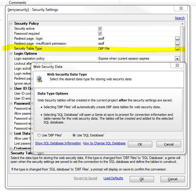
After you click the OK button to close the Security
Settings dialog, the Web Security Tables Upsize Genie is
started.
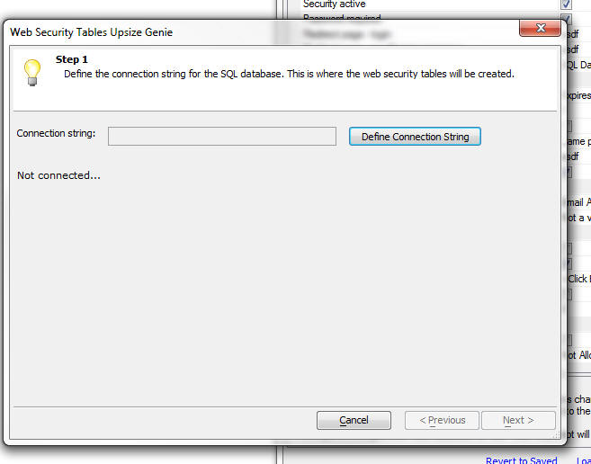
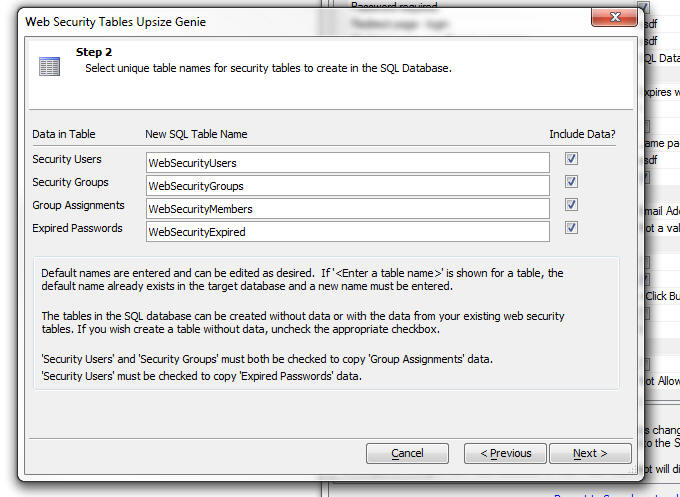
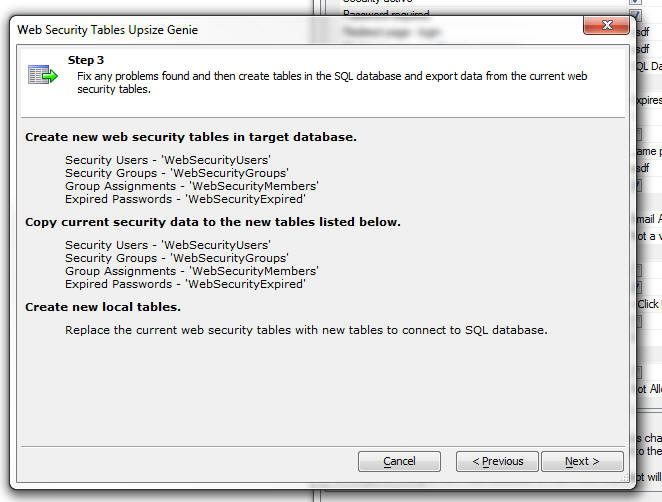
AlphaDAO - <connection>.ListTables() Method - Limit
Tables - The .ListTables() method is now limited to
1,000 table names. This change was made because a user
had a database that has over 1,000,000 tables and
returning the names of all tables in the database in
this case is obviously impractical.
AlphaDAO - ODBC Connection String - DSN Less
Connections - You can now create ODBC connections
that do not use a DSN.
At the Data Source Name prompt in the Connection String
builder, select <None> from the list.
When bypassing the DSN, you must provide the driver name
by adding Driver='' as an additional parameter:
Example:
Driver='{Microsoft Paradox Driver (*.db )}'
For the generic ODBC API Alpha Anywhere populates the following parameters in
the ODBC connection string if the we encounter corresponding values in the Alpha
Anywhere connection string:
- DSN if DataSource is specified and nonblank
- UID if UserName is specified and nonblank
- PWD if Password is specified and nonblank
- If A5Prompt is set then the text values are mapped to the ODBC values
below during the call to open the connection:
Prompt
SQL_DRIVER_NOPROMPT
NoPrompt SQL_DRIVER_PROMPT
Complete SQL_DRIVER_COMPLETE
Required SQL_DRIVER_COMPLETE_REQUIRED
See the Microsoft documentation for ODBC for a complete explanation of these
options.
Here is an example of an Access connection string and the equivalent DSN-less
connection string that Alpha Anywhere automatically creates behind the scenes
when the first connection string is used.
Connection String using the built-in Access option in the Connection String
builder:
{A5API=Access,FileName='C:\temp\Northwind.mdb',A5TraceSQL=Y}
DSN-less ODBC connection string:
{A5API='ODBC',A5Syntax='Access',A5TraceSQL=Y,Driver='{Microsoft
Access Driver (*.mdb, *.accdb)}',DBQ='c:\temp\Northwind.mdb',ExtendedAnsiSQL=1,ImplicitCommitSync=Yes,UserCommitSync=Yes}
a5_show_htmlChrome() Function - Desktop Applications
- Opens an Xdialog window and display HTML
content using the embedded Chrome browser. Contrast with
the existing a5_show_html() function that uses the IE
activex control.
For example, consider the following script in a desktop
application
dim html as c
html = <<%html%
<b>Hello World</b>
%html%
a5_show_htmlChrome(html)
UX and Grid Component - Styles - iOS7 and Android
- New styles are included for iOS7 and Android. For
Android, two styles are included - AndroidDark and
AndroidLight.
IMPORTANT: If you are converting an existing
component that previously used the iOS style to iOS7,
AndroidDark or AndroidLight you will notice that the
'disclosure icons' on the right edge of your List
controls do not render properly. Also, if your component
was built using the Demo Mobile App that ships with
Alpha Anywhere, the Menu List control might not render
properly. Here is how to fix these two issues.
To fix the List template, edit the template and replace
the disclosure icon in the template with
{images.dialog.listNavSubtle}
or {images.dialog.listNav}.
The fixed HTML will then look like this:
<img src="{images.dialog.listNavSubtle}"
/>
To fix the Menu List, edit the Window container that
contains the Menu List and check the HTML template in
the Header HTML
property. This property is in the
Optional Window
Parts
section. Edit this template and make sure that
the following HTML markup exists at the end of the
template HTML:
<br style="clear:both;">
A particularly attractive feature of these new styles is
the way that the icons in the style are rendered.
Instead of using bitmaps for the icons, the styles use
CSS Icons (also called Font Icons because the icons are
all included in a special font file that is included as
part of the style).
See below for more information on CSS Fonts in general
and on Font-Awesome in particular. Font-Awesome is an
open-source Font Icon that is now bundled with Alpha
Anywhere.
UX, Grid and TabbedUI Components - CSS Icons (Icon
Fonts) - Support has been added for CSS Icons (also know
as Icon Fonts) - Icon fonts have become very
popular, especially for mobile applications because they
scale smoothly, and are smaller than bitmaps. Also,
there are many libraries of icon fonts that can be used
with Alpha Anywhere.
In the image below, the two icons in the buttons are
both CSS Icons rendered using the Icon Fonts that come
with the iOS7 style.
An icon font is just a regular font, excepting that
instead of displaying characters, such as 'a', 'b', 'c',
etc., the font has icons at each character position. So,
assuming that the font defines a 'save' icon for
character 'a', then in order to display the 'save' icon
on your component, you would display the character 'a',
and set its style to use the Icon Font.
Remembering that the 'save' icon corresponds to the
character 'a', would be tedious, so a corresponding CSS
file is defined. This CSS file has two main purposes:
- Load the fonts into memory when the page is loaded
- Define CSS rules that give each icon a 'friendly' name
For example, the CSS might define a rule called
'icon-save' that indicates what character the 'save'
icon is mapped to.
When defining an image for a control (for example a
button), you would indicate that the image name is:
cssIcon=icon-save
When the component is rendered the HTML markup, might
look like this:
<img src="cssIcon=icon-save" />
This HTML markup is then automatically translated by
Alpha Anywhere to:
<i class="icon-save"></i>
which correctly renders the icon using the appropriate
character in the Icon Font.
You can also define an inline style for the CSS Icon.
For example, if you define the image name as:
cssIcon=icon-save {color: blue;}
then, when this is translated automatically, the HTML
becomes:
<i class="icon-save" style="color: blue;"></i>
UX, Grid and TabbedUI Components - Font-Awesome Icon
Font Library - Font-Awesome is a popular open-source
icon font library. Alpha Anywhere now comes with
Font-Awesome pre-installed. The Font-Awesome library is
installed in the CSSIcons folder in the folder where the
Alpha Anywhere executable is installed.
For more information on Font-Awesome, please go to:
http://fontawesome.io
Watch Videos - Part 1
Watch Videos - Part 2
Watch Videos - Part 3
In order to use any icons in the Font-Awesome library, (or in any 3rd
party CSS Icon Library) you must set a property in the UX, Grid or
Tabbed UI builder to indicate that the library should be loaded. Click
the smart field button for the CSS (Font) Icons property to open the
dialog that allows you to select which CSS Icon library you want to
load.
NOTE: When you close the 'Select CSS Icon Libraries to
Load' dialog shown in the above image, the library files
are copied from the CSSIcons folder in your executable
folder to the CSS folder in your Web Project. Because
the CSS Icon library files are then part of your Web Project,
they will be automatically published when you publish
your application.
Once you have indicated the libraries that you want to
load, any time you are prompted for the name of an icon,
you can select a regular bitmap, or a CSS Icon. For
example, note the 'CSS Icon' option on the Image
selector:
If you select the CSS Icon option you can select the
icon source. If you are using a style that uses icon
fonts (for example the iOS7, AndroidLight, or
AndroidDark styles), the ImageSource list will show
<Style> as an option.
The Image source list will always include 'Font-Awesome'
since this library is bundled as part of Alpha Anywhere.
But the list will also include any other libraries that
you have installed. See section below on installing 3rd
party CSS Icon font libraries.
To select an icon, click the Select button to open the
genie:
The genie allows you to easily filter the list to
quickly find a particular icon. You can specify the size
of the icon using the dropdown 'Size' selector. If you
select 'Custom' , then you can use the slider to select
any size you want.
As you can see in the image below the icons scale
smoothly, even when displayed at a large size - 127px in
the image below.
You can also specify the color, CSS classes or in-line
style to apply visual effects to the icon. For example:
(In the example below, the style for the Icon has been
set to:
border: solid 3px; border-radius: 20px; padding: 4px;
)
CSS Icon Libraries - Installing 3rd Party Libraries
- There are many sites on the web that supply Icon fonts
and the accompanying CSS file to load and select icons
from the font.
You can generally use any of these third party libraries
as long as the accompanying CSS file for the library
uses the convention of displaying the icon use the HTML
<i> tag.
For example, to display the 'heart' image from the
Font-Awesome library, the HTML markup is:
<i class="fa fa-heart"></i>
If the library you want to install uses the same
conventions, then it can be used in Alpha Anywhere.
To install a 3rd party CSS Icon library, simply copy the
folder that contains the CSS and font files for the
library into the CSSIcons folder in the Alpha Anywhere
executable folder (development version, not Application
Server), and then 'install' the font (so that it can be
used in Working Preview). See below for information on
'installing' fonts.
A popular source of icon fonts is
http://www.fontello.com/
This site allows you to select icons from a menu of
available icons and it then builds a custom icon font
which you can download. After you download the files,
just copy the folder into the CSSIcons folder in your
executable folder.
Watch Video - Installing a 3rd Party CSS Icon Library
Registering the Font For Use in Working Preview
Icon fonts are loaded dynamically by the CSS file when
you are in Live Preview or running your published
application. However, when you are in Working Preview,
in order to see the icons in the icon font, you must
have previously 'installed' the font. Installing a font
is easy. Just open the folder for the CSS Icon library.
Look for a file with a .ttf (true-type font) extension
(it will often be in a sub-folder called 'Fonts') and
double-click on the .ttf file. Windows will
bring up a dialog that has an Install Font button. Click
this button. It will install the font so that it can be
used when you are in Working Preview.
UX Component - List Control - Menu Lists - A common
pattern in mobile applications is to use a List control
as the menu. This list control is then displayed in a
Panel Window that animates in from the Left side of the
screen. Icons are typically displayed for each menu
choice. The CSS Icons are ideal for these types of
icons.
Watch Video
A new pre-defined control is available in the Defined
Controls section of the toolbox.
TIP: If you are building a mobile application,
rather than using the pre-defined List Menu, you might
find the pre-defined SplitView examples more helpful.
These are available by selecting 'QuickPanels' from the
'Panels' category in the UX Toolbox on the left of the
UX builder. See 'New SplitView Examples'
below for more information.
Selecting this option will produce a List control like
this:
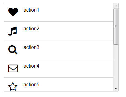
If you edit the List properties for the above List, you
will notice that the control type for the icon field has
been set to CSSIcon. See topic UX Component - List
Control - Using CSS Icons below for more
information.
UX Component - List Control - Using CSS Icons -
You can now easily use CSS Icons in a List. A new
Control type property is available on the Fields tab of
the List Builder.
In the image below, the control type for the Image
column has been set to CSSIcon.
The data in this List's Data Source could be something
like this (using CSS Icons from the Font-Awesome library
in this case):
MenuName|Image|Action
Menu One|cssIcon=fa fa-heart fa-2x|action1
Menu Two|cssIcon=fa fa-music fa-2x|action2
Notice that in the 'Image' column, the name of the CSS
Icon is specified (including the cssIcon= prefix).
You can also use in-line styles or your own classes to
style icons. For example, here is how the data could be
represented using an in-line style for the icon in the
first row and a custom class for data in the second row:
MenuName|Image|Action
Menu One|cssIcon=fa fa-heart fa-2x {color: red;}|action1
Menu Two|cssIcon=fa fa-music fa-2x myiconclass|action2
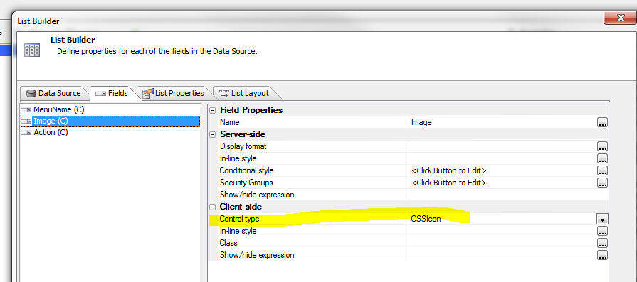
If your list uses a Free-form template, you can put a
CSS Icon directly in the template using this HTML
markup:
<i class="fa fa-heart fa-2x"></i>
Tip: You could just as easily add the following
HTML markup to your template:
<img src="cssIcon=fa
fa-heart fa-2x" />
and at run-time Alpha Anywhere will translate the
<img> tag to the correct <i> tag (because the src
attribute of the
<img> tag
starts with 'cssIcon')
UX Component - Mobile Applications - SplitView -
Pre-Defined Quick Start Templates - A typical mobile
application often includes a 'menu' panel that allows
the user to navigate to different parts of the
application. A common pattern is to use a 'split-view'
with the menu in the left Panel and the main work area
of the application in the right Panel. The menu is
hidden on a phone (where screen space is limited), but
shown on a tablet (where more screen space is
available). If the menu is hidden, tapping on button in
the PanelHeader, or swiping to the right, will reveal
the menu.
In the images below, the UX is shown as it appears on a
phone and a tablet. Notice that on the tablet, the menu
is always visible and the button in the PanelHeader
(shown when the UX is on a phone) is automatically
hidden.
Watch Video - Part 1
Watch Video - Part 2
Watch Video - Part 3
If you want to use the pattern described here, you can
select add a pre-defined set of controls to your UX
component by selecting 'Quick Panels' from the UX
toolbox.
Then select '{Predefined:SplitViewWithIconsAndPanels}'
UX and Grid Component - Client-side Calculated Fields
- Builder - When you open the Builder to define a
client-side calculated field, a new hyperlink appears on
the dialog - 'Format String'. This hyperlink opens a
genie that can be used to define the format string for
the new FormatNumber() function which can be used in
your client-side calculated fields to format numeric
values.
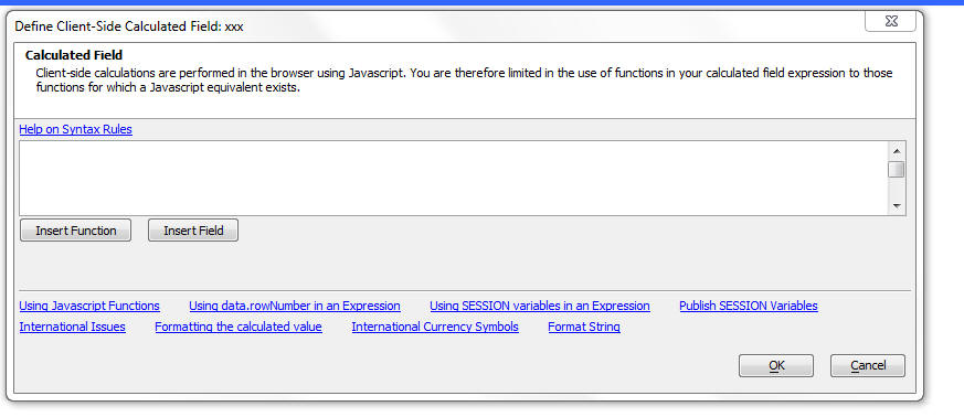
When you click the Format String hyperlink, a genie
opens to help you define your format string:
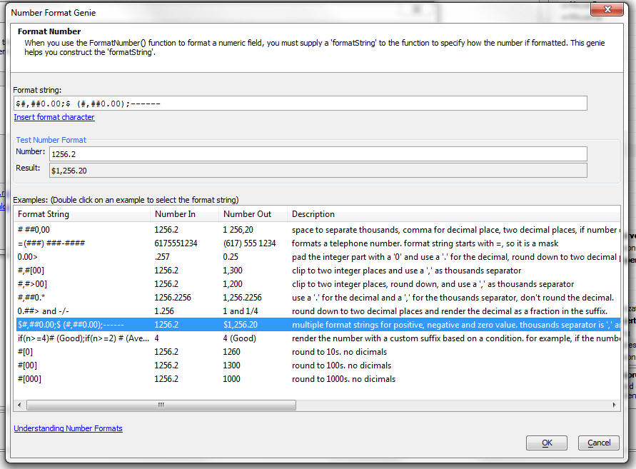
UX and Grid Component - Client-side Calculated field
- FormatNumer() function - Client side calculated
fields can now use a new psuedo function, formatNumber()
to format a numeric field.
For example:
formatNumber(num1,"#,###.00");
The format string is very similar to the syntax used by
Excel. For information on the syntax for format strings,
see the section 'Number Format Strings' below.
NOTE: When you use the
formatNumber() pseudo function in a
client-side expression, the function gets converted to
the following Javascript:
number.toFormat('formatString')
where 'number' is any Javascript numeric variable. The
Alpha Anywhere Javascript library adds a
.toFormat()
method to the prototype for numeric objects.
UX and Grid Component - Number Format Strings
Number format strings are used in the
.toFormat()
method of numeric variables and in the
formatNumber()
function when defining a client-side expression in a
Grid or UX component.
A number format string can have multiple formats in them
by using a ";" to separate multiple formats. The way a
given format in the format string is selected is based
on either its location in the string, or by an optional
condition.
If the format string doesn't contain any conditions then
the first format will be used for a positive value, the
second for a negative, and the third for a zero value.
Conditions can be put into the format by making the
first part of the format string contain
if(expression)
where n
equals the value of the number. For example:
if(n>999999999)=(###) ###-####;=###-####
is a multi-format string that the will return numbers
greater than 999999999 as a 10 digit phone number mask
and number less than 999999999 as a 7 digit phone number
mask.
You can also optionally process a number before it is
formatted by adding
=(expression)
onto the end of a format string where
n equals
the value of the number. For example:
##0.00 %=(n*100)
is a format string that will first multiply the number
by 100 before outputting it with the format. A value of
'.254' would be returned as '25.40 %'
A number format can be either of two types: a "number"
or a "mask" format.
A mask format is indicated by the first character in the
format being an
= sign. The
#
character in the mask will be replaced with the first
available digit from the number. An example of a number
format for a 10 digit phone number is:
=(###) ###-####
Using the above mask, the number
8004511018
would be formatted as:
(800) 451-1018
While 'masks' are simple, 'number' formatting can be
more complex. Below is a list of the special characters
that can be used in a 'number' format string:
|
Character |
Description |
|
# |
an optional digit |
|
0 |
a required digit (will be output as "0" if no
value in the number for the given location) |
|
_
(an underscore character) |
an optional digit (will be output as " "
if no value in the number for the given
location) |
|
* |
after the decimal character will cause there to
be no rounding (number if output with its full
precision) |
|
] |
at end of a number format (before any suffix)
means round to zero (there will be no decimal
value) |
|
[ |
with "]" means force "0" for integer places in
the number (e.g. 123 formatted with #[00] would
be 100) |
|
< |
at end of a number format (before any suffix)
means round decimal up, before "]" is the round
up equivalent of "[" |
|
> |
at end of a number format (before any suffix)
means round decimal down, before "]" is the
round down equivalent of "[" |
|
-/- |
display decimals as fractions |
After optional conditions and number processing
expressions have been removed from the format string,
any non-special characters at the beginning and end of
the format string are placed into the prefix or suffix.
If a format string does not contain multiple formats for
positive and negative values, a
'-'
(minus sign) will be appended to the start of the result
if the number is negative.
Examples
|
Number |
Format String |
Result |
Description |
|
1256.2 |
#
##0,00 |
1 256.20 |
use a " " to separate thousands and a "," for
the decimal, round to two decimal places and
force "0" for those two decimal places |
|
.257 |
0.00> |
0.25 |
pad the integer part with a "0" and use a "."
for the decimal, round down to two decimal
places. |
|
1256.2 |
#,#[00] |
1,300 |
clip to two integer places and use a "," as
thousands separator. |
|
1256.2 |
#,#>00] |
1,200 |
clip to two integer places, round down, and use
a "," as thousands separator. |
|
1256.2256 |
#,##0.* |
1,256.2256 |
use a "." for the decimal and a "," for the
thousands separator, don't round the decimal. |
|
1.256 |
0.##>
and -/- |
1 and 1/4 |
round down to two decimal places and render the
decimal as a fraction in the suffix |
|
1256.2 |
$#,##0.00;$ (#,##0.00);------ |
$1,256.20 |
multiple format strings for positive, negative
and zero value. The thousands separator is ","
and the decimal character is ".". Number if
rounded to 2 places. Negative value is enclosed
in parentheses. Zero value is output as "------" |
4
3
1 |
if(n>=4)#
(Good);if(n>=2) # (Average);# (Bad) |
(Good)
(Average)
(Bad) |
render the number with a custom suffix based on
a condition. For example, if the number if 4,
the output value is (Good). If the number if 1,
the output value is (Bad)
|
|
1256.2 |
#[0] |
1260 |
round to 10, integer only |
|
1256.2 |
#[00] |
1300 |
round to 100 |
|
1256.2 |
#[000] |
1000 |
round to 1000 |
UX Component - Ajax Callback - Timeout Setting -
You can now specify an explicit value for the Ajax
callback timeout. This is the amount of time to wait (in
milliseconds) for the response from the Ajax callback.
If the response is not received within the specified
the, the callback is considered to have failed and the 'onAjaxCallbackFailed'
event is fired and any code defined in the optional
'Ajax failed Javascript' property is executed.
Previously, the timeout setting used the default value
set by the browser.
If you set the property value in the dialog shown below
to <Default>, then a default value for the component is
used. This default can be defined by adding code like
this to the UX component's 'onRenderComplete'
client-side event:
{dialog.object}.ajaxCallbackTimeout = 1000;
If you set the property value to 0, the default value as
defined by the browser is used.
UX Component - Action Javascript - Ajax Callbacks -
Cross-Domain - Because of security issues, browsers
typically enforce a policy that requires that the page
that responds to an Ajax callback must be loaded from
the same domain that the original page was loaded. This
does not represent a problem for typical Ajax callbacks
that are handled by Xbasic code on the server.
However in cases where you want to call a web service
directly from the client (without first going to the
Alpha server), it does represent a problem.
Consider for example the following scenario:
Say you have a button on the UX and you want to make a
call to the Apple iTunes store to retrieve information
about a book.
The URL for this web service (including the query string
for the particular book you are interested in) is as
follows:
http://itunes.apple.com/lookup?isbn=9780316069359
The domain for this URL is obviously not the same as the
domain from which the UX component was loaded in the
first place.
There are two ways in which you could call this web
service:
- Make a standard Ajax callback and define an Xbasic function that
calls out to the Apple web service (using the Xbasic
http_get_page2() function), and then return the response from the
Apple web service to the UX component in the same way that any other
response from an Ajax callback is return to the UX component.
- Directly call the Apple web service from the browser
Clearly, the second approach is more desirable as it
avoids hitting the Alpha server at all.
However, in order to implement the second approach you
need to perform a cross-domain Ajax callback.
The new 'Ajax Callback - Cross Domain' action in Action
Javascript allows you to perform cross-domain Ajax
callbacks.
TECHNICAL NOTE: The Ajax Callback - Cross Domain
action is built on top of jQuery. You must load jQuery
core for this method to work. See the Web Project
Properties dialog to enable jQuery.
When you define this action you specify the URL of the
callback page. Any parameters that you want to pass in
to the web service are in the query string. When you
specify the URL, you can specify an explicit value, or
any Javascript expression that evaluates to the URL.
This allows you to dynamically construct the URL for the
callback.
You also specify the name of a Javascript function that
will be called when the Ajax callback completes
successfully. The function gets passed an argument that
contains the data retuned by the callback.
NOTE: Unfortunately, if the callback fails, there
is no way to specify an 'onFailure' function. This is a
limitation of the technique used for making cross-domain
callbacks.
A useful technique for seeing what data in passed to the
success function is to define the following
success function for your action:
function mySuccessFunction(data){
alert(JSON.stringify(data,'','\t'));
}
This function will convert the data returned by the
callback into a JSON string and display it.
Watch Video - Part 1
Watch Video - Part 2
Watch Video - Part 3
UX and Grid Component - Client-side Expressions - New
Round() functions - In build 1788-4225 new options
were added to the $u.n.round() function in the Alpha
Anywhere Javascript library. These options allowed you
to specify if the rounding was:
- up
- down
- toward zero
- away from zero
However, when using the client-side expression builder,
there was no way to specify which option you wanted to
use when you used the round() function.
Now, these new functions can be used in your client-size
expressions:
- round_up()
- round_down()
- round_towardZero()
- round_awayFromZero()
HTML Reports - Export to Excel, Word or PDF -
beforeHTMLReportExport event - A new client-side
event has been added to the UX, Grid and Tabbed UI
components. This event is fired when an HTML report is
displayed and the user clicks one of the buttons on the
report toolbar to export the HTML report to PDF, Word,
Excel or Text mode. The main motivation for this event
is to allow the developer to put up a custom wait
dialog. The afterAjaxComplete event can be used to
dismiss the custom wait dialog.
UX Component - List Control - Buttons and
Hyperlinks - Set Focus Property - Buttons and
Hyperlink controls now have a new property called 'Set
Focus'. By default, when you click on a button or
hyperlink in a List row, the row that contains the
button or hyperlink does not automatically get selected.
Now, if you check the 'Set Focus' property, when you
click the button or hyperlink, the corresponding row is
also selected.
Grid Component - Edit-Combo and Auto-Suggest Controls
- NotInList Event - Added support for the NotInList
event for edit-combo and auto-suggest controls in Grids.
This event fires when the user enters a value that is
not in the list of choices. The typical use case for
this event is to write code to add the value that the
user entered to the table that contains the choices so
that in future, the value that was entered can be
presented in the pick list.
UX Component - Javascript Controls - 'Initialized'
property - All Javascript controls on a UX (for
example, List, SpinList, ButtonList, Switch, etc.) now
have a new 'initialized' property. Consider the
following example that explains why this property is
useful:
Assume you have a List control and you have unchecked
the 'Allow Null selection' property. This means that
when the List is rendered, the first row in the List
will be automatically selected and the onSelect event of
the List will fire.
Assume that in the onSelect event you reference some
property of the List that does not yet exists because
the List has not yet been fully initialized. Your code
will generate a Javascript error. Using the new
'initialized' property, you can write your onSelect
event as:
if(this.initialized) {
//your
onSelect event code goes here
}
hmac_hash() Function - The hmac_hash() function
is primarily for internal use in situations where OAuth
authentication is used. The function is exposed to
Xbasic as it might be useful to developers.
?hmac_hash("alpha anywhere","secret","HMACSHA1",.F.)
Grid and UX Component - .runAction() Method -
Javascript Actions - Passing in an Object Reference
- The .runAction() method now takes an optional second
argument which is a pointer to an element on the page.
The use case for the parameter is described below.
Assume you used Action Javascript for a button to open a
window that was positioned relative to the button. If
you examine the generated Javascript code, you will see
that the Javascript in the button's onClick event passes
in 'this' - a reference to the button. Therefore the
windows can be positioned relative to the button.
However, if you define the exact same action as a
Javascript Action, and then try to invoke the Javascript
Action from a button (using the .runAction() method in
the button's onClick event), you will get a Javascript
error because the code that tries to position the window
does not have any reference to the button.
Now, by passing in a reference to the button when the .runAction()
method is called, the window can be positioned.
For example
{dialog.object}.runAction('myaction',this)
*property_filter() Function - Takes a .dot
variable and filters out certain properties. The
'filter' specification is a cr-lf delimited string of
directives that can include wildcard characters and a
leading - sign to indicate that a property should be
removed.
For example consider the following .dot variable:
dim prop.firstname as c
dim prop.lastname as c
dim prop.company as c
dim prop.age as n
'this filter selects the properties 'firstname' and
'age'
dim filter as c
filter = <<%str%
firstname
age
%str%
prop = *property_filter(prop,filter)
?prop
= age = 0
firstname = ""
'this filter removes the 'firstname' property, selects
all properties
'that end in 'name' and all properties that start with
'comp'
filter = <<%str%
-firstname
*name
comp*
%str%
prop = *property_filter(prop,filter
?prop
= company = ""
lastname = ""
property_from_url() Function - Parses a URL query string into
an Xbasic .dot variable.
Syntax:
property_from_url(prop as p,url as c)
Example:
dim p2 as p
property_from_url(p2,"firstname=john&lastname=smith&company=ACME%20Industries")
? p2
= company = "ACME Industries"
firstname = "john"
lastname = "smith"
property_to_url() Function - Converts a .dot variable to a
URL.
Syntax:
c Url = property_to_url(prop as p[,options
as c])
options - 'S' - sorts the parameters so that they conform to
the oauth specification for a normalized request. See
http://oauth.net/core/1.0/#anchor14
Example:
dim prop.firstname as c = "john"
dim prop.lastname as c = "smith"
dim prop.company as c = "ACME Industries"
? property_to_url(prop)
= "firstname=john&lastname=smith&company=ACME%20Industries"
? property_to_url(prop,"S")
= "company=ACME%20Industries&firstname=john&lastname=smith"
Tips
AlphaDAO - Oracle - Executing SQL Commands - CRLF Characters -
If you have an Xbasic script that executes some SQL commands against an
Oracle backend, be sure that your SQL commands do not have cr-lf
characters in the command string. You should replace all cr-lf
characters with lf charactrs.
For example, consider the following Oracle SQL code to be executed
dim cmd as c
cmd = <<%str%
DECLARE
prdcode gm_test_t.prd_code%type;
method gm_test_t.method%type;
histid gm_test_t.history_id%type;
BEGIN
prdcode := :prdcode;
method := :method;
histid := :historyid;
insert into gm_test_t (prd_code,method,descr, history_id)
select prdcode, method,descr, gm_test_s.nextval from gm_test_t a where
a.prd_code = prdcode and a.method=method and a.history_id = histid;
COMMIT;
EXCEPTION
WHEN OTHERS THEN
raise_application_error(-20000,sqlerrm);
END;
%str%
dim cn as sql::connetion
cn.open("::name::myoracleconnection")
dim args as sql::arguments
'set argument values
cn.execute(cmd,args)
The above will fail because the SQL commands have cr-lf characters in
the code.
Instead, change the code to this:
dim cn as sql::connetion
cn.open("::name::myoracleconnection")
dim args as sql::arguments
'set argument values
cmd = stritran(cmd,crlf(),chr(10))
cn.execute(cmd,args)
UX Component - List Control - Toggle Display of List or Map - A common
pattern when designing a UX component is to wrap certain controls in a
container, set the inline style of the container to
display: none; and then have
some button or event that will display the container when necessary - using the
Toggle Display action in Action Javascript.
If the container has a List control that uses Columnar layout, or a Map
control, then when the container is shown, the List or Map will not be rendered
properly. This is because when the UX is initially rendered, the Map or List
control is not shown and so these controls do not know how to size themselves
correctly.
This issue is easily solved by using the onShowComplete Javascript event in
the Toggle Display Action Script builder. You can use this event to refresh the
List or Map.
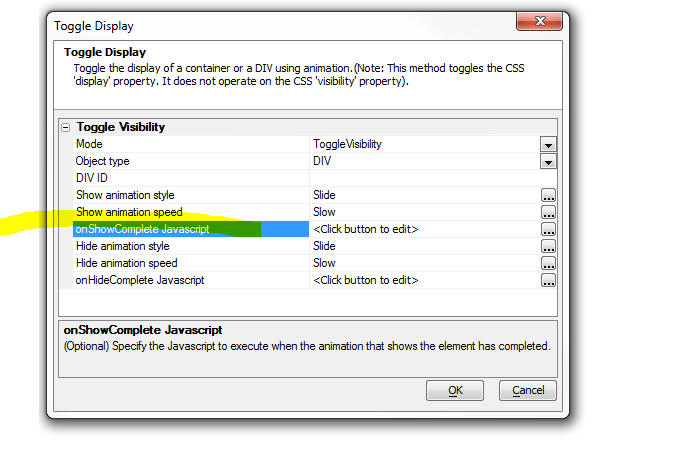
For example, assume that the Id of a List control in the container is 'LIST1'
and a Map control is 'MAP1'. Here is the Javascript to refresh the controls:
{dialog.object}.getControl('LIST1').refresh();
{dialog.object}.getControl('MAP1').refresh();
Xdialog - Chrome Control - Loading HTML in Chrome OnReady Event
- Consider the following simple Xdialog that displays some HTML in
Chrome control:
dim cr as helper::Chrome
cr.html = "HTML to show"
dim dlg_title as c
dlg_title = "Chrome Xdialog"
ui_dlg_box(dlg_title,<<%dlg%
{chrome=100,20cr}
%dlg%,<<%code%
%code%)
This Xdialog will render as follows:
In some cases, however, because of timing problems, the Xdialog
window will open, but the Chrome control will not be properly populated.
The Xdialog can be restructured so that the HTML is only loaded into
the Chrome control when its OnReady event fires:
dim html as c
html = <<%html%
<p>HTML - loaded in the Chrome onReady event</p>
%html%
dim cr as helper::Chrome
cr.html = "Dummy Content"
dim dlg_title as c
dlg_title = "Chrome Xdialog"
cr.OnReady = "ui_dlg_event("+quote(dlg_title)+",\"chromeReady\")"
ui_dlg_box(dlg_title,<<%dlg%
{chrome=100,20cr}
%dlg%,<<%code%
if a_dlg_button = "chromeReady"
a_dlg_button = ""
cr.html = html
end if
%code%)
UX Component - SpinList Control - Getting the value for the
'Display Value' - When you define the choices with which to populate
a SpinList control, you can specify a 'display value' and a 'stored
value' for each value. When you read the current value in the control
(using the {dialog.object}.getValue() method, or the .value property on
the SpinList object itesel), you well be reading the stored value. In
this tip we show you how to get the current display value:
Assume that the SpinList control id is 'spin1'
//get a pointer to the SpinList control
var s = {dialog.object}.getControl('spin1');
var v = s.value; //get the current value
var _d = s._data; //get the array of data in the
SpinList
//find the index in the array where the array's
'value' property
//matches the the current value in the SpinList
var indx = {dialog.object}._findArrayProp(_d,'value',v);
var html = _d[indx].html;
alert(html);
SQL Server - Date or Date/Time Fields - Errors - Installing
correct Native Client - Occasionally we received a bug report from a
user reporting that they are getting an error while doing some type of
SQL query involving a SQl Server date or datetime field. Invariably, the
error is caused because they do not have the correct drivers for the SQL
server Native Client installed.
Here are the links to the download on the Microsoft web site:
X86
Package(sqlncli.msi) - 4549 KB
X64
Package(sqlncli.msi) - 7963 KB
IA64
Package (sqlncli.msi) -
11112 KB
See also:
https://www.microsoft.com/en-us/download/details.aspx?id=53339
Reports - PDF - Acrobat Viewer - Crash - In some
instances, when doing a Live Preview of a component that
prints a PDF report, the Adobe Acrobat viewer might
report a crash, with a dialog similar to this:
Alpha Anywhere will then display a message like this:
Research on the Adobe site indicates that this has been a somewhat
random problem in Acrobat in IE since Acrobat X. One
common suggestion from Adobe was to open Reader and go to Edit ->
Preferences -> Security (enhanced) and disable protected mode by
unchecking "Enable Protected Mode at startup"
http://www.brain-cluster.com/adobe-2/acrobat-reader/there-problem-adobe-acrobatreader-if-it-running-please-exit-and-try-again/
HTTP and FTP Functions Not Working on Certain
Machines - Some users have reported problems with
the built-in FTP and HTTP functions in Xbasic. They
assume that the issue is a port conflict.
In fact, the client functions are not hard-coded
to a specific outbound port. They use the standard
Windows API for accessing a random available port. If
outbound access is being blocked, it is likely being
done so by a firewall, not by a conflict with another
running program. Most Windows installations have Windows
Firewall configured to block outbound access by default
for all applications. See
http://windows.microsoft.com/en-us/windows/communicate-through-windows-firewall#1TC=windows-7
for details on allowing the outbound access.
Grid Component - Search Part - Customizing the Search Part Toolbar
- The Search Part does not allow you to customize the toolbar, as you
can for the Grid Part and Detail View Part. A user wanted to put an
Action Button next to the 'Search' button. Here is how you can do this.
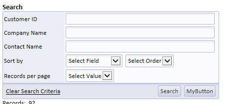
First, define your Action Button and place it anywhere on the Grid
(it does not matter where you place it because we are going to move it
using Javascript).
Then add this code to the Grid's onGridRenderComplete event:
//set this to the ID of your action button
var actionButtonId = 'MYBUTTON';
//get a pointer to the 'Search Button'
var ele = $( '{Grid.ComponentName}.SEARCHBTN' );
ele = ele.parentNode;
var ele2 = ele.parentNode;
var sele = $('{Grid.ComponentName}.ACTIONBUTTON.'+actionButtonId+'.G0');
ele2.appendChild(sele);
UX and Grid Components - Javascript Date Values - Parsing Strings into
Date Values - The Alpha Anywhere Javascript library has added a very useful
method to the Javascript Date object to help parse strings (that represent date
values) into real date objects.
The Date.formFormat() method takes two arguments - a date string and a date
format string. For example
var d1 = new Date();
d1.fromFormat('01/01/2014','MM-dd-yyyy');
You can also use the Date object's .toFormat() method to format a date
object as a sting.
var dString = d1.toFormat('dd-MM-yyyy');
Tab Direction on UX For Right-to-Left Languages
- For languages that go from right-to-left, it is
desirable to also have the tab direction go from
right-to-left so that when the user hits the tab key,
the control to the right of the current control is
selected. This is easily done by adding this CSS to the
UX component's local CSS definition.
IMPORTANT: Be sure that the Layout Mode property on your UX is set to
'ContainerWidth'
body { direction:rtl; }
.A5CWLayout { float:right; }
TIP: If you have List controls on a UX component for which the
body direction has been set to 'rtl', you will need to wrap each List
control in its own container and set the direction property of the
container to 'ltr', or else the titles on the List will not display
correctly.
Generating an UX Component Using Xbasic -
a5wcb_createDialogUsingXbasic() Function - The
a5wcb_createDialogUsingXbasic() function can be used to generate an UX
component programmatically.
Note that for each control, a minimal set of properties is defined.
You can add additional properties for each control if necessary. The
Xbasic tab in the UX builder shows the available properties for each
control type.
dim wp as p
DIM wp.page_fields[0] as P
with wp.page_fields[]
.controltype = "layout_directive_statictext"
.v.StaticText = "Created by Xdialog"
end with
with wp.page_fields[]
.v.variableName = "c"
.v.breakType = "None"
end with
with wp.page_fields[]
.v.variableName = "d"
.v.label = "Field D"
.v.hasWaterMark = .t.
.v.waterMark.text = "Enter name"
end with
with wp.page_fields[]
.controltype = "layout_directive_button"
.v.buttonText = "click me"
.v.javascript.onclick = "alert('click');"
end with
with wp.page_fields[]
.controltype = "layout_directive_FrameBegin"
.v.FrameTitle = "frame"
.v.Frame.ID = "FRAME_1"
.v.Frame.type = "Simple"
end with
with wp.page_fields[]
.controltype = "layout_directive_hyperlink"
.v.hyperlinkText = "this is my hyperlink"
.v.javascript.onclick = "alert('you clicked a hyperlink');"
end with
with wp.page_fields[]
.controltype = "layout_directive_image"
.v.ImageMode = "Static"
.v.javascript.onclick = "alert('click on image');"
.v.Imagename = "images/$$application.alpha.png.a5image"
end with
with wp.page_fields[] ' initialize tmpl.page_fields[8]
.controltype = "layout_directive_FrameEnd"
end with
'create the UX and call it 'genByXbasic'
a5wcb_createDialogUsingXbasic(wp,"genByXbasic",.t.)
Generating a UX Dynamically in a Web Application - In the
previous tip we discuss how to generate a UX component using Xbasic. The
generated component is a permanent component that appears in the Web Control
Panel.
Watch Video
Download Component
However, you might have a use case that requires the
dynamically created UX component at run-time. The UX component, in this case,
should be created as a temporary session file. This is done by specifying a name
with '__sessionFile__' as a
prefix when calling the
a5wcb_createDialogUsingXbasic() function.
The following sample .A5W page shows how this can be done
<%a5
'define the UX component
dim wp as p
DIM wp.page_fields[0] as P
with wp.page_fields[]
.controltype = "layout_directive_statictext"
.v.StaticText = "Created by Xdialog"
end with
with wp.page_fields[]
.v.variableName = "c"
.v.breakType = "None"
end with
with wp.page_fields[]
.v.variableName = "d"
.v.label = "Field D"
.v.hasWaterMark = .t.
.v.waterMark.text = "Enter name"
end with
with wp.page_fields[]
.controltype = "layout_directive_button"
.v.buttonText = "click me"
.v.javascript.onclick = "alert('click');"
end with
with wp.page_fields[]
.controltype = "layout_directive_FrameBegin"
.v.FrameTitle = "frame"
.v.Frame.ID = "FRAME_1"
.v.Frame.type = "Simple"
end with
with wp.page_fields[]
.controltype = "layout_directive_hyperlink"
.v.hyperlinkText = "this is my hyperlink"
.v.javascript.onclick = "alert('you clicked a hyperlink');"
end with
with wp.page_fields[]
.controltype = "layout_directive_image"
.v.ImageMode = "Static"
.v.javascript.onclick = "{grid.Object}.ajaxCallback('G','{Grid.RowNumber}:all','xb','','',{deviceOfflineFunction:
function() { }});"
.v.Imagename = "images/$$application.alpha.png.a5image"
end with
with wp.page_fields[] ' initialize tmpl.page_fields[8]
.controltype = "layout_directive_FrameEnd"
end with
DIM wp.XbasicFunctionDeclarations as C = <<%code%
function xb as c (e as p)
xb = "alert('callback');"
end function
%code%
'give the component name a special name that starts with
__sessionFile__
dim componentName as c
componentName = "__sessionFile__mydynamicUx"
a5wcb_createDialogUsingXbasic(wp,componentName,.f.)
Delete tmpl
DIM tmpl as P
tmpl = a5w_load_component(componentName)
'set the following to properties in tmpl
tmpl.alias = "MYALIAS"
tmpl._dialogFilename = file.filename_parse(componentName,"N")
'now run the dynamically generated component
delete x_ux1
dim x_ux1 as p
x_ux1 = a5w_run_Component(tmpx)
?x_ux1.Output.Head.JavaScript
?x_ux1.Output.Head.CSS_Link
?x_ux1.Output.Head.Title
%>
</head>
<body>
<%a5 ?x_ux1.Output.Body.Dialog2_HTML
%>
</body>
</html>
Alternatively, you might want to generate the UX component dynamically on an
Ajax callback. For example, the following Xbasic function in a UX component
handles an Ajax callback. The function dynamically creates a UX and then sends
the name of the dynamically created UX component back to the UX so that the name
can be stored in a variable and used when you want to open this component.
function xb_generate as c (e as p)
dim wp as p
DIM wp.page_fields[0] as P
with wp.page_fields[]
.controltype = "layout_directive_statictext"
.v.StaticText = "Created by Xdialog"
end with
with wp.page_fields[]
.v.variableName = "c"
.v.breakType = "None"
end with
with wp.page_fields[]
.v.variableName = "d"
.v.label = "Field D"
.v.hasWaterMark = .t.
.v.waterMark.text = "Enter name"
end with
with wp.page_fields[]
.controltype = "layout_directive_button"
.v.buttonText = "click me"
.v.javascript.onclick = "alert('click');"
end with
with wp.page_fields[]
.controltype = "layout_directive_FrameBegin"
.v.FrameTitle = "frame"
.v.Frame.ID = "FRAME_1"
.v.Frame.type = "Simple"
end with
with wp.page_fields[]
.controltype = "layout_directive_hyperlink"
.v.hyperlinkText = "this is my hyperlink"
.v.javascript.onclick = "alert('you clicked a hyperlink');"
end with
with wp.page_fields[]
.controltype = "layout_directive_image"
.v.ImageMode = "Static"
.v.javascript.onclick = "{grid.Object}.ajaxCallback('G','{Grid.RowNumber}:all','xb','','',{deviceOfflineFunction:
function() { }});"
.v.Imagename = "images/$$application.alpha.png.a5image"
end with
with wp.page_fields[] ' initialize tmpl.page_fields[8]
.controltype = "layout_directive_FrameEnd"
end with
DIM wp.XbasicFunctionDeclarations as C = <<%code%
function xb as c (e as p)
xb = "alert('callback');"
end function
%code%
fn = "__sessionFile__myuxonthefly"
a5wcb_createDialogUsingXbasic(wp,fn,.f.)
'generate a response
to send back to the client
'the name of the dynamically
generated UX will be stored
'in a variable called {dialog.object}._ux
xb_generate = "alert('done: "+js_escape(fn)+"');" + crlf()+\
"{dialog.object}._ux = '"+js_escape(fn)+"';"
end function
Now, in order to open this dynamically generated UX, you
would need to make another Ajax callback. The easiest way to code this is use
use Action Javascript to define an action that opens a UX component, and then
convert the action to text mode. Then edit the generated code and replace this
line:
go.dialog2Name = 'Name of component to open';
with this line:
go.dialog2Name = {dialog.object}._ux;
Build 1856-4237 18-Dec-2013
IMPORTANT: If you currently have build 1620-4172 from 21 Aug 2013
or an earlier build installed, then this is a required update.
Videos
|
Xbasic - Xdialog |
Using the Chrome Embeddable Browser in Xdialog |
Xdialog allows users who are building desktop
applications to create very powerful 'screens'
to prompt for and display information to users.
You can now embed Google's Chrome browser
directly into your Xdialogs. This means that you
can use the full power of HTML, CSS3 and
Javascript to create amazing looking Xdialog
screen. When you embed the Chrome control in an
Xdialog you can easily respond to events in the
HTML with either Javascript of Xbasic code. You
can also easily send events from Xbasic to the
HTML that is displayed in the embedded Chrome
control.
If you have used Xdialog in your desktop
applications in the past, this new feature will
open up many exiting possibilities.
Introduction
Watch video - Part 1
Watch video - Part 2
Debugger
Watch Video - Part 3
Binding events:
Watch video - Part 1
Watch video - Part 2
Google Charts:
Watch video
Using jQuery:
Watch video
For extensive documentation on how to embed a
Chrome control into Xdialogs see the release
notes. |
Change in Behavior
UX Component - Abstract Events - Enable Expression - If
the client-side enable expression was false, the click
event did not fire (correct), but the down event did.
This has now been changed and the down event will also
not fire.
Bugs
Grid Component - Image and File Upload - New Records
- Form Layout - If a Grid component used a Form
layout (as opposed to a Tabular layout), then image and
file upload to the new record rows did not work. There
was no problem when doing uploads to existing rows, or
to new rows when the Grid used a Tabular layout.
UX and Tabbed UI Component - Session Timeout Warning
Feature - Under certain conditions, the Session
Timeout Warning for the UX and the Tabbed UI did not
open at the correct time and did not show the correct
time remaining. This has now been fixed and the message
box will now show the actual seconds left in the session
since the last request from the component.
sql_lookup() Function - As a result of a change
made in build 1788 the data type returned by the
sql_lookup() function was always a character value, when
it should have been correctly typed (i.e. a datetime
value, a numeric value, etc, depending on the data type
of the column value that the function was returning).
Now, if sql_lookup() specifies a filter and returns a
single field in the return expression, the return value
is correctly typed. If more than one value is returned,
or no filter is specified, the return value is a
character string.
Grid Component - Search Part - SQL Query Using Group
By - If a Grid built in V11 used a GROUP BY clause
in the SQL statement, performing a search on the Grid
would fail. The problem did not occur if the Grid was
build in V12 and the solution was to de-select the
Search Part fields and re-select them. Now, this is no
longer necessary.
A5_HTML_Pretty() Function - XML - The
A5_HTML_Pretty() function, which takes an HTML string
and adds the correct indentation to all of the elements
can now also be used to format XML. The function takes a
second, optional, parameter that indicates if the input
string is XML. By default, this flag is .f.
txt = http_get_page2("http://feeds.gawker.com/lifehacker/full")
txt = a5_HTML_Pretty(txt,.t.)
showvar(txt)
Xbasic - Working With XML - Working with XML in
Xbasic is now even easier. The following functions have
been enhanced:
-
*property_from_xml()
- now takes a new optional flag to parse the XML and generate the
special '__a5_elementContent'
and '__A5_Xml_manifest'
properties where needed (see below)
-
*property_to_xml() -
now can consume the special '__a5_elementContent'
and '__A5_Xml_manifest'
properties when generating XML from an Xbasic dot variable.
In addition, the
showXML()
function has been enhanced.
Consider the following very simple snippet of XML.
xml = <<%txt%
<name city-name="boston">
Fred Smith
</name>
%txt%
If you view this XML using the XML viewer function (showXML()),
you will see this:
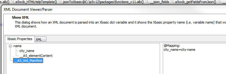
You will notice that the XML has an attribute called
'city-name'. This is not a valid Xbasic variable name,
so the attribute has to be renamed (to 'city_name'). In
order that the
*property_to_xml() function can get back to the
same XML that was originally parsed, a list of all of
the attribute names that were changed is kept in the
special __A5_Xml_Manifest property.
Also, you will notice that in the XML snippet, the
'name' element has a value and also it has attributes.
The attribute values are shown as properties and the
element value is shown using the special property name
'__A5_elementContent'.
Here is how you can parse the above XML into an Xbasic
dot variable:
delete p
dim p as p
'set the optional 3rd flag to .t. to use the special
properties
*property_from_xml(xml,p,.t.)
'convert the dot variable into a script so we can 'see'
what's in the variable
?*variable_to_script(p)
= DIM name as P
DIM name.city_name as C = "boston"
DIM name.__A5_elementContent as C = <<%str%
Fred Smith
%str%
DIM __A5_Xml_Manifest as C = <<%str%
@Mapping:
city_name=city-name%str%
'now, go back to XML
?*property_to_xml(p,"")
=
<name city-name="boston">
Fred Smith
</name>
Notice how this is a perfect 'round-trip'! The generated
XML is the same as the initial XML that was parsed.
Now, try the above exercise without using the new
optional flag on the *property_to_xml() function
delete p
dim p as p
*property_from_xml(xml,p,.f.)
'convert the dot variable into a script so we can 'see'
what's in the variable
?*variable_to_script(p)
= DIM name as P
DIM name.city_name as C = "boston"
Notice how the Xbasic dot variable only has the value of
the attribute. It does NOT have the value of the
element!
*HTML_GET_ATTRIBUTE() Function - Quick way to
extract an attribute value from some HTML markup.
The syntax is:
C result = *HTML_GET_ATTRIBUTE( markup as
c, attributePattern as c)
Consider the following HTML markup:
dim html as c
html = <<%html%
<img
id="GRID1.V.R2.PICTURE1"
onmouseover="$('bp').src=img;"
style="height: 1in; cursor: pointer;"
src="pictures/5.jpg"
title="pictures/5.jpg"
onerror="{grid.object}._executeEvent('onImageError',{element:
this});" />
%html%
Say you wanted to extract the 'src' attribute from this
HTML. A simple string search for the text 'src=' would
be wrong because it would get confused by the code for
the onmouseover event handler.
dim attr as c
attr = *HTML_GET_ATTRIBUTE(html,"src")
? = src="pictures/5.jpg"
AlphaDAO - ResultSet - Generating JSON Data - .ToJSONObjectSyntax()
Method - When you use the .ToJSONObjectSyntax()
method to generate JSON data from a resultset, and you
set the optional ConvertToText flag to .f. (it defaults
to .t.), then date and date time values in the resultset
now create Javascript date objects. For example:
dim cn as sql::Connection
cn.open("::Name::_northwind")
cn.PortableSQLEnabled = .t.
cn.Execute("select first 5 orderid, orderdate from
orders")
rs = cn.ResultSet
?rs.ToJSONObjectSyntax(-1,-1,.f.,.f.)
= {"orderid" : 10255, "orderdate" : new Date(1952, 11,
18, 0, 0, 0, 0)}
{"orderid" : 10249, "orderdate" : new Date(1996, 6, 5,
0, 0, 0, 0)}
{"orderid" : 10250, "orderdate" : new Date(1996, 6, 8,
0, 0, 0, 0)}
{"orderid" : 10251, "orderdate" : new Date(1996, 6, 8,
0, 0, 0, 0)}
{"orderid" : 10252, "orderdate" : new Date(1996, 6, 9,
0, 0, 0, 0)}
Xdialog - Chrome Browser Control - Xdialog now
allows you to embed the Chrome browser control. This
allows you to build some amazing desktop applications
using the full power of HTML, CSS3 and Javascript. This
is a really fantastic new feature and all developers of
desktop applications are strongly encouraged to check it
out!
Previously, Alpha Anywhere allowed you to use the
Internet Explorer ActiveX control in an Xdialog. While
this is still possible, using the Chrome control is now
so much easier and more powerful, that it is hard to
imagine a scenario under which using the Internet
Explorer ActiveX control would be preferable to using
the Chrome control.
NOTE: With Internet Explore, some of Xdialogs
that used the Internet Explorer ActiveX control have
stopped working because of changes Microsoft has made to
IE in IE Version 11. Using the Chrome control instead of the IE ActiveX
control circumvents this issue.
With the Chrome control hosted in an Xdialog you can:
- Use Xbasic to generate Javascript code and then send the code to
the Chrome control to execute
- Use Xbasic to read values from the DOM in the Chrome control
(for example, read the value of an input control in the HTML being
shown in the Chrome control).
- Use Javascript in the Chrome control to invoke Xbasic
- Open the Chrome debugger
to debug your Javascript code
- Set the zoom level of the HTML page
Since the HTML loaded in the Chrome control can use open
source Javascript libraries, such as jQuery, you can
build really powerful Xdialogs for your desktop
applications using a myriad of techniques made possible
by third party libraries. (See below for information on
the a5_html_page_prepare() function.)
NOTE The code for all of the examples used here
is available in the sample Learning Xdialog workspace
that ships with Alpha Anywhere. To get an updated
version of 'Learning Xdialog' you must do a full
install, not a patch install.
A simple Xdialog that uses the Chrome Control
Watch video
Create a new script with this code:
dim cp as helper::Chrome
cp.html = <<%html%
<h1>Hello</h1>
<p>This is html inside an Xdialog.</p>
%html%
dim dlg_title as c
dim dlg_body as c
dlg_body = <<%dlg%
{chrome=100,20cp};
%dlg%
dim dlg_event as c
dlg_title = "Chrome in an Xdialog"
ui_dlg_box(dlg_title,dlg_body,dlg_event)
And here is the resulting Xdialog when you run the code.
In the above code, notice that a new object is declared
with the
dim cp as helper::Chrome
command.
Also notice that the HTML to display in the Chrome
control was set by setting the .html property.
You can either set the object's .html property if you
want to specify explicit HTML to display, or you can set
the .url property (if you want to show a URL - see next
example).
Once the Chrome object has been declared, it can be
placed in the Xdialog using this Xdialog command:
{chrome=100,20cp};
In this above example, the width of the Chrome control
is set to 100 'characters' and the height to 20 'lines'.
Notice that the 'cp' in the above command is the name of
the helper::Chrome object that was defined.
You can put as many Chrome objects on an Xdialog as you
want. For exmaple:
dim cp1 as helper::chrome
dim cp2 as helper::chrome
....
dim cpn as helper::chrome
And then in your Xdialog body:
{chrome=100,20cp1};
{chrome=100,20cp2};
{chrome=100,20cpn};
Specifying a URL to load
Watch video
dim cp as helper::Chrome
cp.url = "http://www.google.com"
dim dlg_title as c
dim dlg_body as c
dlg_body = <<%dlg%
{stretch=height,width}
{chrome=100,30cp};
%dlg%
dim dlg_event as c
dlg_title = "Chrome in an Xdialog"
ui_dlg_box(dlg_title,dlg_body,dlg_event)
Specifying a Dynamic URL
In this next example we show how the URL property can be
dynamically changed after the Xdialog has been rendered.
dim cp as helper::Chrome
cp.url = "http://www.google.com"
dim urls as c
urls = <<%txt%
http://www.google.com
http://www.bing.com
http://www.yahoo.com
%txt%
dim url as c
url = word(urls,1,crlf())
dim dlg_title as c
dim dlg_body as c
dlg_body = <<%dlg%
{startup=urlchanged}
{stretch=width}
[.160url^+urls] <Go!urlchanged>;
{stretch=height,width}
{chrome=173,60cp};
%dlg%
dim dlg_event as c
dlg_event = <<%code%
if a_dlg_button = "urlchanged" then
a_dlg_button = ""
cp.url = url
end if
%code%
dlg_title = "Chrome in an Xdialog"
ui_dlg_box(dlg_title,dlg_body,dlg_event)
The resulting Xdialog looks like this:
You can type any address into the address bar and then
hit the Go button to go to the page.
Notice that in the above code, when the user clicks on
the Go button the Xbasic that gets executed is:
cp.url = url
We simply set the URL of the Chrome object to the new
URL and Chrome automatically navigates to the target
URL.
Using Xbasic to Execute Javascript in the Chrome
Control
The Chrome object exposes two methods that allows you to
execute Javascript from Xbasic. These are:
<chromeObject>.executeJavascript(codetorun)
- executes the Javascript asynchronously
<chromeObject>.executeJavascriptResult(codeToRun)
- executes the Javascript synchronously and
returns the result to Xbasic
Consider the following example of an Xdialog that is
hosting the Chrome control, showing some HTML with an
input control. We have to Xdialog buttons, one to set
the value in the HTML input, and the other to read the
value from the HTML input.
dim cp as helper::Chrome
cp.html = <<%html%
Name: <input id="name" />
%html%
dim dlg_title as c
dim dlg_body as c
dlg_body = <<%dlg%
{chrome=40,10cp};
<Set Name!setName> <Read Name!readName>;
%dlg%
dim dlg_event as c
dlg_event = <<%code%
if a_dlg_button = "setName" then
a_dlg_button = ""
dim jstorun as c
dim name as c
name = ui_get_text("Name","Enter name")
jstorun = "document.getElementById('name').value = '" +
js_escape(name) + "';"
cp.ExecuteJavascript(jstorun)
else if a_dlg_button = "readName" then
a_dlg_button = ""
dim jstorun as c = "document.getElementById('name').value"
dim result as c
result = cp.ExecuteJavascriptResult(jstorun)
ui_msg_box("Notice:","Value read from the HTML is: " +
result)
end if
%code%
dlg_title = "Chrome in an Xdialog"
ui_dlg_box(dlg_title,dlg_body,dlg_event)
The important thing to notice in this example is that
the Javascript that gets executed here is computed by
Xbasic and Xbasic is invoking the Javascript.
Using Javascript to Invoke Xbasic
In the previous example, we used Xbasic to invoke Javascript on the
Chrome control. In this example, we turn it around and invoke Xbasic
from Javascript.
This Xdialog has an event called 'event1' (see code in red below) and
the HTML has a button. When the user clicks on the HTML button, the
Xdialog event ('event1') is fired.
In order to make this work, a special Javascript function (called
xDialogEvent) must be added to the HTML page. The onclick event
for the button is then set to:
xDialogEvent('event1')
TIP: Because it is cumbersome to have to have to
add the xDialogEvent() helper function to the HTML yourself, a special
helper function can be called to 'prepare' the HTML you pass into the
chrome object. For example:
dim cp as helper::Chrome
cp.html = a5_html_page_prepare(<<%html%
<button onclick="xdialogEvent('event1');">Invoke Event on My Parent
Xdialog</button>
%html%)
dim cp as helper::Chrome
cp.html = <<%html%
<html>
<head>
<script>
function xDialogEvent(eventName) {
var client =
new XMLHttpRequest();
client.open('GET', 'a5xdialog:' + eventName,false);
client.setRequestHeader('My-Custom-Header', 'Some Value');
client.send();
}
</script>
</head>
<body>
<button onclick="xDialogEvent('event1');">
Invoke
Event on My Parent Xdialog</button>
</body>
</html>
%html%
dim dlg_title as c
dim dlg_body as c
dlg_body = <<%dlg%
{chrome=40,10cp};
%dlg%
dim dlg_event as c
dlg_event = <<%code%
if a_dlg_button = "event1" then
a_dlg_button = ""
ui_msg_box("Notice","This is Xbasic here. Event1 has just
been fired.")
end if
%code%
dlg_title = "Chrome in an Xdialog"
ui_dlg_box(dlg_title,dlg_body,dlg_event)
Using Built In Images
Alpha Anywhere comes with a large library of built in images and
icons that you might want to use in the HTML that is shown in the Chrome
control.
You can easily use built in images using this syntax:
<img src="a5res:images/$$application.chrome.png"
/>
The portion shown in red is the built in image name.
For example
dim cp as helper::Chrome
cp.html = <<%html%
<img src="a5res:images/$$code.aScript.png" />
<img src="a5res:images/$$file.open.png" />
<img src="a5res:images/a5_email_people.png" />
%html%
dim dlg_title as c
dim dlg_body as c
dlg_body = <<%dlg%
{chrome=100,20cp};
%dlg%
dim dlg_event as c
dlg_title = "Chrome in an Xdialog"
ui_dlg_box(dlg_title,dlg_body,dlg_event)
And the resulting Xdialog:
Referencing Static Resources
To display image files you can either use the special a5file prefix
on the filename, or you can use the standard file:// protocol. However,
in order to the use file:// protocol, you have to turn Chrome security
off using the command shown in red.
dim cp as helper::Chrome
'in order to use the standard file:// protocol you have to turn
'Chrome's web security off.
'otherwise you can use use the special a5file: command.
cp.flag_web_security_disabled = .t.
cp.html = <<%html%
<img src="a5file:C:\Program Files (x86)\a5V12\a5v12logo.jpg" />
<br>
<img src="file://C:\Program Files (x86)\a5V12\a5v12logo.jpg" />
%html%
dim dlg_title as c
dim dlg_body as c
dlg_body = <<%dlg%
{chrome=100,20cp};
%dlg%
dim dlg_event as c
dlg_title = "Chrome in an Xdialog"
ui_dlg_box(dlg_title,dlg_body,dlg_event)
And the resulting Xdialog:
Using the Chrome Debugger
You can use the Chrome debugger to debug Javascript that is running
inside the Chrome control. For example, consider the following Xdialog.
The HTML has a Javascript function that executes a loop. The function
uses the 'debugger;' Javascript command to turn on the debugger.
The Xdialog has a button that executes this code:
cp.OpenDevtools()
'cp' is the Chrome object (created by the dim cp as helper::Chrome
command), and we are calling the object's .OpenDevTools() method to
enable the Chrome Developer tools.
Once the Developer Tools have been opened, we can click the button on
the HTML page to run the Javascript and debug into the code.
Watch Video
dim cp as helper::Chrome
cp.html = <<%html%
<script>
function loopTest() {
debugger;
for(var i = 1; i < 10; i++) {
document.getElementById('div1').innerHTML
= 'Count: ' + i ;
}
}
</script>
<button onclick="loopTest();">Start Loop</button>
<div id="div1"></div>
%html%
dim dlg_title as c
dim dlg_body as c
dlg_body = <<%dlg%
{chrome=100,20cp};
<Open debugger!openDebugger>;
%dlg%
dim dlg_event as c
dlg_event = <<%code%
if a_dlg_button = "openDebugger" then
'open the Chrome debugger
a_dlg_button = ""
cp.OpenDevtools()
end if
%code%
dlg_title = "Chrome in an Xdialog"
ui_dlg_box(dlg_title,dlg_body,dlg_event)
Setting the Zoom Level of the HTML Document
You can set/get the zoom level of the HTML shown in the Chrome
control by using these methods:
- <chromeObject>.GetZoomLevel()
- <chromeObject>.SetZoomLevel(level)
The level is a numeric value
Binding Events Programmatically
When you write the HTML that is displayed in the Chrome control you
can either add events directly into the HTML markup, or you can bind the
events programmatically using Xbasic.
For example, if your HTML included this markup:
<button onclick="myclickevent();">Button1</button>
then, when you ran the Xdialog and clicked on the button, the
Javascript function myclickevent() would be invoked.
However if your HTML included this markup:
<button >Button1</button>
then, clicking on the button would do nothing because no event had
been bound to the button.
Using methods of the Chrome control, you can bind event handlers to
any element.
The syntax is:
<chromeObject}.AddEventListner(definition)
Where definition is a string in this format:
elementId|eventName|xdialogEventToFire
For example:
dim definition as c
definition = "btn1|click|xbasicEvent1"
cp.AddEventListeners(definition)
The definition string that you pass into the .AddEventListners()
function can be a cr-lf delimited string. This allows you to bind events
to multiple elements with a single call to the .AddEventListners()
function.
The above code will bind an onClick event to an element with an id of
'btn1'. When the user clicks the button, the Xdialog event called
'xbasicEvent1' will be fired.
Note: We are using the .AddEventListeners() to
invoke Xbasic (by calling an event in the parent Xdialog). We are
NOT using the method to bind a Javascript event handler, since
there are existing Javascript methods to bind Javascript events to
elements.
Watch video to see an example of using the .AddEventListners()
method.
Watch video - Part 1
Watch video - Part 2
Download sample code used in video
The .AddEventListners() function can be called before the Xdialog is
even instantiated. There is no need to wait for Xdialog and the Chrome
control inside the Xdialog to be ready. For example, consider the
following script:
<div id="div1">This is div1</div>
<button id="b1">Button1</button>
<button id="b2">Button2</button>
'notice that the event binding is defined before the xdialog has
even been rendered!
cp.AddEventListeners(mapping)
dim dlg_title as c = "Binding Multiple Events Handlers at Once"
if a_dlg_button = "event1" then
ui_msg_box("Notice","Event
1 has fired")
else if a_dlg_button = "event2" then
ui_msg_box("Notice","Event
2 has fired")
ui_dlg_box(dlg_title,dlg_body,dlg_event)
Setting/Getting Attributes and Values Programmatically
When you host a Chrome control in an Xdialog you will often want to
manipulate attributes of the HTML that is displayed using Xbasic.
You can obviously do this by using Xbasic to send Javascript to the
Chrome control (using the <chromeObject>.executeJavascript() method),
but a more direct method is available using methods of the Chrome object
that let you directly manipulate the DOM.
For example, say you want to set the Inner HTML of a div with the id
of 'div1'.
Your Xdialog could execute this code
dim js as c
js = "document.getElementById('div1').innerHTML = '" +
js_escape("some text") + "';
cp.ExecuteJavascript(js)
However, the .SetInnerHTML() method provides a more direct way of
accomplishing this. For example
cp.SetInnerHTML("div1","some text");
NOTE: The js_escape() function is a helper function that ensures that
all text in the string is properly escaped so as not to cause Javascript
errors.
Similarly you can use the following methods:
HasElement(elementId) - indicates whether the specified
elementId is present
HasAttribute(elementId,attributeName) - indicates if the
specified element has the specified attribute
GetAttribute(elementId,attributeName) - gets the
value of the specified attribute from the specified element
SetAttribute(elementId,attributeName,attributeValue) -
sets the value of an attribute
GetInnerText(elementId) - gets the inner text property of
an element
GetValue(elementId) - gets the value of element (for
example, an INPUT control)
SetValue(elementId,value) - sets the value of an
element
GetOuterHtml(elementId) - gets the outer html for an
element
GetInnerHtml(elementId) - gets the inner html for an
element
SetInnerHtml(elementId,value) - sets the inner html
of an element
Example code
dim cp as helper::Chrome
html = "<div id=\"div1\">This is div1</div>"
cp.html = html
dim dlg_title as c
dim dlg_body as c
dlg_body = <<%dlg%
{chrome=80,10cp};
<Set Inner HTML of div1!setdiv>;
<Set Attributes on div1!setattr>
%dlg%
dim dlg_event as c
dlg_event = <<%code%
if a_dlg_button = "setdiv" then
a_dlg_button = ""
cp.SetInnerHtml("div1","Test Alpha Anywhere's ability to set
the Inner HTML of an element.")
else if a_dlg_button = "setattr" then
a_dlg_button = ""
cp.SetAttribute("div1","style","border: solid 1px blue;
border-radius: 10px; background: yellow;")
end if
%code%
dlg_title = "Using Google Charts in a Chrome Control
in an Xdialog"
ui_dlg_box(dlg_title,dlg_body,dlg_event)
Using Google Charts in an Xdialog
You can use the Google Charts API to add charting to your Xdialogs.
For example, the image below shows an Xdialog with a Google chart.
For example, the image below shows an Xdialog with a Google chart.
Watch video
Download code
TIP: In addition to watching the above videos,
you might also find these videos helpful. They show how Google Charts can
be used in a UX Web component and they give more background information
on using the Google API documentation to get working code samples:
Watch Video - Part 1
Watch Video - Part 2
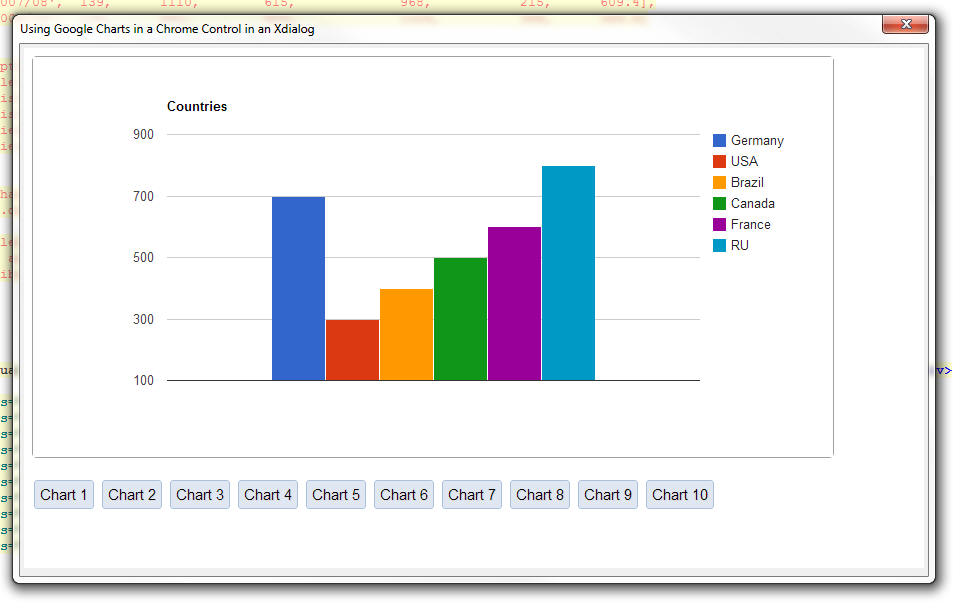
Using the Alpha Anywhere Javascript Library, Styles and 3rd Party
Javascript Libraries
A huge advantage of being able to use the Chrome control in your
Xdialogs is the ability to use Alpha Anywhere Javascript libraries and
styles and 3rd party libraries and styles in your Xdialog.
A special helper function called
a5_html_page_prepare()
makes it very easy to create the HTML page that you will load into the
Chrome control with all of the libraries and styles that you want.
The function takes some input HTML and then adds the necessary code
to your input HTML to load the Javascript and styles that you specify.
The function syntax is:
c html = a5_html_page_prepare(C html [,C
javascriptLibrariesPublic [,L flagIncludeA5JSlibraries [,C
A5StyleName [,C jQueryTheme [,L flagIncludeGoogleJSAPI
]]]]])
where:
- html -- the input HTML that you want to transform
- javascriptLibrariesPublic - a comma delimited list of
public Javascript libraries that can be loaded from the Google CDN
- flagIncludeA5JSLibraries - .t./.f. - indicates if you
want to include the Alpha Anywhere Javascript libraries
- A5StyleName - the name of an Alpha Anywhere style sheet
to load. If you us this option your HTML can use the {style}
placeholder to refer to the style name.
- jQueryTheme - Name of a jQuery UI theme. Typically only
used if you are also loading the jQuery UI library (see
javascriptLibrariesPublic)
- flagIncludeGoogleJSAPI -- .t./.f. - indicates if
you want to load the Google JSAPI library. If you set this flag to
true, the following Google Chart packages will also be loaded:
'table', 'corechart', 'gauge', 'geochart', 'treemap', 'orgchart',
'timeline'
The javascriptLibrariesPublic Parameter
The following libraries can be loaded.
- AngularJS
- Chrome Frame
- Dojo
- Ext Core
- jQuery
- jQuery UI
- MooTools
- Prototype
- script.aculo.us
- SWFObject
- Web Font Loader
For each library that you load, you can specify an optional build
number. The syntax is:
libraryName|buildNumber
If you leave out the buildNumber then the most recent build on
the Google CDN as of December 1, 2013 is loaded.
If you set the buildNumber to 'internal' then the code is loaded from
the Google CDN and then cached locally so that future loads are faster.
Example
dim html as c
html = ""
html =
a5_html_page_prepare(html,"jquery|internal,jquery
ui|internal,angularjs|internal",.t., "iOS","Sunny")
In the above example:
- jQuery is being loaded from a local version
- jQuery ui is being loaded from a local version
- angularjs is being loaded from a local version
- the Alpha Anywhere Javascript Library is being loaded
- the iOS Alpha Anywhere style is being loaded
- The 'Sunny' jQuery UI theme is being loaded.
IMPORTANT: When you specify that Alpha Anywhere
Javascript library and jQuery should be loaded the
jQuery object is automatically changed from its default
'$' to 'jQuery'.
For example, in the code below, the jQuery date picker
is used for the input control.
Watch video
dim html as c
html = <<%html%
<body class="{style}Page">
<p>This input control uses the jQuery Date Picker</p>
<input id="dt1" name="dt1" value="1/1/2013"/>
<script>
jQuery('#dt1').datepicker(
{
onSelect:
function(dateText, inst) {
$e.execute(this,'change')
}
}
);
</script>
</body>
%html%
html = a5_html_page_prepare(html,"jquery|internal,jquery
ui|internal",.t., "MobBlue","Sunny")
dim cp as helper::Chrome
cp.html = html
ui_dlg_box("Xdalog with Chrome Control - Using jQuery",<<%dlg%
{stretch=width,height}
{chrome=150,50cp};
%dlg%,<<%code%
%code%)
And the resulting Xdialog
Using the .OnReady() Event
The Chrome control has an .OnReady() event that fires,
and executes Xbasic, once the control has been
initialized.
For example:
<div id="div1">This is div1</div>
'the onReady event fires when the chrome control has been
initialized
cp.OnReady = "ui_msg_box(\"Notice\",\"The
Chrome control has been initialized.\")"
ui_dlg_box(dlg_title,dlg_body,dlg_event)
Notice: The .onReady() event executes Xbasic code, not
Javascript. If you want to fire Javascript when the
Chrome control is ready, simply put an onload event in
the <body> tag of the HTML you display in the control.
For example:
<body onload="myfunction()">
</body>
Summary of Properties and Methods of the Chrome Object
When you dim a Chrome object, the resulting object instance has many
properties and methods that are exposed to Xbasic.
For example
dim cp as helper::chrome
When the above Xbasic is executed, the resulting Xbasic variable 'cp'
has various method and properties, which are summaries here:
Properties
url - allows you to set the URL for the page to
be shown in the Chrome control
html - allows you to set the HTML to be shown in
the Chrome control
error gets set if you call Javascript
and there is an error, or if there is an error loading
the page
flag_web_security_disabled
flag_allow_file_access_from_url
flag_allow_universal_file_access_from_url
flag_page_cache_disabled
flag_caret_browsing_enabled
flag_databases_disabled
flag_plugins_disabled
flag_java_disabled
flag_javascript_disabled
flag_dom_paste_disabled
flag_encoding_detector_enabled
flag_drag_drop_disabled
flag_load_drops_disabled
flag_history_disabled
flag_remote_fonts_disabled
flag_image_load_disabled
Methods
ExecuteJavascript(code) - executes some
Javascript
ExecuteJavascriptResult(code) - executes
some Javascript and returns a result to Xbasic
Print() - invokes the Chrome control's print
dialog
GoBack()
GoForward()
Reload() - reload the current page
Stop() - stops the page loading
GetZoomLevel() - gets the numeric zoom level
SetZoomLevel(level) - sets the zoom level
OpenDevtools() - opens the Chrome developer tools
CloseDevtools() - closes the Chrome developer
tools
OnReady(xBasicCode) - executes Xbasic code
when the Chrome control has been initialized.
NOTE: The tasks performed by the following method
could just as well be done by using the .ExecuteJavascript()
or .ExecuteJavascriptResult() methods. However, since
these methods that go directly against the DOM without
having to execute Javascript, they are more convenient
to use.
HasElement(elementId) - indicates whether
the specified elementId is present
HasAttribute(elementId,attributeName) -
indicates if the specified element has the specified
attribute
GetAttribute(elementId,attributeName)
- gets the value of the specified attribute from the
specified element
SetAttribute(elementId,attributeName,attributeValue)
- sets the value of an attribute
GetInnerText(elementId) - gets the inner
text property of an element
GetValue(elementId) - gets the value of
element (for example, an INPUT control)
SetValue(elementId,value) - sets
the value of an element
GetOuterHtml(elementId) - gets the outer
html for an element
GetInnerHtml(elementId) - gets the inner
html for an element
SetInnerHtml(elementId,value) -
sets the inner html of an element
AddEventListeners(definition) - binds an
event handler to an element. See section above 'Binding
events programmatically'
DropEventListeners(elementId) - drops an
event listener.
Tips
AlphaDAO - SQL Server - Stored Procedures - Output
Arguments - If you have a SQL server stored
procedure that sets the value of an output argument,
reading the value in the output argument, after the
stored procedure has executed can be tricky. That's
because you have to ensure that you first loop through
all of the result sets that are returned by the stored
procedure before reading the output arguments.
Consider the following trivial stored procedure:
SET ANSI_NULLS ON
GO
SET QUOTED_IDENTIFIER ON
GO
CREATE PROCEDURE TestSP
-- Add the parameters for the stored procedure here
@InParam CHAR(10),
@OutMessage CHAR(50) OUTPUT
AS
BEGIN
-- SET NOCOUNT ON added to prevent extra result sets
from
-- interfering with SELECT statements.
SET NOCOUNT ON;
SET @OutMessage = 'initialized'
END
GO
From the interactive window:
dim cn as sql::Connection
cn.open("::Name::sqlserver")
delete args
dim args as sql::Arguments
dim Message as c = "test message"
'need to pad out the argument so it matches the
definition in the stored procedure
message = padr(Message,50," ")
args.set("InParam" , "1234567890")
args.set("OutMessage",Message,sql::ArgumentUsage::InputOutputArgument)
?cn.Execute("{CALL TestSP(:InParam, :OutMessage)}",args)
= .T.
Now try to read the output parameter value
?args[2].data
= "Initialized"
Notice that this worked as expected. But it only
worked because the stored procedure did not return any
resultsets.
Now let's modify the stored procedure so that it returns
two resultsets:
USE [Northwind]
GO
/****** Object: StoredProcedure [dbo].[TestSP] Script
Date: 12/6/2013 1:25:13 PM ******/
SET ANSI_NULLS ON
GO
SET QUOTED_IDENTIFIER ON
GO
ALTER PROCEDURE [dbo].[TestSP]
-- Add the parameters for the stored procedure here
@InParam CHAR(10),
@OutMessage CHAR(50) OUTPUT
AS
BEGIN
select * from customers
select * from employees
-- SET NOCOUNT ON added to prevent extra result sets
from
-- interfering with SELECT statements.
select * from customers
SET @OutMessage = 'initialized'
END
Now, From the interactive window:
dim cn as sql::Connection
cn.open("::Name::sqlserver")
delete args
dim args as sql::Arguments
dim Message as c = "test message"
'need to pad out the argument so it matches the
definition in the stored procedure
message = padr(Message,50," ")
args.set("InParam" , "1234567890")
args.set("OutMessage",Message,sql::ArgumentUsage::InputOutputArgument)
?cn.Execute("{CALL TestSP(:InParam, :OutMessage)}",args)
= .T.
Now try to read the output parameter value
?args[2].data
= "test message"
This is not what we expect!. The output parameter cannot
yet be read because we have not yet looped through all
of the result sets returned by the stored procedure.
So, execute:
?cn.ResultSet.NextResult()
= .t.
and again:
?cn.ResultSet.NextResult()
= .t.
and again (the .f. return value tells you that there are
no more resultsets):
?cn.ResultSet.NextResult()
= .f.
Now, that there are no more resultsets, you can read the
output arguments:
?args[2].data
= "initialized"
Build 1839-4234 10 Dec 2013
IMPORTANT: If you currently have build 1620-4172 from 21 Aug 2013
or an earlier build installed, then this is a required update.
Notice
UX Component - List - Change in Behavior -
Clicking on 'whitespace' in the list (if there are not
enough rows to fill the list), the list header, or list
footer/header/footer will no longer de-select the
current selection. Therefore the onclick event will no
longer fire when the user clicks on whitespace, the
header, or the footer (which includes the 'Fetch More'
button, if the list is paginated using the 'Fetch More'
option).
De-selecting the current selection when clicking off the
list was an unintended consequence of an important
optimization added to the List in a recent update.
Grid and UX Component - Auto-suggest and Edit-combo
Controls - SQL Data Sources - Null Values - If the
list of data to be shown in the auto-suggest or
edit-combo included null values, Javascript errors might
occur.
Bugs
UX Component - Slider Control - Dates - Setting Min
and Max Value - If the slider control was configured
to return date values, then setting the starting date
value on the slider to a date that did not start on the
1st of the month would sometimes fail. This is now
fixed. Here is a sample Javascript code that sets the
slider start date to a value read from another control
on the UX and then sets the end date to the start date +
90 days.
function setStartAndEnd() {
var dob = {dialog.object}.getValue('dob');
var s = {dialog.object}.getControl('sl1');
var d1 = new Date();
d1.fromFormat(dob,'MM-dd-yyyy');
//set min and max with a date string
using the date format specified
s.min = dob;
d1.setDate(d1.getDate() + 90);
s.max = d1.toFormat('MM-dd-yyyy');
s.refresh();
}
Build 1826-4231 4 Dec 2013
IMPORTANT: If you currently have build 1620-4172 from 21 Aug 2013
or an earlier build installed, then this is a required update.
Videos
|
UX Component |
Using Google Charts as an Alternative to the
Built-in Chart Controls |
The UX component contains a powerful built-in
chart control (based on the Microsoft .Net
visualization library). This is a 'server-side'
control (meaning that the chart is rendered on
the server and then the resulting image is sent
to the browser. However, there may be times when
you want 'client-side' charting (i.e. charts
that are rendered using Javascript). The Google
Chart API is perfect for this. (Note: There are
number of high quality open source Javascript
libraries that you can choose from).
In this video we show how you can use the Google
Chart API to add client-side charts to a UX
component.
Watch Video - Part 1
Watch Video - Part 2
Download Component |
|
UX Component |
Using SQL data in a Google Chart |
In previous videos we have shown ho easy it is
to use Google Charts in a UX component by simply
copying code from the Google Charts API
documentation. However, in all of the example in
the Google Chart API documentation, the data
plotted by the chart is static (i.e. it is hard
coded into the Javascript).
Of course, in a real application, it is likely
that you will want to query a SQL database to
get the data to be plotted on the chart. In this
video we show an example of how this can be
done.
Watch Video - Part 1
Watch Video - Part 2
Watch Video - Part 3
Download Component |
|
UX Component |
Control Behavior Overrides - Customizing The
Data Picker and Edit-Combo Behavior on a Phone |
The UX component allows you to customize the
behavior of certain controls based on the screen
size of the device. For example, normally, the
'picker' for a date control, or an edit-combo
control opens in a drop-down window, immediately
under the control. However, on a phone, which
has a narrow screen, there is not enough room to
display the control's 'picker' in a dropdown
window. Instead, you are likely to want the
control to appear in a window that is docked to
the bottom of the screen, centered horizontally.
In this video we show how you can define
Javascript to override the behavior of certain
controls, depending on the screen size.
Watch Video |
|
|
|
|
Notice
Report Server - The Report Server code was
previously part of the A5ApplicationServer.exe
executable. Now, the Report Server has been moved into
its own executable - A5reportserver.exe. When you
install the Application Server patch you will notice
this new executable has been installed. If you have both
the Application Server and the Development version
installed on the same computer and you want to be able
to use the Report Server when printing reports using the
server in the Development version, copy the
a5reportserver.exe file from the folder where the
Application Server is installed to the folder where the
Development version is installed.
Bugs
HTML Editor - Internet Explorer V11 - As a result
of changes Microsoft made to Internet Explorer V11, the
HTML editor (which is based on the Internet Explorer
ActiveX control) would fail to open under certain
circumstances. While it is still not clear exactly what
change Microsoft made, a work around has been found and
now the HTML editor will work if you have IE11
installed.
UX Component - Absolute Layout Editor - Internet
Explorer 11 - Has been re-written to remove its
dependency on the Internet Explorer 11 ActiveX control.
As a result, this editor will now work correctly even if
you have Internet Explorer 11 installed. Previously, the
editor would fail if you had Internet Explorer 11
installed.
UX Component - Web Style Builder - Internet Explorer
11 - Has been re-written to remove its dependency on
the Internet Explorer 11 ActiveX control. As a result,
this editor will now work correctly even if you have
Internet Explorer 11 installed. Previously, the editor
would fail if you had Internet Explorer 11 installed.
UX Component - List Control - onTap Event -
this.value - The previous update introduced a bug
causing the this.value in an abstract onTap event to be
wrong.
Reports - Absolute Layout - Images - Internet
Explorer - The image background on an Absolute
Layout cell did not render properly in Internet Explorer
under certain circumstances.
Grid Component - DBF Tables - Export to Excel -
International Characters - International characters
did not export to Excel correctly from a Grid if the
Grid was based on a .dbf table. There is no problem with
Grids that use SQL tables.
Features
UX Component - Server Side Event Handlers - Data
Submitted - JSON - When the UX makes any type
of Ajax callback, the data that are submitted (including
data in Repeating Sections) are now available in a
convenient new property called
e.dataSubmittedJSON
For example, assume your UX had the following controls:
Firstname, Lastname and a Repeating Section called
'CONTAINER_1' with AddressType and Address.
The e.dataSubmittedJSON value might look like this:
{
FIRSTNAME: 'Fred',
LASTNAME: 'Smith',
CONTAINER_1: [
{
ADDRESSTYPE: 'Work',
ADDRESS: '123 Main St'
},
{
ADDRESSTYPE: 'Home',
ADDRESS: '456 Center St'
}
]
}
You can use the Xbasic JSON_Parse() function to parse
this JSON string.
UX Component - Mobile Devices - Control Behavior
Overrides - The UX component allows you to customize
the behavior of certain controls based on the screen
size of the device. For example, normally, the 'picker'
for a date control, or an edit-combo control opens in a
drop-down window, immediately under the control.
However, on a phone, which has a narrow screen, there is
not enough room to display the control's 'picker' in a
dropdown window. Instead, you are likely to want the
control to appear in a window that is docked to the
bottom of the screen, centered horizontally.
To define control behavior overrides, click the smart
field button for the 'Control behavior overrides'
property on the UX Properties pane.
Watch Video
This will open a dialog where you can insert the
Javascript that defines the behavior override. The
behavior override is expressed in the form of Javascript
code that uses the
A5.override.add() function to define the behavior
override.
For example, in the code snippet shown below, the
behavior of the 'Edit-combo' control is changed when the
screen size is less than 500 pixels.
/*
if the width of the viewport is less than 500px make
datePickers and edit-combos
pop up from the bottom of the screen, centered
horizontally
*/
var vpSize = AUI.u.getVPSize();
if(Math.min(vpSize.width,vpSize.height) < 500){
A5.overrides.add('editCombo',{
base: {
decouple:
true,
window: {
width: '100%',
height: '50%',
pointer: {show: false},
location: ['dock','bottom'],
animation: {
show: {type: 'css-slide'}
}
}
}
}
);
}
NOTE: The 'base' behavior of the control is
defined in the style.js file. For example, if you are
using the iOS style, then the base behavior is defined
in the css/iOS/style.js file in your executable folder.
UX Component - List Control - NULL Values - If
your data has NULL values, you can now specify the text
to show for the NULL values. For example, you might want
to show n/a for null values.
You can include HTML markup in the text to display.
The new property is on the List Properties pane.
UX Component - List Control - onDownHold Event -
A new event, onDownHold has been added to the List
control.
Add_bus_days() and Bus_days_between() Functions - SQL
'Holidays' Table - These two functions can now use a
SQL table as the data source for the list of holiday
dates.
To specify a SQL table, the 'holidayTable' argument that
is passed into the function is in the form of a JSON
string with these properties:
- connectionString - the connection string to the SQL
database
- table - the name of the table that contains the holiday
dates. If this property is not specified a table called 'A5Holidays'
is assumed.
- column - the name of the column that contains the holiday
dates. If this property is not specified, a column called 'Dates' is
assumed.
- filterColumn - (optional) the name of a column in the
holiday table that you want to filter on
- filterColumnType - (required if filterColumn is
specified) - the data type of the filterColumn. Can be
c,n,d,t,l.
- filterValue - (required if filterColumn is
specified) - the value to search for.
Example:
days = Bus_days_between(
{12/1/2013},{12/31/2013},"yes","{connectionstring: 'myconnstring',
table: 'holidays', column: 'dates'}")
days = Bus_days_between(
{12/1/2013},{12/31/2013},"yes","{connectionstring: 'myconnstring',
table: 'holidays', column: 'dates', filterColumn:
'country', filterColumnType: 'c', filterValue: 'USA'}")
a5_sql_nested_query_to_json_document() Function -
Queries one or more SQL databases and returns a JSON
document with the query result.
This function is inspired by NoSQL databases that return
a JSON document with a query result. The JSON document
return by such a query often contains nested JSON
documents (for example for each customer, show orders
for that customer, and for each order, show order
details for that order).
For example, here is a sample JSON document returned by
this function showing customers, nested orders, and
nested order details:
{
"customer": [
{
"customerId": "HUNGO",
"companyName": "Hungry Owl All-Night Grocers",
"orders": [
{
"orderid": "10298",
"customerid": "HUNGO",
"value": "10298",
"orderDetails": [
{
"OrderID": "10298",
"ProductID": "2",
"UnitPrice": "15.2",
"Quantity": "40",
"Discount": "0"
}
]
},
{
"orderid": "10309",
"customerid": "HUNGO",
"value": "10309",
"orderDetails": [
{
"OrderID": "10309",
"ProductID": "4",
"UnitPrice": "17.6",
"Quantity": "20",
"Discount": "0"
},
truncated for brevity....
The syntax for the function is
P result = a5_sql_nested_query_to_json_document(
P options, SQL::Arguments Args)
The result object that is returned has these
properties
- hasError - .t. or .f. depending on whether the function
returns an error.
- errorText - the error text if hasError is .t.
- data - the JSON data returned by the function
The options object that is passed into the function has
these properties:
- options.connectionString - The connection string for the
query. This is an optional property. You can also specify a query
string to use for each nested query. If you do not specify
options.connectionString, then you MUST specify a connection
string for each query. Typically, you will querying against a single
database, and so it is most efficient to specify the
options.connectionString parameter and NOT specify a connection
string for each SQL statement.
- options.SQL - a CRLF delimited list of SQL statements to
execute. The indentation in the parameter indicates the hierarchy of
the query. See below for more details.
- options.flagUseSubSelects - Indicates if child SQL
queries use a SQL Sub-select in the WHERE clause. If you are querying
against a single database then this is the most efficient option. If
each query specifies its own connection string, then this flag must
be set to .f..
Example options.SQL parameter:
options.sql =
<<%txt%
{sql: 'select * from customers where country = :whatCountry ', name:
'customer' }
{sql:'select * from orders', name: 'orders', parentKey: 'cId',
key: 'cId'}
%txt%
Notice that the options.sql property is a CRLF
delimited string of JSON strings in this format:
options.SQL = <<%txt%
{JSON string 1}
{JSON string2}
%txt%
The fact that {JSON string 2} is indented (using a
single Tab character NOT spaces) is significant. The
indentation indicates that this query is an immediate child of the
query in the line above it.
You can have multiple levels of indentation. and
multiple queries with the same parent, for
example:
options.SQL = <<%txt%
{JSON string 1}
{JSON string2}
{JSON string
3}
{JSON string 4}
%txt%
In the above example, the SQL query defined by {JSON
string 3} is a child of {JSON string2}. The query
defined by {JSON string 1} has two child queries. A real
world example of an hierarchy that would be defined
using the above structure might be:
Customers
` Orders
OrderDetails
Payments
The individual JSON strings each have these properties
- sql - The actual SQL statement to execute
- name - An arbitrary name. Must be unique. This name is
used for the child records in the JSON document that is returned.
- parentKey - Only required for child queries.
Defines the field in the child SQL statement that joins the child
query with the parent query.
- key - Only required for child queries. Defines the field
in the child's parent SQL query that joins the child query with the
parent query.
Example 1 - Simple two level query
dim ops as p
ops.connectionString = "::Name::northwind"
ops.sql = <<%txt%
{sql: 'select * from customers where country = :whatCountry
', name: 'customer' }
{sql: 'select * from orders', name: 'orders', parentKey: 'customerid',
key: 'customerId'}
%txt%
dim args as sql::Arguments
args.add("whatCountry","France")
p = a5_sql_nested_query_to_json_document(ops,args)
?p.data
=
{
"customer": [
{
"CustomerID": "BLONP",
"CompanyName": "Blondesddsl p�re et fils",
"ContactName": "Fr�d�rique Citeaux",
"ContactTitle": "Marketing Manager",
"Address": "24, place Kl�ber",
"City": "Strasbourg",
"Region": null,
"PostalCode": "67000",
"Country": "France",
"Phone": "88.60.15.31",
"Fax": "88.60.15.32",
"image": null,
"imageThumb": null,
"orders": [
{
"OrderID": "10265",
"CustomerID": "BLONP",
"EmployeeID": "2",
"OrderDate": "07/25/1996 12:00:00 00 am",
"RequiredDate": "08/22/1996 12:00:00 00 am",
"ShippedDate": "08/12/1996 12:00:00 00 am",
"ShipVia": "1",
"Freight": "55.28",
"ShipName": "Blondel p�re et fils",
"ShipAddress": "24, place Kl�ber",
"ShipCity": "Strasbourg",
"ShipRegion": null,
"ShipPostalCode": "67000",
"ShipCountry": "France"
},
{
"OrderID": "10297",
"CustomerID": "BLONP",
"EmployeeID": "5",
"OrderDate": "09/04/1996 12:00:00 00 am",
"RequiredDate": "10/16/1996 12:00:00 00 am",
"ShippedDate": "09/10/1996 12:00:00 00 am",
"ShipVia": "2",
"Freight": "5.74",
"ShipName": "Blondel p�re et fils",
"ShipAddress": "24, place Kl�ber",
truncated for brevity......
Example 2 - Simple three level query
dim ops as p
ops.connectionString = "::Name::northwind"
ops.sql = <<%txt%
{sql: 'select * from customers where country = :whatCountry
', name: 'customer' }
{sql: 'select * from orders', name: 'orders', parentKey:
'customerid', key: 'customerId'}
{sql: 'select * from [order details]', name: 'orderDetails',
parentKey: 'orderId', key: 'orderId'}
%txt%
dim args as sql::Arguments
args.add("whatCountry","France")
p = a5_sql_nested_query_to_json_document(ops,args)
Example 3 - Three level query where each query is in a
different database (the connection string is specified
for each query).
'since each query specifies its own connection string,
the flagUseSubSelects flag must
'be set to .f.
ops.flagUseSubSelects = .f.
ops.sql = <<%txt%
{sql: 'select * from customers where country = :whatCountry
', name: 'customer' , connectionString:
'::Name::northwind'}
{sql: 'select * from orders', name: 'orders', parentKey:
'customerid', key: 'customerId', connectionString:
'::Name::northwind2'}
{sql: 'select * from [order details]', name: 'orderDetails',
parentKey: 'orderId', key: 'orderId' , connectionString:
'::Name::northwind2'}
%txt%
dim args as sql::Arguments
args.add("whatCountry","France")
p = a5_sql_nested_query_to_json_document(ops,args)
Limiting the Number of Child Records
If you want to limit the number of records retrieved at
any level in the hierarchy, you can.
To limit the number of records at the top level of the
hierarchy, you would simply use the FIRST clause in your
SQL select statement. However, for child queries, using
the FIRST clause in the SQL will not work (because you
want the FIRST n records within EACH parent
group, not the FIRST n records in ALL parent
groups).
To limit the number of records in a child query, you use
the 'limit' property in the JSON object that defines the
query.
For example in the code shown below we are fetching the
first 5 orders for each customer:
dim ops as p
ops.connectionString = "::Name::northwind"
ops.sql = <<%txt%
{sql: 'select * from customers', name: 'customer' }
{sql: 'select * from orders', name: 'orders', parentKey: 'customerid',
key: 'customerId', limit: 5}
%txt%
NOTE: If you do use a FIRST clause in a child SQL statement,
the SQL statement is automatically parsed and the FIRST clause is
removed and converted into a 'limit' property in the JSON definition.
So, the following two objects are actually equivalent:
dim ops as p
ops.connectionString = "::Name::northwind"
ops.sql = <<%txt%
{sql: 'select * from customers', name: 'customer' }
{sql: 'select * from orders', name: 'orders', parentKey: 'customerid',
key: 'customerId', limit: 5}
%txt%
dim ops as p
ops.connectionString = "::Name::northwind"
ops.sql = <<%txt%
{sql: 'select * from customers', name: 'customer' }
{sql: 'select FIRST 5 * from
orders', name: 'orders', parentKey: 'customerid', key: 'customerId'}
%txt%
Eliminating Key Values
By default, the JSON that is created shows the parent
key value in the child data. For example in the example
JSON shown below (which shows a customer, and all of
their orders), the 'CustomerID' property is shown n each
item in the 'orders' array. This is really not
necessary.
=
{
"customer": [
{
"CustomerID": "BLONP",
"CompanyName": "Blondesddsl p�re et fils",
"ContactName": "Fr�d�rique Citeaux",
"orders": [
{
"OrderID": "10265",
"CustomerID": "BLONP",
"EmployeeID": "2",
"OrderDate": "07/25/1996 12:00:00 00 am",
"ShipVia": "1",
"Freight": "55.28",
In order to suppress parent key values in child records,
you can set the 'sparse' property to .t. in the object
you pass into the a5_sql_nested_query_to_json_document()
function. For example:
dim ops as p
ops.sparse = .t.
ops.connectionString = "::Name::northwind"
ops.sql = <<%txt%
{sql: 'select * from customers', name: 'customer' }
{sql: 'select * from orders', name: 'orders', parentKey: 'customerid',
key: 'customerId', limit: 5}
%txt%
Preserving Data Types in the JSON
You can use the convertToText property in the
options that you pass in to control whether the
generated JSON converts all data to strings, or
preserves data types.
For exmaple:
ops.convertToText = .f.
p = a5_sql_nested_query_to_json_document(ops,args)
would result in JSON that looked like this:
"customer": [
{
"customerId": "GREAL",
"companyName": "Great Lakes Food Market",
"orders": [
{
"orderid": 10528,
"orderdate": new Date(1997,05,06,00,00,0),
"value": 10528,
........
Notice that the 'orderDate, orderId, and value
properties are typed.
Tips
UX Component - List Controls - onClick Event - List
Headers and Footers - If you have defined a header
or a footer for List control, and you have also defined
an onClick event, you will notice that the onClick event
fires when you click on either the header or the footer.
In your application, this might not be desirable. If so,
then you can use the onTap event, rather than the
onClick event, or alternative, in the onClick event, you
can test what row index the user clicked on. The row
index is 0 based, and will return -1 if the user clicked
on either the header or the footer. Your onClick event
would then be:
if( arguments[0] > -1) {
//your onClick code goes here
}
Grid Component - Alphabet Buttons Spacing - Different
Browsers - Because of difference in the amount of
default margin sizes the different browsers use for
buttons, Alphabet button in a Grid will render slightly
differently in different browsers, as shown in the image
below.
To fix this problem, you can add the following markup to
the AboveGrid free-form edit region:
<style>
.{grid.style}Grid button {
margin: 0px;
}
</style>
Build 1794-4227 18 Nov 2013
IMPORTANT: If you currently have build 1620-4172 from 21 Aug 2013
or an earlier build installed, then this is a required update.
Bugs
UX Component - Slider Control - Slider Message - If you turned on
the slider message, but did not have an onChange event defined, you
would get an error when trying to save the component. If you had defined
an onChange event, there was no error.
Build 1790-4226 16 Nov 2013
IMPORTANT: If you currently have build 1620-4172 from 21 Aug 2013
or an earlier build installed, then this is a required update.
Bugs
Internet Explorer 8 - Fixed an issue that would
occasionally result in a page failing to load in
Internet Explorer Version 8.
Tabbed UI - Print Reports - HTML - The Breaking
Change described in the release notes for build
1788-4225 is no longer true. It is not necessary to
recalculate Tabbed UI components.
Features
API_UUIDSEQCREATE Function - Similar to the
existing API_UUIDCREATE() function, but creates the
GUIDs in sequential order.
= "e220817f-4e10-11e3-8ac1-e0cb4e1cb692"
= "e2208180-4e10-11e3-8ac1-e0cb4e1cb692"
= "e2208181-4e10-11e3-8ac1-e0cb4e1cb692"
= "e57b36bb-ba36-48a5-990d-fccf0ac18307"
= "561f9dcf-8c5a-4485-8f65-a99fdfff4195}"
= "2e1f5004-9a83-4d90-8da7-3fdc6c8a244a"
*guid_seqcreate() Function - Similar to the
existing *guid_create() function, but creates the GUIDs
in sequential order.
?*guid_create()
= "{c4bc6cbc-d5a8-44a8-aada-3e94cf5e868f}"
?*guid_seqcreate()
= "{ae059bff-51f0-11e3-89bf-f04da23a263b}"
Build 1788-4225 15 Nov 2013
IMPORTANT: If you currently have build 1620-4172 from 21 Aug 2013
or an earlier build installed, then this is a required update.
Breaking Changes
Tabbed UI - Print Reports - HTML - If your Tabbed UI has any
buttons that print reports with the initial view set to HTML then you
will need to recalculate the button that opens the report. To do this,
edit the Tabbed UI component, then click the Menu button and select
'Recalculate all controls'. If you don't recalculate the button, you
will get this error when you try to print the report: 'phtm.pdfOptions
not found'.
Videos
|
UX and Grid Component |
Accordion Control - Changing the Background
Color of the Pane Selector |
When you define the properties of an Accordion
control you can specify class names to apply to
the Title Band when the band is opened, closed,
or disabled. This can be used to change the
appearance of the title band depending on its
state.
In this video we show how the background color
and font title of the title band can be
dynamically controlled through custom CSS
classes.
Watch Video |
|
|
|
|
Bugs
Reports - Session Variables - Calculated fields
that referenced Session variables were not displaying
the value of session variable.
UX Component - Server-side Action Scripting - Send
Email Action - If you specified that the e-mail body
should be read from the repository table, and that the
name of the item in the repository was based on a field
in the UX (rather than a hard coded name), the action
did not retrieve the entry in the repository correctly.
Web Component - Styles - Global Styles - If
you used the Style Editor to create a new global style,
the global style folder was not in the correct location.
It was placed in a folder called 'Shared Resources' in
the current Project. It should have been one folder up
in the .WebProjects (plural) folder.
Grid Component - Detail View - Edit On Demand - Date
Picker, Edit-Combo, Auto-suggest - Did not work if
the Detail View as set to 'Edit on Demand' mode.
sql_lookup() Function - The function will
now accept a blank filter expression and return all
values. Previously, if the "result_Expression" in the
function was a comma delimited list of fields, the
function would return only the first field in the list
for the first record found if the option "flagReturnAllValues"
was false. It now returns all fields listed in "result_Expression"
for the first record found when "flagReturnAllValues" is
false.
The function now has an optional parameter for a column
delimiter that is only added between fields if the
expression is a comma delimited field list. The default
column delimiter is a tab.
IMPORTANT: If sql_lookup() specifies a filter and
returns a single field in the return expression, the
return value is correctly typed. If more than one value
is returned, or no filter is specified, the return value
is a character string.
sql_records_get() Function - Now allows a blank
filter expression which will return all records.
UX Component - Client-Side Calculated Fields - In
certain cases Javascript rounding errors in math
calculations were causing wrong values to be displayed.
Application Server - Report Server - Multiple
Application Servers - If you were running multiple
instances of the Application Server on a machine, the
Report Server did not work correctly.
Reports - Web Applications - Reports - Report Server
- If a SQL connection string contained high order
characters, it could cause the report to fail.
Forms - Desktop Applications - Web Content Chrome -
The Toolbox now has a new item 'Web Content
Chrome'. This controls duplicates the functionality of
the 'Web Content' control, but uses Chrome and not
Internet Explorer to render the content. For example,
you can use this control to render Google Maps on the
form.
Forms - Desktop Applications - Google Maps
Supercontrol - Fixes issues with this control. You
now can create a Google Map supercontrol on a form using
either the 'Web Content' control (uses Internet
Explorer) or 'Web Content Chrome' (uses Chrome).
UX Component - Client-side Calculated Fields -
Round() Function - The round() function in
client-side calculated fields was using the built-inJavascript
Math.round() method to round values. The Javascript
Math.round() function rounds negative numbers
differently that some people might expect (and
differently than Excel does, for example).
For example:
Math.round(-4.5,0) returns -4
However, Excel returns -5.
To be consistent with Excel's behavior (which is likely
what most users would expect), when the Round() function
is used in a client-side calculation, it now uses the
Excel convention.
Behind the scenes, the round() function in a client-side
calculation is actually translated into the built-in $u.n.round()
function in the Alpha Anywhere Javascript library. This
function now takes these optional flags
-
u - round up
-
d - round down
-
a - away from zero (new)
-
t - toward zero (new)
For example:
$u.n.round(4.25,1)= 4.3
$u.n.round(-4.25,1) = -4.3
$u.n.round(4.25,1,'u') = 4.3
$u.n.round(-4.25,1,'u') = -4.2
$u.n.round(4.25,1,'d') = 4.2
$u.n.round(-4.25,1,'d') = -4.3
$u.n.round(4.25,1,'a') = 4.3
$u.n.round(-4.25,1,'a') = -4.3
$u.n.round(4.25,1,'t') = 4.2
$u.n.round(-4.25,1,'t') = -4.2
Features
UX Component - List Control Performance - The way
in which events are bound to List controls elements has
been improved. This will result in a improvement in
performance when doing an orientation change on the
device and switching to a different List layout based on
the orientation.
Reports - Layout Table Reports - Project Reports -
Text Dictionary - You can now insert text dictionary
tags in Layout Table reports defined at the Project
level. Workspace reports do not support Text
Dictioanries.
For example, you can specify the title of a column in a
Layout Table report as
<a5:t>title1</a5:t>
When the report is printed, the text dictionary tags are
resolved.
NOTE: To define the Text Dictionary, go to the
Project Properties dialog on the Web Control Panel.
To define entries in the Text Dictionary, select the
Text Dictionary... command from the Report menu in the
Layout Table Report Editor.
When you preview your report, you can specify which
Language you want to use by selecting the 'Default
Language for Text Dictionary...' command on the Report
menu.
When you define a Layout Table report, the Cell Contents
dialog allows you to edit the contents of a cell in the
Layout Table. If you want to use Text Dictionary tags on
some static text, you must check the 'Is Template'
checkbox as shown below.
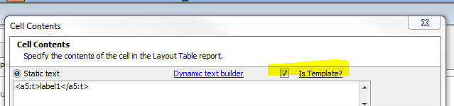
When you click the 'Is Template' checkbox, then <a5:t>
..</a5:/t> tags will be evaluated. In addition, any text
enclosed in { } brackets will be evaluated as an Xbasic
expression.
Mobile Theme - Slate -
A updated version of the new Slate stylesheet is ready for testing.
To download the style click here.
Unzip the file into the CSS folder where you have Alpha Anywhere
installed. This will create a new folder called Slate in the CSS folder.
To use the style, edit a UX component, and then change the style name
for the component to 'Slate'.
NOTE: See Release Notes for more information on the Slate stylesheet.
Grid Component - Query By Example Searches - The
search performed by the QBE search feature is now
case-insensitive on databases that are normally case
sensitive.
You can disable this feature by setting this property in
the Grid's Advanced Properties section:
tmpl.qbeSearchIsCaseInsensitive = .f.
Grid Component - Alphabet Button Search -
Case-insensitive Searches - The search performed by
the Alphabet Button search feature is now
case-insensitive on databases that are normally case
sensitive. To see this change you must make the Grid
dirty and then resave it.
UX and Layout Table Report - AbsoluteLayout Editor
- The AbsoluteLayout editor is now based on an embedded
version of the Chrome Browser. Previous versions were
based on the Internet Explorer ActiveX control. However,
as a result of some very unfortunate changes that
Microsoft apparently made to IE11 (which comes standard
on Windows 8.1), the AbsoluteLayout editor did not work
correctly on machines where IE11 was installed. Now that
the AbsoluteLayout Editor is based on an embedded
version of Chrome, there is no dependency on Internet
Explorer and no risk that a future update to IE will
break some aspect of the AbsoluteLayout editor.
Tips
Grid - Search Part - Setting Initial Value of a
Checkbox Control - Multiple Values - The Search Part
allows you to define the initial value of each control
in the Search Part. However, in the case of a
multi-valued controls, such as a Checkbox control, you
might want to set the initial value of the control to
two or more checked values. You can do this by
specifying some Javascript in the client-side
onSearchRender event. Use the .setValue() method and
pass in an array of the initial selections. For example:
{grid.object}.setValue('S','COLOR',['Red','Green']);
Build 1770-4221 6 Nov 2013
IMPORTANT: If you currently have build 1620-4172 from 21 Aug 2013
or an earlier build installed, then this is a required update.
Bugs
UX Component - Signature Capture Control - Show in
Window - If the Signature Capture control was
placed in a Window Container, when the window was
opened, the signature capture control was shown but you
could not draw on it.
List Control - Microsoft Access - Paginated Lists
- There is a bug in Microsoft Access where if you
specify a SQL Select statement with a limit clause and
an Order By clause, the limit is interpreted as a
percentage. For example
SELECT TOP 5 CustomerID, CompanyName, City FROM
Customers ORDER BY City
In the above query, Access returns the top 5% of records
in the query, not the top 5 records. This bug causes the
wrong number of records to be shown in the List when the
pagination option is set to .t.
A work around for the above Access bug has been added so
that the List now correctly shows the correct number of
records.
UX and Grid Controls - Submitting Data with Leading
Quote Sign - If you submitted a field value that had
a leading quote, the quotes were stripped. For example,
if you tried to save this data into a field:
"alpha"
the value that was actually saved was:
alpha
Grid Component - Postgres - UUID Fields - Fixed an error when
entering a new record with a primary key that was set to a UUID.
Features
Grid Component - Search Part - Case-insensitive
Search Options - The Search Part of the Grid allows
you to specify a search option for each search field.
These options are:
-
1 = Equals
-
2 = Is contained in
-
3 = Starts with
-
4 = Wildcard (user must explicitly enter wildcard characters * or ?)
The above search-options perform a case-insensitive
search on databases that are not case-sensitive, and
perform a case-sensitive search on databases that are
case-sensitive. Oracle and Postgres are examples of
databases that are typically configured to perform
case-sensitive searches, while MySQL and SQLServer
typically perform case-insensitive searches.
Now, new search options are available to force a search
to be case-insensitive, regardless of how the database
is configured. These options use the portable SQL
lower() function to force a case-insensitive search. For
example:
lower(name) LIKE lower(:what_name)
The new options are:
-
11 = Equals (case-insensitive)
-
12 = Is contained in (case-insensitive)
-
13 = Starts with (case-insensitive)
-
14 = Wildcard (user must explicitly enter wildcard characters * or
?) (case-insensitive)
AlphaDAO - Postgres - SSL - Support for SSL is
now available for PostgreSQL ODBC extension driver
variants � these include PostgreSQL, PostgresPlus and
FoundationDB (under development):
-
The connection string dialogs for these extension drivers now have a
checkbox entitled 'Use SSL'.
-
There is a new connection string property called A5SSL and a
connection property called SSL.
-
The extension drivers add the key/value pair 'CA=require;' if SSL is
set to true.
email_smtp_send() Function - Character Set
- You can now specify the character set when using the
email_smtp_send() function.
DIM ps as P
DIM pm as P
pm.from = "aaron@alphasoftware.com"
pm.from_alias = "Aaron Brown"
pm.to = "ed@alphasoftware.com"
pm.subject = "This is a test"
' Text that contains non ascii characters - encoded as
UTF8
pm.message = convert_acp_to_utf8("m�me mani�re")
' Indicate that we want to send the text with 'utf8'
encoding
pm.charset = "utf8"
IF email_smtp_open(ps, "mail.alphasoftware.com")
email_smtp_send(pm, ps)
END IF
Email_smtp_close(ps)
Mobile Theme - Slate -
A updated version of the new Slate stylesheet is ready for testing.
To download the style click here.
Unzip the file into the CSS folder where you have Alpha Anywhere
installed. This will create a new folder called Slate in the CSS folder.
To use the style, edit a UX component, and then change the style name
for the component to 'Slate'.
NOTE: See Release Notes for more information on the Slate stylesheet.
Reports - Free-form Reports - Maximum Report Height - The maximum
height of a report section was previously limited to 22 inches. This
limit has now been substantially expanded. The maximum height of a
report section is now approximately 300 inches.
Tips
UX Component - Watermarks - High Order Characters
(e.g. Hebrew) - Specifying watermark text for
a textbox or textarea control using high order
characters (for example, Hebrew characters) is possible,
but requires the text for the Watermark to be entered as
a unicode encoded string, with the {unicode} prefix.
For example, to set the watermark to the characters
shown in the screenshot below, enter:
{unicode}05D0{unicode}05D1{unicode}05D2
In the
screenshot shown below, the watermark is in Hebrew and
it is on the right side of the control.
To get the text flow direction to 'right-to-left' (so
that the watermark is on the right side of the control),
the following Javascript was added to the client-side
onRenderComplete event:
document.body.style.direction = 'rtl';
Display List of all Session Variables and their
Values - The following .A5W page shows how you can
list all of the session variables in the user's session
and also display the value of each session variable.
<%a5
'test variables - you can delete these if you want
session.var1 = "alpha"
session.var2 = "beta"
'get a list of all of the session variables
'!f flag indicates that no functions should be returned
dim vars as c
vars = properties_enum(session.variables,"!f")
dim html as c
html = ""
'loop over each session variable and get its value
for each vn in vars
html =
html+"session."+vn.value+"="+eval("session.variables."+vn.value)+"<br>"
next
'print out the contents of 'html'
?html
%>
Build 1759-4217 1 Nov 2013
IMPORTANT: If you currently have build 1620-4172 from 21 Aug 2013
or an earlier build installed, then this is a required update.
Bugs
Application Server - Activation - Fixes a bug in
build 1755-4125 that prevented an Application Server
that had not previously been activated from being
activated.
List Control - Microsoft Access - Paginated Lists
- There is a bug in Microsoft Access where if you
specify a SQL Select statement with a limit clause and
an Order By clause, the limit is interpreted as a
percentage. For example
SELECT TOP 5 CustomerID, CompanyName, City FROM
Customers ORDER BY City
In the above query, Access returns the top 5% of records
in the query, not the top 5 records. This bug causes the
wrong number of records to be shown in the List when the
pagination option is set to .t.
A work around for the above Access bug has been added so
that the List now correctly shows the correct number of
records.
UX and Grid Controls - Submitting Data with Leading
Quote Sign - If you submitted a field value that had
a leading quote, the quotes were stripped. For example,
if you tried to save this data into a field:
"alpha"
the value that was actually saved was:
alpha
Features
Mobile Theme - Slate -
A updated version of the new Slate stylesheet is ready for testing.
To download the style click here.
Unzip the file into the CSS folder where you have Alpha Anywhere
installed. This will create a new folder called Slate in the CSS folder.
To use the style, edit a UX component, and then change the style name
for the component to 'Slate'.
NOTE: See Release Notes for more information on the Slate stylesheet.
Reports - Free-form Reports - Maximum Report Height - The maximum
height of a report section was previously limited to 22 inches. This
limit has now been substantially expanded. The maximum height of a
report section is now approximately 300 inches.
Tips
UX Component - Watermarks - High Order Characters
(e.g. Hebrew) - Specifying watermark text for
a textbox or textarea control using high order
characters (for example, Hebrew characters) is possible,
but requires the text for the Watermark to be entered as
a unicode encoded string, with the {unicode} prefix.
For example, to set the watermark to the characters
shown in the screenshot below, enter:
{unicode}05D0{unicode}05D1{unicode}05D2
In the
screenshot shown below, the watermark is in Hebrew and
it is on the right side of the control.
To get the text flow direction to 'right-to-left' (so
that the watermark is on the right side of the control),
the following Javascript was added to the client-side
onRenderComplete event:
document.body.style.direction = 'rtl';
Build 1755-4215 29 Oct 2013
IMPORTANT NOTICE
This update is a required update. It must be
installed before November 1.
Breaking Changes
UX Component - Client-side Readonly Expression - If your UX
component has a client-side readonly expression you must recalculate the
control and then resave the UX component. To recalculate the control,
select the control that has the client side readonly expression and then
make a change to any property of the control.
Videos
|
UX Component |
Image and File Upload - In Depth Look at What
Happens Behind the Scenes When a File is
Uploaded |
When you upload a file or image in the UX
component, the binary data that is uploaded is
stored in temporary session storage until the
user commits the record they are editing. This
video discusses what happens when a file is
uploaded and what happens when the record you
are editing is committed.
The video also shows how you can write Xbasic to
modify the filename that is stored on disk when
the Camera is used to capture an image on a
mobile device.
Watch Video - Part 1
Watch Video - Part 2
Watch Video - Part 3
Watch Video - Part 4
Download Component |
|
Reports |
Printing Data that Contains HTML Markup |
In some cases the data in a report you are
printing might contain HTML markup. You might
want to print the HTML markup in its rendered
form, rather than its raw form. In this video we
show how you can configure the report editor to
print HTML markup as rendered HTML.
Watch Video |
|
UX and Grid Component |
Understanding Component Aliases and the Use of
Placeholders in Javascript Code |
When you write your own Javascript code in a
Grid or UX component, you often use
'placeholders' (such as {Dialog.object} ) in
your code. In this video we explain in depth how
these placeholders work and we discuss the
concepts of a component 'alias'.
Watch Video - Part 1
Watch Video - Part 2
Watch Video - Part 3
Watch Video - Part 4
Watch Video - Part 5 |
|
UX Component |
Consolidate Multiple Ajax Callbacks into a
Single Callback |
This video is aimed at advanced developers. It
shows how the a5_ux_action() utility function
can be used to optimize certain types of UX and
List control actions into a single Ajax
callback.
Watch Video - Part 1
Watch Video - Part 2
Download Component |
|
Xbasic |
Working with XML Documents |
Xbasic has always had a powerful XML parser, but
the new *property_from_xml() function and the
new XML document viewer make it ever easier to
work with XML documents.
Watch Video |
|
Grid and UX Component |
Image Upload to a Character Field |
When you upload images in either the Grid or UX
component, the target field can either be a
binary field or a character field. In the case
of a character field, the filename of the image
is stored in the field and the image file itself
is stored in a file in the specified 'upload
folder'.
The filename of the image that is stored in the
target character field can be a fully qualified
filename, or more likely, you will store the 'shortfilename'
(i.e. a relative filename).
If you choose to store the 'shortfilename', then
you must configure an image path property so
that the image filename can be resolved.
This video discusses this issue.
Watch video |
|
UX Component |
Responsive Layout - Modifying the Design of a
Component Automatically Based on the Device and
Screen Orientation |
'Responsive' is the term used to refer to
a design that automatically changes its layout
based on the device on which it is running, the
device orientation and the window size (for
desktop browsers). The UX component has very
powerful tools for implementing responsive
layouts.
In this video we show how the Responsive Layout
Genie can be used to build highly responsive UX
component designs.
Watch Video - Part 1
Watch Video - Part 2
Watch Video - Part 3
Advanced settings
Watch Video
Download Components |
|
UX Component |
List Controls/Data Series - Using an IN Clause
with Array Arguments in a SQL Statement |
List controls, Charts and Data Series in a UX
can all be based on a SQL query. In some cases
you might want to use an IN clause in the SQL
query and reference an argument value to get the
values for the IN clause.
This video shows how you can use arrays in a
SQL::argument object and then reference the
argument in a SQL IN clause.
Watch Video
Download Component |
|
UX Component - List Control |
Using the Server-side AfterQuery Event -
Computing a Column Total |
For List controls that are based on a SQL query,
the server-side AftterQuery event fires after
the query to get the List data has been
executed. This event is typically used to
compute some Javascript code to return to the
browser.
In this video we show how the event can be used
to return the total for a column in the List.
Since the List is paginated, all of the data in
the List query is not currently shown in the
List and therefore the calculation of the total
must be done on the server.
Watch Video - Part 1
Watch Video - Part 2
Watch Video - Part 3
Download Components |
|
UX Component |
Computing a List Column Total using Client-side
Calculations |
In cases where the List data is not paginated
(and therefore the List contains all of the data
in the List query), column totals can be
computed client-side.
In this video we show how the data in a column
in the List is computed using Javascript.
Watch Video
Download Components |
|
UX Component - List Control |
Adding Dynamic Bubble Help (tooltips) to a Field
in a List |
In this video we show how you can add dynamic
bubble help to a field in a List control using
some Javascript in the onItemDraw event.
Watch Video
Download Component |
|
UX Component |
Embedded UX Components - Understanding the
onPanelActivateEvent |
A common practice when designing mobile
applications is to break a large application
into multiple smaller UX components and then
embed components in Panel Cards in the 'master'
UX component. When you do this, it is useful to
be able to execute code whenever a child UX
component gets focus.
In this video we show how the onPanelActive
client-side event in a child UX will fire
whenever the Panel Card in which it is embedded
gets focus.
Watch Video
Download Components |
|
UX Component |
Annotating an Image using the Signature Capture
Control |
The signature capture control can be used for
more than capturing images. In this video we
show how a medical application can use the
signature capture control to annotate an image
of the body to indicate affected areas.
Watch Video
Download Component |
|
UX Component - List Control |
Server-side Summary Values |
For List controls that are based on SQL data,
you can specify that summary data (e.g. total,
avg, count, min and max) should be computed for
certain columns in the List control. The summary
computations are based on the List query (not on
the rows actually visible in the List). In the
case of a paginated List, there may be more rows
in the query than are visible in the List. For
example, the query might have 1,000,000 rows,
but the list might show 20 rows at a time.
This video shows how a List control is
configured to compute summary values, and then
how the afterServerSideSummaryCompute event in
the List is used to update a label on the UX
component showing the summary values.
Watch Video |
|
Grid Component |
Locking the Screen while a Long Running Ajax
Callback is Executing |
If a Grid or UX component makes an Ajax callback
that takes a long time to complete, you might
want to display a message to the user telling
them to wait and also you might want to 'lock'
the screen to prevent them from firing other
callbacks until the current callback has
completed.
In this video we show how this is easily done
using a custom modal window.
Watch Video |
|
Grid Component |
Storing State Information |
Both the Grid and the UX allow you to store
'state' variables that are available on both the
client and server-side.
The UX has always allowed you to set state
variables on the server side (in any server-side
event or an Ajax callback) by setting variables
in the 'e._state' object. Previously, to set
state variables on the server side in the Grid
you had to generate Javascript code. Now, you
can also set variables in the e._state object on
Grid server side events.
This video shows how this is done.
Watch Video - Part 1
Watch Video - Part 2 |
|
UX and Grid Component |
Overview of How to Localize a UX or Grid
Component |
In this video we give a brief overview on how a
Grid or UX component can be localized so that
the same component can be used for different
languages. The technique involves using either
Language tags (<a5:r>) or Text Dictionary tag
(<a5:t>) around text strings that need to be
localized.
Watch Video - Part 1
Watch Video - Part 2
For certain languages, the text flow direction
is 'right to left' (e.g. Hebrew, Arabic). In
this video we show how you can execute
Javascript to change the text flow direction for
the whole page. The Javascript is added to the
component's render complete event. It sets the
text direction using this code:
document.body.style.direction= 'rtl'
Watch Video - Part 3 |
|
UX Component |
Show/Hide Buttons in Panel Header/Footer Without
Messing Up Button Alignment |
A common pattern in mobile applications is to
have buttons in a Panel header or footer and to
space the buttons so that some are left
justified, some centered and some right
justified. Then you might show/hide one or more
of the buttons, but you don't want the spacing
on the buttons to be affected.
This video shows how this can be done.
Watch Video |
|
UX Component |
Building a Menuing System in a UX Component
Using Docked Panels in a Panel Layout |
In mobile applications is it common to build
menus that slide in from the right or left of
the screen. In this video we contrast how this
is accomplished in jQuery mobile and Alpha
Anywhere. The approach we have taken in this
video for Alpha Anywhere shows how the menus can
be placed in Panel Cards that are docked inside
a Panel Navigator.
Watch Video - Part 1
Watch Video - Part 2
Watch Video - Part 3
Watch Video - Part 4
Watch Video - Part 5
Download Components |
|
UX Component |
How to Dynamically Change the Code on a Button |
(Advanced Javascript Developers) This video
shows how you can dynamically change the code
associated with a button on a UX component by
'unbinding' the existing code and then 'binding'
new code.
Watch Video |
|
UX Component - List Control |
Edit the Current Row in a List Control in
another UX Component |
The Grid component has an option in Action
Javascript to edit the current row in a Grid
using a UX component (that is data bound to the
same table that the Grid is based on). This
option also allows you to add a new record to
the Grid using a UX component. The action for
the Grid is called:
"Open a UX component to Edit Current Record in
Grid, or add a new Record"
Now an analogous action is available in Action
Javascript to edit the current row in a List
control (for Lists that are based on SQL or DBF
data sources) using another UX component that is
data bound to the same table that the List is
based on. The action for the UX is called:
"Open a UX component to Edit Current Record in
List Control in a UX, or add a new Record to a
List Control in a UX"
Watch Video |
|
UX Component - Mobile |
Panel Layout - Understanding the Different Ways
in Which a Docked Panel Can Be Shown - 'Over',
'Slide' and 'Push' |
Using Panel Layouts that contain multiple child
Panels is common when building mobile
applications. One or more of the child Panels
that are shown in a Panel Layout can be 'docked'
(i.e. hidden). Panels can either be explicitly
docked, or conditionally docked (for example, on
an orientation change).
Panels that have been docked can be shown (typically
by clicking on a 'controller' button in a Panel
Header). When a docked Panel is shown, you can
specify the method use to show the Panel. This
method discusses the various methods - Over,
Slide and Push
Watch Video |
|
UX Component - Mobile |
Overview of Different Methods for Specifying the
Size of a Panel in a Panel Layout |
When using a Panel Layout you can optionally
specify the size of each Panel that is displayed
within the Panel Layout. When you specify the
size of a Panel, you can use either an absolute,
percentage or relative size. This video
discusses the various options.
Watch Video |
|
UX Component |
Embedding Reports into a UX Component and
Dynamically Filtering the Report |
Reports can be 'embedded' into the UX component
and then dynamically filtered based on values
that the user enters into controls on the UX.
This allows for powerful interactive dashboard
type applications where users can interact with
reports. This video shows how this can be done.
Watch Video |
|
UX Component |
Custom Styling for RadioButton and CheckBox
Controls |
The standard way in which browsers render
checkbox and radiobutton controls is pretty
drab. In this video we show how the UX component
allows you to apply a rich set of styling
options to radiobutton and checkbox controls.
Watch Video - Part 1
Watch Video - Part 2
Watch Video - Part 3
Download Component |
|
UX Component |
Positioning Controls at Absolute Locations on
the Screen using the WYSYWIG Builder -
Understanding the AbsoluteLayout Container |
By default, the UX component lays out the
controls that have been placed on the component
automatically, 'flowing' the controls from left
to right, top to bottom. All controls are
perfectly aligned. However, there are times when
you want more precise control over the placement
of controls. This is especially true when you
want to use an image (for example, an image
of a PDF form you might have) as the backdrop to
a form and then place your UX component controls
at precise locations exactly over the 'fields'
in the image.
This video shows how you can place controls in
an an AbsoluteLayout container and the set the
absolute position and size of each control.
Watch Video - Part 1
Watch Video - Part 2
Watch Video - Part 3
Watch Video - Part 4
Watch Video - Part 5
Watch Video - Part 6
Watch Video - Part 7 |
|
UX Component |
Understanding the 'NoFloat' Container Type |
By default, all controls in a UX component are
wrapped in a DIV with a class name of
A5CWLayout. This class adds a CSS float and
padding so that the controls 'flow'
automatically, left to right, top to bottom
across the page. If a control has a 'break'
after it, a new 'line' is started. This
automatic lay out of the controls on a UX makes
it very easy to design attractive, perfectly
aligned forms.
However, there are cases when the padding that
is automatically added to all controls gets in
the way of the effect that you are trying to
achieve and in these cases you can wrap controls
in a special 'NoFloat' container.
This video explains how the 'NoFloat' container
works.
Watch Video |
|
UX Component |
Adding a 'Flow Collapse' Button to Panels in a
Panel Layout to Hide/Show Panels |
Panels in a PanelLayout can be hidden or shown
by adding a 'flow collapse' button to a Panel. A
common reason for doing this is to create a
'full screen' view for the 'primary' Panel in a
PanelLayout. This video shows how this is done.
Watch Video
Download Component |
|
UX and Grid Component - |
'NotInList' Event for Auto-Suggest and
Edit-Combo Controls |
The 'NotInList' event fires when the user enters
a value into an Auto-suggest or Edit-combo
control and the value entered is not is the list
of available choices for the control.
Watch Video |
|
Reports |
Printing QR Codes |
Printing QR Codes on Layout Table Reports is now
a built-in feature.
Watch Video |
|
UX Component |
Displaying QR Codes on a UX Component |
A common requirement, especially in mobile
applications, is to display data encoded as a QR
code. The UX component has a built-in QR Code
control that makes it very easy to display any
data in the form of a QR Code. This control uses
Javascript to generate the QR Code. Because it
is a pure Javascript control, no Ajax callback
is required and therefore it is very fast.
However, you can also generate QR codes on the
server.
This video shows how QR codes can be shown on a
UX component using both client-side and
server-side techniques.
Watch Video - Part 1
Watch Video - Part 2
Download Component |
|
Reports |
Absolute Positioning of Objects in a Layout
Table Report - Using a Form Image as Report
Background |
In a previous video we have shown how the UX
component supports absolute positioning of
controls over a bitmap image of a form
(typically a PDF form).
Layout Table reports also offer the ability to
also use an image of a form as the report
background and to then position the report
fields directly over the 'fields' on the
background image.
This video shows how this is done.
Watch Video - Part 1
Watch Video - Part 2
Watch Video - Part 3 |
|
|
|
|
Tips
Reports - Printing Reports that Contain HTML Markup
in the Data - In some cases the data in a report you
are printing might contain HTML markup. You might want
to print the HTML markup in its rendered form, rather
than its raw form. In this video we show how you can
configure the report editor to print HTML markup as
rendered HTML.
Watch Video
UX Component - Buttons - How to Programmatically
Enable and Disable Buttons - In V12 all buttons on
the UX component are 'Adanced Buttons'. (In V11 buttons
could either be 'standard' or 'advanced'). Advanced
buttons are implemented as Javascript objects and so in
order to enable or disable them programmatically, you
need to get a pointer to the object and then call the
object's .setDisabled() method.
NOTE: All Javascript controls, not just buttons,
in the UX (List, ButtonList, SpinList, Tree, etc.)
support the .setDisabled() method.
For example:
var bObj = {dialog.object}.getControl('BUTTON_1');
//set the button disabled
bObj.setDisabled(true);
//now enable the button
bObj.setDiabled(false);
If the button is in a Repeating Section, and you want to
call the .setDisabled() method for a specific button
instance (say the button in row 3), then you can pass in
an optional parameter to the .setDisabled() method. For
example:
//get a pointer the button element in row 3
var eles = $('{dialog.componentname}.V.R1.BUTTON_2_A5INSTANCE3');
//pass in eles as an optional argument to the .setDisabled()
method
{dialog.object}.getControl('BUTTON_2').setDisabled(true,eles);
NOTE: In the above example, if you did not pass
in the optional second argument to the .setDisabled()
method, the button in every row of the Repeating Section
would have been disabled.
Bugs
UX Component - Lists and Embedded Components - Delay
Render Until Visible - Panel Layouts - Panels and
Embedded Objects that were set to delay render until
visible were not rendered if they were in a Panel Card
inside a Panel Layout if the initial state of the Panel
Card was 'docked'.
Forms - Super Controls - Google Maps Supercontrol -
Windows 7/8 - If you used the Google Maps
Superconrol in a Form on a machine where IE10 was
installed, you would get a Javascript error. This error
is apparently a bug in IE10 because the same Form runs
without error on XP (where IE8 is used). A work around
for this IE bug has been found and now the Form will
work on Windows 7/8 without error.
Reports - Layout Table Reports - Linked Reports -
If a child report uses arguments, and the parent report
also uses arguments, then in the dialog where the child
report is linked, you can now specify argument bindings
to bind a child report argument to a parent report
argument. Previously you could only bind child report
arguments to literal or field values.
Report - Layout Table Reports - Linked Reports -
Arguments in the Report Filter - If a child report
(that was based on a SQL query) defined a filter in the
report definition that used arguments, when this report
was linked by a parent report, the child report
arguments were not seen. Child report arguments were
only seen if they were part of the report Data Source.
UX Component - List Control - Scrolling - As a
result of changes to the change event described in a
previous pre-release build, scrolling in he List caused
the List's onClick event to fire. This is now fixed.
Here is how tapping, and scrolling and List events now
work:
- If you tap on a row in the List and move your finger by more than the
threshold amount (currently set to 10px) and you release -- while still on
the same row in the List - the click event will fire.
- If you tap on a row in the List and move your finger by more than the
threshold amount so as to start scrolling the List and then release after
the List has started scrolling - even if you are still over the same List
item on which the tap started - the click event will not fire.
- If you tap on a row and then move by more than the threshold amount the
tap event will not fire.
- The tap event will only fire if you have not moved your finger by more
than the threshold amount when you release.
ReportMailer and Netmailer - The installers for
both have been updated for V12. If you need to use
either of these addins with V12, please download the
installers from the location specified in your order
confirmation email.
UX Component - Data Bound - Security - If a UX
component had security on a control so that for certain
roles a control was not present on the UX, when doing an
insert into a SQL table, you would get an error.
UX Component - Action Javascript - Insert, Update or
Delete on an Unbound UX - Fixed some issues with the
action.
Grid Component - Detail View - Edit on Demand -
Cancelling out of the New Record - If a Grid
with a Detail View was configured to only edit on demand
when cancelling out of a new record, the Detail view did
not return to the correct state (showing controls as
labels, and not textboxes).
AlphaDAO - MySQL - Longbinary Fields - Fixes an
issue with inserting null blobs inot longbinary fields.
Grid Component - File Export - In the case of an
ascii export, was not honoring the extension if you
supplied a custom client side filename.
Windows 8.1 - Working Preview - Windows 8.1 has
made a change that is causing Working Preview in the
Component Builders to fail. You will receive an error
message from Javascript ("access denied"). This build
has a work around so that Working Preview is now working
in Windows 8.1.
Report Server - The 4 core Report Server is now
automatically enabled without requiring a Feature Key to
be added. Previously, the Report Server was only enabled
if you had entered a Feature Key.
TIP: If you want to disable the Report Server,
you can go to Project Properties and disable it from
there. The setting will apply to the current project.
UX Component - Action Javascript - Map Actions - Add
Marker to a Map - If you selected the action to add
a marker to a map and you passed in a comma separated
latitude/longitude value (e.g. 31.65583, -81.21025) the
marker was not positioned correctly on the map. The
problem did not occur if you passed in an address. The
reason that the marker was not being positioned
correctly was that the generated code passed the lat/lng
value to the .addMarker() method as a string, when it
should have been passed in as an array. To fix the
problem you will need to edit and resave the action in
your component.
UX Component - Cascading Dropdown Controls -
Repeating Sections - If a UX component had Repeating
Sections, and had cascading dropdownbox controls in both
the top level section of the UX and in a Repeating
Section, the cascading dropdown in the Repeating Section
was not populated correctly when the UX was populated
with an existing record.
UX Component - Opening Child UX Components in Dynamic
Panels - Fixed a bug where the Image Upload action
in a child UX component that was opened in a Dynamic
Panel did not work.
TabbedUI Component - Grid Component - Multi-line Text
Area - Under some circumstances when working with a
Grid that has a multi-line text-area control in a Tabbed
UI, pressing down or up arrow in the text-area would not
move the insertion point.
Grid and UX Component - Edit Combo - Did not
scroll the current selection into view.
Reports - HTML Reports - SQL Tables with Spaces in
Field Names - Fixed a bug in HTML reports when there
were spaces in field names.
Notice
.Net Framework 4.5 - Alpha Anywhere currently
requires .Net 4.0. We will soon be switching to .Net
4.5. In anticipation of this change the Full and Patch
installers will now install .Net 4.5 on your machine if
it is not already installed.
Features
UX and Grid Component - Javascript Confirmation
Windows - Title Direction - By default, all
confirmation dialogs show the title on the left and the
close icon on the right. For right to left languages,
you might want to change this.
To do so, put the following Javascript in the Grid or UX
onRenderComplete client-side event:
A5.msgBox.window = {
title: {
direction: 'rtl'
}
}
Reports - Layout Table Reports - Absolute Layout
- Layout Table Reports now support absolute positioning
of fields. This feature is similar to the absolute
positioning of controls in a UX component using an
AbsoluteLayout container.
The primary motivation for adding this feature to
reports is to allow you to use an image of a form (for
example, an image of a IRS 1040 PDF form) as the
background for a cell in a Layout Table report, and to
then allow you to place the fields in the report at
explicit locations so that they print 'on top of' the
fields in the image background.
NOTE: This feature is only available for Layout
Table reports that are being edited in the full report
editor - not in the Quick Report genie.
To access the feature, double click on a cell in the
Layout Table report. The 'Cell Contents' dialog opens
up. Note a new choice in the dialog - 'Absolute HTML'.
If you select this option, then click the 'Edit...'
button, the Absolute Layout editor for the cell opens
up:
The editor shows the available fields, a 'canvas' where
you can place the fields using drag and drop actions,
and a property sheet showing properties of the selected
field.
NOTE: Unlike the UX component, the size of the
editing region (shown as 312 by 138 pt in the above
image) cannot be changed in the editor. The size of the
editing region is determined by the size of the cell in
the Layout Report.
For each field that you place on the canvas, you can use
the Style property in the Property Sheet to define
properties (using HTML CSS syntax) to control the
appearance of the field in the report.
For example, if you want a field in the absolute layout
HTML to appear in red, with a blue border, you would
define the following for its Style property:
color: red; border: solid 1px blue;
Placing 'Radio Buttons' and 'Checkbox' Controls
Assume that the background image for a cell uses the
image shown below. Consider the 'Filing Status' area. It
is likely that in your table, you have single field
called 'filingStatus' that might have a value of 1, 2,
3, 4, or 5 stored in the field.
However, when you print a report, you want to print an
'X' above the appropriate box in the image.
To do this, you would need to define five calculated
fields in your report. For example:
filingStatus_1 = if(filingStatus = 1, "X","")
filingStatus_2 = if(filingStatus = 2, "X","")
filingStatus_3 = if(filingStatus = 3, "X","")
filingStatus_4 = if(filingStatus = 4, "X","")
filingStatus_5 = if(filingStatus = 5, "X","")
Having done this, when you open the Absolute Layout
editor, your field list will show the five calculated
fields you have defined, and you can place each one of
these fields over the appropriate radio button control
on the image.
Defining the Background Image for the Cell
When you are in the Absolute Layout editor, you can
define the background image for the cell. When you
specify the image, you can specify how the image should
be scaled to fit the cell. The options are:
-
'default' - use the image absolute size
-
'stretch' - stretch the image to fill the cell,
-
'cover' - fill the cell, but preserve the aspect ratio. If any part
of the image is 'left over', it is clipped.
-
'contain' - preserve aspect ratio, but scale image so that the whole
image can be seen.
UX Component - Mobile Applications - Location
Information - Current location information can be
used in several actions in Action Javascript. These
actions include Ajax Callbacks, Centering a Map, Placing
a Marker on a Map, Filtering a List for Records within
the Vicinity of the Current Location.
Now, the Action Javascript builders expose three
properties which previously were hard coded to default
values. These properties are:
High accuracy - If true, the device will use its most
accurate method to get location information. If false,
the device will use its fastest or lower power
consumption method depending on the device. (Default
true)
Timeout - The amount of time in milliseconds to wait on
the device to acquire location information excluding the
amount of time it takes the user to grant the web page
access to geolocation data. (Default 15000)
Max age - The amount of time in milliseconds to accept a
previously acquired location. 0 means that a new
location must be acquired from the device. (Default
30000).
You can also change the default settings for these
properties, by adding Javascript like this (using
appropriate values for each of the properties) to the
onRenderComplete client-side event:
{dialog.object}.locationMaximumAge = 30000;
{dialog.object}.locationTimeout = 15000;
{dialog.object}.locationHighAccuracy = true;
UX Component - ListControl - onBeforeSelect event
- The onBeforeSelect event fires before the Select
event. If the event returns false, then the user is
prevented from moving off the currently selected row in
the List.
Grid and UX Component - Windows, Auto-suggest and
Edit-combo - Specifying a Maximum Window Height -
When you define the window height for a pop-up window,
an auto-suggest control or an edit-combo control, you
can specify a window height.
If you leave the height property blank, the window will
be sized to accommodate the entire height of the content
(which will result in a window that is too high if there
is a lot of content).
On the other hand, if you specify an explicit size, then
you will end up with a window that looks too big if
there is just a small amount of content in the window.
Now, when you specify the window height you can use the
'max' syntax to specify that the window should be
automatically sized to fit its content, but should not
grow bigger than the specified max size. For example,
you can specify the height property as:
max: 300px
UX and Grid Component - Auto-suggest and Edit-combo
Controls - 'NotInList' Rule - The 'NotInList' event
fires when the user enters a value into an Auto-suggest
or Edit-combo control and the value entered is not is
the list of available choices for the control.
Watch Video
The primary use case for this event is to allow the
developer to add code to the component to add the value
that was entered into the control into the table on
which the control choices are based so that the next
time the user visits the control the value entered will
be in the pick list for that control.
UX Component - QRCode Control Type - A new
control type has been added to the UX component. The
QRCode control displays its value as a QR Code.
The image shown below shows a UX with a QRCode controls.
Watch Video - Part 1
Watch Video - Part 2
Download Component
NOTE: The QRCode control is a client-side
control. That means that Javascript is used to generate
the QR code. You can also use Xbasic methods to generate
servers-side QR codes (as bitmaps or SVG). See
::Qrcode::Creator:: below for more details.
To place a QRCode control on a UX, select the control
type from the toolbox.
The QRCode control is just like other data bound
controls in that it has a .getValue() and .setValue()
method.
To display a QR code, you simply call the .setValue()
method of the control. For example:
{dialog.object}.setValue('MYQRCONTROL_1','value to
encode');
QRCodes - Xbasic - New methods have been added to
Xbasic to generate QRCodes. The methods are:
::Qrcode::Creator::GenerateBmp(c text, c flags)
::Qrcode::Creator::GenerateBmpFile(c text, c filename, c
flags)
::Qrcode::Creator::GenerateJpeg(c text, c
flags)
::Qrcode::Creator::GenerateJpegFile(c text, c filename,
c flags)
::Qrcode::Creator::GeneratePng(c text, c flags)
::Qrcode::Creator::GeneratePngFile(c text, c filename, c
flags)
::Qrcode::Creator::GenerateRTF(c text, c flags,
n width, n height)
::Qrcode::Creator::GenerateSVG(c text, c flags)
The flags parameter can be set to 'L' (low), 'M'
(medium) or 'H' (hight) to indicate the level of error
correction in the generated QR Code.
For example, from the Interactive window:
dim svg as c
svg = ::QRCode::Creator::GenerateSVG("http://www.alphasoftware.com","L")
a5_show_html(svg)
To display a QR code in an Xdialog:
svg = ::QRCode::Creator::GeneratePngFile("http://www.alphasoftware.com","c:\myfiles\qr1.png","L")
ui_dlg_box("QRCODE","{image=c:\myfiles\qr1.png}")
Qrcode_bitmap() Function - Generates a bitmap of
a QR Code - This function is a wrapper for the ::QRCode::Creator::GeneratePng()
function. However, it is able to scale the bitmap to an
explicit size.
Returns either binary PNG data or base64 encoded string
with 'data:image/png;base64,' prefix
Syntax
A blobOrString = qrcode_bitmap(c text, c
flag [,N width , [N height [, L
flagBase64encodedWithPrefix]]])
-
width - width of bitmap in pixels
-
height - height of bitmap in pixels
-
flagBase64encodedWithPrefix - if .t. then return a base64
encoded string with the 'data:image/png;base64,' prefix
QRCodes - Layout Table Reports - Layout Table
Reports now support printing any cell in the Layout
Table that contains a text value as a QR code.
To print the contents of a cell as QR code, simply
check the 'Display QRCode for text in cell' property at
the bottom of the 'Cell Contents' dialog box.
For example, here is a report showing customers in the
sample Northwind database:
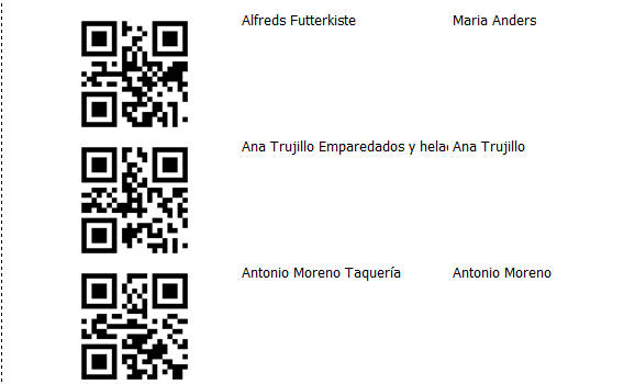
Watch Video
UX Component - PanelLayout Containers - Flow Collapse
Buttons - Allows you to put a button in a Panel
(only applies if the Panel is contained within a
PanelLayout) to 'collapse the flow' of Panels that come
'before' the current Panel. By 'collapsing the flow' of
a Panel, you make the Panel invisible.
Watch Video
The following set of images help to explain the concept:
The image below shows a Panel Layout with 3 child Panel
(the child Panels can be PanelCards, PanelNavigators or
PanelLayouts). The PanelLayout flow is set to LTR so
that the Panels 'flow' from left to right. All of the
Panels in the PanelLayout are currently visible.
PanelCard1 and PanelCard2 both have an explicit size
(say 100px) and PanelCard3 takes up the remaining
available space.
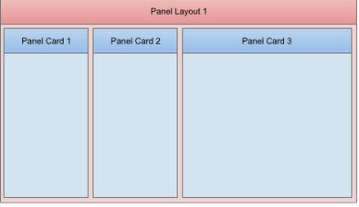
Now, let's assume that PanelCard3 has a button (either
in the Panel body itself, but more likely in its header
or footer) to 'collapse the flow' (of the Panels that
come before it).
If this button was pressed, then the Panels that come
before it (PanelCard1 and PanelCard2 - because the flow
direction is LTR) will get 'collapsed'. Their widths
will get set to zero using an animation.
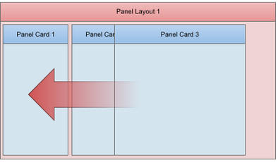
When the animation has completed, Panel Card3 will
consume all of the available space in its parent
PanelLayout.
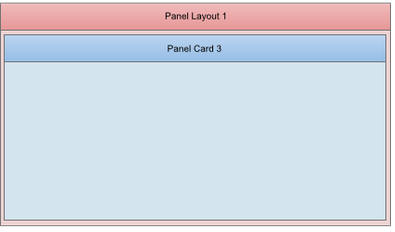
The 'Flow collapse' button acts as a toggle. So, if the
button were pressed a second time (while PanelCard1 and
PanelCard2 are collapsed), then PanelCard1 and
PanelCard2 will be re-shown, again, using an animation.
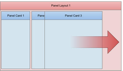
When would you use a 'Flow collapse button'? Assume that
in the above example, PanelCard1 and PanelCard2 contain
navigation or menu controls and that PanelCard3 is the
main 'work' area of your application. By have a 'flow
collapse' button in PanelCard3, you can allows you users
to toggle 'full screen' mode on and off.
The primary use case for this pattern is when PanelCard1
and PanelCard2 contain 'navigation' or 'menu' controls
and
Defining a 'Flow Collapse' Button
To define a 'Flow Collapse' button for any Panel (PanelCard,
PanelNavigator or PanelLayout), set the 'Has a 'flow
collapse' button' property in the Panel's Property
Sheet.
Once you click this property, you can specify the ID of
the button that will act as a 'flow collapse' button.
NOTE: If you have defined an onClick event for
the flow collapse button, the event will be ignored
since the button is being 'hijacked' to perform the
'flow collapse' action.
The builder allows you to define separate icons to use
for when the Panels are in the collapsed state and when
they are in the expanded state.
IMPORTANT: If you want to display icons on the
flow collapse button you must set the button type to the
appropriate option in the properties for the button you
specify as the 'flow collapse' button.
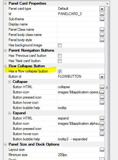
UX Component - NoFloat Container Type - By
default, all controls in a UX component are wrapped in a
DIV with a class name of A5CWLayout. This class adds a
CSS float and padding so that the controls 'flow'
automatically, left to right, top to bottom across the
page. If a control has a 'break' after it, a new 'line'
is started. This automatic lay out of the controls on a
UX make it very easy to design attractive, perfectly
aligned forms.
However, there are cases when the padding that is
automatically added to all controls gets in the way of
the effect that you are trying to achieve and in these
cases you can wrap controls in a special 'NoFloat'
container.
Watch Video
In the image below, the first container (red) is a
standard container. 'Firstname' and 'Lastname' are on
the same line (because the break after 'Firstname' was
turned off) as are 'City' and 'State'. Also, each
control has padding around it.
The second container (blue) has been set to a 'NoFloat'
container. Notice that all controls now are on their own
line (even though there is no break after 'Firstname'
and 'City' and all padding between controls has been
removed.
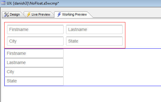
Xdialog - List Control - W=milliseconds Directive to
Delay Firing Selected Event - A new directive can be
added to a List control to delay firing the selected
event for a specified number of milliseconds.
The directive:
W=milliseconds
is inserted in the Listbox commands (between the %
symbols).
To test the effect of this directive, create a new
Xbasic script and paste this code in. Then click on a
row - a message box will show the selected value. Then
hold the down arrow down and the selection will move
quickly down the list, but the event which shows the
current selection will not fire until you have stopped
holding down the down key.
Then, repeat the exercise with te W=2000 directive
removed. You will see that the message box is shown for
every row.
dim colors as c
colors = a5.Color_Enum()
dim selected as c
dim dlg_title as c
dim dlg_body as c
dim dlg_event as c
dlg_title = "Title"
dlg_body = <<%dlg%
{removecomments}
{removeleadingspaces}
[%W=2000%.100,30selected^#colors!selected_changed];
%dlg%
dlg_event = <<%code%
if a_dlg_button = "selected_changed" then
a_dlg_button = ""
ui_msg_box("",selected)
end if
%code%
dim flagOK as l = .f.
ui_dlg_box(dlg_title,dlg_body,dlg_event)
UX Component - Radiobutton and Checkbox Controls -
Custom Styling - The standard way in which browsers
render checkbox and radiobutton controls is pretty drab.
The UX component allows you to apply a rich set of
styling options to radiobutton and checkbox controls.
For example, here is an example of how these controls
can be styled:
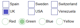
Watch Video - Part 1
Watch Video - Part 2
Watch Video - Part 3
Download Component
To style a Radiobutton or Checkbox, check the 'Has
custom design' property.
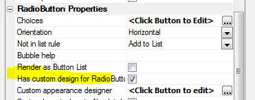
Then click the smart field for the 'Custom appearance
designer' to open the builder. The builder gives you
control over a large number of appearance properties and
also shows a real-time preview of the control's
appearance.
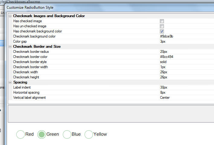
UX Component - Embedded Obects - Reports - HTML
Reports - When you embed a report into a UX
component, you now have the option to specify that the
report should be rendered as HTML.
Watch Video
Panel Layout - Display Method - 'Push' Option - A
new option for the 'Docked Panel display method'
property has been added. The option is 'push'. The
'push' method pushes the Panel that are to the left (or
right, above or below - depending on the Flow direction)
Watch Video
Panel Layout - Dock Options - Several new options
have been added to specify when a Panel that is
contained in a Panel Layout should be docked (i.e.
hidden). The complete list of options is shown below:
- none
- collapse-before
- collapse-after
- auto-collapse-before
- auto-collapse-after
- portrait-collapse-before
- portrait-collapse-after
- landscape-collapse-before
- landscape-collapse-after
- self-portrait-collapse-before
- self-portrait-collapse-after
- self-landscape-collapse-before
- self-landscape-collapse-after
The options prefixed with 'landscape', 'portrait', and 'self' are
new.
If a Panel's dock option is set to 'portrait-collapse-before' then
the Panel will be docked (i.e. hidden) when the device is in portrait
mode, but not when in landscape mode.
If a Panel's dock option is set to 'self-portrait-collapse-before'
then the Panel will be docked when the Panel Layout in which it is
contained is in 'portrait' mode (i.e. it has a width that is less than
its height), regardless of the orientation of the device itself.
Panel Layout - Size Options - New options have
been added for specifying the size of a Panel in a Panel
Layout. You can now use percentages and negative sizes.
If you specify a percentage size, the percentage
represents the percentage of the available space in the
Panel Layout.
If you specify a negative size (e.g. -100px), then the
Panel Layout will have a size equal to the size of the
Panel Layout (in the flow direction), minus 100px.
Watch Video
Grid Component - Alphabet Button Search - Custom
Buttons - The Alphabet Button search feature in the
Grid has always allowed custom button definition. For
example:
A..C = left({searchfield},1) >= 'A' and
left({searchfield},2) <= 'C'
In the above example, a button with a label of 'A..C' is
defined with a corresponding filter of:
left({searchfield},1) >= 'A' and left({searchfield},2)
<= 'C'
Now, you can specify that the filter expression uses
arguments. For example the above custom button can now
be defined as:
A..C = left({searchfield},1) >= :arg1 and
left({searchfield},2) <= :arg1 && a|||c|arg1
The argument value is defined using the syntax:
argumentValue|||argumentType|argumentName
and is separated from the filter by:
&&
When specifying the argument value you can use an
expression by prefixing the argument value with an =
sign.
For example:
Today's Orders = orderDate = :d1 && =date()|||d|d1
If you want o use International characters in an
argument value, then you must use an expression that
uses the *html_to_text() function and an html encoded
version of the argument value.
For example:
&;#1489; = left({searchfield},1) = :arg1 && =*html_to_text("&;#1489;")|||c|arg1
UX and Grid Component - CSS Editor - Remember Last
Pane Used - The CSS editor now remembers the last
pane you were on. If you switched to the Code pane, then
closed the editor, the next time you open the editor you
will be on the Code pane. Previously, the editor always
opened on the Design pane.
UX Component - List Control - Action Javascript -
Edit Current Row in List - A new action has been
added to Action Javascript to allow you to edit the
current row in a List control that is based on a SQL or
DBF data source in another UX component.
Watch Video
The action is called:
Open a UX component to Edit Current Record in List
Control in a UX, or add a new Record to a List Control
in a UX
The UX component that is used to edit the List record
must be data bound to the same table that the List is
based on, and the AfterDialogValidate event in the UX
used to edit the List row must have a server-side Action
Script to save the record when the Submit button is
pressed.
UX Component - Logical Checkbox - Prompt Text -
You can now specify an optional label that appears to
the right of the logical checkbox.
UX Component - Radiobutton, Checkbox and Logical
Checkbox Controls - Now wrap the individual choices
and their corresponding label in a <span> element. You
can specify the class name for this <span> element. This
allows for more styling options on these controls.
Web Projects Control Panel - Find File - A new
option on the right click menu allows you to search for
a particular file in all of the Web Projects in the
current Workspace. This function is useful if you have
many Web Projects in a particular Workspace and you are
not sure in which Web Project a particular file is
located.
UX Component - AbsoluteLayout (WYSIWYG) - You can
now position controls in a UX component at absolute
locations on the screen.
A common use case for absolutely positioning controls is
so that you can display an image of a professionally
designed form as a 'backdrop' to your UX and then
precisely position your UX controls over the 'fields' in
the form image.
By default, when you place controls on a UX component,
the controls are positioned on the screen automatically
by the UX component. The controls 'flow' from left to
right, then top to bottom.
For example, say you have have a UX component that has
these controls on it:
As the image shows, there is no break after the 'firstname'
field, so 'firstname' and 'lastname' will be on the same
'line'.
'address' will be on its own 'line' because there is a
break before and after it. Finally, 'city', 'state' and
'zip' will all be on the same 'line'.
Here is how this UX will render:
Because the UX was in charge of rendering, you can see
that the baselines of all controls on the same 'line'
are automatically aligned. And the left edges of
controls at the start of each line are also
automatically aligned. Furthermore, automatic spacing
has been placed between the controls so that the form
lays out nicely.
NOTE: The amount of spacing between controls is
defined by setting the 'A5CWLayout Class Padding'
property on the UX Properties Pane. By default this is
set to 4px. You can set explicit values for top, right,
bottom and left using the standard CSS convention: For
example: 4px 4px 0px 0px.
An important (and extremely powerful) aspect of the way
Alpha Anywhere lays out controls automatically is how
the UX component will react when the window in which it
is contained is resized. In the example show above,
City, State and Zip are on the same line. However if the
window is resized smaller and there is no longer space
for all of the controls on the line, the Zip control
will automatically 'wrap' to the next line. As the
window is further resized smaller, eventually the State
field will also automatically 'wrap' to the next line.
When you use Absolute Layout, you turn off the automatic
layout of controls that the UX component does and
instead you take on responsibility for positioning
and sizing controls yourself.
For example, you might lay out the controls in the
following (admittedly decidedly odd) fashion:
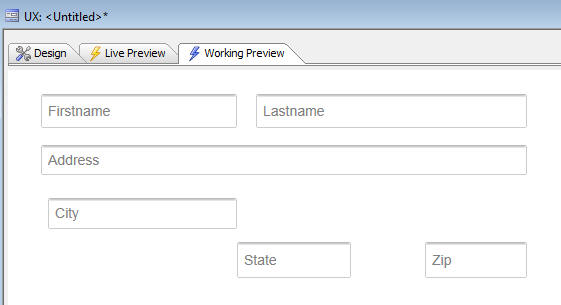
The way in which you indicate that you want to
absolutely position controls in a UX is by wrapping the
controls in an AbsoluteLayout container.
The AbsoluteLayout container has these properties:
Absolute positions for controls - The smart field
for the 'Absolute positions for controls' property will
open the builder where you can visually set the position
and size of each control in the container.
Has background image - The 'Has background image'
property indicates if the AbsoluteLayout container has a
background image.
Control style overrides - The 'Control style
overrides' property is a convenience feature. It allows
you to automatically add some CSS to use for the in-line
style of every control in the AbsoluteLayout container
without having to go to individual controls in the
AbsoluteLayout container and set the in-line style,
control by control. For example, if you wanted every
control in the AbsoluteLayout to have a red border, you
could just set this property to:
border: solid 1px red;
The layout of controls in the screenshot shown earlier
is represented in the AbsoluteLayout builder as follows:
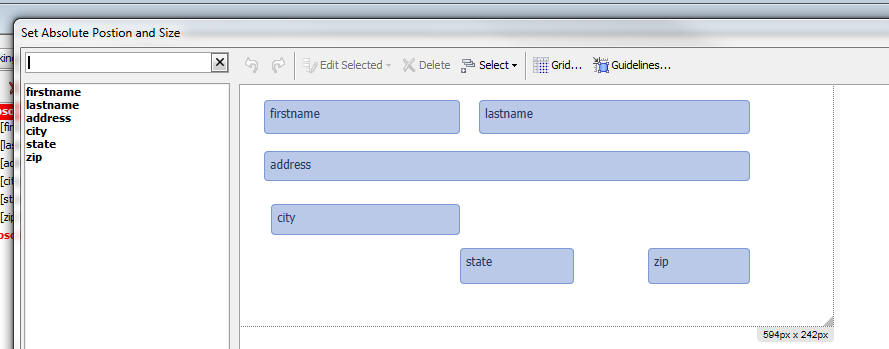
NOTE: Data controls (such as textboxes, textareas,
dropdown boxes, etc.) only show the control itself (and
not the control Label - if the labels are turned on),
when placed in an AbsoluteLayout container.
Working with the AbsoluteLayout Editor
The AbsoluteLayout editor allows you to position
controls on a 'canvas'. You also define the size of the
control on the canvas. The editor has many advanced
features that make positioning and sizing controls
precisely extremely quick and easy.
To place an object on the canvas, select the object in
the field list on the left. The click on the canvas at
the position you want to place the object, and while
holding down the mouse button, draw a rectangle that
represents the size of the object.
While you are drawing, the current size and position of
the object are shown.
You can also edit the size and position of an object in
the Property Sheet shown on the right.
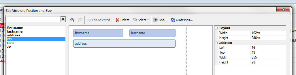
To
Toggling the Background Image On/Off
If you have specified that your AbsoluteLayout container
has an image background, then when you open the editor,
the image background is shown. However, with the image
shown, it can be hard to see all of your controls
against the image background. You can therefore toggle
the image on/off by clicking the 'Background Image'
button on the toolbar:
Guidelines
Guidelines make it very easy to position controls
relative to other controls. For example in the image
shown below, the width of the bottom control is being
adjusted and a vertical guide line has been drawn to
show the the right edge of the control is aligned with
the right edge of the control above it.
Adjusting Multiple Controls as Once
You can select multiple controls by shit-clicking on controls. Once
you have more than one control selected, the Edit Selected button on the
toolbar becomes enabled.
This button displays a menu that allows you to perform
actions on multiple controls at once, such as aligning
them, or sizing them.
A useful option is the ability to size multiple controls
to a be the same size as a 'reference' control. The
'reference' control is the first control that was
selected when you selected multiple controls.
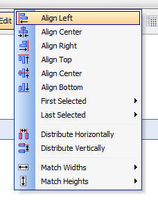
Positioning Individual Radiobutton and Checkbox
Controls
Normally when you position a Checkbox or Radiobutton
control in an AbsoluteLayout container, you position the
control as a single object and then Alpha Anywhere
renders the individual radio button or checkbox controls
for each choice (either horizontally, vertically, or in
snaking columns). However, in certain use cases
(typically when using an image as a background), it is
necessary to precisely position the individual choice
objects.
For example, consider the section of the IRS 1040 form
shown below. The checkboxes show on the form (which are
really radio buttons - since only a single box is meant
to be checked) are laid out in a custom fashion.
When using this image as the background image for an
AbsoluteLayout container you would clearly want to have
a 'FilingStatus' Radiobutton control and then be able to
position each choices over the checkbox shown in the
image.
Furthermore, you would want to suppress the label
associated with each Radiobutton choice because the
image background explains what each option represents.

In order to turn on the ability to individually position
choices in a Checkbox or Radiobutton control, you must
turn on the Custom layout when in AbsoluteLayout
container property for the Checkbox or Radiobutton
control:
NOTE: The Custom layout when in
AbsoluteLayout container property is only shown if
the Radiobutton or Checkbox control is based on a static
list of choices.
Once you have checked the Custom layout when in
AbsoluteLayout container property, when you open the
AbsoluteLayout editor, the individual choices for the
control will be available in the field list so that you
can place them on the canvas. For example, in the image
below the Radiobutton control has 3 choices, and so the
AbsoluteLayout builder shows three objects which can be
individually placed.
UX Component - {dialog.object}.setFocus() Method -
Javascript Controls - Now works for Javascript
controls (such as the List control). Previously this
only worked for HTML controls (such as a checkbox,
textbox, etc). The motivation for adding support for
Javascript controls to the .setFocus() method was to
enable the following use case:
Assume you have a UX component with a List control on
one Panel and some other controls on another Panel. The
second Panel has a button that returns focus to the
first Panel. However, when focus returns to the first
Panel, pressing up and down keys (when running on a
desktop browser) did not navigate in the List (even
though visually, the List appeared to have focus). By
using the .setFocus() method in the event handler for
the button that returns focus to the first Panel, you
can solve this problem.
UX Component - List Control - Client-side Summary
Values - You can specify that client-side summary
values should be computed for any column in a list.
To turn on client-side summary values for a field in the
List, check the property shown below in the List
builder:
NOTE: For Lists based on SQL data, you can also
specify server-side summary values. Server-side summary
values are only different than client-side summary
values if the List is paginated. Server-side summary
values compute the summary based on the List query,
whereas client-side summary values are based on the data
that is currently loaded into the List. In the case of
the paginated List, there can be many more records in
the List query than are displayed in the List.
When you compute summary data for a List column, you
will typically want to display the data on the UX
component. The List's afterClientSideSummaryCompute
event is useful for this. The afterClientSideSummaryCompute
fires after the
client-side summary values have been updated.
In this event handler you can reference the summary data
that was computed. Here are some examples of how your
Javascript code can reference summary values:
csSummary['QTY'].total
csSummary['PRICE'].avg
csSummary['PRICE'].max
The 'csSummary' object contains all of the summary data.
The field name must be in uppercase and the summary type
(total, avg, count, min, or max) must be in lower case.
You can also use a method of the UX object to read a
List summary value using the following method:
{dialog.object}.getListClientSideSummaryValue(listName,
fieldName, summaryType)
For example:
var tot = {dialog.object}.getListClientSideSummaryValue('list1','QTY','total');
UX Component - List Control - Static Data - Group
Breaks - If your data is already in the the correct
sorted order, you can instruct the List not to sort the
data on the break field.
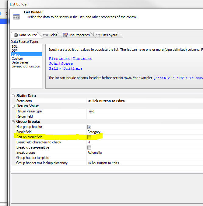
Reports - Layout Table Reports - Creating Custom
Style Sheets - It is now much easier to create
custom style sheets for Layout Table Reports.
In the Quick Report Genie, you can click the 'New Style
Sheet...' hyperlink.
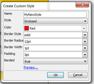
In the Layout Table Report editor when you select the
'Apply or Create Stylesheet..' menu, you can then click
the 'New Style Sheet' button shown below.
When you select the New Style Sheet option, you get a
dialog that allows you to define the color and other
properties of the style.
ShowResultSet() Function - The
showResultSetFunction() is a useful utility function to
quickly show data in an AlphaDAO resultset. It is
typically used in the Interactive window, or while
debugging code.
Here is an example of an Interactive window session:
dim cn as sql::Connection
cn.open("::Name::sqlserver2012_northwind")
dim sql as c = "select * from customers where city = 'london'"
cn.PortableSQLEnabled = .t.
?cn.Execute(sql)
= .T.
dim rs as sql::ResultSet
rs = cn.ResultSet
showResultSet(rs)
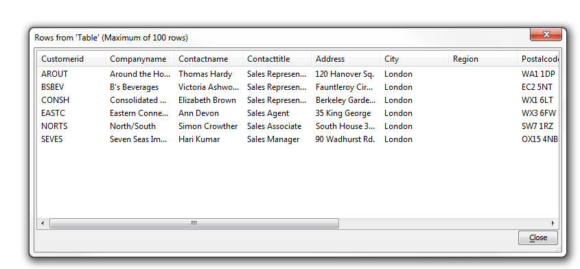
Note: After you have called the
showResultSet() function once to show a resultset, you
cannot call it a second time to show the same resultset
without first executing the query again. That's because
AlphaDAO resultsets are 'forward only'.
Grid Component - State Variables - Setting State
Variables on the Server-Side Using the e._state Object
- Both the Grid and the UX allow you to store 'state'
variables that are available on both the client and
server-side.
NOTE: State variables are variables whose value
can be set or read on either the server-side (using
Xbasic), or the client-side (using Javascript). Once a
state variable has been set, its value is available on
all subsequent Ajax callbacks.
The UX has always allowed you to set state variables on
the server side (in any server-side event or an Ajax
callback) by setting variables in the 'e._state' object.
For example, in a server side event:
e._state.mystatevar1 = "alpha"
However, in the Grid, you could not use this syntax.
Instead, you had to generate Javascript to set the state
variable and then return that Javascript in the response
from your server side event. For example:
{grid.object}.setStateInfo({mystatevar1: 'alpha'});
Now, you can also set variables in the e._state object
on Grid server side events.
NOTE: Some Grid events do not take 'e' as the input
parameter. These events take 'args' as one of their
input parameters. In events that do not take 'e' as in
input parameter, you can still set state variables on
the server-side by setting
args.rtc._state.mystatevar1 = "alpha"
On a Grid, when a server side event is executing, state
variables can be read from the e.__si2 object. (For the
few server-side events that take 'args' you can read
state variables in the args.rtc.__si2 object).
Watch Video - Part 1
Watch Video - Part 2
The section below summarizes how state variables are set
and read on both the server-side and client-side in the
Grid and UX:
UX
Server-side (Xbasic)
Set state
variable -
e._state.myvar1 = "alpha"
Read state
variable -
myvar =
e._state.myvar1
Client-side (Javascirpt)
Set state
variable - {dialog.object}.setStateInfo({myvar1:
'alpha'})
Read state
variable - var
myvar = {dialog.object}.stateInfo['myvar1'];
GRID
Server-side (Xbasic)
Set state
variable -
e._state.myvar1 = "alpha"
Read state
variable -
myvar =
e.__si2.myvar1
Client-side (Javascirpt)
Set state
variable - {grid.object}.setStateInfo({myvar1:
'alpha'})
Read state
variable - var
myvar = {dialog.object}.stateInfo['myvar1'];
NOTE: The inconsistency between the Grid and the
UX in the way state variables are read in server-side
code is because of legacy code in the Grid that could
not be changed without making a breaking change to
Grids. Therefore when you read a state variable in a
Grid you read from the e.__si2 object (and not the
e._state object). Setting state variables, however, is
done in the e._state object.
Mobile Theme - Slate - A updated version of the new
Slate stylesheet is ready for testing.
To download the style click
here. Unzip the file into the CSS folder where you
have Alpha Anywhere installed. This will create a new
folder called Slate in the CSS folder. To use the style,
edit a UX component, and then change the style name for
the component to 'Slate'.
NOTE: See below for more info on the Slate stylesheet.
UX Component - List Control - Server-side Summary
Values - For List controls that are based on SQL
data, you can specify that summary data (e.g. total, avg,
count, min and max - total and avg are only available
for numeric fields) should be computed for certain
columns in the List control.
NOTE: Client-side summary values can also be
computed. Client-side summaries are not limited to SQL
data sources.
The summary computations are based on the List query
(not on the rows actually visible in the List). In the
case of a paginated List, there may be more rows in the
query than are visible in the List. For example, the
query might have 1,000,000 rows, but the list might show
20 rows at a time. If the List is not paginated, then
the number of rows in the List is the same as the number
of rows in the List query.
Server-side summary values are automatically updated
when the List data is refreshed. If your UX is
data-bound and you have specified that the List should
be updated when records are updated or saved, the
server-side summaries will be updated when data in the
List is edited.
Watch Video
To turn on summary calculations for a column in a List,
check the 'Compute summary values' property. Once this
property is checked, the 'Summary field formatting'
property is shown where you can define display formats
for the data. For example, to round the average to 2
decimal places, you would use:
round(<value>,2)
You can use any Xbasic function for format the data.
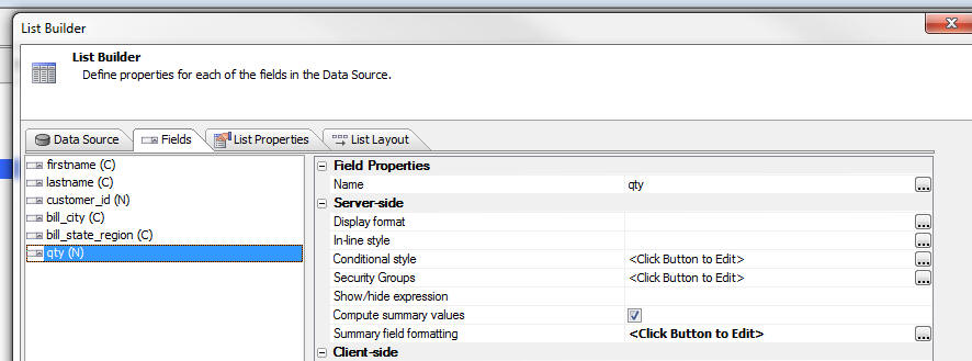
When you compute summary data for a List column, you
will typically want to display the data on the UX
component. The List's afterServerSideSummaryCompute
event is useful for this. The
afterServerSideSummaryCompute fires after the
server-side summary values have been updated.
In this event handler you can reference the summary data
that was computed. Here are some examples of how your
Javascript code can reference summary values:
summary['QTY'].total
summary['PRICE'].avg
summary['PRICE'].max
The 'summary' object contains all of the summary data.
The field name must be in uppercase and the summary type
(total, avg, count, min, or max) must be in lower case.
You can also use a method of the UX object to read a
List summary value using the following method:
{dialog.object}.getListServerSideSummaryValue(listName,
fieldName, summaryType)
For example:
var tot = {dialog.object}.getListServerSideSummaryValue('list1','QTY','total');
UX Components - Abstract Tap and DoubleTap Events
- Two new abstract events have been added to the UX
component. These events have been added because the
behavior of the click and dblClick events have been
changed in an important, but subtle way. (See below for
more details on the click and dblClick events.) The tab
and dblTap events allow you to get the previous behavior
of the click and dblClick events should your application
require this behavior.
Assume you have a large button and you click on the
button and then, before releasing, you move your finger
or mouse by more than the threshold amount (used to be
5px, now upped to 10px). You then released, while
still over the button.
Previously, the click event would not have fired. Now it
will fire. The tap event, however, will not fire
(because you moved by more than the threshold amount).
If you have moved off the button by the time you
release, then neither the tap or click events will fire.
NOTE: The List control has also added onTap and
onDblTap events. The behavior of the onClick and
onDblClick events in the List has been changed.
UX Component - Click and DblClick Event - The
behavior of the abstract click and abstract dblClick
events have been changed slightly so as to make it
consistent with the behavior of a these events on native
devices.
Previously, if you clicked (or dblClicked) on a control
and then, before releasing, moved your pointer by more
than the threshold amount (was 5px, but has not been
changed to 10px), then when you released (assuming you
will still over the original element), the event did
not fire. Now, the event will fire as long as you
are still anywhere over the original element at the time
you release.
NOTE: If your application need the original click event
behavior, use the new tap event.
UX Component - Action Javascript - Delete Record Action -
Enhancements - The Delete Record action allows you to delete a
record in a UX component that has been data bound.
Previously, this action required that the primary keys for the
data bound table had been loaded (normally done in the
onDialogInitialize event using the 'Load Primary Keys for Parent
Table' server-side action, or by an Ajax callback).
It is no longer necessary for primary keys to have been loaded in
order to use this action.
When you use this action now, the builder now gives you these
options for specifying the primary key of the record to delete:
- <PrimaryKeyList> - Use this option if you have loaded
primary keys. (previous to the enhancements to this action, this
was the implicit option)
- ListControl - the name of a List control that has
been configured to return a primary key. (Obviously, the List
Control must be based on the same table as the primary data
bound table.)
- Controls on UX, - one or more controls on the uX that
will be read to get the value of the primary key of the record
to delete. If the primary key is a multi-valued key, then you
will typically select controls to get the value for each key
segment.
- Javascript function - The name of a Javascript
function that will return the primary key of the record to
delete. If the primary key is a multi-valued key, then your
function must return a value with the key segments delimited
with '|||'.
The dialog for this action is shown below.
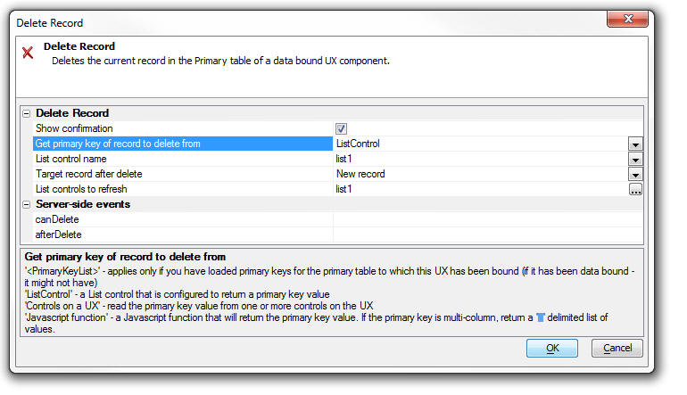
UX Component - Signature Control - Client-side Enable
Expression - Now honors the client-side enable
expression. When the control is disabled, the buttons
are disabled, not the canvas (where the user signs).
UX Component - Signature Control - Client-side
Show/Hide Expression - Now honors the client-side
show/hide expression.
UX Component - Client-Side Events - onPanelActivate
- A common practice when designing mobile applications
is to break a large application into multiple smaller UX
components and then embed components in Panel Cards in
the 'master' UX component. When you do this, it is
useful to be able to execute code whenever a child UX
component gets focus.
The UX component now has a new client-side event -
onPanelActivate. This event fires when the UX gets focus
(because the Panel Card in which it is embedded has
gotten focus).
IMPORTANT: This event will only fire if you have
assigned an explicit alias to the UX component when you
embed it into its parent UX component.
Watch Video
Download Components
pdf_exportJPG() function - Converts a PDF file to a
JPG image - A new function converts a PDF file into
a JPG file. If the PDF file has multiple pages then one
.jpg file is created for each page. The .jpg files are
numbered sequentially.
Syntax:
L flag = Pdf_exportJPG(c file, c
result_file , c resolution)
resolution - 'default', 'low', 'medium', 'high'
result_file - name of the .jpg file to create.
UX Component - Session Timeout Warning - The UX
component can now be configured to display a warning to
the user that their session is about to expire.
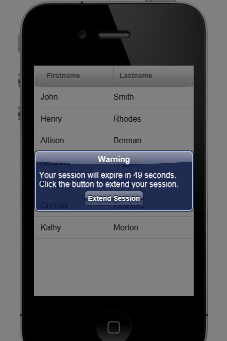
To turn on session timeout warning, check the 'Display
warning before session timeout' property on the
Properties pane of the UX builder.
Once you turn this property on, there are a number of
properties that allow you to customize the feature.
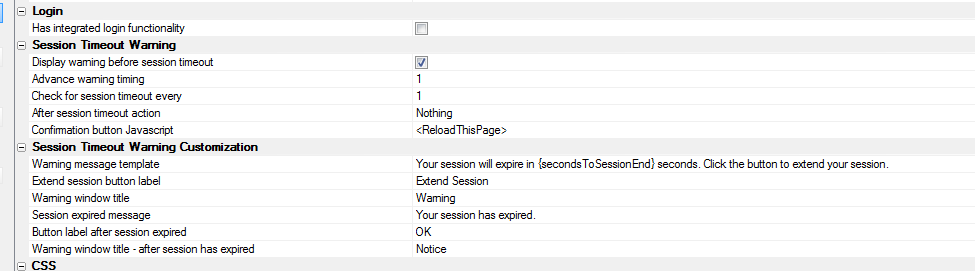
The onSessionTimeoutWarning client-side event will fire
just before the warning dialog comes up telling the user
that their session is about to expire.
UX Component - List Control - Server-side In-line and
Conditional Style - Previously, if you defined a
server-side in-line or conditional style for a field in
a List control, a span was inserted into the data on the
server to format the data. While this gave the required
visual appearance, it meant that if you read the value
from the control, the value that you read included the
HTML markup.
This has now been changed. The server-side style is
computed on the server and is now included in a separate
(hidden) field in the List data. The style is then
applied on the client-side. The net result of this
change is that when you read data from a field that has
a server-side style, the data no longer includes any
HTML markup.
Reports - Double Lines - When setting the style
for the border around a cell in a Layout Table, you can
now set the style to 'double' to create a double line,
as shown in the image below.
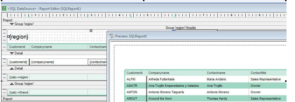
Here is how the Properties Pane is configured to set the
left edge of the field to a double line:
UX Component - Setting Default Values - Multi-valued
Controls - Certain controls in a UX are
multi-valued. For example, the checkbox control, a List
control that has been configured to allow multi-select,
a dropdownbox that has been configured to display more
than one line and allow multi-select, etc.
To set the initial (i.e. default value) for a control,
you can either set the value in the Default Value
property in the control properties, or you can set the
value in the onDialogInitialize event, using code like
this:
e.control.color = "a"
However, there was no easy way to set the default value
to more than a single value.
Now, when you specify the default value for a
multi-value control, you can use a special array()
keyword.
For example, to set the initial value for a checkbox
that displays a list of colors, you can enter this in
the Default Value property:
array(red,green,blue)
Or, you can enter this in the onDialogInitialize event:
e.control.selectedColors = "array(red,green,blue)"
UX Component - List Control - Custom Datasource -
The Xbasic function that is called to compute the data
in a List populated by a Custom data source can now
return Javascript to the browser by setting a value in
this property in the 'e' object that is passed into the
Xbasic function for the Custom data source:
e.javascript
UX Component - List Control - SQL Data Source -
AfterQuery Server-side Event - A new server side
event is available for List controls that are populated
using a SQL data source.
The AfterQuery event fires after the List query has been
performed. The typical use case for this event is to
compute some Javascript to return to the browser. For
example, you might want to compute the total for a
column in the List and then update some control on the
screen.
Watch Video - Part 1
Watch Video - Part 2
Watch Video - Part 3
Download Components
argument_add_array_argument() Function - Adds or
updates an array argument to a sql::arguments object.
The sql::arguments object can be populated with argument
arrays (typically used when passing values to a SQL
query that uses an IN clause).
Syntax: argument_add_array_argument( sql::arguments
argumentObject, c argumentName, c
argumentType, c argumentValues)
Example:
dim args as sql::arguments
dim cities as c
cities = <<%txt%
London
Boston
Bulawayo
%txt%
argument_add_array_argument(args,"color","c",cities)
UX Component - List Control and Data Series - Using
Argument Arrays in SQL Queries - You can now use an
IN clause with an argument array in the SQL query for a
Data Series or List Control.
For example
SELECT customerId FROM customers where country IN (:array_whatCountry)
Notice that when using an IN clause with arguments, the
argument name must start with
array_.
Also notice that the argument reference in the SQL
statement is in parentheses.
UX Component - Responsive Layout Genie - Mobile
applications must run on multiple device form factors
and must respond to orientation changes. You typically
want to design a single UX component that will respond
automatically (i.e. make layout changes) based on the
device it is running on (e.g. phone, small tablet, large
tablet, desktop browser) and the orientation of the
device (mobile devices) or window size (desktop
browsers).
The new Responsive Layout Genie makes it easy to create
responsive layout designs.
Watch Video - Part 1
Watch Video - Part 2
Watch Video - Part 3
Download Components
To open the Responsive Layout Genie, click the smart
field for the 'Responsive layout settings' property on
the UX properties pane.
This will open the builder as shown below:
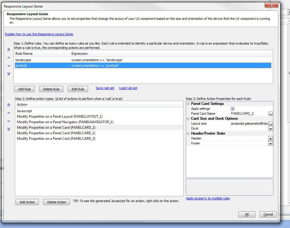
The builder is divided into three sections. In the first
section you define your layout rules. In the second
section you define the actions that should take place
when a rule is true, and in the third section you define
the properties for the action.
Rules
Layout rules are simply Javascript expressions that
evaluate to true or false. The rules can reference
special system fields, such as screen.width, or
device.isWebKit.
IMPORTANT: Since the expression is Javascript,
you need to use Javascript syntax, such as == for an
equality test, && for an AND operator and || for an OR
operator.
You can define as many rules as you want. Each rule you
define is given a name. The name is arbitrary, but a
meaningful name is recommended as you can refer to the
rule name in client-side watch expressions.
For example, in the screen shot show above, there are
two rules that have been defined.
To add a new rule click the Add Rule button an give the
rule a name and enter its expression. When entering the
expression, you can click the Insert Field hyperlink to
get a list of available system fields to use in the
expression.
The image below shows the system fields that can be used
in the rule expression.
You can also save rule sets so that they can easily be
imported into other UX components.
Actions
Actions are performed when a rule is true. You can
define as many actions as you want. To add a new action,
click the Add actions button. A dialog allows you to
select the action you want to perform:
Once you have selected an action, the Properties for
that action can be defined.
Properties
Action properties must be defined for each rules.
Therefore, for a given action, you will select the first
rule and define the action properties. Then you will
select the next rule and define the action properties
for this rule, an so on, moving through all of the
rules.
Using Javascript to Specify an Action Property Value
In some cases you can use Javascript to specify the
value of a property. For example, in the screenshot
shown above, the 'Layout size' property for PANELCARD_2,
for the 'portrait' rule has been specified as:
javascript:getpanelwidth(screen,device)
The 'javascript:' prefix indicates that the property
value should be computed by calling a Javascript
function. This function takes screen and device as
inputs so you can reference the special system fields
that the Javascript rules expressions reference. In the
above case, we are calling a Javascript function, but we
could just as easily specified inline Javascript code
after the Javascript: prefix.
Viewing Generated Javascript
It can be useful to view the generated Javascript for
the actions so that you can learn how certain actions
are performed.
To see the generated Javascript, right click on an
action in the builder.
The dialog (shown below) shows you:
- Javascript for the current action (for the currently selected
rule)
- Javascript for all actions (for the currently selected rule)
- Javascript for all actions and all rules
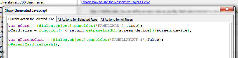
When are Layout Rules Evaluated
Layout rules are evaluated:
-
on the initial load of the component
-
on an orientation change
-
on a window size change (desktop browsers)
When the Layout Rules are evaluated the rules are
evaluated in the order in which they were defined. When
a true rule is found, the actions for that rule are
performed and a special property in the UX object is set
with the name of the rule that was true.
You can reference this property as follows:
{dialog.object}._activeLayoutRule
Using Active Layout Rule Name in a Client-side Watch
Expression
Client-side watch expressions (e.g. show/hide, dynamic
images, enable and dynamic style) can reference a
special system field called:
dialog.activeLayoutRule.
This field has the name of the currently active Layout
Rule.
In the screen below, a container in the UX is only being
shown if the 'landscape' rule is true.
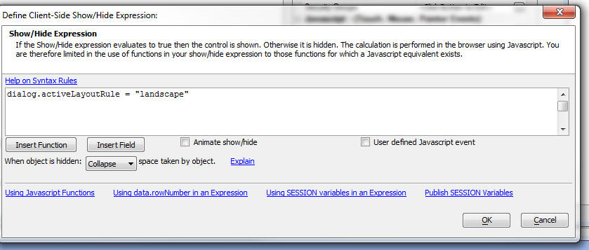
Rules Mode
By default, the actions associated with the first Layout Rule that is true are executed and then further rules are not checked.
However, you can set the Rules Mode to AllRules so that the actions for all
true rules (not just the first true rule), are evaluated. To change the Rules Mode, you need to set the Responsive rules mode property in the UX Properties.
Watch Video
Manually Executing a Rule
Regardless of whether a rule is true or not, you can use
a method of the UX object to force the actions for a
particular rule to fire.
For example:
{dialog.object}.fireLayoutRule(ruleName)
UX, AppLauncher and Custom Component - Page Title
Property - The components now have a page title
property that allows you to set the page title when the
component is run from an .a5w page.
Web Projects Control Panel - Search in Files -
This feature has now been enhanced to allow you to
specify the type of files to search
UX Component - List Control - Read-only Property
- The List control now has a read-only property. This is
especially useful if you have configured the list to
behave like a carousel and you want to prevent any item
in the List from displaying as selected. To find out
what row a click, right click, or double-click action
occurred on, your Javascript can reference
arguments[0]
This gives the zero based row index of the target row.
UX Component - Action Javascript - Panel Action -
A new action to show/hide a Panel header or footer has
been added.
ShowXML() Function - Displaying an XML Document
Structure - The ShowXML() function is a utility
Xbasic function that is helpful in understanding the
structure of an XML Document.
Watch Video
The image below shows the user interface displayed by
the ShowXML() function.
The first image shows the XML pane where the raw XML is
displayed. The second image shows the Xbasic Properties
pane is shown where a tree view of the Xbasic variable
(into which the XML has been parsed) is shown.
*property_from_xml() Function - Populates an Xbasic
Dot Variable with XML Attribute/Element Values -
Xbasic has always had very strong XML parsing features
(see Help, Open Documentation and search for 'Parsing
XML Documents with Xbasic'), however the new *property_from_xml()
function provides a new way in working with XML. This
function populates an Xbasic dot variable with the data
from the XML document. Once you have he Xbasic variable,
it is very easy to extract a specific element or
attribute value from the XML document.
Watch Video
UX Component - List Control - Word Wrapping Text in a
Column - New options are available for controlling
how long text in a list column should be handled. By
default, long text is truncated and ellipses are
displayed to indicate that the text is truncated.
You can turn on the word-wrap option for individual
fields. When you turn on word-wrap, you now get a 'wordwrap
option' property with these choices:
- 'normal' - Sequences of whitespace will collapse into a single
whitespace. Text will wrap when necessary.
- 'nowrap' - Sequences of whitespace will collapse into a single
whitespace. Text will never wrap to the next line. The text
continues on the same line until a <br /> tag is encountered
- 'pre' - Whitespace is preserved by the browser. Text will only
wrap on line breaks Acts like the <pre> tag in HTML
- 'pre-line' - Sequences of whitespace will collapse into a single
whitespace. Text will wrap when necessary, and on line breaks
- 'pre-wrap' - Whitespace is preserved by the browser. Text will
wrap when necessary, and on line breaks 'inherit' - Specifies that
the value of the white-space property should be inherited from the
parent element
UX Component - Server Side Actions - Send E-mail
- The server-side Send E-mail action now supports the
option of using the Mandrill mail service to deliver the
e-mail.
a5_ux_action() - New options added to the
a5_ux_action() Xbasic Utility Function - The
a5_ux_action() is a utility function that generates the
Javascript for certain actions that the UX can perform.
The use case for this function is to consolidate several
Ajax callbacks into a single callback. New options have
been added to this method. The full list of options
current supported are summarized below:
The actions that can be performed by this utility function are:
-
List Control Action
-
Filter List
-
Refresh List
-
Refresh row(s) by key value
-
Append row(s) by key value
-
Refresh Data Series
-
Set UX into 'New Record' mode
-
Populate Controls with Data from a Table
-
Refresh choices in a dropdownbox control
List Control Action:Filter List
Filters/sorts the data in a List control.
This action is equivalent to the {dialog.object}.filterList() method.
Example:
Function myAjaxCallback as c (e as p)
dim ops as p
ops.Action = "Filter"
ops.filter = "country = :country and city = :city"
ops.order = "companyname desc"
'the arguments are specified in a crlf() delimited
string.
'syntax is argumentValue|||type|argumentName
ops.parameters = "UK|||c|country" + crlf() + "London|||c|city"
'specify the id of the list to filter
ops.listId = "list1"
dim xb as c
xb = a5_UX_Action(e,ops,"ajaxListAction")
myAjaxCallback = xb
end function
List Control Action: Refresh List
Refreshes the data in a List control.
This action is equivalent to the {dialog.object}.refreshListData()
method.
Example:
Function myAjaxCallback as c (e as p)
dim ops as p
ops.Action = "Refresh"
ops.listId = "list1"
dim xb as c
xb = a5_UX_Action(e,ops,"ajaxListAction")
myAjaxCallback = xb
end function
List Control Action:Refresh Row(s) by key value
Refreshes data in one or more rows of a List control.
This action is equivalent to the {dialog.object}._listRefreshRecordsByKey()
mehod.
Example:
Function myAjaxCallback as c (e as p)
dim ops as p
'primary keys to refresh (case
sensitive!)
ops.primaryKey = "EASTC,GALED,FURIB"
ops.listId = "list1"
ops.action = "refreshRowByKey"
'if the record to be refreshed is
not currently in the list,
'should it be added to to the list?
ops.appendRowsNotInList = .f.
dim xb as c
xb = a5_UX_Action(e,ops,"ajaxListAction")
myAjaxCallback = xb
end function
List Control Action:Append row(s) by key value
Appends data to a List control.
This action is equivalent to the {dialog.object}._listFetchRecordsByKey()
method.
Example:
Function myAjaxCallback as c (e as p)
dim ops as p
'primary keys to fetch and add to
list (case sensitive!)
ops.primaryKey = "EASTC,GALED,FURIB"
ops.listId = "list1"
ops.action = "appendRowByKey"
dim xb as c
xb = a5_UX_Action(e,ops,"ajaxListAction")
myAjaxCallback = xb
end function
Refresh Data Series
Refreshes one or more data series. All controls that are bound to the
data series are refreshed.
This action is equivalent to the {dialog.object}.refreshDataSeries()
method.
Example:
Function myAjaxCallback as c (e as p)
dim ops as p
ops.Action = "refreshDataSeries"
ops.seriesNames = "series1,series2,series3"
dim xb as c
xb = a5_UX_Action(e,ops,"ajaxListAction")
myAjaxCallback = xb
end function
Set UX into 'New Record' mode
This action is equivalent to the {dialog.object}.newRecord() method
Example:
Function myAjaxCallback as c (e as p)
dim ops as p
myAjaxCallback = a5_UX_Action(e,ops,"NewRecord")
end function
Populate Controls with Data From a Table
(Applies only if the UX has been data bound). Populates controls on the
UX with data from the data bound tables for a specified primary key
value.
This action is equivalent to the {dialog.object}.populateControlsFromTable()
method.
Example:
Function myAjaxCallback as c (e as p)
dim ops as p
ops.primaryKey = "ALFKI"
'case sensitive!
dim js_getRecord as c
ops.__dtfmt = e.rtc._state.__dtfmt
dim js as c
js = a5_UX_Action(e,ops,"populateControlsFromTable")
myAjaxCallback = js
end function
Refresh choices in a dropdownbox control
This action is equivalent to the {dialog.object}.refreshDropdownBoxChoices()
method.
Example:
function myAjaxCallback as c (e as p)
dim js as c
dim ops as p
'name of dropdowncontrol to refresh
ops.controlName = "CITIES"
'if the control is in a repeating
section should just the current instance
'be repopulated
ops.currentRepeatingSectionRowOnly = .f.
'filter for query
ops.filter = "country = :whatcountry"
'argument value - format is
value|||type|argumentName
ops.arguments = "USA|||c|whatCountry"
'value in dropdownbox to select
after it has been populated
ops.selectedValueAfterPopulate = ""
js = a5_ux_action(e,ops,"refreshDropDownBox")
myAjaxCallback = js
end function
SQL Query Genie - Export to Excel - The 'Actions'
button on the SQL Query Genie toolbar now has a new
option - export to Excel.
TabbedUI Object - New methods added to the TabbedUI object - You could previously get the
active Pane by examining private variables in the tbiObj
object. Now, these new methods provide an easier method.
tbiObj.getCurrentPaneIndex() - zero based pane number
for the current pane
tbiObj.getCurrentPaneName() - internal name of the
current pane
tbiObj.getCurrentPaneLabel() - HTML label for the tab
current pane.
You can also programmatically set the active pane,
either by its index (zero based), or by it label.
tbiObj.selectPaneByIndex(index) - set active pane by
index
tbiObj.selectPane(label) - set active pane by Label
UX Component - Frame and Container Controls -
Client-side Conditional Style and Class - You can
now define client-side watch expressions to
automatically change the style and/or class of a
container or frame control. Previously, conditional
client-side style and class were limited to input
controls, buttons, etc.
UX Component - Repeating Sections - Setting a Column
Width Using Javascript - A new method has been added
to the UX control to allow you to programmatically
change the width of a Repeating Section column at
run-time.
{dialog.object}.setRepeatingSectionColumnWidth(columnName,width);
Width is expressed using CSS units (e.g.
'100px'). Percentage widths are not supported.
Mobile Theme - Slate - A new stylesheet for
mobile applications is ready for testing. This style
(screenshots shown below) is not yet complete and will
only work for UX components. If does not contain any CSS
classes for Grids or Tabbed UI. We are making this new
style available to mobile developers now to get feedback
on what you like and don't like about the style.
To download the style click
here. Unzip the file into the CSS folder where you
have Alpha Anywhere installed. This will create a new
folder called Slate in the CSS folder. To use the style,
edit a UX component, and then change the style name for
the component to 'Slate'.
pdf_optimize() Function - Optimize a PDF document
to make it smaller. Results may vary based on the
compression of the original file, but file size may be
reduced by up to 50%.
Syntax:
pdf_optimize(C file [, C NewFile])
If NewFile is not specified the input file is
replaced.
json_generate() Function - Performance - The
json_generate() function has been re-written and is now
considerably faster.
NOTE: Previously the json_generate() function
would escape single quotes. However the JSON spec does
not require this and so single quotes are no longer
escaped. For example:
dim pj as p
pj.text = "some text with ' single quote"
?json_generate(pj)
= {
"text": "some text with ' single quote"
}
UX Component - Spin List Control - Large Data Sets
- There has been a significant improvement in the
time taken to populate a Spin List control when
populating it with a large number of choices.
UX Component - Map Control - Specifying the Map Language
- By default, the language used on the Map control is
based on the browser setting for language preference. A
new property has been added to allow you to specifically
set the language preference. To get a list of valid
language code go to:
http://msdn.microsoft.com/en-us/library/ms533052(VS.85).aspx
SQL Query Genie - Count Query - When you build a
SQL query using the SQL Genie and you preview the query,
a count query is automatically performed when your query
is executed. This is done so that your preview will show
you how many records satisfied the query. However, in
some cases the database to which you are connected might
take a long time to execute a count query and therefore
you might want to turn off the count query when
previewing your query. A new property on the Properties
pane of the SQL Genie allows you to do this.
UX Component - Action Javascript - Buttons - A
new action has been added to Action Javascript to enable
or disable a button. This action only applies to Advanced
Buttons (all buttons in a UX component are advanced
buttons by default).
email_send_mandrill() Function - Setting the Key
Value Globally - You can now set the key for this
function in the Web Project Properties dialog. If you do
set the key in Web Project Properties, then you can pass
in a blank key in the email_send_mandrill() function. If
you pass in an explicit key when calling email_send_mandrill(), then the key you pass in will
override the gloal key.
Grid and UX Component - Field Validation - Xbasic
- If you write custom Xbasic code to validate an
individual field, your Xbasic code and now send back a
Javascript response to the client by setting this
property in Xbasic code:
e.javascript
UX Component - Buttons - .getControl() Method -
The {dialog.object}.getControl() method can now be used
to get a pointer to a button object. Once you have a
pointer to the object, you can call the .setDisabled()
method.
For example:
var bObj = {dialog.object}.getControl('BUTTON_1');
//set the button disabled
bObj.setDisabled(true);
//now enable the button
bObj.setDiabled(false);
NOTE: As a result of this change, if you have a
client-side enable expression for a button in a
Repeating Section, you will need to edit the enable
expression and resave it in order to re-generate the
Javascript code.
ADVANCED NOTE: If you have a button in a
Repeating Section, the .getControl() method will point
to ALL of button instances (i.e. the button in row1,
row2, etc.). If you then call the .setDisabled() method,
you will be set the state on the button in each
row.
If you want to call the .setDisabled() method for a
specific button instance (say the button in row 3), then
you can pass in an optional parameter to the .setDisabled()
method. For example:
//get a pointer the button element in row 3
var eles = $('{dialog.componentname}.V.R1.BUTTON_2_A5INSTANCE3');
//pass in eles as an optional argument to the .setDisabled()
method
{dialog.object}.getControl('BUTTON_2').setDisabled(true,eles);
Build 1620-4172 21 Aug 2013
Videos
|
UX Component |
Preventing a Panel from Losing Focus |
A common design pattern in a mobile application
is to have multiple Panel Cards inside a Panel
Navigator. If one of the Panel Cards contains a
form, you might want to prevent the user from
navigating to another Panel Card if the form has
been edited, but not yet been saved.
In this video we show how this is easily done
using the Panel Navigator's
onBeforePanelActivate event. The same techniques
can be used in a PanelLayout.
Watch Video
Download Component |
|
UX Component |
Responsive Design - Dynamically Resizing
Controls on Orientation or Window Size Change -
Understanding the FlexLayout Container |
A common requirement when designing a UX
component is to have a control dynamically
resize when the orientation of a mobile device
changes or when the window size (in a desktop
browser) changes. This is easily accomplished
using the FlexLayout container on a UX.
Any of the controls in a FlexLayout container
can have their width specified as a 'relative'
size (relative to the size of the other controls
in the FlexLayout container). This video shows
how to use the FlexLayout container type.
Watch Video - Part 1
Watch Video - Part 2 |
Bugs
UX Component - Image Upload Action -
Thumbnails - If you specified that you wanted to
create a thumbnail when uploading images, and the target
for the thumbnail image was a character field in the
target table, the 'image filename transformation
expression' was being ignored and the actual filename
for the thumbnail image that was stored was always just
the short filename.
<Resultset>.ToJSONObjectSyntax() method - The
JSON generated by this AlphaDAO method has been changed.
Previously, the values in the generated JSON were single
quoted. Now, to be consistent with the official JSON
syntax, values are double quoted.
UX Component - Tab Control - Genie Style - If a
'genie' style Tab Control was wrapped in a Container
control and the [Tab Control End] control came
immediately before the [ContainerEnd] control, the genie
buttons did not render.
Grid Component - Images - Under some
circumstances, if a Grid contained an image control, it
would generate an error. This was a newly introduced
bug. If you received this error, you will need to edit
and resave the Grid.
Features
UX Component - PanelNavigator and PanelLayout -
onBeforePanelActivate Event - A new event has been
added to the PanelNavigator and the PanelLayout. This
event is useful if you want to prevent the Panel that
has focus losing focus. For example, if the form fields
on a Panel have been edited, but not yet committed, you
might want to prevent the Panel from losing focus. This
is much like preventing a pop-up window that contains a
Grid or UX component from closing if the child component
has been edited.
If the Javascript that you define in the
onBeforePanelActivate event returns false, then any
attempt to activate another Panel will fail and focus
will remain on the Panel that currently has focus. If
the event returns true, then you will be able to give
focus to another Panel.
Watch Video
Download Component
UX and Grid Component - Image Upload - Thumbnails
- The Action Javascript builder now has a new option in
the Thumbnail Definition Builder to allow you to specify
if the thumbnail file that is created should overwrite
an existing file, or be renamed, so as not to conflict
with existing files.
UX and Grid Component - Image Upload - File Rename -
When you upload images or files and store the
uploaded images or files in a filename on a server,
there is an option to rename the file if there is an
existing file with the same name on the server. The
algorithm that computes the filename in the case of a
conflict has been changed slightly.
Previously, if a filed called "c:\myimages\image1.jpg"
existed and you wanted to create a new file called
'image1.jpg', the new file would have been called "c:\myimages\images2.jpg".
This is now changed to "c:\myimages\myimage1_1.jpg".
UX Component - FlexLayout Containers - A new container
type in the UX component makes it easy to dynamically
size controls when the orientation of the device changes
(mobile devices), or the window size changes (desktop
browsers).
Watch Video - Part 1
Watch Video - Part 2
The purpose of the FlexLayout container is to
dynamically size the widths of controls that are on a
single line. This container does not size the height
of controls.
NOTE FlexLayout containers are not supported in
Repeating Sections.
For example in the image below, the device is in
portrait mode. The button to the right of the textbox
control is set to have a fixed size of 80px. The text
box has been set to have a flexible width, so it
consumes all of the available space (less the built-in
padding between controls, defined by the A5CWLayout
class padding property).
Notice in the image below, when the device orientation
is changed to landscape, the button size has not changed
- it is still 80px wide. But the textbox had grown in
width.
Here is how the textbox and button control are
represented in the builder. Note that the controls are
wrapped in a container with a sub-type of 'FlexLayout'.
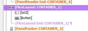
When you set the container sub-type to FlexLayout, a new
property in the Property Grid is exposed. The
image shows that the 'Flexible layout width settings'
have been set to:
flex(1),80px
This means that the first control in the FlexLayout
container will have relative width of flex(1) (this is
the textbox), and the second control (i.e. the button)
will have a fixed width of 80px.
The property has a smart field which brings up a builder
to help you set the control widths.
Notice that the builder also shows the 'Defined Width'
for each control. The 'Defined Width' is the width that
was defined for each individual control.
Typically when you wrap controls in a FlexLayout
container, you will want to set each control's Defined
Width to 100%. The builder will show you at a glance if
any of the top-level controls in the FlexLayout
container have not been set to 100%.
The 'Break' column will also show you at a glance if any
of the top-level controls in the FlexLayout have breaks
after them. You should not have breaks after top-level
controls, so the builder will give you a warning to fix
this problem.
In the case where only one control in a FlexLayout
container has a 'flex' width, the meaning of the flex
setting is simply to fill the available space on the
line (after allocating space to the fixed size
controls).
However, if you have two or more controls with a 'flex'
setting, then all of the flex controls together will
fill the available space (after allotting space to any
fixed size controls), and each 'flex' control will have
a relative size based on its 'flex' setting.
For example, if you have two flex controls with settings
of flex(1) and flex(2), then the second control will
always be twice the width of the first control.
Build 1617-4170 19 Aug 2013
Videos
|
UX Component |
Storing and Restoring the 'state' of a UX
Component with multiple Panels |
UX Components can use complex layouts that
involve multiple Panel Cards inside Panel
Navigators and Panel Layouts. You might want to
persist the state of the Panel (i.e. remember
which Panel Card in a particular Panel Navigator
is active and which Panels in a Panel Navigator
have been docked) so that you can later restore
this state. This video shows how this can be
done.
Watch Video
Download Component |
Tips
SQL Server 2008 - Date Fields -
Occasionally, users report a problem when trying to update a MS SQL table that
has a 'Date' field. The problem is caused because the correct Microsoft files
are not installed on the machine where SQL Server is running. The error reported
by SQL Server is:
"Function requested is not
supported"
The
correct MIcrosoft drivers can be downloaded here:
Bugs
Forms - Embedded Browse - Data Entry - Fixed a
cosmetic issue with data entry when working with a set
that has a one-to-one link off a table that is linked to
the parent in a one-to-many link.
UX - Signature Capture - If the UX component was
not using Panels, and if the component had been
vertically scrolled, the signature capture area did not
scroll with the window. This only affected UX components
that did not use Panels.
UX Component - Image and File Upload Actions in
Action Javascript - As a result of a change made in
a recent update to make the value in the client side
controls available to the server side Xbasic events,
when you clicked the button to upload a file or image,
the popup window which was displayed did not have any
controls in it. This bug, however, only happened if
there were a large number of controls on the UX
component. It also only happened in IE. The reason it
happened is that the maximum length for a query string
was exceeded. This is now fixed.
UX Component - Image and File Upload Actions in
Action Javascript - Xbasic Event Handlers - When the
Xbasic event handlers execute, the value of the control
on the UX component are now available in the
e.formData
property. Previously, the data was made available in
another of the e object's properties. If you have an
event handler that references client side control
values, you will need to change your code.
UX Component - Image Controls (Data Bound) -
Repeating Sections - Fixed a bug that was introduced
in the last update.
Features
Email - Sending Email Using the Mandrill Email Service - Alpha
Anywhere has always offered Xbasic functions to send email. However,
these functions require that you have access to a SMTP mail server. The
existing functions in Xbasic include:
- email_send()
- email_send2()
- email_send_noprofile()
- email_send_noprofile()
With the emergence of email services, such as Mandrill (www.mandrillapp.com)
an alternative, possibly easier, certainly more powerful, way of sending
emails from your applications is now possible.
A new function,
email_send_mandrill()
allows you to send email using the Mandrill service.
Benefits of using a 3rd party emailing service include the easier
setup, better deliverability, and access to powerful value added
features offered by the service, such as tracking whether people open
your email message, etc.
The full functionality of the Mandrill email service can be read by
navigating to this address:
https://mandrillapp.com/api/docs/index.JSON.html
In order to use the Mandrill email server, you will have to visit
their web site and apply for a key. The key allows you to send a certain
number of free emails each month. Beyond that, there is a fee.
NOTE: Alpha Software is not involved in any way at all in the fee and
does not receive any payment at all if you use the Mandrill service.
There are two different ways in which you can use the
email_send_mandrill() function.
1. Simple Method: Define Message Using Xbasic Dot Variable
In the simple method, you define an Xbasic dot variable that defines
the properties of the message you want to send and then you call
email_send_mandrill(), passing in your Mandrill key and the dot
variable. This simple method does not expose all of the functionality of
the Mandrill service, but it is very easy to set up and use, and it
is great for simple email messages.
For example:
'create a .dot variable to define the message
dim ms as p
ms.send_to = "john@acme.com:John Smith,sally@acme.com:Sally Jones"
ms.send_to_cc = ""
ms.send_to_bcc = ""
ms.from_email = "sales@alpha.com"
ms.from_name = "Sales at Alpha" 'friendly name -
optional
ms.subject = "Information You Requested"
ms.message_html = "Here is the <b>information</b> you requested."
ms.message_text = "Plain text version of the message"
ms.attachments = "c:\files\mychart1.pdf,c:\files\mytext1.txt"
Notes About the Properties in the Dot Variable
- The .send_to and
.send_to_cc addresses are a
comma delimited list of addresses. The email address is followed
(optionally) by a colon and then a friendly name.
- The .send_to_bcc
property allows you to specify a single bcc address. If you specify more
than one address, you will get an error.
- .send_to_cc and
.send_to_bcc are optional.
You can omit them entirely.
- .attachments is
optional. It contains a comma delimited list of filenames to attach to the
email.
CC and BCC Addresses
Even though the Dot variable allows you to specify separate comma delimited
lists for the TO and CC addresses, in reality, Mandrill does not support CC
addresses. Furthermore, Mandrill only supports a single BCC address.
If you specify any CC addressesl, the TO list and the CC list of addresses is
combined into a single list and the emails are sent to all addresses in the
combined list. However, the Mandrill internal
.preserve_recipients property is
set to false, so that none of the recipients will see the names of any other
recipients.
If you provided a list of names in the TO list, and no names in the CC list,
the recipients of the email would all be able to see the names of the other
recipients.
Once you have defined the .dot variable, you can send the message. For
example
dim pResult as p
pResult = email_send_mandrill("mysecretkey",ms)
The function returns a .dot variable with several properties:
- .error - a logical value
.t. or .f.
- .result - an Xbasic
array with one item for each address in the recipient list
- .json - the JSON
settings that were constructed from the .dot variable passed into the
function. You can use this value as a starting point should you wish to use
the second method (described below) for calling the email_send_mandrill()
function
Here is what a typical item in the .result array looks like:
result[1].email = "john@acme.com"
result[1].status = "sent"
result[1]._id = "some message id" --- used to make queries
against the Mandrill API for message status
Here is a complete example of sending an email in the simplest possible way
(eliminating all optional properties in the Xbasic .dot variable). As you can
see, it just a few lines of code.
'create a .dot variable to define the message
dim ms as p
ms.send_to = "john@acme.com:John Smith,sally@acme.com:Sally Jones"
ms.from_email = "sales@alpha.com"
ms.from_name = "Sales at Alpha" 'friendly name -
optional
ms.subject = "Information You Requested"
ms.message_html = "Here is the <b>information</b> you requested."
dim pResult as p
pResult = email_send_mandrill("mysecretkey",ms)
Alternative Method for Specifying Attachments - Specifying the Attachment
Data
We have previously indicated that attachments are specified by setting the .attachments
property to a comma delimited list of filenames. An alternative method is to set
the .attachmentsArray property
as a property array with .name,
.type and
.content properties.
Where:
- .name - the filename (no drive/path, just the name and extension) of the
file.
- .type - the mime type
- .content - the base64 encoded data
For Example
dim ms.attachmentsArray[1] as p
ms.attachmentsArray[1].name = "chart.pdf"
ms.attachmentsArray[1].type = resolve_mime_type("pdf")
ms.attachmentsArray[1].content = base64encode(file.to_blob("c:\myfiles\chart.pdf"))
Merge Variables - Mail Merge Variables into the Message Body and Subject
An advanced feature of the Mandrill service is to allow you to specify
placeholders in the message subject and body that will be replaced with
variables that you supply at the time Mandrill sends out the email to each
recipient.
The format for the placeholders is:
*|VariableName|*
For example, here is how the message subject or body could have been
specified using placeholders:
ms.subject = "*|Fname|*, here is the Information You
Requested"
ms.message_html = "*|Fname|* *|Lname|* here is the information you requested."
When you use placeholders in the subject or body, you must specify the
placeholder values. Obviously, you need to specify placeholder values for
each recipient.
For example, assume that you had specified two recipients as follows:
ms.send_to = "john@acme.com:John Smith,sally@acme.com:Sally Jones"
You would then need to specify the FName and LName variables for john@acme.com
and for sally@acme.com.
Here is how you would do this:
'define the .merge_vars[] array with 2 items
dim ms.merge_vars[2] as p
'define the actual variables for the first recipient.
'since there are two variables, we define a sub-array with two
items
dim ms.merge_vars[1].vars[2] as p
'here are the variables for the first recipient
ms.merge_vars[1].vars[1].name = "FName"
ms.merge_vars[1].vars[1].content = "John"
ms.merge_vars[1].vars[2].name = "LName"
ms.merge_vars[1].vars[2].content = "Smith"
ms.merge_vars[1].rcpt = "john@acme.com
'here are the variables for the second recipient
dim ms.merge_vars[2].vars[2] as p
ms.merge_vars[2].vars[1].name = "FName"
ms.merge_vars[2].vars[1].content = "Sally"
ms.merge_vars[2].vars[2].name = "LName"
ms.merge_vars[2].vars[2].content = "Jones"
ms.merge_vars[2].rcpt = "sally@acme.com
In addition to supplying merge variables for each recipient, you can
also supply global merge variables - for all recipients. You do this by
specifying the .global_merge_vars
property array. If a merge variable is defined at the individual
recipient level, it will override the corresponding global merge
variable.
For example:
dim ms.global_merge_vars[1] as p
ms.global_merge_vars[1].name = "Company"
ms.global_merge_vars[1].content = "Alpha Software"
Using a DataSource Property
Instead of supplying the actual email addresses and merge variables directly
in the dot variable you can pass in a 'dataSource' (an array of JSON objects),
and then indicate that the .send_to
property should be populated from the data source.
For example, consider the following definition of the
.dataSource property:
ms.dataSource = <<%txt%
[
{email: "sam@acme.com", firstName: "Sam", lastname: "Smith"},
{email: "joe@acme.com", firstName: "Joe", lastname: "Jones"}
]
%txt%
If the above .dataSource
property has been defined, then you can define the
.sent_to property as follows:
ms.send_to = "{datasource:email}"
This indicates that the .send_to
property should be populated from the 'email' property in the dataSource.
If you pass in a .dataSource
property, then there is no need to pass in the
.merge_vars property - these
properties are automatically generated from the data in the
.dataSource property.
Here is what happens if you pass in a
.dataSource property: The
.message_html,
.message_text and
.subject
properties are scanned to see if any merge-variables are used. If any merge
variables are found in any of these properties, then the merge variables for
each address are automatically extracted from the
.dataSource property.
Using the .dataSource
property, it is extremely easy to create a mass mailing with custom merge
variables for each recipient.
2. Advanced Method: Define Message Using a JSON String
The JSON method exposes the full functionality of the Mandrill
service. To see all of the options that are available, please see the
Mandrill API documentation.
If you want to use advanced features, like track opens, or schedule
delivery, you will need to use this option.
Here is an example of how you can use this method:
DIM json as C = <<%str%
{
"message": {
"to": [
{
"email": "john@acme.com",
"name": "John Smith"
}
],
"from_email": "Sales@alpha.com",
"subject": "Information You Requested",
"html": "Here is the <b>information</b> you requested",
"text": "Plain Text Message",
"preserve_recipients": false
},
"asynch": false,
"ip_pool": null,
"send_at": null
}
%str%
dim pResult as p
pResult = email_send_mandrill("mysecretkey",json)
Generating the JSON String From Xbasic
Xbasic has powerful functions for generating JSON from an Xbasic dot
variable. For example, the json_generate() function will generate JSON from a
.dot variable. A powerful way to programmatically construct the JSON
string that you pass into the email_send_mandrill() function is to build up an
Xbasic .dot variable with the various properties that you want to set, then call
json_generate() to generate the JSON.
UX Component - Panels - New Methods - Some new methods have
been added to the UX component that allow you to save and restore the
state of a complex Panel Layout.
Watch Video
.getPanelObject()
If the UX component use Panels, gets a pointer to the Panel object.
Once you have a pointer to the Panel Object you can call methods of the
Panel Object (such as .getState() and .setState()). For example:
var pno = {dialog.object}.getPanelObject();
<panelObject>.getState()
Gets the 'state' of the Panel Object so that it can later be restored.
An object is returned. The active Panel in all Panel Navigators is
stored as well as the dock state of Panels in Panel Layouts.
The purpose of getting the Panel State is so that you can later restore
is using the .setState() method. For example:
//Get a pointer to the Panel Object
var pnObj = {dialog.object}.getPanelObject();
//Get the current state of the Panel Object
var state = pnObj.getState();
//See what's in the 'state' object
alert($u.o.toJSON(pnObj.getState());
<panelObject>.setState();
Restores the state of a Panel Object from a previously created
//Get a pointer to the Panel Object
var pnObj = {dialog.object}.getPanelObject();
//Restore the state of the Panel Object. (Assume that the state is in a
variable called 'state')
pnObj.setState(state);
Video Player Component - SSL - A new property to use SSL has
been added.
UX Component - List Control - Data Source - A new option has
been added for specifying the data source of a List control. The
'Javascript Function' option allows you to specify the name of a
Javascript function. This function must return an array of JSON objects
that contain the data for the List.
When you choose this option, you must specify the name of the
Javascript function as well as a list of columns that the List has.
For example, assume that you specify that the List has these columns:
Firstname,Lastname,City
Your Javascipt function could then be defined as follows:
function getListData() {
var data = [
{Firstname:
'Jim', Lastname: 'Smith', City: 'Boston'},
{Firstname:
'Cecelia', Lastname: 'Dawkins', City: 'Denver'}
]
return data;
}
Build 1607-4169 14 Aug -2013 8:47 AM
Bugs
Ux Component - Client-side Conditional Style and Text - Repeating
Section - If you set a text property (as opposed to a style
property) for a control that was in a Repeating Section, you would get a
Javascript error.
Web Applications - Publishing - FTP Optimized - AEX Files - If
you used Optimized FTP publishing to publish a web application that used
.aex files, the functions in the .aex file would not be seen until the
server had been stopped and restarted. This is now fixed.
UX Component - Image Upload Action Javascript - A bug introduced
in build 1605 was fixed.
Build 1605-4168 13-Aug -2013 10:15 AM
Videos
|
UX Component |
Chart Control - Dynamically Changing the Chart
Appearance by Changing the Stylesheet |
In the previous video we showed how aspects of
the chart appearance could be changed at
run-time. In this video we show how a dynamic
stylesheet can be applied to the chart to
control even more aspects of the chart
appearance.
Watch video
Download Component
TIP: To get started creating a custom stylesheet
for a chart, you should start with the style
builder, then convert to CSS. See
video. |
|
UX Component |
User-defined Sub-themes to Style UX Component
Controls |
Many of the controls on a UX component allow you
to specify a sub-theme. The sub-theme controls
various aspects of a control's appearance and
also behavior. For most of the controls there
are several built-in sub-themes to chose from.
For example, buttons have sub-themes that can
make the button look like a 'back' or 'next'
button. A powerful aspect of sub-themes is the
fact that it is very easy for developers to
create their own sub-themes to create highly
customized appearances for controls on a UX.
In this video we show how a custom sub-theme for
a window can be created and used.
Watch Video - Part 1
Watch Video - Part 2
Download Component |
|
UX Component |
Getting a Pointer to a Parent or Child Component
So You Can Call Methods of the Parent or Child
Component |
The ability to re-use components and open a
child component in a window, div, TabbedUI pane,
Panel, or embed into a parent component is one
of the most powerful aspects of the Alpha
Anywhere architecture.
When you open a component from a parent
component, you will often want to get a pointer
to the child component so you can manipulate it
in your Javascript code in some way. For
example, you might want some code in the parent
component to read a control in the child, or set
a value in the child. Similarly, you might want
some code in the child component to read or set
a control in its parent.
The .getParentObject() and .getChildObject()
methods are used to get pointer to an object's
parent or child objects.
In this video, we show how this is done.
Watch Video - Part 1
Watch Video - Part 2
Download Component |
|
Grid Component |
Putting the Search Part in a Pop-up Window |
In this video we show how the Search part of a
Grid component can be shown in a window. By
default, the Search part is shown on the page
directly above the Grid part, but by showing the
Search Part on in a window, you can save space
on the page.
Watch Video
Download Component (requires a connection
string called 'Northwind' that points to the
sample Northwind.mdb files database in the MDBFiles
folder). |
|
UX Component |
Example App Showing How to Synchronize an
Embedded UX Component when a Value in a Parent
UX Component Changes |
A common pattern when building mobile
applications is to break the application into
multiple sub-components and then embed child
components into the parent component. Using this
pattern, you break your application into
manageable pieces. However, when you follow this
pattern, it is often necessary to synchronize
the embedded child component when a value in the
parent component changes.
In this video we show a sample application that
shows customers in the sample Northwind
database. An embedded UX component shows the
orders for the selected customer. When the user
selects a different customer, the embedded
'Orders' UX component is synchronized.
Watch Video - Part 1
Watch Video - Part 2
Watch Video - Part 3
Download Components (requires a connection
string called 'Northwind' that points to the
sample Northwind.mdb files database in the
MDBFiles folder). |
|
UX and Grid Component |
Handling Missing Images |
When a UX or Grid component displays images,
there is a possibility that an image referenced
in an image tag is missing. A new onImageError
client side event allows a developer to
programmatically handle this situation and
decide what image to display in place of the
missing image.
Watch Video |
|
UX Component - List Control |
Custom Layout - Setting a List Item Size to Fill
the Screen - Understanding the 'Fill' Option for
List item size and Custom Scrolling Options. |
When you are working with a List control that
uses a free-form layout for the List, you can
set the height (and width in the case where the
List is set to scroll horizontally) of each
'row' (i.e. 'item') in the List. In addition to
setting an explicit size (say 200px) for an item
height or width, you can also use the special
'fill' keyword to indicate that the item should
fill the viewport.
When you use the 'fill' option, it is often
desirable to customize the way in which the List
scrolls, so that it scrolls in discrete amounts
(for example the size of the viewport) rather
than scrolling continuously.
By setting the item size to use the 'fill'
keyword, and by customizing the List scrolling,
it is possible to make a List behave much like a
Panel Card in a Panel Navigator.
In this video we show how these options are
used.
Watch Video - Part 1
Watch Video - Part 2 |
|
UX Component |
Signature Capture Control |
A common requirement in mobile applications is
the ability to capture a signature and store the
signature in a database. In this video we show
how this is easily achieved by placing a
Signature Capture control on a UX component.
Watch Video - Part 1
Watch Video - Part 2 |
|
Reports |
Printing QR Codes |
Video shows how to print a QR Code on a report.
Watch video |
|
UX Component |
Using a UX Component to Create a Login
Component for a Mobile Application |
A common requirement for any application, Mobile
included, is to authenticate users before they
can interact with the application. There are
several ways in which authentication can be
performed in Alpha Anywhere. These include using
the standard Login component, or using the
AppLauncher. In addition to the above two
techniques, you can also build a UX component
for performing the authentication.
The advantage of building the Login screens
using a UX component is that you can make a much
richer UI for the login and it can include
standard mobile elements like Panel Headers,
etc.
In this video we show how an authentication
layer has been added to a mobile application.
Watch Video - Part 1
Watch Video - Part 2
Watch Video - Part 3
Watch Video - Part 4
Watch Video - Part 5
Download Web Project Used in Videos - Note:
To use the project, create a new, empty Web
Project, then click the 'Open Project Folder in
Windows Explorer' button and paste these files
into the folder. The passwords for the sample
accounts are:
a@a.com - aalpha,
s@a.com - salpha
m@a.com - malpha
|
|
|
|
|
Tips
Xbasic - Running External Programs from Within Alpha
Anywhere - .NET Framework- A common requirement is
to run external programs from with Alpha Anywhere.
Xbasic has had the sys_shell() and sys_shell_wait()
command for many versions, but you can also use .Net
framework methods. The method is:
System::Diagnostics::Process::Start()
For example, say you want to log onto a VPN
programmatically from within Alpha Anywhere:
System::Diagnostics::Process::Start("rasdial.exe", "MyVPN
MyUsername MyPassword")
To disconnect:
System::Diagnostics::Process::Start("rasdial.exe", "MyVPN
/d")
AlphaDAO - Customizing the Connection String -
The AlphaDAO connection string builder might not expose
some setting that you would like to use. For example, in
the case of Postgres, the connection string builder does
not expose the option to use SSL.
Here is what an connection string for Postgres might
look like:
{A5API=PostgreSQL,Server='localhost',Port='5432',UserName='postgres',Password='mypassword',Database='postgres'}
The properties that we would like to set are:
ssl=true
sslmode=require
In general, any values Alpha Anywhere doesn�t recognize
in the connection string are passed directly through.
This makes it possible to provide values we don�t
support in the user interface yet.
The above connection string can therefore be modified as
follows:
{A5API=PostgreSQL,Server='localhost',Port='5432',UserName='postgres',Password='mypassowrd',Database='postgres',ssl=true,sslmode=require}
Xbasic - Making RESTful API Calls - Xbasic offers
quite a number of functions and methods for using the
HTTP protocol to make various requests from web servers.
Sending a RESTful request to a web service is becoming
increasingly popular, but is not always as
straightforward a s requesting a simple resource from a
web server.
REST (representational state transfer) is a general
architectural concept, and specific REST APIs will vary
from web service to web service, so there is no "one
size fits all" solution. However, the Xbasic HTTP
functionality still offers all of the requisite
components. The HTTP method used by the API will define
how you send any required information to the service,
and therefore dictate which Xbasic function to use.
GET is very common because it allows you to simply send
data as part of a query string. The My Movie API is a
good example of this. To search IMDB for the movie
titled "Casablanca", a simple GET request needs to be
sent to http://imdbapi.org/?q=Casablanca.
The easiest way to do this would be by using http_get(),
though http_get_page2() and http_fetch() will also work.
For example:
dim MyResponse as p
MyResponse = http_get("http://imdbapi.org/?q=Casablanca")
The response body will be in the MyResponse.body
variable. In the above case, the response is JSON data,
so you can then use the json_parse() function to parse
the response values.
PUT and POST are typically used when more information is
being sent to the web service and generally to be stored
there. http_put() and http_post() are the simplest
functions to use here:
dim Response as p
Response = http_put(<url>,<put_body>)
However, the limitation of both http_put() and http_post()
is that they will always use
application/x-www-form-urlencoded as the body's
content type. If the service to be accessed requires a
body in a different format, http_fetch() must be used so
that the alternate content type may be specified.
For example:
dim Response as p
dim Request as p
Request.Host = "<server>"
Request.Page = "<page>"
Request.Header = "Content-Type: application/json"
Request.Body = "<JSON formatted body>"
Response = http_fetch(Request)
DELETE generally operates the same as GET, just taking
data in a query string. In these cases, http_delete()
may be used just like http_get() would be.
Bugs
UX Component - Image Upload - Thumbnails - If you
had configured the image upload to upload to a binary
field in the target table and you had set the stored
type to (say) PNG, but you uploaded a file of a
different type (say JPG), the code that created the
thumbnail image would create a garbage image. This bug
only happened if the upload file type was different than
the stored file type and the image was stored in a
binary field.
Report Editor - Fixed several bugs when editing
Workspace reports.
Tabbed UI - UX Components with Panels - UX
Components that used Panels did not render properly in
the Tabbed UI.
Grid Component - Linking Grids - Fixed an issue
were, under some circumstances, the wrong linking value
was written into new records in a linked Grid.
a5_getImageSize() Function - Was failing on very
large images.
AppLauncher Component - Fixed a number of bugs.
If the AppLauncher loaded a TabbedUI, the TabbedUI did
not operate properly. The device.isMobile and
device.isTablet flags were not getting set correctly for
Google Nexus devices.
Features
UX and Grid Component - In-line Style Property -
Many of the controls in both the UX and Grid components
allow you to define an in-line style. The in-line style
builder now has two links at the bottom of the screen
that allow you to save commonly used in-line style
definitions in a library and then retrieve from the
library.
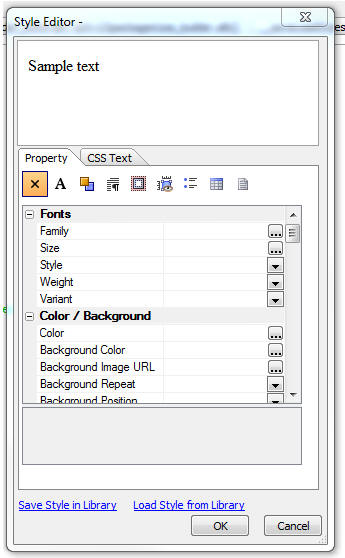
UX and Grid Component - Password Controls - Watermark
- When you set a textbox control to be a 'password'
control and you also turn on the watermark property,
previously, the watermark was not readable because it
was displayed using the same characters used to hide the
text that the user typed into the field. Now, when no
text has been typed into the field, the watermark is
displayed in clear text, so it is readable.
Demo Mobile Application - Step-by-step Tutorial -
A new step-by-step tutorial on how to build the Demo
Mobile Application that ships with Alpha Anywhere is now
available. Currently, the tutorial has 16 lessons. More
lessons are being added, so be sure to check back from
time to time.
http://downloads.alphasoftware.com/a5v12download/BuildingSampleMobileApp.htm
NOTE: If you install Alpha Anywhere updates (as
opposed to using the Full Installer), changes that have
been made to the Demo Mobile App since your initial full
install have not been installed on your machine. You can
get an up-to-date version of the sample app
here. Unzip this into the Samples\DemoMobileApp
folder where Alpha Anyhwere is installed.
Grid and UX Component - Action Javascript - File
Download - A number of improvements have been made
to this action.
-
The 'File not found' message can now include Text Dictionary Tags
(i.e. <a5:t>filenotfound</a5:t>).
Text Dictionary entries are defined by clicking the smart field for
the 'Text dictionary tags' property in the Grid or UX builder.
-
The builder allows you to specify that a message should be displayed
if permission to download the file is denied because either the file
does not have an allowed extension, or the file is not in a folder
from which downloads are allowed. File download permissions are set
in the Project Properties dialog (accessed from the Web Control
Panel).
NOTE: You will need to edit and re-save the action to get the new
features.
Web Applications - Project Properties Dialog -
Allowed File Download Folders - When defining the
folders from which files are allowed to be downloaded,
you can now use the <ApplicationRoot> placeholder. This
placeholder is replaced at run-time with the value for
the webroot.
Web Project Properties - Linked CSS Files - The
Web Project Properties dialog now allows you to specify
linked CSS files. This is useful if you have some CSS
that you want to have available to all of the component
in your project. Instead of linking the CSS files in the
individual components, you can not link the CSS in a
central location. The same comments apply for linked JS
files.
Grid Component - Detail View - Method for Opening
Detail View - A new option has been added for the
method for opening the Detail View. The 'programmatic'
option allows you to add your own button or event
handler to open the Detail View. For example, you might
want to have a button in the Grid row that opens the
Detail View. The event handler for this would be:
{grid.object}.detailView({grid.rowNumber});
If the button to open the Detail View as not placed in
each row of the Grid, but instead was placed (for
example), in the Grid header or footer, then the {grid.rownumber}
placeholder is meaningless and cannot be used to
indicate the row for which the Detail View should be
opened. In this case, your Javascript would be:
//get the row number of the currently selected row
var rowNum = {grid.object}._selectedRow;
{grid.object}.detailView(rowNum);
Reports - Printing QR Codes - You can now print
QR codes in a report, new printQRCode() function.
Watch video
To print a QR Code in a report you define a calculated
field using the printQRCode() function and then place
the calculated field on the report.
The printQRCode() function takes three arguments - the
value to encode, the size of the QR code (in
pixels) and a flag that indicates if the value should be
url encoded (set to .t. by default).
Note: The QR Code function calls into the Google charts
api, so an Internet connection is required.
For example, here is how you can define the calculated
field to print the 'serialnumber' field:
qrcode = printQRCode(serialnumber,400)
UX Component - Integrated Login Functionality -
The UX Component can include integrated login/logout
functionality.
This means you don't have to use a separate Login
Component, or (AppLauncher with login turned on) to
authenticate users in your application.
In this video we show how an authentication layer has
been added to a mobile application.
Watch Video - Part 1
Watch Video - Part 2
Watch Video - Part 3
Watch Video - Part 4
Watch Video - Part 5
The primary use case for integrated login in the UX
component is for mobile applications where the
application is typically built using a UX component.
However, another use case for the integrated login in
the UX is to build a custom login dialog to replace the
built-in Login component.
To turn on the integrated login feature, go to the
Properties pane on the UX Builder and check the 'Has
integrated login functionality' property, as shown in
the image below:
Once you check this property you get prompted for some
additional properties.
'User name control' and 'Password control'
- You must specify which controls on the UX component
are used for entering the username and password. Your UX
component will therefore need to have two controls
(likely textbox controls) where the username and
password are entered.
TIP: For the password control, be sure to check
the 'Password' property so that the password is hidden
when the user is entering it.
Placeholder for login errors - You must put a
placeholder control on the UX (see [Placeholder] in the
Other Controls section of the UX Builder toolbox) to
indicate where login errors should be shown. Use this
property to specify the name of the placeholder.
Customize login failure messages - You can
customize the various messages that the security
framework displays when login errors occur.
Logout does a full page reload - When the user
logs out, do you want this UX component to reload?
If you check this option, the component's layout is
re-computed on the server (and controls on the UX for
which membership in security groups are required are
hidden).
Here is why this is an important property to understand:
Assume that when you design the UX component you set the
security property on certain controls in the component
so that they are only visible to users who are in a
certain group (i.e. security role). For example, you
might have a button called 'Increase Salary' and you
might have set the security on this button to only show
the button for users who are in the 'Manager' group.
Assume that the current user is logged in as a member of
the 'Manager' group - so she sees this button.
After this user logs out, you will want to ensure that
this button is no longer visible. So, forcing the
component to reload will cause the server to re-compute
the layout of the UX component, and the button will be
removed when the server sends back a re-rendered version
of the component - because the user will no longer be
logged in as a member of the 'Manager' group.
Login/Logout Buttons
Once you have configured your UX component to turn on
integrated login functionality, you will also need to
add buttons to the UX component to login and logout.
The event Javascript code that will need for these
buttons is shown below:
Login
{dialog.object}.login();
Logout
{dialog.object}.logout();
Tip: You can select the 'Login-Logout' item in
the 'Defined Controls section of the toolbox to
automatically add login/logout buttons and also the
placeholder for login errors.
Server-side Events
When the user clicks the 'login' button to login, an
Ajax callback is made to authenticate the user. There
are several
server-side events for login and logout.
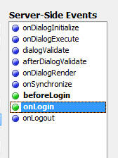
beforeLogin - This event fires before any attempt
is made to authenticate the user. A possible use for
this event is to log out any user who might be logged in
(use the A5WS_LogoutUser() function).
onLogin - Fires after the user is authenticated.
The event fires regardless of whether the authentication
was successful or not. The
e.loginSucceeded flag indicates if the login was
successful or not. An important use of this event is to
force a reload of the component on login. See the
discussion below on 'Forcing a Reload of the UX
Component After Login' for more details. This event can
also be used to set the 'friendly user name'. The
'friendly user name' is made available in client-side 'afterLogin'
event. It can also be used in client-side watch
expressions.
onLogout - Fires after the user logs in.
Client-side Events
When the user logs in or logs out there are several
client-side events that fire, as shown in the image
below.
The afterLogin event can be used to display a
message on the screen indicating the (friendly) name of
the logged in user.
For example, assume you have a static text control on
the UX with this text:
Logged in as: <span id="loggedinusername"></span>
In the afterLogin event, you could add this code:
var ele = $('loggedinusername');
ele.innerHTML = e.userNameFriendly;
You might also put a client-side show/hide expression on
the label as follows:
dialog.isLoggedIn = true
This will cause the static text control to be hidden
when there is no logged in user.
In a Mobile application, a common design pattern is to
put the login screen in a Panel Card and the application
in one or more additional Panel Cards. The Panel Cards
would then all be wrapped in a Panel Navigator that was
set to 'programmatic' mode for the method of navigating
the Panels. In the afterLogin event you would set
focus to the first Panel Card in the application.
In the afterLogout event, you would set focus
back to the Panel Card that contains the logn form.
Forcing a Reload of the UX Component After Login
After the user has logged in you might want to force the
UX component to reload. Consider the following scenario
which explains a use case for this option:
Assume that the application you have built is a single
UX component, and it has integrated login functionality.
Assume also that this component has certain controls
that have security on them (for example a 'Set Salary'
button that is only visible to member of the 'Manager'
group).
When the UX is initially loaded, the 'Set Salary' button
will not be visible (because the user is not yet logged
in).
Now assume that the user enters their username and
password and clicks the login button. This will fire an
Ajax callback and the user will be authenticated. Assume
that the user is now authenticated and is part of the
'Manager' group.
This user should now see the 'Set Salary' button, but
does not because when the UX was originally rendered,
the user was not logged in.
However, by forcing a reload after login, the component
will be re-rendered on the server and the user will see
the 'Set salary' button.
The way in which you force a reload of the UX component
after login is by setting the e.url property in the
onLogin server-side event. For example, you could
add this code to the onLogin server-side event:
e.url = "<thisComponent>"
NOTE: If you are forcing a reload after the UX
component loads, you will likely also want to set the
'Logout does full page reload' property to true.

Friendly User Name
For security reasons, it is not a good idea to expose
the logged in user name on the client-side after the
user has logged in. In the onLogin server-side
event you can execute code to translate the user name
that the user logged in with into a 'friendly' user name
which can be safely displayed on the client-side.
For example, assume that you had a table that had two
columns - 'userName' and 'friendlyUserName'
An example entry in the table might be:
jsmith23 John
Smith
In your onLogin server-side event you would execute code
to set e.userNameFriendly by looking up the friendly
name for the user name.
Once you have set e.userNameFriendly in the server-side
event, it can be used in the afterLogin
client-side event and also in watch expressions.
TIP: If you do want to have the real
logged in user name available on the client-side (for
example, so that you can display it in a message like
'Logged in as: james@acme.com'), then you can always set
the friendly name to the same as the user name in the
onLogin server-side event.
Client-side Watch Expressions
The client-side watch expressions (e.g. the show/hide,
enable, conditional style) can reference the following
system fields that are populated with login information:
dialog.isLoggedIn
dialog.loggedInUserNameFriendly
Note: The system fields that you can use in watch
expressions also include dialog.loggedInUserName, but
this value is always set to 'hidden_for_security_reasons'.
If you want to make the real logged in name available on
the client-side, then you can set the friendly user name
to the real logged in user name in your server-side
onLogin event.
Mobile Applications - Adding Login/Logout
The following section describes a common design pattern for adding
authentication to a mobile application.
In the image below we show the structure of the UX component that
contains the login/logout logic.
NOTE: You can get a quick start building this
component for yourself by selecting it from the list of available
templates when you create a new UX component. Select the 'Security
Framework - LoginComponentMobileApp' template.
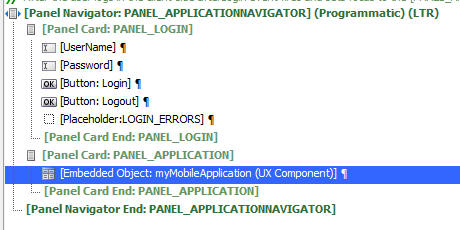
The basic structure of this UX component is a Panel
Navigator with two Panel Cards. The Panel Navigator has
been set to 'Programmatic' (meaning that a Javascript
command, and NOT a user 'swipe' on the screen is needed
to navigate from one Panel Card to another).
The first Panel Card contains the login and password
prompts.
The second Panel Card contains an embedded UX component.
This component is your application.
After the user has successfully authenticated, the
client-side afterLogin event fires and set focus to the
Panel Card that contains the embedded UX (i.e. the
application). The client side event executes this code:
{dialog.object}.panelSetActive('PANEL_APPLICATION');
The [Embedded Object] control (i.e. the UX component for
your application) is set to only render when the Panel
gets focus. This is very important. It means that the
embedded component is not rendered until AFTER the user
is authenticated. At that point, the server knows what
role (i.e. groups) the user is a member of, and when the
component is rendered, any controls that are conditioned
on membership of specific security groups can be
included or excluded in the component.
When the user logs out of the application, the
PANEL_LOGIN panel in the parent UX component is shown.
In this video we show how an authentication layer has
been added to a mobile application.
Watch Video - Part 1
Watch Video - Part 2
Watch Video - Part 3
Watch Video - Part 4
Watch Video - Part 5
Xbasic - helper::HTMLProcess Class - A powerful
new class has been added to Xbasic to help write code
that processes and transforms text. The class is mainly
used for processing HTML or XML documents, but it can be
applied to other types of documents.
NOTE: See the Documentation Viewer (Help,Open
Documentation) for a full list of methods. You might
need to click the refresh button on the Documentation
viewer if you don't see the topics.
Here are some examples showing ways in which the class
can be used.
Example 1: Manipulating attribute values in an HTML
document.
Assume that you have a simple HTML document with this
content:
<html>
<body>
<img src="Logo.png" >
<img src="Signature.png" >
</body>
</html>
You would like to modify all of the img tags to add a
prefix to the src attribute. You would like the
resulting document to look like this:
<html>
<body>
<img src="http://myimages.net/Logo.png"
>
<img src="http://myimages.net/Signature.png"
>
</body>
</html>
Here is how the helper::HTMLProcessor class can be used
to solve this problem:
dim oldHTML as c
oldHTML = <<%html%
<html>
<body>
<img src="Logo.png" >
<img src="Signature.png" >
</body>
</html>
%html%
'dim an instance of the class
dim hh as helper::HtmlProcessor
'define a handler to call the changeSrc() callback
function
'every time an attribute called 'src' is encountered.
hh.AddTagAttributeFilter("src","changeSrc(<tag>,<value>)")
'call the object's .processHTML() method
dim newHtml as c = hh.ProcessHTML(oldHtml)
'define the callback function
function changeSrc as c(tagName as c,tagValue as c)
if tagName = "img" then
tagValue = "http://myimages.net/" + tagValue
end if
changeSrc = tagValue
end function
Here is how the code works:
hh is an instance of the helper::HTMLProcessor object.
hh as a number of methods (see the Documentation viewer
for a full list of methods - you might need to click the
refresh button on the Documentation viewer if you don't
see the topics.).
the .AddTagAttributeFilter() allows you to define a
'callback' function that gets called every time a
specified attribute is encountered when processing the
document. In this case we specify the 'src' tag (first
argument). The second argument is the callback function.
When you define the callback function you can use
special placeholders. For example, the callback function
is specified here as:
"changeSrc(<tag>,<value>)"
<tag> is the element that contains the 'src' attribute.
<value> is the attribute value.
The actual processing of the input document takes place
when the .processHTML() method of the object is called.
Inside the callback handler the code checks to see if
the element name is 'img'. If so, then it returns a new
value for the 'src' element.
Example 2: Manipulating Elements in an HTML
Document
In the previous example, we manipulated attributes in an
element. In this example we manipulate all of the text
for an element.
For example, assume that the input HTML document looks
like this:
<html>
<body>
<code>
var myvar =
'';
myvar =
'alpha';
</code>
</body>
</html>
<code> is some arbitrary element that we want to
transform. The resulting document should look like this:
<html>
<body>
[
var myvar = '';
myvar = 'alpha';
]
</body>
</html>
The solution is very similar to example 1. The
difference is that instead of adding a callback handler
using the .AddTagAttributeFilter() method, this time we
add a callback handler using the .AddTagPair() method.
Here is the working example:
dim hh as helper::HtmlProcessor
'define the callback handler.
'the callback handler will be called whenever a 'code'
element is encountered
'note that <value> is passed into the callback function.
this is the contents of
'the element (including the tags).
hh.AddTagPairFilter("code","","processBlock(<value>)")
dim newtxt as c
'process the document
newtxt = hh.ProcessHTML(txt)
function processBlock as c (txt as c )
dim doc as p
'get a DOM from the text
doc = *xml_document(txt)
dim txtInner as c
txtInner = doc.top.innerXML
processBlock = "[" + txtInner + "]"
end function
The helper::HTMLProcessor class also has some static
method that we demonstrate in the next example.
Example 3: Extract Attribute Values
This example shows how you can quickly dump out
attribute values for a given element.
Say we have an HTML document that looks like this and we
want to extract information about the src and style
attributes for each element:
dim HTML as c
HTML = <<%html%
<html>
<body>
<img src="Logo.png"
style="width:200px;">
<img src="Signature.png" >
</body>
</html>
%html%
Here is how we can do this using a static method of the
class:
'get list of all image sources
dim images as c
images =
helper::HtmlProcessor::ExtractTagAttributes("img",HTML,"src|||style")
?images
Logo.png|||width:200px;
Signature.png|||
The .ExtractTagAttributes() takes three arguments:
tagName - the tag from which you want to extract
attribute values - in this case the 'img' tag
text - the text you want to process
outputFormat - a definition or the output format.
In this was we have specified 'src|||style' which means
we ant to dump out the value of the src attribute, then
3 pipe characters, then the value of the style
attribute.
Example 4: Extracting Elements
In the previous example we dumped the values of
attributes of a specified element.
We can also dump out the text (inner or outer) of a
particular element using another static method of the
class - .extractTags()
For example, assume this input document:
dim html as c
html = <<%html%
<html>
<body>
<div id="id1">
<a href="page1">Go
to page 1</a>
<a href="page2">Go
to page 2</a>
<a href="page3">Go
to page 3</a>
</div>
<div id="id2">
<a href="page10">Go
to page 10</a>
<a href="page20">Go
to page 20</a>
<a href="page30">Go
to page 30</a>
</div>
</body>
</html>
%html%
'Get the outer HTML for all 'a' elements:
outerHTML =
helper::HtmlProcessor::ExtractTags("a",HTML,-1,.t.)
?outerHTML
<a href="page1">Go to page 1</a>
<a href="page2">Go to page 2</a>
<a href="page3">Go to page 3</a>
<a href="page10">Go to page 10</a>
<a href="page20">Go to page 20</a>
<a href="page30">Go to page 30</a>
The .extractTags() method takes the tag name, input
document, instance number and a logical flag indicating
if you want outer or inner html of the tag.
In the above example, the instance number is set to -1,
indicating all instances.
To get the inner HTML for all 'a' elements
innerHTML =
helper::HtmlProcessor::ExtractTags("a",HTML,-1,.f.)
?innerHTML
Go to page 1
Go to page 2
Go to page 3
Go to page 10
Go to page 20
Go to page 30
Now, lets take this example a little further and assume
that we only want to extract the data from 'a' elements
that are inside the div with the id of 'id2'.
We can use the .getTagInnerHTML() method to get the
inner HTML for the div tag with an id of 'id2'. However,
this method takes a tag instance number. We first need
to find out what instance number the div with an id of
'id2' is.
'Extract the ids of all div elements
dim allIds as c
allIds =
helper::HtmlProcessor::ExtractTagAttributes("div",HTML,"[id]")
?allIds
= [id1]
[id2]
Now find out what instance number 'id2' is. We wrapped
the output from .extractTagAttributes() in [ ] so we
actually search for [id2]
dim lineNum as n
lineNum = word_number_get(allIds,"[id2]",crlf())
?lineNum
=2
Now that we know that the instance number of id2, we can
extract the innerHTML of this div
dim txtDiv as c = ""
txtDiv =
helper::HtmlProcessor::GetTagInnerHTML("div",HTML,lineNum)
Now get the text for the 'a' attributes in 'txtDiv'
dim innerHTML =
helper::HtmlProcessor::ExtractTags("a",txtDiv,-1,.f.)
Example 5: Stripping <span> tags
Another useful static method of the class is the .removeSpans()
method which strips <span> tags from HTML.
For example:
dim html as c
html = <<%html%
<html>
<body>
Here is some sample text <span
class="myclass">this is in a
span</span>
and now we are out of the span.
</body>
</html>
%html%
'strip out the span but retain the text inside the span
?helper::HtmlProcessor::RemoveSpans(html)
<html>
<body>
Here is some sample text this is in a
span and now
we are out of the span.
</body>
</html>
UX Component - Signature Capture - A common
requirement in mobile applications is the ability to
capture a signature and store the signature in a
database.
A new Signature Capture control has been added to the UX
component.
Watch Video - Part 1
Watch Video - Part 2
To add a Signature Capture control to a UX component,
select the control from the 'Data Controls' section of
the toolbox.
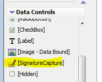
You can then define properties of the control in the
property grid.
The signature control contains two HTML elements, only
one of which is visible at any time:
- a canvas control for capturing the signature
- an image control for displaying previously captured signatures
For example, in the image below, the signature capture
control is showing a previously entered signature, so
the image element is displayed.
The 'Sign' button that appears below the image is a
built-in button (i.e. it is automatically generated by
the Signature Control - you can optionally turn it off).
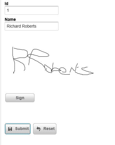
When the user clicks the 'Sign' button, the 'Image'
element that displays the signature is hidden and the
'Canvas' element (where the user can sign) is displayed,
as shown in the image below:
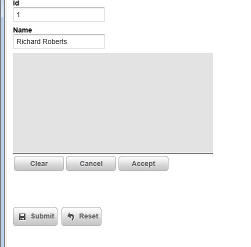
The 'Clear', 'Cancel' and 'Accept' buttons (like the
'Sign' button in the previous image) are automatically
generated by the Signature Capture Control. Like the
'Sign' button, you can optionally turn off these buttons
and add your own buttons to control the Signature
Capture Control. The buttons perform the following
actions:
- Clear - allows the user to clear the signature they have entered
and start over
- Cancel - switches back from 'signature capture' mode (where the
'canvas' element is shown) to 'signature display' mode, where the
existing signature (if any) is shown.
- Accept - accepts the signature that was entered and switches
back to 'signature display' mode.
The image and canvas elements that make up the Signature
Capture control are contained within an outer container.
When you define the properties of the Signature Capture
control you specify the dimensions of the outer
container separately from the dimensions of the
signature capture area.
The dimensions of the signature capture area must be
smaller than the dimensions of the outer container
(because the signature capture area has to fit within
the outer container) and must not use percentage sizes.
For example you can't set the width of the signature
capture area to (say) '80%'. The reason for this is that
you never want the signature capture area to resize (for
example, when the orientation of a mobile device
changes), or else a signature captured when the device
was using (say) portrait mode would look distorted when
you were in landscape mode.
Storing Signatures in a Database
When the user submits the UX component, you can store
the signature that the user entered in a field in a
table. The signature control must be bound to a binary
field. When the UX component is submitted, the value in
the signature capture control is submitted as a base64
encoded PNG image. The value is converted to a binary
value before it is stored in the table field.
NOTE: In the case where you are storing data in a .dbf
table, you must store the data in a PNG image field.
Defining Your Own Buttons to Control the Signature
Capture Control
The property sheet for the Signature Capture control
allows you to turn off the system generated buttons. If
you do this, then you must add your own buttons. Here is
the Javascript code that each button must call:
Sign Button
{dialog.object}._functions._toggleCanvas(signatureControlId,'canvas');
{dialog.object}._functions._clearCanvas(signatureControlId);
Clear Button
{dialog.object}._functions._clearCanvas(signatureControlId);
Cancel Button
{dialog.object}._functions._toggleCanvas(signatureControlId,'image');
Accept Button
{dialog.object}._functions._saveCanvas(signatureControlId);
{dialog.object}._functions._toggleCanvas(signatureControlId,'image');
Where 'signatureControlId' is the id of the
control.
In order to hide the 'Sign' button when the 'Clear',
'Capture' and 'Accept' buttons are shown, and vice
versa, you can hook into the 'onSignatureCaptureToggle'
client-side event.
Validating Signature
A common requirement in a UX component is to validate
that the user has signed the form when the UX is
submitted. You can check that there is data in a
signature capture control by adding code to the
server-side dialogValidate event. When the UX is
submitted, the signature (in base64 encoded form) will
be submitted in a special hidden field with the same
name as the signature control and a '_HIDDENA5FN'
suffix.
The following code in the dialogValidate event will
check to see that the user has signed the UX (assuming
that the signature control was called 'SIG':
function dialogValidate as p (e as p)
dialogValidate.hasError = .f.
dialogValidate.errorText = ""
if e.dataSubmitted.SIG_HIDDENA5FN =
"" then
dialogValidate.hasError = .t.
dialogValidate.errorText = "You have not signed the
form."
end if
end function
UX and Grid Component - onImageError Client-side
Event - Missing Images - A new client-side event has
been added to allow you to handle errors caused by
missing images.
Watch Video
UX Component - Repeating Sections - Populating -
There has been a substantial improvement in the time
taken to populate a repeating section with data. This is
especially noticeable when the Repeating Section has a
large number of rows and there are multiple client-side
watch events in the Repeating Section.
UX Component - List Control - Freeform Layout -
'Fill' Option for List Height or Width - By default,
when you define a freeform layout for a List, each item
(i.e. row) in the list has a default size (the amount of
space taken by the item content), or an explicit size
(that you specify - e.g. 200px). A new option has been
added when you specify an exlicit size. You can now use
the 'fill' keyword (in place of an explicit size).
For example, in a List that is set to scroll
horizontally, you can set both the height and width to
'fill'. This will result in each item on the List
completely filling the List. You will only be able to
see one List item at a time.
The image below shows a List set to scroll horizontally.
The item width is set to 150px and the item height has
not been set.
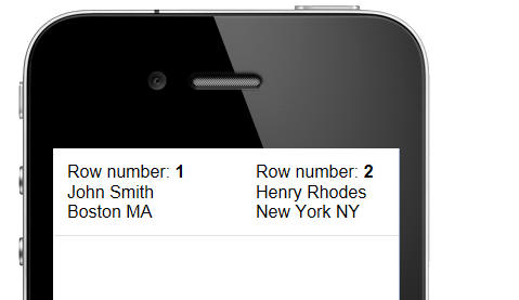
In the next image, the item width has been changed to
'fill'. Notice now that each item has the full width of
the 'viewport' (i.e. the List).
When you use the 'fill' keyword for a List item
dimension (height or width), you can also specify a
modifier - an amount by which the dimension should be
less than the viewport dimension. E.g. fill-10px.
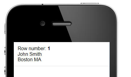
In the next image, the item height has also been changed
from 'blank' (ie. not height specified, so base the
height on the item content) to 'fill'. Notice now that
the item completely fills the 'viewport'.
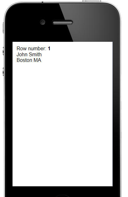
When you set a width or height dimension to 'fill' you
might want to turn on custom scroll settings, to prevent
a situation like the one shown below from happening.
In the image below (for a List set to scroll
horizontally), the item width has been set to 'fill' and
the user has scrolled the List so that some of row 1 and
some of row 2 are shown.
You can set the List so that it scrolls in discrete
amounts to prevent this from happening. See the topic 'UX
Component - List Control - Custom Scroll Settings' for
details.
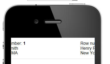
In the image below, custom scroll settings have been
defined so that the List scrolls in discrete amounts (in
this case, the width of the viewport). As a result, when
you stop drag scrolling, the List animates a complete
item into view. A partial item (as in the above image)
will never be shown.
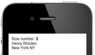
UX Component - List Control - Custom Scroll Settings
- Normally drag-scrolling on a List is continuous. In
other word, when you drag-scroll the List, you can stop
dragging at any time and the List will remain scrolled
in the position where you stopped dragging. However, you
might want the List to scroll in discrete amounts,
rather than continuously.
You can define custom scroll settings for a List, or for
an individual Layout in a List (if the List has more
than one Layout).
When you define custom scroll settings, you can define
these properties:
- Has momentum scrolling
- Scroll step size - the discrete amount by which a List scrolls.
This can be set to an explicit amount (e.g. 100px) or a percentage
(e.g. 100%). The percentage applies to the size of the viewport.
- Offset - an offset amount is pixels (this is an advanced setting
that allows you to compensate for padding settings in the List that
might throw off your scroll settings.
The 'Scroll step size' and 'Offset' can be defined for
both the x and y axes.
UX Component - List Control - Freeform Layout -
Dynamic Templates - When you define a freeform
template for a List control you can now define multiple
sub-templates and then automatically select which
sub-template to use depending on the data in the current
row.
For example, here is a very simple freeform template:
{Firstname} {Lastname}, {State}
Every row of data in the List will be rendered using the
same template. So, row 1 of the List might look like
this:
John Smith, MA
and row 2 of the List might look like this:
Fred Tyson, CA
However, say you want the template for the row to be
completely different for all people in the state of MA
and CA. Here is how you would define the freeform
template:
{condition:data.state == 'MA'}
put template for 'MA' here
{conditionEnd}
{condition:data.state == 'CA'}
{conditionEnd}
{condition:else}
{conditionEnd}
The condition that follows the {condition: directive is
a Javascript logical expression. You can use the 'data'
object to reference data values in the current row.
Application Server - Analyze Web Access Logs -
A5W_AnalyzeWebAccessLogs() Function - A new
function A5W_AnalyzeWebAccessLogs() has been added to
analyze web access logs and find the number of requests
per minute. This is a good tool to estimate the loads
being placed on a server. The Enable server Logging
option must be checked in the server configuration on
the Logging tab to create the access logs.
The function is context aware and can be run on the
desktop or on a web page. The function can output the
requests per minute on a chart or in a list showing the
requests for each minute. The list option can include a
list of all IP addresses that accessed the system and
sort the IP addresses by the number of requests.
When run on the desktop, a genie will allow selecting
any access log stored on the computer and select the
output options. If a list is selected, it can be saved
in a file if desired.
To run on a web page, create a page with only this in
the source HTML
<%a5
?A5W_AnalyzeWebAccessLogs()
%>
The function will create the complete page HTML code. A
dropdown control on the page allows selecting any of the
last 50 logs created by the app server running the page.
The web page can create the same chart or list as the
desktop genie. The desired output is displayed on the
page.
An example of the output generated by this function is
shown below:
UX Component - Comments - You can insert comments
into your UX component to document your component.
Components can be inserted at two levels:
- individual controls
- new comment control
To add a comment to any control in the list of selected controls,
click the comment icon on the toolbar at the top of the list. The
comment icon is shown with a yellow highlight in the image below.
This will open an editor where you can enter your comment.
You can either create a plain text comment, or you can use HTML to
create richly formatted comments.
The comment shows up on the right edge of the control list. For
example in the image below, the [Panel Card CUSTOMERFORM] control has a
comment. You must set the width of the UX builder to be wide enough to
see the comment.
The indent level of the comments is set to 6 inches by default, but
you can control this value by going to the Properties pane, Advanced
section in the UX builder.
You can also turn off comment display if you want by going to the
Properties pane, Advanced section.
The comment control is a new control type. You can insert a comment
control by selecting it from the 'Other Controls' section in the control
toolbox on the left edge of the UX builder. As a shortcut for inserting
a comment control, you can select the 'Insert comment' menu from the
drop down menu. See the 'Menu' button in the toolbar on the image below.
To edit the comment for a comment control you can either click on the
comment icon on the toolbar, or you can double click on the control in
the control list.
In the image below three comment controls are shown directly above
the [Panel Card: CUSTOMERFORM] control.
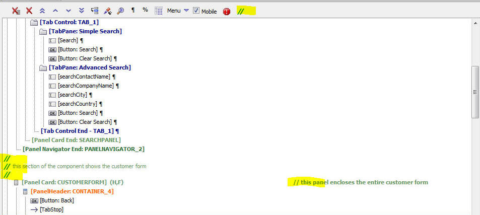
UX Component - Comments - Printing Comments - You
can print all of the comments in a uX component by
selecting the 'Print comments' command on the dropdown
menu.
UX Component - Adding Controls - Watermark - Shortcut
- A common pattern when building mobile applications
is to set control label position to 'None' and then turn
on the watermark property. This saves valuable screen
real estate.
For example:
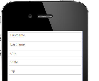
Now, a new shortcut when adding controls makes this even
easier to do. When you add new controls, the component,
the dialog allows you to set the label position to
'watermark'
Watch video
UX Component - Windows - Drag Scrolling on Window
Contents - If a pop-up window contains more content
than can be displayed in the window, you can now turn on
drag scrolling of the window so that the window contents
can be scrolled on touch enabled devices. You can also
define 'pull past end' settings (for example, you can
define an event when the user drags up on the window
contents past the end of the contents).
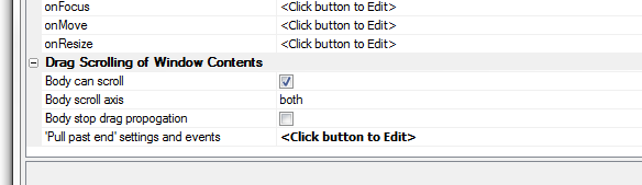
UX and Grid Components - Client-side Watch
Expressions - User Defined Javascript Functions -
When defining client-side watch expressions (e.g.
show/hide, enable, client-side dynamic style, dynamic
images), you have always been able to use user defined
Javascript functions in the expression. However, if you
put your functions in a private name space in the Grid
or Dialog object, the expression would not parse
correctly in the builder.
Now, you can use Javascript functions that are in your
own namespace within the Grid or Dialog object.
For example, say you defined the following function in
the Javascript Function definitions
{dialog.object}._functions.myfunction = function() {
return true;
}
In a show/hide expression, you can now specify this as
the expression:
{dialog.object}._functions.myfunction() = true
UX Component - List Control - Long Data Values -
Word-Wrap - By default, when a long character value
is shown in a List control the data in the list are
truncated, not word-wrapped. A new property in the List
builder, allows you to turn on word-wrapping.
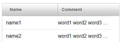
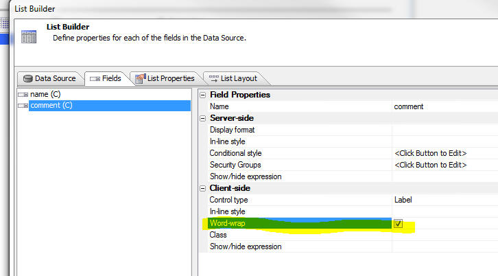
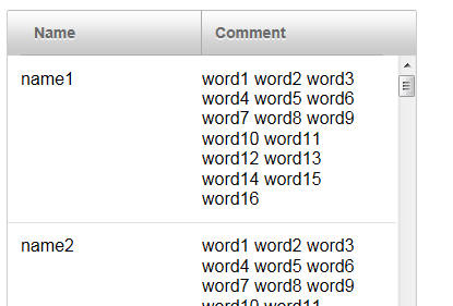
Xdialog - Double Buffering to Reduce Flicker -
{composited} Directive - On large Xdialogs,
when you change the display in a list, you might notice
some screen flickering. A new Xdialog directive can be
used to turn on double-buffering for the screen display
to eliminate, or reduce, screen flickering. The
directive is:
{composited}
This directive can be placed anywhere in the dialog
body. For example:
dlg_body = <<%dlg%
{removecomments}
{composited}
[%O={@@}%.130,40indx^#arr[\].display];
<up><down>
%dlg%
You can
download a sample Xbasic script here to demonstrate
the effect of this directive.
Component Builders - Preview Pane - The Preview
pane has been removed from the builders as it is not
necessary. The Live Preview and Working Preview provide
a better preview of how your design will look.
UX Component - Data Bound - SQL Tables - Refresh
Schema for SQL Tables - When you open a UX component
for editing, if the UX has been data bound to SQL
tables, the schema that is stored in the UX for each
bound table is now automatically refreshed. If you want
to turn off this behavior, there is a new property in
the Properties Pane, Data Binding section to do so.
Grid Component - SQL Tables - GUID as Primary Key
- If you had a Grid based on a table that used a GUID as
the primary key, you had to previously add code to the
CanInsertRecord event to set the value in the GUID
field.
For example:
function CanInsertRecord as v (DataSubmitted as P, Args
as p, PageVariables as p, Result as p)
with PageVariables
Result.Cancel = .f.
Result.ErrorHTML = ""
DataSubmitted.MYGUIDFIELD = *guid_create()
end with
end function
This is now no longer necessary. If no value was
supplied for the GUID field, an GUID value will be
automatically generated (only if the GUID field is the
primary key).
A5W/HTML Page Editor - Remote Test on Mobile Device - You
can now do a remote test of an A5W or HTML page directly from the
editor.
When you click on the 'Execute Page' button (the yellow
lightening bolt), you now get a menu allowing you to select 'Live
Preview' or 'Remote Test'. If you select the 'Remote Test' option
you will get the standard 'Remote Test' dialog that allows you to
easily open the page in the browser on a remote device (e.g. a
mobile device).
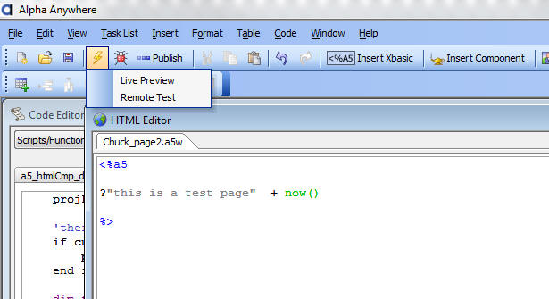
UX Component - Populating Controls with Data in a Data Bound UX -
Ajax Callback - In a data bound UX component, you can make call this
method of the UX component to do an Ajax callback and populate the
UX component with data for the specified primary key value:
{dialog.object}.populateControlsFromTable
However, if you have your own, user defined Ajax
callback, you might want to generate the Javascript to
populate the controls with table data in your own
callback, rather than triggering a second Ajax callback.
A new option in the a5_UX_Action() server-side function
allows you to do this. In the example below we show the
Xbasic function to handle a custom Ajax callback. Assume
the Xbasic function is called myXB.
function myXB as c (e as p)
dim ops as p
ops.primaryKey = primaryKeyValue
ops.showDebugInfo = flagValue
dim javascriptCode as c
javascriptCode = a5_UX_Action(e.ops,"populateControlsFromTable")
dim jsOther as c
jsOther = "any other javascript you
want your callback to return"
myXB = javascriptCode + jsOther
end function
UX Component - Embedded UX Component in a Panel Card
- Synchronize UX - A new property has been added to
the embedded UX component that allows you to
automatically synchronize the UX every time the Panel
Card gets focus (assuming that the Panel Card is
contained in a Panel Navigator).
If this option is checked, the embedded UX component's
server-side onSynchronize event and client-side
onSynchronizeDialog events are fired.
Dynamically Adding Panels to a Panel Navigator - Closing the
Dynamically Added Panel - If the dynamic panel is added to a Panel
Navigator that has been configured to use Tab Bands as the method for
navigating the child Panels, you can allow the user to close a
dynamically added Panel. When the .addPanel() method is called, the JSON
object that defines the new Panel should include:
close: true
For example
//get a pointer to the Panel Navigator where the new Panel
will be added
var pNav = {dialog.object}.panelGet('PANELNAVIGATOR_1');
//add the new Panel Card to the Panel Navigator
pNav.addPanel({
name: panelName ,
title: panelTitle,
src : myNewPanelCard,
close: true
});
In the image below, Pane4 was added dynamically with the close option
set to true. As you can see, the Tab Band label for the Pane includes a
close icon. If you tap on the close icon, the Pane is closed and is
removed from the Panel Navigator.
UX Component - Slider Control - onSlide and onChange
Events - Previously, when you defined these events
you specified the name of a Javascript function and you
put your event handler in the Javascript function. Now,
in order to make the slider more consistent with how
event handlers for other controls (e.g. Switch,
ButtonList, List, etc) are defined, the code for the
event handlers can now be added directly to the property
(you no longer need to call a Javascript function). For
backwards compatibility, the old method is still
supported. So, if you define the following Javascript
for the event handler:
myChangeFunction
This is assumed to be the name of the function that you
want to call.
UX Component - Image and File Upload - Xbasic Event
Handlers - Control Values - In a UX component, when
the server-side Xbasic events defined in the Action
Javascript builder fire, the control values for all of
the controls on the UX are available to the Xbasic code.
For example, assume that the UX had a control called
'FIELD1'. In the Xbasic event handlers, you can
reference this value as follows
request.variables.v.r1.field1
UX and Grid Component - Image and File Upload -
Filename for Uploaded File - When you upload an
image or a file to a target character field (rather than
a binary field), the uploaded file is saved in a file in
the UploadFolder (defined in the builder) and the
filename of the file is saved in the target character
field. The filename is derived from the filename of the
file on the client machine.
Now, a new property in the builder allows you to define
an Xbasic function in which you can compute the filename
to use for the uploaded file.
As shown in the screenshot below, the new 'OnStoredFilename
Compute Xbasic Function' property allows you to define
the name of an Xbasic function. The Xbasic function
exposes the 'e' object which has these properties:
- e.targetFileName - the filename for the uploaded file (computed
based on the setting for the UploadFolder and the name of the file
on the client machine
- e.imageBinaryData - binary data that was uploaded
You Xbasic function can change the value in the e.targetFileName
property. If you do change this value, the uploaded flle will be stored
in the filename specified by the new value in e.targetFileName
IMPORTANT: The transformation expression (defined in Action
Javascript at design time) will be applied to whatever value is in
e.targetFilename. So, if your event handler changes the value in
e.targetFilename, the transformation expression is applied to this new
value.
Your code can optionally set a value for e.storedValue property in the e
object
If you set the e.storedValue property, this value will be stored in the
target field in the record (and the transformation expression will be
ignored).
A5_imageURL_from_blob() Function - Takes a
blob (image data) and creates a URL for the image. A use
case for this function would be if you had a table that
contained a binary field with some image data in it. You
would like to display this image in some html.
Syntax
c URL = a5_imageURL_from_blob(blob
as b, imageTypeIn as c, imageTypeOut = ""
)
Where imageTypeIn is the image type (jpg, bmp,
png) and imageTypeOut is the image type you want
to return.
Example
<%a5
dim cn as sql::connection
cn.open("::name::myconnection")
dim sql as c
sql = "select imageblob from products
where productid = 1")
cn.execute(sql)
dim b as b
b = cn.resultset.data("imageblob")
dim url as c
url = a5_imageURL_from_blob(b,"jpg","jpg")
?"<img src=" + quote(url) + " />"
%>
AppLauncher Component - The AppLauncher
component is designed to address the following problem:
You have designed an application that is accessed
through some URL. For example:
www.mycompany.com/salesApp
Some of the users of this application will be
launching your app in a desktop browser, some will be
launching it in a browser running on an iOS phone,
others on an iOS tablet, other on an Android tablet and
so on.
You do not want to have a different URL for each class
of user. However, you want each class of user to launch
a different startup component or page.
By using the AppLauncher component, you can
automatically determine what type of device the user is
using and then launch the appropriate component, or .a5w
page, using the appropriate stylesheet. You can
even navigate to a different URL.
For example, if a user us using a desktop browser,
you might want to launch a TabbedUI component. If the
user is using a phone, you might want to launch a
particular UX component, but with one stylesheet for the
users on an iOS device, another stylesheet for users on
an Android device, and so on.
The AppLauncher component can also, optionally,
prompt for username and password, and it can
authenticate the user before it launches the startup
component.
How the AppLauncher Component Works
The App Launcher component makes an Ajax callback to
the server after it is launched. When the callback is
made, information about the device that the user is on
is passed back to the server. This information is
available to determine what startup component to load.
How to Define the Startup Component
To define the Startup Component, click the smart field for the
'Startup component' property.
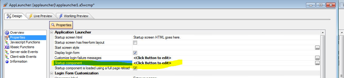
This will open a builder where you can define a series of logical
expressions. When the Ajax callback to the server is made, these logical
expressions are evaluated in the order in which they are defined.
For example, in the screen shown below, if 'logicalExpression1' is
true, then the UX component called 'ux1' is loaded using the GrBlue
stylesheet.
The logical expressions are Xbasic expressions that can reference
'system fields' (such as client.isIPad, client.isAndroid, etc.)
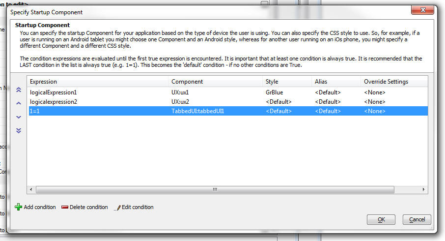
The system fields that the logical expression can reference are
actually properties in the A5.flags global Javascript object.
You can add you own system fields in the AppLauncher by adding your
own code to the client-side 'beforeTargetIsLoaded' event. Your code
would add new properties to the global A5.flags object.
For example, you could add this code to the event:
A5.flags.__myvar = "alpha"
Then, in the logical expressions you define to select the startup
component, you could reference this value as follows:
client.__myvar
Two Ways to Launch the Startup Component
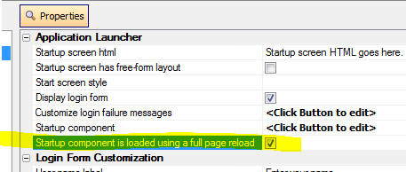
There are two ways to load the application launcher:
-
full page reload, or a
-
inject html in the app launcher component
If the target component is a TabbedUI, PageLayout, or a5w page, then
you have to use the full page reload option.
If you do not use the full page reload option and the style you want to
use for the target component is not the same as the style used in the
AppLauncher you will have to add the target component style name to the
'Additional styles' property.
UX Component - User-Defined Sub-Themes - Most
of the Javascript controls on a UX component support the
concept of 'sub-themes'. This topic discusses how
user-defined sub-themes can be added to a UX component.
Watch Video - Part 1
Watch Video - Part 2
Download Component
NOTE: Javascript controls on a UX
component include Panel Cards, Panel Navigators, Panel
Layouts, Tabs, Accordions, Buttons, Sliders, SpinLists,
ButtonLists, Switches, Lists, Trees, Edit-combos,
Auto-suggest, etc.
The sub-theme sets style and behavior properties of
the control. Out of the box, each control type comes
with one or more built-in sub-theme. For example, the
Button control type comes with the following built-in
sub-themes:
- base
- left
- right
- confirm
- deny
- action
Every control type has a sub-theme of 'base' and this
sub-theme is implied if no sub-theme is explicitly set.
The sub-themes for a given style (e.g. iOS, MobBlue,
etc.) are defined in the style.js file in the folder
with the same name as the style. (e.g. CSS\iOS\style.js)
Developers can define their own sub-themes by adding
code to the style.js file, (in which case the new
sub-theme will be available to all components that use a
particular style), or by adding the sub-theme in as a
'locally' defined sub-theme as part of the UX component.
To define a local sub-theme, use these properties in
the UX builder:
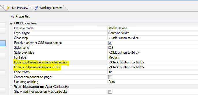
A sub-theme typically has both a Javascript aspect to
it and a CSS aspect.
In the image below, a window with the default
appearance for a window using the iOS theme is shown. In
the builder where this window was defined, no sub-theme
was specified (which means that the 'base' window
sub-theme was used).
However, in this next image, a custom sub-theme for
the window was used. The appearance of the window has
been completely changed as a result of applying the
sub-theme. Notice that the window does not have a title,
it is semi transparent (you can see the controls that
are behind it), and the close button is positioned
slightly above and to the right of the top right corner
of the window.
To define this new window sub-theme, the following
code was added in the 'Local sub-themes definition -
Javascript' property of the UX component:
{
window: {
customSubTheme: {
className: 'customWindow',
title: {
className: 'customWindowTitle',
tools: {
inset: '-12px',
verticalInset: '-12px'
}
},
body: {
className: 'customWindowBody'},
_defaultTools: {
'close' : {
action: 'close',
name: 'close',
image: 'css/iOS/winClose.png'
}
}
}
}
}
NOTE: The above Javascript was
not written from scratch. It was copied, then modified,
from the style.js file for the style (in the CSS folder)
In addition, the following code was added in the
'Local sub-themes definition - CSS' property:
.customWindow {
background:rgba(0,0,0,.5);
color: white;
border-radius: 10px;
}
.customWindowBody { padding: 10px; text-shadow: none;}
.customWindowTitle { overflow:hidden; height: 0px; }
The Javascript shown above for the local sub-theme
definition is a simple JSON object. The JSON object
defines an object called 'window' which is the type of
control for which the sub-theme is being defined. Within
the 'window' object, a sub-theme called 'customSubTheme'
has been defined. In this case only additional sub-theme
for the 'window' class was defined, but you would define
an unlimited number of window sub-themes.
The sub-theme simply defines CSS class names to use
for various aspects of the window and also defines other
properties. For example, the 'inset' and 'verticalInset'
properties define the placement of the window 'tools'
relative to the top, right corner of the window (in this
case, the only 'tool' is the close button).
UX Component - Chart Control - Dynamically
Changing Chart Appearance at Run-time - You can now
dynamically change certain chart properties at run-time
to alter the chart appearance.
Watch Video - Part 1
Watch Video - Part 2
Download Component
Changing the chart stylesheet:
Watch video
Download Component
The properties in the chart that can be changed can
be bound to controls on the UX component. When the chart
is refreshed, the value for these 'bound' properties are
read from the corresponding UX component controls.
Certain chart properties (such as the chart title)
are defined by an expression (e.g.
"My Chart
Title" - this is an expression because it is
enclosed in quotes). However, if you have a control on
the UX (called say 'chartTitle'),
then you can set the chart title expression to:
chartTitle
(no quotes). This means that the chart title will be
read from the
chartTitle control on the UX component.
Other properties (such as whether the chart is 3D or
2D) are not controlled by expressions. To bind these
properties to UX controls, you need to open the 'Binding
- Dynamic Charts' builder in the chart builder.
Once you open the builder for Dynamic Charts, you
will see a dialog like this:
This allows you to define a CR-LF delimited list of
chart bindings. For example, in the image shown above,
the
ChartType
property of the chart control is bound to a control on
the UX component called
chartType
Build 1507-4150 25-Jun -2013 10:15 PM
Features
UX Component - Slider - Date and Character Values - The slider
control by default allows you to select a numeric value in a range of
numbers. But it can also be configured to select a date value from a
range of date values, or a string value from a pre-defined list of
choices (e.g. Poor, Average, Good).
This video shows how the Slider can be configured as a numeric,
character or date slider. It also shows how the range of allowed values
(numeric and date sliders) or the list of choices (character sliders)
can be dynamically changed at runtime.
Watch Video
Bugs
Grid Component - Search Part - Hide Grid if No Active Search - If
a Grid that had a search part was configured to not show the Grid part
if there was no active search was opened from a button that set a base
filter of a link to the child Grid, the base filter or link would not be
applied when a search was performed in the child Grid.
UX Component - List Control - Group Breaks - If a custom List
control was being used as a record navigator in a UX that was data
bound, if the List had group breaks turned on, clicking on a row in the
List would navigate to the wrong record.
Build 1503-4144 23-Jun -2013 9:50 AM
Bugs
UX Builder - Low Resolution Screens - When
working on a machine that has less than 768px vertical
resolution, the OK and Cancel buttons on the dialog were
not visible.
UX Builder - Remote Test - Under certain
circumstances, an error would occur when clicking on the
Remote Test icon on the toolbar.
Build 1500-4143 22-Jun -2013 9:30 AM
Features
UX Component - Action Javascript - 'Google Map
Methods (UX Component)' Action - Resize Map - A new
option has been added to the 'Google Map Methods (UX
Component)' action that allows you to resize the map.
You can set the map height and width to an explicit
size, or you can read the size from controls on the
component, or you can call a Javascript function that
returns the height and width.
NOTE: In many cases where a Map is used in a UX
that has Panels, you will set the 'Fill container'
property on the Map and so the map will resize
automatically. You will not need this new action.
UX and Grid Component - Image Upload - Thumbnails
- When you define how thumbnails are to be created, you
can specify if the thumbnail is to be stored as a file
on disk, or as binary data in a record. In the case
where you specify a file on disk, the builder allows you
to specify a 'suffix' that is automatically added to the
filename. For example if the suffix is 'thumb1', then
the file on disk might called 'image_thumb1.jpg'.
However, there may be situations where you don't want
the suffix. Previously, if you set the suffix to a blank
value, the file on disk was created as 'image_.jpg'.
Now, if you set the suffix to a blank value, the file on
disk has no suffix at all (e.g. 'image.jpg').
Of course, if you set the suffix to a blank value, the
upload folder for the thumbnails needs to be different
than the upload folder for the main image you are
uploading, or else when the thumbnail is created, it
will overwrite the main image.
UX Component - Accordion Controls - Icons to Show
Open/Close Status - You can now display icons on
Accordion Panes to indicate if the pane is open or
closed.
NOTE 2: If you have previously installed Alpha
Anywhere, you will need to run a Full Install to get the
new istyle sheets. The Patch Install does not update stylesheets.
For example, in the image below, the first Accordion
pane is open, and so an icon pointing down is shown. The
second Accordion pane is closed, so an icon pointing to
the right is shown.
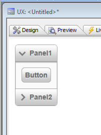
In order to enable this functionality, you simply select
the appropriate sub-theme for the Accordion, as shown in
the image below.
This sub-theme is defined in the style.js and style.css
file in the css\iOS folder. If you wanted to add this
behavior to Accordions for other styles (e.g. MobBlue,
GrGray, etc.), you would need to modify the style.css
and style.js files for these styles as described below.
The text in red below shows the code that was added to
the style.js file in the css/iOS folder in order to add
a new sub-theme called 'icon' to the Accordion control.
If you wanted to add the accordion icon functionality to
a custom style of your own, you would need to edit the
corresponding style.js file for that style and make a
similar modification.
accordion: {
base: {
titleClassName: 'iOSAccordionButton',
titleSelectedClassName: 'iOSAccordionButtonSelected',
titleDisabledClassName: 'iOSAccordionButtonDisabled',
paneClassName: 'iOSAccordionPane'
},
icon: {
titleClassName: 'iOSAccordionIconButton',
titleSelectedClassName: 'iOSAccordionIconButtonSelected',
titleDisabledClassName: 'iOSAccordionIconButtonDisabled',
paneClassName: 'iOSAccordionPane'
}
},
The text below shows the CSS that was added to the
style.css file in the css/iOS folder.
If you wanted to add the accordion icon functionality to
a custom style of your own, you would need to edit the
corresponding style.css file for that style and make a
similar modification.
.iOSAccordionIconButton {
display: block;
text-decoration: none;
font: 14px Arial;
font-weight: bold;
color: #6a6a6a;
text-shadow: 0px 2px #d9dbe0;
background-color: #c8c8c8;
background-image: url('accordionClosed.png'), url('button.jpg');
background-position: left, center;
background-repeat: no-repeat, repeat;
background-size: auto, 100% 100%;
border-bottom: #ababab 1px solid;
padding: 8px;
padding-left: 28px;
}
.iOSAccordionIconButtonSelected {
display: block;
text-decoration: none;
font: 14px Arial;
font-weight: bold;
color: #6a6a6a;
text-shadow: 0px 2px #d9dbe0;
background-color: #c8c8c8;
background-image: url('accordionOpened.png'), url('button.jpg');
background-position: left, center;
background-repeat: no-repeat, repeat;
background-size: auto, 100% 100%;
border-bottom: #ababab 1px solid;
padding: 8px;
padding-left: 28px;
}
.iOSAccordionIconButtonDisabled {
display: block;
text-decoration: none;
font: 14px Arial;
font-weight: bold;
color: #aaa;
text-shadow: 0px 2px #d9dbe0;
background: #c8c8c8 url('button.jpg');
background-size: 100% 100%;
border-bottom: #ababab 1px solid;
padding: 8px;
padding-left: 28px;
}
UX Component - List Control - Refresh and Filter
Operations - User Defined Ajax Callbacks - The List
control has methods that allow you to refresh the data
or filter the data. For example:
{dialog.object}.refreshListData('list1')
{dialog.object}._filterList('list1','country = "usa" ');
Each of these methods causes an Ajax callback.
Say you had a button on a UX that did a user-defined
Ajax callback. Let's also assume that you want the
button to refresh one list and filter another list. In
the Javascript returned by the Ajax callback, you could
certainly include the Javascript code to refresh the
list and filter the other list, but then you would be
triggering two additional Ajax callbacks. It would be
preferable to have only a single Ajax callback.
This is now possible using a new Xbasic function:
a5_UX_Action()
The following examples show how this function can be
used in an Xbasic function that handles a custom Ajax
callback.
Function myCallbackXB as c (e as p)
'compute the Javascript to filter a list.
'we need to set properties in an object that will be
passed to a5_ux_action()
dim ops as p
ops.Action = "Filter"
ops.filter = "country = :country and city = :city"
ops.order = "companyname desc"
'the arguments are specified in a crlf() delimited
string.
'syntax is argumentValue|||type|argumentName
ops.parameters = "UK|||c|country" + crlf() + "London|||c|city"
'specify the id of the list to filter
ops.listId = "list1"
'compute the Javascript to filter the list
'the 3rd parameter 'ajaxListAction' indicates that the
UX action
'we are going to perform is on a List.
'the default value for this parameter is 'ajaxListAction'
so in
'this case, we could have omitted it.
dim xb as c
xb = a5_UX_Action(e,ops,"ajaxListAction")
'you can include other Javascript in the response that
this callback returns.
'for example:
xb = xb + crlf() + "alert('List was filtered');"
myCallbackXB = xb
end function
Example 2:
Function myCallbackXB2 as c (e as p)
'compute the Javascript to refresh a list.
'we need to set properties in an object that will be
passed to a5_ux_action()
dim ops as p
ops.Action = "Refresh"
ops.listId = "list1"
'compute the javascript to refresh the list
dim xb as c
xb = a5_UX_Action(e,ops,"ajaxListAction")
myCallbackXB2 = xb
end function
Example 3:
Function myCallbackXB3 as c (e as p)
'compute the Javascript to refresh data series
dim ops as p
ops.Action = "refreshDataSeries"
ops.seriesNames = "series1,series2,series3"
dim xb as c
xb = a5_UX_Action(e,ops)
myCallbackXB3 = xb
end function
A5_UX_Action() Function - Summary of Actions that Can Be Performed
- The a5_ux_action() Xbasic function is a utility function that can be
used in an Ajax callback to generate the Javascript commands to perform
certain actions on a UX component.
The purpose of this command is to allow you to consolidate several
actions that would normally be performed by distinct Ajax callbacks into
a single Ajax callback.
The actions that can be performed by this utility function are:
-
List Control Action
-
Filter List
-
Refresh List
-
Refresh row(s) by key value
-
Append row(s) by key value
-
Refresh Data Series
-
Set UX into 'New Record' mode
-
Populate Controls with Data from a Table
-
Refresh choices in a dropdownbox control
List Control Action:Filter List
Filters/sorts the data in a List control.
This action is equivalent to the {dialog.object}.filterList() method.
Example:
Function myAjaxCallback as c (e as p)
dim ops as p
ops.Action = "Filter"
ops.filter = "country = :country and city = :city"
ops.order = "companyname desc"
'the arguments are specified in a crlf() delimited
string.
'syntax is argumentValue|||type|argumentName
ops.parameters = "UK|||c|country" + crlf() + "London|||c|city"
'specify the id of the list to filter
ops.listId = "list1"
dim xb as c
xb = a5_UX_Action(e,ops,"ajaxListAction")
myAjaxCallback = xb
end function
List Control Action: Refresh List
Refreshes the data in a List control.
This action is equivalent to the {dialog.object}.refreshListData()
method.
Example:
Function myAjaxCallback as c (e as p)
dim ops as p
ops.Action = "Refresh"
ops.listId = "list1"
dim xb as c
xb = a5_UX_Action(e,ops,"ajaxListAction")
myAjaxCallback = xb
end function
List Control Action:Refresh Row(s) by key value
Refreshes data in one or more rows of a List control.
This action is equivalent to the {dialog.object}._listRefreshRecordsByKey()
mehod.
Example:
Function myAjaxCallback as c (e as p)
dim ops as p
'primary keys to refresh (case
sensitive!)
ops.primaryKey = "EASTC,GALED,FURIB"
ops.listId = "list1"
ops.action = "refreshRowByKey"
'if the record to be refreshed is
not currently in the list,
'should it be added to to the list?
ops.appendRowsNotInList = .f.
dim xb as c
xb = a5_UX_Action(e,ops,"ajaxListAction")
myAjaxCallback = xb
end function
List Control Action:Append row(s) by key value
Appends data to a List control.
This action is equivalent to the {dialog.object}._listFetchRecordsByKey()
method.
Example:
Function myAjaxCallback as c (e as p)
dim ops as p
'primary keys to fetch and add to
list (case sensitive!)
ops.primaryKey = "EASTC,GALED,FURIB"
ops.listId = "list1"
ops.action = "appendRowByKey"
dim xb as c
xb = a5_UX_Action(e,ops,"ajaxListAction")
myAjaxCallback = xb
end function
Refresh Data Series
Refreshes one or more data series. All controls that are bound to the
data series are refreshed.
This action is equivalent to the {dialog.object}.refreshDataSeries()
method.
Example:
Function myAjaxCallback as c (e as p)
dim ops as p
ops.Action = "refreshDataSeries"
ops.seriesNames = "series1,series2,series3"
dim xb as c
xb = a5_UX_Action(e,ops,"ajaxListAction")
myAjaxCallback = xb
end function
Set UX into 'New Record' mode
This action is equivalent to the {dialog.object}.newRecord() method
Example:
Function myAjaxCallback as c (e as p)
dim ops as p
myAjaxCallback = a5_UX_Action(e,ops,"NewRecord")
end function
Populate Controls with Data From a Table
(Applies only if the UX has been data bound). Populates controls on the
UX with data from the data bound tables for a specified primary key
value.
This action is equivalent to the {dialog.object}.populateControlsFromTable()
method.
Example:
Function myAjaxCallback as c (e as p)
dim ops as p
ops.primaryKey = "ALFKI"
'case sensitive!
dim js_getRecord as c
ops.__dtfmt = e.rtc._state.__dtfmt
dim js as c
js = a5_UX_Action(e,ops,"populateControlsFromTable")
myAjaxCallback = js
end function
Refresh choices in a dropdownbox control
This action is equivalent to the {dialog.object}.refreshDropdownBoxChoices()
method.
Example:
function myAjaxCallback as c (e as p)
dim js as c
dim ops as p
'name of dropdowncontrol to refresh
ops.controlName = "CITIES"
'if the control is in a repeating
section should just the current instance
'be repopulated
ops.currentRepeatingSectionRowOnly = .f.
'filter for query
ops.filter = "country = :whatcountry"
'argument value - format is
value|||type|argumentName
ops.arguments = "USA|||c|whatCountry"
'value in dropdownbox to select
after it has been populated
ops.selectedValueAfterPopulate = ""
js = a5_ux_action(e,ops,"refreshDropDownBox")
myAjaxCallback = js
end function
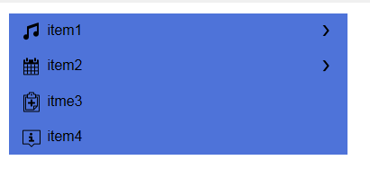
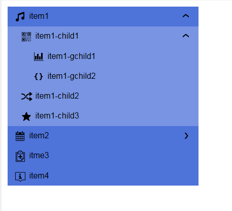
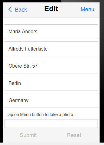
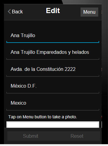
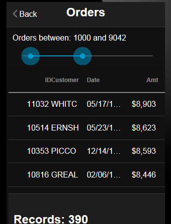
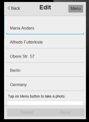
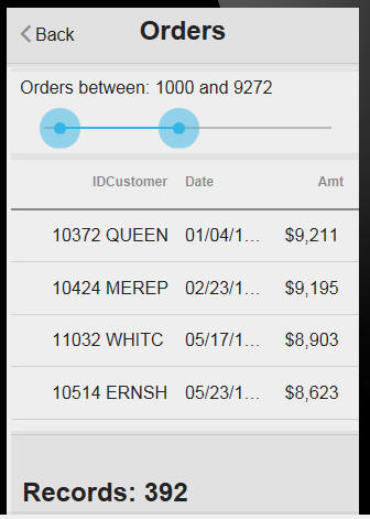
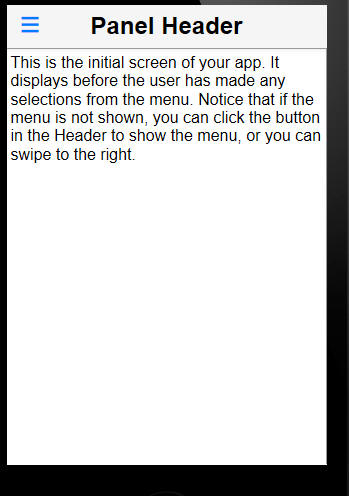
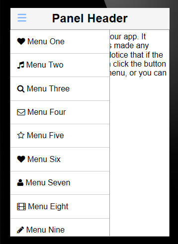
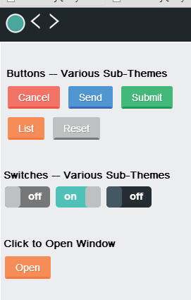