
This document describes the updates and fixes made to Alpha Anywhere in 2021 and 2022.
To see the 'What's New in V12' document (which describes all of the new features in Alpha Anywhere's initial release) please click here.
Please note that Alpha Anywhere patches are only available to users with
a current subscription.
You can verify your subscription status from within Alpha Anywhere by
going to Help, About, or by clicking this link shown here (https://activation.alphasoftware.com/subscriptionStatus.aspx).
If you install an update for which your subscription is not entitled,
you will need to uninstall the update and rollback to an older version
that you are authorized to use in order to continue using Alpha
Anywhere.
To see release notes for other periods, click the appropriate link:
Release notes for 2025 to present
Release notes for 2023 and 2024
Release notes for 2018 and 2019 and 2020
Release notes for 2017 and older
Image Upload Action Javascript - Xbasic - Before save event - the e object passed into the function no longer includes e.fileBlob (the binary data that was uploaded). Instead a new property (e.tempUploadedFilename) is available that contains the filename on the server where the uploaded image is stored.
UX Component - .getValue() Method - Date Variables - If you have defined a custom date format for a textbox and the custom format does not match the Default date form (set in the Other section on the Properties pane in the UX builder), the date value is now normalized to use the Default date format. Previously the .getValue() method returned the value using the custom format defined for the textbox.
If you want to revert to this old behavior, put the following command in the client-side onRenderComplete event:
{dialog.object}.normalizeClientSideDateValues = false;
UX Component - List Control - Action Javascript - Refresh List Data - It is now more obvious that you can refresh multiple Lists with a single Ajax callback, because the combo box to set the List Ids to refresh has been replaced with a checkbox list.
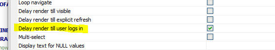
UX Component - List Control - Delay render till user logs in - A new option has been added to the List Builder to delay rendering the list until a user has logged in.
Cordova Android 11 and API Level 31 and Android 12 - Security And Privacy Changes - Android 12 (API level 31 and higher) introduced changes to the handling of third party cookies to provide more security and privacy. These changes impact cookies and session variables in a Cordova App.
If you are targeting Android API level 31 or higher, make sure to enable TLS/SSL on your development server and be sure to set Advanced | Sessions | SameSite Mode to None.
Also, for your Android Project, from within the Cordova App Builder Genie, set the Android Host Scheme property to https.
Cordova App Builder - Third Party Plugins - Cordova-Plugin-Photoviewer - A new PhotoViewer plugin has been added to the list of third-party plugins within the Cordova App Builder.
The PhotoViewer plugin allows the display of a single image, hosted from any URL, within a native view on an iOS or Android device. Support is provided for native zoom and sharing. An optional title may also be added to the photo.
For further details see the readme file at: Cordova-Plugin-PhotoViewer
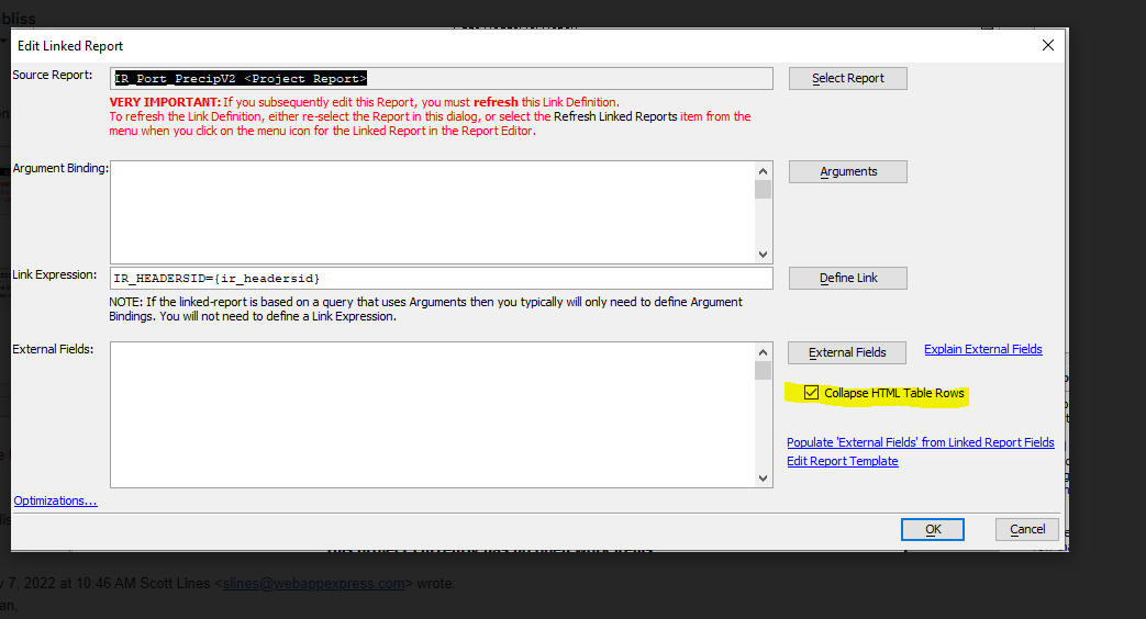
Reports - Linked Reports - A new option has been added to the dialog where you add a linked report to a parent report. The new option, Collapse HTML Table Rows, should be used if your linked report is rendered with extra space between rows of data.
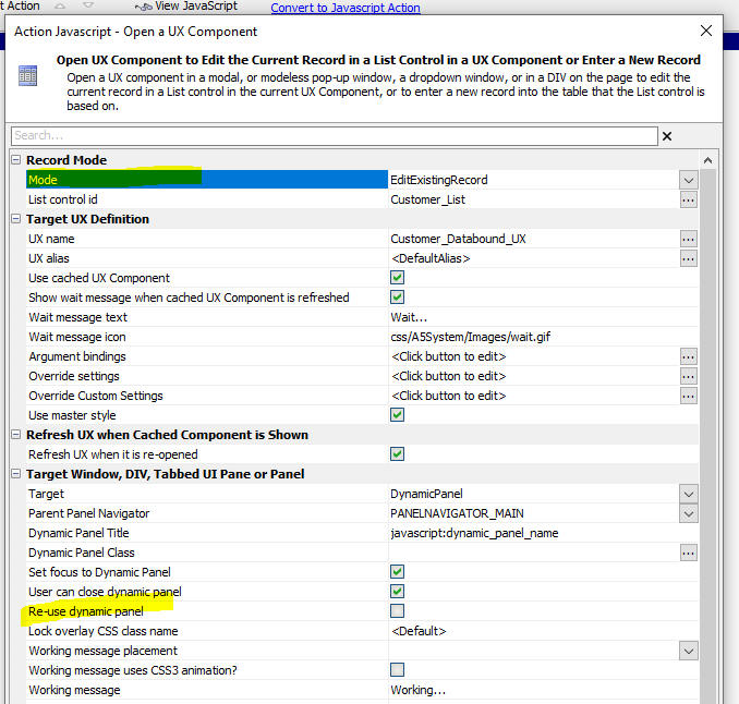
UX Component - Action Javascript - Edit List Row Data in a UX Component - Dynamic Panel - you can now specify that the UX to edit a row in a List should be opened in a new dynamic panel. Previously only one dynamic panel was used. To create a new dynamic panel for each row in the List that you edit, uncheck the Re-use dynamic panel property.
Reports - Missing Images - If a report references an image that does not exist, Alpha Anywhere will automatically look in the Web Project folder or in the web root for an image called:
a5_image_noexist.xxx
where xxx is the extension of the image
filename, in the event the image is not found.
So for example, if your project references a file call foobar.jpg ,
which does not exist, Alpha Anywhere will look for a5_image_noexist.jpg in
the project folder or webroot instead.
Reports - Relative Image Names - If a report references a relative image filename, the image will now be found if the relative image filename is in the webroot. Previously the report would not print the image.
TabbedUI Component - Smart Search Feature - fixed an issue with the smart search feature.
UX Component - Repeating Sections - Logical Checkbox Field - The value of a logical checkbox field in a Repeating Section was alway submitted as True, regardless of whether the checkbox had been checked or not.
UX Component - Repeating Sections - Default Values - If you had previously deleted a row in a Repeating Section and then added a new row, the default values in the new row were not set.
Action Javascript - File Download - Specify file to download using Javascript - fixed a regression.
Grid Component - Detail View - Action Javascript - Send Report via Email - Placeholder in the action that referenced fields in the detail view were not correctly resolved.
Xbasic - Debugger - Background Threads - You can now use the Xbasic debugger to debug into Xbasic code that is running in a background thread.
For example, assume you have a component that makes an Ajax callback. If you run the component in the Live Preview pane in the builder, you are able to debug into your Xbasic code. However, assume you launch the component in a browser (still using the Development server). Previously you were not able to debug into the Xbasic code as this code was running in a background thread. Now, if you use _debug(1), rather than debug(1) in your Xbasic, the debugger will be launched, even if the code is being run in a background thread.
This can be very useful if you are trying to debug into an onLogin event because the onLogin event only fires if the Security Framework is turned on, but the Security Framework is not enabled when running in the Live Preview pane in the builder. So now you can debug into the onLogin event if you run your component in a browser (where the Security Framwork can be used).
Action Javascript - File Download - UX Component - Repeating Section - Fixed a regression where the file was not found if the file reference was a control in a Repeating Section.
Grid Component - Ajax callbacks - Fixed a regression when executing an Ajax callback from a Grid.
Grid Component - UX - List with Detail View - Delete Record - Fixes a regression where the deleted row was not removed from the List until the List was refreshed.
UX Component Dropownbox Control - Dynamic Filter - If the dynamic filter returned no records, the choices in the dropdownbox were not cleared.
Hotfix - Grid Component - Ajax callbacks - Fixes a regression when executing an Ajax callback from a Grid.
Hotfix - Grid Component - UX - List with Detail View - Delete Record - Fixes a regression where the deleted row was not removed from the List until the List was refreshed.
| Grid Component | AlphabetButton Search Bar - Additive Searches |
When you define a search bar with custom buttons, you can now
specify that multiple buttons can be selected. This will then
execute an additive search using the filters for each of the
selected buttons. In this video we show how the search bar can be configured to perform additive searches. Watch video |
| UX Component | Local Functions |
In this video we show how Xbasic and Javascript function can be
defined locally for each control rather than in the global
Xbasic functions or Javascript functions section. The advantage
of local function is that the control is "self contained" and be
copied to the clipboard and pasted into another UX component. Watch video Date added: 2022-10-10 |
| UX Component | Control Libraries |
In this video we how how the combination of local code and
special placeholders allows you to create more powerful Control
Libraries. Watch video Date added: 2022-10-10 |
UX Component - List Control - The List no longer inserts a space after each control in the layout.
Live Test - Alpha Cloud - Lifetime - Live Test deployments on Alpha Cloud now expire after two hours.
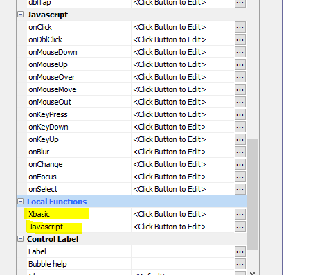
UX Component - Local Functions - Xbasic and Javascript - You can now define Xbasic and Javascript functions at the control level rather than globally on the Xbasic functions or Javascript functions pane in the UX builder.
The advantage of defining your code locally is that if you copy a control to the clipboard and then paste the control into another component, the pasted control will continue to work as it will not be referencing functions that were not copied.
Another significant advantage of defining functions locally is that if you save controls to the Control Library you can then load controls from the Control Library and they will work normally as they do not reference functions that were not loaded.
At run-time, locally defined functions are combined with global functions. That means that if you have defined a local function with the same name as a global function, the local function will overwrite the global function.
When defining local Xbasic functions, you need to be careful that you don't use label names that are duplicates of labels used in other function. To get around this potential problem you can use a special placeholder (__ph_x_ph__
where x is any number) in your local function definitions. At run-time, the placeholder gets replaced with a guid. For example:
Function myfunc as c ()
dim x as c
end
label__ph_1_ph__:
end function
When creating Control Library entries that reference local Xbasic, you might want to give the functions unique names so that if you load more than one instance of the Control Library the function in the second and subsequent instance does not overwrite the function in the first instance. This is done by using a special placeholder (__controlId__) in the function name. For example:
Function xb__controlId__ as c (e as p)
xb__controlId__ = "alert('hello');"
end function
You can also you the special placeholders (__ph_x__ ) in code to make your Control Library entries more robust. For example:
Function xb__controlId__ as c (e as p)
xb__controlId__ = "$('__ph_1_ph__').innerHTML = '" + js_escape("" +
now()) + "';"
end function
Publishing Profile - IIS - Grid cache cleanup - You can now set properties in the IIS publishing profile to turn on Grid Cache cleanup when running under the IIS server.

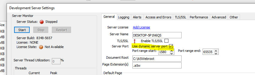
Development Server - Dynamic Port - You can now tell the Development Server to use a dynamic port. If you run multiple copies of Alpha Anywhere this will prevent a Server can not be started because port is in use error from happening when you try to start the server on the second and subsequent Alpha Anywhere instances.
Cordova App Builder Genie - Cordova Android 11 Support Added - Support
has been added for Cordova Android 11 which allows a developer to target
Android API levels up to 32.
As of August 2022, API level 31 or higher is required for apps to be
submitted and published to the Google Play Store.
At the present time, Cordova Android 11 is not included in any of the
Cordova distributions (cli-11.x.x includes support for Cordova Android
10.x.x) so if you want to include support for Cordova Android 11 be sure
to select 11.x.x for the new Cordova Android
Version property, shown in the image below. This forces the
builder to generate a script that includes support for Cordova Android
11.

One of the key changes in Cordova Android 11 is the generation of the
splash screen. In previous versions, multiple splash screen images were
automatically generated for the numerous screen sizes. With Cordova
Android 11 one 2732 x 2732 (px) image is used. Also note that the splash
screen plugin is NOT supported by Cordova Android 11 and the generated
build script will remove the splash screen plugin if it is included.
If you are unsure of the Cordova version installed on your computer,
open a command prompt and enter cordova -v
For more information on Cordova Android 11, see the Cordova
CLI Documentation
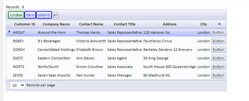
Grid Component - 'Custom Buttons' Search - Multi-select and Button Styling - When you define a custom button search bar you can now specify that multiple buttons can be in the selected state. You can also specify styling for the buttons in both their selected and un-selected states.
Previously only one button could be selected. For example, assume you had defined custom search buttons called 'London', 'Paris' and 'Madrid'. Previously, if you clicked the 'London' button, the Grid might be configured to search for City = 'London'. If you then clicked the 'Paris' button, the Grid would search for City = 'Paris'.
Now, if you set the Button mode to Multiple and you have already clicked the 'London' button, when you click the 'Paris' button, the grid will search for City = 'London' OR City = 'Paris'. You can specify if multiple filters should be combined with AND or OR. The default is OR.

In the image below, the London button has been clicked and so the button has its selected CSS class applied. However, the Paris and Madrid buttons have not been clicked so their un-selected CSS classes have been applied.
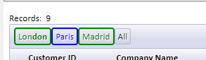
In this next image both the 'London' and 'Madrid' buttons have been clicked.
To define the CSS class names for the button's selected and un-selected state you use the ``` delimiter (3 backticks). For example:
London=City = 'London'```bOn```bOff
Paris=City = 'Paris'```bOn```bOff
Madrid=City = 'Madrid'```bOn```bOff
bOn is the CSS class name for when the button is selected and bOff is the CSS class name for the un-selected button.
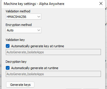
IISServer - A new property named Machine
key settings has been added to an IIS publish profile.
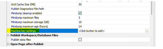
This is used to set the machine key used by the application and
simplifies when publishing to multiple IIS servers behind a load
balancer where the deployment of an application to each IIS server needs
to use the same machine key. Previously the application on each IIS
server would need to have its machine key set manually and the publish
profile would need to set the Preserve web.config element for
the machine key.
The settings dialog is very similar to the IIS Manager machine key UI so
that the IIS documentation for machine key can be followed.
UX Component - CanAjaxCallback - Fixed an issue with the canAjaxCallback event
UX Login Component - Create Account - Extended User Info Table - Send email to Site Admin - If the Extended User Info Table was enabled, email was not being sent to the site administrator when a new account was created.
Grid Component - Disabled Controls - If the value in a disabled control was set using the .setValue() method, the value was not saved when the Grid data was saved.
FTP Publish - fixed an issue in FTP publish when the file being published had a space in the name.
Windows Communication Foundation (WCF) and SOAP Services Deprecation
in Alpha Anywhere - Effective September 1, 2022 Alpha Anywhere (all
products and platforms) is deprecating support for WCF and SOAP web
services.
If your application depends on SOAP or WCF services then you need to
contact your vendor immediately for instructions on connecting using a
RESTful service and then convert your applications to use RESTful
service APIs.
Effective January 1, 2023 new official releases of Alpha Anywhere will
no longer support WCF and SOAP web services. Attempts to use WCF and
SOAP services will fail sometime after that as implementations will be
removed in future releases of the product.
Background
SOAP (Simple Object Access Protocol) has been deprecated by most
vendors, including Microsoft; who have replaced SOAP with RESTful
services and, in some cases, OData V4.
Windows Communication Foundation (WCF) has also been deprecated by
Microsoft and it is not supported natively in .Net Core (now known as
.Net 6 and soon .Net 7).
In order to move the Alpha Anywhere code base forward from .Net
Framework 4.8 to the most recent versions of .Net, we will need to
remove code from Alpha Anywhere that utilizes WCF and SOAP web services.
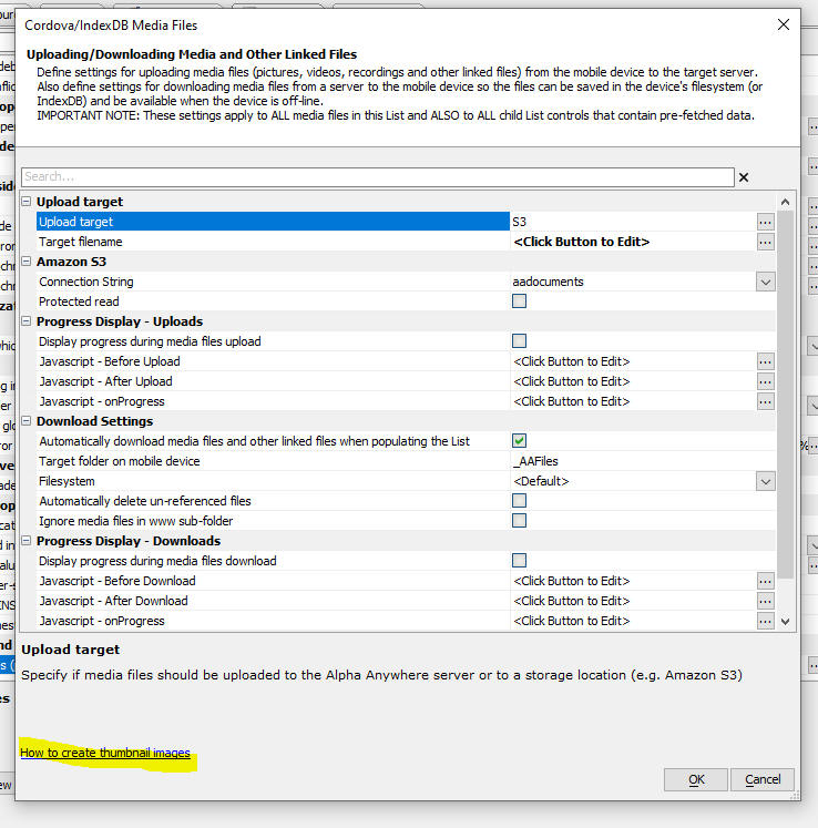
UX Component - List - Image Capture - Cordova - Thumbnails - In Cordova applications that allow image capture using the camera, you can now create thumbnail images when the List data are synchronized. For instructions, click the hyperlink on the dialog.
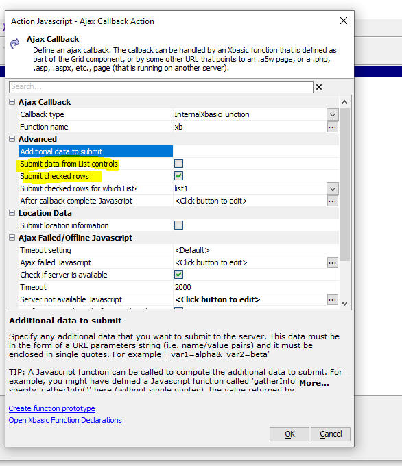
UX Component - List Control - Checkbox Column - Ajax Callbacks - When you add a checkbox column to a List and you make an Ajax callback, it is often desirable to know in the Xbasic function that handles the callback, which rows in a particular list were checked. While this could be done previously by defining custom Javascript code to define the Additional data to submit property in the definition for the Ajax callback, this is now more easily done by checking the new Submit checked rows property and then in the new Submit checked rows for which List? property, specifying the name of the List.
In the Xbasic function that handles the callback, the e object will have a property called __checkedValues, a comma delimited list of the value of each row in the List that was checked. If the List's Return value type property is set to PrimaryKey, then __checkedValues will contain a list of the primary keys for the checked rows.
Xbasic - a5http_CARootsFile() and a5http_CARootsPath() Function - New functions have been added to Xbasic.
Example:
'a request to localhost fails because it uses a self-signed (untrusted)
certificate
?http_get("https://localhost").error_text
= "Could not connect to server: Secure Sockets Layer was not able to
verify certificate."
'add the certificate that the server is configured to use into the
CARoots file
?a5http_AddCertFileToCARoots(httpd_settings_get().SSL_CertificateFile)
= Canceled = .F.
Code = 0
Error = .F.
NativeCode = 0
NativeText = ""
ReturnDataValue = <No data returned>
RowsAffected = 0
StackTrace = ""
Success = .T.
Text = "Success"
TextAndStackTrace = ""
'make another request to localhost and see that here is no longer an
error verifying the certificate
?http_get("https://localhost").error_text
= ""
UX Component - Panels - OnPanelView and OnView events are now called recursively. This means that when a Panel becomes visible, its onView event is called, even if the Panel is contained in multiple nested Panel Navigators or Panel Layouts.
UX Builder - Made changes that should result in the builder feeling more responsive and should eliminate occasional overwriting of property values when changing focus in the control list.
email_send_sparkpost() Function - In-line CSS - The email_send_sparkpost() function now supports in-line CSS. For example, the following HTML message will now be sent correctly.
<style>
.c1 {color:purple;}
</style>
<style>
.c2 {color:red;}
</style>
<div class="c1">hello32</div>
<div class="c2">hello33</div>
Robots.txt File - The robots.txt file controls whether your web site can be crawled by 3rd parties, such as Google. In a self-hosted site the traffic generated by a crawler is generally negligible, but on Alpha Cloud, which charges for compute units, you might want to disable web crawlers.
Now by default, when you publish your application, if your project does not contain a robots.txt file, a default file will be published. This default file will disable all web crawlers. If you want to enable web crawlers you should add an appropriate robot.txt file to your project. For example:
User-agent: *
Disallow:
You can set a property in Project Properties to control whether a default robots.txt file should be published when you publish your app.

For more information about the robots.txt file, see http://www.robotstxt.org/robotstxt.html
The robots.txt file can also be set up to selectively allow crawlers and files/folders.
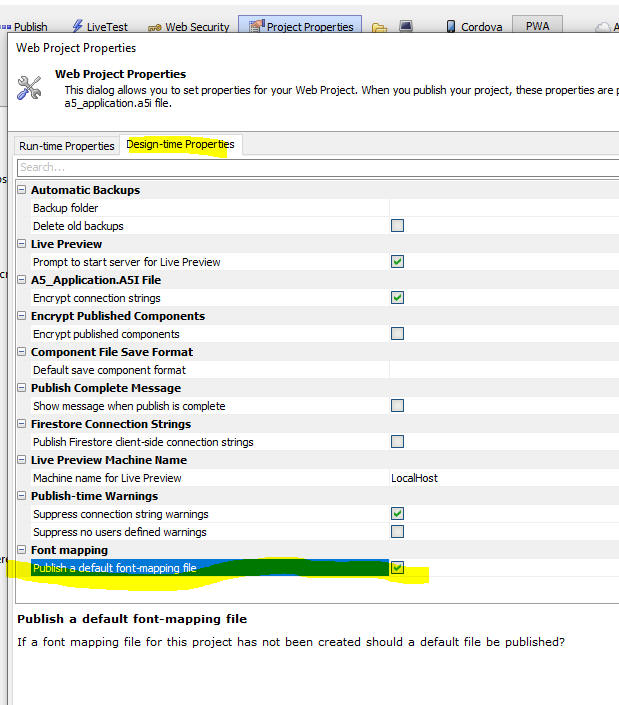
Font mapping - PDF Reports - Font Mapping - In some cases when a report is previewed at design time from the Report Editor it may look different than when it is rendered as as PDF. A common reason for this is that when the report is previewed, Windows will automatically map fonts that the report references to some other font if the referenced font is not present on the machine. However, when the report is rendered as a PDF, the built-in Windows font mapping does not occur. Now, you can define a special file in your Web Project (called font_mapping.txt) to define how font mapping should occur when the report is rendered as a PDF.
You can create a font mapping file by clicking the More... button and then selecting the Create Font mapping command.
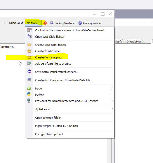
At publish time, a default font mapping will automatically be published unless you explicitly disable this feature by going to Project Properties and un-checking the Publish a default font-mapping file property.
Xdialog - Property Grids - Disable Search - By default, all property grids displayed in an Xdialog now show a search field as shown below:

You might want to disable the search field for certain property grids. This is done by adding the nosearch=true directive to the Property Grid definition. For example:
pg.def = <<%str%
nosearch=true
^^Category
state=opened
++Item
var=v.Item1
%str%
UX Component - List - Delay Render Till Visible - Now works more reliably when the List is in a Panel Card that is inside a Panel Navigator that is nested in a parent Panel Navigator.
Reports - HTML - PDF - Fixed some issues where reports that contained HTML content did not render correctly when output as PDF.
Context.Response.SendFile() Method - Fixed an issue when the filename to send contained high order characters.
Reports - Action Javascript - CurrentGridFilter() and CurrentGridOrder() - Working Preview - The special report filters CurrentGridFilter() and CurrentGridOrder() were not working in Working Preview.
UX Component - List Control - Detail View - Checkbox Column - Checking the checkbox for a row caused the List's Detail View to go dirty. It should not have.
| UX Component - RadioButton Control | Rendering RadioButton, CheckBox and DropDownBox as a Javascript Control |
By default, the RadioButton, CheckBox and DropDownBox controls
are not Javascript controls (like the List control, for example)
and as such, you can't call methods on a control to repopulate
the choices shown in the control. You can however specify that
these controls should be rendered as Javascript controls (which
will then allow the choices in the control to be set using the
control's .populate() method). In this video we show how a RadioButton control can be rendered as a Javascript control. Watch video Download component Data added: 2022-04-02 |
| Reports | Progress Messages |
You can display progress messages while a report is printing.
This can be especially helpful if you have long-running reports
as it keeps the user informed and prevents the browser from
timing out while the report is printing. You can also cancel a
long-running report. Watch video Watch Video - Cancelling a long-running report Date added: 2022-04-26 |
| UX Component | Cascading List Lookups |
A cascading list shows a list of values where each item in the
list may have a sub-list of choices, and so on, until you get to
an entry that has no sub-list (called an endpoint). Once the
user clicks on an endpoint entry, that entry is filled into to
lookup field. In this video we show how you can set up a cascading list lookup that displays data from a SQL table. The lookup displays a list of countries. For each country a sub-list of cities is shown. For each city, a sub-list of company names is shown and then a sub-list of customer Ids is shown. Since customerId is the endpoint, when the user clicks on the Customer Id, that value is inserted into the Lookup field. Watch video Download component Date added: 2022-04-39 |
| UX Component - List Control | Column Footers and Summary Values |
In this video we show how you can add fixed column footers and
data column footers to a List and then add summary values into
the List column footers. Watch video Download component Date added: 2022-05-16 |
| UX Component - Tree Control | Render as Menubar |
A horizontal menu bar with drop down choices for items in the
menu bar is a common UI element in many web applications. In this video we show how you can render a Tree control as a menu bar. Watch video Data added: 2022-06-10 |
| Tabbed UI | Using a Menubar |
In this video we show how the menu for items in a TabbedUI can
be displayed as a horizontal menu bar. Watch video Data added: 2022-06-10 |
| TabbedUI | Defining Favorites |
In a large TabbedUI component with many buttons, a user might
want to designate certain buttons as favorites, so that these
buttons are easier to find. In this video we show how you can define favorites in a TabbedUI component. Watch video Watch video (more) Date added: 2022-06-18 |
UX Component - List Control - Calendar Layout - (This feature is still under development and requires a Feature Key in order to enable it. We are making an early version of the feature available so we can get feedback from the community). To request a feature key, go to Help, send an email to enhancementrequests@alphasoftware.com with "List Calendar Feature Key" in the subject.
The Calendar layout is a view of the data in a List See video:
https://www.screencast.com/t/dvLrLJNmhG1
Live Test - Alpha Cloud - Lifetime - Live Test deployments on Alpha Cloud now expire after two hours.
UX and Grid Component - Action Javascript - File Download - The way in which the file download action has been implemented has changed and it is necessary to edit the action and resave it (no changes to the action definition need to be made) in order to generate new Javascript for the action.
UX Component - Client-side Data Cached - IndexDB - The name of the IndexDB option has been changed to IndexedDB. If you have an existing component that persists client-side data to IndexedDB you must edit your component and set the storage location.
{dialog.object}.submit() method - If you do not supply a submit type as an argument to the function, then when the server-side code is executing, request.variables.__submitType is now set to '' (previously it was set to 'none').
UX Component - State variables - Data type - Previously all state variables in server side code were character type. Now, these variables retain their client side data type.
UX Component - List - Detail View - Editing Records that have been Deleted - If you edit a record and then synchronize the List, if the edited record had previously been deleted from the database, the UX behavior was as follows:
Now, the edited record is shown with an error flag and the error message indicates that the record could not be synchronized.
Property Grids - Search - All of the various builders (e.g. Grid, UX, TabbedUI) and Action Javascript Genies use Property Grids. Now it is easier to find a particular property in a Property Grid because the Property Grid displays a search box. As you type into the search box the Property Grid is filtered. This is easier than the previous method (which is still supported) of right clicking on the Property Grid's left margin and selecting Find from the menu.
Action Javascript - oAuth - Get Access Token Action - This action now has a new option to use redirects rather than pop-ups for the oAuth flow.
The reason for adding this option is that Safari on a Mac will not display pop-ups and so the oAuth flow must be conducted using redirects.

UX Component - PDF Viewer Control - Zip Download File and Client-side Filename - If you enable the Download button on the PDF Viewer toolbar, you can now specify that the downloaded file should not be zipped before being downloaded. You can also specify the client-side filename for the downloaded file.

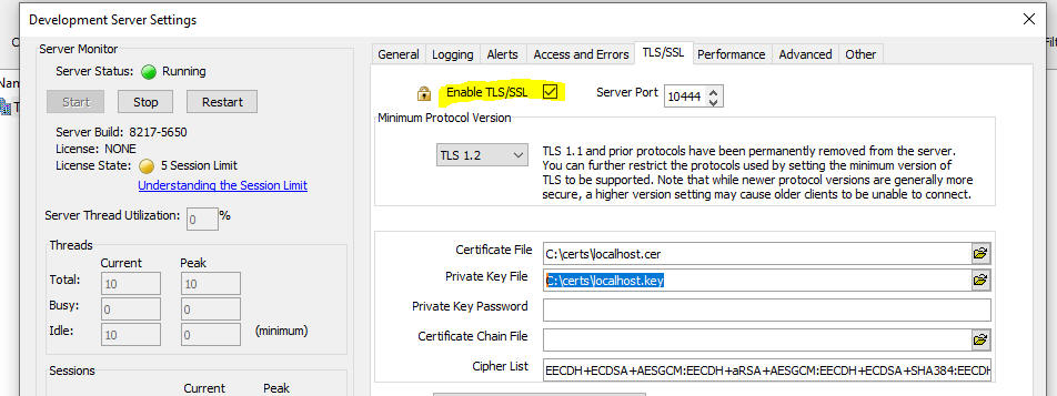
Classic Server - Development Server - Using TLS (SSL) - When you test a component that you are building using Live Preview from within the component builder, you are using the Development Server. It now easier than ever to run your Live Preview (or Live Test) using SSL because Alpha Anywhere will automatically generate a self-signed certificate for you (without requiring you to open the Generate Self-signed Certificate dialog and answer any questions). Alpha Anywhere will also automatically install the self-signed certificate in the Trusted Route Authorities store so that you do not get a prompt at run-time warning you that the certificate is not trusted.
To turn on TLS/SSL for the Development Server, open the Server Settings dialog. Go to the TLS/SSL tab and check the Enable TLS/SSL property. Alpha Anywhere will then automatically generate a self-signed certificate for you.
Xbasic - a5_getFQDN as c () Function - This function returns the fully qualified name of the current host, including any domain name that may be configured.
Example:
?a5_getFQDN()
= "JohnDoe.alphadev.local"
Xbasic - a5_getAllLocalIPAddresses as c () function - This
function returns a CR-LF delimited list of all of the configured IP
addresses for the current host. Note that the reserved localhost address
of 127.0.0.1 is not included in the output of this function, as that
address is not specifically assigned to the computer.
Example:
?a5_getAllLocalIPAddresses()
= fe80::7525:e643:361d:5b04%13
fe80::94ae:cdbe:349a:41f1%14
fe80::f8:30f5:b85e:2368%3
169.254.65.241
192.168.1.54
2001:0:34f1:8072:f8:30f5:b85e:2368
Xbasic a5_CreateLocalSelfSignedCertificate as CallResult (certFile as
c, keyFile as c, keyPassword = "" as c, additionalHostNames = "" as c)
Function - This function creates a self-signed certificate using all
hostnames and IP addresses for the local host. The IP addresses used is
the result of a5_getAllLocalIPAddresses() function
call with 127.0.0.1 added.
certFile and keyFile specify
the names of the certificate and key files to create. If the files
already exist, they will be overwritten.
keyPassword allows an optional password to
be applied to the key file.
additionalHostNames optionally adds
additional host names to the Subject Alternative
Name field of the generated certificate.
a5_InstallTLSCertificateToWindowsStore as CallResult (certFile as c,
storeName = "My" as c, storeLocation = "CurrentUser" as c) Function - This
function installs a TLS/SSL certificate in
the specified Windows Certificate store.
Valid values for storeName are "AddressBook",
"AuthRoot", "CertificateAuthority",
"Disallowed", "My",
"Root", "TrustedPeople",
and "TrustedPublisher"
Valid values for storeLocation are "CurrentUser"
and "LocalMachine"
TabbedUI Component - Favorites - In many applications that use a TabbedUI component as the main menu the TabbedUI component contains a large number of choices in the Buttons Pane. It is not unusual that a user might only use a few of these options and it would be helpful if the user could designate their favorite menu options so that they are easier to find.
You can now turn on a Favorites feature. When you turn on the Favorites feature, all of the menu items shown in the TabbedUI have an icon indicating if the menu item is a favorite. (Unless the Favorites option was specifically turned off for a particular menu item)
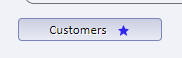
You can click on the star icon to toggle the favorite state of the menu. Once a menu item has been designated as a favorite, it appears as follows:
Favorites are stored in the Repository table. Each logged in user has their own favorites. To configure your project's Repository table, go to the Project Properties dialog (accessed from the Web Projects Control Panel).
Favorites can either be shown in the Buttons Pane (as shown in the image below), or in a menubar (as shown in the second image)
In this image, the favorites are shown in a Menu bar. Then Menu bar style is Dropdown.
In this image, the favorites are shown in a Menu bar. The Menu bar style is Horizontal.
To enable the Favorites feature, edit the TabbedUI and on the Properties pane, in the Favorites section check the Enable favorites property
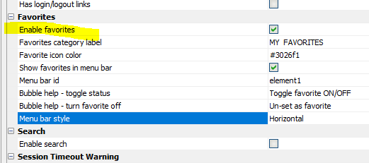
When this Enable favorites properly is checked the following additional properties can be set:
Favorites category label - Specify the label for the Favorites category. (Does not apply if Show favorites in menu bar is checked and Menu bar style is Horizontal).
Favorites icon color - Only applies if you are not using the Alpha style sheet (or a style sheet inherited from Alpha). Specifiy the color for the favorites icon shown next to each button in the Buttons Pane.
Show favorites in menu bar - Specify if the favorites should be shown in a menu bar. If this property is not checked, the favorites are shown at the top of the Buttons Panel.
Menu bar id - the Id of the element where the favorites menu bar should be shown. If favorites are shown in a menu bar, it is common to put an HTML element in the TabbedUI Header text. If the Menu bar id is set to (say), element1, the HTML element that you would place in the Header text would be <span id="element1"></span>
Initial state of favorites container - Can be open or closed. When the TabbedUI is initially shown, if favorites have previously been defined, should the container that shows the favorites be open or closed. If closed, the user will need to click on the container label to open the container. (Does not apply if Show favorites in menu bar is checked)
Bubble help - toggle status - Bubble help for star icon in Tabbed UI buttons
Bubble help - turn favorite off - Bubble help for star icon in Favorites display
Menu bar style - Can be Dropdown or Horizontal - Only applies if Show favorites in menu bar is checked. For Dropdown, a single item appears in the menu bar with a label specified by the Favorites category label. The favorites are shown as a drop-down menu. For Horizontal, all of the favorites appear as a top level, horizontal list of choices.
Show un-set favorite icon in favorites - Indicate if the list of favorites should include an icon to un-set the favorite. If the favorites are shown in a menu bar and the un-set icon is turned off, the user can right click on the favorite to display a menu which will allow the favorite to be un-set.
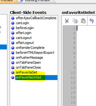
Client-side events
When you set or un-set a favorite, a client-side event will fire. When the event fires, the id of the button (i.e. the idInternal property) is passed to the event as well as an array of all of the buttons in the TabbedUI. This array indicates the favorite status of each button.
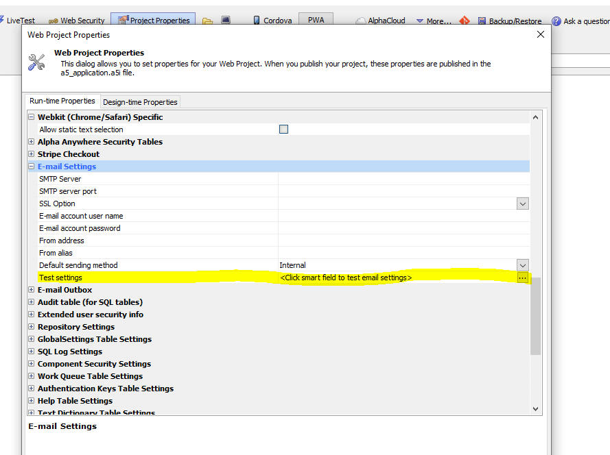
Project Properties - E-mail Settings - Test Settings - When you define E-mail settings in Project Properties, there is now a new feature that allows you to easily test your settings.
UX Component - Tree Control - Render as MenuBar - When you add a Tree control to a UX, you can now specify that the control should be rendered as a Menubar.
The image below show a Tree control rendered as a Tree.
Here is the same control rendered as a Menubar:
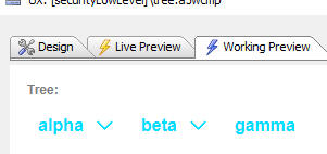
To render a Tree control as a Menubar, set the Render as property to Menubar.

NOTE When you display a tree control as a menubar, the control is no longer a data control. That means that the control does not have a value which can be set (using .setValue()) or read (using .getValue()) and the Default value and Validation properties are not supported.
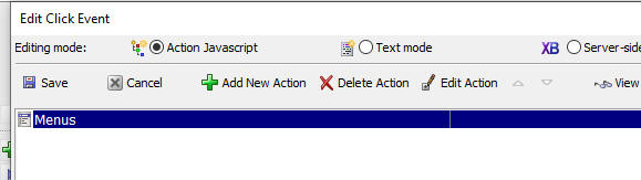
UX Component - Action Javascript - Menus Action - This action can now be configured to display a Menubar.
In the Action builder, set the Render style property and then set the placeholder or element id where the menubar should be rendered.

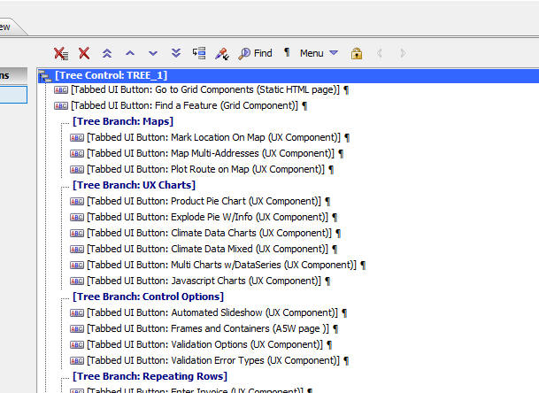
Tabbed UI Component - Menu Bar - Normally, the choices in a Tabbed UI are displayed in a Panel on the left or right of the component, as shown in the image below:

Now, you can specify that the choices should be shown in a menubar (typically across the top) of the component, as shown in the image below:

To enable the menubar option, your choices must be contained in a tree control container, as shown in the image below:
NOTE: You component can have as many menu bars as you want.
For each Tree Control container, you can then set the Render tree as menu bar property.
When you check this property a new property is shown. (Menu bar element). This allows you to specify the id of the HTML element where the menu bar should be located.
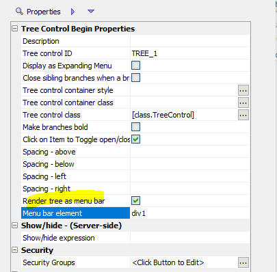
Typically, you will add an HTML element to the Header text. (Although, if you wanted the menu bar to appear in the footer, you could add the HTML element to the Footer text) For example, if you specify that the Menu bar element is div1, you would add this markup to the Header text:
<div id="div1"></div>
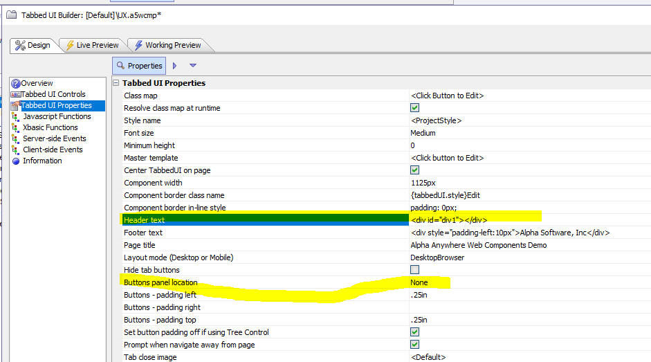
If all of your Tabbed UI buttons are displayed in menu bars, you will typically want to turn off the display of the Buttons Panel. This is done by setting the Buttons panel location property (shown in the previous image) to None.
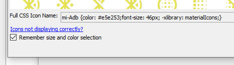
CSS Icon Font Picker - When you open the CSS Icon Font picker, the last used color and size are now automatically set if you check the Remember size and color selection property.
UX Component - Adding Controls - Specifying the Control Label - When you add controls to a UX, you can now optionally specify the label for the control by enclosing the label in square brackets. For example fn[First Name]. If you do not specify the label, the label is inferred automatically from the control name.
List - Detail View - Image Capture - Web Applications - Storage - HTML5 Image Capture - When you create a List with a Detail View, if the List has a character image field you can now specify that uploaded images should be saved to storage (i.e. Amazon S3, Wasabi, etc.).
Previously, the only option was to save the uploaded image in a file on the server. (However, this option was typically not supported if you were using the IIS server unless you specifically gave the IIS account read/write permission to the upload folder and was was meaningless for Alpha Cloud because on Alpha Cloud each server group has a minimum of two physical servers. So even if you were to upload to the server, you would only be uploading to one of the servers in the server group).
In order to upload images to storage, you can configure settings in either the List or the Action Javascript action you define to capture the image.
Configuring the Storage Location in the List
Open the List builder. Go to the Fields tab. Select the image field. Click the smart field for the Image capture and storage properties.
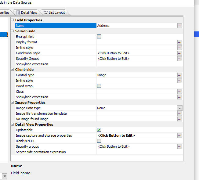
This will open the Image Capture Properties dialog where you can set the Server property to either Storage (for S3, Wasabi, etc.) or Server (for the Alpha Anywhere server).


To configure the upload target from the Action Javascript action that captures the image, open the Action builder and then click the smart field for the More properties... property.

Report Editor - Scroll Wheel - The scroll wheel is now supported in the Report Editor.
Storage - Google Drive - Duplicate Objects - When you save a file to Google Drive storage, duplicate objects are no longer created. Previously, if you had uploaded a file called (say) c:\mydata\file1.txt and given the file an object name of (say) "file1.txt" and then you uploaded the file a second time giving it the same object name, a second object (with a unique object id) was created. When you used the a5storage_listitems() function to list items, the items were listed with the object id as a prefix. For example, the listing might show
12345678901__file1.txt
98765432100__file1.txt
Now, when you upload the file a second time, the original object is overwritten. When you list items, the object id is no longer shown in the list, unless there are duplicate objects, in which case the format for the listing will be:
objectName(objectId)
For example:
file1(12345678901)
file1(98765432100)
When you define a Google Drive connection string, you can click the Advanced Settings hyperlink to define additional settings.
The most important of these options defines how 'duplicate objects' are handled.
What is a 'duplicate' object?
When you save a new object in Google Drive, the object is automatically given a unique id (the object id). So, if you upload a file and give it an existing object name (called a short name), the new object does not overwrite the existing object. Instead it will be given a unique object Id. The fully qualified object name will be a combination of the short name name you specified and the unique object id (automatically assigned). The syntax for the object name is the short name followed by the object Id in parentheses. For example: short name(object Id).
If you select the Require ID option in the dialog, then in order to retrieve or delete an object, you must specify its fully qualified name (if there are duplicates). So, assume you have uploaded a file twice with a short name of file1.txt. Your Google Drive will have two objects with the names like file1.txt(1234) and file1.txt(12345) where 1234 and 12345 are the unique object ids that were assigned to the object when the objects were created.
When you use the a5storage* functions to list, retrieve, or edit storage objects, then you can specify a fully qualified object name.
When you list objects in the bucket, duplicate objects are fully qualified. If an object is not a duplicate only the short name is shown.
On the other hand, if you use the Pick Newest option you do need to specify fully qualified object names. You can use short names and if there is a duplicate, the newest object will be selected. When you list objects in the bucket, only short names will be shown (even if the bucket contains objects with duplicate short names).
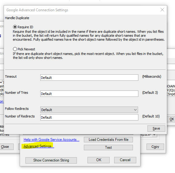
Number of Tries - If accessing the Google Drive fails, how many times should the action be retried. Defaults to 3.
Follow Redirects - Typically not needed in most situations.
Reports - HTML Content - Default Style Sheet - pdf.css - If a PDF report contains an HTML control, you can now specify a default style sheet for the HTML content by adding a file called pdf.css to the web project folder.
The reason for this feature is that HTML content in reports is rendered using a 3rd party control called HTMLLayout. Recently Alpha Anywhere began including a new version of the HTMLLayout control and this has resulted in some reports with HTML content rendering differently than they did in the past. because the default style sheet used by the new HTMLLayout control differs from the one used in older versions of Alpha Anywhere.
For example, assume you added a pdf.css file to your web project with this content:
body {
background: orange;
margin: 0px;
padding: 0px;
}
The HTML content in your report would be rendered with an orange background.
In addition, the pdf.css file can set certain properties that control how a reports is rendered as a PDF file.
The pdf.css file can have this in it:
html { print-settings: no-padding collapse-row-height; }
no-padding - controls horizontal padding between words. Use this property if your report has lines that have too much spacing between objects on a horizontal line. If no-padding is set then you may end up with objects that overlap.
collapse-row-height - use this property if a table in a PDF report is less tightly compacted than in the report preview.
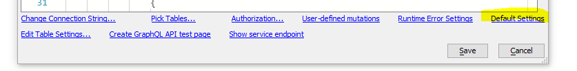
GraphQL - A number of improvements have been made to the GraphQL Service builder - These improvements include
Defaults
Default properties can now be set at the top level. This is useful if
all the tables in the endpoint expose the same features. To set Default properties
click the Default Settings hyperlink in
the GraphQL Service editor.
This will open the GraphQL Defaults dialog
Query rows - If not checked, then the service will not allow queries. It will only allow the mutations that are selected.
Cursor returned as a column - Queries can return a column that is the cursor value. The cursor is a unique value that is equivalent to the primary key of the record. Cursors are used in queries to find a particular record, or to start the query result at a particular record. If this property is checked you can include the cursor in the query result.
'Order By' clause supported - Specify if the query result can be sorted.
'Where' clause supported - Specify if the query can include complex 'Where' clause specifications. See below for more details. If this property is not checked, then the query can only specify simple filtering (e.g. Country = 'USA')
First # records supported - If this option is checked, you can specify queries that return only the first x rows in the query result.
Skip records supported - If this option is checked, you can specify queries that skip over a specified number or records. Used when you want to return a particular 'page' of records in a paginated query
Total row count supported - If this option is checked, the query result indicates how many matches were found.
Complex Where Clauses
By default, you can define simple filters for your GraphQL queries. For example, this query will return all records where the Country is USA. :
query{
GetManyCustomers(Country:USA){
records{
CustomerID
Country
}
}
}
But what if you wanted all records where the Country was USA or UK? In the query shown below a custom Where clause has been defined.
query{
GetManyCustomers(where: {Country: {_eq: USA}, _or: {Country: {_eq:
UK}}}) {
records {
CustomerID
Country
}
}
}
In addition to the _eq operator (equals), a full set of operators are supported. The following shows all of the comparison operators:
In addition to the _or operator, shown in the above example, you can also use _and and _not
Here is an example looking for OrderIds between 10000 and 10250
(inclusive)
query{
GetManyOrders(where: {OrderID: {_gt:10000} _and: {OrderID:{_lte:
10250}}} ) {
records {
OrderID
}
}
}
Support for 'format' for string
When generating a GraphQL endpoint to expose a data source, Alpha
Anywhere now automatically adds a 'format' property to each field to
handle fields that are dateTime or time.
This is necessary in order to perform true date and dateTime queries.
If you have an existing GraphQL service and you want to add the format
property to a field, open the GraphQL service builder, click the Edit
Table Settings... hyperlink. Select the table, then click the Click
Edit Columns hyperlink. Then select the field and then set the Format property.
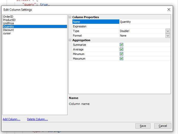
Adding a Calculated Column, and performing summarization
The ability to add a SQL expression for a column already existed,
but there is now UI support for it.
For example, here is how you would add an ExtPrice calculated
field (UnitPrice*Quantity) to a definition
for the OrderDetails table.
Edit the GraphQL service, then click the Edit
Table Settings... hyperlink. Select the 'Order
Details' table, and then click on the 'Edit
Columns...' hyperlink. Then click on the 'Add
Column' hyperlink.
Give the new column a name (for example extPrice),
and enter the SQL expression 'UnitPrice*Quantity'.
To perform summarization on a column, edit the table and column (by
clicking these hyperlinks in the builder: Edit
Table Settings..., select table, 'Edit
Columns.., select column) and then
in the Aggregation section, select the type
of summarization that you want to enable.
Having done this, when you define a GraphQL query on the OrderDetails table,
the calculated field, extPrice, can be
selected and the Aggregation values are
available in special _sum, _avg,
etc. sections.
The supported aggregations are summarize, average, minimum and maximum.
In the example shown below, a query has been defined on the OrderDetails table. The query includes the calculated field, extPrice and also the aggregation value for this field.

GraphQL - Aggregations on Child Objects - When defining a query to return data from child tables (for example, when performing a query to return a list of Orders from Northwind, OrderDetails is a child table), you can now reference a new object with the 'Many' prefix (e.g. ManyOrderDetails) that allows you to display aggregations for the child object.
In addition to the child records as arrays, there is now a version of the child object that has a "Many" prefix, which returns top level 'Many' query results which include all the aggregations as well as the totalCount (NOTE: child records, if requested, are pushed down into a child array called records, just like the top level queries).
For example, consider the following GraphQL query:
{
GetManyOrders(OrderID :10248){
records {
OrderID
CustomerID
EmployeeID
ManyOrderDetails{
_min{
extprice
}
_max{
extprice
}
_sum {
extprice
}
totalCount
records {
OrderID
ProductID
UnitPrice
Quantity
extprice
}
}
}
}
}
This query returns this:
{
    "data": {
        "GetManyOrders": {
            "records": [
                {
                    "OrderID": 10248,
                    "CustomerID": "VINET",
                    "EmployeeID": 5,
                    "ManyOrderDetails": {
                        "_min ": {
                            "extprice": 98
                        },
                        "_max ": {
                            "extprice": 174
                        },
                        "_sum ": {
                            "extprice": 440
                        },
                        "totalCount": 3,
                        "records": [
                            {
                                "OrderID": 10248,
                                "ProductID": 11,
                                "UnitPrice": 14,
                                "Quantity": 12,
                                "extprice": 168
                            },
                            {
                                "OrderID": 10248,
                                "ProductID": 42,
                                "UnitPrice": 9.8,
                                "Quantity": 10,
                                "extprice": 98
                            },
                            {
                                "OrderID": 10248,
                                "ProductID": 72,
                                "UnitPrice": 34.8,
                                "Quantity": 5,
                                "extprice": 174
                            }
                        ]
                    }
                }
            ]
        }
    }
}
Xbasic - http_* functions - Xbasic exposes a number of http_* functions.
These function now set a minimum TLS version
of 1.2. Previously they would negotiate a connection using TLS 1.0 or
above but the older versions are no longer considered to be secure.
Complete list of affected functions:
If you are no longer able to connect to a remote server after this
change, you are urged to update that server to use TLS
1.2 or later. If you cannot update the server, you may work
around the issue by using http_fetch() and
explicitly setting the minimum TLS version
lower, but this is strongly discouraged.
The updated http_fetch function prototype
is as follows
http_fetch(settings as p, show_before_send=.f. as l, SSLCipherList =
httpd_defaultCipherList() as c, minTLSLevel = 1.2 as n)
--
UX Component - List Control - Columnar Layout - Column Footer - The user interface for defining column footers has been changed. A new type of column footer has been added. A genie now allows you to add either server-side or client-side summary values to the column footer without having to add custom code to the afterServerSideSummaryCompute or afterClientSideSummaryCompute events.
Watch video
Download component
Previously, column footers were displayed after the last row of data in the List. These types of footers are still supported and they are now called Data Footers. The Data Footers are only visible if the List has been scrolled to show the last row in the List.
Now you can also define column footers that are displayed at the bottom of the list. These types of footer are called Fixed Footers. These footer are always visible regardless of how the List is scrolled.
To define a column footer (either a Data Footer or a Fixed Footer) check the Has column footer property and then click the smart field to open the Column footer definition genie
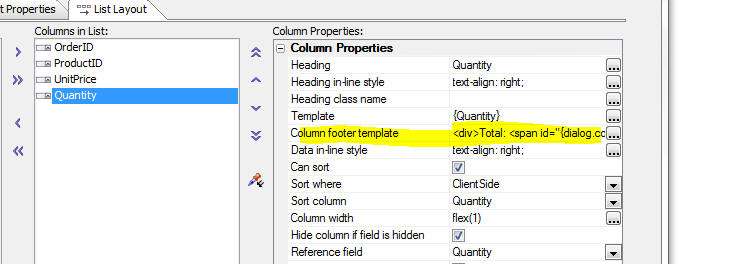
The Column Footer Builder is shown below.
You can turn on a Fixed Footer, a Data Footer or both types of footers for the column.

When you turn on Data Footers the Data footer template property is shown. (The is the same as the Column footer template property that was available in previous builds of Alpha Anywhere). You can enter any HTML that you want in this template (including special placeholders - described below - to show summary values)

When you turn on Fixed Footer you can specify how many rows of footers you want (up to 5 rows). For each row you can define the HTML to display. The HTML can include special placeholders - described below - to show summary values.

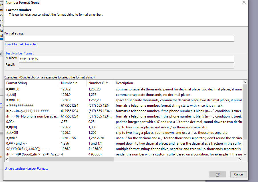
When you click the smart field to edit the HTML in a column footer, you get a dialog like this.

Note the two hyperlinks under the edit area.
The Insert summary field value hyperlink allows you to insert a special placeholder to display either a client-side or server-side summary value.
The command will insert a placeholder into the HTML. The placeholder will look something like this:
{server-side-summary|OrderID|total}
The above placeholder indicates that you want to display server-side summary value for the OrderID field and that the summary you want is the field total.
In the case of client-side summary values the placeholder will look something like this:
{client-side-summary|OrderID|total}
You can define formatting for the summary values. To do so, put your insertion point anywhere within the placeholder and click the Insert format directive hyperlink
Select the format string from the Number Format Genie.
The format directive will be added to the placeholder:
{server-side-summary|Quantity|total||#,##0.00}
IMPORTANT: You can define formatting for server-side summary values on the Fields tab in the List builder. If you use the Insert format directive hyperlink, you should not add formatting on the Fields tab.
Understanding the Difference Between Server-side and Client-side Summary Values
Server-side summary values are only available for Lists that are based on SQL data sources. The summary values summarize all of the data in the List query. So, for example, if your List query returns 1,000 rows, but your List is paginated and it only shows 10 rows at a time, the summary value is for all 1,000 rows in the List. Performing a client-side filter on the List has no effect on the summary value. On the other hand, performing a server-side filter on the List will affect the summary value.
Client-side summary values are computed on the visible rows in the List. So, for example, if your List query returns 1,000 rows, but your List is paginated and it only shows 10 rows at a time, the client-side summary will summarize the 10 visible rows.
UX Component - CORS - New Properties - Two new properties have been added: CORS allow origins and CORS allow private network

CORS allow origins
A comma separated list of origins allowed to make cross site requests to
this component. For instance, assume you have a page loaded from an S3
bucket https://mys3bucket.s3.amazonaws.com/testsite/index.html,
and this component runs on an Alpha Anywhere server https://myalphaserver.acme.com/,
the origin to allow is https://mys3bucket.s3.amazonaws.com/testsite.
This defaults to * to let any origins make
a cross site request to this component.
CORS allow private network
Whether to let a public origin make a cross site request to an Alpha
Anywhere server on a private network (e.g. behind a corporate firewall).
For instance, you have a page loaded from an S3 bucket https://mys3bucket.s3.amazonaws.com/testsite/index.html which
is public, and this component runs on an internal Alpha Anywhere server https://myalphaserver.corporatenetwork.com/.
Cross site requests to the Alpha Anywhere server will be denied unless
the setting is checked. Defaults to unchecked.
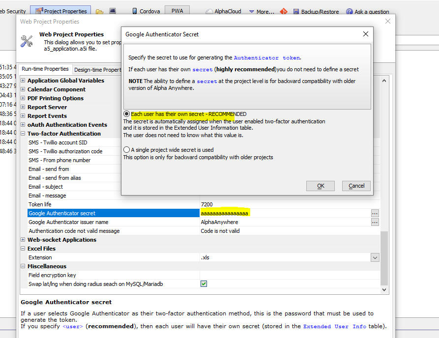
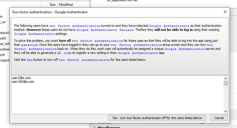
Web Applications - Security Framework - Two-factor Authentication - Google Authenticator - Secret - Previously the secret used for the Google Authenticator was defined at the project level (in Project Properties). Best practices require that each user should have their own secret. Now, the secret is stored at the user level in the Extended User Info table.
For backward compatibility 2FA using Google Authenticator will continue to work with the secret defined at the project level. But you should consider switching to the new method.
If you have an existing project where you have defined the secret at the project level, edit Project Properties and set the secret to <user>. Once you have made this change and republished your application, users who have previously turned on 2FA and who had selected Google Authenticator as their 2FA method will no longer be able to log in to your application. Therefore when you change from project level to user level Authenticator secrets, Alpha Anywhere will automatically find all users for whom two-factor authentication will no longer work using their existing Authenticator settings and it will allow you to turn two factor authentication off for these users.
The images below shows how you can change the Authenticator secret from a project secret to user level secret and how two-factor authentication will then be turned off for users who are affected by this change.
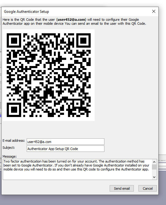
When you edit the seed users in your application you can turn two factor authentication on for any user. When you turn two factor authentication on for a user and you set the method to Google Authenticator, this dialog now is shown which allows you to send an email to the user showing the QR code they will need to configure their Authenticator app.
REST API - Classic Server - __AARegisterClasses.a5w Page - If you have a web service that you publish to the Classic server (not IIS or Alpha Cloud), and if you edit a function in the class that your service exposes the service will not reflect the edited function until you exit and restart the server.
Exiting and restarting the server is inconvenient and often impossible if you are publishing to a remote server.
Now, when you publish your project, a new system page is published. The system page is called __AARegisterClasses.a5w.
After publishing has completed, you can run this page and it will re-register all of your Xbasic classes. Your web service will then work as expected.
NOTE: If the Security Framework is enabled, the __AARegisterClasses.a5w can only be executed if the current user is an administrator. I.e. the current user is in a group with one of the following names: Administrator, Administrators, Admin and Admins
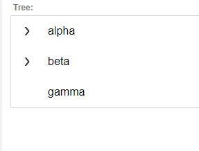
UX Component - Lookup - Cascading List - You can now create a new type of lookup for textbox and textarea controls. The Cascading List lookup display a list of choices. If the choice has a sub list (e.g. list of Cities for a Country), the sub list is shown when the user hovers over the item. If items in the sub list have their own sub lists, the sub lists are shown when the user hovers over any item that has a sub list. This behavior continues indefinitely until an endpoint is displayed (an endpoint is an item that has no sub list). When a user clicks on an endpoint, the lookup field is filled in with the value.
For example, the images below show a lookup for the CustomerId field. The lookup cascade has been defined as Country, City, Contactname, CustomerId
When the lookup is first opened, a list of Countries is shown. If the list contains any Cities for a given Country, the list has an icon showing that a sub-list is available. When the user hovers over (or clicks on) an item that has a sub list, the sub list is shown (as shown in the second image). Finally, when an item has no sub lists (i.e. an endpoint) is shown, and the user clicks on the value, the value is inserted into the Lookup field.


Watch video
Download component
To define a Cascading List lookup for a textbox or textarea,
check the Lookup property and then select CascadingList form
the list of available lookup types.
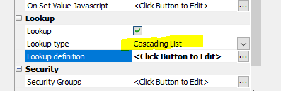
To define the Cascading List lookup, click the smart field for the Lookup definition property. This will open the builder as shown in the image below.
Lists can either be dynamic (based on a SQL query, or an Xbasic function), or static (based on a list of choices that you define at design time).
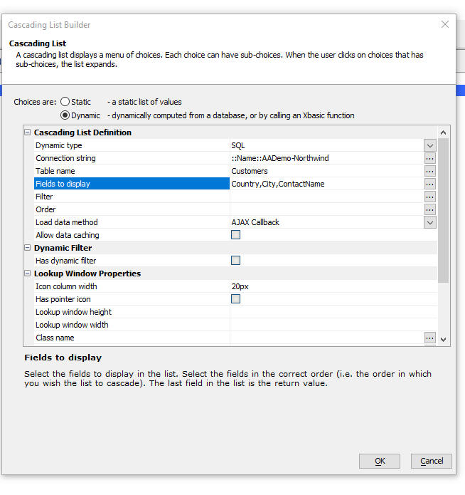
If you are basing the lookup on a SQL data source, you must select the fields to display. The order in which you select the fields is significant. It defines the hierarchy of the cascade. For example, in the image above, the fields are Country, City, ContactName.
This means that when the list is initially displayed, you will see a list of Countries. For each Country you will see a list of Cities, For each City you will see a list of ContactNames. ContactName is the endpoint.
You can also define a static list of choices for the Lookup. The format is sown in the example below.
Notice that if an item has a sub-list, the sub-list is indented with tabs.
alpha
	alpha1
		alpha1-1
		alpha1-2
	alpha2
		alpha2-1
		alpha2-2
			alpha2-2-1
			alpha2-2-2
beta
	beta1
	beta2
gamma
Here is a more complex example of a static list. Notice that each item in the list can be followed by an optional JSON definition that contains a value and icon property. The value property defines the value that will be inserted into the lookup field if the item is an endpoint and it is selected.
Notice also that the values shown in the list are HTML and can be styled. For example, the first item in the list shown below is Alpha and it is styled as green text.
<span style="color:green;">Alpha</span>{value: 'Alpha', icon: 'svgIcon=#alpha-icon-basketRemoveSolid:iconSizeable,15{ fill: #2e72ff; stroke: #53f159;}'}
	SubAlpha1
	SubAlpha2
Beta{icon:'images/$$application.alpha.png.a5image'}
	SubBeta1
	SubSubBeta1{icon: 'svgIcon=#alpha-icon-basketRemoveSolid:iconSizeable,15{ fill: #2e72ff; stroke: #53f159;}'}
{dialog.object}.pdfViewerLoad() Method - Can now specify the name of a session variable that contains the name of a pdf file. - Previously you were required to enter a relative filename to a file in the webroot. Now, you can specify a session variable that contains the name of a fully qualified filename. If the file is a session variable name an Ajax callback is made to the server to create a session file and the URL to the session file is returned.
Example:
{Dialog.object}.pdfViewerLoad('PDFVIEWER_1','session.fn')
UX and Grid Components - Reports - Chunked Responses - Show Progress -Cancel - When you use Action Javascript to print a report to PDF, you can now turn on chunked responses and you can display progress as the report is printing. You can also enable a button to cancel the report.
Watch Video - Cancelling a long-running report
If you display a report that takes a long time to print, it is possible that the client (i.e. the browser) will time out before the server has completed the report. When the server eventually completes the report, if the client has timed out, the report will not be displayed. This problem can be solved by turning on the chunked reports option. This will ensure that the client continues to listen for a response from the server past the time that it would otherwise have timed out.
In addition, if you turn chunked responses on, you can display progress messages as the report is printing. This will keep the user informed of progress while the report is printing. You can also display a button to cancel the report.
NOTE Chunked responses are only enabled if the report is initially rendered as PDF.
If you choose display progress messages, the messages can either be shown in a div on the page, or in the window in which the report is rendered.

If you turn on progress messages you can define the HTML template for the messages. The template should include the special placeholder {pages} that shows the number of pages printed.
For example, this template displays the messages in a div with a green border and rounded corners
<div style="width: 2in;border: solid 2px green; border-radius: 10px; padding: 10px;color:blue;">{pages}
</div>
NOTE: If you display the PDF report using the PDF Viewer control, the option to display the progress messages in a window should be turned off.
If the progress messages are shown in the window in which the report is shown, and the Allow cancel option is checked, the cancel button will be shown in the window.
If progress messages are not shown in the window, or if the target for the report is not a window, then you will need to specify the id of a div where the cancel button should be shown.
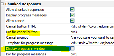
NOTE: The Cancel Button can only be used when the component is running in a browser. It will not work in Live Preview or Working Preview.
If you turn on the Allow cancel property you can define the text for the confirmation message that is shown when the user clicks the Cancel button.
NOTE If you are using the Classic server the Report Server is automatically disabled for chunked reports.
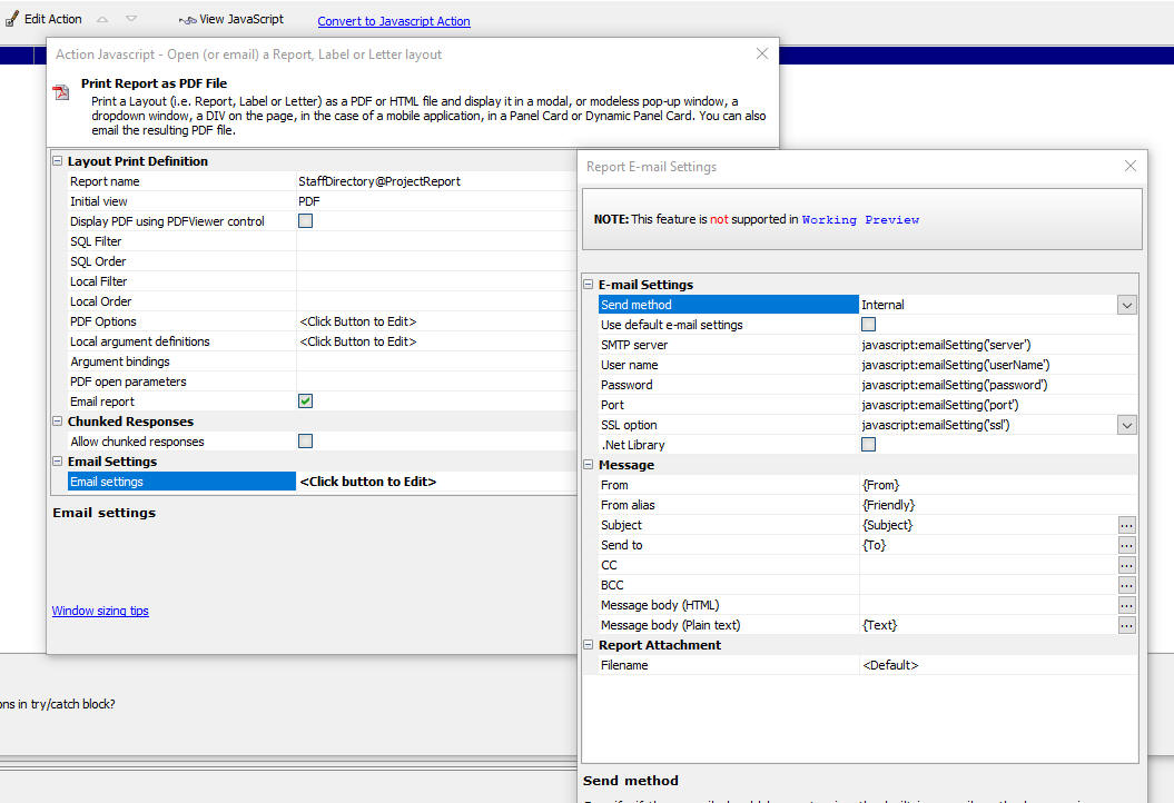
Action Javascript - Send Report via E-mail - You can now specify email settings dynamically by calling Javascript functions. For example, in the image below, the SMTP server is specified by executing Javascript.
Cordova App Builder Genie - Installed Cordova Version - A new property, Installed Cordova Version, has been added which allows the developer to specify the major version of Cordova (8, 9, 10 or 11) that is installed on the development machine. When creating Android builds, certain properties are specific to the installed version of Cordova and this property is used as a reference to show or hide the version specific properties.

NOTE: If you are unsure of the Cordova version installed on your computer, open a command prompt and enter cordova -v
Cordova App Builder Genie - Default Android Build Options - Certain properties will be automatically enabled or disabled based on the version of Cordova specified. Default properties are also assigned, based on a typical use case. You may change these properties as required.
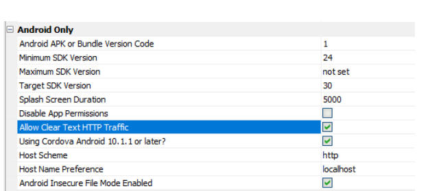
The table below summarizes the default properties for different Cordova versions:
| Property | Cordova 11.x.x | Cordova 10.x.x | Cordova 9.x.x | Cordova 8.x.x |
|---|---|---|---|---|
| Using Cordova 10.1.1 or later | true | false | false | false |
| Host Scheme | http | - | - | - |
| Host Name Preference | localhost | - | - | - |
| Android Insecure File Mode Enabled | true | false | false | false |
| Set AndroidXEnable Preference Flag | false | true | true | false |
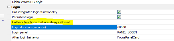
UX Component - Login - Persistent Login - Allowed Callback Functions - If you have a Login UX component with the Persistent login feature enabled, and you have a button on the UX that makes an Ajax callback before the user has logged in, the callback is denied. However, you may want some Ajax callbacks to be allowed even though the user is not logged in.
Now you can specify a list of Xbasic callback functions that are allowed even though the user is not logged in.
Enter a comma delimited list of Xbasic function names at the Callback functions that are always allowed property.
UX and Grid Components - File Download - The File Download action has been made more secure. File download action works as follows:
This is considered insecure because it allows you to specify an arbitrary request to the __a5FileDownload.a5w system page to download any file that is allowed by Project Properties.
Now, a short-lived JWT is generated with the name of the file to be downloaded. Before any file is downloaded the __a5FileDownload.a5w page will validate the JWT to ensure that the token has not expired and also that the name of the file to download has not been changed.
Xbasic - a5_getAuthTokensFromAuthTable() Function - When you complete an oAuth flow to authorize an external resouce (e.g. Salesforce), you can specify that the tokens returned should be stored in a sql table (see Project Properties, Authentication Keys table).
After you have performed an initial authentication for a named resource, the Authentication Keys table will contain a record for the specified named provider.
The a5_getAuthTokensFromAuthTable() function will query the Authentication Keys table and it will return an object with the access token for the service so that you can make an API call.
If the access token has expired, and it a refresh token is available, the function will automatically get a new access token and write this new token to the Authentication Keys table.
Using this function, it is possible to bypass the oAuth authentication flow that would normally be required before making an API call, as long as a prior authentication flow has been completed and a record has been written to the Authentication Keys table.
Example:
dim p as p
'get tokens for the "salesforce" named provider
p = a5_getAuthTokensFromAuthTable("salesforce")
If there is no record in the Authentication Keys table, the p object will contain:
{
"error": true,
"errorText": "token not found"
}
If a record was found in the Authentication Keys table, the p object will contain:
{
"Access_token": "your token",
"Access_token_expires": "20220409115123124",
"Access_token_secret": "",
"oauth_version": "2.0",
"refresh_token": "your refresh token",
"ResourceURL": "you resource URL",
"scopes": "",
"expired": false,
"error": false,
"wasRefreshed": false,
"errorText": ""
}
NOTE: The refresh_token will only be present if the initial authentication requested a refresh_token. This is typically specified in the scopes parameter.
The wasRefreshed property will be true if the access_token had expired and the refresh_token had to be used to refresh the access token.
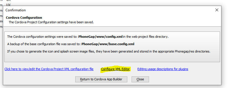
Cordova Applications - Editing the Configuration XML file - Using an External XML Editor - The config.xml file that the Cordova Genie generates may need to be examined or edited when you are building mobile applications. Typically the editing is done using a built-in editor in the Alpha Anywhere IDE. But you may prefer to use an external editor (such as VS Code) to edit these XML files. To configure an external editor, click the Configure XML Editor hyperlink.
UX Component - Android - Ionic App flow - Support for Android
10.1.1. and the Ionic
Android Build Stack, Linux - 2021.10 has been added.
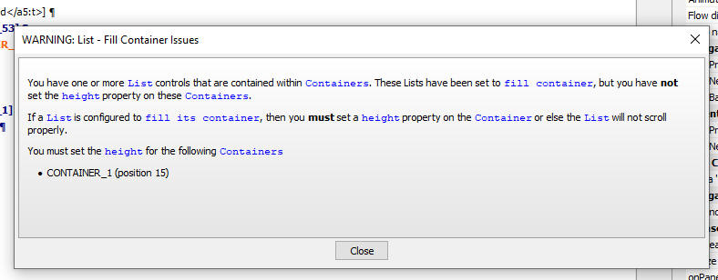
UX Component - List Controls - Fill Container - If your UX has any List controls that are wrapped in Containers and if the Lists are set to fill the container, you will now get a warning when you save the UX if the Container does not have a height.
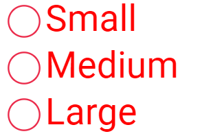
UX Component - RadioButton, CheckBox and DropDownBox Control - Javascript - By default, these control types are rendered using standard HTML controls (e.g. <input type="checkbox", <input type="radiobutton", or <select). You can now specify that these controls should be rendered as Javascript controls. The advantage of the Javascript control option is that the controls can be easily repopulated by calling the .populate() method on the control. In addition, in the case of RadioButtons and CheckBoxes, you have more styling options (such as the ability to select SVG icons for the on and off states).
For example, in the image below, a RadioButton control has been rendered with custom SVG icons for the on and off state.
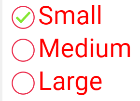
To turn on the Javascript control option, check the Javascript control property in the Property Sheet.
NOTE The settings dialog for DropDownBox controls does not have a Marker section.
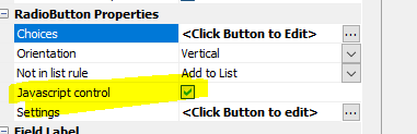
The Settings property will then be revealed. To define control settings, click the smart field.
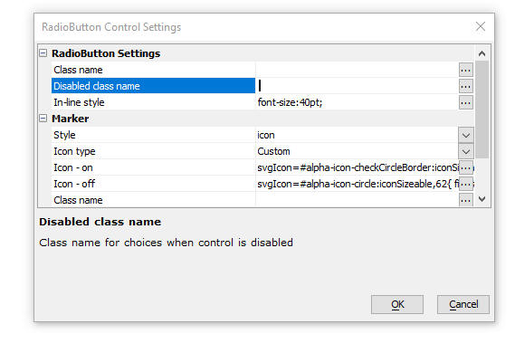
You can specify the Marker style. The option are:
You can also specify a class name for the control choices and for when the control is disabled.
IIS Application Server - Publishing - Overlapping Recycle - When publishing to an IIS server an overlapping recycle of Application Pools is now performed. This means that new processes will be started and immediately begin handling requests. The "old" running processes that are/were handling requests will continue processing requests that they are already handling, but will no longer process new requests (the new processes will do that). Once the old processes finish any pending requests, they will shut down. In this way there won't be any interruption of service at all during a publish operation.
UX Component - List Control - SQL Query - SQL Query for Field List - If a List is based on a non-portable SQL statement (typically a stored procedure), you can now specify an optional separate query to get the field list for the List.
OpenSSL - The version of OpenSSL that is included with Alpha Anywhere has been updated to version 3.0.2.
UX Component - Login Component - Forgot Password Email - Logging - When an email is sent to a user as part of a "Forgot password" action, information is now logged in the Repository table showing the results of the send email action. The Repository table is configured in Project Settings.
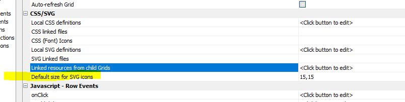
UX and Grid - SVG Icons - Default size - You can now specify a default size for SVG icons when the style for component is not Alpha or a style inherited from Alpha
UX Component - PDF Viewer - Control Bar - Hide - You can now hide the Control Bar that appears above the PDF content.
UX Component - PDF Viewer Control - Zip Download File and Client-side Filename - If you enable the Download button on the PDF Viewer toolbar, you can now specify that the downloaded file should not be zipped before being downloaded. You can also specify the client-side filename for the downloaded file.
UX Component - List - Search Part - Query by Form Mode - Fixed issues with List Search Part when Search Part was set to Query by Form mode.
Web Applications - Current File - The Current file option in the publish dialog was not working correctly.
UX Component - Label Controls - .setValue() method - Was not setting the control state to dirty.
Alpha Launch - Alpha Cloud - Security Framework - If you published an application to Alpha Launch and that application used the Alpha Anywhere security framework and used Alpha Cloud for the backend, login did not work. This is now fixed. You will need to re-publish your apps to Alpha Launch.
UX Component - Action Javascript - PhoneGap Notification - Vibrate - The genie was generating the wrong Javascript for the vibrate action. You will need to edit and resave the action.
UX Component - Auto-suggest - Cordova - iOS - In a Cordova app, running on an iOS device, if the device did not have an internet connection and the user typed into the textbox that had an auto-suggest, the device would pop up a message saying that there was no internet connection.
Grid Component - Time Fields - The time picker was not shown for time fields.
UX and Grid - Advanced Export to Excel - Fixed a regression when running in live mode.
UX Component - Edit Combo - Include blank value in choices - This property was not being honored if an order property had been defined for the choices.
pdf_addBitmap() - Fixed an issue where this function was adding the bitmap to all pages after the specified target page.
UX Component - Image Upload - Thumbnails - Fixed an issue when uploading an image and creating a thumbnail.
{dialog.object}. progressBarShow(i) - Was previously documented as supporting either the name of a Placeholder control or element:elementId for the Id parameter. Support for the element:elementId pattern has been removed. The only option for the Id parameter is now the name of a Placeholder controls.
| TabbedUI Component | Smart Search |
It is not uncommon for the TabbedUI component to have a large
number of buttons in the menu pane. The search feature allows
the user to quickly find a particular button. The Smart Search
feature allows the user to combine filtering the list of buttons
and also applying a filter to the component once it has been
opened in a Tab Pane. Watch video Date added" 2022-01-31 |
| UX Component | Dynamically filtered Dropdownbox Control |
By default, the choices in a dropdownbox control are computed at
the time the UX component is rendered. But you might want to
filter the choices shown in a dropdownbox control dynamically
based on the value of some other control in the UX. In this video we show how you can dynamically filter the choices in a dropdownbox control. Watch video Date added: 2022-02-16 |
| UX Component - ViewBox Control | Enabling drag&drop on an element in a ViewBox layout |
In this video we show how you can make elements in a Viewbox
layout draggable. Watch video Download component Date added: 2022-02--16 |
| Storage Connections - Dropbox | Dropbox |
In this video we show how you can create a name connection
string for Dropbox. Watch video Date added" 2022-03-04 |
| Storage Connections - Google Drive | Google Drive |
In this video we show how you can create a named connection
string for Google Dive and then how you can read/write files in
your Google Drive. Video -part 1 Video - part2 Date added: 2022-02-25 |
| Web Applications - iOS | Using Xcode CLI Tools to Automate Application Creation |
When you use the CLI option to build a Cordova iOS application
you will need to have a Mac with Xcode installed. You can use
the Xcode CLI tools, as shown in this video, to automatic the
process so that it not necessary top manually launch Xcode and
initiate the build. Watch video Date added: 2022-03-04 |
| Backup/Restore | Backing up and Restoring Files in a Web Project |
In this video we show how to use the integrated Backup/Restore
feature to backup your Web Project files. Backups can be stored
on disk on in a storage location (such as Amazon S3, etc.) Watch video Date added: 2022-03-05 |
| Web Applications | Managing Users and Groups at Run-time |
This video shows how you can add an ability to manage Users and
Groups at run-time in your Web Application by adding a sample
template UX component
(SecurityFramework-Admin_MaintainUsersAndGroups) to your Web
Project. Watch video Date added: 2022-03-05 |
| UX Component - List Control | Dynamically setting the choices in the pick list for an edit-combo control |
When you configure an edit-combo for a field in a List that uses
in-place editing, you can specify that the pick list should be
computed by an ajax callback every time the pick list is opened.
But this could be slow because an ajax callback if made every
time the pick list is opened. You might prefer to dynamically
repopulate the pick list when some event occurs and then when
the pick list in a row is ultimately shown, no ajax callback
would be needed. In this video we show how this is done. Watch video Download component Date added: 2022-03-05 |
| UX Component - Login Dialog | Login using Google |
When you configure a UX component as a Login Component you can
enable Login with Google to allow users to login using the
Google credentials. Watch video Date added: 2022-03-20 |
UX Component - List Control - Calendar Layout - (This feature is still under development and requires a Feature Key in order to enable it. We are making an early version of the feature available so we can get feedback from the community). To request a feature key, go to Help, send an email to enhancementrequests@alphasoftware.com with "List Calendar Feature Key" in the subject.
The Calendar layout is a view of the data in a List See video:
https://www.screencast.com/t/dvLrLJNmhG1
UX Component - List Control - Search Part - If a List control has a Search Part, the developer can set the Delay render till active search property to prevent the List from being populated before the user has performed a search.
If the user clicks the Search button without having entered search criteria a search is performed to find all records in the list. Previously, the search would have returned no records.
Also, if the user clicks the Clear Filter button and the Delay render till active search property is checked, the List will show no records. However if the Delay render till active search property is unchecked, the List will show all records. Previously clicking the Clear Filter button would show all records, regardless of the Delay render till active search property value.
Live Test - Alpha Cloud - Lifetime - Live Test deployments on Alpha Cloud now expire after two hours.
Web Applications - LivePreview and LiveTest - URL The default URL for the generated URL when performing a LivePreview or LiveTest (using the Classic Server) now uses the machine name and not localhost. If you prefer to use localhost, you can configure this in Project Properties

UX Component - Login - Login using Google - When you configure a UX component as a Login Dialog you can now turn on the ability to log in with Google.
IMPORTANT When testing the Login with Google feature under LiveTest be sure you have configured the URL to use localhost and not the machine name. See Change in behavior section above for more details.
NOTE Login using Google is for Web applications only at this time. Not supported yet for Cordova application.
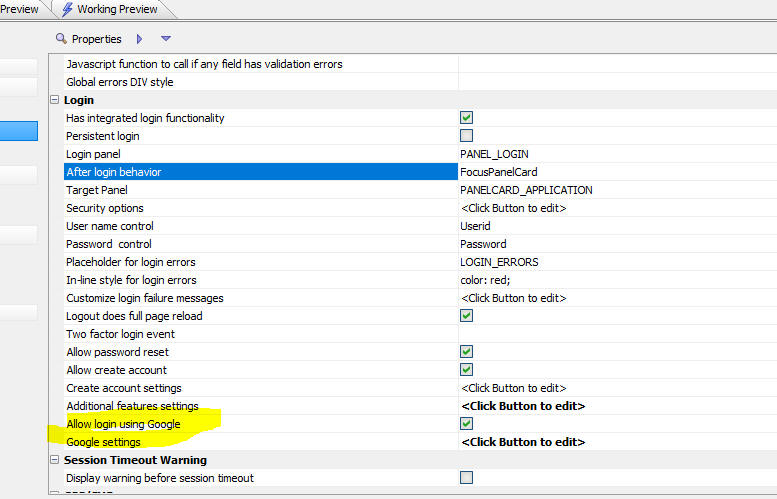
When the Allow login using Google property is checked, the UX component is rendered with two login buttons:

Once you have checked the Allow login using Google property you will need to configure your Google settings. Click the Help on setting up Login with Google hyperlink at the bottom of the dialog for detailed instructions.
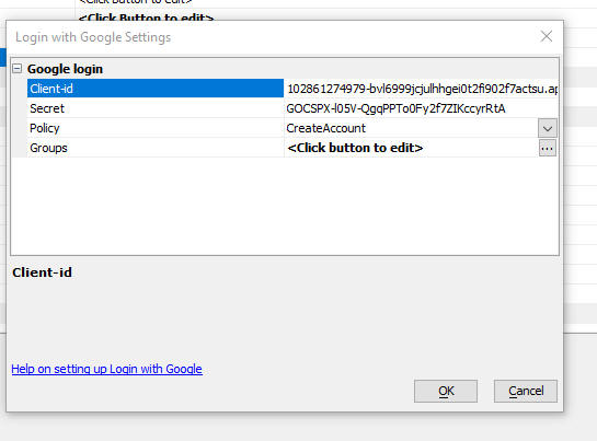
When the user clicks the Login with Google button, a Google authentication flow is launched. If the user has multiple Google accounts they can select which account to use. Once Google has completed the authentication, control is returned to the UX component.
When control is returned to the UX component the user is either logged into the application or denied login depending on the policy setting (as set in the Login with Google Settings dialog)
If the user has an existing account in the Security Framework they are automatically logged in to the application, using a system generated password. (The user's old password will be changed to a system generated password so that the login can be completed)
If the user does not have an existing account and if the Policy is set to CreateAccount, a new account will be created for the user using a system generated password. You can specify what security groups this new account will be a member of.
If the user does not have an existing account and if the Policy is set to DenyLogin, the user will be denied login to the application.
IMPORTANT: When using LiveTest to test this feature on the Classic Server you must be sure to use localhost in the URL. That is because when you configure the callback URL in your Google Settings, Google will not accept a callback URL that uses a machine name. See Web Applications - LivePreview and Live Test - URL for more details.
UX Component - Control Bar Control - Security Groups and Server-side show/hide expressions - You can now specify security groups and server-side show/hide expressions for the items in a Control Bar control.
UX Component - PDF Viewer - Panel Card - Fill Panel Card - When a PDF Viewer control is inside a Panel Card you can automatically have the PDF Viewer fill the entire Panel Card by checking the new Fill Panel Card property.
UX Component - PDF Viewer - Initial resolution - You can now set the initial resolution for the PDF Viewer. Previously the initial resolution was hard coded to 'Fit to page'.
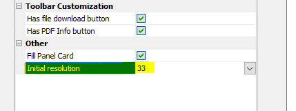
Web Applications - Easily Add User and Role Management and Import/Export to New and Existing Applications - For many developers, adding an ability to manage users and groups in an application has been a challenge. Alpha Anywhere comes with several UX templates that allow developers to add features to their applications to manage users and groups, but now a new genie, and a new template UX, makes it even easier to add these management tasks to an existing application. For more information, see the topic below:
Web Applications - Security Framework - Adding a Security Framework
Component to Manage Users and Roles To an Existing Project
Web Applications - Security Framework - Manage Uses and Groups
Background
When you are working in the Alpha Anywhere Developer Version, or the Community Edition (i.e. the IDE - Integrated Development Environment) and you are in a project for which the Security Framework has been enabled, you can define the users and groups in the project. For example, if you click the Web Security button on the Web Projects control panel
And then select the Users and Groups command you will see a dialog like this showing the users and groups you have defined in your project.
These uses and groups are referred to as the seed users and groups because when you publish your application the seed users and groups are published along with all of your other application files. (See caveat below for the classic server).
NOTE: In the case of IIS (and Alpha
Cloud which uses IIS), the seed users are
published to the membership provider. That
means that any changes made to the seed users
and groups after your application has been published are not
visible in your published application. (In the same way that changes
made to a component after you have published your application are not
visible in the published application). When you do a subsequent publish,
the Publish dialog shows these options:

Additionally, any changes made to users and groups in the running
application will not be visible in the IDE when you examine the seed users
and groups in your project.
NOTE: In the case of the classic server, if you have specified that your Users and Groups are stored in a SQL database (this option is not available in the Community Edition), there is no difference between the seed users and the users in a published application. Any changes you make in the seed users or groups is immediately available in the published application (assuming that the connection string for your security tables in the IDE and in your published application point to the same database). And furthermore, any changes made to Users and Groups in your running application will be visible in the IDE when you examine Users and Groups.
In an application, the developer might have added components that allow the site ADMINISTRATOR to perform the following administrative tasks on the accounts in the application:
The developer would typically create components in their application to perform these tasks and the developer would typically start with a sample template component for each function.
Now, all of the above tasks can be handled by adding a single component to the project. A new template component (called SecuriityFramework-Admin_MaintainUsersAndGroups) will allow the site administrator to perform all of the above tasks.
The new SecuriityFramework-Admin_MaintainUsersAndGroups template can replace the following templates:
In addition, the developer will typically add functionality to an app to allow any user (who is not a site administrator) to perform maintenance tasks on their own account. These tasks include:
There are sample template component that a developer can include in an application to accomplish these tasks:
For example:
| Task Description | Template component |
| Allow a user to change their password | SecurityFramework_ChangePassword |
| Edit information in the Extended User Information table | SecurityFramework-Edit_ExtendedUserInformation |
| Change two-factor authentication settings | SecurityFramework-Two-FactorAuthenticationPreferences |
Finally, the developer might want to add functionality to their application's login screen that allows a user who is trying to log into an app to:
When a user creates a new account you might want the new account to be locked until a site administrator unlocks the account.
NOTE: If your project is configured to use some type of external authentication (e.g. Active Directory), it is not possible to create or delete users and groups, change passwords, or change group assignments. It is possible, however, to edit data in the Extended User Information table.
Security Framework - Template Component - Admin_MaintainUsersAndGroups - A new template UX component (SecurithFramework-Admin_MaintainUsersAndGroups) is available. This template component can be used in any project that uses the Security Framework. The component allows the site ADMINISTRATOR to perform various maintenance tasks for the user accounts in the system. This component combines the functionality of several existing template components into a single component and it also adds considerable additional functionality compared to the existing template components.
NOTE This component can be used in Working Preview, Live Preview and at run-time in a published application. When used in Working or Live Preview you are editing the seed Users and Groups.
The template component allows the site ADMINISTRATOR to perform the following tasks:
The template component allows you to view the account information in two ways:
For example, the image below shows the "Users" view. The groups for the selected user are shown.
The image below shows the "Groups" view. The users in the selected group are shown.
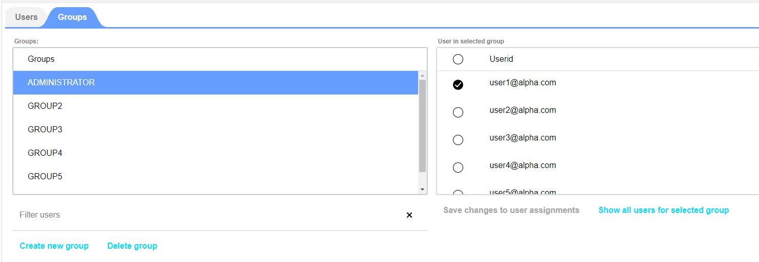
To edit data for a user, make sure you have selected the Users tab. Click on the row for the user you want to edit. Click the Edit user button. Alternatively, double click on a row in the Users list.
Editing a User
To edit a user, click on the user row in the List and then click the Edit user button, or double click on the user row. If your project does not include an Extended User Information table, the following dialog is shown in the panel that slides in from the right. You will be able to change the user's password.
You will also be able to change the account status. If the account is currently enabled (unlocked) you will be able to lock the account. If the account is currently locked you will be able to unlock the account.
Once an account is locked the user will no longer be able to log into the application.
When the account status is changed the onAccountLock or onAccountUnlock Xbasic function is called. These functions are defined in the Xbasic Functions section in the UX Builder. A typical use case for these functions is to inform the user (via email or SMS) that their account in now locked or unlocked.
If your project does include an Extended User Information table, the following dialog is shown in the panel that slides in from the right. You will be able to change the user's password and any value in the Extended User Information table. You will also be able to enable/disable two-factor authentication for that user

Importing Users
In your published application, you might want to give the Administrator a way to quickly create user accounts by importing data from an Excel spreadsheet.
When you import data from an Excel spreadsheet you can:

Web Applications - Security Framework - Adding a Security Framework Component to Manage Users and Roles To an Existing Project - If you have an existing Web Project that uses the Security Framework you might want to add a page to your application that allows the ADMINISTRATOR of the web site to easily perform maintenance tasks on the user accounts in the application.
To add add Security maintenance page your your application, click the New button when then Web Components item is selected.
The dialog shown below is opened. Select the Security - User/Roles Maintenance Page item.

You will be prompted for the name of the page to create and also the security groups that are authorized to see this page.
A new page (named by you) and a new component (called Admin_MaintainUsersAndGroups.a5wcmp) will be added to your project.
If you have an existing TabbedUI component in your project that is the main menu of your application, you would likely want to add the Admin_MaintainUsersAndGroups.a5wcmp to the main menu TabbedUI component and set the Security Group for the component to the role for the site ADMINISTRATOR.
Security Framework - Quick Setup Genie - When you use the Security Framework - Quick Setup Genie to add the Security Framework to a Web Project the sample TabbedUI component now adds the Admin_MaintainUsersAndGroups as shown in the image below.

save_to_file() function -- Now supports ability to save directly to a storage location. The format for the filename argument can be ::storage::name_of_connection_string/objectname. For example:
dim b as b
b = file.to_blob("filename_goes_here")
save_to_file("::storage::myconnstring/folder1/object.zip",b)
get_from_file() function - Now supports ability to get data from a storage location. The format for the filename argument can be ::storage::name_of_connection_string/objectname.
Web Applications - IIS and Alpha Cloud - A new property has been
added to Project Properties to enable
extending the authentication cookie timeout on every request. This
setting is generated into the web.config file
and the SecurityDefinition packet used by Alpha
Cloud.
Under IIS the authentication cookie timeout is only extended when half
the timeout period has passed. This can cause confusion about when a
session will expire since it may not be from the last request that was
done if that request was done before half the timeout period has passed.
Enabling this setting will extend the session to the defined session
lifetime from the point of the last request no matter where the last
request occurs in the timeout period. The response to be slightly larger
as the authentication cookie will be returned for every request.
Once this setting is enabled, the application will need to be
republished. This setting is for IIS and Alpha Cloud only.
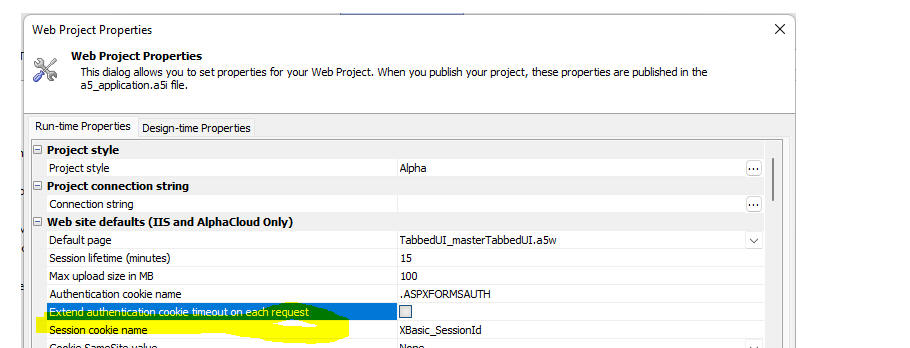
Cordova App Builder Genie - Existing apps - Updated config.xml file - The Cordova config.xml file template has been updated to provide support for the latest version of Cordova-Android and Ionic Appflow.
When you the launch Cordova App Builder Genie you may see this alert
dialog:

When you save the project, the file will be automatically updated to the latest release.
Cordova App Builder Genie - Cordova CLI Builder - iOS Build Options
- You now have the option to generate a Mac OS bash shell script
that uses the Xcode CLI tools to build and
install an iOS app on a device or a simulator without having to build
the app with Xcode. You must be using the
latest version of the iOS-deploy tools and setup Xcode to
use automatic provisioning to use this feature.

Visit the documentation links below for further information.
Mac OSX Cordova Installation Documentation
Web Projects - Backup/Restore - An integrated Backup and Restore feature has been added to the Web Projects Control Panel. Backups can be saved to the file system (in a folder on any drive including network drives), or in a storage location (any location for which a storage connection string has been defined - e.g. Amazon S3, Wasabi, Sharepoint, Google Drive, Dropbox, etc.)
To open the backup and restore dialog, click the Backup/Restore button on the Web Control Panel.
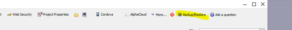
Then select the appropriate tab depending on whether you are backing up or restoring files.

Before you can create a backup, you must first set the Backup location. Click the Select button.
Select one of the options:
When you perform a backup you can choose whether the component backup files should be included. These files are used when you right click on a component and select the Restore backup command.
Over time, the number of component backup files can grow to be quite large and the time taken to create a full backup that includes the component backup files can become excessive. Therefore, you might want to omit these files from your backup.
To restore previously backed up fields, select the Restore tab and then enter the filename of the backup file (a .zip file). You can use the Select button to select the file to restore.
When you click the select button you have the option of selecting from a list of backups made for only the current project, or for all projects.
NOTE: It is possible to create a backup for (say) Project1 and then later to restore that backup to (say) Project2

In the image shown below you can select a project and then select the backup file for that project. If you had defined a description for a particular backup file, the description is shown to the right of the file list.
Google Drive - You can now create named storage connection strings that points to Google Drive and you can use the a5storage* functions (e.g. a5storage_listitems(), a5storage_savefile()) with your Google Drive storage connection string.
Before you build a storage connection string for Google Drive you will need to complete these pre-requisites:
1. Go to the Google Cloud console (https://console.developers.google.com ) and create a new project. (If you already have an existing project you can use that project)
2. Enable the Google Drive api for your project ( https://console.developers.google.com/apis/)
3. Create a service account (https://console.developers.google.com/apis/credentials)
4. Create a key for the service account using the JSON option. Download the JSON file.
5. Get the email address for the service account and share the Google drive with the email address of your service account.
6. Get the ID of the Google Drive folder you want to use in your storage connection string.
Once you have completed all of the above, you can then create a named storage connection string.
To create the names storage connection string you will need:
Once you have created a named storage connection string for Google Drive you can then use any of the a5storage* functions to read/write files to your Google Drive.
Video showing how to complete the pre-requisites
Video showing how to create a named storage connection string for Google Drive
Dropbox - You can now create named storage connection strings that points to Dropbox and you can use the a5storage* functions (e.g. a5storage_listitems(), a5storage_savefile()) with your Dropbox storage connection string.
Before you build a storage connection string for Dropbox you will need to get a access token with the correct scopes. Here is how this is done:
1. Go to the Dropbox Developer console (https://www.dropbox.com/developers/apps) and create a new application.
2. Once you have create a new application, go to the Permissions tab and set the permissions for you access token (it is very important that you set the permissions before you generate the access token)
3. Go the to the Settings tab, set the Access token expiration to No expiration, then click the Generate token button to generate your access token.
4. Copy the generated token to the clipboard. Go to Alpha Anywhere, open the Storage connections dialog and create a new Dropbox connection. Paste the token you generated in step 3 into the dialog.
Once you have created a named storage connection string for Dropbox you can then use any of the a5storage* functions to read/write files to your Google Drive.
Web Applications - Live Test - IIS - HTTPS:// - You can now configure IIS to use https:// when doing a Live Test. When you select the IIS option, a hyperlink is shown with instruction on how to configure IIS.
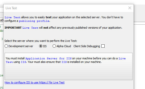
When you do a Live Test, a dialog will be displayed prompting for the URL to use:
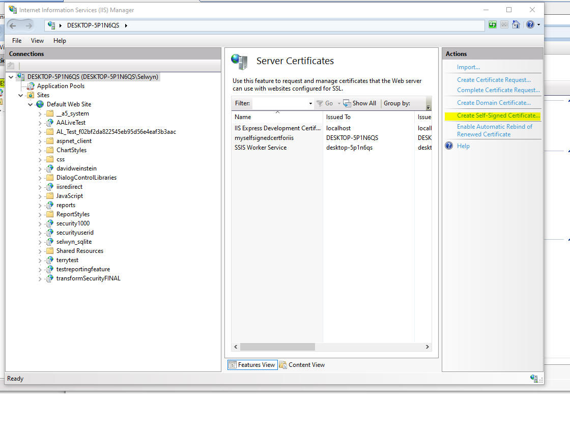
UX Component - Progress Bar - Javascript Methods - New methods have been added to the UX to make it easy to show progress bars. The methods are:
The image below shows how a default progress bar is rendered.
Web Applications - Restore Component - Restore to a new file - When you restore a component backup (by right clicking on the component in the Web Projects Control Panel and then selecting the Restore Backup command), you can now restore any backup to a new component by clicking the Restore to a new file button.

Web Applications - IIS - Application Pool - When you publish to IIS, the application pool will now be started/restarted after the application is published.
Web Applications - Classic Server - Server is Available Test - Ajax Callbacks - By default, all Ajax callbacks perform a server is available test before the actual Ajax callback is made (this can be turned off in the Action Javascript builder for Ajax callbacks). In the Classic server, the time take to perform this test has been substantially reduced. As a result, actions that perform Ajax callbacks will now appear to be faster.
AlphaDAO - SQL Server - ODBC Driver 18 for SQL Server - Support for ODBC Driver 18 for SQL Server has been added.
If the DBVersion property of a SQL Server connection string is set to 2019 (the current version of SQL Server), SQLAzure, or 2022 (currently in preview), Alpha Anywhere will now look first for ODBC Driver 18 for SQL Server and fall back to prior versions if that version is not available.
UX Component - Login Component - Create Account Options - When you configure a UX component as a Login component and you enable the Allow create account property to allow users to create new account, a new property (Create account settings) is now available.
These setting allow you to specify:
To set options for the Create Account action, click the smart field for the Create account settings property.
This will display a dialog where you can define the settings:
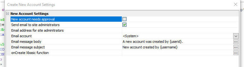
UX Component - ViewBox Control - Drag Events - You can now make elements in a ViewBox draggable. To make an element draggable, add an a5-item attribute to the element.
When you define the item, set the Draggable property to Yes or Function (to enable drag only if some specified Javascript code returns true).
Watch video
Download component
When drag is enabled you can set the Drag on property. The choices for this property are down and down-hold. If the Drag on property is set to down-hold, then before the user can drag the element, they will need to click and hold on the element.
When drag is enabled the following events can be defined:
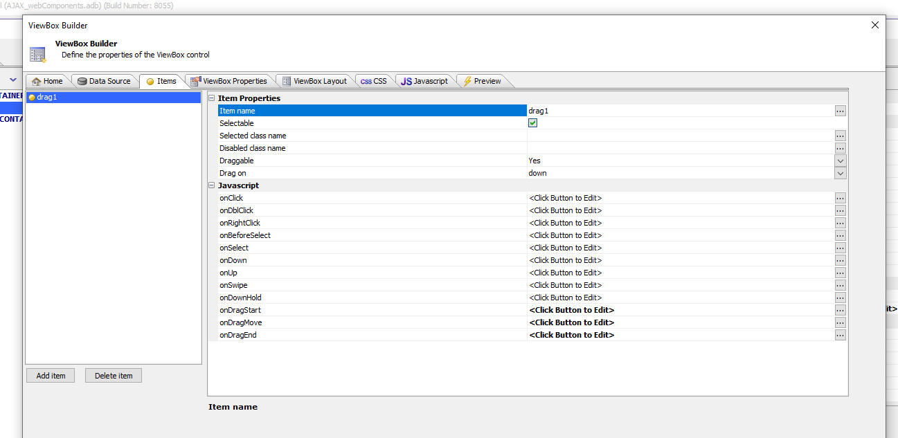
In order to make an element in your ViewBox layout draggable, add an a5-item attribute to the element. Set the value of the a5-item attribute to an item that has been defined as draggable.
For example:
<div id = "item1"
style="width: 1in; height: 1in; border: solid 1px red; position:
absolute; top: 0px; left: 0px;" a5-item="drag1">
div1
</div>
UX Component - Watch Event - You can now define your own watch events. A watch event is some Javascript that gets executed whenever the value in one of the watched controls changes.
MOTE Creating a watch event is really no different than putting some code in the onChange event of a control
For example, you might define a watch event that executes some code whenever the value in the COUNTRY or CITY control is changed.
To define a watch event, click the smart field for the Watch events property in the Javascript section on the UX Properties pane in the UX Builder.
This will open the builder. You can define as many watch events as you want. When you define a new watch event you give the event a name, you specify which controls to watch and then you specify the Javascript to execute.

UX Component - Dropdownboxes - Dynamic filter - A new option has been added for dropdownbox controls. You can now specify a dynamic filter for a dropdownbox control. Typically the choices in a dropdownbox are determined when the UX is rendered and the choices do not change.
Now you can specify a dynamic filter for the choices. When any of the controls that are referenced by the dynamic filter for the dropdownbox change, the choices in the dropdownbox are automatically updated.
NOTE The dynamic filter option for dropdownboxes is only available if the dropdownbox is populated with data from a SQL database using AlphaDAO.
For example, you may have defined the choices in a dropdownbox to display all of the Cities in the Customer table. The dynamic filter for the choices might be
Country = value in the COUNTRY control
When the value in the COUNTRY control changes (e.g. the value is set to USA) the choices in the dropdownbox would be updated to show just the Cities in the USA.
To define a dynamic filter for a dropdownbox, open the builder for the dropdownbox choices, then check the Has dynamic filter checkbox.
NOTE: Dynamic filters are not available if the dropdownbox has cascading choices.
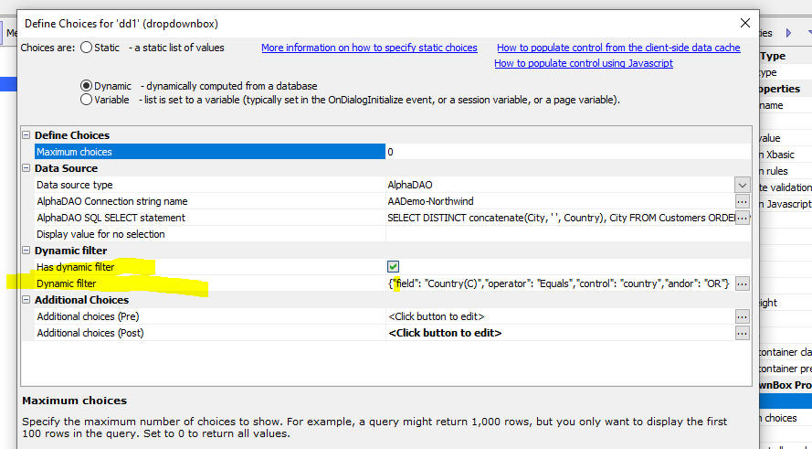
To define the dynamic filter, click the smart field for the Dynamic filter property.
This will open the builder when you can add or edit the filter.
The filter can have multiple parts joined with either AND or OR
Each filter part specifies the field in the source table, the operator and the control in the UX whose value you want to use in the dynamic filter.
For example, in the image below the filter finds all records where the Country field is equal to the value in the country control on the UX.
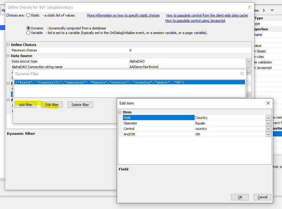
Xbasic - PDF_addBitmap() Function - Adds a bitmap overlay to a PDF file at a specific location - The typical use case for this feature is for adding a signature image to a PDF file. Alpha Anywhere has an Xbasic function to merge JSON data into a fillable PDF file. However, there is no ability to merge signature bitmaps into the PDF file. The pdf_addBitmap() function allows a signature bitmap to be overlaid onto the filled in PDF file at a specific location.
Syntax:
L flag = pdf_addBitmap(c basePDF ,c outputPDF,c imageFileName,n targetPage,c top,c left[,c imageHeight [,c imageWidth]])
Where:
Example:
'Add image to page 4 of PDF
basepdf = "C:\pdffiles\filledin.pdf"
outputpdf = "c:\pdffiles\out.pdf"
imageFileName = "C:\pdffiles\signature.PNG"
page = 4
top = "9.8cm"
left = "1cm"
dim flag as l =
pdf_addBitmap(basePDF,outputPDF,imageFileName,page,top,left)
PDF - Reporting - Clipping - In a previous release, Alpha Anywhere adopted a new method for rendering PDF reports that did not rely on the Amyuni PDF printer driver. As a result of this change some users reported issues where text in a PDF report was 'clipped'.
A new property has been added to the Report Editor which allows you to disable clipping for individual objects. By default clipping is enabled for all objects. But if you notice that some output in a PDF report appears to be clipped you should disable clipping for that object.
The Disable clipping property is available in the Properties Pane for an object as shown in the image below. (If the Properties Pane is not visible, select the Task List, Properties menu item in the Report Editor.)
Web Applications - Web Security Framework - Quick Setup Genie - When you use the genie to create sample users, you can now specify if the user id type is an email address or a value.

UX Component - List Control - In-place Editing - No Records in List - If you have turned on in-place editing for a List and the List has no records initially you can display a 'no records in list' message. Now, you can specify that if this message is clicked, a new row should be added to the List.
Web Applications - Security Framework - Editing Users - Extended User Information Table - When you edit an existing user record you can now also edit data in the Extended User Information table.
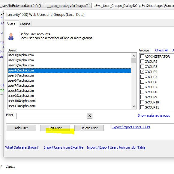

When you click the Edit Extended User Information record for this user button, if the Web Project has not yet been configured to have an Extended User Information table, the genie for defining the Extended User Information table will be opened.
If the project has been configured to have an Edit Extended User Information table, a dialog will open allowing you to set values for the fields in the External User Information table. You will also be able to use this dialog to enable/disable two-factor authentication for the user.
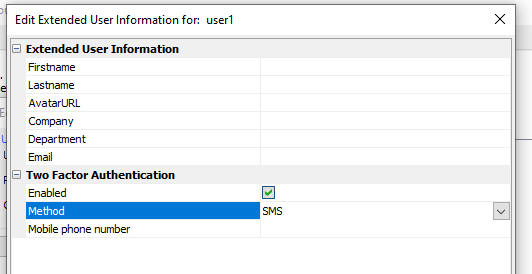
UX Component - .setDefaultValue() method - Allows you to set the default value of a control in a UX.
Contrast with the .setValue() method which sets the value (but not the default value) in a control.
Xbasic Debugger - Conditional Breakpoints - It is now easier to define conditional breakpoints in the Xbasic debugger. After you have added a breakpoint, simply right click on the breakpoint and select the Condiion breakpoint command.
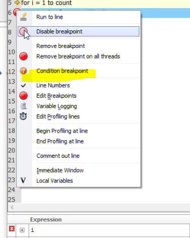
This will open a dialog where you can enter an expression. The debugger will stop when the condition is true.
For example, in the image below, the variable i loops from 1 to 100. You could set a condition break point to break when the condition i = 50 is true.
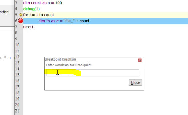
Xbasic - a5_CURL_fastDownloadMultipleFiles() Function - Uses CURL to download multiple files to a folder. Files are downloaded in parallel for maximum speed
NOTE: This function is just a wrapper around the extension::curl::DownloadMultiple() method.
Syntax:
c result = a5_CURL_fastDownloadMultipleFiles(c fileList, c folder)
Where
UX Component - Client-side Data Cache - IndexDB - You can now store client-side data cache data in IndexDB. Previously the only options were LocalStorage or FileSystem. The advantage of the FileSystem option is that you can store substantially more data than LocalStorage allows, but the FileSystem option is only available for Cordova apps.
If you are running a web app then the new IndexFB option allows for substantially more storage than LocalStorage.

UX Component - List Control - IndexDB - You can now persist List data to IndexDB. When you build a mobile application that must work offline, you typically persist the data in List controls to storage (Local Storage if running as a Web Application or the file system if running as a Cordova application). Local Storage is quite limited, which means that unless you running as a Cordova application, the amount of data your offline application could use was fairly limited. Now if you are running as a Web application you can persist List data to IndexDB. This allows for substantially more storage than Local Storage.
TabbedUI - Smart Search - The TabbedUI allows you to add a search box (see the Enable search property) to quickly find the buttons that match a search string. You can now enhance the search feature by defining a Smart Search.
For example, in the image shown below, the user has typed 'cus' into the Search box and the filtered list of buttons matching the search string is shown below the search box.
If the search result shows a single match, that action (in the image below this is the Customers button) is executed automatically and the component for this button is opened in a tab pane. (This assumes that the Automatically click button if search result has a single match property is checked.)
When the Smart Search feature is enabled, a series of tests (defined by you, the developer) are performed to determine what action to perform once the Smart Search has been initiated.
The Smart Search is initiated if the filtered list shows no matches or 2 or more marches. (If the filtered list shows a single match, the behavior is determined by the setting for the Automatically click button if search result has a single match property)
For example assume that the TabbedUI has a button to open the Customers grid and another button to open the Orders UX component. Assume also that the user types a value into the search box, and then presses Enter to initiate the Smart Search which is configured to perform the following tests:
| Rule Number | Rule Description | Action if test true |
| 1 | Search the customers table to see if there are any records with a CustomerID that matches the search string (say, ALFKI) | Open the Customers grid and filter the grid to only show the record where the CustomerID is equal to ALFKI |
| 2 | Search the order detail table to see if there are any records where the product Description matches the search string (say, Books) | Open the Orders UX component and set an argument value so that only records matching the search value are shown. |
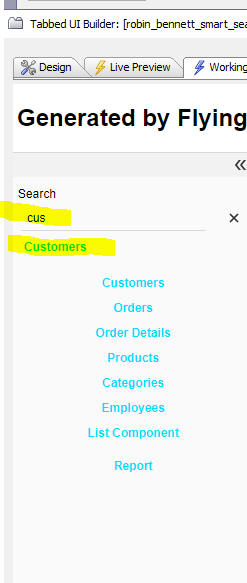
To turn on the Smart Search feature check the Has smart search property.
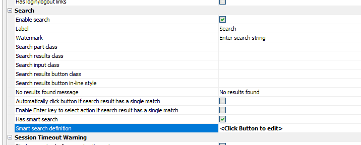
Then to open the builder where you define the Smart Search rules, click the smart field for the Smart search definition property. The builder opens, as shown below.

To add a rule, or to edit and existing rule, click the Add rule or Edit rule button.
This will open an editor, as shown below:
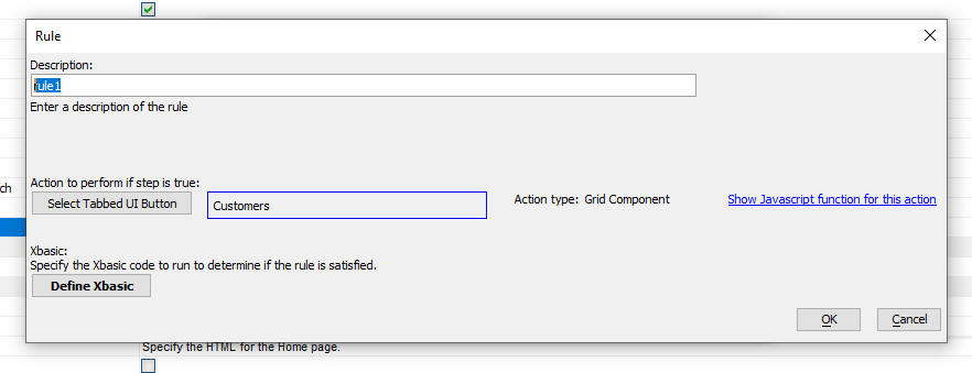
The dialog allows you to define:
To select the action to perform, click the Select Tabbed UI Button button and select the TabbedUI button.
To define the Xbasic code that performs the test, click the Define Xbasic code button. Your Xbasic code will perform the test to determine if the action should be executed and it will also set properties that override the default behavior of the action. For example, the default behavior of the Customers button might be to open the Customers grid, whereas, the test you define might open the Customers grid with a base filter in place.
The Show Javascript function for this action hyperlink allows you to see how the default action for this button is defined.
Special thanks to Robin Bennett of Start Software in London for the suggestion that inspired this feature.
UX and Grid Component - Lookup Grid - Close window Button - You can now add a close button to the window in which a lookup grid is shown. This allows the user to close the lookup window without having to make a selection.
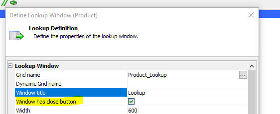
Xbasic - Dot Variables - Get and Set Functions - Two new functions have been added to make it easier to set and get values in/from a dot variable. The functions are: dotVarSet() and dotVarGet().
Example
dim p as p
dotVarSet(p,"name","Fred")
dotVarSet(p,"age",35)
dotVarSet(p,"is married",.t.)
dim p2 as p
p2.foo = "bar"
dotVarSet(p,"obj",p2)
showvar(p)
txt = dotVarGet(p,"age")
showvar(txt)
TabbedUI Object - Client-side events - Two new client-side events have been added. onTabPaneOpen fires when a new tab pane is object. onTabPaneClose fires when a tab pane is closed.
The Javascript code that runs when these events fire can reference:
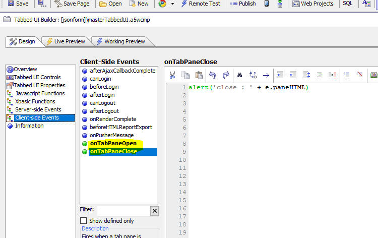
REST API - The REST API Builder has been enhanced. It now allows you to define a service name and description that will be displayed in the Swagger test page and the API documentation page. You can also define argument descriptions and response code descriptions.
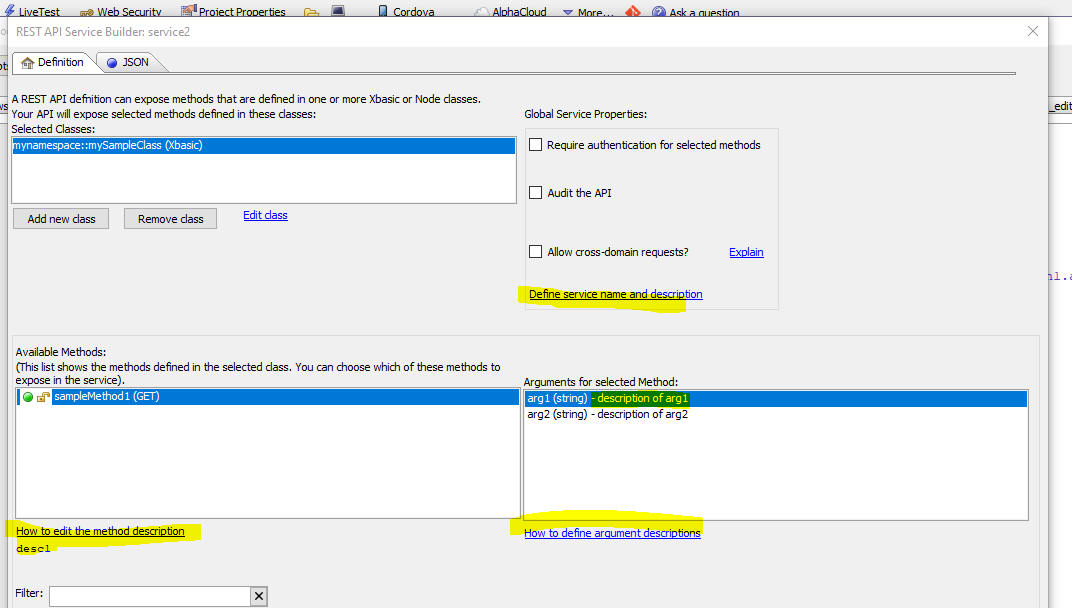
To customize the response codes shown on the Swagger test page and in the API documentation, click the Edit Method Properties button.
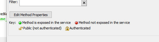
Then click the Define response codes button.
This will open a dialog where you can define the response codes that the method can set and for each code you can specify a description that will be shown on the Swagger test page and also in the API documentation.
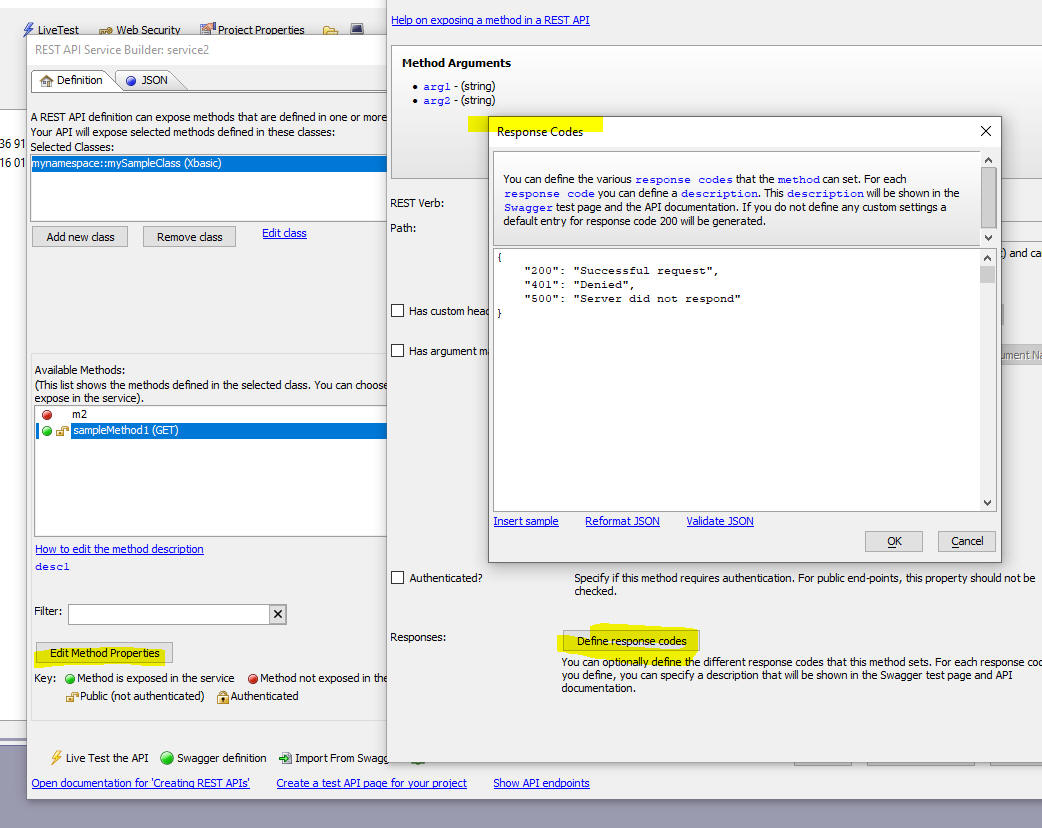
Xbasic - sys_shell_wait_result() Function - The sys_shell_wait_result() function is similar to the sys_shell_result() function, but gives you more control (for example, you can set a timeout) and will typically be preferred to sys_shell_result().
For more information on this function, refer to the documentation.
UX Component - Login Feature - IIS and Alpha Cloud - The <Default> option for the Redirect page can now be used when publishing to IIS or Alpha Cloud. Previously when publishing to IIS or Alpha Cloud you had to specify an explicit page.
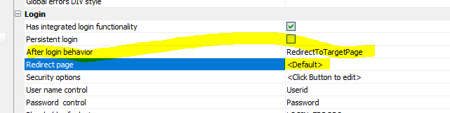
UX Component - List Control - In-place Editing - Edit-combo - Order - You can now define a custom order for the picklist that is shown when an edit-combo is opened.
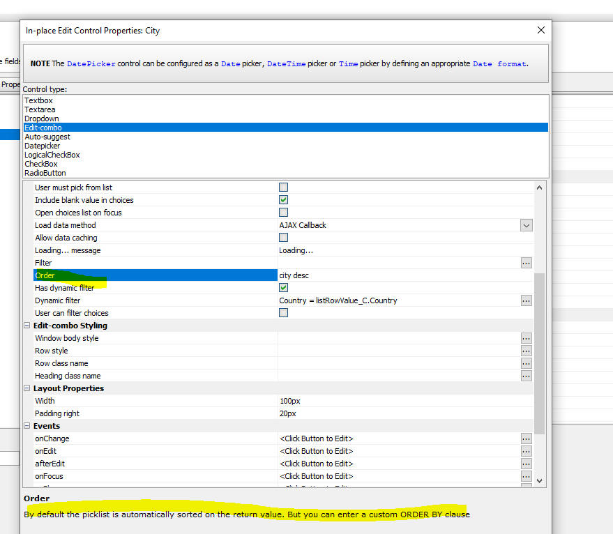
Cordova App Builder Genie - Xcode Build Options - Deployment Target - A new category (Xcode Build Options), and a Deployment Target property were added for iOS builds that allows the developer to specify the iOS deployment target for Xcode or Ionic Appflow builds. This defines the minimum version of iOS that must be installed on the device to support all of the app's functionality.
Cordova App Builder Genie - Default iOS Storyboard Images Added -The Cordova project template files have been modified to include a set of default storyboard images for iOS builds. This resolves a build error that occurred within the Ionic Appflow iOS builder if the developer did not include storyboard images for the app.
Cordova App Builder Genie - New Project Template Files Refactored - The Cordova project template files have also been refactored and additional default properties have been added to be compliant with the latest versions of Cordova Android.
Cordova Builder Genie - Ionic Appflow Builds - Cordova File Transfer Plugin - Changes were required to generate successful iOS and Android builds when using the latest Ionic Appflow Build Stack, currently either Build Stack - MacOS - 2021.10 or Build Stack - Linux-2021.10 when the file transfer plugin is used.
The Cordova App Builder Genie will automatically install the Ionic Appflow compliant 1.5.1 version of the file transfer plugin if it is required in the app.
Cordova Builder Genie - Ionic Appflow Builds - AndroidXAdapter Plugin Auto Installation - Ionic Appflow requires the installation of the AndroidX libraries for all plugins. The AndroidXAdapter plugin is automatically installed when generating an Android build for Ionic Appflow. The AndroidXAdapter plugin maps all older Android supporting libraries to the newer AndroidX libraries.
UX Component - List - Inplace Editing - Events - This List Control System Events builder no longer shows the inplace editing events (see screenshot below). Instead these event are edited using the List Builder's In-place editing settings property (see second screenshot below).

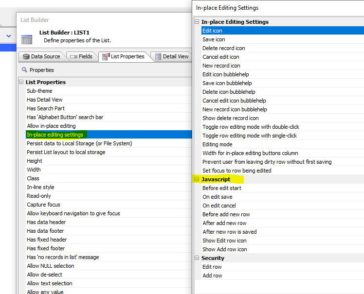
email_send_noprofile() function - Subject - Can now include HTML encoded text in the email subject. For example, this will allow the use of Japanese text in the subject.
Example:
dim message as p
message.from = "jane@acmeinc.com"
message.from_alias = "Jane Doe"
message.send_to = "user@place.org"
message.subject = "メールの件名"
message.message = "The Acme family is excited to see you join."
dim smtpSettings as p
smtpSettings.smtp_server = "mail.acmeinc.com"
smtpSettings.smtp_username = "username"
smtpSettings.smtp_password = "password"
smtpSettings.smtp_port = 25
dim result as p
result = email_send_noprofile(smtpSettings,message,"")
UX Component - Image Upload - AmazonS3Indirect - Accessing client-side Data in S3 object name function - When you upload an image to Amazon s3 using the AmazonS3Indirect option, you can call an Xbasic function to compute the name to assign to the uploaded image. This Xbasic function can now access client side data specified in the Additional info to submit - Javascript property.
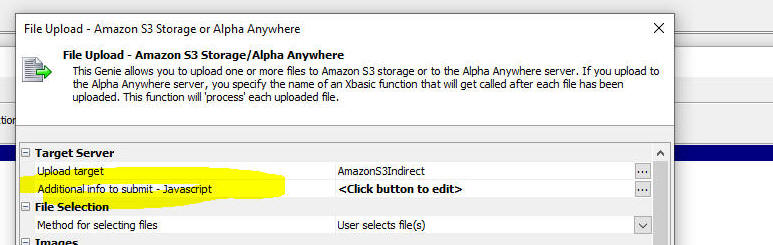
UX Component - Cordova - Bar Code Scanner - Android - PDF_417 Bar code type - The PDF_417 bar cord type on Android devices is now supported. You will need to edit and then resave the action to generate updated Javascript.
UX Component - List Control - Export to Excel - Maximum number of Records - The maximum number of records to export property was being ignored.
UX Component - List Control - Delay render till explicit refresh - Delay render till visible - Delay render till active search - Synchronize - If a UX component has a List control that had its Delay render till explicit refresh, or Delay render till visible, or Delay render till active search property checked and if this UX was opened by a parent component, then the second time the UX was opened (and the onSynchronize event on this component was fired), all of the Lists would be refreshed even if they should not have been refreshed because they had not been rendered when the UX was initially rendered.
So for example, assume that UX1 has a List whose Delay render till visible property had been checked. Assume also that the List was on pane 2 of a Tab control so that when this UX was opened, the List was not visible and therefore it was not rendered. When the UX was opened initially (from say a button on a parent UX), the List would not have been rendered (because it was not visible). If the UX was then closed and reopened, its onSynchronize event will fire and the List would then have (incorrectly) been rendered (even though it was not visible).
Web Projects Control Panel - GIT Integration - Spaces in Machine User Name - Fixed an issue where the GIT integration would fail if the machine user name had a space in the name.
UX Component - Timing Control - When you add a timing control to a UX, the time reported for the Start processing Ajax callbacks item was wrong. This is now fixed. Also, when you are in an Ajax callback, all timing information is now prefixed with the name of the Xbasic function that handles the callback.
Reports - Images - Fixed an issue where the orientation of black and white images was incorrect.
UX Component - Login - Server-side OnLogin Event - e.javascript - If a Login UX component was set to redirect to another .a5w page after login, any Javascript set in the e.javascript property did not get executed.
AlphaDAO - SQL Server - Client drivers were not recognizing
support for the SQL Server Date type if the SQL Server version was set
to for 2017, 2019 and beyond.
UX Component - List Control - In-place Edit - Fixed an issue if you performed a client-side sort and then began using in-place edit.
Classic Server - Report Server - The Report Server was turned off in build 8000. While the Report Server is not needed or used when running under IIS (and Alpha Cloud), it does provide a significant performance benefit when using the Classic Server.
Web Service - Permissions - When you add a new web service to a project that has the security framework turned on, you are now prompted for the permissions for the service.
Swagger Test Pages - Permissions - When you create a Swagger test page for a service in a project that has the security framework turned on, you are now prompted for the permissions for the page.
Xbasic Editor - Auto-complete - DIM Statements - Auto-complete now works when you DIM a variable and then immediately assign a value to the variable. Previously auto-complete did not work on the right hand side of the = sign in a DIM statement
UX Component - Sample Template - Updated the UX_Ad_Hoc_SQL_QueryBuilder sample template to fix an issue when loading a saved query.
UX Component - In-place Editing - Data Picker and Advanced Search - Date Picker - Language Tags - Language tags are now honored.
UX Component - Login Dialog - IIS - When the security framework was configured to use userid (and not email addresses) as the userid and when a UX with integrated login was being used with the 'forgot password' feature enabled, if the user clicked the forgot password link, entered their userid and then clicked the Reset Password button, the email that should be sent to the user was not sent if the application was running under IIS (or on Alpha Cloud).
UX Component - Embedded Object - Pre-render Option - Panel Card - If the Panel Card that contained an embedded object was contained in a Panel Navigator and the Panel Navigator was contained in a Panel Layout, the pre-render option was not working correctly.
UX Component - Embedded Object - Pre-render Option - Panel Card - If the Panel Card in which an object is embedded is visible initially, the Pre-render option is now ignored. Previously it would cause the embedded object to be rendered twice. It is meaningless to check the Pre-render option in the first place if the embedded object was in a Panel Card that was visible initially.
Web Applications - Security Framework - Editing Users and Groups - Fixed some regressions where errors would be shown when you tried to edit users and groups in the IDE.
Report Server - Classic Server - The Report Server is no longer used when printing reports using the Classic Server. This is because now that the Amyuni PDF printer driver is no longer used when printing PDF reports, there is no longer any need for the Report Server.
List - Detail View - New Record - Default Values - Dirty Behavior - Previously if any control in a List's Detail View had a default value, then when the New Record action was executed, the Detail View would immediately be dirty and the Save button would be enabled. Now, the Detail View does not go dirty until the user types into any of the Detail View fields.
UX Component - Arguments - Fixed an issue with argument binding when a child UX was synchronized
Web Control Panel - Fixed an issue that displayed a window when the Web Projects Control Panel was opened. The window showed debugging code that was mistakenly left in.
Web Apps - Publishing - Fixed an error where Alpha Anywhere would fail if the security framework was set to use Active Directory and no users or groups had been defined in the project.
| UX Component - Panel Navigator | Pre-load Embedded Components in Panel Cards |
A common design pattern when building Web Applications is to use
a UX Component with a Panel Navigator and child Panel Cards as
the main controller for your application. Each of the Panel
Cards might contain an embedded component. The embedded
components are typically set to delay render till visible so as
not to slow down the loading of the main controller UX. However,
when the user gives focus to one of the Panel Cards, which
causes the embedded component to load, you might want the
embedded component to load instantly. This is now easily done by
pre-loading the embedded components when the main controller
component is loaded. Watch Video Download component Date added: 2021-10-20 |
| UX and Grid Component | Calling Python Functions in Server-side Code |
Typically, all server-side code in a UX or Grid is written using
Xbasic. But if you are already familiar with Python, you might
prefer to write server-side code using Python. In this video we show how you can write server-side code using Python. Watch Video - Part 1 Watch Video - Part 2 Date added: 2021-11-20 |
| UX Component - Enter Code Control | Using the Enter Code Control |
A common design pattern when building applications that must
prompt the user to enter a code (for example a login screen) is
to provide data entry boxes for the user to type in the code. As
the user types the code focus is automatically moved to the next
box. Once the user has typed in all of the characters in the
code, an Ajax callback is made to the server to validate the
code. If the code is not valid, the control shakes (thus giving
feedback to the user that they have not entered a valid code). In this video we show how an Enter Code control can be added to an UX component. Watch Video Download component Date added: 2021-12-03 |
| UX Component - CSSGrid Container | Creating Complex Responsive Layouts using the CSSGrid Container |
The CSS grid specification allows you to create complex
responsive layouts. In this video we show how you can use a
CCSGrid container type to create a complex, responsive layout. Watch Video - Part 1 Watch Video - Part 2 Download component Date added: 2021-12-05 |
UX Component - List Control - Calendar Layout - (This feature is still under development and requires a Feature Key in order to enable it. We are making an early version of the feature available so we can get feedback from the community). To request a feature key, go to Help, send an email to enhancementrequests@alphasoftware.com with "List Calendar Feature Key" in the subject.
The Calendar layout is a view of the data in a List See video:
https://www.screencast.com/t/dvLrLJNmhG1
UX Component - List with Detail View - If the List is configured to allow NULL selection then when the current selection in the List is nulled out (e.g. <listObject>.setValue(false) ), the Detail View controls are populated with their Default Values (as defined in the control properties). Previously the Detail View controls were set empty regardless of whether the control had a defined default value (NOTE The following behavior has not changed: when the <listObject>.newDetailViewRecord() is called the Detail View controls are initialized to a default value defined in the List for each control. If a default value function for a control is not defined, the default value for the control -- as defined in the Property Grid -- is used).
Building Android Cordova Apps using the CLI - Android Studio - Android Gradle Plugin Upgrade - We have seen occasional reports from users about issues building Android Apps using the Cordova CLI. In many cases this was due to an incompatible version of Gradle being installed.
This topic address this issue.
If you open a Cordova Android App in Android Studio, you may see a
notice indicating that the Android Gradle plugin can be upgraded.
In most cases, you will be better off NOT doing this upgrade
because it can break the build. You can either ignore the notice and
close it or click on the upgraded link and select the Don't
remind me again for this project button.
The Cordova CLI builds the project with the version of Gradle that was
installed on the computer from Gradle.org
If you inadvertently updated the Gradle plugin and broke the build
process in Android Studio, you can regenerate the Android project in
the Cordova App Builder Genie and re-open
the project in Android Studio. Just be sure NOT to upgrade the
Android Gradle plugin.
UX Component - Arguments - Set Value using Javascript - You can now set the value for certain arguments using Javascript.
To designate that an argument's value can be set via Javascript, specify javascript as the argument value when you define the argument.
Next, before any Ajax callback is made you must execute Javascript (i.e. call the {dialog.object}.setStateInfo() method) to specify what the argument value should be set to.
For example, say you have specified ARG2's value is set at run-time using Javascript. The Javascript to set its value is:
{dialog.object}.setStateInfo({argument_arg2:'value for ARG2'})
Notice that the format of the state object is argument_argument_name

TabbedUI Component - Right-click on Tab Menu - Customize - You can now customize the right-click menu that is displayed when a user right-clicks on a tab. If you want to eliminate the right-click menu set the menu definition to nomenu.
UX Builder - Container Controls - Right Click Menu - Select all controls in container - A new option is now available when you right click on a container control in the UX builder. The Select all controls in container menu will select all of the controls in the container.
Cordova App Builder Genie - Cordova Plugins - Cordova-Plugin-Media-With Compression - Upgraded the Cordova-Media-With-Compression plugin to version 2.2.1. Added support for compatibility with Android 10+.
UX and Grid Component - Window - Window Types - Panel Window and ActionSheet Widow - There are several actions in Action Javascript that display content in a Window (for example, opening child UX or Grid, showing a report, etc.)
When you define the Window type for these actions, there are two new window types that are available: Panel and ActionSheet.

The Panel window style creates a window that slides in from either the left or right hand side of the screen. The window height is the full height of the screen. This window style resembles a docked Panel Card being shown in a Panel Layout.
The ActionSheet window style creates a window that slides in from either the top or the bottom of the screen. It resembles a window style common in iOS applications (called an ActionSheet in Apple's terminology).
UX Component - CSS Grid Container - A new container type - CSSGrid - is available. The CSSGrid container type allows you to position the controls in your UX on a grid of rows and columns that allow you to easily define complex, responsive layouts.
NOTE: The CSSGrid container uses the CSS grid specification.
Watch Video - Part 1
Watch Video - Part 2
Download component
The image below shows a UX layout that is easily achieved using the CSSGrid container.
The image shows that the Firstname and Lastname fields are both on the same row and have the same width.
The Address field is on the next row and its width if the full width of the container.
The City, State and Zip fields are all on the same row, but City is defined as 3 times the width of State and Zip is defined as twice the width of State.
Finally there are two buttons. The first button is aligned to the left of the container and the second button is aligned to the right of the container.
NOTE: To make the City field 3 times the width of the State field, the grid was configured to have 6 columns, the City field was configured to have a span of 3 columns and the State field was configured to have a span of 1 column. Finally, the Zip field was configured to have a span of 2 columns so that it would be twice the width of the State field.
The layout is completely responsive. So, if the width of the container increases, the layout changes accordingly:
To add a CSSGrid Container control to your UX component, select the [Container] item from the toolbox in the UX Builder
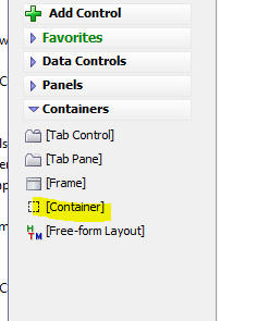
Then select the CSSGrid container type.
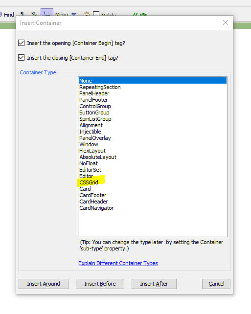
This will add a CSSGrid container to your UX component.
Next, you can configure the CSSGrid container to set properties such as the number of columns and rows and also the gap between each column and row. To open the genie to configure the CSSGrid container, click the smart field for the CSS Grid Container Layout property.
This will open the genie as shown below:
The genie will allow you to set the dimensions of the grid (see the Rows, Columns, Column gap and Row gap prompts at the top of the genie)
The genie also shows all of the controls contained inside the CSSGrid container and it allows you to place these controls on the grid.
NOTE If a control is not explicitly placed on the grid it will still be shown in its default location when the UX is rendered.
To place a control on the grid, click on an empty cell and select the control you want to place. When you click on an empty cell in the grid you will get a popup menu showing the available controls inside the container. Select a control and it will be placed on the grid.
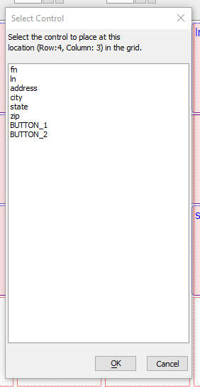
Once a control has been placed on the Grid you can set the control's properties. Select the control whose properties you want to set in the pick list in the top left hand corner. The control will be highlighted on the grid and its properties will be shown in the genie.
You can set the following properties
When you open the CSS genie initially none of the controls contained in the container will have been placed on the grid.
You can click the Additional options button to get a list of menu choices.
One of the available choices (Auto populate the controls onto the grid) will automatically place all of the control on the grid. Each control will be assigned a starting column and row of auto and row and column spans of 1, so the grid will just fill with the controls from left to right, top to bottom.
Other choices in the Additional options menu allow you to add a new row or column at the start of grid (which you click the + button next to the Columns property, the new column is added at the end of grid. When you add a new column at the start of the grid, the existing controls are all shifted to the right by one column).
You can also clear all controls from the grid, or clear just the selected control.
UX Component CSS Grid Container - Custom Row and Column Sizes - By default when you define a CSSGrid container, the width of all columns is set to 1fr and the height of all rows is set to auto. This means that all columns have the same width and that their relative widths remain unchanged as the size of the Grid itself changes. All rows automatically have sufficient height to display their contents.
However, you might want to set explicit sizes for the columns and rows in your Grid.
To do so check the Has custom column sizes or Has custom row sizes checkbox, then click the button to define the custom sizes.
This will bring up a dialog where you define the custom sizes.
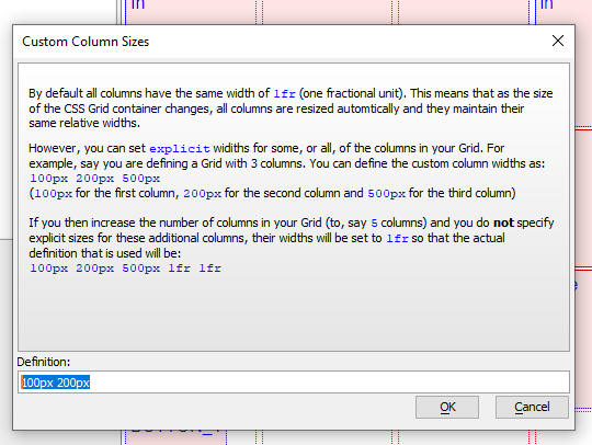
UX Component - Enter Code Control - A new control type is available in the UX Component. The EnterCode control can be used when you are prompting the user to enter a code with a fixed number of characters. The control displays a box for each digit. Once the user has entered values into each of the boxes a user defined Javascript function can be called. Typically this function will make an Ajax callback to the server where the code that the user entered will be validated.
Watch Video
Download component
If the user has entered an incorrect code, the server will send back a Javascript response to 'shake' the control to indicate to the user that the code is not valid. This shake behavior is shown below in the animated gif image.
To add an EnterCode control to your UX, select the [More...] button from the Toolbox.
Then select the EnterCode control.
Once you have added the control to your UX you can can configure it. Click the smart field to edit its properties.

The properties you can set include
If the user enters an invalid code you can shake the control to alert the user that the code is invalid as shown in the image below.
To shake the control, you call its .shake() method.
For example
//get a pointer to your EnterCode control.
var obj = {dialog.object}.getControl('Your_EnterCode_control_name')
obj.shake()
SharePoint 365 - Storage - You can now define storage connection strings to upload and download files to SharePoint 365 (the hosted version of SharePoint)
When you create a new Storage Connection String a new genie will walk you through the steps.
To invoke the genie, click the SharePoint Storage Connection String Genie hyperlink when you define a new Storage Connection String.
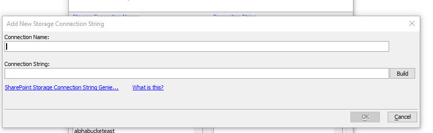
This will open the genie. On page 1 of the genie you specify the URL of your SharePoint site.
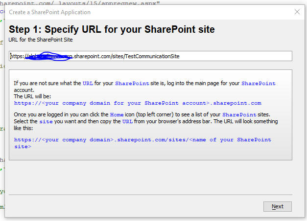
On page 2 of the genie you can define a new SharePoint Application.
When you get to page two you will see that your tenant id has been filled in automatically based on the site URL you specified on the previous page. If the tenant id is not filled in then it is likely that you did not enter a valid site URL on the previous page.
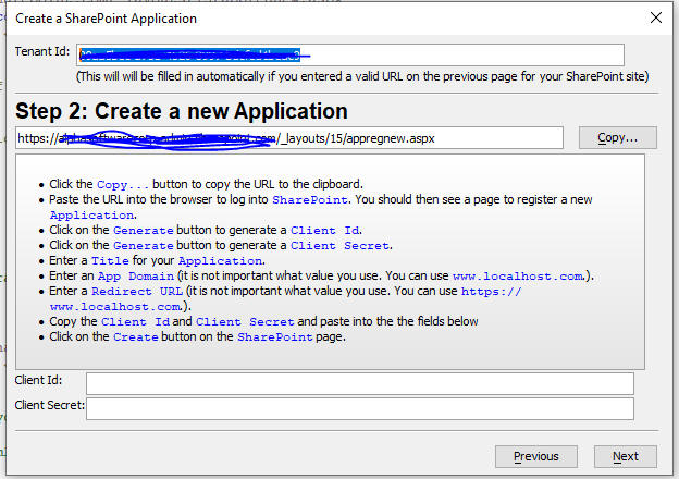
Once you have completed the instructions on this page you will have obtained a Client Id and Client Secret and you can advance to the next page.
On this page you will register your new Application. Once you have completed the instructions on this page you will have registered your new SharePoint application, given it the necessary permissions and told SharePoint to trust the application.
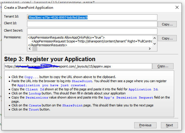
You can now advance to the next page where your Sharepoint storage connection string will be shown. You can save the connection string as a named connection string and you can use it with all of the a5storage* helper functions.
You can also build Grid and UX applications that upload files to upload files to your Sharepoint 365 account if you use the AmazonS3Indirect option when defining the image or file upload actions in Action Javascript.
UX and Grid Components - Server-side Code - Python - All server-side code in an UX and Grid is typically handled using Xbasic code.
Some developers are already quite comfortable with Python and might want to write their server-side code using Python.
Watch Video - Part 1
Watch Video - Part 2
Examples of places where server-side code is invoked include: Xbasic functions that handle Ajax callbacks, The UX Component's onDialogInitialize and onDialogExecute events, the Grid component's onGridInitialize, onGridExecute events and so on (there are many more places in a UX and a Grid were server-side code is executed).
Using Python to write server-side code is now easily done. Furthermore your Python code can access session variables and any other variables that are available to your Xbasic code.
In all cases, the pattern is the same. You start with stub Xbasic code. This Xbasic code calls a function that is written in Python to invoke the Python code. The Python code returns a value to the Xbasic stub code and the Xbasic stub code then returns a value (if necessary).
The Python code you execute is a Python function which must be defined in a Python module that is stored in a folder called Python in your Web Project. A Python module is simply a text file (with a .py extension) in which one or more Python functions are defined.
TIP: To add a Python folder to your Web Project you can click the More... button on the Web Project Control Panel and then select the Python, Create a 'Python' folder in the Web Project command.
Assume you have a button on a UX or Grid and the button's action is to make an Ajax callback. Assume also that you have specified that the name of the Xbasic function that handles the call back is myXbasicFunction. Here is how you might define the Xbasic function (this code will cause the browser to display a message showing the time on the server):
function myXbasicFunction as c (e as p)
dim js as c
dim msg as c = "The time on the server is now: " + now()
js = "alert('" + js_escape(msg) + "');"
'specify the data to be returned by the function
myXbasicFunction = js
end function
Now assume you had defined a Python function in a Python module and you want to call this Python function from your Xbasic function.
Assume the following:
Here is how you would modify the myXbasicFunction function to call your Python code.:
function myXbasicFunction as c (e as p)
'force a reload of the Python modules so that any changes you have
'made to the Python code are picked up
'(Once your app move to production you can remove this line)
helper::Python::ReloadModule("mypython")
dim returnValue as c
'call the myfunc function in the mypython module.
'when you call the Python function you pass in e, session and request
'the code in your Python function can therfore see all session variables,
'and can set session variables. all of the data in the e object is visible to
'your Python code
returnValue =
helper::Python::Call("mypython","myfunc",e,session,request)
'the Xbasic function returns the value that the Python function returned.
myXbasicFunction = returnValue
end function
Here is how you would define the myfunc function in the mypython module (i.e. the mypython.py file stored in the Python folder in your Web Project):
def myfunc(e,session,request):
#Your code can see all of the properties in the e object
#Your code can see and can set session variables
#Your code can see the request object
#Create a variable with the value you want to return to the Xbasic
stub code
fn = "alert('hello from Python');"
#return the value
return fn
Advantages of writing server-side code in Python
Disadvantages of writing server-side code in Python
Executing SQL Statements in your Python Code
One of the significant benefits of writing your server-side code in Xbasic is AlphaDAO which makes it extremely easy to connect to a wide multitude of SQL databases and perform CRUD operations using portable SQL. When you call Python code from within Alpha Anywhere you can get access to the AlphaDAO classes, which means that working with SQL databases in Python is just as easy as it is in Xbasic!
You can certainly import specialized libraries into your Python functions in order to execute SQL commands, but you might find it easier to use the AlphaDAO objects that are built into Alpha Anywhere.
Below is some sample Python code that executes a SQL Select statement on the sample Northwind database.
#import the AApySQL library so that your Python code can access AlphaDAO object
import AApySQL
#create a connection object
cn = AApySQL.Connection()
#your Python code has access to your database connection strings
connectionString = "::Name::AADemo-Northwind"
#open a connection to the Database. The method name (.Open() is
case-sensitive!)
flag = cn.Open(connectionString)
sql = "Select * from Customers"
#execute a SQL command
flag = cn.Execute(sql)
if flag:
#get the data in JSON format
json = cn.ResultSet.ToJSON()
Accessing Alpha Anywhere Classes and Functions in your Python Code
Alpha Anywhere exposes a large number of useful classes to your Xbasic code. These classes can all be used in your Python code.
In the example below the Python function uses the css::styledef class to generate a CSS style.
Notice that the import AAPY statement is needed to import the Alpha Anywhere library and the AApy.xbasic() method is called to create a Python object from the Xbasic css::styledef class.
#import AAPy to that your Python code can reference Alpha Anywhere classes and
import AAPy
ss = AApy.xbasic("new css::styledef()")
ss.background_color = "green"
string = ss.toString()
Accessing Xbasic Functions in your Python Code
Your Python code can execute any of the many functions available in Xbasic. In the example below the Python function executes the Xbasic api_uuidcreate() function to generate a GUID.
#import AAPy to that your Python code can reference Xbasic functions
import AAPy
guid = AApy.xbasic("api_uuidcreate()")
Debugging your Python Code
There is no integrated debugger available to debug into your Pyhon code (unlike Xbasic which has a very easy to use debugger). So the only way to debug your Python code is by writing variable values to a file. Here is sample Python code that you can use to write to a file:
f = open("c:/debug/pythondebug.txt", "w")
f.write("write some text")
f.close()
UX Component - Javascript Charting - Alpha Anywhere SVG Charts - Two new samples have been added. These new samples are notable because they allow you to modify certain aspects of the chart's appearance by setting properties in the charts data object, rather than having to modify the settings object passed into the chart generate function.
UX Component - List Controls - Click Events - All of the click events (click, rightclick and dblclick) now have these arguments: index, value and element in the arguments array available in your Javascript event handler (previously only index and value were available). element is the element in the row that was clicked on. If a row has not been clicked on then the index and value will both be false.
UX Component - Custom Controls - Property Grid - When you create a Custom Control you can define a Property Grid to prompt for property values to be used in your control. The syntax for defining the property grid has been enhanced to allow you to specify show/hide expressions and categories.

UX Component - Custom Controls - The UX Component allows you to create your own Custom Controls. Now you can easily share the Custom Controls you create with other users.
A new menu item on the More... button in the Web Project Control Panel allows you to select the Export/Import Custom UX Controls menu item.
When you select this menu item, this dialog is displayed.
Action Javascript - Ajax Callback - Server is available test - Timeout - When you use Action Javascript to define an Ajax Callback, the default code automatically does a server is available test. The timeout for this test has been increased from 500ms to 4000ms to account for the fact that in some locations, the DNS lookup can be relatively slow.
UX Component - List with Detail View - SaveListEdits() method - Server is available Timeout - The .saveListEdits() method, which is used to synchronize edits in the List, performs a server is available test before sending data to the server. The timeout for this test has been increased to 4,000 ms (from 500ms).
Web Security - Quick Setup Genie - System Tables and Default Extended User Information Table - The genie has been enhanced to make it easier to set up the Extended User Information table and to automatically create selected system tables. Previously you had to go the Project Properties dialog to set up system tables.
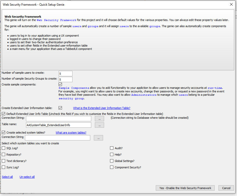
Xbasic - Active Directory - The Xbasic method for working with Active Directory have now been documented. See here.
Xbasic - a5Storage_saveFile() and a5Storage_saveData() Functions - Overwrite Existing Object - Both of these functions now take an additional parameter that allows you to control whether existing objects should be overwritten by the new object that is saved, or if the new object should be given a unique name.
By default, when you create a new object, any existing object is overwritten. If you set the flagOverwriteExistingObject parameter to .f. then existing objects are not overwritten and the new object is automatically assigned a unique name.
If you pass in the optional pResult parameter, the actual object name that was used to save the new object is available in the pResult.actualItemName parameter
The function prototype for these function is now:
function a5Storage_saveFile as l (connectionString as c , filename as c
, itemName as c, mimeType = "", pResult = null_value(), pDataIn =
null_value(), flagSetReadPermission = .f., flagOverwriteExistingObject =
.t.)
function a5Storage_saveData as l (connectionString as c , blob as b ,
itemName as c, mimeType = "", pResult = null_value(),
flagSetReadPermission = .f., flagOverwriteExistingObject = .t.)
Xbasic - a5_sql_nested_query_to_json_document() Function - Optimized for SQL Server R2016 - The a5_sql_nested_query_to_json_document() function has been optimized for SQL Server Release 2016 and above. These versions of SQL Server support a special syntax to generate hierarchical JSON data and the a5_sql_nested_query_to_json_document() function will automatically generate and use the SQL Server syntax if possible. This can be up to 10 times faster than using the non-optimized approach.
The configuration object passed into the a5_sql_nested_query_to_json_document() function now has two additional properties:
ops.flagUseOptimizedQueryIfPossible - can be .t. or .f. (applies only to SQL Server R2016 and above. default to .t.)
ops.convertNumbersToStrings - - can be .t. or .f. (applies only to SQL Server R2016 and above. defaults to .t. - converts numbers to strings and dateTime values from date strings in the same format as used when flagUseOptimizedQueryIfPossible is .f.)
The non-optimized version of a5_sql_nested_query_to_json_document() returns JSON in which all properties are strings. The ops.convertNumbersToStrings property can be set so that the optimized and non-optimized version of the function return the same data.
After the function has run you can examine the ops.optimizedSQL property to see the optimized SQL that was generated for SQL Server.
Xbasic - Json_get_array_length() Function - Returns the length of a JSON array.
This function is just a wrapper on the extension::json object's .getLength() method (and as a result, it is extremely fast) and should be used instead of using the json_parse() function to parse the JSON to an Xbasic array and then getting the array length using the array's .size() method.
UX Components - Fix Duplicate GUIDS - Each component has a unique GUID. This GUID is assigned when a new component is created. The GUID is used to keep track of the component's backups. A new menu option (select Edit, Bulk operations when the Web Control Panel has focus) allows you to find components with duplicate GUIDS.
NOTE One way in which duplicate GUIDS can occur is if you use Windows Explorer to duplicate an existing component.
UX Component - Drag&Drop File Upload and File Upload and Amazon S3 Storage Action in Action Javascript - AmazonS3Indirect - Image Thumbnails - Enhancements have been made to both the File Upload - Amazon S3 Storage Action in Action Javascript and to the Drag & Drop File Upload Action.
Both of these features now support AmazonS3Indirect as the Upload target. When you select AmazonS3Indirect as the Upload target the file is first uploaded to the Alpha Anywhere server and then to the S3 (or Wasabi, or Sharepoint) bucket. This means that you will not need to configure the CORS policy on the target bucket.
Since the file is first uploaded to the Alpha Anywhere server before it is uploaded to storage, you can specify that you want to scale the image and also create image thumbnails (for each image file that is uploaded). A file is considered to be an image if its extension matches one of the extensions specified in the Image file extensions property.
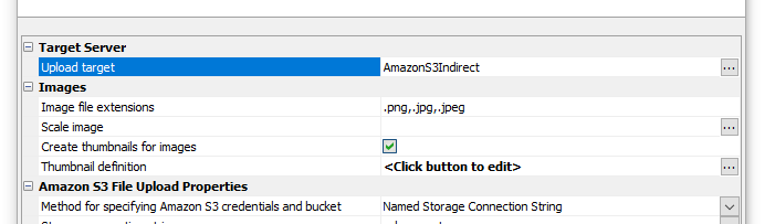
UX Component - Panel Navigator - Panel Card - Embedded Component - Pre-render - You can now specify that Embedded Components in a Panel Card should be pre-rendered by making an automatic Ajax callback when the component is loaded. This means that when the user navigates to the Panel Card that contains the embedded component there is no delay while the component is run.

UX Component - Action Javascript Map Actions - Plot route action - onGotRoute Event - A new event has been added to the Plot route action. The onGotRoute event fires once the route information is available.
NOTICE: This event only applies if the route type is set to MultipleAddresses.

Your code in the event handler can reference the routeData variable. This variable is an object containing information about the route as computed by Google Maps.
Typical use cases for this event include populating a List control showing the computed route data.
List - Detail View - Synchronize Current Row - Media fields - If a List had media fields (images, or audio files) and the synchronize method was called, specifying that just the current row should be synced, all dirty rows would be synced.
IIS Server - Fixed an occasional crash on shutdown.
Xbasic - EmailSendCDO() Function - Attachments - This function allows you to specify multiple comma delimited filenames to send as attachments. If any of the files contains a comma in the filename you can now encode the comma in the filename using {comma}
UX Component - List Control - Client-side Search - Numeric Fields - Fixed an issue when searching in numeric fields.
UX Componenent - List Control - Import Excel - Fixed an issue when importing international characters from an Excel file into a List based on a SQL table.
Action Scripting - Send Email -- Application Server for IIS and Alpha Cloud - Fixed the Send Email action when running using the IIS server or Alpha Cloud.
Grid Component - Customize Icons - Fixed a regression when you customize icons in a Grid
Grid Component - Customize Icons - SVG Icons - When you tried to set the icon to a SVG icon, the icon picker did not display any icons.
IMPORTANT For certain icons, (e.g. RowExpander - expand and collapse), you must choose the same icon type for both icons. For example, if you select a CSS icon for the row expand, you must also select a CSS icon for the row collapse.
UX Component - Slider Control - onChange Event - Fixed a regression that caused the onChange event to not fire.
Layout Table Reports - Property Grid - Certain properties that do not support dynamic features were listed in the Property Grid, suggesting that you could define a dynamic value for the property. The Property Grid no longer allows you to define dynamic property values for these properties. For example, "height" and "growable" cannot be changed at run-time.
Action Javascript - Send Email Action - Fixed a regression when the 'Internal' option was specified.
UX Component - List Control - Write Conflicts - Multi-tenant driver - Write conflicts were not detected when the List was using a multi-tenant driver.
Action Javascript - Open UX Action - Method - Fixed a regression when the method was set to Pre-computed
UX Component - List Control - In-place Editing - Edit-combo - Page Scrolling - If the page needed to be scrolled to bring the List into view, the drop-down list for the edit-combo was not correctly positioned.
UX Component - View Box - SQL Data Source - Server-side AfterQueryEvent - This event was not firing.
UX Component - Labels - onChange Event - Was not firing when value in a label control was changed.
AlphaDAO Connection Strings - Passwords - Semi-colons - Was not properly escaping semi-colons in the password.
Web Applications - Security Framework - DBF Tables - If users and groups were stored in .dbf tables, then at publish time Alpha Anywhere would incorrectly display a warning that there were no defined users and groups for the project.
UX Component - List Control - In-place Editing - Fixed a regression if you turned on in-place editing for a List and you did not define any settings the for in-place settings (In-place editing settings property), you would get an error when running the component.
UX and Grid Components - Text Dictionary Tags - If a text dictionary tag was not found in the text dictionary table, it resolved as a blank value. Now it resolves to the key value.
UX and Grid Builder and Layout Table Report Builder - Property Grid - Fixed a regression in the Property Grid.
| SQL Database Explorer | SQL Database Explorer |
The SQL Database Explorer allows you to perform CRUD operations
against any table in any SQL database for which you have a
connection string. This video gives a quick overview of the tool. Watch video Date added: 08/11/2021 |
| UX Component - List Control | In-row charts |
In this video we show how you can display charts in a List. Each
row in the List can have a line, bar, pie or gauge chart and the
data shown in the chart can come from other data in the List
row. Watch video Download component Date added: 10/3/2021 |
UX Component - List Control - Calendar Layout - (This feature is still under development and requires a Feature Key in order to enable it. We are making an early version of the feature available so we can get feedback from the community). To request a feature key, go to Help, send an email to enhancementrequests@alphasoftware.com with "List Calendar Feature Key" in the subject.
The Calendar layout is a view of the data in a List See video:
https://www.screencast.com/t/dvLrLJNmhG1
GitHub - As a result of a recent change in GitHub you can no longer pull and push to your GitHup repositories using a userid and password. You will need to log into GitHub and generate a token. Then in your Web Project click on the GitHub menu, and set the password for your account to the token that you generated at the GitHub site.
Cordova Applications - IIS and Alpha Cloud - Session Variables and Session Files - Cookie Same Site Policy - In order for session variables (and also session files) to work correctly in Cordova applications that use IIS (or Alpha Cloud) as the backend server, the Cookie Same value property should be set to Unset. Previously, it was documented that this property should be set to None. The property value is set in Project Properties.

Cordova Builder - Android Build - Minimum, Maximum and Target SDK Versions
Android API Levels 30 (Android 11) and 31 (Android 12) may now be selected for the minimum, maximum and target SDK version values.
The default value for the Android Target SDK Version has been changed to API Level 30 which is now required to submit any new Android Apps to the Google Play Store.
Cordova Builder - Android Build - Google Play Store Submission
If you are planning to submit a new app to the Google Play Store, you must now submit an app bundle instead of a signed APK. This requirement became effective in September 2021.
This is accomplished by opening the Android Cordova Project in Android Studio and selecting Build | Build Bundle(s)/APK(s) | Build Bundle(s) from the Android Studio top menu bar.

UX Component - Indexed DB - You can now store data in the browser's IndexedDB database. IndexedDB is available in most modern browsers and can be used as an alternative to localStorage. The advantage of IndexedDB over localStorage is that you can store substantially more data in IndexedDB than you can in localStorage. Also, unlike localStorage, the browser will not occasionally flush the data from IndexedDB.
IndexedDB operations are asynchronous. localStorage operations are synchronous. Therefore it is not possible to simply replace calls to localStorage with calls to the IndexedDB functions.
The following new functions have been added for working with IndexedDB:
Web Applications - Common Folder - You can now define assets that are common to all web projects in a workspace. When you publish a project, all of the project files are published as well as all of the files in the common folder.
To open the common folder in windows Explorer, click the More... button and select the Open common folder menu command.
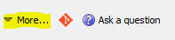
UX Component - List Control - In-place Editing -Styling the Edit Controls - You can now specify in-line style for certain of the in-place editing control types. For example, your list may have data from a numeric column. The List will automatically set the style for this column to text-align: right so that the data in the column are shown right-aligned. When you edit the data in this column using in-place editing, you might want the data in the edit box to also be right-aligned. You can now set the style for the edit control as shown in the image below.
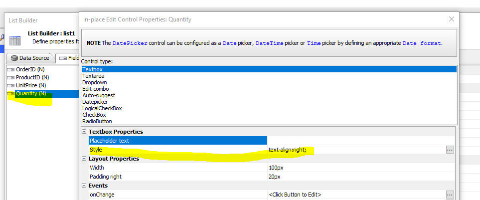
UX Component - List Control - Detail View - Image Upload - When you use a List with a Detail View you can now upload images to S3 in desktop applications. Previously uploading images to S3 from a List with a Detail View was only possible for Cordova mobile applications.
If you want to upload images to S3 from a List with a Detail View you must use the Image Upload action in Action Javascript (and not the Image Capture for List Detail View action).
Using the Image Upload action you have the option of setting the upload target to:
UX Component - List Control - In-row Charts - You can now create
Lists which display charts in each List row. The available chart types
are: line, bar, gauge and pie.
The data in the chart comes from the data in the List row.
Watch video
Download component
In the image below, each row is displaying a Gauge, Line and Pie chart. Notice that in the first List row, the gauge is red because the value is below a threshold value and in the second row it is green because the value is above the threshold value.
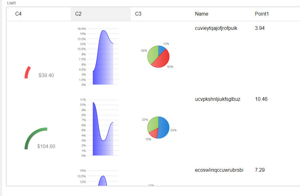
To add a chart to a List definition, go the Fields tab in the List builder and then click the Add Item button.
From the list of available item types, select Chart.
Then click the smart field for the Chart properties to configure the chart.

The properties shown in the builder vary based on the type of chart you select. For example, in the image below, the builder for the Gauge chart is shown:
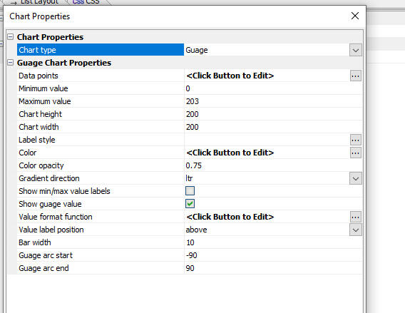
Regardless of the chart type you select, the builder will have a property called Data points where you define the Javascript that returns the data to display in the chart. Typically you will return data from the current List row.
For example, in the image below the Javascript for the Data points property is shown for the Pie chart.
The pie has three slices and so the Javascript returns an array of 3 data points. In this case the data points are the point1, point2 and point3 fields in the current List row.

Once you have configured the chart you can add the chart to the Layout just like you add any other control to a List Layout. For example, in the image below, the first three columns in the List layout display different charts.

TransForm API Explorer - CreateNewFormInstance Endpoint - You can now click the Select button to select a form Id and you can then click the Sample form data hyperlink to automatically generate a sample form instance to match the form definition.
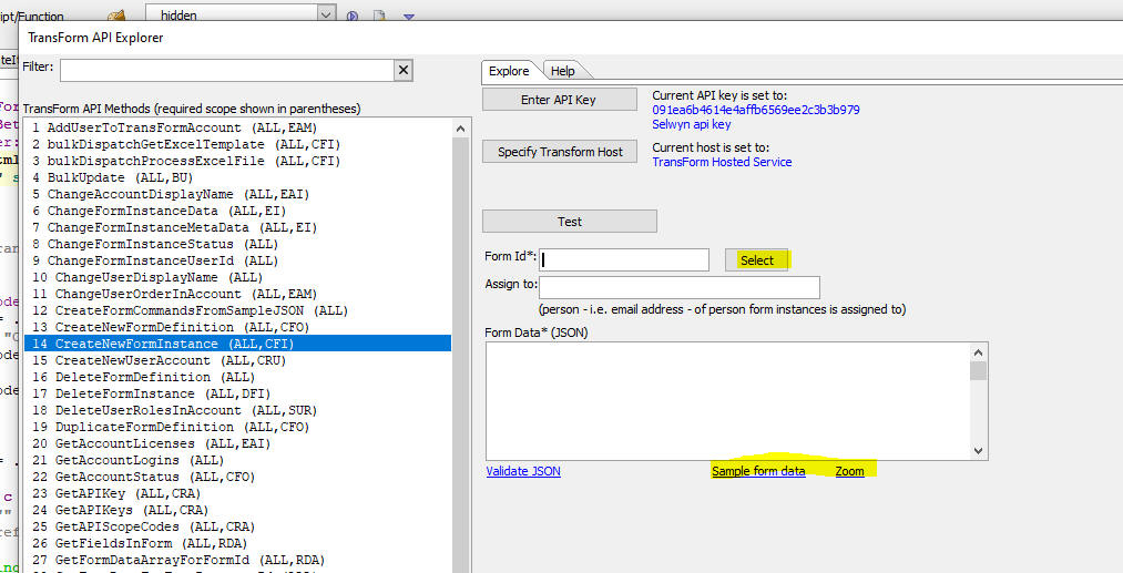
UX and Grid Component - Advanced Search Control - Combolist and Suggest Controls - Filter - You can now specify a filter for the data that are shown in the picklists.
Alpha Cloud - Publish - Publish Currently Selected File - When publishing to Alpha Cloud you can now publish just the currently selected file in the Web Control Panel. In order to access this option you must also check the Only publish changed files options on the Alpha Cloud Publish dialog.
UX Component - List Control - In-place Editing - Edit-combo and Dropdown - Blank Values - You can now set a property to control whether blank values should be automatically added to the choices for an edit-combo or dropdown control.
Web Control Panel - A5W Pages Category - Comments and Description Columns - You can now define text in an .a5w page that will show in the Comments and Descriptions columns in the Web Control Panel.
To add a comment or description to a .a5w page you must add the following HTML markup to the page. (If you are using the HTML editor in Alpha Anywhere this must be done from the Source tab.).
<!-- comment -- this is the comment -->
<!-- description -- this is the description -->
AlphaDAO - Excel Connection String Builder - The dialog to build Excel Connection strings has been enhanced. The following file types are now shown in the file selector:
Excel Workbook (*.xlsx)
Excel Macro-Enabled Workbook (*.xlsm)
Excel Binary Workbook (*.xlsb)
Excel 97-2003 Workbook (*.xls)
Excel Template (*.xltx)
Excel Macro-Enabled Template (*.xltm)
Excel 97-2003 Template (*.xlt)
All Excel Files (*.xl*)
All Files (*.*)
UX Component - Login Feature - Persistent Login - onLogin Server Side event - If you use a UX component as a Login component, and you turn on the Persistent Login feature, then once the user's login has expired, if the user runs the component and then makes an Ajax callback the user is automatically logged in again. Now, when this happens the onLogin server side event will also fire. Previously, the onLogin server side event did not fire.
List Control - Incremental Refresh using Timestamp - List with Pre-fetched Child Records - The incremental List refresh feature allows you to refresh the data in the List without having to fetch all of the data in the List from scratch. The incremental refresh feature allows for an optimization where you can specify that the table that the List is based on has a timestamp field, which allows for a very efficient SQL query to get the records that that must be refreshed. Previously the incremental refresh using timestamp option was only available if the List being refreshed did not have any child Lists with pre-fetched data. Now, this restriction has been removed.
Xbasic - JSON_CombineProperties() function - Combines the properties in two JSON strings into a single JSON string.
Syntax
c jsonOut = json_combineProperties(c json1, c json2)
Where
Example:
dim json1 as c
json1 = <<%str%
{"first name":"fred"}
%str%
dim json2 as c
json2 = <<%str%
{"last name": "smith","array%":["a","b"]}
%str%
?json_combineProperties(json1,json2)
= {"first name":"fred","last name": "smith","array%":["a","b"]}
UX Component - ViewBox - Accordion - You can now use the Accordion control in a ViewBox.
Grid and UX Component - File Upload - AmazonS3Indirect - When you define a File Upload action using Action Javascript you can now upload to Amazon S3 (or Wasabi) using the new AmazonS3Indirect option. This option first uploads the file to the Alpha server and then uploads the file to your storage container. You will therefore not have to configure the CORS properties of you storage bucket as you would if using the AmazonS3 option, which uploads the file directly from the browser to Amazon without involving the Alpha server.
Grid and UX Component - Image Upload - S3 - Scale Image and Thumbnail - AmazonS3Indirect - When you upload an image from a Grid or a UX component, you have the option of storing the image in a folder on the server or in an Amazon S3 (or Wasabi) bucket.
If the upload target is the Alpha Anywhere server, you have the option of scaling the image, or creating thumbnails.
However, if the upload target is Amazon S3 (or Wasabi), you cannot scale the image or create thumbnails because the upload takes place directly between the browser and Amazon (or Wasabi). The Alpha Anywhere server is not involved - making the upload very efficient because no load is placed on the Alpha server.
Now, a new option is available for the Upload target setting in the Action Javascript builder. If you want the ultimate target for your uploaded file to be Amazon S3 (or Wasabi), but you would still like to scale the image or create thumbnails, you can now select AmazonS3Indirect as the Upload target. This will first upload the file to the Alpha server (where scaling can be performed) and thumbnails can be created, and then the scaled file (and any thumbnails) are uploaded to storage.
NOTE: Previously, if you had selected AmazonS3 as the Upload target you would have had to create an AWS Lambda function to create the thumbnail after the image had been uploaded to your S3 bucket.
NOTE: The AmazonS3Indirect method is not supported for components that are based on .dbf tables.
NOTE: For applications that must run on Alpha Cloud you should always select the AmazonS3 or AmazonSeIndirect method because the are always a minimum of two servers in the server group that handles your application and if you have uploaded images to (say) server 1 and the next request is handled by (say) server 2, the uploaded images will not be found.
When you select AmazonS3Indirect as the Upload target you can specify an Xbasic function to run to return the name of the object where the uploaded file will be stored (See the S3 folder function property in the image below).
For example, say that you select an image called "image1.jpg" to upload, and you would like the uploaded file to be stored in a folder called "gridimages" in your storage bucket, you could define a S3 folder function to return this value:
"gridimages/" + e.name
So, when the file is saved in your storage bucket, the object name will be:
gridimages/image1.jpg

Similarly, when you create thumbnails you can specify the object name for the thumbnail file(s) when the thumbnail(s) are uploaded to your storage bucket.
For example, the Define Thumbnails dialog is shown below for the case where the Upload target has been set to AmazonS3Indirect. Note that dialog has these prompts:

UX Component - ViewBox Control - Tab Control - You can now use a Tab Control in a ViewBox. The Tab Control supports sub-themes.
The image below show a ViewBox layout that uses a Tab Control. Notices that the flared sub-theme has been selected.
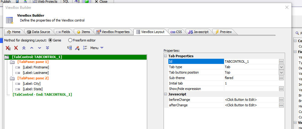
This image shows how the ViewBox is rendered.
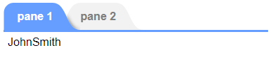
Web Applications - IIS - Automatic Redirect From HTTP:// to HTTPS:// - To enable this feature, go to Project Properties and edit the HTTP to HTTPS property.
For more information see the documentation.
UX Component - FormView Control - Subthemes - You can now set the subtheme for Label, Button, Switch and Tab Controls.
SQL Data Editor - The SQL Data Editor is utility for use in the Alpha Anywhere Developer Version to perform CRUD operations (create, read, update and delete) against any table in any SQL database for which a connection string has been defined.
To open the tool, select the SQL Data Editor... menu item from the Tools menu when the Web Control Panel has focus.
The following dialog will appear:

Start by selecting the connection string to the database you want to explore and then the table in the selected database.
You can filter the records shown by entering a search string the Filter Value field. You can also indicate the data type of the search string. For example, you might enter 1/1/2021 in the Filter Value field and then select Date in the Data type of search value field. When you click the Execute query button a search is performed in all of the fields of the same data type of the selected Data type of search value. So, for example, if you set the Data type of search value field to Date, then when you execute the query, all of the Date fields in the table will be searched for a match. In the case where Data type of search value is set to Character, the search is for all records that contain the search value. Otherwise the search is for all records that match the search value.
The results of the query are displayed in a paginated list. You can click the First, Prev, Next or Last buttons to navigate through the result by page. You can set the page size.
You can click the Select columns... button to select which columns from the table are shown.
To edit the data in a record, double click on a row in the list.
This will display a dialog where you can edit the record values.
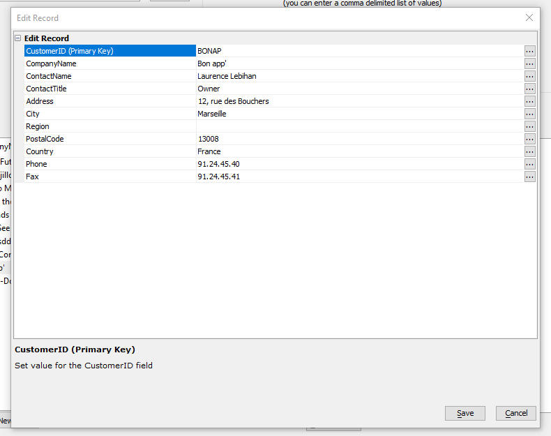
You can delete individual records, or all of the records in the current query.
You can also add new records.
You can export data from the SQL Data Editor to Excel.
You can open the SQL Data Editor from the right click menu in the Database Explorer.

Web Applications - Security Framework - Active Directory - Active Directory Groups can now be mapped to application defined groups.
Using Active Directory for authentication and authorization in an Alpha
Anywhere web application makes it easy for an Alpha Anywhere application
to be integrated into an enterprise's portfolio of applications.
However, there may be times when an application will need to be
published in more than one Active Directory domain where group names are
not the same. This would require a big change to the application for
updating the security settings for the new group names of the new Active
Directory domain. Additionally this becomes a maintenance problem as
features are added to an application and the updated application needs
to be republished.
Now application defined group names can be mapped to Active Directory
group names in a publish profile so that if an application is published
to a different Active Directory domain only the mapping for the publish
profile needs to be set and the rest of the application remains
unchanged.
Groups names are created, assigned to users, pages, and other
application files as if Active Directory is not being used. The mapping
is then defined in the Active Directory Configuration in the publish
profile.
See the Active
Directory Integration documentation for more details.
UX Component - List Builder - Multiple Columnar Layouts - Copy Layout - When you are designing a List with multiple columnar layouts, you can now copy the layout from another of the existing layouts.
Xbasic - String Interpolation - *s() Function - A new function has been added to Xbasic to support string interpolation. String interpolation allows you to replace placeholders in a string with values. The placeholders are enclosed in curly brackets.
Example
Dim name as c = "Fred"
Dim city as c = "Boston"
dim string as c = "Hello {name} from {city}"
?*s(string)
= "Hello Fred from Boston
Import Excel into SQL Database - You can now import data in an Excel file into a SQL database. To open the genie, select the Import Excel file into SQL Table(s)... menu command on the Tools menu when the Web Projects Control Panel has focus.
When you select this command the genie is displayed.
Xbasic - A5Helper_findRecordInSQLTable() - Find records in a SQL table where the search value is found in any of the fields in the table (i.e. a keyword search). If the search value is of type character, all of the character fields in the table are searched. If the search value is of type T (dateTime value), all of the dateTime fields in the table are searched, and so on. For character values, the search is for records where the search value is contained in the search field. For other data types, the search is for records where the search field equals the search value.
Syntax:
p Result = a5Helper_findRecordInSQLTable (c connectionstring ,c tablename ,A findwhatValue as a [,c fieldlist [, L treatcommaasor [ , C pagesizeC [, c pageNumberC [, n maxrows [ c currentPageNumberC [,c Order ]]]]]]])
Where
UX Component - Free-form Layout - By default all of the controls inside a free-form layout are wrapped in a DIV with an in-line style of display:inline-block. If you un-check the Wrap child controls in a DIV property, the child controls will not be wrapped in a DIV.
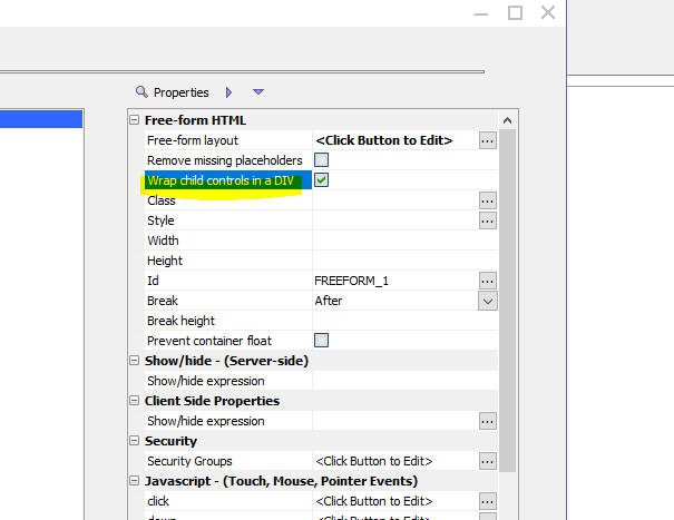
Classic Server - Raw HTTP Log - Gzip - If you have turned on logging for the application server as shown in the dialog below, and if Gzip is enabled, which it is by default, then the contents of the log will be unreadable, as shown in the second image. A new message is now displayed in the log suggesting that gzip be temporarily turned off. This is done on the Performance tab.
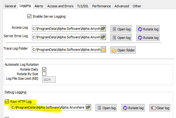
Image showing contents of the log file with Gzip enabled.
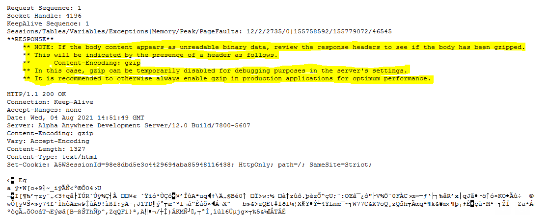
SQL Trace - When you define a connection string, you can specify that all SQL commands should be logged. Enhancements have been made to the logging feature to allow you to control the amount of detail that gets logged and to return the data in JSON format (making it easier to analyze).
To support these new options, two new commands can be added to the
connection string: A5TraceSQLLevel and A5TraceSQLFormat (can
be JSON or Text).
The following drivers are affected by this change(not all are currently
in use): Access, ADONET, DB2, DBF, EnterpriceDB, Excel, FoundationDB,
MariaDB, MySQL, MySQLV4, ODBC, Oracle,Oracle Lite, Paradox, PostgreSQL
PostgresPlus, Quickbooks, Quickbooks Online, SQLAnywhere, SQL Server,
SQLite
Options for A5TraceSQLLevel
UX Component - List Control - Drag scrolling - By default, when a UX is running on a mobile device the List is scrolled by dragging on the List. When running on a device that supports a mouse (e.g. a desktop browser), the List is scrolled by dragging on the vertical scrollbar. There may be cases where you want to force drag scrolling when running on a device that supports a mouse (i.e. a desktop browser). A possible reason you might want to force drag scrolling on a desktop browser is that you want to implement the 'pull to refresh' pattern to refresh the data in the List.
You can now force the List to use drag scrolling even when mouse support is detected. Set the Use drag scrolling property to Always.
UX Component - Tabs - Flared Style - A new tab style is available for the Alpha theme and all themes inherited from Alpha (for example Alpha-Dark-Green). The 'flared' style (shown in images below) can be used for a Panel Navigator that is set to navigate using a TabBand, or for a Tab Control.
The image below shows a Panel Navigator that uses a Tab Band. (the Navigator type property is set to TabBand).

To select the flared style for the Tab band, the Tab band sub-theme property is set to flared.
The image below shows the Tab Control using the flared style.
NOTE The flared style is only supported when the tab position is top.
To select the flared style for the Tab Control, set the sub-theme property to flared.
UX Component - List Control - Checkbox Column - Paginated - If you have added a checkbox selector column to your List and the List is paginated, if you check certain rows on (say) page 1, navigate to (say) page 2, then return to page 1, the previously selected rows of page 1 will be selected.
UX Component - Data Bound - Client-side Events - afterPopulateNewRecord - A new client-side event for data bound UX components has been defined. The afterPopulateNewRecord event fires after the Ajax callback completes when a new record is created.

UX Component - Integrated Login - Enter Key - If you are using a UX with the integrated login feature enabled, you can now press the Enter key as a shortcut for clicking the Login button.
Global Settings Table - You can now create a Global Settings table in a SQL database that allows you to define settings that can be accessed in any server side code.
Each global setting has a setting name and a setting value. The setting value is a string.
Once you have defined your Global Settings table you can use the following Xbasic helper functions.
To define the Global Settings table for a project, open the Project Properties dialog.

SQL Logging - You can now log all SQL CRUD statements executed by a List with a Detail View, a Grid, or a data bound UX component to a table. The SQL Log table contains the sql that got executed, the arguments that were defined, the result of the command, the error message if the SQL failed, the date and time of the command, and how long it took for the SQL to execute.
To enable SQL Logging define properties in the Project Properties dialog.
You can dynamically turn SQL logging on or off by setting a value in the enabled field in the table specified in the Remote enable/disable logging table name property.
For example, assume that you have defined a SQL Log table, but have not specified the Remote enable/disable logging table name property. SQL logging is then enabled.
However, if you have specified a value for the Remote enable/disable logging table name property then Alpha Anywhere will query the value of the enabled field in this table. If the enabled field value in the first record in the table is true, logging will be enabled. If the value is false, logging is disabled.
SQLLog Table - Configure using GlobalSettings Properties - Typically the SQLLog table is configured at design time by setting properties in the Web Project Properties dialog. You can configure the SQLLog table at run-time by setting Global Settings.
The following Global Settings can be used to configure the SQLLog table:
If the table is specified, but does not exist, the table will be created.
Xbasic - Running Python Code - You can now run Python code from Xbasic using the xbasic_execute_python() function.
Syntax
p pr = xbasic_execute_python(c codeToRun)
Where pr is an object with these properties: error, errorText, and result
The Python code can execute Print() statements and the output generated by these Print() statements is returned in the result property.
Example:
dim pythonCode as c
pythonCode = <<%str%
def my_function():
print("value1")
print("value2")
my_function()
%str%
dim pr as p
pr = xbasic_execute_python(pythonCode)
if pr.error = .f. then
showvar(pr.result)
end if
The showvar() window will show:
value1
value2
The Python code that you execute can use Python modules that you have installed.
Python - Installing Python Packages - PIP - You can use PIP to install Python modules into your Web Project. To open the PIP installer, click the More... button on the Web Projects Control Panel and select the Python, Install a Python Package (using PIP) command.
This will open a dialog showing the packages that are already installed and will allow you to install additional packages by clicking the Add Package... button.
Python packages are installed in the Python sub-directory in your Web Project folder.
ImageMagick - The version of ImageMagick that is included with
Alpha Anywhere has been updated to version 7.1.0 which supports the
.HEIC file format, allowing these files to be used with all the
iIagemagick commands.
Example:
dim fileIn as c = "C:\data\img.heic"
dim fileOut as c = "C:\data\img_resize.jpg"
dim result as p
result = a5_runImageMagicCommand(fileIn, fileOut, "-resize 20%")
if (result.hasError) then
' an error occurred:
showvar(result.errorText)
end if
Import JSON Into SQL Database - A new option allows you to import JSON data into a SQL table. You can either create a new table to match the structure of the JSON data, or you can import the JSON data into an existing table.
To select the import genie, select the Import JSON into SQL Table menu option from the Tools menu when the Web Control Panel has focus.
When you select this menu item, the following dialog will be shown:

curl_get() Function - Optional Headers - You can now optionally pass in headers to the curl_get() function.
Syntax
c result curl_get(c usl [,c headers])
Where
headers - A CRLF delimited list of headers where each item is of the form headername: value
Web Applications - Security Framework - Conext.security.username Property - Previously, if a user id was defined using a specific case (e.g. user!@Alpha.com) and the user subsequently logged in specifying the id in a different case (e.g.user1@alpha.com) the context.security.username property would return the value that the user used to log in with and not the name with which the account was defined. Now the name that was used to define the account (i.e. user@Alpha.com) is returned.
List control - Multi-tenant driver - Excel Import - Excel import is now working when you import into a List or Grid that is based on SQL data that uses a multi-tenant connection string.
word_merge_json() Function - If the output file was uploaded to S3, the generated file was always in .docx format even if PDF was the requested output format.
CURL - The version of CURL that is bundled with Alpha Anywhere has been updated to the latest version. This should address some erroneous errors that CURL was reporting regarding certificate validation.
Grid Component - Import Excel - If the Grid was based on a table that was not in the default schema, the import would fail.
Desktop Applications - Web Components - Fixes some regressions when running Web Components in Desktop applications.
UX Component - List with Detail View- .saveListEdits() Method - Was not performing the server is available test, or the connection speed test even though the object passed to the method requested that this test should be performed.
UX Component - List - Increment Refresh - Timestamp - AfterRefreshListIncremental Event - If a List was configured to use a timestamp when performing an incremental refresh, the AfterRefreshListIncremental event was not firing. Also, since incremental refresh on Lists that do NOT have a Detail View can be performed, it is now possible to define an AfterRefreshListIncremental event at the List level.
PDF Reports - Fixed numerous PDF report layout issues.
Web Security - Active Directory - Fixed an issue where occasionally the code that authorized a page/component would fail.
Desktop Applications - Shadow Workspace - Fixed an issue where in some cases after creating a Shadow Workspace, the items in the Code tab of the Control Panel were duplicated.
UX Component - List Control - Checkbox Column - Checkbox in Column Header - When you check the checkbox in the column title, all records in the List are checked. Now only all currently selected records are selected.
Reports - Memo Fields - Truncated - Fixed a regression where memo fields were truncated when a report was output as PDF.
Reports - Export to Excel - File Extension - When exporting a Layout Table report to Excel, if the file extension was set to .xlsx, Excel reported that the file was corrupt. Now, for reports that are exported to Excel, the extension of the Excel file is always set to .xls
Reports - Exporting as Excel - Fixed an issue where the report filter was not being honored.
Desktop Applications - Import Excel - Skip Columns - Fixed a regression that occurred if you defined an Import Operation to import an Excel file and you specified that certain columns in the Excel file should be skipped.
UX Component - Action Javascript - Grid - Add a new record to a Grid using a UX - Fixed a regression.
UX Component - List Control - SQL Data Source - Export - Fixed an issue with exporting records in a filtered List.
UX Component - Password Reset Feature - Language Tags - Fixed an issue where language tags were not being honored.
UX Component - Client-side Data Cache - Fixed an issue where an unnecessary Ajax callback was being made when a cached item was being read.
UX Component - .saveListEdits() Method - Chunked - The {dialog.object}.saveListEdits() method was performing a chunked update regardless of the setting specified in the method options. Now, if you want to do a chunked submit you must explicitly turn on the option. For example:
var obj = {
rows: 'allRows', //can be 'allRows' or 'current' (to synchronized
just the current row in the List),
chunked: { allow: true }, //can be true or false. if chunked is true
the 'beforeCrudExecute' event can be used to display sync progress.
ajax: {
timeOut: 15000, failed.
onAjaxFail: function() { } , //javascript to execute if Ajax
callback fails
onDeviceOffline: function() {alert('Device is offline'); },
//javascript to execute if there is no internet connection
onServerNotAvailable: function() { alert('The server is not
available') }, //javascript to exeucte if the server is not available.
performspeedtest: false, //perform a speed test before
synchronizing data. if speed test fails, list will not be synchronized
amountofdatatosend: '.1MB', //amount of data to send for the
speed test
maxspeedtestduration: 200, //number of milliseconds within which
speed test must complete.
onPoorConnection: function() {
alert('Internet connection too slow. Please try later'); }
,
checkifserveravailable: true, //check to see if server is
available before synchronizing data
serveravailabletimeout: 500
}
}
{dialog.object}.synchronizeLists(obj);
| UX Component - Login Dialog | Password reset when userid is a value (not an email address) |
The password reset feature can be used when the userid in the
security framework is a value (rather than an email address). This video shows how this is done and how the extended user-information table must be configured. Watch video Date added: 2021-07-08 |
| UX Component - Login Dialog | Using the password reset feature in a Cordova mobile application. |
The password reset feature can be used in Cordova applications
running on mobile devices. The behavior of the component is
slightly different than when running in a browser. In this video we show how password reset work in a Cordova application. Watch video Date added: 2021-07-08 |
| UX Component - CheckboxList Control | Using the CheckboxList control to select rows in a List |
The checkboxlist control allows you to quickly select multiple
items, much list a multi-select Select control, a checkbox
control, a multi-select List control, or any other control that
allows multiple selections, but it presents a very intuitive
interface to the user. In this video we show how the checkboxlist control is configured and is used to select records in a List. Watch video Download component Date added: 2021-07-08 |
UX Component - Optimizing Performance For Images - Converting to base64 In-line Images - If your UX component references a large number of images you can improve performance by converting images to base64 encoded in-line images. This will reduce the number of network requests that the browser must make when loading a component.
To convert images to base64 encoded in-line images check this property (on the Properties tab) to

After you have converted images, you must recalculate the UX by selecting the Recalculate all control menu item from the dropdown menu that is shown when you click the Menu button.
UX Component - Checkbox List Control - A new control type is available in the UX Component. The checkboxlist control displays a list of choices. The list of choices is easily filtered or sorted and multiple items in the checkboxlist can be selected.
Here is how the checkbox list control will appear:
To add a CheckboxList control to your UX component, click the [More...] item in the Data Controls section in the UX builder.
To configure the CheckboxList control open the builder by clicking the smart field for Control properties.
The following dialog will be shown:

Properties of note that you can set in the builder include:
Method for defining choices - Can be a static list of data, data from a SQL query, or data returned by a Xbasic function.
Row template - the template that controls the appearance of each row in the list. The template is any HTML that you want, with placeholders for fields in the data. (The template is the same as the template in a List control that uses a freeform layout)
Value - the field that determines the 'value' return by the control. For example, if you have selected 3 rows in the checkboxList and the value for the control is the CustomerId field, then the value of the control would be an array with 3 items. Each item in the array would be the CustomerId value for the selected row.
Filter - indicates if the List can be filtered.
Sort - indicates if the List can be sorted. You can specify a
default sort field, and you can also specify up to 5 additional sort
fields (See the Optional sort fields property).
When you click on the Sort By text button
in the checkboxlist a menu showing the
optional sort fields is shown. For example:
Selected items - You can control whether selected items are show at the top of the list or in place. If selected items are shown at the top of the list you can style the container in which the selected items are shown. For example in the image shown below the selected items are shown at the top of the list and a blue line separates the selected and un-selected items.
''
UX Component - Login - Password Reset - Userid is Value - When a UX component is configured with integrated login, you can turn on a feature that allows a user to reset their password. Previously this feature was only supported if the userid type (as specified in the Web Security settings) was an email address. Now, the password reset feature is also supported when the userid is a value.
The password reset feature is implemented as follows: An email is sent to user requesting the the password reset. In the case where the userid is an email address, the email address where to send the password reset email is known. But in the case where the userid is a value, the email address where to send the password reset email is not known. Therefore, if you have set the userid type to value, then in order to support the password reset feature, your web project must have an extended user-information table. Furthermore, this table must have a field called email and there should be an entry in the table for each user in your application. When the user requests a password reset, they will enter their userid. Alpha Anywhere will then look up this userid value in the extended user information table to find the email address associated with the userid and it will send the password reset email to this email address. If there is no email address found, then the user requesting the password reset will not receive an email, but Alpha Anywhere does not report that there was no associated email found as that would be a hacking vector. (It would allow a hacker to enter random userid values and see which ones generate an error, in effect allowing the hacker to guess userid values).
UX Component - Login - Password Reset - Cordova Mobile Applications - In a Cordova mobile application you can use the password reset feature, but the behavior is somewhat different.
TIP In Cordova mobile applications you will typically set the After login behavior to FocusPanelCard.
At the login screen the user can click the Forgot Password? link to request a password reset. An email will be send to the user and the email will contain a password reset token as shown in the sample below (you can customize the text in this message):
The UX component will then automatically set focus to to a container that displays controls where the user can enter their password reset token and the new password.
UX Component - Login Dialog - Change Password - If you use the Change Password feature and you do not specify the name of a Javascript function to validate the new password, you will get a Javascript error when you try to change the password. The work around is simple. Just specify the name of Javascript function to call to validate the password that the user enters.
UX Builder - Ctrl-D Shortcut - Xbasic Server-side Events - The Ctrll-D keyboard shortcut (to display a list of controls defined in the UX component) is now supported in the server-side events editors.
Web Projects Control Panel - Custom Columns - The Web Project Control Panel allows you to customize the columns shown. Now you can sort and filter on the custom columns.
Web Control Panel - Filter - When you filter the display in the Web Projects Control Panel the filter is now applied to all columns in the display (including the Size and Modified columns). Previously, the filter was only applied to the Name column.
XBasic - Ui_get_folder() Function - Prompt for a folder name - This function is for use in desktop applications. It displays the standard Windows dialog to prompt for a folder name.
Syntax
c folderName = ui_get_folder([c defaultFolder])
Desktop Applications - Form.view() Method - Center option - The 'center' option was not being honored.
Flying Start Genie - View records in source table option - Was not working.
UX Component - Login Component - After Login Behavior - Set Focus to Target Panel - Focus was set to the target panel regardless of whether the login was valid or not.
UX Component - List Control - Export to Excel/CSV - Fixed an issue if the List was based on a SQL statement that contained a GROUP BY clause.
UX Builder - Fixed an issue where the new Login section properties (Allow password reset and Allow create account) did not show.
| Security Framework | Using the Quick Setup Genie |
When you create a new project, it is quite common to turn on the
Security Framework to enable login to your application. There
are quite a few steps to set up the Security Framework and it
can be quite tedious. The Quick Setup Genie configures the
Security Framework and creates sample users and groups to get
you started very quickly. In this video we show how the Quick Setup Genie works. Watch video Date added: 2021-06-22 |
| UX Component - Login Dialog | Using a UX Component as your Login Dialog |
When you enable the Security Framework for your project you will
need a login dialog where users will log into your application.
A UX component can be used as the Login component and can be
configured to allow password reset and new account creation. In this video we show how to use a UX component as your Login dialog. Watch video - Configuring a UX as a Login Component Watch video - Using a UX as a Login Component Date added: 2021-06-22 |
| UX Component - Login Dialog | Reset Password |
A common requirement in any Security Framework is the ability
for the user to reset their password if they have forgotten it.
The typical pattern for this is to send an email to the user.
The email has a link that the user can click to bring up a
dialog where they can change their password. In this video we show how this is done. Watch video Date added: 2021-06-22 |
| UX Component - Login Dialog | Create new account |
A common requirement in any Security Framework is the ability
for a user to create a new account. In this video we show how the user can create a new account. In addition, if the Web Project has defined an Extended User-information table, then at the same time that the user creates their new account, they can choose to enable two-factor authentication. In this video we show how this is done. Watch video Date added: 2021-06-22 |
| UX Component - Login Dialog | After Login Behavior |
After the user has logged into your application using a UX
component, configured as a Login dialog, the "after login
behavior" can either redirect the user to another page in your
application, or to another Panel in the UX component. In this video we show how the "after login behavior" is configured. Watch video Date added: 2021-06-22 |
| UX Component - Login Dialog | Persistent Login |
A common requirement when building an application with the
Security Framework is to enable 'persistent login'. With
'persistent login' a user will not need to log into the app
again after they have successfully logged in once. In this video we show how 'persistent login' is enabled. Watch video Date added: 2021-06-22 |
Web Applications - Security Framework - Quick Setup Genie - The new Quick Setup Genie allows you to configure the Security Framework for a Web Project more quickly that it could be done by selecting the Security Configuration menu command when you click the Web Security button at the Web Projects Control Panel.

When you select the Quick Setup Genie, the following dialog is displayed:

You can specify:
The sample components that the genie adds to your project include the following components:
If you click the Yes button, the Genie will automatically turn on the Security Framework for the current Web Project and then it will display a dialog showing a summary of the sample users and groups that were created.
Next, the Genie will display a dialog allowing you to select the style for the Login component.
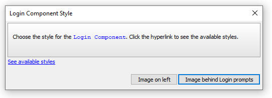
The sample UX component that is used for Login has an image that can either be displayed to the left of the Login dialog, or behind the Login dialog as shown in the images below:
| Image on Left | Image behind |
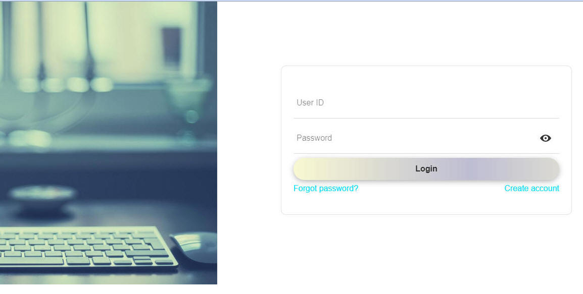 |
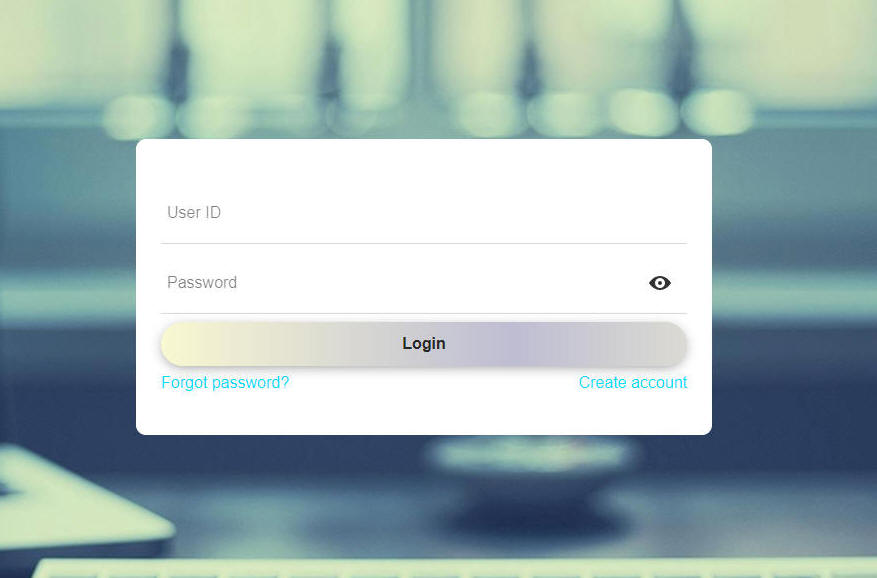 |
If you specified that you want to create the Extended user Information Table, the following dialog will be shown next. You can specify the connection string to the SQL database where the table will be created. You can also create a new table with a custom schema, or select an existing table in the target database.

Web Application - Create New Project - Security Framework - When you create a new Project by clicking the New Project button on the Web Projects Control Panel, the dialog that is shown now allows you to enable the Security Framework for the new project.

Web Application - Creating a Login Component - The legacy Login component, created by clicking Login on the dialog shown below, is now deprecated in favor of a Login component that is built from a UX component.
When you create a new Login component, the following dialog is now shown allowing you to select either a new style Login component that is based on a UX component, or the old legacy Login component.
The new style Login component that is based on a UX component is favored for the following reasons:
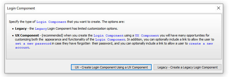
If you choose the new style Login component, the following dialog appears next, allowing you to select the Login dialog style.
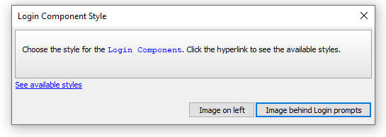
Login Component - UX Component - Allow password reset and Allow create account Properties - When you create a Login component that is based on a UX two new properties are enabled:


If either the Allow password reset property or the Allow create account property is checked, the Additional features settings property is shown.
When you click the smart field for the Additional features settings property, the following dialog is shown when you can configure various aspects of these features.
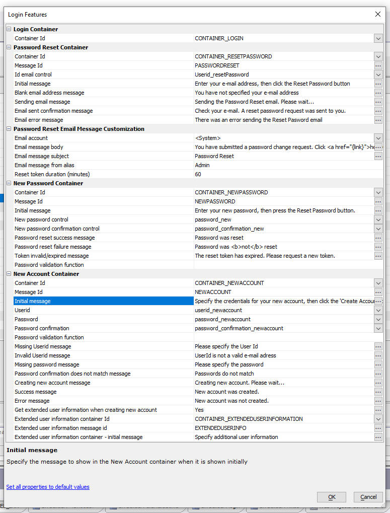
How password reset works
When the user clicks the Forgot password? link on the Login dialog, the Login dialog changes to display the following (you can customize the wording on the dialog in the Login Features dialog. The Login Features dialog is opened when you click the smart field for the Additional features settings property in the Login section of the UX Builder.):
The user will enter their email address and click the Reset Password button. an email will then be sent to the user's account.
The email will either be sent using your own email account or using an Alpha Software account. You can configure which email account is used to send the email in the Login Features dialog. The Login Features dialog is opened when you click the smart field for the Additional features settings property in the Login section of the UX Builder.
NOTE: If you chose to use the <System> email account then you cannot set the from address of the email that is sent. The from address will automatically be set to noreply@alphasoftware.com.
The email that the user receives will contain a link (see image below).
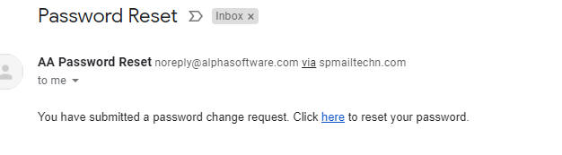
When the user clicks the link the Login dialog is shown as follows:
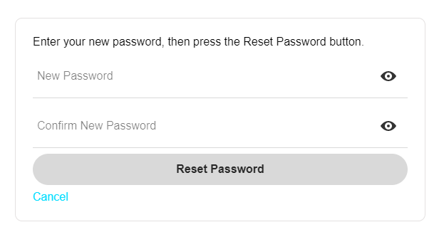
The user will enter their new password and then click the Reset Password button.
The new password must satisfy the password validation rules specified in the Password validation rules property in the Security Settings dialog. In addition, you can also specify the name of a JavaScript function to validate the password that the user enters. To specify a custom Javascript function for the Password validation function property. This property applies both when the user is changing their password, or creating a new account.
Your JavaScript function should take a single argument, the password that the user entered, and it should return a string with an error message if the password is not valid, or it should return a blank value if the password is valid.
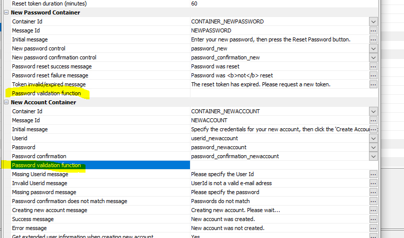
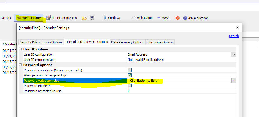
How create account works
If you have enabled the Allow create account property in the UX Component, the Login dialog will have a Create account link.
When the user clicks the link the Login dialog changes as follows:
The user will enter credentials for their new account and then press the Create Account button.
The new password must satisfy the password validation rules specified in the Password validation rules property in the Security Settings dialog. You can optionally specify a Javascript function to perform additional validation on the password.
If the new account is successfully created, then if the Web Project has specified an extended user-information table, the following screen will be shown:
At a minimum the dialog will allow the user to turn two-factor authentication on and if they turn it on, they will be able to select the two-factor authentication options: Email, SMS or Google Authenticator.
In addition, the dialog can prompt for additional fields in the extended user-information table (see How to Capture Extended User Information when a User Creates a New Account below).

How to Capture Extended User Information when a User Creates a New Account
The layout of the dialog shown to capture extended-user information is shown in the UX component in the CONTAINER_EXTENDEDUSERINFORMATION container (the container does not have to have this name. It can be named anything you want. The name is defined in the Login Features dialog).

You can add additional controls to this container to capture information for other fields in your extended user information table. For example, say that your extended user information table contains these fields:
FIRSTNAME
LASTNAME
LANGUAGEPREFERENCE
You could add specially named controls to the CONTAINER_EXTENDEDUSERINFORMATION container to capture this additional information when the user creates a new account. Each control must be named the same as the corresponding field in the extended user-information table, but with a prefix of extended_.
So in the above example, you would add controls to the CONTAINER_EXTENDEDUSERINFORMATION container with the following names
EXTENDED_FIRSTNAME
EXTENDED_LASTNAME
EXTENDED_LANGUAGEPREFERENCE
Understanding the After login behavior property
If you are using a UX component as your Login component, the After login behavior property determines what happens after the user logs in. This property can be set to RedirectToTargetPage or, FocusPanelCard.
If the property is set to RedirectToTargetPage then the Redirect page property is shown. This is the name of the page that the application should redirect to after user user logs in. The redirect page can be set explicitly, or can be set to <Default>. If the redirect page is set to <Default>, the actual redirect page is specified in Security Settings (see the Refirect page after login property.)
NOTE You can override the setting in the UX component's server-side onLogin event by setting the value of the e.url property. In the case where the After login behavior is set to FocusPanelCard, you can overwride the setting for the target Panel by adding code to the client-side AfterLogin event (e.g. {dialog.object}.panelSetActive('target panel') )
If this property is set to FocusPanelCard then after login, the UX will set focus to the specified Panel Card in the component. This option is typically used in Cordova mobile applications in conjunction with the Persistent login feature where there may be no internet connection when the application is launched, so redirecting to another page is not possible.
How Persistent Login Works
If you turn on the Has Integrated login functionality property for the UX you can specify that once the user logs in the login should be 'persistent' (by checking the Persistent login property). If persistent login is turned on then when the user loads the login component again (even after their session has expired, which would normally log them out), the user will be automatically logged back in.
You can specify the duration of the persistent login. If more time has passed than the specified duration, then when the user loads the login component again (after their session has expired), they will no longer be automatically logged in and they will have to log in again.
How to Change the Image in the Sample Login Components
When you create a login component from one of the provided samples, you get a choice of a background image, which is either display to the left of the login controls or behind the login controls. If you want to change the image that is used in the sample components. follow these steps:
Image on Left
Select the PANEL_IMAGE Panel card.
Change the image name in the Image name property.

To change the position of the image (for example, to put the image on the right of the Login controls):
Select the PanelLayout that contains the PANEL_IMAGE and change the Layout flow direction property. For example, to put the image on the right, change the flow direction to RTL (right-to-left).
Image behind
If the UX is configured to show the image behind the login control:
Select the PANEL_LOGIN Panel Card
Set the new image name in the Image name property.
UX Component - Auto-suggest and Edit-combo - OnBeforeSelect Event - These controls now support an onBeforeSelect event. This event fires after the user has made a selection from the pick list but BEFORE the value is written into the control. The event can be used to modify the value written into the control.
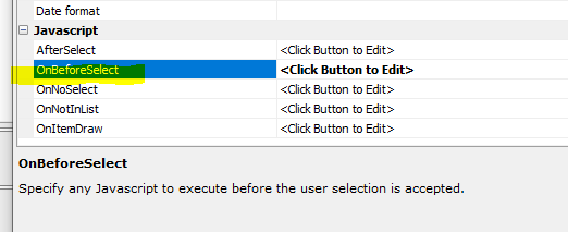
UX Component - List Control - Incremental Refresh - Previously, the Incremental Refresh action could only be performed on List controls that had a Detail View. Now you can perform an Incremental Refresh on Lists that do not have a Detail View under the following conditions:
To allow Increment Refresh for a List that does not have a Detail View, go to the Advanced section in the Data Source tab in the List Builder and check the Allow 'Incremental Refresh' property and specify the name of the timestamp field.
NOTE: Incremental Refresh will update records that have changed and will add new records that have been added, but will not remove from the List records that have been deleted. To remove records that have been deleted a full refresh must be performed.
Grid and UX Builder - <default> Connection String - In all places where you are prompted for a named connection string, you can now specify <default> to use a default connection string.
The <default> connection string is defined in Web Project Properties. To open the Project Properties dialog, click the Project Properties button on the Web Projects Control Panel.
You can use the cn_open() function to open a connection using the <default> connection string. For example:
dim cn as sql::connection
dim flag as l
flag = cn_open(cn,"<default>")
You can also use:
dim cn as sql::connection
dim flag as l
flag = cn.open("::name::<default>")
Grid and UX Components - Arguments - Spaces in name - Spaces in argument names are illegal. Now, when you edit arguments and try to save your definition, Alpha Anywhere will report an error if any argument name has spaces in it. You will need to correct the error before you can save the arguments definition.
UX Component - List Control - Action Javascript - Refresh List Data - Additional Options -- The Refresh Data action now lets you define additional properties to test if the server is available before attempting to refresh a List and to test if the connection speed is fast enough.
Testing if the server is available is will provide for a better user experience than waiting for the Ajax callback to timeout should the server not be available.
If a refresh of List data will result in a lot of data being downloaded (for example, if the List references images), you might want to warn the user if the connection is poor.
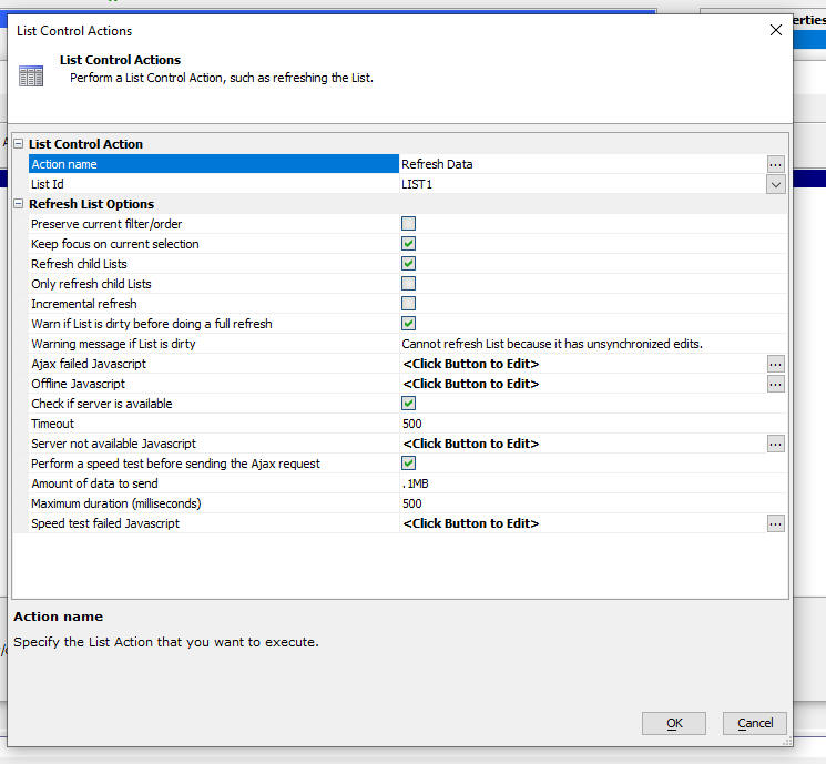
Xbasic - Square API - Square is a popular payment processor. Square offers a rich API for working with their objects. The Xbasic code editor now exposes a genie to help you write code that works with the Square API.
To use the genie, right click on white space in the Xbasic editor and select Genies..., Square genie...
This will bring up a genie that lists all of the APIs defined by Square.
Select an API. This will then display a list of the methods exposed by the selected API
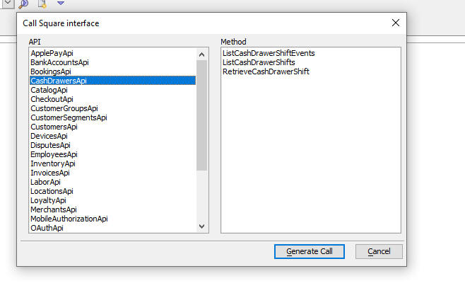
Then click the Generate Call button. Depending on the method that was selected, you will then get a dialog like this showing the parameters that the method expects.

Finally, click the OK button and the Xbasic code to call the selected method will be generated.
Before you can run the code you will need to edit it and make sure that all parameters have meaningful values.
IMPORTANT: In order to effectively use the code generated by the Square genie, you need to understand what the Square API does. That means you will have to refer to the Square API documentation. Without an understanding of the Square API, it will be difficult to understand the Xbasic code generated by the genie.
UX Component - Xbasic Functions Editor - Keyboard Shortcut to insert Name of Control - It is common when writing the code for an Xbasic function that handles an Ajax callback to insert a reference to a control in the UX component. For example:
dim value as c = e.databusmitted.customerId
Now, you can press Ctrl-D to bring up a menu showing the names of all of the controls defined in the UX. When you make your selection the control name is inserted into the code at the current insertion point. You can optionally check the checkbox to include the e.databusmitted. prefix on the inserted text.
Tabbed UI Component - Alpha Theme - Compact Style - You can now specify which parts of the TabbedUI Component should use the compact theme. If a TabbedUI component uses the Alpha theme, (or any theme inherited from Alpha) and you have checked the Use compact theme property, the compact theme would apply to all parts of the TabbedUI and also to all child components opened in the TabbedUI (even if those child components did not specify the compact theme).
Now, you can choose which parts of the TabbedUI should use the compact theme. This allows you, for example, to apply the compact theme to (say) the menu section, but not the client area, which means that child components that were defined to use the full size Alpha theme (or a full size theme inherited from Alpha), will display a defined when opened in the TabbedUI.

word_exists_c() function - Case sensitive version of the word_exists() function.
word_in_common_c() function - Case sensitive version of the word_in_common() function.
UX Component - List - GUID Primary Key - Incremental Refresh - If the option to strip curly brackets from GUID fields had been enabled, when when an incremental refresh was performed, duplicate rows would get added to the List.
UX Component - Tab Control - Javascript Events on Tab Panes - Ajax Callback - If a Tab Pane had code in one of the Javascript events (e.g. onChange) and the code did an Ajax callback, you would be an error because the code was executing the callback before the UX had been completely rendered. You will need to edit and resave the tab control to regenerate the Javascript.
UX Component - Edit-combo and Auto-suggest - Static Data - onItemDraw Event - When an Edit-combo or Auto-suggest control is based on static data, you can now specify an onItemDraw event.
ViewBox Builder - Fixed an issue where the View Builder would open and the Layout template shown in the editor was blank. This would only happen if the ViewBox builder opened with focus on the Layout tab - because it was last saved with focus on this tab.
HTML Editor - Images - When you insert an image into an HTML document (the image must be in the Web Project folder), the HTML editor now correctly renders the image.
Reports - PDF - Right-to-left - The PDF library used by Alpha Anywhere to replace the previous reliance on the Amyuni PDF printer driver does not support rendering text right-to-left. Right-to-left text is now supported.
Application Server - Fixed an issue where the Server might stop responding to requests after it has been running for a while.
Grid Components - Result stack data overflow Error Message - When working with extremely large Grids, it is possible to run out of stack space. This is manifested as a Result stack data overflow error. This error will appear in the Xbasic error log and the server will return a status code of 500 when this condition occurs. You can now work around this issue by increasing the stack size, using a command line parameter when you start Alpha Anywhere, or the Alpha Anywhere server.
For example, if the Application Server is started with this command line parameter:
A5ApplicationServer.exe -rpstack=2
The amount of stack space will be doubled. It is recommended that you not increase the stack size unless your application actually needs additional stack space. The overwhelming majority of applications should not need additional stack space.
Reports - Embedded Charts - Fixed a regression with charts embedded in reports.
UX Component - Action JavaScript - Fixed a regression when opening a cached UX component the second and subsequent times.
Reports - Labels - Letters - Workspace Reports - SQL Data Source - Fixed an issue printing Workspace Labels and Letters that are based on SQL data. Please note that Workspace reports, labels and letters that are based on SQL data sources are being deprecated. Only project reports, labels and letters will be supported. You can easily convert a Workspace Report, Label or Letter that is based on a SQL data source to a Project Report, Label or Letter by clicking the Import Reports hyperlink on the Web Control Panel.
Xbasic - containsAnyCharacter() Function - Returns .t. if a string contains any one of a specified list of characters.
Syntax
L flag = containsAnyCharacter(c string, c characters)
Where
Example
flag = containsAnyCharacter("alpha&","&%#!")
?flag
= .T.
Web Applications - Project Properties - Import from Another Project - When setting Project Properties you can now import settings from another project.

Web Applications - HTML Editor - Tables - Fixed a regression when editing cells in an HTML table.
UX Component - Tab Pane - Events - Comments - Comments in event code were causing run-time Javascript errors.
UX Component - Data Binding - One-to-One Linked Tables - Fixed an issue when entering a new record in a UX with one-to-one linked child tables. New records were not being added to the child tables.
Desktop Applications - Reports - PDF - Fixed a regression where the filter was not being applied when printing reports to PDF.
Hotfix - Desktop Applications - Printing Reports to PDF - Fixes an issue where the filter was ignored.
| UX Component - Ajax Callbacks | Checking connectivity before making an Ajax callback |
If the user makes an Ajax callback and there is no internet
connection, the Ajax failed event will fire after the Ajax
callback times out. It can take quite a few seconds before the
Ajax callback times out. It would be preferable to let the user
know that Ajax callbacks are not possible before they try to
make a callback. Also, in disconnected mobile applications, you
might want to prevent the user from tying to synchronize data if
the connection is poor. In this video we show how this can be done. Watch video Download component Date added: 2021-03-28 |
| UX Component - DropdownBox Controls | Populating the choices in a DropdownBox Control Using Javascript |
Typically, the choices in a Dropdown box control are either
static or the result of a database query. However, you might
want to dynamically populate the choices in a Dropdown box
control using JavaScript. In this video we show how this can be done. We also show how you can implement cascading choices in a dropdown that is populated using JavaScript. The advantage of implementing cascading dropdownboxes using JavaScript is that the child dropdown boxes are populated without having to make an Ajax callback. So this technique will work in disconnected applications. Watch video Download component Data added: 2021-03-29 |
| UX Component - List Control | Synchronizing Data in a List with Detail View - Advanced Synchronization Options |
When you synchronize data in an offline application, you might
want to let the user know immediately if synchronization is
currently not possible - because the server is not available, or
because there is no internet connection rather than waiting for
the Ajax callback to fail after it times out. Also, if there is
an available internet connection, but the connection is slow,
you might want to prevent the user from synchronizing and you
might want to display a message telling the user to try again
later when there is a faster connection. In this video we show how this can be done. Watch video Date added: 2021-03-29 |
| UX Component - List Control | Filtering a List to Show only Checked Rows |
In this video we show how a server-side filter can be applied to
a List to show only the rows that have been checked. Watch video Date added: 2021-04-03 |
| UX and Grid Components - Xbasic | Executing "long-running" Xbasic Code Asynchronously in an Ajax Callback |
When an Ajax callback is made from a Grid or UX component, the
server-side code executes synchronously. The client will wait
for a response from the server. This response is typically sent
when the server-side code completes. However, the browser will
only wait a certain amount of time for the server to send a
response. If the server-side code takes a long time to execute,
the browser will likely have stopped listening (i.e. the Ajax
request will time out) for a response. Furthermore on IIS (which
includes Alpha Cloud), as soon as the browser stops listening
for a response the server will stop executing the server-side
code. Because of all of the above, it is not appropriate to execute 'long-running' server-side code in an Ajax callback, unless the code can be run asynchronously. In this video we show how you can run Xbasic code asynchronously in an Ajax callback. We also show how you can make periodic callbacks to the server to get the status of the asynchronous Xbasic. Watch Video - part 1 Watch Video - part 2 Date added: 2021-04-07 |
| UX Component | Using the PhoneGap Shell - V3 Component |
The PhoneGap Shell - V3 component makes it easy to test
PhoneGap/Cordova mobile apps on a real mobile device without
having to go through the build process to turn your component
into a Cordova application. Watch video Data added: 2021-04-13 |
| Alpha Launch | Publishing an App to Alpha Launch |
Alpha Launch is a great way to publish mobile applications to
iOS or Android devices because it allows you to install native
apps on the device without having to first submit the app to the
Apple App Store or Android Play Store. In this video we show how an App can be published to Alpha Cloud and then installed in Alpha Launch so that it can be run on the mobile device as a true native application. Watch video Data added: 2021-04-25 |
| UX Component - List Control | Momentum Scrolling |
In a mobile application, a List is scrolled by dragging on the
List. If the user swipes on the List, then momentum scrolling is
initiated. You can control the amount of 'friction' required to
initiate momentum scrolling and how long the momentum scrolling
should continue. NOTE: Also applies to ViewBoxes. In this video we show how you can control these settings. Watch video Download component Date added: 2021-05-21 |
| UX Component - SQL Trace | Displaying the SQL Trace Log on the UX Component |
When you define a connection string to a SQL database, you have
the option of turning tracing on. This allows you to see the
actual SQL commands that are sent to the SQL database. But the
SQL logs are written to the standard location for all log files,
which means it can be tricky to find the log files and in the
case of Alpha Cloud, there is a small delay before the log files
are available. Now, you can write the SQL trace logs directly to
the UX component. In this video we show how the SQL Trace log is written to the UX component. Watch video Date added: 2021-05-22 |
| Web Security Framework | Importing Users from an Excel File |
When you are setting up the users and groups in an Application
that uses the Security Framework, it might be convenient to
import users and groups from an Excel file. In this video we show how this can be done. Watch video Date added: 2021-05-25 |
| UX Component - Panels | Drag Scrolling in a Panel Card |
In this video we show how drag-scrolling in a Panel Card can be
enabled in the vertical direction for the Panel Card itself, but
in the horizontal direction for a List that is contained within
the Panel Card. Watch video Download component Date added: 2021-05-25 |
| UX Component - List Control | Pull to Refresh - Animation Duration |
When you turn on the pull to refresh feature in a List you can
control the duration of the animation as the List returns to its
default position after it has been dragged past the end to
initiate a refresh action. Watch video Date added: 2021-05-25 |
UX Component - List Control - Calendar Layout - (This feature is still under development and requires a Feature Key in order to enable it. We are making an early version of the feature available so we can get feedback from the community). To request a feature key, go to Help, send an email to enhancementrequests@alphasoftware.com with "List Calendar Feature Key" in the subject.
The Calendar layout is a view of the data in a List See video:
https://www.screencast.com/t/dvLrLJNmhG1
{dialog.Object}.setArgumentValue Method - Deprecated - This method previously allowed you to change the value in an argument using client-side code. This method is now deprecated and the only way to change an argument value is now in server-side code. This change was made to close a security vulnerability. Argument values are still stored in the {dialog.object}'s .stateInfo object, but they are now stored in encrypted form.
To change a value in an argument using server-side code:
e.arguments.set("name of argument","new value of argument")
Form.saveAs() and Browse.saveAs() - Desktop Applications - These methods are deprecated. If you want to print a browse or form layout, you must create a report and then import the form or browse as as new report. You can then use report.saveAs()
UX Component - Momentum Scrolling - The behavior of momentum scrolling has been improved so that it now feels more natural. The change is especially noticeable when the 'friction' setting is set to a low value and the momentum duration is set to a high value.
UX Component - Panel Card or Container - Pull Past End - Duration - You can now specify how long the animation should last for a Panel Card or Container to return to its default position after it has been pulled past its end and released.
UX Component - List - Pull to Refresh - Duration - You can now specify how long the animation should last for a List to return to its default position after you pull the List past the end and release.
UX Component - Panel Card - Scrolling - If an item in a Panel
Card allows horizontal scrolling (for example, a List configured to
allow horizontal scrolling) and the Panel Card itself allows vertical
scrolling, you can now easily scroll in both directions simultaneously.
Previously if you were scrolling horizontally, vertical scrolling was
disabled. This video shows the new effect more clearly.
UX Component - Default Value - Arguments - If a UX component has arguments, when you are defining the Default Value for a control, you can now easily set the default value to an argument value.
UX Component - List Control - Column Actions - Clear all Filters - If you have a List and you have turned on the Column Actions feature, you can now clear all existing column filters with a new List method.
For example:
var lObj = {dialog.object}.getControl('list1')
lObj.clearAllColumnActionFilters();
UX Component - ViewBox - Drag Scrolling - You can now set the friction and duration properties for drag scrolling on a View Box. For more information see the topic: UX Component - List Control - Drag Scrolling
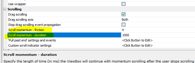
Web Applications - Security - Warning if No Defined Users - When you publish an Application for which the Security Framework has been turned on and for which no users have been defined, a warning is now displayed.
Web Applications - Security - Users and Groups - Import from Excel - You can now import users, groups and group memberships from an Excel file.
IMPORTANT: When you perform this action you are importing into the security tables that are used to seed the production security tables. The seed data is exported to the production security tables at publish time. The exception to this is when you are using the Classic server (as opposed to IIS or Alpha Cloud) and your security tables are stored in a SQL database. In this case the seed data you define in the IDE is the same as the production data.

When you click the Import Users from Excel file hyperlink, the following dialog is shown:
AlphaDAO - List Drivers - the SQL::Connection::ListDrivers() function, only implemented for ODBC, lists the installed drivers. This will help trouble shooting issues where the correct SQL Server driver is missing.
A5w_info() Function - now shows the list of ODBC drivers as well
as the locale and the GMT offset.
UX Component - SQL Trace - When you define an AlphaDAO SQL
connection string, you can turn on the SQL Trace Log, as shown in the
image below.

A new option in the UX component allows you to display the SQL trace log directly on the UX component.
To turn this feature on, open the UX Builder and in the Advanced section, check the Capture SQL Trace Log property.
Then, from the Defined Controls section in the UX Controls Toolbox, add the SQL Trace Log control to the UX component

UX Component - List Control - Drag Scrolling - On mobile applications, the List control is scrolled by dragging on the List. If the user swipes on the List, momentum scrolling is initiated. New settings allow you to control how much 'friction' must be applied to initiate momentum List scrolling, and how long momentum scrolling should continue after the user stops swiping on the List.
The default value for the 'friction' setting is 4. setting a smaller value will mean that a shorter 'swipe' gesture will initiate momentum scrolling. The default setting for 'duration' is 1,000 ms.
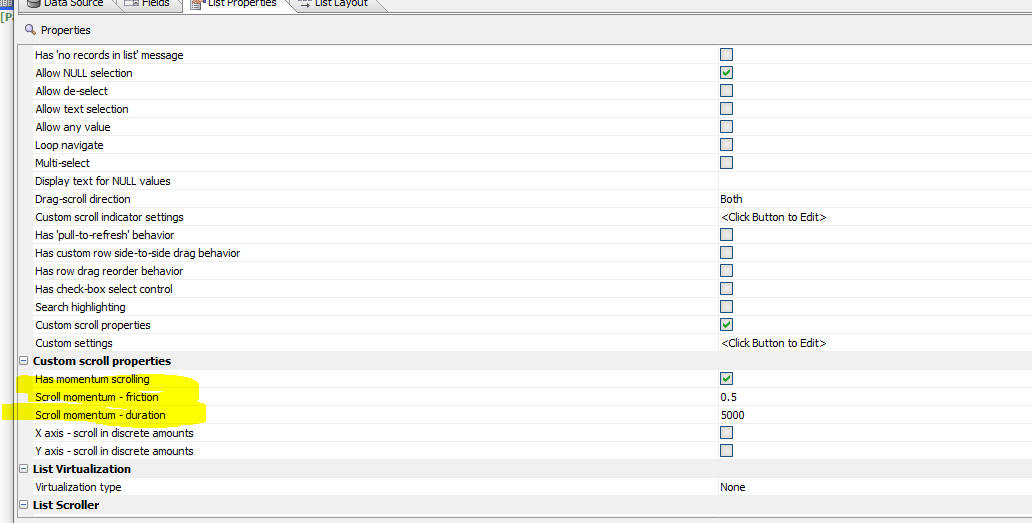
Cordova Builder - iOS Build - iOS Privacy & Resource Usage Strings - As of iOS 10, developers targeting iOS devices must declare access to any user private data types. This is done by adding a string to keys defined in the app's Info.plist file. The list of frameworks that require access to private data includes, Contacts, Calendar, Camera, Microphone, Reminders, Photos, Location, Media Library, Motion, Health, HomeKit, CallKit, Speech Recognition, SiriKit and TV Provider.
Some of these usage strings have default values that are included in some of the Cordova plugins. Apple has become stricter about the explanation provided, for example This App requires access to the camera to take pictures may be rejected in the Apple App review process.
To allow Alpha developers to easily add or edit the usage strings, a new section has been added to the Cordova App Builder Genie property grid, iOS Privacy & Resource Usage Strings. Note that this will only appear if iOS is checked in Cordova Project Platforms.
Some of the usage strings required by commonly used plugins like Camera, Media, Media Capture, Geolocation have default values that can be modified. These usage strings will be automatically included in the Cordova config.xml file if any one of the built-in plugins is used in the project.
Some keys are null by default and the appropriate tags will be included in the Cordova config.xml file if a string is defined for the key. All entries are updated each time the Save or Save & Launch Cordova CLI Builder button is clicked
These keys include:
Cordova Builder - Android Build - Minimum SDK Version - The default value for the Minimum SDK Version has been changed from 22 to 23 which is Android Version 6 "Marshmallow", released in 2015. This is required by many current Android devices and for app submission to the Google Play Store
UX Component - JavaScript Action - Create a Button to execute an Action - You can now easily add a button control to a UX component to execute an action you have defined in JavaScript Actions.
Open the editor, select the action and click the Create button to execute selected action hyperlink.
This will create a new button control and place the control on the clipboard.
Next, go to the UX builder. Select the position where the button should be inserted, and then press Ctrl-V to insert the button from the clipboard.

Cloud Storage - Wasabi - Wasabi is now supported for cloud storage. Wasabi is an alternative to Amazon S3 cloud storage. Wasabi is significantly less expensive than S3. All of the features in Alpha Anywhere that allow you to work with S3 objects now also work with Wasabi.
To use Wasabi, you must create a Storage Connection String, specifying the Wasabi Storage provider.
Once you have defined your storage string, you can use this storage string any place a S3 storage connection string is used.
Xbasic Functions - Export Data from Excel to SQL - A new Xbasic helper function - A5_createSQLTablesFromExcelFile() - allows you to export data from an Excel file to a SQL database.
Syntax
c result = A5_createSQLTablesFromExcelFile(c filename, c connectionString [,c mode [,c tableNamePrefix]])
Where:
Example:
If a table called 'Sheet1' already existed in the target database, and if the mode was set to "skip", the JSON returned by the function would be:
[
{
"tableName": "Sheet1",
"tableCreated": false,
"errortext": "Table already exists"
}
]
UX Component - List Control - Export - Only Export Visible Columns - Action Javascript - You can now specify that the List Export action should only export visible columns. Since columns in a List can be dynamically shown/hidden at run-time, this allows a user to tailor the Excel file by specifying both a List filter and a set of columns to be included in the Excel file.
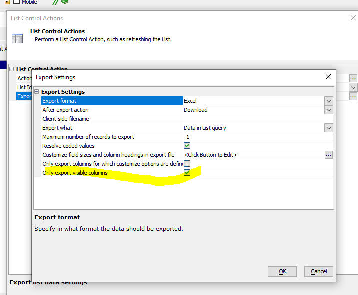
AlphaDAO - MariaDB Connection String Dialog - Has a new checkbox on the TLS/SSL tab of the MariaDB connection string dialog that will allow for skipping the check of the host name.
UX Component - List - Embedded Detail View - New Record - When
you click the New Record button, an empty
Detail View is now displayed at the end of the List.
Cordova Builder - Plugins - Cordova-Plugin-Camera-With-Exif - The Camera with Exif plugin has been updated to version 1.4.3 which allows devices running Android 10 and later to include the photo location in the exif metadata. The update also includes a fix for iOS so that images selected from the photo library are displayed in the correct orientation.
In order to use version 1.4.3 of the Camera with Exif plugin, Cordova version 10.0.0 or greater must be installed and Cordova Android version 9.0.0 is required. If you attempt to install the Cordova with Exif plugin with an installed Cordova version that is less than version 10.0.0, then version 1.3.1 of the plugin will be installed and Android devices that are running Android 9.0 and greater will NOT include lat/lon metadata in the returned exif.
Note If you install Cordova version 10.0.0, Android 9.0.0 will be automatically installed.
To check the installed Cordova version, from a command window or terminal enter cordova -v.
To check on the Android version installed for a Cordova project, from the Cordova project directory enter cordova platforms list at a command prompt.
In order to update Cordova you'll need to uninstall the previous version. From a command prompt enter npm uninstall cordova -g. Mac users may need to add the sudo prefix.
To install the latest release of Cordova, from a command prompt enter npm install -g cordova. Again, Mac users may need to add the sudo prefix.
UX Component - Action JavaScript - Message Box - Default Button - You can now designate the default button in a Message Box. The default button will be executed if the user presses the Enter key.
In the image below, the message box has been defined to have Yes and No buttons and the No button is designated as the default button.

Here is how the message box will appear
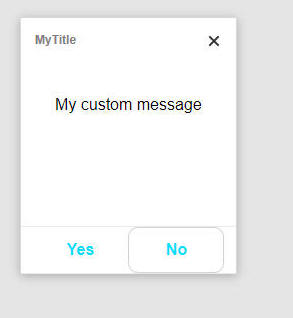
In order to get this appearance, a custom CSS style was defined:
.button:focus { border: 1px solid #d7d1d1;border-radius:10px;}
Mobile Applications - Android - Lists - Performance - If you have a mobile application that uses a large number of List controls that are in different Panel Cards, the performance of the app should now be significantly improved. In an Android app, when the keyboard is shown the screen is resized (this is not the case in iOS apps) and as a result of this, the resize method for all Lists in the app would be triggered. Now, the resize event is only triggered for the Lists that are currently displayed.
Extension::JSON::TemplateReplace Method- Performance - Significant improvements in performance when working with large data sets.
Cordova Applications - Android - Camera with EXIF Plugin - An updated version of the Camera with EXIF plugin is now available. The updated plugin can now correctly obtain lat/lng data when the camera is used. In order to successfully build Android APK files with this plugin you must be using Cordova v10.0 or higher.
Xbasic - Download a file using CURL - The Xbasic curl_get_file() function can be used to download a file from a remote location. The function uses CURL to download the file.
Syntax
L flag = curl_get_file(c url, c filename)
FTP_Upload_CURL() Function - This function, which performs an FTP file upload using the CURL object can now be used in a web application. Previously, you could not use this function in a web application as it displayed UI showing the upload progress. Any functions that display UI cannot be used in web applications.
Example:
ServerName="ftp.myftpserver.com"
remotedir="/name_of_target_folder"
Username="username"
Password="alpha"
fn = "C:\MovieImages\4546.JPG"
result=FTP_Upload_Curl(fn,"",servername,remotedir,Username,Password,null_value())
UX Component - <listObject>.saveListEdits() method - The optional object passed into this method now has an optional property (dirtyDetailViewMessage) that allows you to set the message that is shown if the user tries to synchronize a List row when there are unsaved edits in the Detail View for that row.
Example:
var msg = 'Cannot synchronize now because you have made changes in the
Detail View and you have not yet saved the changes.'
var rowsToSync = [0,1];
{Dialog.object}.saveListEdits('list1',{rows: rowsToSync,
dirtyDetailViewMessage: msg});
Publishing Apps to Alpha Launch - Alpha Launch provides a way to deploy Cordova/PhoneGap applications to a mobile device, without having to submit the apps to the Apple App store or the Android Play store. The apps that run in Alpha Launch are like true native applications. They have full access to native APIs, such as the camera, file system, SQLite databases, etc.
Normally, in order to install an app on a mobile device, the app must be downloaded to the mobile device from the App store or the Play store. Alpha Launch provides a significantly easier and substantially faster way to install apps on a mobile device.
First, the Alpha Launch app must be installed on the mobile device. The Alpha Launch app can be installed on a mobile device by downloading it from the Apple App store or the Android Play store.
Once Alpha Launch is running on a mobile device you install apps into Alpha Launch. The apps that can be installed on Alpha Launch must have previously been published to Alpha Launch. This article describes the process of publishing apps to Alpha Launch.
In order to publish an app to Alpha Launch, start by building the UX Component that is the app. (The UX component is the app). Once you have built the UX component, you can then publish it to Alpha Launch. Here is how this is done:
Start by clicking the More... button on the Web Projects Control Panel, then select the Alpha Launch, Publish Apps to Alpha Launch command.
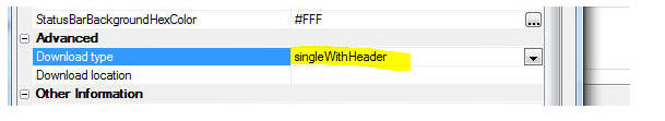
This will open a dialog where you can register one or more UX components (i.e. apps) that you want to publish to Alpha Launch.
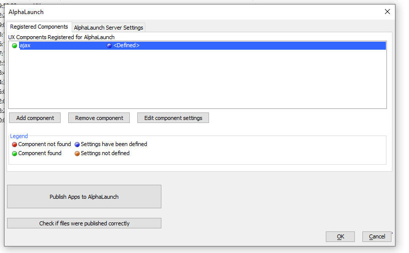
Once you have registered all of the UX components that you want to publish to Alpha Launch, click the Publish Apps to Alpha Launch button.
This will then open this dialog where you can configure the publish operation.
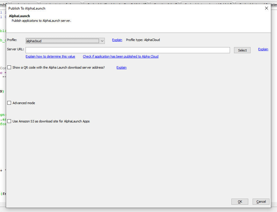
Key Concepts
It is important to understand the key concepts of how Alpha Launch works. There are two servers:
NOTE: The Alpha Anywhere server and the download server can be the same or they can be different. For example, it is common to use an Amazon S3 bucket as the download server. The Alpha Anywhere server can be your own classic or IIS Alpha Anywhere server, or it could be Alpha Cloud.
If you use an Amazon S3 bucket as your download server, you can either use your own private bucket, or you can use a special shared bucket provided by Alpha Software. The shared S3 bucket is a quick and easy way to get started, but ultimately you will likely want to use a private S3 bucket.
When you publish an app to Alpha Launch you specify a publishing profile. This profile determines how your apps are published to the Alpha Anywhere server.
Once an app has been installed into Alpha Launch it will appear on the Alpha Launch home screen.
For example the screen shot below shows Alpha Launch running on a mobile phone. There are two apps installed. If you tap on one of the items in the List. the app is installed from the file system on the device. Just like when you load an app that you previously installed on a device from an App store by tapping its icon on the device home screen, you do not need to have an internet connection to load an app into Alpha Launch. That is because the app has been physically installed into the file system on the device and the app is loaded from the file system. Of course, if the app you load makes Ajax callbacks, you will need to have an internet connection.

Understanding the options on the Publish to Alpha Launch dialog.
The Publish to Alpha Launch dialog is where you configure how the apps that you registered get published to Alpha Launch. You can set the following values in the dialog:
Profile. This is the publishing profile that you want to use to publish your applications to the Alpha Anywhere server.
IMPORTANT If you choose an Alpha Cloud publishing profile, you will need to ensure that you have previously published your application to Alpha Cloud. You can confirm that you have published your app to Alpha Cloud by clicking the Check if application has been published to Alpha Cloud hyperlink.
Server URL - This is the URL of the Alpha Anywhere server where your app will be published. The value for this property depends on what Profile you use to publish your apps. This is the server that will handle Ajax callbacks made by your app. If you do not use an Amazon S3 bucket as your download server, it is also the server from which Alpha Launch will download the app when you install it into Alpha Launch.
If you are using an Alpha Cloud publishing profile and you are unsure of the Server URL, you can set the Server URL to <Auto> and Alpha Anywhere will automatically figure out what the correct value is for the Server URL based on the Publishing profile you selected. There is, however, a disadvantage to using the <Auto> option as it means that Alpha Anywhere will have to go through additional time consuming steps when you publish to Alpha Launch.

In order to install apps into Alpha Launch you first have to register the URL of the download server in the Alpha Launch app. Typing a long URL on a mobile keyboard is tedious and it is much easier to register a server by simply scanning a QR code. To display the QR code for the download server, check the checkbox for the Show QR code prompt. Enter a server name and description and then click the Show QR code hyperlink. This will display a QR code that you can scan in Alpha Launch.
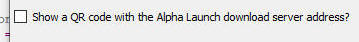
NOTE: If you are using an Alpha Cloud publishing profile and you have set the Server URL to <Auto> you will not be able to display the QR code before the publish to Alpha Launch operation is complete. The QR code will be shown automatically when the publish is complete.
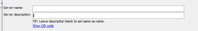
If you want to use an Amazon S3 bucket as your download server, check the Use Amazon S3 checkbox.

When you check this box, the following prompts appear.
If you are not using a private S3 bucket, the following prompt appears
Download site id
If you are using the shared Alpha Anywhere S3 bucket as your download server, this id represents the sub-folder in the shared S3 bucket where your apps are download from. Once this id has been assigned, it is not changed (unless you press the Get new id button).
IMPORTANT If you click the Get new id button, you will then have to register a new download server in Alpha Launch.

If you are using a private S3 bucket as your download server, you will need to specify:
S3 URL - URL of the private bucket where the app files will be loaded
S3 Folder - the sub-folder in the S3 bucket where the app files will be loaded
S3 Connection String - the storage connection string for your S3 bucket.

When you publish files to Alpha Launch, a Deployment Package (also known as a fileset) must be created. This fileset is stored in the files directory in the __alphaLaunch.alphaLaunch folder in the Web Project folder. The fileset is automatically created when you publish to Alpha Launch, but you might want to create the fileset manually before you initiate the publish so that you can examine the files in the fileset.

UX - List Control - onFocusOut Event - A new event has been added to the List control. The onFocusOut event fires when the List (or any of its child focusable elements, such as in-place editing controls) looses focus. This differs from the onBlur event which does not fire when a focusable child element looses focus.
UX Component - Sample Comonent - PhoneGap Shell V3 - The PhoneGap-Shell V2 sample component has been updated. It is now called PhoneGap-Shell V3.
This component is ideal for developers who are building Cordova mobile applications. It allow you to test your application on a real device without having to go through the time consuming process of building a Cordova app.
The improvements to V3 of this component include:
Previously, you could register as many servers as you wanted but before you selected a component you had to first ensure that the appropriate server was selected.
NOTE: You can install the PhoneGap Shell component on your mobile device without having to build it yourself. Go to the App store or Play store and search for Alpha Shell.
UX Component - Generating QR Codes for use with the PhoneGap Shell V3 Component - When you are using the PhoneGap Shell component on your mobile device you have to type in component names and server names when you want to register a new component or server. Typing on a mobile device can be quite tedious and so you can generate a QR code which can be scanned. To generate the QR code, open the UX builder, click the More... button and select the Alpha Shell QR Codes command. This will open a dialog where you can generate the appropriate QR codes.
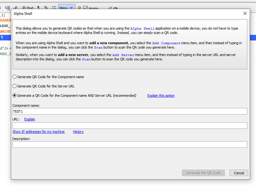
UX Component - ViewBox Control - Wrapper - You can now wrap the ViewBox layout in a template that allows you place static (i.e. non-scrolling) content around the ViewBox layout. For example, you might want to put a static header above some ViewBox content. When the ViewBox content is scrolled, you want the header to remain fixed in place.
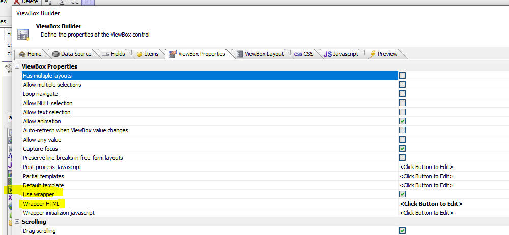
To define a ViewBox wrapper, check the Use wrapper property and then define the Wrapper HTML property.
The Wrapper HTML must include a div element with an attribute called a5-layout-target and the value of this attribute must be set to true. This is the div where the ViewBox layout will be injected
For example:
<div a5-layout-target="true"></div>
Application Server - 'Long-running' Server-side Code - Running Xbasic Code Asynchronously - When you make an Ajax request, the server-side code that handles the request runs synchronously. That means that the client (i.e. the browser) waits for a response that is typically sent when the server-side code that handles the Ajax request completes. (The exception to this is if you have turned on Chunked responses in your Ajax callback, in which case the server can send back responses to the client while it is executing the code to handle the Ajax callback).
In some cases your Ajax callback will trigger server-side code that might be "long running" and you do not need to have the client wait for a response. In these cases you might want to run the server-side code asynchronously. (Ideally, the client should still be able to make occasional Ajax callbacks to check on the "status" of the long-running job).
This can now be done by using a new Xbasic helper function, a5_run_async_xbasic() to run some Xbasic code asynchronously.
The syntax for this function is:
c result = a5_run_async_xbasic(c xbtorun as c, c baseURL [, s3connectionString = ""])
Where
NOTE: The Xbasic code that runs asynchronously must complete within 15 minutes.
Watch Video - part 1
Watch Video - part 2
Here is a typical use case: Say you have a button on a UX or Grid component that runs several long-running reports. When the user clicks the button they need to initiate the job, but they don't need to wait for the job to complete. However, you might want to let the user click another button to find out what the "status" of their long-running job is. This status might be "waiting","running (completed task x of y)", "completed", or any other status that you want to define.
Here is some sample Xbasic that runs reports and then saves the reports as PDF files in a S3 bucket. The code runs the same report multiple times (each time filtered on a different country) and then uploads the resulting PDF files to a S3 bucket.
So, when the Xbasic has completed, the S3 bucket will have file for each country. For example:
report_USA.pdf
report_UK.pdf
report_Austria.pdf
etc.
NOTE: This sample Xbasic makes the following assumptions:
The steps to implement this use-case are as follows:
Typically, your Xbasic code will update status information as it is executing by writing to the web repository table (using the Job id as the key). To write to the web repository table, use the function:
a5w_SaveWebAppRepository("the_job_id_guid","the_job_status")
Assuming that your Xbasic code updates the web repository table while it is executing, you can find out the status of your job by making an Ajax callback and executes code like this:
a5w_GetFromWebAppRepository("the_job_id_guid")
Here is the Xbasic code that must be run asynchronously:
on error goto failed
dim rn as c
'name of the report to run
rn ="rds_customers.a5rpt"
dim cs as c =
"connection_string_to_the_s3_bucket_where_the_reports_should_be_saved"
'The xbasic code can reference the variable '__guid' -- this is the id
of the job
'save the status of the job in the webrepository table
a5w_SaveToWebAppRepository(__guid,"Job has been registered")
'list of countries for which the report should be printed
dim json as c
json = <<%xstr%
[
{"Country" : "Argentina"},
{"Country" : "Austria"},
{"Country" : "Belgium"},
{"Country" : "Brazil"},
{"Country" : "Canada"},
{"Country" : "Denmark"},
{"Country" : "Finland"},
{"Country" : "France"},
{"Country" : "Germany"},
{"Country" : "Ireland"},
{"Country" : "Italy"},
{"Country" : "Mexico"},
{"Country" : "Norway"},
{"Country" : "Poland"},
{"Country" : "Portugal"},
{"Country" : "Spain"},
{"Country" : "Sweden"},
{"Country" : "Switzerland"},
{"Country" : "UK"},
{"Country" : "USA"},
{"Country" : "Venezuela"}
]
%xstr%
dim p as p
p = json_parse(json)
dim i as n
dim count as n
count = p.size()
for i = 1 to count
'save the current status of the job in the repository
dim msg as c
msg = "Printing report " + i + " of " + count + " (" + p[i].country
+ ")"
a5w_SaveToWebAppRepository(__guid,msg)
'define the filter for the report
dim o as p
o.filter = "country = '"+p[i].country+"'"
'get a temporary filename where the report will be saved
dim fn as c
fn = a5_GetTempFilename("pdf")
'print the report to a temporary pdf file
fn =
a5w_report_saveas(rn,"Pdf","","",fn,null_value(),null_value(),null_value(),o)
if file.exists(fn) then
'if the report succeeded (i.e. the file fn exists), then upload
it to the S3 bucket
dim b as b
b = file.to_blob(fn)
'save the report in a s3 bucket
dim objectname as c = "report_" + p[i].country + ".pdf"
a5Storage_saveData(cs,b,objectname)
else
dim objectname as c = "FAILED_" + p[i].country + ".txt"
dim b as b = "failed"
a5Storage_saveData(cs,b,objectname)
end if
next i
'the job is done, update the status in the web repository
msg = "Completed"
a5w_SaveToWebAppRepository(__guid,msg)
end
failed:
'error handling in case there is an error.
dim b as b
b = error_text_get() + " line: " + error_line_get()
dim msg as c
msg = "Error: " + b
a5w_SaveToWebAppRepository(__guid,msg)
'create an object in the S3 bucket with information about the error
a5Storage_saveData(cs,b,"error.txt")
UX Component - List with Detail View - Incremental Refresh - The Incremental Refresh action does not update dirty rows in the List (so as not to blow away unsynchronized data), but now it will also not update rows that have pending edits (i.e. the List Detail View has been edited, but not yet saved back to the List)
UX Component - List Control - Checkbox Column - List Actions - Action JavaScript - A new action has been added to the List Controls Action in Action Javascript. You can now filter the List to show only the rows that have been checked. (The List must be based on a SQL data source and it must have the checkbox column turned on).

NOTE: When you execute the action, and the filtered list is returned, all of the rows in the List will be checked. If you uncheck all rows and then execute the action again, the List returns to its original state.
UX Component - Edit-combo - User Must Select From List - A blank item is now automatically added at the top of the List so that the user can de-select a previous selection. This is also implemented for List in-place editing.
UX Component - Dropdown Boxes - Javascript - You can now populate the choices in a Dropdown Box using Javascript.
Watch video
Download component
To specify that you want to call a Javascript function to populate the Drowdown box, select the Static option in the Choice builder and enter the special syntax:
javascript:name_of_your_javascript_function
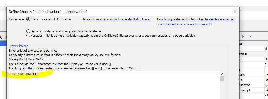
Your Javascript function should return an array of choices. If you want to specify different display and stored values, your function should return an array of arrays in which each array item is an array with the display value and the stored value. For example:
function choices() {
return [['alpha','A'],['beta','B'],['gamma','G']]
}
UX Component - Ajax Callbacks - New options have been added to the Action JavaScript Ajax Callback Action. You can now check if the Alpha Anywhere server is available before making a callback. You can also check the speed of the internet connection before making a callback.
The Alpha Anywhere server might not be available even if an internet connection is available. Checking to see if the Alpha Anywhere server is available will typically be much quicker than waiting for an Ajax callback to time out.
To turn on the option to test if the Alpha Anywhere server is available check the Check if server is available property in the Ajax Callback Action builder (see image below).
When you turn this property on you can specify how long to wait for a response from the server before concluding that the server is not available. To specify the time to wait, set the Timeout property. By default this property is set to 750 ms. That means that if the server does not respond within 750 ms, the server is considered to not be available. In that case, the JavaScript specified in the Server not available Javascript property will be executed and the Ajax callback will not be sent to the server.

The option to perform a speed test before making an Ajax callback is only available if the option to check if the server is available has been turned on.
To turn on the speed test feature, check the Perform a speed test before sending the Ajax reguest property. When you turn this property on you can specify how much data to send to the server (see the Amount of data to send property) to perform the speed test. By default this is set to .1MB (i.e. 100K). You must also specify a maximum time (see the Maximum duration property) in which the server must respond. If the server does not respond within the specified amount of time, the speed test is considered to have failed. In this case, the JavaScript specified in the Speed test failed JavaScript property will be executed and the Ajax callback will not be made.
Javascript {dialog.object}.savelListEdits() Method - New Ajax Options - You can now specify additional options for this method to control the behavior of Ajax callbacks.
The additional options are specified in the optional ajax object and are:
Example:
{dialog.object}.saveListEdits('LIST1',
{
rows: 'allRows',
chunked: {allow: true},
ajax: {
onAjaxFail: function() { alert('Unable to sync.'); } ,
onDeviceOffline: function() { alert('Unable to sync. Device is
offline.'); } ,
onServerNotAvailable: function() { alert('Unable to sync. Server
is not available');}
}
}
);
List - Search Part - Delay populate till active search- If a List control has a Search Part and the Search Part sets the Delay populate till active search property then if you apply a filter to the List and the filter is blank, the List will now no longer be populated. Previously, the List would populate with all of the rows in the List's data source.
Grid and UX Builder - Working Preview and Live Preview - Preview mode now uses the Chrome browser. The option to preview using Internet Explorer has been removed.
The options to open the component in Internet Explorer and Safari have been removed from the menus.
Server-side Date and Datetime Format - Project Properties - You can now specify a server-side date and datetime format in the Web Project Properties dialog.
These properties are particularly useful for applications that are deployed on Alpha Cloud, because Alpha Cloud runs with regional setting set to MM-dd-yyyy format. That means that if you are moving your application from a self-hosted server (where you control the regional settings) to Alpha Cloud, you can change the server-side date and datetime format in one place, rather than having to go to each component and setting the server side display format in the component.
UX Component - Action Javascript - Dynamic Panel - When you open a child UX in a Dynamic Panel, the Use cached property was not being honored.
UX Component - Audio Recorder - Fixed an issue that caused a JavaScript error when the maximum record time was set.
List - Pull to Refresh - If a List has the pull-to-refresh property turned on, then you will always be able to pull on the list to refresh it, even if the List is too short to require scrolling.
Desktop Applications - Forms - Ink Control - Fixed an issue with the ink control clipping the displayed image if the control was not at the top of the form.
UX Component - List Control - In-place editing - Fixes issues with in-place editing on Android and iOS devices.
Layout Table Reports - Fixed an issue with boxes.
Web Projects = Git- Pushing to Remote Repos - Changed the Git command used to push to remote repos from:
git push origin master
to
git push
Grid Component - Entering Records - Fixed an issue when entering a new record in a Grid with a very large number of fields.
{dialog.object}.json_to_excel() Method - Fixed an issue when the JSON data was an object with multiple arrays.
AlphaDAO - Time fields - Fixed a regression with time fields.
UX Component - PDF Viewr Control - Panel Cards - Drag scrolling - Fixed an issue with drag scrolling the PDF Viewer when on a mobile device if the PDF viewer was inside a Panel Card.
Grid Component - Enable Expression - Radio Button Controls - Fixed a regression.
UX Component - List Control - Import - Dynamic Connection Strings - Import action would fail if the List used a dynamic connection string.
UX Component - Client-side show/hide expressions - Control Labels - Fixed a regression where the control label was not hidden when the control itself was hidden.
Grid Component - Cascading Dropdown Controls - Fixed a regression.
UX Components - Repeating Sections - Client-side show/hide expressions - Fixed a regression.
Web2Cal - If the event data contained a \ character, the UX component for editing the event would not display.
UX Component - List with Detail View - Parent/Child - GUID Primary Keys - If a UX contained two List and both Lists were based on SQL tables and both lists used GUIDS as their primary key, and the Lists had a parent-child relationship, then entering a new record a into the parent List and also into the child List and then synchronizing the Lists would fail. If the parent List was synchronized before the child record was added the synchronization would succeed.
Alpha Launch - A new version of Alpha Launch is now available in the Apple and Android App stores. Alpha Launch allows you to install applications on a mobile device without having to submit your applications to the App Stores. If you would like a customized version of Alpha Launch (i.e. with your own icon on the device home screen, etc., please contact Alpha Software Consulting Services).
Data Masking - RandomDateTime Rule - A new data masking rule type for datetime fields was added.
UX Component - Cordova Applications - Action JavaScript - Social Sharing Plugin - This action allows you to share content via the built-in share action on the device.
To add a new Social Sharing action to your UX component, select the PhoneGap/Cordova - Social Sharing action.

This will then open the builder when you can define the action:

The Action name prompt allows you to select the Social Sharing action.
Currently, two actions are supported:

The builder allows you to define set these properties:
UX Component - Tab Order - Restore Default - You can now easily restore the default tab order of controls in a UX Component to their initial order.
Temp Files - Fixed a regression in the code that gets the location of the Windows temp folder. This regression could lead to bugs when rendering PDF reports.
UX Component - List Controls - Tab Control - If a List control was in a Tab Control on a Tab Pane that was not initially visible, the List was automatically set to 'delay render till visible' regardless of the actual setting in the List builder. Now, the setting in the List builder is honored and if the setting is off, Lists in tabs that are not initially visible are rendered, so that when the user ultimately brings the tab pane into view there will be no need for an Ajax callback.
UX Components - Freeform Containers - Fixed a regression where if any of the controls inside a freeform contain had a client-side show hide expression and the expression hid the control, the enclosing freeform container would also be hidden.
PDF Reporting - Fixed some regressions in PDF reports.
Grid and UX Components - Reporting - Temp Files - In certain cases, temp files that were created when the report was generated were not being cleaned up.
PDF Reporting - Fixed some regressions in PDF reports. Rotated text was not rendering correctly. Some bitmaps on report were not rendering correctly.
Data Masking - Fixed some issue in Data Masking - Setting percentage of records to be copied was not working.
UX Builder - Image Controls - Debug message - Removed a debug message that showed when adding an image control to a UX components.
IMPORTANT: A new installer (called the Universal Installer) is used to install this update. To learn more about the Universal Installer, click here.
| UX Component - List Control | Single click on a column in a row to enable in-place editing |
By default a List with in-place editing is toggled into edit
mode by tapping on an edit icon in the row, or by double
clicking on the row. However, you might want to toggle edit mode
on with a single click on the row and simultaneously select the
field that the user clicked on. In this video we show how you do this. Watch video Date added: 01-14-2021 |
| UX Component - List Control | Filtering choices in an edit-combo pick list |
When you are editing data in a List row using in-place editing,
you might have configured some of the columns to be edited using
an edit-combo control. When you open the edit-combo to display
the pick list, there could be a very large number of rows in the
pick list, making it difficult to find the row in the pick list
that you want to select. You can add a filter box to the pick
list to make it easier to find the row you want to select. In this video we show how you can add a user filter box to the edit-combo pick list. Watch Video Date added: 01-20-2021 |
| UX Component | Creating Custom Display Formats for Client-side Templates |
Client side templating is used in many different places in a UX
to display data. For example, it is used in Lists, ViewBoxes,
ControlBars, FormViews, etc. In this video we show how you can create custom format directives. Watch video Date added: 01-22-2021 |
| UX Component | Advanced Image Styling |
A common requirement when displaying images is to style the
image in advanced ways, such as cropped to a circle, etc. In this video we show various advanced styling options that can be applied to images. Watch video Date added: 02-07-2021 |
| UX Component - List Control | Free-form Layout for Detail View |
When creating a List with a Detail View, you might need to
display the Detail View data in a highly styled manner. This can
be done using a Detail View template. In this video we show how Detail View templates can be defined. Watch video Download component Date added: 02-08-2021 |
| UX Component - List Control | Displaying List Values in ControlBars |
A common pattern when using Lists and Control Bars is to display
data from the currently selected List row in the ControlBar.
This is easily done by using special placeholders in the
templates used in the ControlBar. In this video we show an example of using a List field placeholder in a ControlBar template. Watch Video Download Component Date added: 02-15-2021 |
| UX Component - Custom Data Controls | Creating a Custom UX Control |
When you are building a UX component, you add controls to the UX
by selecting controls from the toolbox on the left edge of the
UX Builder. The Data section has an item called [More...] which
allows you to select from several additional control types.
These additional control types are created by Alpha Software.
Now, you can create your own controls and when you click the
[More...] item, your user-defined controls will be listed. The
controls that you create are all based on the ViewBox control. In this video we show how to create a Custom UX Data Control and then how to add a new control to your UX that is based on this custom control. Watch Video Date added: 03-03-2021 |
| UX Component - Custom Data Controls | Editing a Custom UX Control |
Once you have created a Custom UX Data Control you might want to
change its definition in some way. In this video we show how you can edit a previously created Custom UX Data Control. Watch Video Date added: 03-03-2021 |
| UX Component - List Control | Two-state images |
A common design pattern when building user interfaces is to add
icons that change with animation when the icon is clicked. For
example, you might have a 'hamburger' icon that when clicked
shows a menu. When the icon is clicked you might want it to
animate into an different icon (say the 'X' icon) to indicate
that clicking the icon will close the menu. In this video we show how you can define two-state images. Watch Video Download Component Date added: 03-06-2021 |
| UX Component - List Control | Embedding the Detail View in the List |
When you build a List with a Detail View, you might want to
embed the Detail View in the List so that it is only shown when
the user taps on a row in the List. In this video we show how this can be done. Watch Video Download Component Date added: 03-06-2021 |
| UX Component - List Control | Embedding Child Lists in the Top-most Parent List |
It is quite common to build UX components with a series of
related lists. For example, you might have lists for Customers,
Orders and OrderDetails. When you select a row in the Custom
list, the Orders list is repopulated showing he orders for the
selected Customer, and so on. You might want to embed these
child lists inside the top-most parent list (i.e. the Customer
list in this example). so that the child Lists are only shown
when the user taps on a row in the parent list. In this video we show how this can be done. Watch Video Download Component Date added: 03-06-2021 |
| AlphaDAO | Copy tables from one SQL database to another and mask selected fields |
You might need to share a copy of your database with a 3rd party
and if your database contains sensitive information (e.g. credit
card numbers, social security numbers, etc.) you might want to
mask the data in these columns. In this video we show how you can copy the tables in one SQL database to another and also mask the data in selected fields. Watch Video Date added: 03-13-2021 |
UX Component - List Control - Calendar Layout - (This feature is still under development and requires a Feature Key in order to enable it. We are making an early version of the feature available so we can get feedback from the community). To request a feature key, go to Help, send an email to enhancementrequests@alphasoftware.com with "List Calendar Feature Key" in the subject.
The Calendar layout is a view of the data in a List See video:
https://www.screencast.com/t/dvLrLJNmhG1
Alpha DAO - Data Masking - Alpha Anywhere now allows you to mask (i.e. obfuscate) sensitive data when you are copying tables from one database to another database. This is particularly useful if you have to send a backup of your database to a third party and you do not want to reveal any sensitive data.
If addition to masking data in selected table columns you can specify that only a specified percentage of records in a particular table should be copied.
Data Masking is a complex operation, but Alpha Anywhere hides all of the complexity. For example, say you have a Customers table and an Orders table. The CustomerID field is common to both tables and it defines the relationship between the two tables. If you mask the data in the CustomerID column in the Customers table, Alpha Anywhere will automatically update the CustomerID in the Orders table so as not to break the relationship between the tables.
To open the dialog to define a Database Copy operation, select the Tools, More..., Export from a SQL database to another SQL database menu option.
The dialog allows you to define the connection string for both the source database and the target database.

If you want to mask the data in any of the tables that are to be copied, check the Mask data? checkbox. The Define Data Masking Options button will be shown.
Click the button to display the Data Masking Rules dialog.
All of the tables in the source database will be show if the Export all tables checkbox is checked. If you only want to copy selected tables, uncheck the Export all tables checkbox and then select the tables you want to copy.
NOTE: If you select a table, but not the related tables, Alpha Anywhere will automatically add the related tables to your selection list.
The Data Masking Rules dialog allows you to pick a Data Masking rule for any of the columns in any of the selected tables.
For example in the image shown below, the Address field in the Customers table has the StreetAddress Data Masking Rule.
You each field you can select one of the built-in Data Masking Rules or you can define custom Data Masking Rules (see below)
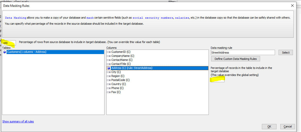
Defining Custom Data Masking Rules
To open the User-Defined Data Masking Rules dialog click the Define Custom Data Masking Rules button in the Data Masking Rules dialog.
This dialog shows all of the custom rules you have defined. You can edit the definition of existing rules, create new rules, or delete rules. Each rule must have a unique name. Each rule is of a certain type. The various rule types are discussed below.
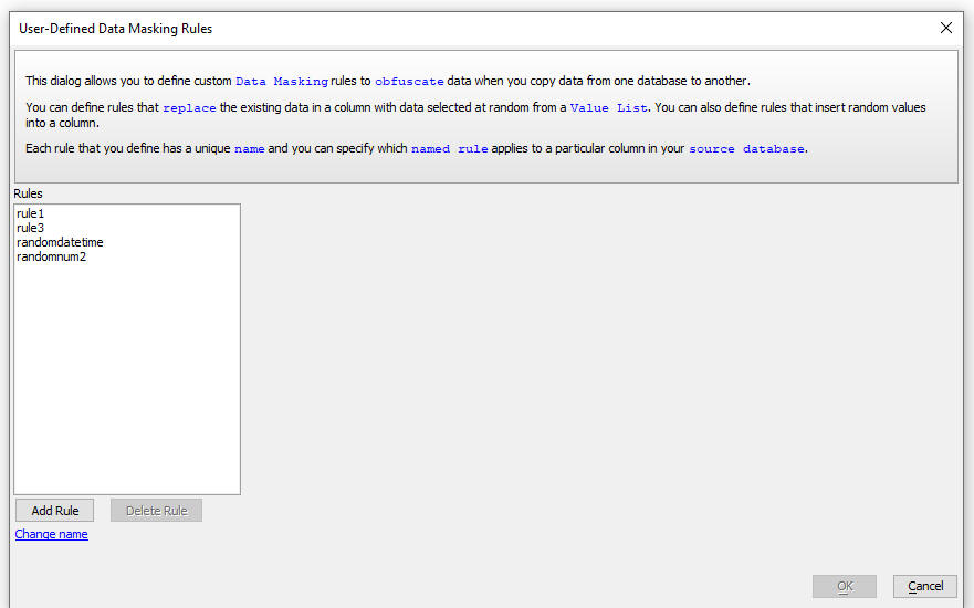
The following rule types are supported:
| Type | Data Type | Description |
| VlueSet | String | The value in the field is replaced with a value taken at random from a pre-defined list of possible values. |
| RandomNumber | Number | You can specify number of decimal places, a minimum and a maximum value |
| RandomString | String | You can specify the minimum and maximum length of the string. |
| SequentialNumber | Number | You can specify a starting number. |
| SequentialString | String | You can specify the length of the string an optional prefix (e.g. "INV_") and a minimum number. For example: INV_001, INV_002, etc. |
| RandomData | Date | You can specify the start and end date values. You can specify Today as a date value |
| RandomDateTime | DateTime | You can specify the start and end datetime values. You can specify Today and Now e.g. Today Now |
JavaScript Function Library - {dialog.object}.networkSpeedTest()
Method - Measures the speed of a network connection by sending a
packet of data to the server and measuring how long it takes until a
response from the server is received. The primary use case for this
method is to determine if the quality of the network connection is
sufficiently good to synchronize data in a mobile application.
Syntax:
{dialog.object}.networkSpeedTest(packetSize,onComplete,onFail)
Where:
Example:
var ok = function(elapse) {
if(elapse < 300) {
//do the synchronization operation
}else {
alert('Connection not good enough. Please try later.');
}
}
var fail = function() {
alert('No connection');
}
{dialog.object}.networkSpeedTest('1MB',ok,fail);
UX Component - Protection Against Events Firing Multiple Times - Assume you have a UX Component with a Button that has a click handler. If the user double clicks on this button, it is possible that the click event would fire twice because the browser will see the action a two separate clicks. To prevent this from happening you can temporarily lock the button after the first click so that the second click does not fire.
A new property in the UX allows you to do this automatically for all of the Abstract events (these are the events shown in the Javascript - (Touch, Mouse, Pointer Events) category.
The new property is in the Advanced section in the UX Builder Properties pane.
By default this property is turned on and the lock duration is set to 300 ms.

UX Component - List Control - Detail View - Embed Detail View in List - When you create a List with a Detail View, you can now specify that the Detail View should be embedded directly in the List and that it should be shown/hidden when the user clicks on a row in the List.

To embed the Detail View in the List, open the List Builder.
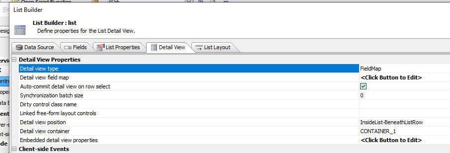
When you set the Detail View properties, this dialog is displayed:
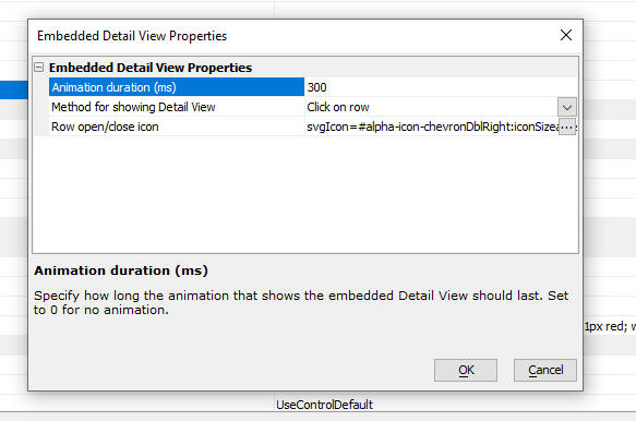
You can set the duration of the animation that displays when you click on a row to show the Detail View. If you do not want any animation, set the duration to 0.
You can open the detail view by clicking anywhere on a row or by clicking on the special Row open/close icon in the row.
You can set the icon used for the Row open/close icon
To add the Row open/close icon to the List layout, add the <RowOpen/CloseIndicator> placeholder to your Layout.
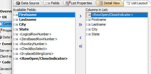
NOTE: This feature can also be used to embed a child List inside
a parent List. For example, you might have a UX with a List for Customer
and another List for Orders. You might want to embed the Orders List
inside the Customers Lists. See video for more details.
Watch Video
Download Component
UX Component - List Control - Static Images - Two-State Images - Rotate and swap Image on Click - You can now define static image columns in the List where the image that is shown is swapped for another image when the image is clicked, or is rotated when the image is clicked.
Watch Video
Download Component

To add a two-state image to a List:
<listObject>.twoStateImageSet() Method - The <listObject>.twoStateImageSet() method allows you to programmatically set the state of a two-stage image.
Syntax:
<listObject>.twoStateImageSet(imageName, state [,row])
Where:
AlphaDAO - The GenerateCreateDatabaseStatement() function
handler for MySQL and MariaDB will generate the following syntax going
forward. This also affects the <SQL::Connection>.CreateDatabase() method:
CREATE DATABASE foo CHARACTER SET utf8mb4 COLLATE utf8mb4_unicode_ci
This will force the character set and collation to the currently
recommended format assuring proper handling of character data.
Oracle recommends using MB4 as the default character set for all MySQL
databases (and that includes MariaDB as well).
� MB4 (or Multi-Byte Character set 4 � for four bytes) is now the
standard character set (along with the associated collation for MySQL
and MariaDB). MB4 was introduced in MySQL to address the prior
limitation of 3 bytes for UTF-8 character sets. Most recently, UTF-8 has
been aliased to refer to the newer MB4.
� Depending on the server installation, the default can end up being set
to a Latin character set, and that breaks copies across databases.
Note: The MySQLV4 driver will continue to generate a CREATE statement without the character set and collation.
UX Component - SemiCircleNumberDisplay2 Control - A new control type is available when you select the More... item in the Data Controls section in the UX Builder.
The SemiCircleNumberDisplay2 control is very similar to the SemiCircleNumberDisplay control, but it does not use the 3rd party RGraph library and it is responsive.

UX Component - User Defined Custom UX Data Controls - When you select the More... item in the Data Controls section in the UX Builder a list of additional controls is displayed. The controls shown in this list are all defined by Alpha Software. Now, you can create your own custom data bound UX controls and these controls will be displayed when you select the More... item, or when you click the Add Control button.

The controls that you define are all built using the ViewBox control.
To create a new Custom UX Data Control add a new ViewBox control to your UX component.
Then go to the Home tab and click the Load Sample ViewBox hyperlink.
Select the Template for user-defined Custom UX Control menu item.
Define the control using features in the ViewBox builder.
When you are done you can then save your settings as a new Custom UX Control. To do this, click the More... button and then select the Save as custom UX control menu item.
This will bring up a dialog where you can define settings for your custom UX control.
Fill in the settings and then click the OK button. You will then be able to add a new control to your UX that is based on your custom UX control design.
UX Component - Custom UX Data Control - Editing - You can edit the definition of a Custom UX Data Control by adding a ViewBox to your UX component. The loading your Custom UX Data Control into the ViewBox and then resaving the control once you have made any changes you want.
PDF Reports - Maximum Number of Pages - You can now specify the maximum number of pages any PDF report should be allowed to have.
To set this property, click the Projects Property button on the Web Control Panel and set the Maximum pages property in the PDF Printing Options section. By default, this value is set to 1000. To specify that there is no limit, set the value to 0.
TabbedUI - Right Click on Tabs - When you right click on a Tab in a Tabbed UI you now get a menu with options to close the tab, to close all other tabs, and to close the tabs to the right of the current tab.
UX Component - Add Control - More... - When you click the Add Control button in the UX Toolbox, the list of choices now expands all of the controls in the [More...] category

UX Component - Data Bound - Server-side onBeforePopulateUXControlsFromTable Event - You can now specify an Xbasic function to execute before a data bound UX is populated with data from a table. This function tan be used to authorize or deny permission to view a particular record.
To specify the name of the Xbasic function, set the Server-side onBeforePopulateUXControlsFromTable Event in the UX Builder Advanced section.

GraphQL Service - Views - The GraphQL Service Genie now allows you to select View when you build your GraphQL service.
PDF Reports - Font Mapping - You can now add a special configuration file to the web project folder called font_mapping.txt. This file allows you to define how certain fonts in your report definitions can be mapped to other fonts when the PDF is rendered.
For example, assume you have a font_mapping.txt file with the following contents:
Tahoma=Arial
When a report is rendered, all controls that were defined to use Arial will instead use Tahoma in the rendered report.
PDF Reports - File Size - PDF reports are now no longer generated using the Amyuni printer driver. However, as a result of this change, the size of the PDF files (if they contained images) was substantially larger than the size of the files create using the Amyuni printer driver. Now, Alpha Anywhere automatically down scales the images and the resulting PDF file is now substantially smaller.
Web Applications- CSS Files - Shared Styles - When you create a new CSS style sheet, you can now specify that the file you create is a shared style. Shared styles are available to all of the components in your Web Project and do not have to be explicitly linked to the component (as is the case with other CSS files)
Shard styles are stored in the css\_sharedStyles\style.css file in the Web Project folder.
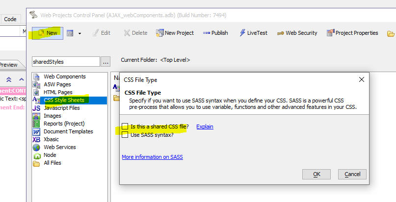
UX Component - Cordova Applications - SQLite Database - Incremental Refresh - A common pattern when designing mobile applications for disconnected use it is allow for a SQLite database to be loaded onto the mobile device. Now, you can perform incrmental updates to the SQLite database (as long as the SQLite database was generated by Alpha Anywhere). Previously to get an updated SQLite database onto the device you had to download a new version of the database to the device. In the case of very large SQLite databases this might be relatively slow.
Only the tables in the SQLite database that are based on SQL queries can be incrementally updated.
In order to implement the incremental update feature, the SQLite database must have been created by Alpha Anywhere and each table must have a tmestamp field that get updated when a record is added or edited.
When you define the SQLite database you specify the name of the timestamp field.

When Alpha Anywhere creates the SQLite database it includes an additional table called __metaData. This table stores the highest value in the timestamp field for each of the tables in the SQLite database.
When an action to perform an incremental update of the SQLite database is triggered, an Ajax callback to the server is made. This Ajax callback includes the data from the __metaData table.
Using the data from the __metaData table, the server can compute all of the rows that were added or updated since either the initial creation of the SQLite database, or the last incremental update. The server can also compute new data for the __metaData table.
This data is then sent to the mobile device and the mobile device executes code to apply the edits (updates and inserts) to the SQLite database.
To create a button on your UX that will execute an Incremental Refresh action, use Action Javascript.
Select the Incremental refresh action from the list of available actions in the PhoneGap - SQLite Actions action.
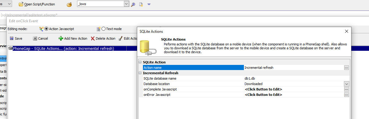
NOTE: Incremental update will not delete records from the SQLite database if they have been deleted from the source tables. Therefore, it is recommended that rather than physically deleting records in the source tables, you perform a 'soft delete' (i.e. you add a field to the table that indicates if the records is deleted or not and then when you want to delete a record, you simply set the value in the soft delete field).
A5w_report_saveAs(), A5w_label_saveas() and A5w_letter_saveas() functions - Filter Parameter - If the layout is based on a SQL data source and the filter can be promoted to a SQL filter, the filter parameter is automatically moved into the options.filter property, which will typically result is much better performance as the query will be executed by the database server.
Example of a filter parameter that can be promoted to a SQL filter: quantity = 100
Example of a filter parameter that can not be promoted: quantity = max(100,0)
This filter can not be promoted because it uses an Xbasic function in the filter expression.
UX Component - List Control - Control Bar - Placeholder for List Row Data - You can now use placeholders in ControlBar templates to display data from a row in a List.
For example, in the image below, the Control Bar that is displayed above the list shows the Lastname from the row in the List that has focus.

The syntax for the placeholder in the Control Bar templateis:
{lits::listname::listfield}
Where listname is the name of the list and listfield is the field in the list data that you want to display.
When you are defining the Control Bar template you can use the Insert List field to insert a placeholder for a List field.
IMPORTANT: This feature is only available for Lists that had Detail Views. i.e. the List's Detail View property must be checked.

Web Applications - Live Test - You can now perform a Live Test of your application on the Development Server, IIS Server (not supported in Community Edition) or Alpha Cloud. To start a Live Test, click the LiveTest button on the Web Control Panel.
When you click the LiveTest button, the LiveTest dialog is shown.
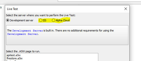
NOTE The IIS option is only displayed if you have the Alpha Anywhere Server for IIS installed on your machine. You do not need to have a license for this server to use it in test mode. You can installe the Alpha Anywhere Server for IIS using the Universal Installer (The option to Live Test using IIS is not available in the Community Edition).
In order to do a Live Test using Alpha Cloud, you must have an Alpha Cloud subscription.
When you click the LiveTest button on Web Control Panel and you select the Development server option, the following will happen:
LiveTest differs from LivePreview in that it is a test of your entire application. LivePreview is a test of a single component or page.
UX Component - List Control - Detail-View - Free-form Layout - In many cases the Detail-View for a List will display data from the currently selected row in the List in a read-only format that must be highly styled. There are many ways to do this, including using a ViewBox to display the List's Detail View. However, if you want the Detail View to be a mix of some controls that allow editing and some highly styled read-only content, you can use Free-form Layout controls.
In order to bind a Free-form Layout control to the List's Detail View, click on the smart field for the Linked free-form layout controls property in the Detail View tab in the List builder.
Select the Free-form Layout controls you want to use display List Detail View content. You can select as many Free-form Layout controls as you want.
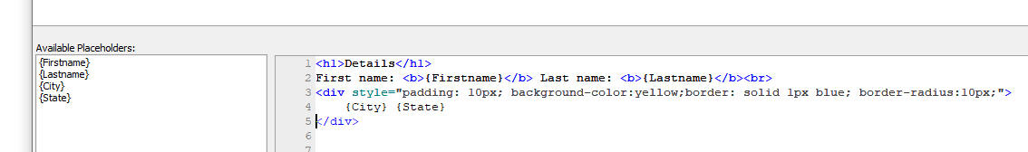
When you edit a Free-form Layout that has been bound to a List Detail View, the Available Placeholder will show the fields in the List.
The template you define here can use client-side templating directives.

For example, in the image below the Detail View for the current row in the List is shown with some simple formatting:
Here is how the Detail View Free-form Layout template was defined to achieve the layout shown in the image above:
UX Control - List Control - Map Control - .SetValue() Method - You can now use the .setValue() method to set the 'value' of a Map control. When you use this method, a marker is placed on the map to represent the value.
The value can either be an object with latitude and longitude properties, or an object with lat and lng properties, or an array with two items - latitude and longitude.
Example:
var v = {
"longitude": -116.166868,
"latitude": 34.011286
};
{dialog.object}.setValue('mymapcontrol',v)
UX Component - Images - Advanced Styling - You can now style images to display images in various advanced styling formats.
For example, in the image shown below, the image is show cropped to a circle with a purple border. The image appears to "float" on the page above the List controls.
To turn on Advanced image styling for an image, click the smart field for the Advanced image display options property.
This will open a dialog where you can define the properties.
The properties you can set include:
Xbasic - ShowVarJSON() - The ShowVarJSON() utility function now displays the JSON using the Monaco editor.
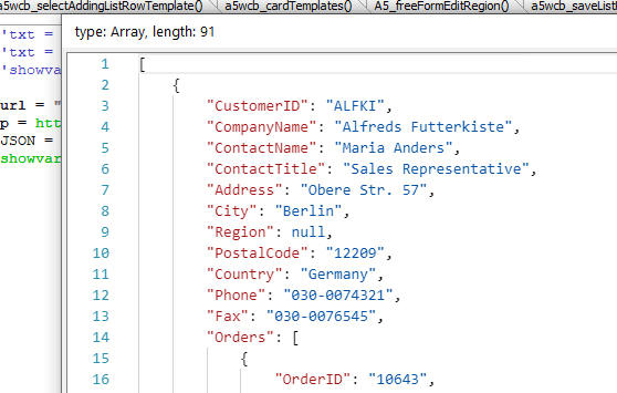
UX Component - Free-form Layout Editor - Save Template - You can now save the contents of the Free-form Layout Editor as a named template that can later be loaded from the repository of saved templates.
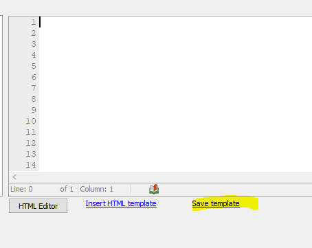
UX Component - Maps - Scrolling - If a Map control is inside a scrollable Panel Card, dragging on the map will scroll the Panel Card. You may not want this behavior. Instead you might prefer that dragging on the map will pan the map and not scroll the Panel Card. In order to scroll the Panel Card the user should drag outside the map. Now, the Map control has a new property Prevent scroll that can prevent the Panel Card from scrolling when the map is being panned.
UX Component - List Control - Detail View - ViewBox - You can now use a ViewBox to display a List's Detail View. When you click on a row in the List, the ViewBox will be populated with data from the target row in the List.

In order to design the Layout of the ViewBox, you will need sample data from the List. When you click the smart field to specify the name of the ViewBox you can click the hyperlink at the bottom of the screen to show sample data from a List row. You can paste this JSON into the ViewBox Static JSON property.

UX Component - List column selector control - Hide System Columns - The List column selector control (which allows you to dynamically turn List columns on/off and to re-order the position of columns in the List) now allows you to hide system columns when the pick list is shown. In the images below, the pick-list on the right has hidden the system columns.
NOTE: The List column selector control is added to a UX by selecting it from the Defined Controls section in UX toolbox.
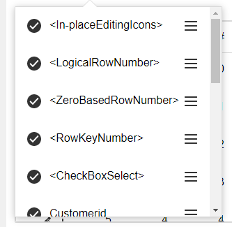 |
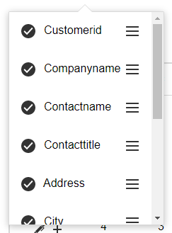 |
To hide system columns in the picker, call the listColumnSelector() method with the appropriable parameters. For example:
var flagHideSystemColumns = true;
var maxWindowHeight = 200;
{dialog.object}.listColumnSelector(this,'LIST1',maxWindowHeight,flagHideSystemColumns);
UX Component - List Control - JSON File - You can now specify a JSON File as the data source for a List. The JSON file can either be a local file (in the project folder), or a remote file, referenced by a URL.

Reports - PDF - Client-side filename - You can now include placeholders in the client-side filename. The client-side filename is used when the PDF is downloaded. The placeholders can reference fields in the UX or Grid from where the action to print the PDF is called.
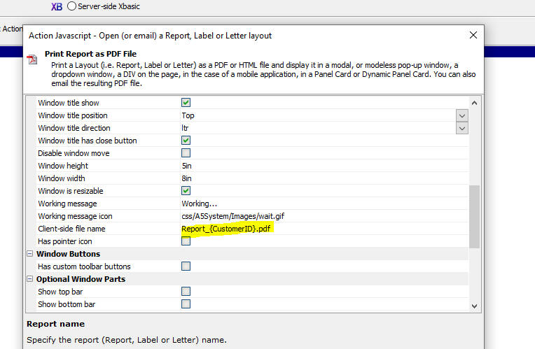
UX Component - List Control - Incremental Refresh - Timestamp Fields - Incremental refresh on a List can be configured to use a timestamp field to enable faster incremental refresh. Now, the internal algorithm for doing an incremental refresh on a List that has a timestamp field has been changed and the refresh is now orders of magnitude faster (especially on Lists that have a very large number of rows). The downside of this new algorithm is that rows that were deleted from the database are not removed from the List when an incremental refresh is done, unless the List has been configured to use soft deletes (set in Table Properties on the Detail View tab in the List builder).
Trace Window - Show/hide Panes - You can now turn panes on or off in the Trace Window.
Xbasic - A5w_report_saveas(), A5w_label_saveas() and A5a_letter_saves() Functions - Email - These functions, can now automatically send the resulting filename as an email attachment.
These function now create a file in the specified format from the report and either:
To specify that the file should be saved in an S3 bucket or send as an email attachment, the filename parameter must be a JSON string. Fo example:
To store the file in an S3 bucket
{"type": "Store","ConnectionString": "your_named_s3_connection_string","objectName": "folder_name_on_s3/objectname.pdf"}
To send the as an email attachment
{"type": "email", "apikey": "XXXXX","send_to":
"XXXX@alphasoftware.com","send_from":
"XXXX@alphasoftware.com","send_from_friendly_name": "XXXXX","subject":
"XXXXX","message": "XXXXX"}
Where apikey is your SparkPost or SendGrid API key. If specifying a SendGrid API key you must prefix with API key with sendgrid:
UX Components - List Controls - SQL Tables - GUID Fields - Curly Brackets - A new option has been added to strip curly brackets from GUID fields. By default, GUID fields are enclosed in curly brackets.
Web Applications - Repository Table - {dialog.object}.loadDataFromRepository() Method - The .loadDataFromRepository() Method allows you to make a client-side call to retrieve data (which is typically JavaScript code) from the system Repository table. You can now specify that certain repository values are protected from client-side access - i.e. these values cannot be retrieved by calling the .loadDataFromRepository() method).
When you add items to the repository using the a5w_SaveToWebAppRepository() method, you can now specify if the item should be accessible from the client-side.
Example:
dim flagAllowClientSideAccess as l = .f.
a5w_SaveToWebAppRepository("key1","this is the key","string","","","",null_value(),flagAllowClientSideAccess)
UX Component- Repeating Sections - Client-side Show/Hide - If a column in a Repeating Section has a show/hide expression that is based on a field outside the Repeating Section, the entire column in the Repeating Section is now shown or hidden, depending on the result of the show/hide expression.
Grid and UX Components - Print Report Action - Client-side Filename- When you define Action JavaScript to print a report as a PDF file, you can now specify the name of the generated PDF file (see the Client-side filename property).
UX Component - Custom Template Display Formats - You can now define custom display formats for use in client-side templates.
For example, in the List shown below, the actual data in the list is:
Name|Score
Fred|50
John|200
However, instead of displaying the actual scores (50 and 200) we display either High risk or Low risk.
This is done by creating a custom template display format.
To create a custom template display format, open the Web Project Properties dialog (click the Project Properties button at the Web Control Panel).
Then click the smart field for the Template format directives property.
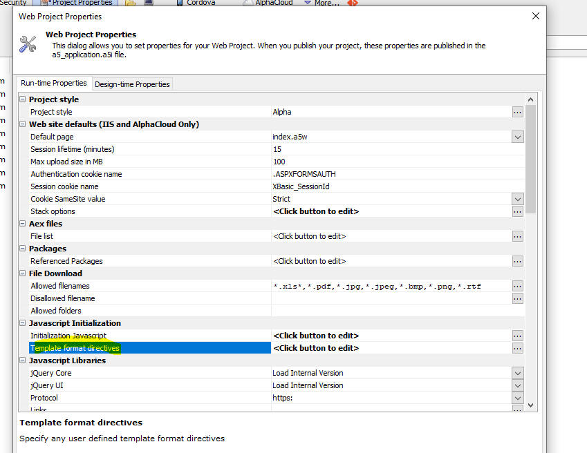
The Template - User Defined Format Directives dialog allows you to define as many format directives as you want. To define a new directive, click the Add button and then define the JavaScript code. You code can reference v - the value to be formatted and your code must return the formatted value.
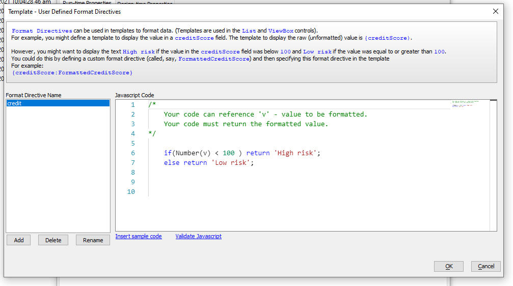
UX Component - List Control - In-place Editing - Edit-combo - Filter the Pick List - You can now filter the choices shown in an edit-combo pick list.
To enable filtering in the edit-combo pick list, edit the properties for the edit-combo control in the List Builder. (Fields tab, Control settings property)
UX Component - PDF Viewer Control - The PDF Viewer Control has been rewritten. The new PDF Viewer eliminates some of the limitations of the previous PDF Viewer Control . Previously, you could only only include a single PDF Viewer control in a UX. Now, there is no limit as to how many PDF Viewer controls can be added to a UX.
The control allows you to navigate from page to page in a multi-page PDF document. You can either navigate by clicking on the VCR icons or typing a target page number into the text box and then pressing enter. You can scale the PDF document by selecting a scaling factor in the dropdown box. You can click the Find icon to search for text in the PDF document. The page in which the first match is found will be focussed. You can also click the help icon to get metadata information about the PDF file.
To add a PDF Viewer control to a UX, select the control from the Other Controls section of the UX Builder toolbox.
The syntax for the {dialog.object}.pdfViewerLoad() method has changed. Since a UX can now have multiple PDF Viewer controls, you must now specify the ID of the PDF Viewer control you want to load. For example:
{dialog.object}.pdfViewerLoad('PDFVIEWER_1','mypdffile.pdf')

UX Component - List Control - Column Actions - Change in behavior - The behavior of the List Column Actions feature has been changed to more closely resemble the behavior in Excel (after which this feature was modeled).
Now, if you type into the search box, the list of matches is automatically selected (i.e. the checked icon is shown for each item) and you can then click the Filter button to search for the selected items (previously when you typed in the filter box, the items in the filtered list shown in the pick list were not selected. Clicking the <Select All> option would select all of the records in the list, not just those shown in the pick list).
If addition, when you type into the filter box you have a new option - (Add current selection to filter). If you check this item, then when you click the Filter button, the selected items are added to the existing List filter.

UX Component - List Control - In-place Edit - Single Click to Go into Edit Mode - You can now configure a List to toggle into row editing mode with a single click on the row. You can also specify that the field you clicked on should get focus and that the text in the field should be selected when the row is toggled into editing mode.
UX Component - List Control - <listObj>.editInplaceEditRow(rowNumber,flagSetFocusToTarget) method - If you tap on a field in the List and call this method from the List's onClick or onTap event, the row you clicked on will be put into edit mode and the field you clicked on will have focus and the existing text will be selected. Previously the first input control in the row had focus and nothing was selected. You can turn off this behavior by setting the optional setFocusToTarget parameter to false.
UX Component - Static HTML - Upload to S3 - When you create a static HTML fileset from a a UX component you can now upload your files to S3 into a special bucket managed by Alpha Software.
When you select the Create Static HTML Files... menu open from the drop down Menu button in the UX Builder, you can now set the Storage connection string to <AlphasSoftware> to use the special bucket managed by Alpha Software. You can still continue using a private bucket if you prefer by entering the name of your connection string.

UX Component - List Control - In-place Editing - Double Click - If you configure the List to switch into in-place editing mode when you double click on a row, you can now double click on a column in the row and when the row goes into edit mode, the field you double clicked on is now automatically given focus and the text in the field is selected.
Web Applications - Security tables - If you change the connection string for your web security tables to a different database in which the security tables do not exist, the Utilities menu open, shown in the image below, can be used to re-create the missing security tables.
NOTE: You can also use the Xbasic utility function: a5wcb_createSecurityTables(connectionString) to re-create the missing tables in the target database.

Xbasic split() Function - Takes a delimited string and populates an array.
Syntax
split(c string, c delimiter, p array)
Function does not return any value.
Where
Example:
string = "x|y|z"
dim a[0] as c
split(string,"|",a)
showvar(a)
pdf_merge_amyuni() - Same functionality of the pdf_merge() function, but uses the Amyuni ActiveX control, rather than PDFSharp. The PDFSharp implementation of the pdf_merge() functionality is more sensitive to malformed PDF documents and will throw an error in certain situations where pdf_merge_amyuni() will succeed.
NOTE: The pdf_merge_amyuni() function can only be used if Alpha Anywhere has been previously installed on your machine using the old installer. That is because the new Universal Installer no longer installs the Amyuni controls.
Web Applications - Security Framework - LDAPS - Added support for secure LDAP.
Xbasic - a5w_report_saveas(), a5w_letter_saveas() and a5w_label_saveas() - The functions now all now use the PDFDOCGEN format which does not use the Amyuni primter driver. If you want to force these functions to use the Amyuni printer driver specify the save as format as PDFAMYUNI.
NOTE: The PDFAMYUNI option will only work if the Amyuni PDF Printer drivers have been installed. If Alpha A nywhere was installed using the Universal Installer, the Amyuni printer drivers will not have been installed.
Cordova Applications - Printer Plugin - The Cordova Printer plugin has been updated to work with iOS 14. If you have used the older plugin in your Cordova app you will need to either create a new Cordova project or uninstall the older plugin by unchecking it in the Cordova app builder genie and save, then add the Printer plugin to the project. If you are using the CLI builder, make sure to generate a new iOS app which will include the latest version of the printer plugin.
UX Component - Create static HTML files... menu option - Upload files to Amazon S3 storage - When you create a static HTML file from a UX component and then select the option to upload the files to S3, the files are now uploaded to S3 much more quickly.
The static HTML files option is an ideal way for quickly sharing the basic layout of a UX component with another person. For example, you may be designing an app for a client and the client has given feedback on the appearance of a UX. You can generate a static HTML file, copy the files to S3 and then send the client the URL for the file.
To generate a static HTML file, edit the component, Click the Menu button.

Then select the Create static HTML files... option.
Then check the Upload files to Amazon S3 storage option.
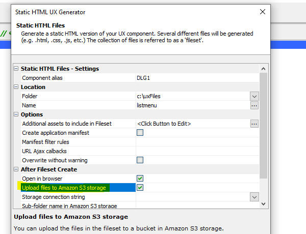
Xbasic - a5Storage_copyFiles() - Fast copy of multiple files to Storage - A new Xbasic function makes it possible to copy files to storage (in particular S3 and Azure) up to 10 times faster than copying individual files (using the a5Storage_saveFile() function).
The function, a5Storage_CopyFiles() can copy an entire folder, or a comma delimited list of files.
NOTICE: If the target connection string points to disk storage (rather than S3 or Azure), then there may be no advantage to using this function. Instead, use the copy_folder() function.
Syntax:
L flagResult = a5storage_copyfiles(C connectionstring ,C sourceFolder [,C pattern [,C targetFolder [,N concurrentTasks [,* pResultIn [,L flagSetReadPermission]]]]])
Where:
Example
Copy all .jpg files in the c:\myfiles folder to a folder called 'images' in a S3 bucket referenced by the 'myS3Bucket' storage connection string.
flag = a5storage("myS3Bucket","c:\myfiles","*.jpg","images",100)
UX and Grid Components - Javascript Actions - Description - You can now add descriptions to actions defined in Javascript Actions
Alpha Cloud - Publishing - Only publish files that have changed - Fixed issues when publishing to Alpha Cloud and checking the Only publish files that have changed option.
UX Component - Client-side Show/Hide - In-control Buttons - If an edit control used in-control buttons, when when the control was hidden by a show/hide client side expression, the space taken by the control was not removed.
Shared CSS Styles - Fixed an issue where shared CSS styles were not getting published when an application was published.
Alpha Cloud - Node Modules - Publishing - Incremental Publish - If you had added Node modules to your project, the Node modules were republished every time even if you selected the Incremental Publish option.
Sample UX Templates - SecurityFramework-LoginComponentMobileApp-Persistent Login - Fixed a bug in the server-side CanAjaxCallback code in the code that was checking for an expired JWT.
UX Component - Data Binding Image - If the Alpha Anywhere IDE was installed in a folder that had spaces in the folder name, the image on the UX Database Binding tab did not show the correct single or double lines joining the tables. This issue was purely cosmetic. It had no impace on the behavior of the UX component.
UX Component - Absolute Layout Container - Background Image - WKHTMLToPDF - If you used Action JavaScript to create a PDF from an Absolute Layout Container that had a background image, the background image would not be displayed on the PDF if you used the WKHTMLToPDF method for creating the PDF file.
UX Component - Calendar Control - Width - Fixed a regression where the calendar control could not be set to 100% of the width of its container.
PDF_merge() Function - Fixed a regression in this function when it was called successively with the same filenames as input parameters.
Cordova - Android - By default, Android Cordova applications automatically exclude all folders that start with "_" when the apps are built using the CLI. This is a problem for Alpha Anywhere as certain system folders do in fact start with "_" and as a result, certain features (such as the PDF Viewer control) did not work in Android Cordova apps. A change has been made to the Android CLI build scripts to allow folders that start with "_" to be loaded.
UX Component - List Control - In-place Editing - Edit-combo and Auto-suggest - AtRenderTime - If the choices for the edit-combo or auto-suggest were configured to be fetched atRenderTime, the second and subsequent edit-combo or auto-suggest did not display a picklist.
Web2Cal - Month View - If you are using the 3rd party Web2Cal component in your application you may see that the Month view does not render correctly. This is the result of a bug in both Web2Cal and jQuery (which Web2Cal relies on).
The bug in Web2Cal is benign if you use an older version of jQuery.
If you are experiencing this issue, go to Project Properties and change the location to where jQuery core is loaded from.
Set the location to Load from Google and set the version number to 1.6.2.
Universal Installer - When a new version of the Universal Installer is released, installing a build from the "Available" tab into a folder where that build was previously installed will work as expected. Before this fix an optimization was incorrectly kicking in seeing that the previous build was already installed.
UX Component - Repeating Sections - Labels - Each Row Option - Below - The 'below' option was not being honored when the Labels for a Repeating Section were set to show on all rows.
UX Component - Data Seriew - Array Arguments - Fixed an issue when the SQL for a data seriew used array arguments.
Web Projects Control Panel - Title - Build Number - The Web Projects dialog now shows the Alpha Anywhere build number in the title. You can turn this off if you wish by going to View, Settings, Preferences and then searching for Web Projects Control Panel.

UX Component - Repeating Sections - Row Number - If you had added a Row Number control to a Repeating Section, the row numbers were not displayed correctly.
UX Component - Repeating Sections - Show label rule - If the Show label rule was set to All rows, the labels were not