This document describes the updates and fixes made to Alpha Anywhere in 2023 and 2024.
To see the 'What's New in V12' document (which describes all of the new features in Alpha Anywhere's initial release) please click here.
Please note that Alpha Anywhere patches are only available to users with
a current subscription.
You can verify your subscription status from within Alpha Anywhere by
going to Help, About, or by clicking this link shown here (https://activation.alphasoftware.com/subscriptionStatus.aspx).
If you install an update for which your subscription is not entitled,
you will need to uninstall the update and rollback to an older version
that you are authorized to use in order to continue using Alpha
Anywhere.
To see release notes for other periods, click the appropriate link:
Release notes for 2025 to present
Release notes for 2021 and 2022
Release notes for 2018 and 2019 and 2020
Release notes for 2017 and older
| UX Component - List Control | Create new List from Template |
In this video we show how you can quickly create
a new List control from a pre-defined template. Watch video Date added: 2024-10-07 |
| UX component - List Control -ActionBar | Defining an ActionBar |
In this video we show how an ActionBar can be
defined for a List. Watch video Date added: 2024-11-22 |
| UX component - List Control -ActionBar | Default AcionBar |
In this video we show how a Default ActionBar is
defined for a List. Watch video Date added: 2024-11-22 |
| UX component - List Control -ActionBar | ActionBar with Detail View Buttons |
In this video we show how Detail View buttons
(e.g. Save, Delete, New Recod, Restor and
Synchronize) can be added to an ActionBar. If
the List does not have an ActionBar, the
DetailView buttons in the ActionBarare
automatically hidden. Watch video Date added: 2024-11-22 |
| UX component - List Control - QBE | Defining QBE for a List |
In this video we show how a QBE feature can be
defined for a List. Watch video Date added: 2024-11-22 |
| UX component - List Control - QBE | Server-side and client-side searched in a List QBE |
In this video we show the difference between
client-side and server-side QBE searches Watch video Date added: 2024-11-22 |
| UX component - List Control - QBE | Searching in Date and Datetime fields using QBE. |
In this video we show how friendly date range
names (e.g. this week, next week, etc.) can be
used to search Date and Datetime values in a
List. Watch video Date added: 2024-11-22 |
| UX component - List Control - QBE | List Has QBE because ActionBar has Search Button |
In this video we show how the List will have a
QBE feature even though the QBE feature has not
been enabled for the List. watch video Date added: 2024011-22 |
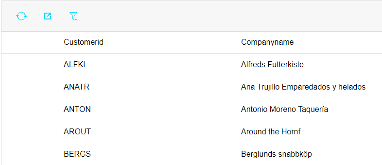
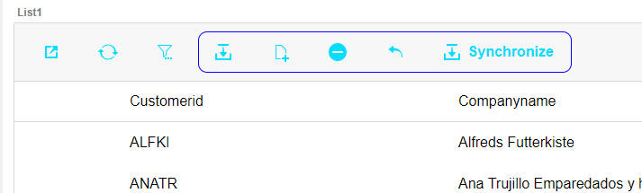
UX Component - List Control - Action Bar - You can specify that a List control should have an Action Bar. An Action Bar is a row of buttons, displayed either above or below the List data. The Action Bar can have system buttons and user-defined buttons. The system buttons can refresh the List data, export the List data to Excel and open the List's Query-by-Example feature to search for data in the List. User-defined button can execute arbitrary Javascript code.
The image below show a List with an Action Bar showing system buttons to refresh data, export data and search the List.
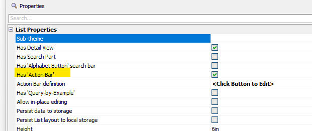
To turn on an Action Bar for a List, edit the List and check the Has 'Action Bar' property on the List Properties tab in the List Builder.
To define the properties of the Action Bar, click the smart field for the Action Bar definition property. This will open the builder shown below.
You can specify which system buttons the Action Bar should have and you can customize the appearance of each system button.
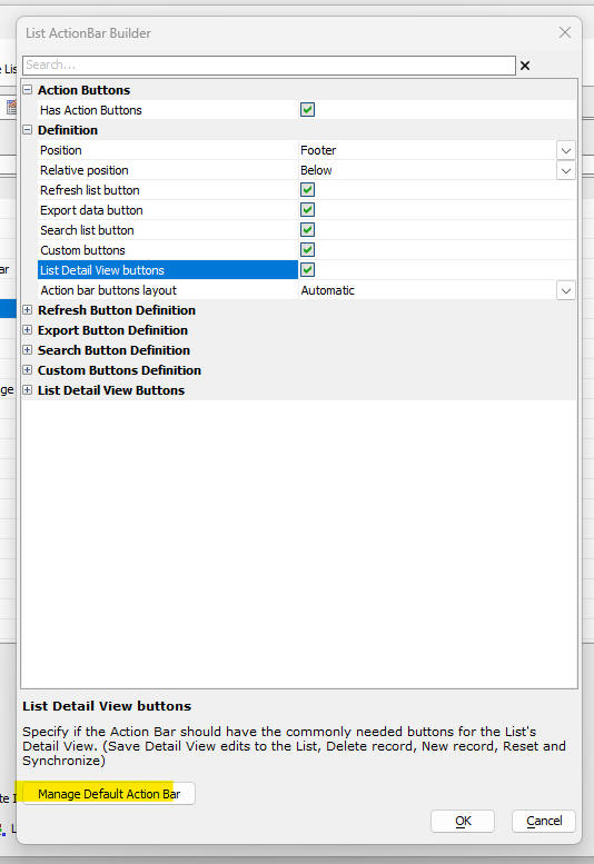
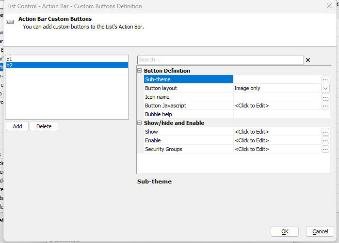
To define custom buttons, check the Custom buttons property, then expand the Custom Buttons Definition category (by clicking on the + icon), then click the smart field for the Definition property. This will open a builder (shown below) where you can define the appearance of each of the custom buttons and their Javascript actions. You can also define which security groups can see the button, and you can define Javascript code that determines if a button is shown or hidden or enabled or disabled. You can define as many custom buttons as you want.
The Default Action Bar
You can specify that every List should have an Action Bar even if an Action Bar has not been explicitly designed for the List. To define a Default Action Bar, click the Manage Default Action Bar button on the List ActionBar Builder dialog.
NOTE If you change the default Action Bar, after a List control has been defined, the default Action Bar displayed by the List (if any) will be the default Action Bar that was defined at the time the List was defined. If you want the List to display the new Action Bar, you must edit and then re-save the List.
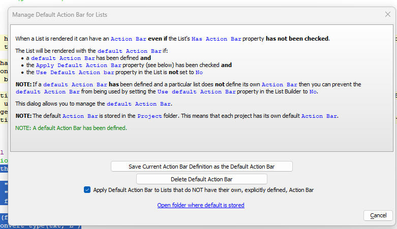
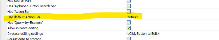
Once you have defined a Default Action Bar, you might want a particular List to not have an Action Bar. To do this, ensure that the List's Has 'Action Bar' property is not checked and the Use default Action Bar property is set to No. (or Default if the Apply Default Action Bar property on the Manage Default Action Bar for Lists dialog is not checked)
Action Bar Layout
You can control the order in which the Action Bar buttons appear in the Action Bar. You can also have complete control over the appearance of the Action Bar by defining an HTML template with placeholders for each of the Action Bar buttons.
The image below shown an Action Bar with a custom template that draws a border around the Detail View buttons.
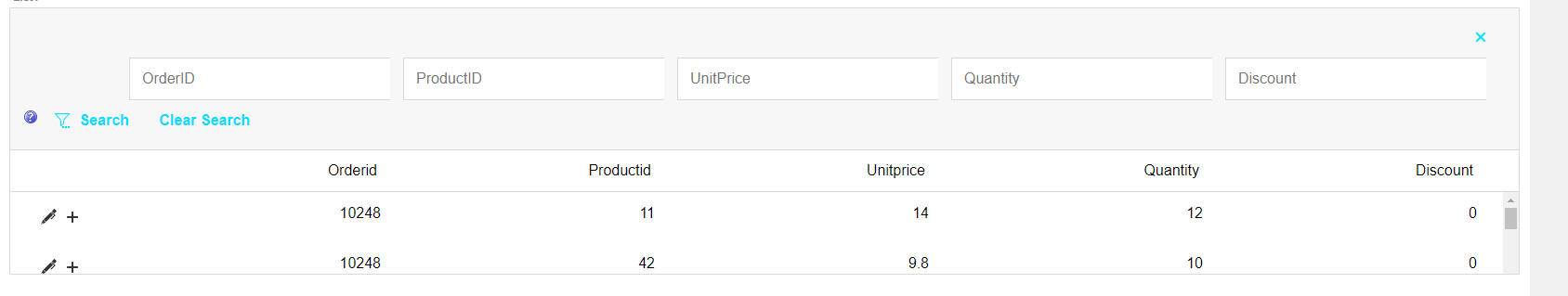
UX Component - List Control - Query-by-Example (QBE) - The QBE feature is a powerful way to search for data in a List.
The QBE feature display an input control above each column in the List as shown in the image below.
If the List columns are resizable, then the QBE fields will automatically adjust in size as the List columns are resized. Similarly, if you change the order of columns in the List, or you hide certain columns, the QBE fields will automatically adjust
NOTE: The QBE feature is only available for columnar Layouts.
NOTE: Even if you do not explicitly turn on the QBE feature for a List, the List can still use QBE to perform searches if the List has an Action Bar (which could be a default Action Bar) that includes the Search system button.
Turning on QBE for a List
To turn on the QBE feature in a List, open the List Builder and then in the List Properties pane, check the Has 'Query-by-Example' property.

To configure the QBE click the smart field for the Query-by-Example definition property. This will open the dialog shown below:
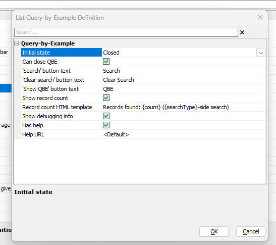
Properties of note in this dialog are:
Initial state - The QBE can either be shown or closed when the UX is initially rendered. If it is closed, a button (whose label you can set) is shown to open the QBE.
Record count HTML template - The template to use for displaying the records found by a search if the Show record count property is checked. The template should include placeholders. {count} - number of records found. {searchType} - indicates if the search as done client-side or server-side.
Has help - Indicate if the QBE has a button to explain the QBE syntax.
Help URL - If blank or <Default>, default help text is shown. If you want to customize the help text, specify the URL from where the customized help text should be loaded.
NOTE A List might have the QBE feature enabled even if you have not checked the Has 'Query-by-Example' property. If a List has an Action Bar, and the Action Bar has a Search button, the QBE feature will be enabled. Clicking the Search button in the Action Bar will open the List's QBE,
QBE Syntax
The following operators can be used when entering search criteria: .. (two dots), =, >, <, >= and <=
The .. (two dots) operator is used to indicate that you want to find:
Searches on character field are case-insensitive.
The search operators =, >, <, >=and <= have the following meaning:
= - finds record where a field is equal to a certain value (e.g. =alpha)
> - finds record where a field is greater that a certain value (e.g. >alpha)
< - finds record where a field is less than a certain value (e.g. <alpha)
>= - finds record where a field is equal to or greater than a certain value (e.g. >=alpha)
<= - finds record where a field is equal to or less than a certain value (e.g. <=alpha)
, - finds records when field is equal to any of a list of comma delimited search values (e.g. alpha,beta,gamma or =alpha,>beta,<omega) - finds record where a field equals alpha OR is greater than beta OR is less than gamma.
If you enter a search value without any operator (e.g. alpha), the default search operator for the field's data type is used.
The default search operator for each field in the List is defined in the Fields tab in the List builder.
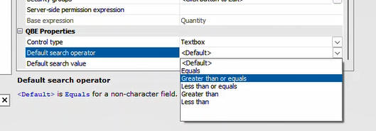
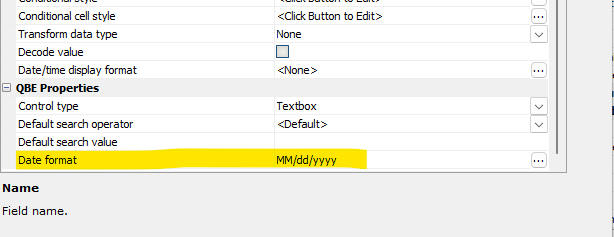
QBE Properties
Date and Datetime Searches
When searching for Date or Datetime values, you must specify the Date format in which the value appears in the List. This is needed so that the value can be converted to a Javascript date object.
When you enter a search value in the QBE for a Date or Datetime field, you can use any of the following special values:
To make it easier to enter one of these value, you can set the control type for the QBE field to DateRangeNames. This will display a dropdown control for the field in the QBE row where the user can select the Date Range Name.
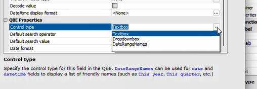
For certain fields in the QBE you might want to present the user with a list of choices. You can do this by setting the QBE control type for the field to Dropdownbox. The choices for the Dropdownbox and either be static or dynamic (a SQL query or an Xbasic function that returns a CR-LF delimited list of choices).
Understanding where QBE Searches are Executed
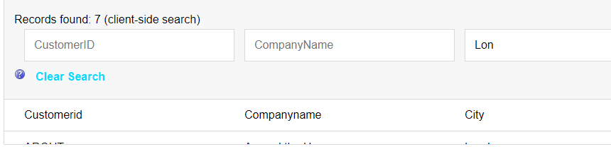
By default, QBE searches are executed client-side, making them extremely fast. If you have turned on the option to show the number of records found by a query, the message will indicate where the search was performed. For example, in the image below, the search was performed client-side.
In some cases, a server-side search is executed. For example, if the List is paginated or the List specifies the number of records to retrieve (i.e. the Record limit property is greater than -1)
This next image shows the message when a server-side search is executed
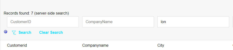
Notice that in the case of a server-side search, the QBE has a Search button which you must click in order to perform the search. In the case of a client-side search, the QBE does not have a Search button because the search is triggered by the onKeyUp event as you type a value into one of the search fields.
Live Test - Connection String Overrides - When you do a Live Test, the connection strings from the Local Webroot profile are used. Now you can set specific AlphaDAO and Storage connection strings for Live Test.
To define connection string overrides, click the Define Connection String Overrides hyperlink on the Live Test dialog.
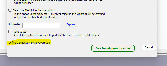
Overrides as stored in a file called LiveTestOverrides.json in the Web Projects folder.
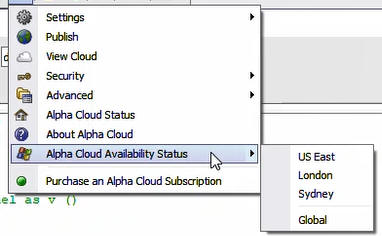
Alpha Cloud Status - You can now get uptime statistics for the various regions in which Alpha Cloud is available. To see the menu, click the Alpha Cloud button on the Web Control Panel.
a5w_reportSaveas Function - Email Report - You can now use use email settings defined in Project Properties to send a report via email after is has been generated. Previously, the only option was to use Sparkpost (or Sendgrid). When you specify the output filename, you specify a JSON string. In order to use settings defined in Project Properties, add a new property (emailType) to the JSON snd set this property value to ProjectProperties.
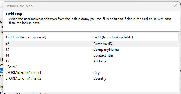
UX Component - Edit-combo and Auto-Suggest - Fiil-in Filelds - JSON Forms - When you define fill-in fields in an edit-combo or auto-suggest control, you can now fill in fields in a JSON Form.
UX Component - Repeating Sections - Pagination - You can now paginate the records in a Repeating Section if the UX is bound to SQL tables.
To turn on pagination, check the Paginate repeating section property in the Repeating section part of the property grid.
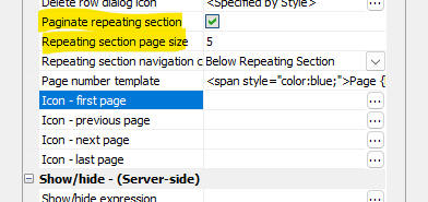
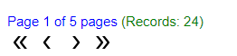
You can specify the page size, the template for the message showing what page of repeating section records is currently shown, and you can specify the icons to use in the Repeating Section navigation bar.
The image below shows a styled page number template and a navigation bar with customized icons.
When you navigate to a new page or records in a Repeating Section, the client-side beforeRptSectionNavigate event fires. If your code returns false, the navigation is aborted.
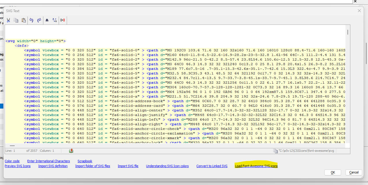
Font-Awesome V6 SVG Icons - You can now use Font-Awesome v6 SVG icons in your UX components. To load the font-awesome SVG icons, click the smart field for the Local SVG definitions property.
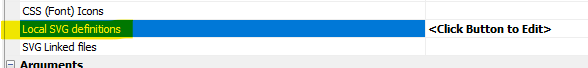
Then when the window opens, click the Load Font-Awesome SVG Icons hyperlink.
Xbasic - word_to_pdf() Function - Converts a MS Word .docx file to a .pdf file.
Syntxt:
flag = word_to_pdf as l (fndocx as c, fnpdf as c )
Where:
Application Server for IIS - Publishing - There is a new
setting in a publish profile labeled Account type.
The value defaults to Local Administrator Account
and can be changed to IIS Manager User.
When this is set, the publish process will only copy files from
Developer Edition to the IIS server.
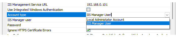
There is a lot of IIS configuration and validation that is left out of
the publish process when using an IIS Manager User.
If you are publishing a new site or application, the site/application
and application pool needed for the Alpha application will need to be
created/configured by an IIS server administrator.
UX Component - List Control - Create from Template - Now, when you create a new List control, you can now create the List from a previously saved template.
If you do not have any templates, a hyperlink that shows instructions on how to create templates is shown
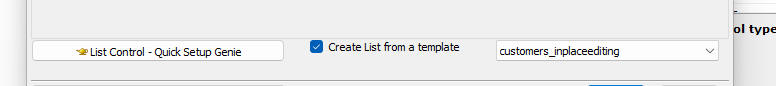
To create a template, open the List builder, define the List settings, then click the Save/load settings button.

NOTE The Create List from a template option is only shown if you select the Create a single new control option.
Xbasic - Export Functions - Xbasic now supports the export functions pattern, similar to the export pattern in Javascript modules.
To export a function, use the following Xbasic command
export.name_of_exported_function = function_to_export
Example:
'define a function called f1()
function f1 as c()
f1 = "alpha"
end function
'define a function called export() to export the f1()
function as myexportedfunction.
function export as p()
export.myexportedfunction = f1
end function
'call the export() function to get a reference to the
exported functions.
dim e as p
e = export()
txt = e.myexportedfunction()
showvar(txt)
NOTE: The function that exports functions can export as many functions as you want.
In the above example, we call e.myexportedfunction() (and not e.f1() ) because that is the name we gave the exported function.
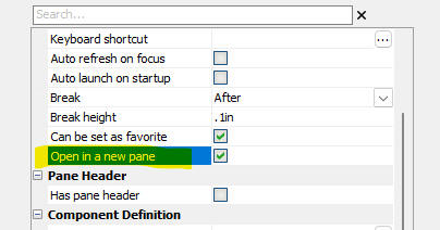
TabbedUI Component - Open Multiple Instances - By default, when you click a button in the TabbedUI component to open a component, the component is opened in a new tab Pane if it has not been previously opened, and if it has been previously opened, focus is given to the Pane where the component was opened. Now, a new option allows you to open a new instance of a component, in a new tab Pane, each time the button is clicked to open a component.
To turn on this feature, check the Open in a new page property in the button's properties.
UX Component - List Control - Freeform Layout - CSS Grid Genie - When defining the layout for a List row in a List that is configured to use a Freeform layout, you can now use the CSS Grid Genie to create a template that uses CSS Grid for precise layout of the controls in the List row.
To open the CSS Grid Genie click the hyperlink on the List Layout screen.
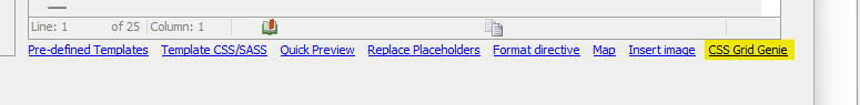
The genie will be displayed where you can define the structure (i.e. number of rows, columns, etc.) of the grid. The left hand column shows the fields in the list row. Fields shown in bold have already been placed in the grid. You can specify in which cell each field should be placed by clicking in a cell and selecting the field from the pop-up menu.
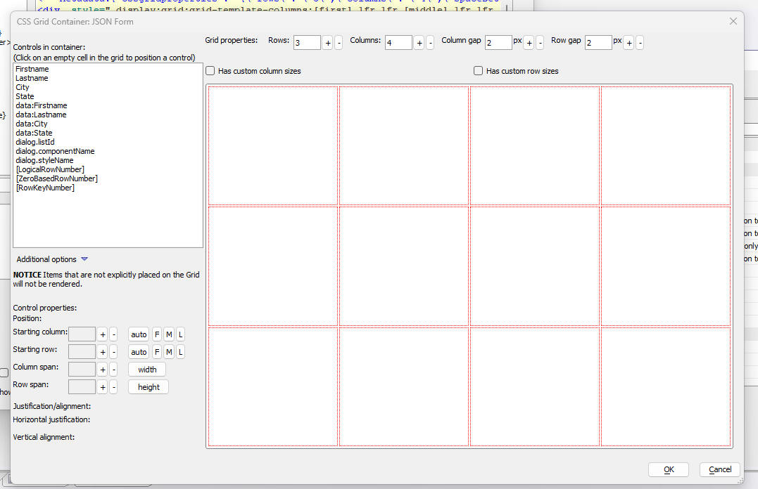
Once you have finished defining the CSS Grid layout and you have placed the fields on the grid, click the OK button to generate the HTML template as shown in the image below. Notice that the first line of the generated template is an HTML comment with meta data bout the CSS Grid. This meta data allows you to edit a previously defined CSS Grid.
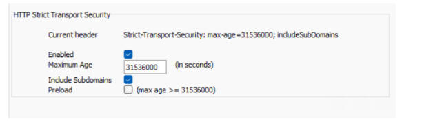
App Server - Classic - Headers - You can now specify that Include Subdomains and Preload should be including in the header.
word_merge_json() Function - Fixed an issue when running in the IIS server.
email_send_noprofile() - Fixed an issue when an attachment filename had a comma in the name (that had been encoded as {comma})
| UX Component - Federated Authentication | Federated Authentication - Cordova Application |
This video (without sound), shows a Cordova
application that uses federated authentication
with Azure AD. The video shows the
authentication step with Azure AD (initiated
from a button click in the Cordova app). After
the login has succeeded, the Cordova app is
closed and then reopened. The user is
immediately logged in, without having to go
through the authentication flow. Watch video Date added: 09-01-2024 |
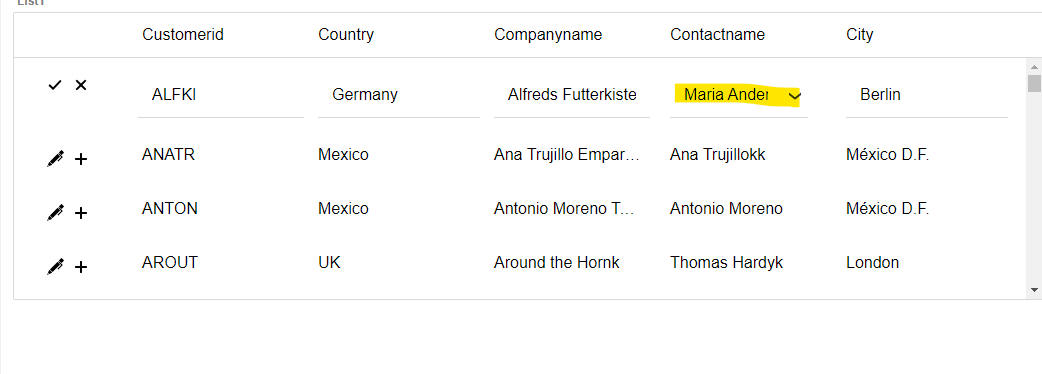
| UX Component - List Control - In-place editing | Using the CustomLookup control in the List when editing a value in the List with in-place editing. |
In this video we show how you can define a
CustomLookup control for editing a field in a
List using in-place editing. Watch video Download component Date added: 09-01--2024 |
| UX Component - List Control - In-place editing | Using the ListLookup control in the List when editing a value in the List with in-place editing. |
In this video we show how you can define a
ListLookup control for editing a field in a List
using in-place editing. Watch video - 1 Watch video - 2 Download component Date added: 09-01--2024 |
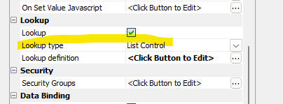
UX Component - List Control - In-place Editing - CustomLookup and ListLookup - You can now define two additional control types for in-place editing of a List. These are CustomLookup and ListLookup.
CustomLookup
ListLookup
Watch video - 1
Watch video - 2
When you are editing a row in a Lst, the CustomLookup and ListLookup control will appear as shown in the image below. (You can specify the icon to use). When the user clicks on the icon the CustomLookup or ListLookup window is shown.
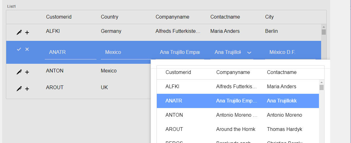
In the case of a ListLookup, the window will contain a List control. (the Lookup List) The user can either double click on a row in the List, or select a row, and then click the Commit button. The specified value from the selected row in the Lookup List will be filled into the List that you are editing.
In the image below, the Lookup Window is shown after the user has clicked the icon in the field that is being edited. The Lookup Window shows a List control and the List is synchronized to show the correct row (matching the value being edited).
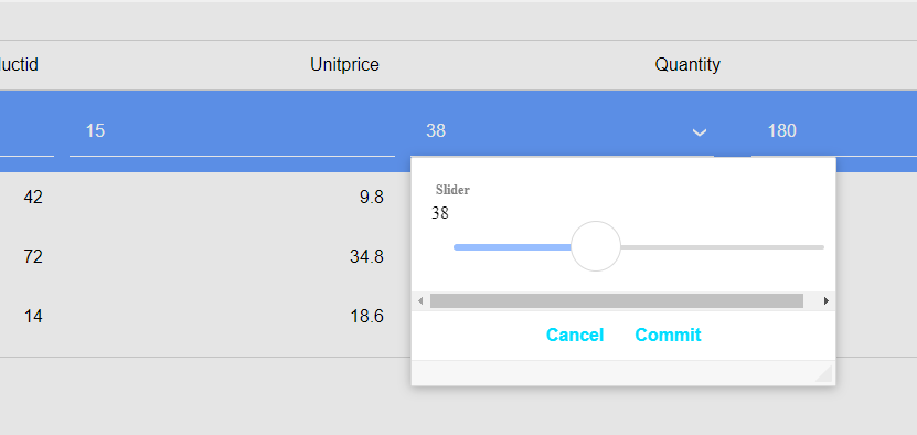
In the case of a CustomLookup, the window will contain any controls that you place in the window. The on Show event (which you must define) can be used to initialize the control(s) in the window with the value in the List that you are editing. When the user clicks the Commit button, the on Commit event fires. This event is used to insert a value from a control in the CustomLookup Window into the List that you are editing.
In the image below, the CustomLookup Window is shown after the user has clicked the icon in the field that is being edited. The CustomLookup Window shows a slider control and the slider is synchronized to show the correct value (matching the value being edited).
Defining a ListLookup Control
To define a ListLookup, go to the Fields tab in the List builder. Select the field that you want to edit. Then click the smart field for the Control settings property.
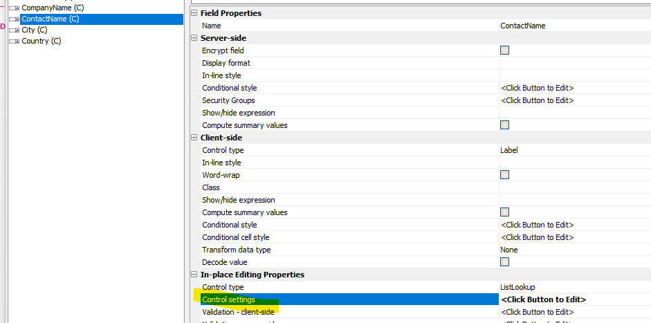
The In-place Edit Control Properties dialog will be shown, where you can define the ListLookup behavior.
The properties that you must set are:
All other properties need not be specified as they have default values.
Defining a CustomLookup Control
The In-place Edit Control Properties dialog for the CustomLookup is shown below.
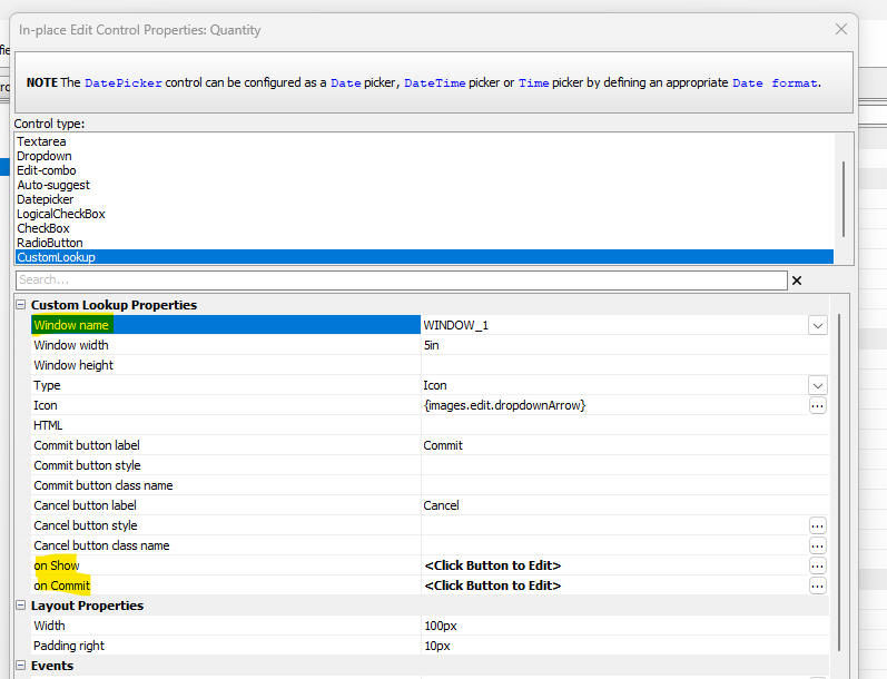
The properties that you must set are:
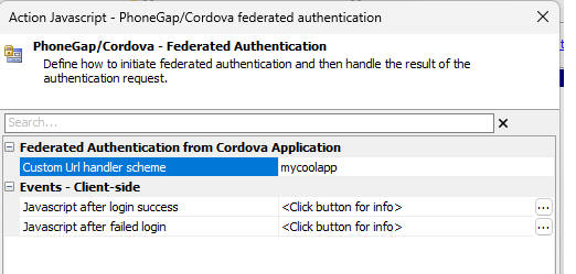
UX Component - Cordova - Federated Authentication - Logging in using federated authentication in a Cordova application is not as straightforward as with a web based application because the web view hosting the Cordova application has limited access. Additions have been made to Alpha Anywhere that allow federated authentication workflows to be done from a Cordova application.
Watch video (no sound)
The Cordova application will need to have the
custom URL scheme plugin and the in app
browser plugin added to the application. The
in app browser plugin will be used to
handle the SAML authentication workflow in
a system browser window and the custom URL scheme
plugin will be used to get back to the Cordova
application from the system browser window once the authentication
finishes.
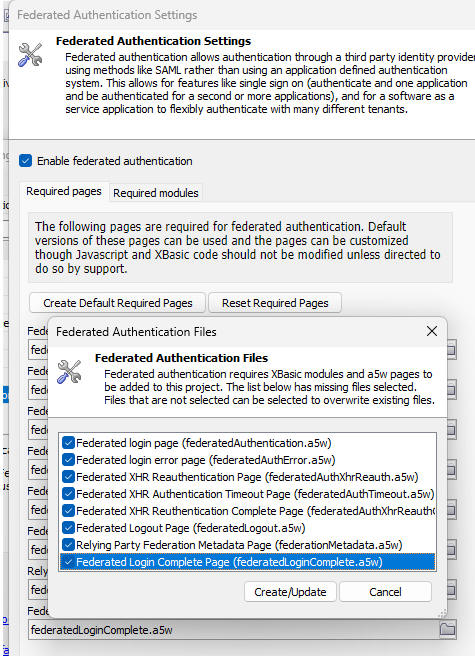
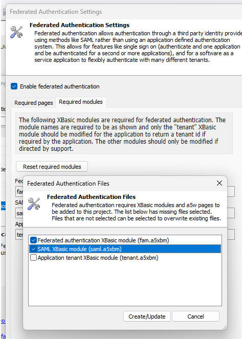
There are updated and new .A5W pages and updated XBasic modules in the
federated authentication configuration. If
federated authentication is already enabled
you will need to update/add these pages and modules. Use the "Reset
Required Pages" and "Reset Required Modules"
buttons in the configuration dialog to get these updates. Note that you
do not need to update the tenant.a5xbm
XBasic module.
 i
i
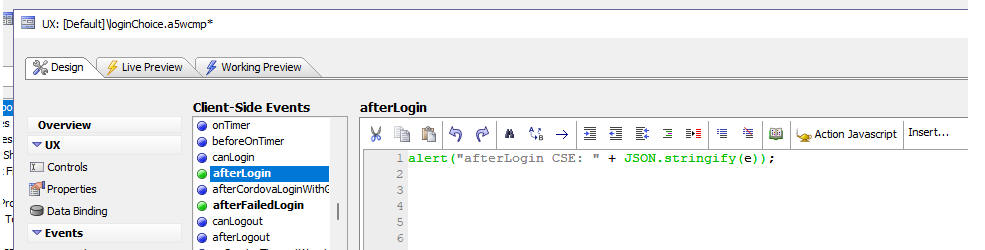
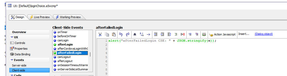
Finally, there is a new action Javascript option to initiate the
federated authentication login workflow,
define what the custom URL scheme is for
your application, and pointers to the component's
afterLogin and afterFailedLogin
client side event handlers so that your Cordova app will know about a
successful or failed login.
fec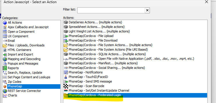
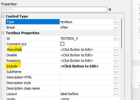
UX Component - JSON Forms - Include Property - All controls in JSON forms now have an Include property. The Include property is similar to the Show/hide property in that it can be used to show and hide controls.
The difference between the Show/hide property and the Include property is that if a control's Include property returns false, the control is not rendered at all, whereas if a Show/hide property returns false, the control is rendered, but it is not displayed and when the UX is submitted, the JSON data that is submitted will include a property for all hidden controls, but will not include any controls that are not included.
UX Component - JSON Forms - Containers - Two new Container controls have been added to JSON forms. These are FreeFormLayout and CSSGrid.
The image below shows the dialog for the Add item button with the Containers category selected.
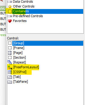
The FreeFormLayout container allows you to define an HTML template (in the control's Template property) that includes placeholders for the controls contained within the container. The FreeFormLayout container is functionally equivalent to the Group container (with the template specified in the Group control's Layout property).
The CSSGrid container allows you to define a CSS grid layout (e.g. number of columns, number of rows, gap between columns and rows, etc.) and then place the controls contained within the container in individual cells within the grid.
To define the CSS grid template, click the smart field for the CSS Grid template property, or double click on the CSSGridStart item in the list of selected controls.
The genie for defining the CSS grid is shown in the image below.
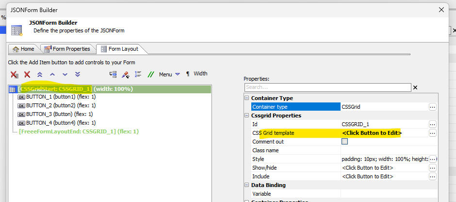
The next image shows the builder for the CSS grid, You can set the number of rows and columns in the grid. You can also set the gap between rows and columns. The list on the left shows the controls in the container. Each control must be placed in a cell in the grid. Controls that are not added to the grid will not be rendered. Controls that have been added to the grid are shown as bolded.
To add a control to the grid, click on the target cell. A pop-up menu showing all of the controls is show. Select a control. If you select a control that had previously been added to another cell in the grid, the control is moved from its original location to the target cell.
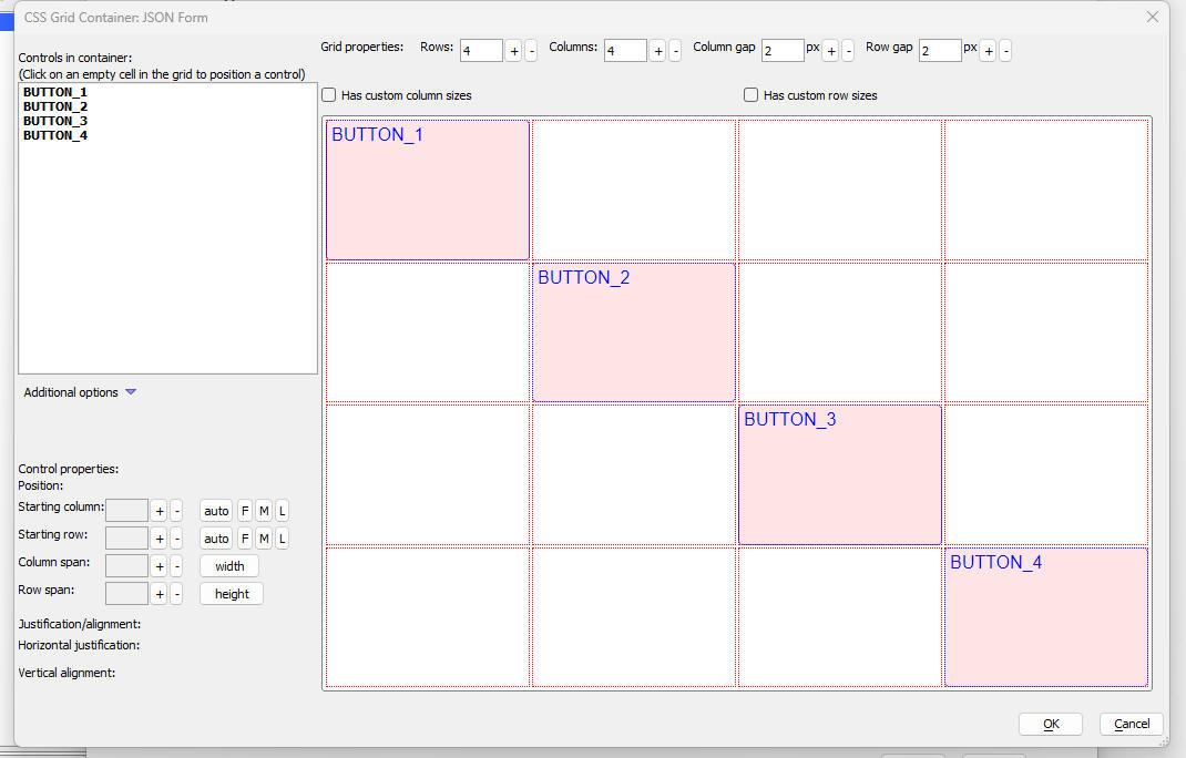
For each control on the grid, you can specify how many rows and columns the control should span, and how the control should be justified (both horizontally and vertically), within the cell.
UX Component - Cordova - iOS - Instant Update - Fixes an
issue with Instant Update on iOS devices. The
{dialog.object}.instatnUpdateUseAutoUpdate()
method, which can be used to turn off auto-updating of an app, did not
work on iOS devices.
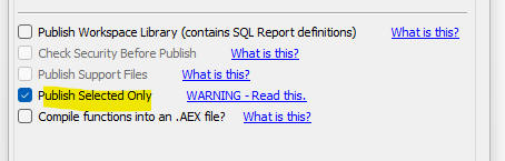
Publishing - Publish Selected Only - When you check the Publish Selected Only option, no additional files are automatically added to the list of files to be published.
Export to Excel - Numeric fields in the exported data are now preserved as numeric in the Excel file. Previously, numeric data was exported as character data.
| Firestore | Using the Firestore Explorer |
The Firestore Explorer allow you to see and edit
data in a Firestore collection. Watch video Watch video - querying a Firestore collection Date added: 2024-08-05 |
| UX Component - List Control | Using Firestore as the List's Data Source - Server-side Execution |
In this video we show how you can create a List
control that uses Firestore as its data source.
The List makes callback to the Alpha Anywhere
server and the Alpha Anywhere server
communicates with Firestore to get and update
data. Watch video Date added: 2024-08-05 |
| UX Component - List Control | Using Firestore as the List's Data Source - Client-side Execution |
In these videos we show how you can create a
List control that uses Firestore as its data
source. The List communicates directly with
Firestore to get and update data, so the Alpha
Anywhere server is not used. We demonstrate
Firestore's real-time features. We also show how
you can define Rules to lock down your Firestore
database and how you can add a login feature to
your UX so that only logged in users can see and
update data in the Firestore database. Finally,
we show how you can use the List's
onFirestoreLogin and onFirestorLogout events to
update a message on the screen that show the
login status. Watch video 1 Watch video 2 Watch video 3 Watch video 4 Watch video 5 Watch video 6 Date added: 2024-08-05 |
How to add Basic Authentication to an .a5w page (Classic Server) - The following .a5w page shows an example of how basic authentication can be added to an .a5w page.
<%a5
if .not. Authenticated() then
AuthenticationPrompt()
Response.End()
else
%>
<html>
<head><title>Protected by Basic Authentication</title></head>
<body>
<h2>You are Authenticated</h2>
<p>You cannot see this page unless you have passed HTTP Basic
Authentication. Congratulations, you have been authenticated.</p>
<p>The current time on the server is <%a5 ? time() %> </p>
</body>
</html>
<%a5
end if
function Authenticated as l ()
Authenticated = .f.
if ("Authorization: Basic " $ Request.Headers)
dim EncodedUserAndPass as c =
extract_string(Request.Headers, "Authorization: Basic ", crlf())
dim DecodedUserAndPass as b =
base64decode(EncodedUserAndPass)
dim Username as c =
word(DecodedUserAndPass, 1, ":")
dim Password as c =
word(DecodedUserAndPass, 2, ":")
if (Username = "Alpha" .and. Password
= "Anywhere")
Authenticated
= .t.
end if
end if
end function
function AuthenticationPrompt as v ()
Response.StatusCode = "401"
Response.StatusDescription = "Not Authorized"
Response.Headers.Add("WWW-Authenticate", "Basic")
end function
%>
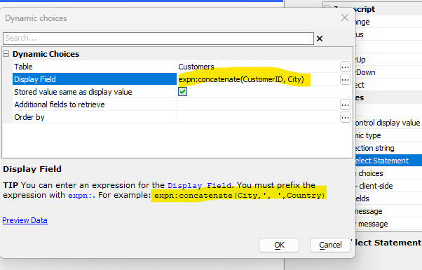
JSON Forms - Auto-suggest and Edit-Combo - Defining an expression for the Display Field - When you define an expression for the Display Field you must now prefix the expression with expn:
SetValue Method - JSON Forms - Previously, when you set the value of a control in a JSON form using this syntax:
{dialog.object}.setValue('JSONFORM::JForm1::FirstName','Fred',true);
the JSON form did not go dirty. Now, there is an optional parameter that can be set to true to force the JSON form to go dirty.
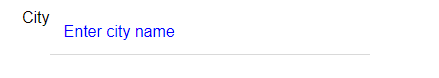
UX Component - JSON Forms - Placeholders - You can now define placeholders for textbox, dropdown, edit-combo and auto-suggest controls. The placeholder text can be styled by specifying a class name or a style.
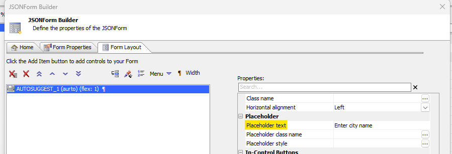
The image below shows a textbox control with some placeholder text, styled to appear in blue. As soon as the user starts typing into the field, the placeholder text is removed.
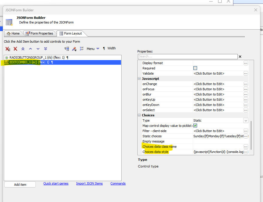
UX Component -JSON Forms - RadioButtonsGroup, CheckboxesGroup and RadioButton. JSON Forms now support three additional control types. The RadioButtonsGroup and the CheckboxesGroup controls allow you to define a radio button or checkbox control and also specify the choices for the control. The choices can be static or dynamic. If dynamic, you can specify a SQL query, or an Xbasic function, or a Javascript function. The controls in the group can be laid our horizontally, vertically, or in multiple columns.
The RadioButton control is a single control. It does not have choices. Instead you must specify the label for each individual control in the Radio Button HTML property. You can insert as many RadioButton controls into the JSON form as you require. The individual RadioButton controls will behave as RadioButtonsGroup conjtrol as long as you specify the same varialble name for each control in the group.
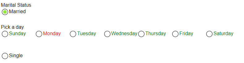
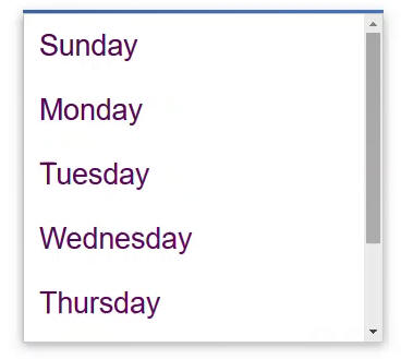
In the image below, the radio button for Pick a day are in a RadioButtonsGroup control and the choices have been defined as a static list. Note also that the radio button for Monday is red. This was done by setting the Choices data style property to this Javascript function.
{javascript}function(d) {if(d.html == 'Monday') return 'color red; else return 'color:green;'}
The Married and Single radio buttons are individual RadioButton controls. They behave as a group because they use the same variable name. Notice that the RadioButtons in this group are separated by the Pick a day control. This is possible because you have the ability to place the individual RadioButton controls at any location on the JSON form.
When you define a RadioButton control, you must specify the value that the control will return when the RadioButon is selected. The value is set in the Value property in the RadioButton Properties section in the JSON Form builder. For example in the JSON Form shown below the value for the Married radio button might be set to married and the value for the Single radio button might be set to single.
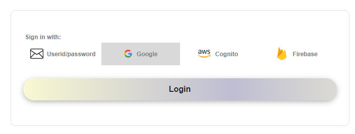
UX Component - Login - The Login Component (built from a UX component) has been redesigned. The component now supports login using Firebase and instead of multiple login buttons (one for each login provider), there is now a single button, which logs the user in using the provider selected in the button list above the User ID prompt.
If the only supported login provider is Userid/password, the button list is hidden.
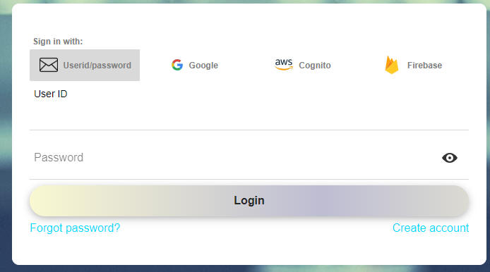
Note: When you select the Google or Cognito option, the User D and Password prompts are hidden because they are not needed.
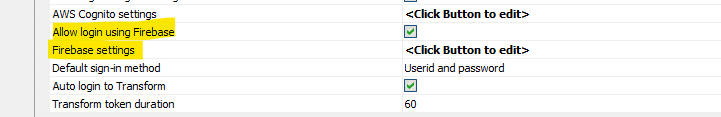
To enable the Firebase login provider, you must have a Firebase account with Google and then in the UX Builder,
check the Allow login using Firebase property and then define your Firebase settings
UX Component - List Control - Firestore - The List control can now use Firestore as a data source. Firestore is a NoSQL database that is part of Google's Firebase product line.
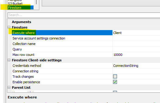
When you use Firestore as the data source for a List you must set the Execute where property to either Server or Client. When you use the Server option, the List communicates with the Alpha Anywhere server and the server communicates with Firestore. When you use the Client option, the List communicates directly with Firestore (i.e. the AA server is not involved at all).
Watch video
- server- side execution
Watch video
1 - client-side execution
Watch video
2 - client-side execution
Watch video 3 -
client-side execution
Watch video 4 - client-side execution
Watch video
5 - client-side execution
Watch video
6
-
client-side execution
NOTE The client option is not supported in the Alpha Anywhere Community Edition.
The Client option exposes more of the Firestore features, such as offline use and real time updates. To turn on offline use, check the Enable persistence property.
To turn on real-time updates, check the Track changes property. When Track changes is turned on, any update to the data in the Firestore database are immediately reflected in the List, (i.e. no need to refresh the List) and any updates to the List data that are made are immediately reflected in the Firestore database and in the List control that any other user sees (assuming that those uses are using a List that is also configured to track changes).
When you configure a List to use Firestore you will need a server-side connection string (i.e. a service account) and a client connection string (assuming you have selected the Client option for the Execute where property). For more details on how to create Firestore connection strings, see the section below.
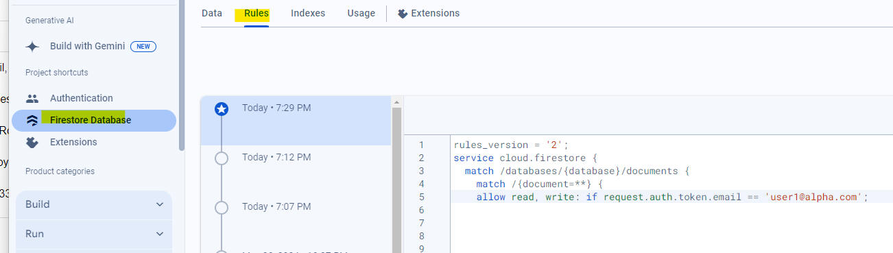
List Control - Client-side Execution - Securing your Firestore Database - When you use client-side execution for a List that uses Firestore as its data source, it is necessary to to secure your database by defining rules for your database in the Firestore console. This is because your Firestore credentials are exposed in the browser and can be seen by a user who uses the browser's developer tools.
You will typically want to define a rule that only allows logged in users to read and write data. For example, your rule might have
allow read, write if
request.auth != null
Or, you might want to further lock down your database by defining a rule that only user1@alpha.com can read and write data. Your rule would then have:
allow read, write:
if request.auth.token.email == 'user1@alpha.com';
The image shown below shows the Firestore console where a rule has been defined to only allow user1@alpha.com to see and update the database.
Logging into Firestore - You can log into Firestore by creating a Login component (from a UX) and enabling the Firebase option, or by calling the List object's .firestoreLogin() method.
Here is some sample code you might put in a UX component to log into Firestore using a method on the List object:
var lObj = {Dialog.object}.getControl('LIST1')
//read the userid and password fields
var user = {dialog.object}.getValue('uid');
var pw = {dialog.object}.getValue('pw')
lObj.firestoreLogin(user,pw);
By using the List's firesoreLogin() method, you can create a UX with multiple List controls, each connected to a different Firestore database. Each List on the UX might have its own rules that protect the database to only allow certain users to see the data.
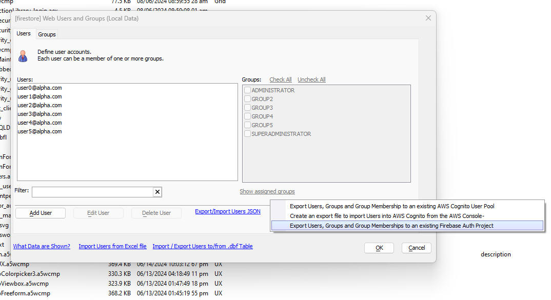
Exporting Users, Groups and Group Memberships from the Security Framework to Firebase - You can export the seed users, groups, and group memberships from the Alpha Anywhere Security Framework to Firebase.
To do so, open the Web Users and Groups dialog and click the Other Export hyperlink.
This will display a menu as shown in the image below.

Firestore Explorer - The Firestore Explorer allows you to view, query and update a Firestore database. To open the Firestore Explorer, select the Firestore Explorer menu command from the Tools menu.
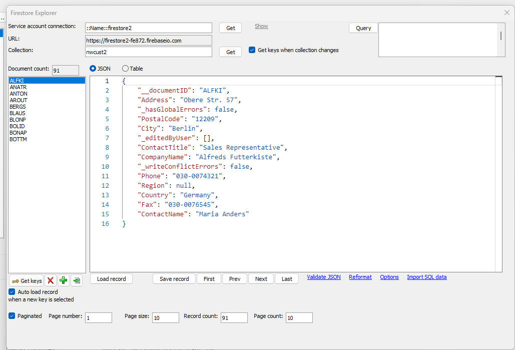
The Firestore Explorer allows you to edit, delete and insert documents into a collection. You can create and delete collections. You can search for specific documents in a collection and you can import data from a SQL table into a collection.
T he Firestore Explorer is shown below:
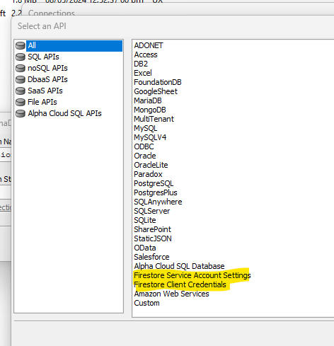
Firestore Connection Strings - You can create two different types of Firestore connection strings. These are for server-side use (i.e. also called a Service Account) and for client-side use (where the browser communicates directly with Firestore rather than making calls to the Alpha Anywhere server, which then in turn interacts with Firestore). To create a new connection string, select the Tools menu and then AlphaDAO connection strings.
Then click the New button.
When you build your connection string you can select either Firestore Service Account Settings or Firestore Client Credentials.
Xbasic - Firestore - New functions have been added for working with a Goggle Firestore NoSQL database.
These functions are:
firestore_addDocument () -- Adds a new document to a Firestore collection.
Syntax
p result = firestore_addDocument(c serviceAccountConnectionString, c collection, c JSON [, c key])
Where:
Example
'create a new document with an id of "Smith" in a collection called "newCollection"
dim p as p
p.firstName = "Fred"
p.lastName = "Smith"
dim json as c
json = json_generate(p)
dim pr as p
pr = firestore_addDocument("::name::my_fs_connString","newCollection",json,"Smith")
firestore_updateDocument() - Updates a Firestore document.
Where:
firestore_deleteDocument() - Deletes a document from a Firestore collection.
Where:
firestore_bulkImportDocuments() - Imports multiple documents into
a Firestore collection.
Where:
Importing from a SQL Database
If you want to bulk import from a SQL database, the JSON that you pass to the function must be an object with these properties:
Example:
dim pp as p
pp.connectionstring = "AADemo-Northwind"
pp.sql = "select EmployeeId as id, Lastname from Employees"
pp.argumentsXML = ""
dim json as c
json = json_generate(pp)
'this JSON can be passed into the firestore_buldImportDocuments() function
firestore_getDocument() - Finds an individual Firestore document specified by the document ID
Where:
firestore_query() - Finds all documents matching a filter condition. Returns an array of matching documents
Where:
Query Definition Syntax
Firestore supports the following following query operators:
A query can only contain a single in, not-in or array-contains-any clause.
The query syntax is a CR-LF delimited string of query clauses. For example:
Find all documents where the City is London
City (==) London
Find all documents where the City is London or Paris
City (in) London,Paris
Find all documents where the City is Paris and the Country is USA
City (in) Paris
Country (==) USA
Multiple conditions are always ANDed together. You cannot specify that conditions should be ORed. Simple OR conditions are achieved using he in, not-in and array-contains-any operators.
See the Firestore documentation for more information.
UX Component - JSON Forms - Choices - Style and Class - You can now specify a style and classname for the choices displayed by edit-combo and auto-suggest, RadioButtonsGroup and CheckBoxesGroup .
The style or classname can be specified by a function that returns different class names or styles, depending on the data.
For example, you might enter the following value for the style to show the label for Monday in red.
{javascript}function(d) {if(d.html == 'Monday') return 'color:red; else return 'color:purple;'}
Notice that the function must be prefixed with {javascript} and that the function takes 'd' (an object with an html and value property)
Grid Component - Export to Excel/Ascii - Security Groups - You can now specify which security groups can see the Export button. If you specify Security groups for the export action, only users who are logged into the specified group will see the Export button
Grid Component - Export to Excel/Asccii - Minimum Duration Between Successive Executions - You must now wait at least 10 seconds between successive export actions. This was added to prevent a user from clicking rapidly on the Export button, and therefore making multiple Ajax callbacks, which increases the load on the server.
Application Server- Classic - The Alpha Anywhere Classic Application Server now supports and fully honors the Context.Request.TimeoutBehavior and Context.Request.TimeoutDurationSeconds settings, making it consistent with IIS and Alpha Cloud.
Chrome - The embedded version of Chrome that is built into the IDE (used for Live Preview and Working Preview, for example) has been updated to use the latest Chrome build.
UX Component - JSON Forms - Textbox Controls - In-Control Buttons - You can now define in-control buttons for textbox controls and all control types that derive from textbox (e.g. edit-combo).
To define in-control buttons check the Custom in-control buttons property and then click the smart field for the In-control buttons definition property.
This will open a dialog (shown below), where you can define the buttons. You can place the buttons at either the left or right edge of the control and the buttons can be either an icon or HTML text.
The image below shows a textbox control with an in-control button (an icon) on the right edge of the control.
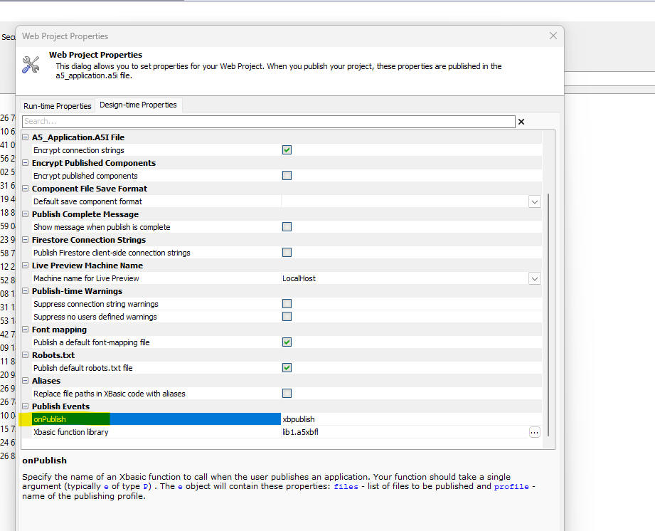
onPublish Event - A new event is fired when an application is published. The event calls an Xbasic function which must be defined in an Xbasic Function Library.\
To define the name of the function and the Xbasic Function Library, go to the Design-time Properties tab in the Web Project Properties dialog.
The Xbasic function should take a single argument of type P. This object will have these properties:
The typical use case for this function is to bump the version number of your application and to store the value in a database table that can be referenced at run-time in an .a5w code block..
UX Component - Repeating Section - List and Custom Lookup - List and Custom lookups are now supported for controls in Repeating Sections.
XBasic - AWS Functions - The following Xbasic functions have been added for working with various AWS services:
| Function Prototype | Description |
| C aws_cognito_group_create(C connectionString ,C userPoolId ,C groupName [,C region ]) | Create a group in a Cognito User Pool |
| C aws_cognito_group_delete(C connectionString ,C userPoolId ,C groupName [,C region ]) | Delete a group from a Cognito User Pool |
| C aws_cognito_groups_list(C connectionString ,C userPoolId [,C region ]) | List the groups in a Cognito User Pool |
| C aws_cognito_user_add_to_group(C connectionString ,C userPoolId ,C email ,C groupName [,C region ]) | Add a Cognito user to a Cognito group. |
| C aws_cognito_user_create(C connectionString ,C userPoolId ,C email [,C first_name [,C last_name [,C region ]]]) | Create a new user in a Cognito User Pool |
| C aws_cognito_user_delete(C connectionString ,C userPoolId ,C email [,C region ]) | Delete a new user in a Cognito User Pool |
| C aws_cognito_user_password_set(C connectionString ,C userPoolId ,C UserId ,C Password [,C region ]) | Set the password of a user in a Cognito User Pool |
| C aws_cognito_users_list(C connectionString ,C userPoolId [,C region ]) | List users in a Cognito User Pool |
| C aws_dynamodb_item_delete(C connectionString ,C tableName ,C key [,C region ]) | Delete a record in a Dynamodb database |
| C aws_dynamodb_item_get(C connectionString ,C tableName ,C keyJson [,C region ]) | Retrieve a record from a table in a Dynamodb database |
| C aws_dynamodb_item_put(C connectionString ,C tableName ,C json [,C region ]) | Save a record in a table in a Dynamodb database |
| C aws_dynamodb_item_put_batch(C connectionString ,C tableName ,C json [,C region ]) | Executes a SQL query to retrieve data and then inserts new records into a table in a Dynamodb database. JSON has these properties: connectionstring, sqlstatement and argumentsxml. |
| C aws_dynamodb_item_scan(C connectionString ,C tableName ,N limit [,C startkeyjson [,C region ]]) | Retrieves multiple records from a table in a Dynamodb database |
| C aws_dynamodb_table_create(C connectionString ,C tableName ,C primaryKey [,C region ]) | Create a table in a Dynamodb database |
| C aws_dynamodb_table_delete(C connectionString ,C tableName [,C region ]) | Delete a table in a Dynamodb database |
| C aws_dynamodb_table_describe(C connectionString ,C tableName [,C region ]) | Describe a table in a Dynamodb database |
| C aws_dynamodb_tables_list(C connectionString [,C region ]) | List tables in a Dynamodb database |
| P aws_s3_bucket_create(C connectionString ,C bucketname [,L makePublic ]) | Create a S3 bucket |
| P aws_s3_bucket_delete(C connectionString ,C bucketname ) | Delete a S3 bucket |
| P aws_s3_bucket_SetPublic(C connectionString ,C bucketname ) | Enable public access to a S3 bucket |
| C aws_s3_buckets_list(C connectionString ) | List all S3 buckets |
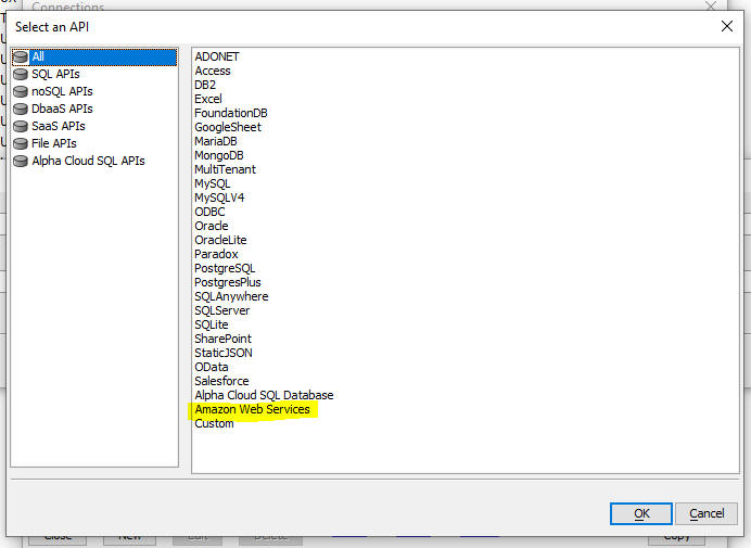
In all of the AWS functions, connectionString is an Alpha DAO connection string defined using the Amazon Web Services option.
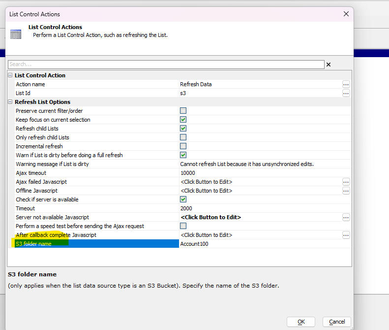
UX Component - List Control - S3 Bucket _Refresh - Folder - When a List is based on a S3 bucket, you can now specify a folder name when you refresh the list data.
Xbasic Functions - a5storage_getItem_as_blob2() - This function is a variant of a5storage_getIem_as_blob(), but it returns a CallResult object, with information about whether there was an error when the item was retrieved. The a5storage_getIem_as_blob() function simply returns a blank value if the object was not found.
Syntax:
CR as callResult = a5storage_getItem_as_blob2( c StorageConnectionString, c Itemname[,P presult])
Where:
Example:
dim cs as c = "mystorageconnection"
dim objname as c = "folder1/obj1.jpg"
dim cr as callResult
dim pResult as p
cr = a5storage_getItem_as_blob2(cs,objname,pResult)
if cr.error = .f. then
dim blob as b
blob = cr.ReturnDataValue
end if
onAppinit Event - A new event has been defined for both the classic server and the IIS server. The event calls an Xbasic function when an application is first started. Then event will fire once (and only once) before the first request is handled by the server. The Xbasic function is defined in an Xbasic Function Library in the web project.
To define the name of the Xbasic function and the name of the Xbasic Function Library open the Project Properties dialog and navigate to the Application Events section. Fill in the name of the function to call at the onAppStart property and the name of the Xbasic function library at the Xbasic function library property.
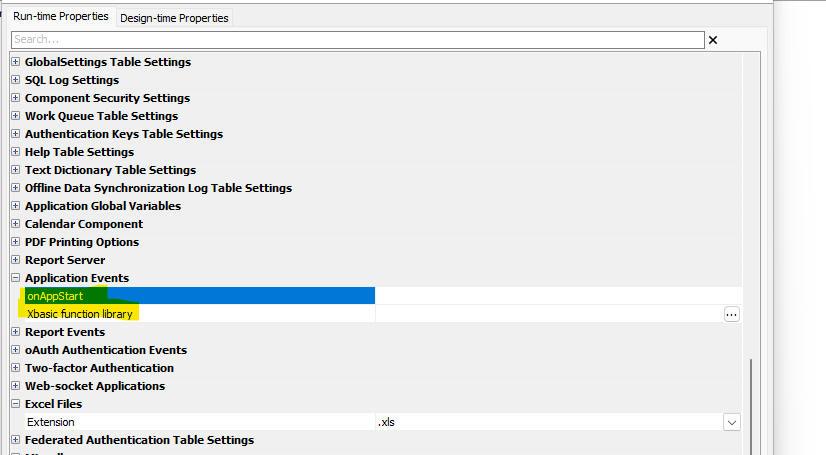
In the IIS server, the script is run at the end of AppDomain initialization. It is not run in the context of a request so while there is a "Context" object, there are no Context.Request, Context.Response, or Context.Session objects. The Context.Security object exists, but there is no logged in user and any user specific functions will either return false or a CallResult failure.
UX and Grid Component - Export Excel - Client-side Date Format - Dates in the Excel file now use the format defined in the UX or Grid component.
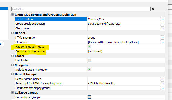
UX Component _ list Control - Client-side Group Breaks - Continuation Headers - (Only applies if List virtualization is turned on.) You can now define continuation headers. A continuation header is displayed when a group crosses a page boundary.
For example in the image below, the group for Brazil has started on the previous page. The continuation header for Brazil is displayed at the start of the current page.
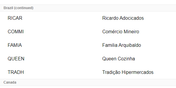
To turn on continuation headers check the Has continuation header property and define the Continuation header text.
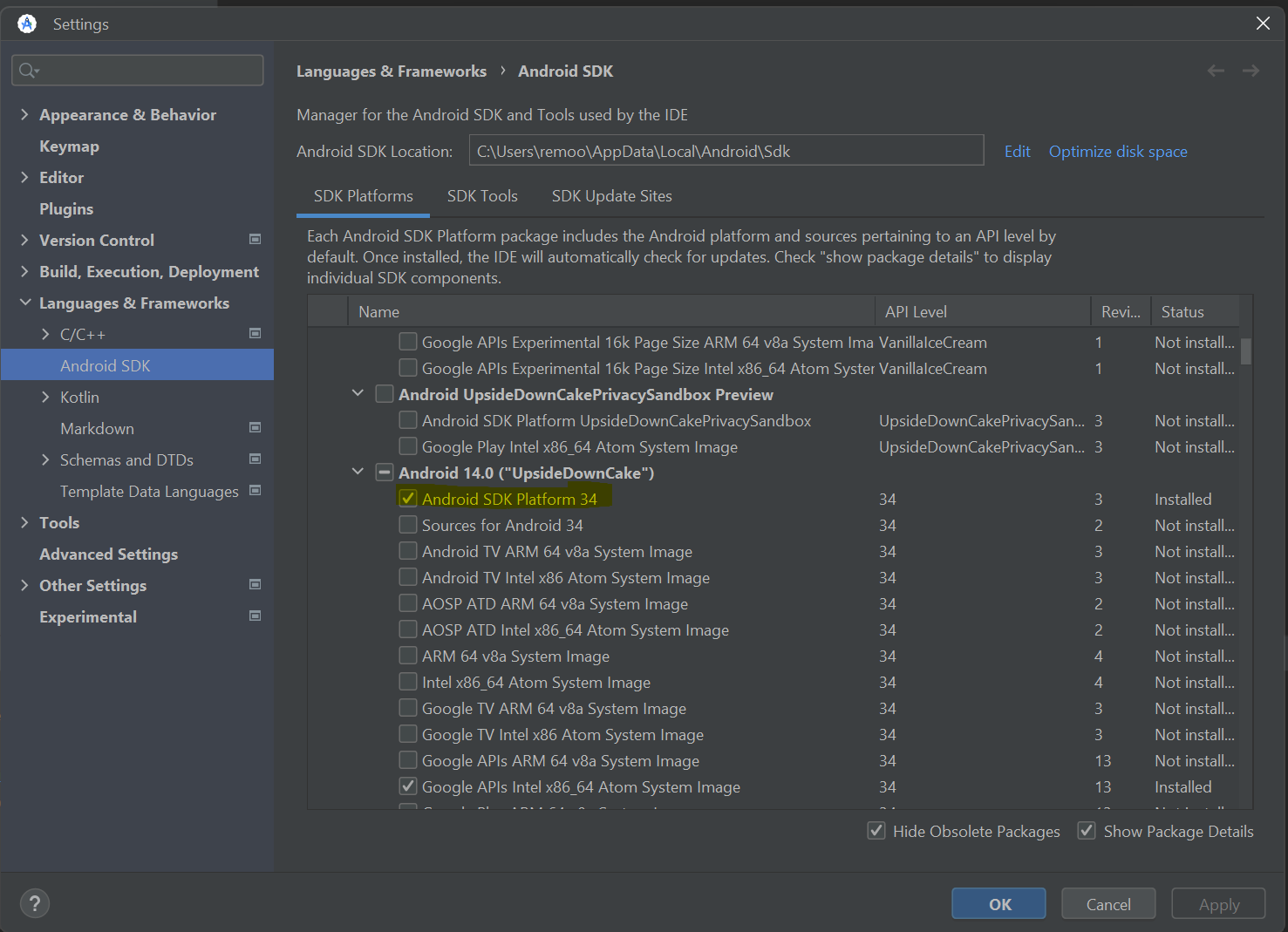
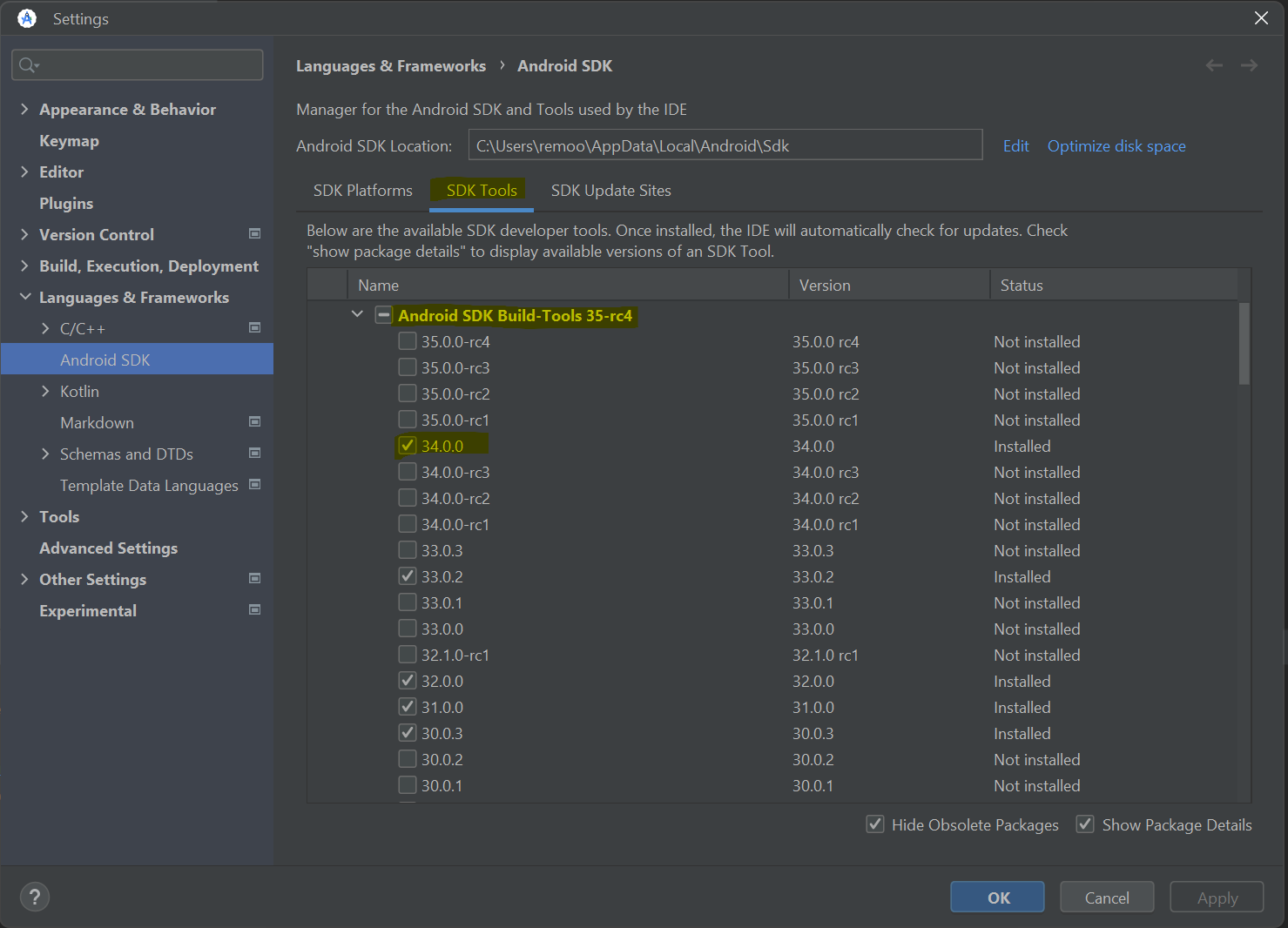
Cordova App Builder Genie - Cordova Android 13.0.0, API Level 34 - This release includes support for Cordova Android 13.0.0, API Level 34, which has breaking changes when compared to the previous release, Cordova Android 12.x.x.
The changes include:
Project Dependencies
The following project dependencies were bumped:
You no longer need a local version of Gradle installed. Gradle 8.7 will be downloaded as part of the build process.
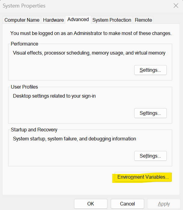
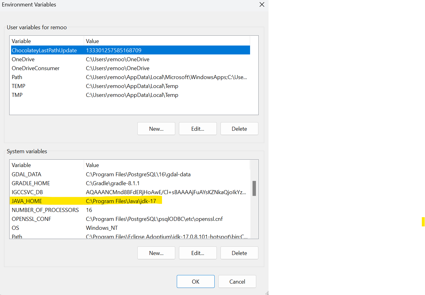
If you have a local version of Gradle installed and you run into build problems, look for and remove the Gradle reference in your system environment variables.
To install Android SDK Platform 34
To install SDK Build Tools 34
To download and install JDK 17:
After JDK 17 is installed, be sure to check your system environment variables to be sure the JAVA_HOME is pointed to your install of JDK 17
When building a Cordova Android App with the Alpha Cordova App Builder genie be sure to set the target SDK to API level 34.
For further infomation see:
Docker Container Builds | Docker Desktop | New Docker Image Required
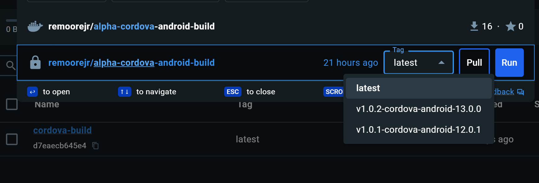
If you are building Android apps with a Docker Container, you will need to delete the existing remoorejr/alpha-cordova-android-build Docker Image in Docker Desktop and install the latest version of the Docker Image.
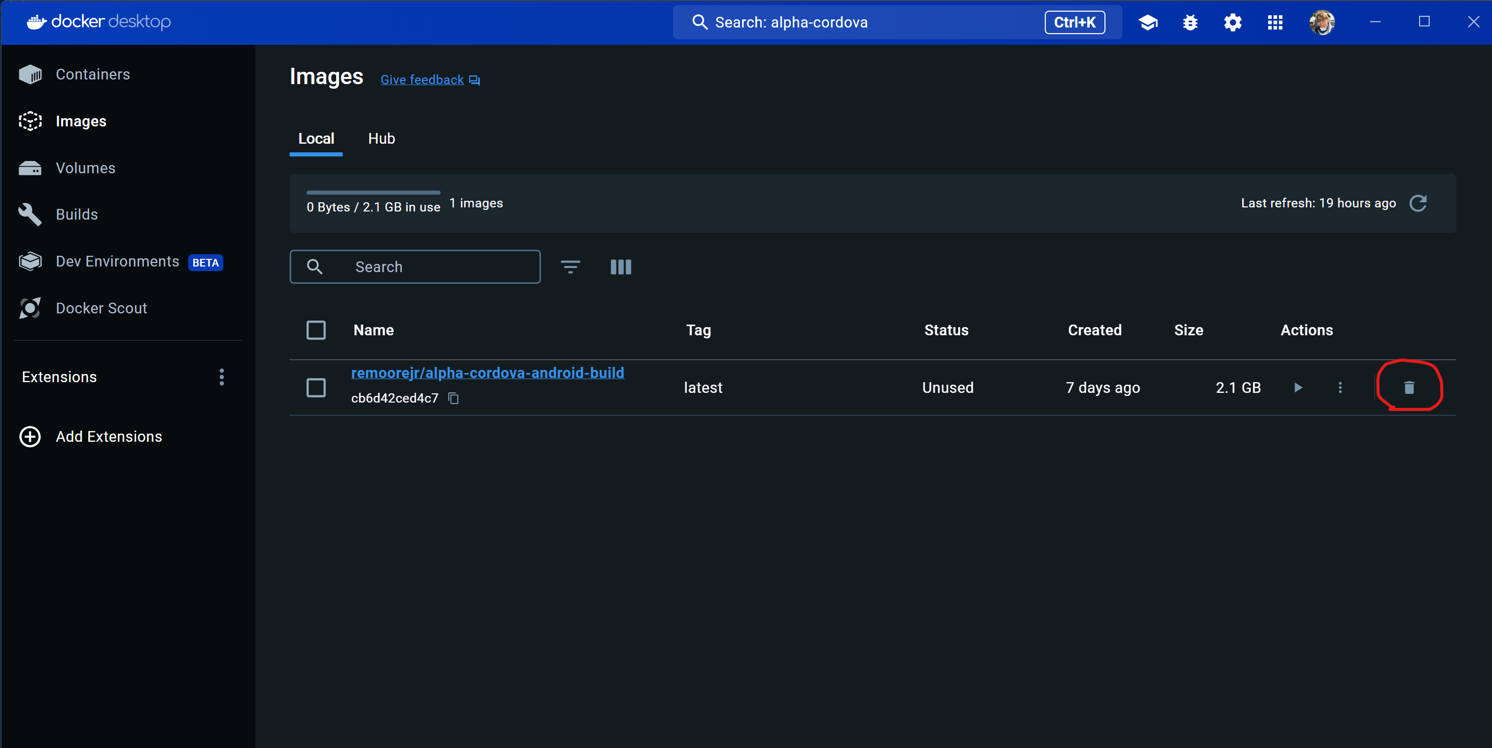
Once you delete the container, search for "Alpha-Cordova" and select the latest version of the image
remoorejr/alpha-cordova-android-build, which is the same as
the image tagged v1.0.2-cordova-android-13.0.0.
The new container includes support for:
When building a Cordova Android App with the Alpha Cordova App Builder genie be sure to set the target SDK to API level 34.
UX Component - Slider - Date Data Type - Fixed issues with the slider control when the data type was set to date.
UX Component - List Control - .addTableRowsBulk() Method - Fixed an issue when the method was used on a List hat had a parent and a child List with pre-fetched data.
UX Component - Embedded Grid - Delay Render Till Visible - Fixed a regression.
Grid and List in UX Component - Export to Excel - No records - When the exported data has no records, field names are now emitted into the first row in the Excel file.
Action Javascript - Send Report via Email - Classic Server - Fixed a regression.
Grid Component - Detail View - Security - Only show Detail View on Demand - If the Detail View was only shown on demand, security settings to show/hide fields in the Grid's Detail View were not applied.
Gid Component - Show/hide and Enable Expressions - Grid.isDirty and Grid.rowIsDirty - Fixed a regression when Grid.isDirty or Grid.rowIsDirty were used in a client-side watch expression.
UX Component - Edit-combo - Blank Entries - Blank entries were incorrectly added to the picklist even when the User must select from list property was false.
UX Component - Sign S3 URL - The code to sign AWS S3 URLs was executing in situations where it should not have been executing. This occasionally resulted in Node JS errors, which impacted the performance of the application.
UX Component - Export to Excel - if the Use column-headers property was not checked, the column headers in the Excel file would not be correct for column names that had an underscore (e.g. Last_name).
UX Component - Panels - Fixed an error when saving a UX component that had a Panel Card inside a Panel Navigator.
| Grid Component | Validating Data in Search Part |
In this video we show how to create the
client-side CanSearch event is used to validate
the data in the Grid's Search Part before the
data are submitted to the server. Watch Video Date added: 2024-02-08 |
| UX Component - Light Weight List | Defining Dropdownbox, Edit-combo and Auto-suggest Controls |
When you create a Light Weight List control you
can specify that the controls for certain
columns should be dropdown boxes, edit-combo or
auto-suggest controls. For all of these control
types you can specify the choices shown in the
pick list. The choices can either be static or
dynamic. Dynamic choices are derived by querying
a SQL database. In this video we should how the Country field is an edit-combo and the City field is a dropdown box control that is filtered to only show cities for the selected Country. Watch video Date added: 2024-02-19 |
| UX Component - Light Weight List | Create Light Weight List from List |
In this video we show how you can create a Light
Weight List by importing settings from a List
control. Watch video Date added: 2024-02-25 |
| Grid Component | Lock Screen During Ajax Callbacks |
In this video we show how you can lock the
screen during an Ajax callback. This prevents
the user from initiating a subsequent callback
until the initial callback has completed. Watch video Date added: 2024-03-08 |
| UX Component - JSON Forms | Using the A5Helper_getJSONFormitems_fromDatabase() Function to Dynamically Populate a JSON Form with an Arbitrary Control Type |
The A5Helper_getJSONFormitems_fromDatabase()
function can be used to create data-driven JSON
forms. In this video we should how you can
define any control type to add to a dynamically
generated JSON form. Watch video Date added: 2024-03-24 |
| Web Applications - IIS and AlphaCloud | Using the Fast Publish Feature to Publish Changes to Files in your Web Site |
In this video we show how you can perform Fast
Publishes to an IIS or Alpha Cloud web site to
test changes you have made to your components
and pages. Fast Publish is generally
significantly faster than a full publish. Watch video Date added: 2024-04-02 |
| UX Component - List Control | Displaying Images in Private S3 Buckets |
It is often a requirement to store images in a
S3 bucket where the images are not
publicly accessible. In this video we show how
the image URLs can be signed so that the images
can be viewed in the List. Watch video Date added: 2024-04-12 |
| UX Component - List Control | Displaying Objects in a S3 or Wasabi Bucket |
You can specify that a List's data source is a
S3 Bucket to have the List show the names of
objects that are in a S3 or Wasabi bucket. You
can also configure actions to view or download
objects in the bucket. Watch video - 1 Watch video - 2 Date added: 2024-04-27 |
| Reports | Printing a JSON field in a Report |
Say you have a table with a JSON field. The JSON
data in the field might be an array of objects.
For example: [ { "Firstname": "John", "Lastname": "Smith", "City": "Boston", "State": "MA" }, { Firstname": "Henry", "Lastname": "Rhodes", "City": "New York", "Sste": "NY" } ] When you print this data in a report, you might want to format the JSON data as an HTML table. In this video we show how this can be done. Watch video - part 1 Watch video - part 2 Download SQL to create Table Download Xbasic Functions Date added: 2024-04-28 |
| UX Component - Lookup | Lookup List |
In this video we show how a List control can be
used as the data source for a Lookup. Watch video Watch video 2 Download component Date added: 2024 -05-03 |
| UX Component | Custom Lookup |
In this video we show how you can create a
Custom Lookup for a textbox or textarea control. Watch video Date added: 2024-05-11 |
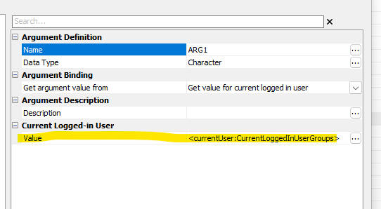
UX Component - Arguments - the <currentUser:CurrentLoggedInUserGroups> now returns a list of group names rather than Group guids.
Window Bar - The Web Projects Control Panel tab is now always the first tab in the tab list, making it easier to find when you have many windows open.

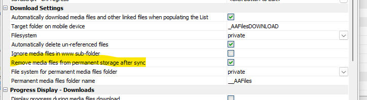
UX Component - List - Detail View - Images - Cordova - When you capture an image (or other media file) in a Cordova app, the image is (optionally) moved to permanent storage in the device's file system so that it is not removed by the operating system when the app is exited (before the data has been synced). However, once the data are synced it is safe to remove these media files from permanent storage.
Now, a new option (Remove media files from permanent storage after sync) in the the List, Detail View, Media files settings allows you to specify that these files should be removed.
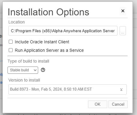
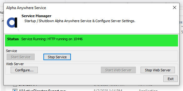
Application Server - Run as a Service - The Classic Application Server can now be run as a Windows Service. Previously many developers used 3rd party products, such as AllwaysUp, to run the App Server as a service.
Now, when you install the Classic Application Server there is a new prompt on the Universal Installer dialog. Check the Run Application Server as a Service option.
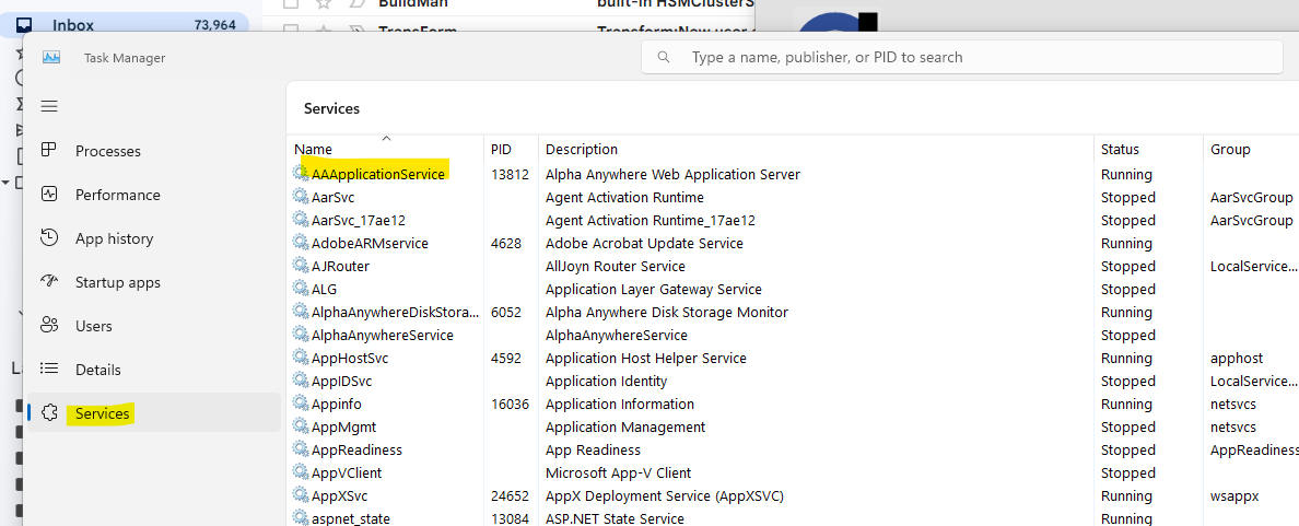
After the Application Server is installed, if you open the Windows Task Manager and you go to the Services pane, you will see the AAAplicationService listed.
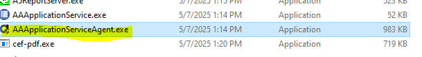
To configure the Server, navigate to the folder where the server is installed and launch AAAplictionServiceAgent.exe
This will display this dialog. Click the Configure.. button to configure the service.
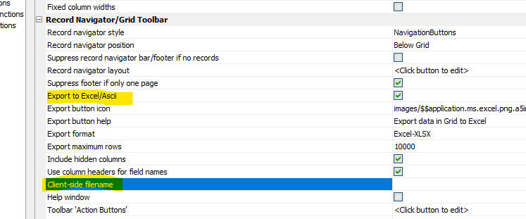
Grid Component - Export to Excel - Client-side Filename - You can now specify the client-side filename for the exported file
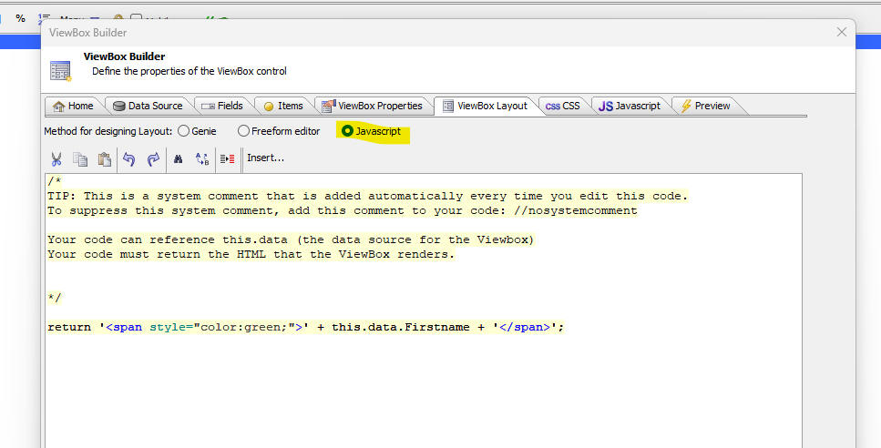
UX Component - Viewbox - Layout - Javascript - You can now specify that a ViewBox layout should be generated by Javascript. Your Javascript code can reference this.data, the data source for the ViewBox.
UX Component - Button List - Readonly - The buttonlist control now has a readonly expression property.
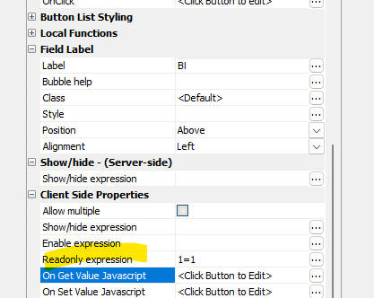
UX Component - Lookup - List Control - You can now use a List control as a Lookup type.
To define the Lookup, click the smart field for the Lookup definition property.
This will open a dialog.
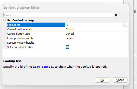
You can set these properties in the dialog:
You can set the Lookup List to have a checkbox control in each row. In that case, you will be able to use the Lookup to select multiple values (these values will be comma delimited).
UX Component - Lookup - Custom - When defining a lookup for a textbox or textarea control you can now define a custom lookup.
The custom lookup displays a window with an arbitrary collection of controls in the window. when the user clicks the commit button in the window footer a value (which is returned by some user-defined code) is filled into the lookup control.
To define a custom lookup for a control, select Custom as the Lookup type, then open the lookup builder (shown below).
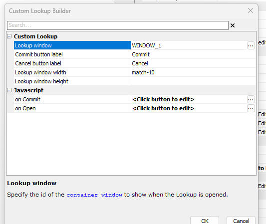
You must set the following properties in the dialog:
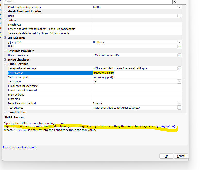
Project Properties - Read from Database - You can specify that certain properties can be read from a database at run-time (i.e. the repository table). To do so, set the property value to: {repository:keyvalue}.
Cordova App Builder Genie-- Cordova Update -Updated to Support the Latest Cordova Releases
- Significant changes have been made to the
Cordova App Builder Genie
Only the most recent versions of Cordova,
Cordova Android and Cordova iOS are
now supported. Moving forward, we are only going to support the
latest releases of Cordova,
Cordova iOS and Cordova Android. If you need support for the older versions you'll have to load an
older version of Alpha Anywhere using the installer.
Cordova App Builder Genie - Cordova iOS 7.1.0 0- Privacy Manifest - As of May 1, 2024, Apple requires a privacy manifest file to be created for apps and third-party SDKs. The purpose of the privacy manifest file is to explain the data being collected and the reasons for the required APIs it uses.
Starting with cordova-ios@7.1.0, APIs are available for configuring the privacy manifest file from the project's config.xml file.
See the links below for a good starting point to learn about the iOS Privacy Manifest:
There are 4 major areas that an iOS app developer needs to consider:
This article provides a good foundation on the subject:
In a Cordova app, the privacy manifest is an application wide privacy manifest defined in the project's config.xml file. The developer needs to edit the config.xml file to add the entries that may be required for the app.
In general, the Cordova plugins that are used in the app may have the biggest impact on what needs to be included in the NSPrivacyAccessedAPITypes category.
If the plugin includes a privacy manifest within an iOS source code bundle, and at this point only 2 plugins do, the dev versions of the File and Device plugins, then those privacy manifests will be included in the Xcode generated app. Xcode will automatically merge the privacy manifests defined in an iOS bundle in the plugin source code. This makes it easy to install plugins that may need to specify entries in the NSPrivacyAccessedAPITypes category.
The Cordova team is in the process of updating a number of core plugins to include a privacy manifest in the plugin source code. These plugins are only available on GitHub at this time and they are considered to be in a development state. The dev plugins are not available through NPM which is how all of the core plugins are installed in the builder. The dev versions of a plugin go through a test/review cycle before they are formally released and published to NPM. This takes some time.
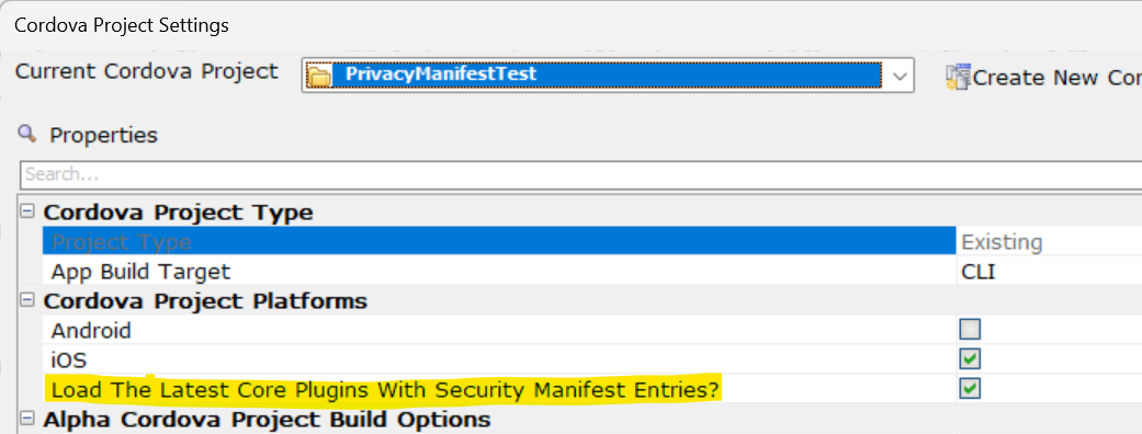
If you want to include the latest development plugins from GitHub that include an iOS privacy manifest, check the highlighted property below:
If a plugin you are using requires access to any of the API's that require an entry in the NSPrivacyAccessedAPITypes section of the privacy manifest and they do not include a privacy manifest in the plugin source code then it will be up to the developer to determine what API's are being used and why.
At this time, these are the API's that may require an entry in the NSPrivacyAccessedAPITypes section of the privacy manifest file.
See: Describing Use Of Required Reason for further details.
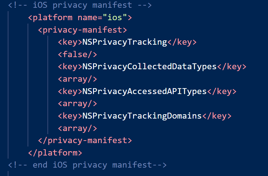
To build an app for Cordova iOS 7.1.0, you'll need to create a new project within the Cordova App Builder to be sure to get the latest changes to the config.xml file which will include the privacy manifest entries as shown in the image below:
If the app is collecting any user data, then it is the responsibility of the iOS app developer to identify information explaining what your app does with the data that it collects.
See: Describing data use in privacy manifests
Also, be sure that all four keys are defined even if there are no additions to an item. Apple requires all to be defined.
Cordova App Builder Genie - Cordova CLI Builder - Build Android Apps With A Docker Container = One of the challenges of building Cordova Android apps on a development machine is the requirement to install and configure specific versions of Node.js, Java, Gradle, Cordova and the Android SDK. Even for a very experienced developer, it can take a full day to get everything configured properly. Building from a Docker image in a Docker Container resolves this problem.
The new version of the Cordova CLI Builder allows a developer to build an Android app using a Docker image that was specifically created for use with Alpha Anywhere and the integrated Cordova App Builder genie. A Docker Image is essentially a blueprint for a Docker Container. A Docker image runs in a Docker container. The Docker container includes all of the required versions of Cordova, Node.js, Java, Gradle and the Android SDK.
For an overview of Docker, see: Docker Overview
Building an app with a Docker Container on a Windows machine requires the installation of:
Once Docker Desktop for Windows is installed, do a search on Docker Hub for the alpha-cordova-android-build Docker image. Once found, pull the image into Docker Desktop. You only need to do this once or anytime that a new alpha-cordova-android-build image is created and made available on Docker Hub.
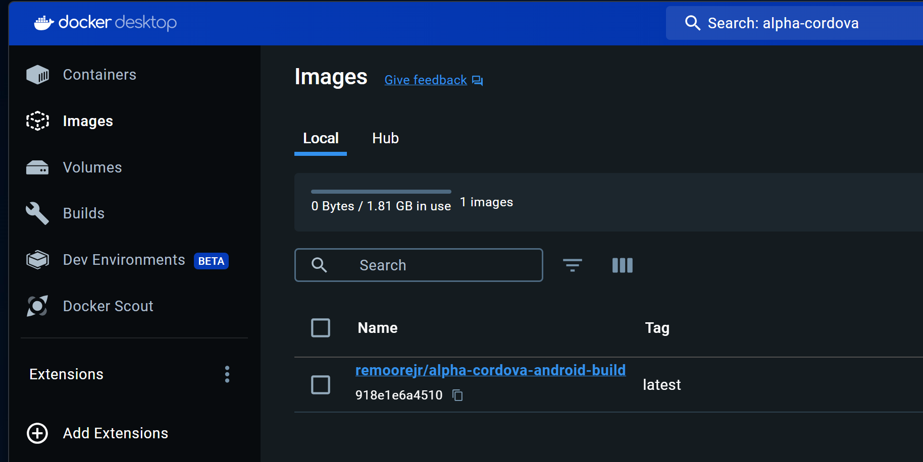
Once the image is loaded into Docker Desktop, as shown below, the Docker Image can be used by the Cordova CLI Builder. Docker Desktop can be left running in a minimized window.
Each time you wish to build an Android app with Docker, make sure to have Docker Desktop loaded prior to launching the Cordova CLI Builder so the image can be found.
If you would like to install the Android app on an Android device that is connected to the development computer after the build completes you need to install the Android Debug Bridge (ADB) utility for Windows. See: Download and install Android SDK Tools
Prior to launching the Docker Container, make sure the
ADB utility can see the connected Android device.
To do so, launch a terminal window and enter ADB
To start the Docker build process, from within the Cordova CLI Builder, check the property highlighted below.
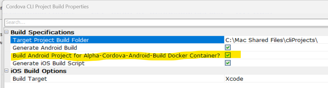
When all of the app files are generated, the prompt below will appear:
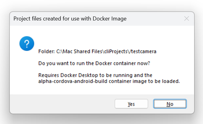
Select the Yes button to start the Docker Container and you will be launched into a Linux Bash terminal where the Cordova Android build process will start and complete. When the app build process is completed, the Linux terminal window will remain displayed.
At this point the Cordova Android app has been built and all of the files are in the Windows project target folder as well as within the file system of the Linux container. You can see the location of the APK file in the containers file system in the image below:
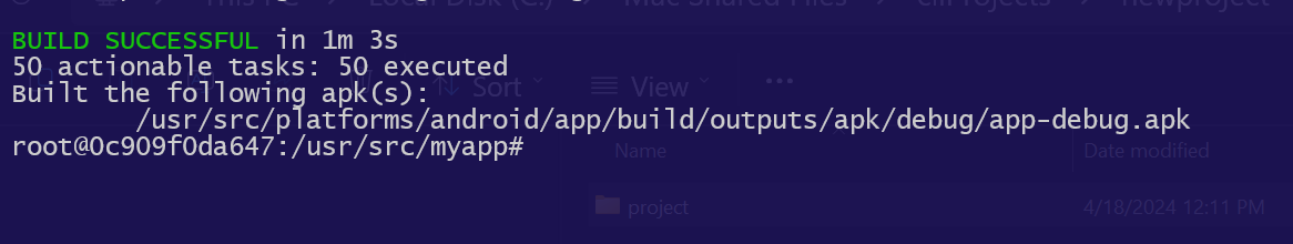
The APK file can be found within the Windows project target folder at targetDriveDirectory\projectname\platforms\android\app\build\outputs\apk\debug.
To install and run the app on an Android device that is connected to the computer and seen by ADB, enter:
at the Linux command prompt.
To close and remove the container, enter
at the Linux command prompt.
This removes the Docker Container instance and all of the files associated with it. The Windows Cordova project files remain. The Docker image remains installed within Docker Desktop for continued use. You do not need to download the image once again unless it is updated to handle a revision to Cordova Android or the Cordova Android support files.
UX Component - Spin List Control - Mouse Wheel - You can now use the wheel on the mouse to change the selection in the spin list.
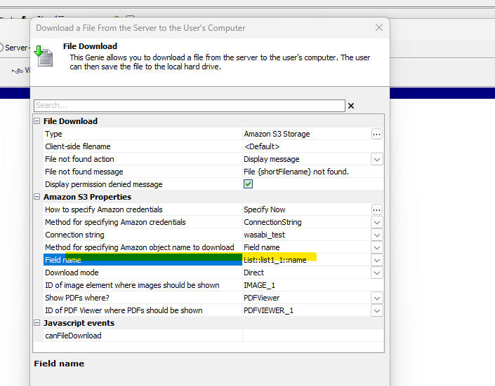
Action Javascript - Download a File from the Server to the User's Computer Action - PDF Viewer - When you use this action, the Direct mode gives you the option to display the downloaded file. If the file is a PDF you can now specify that the PDF should be shown in the PDF Viewer control.
Also, if you select Field name for the Method for specifying Amazon object name to download, the pick list for the source field name will show List columns.
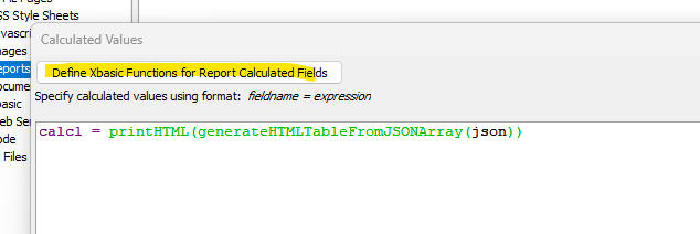
Reports - Xbasic Functions - When you define a Project Report, Label or Letter you can now define Xbasic Functions for use in the report's calculated fields.
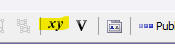
When you click on the XY icon on the Report Editor toolbar to open the dialog where you define calculated fields, the dialog that is opened (shown below) has a button called Define Xbasic Functions for Report Calculated Fields.
When you click this button, a dialog is opened where you can define Xbasic functions. These functions can be used in the report's calculated fields.
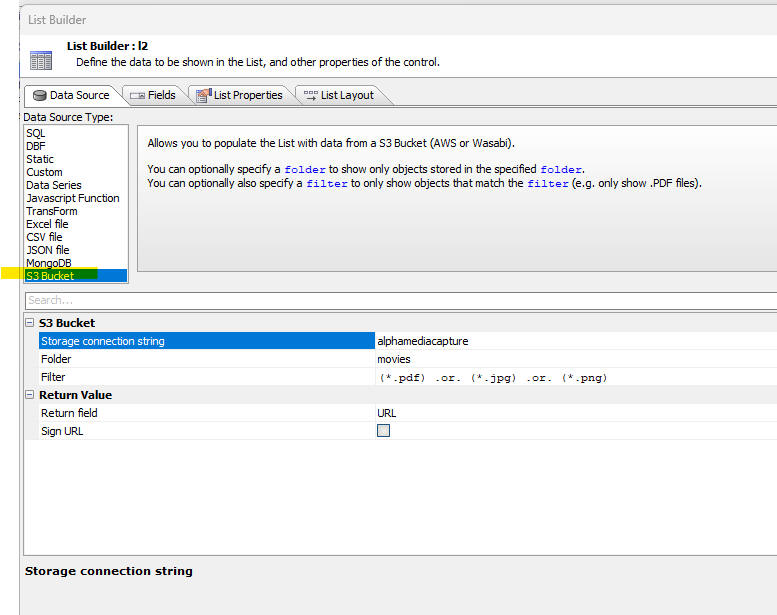
UX Component - List Control - S3 Bucket Data Source - When you create a List control you can now specify that the data source for the List is a S3 Bucket. The List data will contain two properties: objectName and URL. - The objectName is the name of the object in the bucket and URL is the url for the object.
Watch video - 1
Watch video - 2
IMPORTANT: All comments about S3 buckets also apply to Wasabi buckets.
When you select S3 Bucket as the data source for a List you can then specify these properties:
You can also optionally specify that the URLs that are computed for each object when the List is populated should be signed. If you specify that the URLs should be signed, you can specify the duration (in seconds) for how long the signed URL should be valid.
The image below shows how you can select S3 Bucket as your List's data source.
When you select S3 Bucket as the List data source, you can easily define actions to view or download the object shown in the current List row. These actions can be triggered by a click or double-click on a List row, or by buttons in a List row.
For example, you might configure the List to view an object when you click on a List row and to download the object when you double-click on a List row.
Alternatively you may prefer to add explicit View and Download buttons to each row in the List to trigger the actions and not use the click or double-click actions.
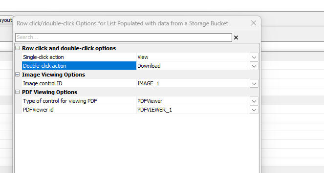
Here is how to configure the View and Download actions when the user clicks or double-clicks on a List row.
Go to the List Properties tab in the List Builder and scroll to the bottom of the list of properties. Click the smart field for the Set properties property
The following dialog will be shown where you can set the action for a row click and double-click. The action can be:
If you set the action to View then you must specify:
If you want to perform a View or Download action when the user clicks a button in the List row, go to the Fields tab in the List builder. Click the Add Item button. Because the List's data source is S3 Bucket, the menu will offer two additional choices
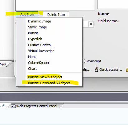
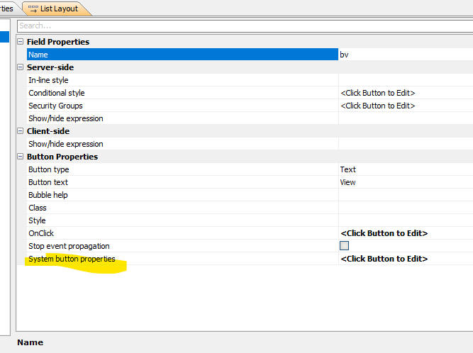
If you select either of these options, the property sheet will show a new property, System button properties where you can configure the action.
If you click the smart field for the View action you will get the following dialog where you can set:
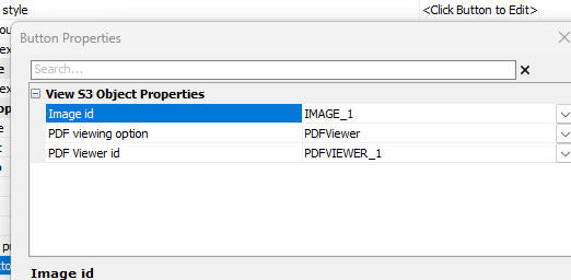
There are no system button properties for the download action.
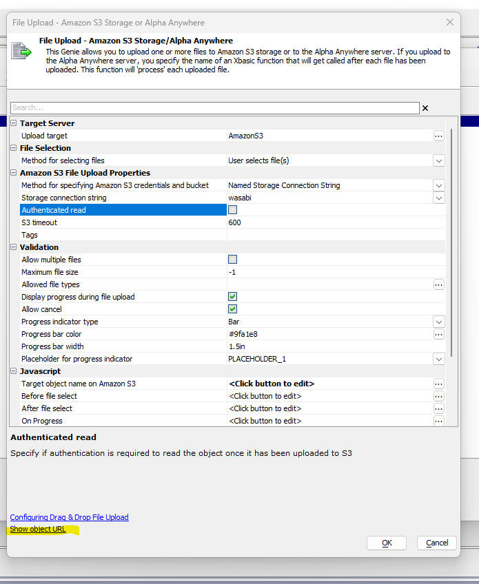
Action Javascript - File Upload - Amazon S3 - The builder for this action now has a new hyperlink to show the URL for the uploaded object. If the Authenticated read option is checked, the generated URL will be signed.
UX Component - Ajax Callbacks - Timing - You can now easily capture timing information for Ajax callbacks. The information iis shown in the browser console window. The name of the Xbasic function that was executed and the time it took are shown (see image below).
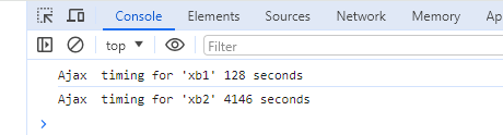
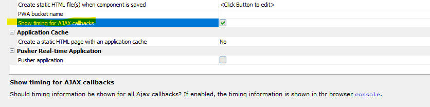
To turn the timing feature on, check the Show timing for AJAX callbacks property in the Advanced section of the Properties pane in the UX Builder.
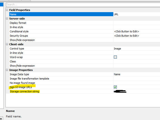
UX Component - List Control - Displaying Images in Private S3 Buckets - You can now create List controls that show images in a S3 bucket that is not publicly accessible. In order to do this it is necessary to sign the image URLs. To indicate that an image URL must be signed, go to the Fields tab in the List builder and check the Sign S3 image URLs property and indicate which storage connection string to use.
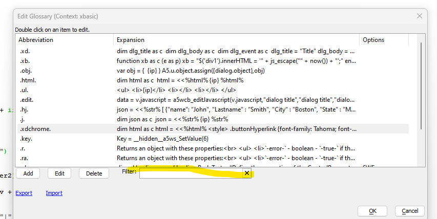
Xbasic and Javascript Glossary - Filter - When editing the Javascript or Xbasic glossaries, you can now filter the items shown in the display.
Fast Publish - IIS and Alpha Cloud - Publishing a web site to Alpha Cloud or to IIS can take some time. During the development phase of an application if may be desirable to have a faster design-test cycle. This is now possible using a new type of publishing profile - the Fast Publish profile.
Fast Publishing works as follows: The initial publish (called the base publish) of your website is done the normal way (using your IIS or Alpha Cloud publishing profile - which must be configured to allow Fast Publishing). After the base publish, any time you make a change to a component or other file in your project, you can publish the changed file (or all changed files), using a Fast Publishing publishing profile.
Fast Publishing publishes the edited files to an AWS S3 bucket (which you specify when you set up your Fast Publishing profile). Publishing to a S3 bucket is generally much faster than publishing to IIS or Alpha Cloud. At run-time Alpha anywhere will retrieve files from the S3 bucket in preference to the website's webroot folder.
Every time you do a new base publish the files in the S3 bucket are cleared out.
To enable Fast Publishing when you define an IIS or Alpha Cloud publishing profile, check the Enabled property in the Fast Publishing section. You will then need to specify the Storage Connection String name for your S3 bucket and optionally the name of a folder in that bucket where edited files will be published.
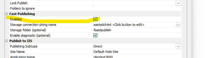
For each IIS or Alpha Cloud publishing profile for which Fast Publishing is enabled, you will need to define a matching Fast Publish publishing profile that uses the same storage connection string and folder.
TIP You can have Alpha Anywhere create the necessary Fast Publishing profiles automatically when you save your publishing profiles.
Limitations
If you add a new file to your website after the initial base publish and you publish that file using a Fast Publish publishing profile, you will be able to reference this file when you run your application as long as your website does not use the Alpha Anywhere security framework. However, if your web site uses the security framework, then you will need to do a new base publish before this new file can be referenced.
Xbasic - a5Storage_deleteFolder() - Deletes an entire folder and all of the files in that folder.
Syntax:
L flag = a5Storage_deleteFolder(c
storageconnectionString , C folderName[, p pResult])
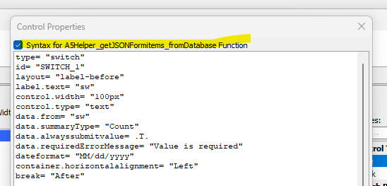
Xbasic - A5Helper_getJSONFormitems_fromDatabase() Function - Enhancements have been made to this function to make it easier to use.
You can now optionally specify the name of a filter field to indicate if a control should be included in the JSON form.
The syntax for the function is:
C result = A5Helper_getJSONFormITEMS_fromDatabase(C cs ,C tablename ,C formnamefield ,C formname [,C style_name [,C orderbyfield [,C filterfield ]]])
Where:
You can define any control type to appear in your JSON form by specifying the properties for the control in the Other field in the table that is queried by the A5Helper_getJSONFormITEMS_fromDatabase() function.
Here is how to get the properties for an arbitrary control:
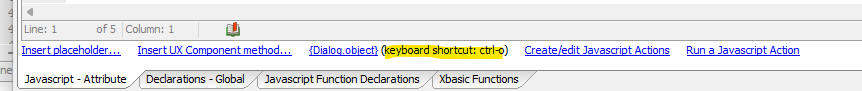
UX and Grid Builder - Editiing Javascript - Keyboard Shortcut - You can now use the keyboard shortcut (ctrl-o) to insert {dialog.object} or {grid.object} into the code you are editing.
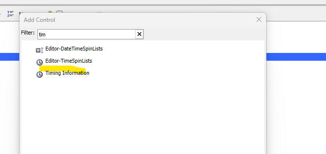
UX Component - Timer Control - The Timer Control now displays information about how long the query to populate each List in a UX component took.
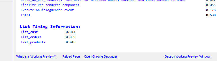
To add a Timer Control to a UX component, click the Add Control button in the UX builder and then select the Timing Information control.
This control will help you understand how much time various tasks are taking when your UX is being rendered.
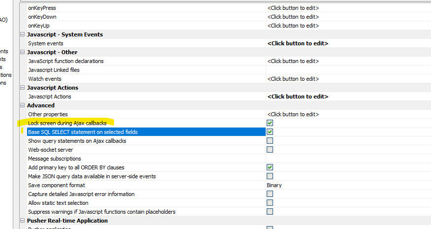
Grid Component - Lock Screen During Ajax Callback - You can now lock the screen during an Ajax callback to prevent the user from initiating a subsequent callback until the initial callback has completed.
To turn on the lock feature, check the Lock screen during Ajax callbacks property on the Grid Properties screen.
UX Component - Light Weight List -Date and Datetime Fields - You can now set the display format for date and datetime fields in the Light Weight List.
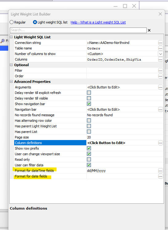
UX Xomponent - Light Weight List - Row Prefix - You can now turn off the Row Prefix for each row in a Light Weight List.
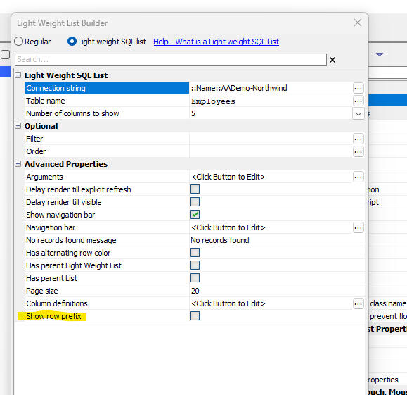
When you turn off the Row Prefix, then dirty rows, deleted rows, new rows and rows with errors are shown with a background color, as shown in the image below:
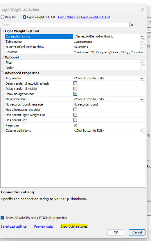
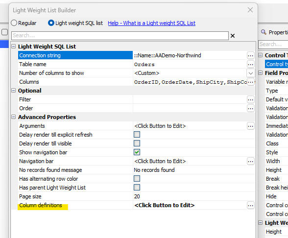
UX Component - Light Weight List - Import Settings From List - When you add a Light Weight List to a UX component that already has one or more List control(s) (that are based on SQL data sources), you can configure the Light Weight List by importing settings from one of the Lists in the UX component.
UX Component - List Control - <listObject>.deleteTableRowsBulk() Method - A new method has been added to the List control. The .deleteTableRowsBulk() method allows you to pass in an array of primary key values (strings), or row numbers to delete.
Example:
var lObj = {dialog.object}.getControl('mylist');
var primaryKeysToDelete = ['alpha','beta'];
lObj.deleteTableRows(primaryKeysToDelete );
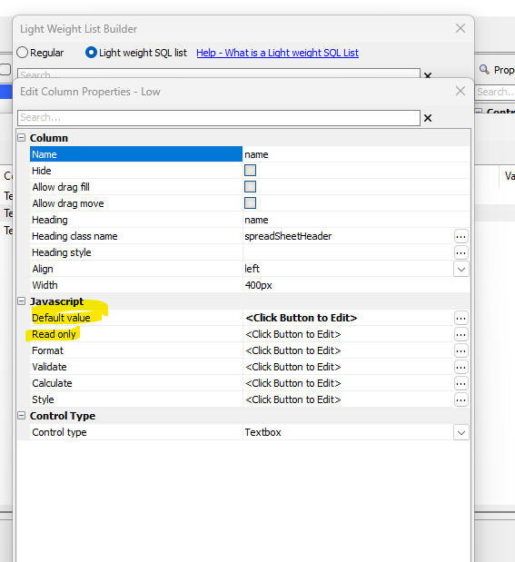
UX Component - Light Weight List - Default Value - Readonly- You can now specify Javascript code to define the default value for a field in the new record row, and to indicate if a field in a particular row is readonly.
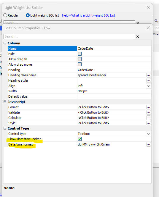
UX Component - Light Weight List - Date and Datetime Columns - You can now specify if a date picker should be shown and you can also set the date format.
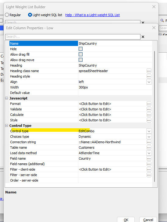
UX Component - Light Weight List - Dropdownbox - Edit-combo - Auto-suggest - When you configure a Light Weight List control you can now specify that controls in a specific column should be rendered as dropdownbox, edit-combo, or auto-suggest controls.
To set the control type for a column, open the Column definition dialog.
Then double click on the field (i.e. column) whose control type you want to set.
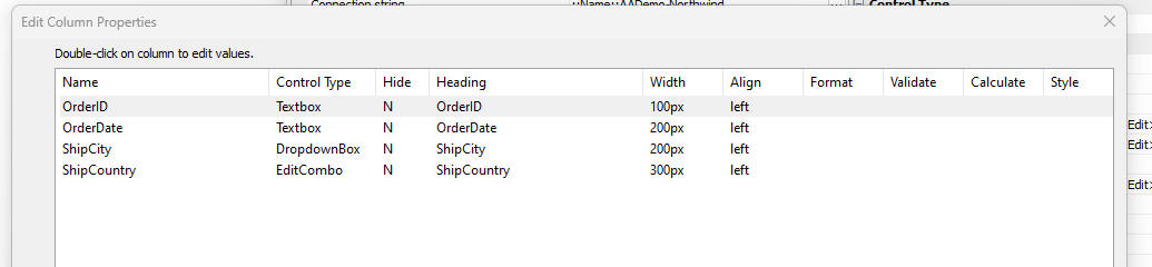
Then set the control type and define the choices for the picklist.
UX Component - Login - Two Factor Authentication - Trust Browser - When a UX component is used as a login component and if two factor authentication is turned on for a user, when that user logs in the 2nd factor authentication prompt fill be shown. The user can then check the Trust this browser checkbox so that the next time that they log in the 2nd factor prompt fill not be shown.
Now, you can set a property in the Xbasic function that fires when Two Factor login is enabled to force the 2nd factor prompt to be shown regardless of the setting for the Trust this browser property.
Then Xbasic function can set this property:
e.forceToFactorLogin - if set to .t. the 2nd factor prompt is shown regardless of whether the user has previously checked the Trust this browser checkbox.
UX Component _ list Control - Server-side display format - date and time fields - Fixed a regression.
Grid Component - Export to Excel - Use Column Headings - The Use column headers for field names property was not being honored and spaces in column headings were not preserved in the Excel file.
UX _Repeating Section - Fixed an issue when inserting new data in both the parent and repeating section simultaneously.
SCRIPT_SCHEDULE() Function - Fixed a regression in this function.
UX Coponent- List - Detail View - Fixed a regression when synchronizing a List with a Detail View.
Security Framework - Federated Authentication - Fixed a bug when logging out from an Identity Provider.
In order to pick up these changes you will need to update the federated authentication configuration table, the federatedLogout.a5w page, the saml and XBasic modules, and the Federated Authentication Configuration UX component with build 9170 or later.
Here is how to make these updates:
Update the Federated Authentication Configuration Table

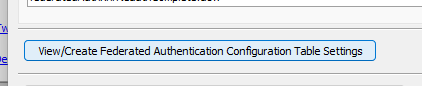
Update the federatedLogout.a5w page

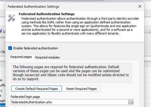
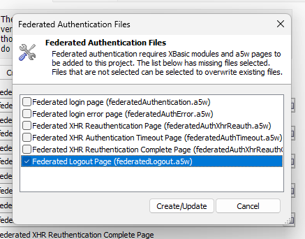
Update the saml and fam XBasic Modules
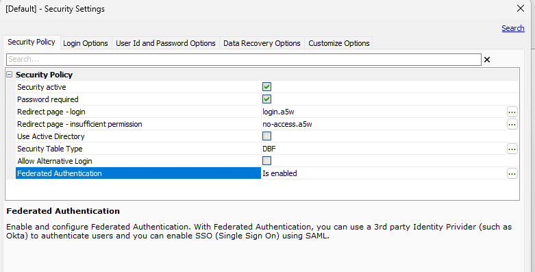
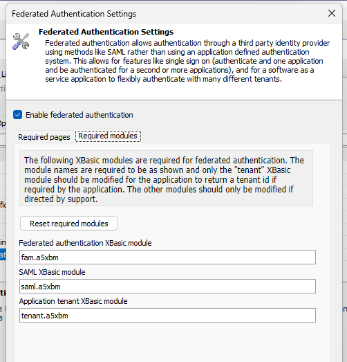
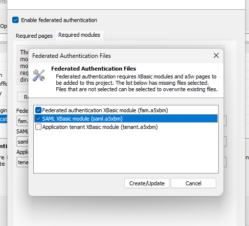
Update the Federated Authentication Configuration UX

Final Steps
Now that all the updates have been done, you can republish the application. If the UX component is in a separate application, you'll need to republish that application too.
The federated authentication table has a new column for the type of logout request that is made, either Redirect or POST. You can edit your existing configuration rows and redownload the identity provider metadata to update the logout url and request type:
or you can update those prompts manually:
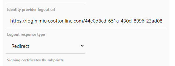
Once the configuration is updated you can test the logoutFromIdp to verify it is working.
| UX Component - Light Weight List | Hiding Columns and using Drag Fill and Drag Move |
In this video we show how you can hide a column in a Light
Weight List and how you can use the Drag Fill feature to copy
values to other cells in the List Watch video Date added: 2024-02-03 |
UX Component - Light Weight List - Hide Columns - You can now designate that certain columns in a Light Weight List should be hidden.
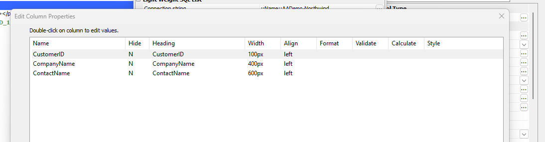
To hide a column, double click on the column in the Edit Column Properties dialog and check the Hide property.
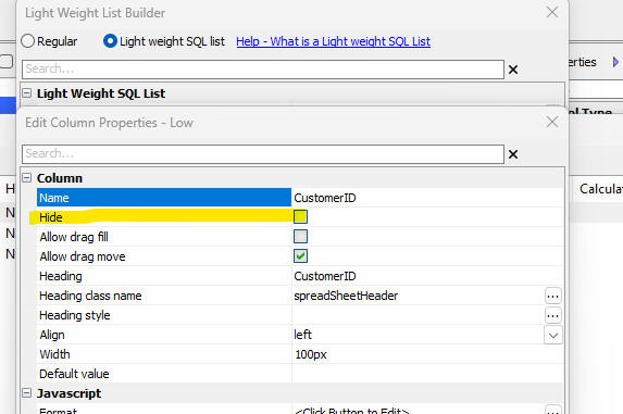
You can programmatically hide/show columns using Javascript as follows:
var obj = {dialog.object}.getControl('name_of_light_weight_list')
var obj.data.columns[0].hide = true; //hide the first column (index 0)
obj.refresh() //refresh the control
UX Component - Light Weight List - Fill Drag and Fill Move - For each column in a Light Weight List you can enable Drag Fill and Drag Move.
When a cell in a column for which Drag Move in enabled has focus, the focus rectangle has a blue box in the top left corner of the focus rectangle.
When a cell in a column for which Drag Fill in enabled has focus, the focus rectangle has a green box in the lower right corner of the focus rectangle.
If you click on the Drag Fill rectangle (green) and drag up or down, the values in the highlighted cells above or below the current cell will be replaced with the selected value.
if you click on the Drag Move rectangle (blue) and drag left or right, the target cell will be updated with the selected value.
UX Component - List Control - Export to Excel - Encrypted Fields - When you export data from a List to Excel, if the List has encrypted fields, you can now optionally decrypt the fields before the data are exported.

Security Framework - Fixed a regression in the Security Framework. The context.security.currentUser property was not returning the name of the current logged in user.
UX Component - Data Bound - Repeating Sections
- Fixed a regression in Data Bound UX components that were bound to more
than a single table.
| UX Component - List Control | Named queries |
In this video we show how you can create a set of named queries
for a List control and then select which named query to apply to
the List. Watch video Date added: 2023-11-21 |
| Ux Component - Spreadsheet Control | Linked spreadsheets |
In this video we show how to define linked (i.e. parent-child)
spreadsheet controls. Watch video Date added: 2023-11-21 |
| UX Component - Static HTML | Populating a Dropdown, RadioButton or Checkbox control in a Static HTML version of the component |
In this video we show how a Dropdown,
RadioButton or
Checkbox control can be populated
with choices that are computed at runtime in the
onDialogInitialize event. The
technique shown in this video can be used if the UX is rendered
using the Static HTML option. Watch video Date added 2023-11-27 |
| UX Component - Login | Login using AWS Cognito |
This video shows how you can use AWS Cognito to log into an
Alpha Anywhere application Watch video Date added: 2024-01-11 |
| UX Component - Login | Configuring an AWS Cognito User Pool |
This video shows how to configure an AWS Cognito User Pool for
use in an Alpha Anywhere application Watch video Date added: 2024-01-11 |
| UX Component - Login | Exporting security framework users and groups to AWS Cognito |
This video shows how to export AA users and groups to a User
Pool in AWS Cognito Watch video This video shows how to set up an AWS Connection String for use when exporting users to AWS Cognito Watch video Date added: 2024-01-11 |
| UX Component - Login | Using Facebook or Google as federated identity providers with AWS Cognito |
This video shows how you can use federated identity providers
(such as Facebook or Google) to log into an Alpha Anywhere
application using AWS Cognito Watch video Date added: 2024-01-11 |
| UX Component - Login | Configuring Facebook as a federated identity provider in AWS Cognito |
This video shows how to configure AWS Cognito to use Facebook as
a federated identity provider Watch video Date added: 2024-01-11 |
| UX Component - Login | Configuring Google as a federated identity provider in AWS Cognito |
This video shows how to configure AWS Cognito to use Google as a
federated identity provider. Watch video Date added: 2024-01-11 |
| UX Component - Light Weight List | Introduction to the Light Weight List |
In this video we show how to add a Light Weight List control to
a UX component. Watch video Data added: 2024-01-16 |
| UX Component - Light Weight List | Setting up a Parent-Child Relationship Between Two Light Weight Lists |
In this video we show how to set up a parent-child relationship
between Light Weight Lists. Watch video Data added: 2024-01-16 |
| Security Framework | Managing Users and Groups in a Multi-tenant Application |
This video shows how the sample
Admin_MaintainUsersAndGroups component (which is installed
automatically when you create a new Web Project and you turn on
the security framework) can be used to manage users and groups
in a multi-tenant application. Watch video Date added: 2024-01-19 |
UX Component - List Control - Calendar Layout - (This feature is still under development and requires a Feature Key in order to enable it. We are making an early version of the feature available so we can get feedback from the community). To request a feature key, go to Help, send an email to enhancementrequests@alphasoftware.com with "List Calendar Feature Key" in the subject.
The Calendar layout is a view of the data in a List See video:
https://www.screencast.com/t/dvLrLJNmhG1
Mobile Applications - Instant Update - Alpha Software S3 Bucket - If you are using Instant Update with updates published to an Alpha Software S3 bucket, be aware that, for security reasons, we have changed the credentials for the Alpha Anywhere S3 bucket. If you use this build to publish your Instant Update it will work correctly. However, if you are using an older Alpha Anywhere build, you will not be able to use the Alpha Anywhere S3 bucket. You must use your own private S3 bucket.
UX Component - Cordova Applications - List Controls - Previously when a Cordova app was built, the List controls in the app were populated with data. That mean that when the app was run, (which might be some time after the app was initially built), the data shown in the List was potentially quite stale. Now, when the app is run the List controls are refreshed to show current data. This behavior only applies to List controls that are based on SQL data and that are not configured to delay render. If you want to turn off this behavior, uncheck the Perform incremental refresh when List is loaded property.
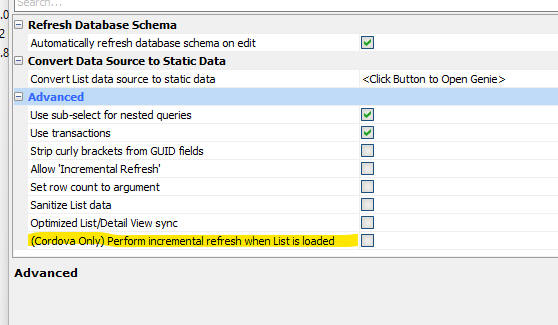 ,
,
Video Finder - The Video Finder (which allows you to search for videos that explain different aspects of Alpha Anywhere) has been re-written. To access the Video Finder, select the Help, Video Finder menu option.

UX Builder Static HTML Live Preview - When you do a Live Preview of a UX component for which a static HTML page has been created, the Live Preview now can use the static HTML page. When you execute a Live Preview, Alpha Anywhere will display a prompt asking if you want to use the Static HTML version, of if you want to run the component.
If the component is dirty, the prompt will not be displayed.
Cordova App Builder Genie - Plugins- Cordova Fingerprint - Support has been added for Cordova Fingerprint All-In-One Plugin which provides a single and simple interface for accessing the fingerprint API's on both Android 6+ and iOS. This provides biometric authentication for both Android and iOS Cordova apps.
When this plugin is installed, the required iOS preference name="SwiftVersion" value="5.0" is automatically added to the project's config.xml file.
The link below contains further information on this plugin. Make sure to read all of the information in the readme file.
See cordova-plugin-fingerprint-aio on GitHub.
Web Projects Control Panel - Search all Web Projects for a file that contains specified text - A new search option is available when you right-click on white space in the Web Projects Control Panel. This option allows you to search for a file that contains the specified text. The search is performed across all web projects in the current workspace. To speed up the search you can filter the projects and files that are searched.
UX Component - Light Weight List - A new control type is available in the UX component. The Light Weight List allows you to quickly set up a highly performant control for displaying and editing data in a SQL table.
NOTE: The Light Weight List control is a pre-populated Spreadsheet control.
To add a Light Weight List control to a UX component, select Light Weight List from the Data Controls section of the UX Component toolbox.
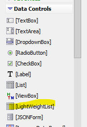
To configure a Light Weight List either double click on the item in UX builder, or click the smart field for the Light weight list properties.
A builder, as shown below, will open up.
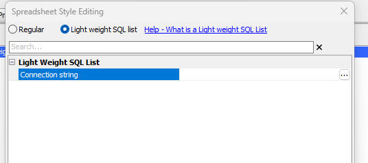
Once you specify the Connection string you will be able to specify the Table name.
Once you specify the table name you will be able to specify how many columns from the table you want to display.
You can select any number from 1 to 10, or <Custom> if you want to manually select the columns to display.
After you have specified the Connection String and Table name, you have specified all of the required properties and you can close the dialog and render the component

Grid Component - Buttons - Sub-themes - You can now specify sub-themes for buttons in a Grid as shown in the image below.
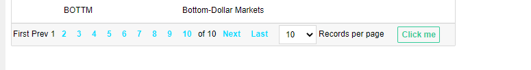
To specify the sub-them for an Action Button click the smart field for the Button sub-theme property.
NOTE Button sub-themes are only supported for the Alpha theme (and themes inherited from Alpha)
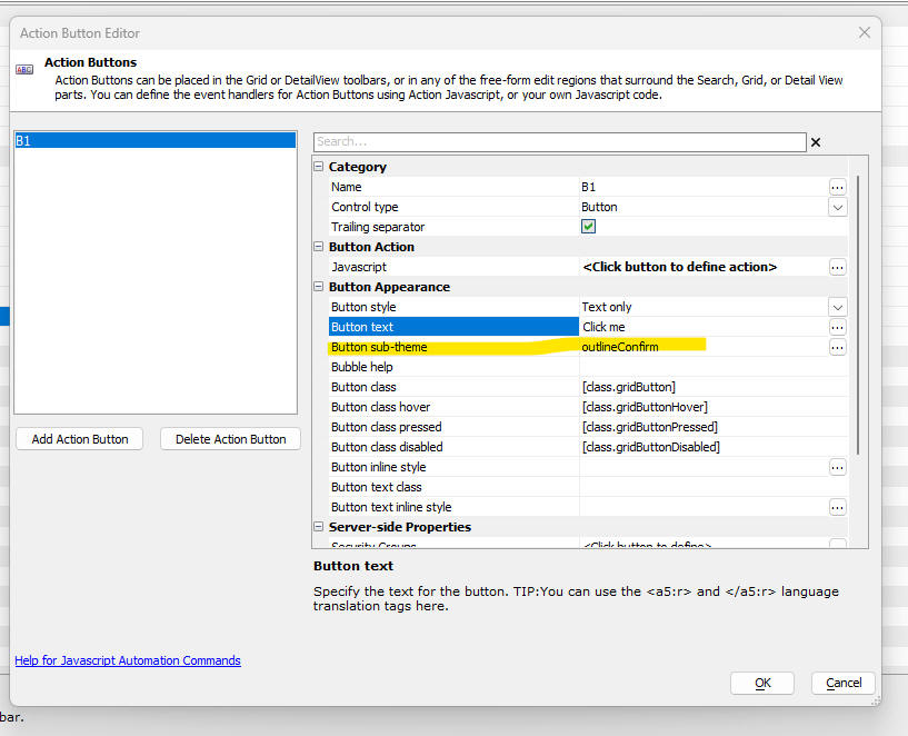
HTML5 Camera - Android14 - Previously, when you used the HTML5 camera on an Android device, you would be able to either select the camera or the photo library. Google has made a change so that you must select either the library or camera in advance. You can no longer switch sources once the camera button on the UX has been clicked. Therefore, the Action Javascript builder now allows you to select an option:
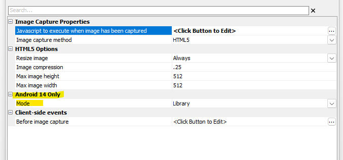
Security Framework - Amazon Cognito - You can now use Amazon Cognito as an Identity Provider in the UX Login Component
AWS Cognito is a service provided by Amazon for managing users and groups. You can use a single AWS Cognito application (called a User Pool) to handle authentication for multiple Alpha Anywhere applications.
The advantage of using a single User Pool for all of your Alpha Anywhere applications is that once a user has authenticated with AWS Cognito they are then automatically authenticated for all of the Alpha Anywhere applications that use that User Pool.
Another significant advantage of AWS Cognito is that you can set up federated authentication with Google, Facebook, Amazon, any OIDC identity provider, or any SAML identity provider.
The following videos show how to configure the UX login component to enable login with AWS Cognito, how to configure an AWS User Pool and how to enable federated authentication with AWS Cognito.
|
This video shows how you can use AWS Cognito to log into an
Alpha Anywhere application Watch video |
|
This video shows how to configure an AWS Cognito User Pool for
use in an Alpha Anywhere application Watch video |
|
This video shows how to export AA users and groups to a User
Pool in AWS Cognito Watch video This video shows how to set up an AWS Connection String for use when exporting users to AWS Cognito Watch video |
|
This video shows how you can use federated identity providers
(such as Facebook or Google) to log into an Alpha Anywhere
application using AWS Cognito Watch video |
|
This video shows how to configure AWS Cognito to use Facebook as
a federated identity provider Watch video |
|
This video shows how to configure AWS Cognito to use Google as a
federated identity provider. Watch video |
Security Framework - Sample Admin_MaintainUsersAndGroups Component - Multi-tenant - The sample Admin_MaintainUsersAndGroups component (which is automatically installed when you use the Security Genie to set up the Security Framework for a new project) can now operate in multi-tenant mode.
Button Sub-themes - New button outline sub-themes are available for the Alpha theme and all themes that are inherited from Alpha.
The new sub-themes are shown below:
UX Component - List Control - Named Queries - Checkbox Control - You can now display the Named Queries you have defined for a List control using a checkbox control. When you select a checkbox control you must specify if the queries are combined using AND or OR.
Xbasic - Get Public IP Address - api_getPublicIPAddress() - Returns the public IP address for the machine.
UX Component - RadioButton, CheckBox and Dropdown Controls - Populate using a Variable - StaticHTML - The RadioButton, CheckBox and Dropdown control all have the option of populating their choices from a variable that is defined in the onDialogInitialize event. If the UX component is rendered using the static HTML option, this pattern will not work and instead you must set the control to be a Javascript control and then in the onDialogInitialize event, you must generate Javascript to populate the control.
UX Component - List Control - Named Queries - The List control now allows you to define multiple named queries and to select a named query at runtime. The selector for the named query to apply can either be a radio button control, or a dropdown control. The selector can be positioned anywhere in the UX, including in the List itself (by wrapping the selector in an Injectible container).
Named queries can only be defined for List controls that are based on a SQL database.
To define Named queries for a List, check the Has named queries property in the Data Source tab in the List Builder.
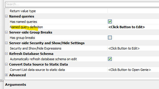
Once you check this property, click the smart field button for the Named query definition property.
This will open the following dialog:
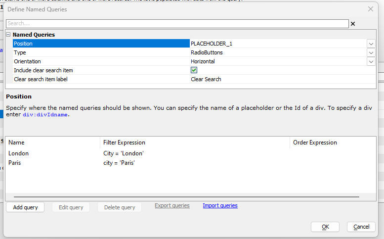
The following properties are of note:
Position - Can either be the name of a placeholder control, or a div (typically inside a Static text control). To specify a div, use this syntax: div: divIdname (e.g. div:div1)
Type - Can be Radiobutton, Checkbox or Dropdown. (If you select Checkbox you must specify if multiple conditions are combined with AND or OR)
Orientation - Applies only if type is Radiobutton. Specifies if the radio buttons are laid out vertically or horizontally.
Include clear search item - Specify if the list of Named queries includes an option to clear the search.
Clear search item label - If the Include clear search item property is checked, you can specify the text for the clear search item. You can used language or text dictionary tags on the label.
To define the Named queries, click the Add query button. The following dialog will appear where you can define the filter and order for the Named query. You can define as many named queries as you want.

List Events
When a named query is selected a List event (the onNamedQuerySelected event) is fired. A typical use case for this event might be to select a different List Layout depending on which Named query had been selected.
Injecting the Named query selector into the List
In the image shown below, the Named query selector is show embedded into the List's Fixed Header.
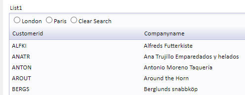
This is done by wrapping the Placeholder for the selector in an Injectible container as shown below:

Next, turn on the List's Fixed header or Data header and inject the container into the header.

Javascript method
The {dialog.object}.namedListQuery() method can be used to apply a named query to a List. The syntax is:
{dialog.object}.namedListQuery(listName,queryName)
You can apply multiple named queries that are combined with AND or OR by specifying an expression that uses named queries as placeholders. Named query names must be enclosed in curly brackets. For example, say you have two named queries: London and Paris. You could specify:
{dialog.object}.namedListQuery(listName,'{london} OR {paris}')
UX Component - Spreadsheet Control - Pre-populated -Parent-Child Relationships
When you define pre-populated spreadsheet controls, you can link them in a parent-child relationship.
For example, say you have a UX component with two spreadsheet controls - one based on (say) Northwind Customers and the other based on (say) Northwind Orders. When you select a row in the Customers spreadsheet, you would like the Orders spreadsheet to show only the orders for the selected customer.
To define linked spreadsheets, open the builder for the child spreadsheet and check the Has parent spreadsheet property. Then specify the name of the parent spreadsheet in the Parent spreadsheet name property.
The Linking field name property need only be specified if the name of the linking field in the child spreadsheet is not the same as the name of the primary key field in the parent spreadsheet. For example, assume that the primary key field in the Customers spreadsheet is called CustomerId. If the linking field name in the Orders spreadsheet is also called CustomerId, then there is no need to specify a value for the Linking field name property.
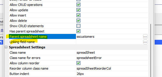 \
\
Android Mobile Devices - Session Variables - Session variables were lost in a child UX that was opened from a parent UX. This broke as a result of a change Google made relating to how cookies worked
HTM5 Image capture - Android - As a result of a recent change made by Google, Image Capture using the Camera on Android devices was broken (only allowed images to be selected from the library). This is now fixed. You will need to reclculate the UX component.
| UX Component - Spreadsheet Control | Conditional styles |
In this video we show how you can define conditional styles. For
example, you might want to display values that are negative in
red. Watch video Date added: 2023-11-10 |
UX Component - Spreadsheet Control - Pre-populated - .getValue() and .setValue() Methods - The .getValue() and .setValue() methods have been enhanced when applied to a pre-populated spreadsheet control
.getValue()
.getValue(spreadsheetControlName) - returns the primary key of the currently selected row. If the primary key has multiple columns, the returned value is '|||' delimited (.e.g '10248|||51')
.getValue(spreadsheetControlName::columnName) - returns an array of data from the specified column in the spreadsheet control.
.getValue(spreadsheetControlName::columnName::row) - returns the value of a specified cell where row is the zero based row number.
.setValue()
.setValue(spreadsheetControlName::primaryKey, primaryKeyValue) - sets the selected row to the row with the specified primary key. If the primary key has multiple columns, specify the primary key as a '|||' delimited value (e.g. '10248|||51')
.setValue(spreadsheetControlName::rowNumber,rowNumber) - sets the selected row to the specified rowNumber.
.setValue(spreadsheetControlName::rcolumn::columName,values) - sets the values in the specified column, Values is a comma delimited list of values. For example, if the spreadsheet shows 10 rows, then the first value in values is inserted into the specified column, row 0, the second value in values is inserted into row 1, and so on. if values does not have enough entries for all of the rows in the spreadsheet, the last value is in values is used. If a particular value in values has a comma in it, encode the comma as {comma}.
.setValue(spreadsheetControlName::rcolumn::columName::row,value)
- sets the values in a specified call.
UX Component - Spreadsheet Control - Conditional Style - You can now define a Javascript function to return the style for a cell in the spreadsheet. You Javascript can reference the data in the spreadsheet, making it easy to define conditional styled.
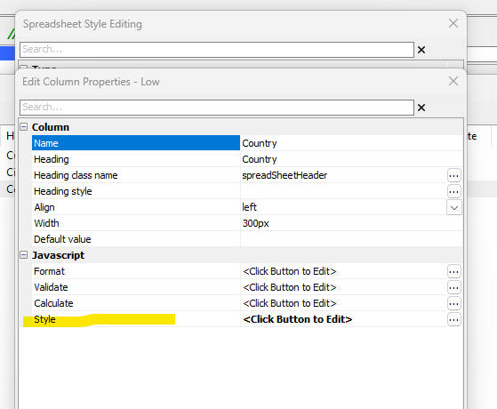
Security Framework - SQL - Fixed a regression introduced in the previous build that reported an error when viewing user and groups in the IDE.
| UX Component - Spreadsheet Control | Advanced Features |
In this video we show how the spreadsheet control can be
configured to allow the user to dynamically add and remove
columns. Also, we show how the control can be populated with
arbitrary JSON data and how the layout of the control can be
dynamically configured to match the structure of the data.
Finally we show hos you can use the virtual row feature to
populate the control with a large amount of data. Watch video - part 1 Watch video - part 2 Watch video - part 3 Download component Date added- 2023-07-24 |
| UX Component - SVG Charting | Using SQL data in client-side SVG charts |
This video explains how to use SQL data (defined in UX Component
Data Series) in client-side SVG charts. Watch video Download component Date added 2023-09-04 |
| MongoDB | Creating a connection String - Mongo Atlas |
Watch Video Date added: 2023-09-14 |
| MongoDB | Creating a connection String - Local Instance of Mongo |
Watch Video Date added: 2023-09-14 |
| MongoDB | Creating a Database |
Watch Video Date added: 2023-09-14 |
| MongoDB | Importing Tables from a SQL Database |
Watch Video Date added: 2023-09-14 |
| MongoDB | Browsing Records |
Watch Video Date added: 2023-09-14 |
| MongoDB | Querying a Collection |
Watch Video Date added: 2023-09-14 |
| MongoDB | Editing Documents and Creating New Documents |
Watch Video Date added: 2023-09-14 |
| UX Component - Spreadsheet Control | Editing Data in a SQL Table Using the Spreadsheet Control |
In this video we show how a Spreadsheet control can be populated
with data from a SQL table and how you can perform CRUD
operations on the data. Watch Video 1 Watch Video 2 Watch Video 3 Watch Video 4 Watch Video 5 Date added: 2023-10-08 |
| Security Framework - Sample Application | Generic SQL Table Editor |
A common requirement in many applications is to allow an
administrator to be able to perform maintenance on certain
tables in the application. In this video we show how a single
generic table editor component can be added to the sample
security application. This component provides a convenient
alternative to building separate components for each table that
needs to be edited. Watch video Date added: 2023-10-08 |
| UX Component - List Control | Adding Custom Icons to Column Headers |
In this video we show how you can add custom icons to column
titles in a columnar List. When the user clicks on an icon,
Javascript that you define, is executed. Watch video Date added: 2023-10,26 |
| UX Component - Panel Layout | Scrolling Panel Layout |
A common pattern in many web sites is to design a page that has
a lot of content on the home page of the site (rather than
dividing the content into multiple pages). The content on this
page can be scrolled using the mouse wheel or the keyboard. This
video shows how you can use a Panel Layout with multiple child
Panel Cards to contain the content to implement this pattern. Watch video Download component Date added: 2023-11-05 |
| UX Component | Faster Loading using Static HTML Versions of a Component |
In most Alpha Anywhere applications it is common to load child
UX components. For example a user might click a button to open a
child UX in a window, or a user might click a button to load a
child UX component into a a new pane in a Tabbed UI component. In this video we show how the loading of child UX components can be substantially sped up by using static HTML versions of the child UX component. Watch video - 1 Watch video - 2 Date added: 2023-11-06 |
| Document Template | Creating and Printing a Document Template |
Document Templates can be used to merge JSON data into a
template to create a .pdf file or a Microsoft Word .docx file.
In this video we show how some static JSON data is merged into a
Document Template. The Document Template is created from an HTML
string that included placeholders for field values. Watch Video Date added: 2023-11-06 |
| Document Template | Creating a Document Template by Importing a Report Dfinition |
In this video we show how a Document Template is created by
importing a report definition. Watch Video Date added: 2023-11-06 |
| UX Component - Progressive Web Applications | Creating a basic PWA |
PWAs are an attractive option for building installable
applications. They are easier to build than native Cordova apps
and there is no need to submit them to the App Store (iOS) or
Play Store (Android). In this video we show how a simple PWA can
be created from a UX component that makes Ajax callbacks. We
show how the PWA can be installed on a desktop computer and how
the PWA can easily be updated. Watch video Date added: 2023-11-06 |
| UX Component - Progressive Web Applications | Creating a PWA for Offline use |
In this video we create a PWA for offline use. The PWA has a
List with Detail View to update a SQL database and the List data
are persisted to IndexedDB. Watch video Date added: 2023-11-06 |
UX Component - List Control - Calendar Layout - (This feature is still under development and requires a Feature Key in order to enable it. We are making an early version of the feature available so we can get feedback from the community). To request a feature key, go to Help, send an email to enhancementrequests@alphasoftware.com with "List Calendar Feature Key" in the subject.
The Calendar layout is a view of the data in a List See video:
https://www.screencast.com/t/dvLrLJNmhG1
Mobile Applications - Instant Update - Alpha Software S3 Bucket - If you are using Instant Update with updates published to an Alpha Software S3 bucket, be aware that, for security reasons, we have changed the credentials for the Alpha Anywhere S3 bucket. If you use this build to publish your Instant Update it will work correctly. However, if you are using an older Alpha Anywhere build, you will not be able to use the Alpha Anywhere S3 bucket. You must use your own private S3 bucket.
UX Component - Session Timeout Warning - A feature of the UX component is to display a warning a specified time before the user's session times out. If the user makes an Ajax callback, the session timeout warning is reset to the session duration. You may want to make an Ajax callback but not reset the session timeout warning. This is easily done as follows:
In the Javascript that makes the Ajax callback, add this code:
{Dialog.object}.__lastCallback = $a.lastCallback;
Iin the afterAjaxCallback client side
event for the Ajax callback, add this code:
var txt = {Dialog.object}.__lastCallback;
$a.lastCallback = txt;
UX Component = Spreadsheet Control - Enhancements have been made to the Spreadsheet control. The control can now be pre-populated with data from a SQL table and you can perform CRUD operations on the SQL table.
Watch Video 1
Watch Video 2
Watch Video 3
Watch Video 4
Watch Video 5
To add a pre-populated Spreadsheet control to a UX component, click the Add Control button on the UX Component builder toolbox and select the Spreadsheet control. Then open the builder. The builder dialog is shown below.
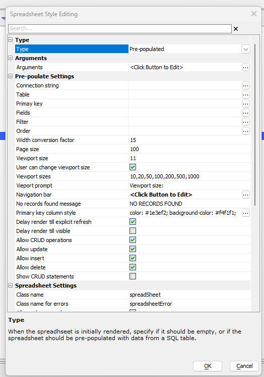
Select Pre-populated in the Type property.
Fill in the choices in the Pre-populate Settings section.
The properties of not in this section are:
The columns shown in the Spreadsheet can be resized and reordered. When you resize or reorder a column the settings are stored in local storage so that when you re-run the component, the stored settings are automatically retrieved and applied to the Spreadsheet.
You can filter the records shown in the Spreadsheet by clicking on the filter icon in the column heading of each column.
You can sort the data shown in the Spreadsheet by clicking on the column heading of a particular column. The first click on a column sorts in ascending order. The second click sorts in descending order and the 3rd click removes the sort.
You can add an Advanced Search control to the UX component to search the records shown in the Spreadsheet.
When you create a pre-populated spreadsheet control and you specify a table and you select fields (as opposed to leaving the fields property blank, which selects all fields), you can set properties on individual fields (i.e. columns) in the spreadsheet.
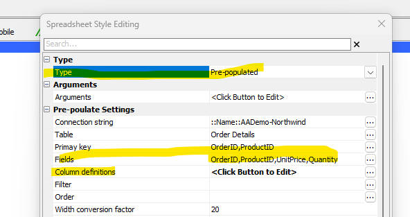
When you click the smart field for Column definitions, the following dialog is shown.

You can set the width of a column (using CSS units, but not % or flex), you can define the column alignment and style and you can specify Javascript to format, validate and calculate the value in a field.
If you configure the Spreadsheet control to be Pre-populated you can now specify that the spreadsheet should be rendered with alternating row colors.
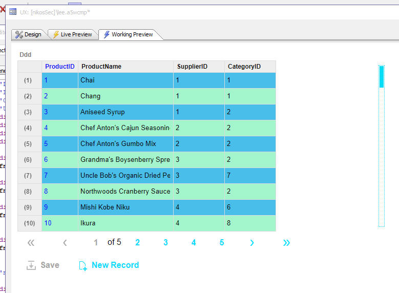
UX Component - Spreadsheet Control - The spreadsheet control has been updated. It now allows for columns to be added and removed dynamically and it now supports virtualization (for efficient loading and display of very large amounts of data). When virtualization is enabled the control displays a fixed number of rows (regardless of the number of rows of data that have been loaded) and a slider control is displayed for scrolling the data.
Watch video - part 1
Watch video - part 2
Watch video - part 3
Download component
If a row of data has been edited, the data for that row will contain a property called __dirty which will be set to true.
A new Javascript method ( {dialog.object}.setSpreadSheetLayoutAndPopulate(controlname,data) ) has been added to populate a spreadsheet control with JSON data and to simultaneously configure the layout of the spreadsheet control to match the structure of the first row of data.
Where:
Example 1 (data an object):
var data = [
{"OrderID" : "11077", "ProductID" : "73", "UnitPrice" : "15", "Quantity" : "2", "Discount" : "0.009999999776483"},
{"OrderID" : "11077", "ProductID" : "75", "UnitPrice" : "7.75", "Quantity" : "4", "Discount" : "0"},
{"OrderID" : "11077", "ProductID" : "77", "UnitPrice" : "13", "Quantity" : "2", "Discount" : "0"}
]
{dialog.object}.setSpreadSheetLayoutAndPopulate('spreadsheetInput1',
data)
Example 2 (data a CSV, (comma separated value) string ):
var data = `"firstname","lastname"
fred,smith
tom,"jones,3rd"
`
{dialog.object}.setSpreadSheetLayoutAndPopulate('spreadsheetInput1',
data)
UX Component - Panel Layout - Scrolling - A new option is available for Panel Layouts controls.
A common pattern in many web sites is to have a lot of content on the home page of the site that can be scrolled using the mouse wheel or keyboard rather than having content spread over multiple pages.
You can now implement this pattern by using multiple Panel Cards inside a Panel Layout and then setting the Panel Layout Behavior property to Scrolling. This pattern is demonstrated in this video.
To set the Panel Layout behavior to scrolling, set the Panel layout behavior property to Scrolling.

When you set the behavior to scrolling you can also indicate if a scroller should be shown to allow the user to quickly scroll the content of the Panel Layout.
When you set the behavior to scrolling you must set an explicit size for all of the Panels (Panel Cards, Panel Navigators and Panel Layouts) that are contained within the Panel Layout.

If any of the Panel Cards in a scrolling Panel Layout contain List or ViewBox controls that are set to Delay render till visible, the List or ViewBox will only render once the containing Panel Card is scrolled into view.
A new UX component template is available when you create a new UX. This template is called ScrollingPanelLayout and it implements a scrolling Panel Layout

Document Templates - A new component type (Document Templates) is available. A Document Template is a data and layout definition that is stored as a JSON definition. Document Templates can be used to generate .PDF or Microsoft Word .docx files by merging data into a template. The advantage of document templates over using the Report feature to generate PDF files is speed. Generating a PDF file using a Document Template is extremely fast.
To create a new Document Template, select the Document Template item in the Categories list in the Web Projects Control panel, then click the New button in the toolbar.
A builder for the Document Template is then shown.

The easiest way to get started is to import a report definition by clicking the Import report definition hyperlink at the bottom, right of the dialog. This will populate both the Data tab and the Layout tab in the builder.
NOTE: Document Templates support most, but not all report features. In particular, Document Templates do not support continuation headers or snaking columns.
If you prefer to build the Document Template manually, click the Define datasource... hyperlink. This will open a dialog where you can define the data source for the Document Template.

If you want to define a SQL data source, click the Define SQL Datasource.. button.
Once you have defined the connection string and query for the datasource, the screen will change.
Click the Pick Fields and Groups... hyperlink to pick the fields that will appear in the report. If you want to group your data you an specify fields to group the data on. When you click on the Pick Fields and Groups... hyperlink the following dialog is shown:

Once you have completed the definition of the Document Template datasrouce you can select the Layout tab to define the layout of the Document Template.
NOTE: If you imported a Report Definition, the Layout tab will already be populated.
If you did not import a report you will need to define the Layout yourself.

There are a number of helper function to generate a default Layout. These are:
This option generates a Layout based on the shape of the JSON data defined in the Data tab. When you click the Generate Layout From Data hyperlink, the following dialog is shown. You can generate a layout that displays data in a columnar or 'form' layout and you can turn on page headers and footers for the generated layout. When you turn on a header or footer, you specify what content should be shown in the header or footer.
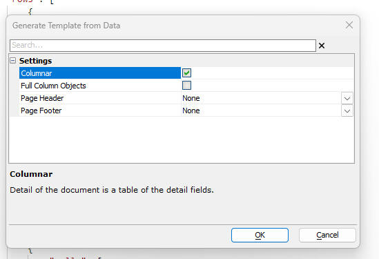
This option allows you to import a Microsoft Word Merge document template.
This option allows you to define an HTML template that contains placeholders for fields in the data.
Once you have defined the layout for the Document Template, you can preview it by clicking the Preview Document... hyperlink.
UX Component - Action Javascript - Open Document Template - A new action is available in Action Javascript to open a Document Template. The Open a Document Template action can be used to render a Document Template in either PDF or Microsoft .docx format. In the case of the PDF option you can display the PDF on screen in a window, DIV or TabbedUI pane, or you can email the document. In the case of a .docx file, you can email the document or call an Xbasic function to process the file after it is created.
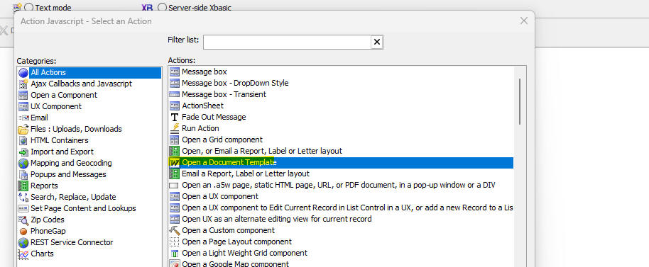
UX Component - List Control - Add Custom Icons to Column Titles - You can now add custom icons to each column title in a Columnar List layout. You can add multiple icons to each title and each icon can have its own Javascript event code. To turn on custom icons for a column title check the Has user defined icons in column header property and then click the smart field for the Column header icons property to define the icons and the corresponding Javascript.

When you click the smart field for the Column header icons property, the following dialog is shown;

You can define as many icons as you want. For each icon, you specify the icon name by clicking on the Click to set icon button. If an icon has been set, the button text is shown in blue.
For each icon you must define the Javascript to execute when the user clicks on the icon. Click the Click to edit Javascript button to define the Javascript
Live Test - Classic Server - Security Framework - Previously it was necessary to stop and then restart the server before Live Test would pick up changes to page and component security settings. This is no longer necessary.
Alpha Cloud - Amazon RDS - Amazon RDS Certificate and Certificate
Authority File Rotation - As of August 2024, Amazon will be
replacing both certificates and the certificate authority files used for
Amazon RDS; and which are expiring.
What You Need To Do
Sometime before expiration, you will need to change the certificate
on your Amazon RDS database to use one of the new ones provided by
Amazon. It is likely that Amazon will automatically replace expired
certificates, but if you have not planned for the change, you
application may stop working at that time.
Prior to updating your Amazon RDS certificates, be sure you have
installed this build (or a later one), or replaced the older certificate
authority file on your existing installation as discussed below.
If you are running an older build on Alpha Cloud, you will want to wait
to make the change until Alpha Cloud has been updated, as discussed
below. Alternatively, you can explicitly include the new certificate
authority file in your deployment. Please contact
CloudSupport@alphasoftware.com for help if this is a requirement.
If applications other than Alpha Anywhere are accessing your Amazon RDS
database, please refer to documentation for those applications and
verify that you have made the necessary changes.
How Alpha Anywhere is Affected
When you select TLS/SSL on the connection string dialog in Alpha
Anywhere, we automatically handle the certificate authority file for you
to assure a secure connection with the intended database server.
Beginning with this build and beyond, Alpha Anywhere will no longer
automatically assign "rds-combined-ca-bundle.pem" as the certificate
authority file for connections to Amazon AWS RDS. Instead it will use
"global-bundle-2023-09.pem" when connecting to Amazon RDS using TLS/SSL.
As a result, your application will work with the old and the new
certificates as long as you deploy this build and beyond.
No change is required for applications to continue working with the old
certificate as the replacement bundle includes the old certificate
authority certificates and the new ones.
Where the Certificate Authority Files Are Located
During installation of Alpha Anywhere Application Server (all
editions), a folder called "redist\SQLDatabases\Certificates\AmazonRDS"
is populated with certificate authority files required to validate the
Amazon RDS server security host.
The "official" name of the file (and as downloaded) is
"global-bundle.pem". Both "global-bundle.pem" and
"global-bundle-2023-09.pem" are included in the installation and can be
found in the folder named above. We have included an additional copy of
the file with the date in the name to document the actual date so it is
clearer when the file was added.
The older file is called "rds-combined-ca-bundle.pem. We have left it in
the folder.
If you want to download the Amazon RDS Certificate Authority file
directly, you can do so from
https://truststore.pki.rds.amazonaws.com/global/global-bundle.pem
Older Alpha Anywhere Builds
If you are running an older build that does not have the new
certificate authority file installed, you can manually update your
installation.
Download "global-bundle.pem" and overwrite "rds-combined-ca-bundle.pem"
in the folder on your deployed server.
Don't forget to do the same thing in the binary folder for Alpha
Anywhere so you can test against your server.
Alpha Cloud
Newer builds will work on Alpha Cloud without any changes to the
application on your part. If all of your deployed applications are using
the latest build, you can safely update the server certificate on Amazon
AWS.
For older builds, we will be automating the same change discussed in the
section above (overwriting rds-combined-ca-bundle.pem with the contents
of global-bundle.pem).
This change will be announced during a future control plane recycle.
Again, if you are running an older build on Alpha Cloud, please wait
until the announcement to change the root certificate on your Amazon RDS
database! Alternatively, you can explicitly include the new certificate
authority file in your deployment. Please contact
CloudSupport@alphasoftware.com if this is a requirement.
Amazon Documentation Regarding the Certificate Rotation
According to the following documents, the new file (global-bundle.pem)
includes the root certificates for all regions and from 2019 to handle
the transition better. As we understand it, the expiration on the RDS
database certificates is August 2024, and presumably the root
certificates from 2019 will expire around that time frame.
https://docs.aws.amazon.com/AmazonRDS/latest/UserGuide/UsingWithRDS.SSL-certificate-rotation.html#UsingWithRDS.SSL-certificate-rotation-server-cert-rotation
https://docs.aws.amazon.com/AmazonRDS/latest/UserGuide/UsingWithRDS.SSL.html#UsingWithRDS.SSL.RegionCertificateAuthorities
UX Components - Improved Performance - Static HTML Pages - The UX component can now be configured to deliver significantly better performance for the initial load. This is done by rendering a static HTML version of the component and then using the static HTML version of the component at run time for the initial load of the component, rather than using the .a5wcmp file. The improved performance is available in all places where a UX component is loaded. For example, in an .a5w page that runs a component, in a UX that embeds another UX component, in Action Javascript that runs a UX component and in a TabbedUI that loads a UX component.
Watch video - 1
Watch video - 2
To enable the faster performance you must check the appropriate property.
The builder for the Action Javascript Open a UX action is shown below. To enable the Static HTML option, check the Open UX using static HTML file property.

The builder for the TabbedUI component is shown below. To enable the Static HTML option, check the Open UX using static HTML file property.
The builder for creating an .a5w page to run a UX component is shown below. (This builder is displayed when you click the Save Page button on the toolbar when you are editing a UX component). To enable the Static HTML option check the Run component using a static HTML page checkbox

When the Static HTML version of the component is run, the static HTML page is run in an IFrame. Because the page is running in an IFrame you can use different styles for the parent and child component. This was only possible previously if the components used legacy style sheets (i.e. not Alpha or a style that was inherited from Alpha)
When you turn on the Open UX using static HTML file property, Alpha Anywhere checks to see if the target UX component is configured to automatically create a static HTML version of the component when it is saved. If not, you can direct Alpha Anywhere to automatically turn on this option (see next topic).
UX Component - Creating a Static HTML Version of the Component when the Component is saved - When you edit and save a UX component you can configure Alpha Anywhere to automatically create a static HTML version of the component. To do this, set the Create static HTML file(s) when component is saved property. When the component is saved you can create one or more static HTML files.
When you click on the smart field for this property you get the following dialog:
You can configure Alpha Anywhere to create multiple static HTML files from the component.
When you click the Add File or
Edit File button, the following dialog is
shown:

This dialog allows you to specify properties for each static HTML file that you want to create.
The <default>.html entry indicates that a static HTML file with the same name as the component should be created. For example, if the component you are editing is called customers, <default>.html will create a static file called customers.html.
You can specify that before the static HTML file is created, Alpha Anywhere should prompt for confirmation. This can be useful because it can take some time to create a static HTML file and you might not want to do this every time you save the component.
The Modify HTML option is an advanced option that allows you to modify the static HTML that was generated for the component before is is saved to a file. You can insert or remove existing HTML from the generated HTML.
UX Component - Action Javascript - Absolute Layout Container - Create PDF - This action now no longer supports PhantomJS as the method for creating the PDF. The WebKittoHTML option is now automatically selected.
Xbasic - A5Helper_getJSONFormitems_fromDatabase() Function - The Excel file or SQL database used as a data source for this helper function now supports these additional fields:
Xbasic - AWS Functions - Several new functions for working with Amazon Web Services (AWS) have been added. These are:
For information on how to create an AWS connection string, see below.
Connection Strings - AWS - A new type of connection string (AWS) can be created. An AWS connection string is needed for all of the aws_* function. To define an AWS connection string you specify the access key and secret for the user.
To create an AWS connection string, select the click the SQL button on the Web Projects Control Panel toolbar.
UX Component - Action Javascript - Update, Insert of Delete (Unbound Component) - Null if Blank - A new property (Null if blank) has been added to this action to allow you to specify fields that should be set to NULL if they are blank.
UX Component - Generic SQL Table Data Editor template - A new template (GenericSQLDataTableEditor) is available when you create a new UX component. The template displays a list of connection strings in a dropdown box. When the user selects a connection string, a list of tables in the database are shown. When the user selects a table, the Spreadheet control is populated with data from the selected table and the user can perform CRUD actions on the table.
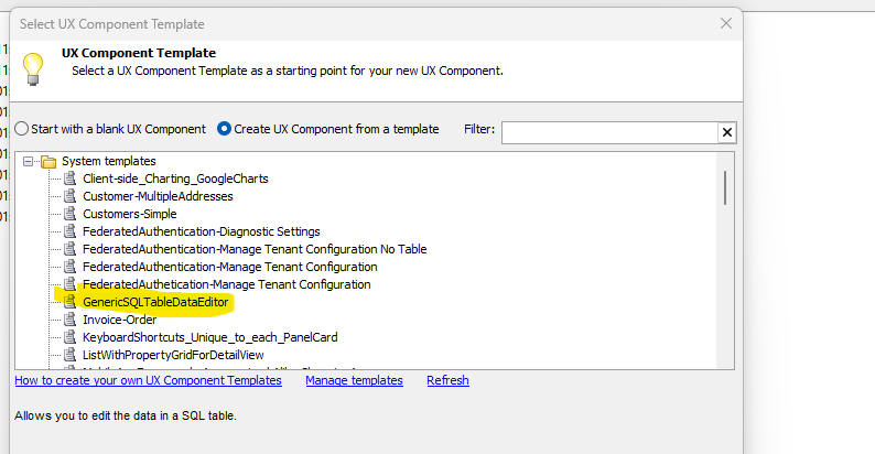
Security Framework Sample Application - - The Generic SQL Data Table editor component has been added to the Sample Security Framework Sample Application. The Tabbed UI shows the menu item when you are logged in as an Administrator.

UX Component - JSON Forms - Auto-suggest, and Edit Combo - The picklist that is displayed can now be based on a SQL expression. This allows you to display data from more than one field in the picklist. For example, if you set the Display field property to:
expn:concatenate(City,', ',Country)
The picklist will display data from the City and Country fields.
NOTE The expression is defined using Portable SQL syntax.
UX Component - Submit component even if has client-side errors - The default value for this property is now .f. and validate code in JSON form controls are evaluated to determine if there are client side errors.

Ajax Callbacks - If an Ajax callback is made and there is no internet connection, and the Offline Javascript property is blank, a default alert is shown (saying No internet connection) . To suppress the message set the Offline Javascript property to a space. NOTE: You will need to edit and re-save existing Ajax callback actions.
PWA - Progressive Web Applications - You can now build PWAs in Alpha Anywhere. A PWA is an installable web application that can run in disconnected mode. On desktop applications, you can install an icon on your computer's home screen to launch the PWA. On mobile devices you can install the app and create an icon on the home screen (just as you would with a native Cordova app).
PWAs are an attractive alternative to building mobile applications using Cordova because you don't need to publish your application to an App store. Like native Cordova applications, PWAs have access to many native device APIs (such as the camera). However, native Cordova applications can still access a much broader range of native device APIs (such as the device file system, SQLite, etc.).
Once a PWA has been installed, launching the PWA (by tapping on its icon on the home screen (or desktop) ) is extremely fast. The application can typically be launched even if your device is not currently connected to the internet.
PWAs can be easily updated by simply publishing an updated version of the application to the site where the PWA is hostedand also bumping the PWA cache value. When a user launches a previously installed PWA, the latest version of the application is automatically downloaded and installed (assuming that at the time the app is launched, an internet connection is available)
PWAs are created from UX components.
To create a PWA:

The PWA builder genie will then be displayed.
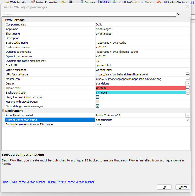
The majority of the properties have default values, which do not need to be changed. The properties of note are:
NOTE: PWAs must be loaded from a web site that supports the https protocol.
Installing a PWA on an iPhone
IMPORTANT: You must use Safari to open the PWA page. If you open the PWA page in Chrome you will not be able to install the app (i.e. create an icon on the phone's Home screen).
Once you have loaded the PWA page in Safari, tap the Share icon (shown below with the yellow highlight)

The Share icon will bring up a menu. Scroll the menu till you see the Add to Home Screen menu item.
This will install the PWA on your device's Home screen using the icon you specified in the PWA Builder.
NOTE: If you want to change the icon after the app has been installed, you will need to first uninstall the PWA and then re-install it.
Installing a PWA on an Android Device
(Note: Images shown below are for the Chrome browser running on a Pixel 6 device).
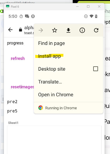
Installing a PWA in your Browser
After the PWA page is openeded in your browser you will see an icon in the address bar (as shown in the image below for the Chrome browser). (If this icon is not visible then it is likely that the PWA has been previously installed.) Click the icon to install the PWA.

Offline PWA Applications
A common use case for PWA applications is for offline mobile applications. The following section explains how an application that uses a List control with a Detail View and an image capture feature work while offline when deployed as a PWA.
The List must be set to persist the the List data to storage and the storage location must be set to IndexedDB. Images must be set to be stored on Amazon S3.
When the List data are loaded all of the image field values contain URLs that point to objects stored on S3.
Once the data has been loaded into the List, if the application must run while there is no connection, the image URLs that point to Amazon S3 can not be resolved. Therefore, if the images are to be displayed when there is no Internet connection, it is necessary to store the images on the device. Since PWAs do not have access to the file system on the device, the image data is stored as base64 encoded data in IndexedDB. After the List is loaded, an Ajax callback is made to the server to retrieve the base64 encoded data for all images in the List. This data is then stored in IndexedDB and each image in IndexedDB will have a unique key value. The List data is then updated, replacing all of the image URLs that point to S3 with key values of the base64 data that is stored in IndexedDB.
The List might have thousands of rows, but at any given time, only a few or the rows are visible. Javascript code in the List determines which rows in the List are currently visible and the data for the images in the visible rows are replaced with the base64 data for the image (which is retrieved from the IndexedDB). Once the image data has been replaced with the base64 encoded data the image in the List is visible.
When a picture is taken, the base64 data for the image is stored in IndexedDB and the key value for this data is stored in the List.
When edits to the List are persisted, the base64 data for all of the images in dirty rows are sent to the server. The images are then stored as objects in S3. The data in the image fields are replaced with URLs that point to S3 and the data are then persisted to the SQL database.
Using Embedded Components in a PWA
You can use embedded UX components in a PWA (only UX components are supported). You must set the Method for opening UX in PhoneGap or Static HTML property to Precomputed.
{dialog.object}.setListTemplateAndPopulate() - This method will now automatically turn off list titles if the List was displaying titles before the command was invoked.
IIS Server Manager - The last valid build for a selected license is now displayed in the Alpha Anywhere Application Server for IIS "License Information" page in IIS Manager.
Additionally, on the Application Server Build page for an application there is an indication of whether or not the current license is valid for the selected license. When the license is valid for the current build, the page will say so. When the build is not valid for the current license, there will be a statement saying the build is not valid for the current license and a statement saying what the last build is that the license will support.
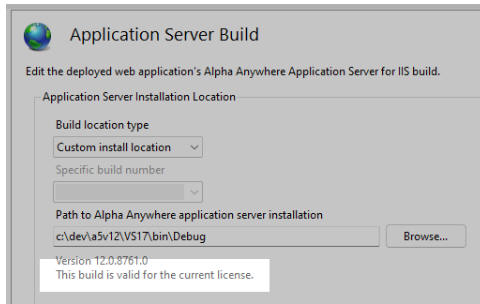
MongoDB - MongoDB is a NoSQL database. For some time Alpha Anywhere has allowed you to work with data in a MongoDB database by treating the MongoDB database as if it was a SQL database. This meant that all of the AlphaDAO methods that are used with traditional SQL databases could be used with MongoDB. In order to use AlphaDAO methods with MongoDB it is necessary to create a schema definition for the collections in the MongoDB database.
Now, a new option is available for MongoDB. You can use low level Xbasic functions to interact with the MongoDB database, bypassing AlphaDAO commands (which convert SQL statements into low level Xbasic functions). When you use this option, there is no need to define a schema.
The following Xbasic functions for working with MongoDB are supported:
See the section below (MongoDB Functions) for more information on each of these functions.
Using the MongoDB Explorer
The MongoDB Explorer can be used to perform CRUD (create, read, update and delete) operations on any collection in a MongoDB database. The MongoDB database can either be running locally, or in the cloud (Mongo Atlas).
To open the MongoDB Explorer select the MongoDB Explorer... command from the Tools menu when the Web Control Panel has focus.
When the MongoDB Explorer is shown you will need to select a Connection string, Database and Collection to explore.
For more information on how to define a MongoDB connection string, see Defining a MongoDB connection string below.
The MongoDB Explorer allows you to:
The MongoDB explorer is shown in the image below:
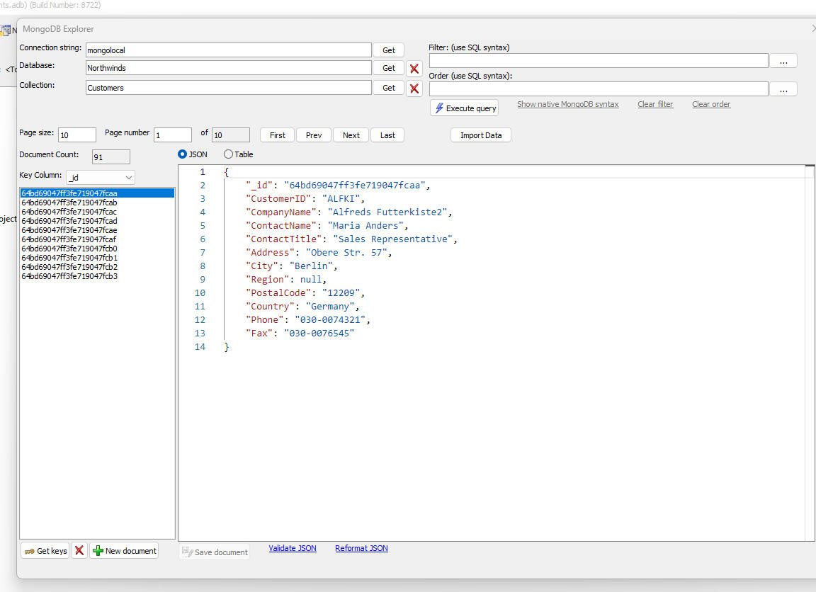
Defining a MongoDB connection string
To define a Mongo connection string, click the SQL button on the toolbar when the Web Control Panel has focus. Then select the AlphaDAO Connection strings command. Then click the New button, specify the connection name and then click the Build button. The Select an API dialog appears. Select MongoDB.
The following dialog will then appear:
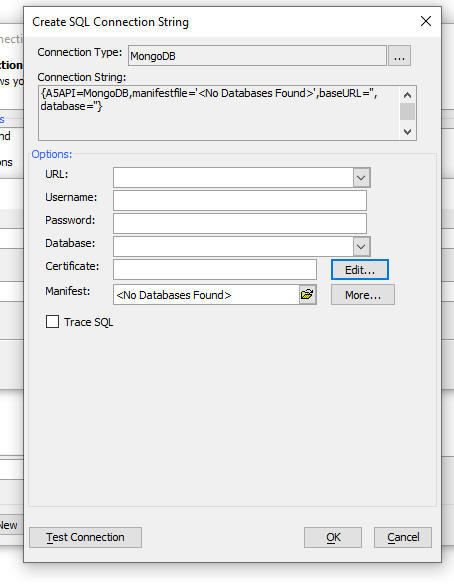
Select the URL for the MongoDB service. For example, if you are connecting to a MongoDB service that is running locally, the URL will be something like:
mongodb://localhost:27017
If you are connecting to a hosted Mogodb instance (for example, Mongo Atlas), the URL will be something like:
mongodb+srv://<userName>:<password>@cluster0.wrchfwt.mongodb.net/
After you have specified the URL and Database, click the OK button.
You will then see the following screen.
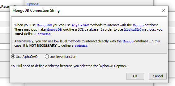
Specify if you want to use AlphaDAO or low level Xbasic functions to interact with your Mongo database.
TIP: Using low level Xbasic functions is faster because Alpha Anywhere will not have to translate SQL statements into low level Mongo commands.
Using MongoDB as a data source for a List control
When you create a List control you can specify that you want to use MongoDB as the data source.
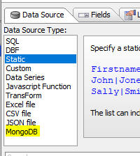
This option will use low level Xbasic functions to interact with the MongoDB database and is preferable to using the SQL option (which is possible if you defined a schema when you defined the connection string.)
MongoDB Functions
mongo_updateDocument() -- updates a document in a MongoDB collection.
Syntax:
c result = mongo_updateDocument(c mongoURL_or_connectionString , c databaseName,c collection,c id,c json[, c mode])
Where:
Example
'update the document with an Id of "60773000296c0832586538ba"
dim id as c = "60773000296c0832586538ba"
dim p as p
p.firstName = "Fred"
p.lastName = "Smith"
dim json as c
json = json_generate(p)
dim pr as p
pr = mongo_updateDocument("::name::my_mongo_connString","myDatabase","newCollection",id,json,"add")
mongo_deletedocument() - delete a document (specified by document Id) from a collection.
Syntax:
P result = mongo_deleteDocument(C
mongoURL_or_connectionString ,C databaseName ,C collection ,C id )
Where:
Example:
dim p as p
dim id as c = "60773000296c0832586538ba"
p =
mongo_deleteDocument("::name::my_mongo_connstring","myDatabase","newCollection",id)
mongo_createdocument() - create a new document in a collection. Returns the Id of the new document
Syntax:
P result = mongo_createDocument(C mongoURL_or_connectionString ,C databaseName ,C collection ,C json )
Where:
Example:
dim p as p
p.firstName = "Fred"
p.lastName = "Smith"
dim json as c
json = json_generate(p)
dim pr as p
pr = mongo_createDocument("::name::my_mongo_connString","myDatabase","newCollection",json)
mongo_getdocument() - retrieve a document (specified by document Id)
Syntax:
P result = mongo_getDocument(C mongoURL_or_connectionString ,C databaseName ,C collection ,C id [,C fields ])
Where:
Example:
id = "10051164"
cs = "mongoAtlas"
db = "sample_airbnb"
collection = "listingsAndReviews"
p = mongo_getdocument(cs,db,collection,id,"room_type,bed_type")
mongo_query() - execute a query to find documents in a collection.
Syntax:
P result = mongo_query(C
mongoURL_or_connectionString ,C databaseName ,C collection [,C filter[,C
order [,N offset [,N limit [,C fields ]]]]])
Where:
Example:
dim cs as c = "mongoAtlas"
dim db as c = "sample_airbnb"
dim collection as c = "listingsAndReviews"
dim filter as c filter = "[name] like '%house%'"
dim order as c = ""
dim offset as n = -1
dim limit as n = 3
dim fields as c = "name"
dim p as p
p = mongo_query(cs,db,collection,filter,order,offset,limit,fields,fields)
showarjson(p.result)
mongo_listDatabase() - lists the databases in a MongoDB server.
Syntax:
c result = mongo_listDatabases(c mongoURL_or_connectionString)
Where:
Example:
dim cs as c = "mongoAtlas"
dim list as c = mongo_listDatabases(cs)
mongo_listCollections() - list the collections in a database
Syntax:
c result = mongo_listCollections(c mongoURL_or_connectionString, c databaseName)
Where:
Example:
dim cs as c = "mongoAtlas"
dim db as c = "sample_airbnb"
dim list as c = mongo_listCollections(cs,db)
mongo_deleteCollection() - delete a collection in a database
Syntax:
p result = mongo_deleteCollections(c mongoURL_or_connectionString, c databaseName, c collection)
Where:
Control Panel (Desktop applications) - SQL Data Editor - The SQL Data editor is now available from the Tools, External Databases menu in the Desktop Applications Control Panel.
Previously, this editor was only available from the Web Projects Control Panel
This editor allows you to edit data in any SQL table.
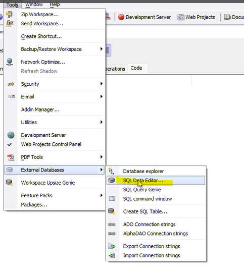
UX Component - Container Window - Embedded UX Components - Caching and Delay Render - If a UX component has a Container Window that contains embedded UX components, you can now specify that the embedded UX components should not be rendered until the window is opened and that the UX should be cached. If you cache the UX then the second and subsequent times that you open the window the UX will not need to be re-rendered. Instead, the UX's client-side onSynchronize event will fire.
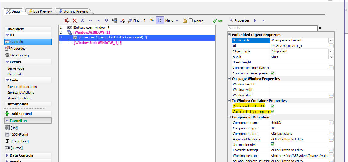
UX Component - Login Component - Change Password - Events - Two new Xbasic events are now available when a user changes their password in the UX Login component. The beforePasswordChange event fires before the password is changed and the afterPasswordChange event fires after the password has been changed.
The typical use case for these events is to store recently used password hashes in a database (using the afterPasswordChange event) so that you can prevent the user from reusing a previously used password (in the beforePasswordChange event).
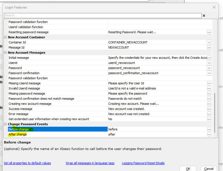
Xbasic - a5_imageFile_FixRotation() - Fix the rotation on an image file. The function will apply any necessary rotation to the image and then save the image back to the original filename. The function returns .t. if the image needed to be fixed and .f. if the image did not need to be fixed.
Example:
dim fn as c = "c:\data\myimage.jpg"
dim flag as l = a5_imageFileRotate(fn)
Javascript Library - Convert Comma Separated Value String to Object- A new function has been added to the Alpha Anywhere Javascript function library. A5.u.array.dsv.from(). This function takes a string of delimited values and creates an array of objects.
Syntax:
obj = A5.u.array.dsv.from(string[,settings])
Where:
obj - The resulting objected created by the function.
string - The delimited string to be converted into an object
settings - An optional object with settings. The settings can include these properties: separator (defaults to ,), quote (defaults to ")
UX Component - JSON Forms - A new property if available for controls to ensure that the control submits a value even if the data in the control has not been edited. By default, the JSON form will only submit a value for a control if the control is dirty. When this property is checked a value for the control is always submitted
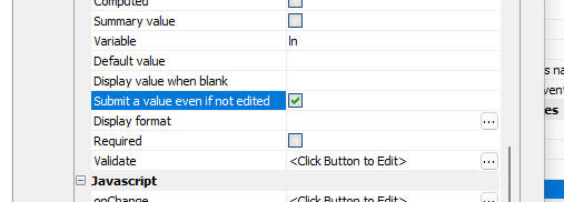
Cordova App Builder Genie - Added Support for Cordova iOS 7.0.0 - Cordova iOS 7.0.0 is the latest official release for building Cordova iOS applications.
The Cordova App Builder Genie now includes options for building iOS apps with 4 different versions of Cordova iOS.
These include Cordova iOS versions:
The Cordova iOS version that you can build for is dependant on the Cordova version installed on your computer.
Cordova iOS 7.0.0 requires that Cordova version 12 is installed on your development machine.
For more information on upgrading to Cordova version 12 see: Cordova CLI Documentation, upgrading to Cordova Version 12
For more information on Cordova iOS 7.0.0. see: Cordova iOS 7.0.0 Released
Import Excel into SQL table - SQLite - The Import Excel file into SQL Table(s) command (accessible from the Tools menu when the Web Control Panel has focus) can now import an Excel file into a SQLite database. Each sheet in the Excel file becomes a table in the SQLite database.

UX Component - JSON Forms Data Driven JSON Forms - A5Helper_getJSONFormITEMS_fromDatabase() Function - This function now allows you to set any property in the dynamic form by adding settings to a new field called Other.
For example, say you wanted to set the label style for a control. To find out how the label property is set, define a JSON form, set the label property, then click on the Show... button (lower left in the JSON Form builder) and select the Control Properties menu item.
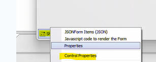
A dialog will show all of the property values for the control. You should be able to identify the label style property (label.style) in this window. Add the property name and value to the Other field (e.g. label.style="color:red;"). You can set as many property values as you want by entering a comma delimited list (e.g. label.style="color:red;",layout = "label-float-above",control.style="color:purple;") . If a property value has a comma in it, you must encode the comma as \comma
UX Component - List - Search Part - Range Searches - You can perform range searches in the List search part by adding a control with the id:
SEARCH_TO_fieldname
So for example, if the Search Part has a control with an id of SEARCH_OrderDate, adding a second control with an id of SEARCH_TO_OrderDate will allow you to perform range searches on the OrderDate field.
Grid and UX Component - Client-side Expressions - Fixed a regression that was introduced in previous release.
TabbedUI Builder - Fixed a regression when creating a new TabbedUI. Issue was introduced in previous build.
Cordova Builder = Fixes an error with generation of Config.xml when generating iOS or Android apps.
UX Component - List - Date and Datetime fields - Client-side <Default - date part only> format option - fixed an issue when the search was using dd/MM/yyyy regional settings.
UX Component - Submit component even if has client-side errors - This property was not working correctly.
Hotfix - Grid and UX Component - Fixed a regression if client-side Expressions (i.e. Show/hide, readonly, enable expressions) contained fields like: dialog.list.LIST1.isDirty or dialog.listDetailView.LIST1.mode IMPORTANT: You must recalculate the UX component after installing the hotfix. In the case of a Grid component, edit and resave the client-side expressions.
Hotfix - TabbedUI - Fixes an error when creating a new TabbedUI component.
Hotfix - Cordova Builder - Fixes an error with generation of Config.xml when generating iOS or Android apps.
UX Component - Client-side Expressions - Fixed a regression if the client-side expression referenced a Javascript function of the form: {dialog.object}._functions.functionName().
| UX Component - Panel Layout | Resizing Panels in a Panel Layout |
A Panel Layout can contain other Panels (PanelLayouts,
PanelNavigators and PanelCards). These child Panels can be
resized. In this video we show how to enable panel resizing. Watch video Download component Date added - 2023-04-25 |
| UX Component - Property Grid | Property Grid Control |
In this video we show how you can define a Property Grid control
to edit data in a List and how the Property Grid can be placed
in a Panel Window so that it is only shown when the user double
clicks on a row in the List. Watch video - part 1 Watch video - part 2 Watch video - part 3 Download component Date added - 2023-05-19 |
| UX Component - Property Grid | How to populate a Property Grid with Data from a SQL Table |
When you create a Property Grid control you can specify that the
Property Grid should be created from fields in a SQL Table. In
this video we show how you can populate a Property Grid that is
build from a SQL table. Watch Video Download component Date added: 2023-05-26 |
| Security Framework | Displaying Active Users |
A common requirement in apps that use the Security Framework is
to know who is currently logged into the application. It is not
possible to know this data accurately because a user may have
logged in and then subsequently been logged out automatically
because they were inactive (and their session expired). Instead,
you can know which users have been active (in a specified time
period, e.g. last 5 hours) and how active each user was. In this video we show how you can set up your application to keep track of Active Users and to display data about Active Users. Watch video Date added: 2023-05-24 |
Working Preview - Protocol - The way in which Working Preview is implemented has changed. The A5RES protocol is no longer used. If you want to test if your component is running in Working Preview use the a5_isWorkingPreview() function.
UX and Grid - RadioButton, Checkbox - Blank Entry - A blank entry is now no longer automatically added to the list of choices. You must add a directive to add a blank entry by setting the first choice in the Additional Choices (pre) property to <blank>.
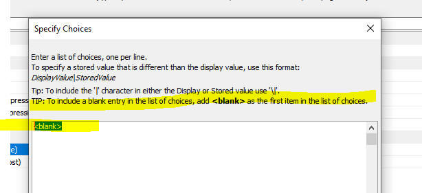
UX Component - Number Format - The number format (decimal character) now controls both how numbers are displayed and also how the user must enter the number. Previously, this property only controlled how users has to enter numbers.

UX Component - Client-side Date Format - Simulated Culture - The simulated culture property is now only honored in Working Preview. Previously it was also honored in Live Preview.
Android Mobile Apps - If you are building Android mobile apps that you intend to submit to the Play store keep the following in mind.
1 You must set the Cordova Android Version property to 11.x.x (up until August 2023) and then 12.x.x (after July 2023)
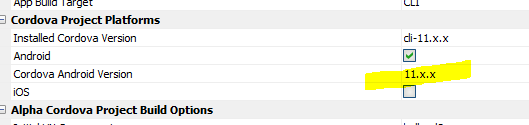
2. Your server must be configured to use HTTPS.
3. Your server must have a valid certificate and a valid domain name. (NOTE: If you publish your app to Alpha Cloud as you will satisfy these requirements).
4. You must set the Host Scheme property to https and you must set a valid value in the Host Name Preference property.

SQL Server - DateTime fields - Seconds - SQL server supports datetime values with fractional seconds (up to 3 decimal places). In order to perform CRUD operations on datetime values with fractional seconds, you must set the client-side date format to a value that preserves fractional seconds. e.g. MM/dd/yyyy&&0h:0m:0s.3
UX Component - Login - JSON Form - The sample UX Login component has been rebuilt using JSON Forms. When you create a new login component from a UX you have the option of using individual controls for the login controls, or using a single JSON Form for all of the login controls.
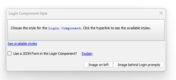
If you chose to use a JSON form the resulting UX component has significantly fewer controls (as shown in the image below)

A UX login component built with individual controls has many more controls that the same component built using a JSON Form (as shown in the image below).
Cordova App Builder Genie - Added support for Cordova 12, Cordova Android 12 and Cordova iOS 6.3.0
This release includes support for Cordova 12 which is the latest release of Cordova. It was officially released by Apache on May 22, 2023.

Cordova 12 is a major update to the Cordova CLI and includes the latest internal libraries:
Support has been dropped for NodeJS 14. The minimum supported version is now greater than or equal to NodeJS 16.13.0.
The npm packages have all been updated to the latest releases supported by Cordova
To verify the version of Node installed on your computer, from a command prompt enter: node -v
To update to Cordova 12, from a command prompt enter: npm update -g cordova
To verify the Cordova version installed on your computer, from a command prompt enter cordova -v
Cordova 12 includes support for Cordova Android 12 and Cordova iOS 6.3.0
Cordova Android 12 includes support for Android 13, (API level 33) which will be required for new and updated Android apps submitted to the Google Play Store starting on August 31, 2023.
To use Cordova Android 12, SDK Platform 33 and SDK Build Tools 33.0.2 must be installed.
To install SDK Platform 33:
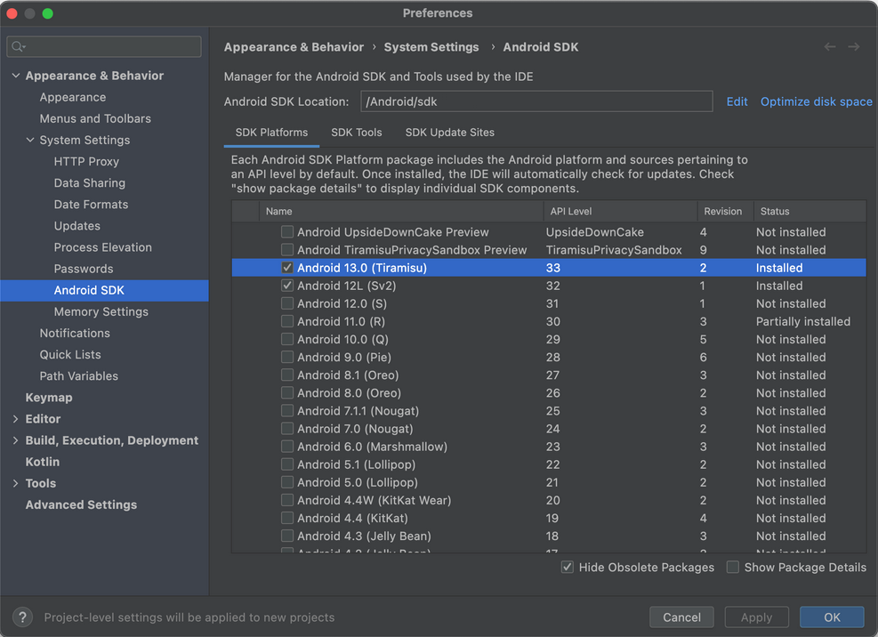
To install SDK Build Tools 33.0.2:
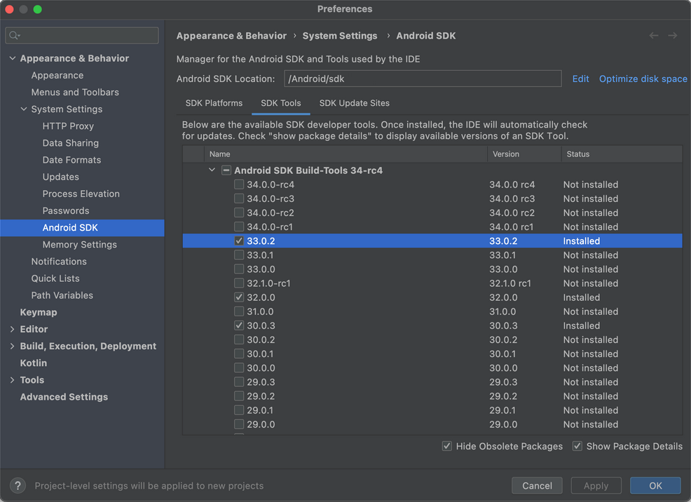
Android Project Dependencies
Tested with Android Studio Flamingo | 2022.2.1 Patch 2
Cordova CLI Project Builder Genie - Modified Cordova Android and Cordova iOS Version Property Handler
Previous versions of the Cordova CLI Project Builder allowed you to override the Cordova Android and the Cordova iOS versions. This value is determined by the Cordova App Builder project properties and it is automatically set. You can no longer override this setting. If you need to modify the Cordova Android or Cordova iOS version, you'll need to make the change from within the Cordova App Builder Genie.
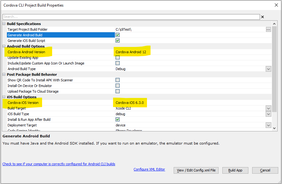
JSON Forms - JSON Forms are a new way of designing forms in the UX component. JSON Forms are extremely light weight and fast and for large forms are much more efficient than adding individual controls to a UX.
For more information on JSON Forms, click here.
Live Test - IIS - Speed - Performing a Live Test using the IIS server is now significantly faster.
Reports - PDF - Fillable PDF Files - You can now generate fillable PDF files when you create a PDF by saving a report as a PDF. This feature os only available for Freeform reports. In the report designer, right click on any field that you want to turn into a fill-in field and check the PDF Fill-in Field property.
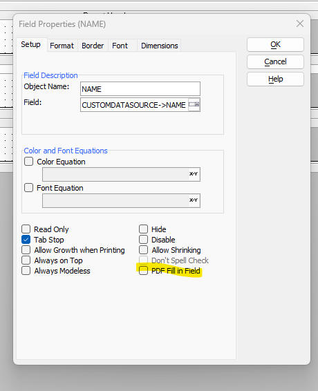
UX Component - Login - If a user tries to load a page that requires a login and the user is not yet logged in, the Login Page (that hosts the login UX component) is displayed. After the user logs in, you would typically want to load the page that the user was originally trying to load. In order to make this happen, you must edit the Security Settings and uncheck the Ignore return to page after login property.
You will also need to ensure that the following code is present in the client-side afterLogin event on the Login UX component:
var url = location.href;
url = decodeURI(url);
var qs = url.split('?')[1];
if(typeof qs != 'undefined') {
	qs = qs.split('%2f').join('/');
	qs = qs.split('%3f').join('?');
	qs = qs.split('%3d').join('=');
	var sep = '';;
	if(qs.indexOf('np=') > -1) sep = 'np=';
	if(qs.indexOf('ReturnUrl=') > -1) sep = 'ReturnUrl=';
	if(sep != '') {
		var qs1 = qs;
		qs = qs.split(sep)[1];
		qs = qs.split('&')[0];
		qs = qs.split('=')[0];
		location.href = qs;
	}
}
UX Component - Number Format - Culture - The Number format properties in the UX now allows you to select <cultureNumberFormat> as the option. When you select the <cultureNumberFormat> option, the format specified by the browser configuration is used. So, for example, if a user in Spain runs the component, decimal numbers will be shown with a comma as the decimal character, but a user in the UK will see numbers with a period as the decimal character. This allows you to build applications that feel more natural to users in different countries.
List Control - Two new control types are available for fields in a list.

SystemGlobal .js, .css, .a5xbfl, .svg - Linked Files - All components allow you to specify linked CSS, Javascript, Xbasic and SVG files. Now you can automatically link a special file called systemGlobal.<ext>, (where <ext> is one of .css, .js, .a5xbfl, or .svg) to all of your components in a project. This makes it easier to globally link a file than having to edit each component in a project and adding a filename to the list of linked files. For any individual component, you can suppress the systemGlobal file from being linked by specifying <noglobal> in the list of linked files.
Two Factor Authentication - SMS - Message - You can now customize the message that is sent via SMS when a user has two factor authentication enabled using the SMS option. Previously, the message was always Your authentication code: code
Now, you can specify any text that includes {code} as as placeholder for the authentication code. Your message can use text dictionary tags if you want to translate the message into different languages.
MariaDB 11.xxxx - Driver - Alpha Anywhere includes a new driver with support for MariaDB version 11 and above.
Security Framework - Active Users - A common requirement in applications that use the Security Framework is to know which users are currently logged in. Knowing if a user is logged in is problematical because, while it is possible to track when a user logs in, a user might be logged out either because:
It is more practical to keep track of active users.
Alpha Anywhere now allows you to keep track of the active users in an application that uses the security framework.
A user is considered to be active when they log in and when they make Ajax callbacks to the server.
In order for your application to track active users, you must set up an Active Users table in Web Project Properties.

TIP: If you set up the Security Framework using the Web Security Framework - Quick Setup Genie you can specify that an Active Users table should be created.
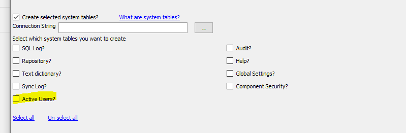
Once you have set up the Active Users table you can use the a5w_getActiveUsers() function to retrieve data from the table.
The prototype for the function is:
c jsondata = a5w_getActiveUsers as c (c timeperiod [, type]])
Where
Example:
dim json as c
json = a5w_getActiveUsers("last:5days","summary")
Note: In the above example activity is retrieved for the last 5 days. But by default when the Active Users table is configured, data are only retained by default for 3 days. So in order for the above example to be meaningful you would need to adjust the Maximum number of days activity property to 5.
A sample UX component to view data in the Active Users table is available. The template is called: UX_ActiveUsers_List.
Xbasic - email_send_SparkPost() Function - European Union - The email_send_SparkPost() now allows you to specify an optional 3rd parameter to indicate if you want to use SparkPost's EU server.
The function prototype is now:
email_send_SparkPost as p (key as c , message as A, flagEU as l = .f.)
If the flagEU parameter is set to .t. the folllowing endpoint is used to make the API request:
https://api.eu.sparkpost.com/api/v1/transmissions
Otherwise the default API endpoint is used:
https://api.sparkpost.com/api/v1/transmissions
UX Component - Property Grid Control - A new control type is available in UX components. The Property Grid control allows you to make a Property Grid. Property Grids are used extensively in the Alpha Anywhere IDE and you can use the same definition for the Property Grid as is used in Alpha Anywhere desktop application.
Watch video - part 1
Watch video - part 2
Watch video - part 3
Here is how a Property Grid might appear in the Alpha Anywhere IDE:
Here is how the same Property Grid might appear in a UX component:

The Property Grid can be configured to display differently depending on the UX style. Here is the same Property Grid when the UX style is set to Alpha-Dark-Green
Note: The Property Grid control is inherited from the JSON Form control.
To add a Property Grid control to a UX, select [More...] from the Data Bound Controls section in the UX Builder toolbox.
Then select Property Grid from the list of control types.

Once you have added the Property Grid control to the UX, you can configure its properties, by clicking the smart field for the Control properties property.

This will bring up the builder for the Property Grid.
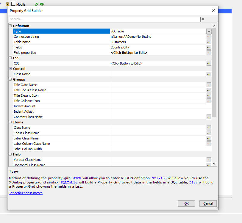
The Type property allows you to specify how the Property Grid should be defined:
The options are:
The Xdialog, SQL Table and List options expose a Field Properties property where you can set additional properties for the fields in the Propery Grid.
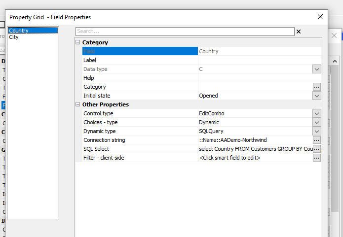
For example, in the image above, the Country field in the Property Grid is configured as an EditCombo control and the choices in the control are based on a query of a SQL table.
If the data for the pick list of a Combo or EditCombo control is based on a SQL query, you can specify a Filter - client-side property to dynamically filter the pick list. For example, say you have a pick list for Country and one for City. You might want the pick list for the City control to only show cities in the selected Country. In order to do this, you must specify Country as an Additional field, when specifying the SQL Select for the Country pick list

Then, in the Filter - client side property, define the following Javascript:
if(data.Country == this.data.v.Country) return true;
return false;
Note that the value that was selected in the Country field in the Property Grid is referenced using this.data.v.Country.
Defining The Property Grid Using the SQL Table Option
When you use the SQL Table option you must specify the connection string to the SQL database, the name of the SQL table and the fields from the table that you want to appear in the Property Grid. By default, all of the fields you select are shown as text boxes in the Property Grid and default labels and help text is generated. You can use the Field properties property to define additional customization for the fields in the Property Grid.
Defining The Property Grid Using the Xdialog Option
When you use the Xdialog option, you must specify an Xdialog definition for the Property Grid. For example:
^^Category
state=opened
++Item1
var=v.Item1
event=event1
++Item2
var=v.Item2
type=smart
data=smartevent1
++Item3
var=v.item3
html_help=<b>this is bold</b> and
this is normal.
Notice that the Xdialog syntax allows you to specify events for the various items in the Property Grid (using the syntax event=eventName).
When a value in a field that has an event is changed, a Javascript event is fired. The Javascript for this event is defined in the Xdialog Syntax Javascript Event property. Your Javascript can reference evetName, the name of the event.
The Xdialog definition can also specify that certain items have Smart Fields. For example, in the image below, the Xdialog Syntax property has a Smart Field.
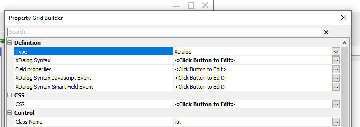
Here is how the Smart Field is rendered in a Property Grid control:
When the Smart Field button is clicked, the Javascript specified in the Xdialog Syntax Smart Field Event is executed. The Javascript can reference these variables:
Defining The Property Grid Using the List Option
When you use the List option, you specify that name of a List control. The Property Grid contains controls for each field in the List.
Styling a Property Grid
When you create a Property Grid the appearance of the Property Grid is generic. However you have a lot of control over the CSS classes that are used for the various parts of the Property Grid. You can apply a pre-defined style to the Property Grid by clicking the Set default class names hyperlink at the bottom of the Property Grid Builder window.
This will add CSS class definitions to the CSS property and it will set the class names for the various sections of the Property Grid.
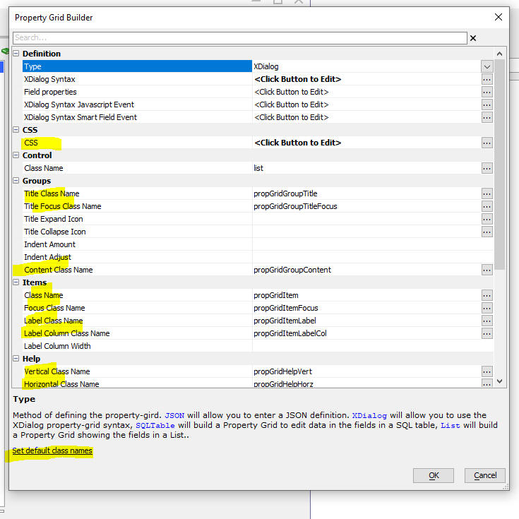
Using a Property Grid as a Detail View for a List.
By default, when you build a List with a Detail View, the Detail View is implemented by adding controls to the UX for each field in the List and then defining a Field Map to map List controls fields to Detail View fields.
However, instead of using individual controls for each of the fields in the List for the List's Detail View you can use a Property Grid. To do this, edit the List in the List Builder and on the Detail View tab, set the Detail View type to PropertyGrid.
You can either pre-define the definition of the Property Grid (by setting the Property Grid definition property to Pre-defined), or Alpha Anywhere can automatically generate the Property Grid to match the structure of the List.
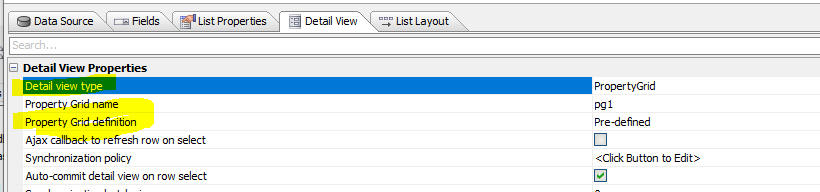
There is a new sample UX template that you can use to quickly create a UX that is pre-configured to use a Property Grid for the List's Detail View: ListWithPropertyGridForDetailView
Web Publishing - IIS and Alpha Cloud - Default Page - A new
setting has been added for how to handle the default page (the default
page is the page that is displayed when you visit a page in your site
without specifying an explicit page. e.g.
https.www.mysite.com):
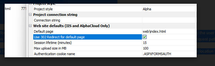
The default behavior is for Application Server for IIS to handle the
default page by doing an internal redirect so that the URL entered by
the user in the browser's address bar
https://www.host.com/
does not get changed to
https://www.host.com/home.a5w. This can cause a problem for
default pages that are in a subfolder. Because the browser's URL is not
updated, the subfolder will not be included in the request path of
relative resources on the page. This can result in broken images on the
page.
Enabling this setting will cause Application Server for IIS to return a
302 redirect to the browser instead of handling the redirect internally.
This causes the location in the browser address bar to update to the
actual page location. e.g. https://www.host.com/
becomes
https://www.host.com/web/index.html
Note: A <base> HTML element can be added to a page to specify the base path of relative URLs in a document if the default internal redirect behavior is desired with a default page in a subfolder.
UX Component - Login - Turn Two Factor On/Off for All Users - If you have two factor authentication turned on for your application you might want temporarily turn two factor authentication off for all users or certain users.
This is easily done by defining code in the Xbasic function for the Two factor login event.
One approach might be to use the GlobalSettings table to store settings to control whether two factor authentication is enabled or not.
The GlobalSettings table is configured in Web Project Properties
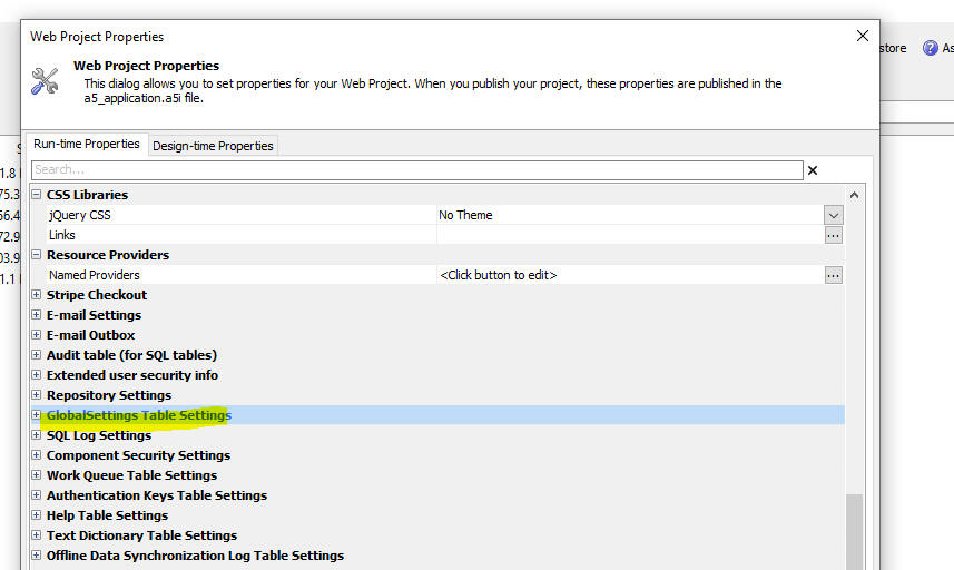
For example suppose you have configured the GlobalSettings table and stored data in the table using the following code:
dim p as p
p.turn2factorOffForAllUsers = .t.
json = json_generate(p)
flag = a5_globalsetting_add("twofactor",json)
Then in your Xbasic function that handles the Two factor login event you might have this code:
dim json as c
json = a5_globalsetting_get("twofactor")
if json <> "" then
dim p as p
p = json_parse(json)
end if
dim p.turn2factorOffForAllUsers as l = default .f.
if p.turn2factorOffForAllUsers then
e.suppressTwoFactorPrompt = .t.
end if
UX Component - Login - Two factor login event - This event can be used to programmatically suppress the two factor authentication prompt when it would otherwise have been displayed.
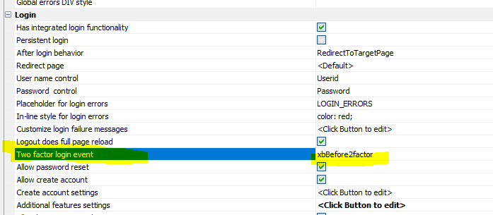
Now, when this event is executed, additional data are available in the function to use when computing if the two factor authentication prompt should be suppressed.
The new information that is available is listed below (the values are in the e object that is passed into the function) :
IMPORTANT: if you have an existing External User Information table, you must edit the table structure and add a new field called MiscJSON (data type longtext). If you recreate the External User Information table, this field is automatically added.
1. To suppress the two factor authentication prompt if the user has previously logged in from the same IP address as they are currently using
if
atc(e.IPAddressForCurrentLoginAttempt,e.IPAaddressesForPreviousLogins) >
0 then
e.suppressTwoFactorPrompt = .t.
end if
2. To suppress the two factor authentication prompt if it is less than
14 days since the user last logged in using two factor authentication
dim dateLastTwoFactorLogin as d = convert_type(e.lastLoginDateUsingTwoFactorAuth,"d")
if date() - dateLastTwoFactorLogin < 14 then
e.suppressTwoFactorPrompt = .t.
end if
3. To require two factor authentication every 10
login attempts. For example, once the user has successfully logged in
using two factor authentication, the next time the user tries to log in,
the two factor authentication prompt will be suppressed. The 10th time
the user tries to log in the two factor authentication prompt will be
shown.
The user will then be able to log in 9 more times without having to go
through a two factor login.
if mod(e.numberOfLogins,10) <> 0 then
e.suppressTwoFactorPrompt = .t.
end if
UX Component - Login - Two Factor Authentication - Trust Browser - If two factor authentication is turned on, when a user logs in a dialog is shown prompting the user for their authentication code. This dialog now has a checkbox control that the user can check to direct Alpha Anywhere to trust this browser. If the user checks the box and then successfully completes the login a cookie is stored in the browser. The next time the user logs in from the same browser, the two factor authentication is skipped.

If you do not want to display the Trust this browser prompt, edit the Login component, find the TWOFACTORAUTHENTICATION_STAGE2 container and delete the control.
UX and Grid Component - Warning Shown When Saving Component - When you save a UX or Grid component, if your Javascript function definitions contain object placeholders (e.g. {dialog.object} in the case of a UX or {grid.object} in the case of a Grid), a warning message is displayed alerting you to the possibility of a problem. In many cases you can safely ignore this warning and you might want to check the box to suppress the warning in the future. You can suppress the warning for all components or just the component you are editing.
This video explains the type of problems that can occur if you use object placeholders in Javascript functions. Watch video.
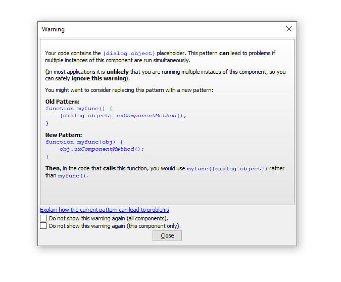
Security Framework - Two Factor Authentication - Authentication Code - You can now specify whether the authentication code (for use in email and SMS) should be all numbers or all characters and how long the code should be. Previously, the code was 6 characters long and it was all characters.
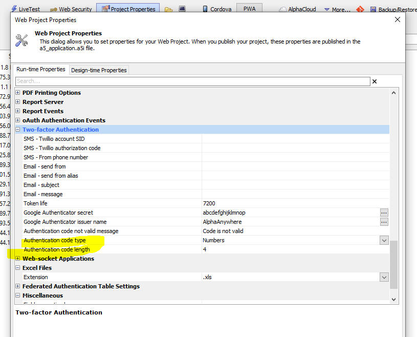
Action Javascript - Run Actions Synchronously - Now displays a warning alerting you that your Ajax callbacks must not perform a Server is available test, or else the actions will not run synchronously.
Panel Layout - Resize Child Panels - A Panel Layout can contain child Panel Cards, Panel Layouts and Panel Navigators. Now, these child Panels can be resized. When the UX is reloaded, the sizes of each resized Panel can optionally be restored.
Watch video
Download component
In order to turn on panel resizing, check the Allow resize property in the Panel Size and Dock Options section.
Once you enable panel resizing you can specify if the Grip icon should be show. If the Grip icon (see image below) is shown you can specify its position. By default, the position is set to 50% which is in the middle of Panel. For example, you could set the position to -200px, which would be 200px from the bottom (assuming a LRT or RTL layout, or 200px from the right (assuming a TTB or BTT layout).

You can specify a minimum and maximum size for a Panel (using CSS syntax).
You can specify if the Panel sizes should be restored when the UX is loaded (in the Advanced section of the UX Properties).
When a Panel is resized, the Panel Layout's onPanelResize event will fire.

Then panel sizes are stored in local storage with a key name of PANELLAYOUTSIZES_ + <UX Component Guid>;
The Javascript method to store the panel sizes is: {dialog.object}.__storePanelSizes() and the method to restore panel sizes is: {dialog.object}.__restorePanelSizes()
Then panel resize feature will work correctly on touch devices.
Windows - Body Class Name - You can now specify a class name to apply to the Window Body for pop-up windows.

Application Server - Securing HTTP Response Headers - A new
setting for response headers is now available.
For the IIS server and
Alpha Cloud, the setting is available in
the Web Project Properties dialog.

For the Classic server, the setting is on
the Advanced tab in the
Server Settings dialog.
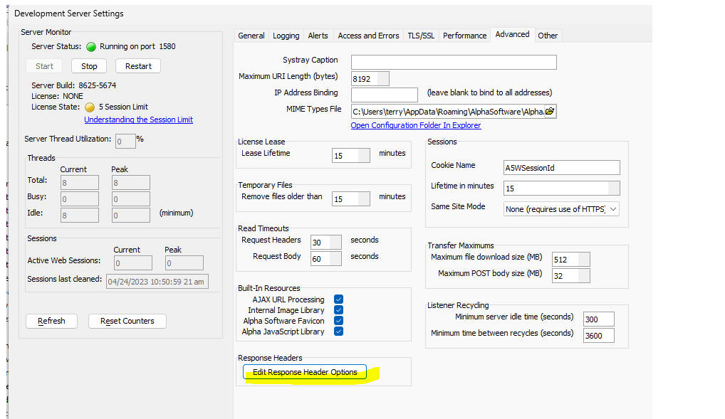
The following dialog is used for both server types to turn off insecure
headers (Server, X-Powered-By, X-ASPNET-Version)
by un-checking Include insecure headers,
and to add custom headers with specific values.
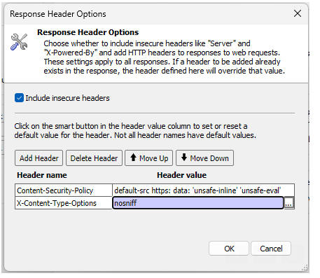
Components - Linked Xbasic Function Libraries - Project Properties - You can now specify Linked Xbasic Function Libraries at the Project Properties level. If you have a library that you want to link to all of your components, it is more convenient to specify the library to link at the Project Properties level rather than in each component.

UX Component - Dynamic Panel - onBeforeHide Event - If a UX component is opened in a Dynamic Panel and if the user is allowed to close the Dynamic Panel, the onBeforeRemove event fires if the UX is not cached. However, if the UX is cached, the onBeforeRemove event is not fired. Instead a new onBeforeHide event is fired.
Classic Application Server - Raw HTTP Logging - The
Alpha Anywhere Classic Application Server
now has a new option for Raw HTTP Logging.
The raw log can be extremely useful in debugging unexpected application
behavior, but it tends to generate a very large amount of output to be
analyzed. There is now an option to only write to the raw log when there
is an error processing a request or sending a response.
When set to Off, the raw log is never
written to. When set to On, every request
and response is logged. When set the the new
Errors setting, the requests and responses are only logged when
the response is an error - specifically the HTPP response code is in the
400 or 500
range.

UX Components - Arguments - Query String - You can now set the value of an arguments in a UX component by supplying a query string to the .A5W page that runs the component. For example, assume you have a component called UX1.a5wcmp (that has an argument called COUNTRY), and an .A5W page called MyPage.A5W. if you run the page as follows: MyPage.a5w?country=USA, the COUNTRY argument will be set to USA. You can set multiple argument values. For example: MyPage.a5w?country=USA&arg2=1.
You can also set the value in array arguments by setting the value to a comma delimited set of values. For example:
MyPage.a5w?country=USA&arg2=1&array_city=Boston,New York.
The ability to set argument values from the query string must be enabled by checking the Set argument values from query string property in the Advanced section of the UX Properties.
PDF File _JPG Images - Ever since Alpha Anywhere stopped using the Amyuni printer driver to create PDF files from reports, the JPEG Image Quality property has been ignored. Now, this property is honored.
Editing HTML Snippets - Legacy Editor - By default, Alpha Anywhere uses Monaco (same editor as used by VS Code) for editing HTML snippets. But the legacy HTML editor in Alpha Anywhere has better auto-complete for HTML attributes, so you might want to switch back to the legacy HTML editor. To do this, select View, Settings from the menu. Then navigate to Peferences, HTML Editor .
Extensionless URLs - Extensionless URL handling has been added to
Alpha Anywhere Application Server and Alpha Anywhere Application Server
for IIS. This feature allows you to define a list of extensions to be
used when a page request is not found and the page request does not have
an extension. Each extension will be added to the page request name and
if that page exists, it will be used to fulfill the request. For
example, an application can have a page named
home.a5w and the list of default extensions of ".html,
.a5w". Normally the page would be requested as
https://www.mywebsite.com/home.a5w. With
this feature, the page request can be "https://www.mywebsite.com/home"
and the server won't find a file named "home". The server will then
start trying the filename with extensions from the default extension
list.
home.html does not exist so try the next
extension. home.a5w does exist so continue
processing on the server with that file.
This feature is accessible for Application Server for IIS in the web
project properties in the IIS/Alpha Cloud site defaults section:
This feature is accessed on the server settings dialog for the classic
Alpha Anywhere Application Server:
UX Component - Mobile Preview - A new version of Mobile Preview is available in the UX builder. If you prefer the classic Mobile Preview, you can switch back to the old version by going to View, Settings, Preferences, UX Components.
The new Mobile Preview provides an expanded list of device sizes to select from.

You can also define custom sizes and save these definitions by clicking the Save button.

You can toggle between portrait and landscape mode by clicking the Phone icon.
The preview can be resized by dragging on the right or bottom border bar.

UX Component - Working Preview - It is no longer required that a new UX be saved before you can do a Working Preview.
Xbasic - Comma_to_CRLF2() - Same as comma_to_crllf(), but commas in quoted strings are ignored.
Example:
dim txt as c
txt = "a,\"alpha,beta\",c"
?comma_to_crlf2(txt)
= a
alpha,beta
c
UX Component - Xbasic - Aliases - When you save a component, file paths in Xbasic code can be converted to use aliases (for example, c:\mydata\file1.txt can be converted to [alias_1]file1.txt and a new alias of [alias_1] will automatically be defined) . This make your Xbasic more portable because you can define different values for [alias_1] in your publishing profiles.
You can now control whether file paths are converted to aliases when a component is saved using a property in Web Project Properties.

Cordova App Builder Genie - Plugins - Added support for the Facebook SDK plugin - Support has been added for cordova-plugin-fbsdk which provides support for the full Facebook SDK.
If you want to build an iOS app that uses this plugin make sure to build your app with Cordova iOS 6.2.0 or greater.
The link below contains further information and an example component that demonstrates Facebook login and logout. Make sure to read all of the documentation in the readme file.
Alpha Facebook Login Example Component
UX Component - Google Address Suggest - Establishment Names - Will now suggest addresses for business establishments (e.g. Savoy London).
Xbasic - convert_blob_to_acp() Function - Converts a blob to a
character string. Handles UTF-8 (with and without BOM), UTF-16 BE,
UTF-16 LE, UTF-32 BE, and UTF-32 LE.
Universal Installer - Unattended Mode - A new version of the Alpha Anywhere Universal Installer has been released: This includes a new feature to run the Universal Installer in unattended mode. Unattended mode allows the installer to be run without user interaction, which is suitable for automated deployments. For more information, click here.
Reports - SVG and Ink Fields - The rendering of SVG and Ink fields were not scaling lines properly when using a PRINTER reference driver This resulted in line images that were taking up more space on the page than they should have, and in some cases having much thicker lines that the original image.
UX Component - Cordova - Video Recorder - Android - Samsung - The Video Recorder would fail when used on a Samsung device. This is now fixed. You will need to edit and resave the Video Player/Recorder control in order to generate the fixed Javascript.
UX Component = Embedded Objects - Delay Render till Visible - Now works reliably if the embedded component is in a tab Pane.
List Control - Client-side Groups - Trailing and Leading Spaces - Trailing and Leading spaces in the Group field are now automatically trimmed.
Panel Navigator - Indicator Icons - Panel Hide - If a UX is opened in a Dynamic Panel in a Panel Navigator and the UX is cached and if the Panel Navigator mode is set to Tab Band and if the Dynamic Panel is configured to allow uses to close the panel, the Indicator icons did not refresh to indicate that a Panel had been closed. This was because the Dynamic Panel was actually only hidden (and not closed). Now, when a Dynamic Panel is hidden the indicator icons refresh correctly.

Working Preview - Functions Defined in Desktop Control Panel - If you edited a function in the Desktop Control Panel and then ran a component in Working Preview, the edited version of the function was no executed.
AlphaDAO - Get Schema - Postgres - Fixed an issue getting the schema of a Postgres database.
a5storage_copyfiles() Function - Wasabi - Fixed an issue when using the a5storage_copyfiles() function with Wasabi.
| UX Component - List Control | Nested Lists |
The Grid Component allows you to embed child Grids inside a
parent Grid using the Row Expander feature. A similar design is
possible with Lists by embedding child Lists within a parent
List. In this video we show how Customer, Orders and Order
Details lists can be nested in each other. Watch video - part 1 Watch video - part 2 Download component Date added- 2023-03-08 |
UX and Grid Component - Date format - The default value for the Date format property has been changed to include a time portion. Previously the default Date format property only had a date portion.
Publish - Ignore Folders - When you define a publishing profile, you can now specify a comma delimited list of folders to ignore (i.e. not publish)
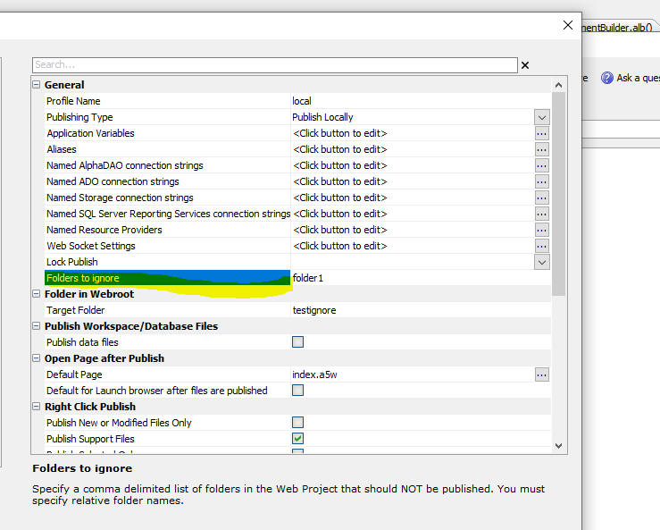
NODE - Memory Management Functions - A new object (NodeServices::NodeMemory) allows you to get insight into memory utilization by Node.JS/
The methods on this object are:
Interactive window example:
dim nm as NodeServices::NodeMemory
? nm.CollectHeap()
= .T.
? nm.GetHeapSize()
= 3997696
? json_reformat( nm.GetHeapStatistics())
= {
"total_heap_size": 3997696,
"total_heap_size_executable": 524288,
"total_physical_size": 3997696,
"total_available_size": 1097281744,
"used_heap_size": 2462864,
"heap_size_limit": 1098907648,
"malloced_memory": 73756,
"peak_malloced_memory": 379476,
"does_zap_garbage": 0,
"number_of_native_contexts": 1,
"number_of_detached_contexts": 0
}
UX Component - List and ViewBox - Delay Render Till Visible - Window Container - If a List or Viewbox control was inside a Window container and the List or Viewbox was configured to Delay render till visible, the control was rendered as soon as the UX was rendered. It is now correctly delayed until the Window is shown.
Cordova Applications - Session Timeout Warning - Session timeout warnings did not work in Cordova applications.
Grid Component - Search Highlighting - Fixed a regression in the search highlighting feature.
Grid - Time Fields - Fixed a regression when a display format was defined for a time field.
UX Component - Login Component - Automatically Login in After New Account Created - A new option is now available in the UX component when you make a Login component using a UX component. If you check the Automatically log in after new account created property, then when a user creates a new account that does NOT require approval the user will be logged in automatically using the credentials for the new account.
Previously, focus was set to the login panel and the user would need to manually log in.
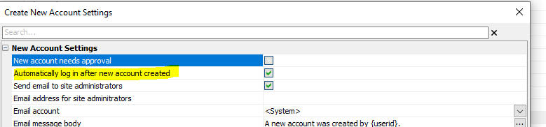
SQLite Database - Date and Datetime format - When you create a SQLite database you can now specify the format for date and datetime fields.
UX Component - Ajax Callback - Retries - By default, if you have specified a timeout that is greater than 0 (which indicates an infinite timeout), Alpha Anywhere will automatically retry the Ajax callback up to 3 times before it fails. You can now specify the number of retries. This property is only exposed if the Timeout setting is not <Default> or blank.
For example, if you set the Timeout setting to 2000 (i.e. 2 seconds) and the Number of retries to 0 then if an Ajax callback take longer than 2 seconds, it will be considered to have failed and the Ajax failed Javascript will be executed.
SVG Icons - 86 new SVG icons have been added - The new icons are:
cameraViewfinder, creditCardAdd, creditCardAddSolid, creditCardCVC, creditCardCVCSolid, creditCardCheck, creditCardCheckSolid, creditCardLock, creditCardLockOpen, creditCardLockOpenSolid, creditCardLockSolid, creditCardRemove, creditCardRemoveSolid, creditCardX, creditCardXSolid, docShred, docShredSolid, equipBackhoe, equipBulldozer, equipConcreteMixer, equipCrane, equipCraneTower, equipCraneWrecking, equipDumpTruck, equipExcavator, equipForklift, equipForkliftLoad, equipForkliftLoadDown, equipHarvester, equipHaulTruck, equipLoader, equipRoller, equipSkidsteer, equipTowTruck, equipTractor, eyeAdd, eyeCheck, eyeLock, eyeLockOpen, eyeRemove, eyeX, fontFormatClear, fontFormatCopy, fontFormatPaste, fontKerning, fontSub, fontSuper, graphicBrightnessDownInside, graphicBrightnessUpInside, layoutBreakHorizontal, layoutBreakVertical, medicalBPCuff, medicalCaduceus, medicalStethoscope, peopleCommunicate, scaleBalanced, searchlight, selectAdd, selectGrow, selectIntersect, selectShrink, selectSubtract, textBlockSpacing, textLineSpacing, textWordSpacing, thermometerBoilingPoint, thermometerDewPoint, thermometerFirePoint, thermometerFreezingPoint, thermometerMeltingPoint, transportAerialLift, transportAmbulance, transportAmbulanceAir, transportBike, transportBus, transportCar, transportFireEngine, transportHelicopter, transportMotorcycle, transportPolice, transportShip, transportTaxi, transportTrain, transportTrainFreight, transportTrainMetro, vector
UX Component Spin-List Control - Subtheme - A new subtheme (called Primary) is now available for the Alpha style (and all styles inherited from Alpha). This sub-theme makes it easier to see the current selection by displaying a shaded background behind the selection.
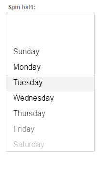
Action Javascript - File Upload - AmazonS3Indirect - OnUploadCompleteS3Indirect - A new event is now available in the File Upload - Amazon S3 Storage/Alpha Anywhere action when the target is set to AmazonS3Indirect. The OnUploadCompleteS3Indirect event fires after each file (assuming the user selected multiple files to upload) has been uploaded to the Alpha Anywhere server and then the file has been uploaded to S3. The Javascript in this event can reference e.targetName, the name of the object on S3 and e.url, the URL of the object.
Note: e.targetName will correctly show the target name defined by the S3 object name function.
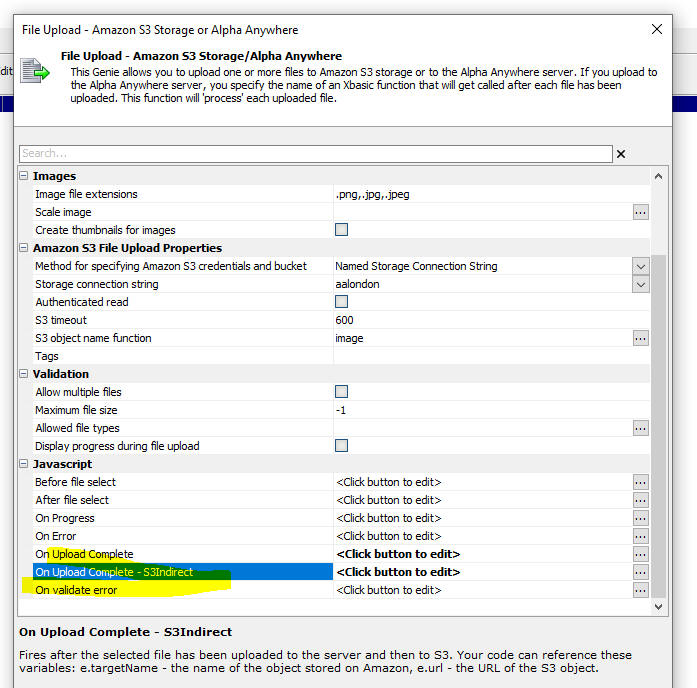
Security Framework - Manage Users and Groups Sample Component - Two-factor Authentication - Google Authenticator - When you use the sample Manage Users and Groups sample UX component to turn on two-factor authentication for a user and you set the method to Google Authenticator, you can now send an email to the user showing the QR code that the user will need to configure their Google Authenticator app.
The text of the message that is sent can be customized by editing the xbSendQRCodeToUser function in the Xbasic Functions section of the component.

Xbasic - send_email_using_ProjectPropertySettings() Function - When you send email in Alpha Anywhere, you can either use credentials that are stored in Project Properties (Email Settings) or you can explicitly define the email properties (such as the SMTP server, etc). The send_email_using_ProjectPropertySettings() function will send an email using the settings that are defined in Project Properties. The settings in Project Properties indicate if the email should be sent using a server you specify (the Internal method), or using a service (such as SparkPost or SendGrid).
Syntax:
C result = send_email_using_projectProperties(p settings [ c send_to [, c send_from [, c from_name [, c subject [, c message_html [, c message_text [,c atachments [, c cc [, c bcc]]]]]]]]])
Where
Example
dim ms as p
dim result as c
=send_email_using_ProjectPropertySettings(ms,"fred@acme.com","sales@acme.com","Sales
at Acme","Your Quote","this is my <span style=\"color:green;\">html
message</span>","text message")
showvar(result)
'dim ms as p
'ms.send_to = "john@acme.com:John Smith,sally@acme.com:Sally
Jones,molly@acme.com"
'ms.send_to = "selwyn.rabins@gmail.com,selwyn@alphasoftware.com"
'ms.from_email = "selwyn@alphasoftware.com"
'ms.from_name = "Sales at Alpha" 'friendly name - optional
'ms.subject = "Information You Requested"
'ms.message_html = "Here is the <b>information</b> you requested."
'ms.message_text = "Plain text version of the message"
function send_email_using_ProjectPropertySettings as c (ms as p, send_to
= "", from_email = "", from_name = "", subject = "", message_html = "",
message_text = "", attachments = "", cc = "", bcc = "")
'DESCRIPTION:Sends an email using the settings in Project Properties.
'LIMITATIONS:X
UX Component - List Control - Columnar Layout - Column Spacer - A new field type type is available in the List Builder. On the Fields tab when you click the Add Item button, you can select ColumnSpacer as the type. When you define a columnar layout, you can use a field that has been defined as a ColumnSpacer to add some spacing between columns.
The actual amount of spacing is defined in the Layout by setting the Column width property.
UX Component - List - Detail View - Server-side Synchronization Log - If you have enabled the sync log and the snyc log uses the same connection string as the List, the sync log updates are made using the same connection as the List. This means that if an error occurs while updating the List and the transaction is rolled back, entries in the sync log will also automatically be rolled back.
UX Component - Client-side Templating - Errors - When an error occurs in a client-side template, the error is logged in the console. You might want to debug into the code that caused the error. Now you can do this by checking the Debug Javascript on template error property in the Advanced section of the UX Builder Properties pane.

App Server - Classic - Listener Recycling - New properties have been exposed in the Classic server to control the socket recycling.
The Application Server periodically recycles the TCP socket which is
being used to provide service in order to free up unused resources being
held by the operating system. Any active connections would be terminated
during a recycle operation so this is only done when the server is idle.
Minimum server idle time sets the amount of
time during which the server must have no active connections before the
socket will be recycled. On a busy server that does not have any long
periods of inactivity, setting this value too high may prevent any
recycling from happening. The default value is 300 seconds (5 minutes).
Minimum time between recycles sets the
amount of time that must pass since the last recycle operation (or the
start of the server) before a recycle operation is initiated. As the
recycle is intended to clear accumulated resources, there is minimal
benefit to performing this operation more frequently than resources are
being consumed. The default value is 3600 seconds (1 hour).

Xbasic - A5w_report_saveAs() - Sending reports via email - You can now specify CC email addresses and BCC email addresses using the send_to_cc property and send_to_BCC property in the JSON that defines the email settings.
UX and Grid Component - Fix connection strings and aliases - A new utility function has been added to the Bulk Operations menu in the Web Projects Control Panel. The Fix connection strings and aliases command will scan all Grid and UX components in a project looking for explicit connection strings and will replace these connection string with named connection strings. If a named connection string does not exist a new named connection string will be created. Also, all Xbasic code will be scanned for explicit file paths and these will be converted to use aliases.
UX Component - File Upload - S3 - Tags -You can now specify tags when you upload a file to S3. Refer to the AWS S3 documentation for more information on tags. Use a query string format to specify the tags. For example:
tag1=valueTag1&tag2=valueTag2
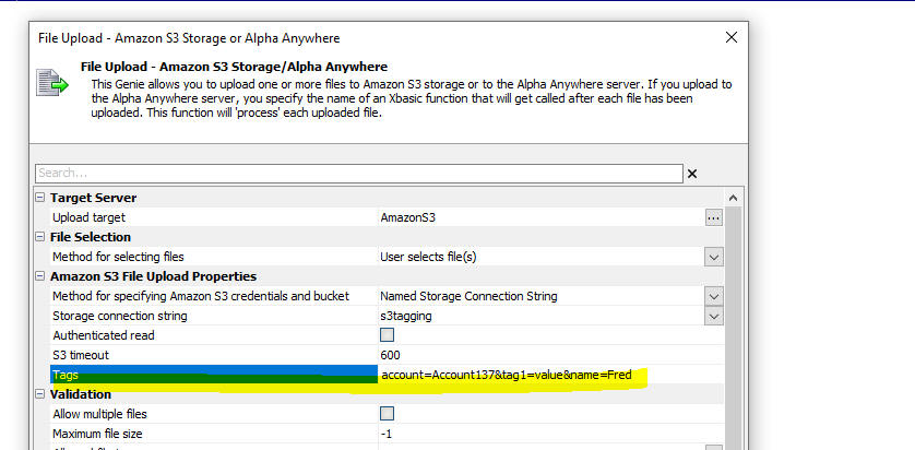
AlphaLaunch - Optimize publishing - When you publish to Alpha Launch, there is now a new option to turn on Optimized Publishing When this option is enabled, all files that have been previously published are not published again (unless a file has been edited).
Xbasic - a5_isWorkingPreview() Function - A new function can be used to test if a component is running in Working Preview mode. The function returns .t. if a component is running in Working Preview. The previous technique that was used (request.SERVER_PROTOCOL = "A5RES") can no longer be used as Working Preview now no longer uses the special A5RES protocol.
Cordova App Builder Genie - Added Support for Cordova iOS 6.2.0 -
Cordova iOS 6.2.0 is the latest official release for building Cordova
iOS applications and it includes support for Xcode 11 and the iOS 13
SDK. The UIWebView code was removed and replaced with the required
WKWebView. As such, it does not require the Alpha WKWebView plugin that
is used for Cordova iOS 5.1.1 builds.
If you are generating a build for iOS, you can now choose one of two
versions of Cordova iOS to build your app. Both versions require
different plugins (which will be automatically installed) for handling
access to local device files and XHR requests.
Cordova iOS 5.1.1 is the default version and it has been used
extensively over the years to build Cordova iOS apps with Alpha
Anywhere. When you build with Cordova iOS 5.1.1 the Cordova Alpha
WKWebView plugin is automatically installed along with the associated
cordova-plugin-alpha-wkwebview-file-xhr
plugin.
The latest version of Cordova iOS is version 6.2.0 and it includes the
required WKWebView. It does not require the installation of the
Alpha WKWebView Plugin. When you build with
Cordova iOS 6.2.0, the
cordova-plugin-alpha-wkwebview-file-xhr-fix v2.3.0 is
automatically installed.
Some of the newer Cordova plugins may require Cordova iOS 6.x.x
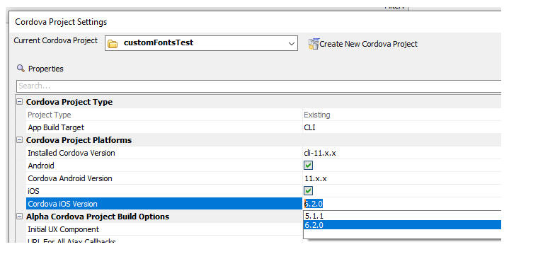
For more information on
Cordova iOS 6.2.0, see the
Cordova CLI Documentation
Cordova App Builder Genie - iOS Apps -
NSLocationAlwaysAndWhenInUseUsageDescription - Since iOS 10,
it is mandatory to provide a usage description string in the
info.plist if the app is trying to access privacy-sensitive data.
When the system prompts the user to allow access, this usage description
string will displayed as part of the permission dialog box. If you did
not provide the usage description, the app will crash before showing the
dialog. Keep in mind that Apple will reject apps that access private
data without providing a usage description.
NSLocationAlwaysUsageDescription describes
the reason that the app is requesting access to the user's location at
all times, however this key was deprecated as of iOS 8.0.
NSLocationAlwaysUsageDescription can still be used if your app
accesses location information in the background and you deploy to a
target earlier than iOS 11.
For iOS 11 and later, it is
recommended to add both
NSLocationAlwaysUsageDescription and
NSLocationAlwaysAndWhenInUseUsageDescription
to your app�s Info.plist
file with the same message.
When either of the
Geolocation,
Pushwoosh or the
Background Geolocation LT plugins are
used, the following entries are automatically added to your project
config.xml file.
This ensures that your app has all of the required
info.plist
entries.
File Upload - Cordova - Amazon S3 Indirect - Fixed an issue with uploading to S3 using the indirect method when running in a Cordova app.
Xbasic - pdf_fillinfields_merge() - This function would sometime fail if the JSON merge data contained parentheses.
Reports - Saving reports to PDF in desktop applications failed.
Client-side data cache - static data - Filesystem - Refreshing a client-side data cache item that was based on static data would fail if the data was persisted to the file system.
UX component - List - Client-side search - Failed if the List was based on a SQL query that joined two or more tables.
Grid - Images - Embed in HTML - Fixed a regression in the Embed in HTML option.
| Xbasic | Uploading Videos to YouTube |
This video shows how to create a Google project and a Named
Provider in Alpha Anywhere to that you can then use the
a5Storage_UploadVideoToYouTube()
function to upload videos to YouTube. Watch video Date added: 2022-12-21 |
UX Component - List Control - Calendar Layout - (This feature is still under development and requires a Feature Key in order to enable it. We are making an early version of the feature available so we can get feedback from the community). To request a feature key, go to Help, send an email to enhancementrequests@alphasoftware.com with "List Calendar Feature Key" in the subject.
The Calendar layout is a view of the data in a List See video:
https://www.screencast.com/t/dvLrLJNmhG1
UX and Grid Components - Date Format property - Previously, the Date format property in UX and Grid properties was used to control how the user was expected to enter date/datetime values (and also to control how the Date Picker returned values if the format for the Date Picker had been set to <Default>). The default display format for date/datetime values was determined by the regional settings on the server.
Now, the Date Format property in UX/Grid properties controls both how the user is expected to enter date values, but also how data bound UX controls (including List and ViewBox controls) and Grid components will display date and datetime values.
An example of how this will work from now on is: if the regional settings on your server are configured to render dates in MM/dd/yyyy format (i.e. US format) and the Date format property in a UX component is set to dd.MM.yyyy then assuming the UX is data bound, any control that displays date or datetime values, will use the dd.MM.yyyy format (because that is the format that is set in the Date Format property. In addition, List and ViewBox controls that display date or datetime values will use the dd.MM.yyyy format for the date part (again, because that is the setting for the Date Format property).
Previously, the data would have been displayed in MM/dd/yyyy format because that is the format of dates on the server.
NOTE: Previously, when a date or
datetime field was added to a
Grid component, a default
Format display property was set to:
time("{grid.clientSideDateFormat} 0h:0m 0s am",<value>).
Therefore, the values displayed in the Grid were formatted as
dd.MM.yyyy (because the
Date Format property had been set to
dd.MM.yyyy. However if the Display Format
property was removed, the data in the Grid's date
and datetime fields would use the
MM/dd/yyyy format (if that was the server format)
As a result of this change, when you add a date
or datetime field to a
Grid, the Display
Format property is no longer set (because it is not needed).
The benefit of this change in behavior is that it is now easier to create applications that deal with date and datetime values in a more intuitive manner.
For example, say you have an app that is hosted on Alpha Cloud. The server format for dates on Alpha Cloud is MM/dd/yyyy. This means that if a developer is hosting their app on Alpha Cloud, date and datetime value in the application would by default be displayed in MM/dd/yyyy format. Any user of this app who was outside the US would likely expect the date and datetime values to be formatted in dd/MM/yyyy format.
This is now easily achieved by setting the Date format property in the Grid or UX to <cultureDateFormat> (and if you also want to display dates with time values set the time part of the Date format to <cultureTimeFormat>).
When a user in (say) the UK accesses this app, dates will be displayed in dd/MM/yyyy format (because the browser will automatically tell the server what culture to use. Similarly when a user in the US access the same app, dates will be displayed in MM/dd/yyyy format (because that is the format for dates if the culture is US).
During development, the developer might want to know how dates will be rendered for users in any particular culture. If the Date Format is set to <cultureDateFormat>, a new property is displayed (Simulated culture). This allows you to simulate any culture.
NOTE: Be sure to set the Simulated culture back to a blank value before you deploy your app to production.
IMPORTANT: Once you edit and save a Grid component using this version, you will not be able to run the Grid using a server that is an older build. If you need to run the Grid using an older build, you must first edit and resave the grid using the older build.
This change will also affect the behavior of the .getValue() method in a UX component when getting the value in a textbox control that is configured to have a date picker, where the textbox datatype is "D" or "T" and the date format on the textbox date picker does not match the date format set in the UX's Date format property (an illogical setting, but nevertheless, possible). Previously the .getValue() method would return the actual value in the textbox. Now, the .getValue() method will return a data value formatted according to the UX's Date format property.
Project Properties - Allow static text selection - This property which was previously in Project Properties has been moved into the Grid and UX builder (in the Advanced) section. This means that this property can now be set for individual components. By default most browsers do not allow you to select static text. By turning on the Allow static text selection property, users will be able to select static text (for example, to copy the text to the clipboard).
Reports - Chunked Reports - HTML - Chunked responses can now be enabled for HTML reports (previously only PDF reports honored the Chunked reports setting). Additionally if you use Action Javascript to render an HTML report and then if you click the PDF button in the report window, the PDF report will honor the chunked report settings.
Action Javascript - File Upload to S3 - Connection String Property - You can now specify a Javascript function to return the name of the storage connection string to use.

Xbasic - WordFromEnd() Function - Returns words from the end of a string.
Syntax
c Result = WordFromEnd(c string, c delimiter [,n numberOfWords])
Example
?WordFromEnd("a.b.c",".",2)
= "b.c"
UX and Grid Components - Simulated Culture - If you set the Date format property for dates to <cultureDateFormat>, the Simulated culture property is displayed. This allows you easily test how dates and times will be rendered in different cultures.
UX and Grid Components - Date Format for Date Values - The Date format property now controls how date values are displayed. Previously this property was only used to control how users were expected to enter date values. (See the Change in behavior section for more information.)
Xbasic - Excel_to_SQLite() - Primary Key and Indexes - You can now explicitly designate the primary key by including the keyword (Primary key) after the column name in the Excel sheet. You can now also designate that a column should be indexed by including the keyword (Index) after the column name in Excel sheet.
Previously you could not designate that a column should be indexed and the primary key was automatically assigned.
Xbasic - A5W_report_saveas() - Send Report via Email as Inline HTML - The A5W_report_saveas() function allows you to easily send the file created by this function as en email attachment. This is done by specifying a JSON string for the filename argument. This JSON string defines the email settings.
Now, you can send the HTML inline in the email body rather than as an
attachment. This is done by adding a new property (inlineHTML)
to the JSON string that defines the email settings. This property can be
true or false.
For example:
{
"type":"email",
"htmlInline":true,
"apikey":"xxxxxx",
"send_to":"xxx",
"send_from":"xxx",
"subject":"xxxxL",
"message":"not used if htmlInline is true"
}
UX and Grid Component - Advanced Search Control - Edit-combo - Cache data - You can now specify that the data in an edit-combo control should be cached so that an Ajax callback is only made the first time the picklist for the edit-combo is opened.
Xbasic - JSON_to_CSV() Function - Converts JSON text to CSV text.
Xbasic - a5Storage_UploadVideoToYouTube() Function - Upload Videos to YouTube From Alpha Anywhere - A new Xbasic function (a5Storage_UploadVideoToYouTube()) allows you to upload videos to a YouTube account. The function uses the Google YouTube API.
In order to use the function you will first need to create a named provider for Google. You will also need to authenticate a connection to a Google account with the correct scopes. This video explains how to set up a Google project and how to create the necessary named provider.
http://aapatches.s3.amazonaws.com/jing/youtubeuploadvideo.mp4
Once you have create the named provider, and authenticated your account to get the necessary Access token, you can use the a5Storage_UploadVideoToYouTube() function to upload videos.
The syntax for the function is:
p result = a5Storage_UploadVideoToYouTube(c namedProvider,c filename, c itemName[,c description,[c title,[c tags]]])
Where
UX Component - Textbox Control - Edit-combo - Multiple - Strip trailing separator character - When an edit-combo allows multiple selections and the user make multiple selections , each selection if followed by the specified Multiple value separator.
You can now specify that the trailing separator character should be removed when the control is blurred.
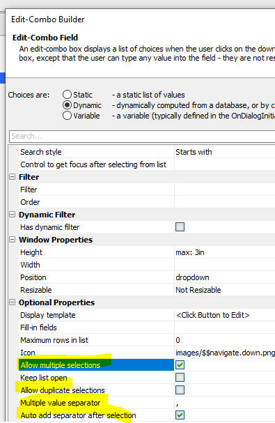
UX Component - Textbox Control - Client-side formatting - Mask - Multiple - If you define a client-side format for a textbox control and you have checked the Allow multiple property, you can now enter multiple values that will each be formatted according to the Mask definition.
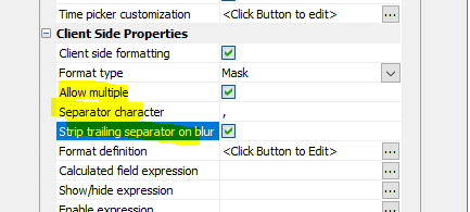
For example, in the image below, the textbox has a Mask to display the value as a US telephone number and the Allow multiple property has been checked. The image shows two formatted values in the textbox.
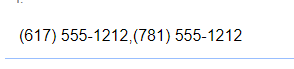
Grid Component - Open Child Grid Action Javascript - Refresh Parent Grid on window close - You can now specify that when the window in which the child grid is displayed is closed, the parent Grid should only be refreshed if the child Grid has been edited.

UX Component - Action Javascript - Refresh ViewBox Data - afterAjaxCallbackComplete - You can now specify Javascript to execute after a ViewBox Refresh action has completed (only applies if the ViewBox is based on a SQL data source).

UX Component - Action Javascript - Refresh List Data - afterAjaxCallbackComplete - You can now specify Javascript to execute after a List Refresh action has completed.

A5Storage_getProperties() function - Was not returning the content type of an object.
UX Component - List Control - Delay Render Until User Logs In - After List Refresh Event - This event was not firing after the user logged in.
UX Component - List Control - In-place Editing - Logical Checkbox - Fixed an issue with logical checkbox.
UX and Grid Component - Advanced Search Control - Fixed an issue with edit-combo controls that were based on dynamic data.
Action Javascript - File Download - Client-side Filename - Javascript - If the client-side filename was specified by a Javascript function, the client-side filename did not get set correctly.
UX Component - Logical Checkbox - Javascript - If you specified that a logical checkbox was a Javascript control, the control did not render.