This document describes the updates and fixes made to Alpha Anywhere in 2025 to present.
To see the 'What's New in V12' document (which describes all of the new features in Alpha Anywhere's initial release) please click here.
Please note that Alpha Anywhere patches are only available to users with
a current subscription.
You can verify your subscription status from within Alpha Anywhere by going to Help, About, or by clicking this link shown here (https://activation.alphasoftware.com/subscriptionStatus.aspx). If you install an update for which your subscription is not entitled, you will need to uninstall the update and rollback to an older version that you are authorized to use in order to continue using Alpha Anywhere.
To see release notes for other periods, click the appropriate link:
Release notes for 2023 and 2024
Release notes for 2021 and 2022
Release notes for 2018 and 2019 and 2020
Release notes for 2017 and older
In addition to the official updates that Alpha Software makes available from time to time (which are described in this document), we also make available our internal pre-release builds that allow you to see what features have been added and what bugs have been fixed since the last official update. The features and bug fixes in the pre-release build (called the 'Nightly' build) will be part of the next official update. To see the Nightly build release notes, please click here.
In order to keep Alpha Anywhere current with new technology from Microsoft, we are announcing the end of support for older versions of Microsoft Windows and Microsoft Windows Server that are no longer in mainstream support by Microsoft.
Schedule of Alpha Anywhere Windows Operating System Support
| Microsoft Windows Operating System | Supported For Alpha Anywhere Prior To | Microsoft Mainstream Support |
| Windows XP, Windows Server 2003 | Already ended | Ended in 2015 |
| Windows 7/Windows Server 2008-R2 | January 1, 2021 | Ended January 14, 2020 |
| Windows 8/Windows Server 2012 | Not supported. | Ended October 9, 2018 |
| Windows 8.1/Windows Server 2012-R2 | July 1, 2021 | Ended October 9, 2018 |
| Windows 10 | Must be kept up to date. |
Rolling Upgrades Semi-Annual/Annual |
| Windows Server 2016 | July 1, 2022 | January 11, 2022 |
| Windows Server 2019 | July 1, 2024 | January 9, 2024 |
| Windows Server (vNext/2021) | TBD | TBD |
Note: The operating system support
lifecycle does not apply to Alpha Cloud deployments. On Alpha
Cloud, Alpha Software manages the operating system deployment
for you. Alpha Cloud subscriptions currently deploy on Windows
Server 2016. For more information about Alpha Cloud see
https://www.alphasoftware.com/alpha-cloud-worry-free.
| UX Component - JSON Forms | How to create a custom Integer-Step control |
In this video we show how you can turn a
standard textbox control into a custom
Integer-Step control. Watch video Download component Date added: 2025-08-21 |
| UX Component - QUILL HTML Editor | How to customize available fonts in the QUILL HTML editor |
In this video we show how to customize the fonts
in the QUILL HTML editor. Watch video Date added: 2025-09-20 |
| Grid Component - Context Menu Search | How to add context menu searching to a Grid |
In this video we show how you can add a search
feature to a Grid that is invoked by right
clicking on a Grid row. Watch video Date added: 2025-10-03 |
| CRON Jobs | How to Define CRON Jobs |
In this video we show how you can define CRON
jobs. A CRON Job is server-side code that runs
on a schedule. For example: print a particular
report every Friday at 3 MM and mail the report
to a group of recipients. Watch video Date added: 2025-10-09 |
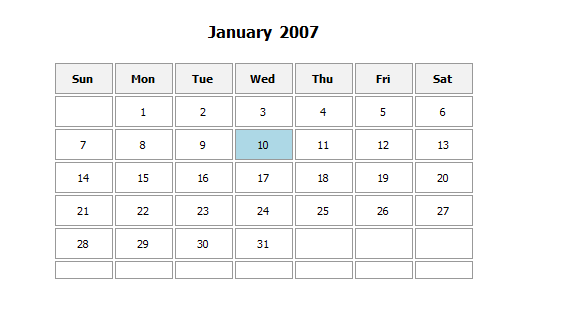
xbasic a5_calendar_html() Function - Generates an HTML calendar layout. The typical use case for this function is in a report to print a calendar control showing a date value. The syntax for the function is:
Syntax:
c html = a5_calendar_html(n year, n month, c days)
where days is a comma delimited list of days to highlight (e.g. 5,6,7). You can also highlight a range of dates (e.g.5-8) and you can put a comment in a calendar cell (e.g 5:comment).
To use the function, add an HTML Layout control, to your report, define a calculated field using the a5_calendar_html() function (e.g. calc1 = a5_calendar_html(year(date),month(date),""+day(date)) ) and then add the calc field to the HTML Layout control.
Here is how the resulting report might look:
Open SSL - OpenSSL 3.3.5 is included with all Alpha
Anywhere servers and desktop environments. The Alpha Anywhere
Application Server for IIS does not use OpenSSL to provide TLS/SSL
service, but does use OpenSSL for making cUrl and http* requests.
OpenSSL 3.3.5 was released to address a known vulnerability. For more
information regarding OpenSSL vulnerabilities, see
https://openssl-library.org/news/vulnerabilities/index.html
CRON Jobs - - You can now define CRON Jobs in Alpha Anywhere. CRON Jobs are server-side tasks that run on a schedule. For example, you might want to run a particular report at 3 am every Friday and email the report to certain recipients. Previously CRON Jobs could be set up using the Windows Event Scheduler service, but this service is not available on Alpha Cloud.
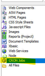
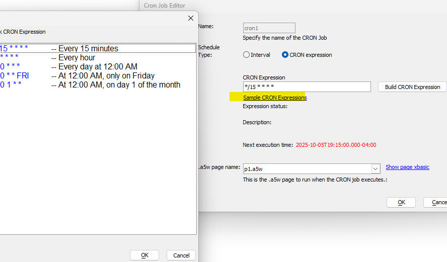
To define a CRON job, select the CRON Jobs category in the Web Projects control panel and then click the New button.
A CRON job is specified by calling an .a5w page that executes server-side code (typically Xbasic, but could be Node, Python, etc.)
When you click the New button, or edit an existing job, this CRON Job Editor dialog will be shown
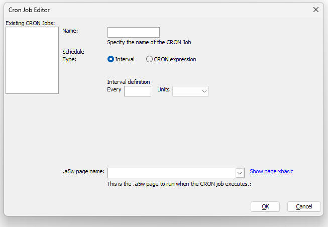
To define a CRON Job, specify:
To define when the job should run, you can either select the Interval radio-button or the CRON expression radio-button.
If you specify an interval, you can specify an interval in minutes, hours or days (e.g. every 15 minutes).
NOTE: You cannot specify an interval that is shorter than 15 minutes
To define a CRON expression, select the CRON expression radio button. A CRON expression is a standard way of specifying when a CRON job should run. A CRON expression is comprised of 5 parts separated by spaces.
NOTE There are many on-line resources to help you construct CRON expressions.
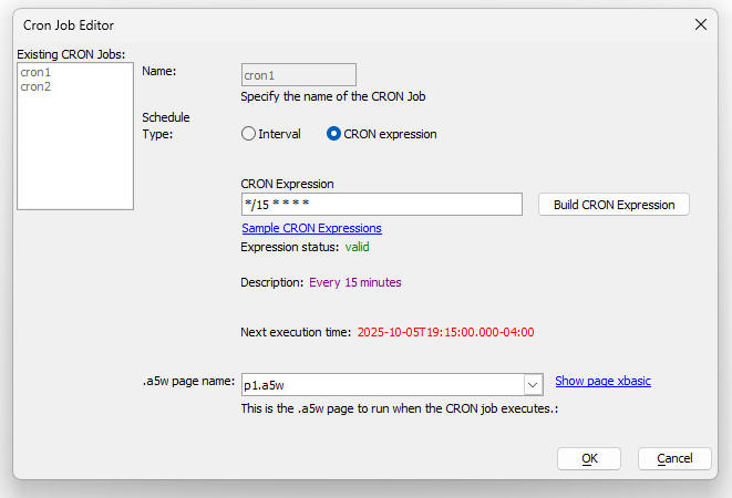
If you click on the Build CRON Expression button, the following dialog is shown. The dialog shows the human readable description of the CRON expression.
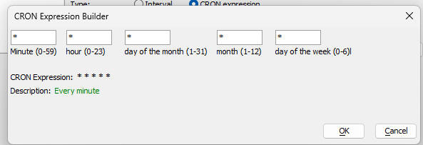
You can also click on the Sample CRON Expressions hyperlink to get a display of some common CRON expressions.
For each CRON job that you define, you must specify that name of the .a5w page to run when the CRON job runs. The .a5w page should contain an Xbasic code block.
IMPORTANT; Once you have published your project (that includes one or more CRON jobs), you must register your CRON jobs by running a special system page. __a5RegisterCronJobs.a5w. For example, assume the URL of your published site is https://mydomain.com/. You will need to run this page: https://mydomain.com/__a5RegisterCronjobs.a5w. Tje page will return a message telling you how many CRON jobs we registered.
System Table
The CRON feature makes use of a system table, the CRON Job Log. The CRON Job Log table is used to store information about the success or failure of each CRON job. If you have not defined this system table, it will be automatically created when you define a CRON job.The table is defined in the Project Properties dialog.
The a5_updateCRONLog() helper function can be used to update the CRON Job Log table. If a CRON job fails because of an error in the Xbasic code a new entry is automatically made in the CRON Job Log table. if the CRON job succeeds you must add code in your .a5w page to update the table.
Here is a sample .a5w page to print a report and mail it to a list of recipients;
<%a5
dim report AS C = "report1.a5rpt"
DIM FN AS C = a5_default_path + chr(92) + REPORT
DIM REPORTFN AS C = a5w_report_saveas(fn,"PDf")
dim ms as p
DIM ms.message_html as c = "Here is your report"
DIM MS.send_to as C = "person1@acme.com,person2@acme.com,person3@acme.com"
DIM MS.subject as C = "Your report"
DIM MS.from_alias as C = "AlphaSoftware"
DIM MS.from_email as C = "noreply@alphasoftware.com"
DIM MS.from_name as C = "AlphaSoftware"
dim ms.attachments as c = reportfn
dim key as c = "your_sparkpost_key"
p = email_send_sparkpost(key,ms)
'update the CRON Job Log table
if p.error = .f. then
a5_updateCRONLog(a5_getprojectguid(),"name_of_cron_job",now(),"success")
else
a5_updateCRONLog(a5_getprojectguid(),"cron1",now(),"failed")
end if
%a5
Grid Component - Context Menu Searching - When you right click on a row in the Grid, a menu with search options is now shown. To turn on this feature, check the Has 'Context Menu' search property in the Grid properties. By default, this property is checked.
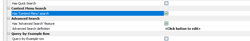
Different search options are available, depending on the data type of the column you right click on.
In the case of a date or date/time field, you can search on friendly date values, such as today, yesterday, etc. You can also search for all records in a particular month or quarter.
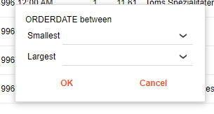
For numeric and date columns you can search for records between two values.
Cordova - Cordova Project Settings - Plugins - SQLite -With
the release of Android 15, Google now supports devices with 16KB memory
page sizes. Previously, 4KB memory page sizes were used.
When publishing Cordova apps to the Google Play Store, a warning is
shown if native libraries (.so files) are not aligned for 16KB memory
pages.
This requirement will affect apps that use Cordova plugins that include
native libraries (.so files). To date the only plugins we've identified
that include native libraries are the series of
SQLite plugins.
If you are using the Cordova SQLite plugin, you should be sure to use
the latest version of the SQLiteStorage
plugin (cordova-sqlite-storage). The latest version of the SQLiteStorage
plugin includes .so files that are aligned for 16KB memory pages.
If you have previously included any of the other SQLite plugins, first
uncheck the plugin and save the project. Next re-launch the Cordova app
builder and select the SQLiteStorage plugin. This is the only SQLite
plugin that has been updated by the plugin author to support 16KB memory
pages.
For further details see:
Android 15 16KB Memory Page Size Support
Prepare your apps for Google Play�s 16 KB page size compatibility
requirement
Xcode - General - Supported Destinations - The latest versions of
Xcode have changed the default selections for the projects supported
destinations The default supported destinations now includes Mac and
Apple Vision.
If your intention is to build a Cordova app for an iPhone or an iPad and
you are not building apps for the Mac or Apple Vision, then you should
uncheck these options. If you upload your app to TestFlight and you see
an error rejecting your TestFlight build with errors indicating a
missing LSApplicationCategoryType key and a disabled
com.apple.security.app-sandbox these are typically only required for
macOS apps, not iOS apps.
Javascript - Client-side Templates - How to merge data into a client-side template using Javascript
var template = 'Hello {Firstname} {Lastname}';
var pTemplate = {template: A5.u.template.parse(template)}
var data = {Firstname:'Fred', Lastname: 'Smith'}
var html = A5.u.template.expand(data,pTemplate)
alert(html)
CRON Functions - Three new CRON function are available
Examples
dim CRONExpession as c
conExpression = "*/15 * * * *"
?cron_validate(cronExpression)
+"valid"
?cron_validate("")
= "Error: Too few fields"
?cron_nextExecutionTime(cronExpression)
= "2025-09-06T18:15:00.000-04:00"
?cron_describe(cronExpression)
= "Every 15 minutes"
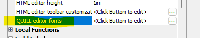
UX Component - QUILL HTML Editor - Fonts - You can now customize the fonts that are available in the QUILL HTML editor. By default three fonts are available, Seris, Sans Serif and Monospace.
To customize the available fonts click the smart field for the HTML editor fonts property.
This will open a fonts selection dialog.
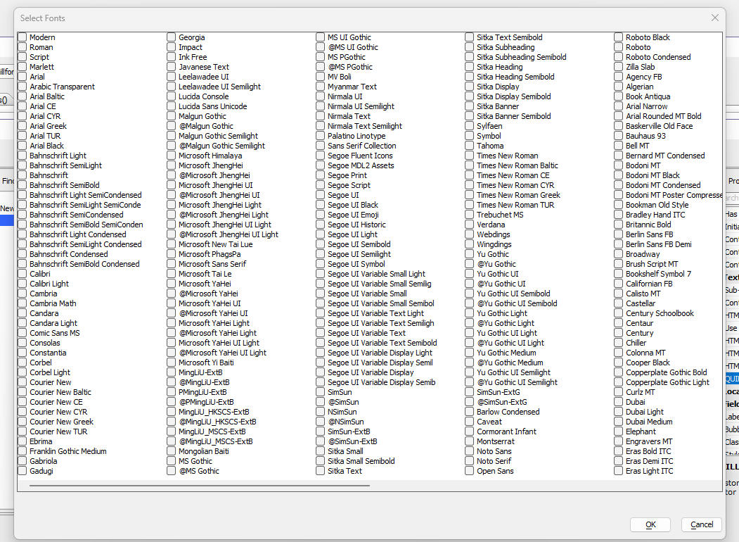
Select the fonts you want to make available in the QUILL HTML editor.
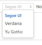
When you open the font selection dropdown, the list of selected fonts is shown
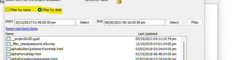
Publish - Select Files by Date - When selecting files to publish, you can now filter the list of available files by date/time
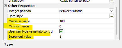
UX Component - JSON Forms - Integer-Step Control - Additional functionality has been added to the Integer-Step control.
You can now:
To set these properties of the Integer-Step control, edit the JSON form select the Integer-step control and navigate to the Other Properties section of the properties grid.
AD Login - Fixed regression with Active Directory login
Reports - Page x of y - Fixed regression with PageXofY
UX Component- List - Fixed issue when List data source is a Javascript function
SQL Query Builder - Icons were not showing on Filter pane when AA was installed in a folder with spaces in the name.
UX Component - Refresh - When refreshing a List, two Ajax callbacks were executed.
Workspace Restore - Fixed multiple issues with Workspace Restore.
UX Component List - Synchronize Edits - Batch size - Fixed a regression when a List was synchronized and the batch size was greater than 0.
Grid Component - show/hide expression - Fixed regression when when expression was data.rowNumber > 0
ux, Tabbed UI and Page Layout Components - Tab and Accordion Control - Fixed regression
| UX Component _Web Push Notifications | Using OneSignal to send push notifications in Web applications |
These videos show how you can use the OneSignal
service to send notifications to a web
application (including PWAs) Watch videos Date added: 2025-06-21 |
Xbasic, PDF_Merge() Function - Now allows you to specify the page size of the merged document. If you don't specify the page size the default page size is determined by the page size of the largest source document.
The syntax for pdf_merge() is now:
L pdf_merge(Base_File as c, Merge_File as c,
Result_File = "", flagMergeAllPages = .t., flagMergeFileOnTop = .f.,
flagNested = .f., pageWidthInPoints = "", pageHeightInPoints = "")
Push Notifications - You can now send push notifications to Web applications (including PWAs) using the OneSignal service.
OneSignal is a unified messaging platform that supports web push, email and SMS notifications. To setup an account at OneSignal visit OneSignal.com
To enable OneSignal within a web project go
to Project Properties/OneSignal and check
Enabled. Next enter your
OneSignal App Id.
(which you will obtain from the OneSignal
web site.)
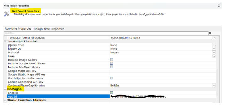
Click here for information on setting up a
OneSignal project and obtaining a OneSignal
App Id.
For further details on using web push notifications with Alpha Anywhere
see the Alpha Anywhere documentation topic:
Web Push Notifications with OneSignal
For a series of video tutorials on the OneSignal
integration click the link:
OneSignal Web Push Notifications Playlist.
JSON Forms - Date Picker - You can now control if a datepicker control should have an icon to open the datepicker. if no icon is shown clicking anywhere in the control will open the dqtepicker. if an icon is shown you can customize the icon.

Datepicker control with no icon.

Datepicker control with default icon.

Datepicker control with custom icon.
To set the properties of the datepicker icon, set these properties
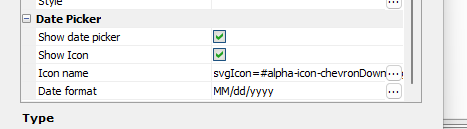
If you have turned on the Show Icon property, you can leave the Icon Name property blank to use the default icon
Security Framework - New folder level allow options have been added to include subfolder for the selected folder. These options are named
These options have been added to the Folder Security menu for folders.
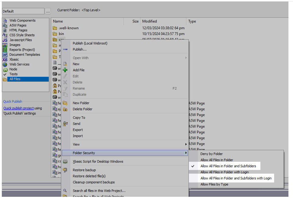
When either of these options is used files in subfolders are allowed when the option's condition(s) are met.
Note
The implementation of the existing Allow All Files
in Folder and Allow All Files in Folder
with Login was done incorrectly under IIS. Subfolders are
included in the folder level option. Because of this, Allow All Files in
Folder and Allow All Files in Folder with Login for existing IIS
applications will continue to behave as if and Subfolders was selected.
However, if the allow option for a folder is changed, the consistent
meaning will be used and and Subfolders must be explicitly selected to
get that behavior.
Xbasic - For Each Loops - Fixed a regression that did not allow the iterator variable to be referenced directly (e.g. varname). It was required to explicitly use varname.value.
As a result of this bug, the output generated by the a5w_info() function was incorrect.
unique_key_value() Function - Fixed a regression.
List - multi-column primary key - Fixed sync bug if List has a multi-column primary key.
Classic server and IIS - Enable free threading feature by default.
Backup - Fixed regression in backup feature.
UX component - Edit-combo - Various fixes.
UX component - Date Format - Fixes for UK date format.
UX component - List - Fix delay render till visible.
Publish - HTTP Publish - Various fixes.
Security = Extended User Info Table - Added support for dynamic connection strings.
USPS Lookup Function - Various fixes.
| UX Component - Advanced Dropdown Message box | Advanced Dropdown Message box |
This video show the various kind of Advanced
Dropdown message boxes. Watch video Date added: 2025-03-16 |
| UX Component - Advanced Dropdown Message box | Advanced Dropdown Message box - wait style |
This video shows how a Wait style Advanced
Dropdown message box can be used to show progress
messages as a chunked Ajax callback executes. Watch video Download component Date added: 2025-03-16 |
geocode_address() Function - OpenCage - You can now use the OpenCage service to geocode addresses. OpenCage is cheaper than the Google service.
Example
key = "your OpenCage API key"
address = "36 Bigelow street, Cambridge MA 02139 USA"
dim p as p
p = geocode_address(address1,"opencage",key)
UX Component - Edit-Combo Control - .setValue() Method - Fill-in Fields - If you have defined an edit-combo lookup with fill-in fields (and the choices are populated at render time), when you use the .setValue() method to set the value in the control, the fill-in fields are now also populated.
Cordova App Builder Genie - Plugins - InAppBrowser - The installed plugin version for the InAppBrowser plugin has been upgraded to the latest release which is V6.0.0.
This resolves a bug that appeared in the latest iOS versions related to url's that specifically target the system level browser.
Cordova App Builder Genie - Cordova Android 14.0.0 - API Level 35
This release includes support for Cordova Android 14.0.0, API Level 35, which is the latest release of Cordova Android. It has breaking changes when compared to the previous release, Cordova Android 13.x.x.
The changes include:
Project Dependencies
The following project dependencies were bumped:
To install Android SDK Platform 35
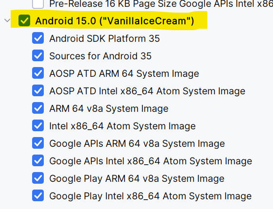
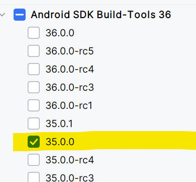
To install SDK Build Tools 35
 '
'
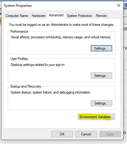
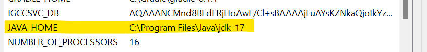
To download and install JDK 17:
After JDK 17 is installed, be sure to check your system environment variables to be sure that JAVA_HOME is pointed to your install of JDK 17
When building a Cordova Android App with the Alpha Cordova App Builder genie be sure to set the target SDK to API level 35.
For further information see:
Docker Container Builds - Docker Desktop - New Docker Image Required When Targeting API Level 35
If you are building Android apps with a Docker Container and your project is targeting API Level 35, you will need to delete the existing remoorejr/alpha-cordova-android-build Docker Image in Docker Desktop and install the latest version of the Docker Image.
Once you delete the container, search for "Alpha-Cordova" and select the latest version of the image
remoorejr/alpha-cordova-android-build, which is the same as
the image tagged v1.0.3-cordova-android-14.0.0.
The new container includes support for:
When building a Cordova Android App with the Alpha Cordova App Builder genie be sure to set the target SDK to API level 35.
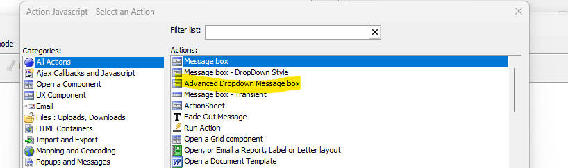
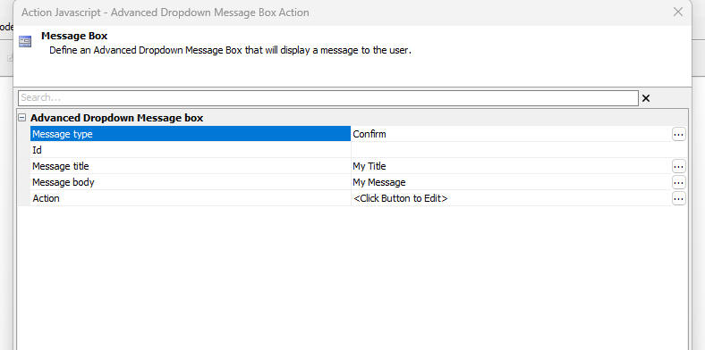
UX Component - Advanced Dropdown Message Box = Action Javascript now allows you to define Advanced Dropdown Messages. Several styles of messages are available. These are:
Images of the various message type are shown below:
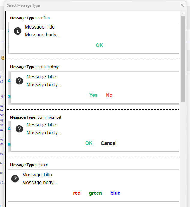
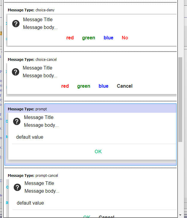
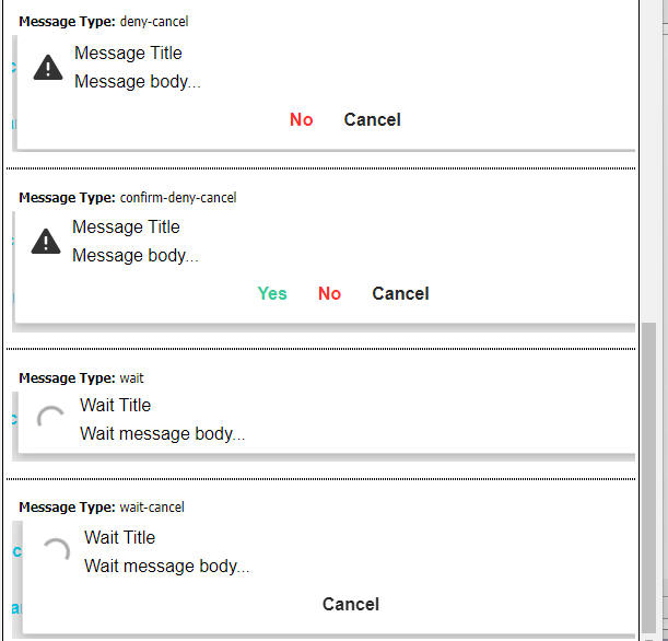
To define an Advanced Dropdown message, use Action Javascript. Select the Advanced Dropdown Message box action and then open the builder.
Builder for Confirm style message box.
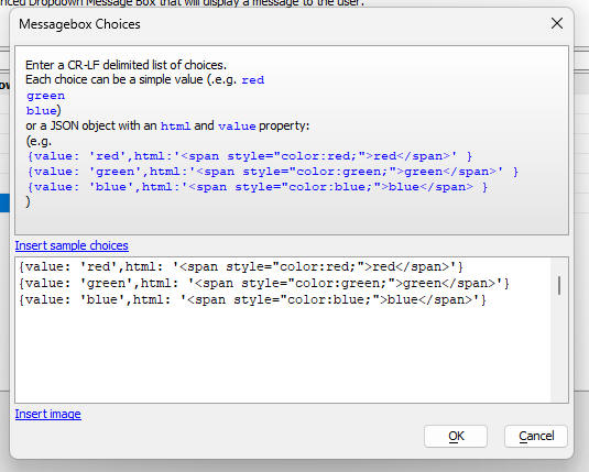
Builder for Choice style message box. This dialog allow you to define the choices that are displayed.
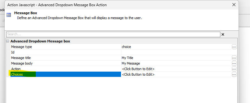
When you click the smart field for the Choices property a dialog is shown where you can define the choices.
Builder for the Prompt style message box.
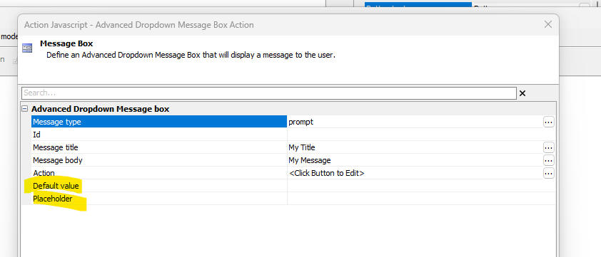
The builder allows you to define an optional Id for the message box, a title, message body and an action (the Javascript to execute when a button on the message box is clicked). The action makes a variable called action available which contains the name of the button that the user clicked.
The following methods are available for use with the Advanced Dropdown Message box.
A5.message.hide(id [, flagFireEvent]) - Hides a message box. If flagFireEvent is true, the action is executed and the action variable is set to hide.
A5.message.update(id,title,message) - updates a message box
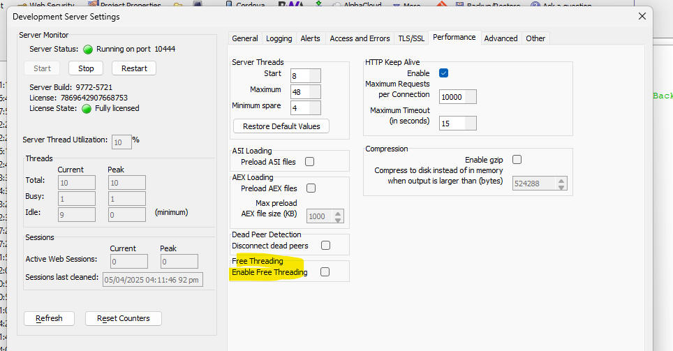
Free Threading - This release is now free-threaded. Xbasic is now thread-safe. The benefits of free-threading are explained below:
Watch video
Download test .a5w page
In the past, the XBasic interpreter was cooperatively shared between simultaneous
web requests. While one request was processing XBasic all the other
requests would wait until the first request finished processing or
paused XBasic processing by doing something like accessing a database. This was
needed because there was a limitation with internal data that was not
thread safe.
Free threading fixes this limitation so
that multiple simultaneous requests can be processed at the same time.
In other words, the XBasic interpreter does not need to be cooperatively
shared. This change benefits web apps that have a high load or spikes in
requests as these requests can be handled simultaneously. Additionally,
these requests can be handled on any core where in cooperatively shared
mode, there would be an affinity to a single core. This means there will
be a more balanced usage of processor resources.
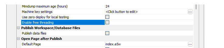
Free-threading can be enabled or disabled on the classic server on the Performance tab of the Server Settings dialog.
For both IIS and AlphaCloud, there is a setting in the publish profile:
UX Component - List Control - List Builder - Return Value - The List builder now requires you to specify an explicit return value. Previously, the return value could be blank.
Google Sheets - Xbasic Functions to read and write data - Two new Xbasic functions are available to read data from and write data to Google Sheets. These functions are:
IMPORTANT Before you can use these functions on your Google Sheet you must first share the Sheet with this email address: sheets@sheets-448303.iam.gserviceaccount.com You can get the email address by calling the google_sheet_to_json() function specifying a blank id. For example: google_sheet_to_json("","")
Syntax
C jsonData = google_sheet_to_json(C
spreadsheetId [,C range ])"
google_sheet_update(C spreadsheetId ,C values ,C
range )
Where:
The Sheet id is obtained by taking the address shown in the browser when you have the Sheet open and then extracting the id from the URL:
https://docs.google.com/spreadsheets/d/this is the id /edit?gid=0#gid=0
The range starts with the sheet name followed by ! and the starting and ending cell address, separated by a colon. For example: Sheet1!A1:E10
When updating a Google Sheet the range need only specify the starting cell. For example: Sheet1!A1
Examples
Dim id as c = "1klxbQOgMiE1xxxxxxxxxxxxxxxxxxxxxxxxxxxxxxxxxxxxxx"
dim range as c = "Sheet1!A1:B5"
?google_sheet_to_json(id,range)
= [
{
"firstname":
"Fred",
"lastname":
"Smith"
},
{
"firstname":
"John ",
"lastname":
"Jones"
},
{
"firstname":
"Nancy",
"lastname": "Kiley"
},
{
"firstname":
"Cecil",
"lastname": "Luxa"
}
]
'To update the Sheet
dim p[2] as p
p[1].company = "alpha"
p[2].company = "beta"
dim json as c = json_generate(p)
google_sheet_update(id,json,"Sheet1!a1")
UX Component - Textarea Control - HTML Editor -- QUILL - When you configure a textarea control as an HTML editor, you now have the option of using the 3rd party, open source, QUILL editor.
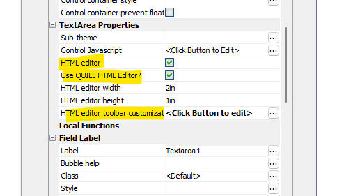
The image below show how the QUILL editor is rendered in a UX component.
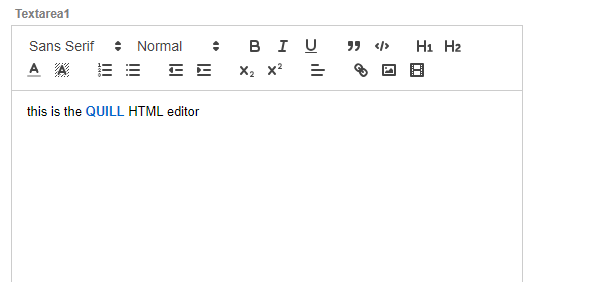
You can customize the QUILL editor toolbar by defining the HTML editor toolbar customization property. If you do not customize the toolbar, a default toolbar is shown.
CURL_Post_data Function() - this function now takes an optional timeout parameter. The default timeout is 10 seconds. Previously this function did not timeout. If you set the timeout to 0, then no timeout is set.
a5_showHtml_browser() function - Displays HTML content in a browser tab using the default browser. Contrast with a5_show_htmlchrome() which shows the HTML using the embedded chrome control.
UX Component - Client-side Calculated Fields - Client-side calculated field are now automatically set to read-only.
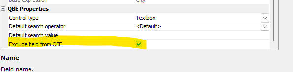
UX Component - List Control - Query By Example - You can now specify that certain fields should be excluded from QBE. Previously, all fields in the List were automatically included in the QBE.
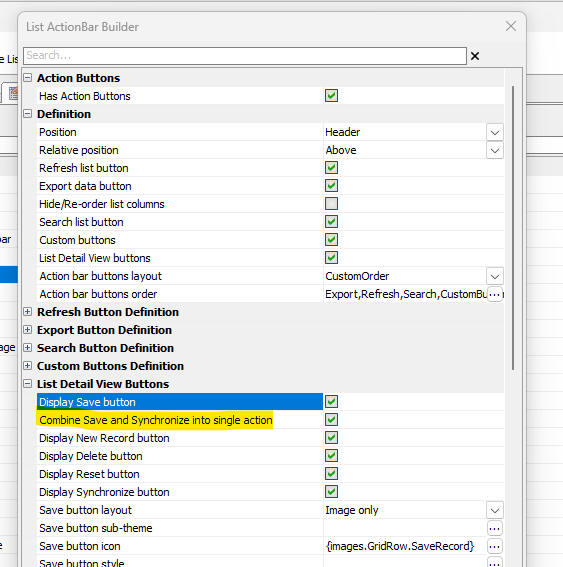
UX Component _list Control Action Bar- Detail View Buttons - You can now specify that the Save and Synchronize actions should be combined into a single action.
UX Component - List Control - Fixes a regression where the List control did not render.